Transcripts
1. Introduction: We're heading into the holiday season and wouldn't it be great? You get into the MOOC with a nice seasonal painting. Well, if pick the right class, we're going to pay a lovely seasonal painting in procreate. To get into that mode, with course needs some elements. Fireplace, stopping, string, nice, warm, light, nice atmosphere, and a nice move. And with the help of Procreate this class, some brushes are rough drawing I made and a nice pellet work on creating beautiful painting that really suits the season. Could be a nice Christmas card, could be a nice little painting you put on your table or over your fireplace. That's up to you. I'm going to take you through this step-by-step, are going to show you how to build up the Canvas, how to start with your underpainting, how to paint the rough elements, how to add details, how to bring in light shadow, and how to create that nice warm atmosphere painting. And when done, we're going to have a beautiful oil painting. Now all the supplies to successfully create this painting are supplied with this class. And in the next lesson, I will explain how to download them, how to install them, and how to use them. So let's get our supplies ready and start painting together.
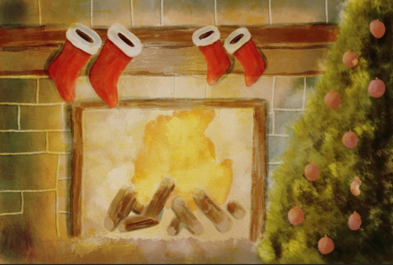
2. What you need & Supplies: Let's go over what you need for this class together and look at the supplies to now, what are you going to need? Obviously, you're going to need an iPad and preferably with an Apple pencil, because it really helps for the painting part. Yes, you could do it with your finger, but pressure sensitivity will be very hard with your fingers. So I recommend iPad, procreate and of course, your Apple pencil. The other things you're going to need are some of the brushes I've created a color palette canvas and also the sketch. The sketch we're going to use as a rough outline for us to paint with. So let me show you that. Now to get to all the supplies, you're going to need to start up Safari and go to this class and Skillshare. So far just works the best for the downloads on your iPads. And most of the time it's on about, you see here these taps and you need to go to this tab, Projects and Resources. Then you can see here a few supplies and I need to get rid of this thing. You see an ABB oil's oil brush at Christmas pellet swatches, stockings over the fireplace. This is the sketch itself, the file with the canvases and the sketch. Then you see stock which over the fireplace, that is a JPEG, that is the finished work you could use as a reference. And then you see here holiday season project and a holy seed holiday season project, JPEG. This is the finished project I've done, and this is the project file. If you want to do the project, then you're going to need this two files to later on. Let's start with the brushes. The simple thing is just to click the brushes. It will start downloading what won't start down, and it takes you to a new tab. It says, do you want to download this? Yes, I do want to download this. Now, starting to download here, you saw that this little animation here did something press on it. And then you see a baby oil brush at two. Now that it is finished, just press on it. It takes you to your founds. The easiest thing to do is to press on recent and they're the first value find will be that oils, that old brush set. You just click on it and it will be importing this into Procreate. Now how to find it? I'll show you that. Let me quickly go into one of the files. This is the project file, but to show you where the brushes and normally if you press on the brushes than the first set on top, you find the brush set with all the own brushes. All right, let's go back to Safari. And the next one is the swatches. Now, same procedure. Press on, it, starts downloading it here. If I press on it, well, Diego, press on it and I want to download the swatches. Now it says it's ready. You see the Swatches. Click on it. Same thing again. Go to recent, click on them and it will import them automatically into Procreate. Now you will find them here on the pellets. And depending on how many pallets you have, it will be the last pellet you find on the set, that is this one. These three dots click on them, say set as default. And now she go back to you. You've got the Christmas palette. Okay, now we just need the file to work with. Go back to Safari. Then you see this one stockings over the fireplace. You just tap on it. Again. It asks you to download. Going to download it. This takes a little while. Now it's ready. I'll click on it and you see the file. Click it. And this will automatically import into procreate. Go back to the gallery. And the first one you'll find is this one, stockings over the fireplace and you can open it. There's a note, we'll talk about that node later on. And you see a file here with Sketch. And there's the sketch we're going to use for painting, our painting and some other things do. Going back to Safari, There's two more files. You see here. This holiday season project that is used if you want to do the project that is a separate found. So if you click on that, again, it asks you to download a file, starts downloading it here. Now it's ready. If I open it, it opens this in Procreate. I go back to my gallery and there you'll find the holiday season painting. If you want to participate in the project, do a second painting, then that is what this for the other two files. Let's go back to Safari again. You will see here are these JPEG. Jpeg. You just click on it and it's going to show you, you want to download it or watch it? I just want to download it. Let it download it. And there it is. Stockings over the fireplace, and there it is. So now we're here and what we're gonna do next, we've got the picture, but it's not in our photo roll. So what we're gonna do here, click on that arrow and that box and say save image. And now this image should be all goes well in your photos. There it is, the last one, and now you can use it as a reference in Procreate. I will show you how to use the reference in procreate, going back one more time. And with this seasonal paint, this one, you do exactly the same downloaded. Click on it, and there it is. And now you can save it to your photos. All right. That's it. That's all the risks to getting the files ready. So now we've got the files. You've got your iPad with Procreate. We've cut the sketch, the palate, the brushes, the Canvas, everything ready? And we're ready to go to the next lesson where we really going to start painting. All right, see you in the next lesson.
3. Settings and Underpainting: Now that we've got everything, we can start painting. First, I'm going to show you few things before we actually can start painting few settings you may need to change. And once we've done that, we're going to start with the first steps. All right. I'm not gonna talk too long with this one. We're just going to dive into it. All right, Let's go. You have a canvas that's called stockings over the fireplace, a six inch by four inch canvas, and you got to open that one. Now we have mine right away. It does a big node in it. Please note time-lapse recording is off. Now to make the file size smaller for downloading, I switched off time-lapse recording. That means that if you start painting, procreate will not record anything. If you want to show your friends or family what you've painted in the time-lapse, you need to switch the num. So let me show you that first how to get that backup. What we're gonna do, we're going to tap the wrench. And we've got all kinds of options and we're going to save video. And there you see time-lapse recording. It is off. Now. If you switch it on, now it is on. It should be automatically set to the settings. You set it too and it should now start recording. All right, So what I'm gonna do is I'm going to hide this layer and we're going to work from here. Okay, That's one setting back. If you want to record this, now you can do so. The next thing I want to show you how to change the canvas. Perhaps you don't want a four by six inch, rather small, perhaps you want to larger confess. So before we start, I'll show you how to do that too. Let's do that. All right, now if you say four by six is too small for me, you can change it, of course. And at best to change it before you start painting, you go to the wrench. You go to Canvas. There you have Crop and Resize, and then you get your Canvas. What you're gonna do is settings. And now it is in inches, and you can change it to whatever you want. Now the best thing is to make sure that they're connected to each other so that if you change one setting, that they said that a change everything. So let me say if I want 12 inches and you see that that one turns to eight inches right away. Now if you don't want interests, you have the option here to put it to centimeters, two millimeters, pixels, even whatever you want, depending on how large you want to go. If you decide to print this huge painting as a huge painting hanging on your wall, then you want to change that settings for sure and make it larger. Now, the backdrop of this is that the larger you make it, the less layers you have. So I've, I'm putting it back on 64 inch. Then we got plenty of layers to work with. The high you put this number, the less layers you have. So you may need to take that into account. Alright, I'm going to say Cancel because I don't want to change it. Alright, so that is the settings. If you want to change it to a larger canvas, you can do so. I wouldn't go smaller with it. Just keep it at a six by four inch, which is quite a nice size for little card or a small painting. If you want to frame it into a small frame, not a huge one, that would work fine, or even a larger frame might work. Procreate, compensate with the DPI or dots per inch, that's 7300. So you can't blow it up a little bit. Okay. I'm going to leave it at that. The next thing I want to show you is how to get a reference. So let's do that. Alright, the reference, if you want the reference with it, I'm not gonna do that. I've got the reference of cameras so I can just follow it. But if you want the reference, you go tap the wrench again. And you see here a function called reference. If you tap on that, you get the reference, but that will be the Canvas what you are painting. So what do you want to do is each image, say Import Image, and then from your gallery, pick the one, whichever you need. And that is, of course, the painting here it is. And you can move that over. You can resize that however you want. And you can make this smaller, larger the reference itself. And you could put it into a small little Kansas and keep it to the side. And have your canvas here and work like that. So you have the reference. Now I'm not gonna do that as such, so I'm going to hide that reference again, but if you need the reference, is there. Okay, Well, there are the first steps in painting, but just some helpful tips that if you want to have your reference change the canvas size or wanted time-lapse recording on. So now time-lapse recording is online. So whatever I paint, procreate will record if you don't want that, just leave it off. All right. Well, we should start painting. Let's start with the first layer, the underpainting. Although in this oil painting It's not really an under painting where we have light and shadow in it. We're gonna do a slightly different way, but we're going to create a background first. So let's do that. Now, if all goes well, you have the palette here, the Christmas palette. You have a number of layers now, know time-lapse layer, you don't have that one, but you have these three layers. We're going to switch on, make sure that the sketch is on, but the canvas and warm tone are off. So you don't want that off because this gets in the way of painting. We don't want that. We need that later on. And what you wanna do is make sure the underpainting layers on I named it under painting, it's more of a background and we're going to start there. So we have this painting. We've got our tree, our socks, the background and the, and the fireplace. What we're gonna do first, we're going to create a bit of a background, none the painting where everything else will go on top of it. And the on the painting will continually get through all of it except for the tree. We are going to block that, of course. Now what we're gonna do for that, we're going to pick a brush and if all goes well, the brush them, you have the ABB oil brushes. And for the background, what we're gonna do is we're going to use the oil paint dash for it. All pain dash set to a nice size. So I'm going about 40% is nice. And we're going to create the background with that. Now what we're gonna do is we're going to make sure that the fireplace is a nice light column and the rest is just a bit of a texture effect for the war. So we need some colors. We're going to start with the first color photo wall. For the wall I'm picking starting with this light color, the lightest, not the white, but that light cream color. And I'm using that and I'm just going to paint the whole thing in. I'm making sure that I'm on the right layer and I am not on the right layer as you see, I need to be under painting layer. What you could do with the sketch. You could lock this one so that you don't accidentally paint on it. So if you want to lock it, you slide it to the left and you just press lock. So we're going to lock that drawing so that I won't accidentally paint on it. This one is off, you can't accidentally paint on it. And this one, I'm just going to lock for now so that I won't accidentally paint on that, but you don't have that one. Make sure you're on the, on the painting. Now what we're gonna do is we're going to bring in that light color first. And if I just tap like that, you get a nice color. And if I paint, it gets a nice color. Now, brushes are sensitive, so if I hardly press, nothing will happen. The harder I press, the darker the color walk at. And I'm just going to paint this whole thing and with this light color. And that's the first step. There we go. Now I got everything a little bit here, although I'm going to paint over that. All right, now, that is the first step, easy step. Now, that is all the light colors I want to bring in some darker tones too. So what I'm gonna do is tap on the little color and pick a little bit darker color, that one. And the next thing I'm gonna do is just to create a little bit of an effect. And this is all a bit, little bit random. And there we go. I like this. So I got a bit of a background, but it's not really nice textures. So what I'm gonna do if that same color, I'm going to change the opacity to about 50 percent. And I'm just painting in some of that color. There you go. Nice. Now, what I wanna do if this is around the fire, it will be lighter. So I'm going to this part here. I'm going to make it really light. Now, I've got a texture effect in the background already. I just want to have some of that light color back. Make sure it's on a 100 percent. And maybe even bring in some white to a little bit of white, some spots, right? There you go. And not too many. I'm going to lower this one till about 19% opacity to 50 percent again. And I'm just going to paint in here and there a little bit of light spots. Now I get an interesting, nice background. All right, I want to leave my background like this. But what I wanna do is, of course, create that fire. And for that fire, I'm just going to go to that yellow color here. So we want the light color. I want a different brush for that. I want to take that round brush that is here. Let me see that it is larger. Let's say about 20 percent, mouse too much, 14, 15 percent. And I'm going to paint in that light color here. And again with this one, the harder I press, the darker the color gets. So I want a light color. And in the fireplace I want that and that will be the background in the fireplace. Now, if you go slightly onto the group work, that is not problem. But I don't want this outside here, so I got corrected. All right. And I want that color in my fireplace. And I want to correct this mistake here. So I'm just using the same brushes, smudge this collar away a little bit with the original color. There you go. My do this one darker too. Just a little bit of dark tone in its day you go. Okay, so we got our first step now we've got our on the painting, but we want the tree to, I do want an underpainting for the tree. So we're going to add that to this too. So let's do that and add the tree. I do want the underpainting of the tree too. What I'm gonna do for that is I'm going to add a new layer on top of the under painting. And let me rename it right away and call it tree. There you go. I've called a tree to rename it, tap on it, select, Rename, give it the name you want. And there we go. All right, now, I'm going to stick to that round brush I have for now. But I want a different color. Of course, I want just a light green. And we're going to use this screen, and I'm going to paint in the tree, right? Let's start here. Now we're doing this quite roughly. And there you go. And I want to make sure that that brown under it, which is still coming through at a couple of places, is really gone. Now, just a rough 3, this is just the tree impression, the underground. Now this is a little bit too light, so we're going to add some color, but we're going to change brushes. We're going to go to the orange smudge brush that is set to a 100 percent opacity but not that large. And we're going to go about 1920 percent and we're going to pick a slightly darker color. So let's go for this green. And I'm just going to add some dark areas to it. And there you go. Now, the rest we're going to do later on, but we got are on the ground for the tree like this bit on the edges. There you go. And later on, we'll make it a nice tree. All right, we've got our underpainting setup. Now we can start painting the rest in details or the elements and create a nice painting of it. But the first step is, this, under painting isn't important step to do because this will shine through, yeah, oh, come from the painting and you will see this, this is the base. Alright. Well, I'm going to go to the next lesson. So I'll see you there.
4. Painting the Objects: Welcome back to the next lesson. We're going to paint some more. Of course, what we're gonna do in this lesson, we're going to start with the ornaments in the tree. We've cut the tree, we've got the background. Now we're going to add the main colors for the ornaments. All right, let's do that. First thing we're gonna do is we're going to pick the round brush. We're not going to make it that large because those ornaments and huge, I'm gonna go 7%. Now, ornaments, we need some ornament colors. Of course, we're going to start just with that really Christmas green for the ornaments. Now, I'm going to zoom this in a little bit. And let's say we're gonna do this both. I'm going to alternate them. Green, red a little bit. And whichever one you want to do, green and red, that doesn't really matter. I'm going to just start with this one. Oh, I'm not going to start with this one. I need of course, a new layer first, new layer on top of it. I don't want to mix it in with the previous one. I'm renaming it, tapping on it, rename and I'm calling this ornaments or decorations, whatever it, Let's do declarations. Declarations, what the ego. All right, so let's go and with this first one, I'm just going to paint that in with that nice green. And we're going to zoom in a little bit and I'm going to erase that because my brush is definitely too large. Let's go to the 4%. That's better. All right, and we're doing just one color like this. Here's a 1.5. Let's do this one green. Alright, let's pick this one up here. Let's do that one green. Go for the top one. I'm doing that one green to getting a nice even color on it. There you go. I think I've got enough greens. That's okay. Since the tree is green, I don't want to do more green the rest I'm going to do red. So I'm picking that light red here, not too dark, but the light red. And it's going for the first one here. And I'm painting in a nice even color here too. I'm just making a circular motion so that I get a nice ball. And I'm doing all of them. And the last one, nice, this one, I want a bit more color. That's too much collage side. All right, that would be the ornaments or the Christmas tree. Now, I want the bells. There's some bells on it. I'm going for this color for the bells. Now let me find the bells differently. Oh, I missed one ball here. Let's do that first. If that red, there's a bowl here, still writes too much outside of it. Taking my eraser. And for my eraser I'm just using airbrushing, a medium hard airbrush. And I'm just making it really small, 3% and I'm just correcting that a little bit. All right, now I'm taking this darker yellow color. Should I take that yellowish color right away? Now going for this color. And I'm going to paint in those ornaments. On the balance. What are they? Don't wanna do that definitely smaller than 2, 2% percent is nice. And on the ornaments on the top, I want that little while they hang, put that with the same color. I'm doing all of the bells, painting them in. Do we have more balanced? There's a faint bell here, right? And I think I've got these bells, coffee, snob, the ornaments, the bells. So the only thing I want is on the balls. Have that little dot on it where they're hanging. The little clips. All rights to have them all. This one. You don't see the clip. All right, That's the decorations. We've got them now two, we're gonna do this stockings. Next, we're gonna do the Main color of the stockings. So let's go into that now. The stockings, we're going to add a new layer. We're going at stockings, of course. Stockings. There you go. For the stockings, we're going to use that light red color to end with the same brush. I'm just going to paint in the stockings, but I might go a little bit larger in size 4%. I think 4% is pretty nice. There you go. And with this one, you want to press slightly harder to get that nice red color. And as you can see, with the round brushes, smearing it all in and to blend it, I'm just not using a lot of colors, so pressing hard to get that nice color and then with less pressure, I'm distributing the color nicely. The next stopping is here, pressing nicely. And now I'm just starting to distribute the color. Now for this stocking, I could go slightly less. And if you go outside, it's just pick that eraser and keep on painting. All right. That a little bit. And this one. Okay. All right. Now, I'm just checking. I'm seeing I missed a little bit of a spot there. All right. Now you can do one nice even color or have some effect like this. That's totally up to you. Just make sure, oh, that's too much of it. There's some nice red in it. I'm going to bring that in by dabbing a little bit more here too. So I'm making this sliding motion, lifting my pen with every stroke so that I get some stronger collars on it. All right, that will be this. Now let me even this out a little bit. And now I'm losing, losing, now I'm using less pressure again. All right, that would be the stockings little bit there. Okay, now I got to do that white spot there. So I've got my white selected. So I'm just going to paint in white, wherever it is, white. Here to read a little bit there. These guys here. Okay. I'm guessing some more depth. All right. And that's its law. That's almost it. Now if you per accident, take some of that review, you could do, of course the OEM do. Start again or just keep on smearing the color in. And then I will slowly but surely disappear. Little bit red in it. Big issue. Alright, I got my stockings. Now what I'm gonna do next is I'm going to hide my drawing and I'm going to check to see if that is nicely done. Yes, that is nice. See. Get the base of it. Just looks good. All right, we've got those stockings. Now, the next step we're gonna do is create the fireplace. Let's go for that photo fireplace. I'm adding a new layer. I'm calling it of course, fireplace. Let's see. Yes, the iPad recognizes it. And I got a new layer called fireplace. Alright, and I'm going to paint the fireplace now I need to bring back my sketch. For the fireplace, I'm going to switch brushes. I'm going to take that oil paint, one brush, get a nice even color and I'm going to have some browns in it, of course. And now this is going to be a little bit playing. I want to start with this, right? That light brown there, start with that and then mixing a number of Brown's to get a nice fireplace. I'm going to check this brush. What is it on 4%. That's a little bit too small for this brush. Go to 13 percent. Yes, I do like that. And with this brush, as you can see, this brush automatically for paint creates a nice texture and that is what I want for this would EVA. And the other side to smear that a little bit, paints an experimental little bit of a fish brushes. Now for this part, this would definitely, I don't want that thick color, so I'm going to that fixed brush, I'm gonna go to 6%. Yes, that is a very nice paint that in. Now in a minute we're going to move the SOX2 another layer of to another position on another layer, but another position. All right? And here, up here, this part here that is moved to, so I can go larger again. And I want to create a couple of tones in that I'm going to 10 percent. Yes, that is nice. So don't worry if you're going over the stockings at the moment, we're going to correct that. Let's do that. Coated layer. Tap and hold on your stockings and just move it above the other one. And now you get a nice, better. They go on top and they're nicely over the fireplace as they should be. Make sure I'm going back to the fireplace IM and let's paint in a little bit more. Now that was perhaps slightly too rough. So I'm going to erase a little bit of that. Now on the hair. Want to paint that into and I wanna make these strokes going the way that would, would go. So not like that, we'll doesn't go like that, but more like this to create that nice wood texture in it. And there you go. All right, now, that would be nice. On top of here. This I want darker, so I'm just going to pick a darker color. This color. Yeah, that should work or pick this one. Let's pick this one. So this light color, the one next to it, this one I'm gonna do here. Now. I'm going to mix that in a little bit. And there you go. Now I gotta nice fireplace. Right now for, let's see this. I want some more on the top there. This went wrong, so I need to go back to that light color and correct that with a few strokes of that light color. And there's my fireplace. I like that. All right. At least that's the base of my fireplace. What I wanna do with this, I want to mix in some of the dark color here too, but I don't want it that dark. So I'm setting the opacity down to 60, 70 percent. I'm just adding a few strokes to it. Create a little bit of that more natural would look. Hey, go look at that. Go back to that original color at that in a little bit on this side. And now we've got a nice fireplace, except for that part there. I have missed that. Let's check that here. It looks good. All right, Good. Little bit on the edge there. And we're going to leave it like this. Now, let's hide the sketch and look at that. We're getting somewhere. We have a nice tree, some nice boots. Boots. And we don't have boots. We have some nice wood and we've got our stockings. But as you can see now, for the stockings, that Brown comes through. So I got to correct that poll back to the stockings. Take that white, makes sure the opacity is all the way up. I'm having that same brush. Shouldn't be a real problem. Get rid of that brown a little bit. Making the brush slightly smaller. And the ACO also on the edge a little bit. You could do this, of course again with the round brush, but this way it works too. All right, there we are. And that's that we're going to leave this like this. In the next lesson. We're going to of course, add a lot more to this, but we've got our base now. So the base painting is ready. We've got everything where it needs to be except for one thing, does the fire. All right, do we do that in this lesson? Now? We do that in the next lesson. Alright, in the next lesson, we're going to work on that fire. See you in the next lesson.
5. Painting Fiire & Firewood: We're almost got all of the base ready except for one thing, the fire, the roots and the fire itself we haven't done anything with. So we're going to do that now. All right, we're going to add a new layer. This layer goes under the fireplace on top of the declarations. You just add the layers. We've got the Layers open at the plus, and we're going to call this just the fire. Now there's fire and routing it, but we're just going to call it the fire. That makes it easy. I need to bring back my sketch too. So there's my sketch, all right. And I need to paint this now, the first thing I'm gonna do is I'm going to use that same brush I still have, but make it smaller. I would say 3%. Get that wood color in it, that same good color I have here? Or should we go a little bit darker? Now let's go for this color here. Just slightly different than the root, this column. Somewhere in the middle. We're going to take that color and paint in this world that can go a lot. Thicker. 6% is nice. All right? And we're just going to paint in the base of this MOOC. There's some boot here. Let's move here. Now, we're just painting, still painting all the base colors in later on, of course, we're going to work with these colors, add some darker parts, lighter parts, make it more exciting than it is now. Now it's pretty plain. But plain works for now. And I think we've got that one. There's one behind here. There's definitely rude here. Some rule behind there. I think that might be pretty much the wood. This might not even be rude, but not a big problem if we're painted over it. Okay, I got the woods. Now we're gonna do the fire for the fire. And we're going to take that orange color here, and we're going to start with that orange color. And I might just as well use the same brush for that. But now I'm not going in one direction. I'm playing a little bit with my direction. And I'm bringing in dark tone of fi first. Let's see why that should be pretty much, it's going to smaller brush 3%. So to add a little bit of fire nicely on the edges. And now the next thing that we're going to do, because this is quite dark fine, going back to that light yellow. And with that same 6% brush, I'm going to mix that in. Sure I'm not going over the world. Only when a fire is they go, I'm going to lower the opacity. Large brush to about 13 percent, lower the opacity to 30 percent. And smear this smear, this blended, whatever you wanna call it. Smear and blended a little bit to create a nicer fire. All right, that's it. Okay. Well, I think let's hide the sketch that looks pretty much good. Yes. We're going to leave that like this. All right. Just a little bit. Smaller brush, add some fire there to the edges. Some there. Alright, so now we've got their vote. We've cut that fire. There's one thing you just wanna do. Bring back the sketch, the ends. I want to add the ends. And for that I'm going to the light color. So we started with this one. I'm going to go the next one there, right in the middle. That color I want on these parts. And for that I'm switching to the round brush again. Its own. Or is it on to 3%? 2, 2% percent is nice. And I'm just painting in these ends. Since later on we're going to hide that sketch. So you won't see that anymore the sketch, so we gotta bring in those details that are there here too, that are clearly visible. Let's go to the original color, this one. A little bit. Some of the places where I've gone over it too much, perhaps with the fire. All right. I think we should be fine like this. They're a little bit all right. Good. We're getting somewhere. All right. We've got the fireplace ready now the fire is there. The fireplace, the stockings, the walls, the tree is there. Every main element is there already. Now we're going to work on some of the details. We do that in the next lesson. So create the main elements that we're going to go for the details. Alright, see you in the next lesson.
6. Painting the Wall: Welcome back. The next step. The next step, we're going to add the warm water. Yes, we've cut this both the basic roles, but now we're going to create a motor on it to show that there's really stones in it, various stones. All right, Still that's what we're gonna do devo motor for that, we're going to start a new layer. First of all, let's see where do we want that layer? We want that layer. Let's see, on top of the under painting, there would be two good place for this. Yep. So select the under painting, press the plus on that new layer, rename it. And let's call it water, warm water, whatever. Ball, more time they are. We've got that ready now for this, we're going to use that same round brush. We're going to make it small and small. 1%. We're going to test that. Let's see how small we need to go. All right, What we're gonna do is on this new layer, we need a different column. We're going to pick that life of that white color. And we're going to create our mortar with this one. And what I'm gonna do is I'm just going to add lines. I'm going to show you that. Just like that. See, but not here of course, under the lines we have here. So what we can do the easiest now is to move this warm water for now on top of the sketch so that we can see what we're doing. Because now if I paint a line now over the black, it should disappear and that is what we want. So I'm just starting somewhere random and I'm starting to paint these mortar lines in. And I think that 1% is pretty good. Let me hide the sketch. Yes, that 1% is good. All right. And just everywhere where that black is, I'm just going to add these lines. Now later on we're going to bring out this mortar really strong. But for now, we're just adding the base. And let's make sure we got this. May 1, go over it a couple of times. Let's see, here's one. There's one. I don't think we need to have some warm water on top of it. It's all right. That's it. One more. Okay. Now, what we're gonna do next is we're going to hide our sketch and we're going to look at my warm water and say, is it strong enough? Yes, there it is. There it is except for here, it's not really strong enough. That's because the background is slightly lighter. So let's adjust that. So go back to our background, the underpainting and get that depth again. Kept the light color. And make sure cutting a big brush. And I'm adding back some of that light color. I want it slightly darker. Probably this color works better. I am painting in that where it is too light. And I still want some all affect the ego. And now the mortar really comes through. Let's add a bit dark now here too. We've got this one. Let's go for this one. I'm diving in a little bit darker some places. Let's do that on the ground to ground. So I'm going to bring back the sketch. Let's bring the mortar to where it's supposed to be above the layer. Let's go at underground. The underpainting. We're gonna do a little bit of a ground. Let's pick a different color for that. Now I want a different color. Let's go for which color should we pick? A good question? Isn't it this color for the ground? Let's try it. Get the size of the brush to about 12 percent. I'm gonna go for that color. So which color did I pick this color? I picked there it is. I like that for the ground and painting in the ground so that it stands out from the other colors are right. Now, let's hide that sketch and now look at that. Now we've got a nice painting. While you say, kind of looks like a painting but hardly any details, hardly any nice accents. Hartley, warm yet I would know we're gonna work on, we got the mortar now. We've got everything in place. Now it's time to just start having some fun with this, bringing out these details, making this image really nice. All right, dude, and in this lesson, now, we're doing that in the next lesson. Alright? The next lesson, we're going to play with this and add more to it. Alright, see you in the next lesson.
7. Detailing the Scene: Welcome. Well, we've come this far. We got kind of a painting, but we want to add more to it. I want to make it really nice painting. So what we're gonna do now is add extra elements, bring forward certain paths and push back or the parts so that you get really an idea of some light shadow depth going on that you noted certain parts are in the front, other parts are further back. And just some nice elements that catch the eye and just make this, this painting complete in real life to not everything is Wonderland column 1. Now it has new answers, and that's what we're going to work on now, let's do that. The first thing we're gonna do is we're going to add some new answers to the root. So for that, what we're gonna do, we're gonna go to the fireplace, add a new layer on top of it. Press on that and clipping mask. Now, clipping mask, what it does, it takes into account everything that is under it, but you can paint over it without going outside of it. So if I paint over the wood and if I would paint right there, it would not do anything only if I paint over the woods. Now, let's call this, rename this to, let's call this dark wood. We're going to use some darker accents too. I would not drag. Now, let's go for dark woods. And there we go. We have the clipping mask of the dark woods. So for that, of course we need some dark wood. Let's pick a nice dark color like this, darker than the Moody's. And we're going to just play with this. Let's see, we're going to go back to that oil paint one brush size about free percent, I would say. Now, the first obvious place whether it would be slightly darker, is under here. Now we have the sketch off now and we leave the SketchUp, so the sketch is gone. We don't need that anymore. What we're gonna do is that's the same color. So I noticed that right away. So I need a darker color. So I'm picking this dark color, this dark brown for this. Here. There you go. And I'm just painting a line on the Red Sea. And that gives you the idea. A little bit shadow, a little bit dark accents going on. There we go. Nice. And we want to make sure I've said in the camera we can. And we want to make sure we're going to keep that painting. We don't want to make this smooth illustration with all kinds of nice blends. Know we want to have that oil painting impression and keep that oil painting oppression. And that's why we use this clipping mask on top of it so that we don't destroy what's Andre's keeping those strokes? Adding new strokes to it which looked like painted strokes. Okay. That is it for this. I want to have that here too. But for that, I'm going to go to the lighter dark color. This one should work here. Even this one might work. Let's see. Yeah, that one is good. So I'm sorry. I've got this color now. This is the original color. I'm going one up and honest. I'm adding some darker new answers here, two. And the nice thing as you can see about clipping mask, if I paint there, nothing is going to happen while something is happening. If I put, put this clipping mass of say, no more clipping mask, look and all my paint is back. So clipping mask, all the paint hot site is gone and it stays nicely where it needs to stay. All right. I'm doing the fireplace to guessing the same column would work under here. Some little bit of an accent, but I want to drag this in a little bit with the other color there too. We're gonna do the same here, created line and I'll drag it down just a little bit. And let's go for the edge 2. They go and the edge around here. And then I want to do the top two here, two. Since closer to the fire, it's light, of course, further away from the fire. It is a bit darker. Now, look at that. And that improves our little painting right away. We do this on the, on this mu2. Let's do that. But for that, I'm going to bring back the sketch to get an idea where what is, what I'm gonna do is the pots under it. I'm using that same brown color still. There's, of course now a little bit at a reference, this is not going to work. Because my fireplace, the fire has its own layer, so I'm going to need a layer on top of that, on the layer, call that a clipping mask to. I'm not going to give that a name. Rename that. We'll call it dark or too dark woods. And I need that on here. Now it should work with the clipping mass. So let me see at the bottom a little bit here too. On this bottom. And around here a little bit on this bottom here. Painting that in slightly here. Also around that pot. Okay. See I want to make sure these outstanding out as part of Roots. Painting it there. Here, a little bit there too. Let's add just a few strokes here and there. All right, and now this is looking more like root, right? Height. That sketch again. There you go. Now you get a nice, good idea. Let's add some more on the here. On the hair to say this one should have some too. All right. And there's some more here. Okay. That looks a lot more interesting. Does it add just a little there? Now we're gonna do this opacity, bring it down to about 25 percent. And I'm going to smear some of these pots a little bit, blend them in with the root. Still creating a little bit of DACA would do it there too. That's nice. Okay, and that's debt. Now the MOOC does have some of the exons. Later on we're going to add definitely some shadows. I want to have this a bit darker. Do that on this one too little bit darker hair. Alright. This one we want to blend a little bit. There you go. And there is that part. All right, that's the root. Now we want to do the same with the socks to create the darker parts of the socks. Let's do that. For that we're going to go to our layers, the stockings of above the stockings, we add a layer and we're just calling that, that's called a dark stockings too. Then we have dug roots. So why not dark stockings? There you go. Make that a clipping mask to tap on it. Clipping mask. Now it should be fine with keeping that same brush. I'm fine with that brush. But I'm not fine with the color. Some kind of pick that dark red color, go to my socks. Put the opacity all the way up again. 4%, much should work. I would say that should work. And create some dark parts. We're going to smear them in later on in a minute first. So I'm just creating those dark part where they should be. And we're going to do that. The same here too. Right? There you go. And now what I'm gonna do is I'm going to blend it in, well, want to do a little bit more on this sides. And for that, I'm going to lower the opacity again till about 50 percent. And now I'm gonna just smear it is in nicely. Blend, this nice, lovely blend. Day you go, That looks nice. Here too. All right. Here too. And you got don't like this one, color to something about that. So you don't like this spot here. So I'm going back to the stocking, picking that original Christmas color, adding a little under it. That is what I like. A lot better. Day go the rest. I'm happy with. The rest I'm happy with. Okay. Now in the stockings, of course there's holes. I'm going back to that dark stocking part. I might just bring my sketch back for a moment and know where these dark parts go. I'm going to go for really dark brown. And I've got that same brush tail should work. Might be too big, actually. Put it on a 100 percent, lower its size 2%. And I'm painting in that hole just roughly for now. And then when I hide the sketch again, I'm going to do it better. All right, let's hide that sketch. There you go. Look at that, that looks pretty good. Make slightly bigger. This one bit nicer than it is. All right, and now go back. And now we've got some nice dark color in the sucks. Now they're looking like stockings are rights. That would be this part. All right. Our painting is getting along nicely. Sign to look like a nice painting. Next thing we're gonna do is we're going to work on the three little bit and add some branches to it, at least give the impression there are branches we're not going to draw in every branch, every needle nicely, just give the impression. We're going for that now. For that, we're going to do above the decorations new layer and we're going to call that the dark tree. Since we're on everything dark already, let's call it dark 32. Now, what we're gonna do is we're going to go to that smudge brush. We're going to get a nice dark. Let's do, let's do this one here. And we're going to add the impression of some branches to know where the branches are. What we're gonna do is we're going to bring back that sketch a little bit then we see what these branches are and we're just going to paint them in a little bit. So we need that smudge brush. We've got our branches. I'm going to go for probably 10 percent. Let's see if that works. Make sure I'm on the right layer, dark tree layer above the ornaments. And I'm just going to paint in. Yeah, I had a 10 percent works like this and even on the ornaments over them a little bit, that gives you the impression. This is really a tree here too little bit hide some of the ornaments like this half, 1, 2 and branch goes over it, but also on the edges. And as you can see, this goes pretty roughly. Just follow little bit those branches. And in the next step we're really going to add some lights to make the effect of the fire on everything. But for this step, we're just adding some branches here and there. Go over some of these, giving the idea. Well, that's it. I think we get the idea. Let's hide our sketch again. Stockings up here. And look at our tree. See a tree is starting to look like a tree that's added another column. We've got this color. So let's add just the color next to it. And on some of the parts, just paint over it a little bit. Create a little bit of a nuance in color. Hello, idea of branches. Nice. There we go. All right. This would be good. The rest I'm leaving light like this. All right, that's a good step. C, starting to look pretty nice, like a nice painting. All right, so far, I'm pretty happy with my painting. I'm hoping you're happy too. We've got now everything in place. Now it's time to start playing with light and shadows with this fire, of course, casts a nice light on everything. So we're going to bring that into this painting in the next lesson. All right, so once you've done this step, once you're happy with your basic painting and now it's time to make it pop. Alright, see you in the next lesson.
8. Painting with Shadows: All right, time to start painting with light and shadows. Now, in painting, that is an important part because now we've got our rough painting and it looks pretty okay, but it's definitely missing that nice light and that nice shadow that you can bring into a painting. We're going to do that. Normally an oil painting, this will be quite a process, but Procreate has made it really easy for us. Digital painting has made this really easy for us where we can go through this really quick and get a great effect. All right, let me show you that we need another layer for this. Yes, we do. On top of everything else. So on top of the dark stockings, we're going to add another layer. And we're going to call this layer just simply shadows. Shadow, shadows, multiple. Yeah, they're more often. What we're gonna do two, we're going to set this layer to multiply, and we're going to click on that little n here. You get a menu, you slide it up to you have multiply. And there you go. We've cut multiply r. What we're gonna do is we're gonna literally multiply some of the painting we have, but make it dark. So on top of it, we're adding leaves, which makes what is under it really dark, but still showing through what is under it. Now there's various parts we need to add shadows to like under the socks they would cut some shadows. Here we need some shadows, even in the face and shadows in the tree. We need a shadow here and there. Well, let's type of the tree. The balls in the tree. We're going to give them some shadow. What we're gonna do for this one? We're going to go for the oily paint, one brush or let's see, where would the fall bring us? It's a bit of general. Let's stick to that one. The four would be too messy. All paid one oil paint too. Let's go for two or three. One, 23. We are going for free. Right? All pain-free now would really matter. This one will be a bit more messy. This one gives us a little bit more control. Not that large, Please. Going for free percent because we're going to start on the boat. Now the bowls are really flat at the moment, so we need some to create some shape and that's what we're gonna do with our shadows. So what we're going to do is the color. We're going to pick this blue color here, this kind of indigo column, a dark blue color. And that is what we're going to use to add our shadows. Now we're going to just experiment a little bit with this. And we're going to add this now this is right away, way too strong way to fake. So let's remove that, removing two fingers, tap or just use the arrow back forth. This brings it back, and this top arrow removes it too large. Let's go just for 2%. On the low side, the 2%. I'm doing this again. Yes, there we go. All right, I'm just bringing in that column. And what I'm going to do now I'm going to smear this in and create that nice, bland, hardly any pressure. Now look at that ball, see that that's, has suddenly some shape and form. When we do the highlights on this side than it really looks rounded. Alright, let's do that with this ball to a little bit here. Is paint in that form that Shanna, not pressing too hard, making a nice blends. There you go. Now if you have a problem with pressure and you're pressing, you find yourself pressing really hard. You could slide this down, of course, to an ISO lower pressure. Let's go for this one too. This one, I'm not using them much pressure. And they go on doing that basically with everyone, everyone, every bool. And let's check now look at that. Now these balls suddenly get a little bit of shape and form. Now this one, what we're gonna do is pick that finger. That is the smear brush. It's set on something. We are going back to the oil brushes, Pick that smart brush, smudge brush. And we're going to smudge a little bit. Now, if I leave it like this, it's now on 71%, rather large. I'm gonna get it really small. That should work. And now I'm just smashing this a little bit and creating a nice edge here. The ego. And now that looks really nice. I'm going to do the same here too, on the edge, smashing it in a little bit. Making it slightly nicer, giving that round form. They go this one to. The next thing I need to do is of course, do these bells ringing back my sketch for that C. And now I can see obviously what I wanted in the vowels. I'm going for that same brush and I'm going to switch brushes. Want to go to the round blush brush for this one around blush, the round brush. Making sure it is small. Yep, it's a 100 percent going for the bell at that layer in and add some shadow there and some shadow on there, and add shadow under there. And if I hide the sketch, I'm getting this. I'm doing that with the other ball2 pit there, that line there. And then we have the edge there. Is there another one? There was one more. There you go. Here. On the red a little bit. There on top of it. There you go. All right, now we're going to take that smudge brush, iPad sketch. And nicely this and make it look a lot nicer. Create a nice edge, some form and shape. Notice I got blend away a little bit, pushed it. Unlike that, of course, the other bell here. We're working on this edge here. A little bit more of that bell look a bit too strong still. So our smearing this over a little bit. All right, Now we need this one. We'll bring in some bell shape. This one needs some more shape for sure. Scaffolding at some there much this nicely like that. All right, Good. And that is the part looking good when I'm going to do some more shadows. But what we do is we are going to change brushes. We're going to go to that oil flat brush for this, we're going to lower the opacity. I would say about 60 percent. And the size of this one is about 2% to 3%. Perhaps, let's go for free. And we want to add the first shadow here. And with this brush, I can smear it out a little bit right away. And it's fine that if I go over the brush and brush with the brush a little bit over the woodwork, the edge to, to create that nice dark edge, the ego. We might lower the opacity a little bit more. Let's go for 40 percent. Let's check that here and go for 2% instead of. Yeah, that is nice. So we've now on 32% percent C and that gives a nice shadow due also on the wood itself, a little bit, on the hair a little bit. And let's smear this. Now let's remove this with an eraser. I'm doing this part. Again. That's nice thing about working in layers. I can just erase it. Try again and this is much better. There you go. Over the edge of the woods to on the hair a little bit. Bring in that shadow. A little bit under there too. Right there. I want to bring it on top are a little bit even go over the wood itself. There you go. Now look at that. See, and now we're bringing out some of the elements really nicely. We can do the edges of this. Kathleen a little bit more on the hair, a little bit. There you go. And now under the socks we need some shadow. See around here. And we might go for a bit larger on this 1, 3% is nice. Just create that shadow. Whether hanging, see, now, we're getting something that looks really nice. All right? And that is pretty much a lot more interesting. Let's do on top of Ubuntu, making sure I'm not going over that stoking. I'm going over that stocking. So F2, erase that part. At some on the top of the root, two. In here, a little bit dark. Smooth this out a little bit. There you go. Now, on the top of stoking, I'm removing that again. Right now. I need a little bit of a line here too. Let's do that. One on the stocking, go to 1%. That's different, one go to 1% here. Let's add an edge under it. Even in here, a bit darker on the bottom now, so not on the top. On the bottom it will be slightly darker. That Eurasia c and I get that nice effect in it. And again, if you go over it, just take that eraser and remove. And sometimes you can just paint, but sometimes you just need to lift your brush a little bit so that your stroke is renewed. Now I'm just adding, as you can see, an etch on the SOX2. Here it is already a bit stronger. I wanted here too. And there we go. Now, light comes from down here. So the top part here would get slightly darker. So what are we gonna do with that same brush, about 3%, 10 percent opacity. And on the top, I'm building up slowly. Bit of a darker color. C. Not huge, not fic. Well, all the way around it, just to create that edge a little bit in it to show that. All right. And the bit at the back to see, and now we're getting forms and shapes in it. All right, our painting is taking shape.
9. Painting with Highlights and Soft Light: We've got some of these main shadows in. The next thing we're gonna do is we're going to add some to the fireplace, to the fire or written some to the fireplace ready to the fire itself will not to defy about the book in the fire. Yes, we're going to do that. We're going to add shadow to the mood in the fire to bring in some nice details there too. And to show some nice rounding of the vote, we're gonna do that. Yeah, let's do that. For this, I'm going to zoom into my fire. And this brushes definitely way too large for this. I'm going to go to the 1% and we're going to just add some shadows to the fire. Simple. We don't need a lot of shadows. Where we do need is some shadow under here and check, yes, we're still on the same good layer. We're going to go for the opacity the two might be, Let's go to, and let's see if we can go here. 25 percent. Let's see what that brings. That brings a nice shadow line. And on the HER2 there will be some shadow under there. Then you get the idea these logs are lay in here. And that's just some shadow. There you go. Add a little bit on the hair too. In here, a little bit under there. Okay. And now some of these on these logs to get them standing out from the others to show that. It's not all just one big, massive luck, but there's more of them. All right. My smear this one a little bit. It on the hair to go slightly there. Now how about that? Let's add some shadow in this place here to hear a little bit. Okay? And that looks now looked at that, now looking some way way more like real pieces of wood. Little bit here. All right, Good. And that is dead part. We're getting somewhere with this painting might do somewhere in there. All right, we've got that shape, those shadows. Now I want to smudge some of this a little bit code to the smudge brush. I'm putting it at 5%. And here it's around 1773. And I want to smudge some of the shadows. There you go. Nice here to smudge them just a little bit. Make it look nice here to less strong on these parts on top here to blend them in a little bit more, you get a nicer transition between the wall and the shadow. All right? And I think that looks pretty nice. I do that here roughly, a little bit too, on these bottoms day ICO. And now that looks nice. Let's look at the socks for a moment. I want some more shadow under there, right? That's better. Here, too little bit more. There you go. Right now I need that smudge brush pack again, smudge this a little bit here to just the edges. This looks nice, but the edges could be slightly blurred a little bit. All right, now that starts to look quite a lot better. The next thing we're gonna do is bring in some light. We've got the shadows now. Now we're going to bring in die lights. Let's go for that. We're going to add a new layer on top of the shadows. And we're going to call this obviously Highlights, highlights. Degas. We're going to set this to an overlay. It's pulling the color, overlaying the color on top of what is beneath it. Overlays down here. There you go. That is the overlay. So we set it to overlay. And now we need, of course, a different column. And that would be the white. We're going to work with the wide, we might keep that fledged. Russia would say that would work nice for this. And let's just take a look at this image. Alright, let's first of all test and see how strong this is. We've cut the same brush till the flat brush? Yes. Putting it. 2%. It is here on 26. So let's paint in some of these highlight em can tell you right away is not doing much, so this is not right. We want to put this first to a 100 percent see where it takes us, Diego, that's way too much. Bring that down. That's not enough. And that's this is nice day you go. So around 66 percent. Now we've got to remove this again, right around 66 percent. I'm going to start with the obvious part that is here and add some highlights to this here too. We're going to smudge it for sure. Here to there are some look not already makes this looks very much different, doesn't it? Underwood's. We're going to add that had the edge of the root and it's fine to go over it a little bit. That is no problem. So that doesn't need to be totally accurate. There you go. See and you get that nice effect right away. Now this looks like that fire is doing something. We need to do that on this mu2 close to the fire, which is adding some random brushstrokes. Now, can that, now it looks like it's catching fire. We're gonna do to phi2, but not with this brush and we're going to continue with this brush first. I want to have some lights on the hair too. Right? That is nice. And then perhaps just a little bit here too. And we oh, no, My do some here. That white back nicely. And a little bit here too. Not that, that's not good. Keep it on the SOC place. Now, the balls, we're going to do that. We're going to go back to the 1% and gift these balls. A nice highlight, smearing that out a little bit. But we're going to use the smudge brush for that in a minute. The ego, this one a bit under there, this one to this one. And add some on the clock to this one, obviously two. And there you go. Now you get that nice feeling. The warm feeling is slowly coming in. All right, so let's go for these beams and do them slightly more under there. And we need some on the tree too, but we're not gonna do that with the same brush. Let's see. Let's go for the blending first 2% on the smudge was still having the oil smudge. And opacity is 73. And painting in a little bit of that edge of the light so that you get a nicer transition here. That's why I leave like that. I like that effect on here. All right. And there we go. Do the edges of this too. Look at that, that looks better now we're going to add some to the tree. We're going to get this much oil again. We're having still the same white. How launched do we have it? 10 percent Nice. And we're going to dab in painting highlights on the tree edges. All right, that is on the edge. But I want some more here too. We're going to lower the opacity till about 66 percent. That's still slightly too much of a smudge debt. Here. I'm pressing too hot, creating a little bit of light affects in it. There you go. Nice. Get that smashing. A little bit going on here is too much. And there we go. Now we have some nice light. I want some highlights on here too. But I'm going to go for 35 percent. Painting a little bit of highlights here. More bit more on these balls to bit random day go. And now I'm going back to the same brush. We had the flat brush. Can find it. There it is. Setting it to 1%. And we're going to add some depth, some speckles here and there. We're going to do that manually. Only on these balls. There you go and the bells. And now we have something really nice. Now we're getting there. It's looking nice, isn't it? What to do something about that? Phi 2 Phi needs to be lighted up. Now it's still a bit dark, muted. Are we going to add some highlighted that too? Let's do that, that fire. We're going to experiment with that a little bit too. We're going to pick this one and let's say the oil depth one we're gonna do. And I'm going to dab here now that would be great, but way too much. So we're going to bring that down. So about 9% and hit that. Just like this a little bit. Let's lower the opacity 25 percent. And let's add some shine. Little bit more. Around here. There you go a little bit here too. Little bit on the tree, little bit under here, under root. There you go. Now. Now it is really light it up nicely. Okay, let's lower it to 3%. Go here for about 60, 70 percent and add some smaller, really strong highlights. Get the illusion that the fire is burning. All right, let's give it as much. See what it brings us large much. Got it on 22 percent and I got it here on 59. And I'm so much in this fire a little bit than two. I'm going to I think I'm going to leave it like this. Got a nice fire going. The tree is nicely highlighted like this. All the major parts are highlighted. We've highlighted, I think pretty much everything we want to highlight. The next thing what we wanna do is bring in some of the light shining everywhere from the fire. So not specific highlights, but more a general larger area where that light floods out and then where the light isn't. We're going to bring back some of the tones later on to bring in some dark parts. But first light, the general scene, let's do that. So for that, we're going to add a new layer on top of the highlights. We're going to do that layer and give it a soft light. We want to add some soft light heritage. Soft light. Keep it just at 100 percent. That's fine. We could call this soft light too. Yeah. Let's rename it that we know what it is. Soft light. We're going to use this layer to bring in some more. Yeah, general global at color that we're going to keep it. Let's see, Let's go for the oil pain dash for this and just keep it on that white. This one is on 18 percent. Now we want to add larger than that. Let's go for 30 percent. The opacity is on 55 percent. Well, let's give that a try. And what do we wanna do is, yeah, that would work around here, but at little bit of extra light here, C and now it lights up the whole scene. Let's go a bit smaller. 18 percent opacity till 60%. And last sunlight here on some specific places. Now with here pit down here too. Because that lights the fire lights up. This part 2, of course. Bit more around here on the tree. And this is good. We're not gonna do anything more with this. This looks good. Now the scene is almost ready. The next thing we're gonna do is bring in some final touches. Look a little bit on the mortar. Bringing some really dark parts. Play a little bit more, some shadow, and then we're done. All right, but let's for the next lesson. So if you haven't followed along, How would say experiment with this a little bit? Tried to light that scene nicely. And once you've done that, we're going to go to the next lesson. See you there.
10. The Finishing Touches: We're almost there. The finishing touches we're going to do now, the painting is getting along really nicely. But what we wanna do is bring in some extra that make this painting complete. We're going to start with the motor. Now it's just a white line, but we're going to add a little bit of a shadow line to really show that the motor is a motor that it has some depth to because now it's flat. We'll go do that first. We'll find the mortar. There it is now under or above. It doesn't really matter. Let's go just above. Rename it. Say mortar, shadow. More time, shadow. There you go. We're not going to put this one to multiply because we were kind of paint in some nice lines so we keep it to normal, that should work. We're going to get a round brush for this one. We're going to set it to small. Yes, it's about 1% and it's a 100 percent, we're going to get that dark color, that dark shadow color. And we're going to just add some lines. Let's start here. So we have our mortar and under it, what do we do? We add a little bit of a line nicely under it. Like death. Now, that is quite strong, so let's remove that. But that is the idea, what we're gonna do, setting this to 1%, setting the opacity to about 50 percent were around 50. And then we get a nice line, not so strong. And we're painting in that line and away from the light. So light is coming from this side. So on the opposite side we're going to add some mortar. Some mortar. It's really a dark line. And as you can see now, see, this is all flat, but this has a nice depth to it. The hero and the heroine with yes please. And so we're just doing it on the here. We could do it above two, but let's make it herself quite easy and just do it under it. Now we're bringing in nicely under this white line. Or besides this was Besides or a site of this white line. We're just getting this mortar to become really mortar stones becoming really stones. Save, that looks a lot better. All right, Let's find this one. What shall we do with this one? Well, this one, we have a choice left or right. Let's go four, right? That's even create the illusion of one there. No, let's not do that. Let's just keep on going. This one on this side, this one on this side. Here we go. This one again, we're keeping it under it. You could go above a two. Here, one. There we go. Do we have them all on top? Of course. This one, we're going on this sides, hey, we're swapping side or going to the left instead of the rights. And that's too much. So if you go really too much, just erase it. Let's see. I think we're pretty much fine with this. And now look at that. See, now this mortar is really popping up and just I'm hiding it C colon as the motor, there is the mortar and now also the white lines come out a lot better. That's the first, final touch. We're going to go on with another one. Just a big general final touch that is, on the tree, we need a shadow side on the t. Now it's all in light, but one part of it, we just want to go really in shadow. I'll show you how to do that. The tree, this side of the tree, I want a really dark. So what we're gonna do is above the tree, we're going to add another layer. We're going to make this layer a clipping mask. So clipping mask, this will be the tree shadow, and I'm renaming it to tree's shadow. Shadow. There you go. Tree shadow. Okay, That's the tree shadow. So what we're gonna do is on this side of the tree, we're going to add that shadow, just a dark, really general dark area. We've got that dark color still. If you don't have it, tap on the dark color, make sure this layer is set to multiply because we want to strengthen what is under it. And let's see, we need not around, not flat. We're gonna do that with that much. Let's do that with that smudge brush. And let's see, the smudge brush is on 28, but we want to enlarge. So 21% 28. Is that enough? No, definitely want more. Let's, There you go. It's now on 70%. And the large, It's 16 percent. Now. It's 20 and 70 percent size 20, opacity, 70. And we're adding in a general darker area. Go really dark down here. Bit on the edge. So if you treat terms are too dark, just bringing out, bring down the opacity a little bit, step a little bit here and there they go. And now this tree has a nice shadow sides, a lighted side, and a nice shadow side. I want to bring probably a bit in here, bit strong, but there you go. Okay. That is that there was easy, wasn't it? We're going to do exactly the same on the wall, the background. We've got plenty of light, but some of the edges we want on dark and now let's do that. So what we're gonna do for that, we're going to add, I think I'm pretty sure the last layer to it And we're gonna do that above are on the painting. We want this on the wall. So this will be the wall shadow. Let's call that order dark shadows, whatever I'm calling them dark shadows. Let's do that. Dark shadows, sounds nice. All right. And what we're gonna do is mainly where the lights just doesn't reach from the fireplace. We're going to add some darker parts and we're gonna do that now we're going to leave it at that same column. We're going to get a different brush. Let's go for a damp brush. And we're going to dab in our shadows and we're going to start, let's see. We need something larger, 20 percent again, this is 168. Let's see if that works first. And that is way, way, way, way too strong. Tone looks nice, but that is too strong, but that is pretty much the idea we want. Bring back this to 36. Yeah, like that. And we're going to dab in some shadow. Also on top of here. See I'm not even going right there because then you get a day where I don't want it. I'm even going outside the canvas a little bit so that it only takes the edge of my brush. They are. I want this tree to cancel it with a shadow in a minute. Let's do that a bit here. Two. There you go. Now that looks nice. And let's do it along this edge just a little bit too. I don't want it on the floor. There's as much. Rather have a little bit more there. C. And now we're bringing in some interesting dark parts. And I only want the tree to count slightly a shadow on the wall. Let's go smaller, 6, 7, 8 percent. And that's dab in a little bit of shadow right there, like that. Sum or the sum here. Some on there even. And there we go. I would say that is pretty much the finishing touch we need. On the hair a bit darker. It will still show through the dark. Sea was still get darker even though it's on the hair through the light day you go. All right. I think I'm pretty happy with that except for that ad. That's really dark part here too. And that's a little bit on the hair. Now it's still same with the tree. On certain parts, it will show through. And now that looks good. Okay, Let's see. We might want to do that carefully. Around there too, a little bit, I would say. All right, Good. Now this is pretty much done. Yes, this is pretty much done. The painting is done. But you might say, hey, we have one layer that is not active yet, right? We gotta do that. And this is nice, is good, but we can bring in a bit warmer, more warmth in it, and also a texture giving it a hint that it is really painting. For that, the only thing we need to do is activate the layer. But I'm still gonna explain of course, a little bit what is happening there. All right, let's do that last step, the final step for our painting. Let's finish it. Now it looks nice like this. What we can bring in some warmth now, there is a layer him. It's called conscious and warm tone. If I act fade that. Now you probably right away see what is happening here. This is our regular layer. This is our painting. And this is nice, but it's not really having that Christmas feel. And now it is getting that Christmas feel. Now what have I done here? Let me explain. First of all, let me do these two away. The first thing what I have here is an image that is just a photograph of a canvas. And if you zoom in, right, you can see it here. Canvas. See there's a bit of a texture and I set it on multiply needs to go on top of everything and just add a little bit of a canvas. And as you can see, I set the opacity low to about 50, 50 percent. If you, the more you do it see the strongly agree. But also, let's go for the overall image. The more you do that and it's constantly see, the darker your image catch two. So I'm finding a trade off where I can still see the canvas nicely entered, but it's not becoming too dark. The next thing what I've done is an ofs, a second multiply layer. And that is an image I have inserted image, an image I prepared, and that has some color structuring and that has a bit of an orange yellowish color in it. Now, normally an oil painting, you could give it a fun. Some final layers, bring out some colors, mixing some more tones with your colors. But in Procreate, that is really easy. You just put over 0 or the layer and influence that and bring in that nice warm orange tones. I'm showing you the image. If I put it, let me copy the image for you. Duplicate. Bring it out of this layer. Put it on top. All right. Give it a normal, not a multiply anymore, but normal Gaussian would destroy this image right away. And this is what that image looks like. See just the painting with a yellow, some orange, some light and dark tones, see where it's supposed to be a bit darker there and made it really dark. And some structure you can do that with the paint brushes too. You could actually paint this yourself. Just take some brushes and experiment with it, create a layer. Now we could do that. Of course, I'm going to hide this one, I'm going to hide this two. We're going to add just one new layer and just a general layer. I'm going to just pick one whatever brush that one the oil paint for. And just to demonstrate, I'm going to get that orange. And what we're gonna do is 7 are nice and large. And just start adding that first color. Now we're going to decide, okay, slightly lower, 35 percent in the middle here. I want this to be not as dark, might bring in some new answers. That's not enough nuance. Lower the opacity. There we go. Now, this is rough, of course, don't spend too much time on it, but just show the idea. And what you would do next with this one. Said it on multiply. And there you go. See, I get this whole effect, what I've done right into my painting. So you get this atmosphere, this is the way to bring in some atmosphere. Now this is way too strong, so I'm setting it to 50 percent. And with it, it just brings in that warm. Now this is more of a cold tones picture. And to change that really easy is to bring in that warm orange tones some use, and it's very simple. All right, Now, the next thing I've done to really strengthen this is to just duplicate this. Now it's getting too much and do a color burn and burn the color into the image. Now see what happens. I'm burning the color into the image now this is way too strong this image, but you burn a color's order college you have into it. And I would lower this definitely just around here. And there will be an IC with some simple brush strokes. I brought in an atmosphere, added some extra depth and colors to it. Now, I'm going to throw these away again, because this is not what I want. I have them here already. I have the perfect ones for that. So the first one is, again that multiply my orange is on the bottom and it's set to 56 percent. And then I have my color burn to it, which is set to 56 because this is not a really strong one as the previous one. And you get this nice effect, this bomb, right image, for example, without it's just this nicely lighted painted area. But not, you don't get that Christmas feeling with it. Not at Christmas atmosphere. By adding just these simple additions to it, we're creating that atmosphere right away. And that concludes this class. Painted a beautiful Christmas scene, stockings on the fireplace. A request must. Now all we need is center. I think by the time I'm releasing this class, he's not around yet, so we still have to wait a little bit, but we're getting in the mood for Christmas. All right, that concludes the class. There's one more thing to do projects. I'll talk you through that in the next video. All right. See you in that last one.
11. The Project: Let's talk about the projects. Now. I do understand that for some of you, this whole kind of painting might be totally new. And then just following all these lessons in the class is enough of a challenge. And then your project is really simple. Recreate this fall and posted in the project section so that we all can see what you have painted. Now if you want to have an extra challenge, you may already have seen that with the project section of this class. There's another file called the projects. I've created a rough drawing, another Christmas scene, and I will challenge you, try to paint that one. Once you've done that posted in the project section still. Now at this moment, you will see mine going across the screen nicely and you see what I've created. So I've painted this scene with the same brushes, the same techniques, the same ideas, just a bit of a different Christmas scene. Alright, nice challenge, isn't it? Well, looking forward to what you will create, either just following the class and posting that, or doing that and also doing the project, adding that extra challenge, looking forward, what do you create a form with their projects?
12. Project Demonstration: This is just an extra video where I'm going to show you how I have done my project. So I've created this canvas is extra sketch for a project with also a reference picture energy you can use. You can download it through this class skillshare page of showed you that in the beginning. So you have everything needed to participate in this project is an extract. So if you follow the lessons and you just want to have some more fun with it, pays a little bit yourself more without me guiding you through it. This is a nice challenge for you. Address of this video will show the time-lapse of my project. Just a time-lapse from procreate, showing how I've painted their sons. And you can have a little bit of a guide, a site from the reference. You could also watch it over to this video and probably figure out what I'm hearing. And with all the previous knowledge you've gained from all the lessons, you should be able to tackle this project. Well, alright, have fun watching this little bit. Thank you for being in this class and enjoy this extra projects. Hi. Okay.
 Benjamin A, Art Teacher, illustrator Art by Benjamin