Transcripts
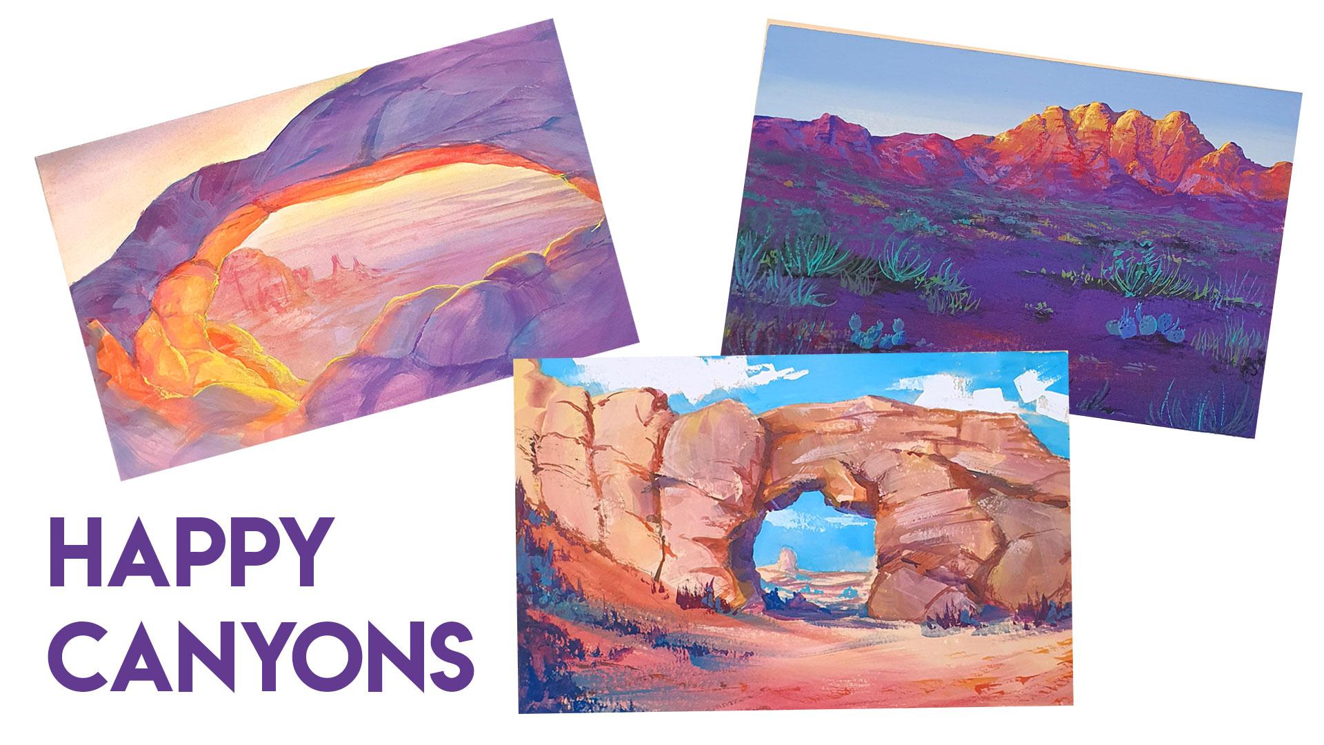
1. Intro: If you've watched my class about drawing and painting rocks, you might be at a point where you want to take it to the next level. So this class is all about getting creative with our rock formations and then painting them with really fun colors. I call it Happy canyons. I'll walk you through my sketching and experiment phase and then show you my step-by-step process for painting these unique rock formations will also explore the basic concepts of desert light, which can sometimes be very otherworldly. But with a few important principles in mind, I'll show you how you can use any color combination to make your own unique paintings. So grab your sketchbooks and let's get started.
2. Sketching: Drawing is the best way to get familiar with rocks. It really helps to start with basic shapes like cubes or spheres. Before moving on to more complex arrangements, in my previous rock class, I shared my techniques for visualizing and drawing the basic shapes before moving on to painting. If you haven't watched that class yet, I highly recommend you pause this video and watch it first. I'll put the link in the description below. When I sit down to draw rock formations like this, I'm always thinking about the internal structure. I often begin with a little scribble, maybe a few overlapping, simple shapes. But in my mind, I'm always trying to visualize how it looks in 3D. This is where all that practice withdrawing basic shapes comes in. Not only are we going to need that when it comes time to paint, but it's the key to being able to draw any type of rock in any situation instead of just being stuck copying reference for our purposes in this class, I'm focusing on unique formations. I often keep an inspiration board nearby so I can stay inspired and kind of think outside the box. Otherwise, I can get stuck drawing and the same things over and over. And after a few sketches, you might discover a gem among your pages that you just have to paint. So in the next lesson, I'll show you how I do that. But first I just want to say if you find yourself getting frustrated because you're rocks aren't looking super great. Just remember that it's very much about following three key principles. Observation, practice or repetition in critique. And this is how I improve my own skills. And honestly it never really ends. Starting with a reference is great for a warm up. When I look at a reference, I tried to understand what the internal structure might look like as basic shapes. Once I get a feel for that structure, I'll start to give the rock's own personality. I can invent new shapes, create new cracks, designed the lighting however I want, and just make it my own. And I know each of us has our own drawing style. So you don't have to try to conform to how you see others drawing. Just use it as inspiration to keep your mind opened. And after tons of repetition, your style will emerge naturally. Your brain and your hand find ways to work together to create something that didn't exist before. And part of you is in that drawing. So just embrace that. And then repeat, repeat, repeat. Along the way. Critique your drawings. Really look at them and find what works and what doesn't. If you look at your drawing and you have no idea how it can be improved, that probably means you need to spend more time observing rocks, preferably from life, because I find that's the best way to learn that observation will eventually internalize. So when you look at your rock drawing, you can immediately tell if something is off and work on improving it. And the next one.
3. Color in the Desert: Before we start painting, let's get familiar with the colors of the desert. I've only been to a desert a handful of times, and it always feels so surreal. Late behaves differently in these vast rocky landscapes. So let's take it back to the basics. The air is full of different molecules and the light is constantly moving through those molecules. And sometimes they bounce off of them, which is called scattering. Light from the blue violent end of the spectrum is much more likely to bounce off an air molecule then is light from the red, orange. And in the desert, the air is very pure and often free of most of the aerosols or, you know, those tiny solid particles or liquid droplets. And therefore less Les is scattered and we can see clear, brilliant blue skies, especially at midday. Distant elements will also appear more blue or purple or sometimes even a little hazy as there's more atmosphere for the light to pass through before it reaches our eye. At sunrise or sunset, light has to travel much farther to reach our eye. Passing through more atmosphere and scattering more. The tiny airborne dust will intensify the colors of the sunset because they scatter blue light more than red. Therefore, more red wavelengths make it to our eye and create that famous desert sunset glow. I know this has a lot to take in, but the more you look at Desert imagery or visit the desert, it becomes more and more familiar. And we can apply these concepts to our paintings.
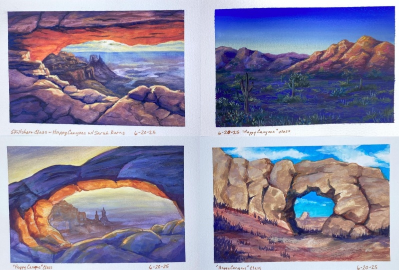
4. Mesa Arch Demo: After taping off the edges of my paper, I'm ready to sketch. If you've already decided on a composition, just draw it again or use it as an opportunity to finesse your drawing into something better. I'm using the mesa arch as my reference. And there are many versions of this view that show all sorts of different lighting and colors. So I'll take this one as my inspiration, but I'm gonna apply my own colours to it. After capturing the likeness of the arch, it's time to start painting. And I usually like to start my gosh, paintings with a diluted layer of paint. So it's very faint and just offers kind of an underlayer undertone to the painting. I work on this layer, wet into wet. It's nice and juicy. And I love using wash this way because it's fun to let those colors bleed. There's no pressure at this point because I can paint on top of this leader. This initial layer helps to set the tone of the painting or it just gets me started because sometimes the fear of the blank page is real. So thinking about how light behaves in the desert, I want my distant elements to be lighter and less saturated. So if I add too much pigment at this point, I can easily wipe it off. I decided it would be fun to play with that purple haze and the distance plus that would really help my warm colors of the foreground rocks standout leader. So mixing a bit of white with my blue and magenta will help me achieve that pastel purple color. And as for the sky, I'm keeping it pretty simple and subtle. After that dries, it's time to work on the rocks. Sometimes I work from dark to light, but in this case I wanted to establish where my highlights would be so that I don't forget them. I'll be layering on top of this again later, but this just gets me started. Lemon yellow and Permanent Alizarin crimson combined to create a beautiful, vivid orange. And I can add a bit of white to desaturated and slightly brighten the value. But if I wanted to keep this mix really saturated and break in it, I would just add more yellow. Here in there. I touch in more magenta in order to capture the shifting of the tones as the rocks curve, they reflect different colors. So we can use magenta to indicate the areas of the rock that are shifting more towards the shadows. If you think about the spectrum from yellow to orange to red down to purple, you can use that concept to apply any color combination. So let's say your highlights where green, as the color shifted towards shadows, you would add more and more and more blue. And so instead of using magenta right now, I would technically be using like a bluish green in that case. I hope that makes sense. I also want to point out that at this point we're really just concerned with blocking in the majority of our colors. We don't have to get super detailed or think about the final look of the painting quite yet. My main goal at this point is just to get rid of all that distracting white on the paper. So I will continue to lay in or block in my major colors. And then later we'll come back and subtly adjust things and just add our detail. And as I start painting the shadow side of the rocks, I'm shifting way more towards the cooler end of the spectrum. So blue and purple, the more blue I add to my mix, the cooler it will feel especially compared to that bright orange and yellow highlight and the distant warmth. Even though I used purple in the distance, that purple was much more towards the pink side of things, so it feels much warmer. So now in my shadows when I'm using a deeper purple, it really pops out. If you wanted the overall feeling of the painting to be a little bit more cooler, you could add more blue here or even dull it down with a little bit of black or just d saturate it and not go quite so vibrant. When I'm thinking about the cracks and crevices of these rocks, I'll add a bit more pigment to those areas. So sometimes I'll lay in a bit more magenta or a bit more of the darker purple here and there. But again, I'm not hyper-focused on the details yet. It's mostly just to give myself a reminder that I need to add those details later. The purple color I'm using is a combination of the blue and magenta with a tiny bit of white. Here in there, I add more of one color, and if I want to darken it, I just add less white. If I D saturate the reference photo a little and start color picking different areas and can see that the values hover in the middle area. They're not really bright or really dark. Even in the darker shadow Iraq, there's still a lot of light. The only place we see extremely dark value is in the cracks. These rocks on the lower part of the foreground, we'll get a bit of room light. And later I'll come back with a really bright highlight just on the edge of those rocks. But for now I just continue to fill in the rocks to get rid of all that whitespace. Once the weight of the paper is gone, you have a much easier time seeing the values of your painting. That's another reason I often like to start with an under painting because it gets rid of the white straightaway. But obviously I didn't do that here. Now I can add a little definition to the distance. And I'm really only going to be using the bare minimum here. So with a dry brush, I just touch in a slightly darker version of the color that's already there. And try to capture some of those distant plateaus. In this area, less is more. So start with diluted paint and work your way up. I'm using a very thin down orangeish color here just to fill in the mass of those rocks back there. And otherwise, it's just dry brush. But in the end I barely have to do anything and it'll kind of mimic the distant shapes in any way. Those are not the focus of the painting. Even just a few sweeps of color will do the trick and the viewer's eye will be able to fill in the rest. Moving back to the foreground, I'll start focusing on blending and smoothing out some of my colors, and then finally adding the shadows and highlights. I'll use really thinned down versions, almost doing like a glazing on top of my existing color. So whether I'm using a shadow color or a highlight, this is pretty thin. And at first it looks really opaque, but when it starts to dry, you can see that it changes so much because it allows some of that under color to show through. If I speed up the process, you see that much more clearly. And the reason I like to do that for my rocks is because it gives a really interesting effect. It allows a lot of the color to show through, but it also gives it more of a dusty, solid look, but it makes the ROTC color and the surface a little bit more uniform. And here in there I can use more or less to let some of the color show through underneath, or to put more color on top and make it a new colour. My shadow color is nowhere near black. I want to keep it relatively light, but still darker than the rest. Because if I keep it later, the overall feeling of the painting stays light and it just gives that idea of light moving through the canyons. And it kinda adds to that sunny, hazy look. And I do the same and some of the highlight areas. But for the final, beautiful bright highlights, I use thick paint and I'll mix white with my yellow so I can get the brightest version possible and then line the edges of the rocks. And so it's kind of like a rim light. The sun from the behind in the distance is just catching the edge of those rocks. And it's up to you to decide how dramatic you want to be with those bright highlights. Sometimes less is more. In this case, I just wanted a little hint at that bright sun peeking over the rocks. My highlight is more yellow than it is white because I want to maintain that glow and automatically seeing bright yellow on the rocks is gonna make it feel so much more like sunset. If it was midday, I might use more of a white or pale version of my highlight because then it would be more reflecting the sky and get some of that glimmer from the bright midday sun. My final tip for the highlights is to use thick paint, so don't use any water as much as you can avoid it. If you start introducing water at this point, your highlights will appear much more dull when they dry. So yeah, thick paint all the way. I hope you enjoyed this first demo. Next, we're gonna move on to a scene where it is bright, sunny mid day in the desert. And we'll use some punchier, more vibrant colors.
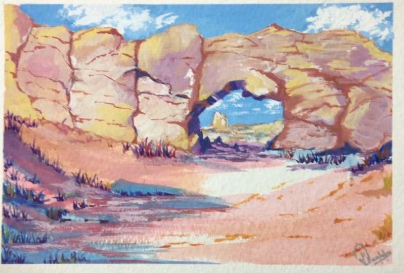
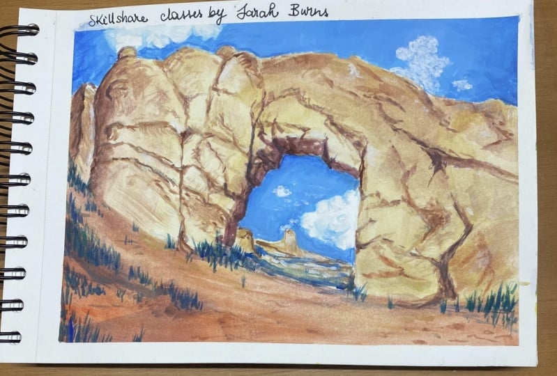
5. Arches National Park Demo: Here's another unique rock formation. This time it was in Arches National Park. I visited here a few years ago in the summer and it was incredible, even though the photo is a little wonky because I took it with my panorama phone feature. I love being able to peek through that arch and still get some of that sky and the distant elements. It's just something that draws me in. I chose toned paper for this one because I felt that the bright blue sky and the bright white clouds would look really cool. Popping off this tone paper, I'll be zooming in a little bit and maybe changing the shapes of some of the rocks here and there. So of course, that arch, that little window into the distance is going to be my focus. And I left a little space in the foreground to have fun with some of those scraggly bushes and shadows that fall across the sand. I'm thinking about the internal structure of the rocks. And at first I'll just draw the overall outline of most of it. And then I can come back with a little more detail if I want to pinpoint any particular rocks are shapes that I see. And I can even go as far as to shade in some of the shadows of the rocks. So you don't always just have to do a very minimal sketch. You can go all out and do almost a full value sketch because the BDI of gloss is that it's opaque. When we paint on top of it, all this pencil is going to disappear. Something kind of interesting happens on beige or toned paper. You'll see kind of leader or I'll talk about it when I noticed that happening. But a lot of times, if you have any of your color thin down at all. So if, for instance, my blue is slightly thin down, which it is that underlayer or color of the paper is going to change how you perceive the colors. Everything is going to have a warmer feel to it. So if you really want to cover that up and make sure something is pure color, you have to work thick. So it's just something to keep in mind. I'm starting off with a mix of my white and primary blue. Primary blue is much brighter and a vivid, It's almost like a phthalo blue. So this gives me a really bright sky blue and I can fill that in before I start painting the rocks. I left a few areas open because I wanted to paint some bright white clouds, leaving some of that space clear for your wife is a good idea. If you want your clouds to be wispy and sort of blend in with your sky. You can just go ahead and fill the whole sky in with blue then Azure Clouds. But I really wanted to use more of a chunky style in this painting, meaning I'm letting a lot of the edges of my brushstrokes stave really raw. So I might just sweep a solid line and that's a cloud. And it is a various styles specific thing. So I know not everyone likes that style or wants to do that style. If you have trouble painting clouds are skies. I have a whole other Skillshare class about that. So feel free to check that out. Typically when I paint on toned paper, I like to start with my darker values. And I really like to start with a diluted version just to get it on the page and kinda see what I'm working with. I have a very watered-down purple. And then I can start adding a little bit of yellow ocher or yellow here and there, and start warming it up as I move towards the highlights of the rocks. I love doing this because it gives me that wet into wet bleed of the colors. And then later I can come back with some sharper brush strokes and dry brush texture and really build up the depth of the rocks. Another reason I like starting with my darker values is because it's much harder to get white paint out of the mix hones you add it. So later when they get to the highlights, I'll start adding a little bit of white here and there. And I'll get a nice dusty rock texture on the outer layer of the rock. But for now I'm sticking with my highly saturated colors and laying in the majority of my cracks and crevices and maybe bigger areas of the rock that might have a bit of a shadow on them. One trick with scenes where the sun is bright, almost like midday sun, is if you have really strong shadows, it's going to make it feel much brighter out. The sun is beating down on these rocks and there's some really deep shadows going on. And in the distance, of course, you can see the bright blue sky with the bright clouds. And so that really helps us well. Unlike the first painting, I'm not purely blocking in all of my color. First, I'm sort of working up from my darker values to my lighter values. And as I go I'm establishing the shapes of the rock. Sometimes they stick to my sketch really tightly and other times I just kinda let it evolve as I go. And by doing that, I can have some really fun surprises along the way. Sometimes I'll do a brushstroke and it'll look like the perfect shadow or highly and I'm like, yeah, I'm keeping that. When gouache dries it has a color shift or a value shift. And sometimes that value shift or color shift is better than what I originally planned. So I can take advantage of that and react in the moment. It kinda looks like chaos when I'm at this point in the painting. But it's a really fun chaos. Ultimately, I know I need to just lay in my colors and kinda fill up the paper. But because it's toned paper, it's not nearly as distracting as if it were white paper. So sometimes having a bit of that toned paper bleed through or show through is a perfect way to get some variety in the color or represent a highlight here and there. Here I'm adding a bit more white to the surface of the rock. Because if you look at the reference, you can see that when the bright light hits that rocket reflects more of the sky. So we get a bit of a white or even sometimes a bluish tint. And the cool thing with gouache is that it almost gives it like this natural dusty look by EM going back and forth between watering down my colors and using a very dry brush to get some texture. The sand on the ground looks much different than the rocket itself. It's going to reflect light differently. And therefore, I'm going to use a more saturated version of my colors. I'll mix a variety of colors because I don't want the whole thing to be filled in with one tone. And I'm also going to add long shadows. There's lots of bushes and little trees and even small rocks on the ground that will be casting shadows across the sand using colors that wouldn't necessarily be found in nature is a really fun way to show a little bit of your personality in the painting. In the reference, you could clearly see that the rocks in this area are very highly pigmented and that is something I love to play with. But I've really enjoyed playing and pushing my colors past realism. So if we look at the reference photo and color, pick the shadows. We can see this more earthy color, but I'm using deep purple and bright magenta. So you can assign a color family to your shadows or to your highlights. And as long as you kind of understand how values work, it's going to look cool. It's still going to have a sense of realism. So if you struggle with values, you could do this painting as a value study first. So just with black and white and then choose what highlights you want. It could be green, it could be yellow, could be orange, and then choose your shadow family like purple or dark red or even dark blue or green. And then as long as you stay within your own spectrum, it'll still work. Much like the first painting. I'm putting very little detail in the distance. It's mainly just dry brush and I'm actually letting lots of the tone paper show through. There's a pretty heavy shadow that falls underneath that arch. And if there's rock or bushes or anything like that, they'll all be in shadow. So I'm keeping it really simple and keep it for the most part using one color to represent anything that's underneath there. And for any grasses and bushes and little trees in the foreground, I'll start with very simple brushstrokes, mostly vertical, and it's a dry brush. So I get lots of that lovely texture. I'm using my deepest shadow color for these kind of shifting between a bluish and a reddish tone. And then here in there I'll add a bit of white to the mix and do some highlights. Although it's not really a highlight, It's more like a lighter version of the shadows on those bushes. By keeping the majority of this foreground stuff really simple, I'm letting the focus stay on the rocks and the arch. And as my final detail, I'll start laying in more cracks and crevices in the rock and just giving them more depth and personality. So definitely no water just as dry of a brushes you can handle and deep dark pigments, allowing the pigment to just kind of dust off of my brush. And by doing that, I get all these natural variations in the brushstroke and the rock texture. And once again, I'm not going to darken the shadows because I want to let this painting feel a little bit light and airy. So I hope you enjoyed this demo. Next up we're going to paint a desert scene where it's shifting from sunset to twilight. And we'll especially addressed the concept of using unique colors, as well as a little bit more about desert foliage.
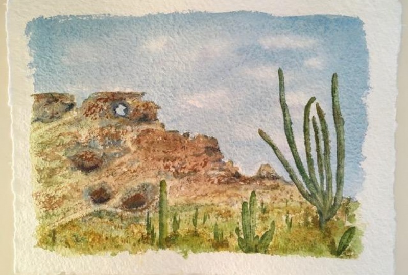
6. Aplenglow Demo: There are a vast amount of really cool and almost alien lake plants that grow in the desert. And I think it's a really fun way to add life to a scene that would otherwise maybe look like it's somewhere on Mars. I do recommend doing some sketches of different plans before you put them in your painting. Because if you're like me, you're maybe unfamiliar with these types of plans. And it just helps to get a little practice under your belt before you jump into painting. Okay, and there's this really cool phenomenon that happens known as the alpine glow effect. Have you ever seen images of a mountain or a desert where there's this epic bright orange or pink or red glow. But then the rest of the image is kind of cool and dark. That is a reflection off of the particles and the atmosphere. The sun is not directly hitting the mountains, are those sand or the desert. But it's casting down on the land. And because it's either sunrise or sunset, the rest of the land is in darkness. So you often get that bluish or purple glow. So that is something I want to paint. And it's going to be really fun because we can use as a bright and as crazy colors as we want. In this lesson, I really want you to push your limits of color and just go for it. So go search for that for a little while and just familiarize yourself with how that color looks in the landscape. And again, you don't have to use a desert per se. You can use mountains and then kinda change it to fit a desert theme. And then of course, after you've sketched some foliage for practice, we can kind of combine all these elements into a unique painting. So we're not going to use a reference for this. It's going to be out of our imaginations, but of course, guided by our inspirational images. And this is the main reason I marked this class as intermediate because I know that this is a thing that takes practice. It's a skill in itself to be able to visualize something and paint from that rather than a reference photo. So basically what I do to train myself in that way is to constantly observe things and really tried to internalize what I'm seeing. So that when I'm sitting down at my desk later, I can bring those images up in my mind and paint from that. If you keep a Pinterest board or Google image result up at your monitor somewhere nearby. It will help you. And that is something that I do all the time. But when it comes to actually painting the subject or any specific details that just comes out of my mind and I can wing it and just go with the flow. And a lot of times I'm not even forcing all the little details. They just kinda happen. And I'm often very surprised and excited by the results. In fact, in this case, I didn't even sketch out the whole thing first, I just gave myself a guide for the tops of my mountains because that was where the glowing effect was going to happen. So if you need a little help here, feel free to use my liner as your starter. And kind of shift things or adjust things as you go. But otherwise, I really recommend just using this as an opportunity to paint something from your imagination and start practicing that skill. First, I want to show you my result because it's important to see what we're working towards. So you can keep this general look in mind and I'll talk you through how I got there. First things first, if we have any type of gradient, especially in our sky, we want to add that to the paper first because it's much harder to do a gradient around some kind of subject. So just using long horizontal sweeps, I'll introduce my first color and then slowly add my second color. In this case, I barely had any room to make a gradient, so it's hardly noticeable. But if you have more space, this is a really easy method. Also in a scene where we're leaning more towards sunrise or sunset, we're going to have much cooler or darker blues in the sky, especially on the upper and outer edges. And I didn't quite go dark enough or bold enough. So take a lesson learned for me and maybe start with less white in your mix. But it does get a little bit later near the horizon. So I added a little bit of white there. If you wanted to, you could even add a tiny bit of color. So maybe a little pink and kinda shift to their tones towards purple. And unfortunately I painted over the tips of my mountains and I did not do that initial sketch dark enough. So I lost all of that drawing, all that detail. So when I go to paint my mountains, I'm going to have to just kind of wing it. And now I'm going to lay in the color of the foreground. So basically from the bottom of the page up to that gradient is going to be a dark purple. Maybe you can shift a little bit towards red here and there. But I wanted to go really, really bold. So I used my ultramarine mixed with my quinacridone magenta. I think I even touched in a tiny bit of permanent alizarin crimson, but you can see that it's leaning way more towards the blue side. And because filling in quite a large space with thicker paint takes awhile, I will speed this up for you. The pain isn't completely 100% opaque. You can see a tiny bit of that beige paper showing through here and there. But that's okay because most of this foreground is going to be covered in lots of little plants. The main concern is just getting it dark enough for your taste. And you could always come back and layer more if you wanted to. Just start with something on the paper and see how it dries and then work your way to your final result. As I get closer to the tops of my mountains, I'm touching in more and more red, maybe even a little orange, but making a transition from that purple to where the mountains start. And then adding the red helps to give a bit of a plane change. So basically the ground is flat and then the mountains start rising. And because the colors changing there, it's going to be much easier for the viewer to understand what's happening. If you did the whole foreground and the mountains with a very dark purple color like I have here. It would basically just look like a silhouette. And you wouldn't really get the same effect that we're going for. Because I want the tips of my mountains to be pretty warm. I'm going to start laying in a yellow ocher color to the tops of the mountains. Also just to get the mountains defined because I painted over the sketch. So I had to redo this whole thing. So in this moment as you see me painting, I'm just guessing or inventing them as I go. And I'm just doing the peaks at this point. And then from there I can start shifting to a reddish tone down into the purple. By laying in our base colors really bright and vibrant. We're going to contrast that later with some cooler, more green and earthy tones in the foreground with all of the different plants. And in the end, this painting overall is going to feel very vibrant and alive, even though it's almost nighttime. And the cooler and darker we go in the rest of the painting, the more that these vibrant peaks are going to stand out and buy. Now the rest of the painting should be dry because it takes how long to fill in this amount of space, especially if you're using a small brush like IM. So we can already start adding our highlights and shadows to those mountains. For my shadows, I'm using my ultramarine blue in almost its pure form. And I'm using the sharp edge of my flat brush to lay in little chunks of shadow, mainly thinking about how there's lots of vertical and horizontal streaks in the rocks. And then for all the teeny tiny little details at the peaks at the top, I'm going to use my little brush and lay in some of those deep shadows. It's going to make that warm highlight side pop even more. Once again, using a dry brush is going to give us lots of natural texture. And that works so well for mountains and rocks. With some more yellow ocher, I will start cleaning up those edges of the brighter side of the rocks. And if it's not super obvious, I chose the left side of my mountains to be more of the highlight side versus the right side. So the shadows are falling to the right. And on the left side of the peaks or any big rocks that stick out, I'm adding the highlight slowly here and there. I'll touch in a little bit more white or bright yellow, light lemon yellow, and just give a little bit of a pop there. But as a shift down towards that blue purple, I'm going to change my highlight color to more of a pill version of that purple. So adding a little bit more white. And then with the same technique, that dry brush I'm dusting on that highlight on more of the left side of any of the little peaks that are down there. A lot of times when I'm painting mountains like this, I shift back and forth from my highlights to my shadows. And I kinda judge it as I go. So anytime I do that, I just clean off my brush completely so that I don't muddy up my colors are mixed them and touch in either the shadow or the highlight. One thing I want to point out is that the base color of the shadow part of the mountain. Was more of a plum or like a grayish purple even it wasn't pure blue or pure purple. Now when I go in with my shadow color, which is almost a pure blue, shows up so vibrant. Once we're happy with her mountains, we have to start thinking about the foreground. And this is where this type of scene can be a little bit tricky. I pulled up a couple of examples here just to demonstrate what I'm going to talk about. So if we look at these sunset or sunrise seems regardless of what the sky is doing, the foreground and the plans have very little variation in color. There aren't going to be any super bright highlights either. For the most part, it's almost monochromatic. My strategy was to stick with colors that were slightly more muted. So pale blues and pale turquoise is there are a few spots of warmth here and there, but it's very subtle in the distance where the mountains meet the ground. I'm not going to put any detail into my plants. I'm just sweeping a little bit of a pill, dark green color over the purple. Again, it's dry brush, so it's just letting a bit of that pigment dust across the paper. And it's only to give me a little variety back there. It's not to represent anything in particular. I just want to indicate that there are plants growing. To add a bit of variety. I'll touch in a tiny amount of yellow here and there. So I get more of an olive green. And in other spots I'll add more of my darker green. So I have a color called perylene green or perylene black, and it is basically blackish green. If I add a bit of blue to it, it becomes more of a turquoise, a dark turquoise which is lovely. But regardless of what colors you have, just getting a bit of variety in the greens will help so much. As I get closer to the bottom or toward the foreground, I want to start identifying some plans or making them a little bit more obvious. So by touching in a bit more of my cobalt turquoise light, or even a bit of white mixed with ultramarine and the cobol, I will be able to capture that paleness of the plants because the sun has already said there's not gonna be any vibrant tones down here or bright highlights. So I don't really have to worry too much about highlight and shadow side of things. In general, I just want to capture the shapes of the objects. If anything, we'll have a bit of variation from our highlights and shadows, but it won't be super intense like it is on the mountains. If you know, you want to have an area that has a large bush or big cactus or something, it's easier to lay in some shadow color underneath first and then paint them on top. In my scene, I didn't want any huge cacti or anything. I was going for more of the lower lying shrubs and the smaller prickly pear cactus. Using my rigger brush, I can get some really skinny spiky plants. And that works really well for like aloe type plans or just the general scraggly grasses you see. And I start with my darker greens then move up towards my quote unquote highlight color, which is still a very dark turquoise. One rule of thumb we can kind of go by is that we don't want our brightest parts of our plans to be brighter than our sky or the bright part of our skies. So if you look at my horizon, it's still relatively a light blue there. So as long as I keep my highlight color on my plants darker than that, it'll still work in this kind of alpine glow effect. I have to admit, I don't have a lot of practice painting cacti. But here's my recipe. Basically, I started with a pale blue color. Then I touched in a little bit of my cobalt turquoise. And for the highlight or spikiness on the plants, I used a slightly lighter, pale blue and then just a tiny bit of darker shadow underneath. I also wanted to paint sort of like an allo type plant. So I used some thicker, wispy brush strokes. But for the most part, I didn't add a ton of detail to really anything except the prickly pear cactus. Most of my time was spent filling in the extra stuff like the little grasses here in there. Since I was using my rigger brush, it doesn't hold a lot of pain and I wanted that dry brush texture, so it was a constant reloading and brushing it. It was just a lot of work. But it's always so worth it because having that variety really builds up the depth and the realism of the painting. No, obviously we aren't going for hyper realism here because it's still very stylized painting. But I did want to capture the variety and the lushness of the desert. Looking at all the reference photos, I was actually so shocked and surprised by how lush it felt. There are so many plans everywhere. And even though they're not as vibrant or maybe noticeable as like a rain forest. There is a lot going on in a desert. Down here in the very foreground, I used my bigger flat brush to sweep over some dry brush texture and get a bit of variety in that big purple area because I felt like it was just a little bit too much. And of course, some more prickly pear. On this particular cluster, I added a little bit more differentiation between the highlights and shadows. Even though we can't see a ton of detail, it's still helps a little bit. I've found painting a variety of plans to be really fun and relaxing. I'm really curious if any of you will try to paint those large cacti. All right, so I hope you enjoyed this final demo. If you have any further questions on anything I talked about, feel free to message me. I would love to see your happy Canyons. So if you have a chance, please upload them to the class projects so I can take a look if you want any feedback there, of course, just let me know. Otherwise, if you use my hashtag on social media, I'll be able to find you.
7. Homework: Okay, Now it's your turn for your homework. I want you to choose one to three Kenyan seems to paint. Start off with a few pages of sketches to loosen up and get more familiar with the structure of rocks. Then pick up those pains and go for it. Have fun with color. Push yourself outside your comfort zone. You never know what magical scenes you might create if you've made it this far, I hope you'll take a couple extra seconds to leave a review so that others know what to look forward to. And of course, if you need any feedback, you know where to find me. Thank you so much for watching this class and I'll see you again soon.
 Sarah Burns, Painter / Photographer / Youtuber