Transcripts
1. Intro to Class: In this class I will share
some easy to follow steps to get you started on your journey of drawing and painting trees. With these steps in mind, my hope is that you'll
feel more confident to head outside with your sketchbook
and share in this joy. To me, drawing and
painting in the forest is just the perfect combination of ART therapy and Schindler
and Yoko or forests therapy. Something I'm very
passionate about. In the drawing portion
of this class, you'll learn how to start seeing the internal structure of
trees as simple shapes so that you can understand
why they look the way they do and be able to build
your own unique trees. I'll break down each
section of the tree into easily understandable
forms and then we'll practice drawing and
painting trees together. When it comes to painting trees, there are so many styles
and techniques out there. I'll show you some
simple ways to get started using watercolor, gouache, and digital paint. I'll also provide you with some line art, some show notes, and all the reference photos
so that you can continue practicing on your own if you
aren't able to go outside. As always, my goal as
a teacher is to help you understand the
subject matter rather than just copy what you see so that you can
continue growing on your own and enjoy a lifetime of drawing our beautiful
leafy friends.
2. Finding Your Style: my approach to drawing trees has its roots and architectural rendering. When I was in design school, we had to drop plans for our sites and structures. This was done in two D, either looking down from above or directly from the side, and then later in three D programs. And this really helped me see objects in both two D and three D spaces. In order to bring life in a sense of scale to our drawings, we had to add entourage. That means people, cars, plants, trees, the things that make our spaces feel lived in. And even today, my tree sketches tend to lean more towards graphic style rather than fine art rendering. If you're new to drawing, you might be overwhelmed when you see all the different styles out there, especially with social media being ableto endlessly browse and look at countless styles of drawing or worse, comparing your own skills and style to others. My advice to beginners is to stop thinking about style altogether and more about what is important to you and what do you want to say with your drawings? After all, we need a purpose and what drives us to create anyway. Answering that question will help guide us on our journey. If you require hyper realistic trees to complete your landscapes, your focus will be on studying trees from life every detail, from bark to individual leaf shapes. But each of our journey is unique. Not everyone wants to draw detailed trees or botanical studies, nor does everyone want to draw graphic, stylized trees. So ask yourself what compels you to pick up your pencil and draw? Do you love the dappled light that filters down through the branches? Do you like the interesting shapes of the branches themselves? Do you want to capture people's imaginations by painting fantastical trees? Where do you need to improve your backgrounds to highlight your character's story? Let the answer guide you in your practice. And don't ever lose sight of that passion. It can sometimes feel like our skills will never meet our expectations. Even after so many years of study. I still feel that way. Sometimes I do, however, feel that regardless of what you define your purpose as or what style you favour, having a solid understanding of the underlying structure of trees will really help in your progress. Ultimately, it will give you more freedom of choice in your artwork.
3. Tree Profiles: to simplify things, Let's look at some common types of trees and break them down into their basic shapes. Doing this is really good practice for drawing masses of trees in a landscape, especially for distant clusters of trees, which are background elements and aren't necessarily the focus of your drawing or painting . I've chosen six common tree types to start with. Looking at these directly from the side, we can quickly identify their silhouette. Practice this with as many tree types as you can. After you've done it a few times, and you commit these shapes to memory, you can pull from your internal library in future drawings. Feel free to include the branches and trunks. While doing this. You can find photos online really easily just by searching for different tree types or just typing in tree profiles or tree shapes. I use this really handy field guide. Not only can you utilize this strategy for quick field studies, this simplified style works great. For background illustrations, try combining several tree shapes together in a cluster. This is a quick way to indicate a forest in the distance. You can even use simple outlines to show the entire forest together, and after you've done it enough, you won't need to draw the individual trees. You can simply imagine them next to each other and create the outline even faster. This translates really well to painting. I've often seen this style utilized by illustrators to create simplified backgrounds for their characters. If you search online for Children's book illustrations, you can quickly find some unique ways. Illustrator simplified trees and forests using this profile or silhouette method.
4. Shapes & Gesture : we have to start thinking about trees in three dimensional space, not just a flat objects. If you're brand new to drawing, you'll want to practice drawing simple shapes like cubes, spheres and cylinders. This will really help with every subject you'll want to draw in the future. If you understand how these shapes appear from different angles, you'll be able to quickly construct so many different types of forms. I like to think about cylinders or long tubes to construct my trees. You can use thes simple shapes to help you visualize the trunk and the branches. It also helps me when it's time to shade the tree. As light falls on the cylinder and wraps around the form, you can clearly see where the shadow would be. But to begin, I like to find the gesture of the tree similar to anatomy drawing. Finding that first gesture line is the key to the entire structure. You want your tree to have balance, poise and interest. A straight line works well for some trees, like certain pine trees, but in general I like to add a bit of lean to my trees, practice doing this a few times and see what kind of creative shapes you can come up with. Thinking about the balance of the tree. Remember not to make your trees too top heavy or leaning to one side too much unless it's balanced by a very strong tree trunk. However, I do encourage you to be as creative is, he can at this point see how far you can push it while still making it believable. Just have fun at this stage. Let's start drawing a tree together and will talk through the steps. Let's start with our first gesture line and we can build up from there.
5. Trunk and Roots: before we go further, let's quickly talk about supplies I like to use. It needed a razor to pick up some of these gesture lines or under sketches. Basically, this just picks up a little bit of a graphite, so it's not so dark so that our next layer is more of the focus rather than these sketchy lines. Also, I really recommend keeping your pencil sharp. If you point your sharp tip at the paper, you can get a nice, thin line, and if you hold it parallel to the paper, you can use the entire side of the graphite or charcoal to get a thick line. How hard we pressed against the paper can control our line thickness as well. Practice using thin lines for lighter areas of your tree and thick lines for the shadow areas. As you continue to draw lines, you'll slowly wear down the tip of the pencil. So what I do is slowly spin the pencil in my hand as I continue to draw the line. It's almost undetectable as you watch me draw these lines, but it ensures that the same spot on the graphite is not continuously worn down. This allows just a little bit more control line quality will be an important skill to practice. We can utilize thick or thin lines to indicate shadow or texture. So at all times, think about how you're applying this to the paper. Let's go back to our tree sketch when starting the base of the tree. We have to consider how tall or how wide we want a treat to be in the end. After all, this base is what will support everything else for a pine tree. You'll probably be using completely vertical lines at this stage, but for many other trees, I usually start off with slightly curved, sweeping lines, imagining how the roots rise up to meet the trunk. The outer lines of the trunk can follow our gesture line up and throughout the drawing. How smooth or how rough you draw. These lines will indicate whether the tree has heavy thick bark or is a very smooth soft tree. The trunk should be the widest at the base and get thinner towards the top, and eventually the ends of the branches, once you've established the trunk, will use this as the foundation to build the rest of the tree. When adding dramatic routes like this, it's really helpful to imagine those tubes that I showed you earlier. Let's talk a little bit more about roots. Studies have shown that up to 90% of the tree's roots grow in the upper 60 centimeters or two feet of soil in Scotland. I often see exposed roots, and it has greatly influenced my drawings. I'm fascinated by these root systems that seem to claw their way across the ground, and sometimes I wonder if the trees going to stand up and run away. This is the very thing that inspired my first book, Tree Girl, and is often the subject for my nature sketches. Again, we can envision these routes like tubes or tentacles weaving their way through the dirt. Depending on how dramatic we want our roots, it really helps to break it down into simple steps. We can start with a circle at the base of the trunk, which will be the beginning of our root system. Start plotting out the path of the route with more circles, and we'll connect them later. If the route is going to the side, the circles will eventually get a little smaller as we lead it into the ground. A lot of times, the bottom of the route that's facing us will be slightly hidden, my grass or other things on the ground. Basic perspective tells us that objects closer to us will appear larger. So for routes that are coming towards us, we will draw slightly bigger circles. But eventually these will be a bit smaller as they enter the ground, continue to plot out and connect all your roots. You can always come back and clean things up later. This might sound strange, but a lot of times when I draw roots, I'm imagining octopus tentacles. Trees are living beings, and I'm always picturing them as such. Seeing the roots as fingers, the trunk as a torso and the branches as arms or fingers helps me avoid drawing lifeless trees. If it helps, you can pause and do some thumbnails. Using tubes. Making elbows in our roots helps them appear as though they're coming towards us or moving away from us. One thing that will help with the perspective is to draw overlapping lines, so each section that is closer to us will slightly overlapped. The background section this is similar to how an arm or a leg would bend when doing anatomy studies come back and erase the lines that would be hidden by the foreground elements. Then you can add a bit of a lip or a curve right where those sections bend, and then you can add a bit of shadow, and this will really round out the form. You can do this quickly by turning your pencil to the side and using the larger part of the graphite. If you take a look at my tree sketches, you can see these guidelines are always visible. But if you want, you can erase them later. Leader in the tutorial I'll walk you through how to Pete this fun floating root system with wash so back to our sketch, we can finish off the base here by adding in a few routes, but in this case, I'm not going too overboard.
6. Bark: I like to think about the bark as the skin of the tree. And just like humans, Each tree has a unique skin in my forest. I can't go 10 feet without seeing a different type of tree with different skin, and I especially love observing them up close. There's such a huge variety of styles of bark for this example that I'm going to show you now I'm gonna stick to kind of a classic pine bark, which is more of a vertical cracked style. If you peel away the bark of the tree underneath, you're gonna find a pretty smooth internal structure, the actual trunk of the tree and what I think it would be a good exercises to draw that smooth internal structure as just a basic cylinder. And then on the outside we can draw these skin or the bark. This is really great for practicing, getting a little bit more volume in our bark, a little bit more mass to it in depth, because we have to remember that the bark itself is thick. It's not just a flat piece of paper against the tree. It's got some depth to it. So practice, drawing some bark wrapping around that internal structure, and you can use some of the reference photos I'm giving you as quick examples. But I highly recommend that you go out and observe from life because you'll quickly see just how much variety there is. You can shade the sides to add a little bit of depth to it to give a little shadow and really try to make that a three dimensional form. In addition to that soft shading, we can capture these deep cracks in the bark by pointing our pencil more directly at the paper and pressing a little bit harder. You can think back to what I talked about earlier with line waits. By pressing or releasing the pencil against the paper, we can get thick and thin lines as well. Aziz Dark and light lines. I recommend grabbing some scrap paper or a couple pages in your sketchbook and do a few studies from life if you can. Otherwise, there's tons of photos you can find online as quick references or use some of my reference photos in the class. Resource is let's start off with just a really simple one. Using that vertical style bark and practice turning your pencil to the side to get that soft shading, as well as pointing your pencil at the trunk and getting a little bit more deep. Cuts in the bark or rough texture and try to show some of that depth. Sometimes it looks like the bark is flaking off the tree or peeling off the tree, and I'll show you how to do that in a second. But for this example will just stay more simplified and try to emphasize those vertical scars for the bark that looks like it's actually peeling off the tree. You can visualize this by imagining pieces of paper that are curled up and placed against the tree. However, we do want to remember that they have a bit of depth to them more than a little sheet of paper. But we can just use that as a visualization to help us through this process. One really easy way you can show this is by doing these little upturned pieces and then shading a little bit darker underneath them, as well as having a piece of that bark below kind of taken away from the trunk. So as long as you indicate that there's a little bit of a difference below that peel. The viewer will see that as it's coming away from the bark or peeling away from the the trunk. I think this is a really fun way to add a lot of depth to the bark of the tree, but it is a little tricky, so just go slow and try just a few at first. Later, you can come back and try more advance shapes like you see in this reference photo with the curl, the big swirl of bark coming off of the trunk, and we not only have pieces of bark curling off the tree, but we also have, like knots, and Berle's in the side of the tree, and I like to indicate these by doing little doughnuts. So if you think about it, a donut is placed against the tree. Its got a hole in the center so you can quickly fill in or shade in those holes. And then you can start shading around that burl or that hole and give it a little volume. Even just a quick mark. Inside that circle, like a little bit darker, is going to show that it's ah hole, so you don't have to go overboard. But this is just a really quick way to indicate that there is some variety in the trunk. I find it really fun. Sometimes you can make really deep holes and have like moss and stuff inside them. But just start off simple like this and work your way up. If it helps, you can actually practice drawing doughnuts. So just do a quick little sketch on the side to warm up or get you started thinking about those forms, and then once you have done a couple of those, it will be a lot easier to add them to your tree. You can practice drawing these doughnuts in any direction from any perspective, and it will really help add a bit of realism to your tree. So I suggest grabbing your sketchbook, heading outside and see what kind of variety you confined and practice drawing from life
7. Branches: We need to remember that trees are always trying to give their leaves or needles the best chance to reach the light, so in general they'll send their branches out and up. Different types of trees have different branches, but a lot of trees have some things in common. I find myself enjoying drawing thes bare trees because of the way the branches flow out of that central trunk. Almost like veins. It can get a bit addicting, so make sure you don't overcrowd your sketch. Let's draw on Oak Tree Branch. They're known for their thick, strong branches that me under this way in that way, sometimes in very dramatic and exciting ways, make sure the branch is thicker as it comes out of the trunk and skinnier as it grows outwards, as well as all the smaller branches coming off of it. Often times when I'm drawing these twisty, cool branches, I try to surprise myself and stay unpredictable so that they don't get too stiff. If it helps, you can draw the slinky method or the spiral, draw your slinky or spiral, then add the skin or line along the outside. You want to be visualizing where the branches are going to end before you begin. Let's go back to the tube method while drawing the tubes. Make sure to include some elbows, and on each elbow the tube changes direction. Sometimes it's more drastic than others. Branches are not ultra stiff, they're flexible and they move in the wind. A lot of branches will dip and rise and twist and turn practice, drawing consecutively smaller branches. And if you catch yourself being too stiff, think back to the gesture lines, which are loose, flowy and lively. The more you draw different types of trees, this will become much more natural and you'll loosen up. So be patient with yourself. Keep exploring new forms and new shapes. Try some really exaggerated branches just for fun.
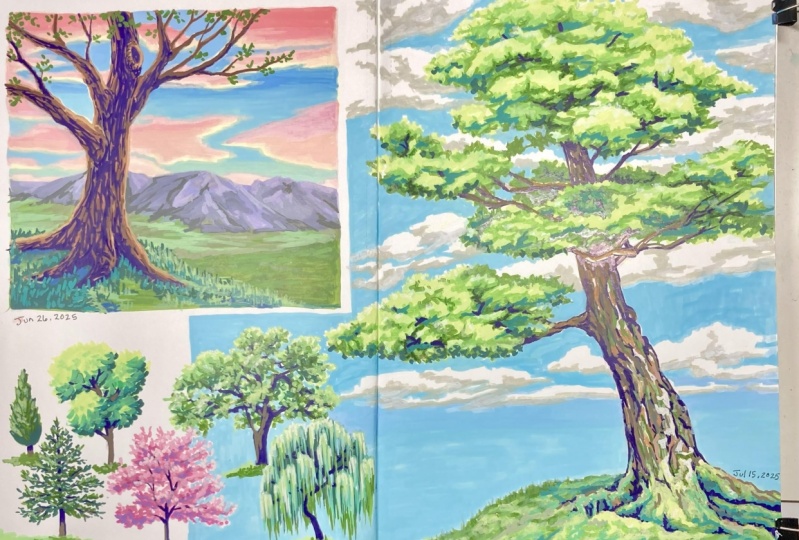
8. Foliage: foliage means all the leaves collectively. So when we talk about foliage, we don't just mean single leaves, and we can draw it as such a large mass of leaves or clusters of leaves. I like to think about my foliage as being made up of spears or ovals, or avoids, which are three dimensional ovals. Starting this way, insurers, I give enough volume to my foliage. A common mistake is to draw the foliage too small for the scale of the trunk and branches. After we establish our initial avoids as guides weaken, start to define the edge and give it some more leafy definition. As I'm drawing this massive leaves, I like to think about the shape of the individual leaves. If you have many leaves next to each other, it might look like this, but we can simplify them to an outline. We can give the foliage more depth by adding areas of shadow, especially where the branches meet the foliage. So find your light source first and think about which areas will not be receiving direct sunlight. So back to our sketch, we'll draw in those big volumes, and then we'll draw the leafy of masses on top of it, making sure we don't give too much focus on any particular leaf. You might be tempted to squish your leaves or your tree so that it fits inside your frame or your paper. It's okay if it runs off the side of the page is just gonna make the tree feel even more massive in that we're standing closer to it. You can add some little areas of shadow underneath the canopy right on the mark, or it touches the leaves and then drop in some bark texture. Let's do another larger tree with more volume, starting with the gesture line. Then you quickly movinto, identifying the major areas of foliage with some of the ovals I showed you keep the trunk shaped simple, but use thicker lines on the shadow side. Start to finding your foliage shapes with leafy outlines and try not to be too repetitive with shapes. In this example, I'm jumping back and forth between dropping and chunky shadows and working around my masses of leaves. Most of the branches that are peeking through are in shadow, which makes them our seed under the foliage. The right side of the tree gets strong shadows. Since it's not in direct sunlight using directional lines for clumps of shadow, you can show which way the branches or leaves would be leaning. Depending on how bright you want your foliage to peer. Leave more white space there. I often do concept sketches like this before I start a big painting, or just when I'm doing value studies in the forest to study the forms of trees. It's a very efficient way of sketching because it doesn't take too much time to get the overall shape. And then you can always come back and add more detail. Pine trees airfone Because they have heavy bows that create interesting patterns and shadows, you can start with a teardrop shape and then work your way from top to bottom in layers of branches. In a quick sketch like this, we aren't worried about defining the individual pine needles, but rather giving the impression of spiky branches that are full of needles. Each layer of branches get slightly longer and heavier, weighted down by the additional needles. You can even let part of the trunk peek through. I keep my pencil moving quickly so I don't get too stiff or focused on one particular spot . After you have to find your branch layers, you can go back and add a bit of shadow underneath each one to add a bit more depth to your sketch. I like to do little thumbnails to get more creative with my branches helps me to practice different shapes and layouts. Sometimes I'll make them a little bit chunkier. Sometimes I'll make them look almost like hair flowing in the wind, but in the end, it does look like a pine tree. Because of its iconic shape, I recommend grabbing a couple pieces of scrap paper like this or taking a few pages in your sketchbook to do a lot of little thumbnails just to practice different shapes and push yourself to try something a little bit new. It's the same as doing anatomy studies over and over again. When I first started drawing trees a lot, I was drawing the same kind of trees over and over again, and it kind of gets boring. So I ended up doing tons and tons of tree studies, and in the end it made me much more creative. If you're a bit overwhelmed with adding leaves or needles to the branches. Take a step back, continue studying the structure of trees and the various brand shapes, because this is really what will help us visualize where are leaves need to be. I take a lot of reference photos of all the leafless trees in winter, and I refer to them throughout the year as needed.
9. Watercolor Trees: First, let me explain our two main watercolor techniques. What into wet and dry brush here I'm demonstrating wet into wet. What in tow? What means are paper is already wet with clear water or a color, and then we'll touch wet pay into this area, and it will start to bleed and flow into the other color. The pain will try to flow anywhere that has already wet, but it won't go beyond that border unless forced. This is my favorite way to blend colors, because it's what makes watercolor unique to other types of painting. Dry brush means that you don't have a lot of water on your brush, and the paper is dry. You can create really interesting textures this way. If you lightly graze the bristles of your brush across the surface of the paper, also with watercolor, you always need to remember that your paper is the brightest tone in the painting. So if you want an area of your painting to be bright, you need to let the paper show through. This requires more forethought than other types of painting, like acrylic or oil. Let's start with a wet into wet style tree. We should always think about our highlights and shadows right away. Remember back to the lesson about foliage we sketched in big, chunky areas of shadow on one side of the tree, indicating that these areas are not being hit by direct sunlight. We can start off by laying in the bigger areas of highlight. Using a warm green color. Warm green means there's more yellow in there than blue. This mimics how bright the leaves looking sunlight before this dries, start touching in a cooler, darker green. Cool green means there's more blue in there. Miss mimics how the leaves looking shadow allow the pigment to bleed and flow, but don't touch it too much. After this point, the pain will spread further than your brush point, so try not to go overboard with shadows. Water control is probably one of the most important aspects of watercolor getting used to. How much pigment versus how much water you use is crucial and honestly, that only comes with time and practice. So keep doing studies, even if it's just little thumbnails and get used to your brushes and your pigment. I'll give you guys the Leinart for this tree so that you can practice this on your own. After the foliage is in place, start touching in the branches and trunk color. Here I'm using a dark brown color. You can see it bleeds a little bit into the leaves. That's okay with me, as I like how soft it looks when it dries on the trunk under the leaves. Make sure to use a bit more pigment so that it stays darker and makes it look like the leaves or casting shadows there. When you go out and study from life, you start to notice that tree trunks aren't just brown. They actually have a lot of different colors. There's colors being reflected from everywhere onto the tree trunk, so a lot of times you'll see gray reds, greens, browns, blues in the shadows and even in the highlights of the trunk. For now, we're just sticking with basic colors. Here. I'm coming back in with a grayish blue, indicating that there's a bit more shadow on the right side of the tree. Overall, this painting took five minutes, and that's not so. I can brag. It's because with went into what you do have to work quickly. If you let your paint dry. You won't be able to get these nice flowy colors and bleeds. So this is where AH 100% cotton paper comes in very handy as it lets your paint stay wet longer. Watercolor undergoes a drying shift, meaning the colors will be lighter and less saturated when they dry. Every brand and pigment is different, so I recommend doing tests beforehand to see how your colors dry. I'll speed up the video here so you can see how that color shift looks. The more often you do this technique, the more you'll get used to how these changes occur. Being able to visualize how it will look after it dries is really important. While we're painting now, here's the whole process again in 10 seconds. Now let's do a tree using the dry brush technique. Quite often you'll hear people talking about glazing This just means were layering transparent washes of watercolor on top of each other. The more water we add to subsequent layers, the more the color underneath shows through, but dry Russian glazing go hand in hand. Since we aren't letting our highlight and shadow colors bleed together, we have to do them step by step, starting with a warm green, fill the entire area of foliage and then let it dry. Then take a cooler green and start laying in some bigger, chunky shadow areas. You can use the tip of the brush to mimic the pointy shapes of leaves, making sure not to make any straight lines. Continue to lay in the shadows on the under side and right side of the foliage. You can add water here and there to dilute certain areas so that the entire thing is not the same darkness. In general, we want to avoid having too many repetitive shapes. After that dries, begin painting the branches and trunk with the brown color. Make sure to avoid covering any of the leaves. After that dries at a final layer of bluish brown to the branches and trunk. Using the dry brush technique here and very light pressure, you congenitally graze the surface of the water color paper, and this gives your tree a more natural bark like texture. I'd really recommend doing color swatches and glazing charts, using your colors in your palette. Just do a couple swatches on an extra piece of paper. Let it dry and you can see how light the colors look after they dry, as well as the interesting combinations you can get by layering side by side. You can really notice the difference in these two styles. As I mentioned, I love the soft and beautiful blends you can get with wet into wet. I feel like this really highlights the unique features of watercolor glazing and dry brush . Technique is also really useful and can be used for many applications. You can even combine them to get the best of both worlds.
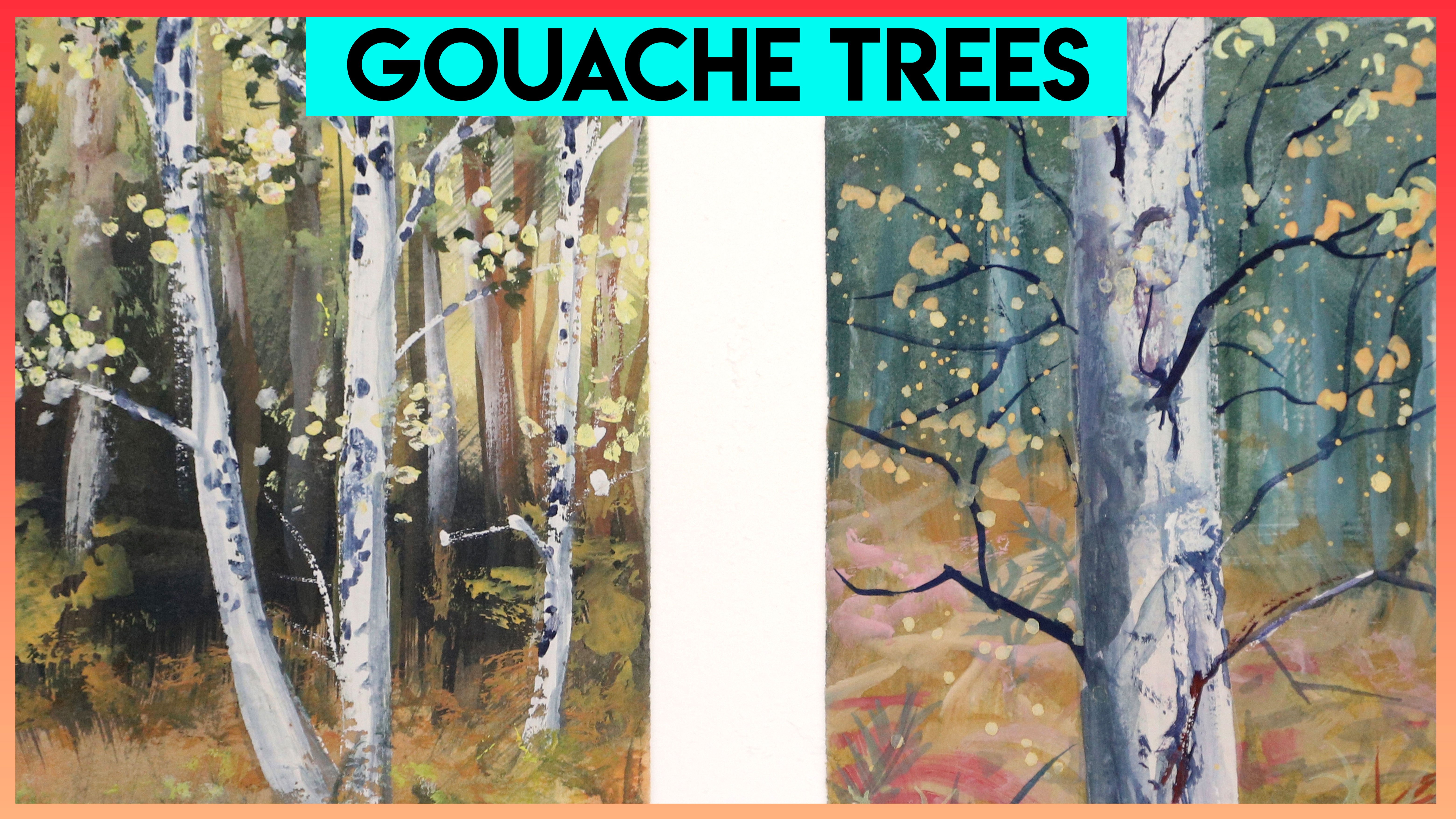
10. Gouache Tree Stump: There's a spot in the forest where used to live, where the ground was slowly eroding away. Over the course of a year, I saw how much more the roots of these trees were exposed, and it really started to fascinate me. It was around this time I started drawing more dramatic roots, and it got me thinking about other interesting, slightly less conventional forest elements I could draw. We all remember Avatar, right? You know, the Hallelujah Mountains or Floating mountains, inspired by the magical and very rails on Judge A and China. That imagery has always stuck with me. So I decided it would be fun to combine some force elements with this idea of a floating rock. In this case will be using tree roots and tree stumps as inspiration. If you want to join me, you can use some of the reference photos in the class. Resource is to get inspired. I'll demonstrate how I approach this subject from drawing to painting with Wash. I'll talk you through my steps along the way, as well as give you some general go wash tips. If you feel like you need a bit more help drawing rocks feel free to check out my in depth class about drawing and painting all kinds of rocks. But for this particular lesson, I will provide you with some building blocks that you can use as a reference to draw from. You can even trace it onto your paper. If you want to, you can find it in the class. Resource is when I start my sketches, I find that it's easier to use very light lines until I've established the placement of my major shapes. It's really helpful to imagine our basic shapes such as the Cube, and from there we can chisel away until we get this floating rock shape. Even if you just want to start off with a basic cube and only cut away a couple sides, I think it'll still work for this process. If you're having trouble with the trunk shape, imagine a basket sitting on the ground. You can start chiseling away at that shape and add a little bit of some imperfections, such as like a rough top. And then, from there we can start building our roots coming out of it using the tube idea. In addition to drawing more of a jagged edge on the top of the trunk. We want to add little things like grow ease or mushrooms, things that air kind of growing up out of the trunk inside the trunk. Maybe surrounding the some of the routes, and you can even get creative. I have seen the craziest things growing in trees, including other trees. But if we want to stay simple, we can just think about losses or very small plants growing inside the tree trunk. Ah, as well as little flowers and little mushrooms. After we've mapped out where we want our major shapes to be, we can come back and dark in the lines, even though the glass will cover up our lines. This is kind of our practice run, and it will help guide us along. For this painting, I will be using the following colors titanium white, primary yellow burnt sienna, cerulean blue in to go moss green and black. You can use any colors you'd like, but I highly suggest practicing, mixing your colors with a primary set so red, yellow and blue you can use all of these colors to make pretty much any color you can think of and in this case, I substituted red for my burnt Sienna because I thought that it was just a little bit more earthy. Our first step will be to fill in pretty much the entire base coat of our trunk with our brownish red tone. I'm using a brownish red tone because I want the overall feeling of this painting to be a little bit more warm. If I was going for a cooler feeling like and perhaps nighttime, I would use a lot more blue so that it would be a lot cooler. Now there are a couple little tips I want to give you about using wash. First of all, it is possible to lay Urgh Wash. And I'll show you the way that I do that we can kind of think of wash. Similar to oil where we can consistently blend are layers, especially if you think about Allah prima oil painting where you paint the whole thing in one session. The paint stays very wet throughout the session, and it allows you to continuously blend into whatever layer is already down on the canvas, and the same thing goes with wash, because wash never cures or like becomes permanent like acrylic does. You can. You can always come back and blend into it, so this first layer that I'm putting down is not the final color. It's not the final look that I'm going for. It's just the base color, and on top of that later will come back in and blend some other tones. And I'll talk about highly and shadow color soon. And those colors will blend into this base coat and give us a really nice lighting effect. One important thing when laying on your base coat is not to go too thick. We want to get a nice coating so that there's no paper showing through, but we don't want it to be like a big, chunky layer. So I recommend practicing your water control on this first layer, meaning we want our brush to be a little bit wet just so that it doesn't clog up with pain . Because gosh does tend to dry pretty quick, but we don't want it to be soupy or goopy when we put it down on the paper. So it is a delicate balance of just wet enough and, um, enough pigment on the brush to get a nice coating. I will point out that some papers are much thirstier than others. For instance, I enjoy painting on very smooth paper with wash, so I often paint on watercolor paper and I usually go for hot press because it's not as textured. But watercolor paper is pretty thirsty. So when I'm painting on that kind of paper, I have to be careful. I have to constantly wet my brush and make sure my pigment, my pain, is nice and smooth, and within a few seconds of that brush stroke the the paper will absorb all that water. So it's a constant replenishing of my water on my brush and my pigment. You can see some inconsistencies with my application at the moment in some areas, the paper showing a little bit through. So it's a little bit later, and in other areas the pain is thicker, so it's a lot darker. But that's okay for your first layer, because again, we're going to come back in and lay some color into this and keep blending. We just want to make sure that there's no bright white spots showing through. The wonderful thing about Gua Shi is that because it's an opaque medium. We don't have to worry about preserving our highlights from the beginning of the painting like we do with watercolor. So I find wash to be much more relaxing, and I know that it can be a little finicky, especially when it comes to layering and just figuring out that water control. But the more you do it, that part becomes a little bit more natural. And I really hope that you guys start to enjoy gosh the way that I do, just because it is so relaxing and there's no rush. We don't have to worry about our wet and toe wet like we do with watercolor. And, yeah, you can just take your time and enjoy blending the colors with the curvature of the trunk, kind of bending away from us as it comes into this back area. We want to indicate that depth by adding just a little bit more blue or black, just a dark in that color a little bit and just indicate that perhaps part of it will be hidden by hidden in some shadow, not too much shadow, because, you know the sun will still bounce around in there. But in this case, I am getting in a little bit darker, especially when it makes that transition from front to back. Now, if you watched my rock tutorial, you'll know what I mean when I say drying shift or color change so again, this is going to start becoming noticeable when we start adding other colors into our mixes . As soon as you start getting a little bit darker or adding like a little more blue or black , you'll notice that when the paint dries, it's gonna look different than when it's wet. In most cases with wash. If your wet pain is darker, it's going to dry a little bit later. If the wet paint is later, it's going to dry a little bit darker. So it's a really tricky thing to color match in gua sh when you're using custom blends. And that is why a lot of illustrators use paint street out of the tube because they don't have to worry about that color match when they're filling in larger areas. For us, in this case, it doesn't matter too much because the natural texture of bark is rough or it's not like perfectly smooth so we actually don't want to get a perfect blend of colors from light to dark. We wanted to kind of look a little bit, um, not necessarily splotchy, but a little bit varied. So in our case, that kind of works to our advantage here. But if you did want to fill in a larger area with a pure solid color, you would want to make sure that you mix enough of that from the very beginning because it is nearly impossible to match that color later. And if you're doing custom mix is like I am almost all of the time, you do get a little bit more used to it as you go, especially if you use the same colors all the time. But that's just my quick piece of advice when mixing custom colors. Now I'm adding a little bit of yellow to my mix again. It's pretty much the same base coat of burnt sienna. I'm just adding either warm colors such as yellow or blue to cool it down or darken it a little. Right now with this yellow, I'm creating a bit of a edge or a lip on the inner side of the bark of the trunk just to indicate that it's a little bit thick there and to make it stand out a little bit more, I'm going to fill my trunk with moss and little flowers. So for my base co, I'm using a mixture of the indigo and moss green, and this is going to give me a nice deep green color. And later we can come back and add some of the highlights that will give it more of the mossy texture and some of the depth that we need. I switched to a smaller brush because there are some smaller areas that I have to squeeze into here. But in general, I'm just trying to stick to that same strategy of filling in a nice, even coating of paint within this area. I'm going to speed up the video a little bit because I'm going to also fill in the grass color as soon as I'm done with this area and we'll talk about that in a second. So I just realized that I forgot to finish that background route color because of this route is slightly in the background, like behind that floating rock. I'm going to darken it a little bit by adding some blue. And then when it comes back down here, out of the shadow of the rock will add a little bit of more of a later tone to it. So it's kind of being brightened up by the light again. Now back to the grass. In this case, it's not going to be all grass or all moss. It's kind of a mixture, so I'm going to just fill it in with a nice base coat of color. Now that it's not within the trunk and it's going to be hit with much more directly, I'm going to add a little bit more warmth here and there. Or use more of the pure moss green color. In the surface of this grass. You can see a little bit of variation in value, so there's some of the paper showing through, and that is achieved by just using a little bit less pain and a little bit more water, so you don't just have to mix a white into your green to get it to be lighter. You can also just use a little bit more water to dilute it, but just By doing that, we can fill in a nice chunk of it, and we can come back later and add our highlights and shadows. If you've watched any of my YouTube videos, when I'm painting with Wash for my bigger landscapes, I pretty much always use a based layer of very diluted quash. So basically, that first layer is almost like watercolor, kind of similar to what I did here. And then I come back in with thicker and thicker layers, leaving the very thickest lier or the bright whites for my final layer, and sometimes will even use a palette knife. But I love the fact that Gua cious so versatile and just for me it's It works really well for landscapes because of that versatility. Now we're going to make our raw color, and with a little bit of white, a little bit of blue and a teeny bit of black, I'm going to make a light gray color kind of a neutral gray and just fill in the base color of these rocks. I'm using just pretty much the pure moss green color to top that rock right there, and now it's time to fill in the base coat of our floating rock, so I'll start off with a bigger pile of light gray color. So mixing my white blue and black just to get that cool grey again. And I will start by laying in trying to get an even coat of gray. And as I go, I may lay in or dark, innit? Depending on if I think they say that it will be in shadow or not, but again will come back with a bit of ah blended layer later to indicate our highlights and shadows for bigger areas of rock. I like using a flat brush like this, and depending on how big of an area you have to fill in, thes flat brushes will give you a much smoother application than a round brush will. So if you think back to that little animation I showed you earlier of the floating rock, we can think about these different facets or faces of the rock as being either in shadow or highlight. Depending on which direction the light is coming from, certain faces will be in shadow and others will be highlighted so we can apply this same method to our floating rock while we paint it. But instead of just mixing white to make it lighter or black to make it darker, we can also mix in colors. So for a little bit of a cooler shadow Allah mix and more blue for a warmer, highly all mix in a little bit of yellow or even bread. In fact, one of the fastest ways to dull down a color is to add white or black, and in a way that can help you neutralize certain colors. And it can be great for certain effects, like a misty landscape or skies or something like that. But in this case, we don't want to dull down our painting. We want to have a be nice and vibrant so we can use color when we're making our shadows and highlight. So as a little exercise to practise this, every time you have one of those plane changes or a directional change in the face of the rock, try adding a little bit of color into your mix rather than just black, or just wait and see what kind of mixes you can create and how much more interesting it could be in order for that to work. We have to make sure we're consistent with our light source. So from the beginning of the painting, we need to identify where are light is coming from. So if it's on the left side, all of the things facing the left side are going to be lighter or more highlighted. And you know the opposite on the other side. Even though I'm not going to realistic with this painting, I do want to indicate some realistic textures and elements. So I'm going to now add a little bit of dirty wash to my rock right below, where the moss is kind of overhanging at the top. I'm gonna sweep it in that muddy color and let it just fade down to the bottom by slowly lifting my brush off the paper. And this will just help with that feeling of Maybe there's water running down or something . It's It's a little bit weathered, and that will help kind of break up those big shapes of gray. At this point, our upper area will definitely be dry, so now we can see how dark or light things dried, and we can start coming back in with our highlight and shadow tones and start to define some more detail. So here I'm adding a bit more vibrancy to the lip of the tree trunk. So the edge just to make it look a little bit thicker. And now I'm going to start mixing some of my shadow tone that I'm gonna sweep onto my bark . Let's quickly take a break and talk about color. Let's say we have a brown ball that represents our tree. This brown is the local color or the actual color of the tree care tree is outside. We have a sky, and we have some nice green grass, and we also have a son, a light source. It's a happy little son that sun is shining down on our tree and creating a highlight. So in this highlight, you can see it's a little bit warmer brown, a little bit lighter, so it has an effect changed our local color, and it's also casting a shadow onto the grass. The sun is shining down on that grass, and it's gonna bounce all those green particles all around, and those green particles are going to bounce up and reflect off of our tree, and we call this bounce light, but it doesn't stop there. The sun is also sending light through the sky in that blue color is also going to be sent bouncing around, casting down onto our surface of the tree. So we get some of that blue light bouncing off our local color, giving it a bit of a blue tint. And this doesn't only happen in directs lay. It can also happen in a more ambient light, seen like at dusk or night time, when there isn't one direct light source. But the light is kind of glowing in the sky. It's still bouncing all those colors all around, and those colors are going to be cast down onto our local color, tinting them slightly as well as bouncing up off of any nearby objects or surface area like the grass. And I know this is a lot to take in, but we can practice thes things with our tree trunk and our roots and everything. So as we go along well, we'll still be thinking about this concept of bounce, lay and reflected light in all of that for my tree trunk scene. I want to have a bit of a bluish gray cast color onto my trunk for the shadow side. So I'm mixing in a little bit more of these early in blue, and it's gonna give me kind of a grayish brown tone. I don't want it to be too bright, because I feel like that would be just too distracting. So in most of my shadow areas, I'm sticking with a grayish tone, and you can see here that I'm sometimes mixing in a little bit more white to neutralize it a little bit more, and I'll just gently run my brush across that surface. I'm not scrubbing the rush, because if I did that, I would really start toe lift that first layer that we already laid in. Ah, but I'll just keep reloading my brush and keep dragging thin layers across that Burke surface. And when it first goes down, it might seem really dramatic, Like in this case, when I lay in that first wash of blue on top of my bark, it seems it seems kind of too much too drastic, but we a second let it dry because you will get that drying shift. Sometimes you'll realize after it dries, it was the perfect amount. Other times you might need to add more. If you ever add too much, you can come back in with a thin layer of your base color and kind of blend it a little bit in, because again, it's gonna be able to be blended forever. You have that luxury of time. You don't have to rush through this process. I will say that you need to be very careful with adding water to your brush the more you get your brush wet at this point, the more likely you are to accidentally lift up the under layer completely and you'll end up with white spots showing through. You can see I've done it a couple times here, but you know it's OK. We can still come back and lay more color in. But beep where of overworking one spot? Because that is definitely a thing that happens with wash. My suggestion is, if that happens to you, just let it dry, step back for a second or work on another area. Let that spot dry because once it's dry, it will accept more pain a little bit easier. And now for the really fun part We've already done the majority of the work on this piece, and now we can just come back in and play with all the little details. So we can add Are mushrooms are grasses or moss? Are flowers whatever we want to bring a little bit more life to it. I've given you guys a couple of reference photos of lots of little details like this that you can look at while you paint. Since we're not worried about picking up the layer underneath with all these tiny little details, we can use thicker paint, and we can also use a bit more saturation in our colors and the that will really make them pop forward. It's going to give a lot of depth to our peace in order to make this grass inside the trunk appear as though it's in highlight in the left and foreground part, um, and kind of fading into shadow as it goes towards that background part of the trunk. I simply just keep swiping the color on, but as it gets closer and closer to the back area, I just let the pain run out. Basically, I just don't refill my brush as often so it'll just give it a natural Grady in, almost rather than mixing each stage of that shadow color. As I'm painting these little details, I start to notice that the grass and the actual trunk, especially where it's it Maurin Shadow is kind of just two similar in value. So I want to come back in with more of a shadow tone and dark in that bark behind the grass , and that's going to really make the grass pop forward and make it looks even more, uh, at a little bit more depth to it. I mixed a little bit of indigo with my burnt sienna and just a quick tip for color mixing if you don't want to use pure black, which, as I mentioned, can sometimes dull your colors down. I like to mix a red or burnt sienna type color with my dark blue, because those two colors when they combined, they give you much more of a natural black tone. And I think they add a little bit of life to the shadows more than Blackwood. And now that this background is a little bit darker, I can start to see where my grass needs more shadow or more highlight. And you know, once again, I talked about this in the rock tutorial, but it's a constant back and forth with gua sh The way that the color shift happens as I'm getting closer to the end of my gosh pieces. I'm always thinking about how each decision is affecting everything. So I might realize I need to add a bit more highlight, a bit more warmth, whatever the whatever and keep going step by step little baby steps towards the end. So it seems like the beginning, like 90% of the painting happens so fast, and then the final 10% is like a long, slow process. But I enjoy those details, and I think adding them last makes it kind of exciting because they really set the painting alive. Now that my trunk is completely dry, I can come back in with more color if I want to set off some of those shadow areas, make them a little bit more bright or vibrant. In this case, I'm doing a tiny bit more blue in that shadow color, and I'm sweeping it up and down the trunk in kind of more of a chunky style, so not just a big flat brush, wiping a smooth layer over it. It's little touches here and there, perhaps elevating certain pieces of the bark or making certain parts recede. I'm also gonna add a bit of shadow underneath some of the grassy chunks and maybe in parts that I think the floating rock will cast shadow on two again kind of going back and forth between light and dark and constantly assessing my what I've done, how it affects the next step. I really hope my instruction isn't too repetitive, but it is a lot of repetition at this point, just in different areas, so touching in some highlights and shadows on the rocks and foreground grassy areas, either adding warm green or cool green to it. Adding a couple really dark, thin lines, especially between like the rock and the trunk, will really add a bit of depth to those areas. One interesting idea is that a shadow can technically have, ah, shadow and the highlight. So within that shadow area we can have lighter and darker spots. So in some cases I might add more highlight tones of that shadow color. In another areas, I'll add a bit darker. Maybe that's a little confusing, but I just wanted to point that out because our shadows aren't all just one value for the highlighted areas of the trunk. I'm gonna add some warm brown, so I'll mix in a little bit more yellow into that burnt Sienna, maybe a little white, just to knock it back a bit and sweep it back over the trunk with my same flat brush. The cool thing about a flat brush is sometimes when it dries out, the actual bristles will separate slightly. So you'll get kind of a streaky effect. And I find that to be incredible, useful for creating a more realistic bark texture. And not all brushes are the same. This is a synthetic brush, and the bristles are a teeny bit more stiff. So if you're having trouble doing that, maybe try a synthetic brush like this. I buy a lot of them because they're cheap and I don't want to use natural animal hair is as much as I can avoid that. Eso getting a cheap a couple cheap brushes for your wash for a little tricks like this is actually really useful come back with a shadow tone and give a little bit of darkness underneath that lip, where the grass overhangs the rock and will come back in with a warmer green and give some highlights to the Mosses and the grasses that are sitting on top of that floating rock most of the time. For tiny details like that, I'll just use really twitchy brushstrokes, just kind of getting a natural variation in pattern. So nothing too repetitive. And, of course, we don't want to neglect our routes that are hanging down below. So we'll just add a bit of shadow and variation to the texture. We're almost done. My final detail is going to be adding flowers and depending on what your final detail is at this point, we're pretty much using pure saturated color, so not diluting it at all, even in our flowers or mushrooms. Whatever you're adding last, we still want to think about highlight and shadow. So if we're putting them in a place where we think the sun will hit them directly, will want them to be that bright, pure color anywhere that we think that they'll be more in shadow like, for instance, in this background area of the inside the tree trunk that's a little bit more shadowy. I'll make sure that that purple is tinted more towards blue, and it's very, very subtle, especially because these marks air so incredibly tiny. They're just little dots, but it will make a difference. Overall, it'll give that impression that the background flowers are in shadow. I find that is especially noticeable if you're using reds. So for perhaps poppies or something like that, it becomes very obvious. No, if you guys are trying this and you run into any problems, please don't hesitate to reach out to me. I would love to be able to talk you through something or explain things more. And of course, I would absolutely love to see your final attempts or your projects in the project section of my sculpture class. So feel free to upload step by step photos or the final photo whatever you want. I would definitely love to see that
11. Digital Painting Trees: For those of you who enjoy digital painting, I thought it would be fun for us to paint a pine tree together. You can find this in the class. Resource is, but I want to quickly go through all the steps I took to create this snowy pine tree. You might remember from the gesture lesson that most pine trees are gonna have very straight vertical trunk, and the bows or the branches that are coming off of that trunk are going to start at the top, going more upwards and towards the centre, mid portion of the trunk, they'll kind of extend more horizontal. And at the base of the trunk, where they're really heavy and large. They're kind of kind of droop down because they're so heavy and thinking back to the shape lesson. We can recall that the overall shape or profile of the tree is kind of like a teardrop, so make sure that the branches get gradually wider towards the bottom to indicate that teardrop shape the beauty of digital painting as we can have as many layers as we want and move them around as we need Teoh. So when I'm starting out, I like to do a slightly fluffy. Or maybe you might call it blurry brushed pine layer in the background, and I'll use my darkest dark for that layer. Next, I'll use a bit later. Green still in the cool green family, and I will use a harder brush, so it has like a more crisp edge on it, and I'll do the bigger clusters of green, um, slightly in front of that background green layer. So when these two layers combine, it gives the impression that some of the branches are a bit further behind the foreground branches. So those were the softer, darker ones, and the foreground ones are intermingled with those dark ones, but they have a crisper edge. All in all, when you kind of back up from the piece, you see that it looks a bit more realistic. If you combine the soft and the hard brushes when it comes to adding the snow, I'll do something very similar. I'll have a soft and a hard brush, but we're also gonna have a shadow color, which will be kind of a light. Blue snow reflects whatever is around it, so if the sky is blue, it'll have a bit of a blue tint in the shadow. If the sky is warm or have a sunset color, maybe it's a bit more purple. You get the idea. Since we're using white for the base of the snow, it doesn't matter which brush you use either. Harder, soft. First, you can use them in any order. In this case, I'm using the harder, more crisp brush, and then I'll come back in with my softer brush. It's actually just a standard round brush, but at first I'm just trying to lay in sporadic clusters of snow, not trying to repeat too much. We don't want any noticeable patterns. But instead of just doing big blobs of white snow, I'm actually letting my brush strokes follow the curvature of those branches as they slightly curl up at the ends. And then we can begin touching in that blue shadow color and playing back and forth between that hard and soft brush. The soft brush will kind of give more volume to that snow and just make it appear like it's really heavy laying on those bows. When you are practicing this, I recommend doing each of these steps on a different layer, so you can keep looking back at your previous layer and see if you're on track. I don't know about you guys, but I don't even want to think about winter right now. So let's go to the park on a sunny, warm summer day. This is a pretty typical concept sketch that I might do with my digital painting program before I jump into a bigger painting. So it is quite stylized. But I just want to show you the process for doing this because I think it's a really fun way to practice painting and drawing trees. This piece was out of my imagination, so I was just trying to have fun with composition and form and color. All the things I was kind of just doodling. You can use a reference photo if you want to practice these steps, or you could follow along and recreate what I'm doing here. The reason I chose such a wide format for this piece is because I just wanted it to fit within the video as an example. But usually I would do something a little bit more square or vertical, so this was an interesting challenge for me because I needed to have a lot more emphasis on the horizontal elements. So you can see that my branches and trees lean a lot more and they stretch their branches quite wide across the entire scene. And that was just to help. Well, what I think helps make the viewers I move through the piece from left to right and not really get stuck in any particular area. For colors, you'll see that I stick with quite a warm palette because it is a summer day. I wanted to indicate that great sunniness, and you'll see also that I actually go back and forth between the foreground and background while painting. Because that is just one of the benefits of painting digitally, we don't have to worry about layering from background to forward quite as much. Those distant trees are indicated by simple round brush strokes and clusters of round shapes, and then the foreground elements become a lot more clear and more defined. The coloring of the trees shifts from the background, trees being more purplish gray to the foreground tree, which will be much more warm and higher contrast in higher saturation. If you were trying to go for a more realistic style. You can use the steps that I'm doing here, but then study color from life. I'm going to do a more advanced tree while actually a forest tutorial in the future, which will incorporate many trees together. And I didn't include it in this tutorial as much because I just felt like it was a bit too advanced. And this is supposed to be a beginner tutorial for the shadows of the foreground tree. I wanted to go pretty bold and you might remember in the wash tutorial, I talked about how, instead of just using black or white to brighten or darken our colors, we can use other colors. So mixing brown with a blue in traditional pain is a really great way to get a more colorful black or a dark color. By layering those two colors and digital form, it's not quite the same, but I do like the fact that it's quite stylized, and if you kind of squint your eyes, you see those blue areas as being very, very dark compared to the rest. Then I can come back in with a warm brown and kind of dot some light patterns on the tree trunk. If the late is coming from the upper right, I'll keep those lighter areas to the right side of the tree, and I'm using a pretty chunky brush that has a lot of texture there. So it kind of imitates the look of the bark. And since I don't want to sit there in pain, every single grass piece at the base of that tree, I usually just do really quick, um, twitchy hand motions to create the grass marks. And then I can even come back in and blend out the base of the grass with a bigger brush. So it kind of makes the bottom of the trunk appear a little bit more jagged instead of so straight cause you know, it's not really gonna look straight in person. And then to add shadow on the ground, I'll use a cooler, darker brush. Pretty rough textured brush. Anil keep playing in different amounts of opacity, trying to build it up slowly. Ah, lot of times I'll go back and forth between finding the right color and value, and it just takes me a little time to work that out. But I try not to stick with one particular area of the painting for too long because I want to keep it fresh and keep it lively. And I find with digital it's so tempting, toe like zoom way in and focus on one little area and one little detail so much. And I can just lead to some parts of the painting being a little bit more stale here. I'm playing with reflected green on the tree trunk as we talked about in the wash lesson, and then I can come back in and just do some final touches like add a bit more blue in the background for the sky, peeking through you can see. I also added a path there running through the park, but I ended up not liking that so much so I took that out. But overall it was a pretty fun piece, and I tried to keep it pretty fast so that I was forced to be creative with my in color choices and mark making and just work pretty instinctually in the moment. I do understand that that takes a lot of time to get used to doing, but you know, I paint and draw trees every single night, and I have for years. So for me it's more natural. Don't give up if you get frustrated, though, because I know sometimes I sit down to paint and I just throw want to throw it out the window. But I just want to encourage you guys to keep experimenting and keep combining the study that you draw from life and from your imagination as much as you can.
12. Final Thoughts and Homework: Okay, I know this class covered a lot of content in a short amount of time, and now it's time to put this information toe work. Approaching trees in a more simplified manner and starting with simple shapes in working my way up to complex forms is what I'm doing. Every time I go out to pink trees, I have some suggestions for you for practical homework that I hope will get you guys started. First of all, I suggest making an inspiration board either on Pinterest or you could print photos out and make a physical board above your desk. But basically what I want you to do is find images or paintings that inspire you to pick up your pencil or your brush, look really closely at each image and try to figure out what it is that appeals to you. Maybe you can try to visually dissect the image and start to understand how the artist layered things or where the use certain colors, like in the highlights and shadows. You can also use these boards to collect lots of reference photos, and you can come back to it any time you need a little boost of inspiration or something to draw. Remember that if you're using someone else's artwork or photo as a reference, don't post it online without permission and make sure you post it with proper credit. But there's absolutely nothing wrong with using them as inspiration or reference if you're just doing it for learning purposes in your own sketchbook. Speaking of sketchbook, now it's time to grab your sketchbook or a bunch of loose sheets of paper and go back through the lessons and follow the recipe I showed you within each lesson. Do lots and lots of sketches of each part of the tree, as well as whole trees, combining all the pieces together. Push yourself to be creative and try interesting or weird shapes and just have lots of fun . Keep yourself inspired and don't get hard on yourself. If it's difficult, Phil, lots of pages and just really start getting that mileage after you get lots of sketches under your belt. Finally, it's time to choose a reference photo or go outside to paint from life and use either watercolor or go wash or whatever your favorite painting medium is to capture your subject . After that scan or take a photo of your artwork and share it to the class projects. If you would like to share sketches or step by step photos, that's even better. It's really cool to see each person's process. I'll give you feedback when requested, but I am especially excited to see the variety of styles and cool trees from people all around the world. When you feel ready to move on to more complex scenes such as forests, I do live paint alongs each month either on my twitch channel or my YouTube. And all of these recorded paint alongs are available to my patrons after. So this is an example of a scene from January 2019. Basically, I walked the participants through the painting from start to finish, and I go over every single step very carefully, and people can ask questions during the process, so feel free to check those out if you really want to level up. I also post lots of tree and forests and planner videos over on my YouTube. Don't forget to leave a review of this class and feel free to message me if you have any questions. I really want to help you guys learn. And I know everyone has a different learning style as well as learns at a different pace. So I really hope that this class was helpful to get you started. Thanks for joining me and go out and enjoy a forest near you.
 Sarah Burns, Painter / Photographer / Youtuber