Transcripts
1. Introduction: A graphic designer, most of the designs you work on
will end up being flat. Not in the sense that
they won't look good, but in the literal sense. They will be printed on
sheets of paper, fabric, or displayed on flat
screens of TVs, monitors, and mobile devices. So you might be wondering, how can we even talk about space without three
dimensions, but we can. Besides the width and
height of your artwork, to create compelling designs, you will also need
to imply depth. In this course, we
will cover overlap, overlay, perspective,
negative space, proximity, shape, form, and everything
else that can help you to make your designs inviting,
engaging, and spacious. We will also analyze hundreds of amazing designs from all
areas of graphic design to help you easily
visualize and understand all the terms and rules that
are covered in this course. Together with the
exciting class project that I hope you will complete
at the end of the course, you also have the analysis
worksheet and the term glossary to help you practice everything that you've learned. I hope you are just as excited
as I am to get started and dive into the sea of knowledge and beautiful graphic
design examples.
2. Space: Spaces like a commodity
in graphic design, similarly to buying a plot of land and then have your
house built on it. As a graphic designer, you get a canvas with a specific orientation
and aspect ratio. And it is up to you
how you fill it up with the elements that you will be using in your composition. When you have a lot of
information that you need to display
on a single page, for instance, in a magazine or on a single page on a website. You will have to work out
how to balance everything, making sure that
your design will end up looking cluttered, confusing, and it can be similarly
challenging if you don't have a lot of elements
to use in InDesign, you might feel that
your design will end up looking empty and
unprofessional. It is a very common
mistake amongst designers who are just
starting out that the pack too much things
into a design that they tried to fill all the
available space with elements, not leaving any negative space. And that's also an
important term we will be discussing
in much more detail. But generally, we consider any elements that you place in your design positive space, while anything
that's left empty, even if it's not
completely white, we would consider
a negative space, or sometimes we also refer
to it as whitespace. In especially when we
talk about print design, where white is obviously
the color of the paper. In the next couple of videos, we will dive deeper
and learn about all the various
design principles and methods that you can use to improve the space in
your compositions. But first in this video, there's a couple of
important general terms about space that I would like to discuss and also show you some creative examples of
these rules in action. So normally, when we
will talk about space, we refer to a volume
that has height, width, but also depth. But there is a
contradiction here because as a graphic designer, almost all the time, you would work in
two-dimensional planes. So whether it's a printed
page or a screen, It's always just
width and height. However, there are
many different ways and methods that you can imply the depth in your design and make it look more
three-dimensional. And that is crucial because you want your viewers to feel like they can enter that space that
you create on your canvas. You want to draw them into your compositions and you
want to keep them there for as long as
possible by making your design engaging
and captivating. Let's take a look at a
couple of techniques to imply depth or space. First of all, you can use size. Here we have two great
examples of this, the oceans eight poster and the Barnes Foundation
logo by pentagram. In both of these examples, we can see that
whatever appears to be larger in scale
feels closer to us. This is a simple fact that
we see in real life as well. Wherever there is perspective, things that are further in the distance are
getting smaller. That is, for instance, why these two kayaks here
in the foreground of this illustration are
almost the same size as this mountain
in the background. Or they take up
the same amount of space within the composition. But we know from experience that there is perspective here and that mountain in the
background is actually they bigger than these two
coyotes in the foreground? But returning back to these two examples here on the right, the person on the left, which I believe is
Sandra Bullock, is the closest to us. So that's why she appears to be the tallest by this
person here on the right, appears to be the
shortest, but of course, we understand it
immediately that she is further back in space. The same thing is
happening here with the Barnes Foundation logo, where the main word
mark on the top is divided into these five
rectangular shapes. And some of them are
larger than the others. And immediately
the ones that are smaller feel like they're
further back in space. And this is actually intentional because these five shapes supposed to represent
the structure of the Barnes
Foundation building. This is a great example of many other design
principles also in use like negative space, but also alternating rhythm, where we have larger
and smaller shapes alternating each other and many other principles like simplicity, framing,
and consistency. Another common technique
to imply space or depth in your composition is to rely
on the intensity of colors. And it means that more vibrant, saturated colors and
especially warm colors, tend to be closer to us
or feel closer to us. Compare two colors with less intensity and
more cooler tones. This has also
something to do with the physical world and
how we learn to see things like landscapes
where we have a lot of distance that
we can see all at once. And there is a term called
atmospheric perspective, which we will also
be talking about in more detail once we get to
talk about perspective. But essentially what it means is that the further
away something is, the more cooler and washed
out its colors get due to the sheer volume of air or sky between us and that object. So to simplify what I just said, the further away something gets, the more it starts
to mix together with whatever the
color of the sky is. And we can see this
in action here on the illustration where the
foreground colors are darker, more saturated and warmer while we are getting more washed out, these saturated colors appearing further in the background and they are also getting more closer to the colors in the sky. But even on this design here, we can see that space
is implied by having the more vibrant and
saturated colors in the foreground or the front
of this cylindrical shape. While we are having softer
and more washed out colors on the back of these
ribbons forming the cylinder.
3. Techniques to utilise space in design: A very powerful and
straightforward method of implying space and
especially depth, is to use overlapping
between shapes, like in this case, we
can immediately see that this leaf is most likely
the closest to us, while the person here
is the furthest away. So by layering things on top
of each other and indicating depth with subtle drop shadows
or out of bounds effects, we can quickly and effectively
established depth. And the same technique can
be achieved, of course, even without using drop shadows. In this case, we have an overlap going on between the
type and the image. So this letter feels like
it's behind the image. By this one, for instance, is in front of it. And even just by relying on the appearance of these two
letters from the title, the designer managed to already create an interesting
composition. But besides of us, the
viewers experiencing depth, we also have to work
a little bit harder compared to having
this adventure title written in a single
line placed on top of an image that would be so much more boring than what
we can see here. This cover of the
stylish magazine is also a great example of
implying depth. Having this athlete
jumping over the masthead. But besides the depth here, we also imply height by having a lot of empty or negative
space here in the middle. So that immediately makes
this feel much higher than if the center part of
the composition was filled with text or images. And most likely the reason
why they decided not to make this text bigger than what it
appears at the moment, is that because there is another thing that can
help to imply space. Wherever you place, closer
to the top of your frame always feels slightly further away than whatever
is at the bottom. Now this comes back to again
how we see landscapes. Usually whatever is at the
bottom is closer to us. That's the foreground. And as we go further up in
the composition or frame, we would see things
that are further away. Just remember the
illustration with the kayaks in the foreground and the mountains in the back. So even though there is no indication whether
these texts here at the bottom is closer or further away compared to what
we see here on the top. And even though the
details are on the top, seem larger than what we
have at the bottom due to the positioning of the
flying high text at the bottom, still feels like it
is in the foreground. I believe that is why
it wasn't necessary to make that any larger than
what it is at the moment. This poster is also
confidently using this understanding
that wherever it is closer to the top
fuels further away. But of course it also
relies on perspective. So we can see that
parallel lines are all leading to a vanishing
point in the distance. And you can probably
imagine that it would feel weird if it was
the opposite shape, having the texts on
the top feel closer to us and then the rest going
back further in space, it could still work. It would just not
feel as balanced and as natural as what
we have on this poster. There is also another
important way to categorize space or think about space
whenever you are designing, you can create open
or closed spaces. And each of these will
have an important effect on how your design is
perceived by our viewers. Open spaces are
usually more inviting. Why closed spaces
can contain and hold information
together more rigidly. There are a couple
of great examples of open space being
used on this board, like the Utah Arches National
Park and the Zurich, Switzerland composition,
where the floating letters, having just a very
subtle drop shadow, establish a big open whitespace which is completely border less. So it feels like we can enter this space from any direction. While here with the
New York Magazine, we have a very strong boundary, this frame which
closes everything up, creating this enclosed space. So don't think that this is less inviting or engaging to look at, but it's definitely set a different tone of
visual communication. Another example where we
have these very rigid frames holding and grouping the tax and most of the
illustration together, the overall composition
still doesn't feel too close because of the small details that are coming
out of the frames. Like this person here, the birds flying across these frames and even this plant here coming out on
the right side. So in this case,
this overlapping or out-of-bounds out of
frame effect really helps to open up the composition
that would have ended up being much more
closed without them. And last but not least, another term worth
mentioning is Fengshui, which actually is used
for interior design and the arrangements of
furniture in the space. I also like to think of it
as something that can be used for compositions
in graphic design, which states that every
object in space exists in relation to each other
and to their environment. And this is a perfect
explanation how you need to think of space
in your compositions. Whatever you place on your
canvas or whatever you leave out will have an effect on all the components that
you are working with.
4. Depth : In the previous video,
we already established how important it is to establish depth in your compositions
because that is the missing property
that we don't have in a two-dimensional plane
whenever our work is going to appear on a piece
of paper or a screen. So while our Canvas will
always have height and width, we wouldn't have the depth. So that is something
we can only imply. And even though we
already learned a couple of ways of doing this, now in this video, we will look at a couple of additional creative examples
and methods that's worth discussing and
remembering whenever you have to create depth in
your own compositions. So let's start with
something very simple. This isometric view of a cube, which can also be referred
to as the Necker cube, which is a great example
of multi stability, where we can decide whether
we are looking at the front of this object here
or here on the top. So if you consider this part
here to be closer to us, then that means that we are looking at this cube from below. While if we consider
this to be closer to us, it feels like we are looking
at the cube from above. This is something
that we covered in much more detail in
the psychology of design section when we go through or the
Gestalt principles. But the reason I'm
showing it here as well is because it's a very common way that we represent depth in illustration. And we will see more
isometric drawings later on. But for now, what I wanted
to draw attention to is even though we established
depth in this composition, it is still not clear what's closer and further away from us. And that is due to the lack
of visual information. Now once you start
introducing field shapes, colors, and gradients
are shading. Understanding volume and
depth becomes much easier. So here, no one will
be struggling to understand that these details
are the closest to us, while this detail here
is the furthest away. But even when you are
using colours and shading, sometimes you might still
confuse your viewers, whether intentionally or not. So, for instance, imagine just looking at this
little section here. And when you see
this on its own, you might actually see a
cube that's upside down, even though in the
current composition, this is supposed to
be an empty area. And it is clear when we look at the whole composition together. But once again,
by extracting it, we can easily confuse the viewer relying on the Gestalt
principle called closure. You can also create
interesting designs like this one where
there is no shading, only a single color,
black is used. And these cone like triangular shapes are not
even connected to each other. But still our mind immediately feels in that
empty space in the middle. And we imagine that to
be not just a circle, but an actual sphere, which once again has volume. So not only height and
width, but also depth. And the main reason why we
see it like that is because these spikes here are smaller that we feel like
are further away from us. While the cones here on
the front or larger, but also they have these
elliptical shapes to them which describe that's
free recall empty space. So sometimes very
subtle hints like these can help your viewers to understand what you actually, even in an abstract
form like this. And in case you are not good at drawing or haven't spent time studying how to draw
three-dimensional forums, I highly recommend to spend
some time doing just that. Because believe me, it's
going to help you a lot to be able to represent
depth in your compositions, even without actually relying on drawings or illustration. Now when it comes to
actual compositions, showing or implying depth doesn't have to be overpowering. So you don't have
to exaggerate it. And as most of the
time, less is more. So the more subtle you can be, but still achieved the
depth, the better. And the beautiful example
of that restraint in action is this cover of the
novel of Zelda Fitzgerald, where the only detail
that implies depth is this small section
here of the face. So instead of having more details coming out
of the letter form, this already achieves
that sense of depth. And this is a great
choice because this is naturally going to
be a focal point. We are always drawn
to look at faces, even if we see them
from the side. Here is a similar
composition, again, portrait and a letter
form combined together, but in a completely
different way. Here we can see
the full image and the letter V is
interlocking the portray, having the side here on the left going
behind the face and getting interrupted again
by the lips and the chin. And then the other
side of the letter, It's coming clearly
in front of the body, but then again going
slightly behind the head. So this action of coming from the background to the
foreground and then again going back
into the background creates an amazing
sense of depth. But again, like before, in a very subtle way.
5. Curves, Lines and Shadows : I also love this
example where we have this thick white curvy
line interlocking, again, the model in
the composition. And I'm showing this again for its subtlety because
even though we have a very subtle drop
shadow here on this area, which helps to separate this curve from the
curve behind it. We still don't have
further indication whether this curve or that curve is closer or further
away from us. And the reason why that wasn't
necessary is because of another Gestalt principle being
in use called continuity, which states that the
viewer will be able to continue details even when they are not completely visible. So we can follow
along this shape, which clearly is the closest to us because it is in front of the model and then it
goes behind the person. But we can immediately connect it to this
other section here. So if we trace it along, we will be able to tell that this section continues here
and then goes further away. And most likely,
since this shape is starting in the
foreground and going further back in space than
this section would be closer to us and the other
shape would go underneath it. So if there were shading, I would imagine that
to appear here, these shape casting its
shadow on the other form. And besides the
contiguity principle, this means that the simplicity
principle is also in use, which means that only the
very necessary details are introduced in the
composition and everything else is taken out. You might recall
that I talked about atmospheric perspective
in the previous video. That details closer
to us tend to feel warmer and more
vibrant in their colors. And here is a perfect example, just to remind you of that, where we can see that
these are the colors mainly in use in the
foreground on the characters, while these cooler and less saturated colors
used in the background. So once again, on the mountain, the sky, and even these
details here at the bottom. And even though this is more
important for illustration, it still can be used in your
graphic design compositions. Another smart way that
you can achieve depth in your compositions
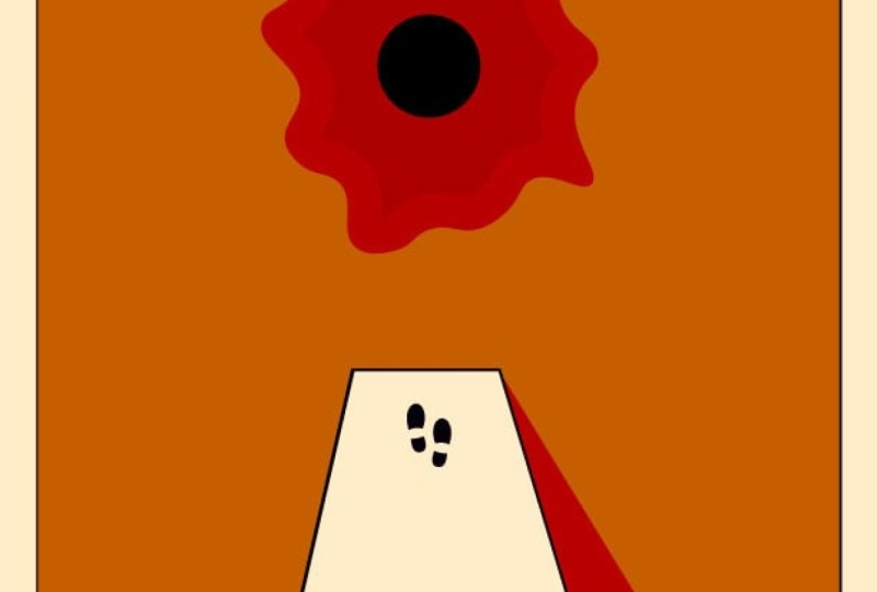
is the use of texture. In this case, we have
these bullet holes, which would imply that there is a glass window or screen in front of the cover
of this magazine and shots were fired
and that glass broke. But besides that texture establishing something
that's the closest to us, still further depth
created within the composition by having
the main character, Daniel Craig, James Bond, standing in front
of the masthead, which is a very common
technique with magazines. And then having
covered lines and the rest of the
topography and supporting images on top or in front of the main character
in the composition. So even without
the bullet holes, There's three distinct planes or layers on top of
each other here. And that additional
texture layer is adding fourth one on top of it. Here is another great example of implying depth with texture. In this case, besides the obvious perspective
that we can see on the letters establishing details going further away in space. We also have that sensation that these letters are standing
in water and that is achieved with this
distorted texture on these reflected details for
each of the letter forms. So even though there are
no overlapping details here and also no
shading use at all, we still feel that there is
distance in the composition, but also that there is a
plane or a surface of water. I love simple solutions like this because they
are so effective. So instead of using more highlights and
shading on the water, it simply just implied by having those ripples or texture
on the reflected details. And last but not least, here is another example of texture
used to create depth. But again, it feels like there is a window or a screen that's semi-transparent and
the details that are further away from us are
getting blurred out. While the face that feels
closest to us are closest to that semi-transparent screen
is clearer or more in focus. It is a genius solution to make the face really stand
out from the rest of the details and also enable the typography to be legible
on top of this image. Once all the details besides
the face are blurred out, it is easy to place text on top of them because
now they interfere much less due to the
fact that now there are low frequency in terms
of a visual load. And besides implying depth, texture can actually be used for a lot of different reasons
in graphic design. And that is why we will
coming back to it and talking more about
it in another video.
6. Overlay & Overlap: Overlapping or overlaying
images and typography in your compositions can help
also to achieve depth. And it can also be
used to emphasize other things like
movement and written. In some cases, you can also
use this approach to compress more visual information into a single composition that would otherwise not be possible. The most important
technique we rely on when we are using
design applications to be able to create
overlaps and overlays between our elements
is the use of layers. They are fundamental for
every graphic design project. It is almost impossible
working without them anymore. In the past, before the digital era and
desktop publishing, of course, it was
much harder to do this because they were
just simply no layers. And the only way
graphic designers would be able to do this by literally cutting
things out and placing things on
top of each other. Of course, this is a very
limited method because you can't really adjust the
opacity of these components. And there's also new blend
modes which can help to create interesting interactions
between your layers. So we definitely came
a long way since then. And it's mainly down to the simplicity or the
ease of being able to work with layers that shows in a lot of
graphic design projects. And the common use of
transparency being used as an integral
part of compositions. Because if you think about it, both overlap and overlay relies on visibility
or transparency, which can become an
active design element, just like color,
text, and imagery. So like always in this video, we will be looking at some creative uses of
overlaps and overlays. Even though we've
seen some examples of this in the previous videos, There's a lot more to
discover here and a lot more inspiration together
that you will be able to apply
in your projects. I mentioned blend
modes or blending of layers already in the
beginning of this video. And that is something
we can see being used in many of these examples. However, blending is
not always necessary. We can also just simply
use transparency, which makes certain elements more see-through than others. So, for instance, the
PG tapes logo and also the MasterCard logo relies more on blending than transparency. And in case you are
using Blend Modes often in applications
like Photoshop, you will develop an
eye of even being able to tell which blend
mode is being used. In this case, for the PG tapes, I believe it is multiply while on MasterCard this looks
more like overlay. It is definitely a good idea to get familiar with
these blend modes. But don't feel like you
have to learn all of them. Because depending on what images or components you are
planning to blend together, they will always create a
slightly different result. So even after a
year of using them, I still experiment and
sometimes flick through all of them before I
decide which one is the one that works best
in my composition. The cool thing about blending instead of using
transparency is that both of the elements
that you are blending together will still be
fully opaque or visible. And here is a great
example of this. Once again, we have
the illustration of the scat and also we have
the type on top of it. And remember what I said, sometimes we are using this
technique of overlapping or overlaying to be
able to compress more visual information
into our canvas. In this case, by using
the overlap technique, it was possible to
maximize the size of both the illustration
and the topography. So both of them are filling
completely the canvas. And because of the
clever use of overlay, we can still see both of them. It is also like a
challenge that you send to your viewers when you
do this type of thing. So they have to
work a little bit harder to make sense of
what they're seeing. Because of course,
this is not as clear as having these two details
next to each other, but as long as there is
enough difference in the colors of the details
that are blended together, it won't be annoying or
confusing your viewers. Instead, it will be more
intriguing and engaging. Notice that there is
actually a little hint or visual aid here on the left side of this poster
saying made in Japan, which is exactly
the same texts that is overlaid in the composition. But these texts here is
much easier to read. So even if we just glimpse
at that for a split second, it will help us to
identify what we can see in the main
larger topography. And in this case, it's
not only the overlay that makes it difficult
to read the text, since readability is further reduced or decreased by having the three words made in Japan physically merged
into each other. So for instance, the letter a, which we can see here
is used both for the word made and also
Japan here at the bottom. But notice that
even the word in is connected to the other end
character in the word Japan. And if this was not enough, there's even another
interesting little detail here. The E character in the word made actually has two bars
instead of just one. And I'm not sure why
that was necessary, especially because these
gaps here are not equal. So the one in the middle is
wider than the other two. The only thing I can think of is that without these two bars, that would have been a little
bit too much negative space here on the top compared to
the rest of the composition. So it was probably necessary to achieve the right
visual balance. Coming back to blending,
I believe again, this is multiply or it
could be hard light, or maybe even overlay, not a 100% sure. However, having these
complimentary colors overlaid on top of
each other really helps us to separate the two layers that we're
seeing on top of each other, things can get even more interesting once you
start combining, overlaying and overlapping
in a single composition. So in this case it's a
very similar combination. Even the colors are similar. And we can see that the blending is happening
in certain areas, like here, here, there, and so on and so forth. Wherever you see that
darker blue color, that's where both of
the words high and five are visible at the same time due to the overlay or blending. But notice that there is also
overlapping going on here because in some
parts the two words are actually covering
up each other. Like in this case here, the blue text is disappearing
behind the red one. The same thing happening here. Once again, the blue text
is behind the red one. And if you spend a
little bit more time analyzing all of the
intertwining details here, you will realize that every time the blue text is
coming in front, it's going to be blending
into the red text. While the red text is
fully opaque and it is not blending to the blue texts whenever that goes
in the background. So it is important if you are working with multiple
effects, in this case, overlaps and overlay, that
you stick to a specific rule. In this case, keeping
one word opaque and only the other one being
used for blending. Otherwise, if there
is no system, it might get confusing and you might lose the interests
of your viewers.
7. In front or Behind: Here's another great example of overlaying things
on top of each other. In this case, blending
was not necessary mainly because of the difference in the two things that are
on top of each other. So there's a huge contrast
between this thin line art of the sloth and the chunky
white typography behind it. And it is actually
not clear what's in front and what's behind. Mainly, I would consider this to be in the foreground
because it is larger. And if you remember, when
we think about space, whatever is larger, always
feels closer to us. Now there's one thing that you really have to pay
attention once you start overlaying or overlapping things on top of each other. And that is the tangents
in your composition. And this is actually an
area that we will be covering in much more
detail in that topic. But essentially what this
means is that you have to avoid details from different elements
clashing with each other or having their edges meeting exactly in
the same position. Because that can end up being
confusing and distracting, not knowing what is actually closer and further away from us. So in this case, because of the high contrast between the two elements that are
on top of each other. We don't really have to think
too much about tangents. But still, I believe
that this area here gets a little bit
too close to each other. So the top of the O
is perfectly aligned. Two important features
of the sloths, like the nose and the eyes. So if it was up to me, I would have moved the
sloth just ever so slightly higher so
that these details are not clashing with
that line of the o in may have been an
intentional decision to place it exactly there. However, this would already be considered subtle but
still noticeable tangent. If I was very picky
and critical, I would say that there is
another little tangent here. Once again, the line meeting the corner of this letter
exactly at that point. And even this little line
here is almost following exactly the end or coordinator of this
letter here on the left. And same thing is
happening here and here. Once again, the
line is perfectly tangent to the curves
of the typography. So for instance, take a look
at this illustration here. The way that these vegetables are overlaid on top of
each other and again, blended into each
other allows them to steal all be visible
and recognizable, even in this highly stylized
or abstracted version. But to make sure that it's clear that they are on
top of each other, even though we can
see through them, the designer or
illustrator made sure that there are no tangents
in this composition. So for instance, the
carrot and the onion in this place here has
an obvious overlap. Well, imagine if the carrot
was pushed a little bit to the left and there
was a tension there. Then immediately we
would lose that sense of depth and things would
start looking way too flat. Then you are relying solely on overlapping and not
overlaying things. Then you can still introduce
some subtle effects like drop shadows to
indicate space and depth. In this case, we have the
type tool set in perfect wide apart from that
one letter in the back, which is set in red. But notice that some of these letters have some
subtle shading on them. It's most noticeable
here on the w, can also see it a little
bit here on the red, and maybe just ever so
slightly here on the M. Again, when you are
introducing effects like this, make sure that you are
very subtle with it. So use the least
amount necessary. So let's say you have
a layer created for the shadow that is
set to 100% opacity. I would go back all
the way down to 0%, slowly increasing it until it is enough already
to be noticeable. The first time you
can start seeing it is going to be
enough compared to going from 100 per cent down slowly until you think or believe that it
became subtle enough. So go from 0% up slowly instead of doing
it the other way. Remember, at the beginning I mentioned that you can achieve movement by overlaying or overlapping things on
top of each other. And in this case, it's a brilliant example
of the same image. Use three times in different
colors blended together. And just simply by having them rotated within the composition, ever so slightly simulates that motion that
we would expect to see when we're looking
at the cyclist climbing up a hill
and struggling, leaning left and right. This type of composition
works well when you are paying attention to
the repeated details, in this case, the bank
being close to each other. So we have a visual anchor in the composition and things
won't get too confusing. Here we have another
brilliant example of four completely different images using different colors
blended into each other. And these colors are actually the colors of ink used in print. Cyan, magenta,
yellow, and black. And what makes this composition really engaging, I believe, is that we have the main
image setting black, which feels the strongest or which has the most
visual weight, being very static and centered by the other three images
are much more dynamic. And there is even at trajectory
here that we can notice. So it almost feels
like the composition has a movement from
left to right. I'm sure you've seen examples of these types of
compositions where you have two completely
different things exposed on top of each other. This is actually called multi
exposure in photography. However, it became a
trend in graphic design. And now there are so many
different creative uses that you can find this
particular method. And I really like this
example because first of all, it uses the face of a woman, which is always a great way to grab the attention of people. But then it also has the books which
relates to the topic. In this case, you guys did. It's about reading. To achieve this type of effect, you don't need to
use blend modes. You just simply have to align the two layers on top
of each other and use layer masks to show and hide certain parts of
each of your layers. So in case of changing the
opacity of each layer, you have to gradually reduce
the visibility of items. So while the face
is fully visible on the left side and the books are fully visible
on the right side. They are slowly feeding
into each other. But this transition is not
like a linear gradient because we can see the
books more on the top, while at the bottom, they are
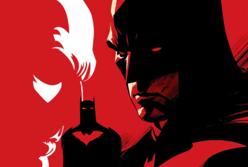
disappearing much faster. Switching back to blending
and the overlay effect, you can also be
extremely clever and creative in the way you use
it in your compositions. Like in case of this
Fight Club poster. But the profile of the two main actors
are blended together. And the resulting blend here in the middle actually
forms the silhouette or the phase of the
third character from the movie was played by
Helena bone and Carter. Something like this, of course, is very hard to pull off
because you have to really find the right images for this
type of composition to work. But when it does, it creates a very eye-catching
and compelling design.
8. Shape & Form : Every graphic designer should learn how to work and make the most of shapes and forms
in their compositions. In this video, we will
cover a couple of important terms that you
should be familiar with. But also we will look at a few amazing and
creative examples. Whereas shapes and forms
play an important role. So first of all, the difference
between shape and form is that we're talking about shapes when they are two-dimensional, circles, rectangles,
triangles, and even lines. While forms are three-dimensional
objects like cubes, spheres, cylinders, cones,
and so on and so forth. I love this project
where we can see the original photograph and composition here on
the top left corner. And then here on the
right side we see a stylized abstracted
version which uses forums. And then at the bottom, a further abstracted version, which relies solely on shapes. In real-life shapes and forms are very different
from one another. While in graphic design, both shapes and forms are still represented in a
two-dimensional plane, the printed page or a screen. And we have to rely on
things like shading and perspective to make sure that the form still look
three-dimensional. And this is something we
already talked about. This is implying space or implying the
three-dimensional forums. But even when you're
working with shapes, you can still imply depth. For instance, again,
by using shading or even texture in case
of this composition. Another important term worth remembering when we
talk about shapes is whether something is a
positive or negative shape. The easiest way to explain this is that when you look
at positive shapes, they have details inside them, while a negative shape
only has an outline. So in case of this
composition, for instance, we see a couple of
positive shapes like that black triangle or these triangles with the
images of people inside them. And these are
combined with all of these triangles overlaid
on top of them, which are only using
a thin outline. And these are the ones that we would call negative shapes. In the previous
video, we discussed overlaying an overlapping
objects on top of each other. And here you can see a
great example again, of overlapping both positive and negative
shapes on top of each other can create a very intriguing and
balanced composition. Of course, you don't have to combine negative and positive
shapes all the time. You can also just simply
rely on negative shapes and still create an interesting composition like in this case, again, we only see
the outlines of this shape and all the
other details around it. And what makes this even more
interesting is that we can also see the outline and
being a perfect circle, even though there
is no actual line holding things together. So in a sense, that circle
that's not even there, we are only imagining it is
not even a negative shape. It's less than that. It can be considered
a hidden shape. And remember, closure is one of the Gestalt principles that
can make designs interesting. Again, we're relying on
our viewer to imagine those missing details and connect the elements
that they see. Both shapes and forms
can be categorized as being organic or geometric, which sometimes is also
referred to as inorganic. And in this
composition we can see a great pairing of both
S-shape and forums. So we have this circle
here, which is a shape, and then we have these
three-dimensional liquid forms. And while the circle in the background is
a geometric shape, this liquid here in the
foreground is an organic form. Anything can be
considered organic, that is more than just
the combination of the simple geometric
shapes or geometric forms. But another very
common attribute that we would associate with organic shapes and forms is that their outline is
mainly made up of curves. And even if they have corners, they are usually rounded. Here we have another
nice example of again, a combination of geometric
and organic shapes. These circles and the lines,
all geometric shapes. While here we have
an organic shape. This is also considered
an organic shape. Again, even though it
doesn't have an outline, we would still see
this as one shape. And then there is also another organic shape
here on the top-left, nicely balancing out what
we have here on the right, and also helping to create
this diagonal composition. Now, even when we are looking at photographs like in this case, this lady here or the
flowers behind her. We can also consider
these organic forms. So these terms still
apply even when we are thinking in
three-dimensions.
9. Primitives or Compound : Another important
way that you can categorize shapes is that whether they are primitives
or simple geometric shapes, once again, circles,
triangles, squares, or the compound shapes made up of multiple shapes
merge together. So in case of this
poster, for instance, we see lots of triangles
on top of each other, but these would still
be considered all individually as primitives
or simple shapes. While the topography
and the letters can be already considered individually
as compound shapes. For instance, the letter
e can be made up of four rectangles, 123 and four. So you can imagine this and all the other letters
formed from simple shapes. And there's some great examples in logo design where you can create interesting
compound shapes simply just by implying them, placing a couple of simple or primitive shapes
next to each other. In this case, we have these rectangles displayed
in a radial symmetry and they form an
interesting negative space that is actually
becoming another shape, this star, which by default would be considered
a compound shape. Here is another
example that's more three-dimensional thanks to these gradients and the shading. But if you just consider
this to be as simple, thick line that was twisted
and folded into itself. Then once again, we had
originally as simple shape that then created a compound shape in the end or compound form, if we think of this as
being three-dimensional. And here is another
great logo example. Well, we can see that even
within an individual object, we can transition seamlessly between a geometric
and organic form. So we can consider this to be a sphere if we imagine
it being closed. But we can also see this
liquid spiral that keeps going up and wrapping around
that invisible sphere. So by now, you can already see the pattern that visual
interests can be achieved, usually by combining
contrasting things, whether they are negative
and positive shapes, organic and geometric shapes, or simple and compound shapes. And another term
worth remembering, especially if you are
interested in designing icons, is abstract shapes, which again, is a form of compound shapes. Or specifically to create a simplified representation
of real life forms or shapes and symbols like
these bathroom signs are perfect examples
of abstract shapes. So even though
they are extremely simplified compared to what
they are representing, they can be seal recognized. And the advantage of this simplification
process is that they become much more universal. So we can only associate to the genders of these
two characters, but we can't see their age, their ethnicity, or
any other attributes. And finally, it is important
to mention that there is actually psychology of shapes. So all the primitive shapes have associated feelings
connected to them. And the best example to
understand this is if you think about inside out the
movie from Pixar, where all the characters have very distinct traits
and personalities. But when you look
at their design, you can see that they
are also made up of the shapes above them. So anger almost looks
like a simple square, while sadness looks like
a circle or ellipse, disgust is coasters
probably to a triangle, mainly due to the
skirt she is wearing. While Joy and fear
are made up over a little bit more complex
shapes and associations. So it looks more like
a question mark. So we can see that former shape, both in his body but
even on his hair. We have that sorts of
question mark type, shape. And joy is usually
looking like history, especially when she's spreading
out her arms and legs, being excited all the time. On this board, I have a list of the most commonly
associated attributes or traits that we would think of when we are looking at
specific primitives. And you can see
that there's even a big difference between seeing horizontal
and vertical lines. So while a horizontal line
can mean moving through time, a vertical line feels more stable or static and it
can mean commitment. For instance, circles
and round shapes have generally positive
emotional vibe to them, and that is why they
are so commonly used in illustrations for kids. So once again, we can see even from these
very simple shapes, we can still recognize
these animals. And we also have this
great example of the whale formed
within a circle. So in this case, these round
shapes are helping to make everything look cuter and
friendly or inviting. And even with typography, you can make use of
these connotations or associations to the traits
that I mentioned earlier. In this case, the long
vertical lines and also the sharp angle
here at the bottom makes this composition
quite dramatic. And this shape can symbolize
strength, power, or bravery. By this design, made up
completely of typography, feels much more solid,
static, and balanced, mainly thanks to the fact that
it forms a perfect square, but also the subtle
round corners help to make this a bit more approachable compared
to the previous design. And one last thing I
wanted to mention is that you can also use juxtaposition when you are showing
certain items that we're familiar with in a
completely different way, like this skull or the golf ball turned
into a cube or a square. Creating unusual versions of familiar objects can always
create a great shock value, which will definitely grab
your viewers attention.
10. Texture : It is easy to overlook texture
as an element of design. However, when it's used
cleverly in compositions, it can create contrast
and depth and even evoke emotions
from our viewers. Now, just like everything
else in design, you should never use texture
just for the sake of it. It should always
reinforce and support the message of your composition because we're not used properly, textures can easily end
up becoming distracting. What I really like about textures and the reason
why I like to use them in my work is that
normally we can only rely on the vision
of our viewers. So people look at the
design that we create. That's the only sense
they are using. However, once you
introduce texture, whether it's
physical or virtual, you will be relying on
their sensation of touch. And in real life, we can now only feel things with our hands, but anything that
touches our skin, we will react to that sensation
is incredibly sensitive. You can even feel a single hair falling on
your hand, for instance. So even when you
are just showing or implying textures in
your compositions, your viewer's past experience of interacting with those
textures will be recalled. And their visual
experience of looking at your design will be enriched with the sensation of touch that they are imagining
in their head. Now I mentioned that
in graphic design, textures can be also tactile and physical
and are only virtual. So this is something
that they can actually experience and touch. A good example of this, a special printing
technique is an boss. And the boss when you
have certain details like topography pressed into
the paper or punched out. And this can even
be combined with special inks used
on the same areas, which again can
increase the contrast like in this example
where we have the rough cardboard next to
these divorced or pressed in typography covered in
this special metallic ink in the print design topic, we will talk a lot
more about these and various other printing
techniques that can help to make your composition
more interesting and engaging compared to tactile and physical
textures for which we have to rely on these
special printing techniques. You can also use
digital textures where you are just implying
certain materials. This is again
similar to implying depth with all those techniques
that we already covered. And certain textures like this plastic curtain can also add depth to
the composition. Whenever you are deciding on using a texture in
your composition, you should always think
about its qualities. In this case, the
texture is very reflective and it's going to pick up any lights
in the environment. And it's actually working
amazingly well in this case, because we can see
that reflected purple light that
otherwise won't be visible because there
is nothing else in the background that would
otherwise indicated. It is a very common
practice for adverts, especially for
drinks and juices, that we would see
some form of liquid also used as a texture
in the composition. Like here, we have all
of these lovely little drops next to the
slices of oranges. And in this case, not only the drops can be
considered textures, but even the oranges themselves. And in these cases, on top of the sensation
of vision and touch, we are also triggering
the sensation of taste. So showing delicious food or even ingredients
of a beverage is always a great way to get your viewers attention and to make them thirsty or hungry.
11. Liquids: Here we can see a couple of really cool virtual textures
applied to topography. Most of them are
simulating liquids. Like in this case, we have a two-dimensional
representation of liquid. While here we have
a 3D render showing this abstract organic form
of some kind of liquid. It looks more like oil. Then we have another cool
digital hand lettering here, which simulates dripping paint. And very similar to this, this composition
which says dirty is a very cool combination of something that's
completely digital, which is the hand lettering, but combined with an
actual photograph of a hand getting dirty, makes the whole composition much more powerful
and impactful. 3d renders are also commonly used to introduce
textures in work, you can find loads of
different examples of this, like this furry and
percent here on the right, which looks so soft and you just want to cut the lead
like a teddy bear. And again, to increase
visual interests, you can always combine completely different and
contrasting textures like here we have this very soft
texture on one of the forums. By the other one
looks much sharper, more rigid, and colder. Here is another
interesting composition which shows that you
don't even need to introduce two different
textures to create contrast. Because by applying the texture only on a section, in this case, 1.5 of the composition, we immediately created
a big contrast between the two sides. And since we have some
topography on this poster, It's also worth mentioning that even text forms
texture in your work, which you wouldn't normally
think of because everyone is, first of all, reading the tax that is placed
in a composition. But when texts gets distorted or even rotated 90
degrees like here, it is easier to concentrate on the textural quality
of the text, which mainly relies on the typeface that you
use in your work. And also things like the
tracking or letter spacing, the leading or line spacing, and of course, color, scale and even the position of the text within
the composition. In this particular case, I believe that the
designer chose intentionally this bold
and bulky typeface, which turned 90
degrees to the side, still reads perfectly in German, the language that it is setting. However, because of its
thickness and orientation, it can also remind us of Japanese characters that are written vertically
instead of horizontally. Just tried to squint your eyes and you most likely will be able to imagine the
Japanese characters. Virtual texture is also something that is
very commonly used in digital illustration to simulate traditional media like
paint or crayons on Canvas. So for instance, here we can see an illustration
without any texture. And then once we
introduce texture becomes much more interesting
and feels more natural. It can help to reduce
the rigidness and structure of vector
illustrations. Here's another nice
example of an illustration that relies heavily on textures. And I love the fact that the central area becomes
the focal point, not only by having it set in a contrasting color
to the environment, but also by not having
any texture on it. So even though we see
texture all around, this central part here
is completely clean. And even though the
textures are completely virtual and everything
is in a digital format, is still gives us the same
sensation when we are touching different textures
in a printed format. Last but not least, it's
also worth mentioning another useful term
that you might hear, especially if you get into
web design or UX design. It's skeuomorphism,
which is a technique used to simulate
real life objects. There was a big trend where all icons were
created with this. And here we can see
a comparison of the old icons using
skeuomorphism out-of each. Probably the most realistic ones are the nodes and
the new standard, which both showed
these objects in 3D, even though they
are restricted in this small square format. But more importantly, they also implied textures of
the original objects. In this case, paper by here is the vote that the
bookshelf is made of and compare it to this completely
different direction is the flat design where all of these skeuomorphic
details are removed. Trends in graphic
design come and go just like in fashion. So you shouldn't ignore
something just because currently is not being
used or not being trendy. And most of the time when
something feels outdated, eventually will return
and become trendy again, maybe with the combination
of another style.
12. Perspective : Perspective is a term that
most of the time you would hear mentioned in the
context of architecture, drawing, illustration,
or photography. However, it also plays a very crucial role
in graphic design. It is also a way we can
simulate depth that we experience in real life
in our compositions. But it can also add a
lot of dynamism and momentum to our designs to
understand perspective, first of all, we
need to understand the term vanishing point, which is a point in space. All receding parallel
lines seem to converge. So to make sense of that, in case of this first composition
here, the blame poster, we would have a vanishing
point somewhere around here, close to this focal point in the composition that men
standing in the door. But the important thing
here is that if we connect these two lines which are supposed to be parallel
to each other, wherever they meet,
somewhere in the distance, that is going to be
a vanishing point. Now when you're using
perspective in your designs, you can decide how
many vanishing points you wouldn't want to use. A single vanishing
point is already enough to make things
feel realistic. In case of these photographs
here on the left side, you will mainly see the
vanishing point in the middle, but all the receding parallel
lines are converging to. So we can see these lines
all pointing there. So the ones on the right
and even the trees feel like they are pointing
all to the same position. The same thing we can see here, an obvious vanishing point or
so aligned to the horizon. But even when we are
looking up to skyscrapers, we will be able to find that vanishing point
by once again, all these parallel lines
would be converging to. And finally, one more
photograph where again, you will be able to find
the vanishing point of this one-point perspective very easily to help you imagine
how vanishing points work, here are a couple
of simple examples. So first of all, we can see the one-point
perspective, again, the vanishing point
being in the middle, followed by the
two-point perspective, where we have a
vanishing point on the left and another
one on the right. So compared to the
one-point perspective, where the horizontal lines were still completely straight. Here, horizontal parallel
lines also start to recede into space
in both directions. But notice how vertical
lines are still straight. However, once we introduce
a third vanishing point, like in this case, we have two and then
there is the third one. Even vertical lines will start to recede and converge in space. Using three-point perspective is a great way to emphasize height. And depending whether you place your third vanishing point below the horizon level or above, you will be able to create a completely different
viewpoint here, when the third vanishing point is placed above
the horizon line, we would get the frog's eye view when we are looking
up towards things. And even if they are
not total objects, if you have the vanishing
points close to each other, you would get an
extreme distortion, which could make
things look much taller than what
they actually are. And on the other
hand, if you place your third vanishing point
below the horizon line, you would get the
bird's-eye view when you are looking
down at things, this can be used if you want to display a lot of things and you want to make sure they all
fit into your composition. And this is probably the best
type of perspective view, which can cover the
largest distance within a composition. Now in case you want to make things even more complicated, you can even go beyond three
vanishing points within a composition like
this drawing here actually uses five-point
perspective view, where we have the
four vanishing points here on the edges
of this sphere. And then the fifth one would
be here in the middle. And if you want to see these more complex
perspective in action, I highly recommend you
check out the work of the amazing Korean
artist called Kim UMG. Here you can see two of his
incredibly complex drawings. And the unbelievable thing about him is that he is
drawing these all completely from his imagination
and without any sketches. So he has everything
already planned in his head when he
started drawing. And most of the time he's
actually drawing with ink. So it is not even
using an eraser.
13. Vanishing lines: But since this course is
about graphic design, Let's come back to a couple of very creative examples of
again, perspective being used. Like with this Tour
de France poster, we can clearly see
those parallel lines. In this case, these are actually exaggerated
motion lines. We can see here, which
really emphasizes the speed and power
of the cyclist. And the great thing about this composition is that
the vanishing point again, is placed close to
these landmarks, the Eiffel Tower and
the Arc de Triomphe. On this board, you
will find lots of other great examples Where perspective is used mainly to
emphasize motion and speed. Like with the cars
poster, once again, we have a very
extreme distortion, further amplified
by the fact that the car is so close to us. And when we will reach
the Topic hierarchy, we will talk a lot about
dominance and emphasis. This is actually
a perfect example of showing dominance within a composition where
the dominant feature is the tire and
perspective views, especially where
vanishing points are close to each other, can result in these
extreme distortions that can help to fit more information into
a composition and really highlight the
specific detail like this. The same thing we can
see here on this poster. But besides having the
vanishing point, again, in a strong focal point
where the sun is, we also have all of
these motion lines amplifying the effect
of the perspective. And by placing this detail about the disability of this
character so close to us within this extreme distortion
makes it much larger than it would appear normally when a strong distortions
like this is used. It's also important to learn another term called
foreshortening, which explains the
differences in proportions and helps us to understand what we
are looking at. You don't always have to
rely on illustrations. If you want to introduce perspective in
your compositions. You can see a few examples
here where it's mainly the topography that
creates the perspective, like in this poster, we have this simple
outline texts in 3D using a two-point
perspective. And because we are seeing
these characters from below, it means that the horizon line must be somewhere
underneath them. And then another
technique used here that can also make
compositions like this more interesting
is that actually the horizon line is
probably on an angle. I would say something like this. And the way I can
tell that is because the vertical lines
that are supposed to be straight are
also on an angle. Now I'm not a 100% sure, but there might even be a
third vanishing point here. So if we were to connect all
of these vertical lines, and if they appear
to recede in space, we might actually find a third vanishing point
somewhere up here, which again, as you remember, can help to make things feel
much larger than the art, especially from this angle, looking at them from below, we will talk more about
viewpoints once we reach the topic of balance. But for now, let's
just take a look at a few other examples
like this one. Once again, relying mainly on the typography to
achieve perspective or this layout with the amplify text using
an extreme distortion. And even in logo design, perspective can
be used like with this one, constructions image. And I love how clever
this design is. Because not only we
can see that there are these cubes in perspective
and having again, a vanishing point
somewhere here in space. But also it relies on
the design principle of closure because these
details are not connected. It's only our mind that
connects the missing details. But more importantly, and
what makes this really clever is that we also
get these numbers here. Number one, which
is what connects it to the actual brand name
one, constructions. Now, while perspective
can help us to simulate
three-dimensional space, axonometric views are
considered to be some things more similar to 2.5 dimensions. It is something that is
not completely natural. It's not something you
would see in real life, but we still understand them representing height,
width, and depth, even easier than compositions
using perspective, you can think of
axonometric projections as simplified version
of perspective. And what makes these
views unique is that there are no distortions at all. So there are no receding lines
and no vanishing points, which means that objects
as they get further away in space don't
actually get smaller. So here is a good example of an axonometric projection where we have all four letters
being exactly the same size, even though it feels like T
is furthest away from us, it's still exactly the same size as the letter E at the front. And this is actually the most common
axonometric projection. Which we call isometric view, where the angles to
show the three sides, left, right, and top are equal. So here is a simple
comparison of the different types of
axonometric projections. And this one is the
isometric one where, as you can see here, is the 30 degrees angle used to show the left
side of the object. And this angle would be equal, that would again be 30 degrees. But for isometric views, you also have to make
sure that the same length vertically is going to be equal to the other two
sides of the cube. So all sides will be exactly the same length
By compared to this. In diametric view, the height is not going
to be the same length. So there's already a
subtle distortion, but still there are
no receding lines. So this doesn't
introduce perspective, it just changes the
viewpoint of the projection. And finally, in trigometric,
axonometric projections, you would have all the sides of the cube slightly
different in length. So this edge here is not
equal to the vertical edge, and also they are not equal to the edge on the right side. Here's another example comparing the three axonometric
projection options that you can use out of which the most common one has
to be the isometric view. This is what you
would see most of the time in graphic
design and illustration. One of my favorite example
for isometric view has to be the mobile game
called Monument Valley. There's actually two of these at the moment of
recording this video. And the reason I like this game because it displays and uses the strange optical
illusion that a line that we feel connected
like this platform here, it starts off being at
the bottom of this tower. But by the end, without
actually showing any increase in
altitude or height, it ends up connecting to
the center of the tower. So it somehow manage
to go up this much, once again without showing
any changes in height, even this little detail here, this column seems like it is
resting on that platform, but this character in the
game can actually walk across it and step on
it from that side. Even though logically
this point here should be much higher
than this platform. Here's another cool
illustration that plays with this strange optical
sensation that we have when we look at
isometric illustrations. So in this case we have two letters placed on
top of each other, you and P, which stands for up. And even though there is
no indication of space, we would normally feel like
this detail is closer to us. This one here on the top. But by having these letters
and connecting lines, we can understand that they are actually above each other. But just like with perspective, when you want to use isometric or other
axonometric views, you don't have to rely
on illustrations. You can also recreate the same experience simply
just by relying on typography. And this poster is a
brilliant example, but you will also find
other ones on this board, like this one here, also another poster
on the right, and even this one
where a timeline with its captions is created in
an isometric projection.
14. Leading lines: And cooperating
leading lines into your composition can be
another great way of helping your viewers and leading their eyes to certain
parts within your design. The best way to
utilize them is to have them point to a focal point within the composition or to indicate a specific
direction or motion. At first, you might
think that leading lines and perspective is
the same thing, but actually they are quite
different because you can use leading lines
even without perspective. So here's a great example. This retro poster of
New York has all of these colorful lines indicating a left to right direction, mainly because we can't see where they start here
on the left side, but we can see that end
points on the right. And the illustrator or
designer introducing these lines in the composition achieved a couple of
different things. First of all, it helps to
focus on the Statue of Liberty because all
of these lines are pointing towards that
part in the design, but they are also used
to establish depth, like some of these lines, as you can see, are coming in front of the Chrysler
Building in the foreground. Bio, some of the lines
are going behind it. And the same thing happens here with the Statue of Liberty. Again, we have a line
that goes behind it and another line that
comes in front of it. The variation of
depth in these lines, but also the variation in
their thickness and color also helps to add visual
rhythm in the composition. And rhythm is a very important principle that we discuss in much more detail in the
unity and harmony topic. Here is another illustration
that shows that we don't actually need perspective
for leading lines to work. In this case, the
viewpoint is placed above these runners and these diagonal lines
here that represents the track on which they are running can be considered
leading lines, helping again to establish the forward motion
of the athletes. Now of course, you don't
have to avoid perspective. If you want to
create or introduce leading lines into your
composition, they want cash. They can actually work
really nicely hand-in-hand. In this case, I would
consider the curves of the beach to be
the leading lines. And they obviously create this
great sense of perspective as they are all getting closer to each other
here in the distance. And these lines also
help us and direct our attention to this
focal point area here, which is the airplane on
this brilliant poster for the movie Dune that
was released in 2021. We also have a
very strong curve, the tip of this June in the
desert world of Iraqis that connects the title and this
character here at the bottom. But the amazing thing
about this composition is that the same curve
that we see here also forms as section of something that we can
imagine being a planet. And since this is a sci-fi
story set in the future, in space, planets
play a huge role. But besides that, it can also be considered as the first
letter of the word June. And I really admire the designer who came up with this
composition because there's just so much
hidden meanings packed into this extremely
simplistic design. It's a great example of the
less is more rule in action, but also showing the power
and strength of simplicity. Gestalt principle. Moving on, here is another
brilliant illustration where the leading lines are actually indicated by light and shadow. It might be hard to
notice at this size. But there is a character here at the bottom where the horse and also leading another horse. And even though these
characters are tiny, thanks to the leading lines, eventually almost everyone
would notice them. And the leading lines in
this case, as I said, are created by light and shadow. So these lines, and also
these lines are all pointing down here around this section where we
have the characters. And what makes this illustration even more interesting is that instead of having
just parallel lines used as leading lines, here, they almost
form like arrows. So we can see the
tip of this arrow here and there's the
two sides of it. And the same thing here. Again, it looks like
an arrow to me. So this is just another
masterful example of how you can use leading lines to
direct your viewers attention to important
details in your composition.
15. Negative Space: If you're interested in
graphic design at term, most likely you
already came across has to be negative
space or whitespace. In this video, I am
going to show you many examples of why it is so important to use and utilize negative space
in your compositions. And we will learn different
ways of using it, whether it is to create a certain type of
aesthetic or mood, or to add some hidden
meanings into your designs. So first of all, why is
it called negative space? The reason for that is
because all the elements that we place into
our compositions we consider to take up
positive space so the surrounding empty spaces can be considered being negative. Now you probably guessed that negative space can be just as important as the positive
space in your compositions. And finding a balance
between these two is a key and crucial tasks for
every graphic designer, the best way to remember the importance and the
relationship between these two types of spaces in your compositions is to
think about breathing. Something that we all have to do constantly throughout
our entire life, most of the time, even
without thinking about it. And you would think
that breathing in is the important bit
in this process. However, without first clearing your lungs and breathing out, you would never be
able to breathe in. So you can consider
positive space in graphic design to be
the breeding in part, and negative space to
be the breathing out. One cannot exist
without the other. And that has to also be
a good balance between breathing in and out or
positive and negative space. And you can find lots
of other analogies are ways to understand how
this relationship works. Like in music, for instance, without having some break
or pause between sounds, we won't be able
to enjoy the music because it would just end
up being a constant noise. And even in pop music, usually the most
impactful part of a song is just after
a longer pause, and usually it happens
just before the chorus, the repeated part in
the song returns. You can see the pause in
music or negative space in design is reserved for the most important
or impactful detail. So if you look at this
design for instance, we can see that these would be considered positive spaces. And also obviously
all the typography that we can see
here in the middle, also on the top, and
also here at the bottom. But already in-between these, we have negative space right
here or so here and here. But the more noticeable are these larger areas where again, we have nothing, just
a white background. And specifically in print
where the paper is white, we would refer to
this as whitespace. There is also a useful way of categorizing negative space. You can use it on a
micro or macro level. And in this case,
these larger areas would be macro negative spaces, while the smaller spaces
between letters, for instance, in the topography, would be considered micro
negative spaces. And spaces between
characters can also be considered passive
negative space, while the spaces that you
intentionally leave blank, like all of these larger areas, you can consider active
negative spaces. And in most compositions, you will always have a
combination of micro and macro, or passive and active
negative spaces. Since we're talking about music, here is a great example of a classical music
festival where we now only see a brilliant way of
utilizing negative space. But also a great example of the figure ground
Gestalt principle, which is a method that can
help your viewer to see multiple different meanings
in the same design. So in this case, you can
consider these two violins to be the subjects placed in front
of this white backdrop, which encase the white backdrop, would be the ground and the
violence would be the figure. However, if you concentrate
at the outline or contour, foreign by the violins, it looks like a
face and especially further emphasized
by this bow tie. So we're looking at
it from this point. This empty space
becomes a person and the figure in the
composition and the violence become the
ground or the backdrop. And most of the
time, if you want to use the figure ground
rule in your work, you would have to
use negative space to suggest additional meanings. And you can see
many other examples of this on this board, like the light bulb here that
is also forming a bridge, the smoke that is also forming the contour of
Sherlock Holmes phase. These two kids playing
football here. But in between them
we can also see the outline of Africa, or this brilliant poster
created by Olly Moss, by the cliffs and
the mountains are also forming the
outline of a tree.
16. Hidden meanings: If you are interested to
see other great examples of negative space used
in illustrations, I highly recommend you check
out all the mosses work or compositions by the
legendary designer Paul Rand. Negative space can also
be used in logo design. And I'm pretty sure
you've also came across this example of the
FedEx logo where the reason for this
tight tracking or narrow letter spacing was to create this little arrow here between the E and the x. And this is a brilliant solution
for this company because that arrow is suggesting
the speed of delivery. But besides using
negative space to achieve these type
of hidden meanings, we can also rely on it
to introduce tension in our composition or even to achieve a specific
mood or aesthetic. In editorial design, especially
for layouts in magazines, large areas of negative
space achieves a more luxurious,
sophisticated fail. And that usually comes
down to the fact that if you have a
lot of empty space, then that means that
you will have to have more pages within your magazine, which would lead to the
cost of manufacturing or printing and even
delivery to increase. Here is a very interesting study conducted by Sally Lin Meyer, who recognized that the
more negative space you have in a magazine, the higher the average household income of their readership is. So here we can see some of the spreads
simplified to showing the positive spaces in black and the negative
spaces in white. So it is clear
that for instance, the New York Times Time
Magazine has a lot of negative space compared
to the ok Magazine, which is almost completely
filled with positive space to a point that most likely in some cases can even
feel cluttered. And why the average household
income of the readership of this magazine is around
$150 thousand per year. The OK magazines
readership is closer to only $40 thousand per year. So when we look at the
magazine spread like this one, immediately we can
spot the vast amount of negative space being used
here on the right side. And besides the feeling
of sophistication, we can also get a
sense of calmness, which perfectly emphasizes
the topic of this article, which is about the
nature of a place. Using large amounts
of negative space in adverts can also help to
grab viewers attention, because the same
rule applies here. Most advertisers like to put as much information as
possible into a composition. And controversially,
these are the ones that we would most
likely ignore. However, an advert like
this in a magazine or on the street would immediately
grab our attention. But make sure whenever you use extreme amount of
negative space like this, there should always
be a reason for it. So in this case, again, it is helping not only to
grab people's attention, but also to emphasize the small scale of this
sapling of a Christmas tree, which is a perfect
way to visually imply the early Christmas sale. Basically, it tries to indicate that the sale is so early that the Christmas tree is still just a tiny little
sapling in the ground. And the way that the designer assured that we can immediately tell that this is a
tiny little tree, is that we have a very
recognizable object here, this red bubble that
establishes the proportions. And here's another advert where instead of the negative
space being used to create that juxtaposition
between large and small. Here it is used more to achieve that luxurious feel that again, is working perfectly well with the product that's
being advertised. And it would be a shame
not to mention the adverts from Apple when we are
talking about negative space, because it is a brand
that clearly utilizes it in pretty much everything
that they do and innovate. They made it into a signature element or
component of their brand. So you can see that
they are using a lot of negative space, whether it is a
snapshot from one of their webpages or one of
their large billboards. And it is again, a clever use of
negative space because obviously the product in
this case is iPad Mini. And the way they kept
everything free here, and only using a small
little area here on the right side indicates
how small this product is, even when it is displayed on a massive billboard
like this one. So by using this
much negative space, they could create
this visual pun. But remember, it is also
a great way to grab the viewer's attention
because we're not used to seeing these
blank billboards, but only a small little information hidden on
the two sides of it.
17. Proximity: Proximity is a
principle of design and also a gestalt principle
that states that objects that are placed
closer to each other feel more related than objects
further away from each other. It is very similar to the technique of grouping
in graphic design, which we'll cover
in more detail in the unity and harmony topic, but proximately is slightly more complex than just
grouping things together. And in this video, we
will be looking at some very creative examples of utilizing proximity and
playing around with it. Starting off with this
unusual book cover, which relies solely
on typography, but also it uses these strange large gaps
between certain letters. This is something we would
call kerning when you are adjusting individually the
spacing between characters, and in this case, currently, is not used to create a
visually balanced composition. The opposite, it creates
more of a shock value. And even though I
haven't read the book, I guess it is suggesting
that large cities should have more space in them to
make them more habitable. But more importantly,
this cover is actually going against the
rule of proximity. Because for words
to read as one, we would normally want to have the characters close to each other and having balanced or
equal spacing between them. While here characters
that are supposed to be close to each other are pushed or move further away,
decreasing their proximity. And it is important to remember that as a graphic designer, once you learn and
understand a rule, you can always flip it
around and use it in the opposite way that
most people would expect. This way, you can be
sure that you will grab your viewers
attention and they will be intrigued to find
out why you went against something that
would feel more natural, the more information or options that you have to
display in your designs, the more important it
becomes to use proximity. In case of a website,
for instance, similar options should be
placed close to each other. Like all the pages can be
accessed from the same area. Also, the most important buttons
are placed side-by-side, but they are also placed close the main title and
tagline within the site. But there is also another
very creative use of proximity by having this orange balloon right in
front of this white shape, we immediately associate
to an egg or an omelet. So the proximity
of the balloon to this shape was necessary to introduce this
hidden meaning. And similarly to this, we also have this very
smart McDonald's post on their social media. We have these two slippers
placed next to each other form the iconic logo of the brand
or this Toyota Edward, where the three tennis rackets, please together forms
the logo of the brand. And also in these Lego Edwards, proximity plays a very important
role in each of these, the shadows are indicating the imagination of the kids who would play
with these blocks. So even a few simple blocks attached to each other
can already help kids to imagine things like a tank or a ship or a dinosaur. And all of these compositions
rely mainly on the vicinity or proximity of the shadows
and the Lego blocks. And even though we know that these two things actually
don't belong to each other, placing them so
close to each other still makes us believe
that they are connected. I also really liked
this poster of the golden melody of
words by once again, we can see proximity used in
a couple of different ways. First of all, we have the
model really close to us, and actually with
her back towards us, that already sets the mood for this composition and also
grabs our attention. But it is further amplified
by the topography, which once again is not trying to achieve
good Readability, instead is used for making
this design more dynamic. So the proximity of these
letters is once again unusual and again helps to make the whole composition
more interesting. And just to stay with
typographic examples, we've already seen that
extreme kerning or lattice spacing can be used to emphasize certain things
in a composition. For this particular cover, the spaces between words
are completely removed and the viewers are
challenged to be able to make sense of
what they see here. Because the readability
obviously suffers a lot once you remove the
spaces between words. So this is just another great
example of how you can be creative in the way that you utilize proximity in your work.
18. Conclusion: Congratulations on
completing this course of the graphic design
theory series. I hope you found it
useful and inspiring. Don't forget to go through
the glossary of terms PDF, review everything we covered, and if you feel ready, take the quiz to
test your knowledge. Come back anytime to
the references on the millenial boards we used
in this course to help you remember the things we
talked about or define inspiration for your
next design project, please let us know if you felt there was
anything missing from this course or if you have any suggestions on how
we can improve it, email us at info at the
assignment designer.com, and we will get back to
you as soon as possible. We really appreciate
your input and help. Now, it's time for you
to pick your next topic and dive into another graphic
design theory course. Remember, there is no right or wrong order to
complete this series. All the rules we
cover are equally important and
everything is related. But what is most important is getting a good understanding of these rules and applying
them in your projects. I'm sure you will
use what you've learned to create
something amazing. And I cannot wait to see it.
 Martin Perhiniak, Graphic Designer, Illustrator & Educator