Transcripts
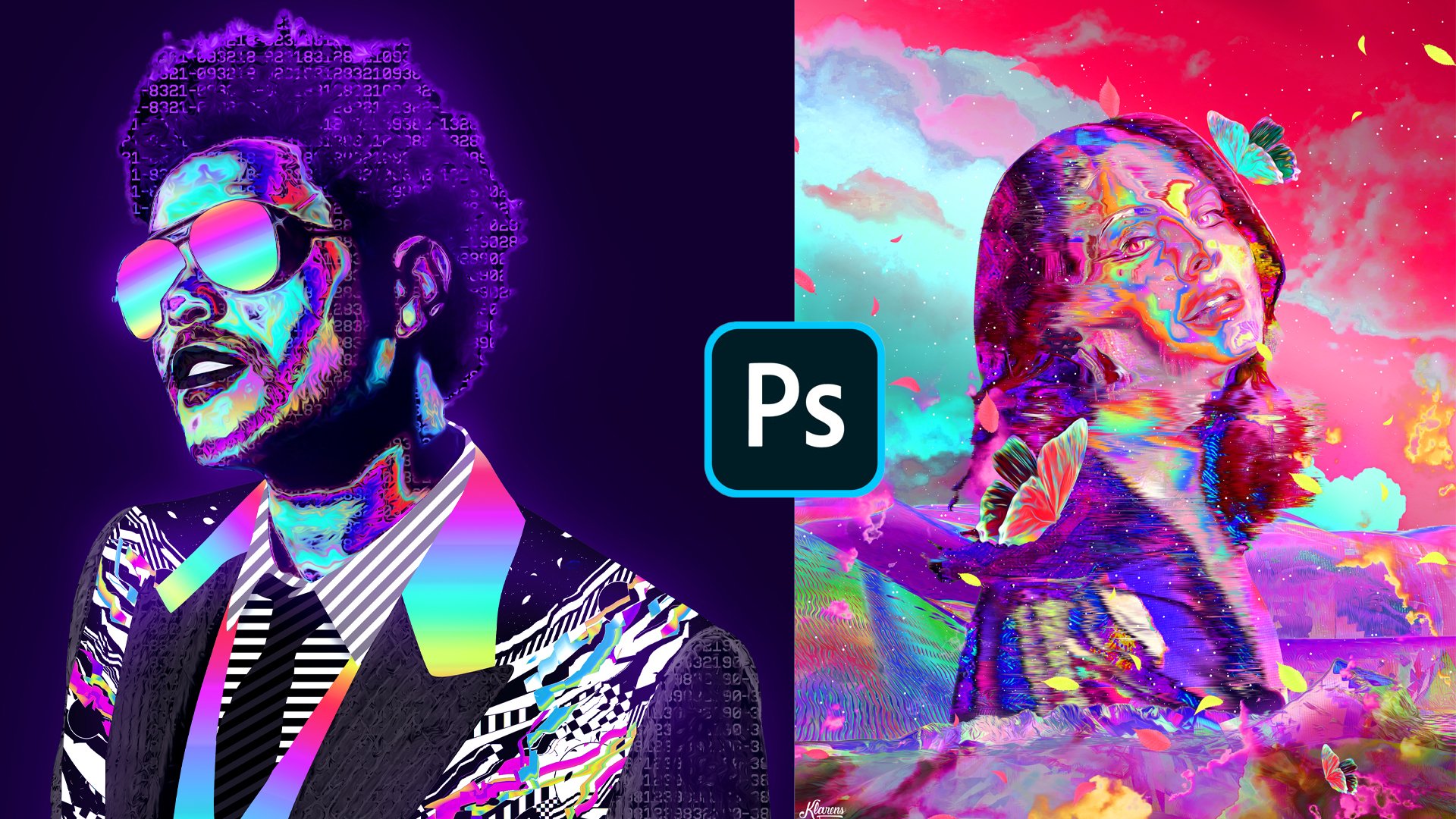
1. Intro: Hello, everyone. My name is Clarence. I am on the third year of far doing every day's experimenting with different Softwares to create some cool visuals on I'd like to share with you what I learned here on skill share On this class, you will learn how to create this chromatic effect and applied in different funds, shapes or pictures. We will start by learning the basics of this effect and then adjusted for different phones . Then you will be able to create a simple obstruct buster by applying this chromatic effect to some liquid saves. To finalize what we have learned, people create a cool chromatic poster using a picture of a statue or whatever picture you like. I will show you where to get the resource is and where to find the inspiration. So I hope you will be able to create something unique. You will need Onley photo shop for this course, so make sure to enroll and see the whole class
2. Find Inspiration: Hey guys. So before we get started, I just wanted to show you some poster that I find inspiring and Ah, yeah, The 1st 1 is this one. You can see all the edits here where the designer apply this kind of dramatic style on DA something that you can find similar in all the edits are the Grady INTs. And also there is a certain type of fund that is used in this in this kind of style. So, yeah, let's move onto the next one. Here is the designer who did this. All credits go to her, Onda, Let's move on to the 2nd 1 This one is really cool too. So, yeah, you can see that there is a certain type of fund that is used in this kind off style or a certain type of off shapes. So here is the other creator who did this. Andi also I was making some research on how to create this kind of style. So I was looking through the comments and I notice that these were made. These were not made in ah, in photo shop. So Martin, who created this, says that created that affect in filter forgeries, which is another software. But I was experimenting on for a shop, and I think I found a way how to create something similar, which I'm going to show it to you later. But yeah, just to show you that there are different ways to create this kind of for style. Andi. Yeah. Another page that I find inspiring or has shared some really cool, uh, chromatic type pictures is this chrome type on instagram, so you can scroll and see different posts with this chromatic style. And as you can see, they also applied on the logos. And also, I'm going to show you how to apply that that effect on pictures. So I just wanted to show you where I got the inspiration from, and also some resource where you can get inspired, prominent, create something cool. So on the next video, we'll show you the resources that you need to create this kind of style. So see, in the next video
3. Find Resources: Okay. So as I was saying before, you need a certain type of fund to get a better results on on this chromatic style. So on these kind of pages, you can find a graphic designers who cell phones, but I'm going to show you some free resource is off. Where to get these kind of funds. So usually I'll go to this side the fund that come on, da. I've put some some names off funds that you can download here, the the names, all of them. And I put them on their own style. But basically, you can just go on this site than usually They are on this category Gulf Gothic so you can scroll on DA find, find funds that you like. For example, I've downloaded this one. You're basically I just scrolled on the found some some funds that I like them. Yeah, this is how it downloaded this one. But you can find the names. You can see the names here and download any of these if you want, because certain type of funds, the chromatic style look look different. So yeah, this That's it for the fancy. The next thing that you can download as a resource for this class is ah, picture of a statue. So for that, usually I go on Pinterest just search for a statue on Duh. Yeah, you can scroll down and and find something that you like. Say, it's on the intro, the kind off statue picture that I got. So maybe you can get something similar to that. So, yeah, that's it for the resource is now let's move on to the next video so we can create the chromatic style.
4. Chromatic Type 01: Okay, so now that we know where to find inspiration and also we have found that we need to use let's get started on creating a new document. So I'm going to use a big size. And, uh, actually, the size is important because if you start on a certain size image and then you decrease the size, it will effect on the chromatic effect. But anyway, well, I'll show you how that effects later. So for now, just create a new document on I'm going to invert the background control I on Let's create a new layer. And of course, that's got type tool, and I'm going to use one of the funds will use this one. So here's the name of the fund. So yeah, there's just type chrome. I was selected because it is black. I'll make it white, and now I'm going to increase the size. Okay, let's make it big enough for this picture that we have. Okay, I'm going to place it in the center. You can just click on the text, hold control, click on the on the background and go to the move. Told you, have these, uh, alignment tools. So you can put it in the center on. I'm going to actually put it a little bit on the side. So it looks more in the center and Ah, yeah. Now let's get started by creating the chromatic type. Okay? Now, the first step that you need to do is to right click on the on the tax and goto blending options. Onda uh, we need to start with a great aunt. Overly. First, I'm going to reset to get all the layer style options on Let's start with Ingredient over late. And as you can see, we have the band moda Passivity. Grady intent all the other tools we could start with Ingredient on the the default grade int is this one that anyone has solved. Click on it, Click OK, And here on the scale, I'm going toe decrease the scale and on the angle uh, I can change the angle or leave it as it is. But for now, I'm just going to make it 90 degrees. Andi, I'm going to change the grade and also So let's go on the radiant and I'm going toe pick some some lighter colors. So to change the gray, Didn't you just need to click on each of these colors. So, as I said, I'm just going to take some lighter colors. So how go to each of them and change? It's really fast. Okay, now let's just click OK on. If you want to say that, you just click new and it will be saved down here. I've also made some other radiance, as you can see, so I'll just click. OK on. Duh. Yeah, Maybe I can change the angle and change a little bit. The scale. You can always change that later based on what you like. So for now, I'll just move to the other option. That is the most important option toe get this chromatic style, which is the babble in ambos. So I'll just check it. Andi again. Here you have all the options. I think by default you'll get this one, uh so you can start with the style technique and all the other tools and out say, there's not like a formula to get the chromatic style by putting a certain number on each of the options. So I would just say play around with with them on based on the size you'll get a certain result but something Ah, important is this glass contour? Andi Ah, for me, this this one looks better because it gets so many highlights and shadows on the text Onda . Now we can change all the other settings based on what we like. So, for example, I'm going toe put the inner bevel. You can see the difference by changing them all. But for me, this one looks better And the the depth you can change it to see, uh, how it looks and now the size and how soft And it is Basically I'm just playing around and seeing how it affects the type. Yeah, okay. I think it looks nice here. And also here you have the angle. I'm just going to leave it as it is. Basically, it's the angle of the light so you can see how it effects on the picture. So let's just make it 90 degrees as it is. Andi Yeah, the direction up and down. If you want the light to come from from below, you can select the down option. But for now, just click on the up. Andi, here you have the highlight mode and the shadow mode. So, yeah, I'm going to just leave them black and white. And on the the blending mold that they are colored dodge and multiply for the shadow on you can play around with the capacity and yeah, just see See what you like Andi here. Now just click. OK, so yeah, that's the first steps that we need to do to get the chromatic style. Now we're going to play around with some adjustment leers to make it look better. So see on the next video.
5. Chromatic Type 02: Okay, so now with the adjustment layer is the most important one is are the curves. So to to add that adjustment layer, you just need to go right here on this icon and search for curves on here. You can see that there are the four option RGB red, green and blue, but the most important one is rgb again. As you can see, there is this diagonal line that you can create curves with Onda again. There is not a certain formula to get ah, cool result, but out suggested to create like, wavy shapes. So just click on a point on you can drag it down on now you can click on another point and drag up on. As you can see, it gives this kind of result. You can do that a gun by clicking on another point on again. So yet as many kind of curves you make the more highlights to get and now you can play around with it. Andi, See? See what looks better. So I'm just going to play around with it and see what I like. Okay, so I think it looks good enough. Now we can just play around a little bit with a red, green and blue. So here you can just change the colors a little bit on. Don't worry about the final colors here, because we can also add some great and maps and us we can play around with the hue saturation also change the grade and that we put on the on the landing options. So yet just play around with these other ones too. But as I said, the most important one is the RGB part. Just make sure to create something wavy on yet now with some check and check, and you can see the difference if I so men can see better. Yeah, okay, so now we need to play around with the colors. So to do that again, we can go to the adjustment layers and Lyon grated map on by default. I think you've got this black and white bond, which is also nice if you want to get a chromatic style in black and white. But, ah again we can play around with a with ingredients that we can create. As I showed you before to create a Grady int, you can just go on the default one and change the colors one by one and just click new to save it. So I have this great aunts that I've created before, so I don't know. Let's seat which one would look nice. Okay, I think I'll go with this one click. OK, you know, so reverse the colors. Andi. Yeah. Now I'm going to play around with a blending mode. So from normal, I can see different modes. And I think this one looks nice case. I think I'll go with that overly on may be changed. Capacity it. You can see that it doesn't make a really big difference. Maybe I can double click and check the reverse. Yeah, it's still just a small difference. Or maybe I can try another ingredient yet it just just kind of minor changes. But it can be as an option to kind of change the colors a little bit, so yeah, I'll just leave it as it is. And now I'm going toe. Try the hue. Saturation adjustment can increase the separation. I can play around with Hugh and seat. I got a nice result on I think it is kind of too bright. So again, first of all, I'll just do the color balance. But also, I'm also thinking about changing the grey Dent's from the from the blending options. So you're right now I'm just trying toe increase the blue and the and the pink. Okay, It also depends on your taste so you can play around with these. So you Now let's go again to the blending options. So right, click blending options and let's see how it looks in different radiance. I'll go to the great and overly Here is the great aunt or I can just change the scale. So it was 34. Let's see how it looks. If I change it, you can see that it looks, huh looks different. I'll click on this and try different, different Grady INTs and see if I if there is a specific grade in there like that, I like more. Okay, so I think this one looks really nice. I'll just click OK on, see if I can change the scale again. Okay. I'll just leave it as it is. Click. OK, now, just double click on the hue saturation and see if I get a better combination. Yeah, I think this all looks cool so yeah, these are the adjustments that you need to make to get this kind of result on the most important, the most important one is the curves. You need to play around with the curves to get these kind of results on. DA. Yeah. Now we can see how how this kind of style effects on different ah funds and see what kind of changes we can do to make it look better on each front. So see in the next video.
6. Adjust for Different Fonts: Okay. Now, we don't need to do everything from scratch to apply the effect on the other funds. So, first of all, I'm just going to group this. You can just click on a on the first layer, hold shift, click on the layer above, and just click on this group I can on I'm going to create a new layer, apply a black background, and now let's go to the funds. Okay, so I'll try this one, so Okay, let's just, uh maybe I can just copy this This one that says chrome on going toe hold old key and drag it up. Andi yet now I'm just going toe click on it and change the fund. Yeah. Okay. Maybe we can make it smaller. Okay. And now I'm going to just, uh, copy all these elements again by clicking on the layer below. Hold shift, click on the layer above so you can select them all. Onda, hold old key on Drag it up to make a copy on Yeah, you can see that you get a different a different ah effect. And if we make it smaller, you can see that it will change. For example, you'll be aware of this green color right here. Sorry, control T You can see that it changes. There is not the green collar right here anymore. Andi. Yeah, I'm going to undo that, Andi, to make some kind of changes. So it fits. So every found. The most important option is the babble and ambles. So we can just go here and change the depth. You can see how it effects the fund. You can change the size that make it something like that. If you want the those kind of details only at the edges. Yes, often on also, it can change the grade and overly. You can make the the angle like 90%. You can change the scale so it always depends on what kind of style you like, But these are the the options that you can play around with. So the bevel int ambles and ingredient overly click, OK. And of course, you can also play around with great and maps and you separation like, uh but these are just, uh, player playing around with colors. But for the style off the chromatic text, these are the most important tools, and I'm going to try it with all the other funds to, but I'm going to speed it up because I'm going toe. Just repeat. Ah, the process. Okay, so here's how it looks on the different funds with the adjustments that I made. As I said before, I just play around with the bevel and Ambos town, the radiance. But yeah, it looks different on different funds. This why it's important to choose the right the right found for this kind of style. And before I am the this this part I just wanted to show you Ah, final adjustment that you can make. For example, when you apply the highlights on the Babylon Ambos, you can see that it creates some white parts. If you want toe, apply some colors to it. One way to do it is just goto select. But first tell it's just big the the right later. Okay, go to select color range and we can select Ah, we can go to select highlights. Or you can just go to sampled collars and select the white collar. You can decrease the fuzziness or increase it, but out suggested to decrease it so you can just like the white color click. OK on. You can see the selection, right, mate. On you can create a new layer. Goto the great and tool right here. Great and tool. And you can apply Can apply a great it. Okay. And to select control you and you can change also the colors so you can make it fit with a style that you want. Click OK, you can decrease the opacity so it looks more like highlight. But ah, yeah. This is another adjustment that you can make to get this kind of style. Okay, so I'm going to show you how to create. Ah, great background circle represented in a cool way.
7. Apply Chrome to a Logo: case, and I'm going to show you how to create a great background. So let's create new documents on the gun. Let's go with the square size soldiers. Quick, create Andi. I'll create a new layer, and now we need to use the rectangular market tool. I'm just going to create a kind of frame, so let's go to the pain back a tool and I'm going to apply a black color de select on going toe. Hold old key and drag this up to make a copy control T hold shift so you can put it down in a straight line and let's elect on both by clicking control or command and hold old key again to drag them up. Control T Andi again Hold shift so you can rotate them in a 90 degree angle. Click OK, and yet now I'm going to get another. I'm going to make another copy off one of the lines. For example, this one I'm going to hold old key and drag it up now control T on hold shift against you can dragged in a certain in a straight line on. I'll put it in the center if you don't get this kind of far guided lines that are helpful helpful for you to understand where the centuries you can just click on the layer and hold control, click on the background and just go to the move tool and use this alignment tools so you can align it in the center. Andi had just hold old key again and drag it up. Control T and I'm going toe rotated by holding shift. So yeah, this is the base that we need to create the great background. So we need to goto adit go to define pattern Click OK goto layer newfield layer angled pattern. Now click. OK. And here is the scale 100% Which is Ah, the picture that we created, uh, to create the grid. We just need to decrease the scale. Let's make it 20 and let's see how it looks. And I think it will look nice with five. Yes, I'll just go with five. Click OK on. Just select the whole thing. Goto Edit Copy merged and I'm going toe to paste it on one of the one of the chromatic text . So control v and now I just need to invert this. I'll go to image adjustment and invert and as you can see ah, the adjustment layers they apply also on the background. So I had to avoid that we can uncheck all the layers. Yeah, OK, and I'm going to copy that I'm going to select. And Goto added, cop emerged at it paced. Somehow we have it as a one layer and yeah, that's just get the the background again and put it right here. That's check them both, and I need to make sure that this is in the center. So again, I'm going to select the text on the background, got the move toe and put it in the center on. Now I can just great and you layer lie black color and decrease the capacities. So it is something dark. Andi, I think it looks Ah, nice in this kind off in this kind of background, So something else to make it look better is toe play around with the with the blending options against so right click or the blending options and you can apply an outer glow. Andi Ah, yeah, That's changed the color to something pink to a lighter pink on increase its size can play around with the capacity with a spread on just minor changes outside. So let's go to the inner glow again. Can also do that can the same thing that's changes the color to a lighter pink click. OK, Yes, I think it looks nice with that. How quick. Okay, Andi. Yeah. We can also apply this kind of this kind of the fact that dramatic effect toe a certain shape like a logo like the Adidas logo on Nike. But for enologist greatest, certain shapes are created. You layer and so crazy. Huh? Feet. Ah, a circle. Sorry. So I'll just put it in the center, going toe inverted by clicking control. I'm going to make a copy of it, inverted again, control tea and just places right here. Andi. Yeah, and I'm going to select the black circle by clicking control and clicking on the earlier right here. Now, I can go to the white, uh, circle and check the layer above and just click delete keyboard. And here we have this this shape. Andi. Yeah, I just created that, like so you can have. There's a reference so you can apply the same effect on the logo. So basically, is the same logic as we did before the same steps. We can just go to the chrome effect. Right? Click copy, layer style. Andi. Right. Click paste layer. Style on. Now we can also get all the adjustment layers, make a copy of them by holding bulky and dragging up on yet again. We can go to the Babylon Dembele's toe, adjusted to the shape that we have yet we can increase the size on. We can change the scale off the of the great aunt. Overly. Andi, I just, uh, just play around with it and see. See what you like, so I'll just click, Okay? We can also make it smaller. See how it changes. So basically, what I'm saying is that you can apply that a pact also on locals, so under or in different shapes. So, yeah. Now I'm going to show you how to make some postures using these kind off effects. So see, in the next videos
8. First poster: Okay, guys. So now I'm going to show you how to create a simple posture similar to this one with these kind of wavy shapes. So let's start by creating a new document on going toe. Make the wit for thousands and the height. Five thousands. Resolution 72. If you want to print it, you need to make the resolution 300. So I'll just click create for now. And as a background, I'm going to use the great that we created. So I'll Goto added Copy Merced on. I would suggest it to save it as a picture so you can use it for different projects. So you know I'm going toe inverted. The shortcut is control I and I'll create a new layer and apply a black back black color, and I will decrease the capacity a little bit. Okay, so now, as you can see right here, there are these. There are these kind of wavy shapes. One way to do that is just creating new layer. And let's start by picking up color. I'll go to the brush tool and I'll increase the hardness. Just use around brush on bond. That's, ah, decrease the size okay, I'll just make it 800. Okay, now that we have this this circle, uh, I just need to go to filter and go to liquefy. And now there is this forward work tool, and you have also the size and the pressure out suggested to decrease the size based on the shape that you have to make it up on a similar size. Now we can just drag Andi. Yeah, this So you can create the kind of wavy shapes. So I basically just just drag and, uh, get some some kind of wavy shapes and yeah, now I'll just click, OK? And basically, it's like having a shape on deploying the chromatic style to it so similar to the way that we did with with a shape the way that you can apply it on the logo. So I'll just go so that, though to the chromatic type and let's go on our first layer. And first, I'm just going to go to the tax time copy layer style that's go back to the shape and paced lier style on. I'll go back again and get the the adjustment Lear send. Put them in here and again I'm going to uncheck the background for now on. The first thing that I need to do is ah is tool play around with the bevel and I'm also it fits so it looks better with a shape that we have. So I'm going to uncheck the the adjustment leers first and go to the radiant Overly and I'm going toe increase the scale so it fits the shapes go to the bevel in ambo sand It's play around with the size And as I said, it depends on what you like more, but I just want to have some more Ah highlights from the from the shapes. So let's try a different angle. I think it looks so better. 90 degrees. Okay. Yeah, Maybe this one looks better. Okay, I'll just click, OK on da Let's try how it looks with a with a curves. Yeah, it looks better. I think it looks really nice. Okay, so we can try the Houston oration. Okay, Also the color balance, but I think it looks nice. Maybe something else that I can do is ah, and check the background and have a transparent background. I'm just copy the whole thing. So go toe edit. Copy. Merson had it paste, and now we have It is as a one year Onda. We can add the background with a grid. Let's decrease the opacity here. Andi. Yeah? I'm going to make some other adjustments to this shape and ah, at this kind of type on, just some small details to make it look nice. So see in the next video.
9. Finalize First Poster: Okay, So before I show you where to get this kind of tax first I wanted to try and see if I can apply again the bevel in ambos effect. But for now, I'm just going to use this first option on the 2nd 1 Yeah, and, ah, just increase the soft un decreased the steps and yeah, I just want to make some minor adjustments. State maybe I can change the color. Here, Make something pink. Andi e. I think it looks nice. As I said, you can play around with it and see, See if you like it or not. But I just wanted to add some more Adapts to it, so Okay. Yeah, Let's click. OK, we can uncheck and check the the effects so we can see how it looks. Andi. And now I'm going to show you where to get this kind of text. Basically, just need to go to Google on there is this website called hacker Type Er and whatever your type on the keyboard, you get these kind of, uh, get this kind of type like a hacker. So I'm just typing random things. Okay, Now let's select it. Sometimes I find it difficult. Toe carpets are in case you get the same problem. Just goto print on. You can copy it from here, So yeah, that's one way to do it. Okay, Now that I copied it, you can got back to that. Can go back to the pastor that we're making and create a new layer and go to the type tool . Let's just use random normal fund like cardio and going toe. Create this shape and paste it. Control V. Uh, I need to decrease size first saw. Let's make it like 20. And we can increase it now. And also I'm going toe. Line it on the left side. We can no. So change the shape of it. Andi, I just ah, to get to get some type on it. I think it looks nice. And I'm going to make another copy of it going toe. Make it smaller. I put it right here. As I said, this is just to create some not something nice with typography and without, with their shapes with chromatic shapes, I'm going to make a copy of chromatic shapes. Control T Andi. I can also put it right here, and I can put it above the type just too great kind of overlap. Let's put it right here too. And, yeah, Now we can Also at some geometric shapes like I can create a new layer used up elliptical, elliptical market tool. Hold shift grade. A perfect circle on. Just apply the color. I'm going to put it below the shapes. Okay, Let's just find a place where look nice on. Maybe I can. No. So copy this text and again, I'm going to remove the background. Second, copy it as a picture. So this way it won't effect on on the chromatic effect, because I'm going to scale it down. Maybe so, yeah. When you paste it as, ah, as a picture doesn't affect on anything, So yeah, let's just put it right here. I don't know. Just find a place where it looked nice. Basically, I'm just throwing your possibilities are ways that you can use this kind of effect to create different, different projects. I'm not going into too much details about how to create a certain pastor. Yeah, Let's just had some some shadow going toe. Decrease the hardness. Yeah. Okay. Andi. Yeah. Now we can just play around with the adjustment. There's so I'm going to copy the whole thing at it. Copy. Merged at it paste. And yeah, I'm going to select the highlights. I'll go to select color range on right here. We can change it to highlights. We can play around with fuzziness and the range, but yet just play around with it and select something. Just some parts of the from the poster on the parts that are white means the These are the parts that are selected, so I'll just quick. Okay, control C control V. So here on this layer, there are the highlights selected, and I'm going to add some. Go to it. So right, click blending options and let's go to the outer globe. I'm going to change it again. Too pink. Andi, I need to play around with the size. The capacity? Yeah, I just want to have minor changes. Finer details, Teoh. Basically, I'm adding these glow just to add that kind of retro effect. We can also try it with in ago can with the same color. I don't know if it will look nice, but that's just right. And then we can decide. Okay, I don't think we see any changes. So yeah, maybe we can try the color overly. Let's make it again something pink and change the multi colored dodge. Yeah, basically admits makes everything brighter. So I think it looked nice, so I'll just click, OK? And the final thing, Let's go to the adjustment layers and play around with the brightness and contrast also with a color balance. Okay, let's make it more blue. Onda. Also, you can change the you to see if you like any other color combinations. So yeah, I think I'll leave it as it is on. Yeah, this is how you can create a certain posture. Now let's move on to the next video where I'm going to show you how to use a picture of a statue together. Chromatic style. So see on the next video
10. Selecting Shapes: good guys. So now I'm going to show you how to create Ah, posture similar to this one that I have already created so we can have it as a reference. So the first thing that we need is ah, picture of a statue. So I'm going to use this layer right here, which is the of the original picture. I'm going to Goto added copy on Let's create a new document again with the same size as a previous poster and al quick create at it paste and just put it in the center. I think it is OK. So yeah, the first thing that we need to do is remove the background from this picture or whatever picture that you have chosen. So I'm going to zoom in and uh, to remove the background. I usually use pan tool. I find it more effective on, and he also there is a new tool on the latest version of photo shop called the Object Selection Tool, so you can just select on the picture and it will select the object. Sometimes it does a really good job. Sometimes you need to make some other adjustments. For example, you can go to quick selection Tool. Go to this minus one. And you had just fix, uh, everything, but ah, as I said for me, it is better. Better to use the pen tal. I know it takes more time, but you get a better result. So yeah, I'm going to de select this on. I'll zoom in so I can go to the pan tool right here on. I just need to click on a point on. Basically, you can just click another point. And if it is a curvy shape, you can click and hold and drag. So it, ah, matches the shape off the of the object that we are selecting and you can go another point . And if you do something wrong, you can undo. So that zoom in on also something else that I can show you is you can click on the point and then you can make this curve on. Go to this point and legacy. It gets this kind of curve. So to avoid that, you can hold old key and click on the Point se. And now you can start like from scratch. So yeah, this is this is how you can use pen tool. I know it takes practice, but yeah, just start by doing this kind of simple, uh, shapes and the Yeah, I think you'll get a nice results. So I'm going to speed this up now. Okay, so now we go to the point where we started. And if we click on this point, you can see that it creates This creates this kind of round shape so we can click on it. Onda, we have a closed path right now, so we just need to right? Click, make selection. Click. OK, we make sure that we are on the layer that we want to remove the background from on click control C control V, or you can go to add it. Copy. And that it based on as you can see, it creates a new layer. We can check the layer below, and yeah, now we have the picture without a background. So the next step is to make some other selections using the pen tool. So, like I did on this example, as you can see, basically have selected some some shapes from from the statue, and I've applied the chromatic effect to it, so I'm just going toe. Use the mental again toe to select the shapes and Ah, and pays them to create a new layer. So I'm going to show you how you can select one shape, and then I'm going to speed up on the next ones so you can click on a point. Don't. Yeah, just create certain shape. Now I'm going to close the past. Okay? Make selection. Click OK on. Make sure we are on the layer where we need to remove up to select the shape from control C Control V. Now we have a new layer, but we cannot really see so we can just click control I to invert the shape. So this way you get a better sense off the shapes that you have already selected. Okay, so this is how I'm going to select all the other shapes. I'm going to speed it up now. Okay, so now that I finished with the selections, you can see that they are all in different layers. I can just select them all, put them on a group, and I'm going to make a copy of the group on da right click merged group. So now we can have. It is a one layer. So now I'm going to apply the chromatic affect rates, etc. On the next video.
11. Apply Chromatic Effect to Shapes: Okay. As I said, No, I'm going toe Apply the chromatic effect to these shapes. So I'm going to uncheck the picture of the statute below. Also, I'm going to uncheck the background. Onda, Let's go on the imaged where we apply the chromatic effect on as always, I'm going toe copy layer style meeting. I can copy the bevel int ambles and gratitude. Radiant, Overly. So let's paste the layers tile. Andi Actually, I can check the backgrounds and invert it. And now I'm going toe, get the adjustment layers. Okay, so again, I'm going to make the adjustments now so I could go toe blending options and start with the bevel in ambos. Yeah, I think increasing the size make it look better. Also soft in it. Change the depths. Yeah, basically, just play around with it because, as I said, as I mentioned before, it also depends on the size of your Ah, of your image. Let's go to the great and over late to see how it looks. If we scale it, I think I'm going to change the angle to 90 degrees. It looks much better. I think it looks nice. So I'm just going to click. OK, Andi. Yeah, We can see how the other options affecting it. How the adjustment layers Fact in it. I think we can change the radiant Overly. Yeah, it depends on the kind of colors you like, But I think I'll go with something like that with a blue one on. And, you know, let's check the image. As you can see, these adjustment layers also affect the statue below safe. And check this. You can see the kind of result that you like that you get on. Maybe you like this kind of image. So you can you can, Koppett. But ah, for now, I'm just going to make it dark. Similar. Similar to this one. So yeah, I'm going toe uncheck all the layers and I'm going toe. Copy this one at it. Copy merged on going to paste it. Control V going to put it on the same position. Andi, I can put these in a group. I can uncheck the group and yeah, now we have Onley these these chromatic shapes. OK, so yeah, Now we're going to move to the next step. Soc! On the next video
12. Adjustment Layers: Okay, so now we're going to make some adjustments on the picture of the statue. So I'm going toe work with the adjustment layers. This time I'm going to use a hue saturation one on DA. I'm just going to decrease the saturation and also decrease the lightness. As you can see, it is affecting the crow America parts too. So we need to put this down. But above the the statue picture Onda, as you can see when we decrease the lightness, it creates this really nice contrast. But if I zoom in, you can see that the quality is not really good. And, uh, when you get these kind of pictures, you don't get a really good resolution. So one way to make it look better is to use the oil paint. So let's make sure we are on the layer of the statue and go to filter stylized and used the oil paint on DA. You can increase all these settings and, uh, I've unchecked the lighting. If you check it. I don't know. It makes it look more like like a painting. I don't really like that effect. Eso I always and check it and increase all these other level options so you can play around with these, But I think it looks OK, so I'll just click. OK, and uh, now let's see our example. So as you can see, I've put some highlights at the edges. So also I have had some Ah, have added some shadow on the left side. So let's great a new layer. And actually, at first I'm going toe. Ah merged these layers both the chromatic effect and the statue. So that's just uncheck the background. I can select the whole thing. Goto Edit Copy merged and pasted Control V Let's put it in the center. Andi, I can check all these other layers are I can just create a new layer below the statue and apply a black color like that on you and I'm going toe work with the highlights all great, and you layer and thats pick a pink color. I'll click OK, and I'll just go to the right side. Use the brush tool, increase the size degrees, the hardness on. I'm just going to use that the brush tool, the touch pad of the laptop and first that's great! The clipping mask. Andi, I'm just going to paint here at the edges. Okay? I'm going to delete it a little bit on this side because I'm going to add shadows on you. I'm going to Rick to create a new layer and ah, it is again on this clipping mask option. Andi, I'll use the Ganda brush tool. I'm going to increase the size on. I'm going to add this color too. But this time I'm going to make it from normal toe soft light, and I can decrease their past still a little bit. And now I'm going toe at some shadows cell, create a new layer. Andi again with a clipping mask option. And I'm going to choose the black color. And I'm going to paint on this side. Yeah, painting the half of it. Andi, I can change the blending mode to something like overly are soft light. I don't know, whatever looks better and I can decrease the opacity and yeah, I think it creates with a nice contrast. Maybe I can try to create a new one on again to put it right here. So it has the clipping mask option, Andi thing. I can do something here at the edges, but use the normal mode. I can decrease the opacity, but also used ah, layer mask. So I'm going to apply. Then, as you can see, it creates a new white layer or shape on the side of the layer on. Basically, the white collar represents the lier. If we apply a black color to it, it will delete the part that is there is represented on ah, a certain part. So, for example, I can just click here with a bread with ah, black color. Make sure you are clicking on the layer where there is this white part on T. I'm just trying to delete some some parts. Okay, so I think it looks OK. Maybe I can decrease it a little bit. Andi. Yeah. Okay. So now the next step would be to at some tried the background that some glow and finalize the posture. So see, in the next video
13. Glow and Typography: Okay, so first, let's start beheading the background, the grid. So I'm just going to cop it from here because we already created the grid on going to adjust it. Okay. Andi? Yeah. Now, as you can see from this example, I've added some text as I showed you before. So let's just go to this hacker type er website and legis type A random things can going to cop it. Andi. Okay. I'm going to create a new earlier. Go to the title on I'm going toe. Create a shapes. I can apply it here. Andi, I need toe change the front also the size Let's face it by clicking control V. It is in black color, so I'm going to invert it and I need to increase it a little bit. And I'm going to align it on the left side so it looks much better There is for the reason that I'm putting it on the left side is because I want tohave. Ah, straight line on one side. So it really helps and I can delete some empty rows. Yeah, I think it looks nice. So now I'm going toe change the color of it. Let's pick something like that, I'll click. OK, and yet? No, I could make a copy of it. I'll hold old key and drag it up. Control T. And that's just decrease the size again. Putting it on the side just to fill this empty space right here. So it feels more balanced, like, uh, like on this example that I should have done before. Okay, I'm going to select it all on board. Yeah, I just change the color also to change other settings. You You can just go here on this icon right here, and you can change the color. Andi. He also the space between rows and yeah, there are all these options here. Okay, Andi, I think maybe I can make this narrow. Yeah, I think it looks better like that. So, yeah, now that I did the text, the next thing would be toe toe at some. Some glow. So I'll create a new layer, and I'm going toe. Choose the pink color and also something like green or blue and yellow. Use the brush tool on. I'm going to apply the green color on this side. And let's change the color too. Screener light ton and I can also decrease your past a little bit. And I'm going to create a new layer, and I'm still going to apply the same color on the same spot. But this time I'm going to change it toe overly. Andi Right here. Maybe I can increase the capacity, but try to deleted on some some parts. I'm going toe make the size of the brush smaller. Yeah, I can apply it again. Can decrease the opacity. Just I'm just playing around so I can have something more balanced on your. Now I'm going to create a new layer. Let's increase the size a little bit and I'm going to choose the pink color and basically I'll do the same thing. But on the other side with a with a pink color. Andi, let's change it to screen on. I'm going toe delete it on some parts and I'm going to create a new layer again, and I'm going to apply the same color. But this time I'm going to change the moat tool to overly Yeah, Okay. I think Looks nice. Maybe I don't know. I don't like this screen layers all created you earlier and tried again okay? Yeah. It looks better with this. Saw small. Ah, brush saw godless changes to screen. And I'm going to decrease the opacity a little bit on Delete this part right here. Okay. So, yeah, you can have another picture and ah, it may look different, but I'm just showing you that the tools that I used to get this kind of result So you're now let's finalize it by by doing the color adjustments, so see in the next video.
14. Finalize: Okay, So before I do the final adjustments, I just wanted to say that if you have enjoyed this class until now, I would appreciate a good review. It's really house me to keep doing these classes, so yeah. Okay, Now let's ah, move to the other steps to finalize this. So basically, I'm just going to use up the adjustment layers. Let's start with the brightness and contrast going to increase the contrast and the brightness to A to make it look up toe had this kind of glow effect on yet Now, let's try the color balance. I'm not going to increase it a lot because I still want to have that kind of black and white background. So I don't want to do that kind of effect. I just want to, uh, do minor changes of the color on. You also have the shadows, Andi and the highlights saw just a minor changes. Okay, let's also the highlights, okay? And you can check in and check toe to see the difference. You can decrease the opacity now. You can also see the hue saturation. Andi, when you get a nice color combination, whatever the hue, maybe it always looks nice so you can play around with these and still get a nice result. So, yeah, maybe I can increase the separation. Andi. Yes. So that's it for this posture. It is the final posture that I made. Basically, I wanted to show you how to create the chromatic style on DA. I just find ways to use it. We started with ah, with a chrome texts and how you can apply it in different funds. And then I did the second poster with wavy shapes. And now the 3rd 1 where you can apply it on a picture or a statue. So, yeah, maybe you get another at the idea of how to use it. You can also animate it on after effects. Andi, you can animate the curves and stuff like that. So yeah, I would love to see what you create. And also, when you share your projects on skill share, please add your instagram account soul so I can re share your projects and tag you So yeah , again. Thanks a lot for watching on the I'll see you on the next courses by
 Klarens Malluta, Visual Artist