Transcripts
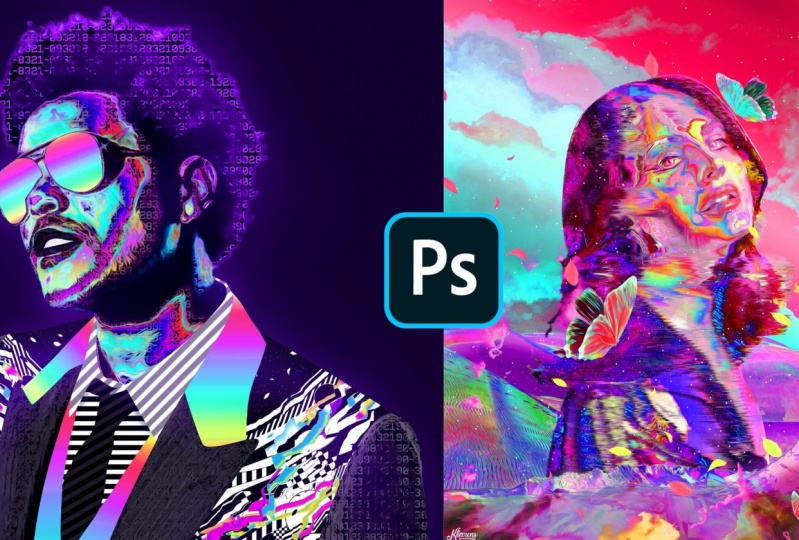
1. Intro: Hello, everyone. My name is Karen. I'm on the third year of Doing Everyday is trying to experiment with different styles on be able to come up with something unique from time to time in this class will be able to create these two artworks. In this retro futuristic style, you will be able to learn a lot in the shop like pen tool field terrorists, adjustment layers, patterns, radiance. How to make a bleacher packed on much more way will start by gathering. The resource is that we need on then start working with the artwork. By the end of this course, you will be able to create these two retro futuristic portrays and use the technique that you learn to create personal or client works in the and you will see two bonus videos that are speed processes off these two artworks. You will need only put a shop for these past, so make sure you enroll and see the whole past
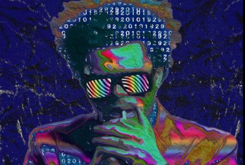
2. Resources: Okay, guys. So before we get started in photo shop, I'm going to show you where to get some. Resource is in case you have everything you need. Like a picture, landscapes, sky background, thes stars, leaves, butterflies, textures and stuff like that. You can skip this part. Uh, otherwise, I'm going to go to unspool at that. Come on. Go. This is where you can search for portrayed, like just school. Search for portrayed than you can find a picture to play around with. Or you can have your own picture. Or you can find the picture off celebrity like like a did with Lana Hillary or with a weekend on the next thing that you want to find this some textures. So that's this. Just search for abstract Onda. You get a lot off results, you can find something colorful. For example, we can download this one. You can go to related photos on duh. You can download all those these pictures for free in. Ah, In my case, sometimes I use my own artworks as textures. Like, I didn't in this case, but yeah, you can just find something colorful and it does the job, So you can download a lot off pictures. Yeah, you have different patterns, Can download this one and I'm going to show you later how to do download how to create a black and white patterns. But for now, I just wanted to see for some colorful liquid taxers and stuff like that. So yeah, this is the the main website where you can download textures for free. On the next thing, you can see that we have these kind of landscapes. Also the sky. First of all, let's search for sunset. I think we can get something cool. Yes. So again, you have a lot of results. I think this one is nice, but again it it's up to you. What kind of picture you like? Ah Onda, You can see really related photos and decide which one do you like more? They are all in good quality So you don't have to worry about the size. Say after you decide about the sky picture that you like Now we have the landscapes and the butterflies. So for that I go to Debbie and tartan the I'm going to search for ah, downturns and PNG. I know source that has these on times PNG pack on duh. You can download these for free. This is the the Creator. She I think she got them from on Splash and removed the background That stuff like that so you can download these and, uh yeah, have themis PNG files. So you don't have to remove the background from all of them. In case you want to do everything yourself. You can just go toe on, splash again and search for landscapes. And you have a lot of pictures where you can, for example, take this one and select the sky. Remove it and use it as a PNG say I talk to you but out suggested to to use these packs uh , as on easier. Wait. The same thing for the butterflies you can just search for butterfly. PNG Onda Uh, you get different results. Let's go to you all. And yet that's the one that I have downloaded. Here's the creator. You can download it right here. Onda. Actually, you have to join Debian tart. I have the I have ah, the entire to combat. In case you don't have one, you can just create it really fast. And, uh, it's free you can download them all for free. Yeah, again. Now we have these stars and the leaves. So for the stars, maybe we can go the on splash and just search for stars that search black and white. Okay, so, yeah, for example, you can download this one or this one, and, uh, you can use it later. So now we have the leaves. I think I found them on Google images. So let's just search for leaves. PNG? Yeah, let's go to images. And I think I downloaded these ones. And yes, this is just to show you some options. Where to get thes Resource is now let's move on by working with the picture. So see you in the next video.
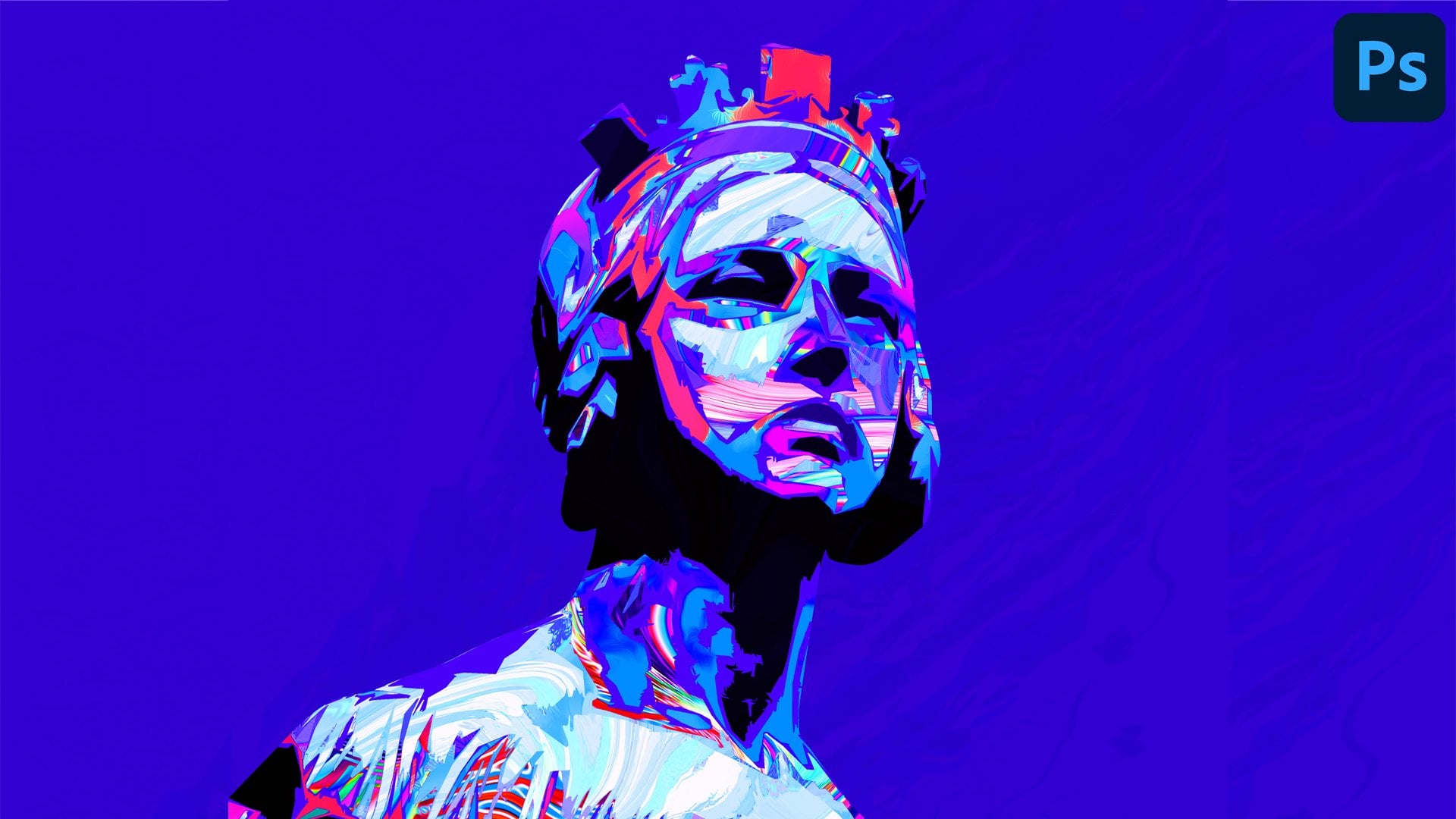
3. Remove the Background: Okay, so I just find the portrays that I'm going to use for both artworks. This is one of them on duh. That's for second artwork Onda on this part. I'm just going to remove the background for that. I'm going to use a pencil in case you know how to do that. You can skip that part. So I'm going to zoom in Andi, I can unlock the layer Onda Uh, let's pick the pen tool and I'll just click on a point. And now I can click and hold on dykan drag to adjust the shape with the shape of the image . Andi, this is what I'm going to do until the end. Something that you can find helpful is to hold old key and click on this point, it means that you can start over, So yeah, just in case you will find that helpful. And now I'm going to speed up the process. Okay, so at this point, we just need to close the path, so I will click on it right Quick makes election click. OK, Control, See on Dow, I will go to file you Onda for the artworks up that I create. Usually I go with this size 4005 thousands. Resolution 72. In case you want to print it, you can make it 300 on color mold RGB. I will click great control V to paste it. And, uh, yeah, that's just position it for now. Also, you don't have to worry about being super precise with hair because we're going to apply some glue. She effects, and it won't matter at some point. So, for example, I'm going to zoom in and you can see that had the edges. We have these glitchy effects, so, yeah, I'm just going to fix this area right here, and then we're going to move to the next video.
4. Patterns + Gradients: Okay, So before we start editing this picture, we need to create some textures and patterns so we can use to create this poster and the other one after that. So I will just create a new document that will create a square document where the width and the height is the same on I will click create. So you know, let's start with some black and white patterns. Let's start with a checkered pattern. So to do that, I'll just go to the rectangular market tool. I'm going toe hold shift to greater regular square Onda Uh, yeah, let's just click. Create one. We need to have four squares to fill the hole space so you can just guess about the size and we're going to fix it later. So I will create a new layer. I'm going to fly the black color right click to select. I will go to the layer, hold old key and drag it up. Control T onda. That's position it on this side. Yes. So I'm going to invert Andi control T to selected. You can see that it doesn't match perfectly. So to fix that, I'm going to click on the layer on top. Hold control. Click on the layer below. Now control T Onda Uh, yeah. By holding shift. Yeah, I can adjust it so I will click Enter. And now I will just, uh, drag this boats on top. Hold old key and drag them up. Control t again. Let's rotate them by holding shift. Onda Uh, yeah, we can see that it doesn't match perfectly with the documents, so I'm going to select everything. So click on the layer below. Hold shift, click on the layer on top Controlled t By holding shift we just need to adjust it to the size of the document. So and now we have this pattern. And based on that, we're going to create a checkered pattern. So let's go toe edit. Define pattern. Uh, that's click. OK, even give you the name. Now let's go to layer New feel layer Go to pattern Onda. Uh, I will click. Ok, now we just have to scaled. It's down. Yeah, we can make it five. Andi Yeah, that's click. Ok, so now we have one pattern. We can save it as a J pack to use it later, I will create a new layer on going to great And you pattern with with stripes. So again, to do that, that's just greater rectangular shape going to apply the black color. By the way, I created a new layer, So can we select? Hold bulky to drag clear up control T Let's position it on the other side. Control I to invert it or you can just go to image adjustment. Invert Now let's select Impose on by holding shift. We can just it. Okay, Onda Uh yeah. Now we have to go toe edit. Define parent click OK, go to layer. You feel their pattern Click Ok, and uh, let's make this five three. Yeah. Um Okay, that's better. I will click. Ok, I'm going to select the whole thing. I'm selecting the layer right here and I will go to edit Cop emerged at it paste And yet now we have this as well Layer Onda I can do the same thing with the other pattern And the reason that I'm doing this is because I want to added them again Cop emerged at it. Taste Yeah, we have them as one leader now, so let's make a copy of this by holding old key and dragging up Onda. Now I'm going to go to filter liquefy on. I'm going to use this 12 clockwise tool Onda. Here you have the size and the pressure. You can adjust it. Andi, I'm just going to click on these and create this liquid stripes pattern. Okay? So we can see that we have thes transparent shapes, so fix that we can use this forward work tool on again. We have the size on the pressure. We can just it and yeah, we can just drag. Yeah, just to fill the hole space. Okay, now I'll just click. Ok, Onda, we have another pattern that we can use. So something else that I want to show you is how to create radiance. So I will create a new layer. Onda Uh, let's go to this Grady int tool right here on and let's go to the great int here. And you have these default Grady INTs. I also have created some other ones, and I've saved them also. If you have the latest version of for shopped CC 2020 you have also these folders, Andi. Yeah, but anyway, I'm going to show you how to create new radiant. Usually I just go to this default one on and you can see that we have all the colors that are part of the Grady Int Onda. Now we just have to change them. For example, let's go to the red color and, uh, you can make it lighter are just change it, Onda. Also, you can have a picture as a reference. For example Yeah, let's go to this texture that we don't load it, Onda, uh, I will go to the default radiant. And that will just pick some colors from here. Yeah, he's one. I can add it myself, So yeah, you can have ah picture as a reference to create Ah, ingredient. Usually this is how I do it. And then after you add it, all the pictures you just quick, new on it will show up right here. You have it every time that you want to use it. So, yeah, now something else that I used in this case are these numbers that are as, ah as a texture as a pattern for that You can just let's use this square document that I use that I created Yeah, let's create a new layer. Let's make this black. By using the paint bucket tool, I will create a new layer. Let's make this white on. You can just go to type tool Onda. Uh, I don't know that. Just be call Pick a fund on. Just start typing numbers to end it Fund. You can just selected Go to this. I can right here on the we can increase the size of it. We can increase the space between letters on da Yeah, I think that's OK. No, we can just competence Control seat. Let's go to the second roll Control V on. I'm just pasting this again and again. I'm going to select the whole thing on day right here we have the space between rows. We can decrease that. And now I'm just going to select everything. Onda Just paste it until I feel the whole screen. Yes, And now we have this as a pattern. So what we can do? We can save them as ah has a J pack, for example. Let's go to file. Save us liquid fire. Andi! Ah, yeah. We can save this as a J. Paige click. Ok, And this what we can do with all the other patterns so we can use it later. So see on the next video
5. Adjustment Layers: Okay, Now we're going to work with the adjustment layers. So most of the adjustments that we're going to use our right here. So you just have to click on this icon and you have brightness, contrast levels, curves and told the other adjustments. So we will start with brightness and contrast Onda We can play around with it. Uh, we just need to add some contrast. Now we're going toe apply this adjustment layer only to the image below. So that's great. A new background first just to get a better sense off what I mean. So let's in check the just move there. You can see that the adjustment also facts the background. So to fix that, we can just click on the layer on go to layer, create clipping mask or the shortcut Old control G. So ah, yet this. Now we can see that it only affects the picture below. So you now let's create a new adjustment lier we're going toe work with curves on Let's drag it right here. So it is applied only to the layer below and on the curves we have rgb red, green and blue. We are just going to try to make this colorful. So RGB is the most important part in this option. We can see that we have this diagonal line on to make the image colorful. We just need to play around with this so we can drag it on. Duh. See how it affects the picture. In this case, this is not like a formula where you just put the number and it will make the image colorful. But I've noticed that when you make this ah, as a wave, it makes the image colorful salt, you just have to click and yeah, you can see what I mean. It creates this kind of shape, and, uh, we get this colorful image so we can do some tweaks. We can adjust it. Yeah, I don't want the hair to be black. So a complete around with it, so we just have the face colorful. Okay, now we can go toe red, green and blue again. We can just play around on, see what looks better. Okay, so I think we got really good colors from this. So just by playing around with curves, you can see the difference on duh. Now, we can also add the hue saturation adjustment just to make this more colorful, we can increase the saturation and also play around with a Hugh. You can play around with these and see what colors you like. Of course, we can also change it later. So for now, I'll just leave it as it is. Onda Uh, yeah. Now we just have to make one final adjustment. So if you zoom in, you can see that by adding this curves, it makes it a little bit pixelated. So to fix that, we can and check the background. I'm going to select the whole picture. Go to at it cop immersed Onda. Let's create a new layer at it paste. So now we have this whole images one layer We don't have to keep the layers below. Yeah, that's adjusted on Duh. Now I'm going to make the final adjustment. I will go to filter stylized and use the oil paint option. You can see the difference that it does. You have the stylization and all the other options. Also, you have the lighting. I don't really use the lighting. I don't like it. It creates this kind of texture on top. But if you like it? You can You can use it. Of course. So, yeah. Usually I put these options on 10 and I just play around with a stylization. Yeah, I think I'll leave it at 3.4. I think it looks OK. Yeah, Case. And now that I made it colorful, I'm going to work with the textures and the background, So see, in the next videos.
6. Applying Textures: Okay, so now that we have this colorful picture, we're going to apply some textures to it so you can see that the picture contains ah, let off colors. It starts with a dark blue light blue, green, yellow, pink and so on. So we have this in one layer on. What we're going to do is just separate some of these colors. For example, we can go to select color range on duh. Now, on this select thing, we can just goes to go to sampled colors. This means that we can select the color that we want. In this case. Let's stride with this green color. And now we have the fuzziness. If we decrease the fuzziness, it means that it is selecting that particular color that I picked. So I just clicked on this. And if we increase the fuzziness, it means that we are selecting colors that are similar to what I picked. So this white part right here is ah, the selection part. So I'm increasing it in this case. Andi, I will click. OK, now, Control, see on the control shift be to paste in place and we can see that we have another layer. If I uncheck the layer below, we can see that we have on Lee this green Onda. I'm going to pick a few more colors and have them as separate layers. And I'm going to show you why in a few. Okay. So as you can see by doing the selections, we have all these layers. I'm going to put them in a group. And, uh, yeah, these are older selections, So fan, check them, you can see better all of them, but you anyway, Now I'm going to get some of the textures that we downloaded from on Splash, and I'm going to paste them on our main documents. I'll just like them. Control C Control V and I'm going to show you what what we're going to do with it. Okay, so now I think these are enough, uh, textures to play around with. First of all, let's ah, change the background. I'm just going to do you use the Grady in just so we have a better sense off how the textures will look like So, yeah, now we put all the selections in one group. Let's just pick one of the textures and I'm going to put it on top off of the selections on , I will go to layer create clipping mask, meaning that it will be applied on the layer below. This layer below is the green color on. Do you can see that we have the texture flight to it. We can click control You too. They around with Hugh and may be adjusted more can increase the lightness. Maybe I can go to filter stylized oil paint. Andi yeah, will do the same thing with the other shapes. First of all, I'm going to make the main picture dark just so I can understand better what I'm selecting . So I will go to Houston oration on the layer, great clipping mask and I would decrease the separation. Decrease the lightness. So now we have on top just selections. I'm going to fix that later, but it is just for now. So yeah, let's drag another texture by holding old key. And let's see, what color is this layer? Yeah, it's the blue one, So let's paste it. Old control G. Onda uh, I can adjust the size going to so many control. You can increase the saturation play around with it and see what looks better. Onda? Uh, yeah, we'll do the same thing with the other selections. Okay? Sometimes I can also apply a grade in. So let's create a new layer on top of the selection. I will go to great and tool on dure Pick one of the Grady INTs on Let's supply by holding shift Onda Uh, yeah, I'm going to apply on the selection. So again, layer Great clipping mask. Onda Uh, yeah, we can see the difference on this election. Maybe I can just change the hue and see if I can combine it better. So, yeah, you can play around basically with you separation at ingredients and adding those colorful texture because it depends on the picture that you have. Now that I put old textures in these elections, I'm going to play around with the Houston oration on DSI. What color combination looks better? I can increase the separation and just play around with a Hugh. I think this one looks nice. Okay, so at this point, we have the colorful portrait. Now I'm going to show you how to apply which, in fact, so see in the next video
7. Glitchy Effect: Okay, Now I'm going to show you how to do that. Which effects? So, first of all, I'm going to remove the background and I'm going to select the whole thing. And again, I'm going to get this as one layers. I will goto edit Copy merged at it paste. Andi, I just have to reposition it. So now I can uncheck the layers below that silly this textures Onda, let's make a copy of it by holding old key. And basically, the glitch effect is just the wind. The facts that we can go to filter style eyes go to wind on. Duh. We have three options right here. And I think I mean, you can try them all. But I like this the third option more. And you also have a direction from the left or from the from the right. So, uh, yeah, I will try. Don't click. OK, I'm going to have the background. Just I can see better on Duh. Yeah. Now you can just keep some part of it. You can see the difference, and yeah, it's just used it race tool, and I'm going to erase most of it. But I can keep some parts of it, just so it looks kind of distorted. You can decide based on your picture. What? What part of the rich effect you want to keep? So you can see the difference. And you can make another copy of this image old, bulky, drag it up on day. Now we can change the direction. So it's click. OK, Okay. I will take that image below again on Duh. Yeah, We'll just see what part of it I want to keep again. So you can see that these two layers are the glitch. In fact, I'm going to put them in a group. It's called this glitch. Okay, so yet you can make the whole picture glitchy. And you can also play around with the other effects on the wind filter. But I'm just going to leave it like that on now. We will work with composition, landscapes and all that. So see you in the next video
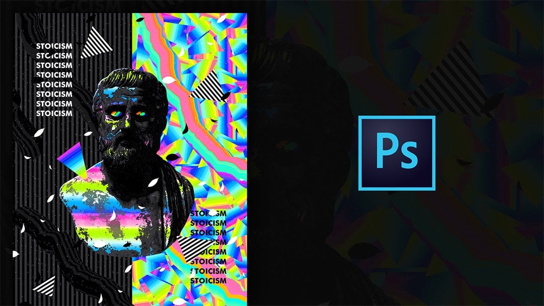
8. Composition: Okay, So now I'm going to open the landscapes to create a composition, like a date on this example that I showed you before. So for that, I'm just going to go to file open and go to the folder where I have the landscapes. So I have this folder, Where have all these college artery sources? And I'm going to open the folder where I have the so landscape images. Yeah, I'll go with these ones that I downloaded from the web sites that I mentioned before. This one in particular from deviant art. Say, I'm going to open a few of them. Yeah, maybe I don't use them all, but I just open all of them Vietnam going to start copying and pasting them to the artwork that we are creating. Okay, so now that I pasted them, I'm going to put some of them on top of this, mainly, and some of them below that mainly, er so here are all three layers that I paste it. I scaled this one. So first of all, let's of like them old. I'm going to drag them up to remove them from this glitch group. Okay, so I think I'm going to use this one in front of the image, so I will click control T, and I'm going to scale this. And, uh, yeah, I make sure to check this option right here. So we keep the ratio. If you don't have that checked, you need to hold shift. So, yeah, I'm just trying to position it right here. So it feels the weight of the document. And now there are also these other landscapes. Desserts are images that I need to use. And now I have to put it below the main image, which is this one? Yeah, Let's and check the one below where I applied the hue saturation and let's drag it down. Gabs against C. Now we can see it in the background, as do the same thing with this other landscape Dessert. I'm going to increase the size and again, but it below the main image Yes, something else that you can do is to flip the image so you can go to add it, transform and flay parties on took. Yeah, if you like this position more so now that's reposition the landscape below on the next step would be to work with the colors of them. First of all, let's organize our layers. Has you can see I don't we name them, but yeah, let's just click on the layer below, hold shift and click on the layer above their older layers that were not using So holding shift and clicking on this group, I can't so and now we have just the glitch, the main now layer on the landscapes here. So, as I said now, I'm going to work with color adjustments so I will start with this one that we can see more . So let's go to the adjustment layers. Goto brightness and contrast. Andi. We want the adjustments to be applied on the layer below. So we go to layer, create clipping mask and let's play around with the adjustments. And now I'm going to apply the curves. So similar effects, like I did on the face off this image, I'm just trying to make it colorful. Okay, so again, there is not a formula for the curves. I just tried to play around with it and create these wavy shapes, so we get this kind of result, the the colorful texture. Now let's add post of the hue saturation on top. And as always, we need to make sure that we are clicking on this clipping mask option. Okay, Now I want to apply the same effects to the other images to the desert images. So I'm going to click on this old shift click on the layer buck, and I'm going to hold old key to drag them down. And they need to be above one of the landscapes. Say, this way it effects everything that is below. So to fix that, we can go to layer creates clipping mask. We need to be sure that we have selected three adjustment layers. So great clipping mask. And now it is applied only to this layer. If you want, you can make more adjustments so you can click on it. And, yeah, you can change something if you don't like certain color. Okay, let's go to the hue saturation. Yeah, I'm going to do the same thing for the other desert image. I'm going to select these adjustments. Put them below by holding old key on, go to layer, create clipping mask. Now, I will just double click on the hue saturation and change that you Okay, so now is going to see. It looks like a total mess. There are so many colors, and it's difficult to see where one him it starts and where the other on. So because of that, I want to create some contrast. And to do that I will just great a new layer on top of each landscape. Onda As always, I'll go to layer, create clipping mask. Now let's go to the brush tool going to increase the size decreased the hardness. Andi Yeah, that's increasing a little bit more. Andi, I'm going to change the color to Black and I'm going to apply these. Okay? Now I'm going to use the race tool because I want to keep the just A Z. They are that's decreased. The hardness increase a little bit size. Okay, I'm going to decrease the capacity a little bit. Now let's create a new layer gun goto layer, create clipping mask, and I'm going to pick another color like a light pink color. Let's go to the brush tool again, and I'm applying the color on the edges. And now from normal, let's put it on screen mode. You're gonna also play around with the other of blending modes, but I think screen mold works better. Maybe I can decrease this a little bit more. Okay, so, yeah, I'm going to do the same thing with two other desert images, so I'm going to speed this up now. Okay, so now that I did the same thing on both other images, one final thing that you can do is to apply the oil paint on any of the images. If you don't like this kind of pixelated textures. So, for example, we can go to this image right here and go to filter style eyes, go to oil paint, and yeah, you can see that it looks much better now going to click. OK, and I'm going to do the same thing with two other images. Okay, so now we're going to move on to working with the other elements, like background stars and all the small elements to make this more dynamic. So see, on the next video
9. Dynamic Elements: case. Now we're going to add some final elements, and I opened older. Resource is here. So first of all, some clouds, images, and then these leaves, stars and butterflies on this cloud. I don't know if I will use this, but yeah, and by the way, if you have any problems, finding the right resource is just send me a message on Instagram and I'll provide you with the images that I have. So let's copy this one control seat on Let's go to the pastor project and I'm going to pay state control V. I'm going to put it below all the elements. So yeah, right here. Controlled t on. I will see how I can adjust it. Okay, so now we need to adjust with the other elements, meaning that I have to change the colors so I can go to the adjustment layers options right here. And let's start with the hue saturation layer. Create clipping mask. Andi, I will just increase the saturation. And now I can play around with you. Andi, I will just try to find the color that matches the artwork that I'm creating. Okay, I think that's OK. You can play around more with this. For example, you cannot the glitchy effect. Or maybe we can try the curves on bond. Yeah, I got these crazy effects, but I want to keep it simple for now. So let's see what other elements we need to add. Yeah, I think we can continue with the butterflies. So, um yeah, let's use the lasso tool to select it. Okay. Controlled seat. I will go to pastor on dime, going to paste it on top of the other layers. Control be Andi. I'm going to put one here. I'm going to make it a little bit smaller on again. I'm going to apply some adjustment layers like you separation old control g again. Which is a shortcut for clipping mask. Andi. Yeah. I'm just trying to adjust the colors. Something that I can do is actually invert the image. Cell can go to adjustments again and invert. Okay, that obviously inverts the colors. Okay, I'm going to make a copy of this. I'm going to select them all. Let's put them on a group on. Let's hold old key to drag it up and create a copy. And now I'm going to transform and sleep, Ari Santo. Yeah, This way. I'm going to put it right here. I think to make it smaller. Andi. Yeah, I think it looks nice. Now let's Ah, use the other elements. Like these leaves. I'm going to use the lesser tool again to select them. Control seat on control Be I'm going to paste them on top control T to transform them. Andi, I just want to create this kind of dynamic, uh, elements and course I can click control you to change the separation, to match it with a color. Something the artwork. Okay, I'm going to make some copies of it and put it on different positions. Okay, so I just put them on random areas of the artwork. And now I'm going to use that picture of stars going to cop it. So at it, Copy. And now I'm going to paste it on top control. T may be rotated so it matches the size of our artwork, Andi. And now I just need to change the blending mode to maybe something like screen are colored dodge on the I also need to play around with the levels because I feel like it makes the image brighter. So control al or ledges to it from the adjustments levels again, layer, create clipping mask. Now I want to increase the contrast. Okay, So you can always see less stars. And I think that looks better. Yeah, I'm going to make a copy of this by holding old key, and I can rotate it. So this way, maybe a connect a few more stars in some other areas and also make this bigger. Let's try also the screen mode. I'm going to uncheck the layer below and try the screen mode here. Okay, Maybe it looks better like that. Okay, so now we just need to make some final adjustments. So let's move on to the next video.
10. Finalizing First Poster: Okay, So before I make some final color adjustments, I feel like this image is too dark compared to the background. I mean, it has these shadows, so I want to blend it more with the environment. So to do that, I want to at some highlights at the edges like I did with the desert images. So I will go to the layer where I have the image, which is, uh, yeah, it's this combination of bleacher facts with this layer. So I'm going to make that that's one layer by putting them on the group on. Let's make a copy of it and I'm going to merge groups and now I have it as one layer. Yeah, let's in. Check the group below. I will create a new layer old control G to create the clipping mask on Let's go to the brush tool and that will just, uh, put these highlights had the edges. Depending on the colors that you have on the environment, you can choose the color of the background for me. I have this kind of pink colored this why I'm choosing that color for the brush can. I'm going to put that on screen mold Onda. Now I'm going to use the race tool toe, Erase some of it. Yeah, I just want to have some really small changes. Just small adjustments for the colors. Yeah, you can see that. It feels much better with a background. So now I'm going to create a new layer on top. Andi, I can use the brush tool again. Change the size a little bit. I just had some more highlights on top. Let's put it on screen mode on again. I'm going to delete some part of it. So I just want to make it as a light coming in. And I'm going to decrease the opacity, maybe. Okay. Yeah, I think it looks nice. So now I'm just going to work with the color adjustments. So let's start with brightness and contrast, Okay? Now, with color balance. So the color balance is really important in this case, Especially when you work with too many colors because it kind of blends everything together , and yeah, As you can see, everything looks more landed now and now you can just play around with the huge separation . This is the hardest decision. Every time that I work with these colors because I feel like all the combinations look nice . So, yeah, usually I end up using the same color palette, but yeah, let's just keep it like that. So I think that's it for this poster. We can just save it as, ah j pack. Okay. And now I'm going to move on to work on the second posture, So see on the video.
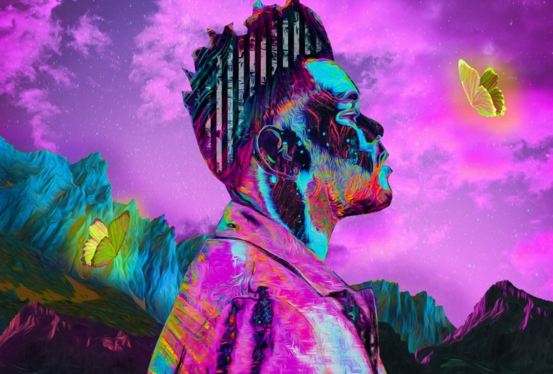
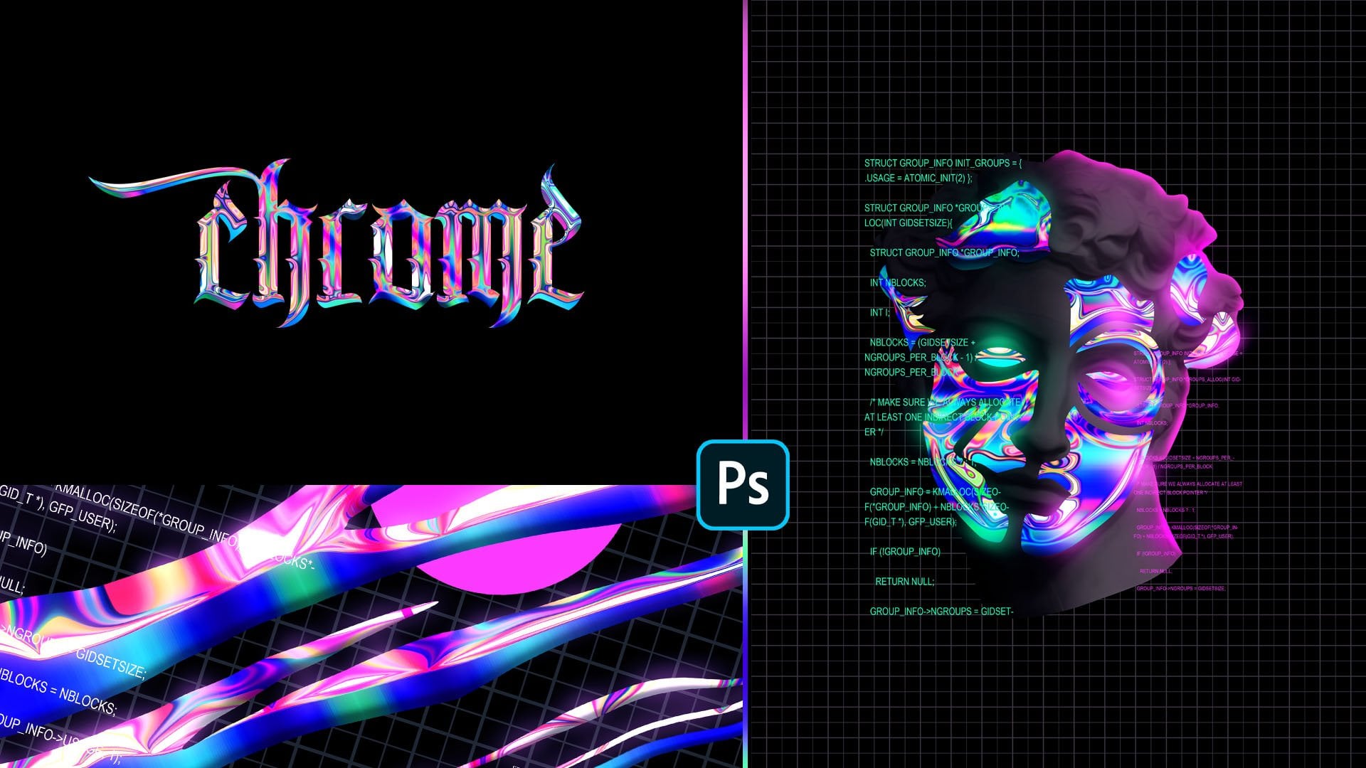
11. Starting the Second Poster: Okay, so now I'm going to work on second poster. I'm going to try to create something similar to this. In this case, I've used a picture of the weekend, and I didn't want to use the same picture because I'm not sure about the copyright and stuff like that. So this is why I tried to find a similar picture for this case, but, yeah, we'll use the same techniques that I used in this one, so you can try it in different pictures on before I keep working on this. Just wanted to say that if you have enjoyed this course so far out, appreciate a review. So, yeah. Now I'm going to work on this one. And the 1st 2 stops is to just remove the background on DA playing around with the adjustments like curves, brightness and contrast and hue saturation like a date on the first posture in this case, because it is the same process. I'm going to speed that up on DA show You. The other stops later. Okay, So this is the results that we get after I apply the adjustment layers. First of all, I just remove the background using the pen tool Onda. Then I started to apply the adjustment layers that curves hue, saturation and brightness and contrast. Andi. Then I just put this as one layer and applied the oil paint to remove those pixelated areas , and now we will start adding the patterns, so see in the next video.
12. Applying Patterns: Okay. First, I'm going to open the patterns that I have. We created them on the previous videos. Andi? Uh, yeah, As you can see right here I cut the hand part because I want to replace that with the pattern, but we will get there. First of all, I want to start with a face shapes. So as you can see, I try to divide the face in different colors like the green wand, the purple one on day. Ah, orange colors. So let's go to select color range on. I will try to select the green color. So I just picked the color from here. You can play around with. The fuzziness is always going to click. OK, control C control shift V to paste in place. And yet we have this new layer. Now, Andi, on this one, maybe we can apply one of the patterns. But before I do that, let's just keep selecting the shapes. So select color range. Now the pink color. I'll click. OK, control C control ship feet. Yeah. Okay, let's move on to the other areas. Okay. Now we have four different colors for the face on. We have also this jacket, and I didn't picked it. Uh, randomly. I wanted to get a person wearing this jacket, because this way I can do these kind of selections and apply different textures. Aarggh radiance on each of those shapes. So now I'm going to select the's shapes and create a new layer for each of them. So I will start from this side, and, as always, I'm going to use pen tool. Okay to see that we have selected it. I'm going to inverted by clicking control. Liar. You can just go to image adjustment and invert Andi. Now I will pick the other areas of the jacket and, uh, all the ones that I copy and paste I'm going to invert. Just so just so I know which one I have selected. Okay, so now I just competent pasted old shapes. Andi, they are all here. I'm going to put them in a group and you have to make sure that you have put them on the right order. For example, we have this area on the right side and let's say we selected by clicking control or command. If you're in American, let's go to the greater just going to apply radiant on. Duh. Yeah, If I put it below this other area, it will look like that because of the selections that I did. So just make sure that you put them on the right order by thinking of the layers as papers that are on top of each other and you can see just the one that is on top. So, yeah, I just wanted to say that so you can have it in mind. Okay, So going to undo that Grady in because we're going to work on that later. Okay, so now we're going to work with these four layers on top, going to uncheck the inverted shapes, and let's start working with them one by one. So first of all, we have these green selection. I'm going to get one of the textures patterns that we created. Let's go with this one with numbers. I'm going to cop it. Andi control v old control G to paste it below. Andi. Yeah, Let's see how it looks. Okay. Now, let's go with this other one with a pink color. I'm going to create a new layer on. Let's go to the great and tool. I'm going to pick a radiant and I'm going to apply by holding shift too. Great a straight line. I'm going to you Stop clipping mask now, so this weight is applied to the shape below. Andi, I think I'm going to do the same thing with this light, uh, orange color of the greater new layer. Andi, let's go to the great and tool applied by holding shift hand. That's go to lay your great clipping mask. No, we have this other shape on. I think before I decide what to do with this, I'm going to bring back this main image on. I'm going to apply a hue saturation adjustment to it now. Go to layer. Create clipping mask on. I'm going to decrease the saturation. Also decrease the lightness. Okay, now let's see what we can do with this. I'm going to just play around with the hue so I can take the Houston aeration adjustment. Goto layer, create clipping mask. Andi increased the saturation and play around with the hue to find the color that matches what I want to do. And I feel like I can select one more color, so I will zoom in and select this light pink color. I'm going to click. OK, control, See Control shift V and I'm going to drag that up. Okay, Now I'm going to apply the Houston aeration again, and, uh, going to zoom out control you on. Let's see what we can do with that. Okay? I think I'm going to apply a hue. Saturation just meant old control. G. Onda. Uh, yeah, that's just decide what do with the colors. Okay, I will go with that color going to zoom out on. Duh. Yeah. Now we need to work with shapes on the jackets and see in the next video.
13. Applying Patterns 2: Okay, now, first of all, I'm going to put all these elements in a group, so yeah, we can see a difference now on. Duh. The next thing that I need to do is work with the shapes of the jacket. So here are all the layers. So we have them all separated from each other and each of them I'm going toe apply something different. So I'm going to zoom in and I'm going to start with this one, I guess on the edges, I'm just going to make it darker. So let's go to Hue. Saturation on old control G going to decrease separation and decrease the lightness on something that I need to do is actually put this group where I have the elements of the jacket on top of the elements where I put the great aunts. So yet Now, uh, we don't see the great ends. On top of these black and white shapes are all the jacket shapes. So going to increase the lightness a little bit, Onda, uh, now we can move on to the next shape on this one, going to see maybe I can apply that this pattern. So I'm going to cop it on. I'm going to paste it. Old control G control T to transform it. Okay, now the same thing for the other shapes right here. I'm thinking to apply. Maybe the checkered pattern. Yeah, it's up to you. Just try to make thes pattern combinations going to paste it old control g again control t to transform it, and I will adjust it to the shape of it. Okay. And as you can see, the kind of blend to each other. So, uh, I'm going to add another adjustment layer on top layer, great clipping mask. And I'm going to decrease the lightness just so we can have more contrast on. And now I'm going to move on to the next shape. Yeah, which is this one on for that? I will create a new layer, Old control G. And I'm just going to apply the radiant Que Onda. Yeah. Let's move on to the next shape for that, I'm going to apply the stripes. I'm going to cop it. Control seat control V and I'm going to rotate it by holding shift. Now go to layer, create clipping mask and let's see how it looks like we can do the same thing for the shapes that are left. First of all, I'm going to apply the same pattern on this one. The checkered pattern. I'm going to drag him, put it below old control G. Yeah, And I also have to use the same hue, saturation adjustment, old control G. And we have a few more shapes left. Yeah. Where? This one I'm going to apply radiant. In this case, I think I have to separate this into shape. So I'm going to zoom in Andi? Yeah, less. Just do the separation going to select It makes election click. OK, control C control ship V to paste in place. Andi, I'm going to get the adjustment from the top layer going to drag it down by holding old key . Okay, all control G. And now we have the final shape on for that. I'm going to use this cell liquids pattern. Yeah, this one. I'm going to drag it down by holding cold key again. Okay, Old control G, we can play around with the position of it. Andi. Yeah, I think now maybe you can make some other adjustments. For example, let's put the Houston aeration adjustment. Old control G. I can colorize. It creates a saturation decreased lightness on. You can pick a color. Yeah, maybe this want just to have some more contrast. I'm going to do the same thing on the other pattern on the other side. Yeah. All control, G. Andi. Yeah, of course. You can have more elements on it. You can draw on top of it. But that's the basic idea. Just replace each shape with something different, Like a pattern or ingredient. Okay, so now I'm going to make some adjustments on the face. So it is more recognisable, so see in the next video.
14. Adding Shadow: Okay, so now you can see that the face is kind of difficult to recognize. There are too many shapes. So to make that easier, I'm going to create a new earlier and put it on top. Let's close the groups. Andi. I'm going to uncheck this group with the radiance first, and I'm going to trace the lips shape. Maybe we can also check the other elements. Just keep the original image so we can see better the shape. And I'm going to use the pen tool again. Let's make selection click, OK? And I'm going to apply the black color. Okay, lets de select. I'm going to create a new layer and do the same thing on the bottom lip. Okay, Now I'm going to zoom out on bond before I bring back the great aunts. I'm going to create a new layer, and I want to apply some Grady INTs on the sunglasses. So let's do the selections. In this case, I'm going to apply a great and so let's go to the great and tool. And, uh, yeah, just apply great in that like, and I'm going to do the same thing on the other side So let's create a new layer. Okay, lets to select. And now I'm going to bring back all the adjustments that I did. So yeah, here are the adjustments. Now I can play around with the pass it off the lips, for example. We can decrease the opacity a little bit. Andi, I think I need to do the same thing with the frame off the glasses like I did with the lips . So I'm going to create a new layer and select the shape of the frames. Okay, I'm going to make selection again on DA. For now. Let's just apply a great and I'm going to change that later. But I just want to have a shape. So now let's select and I'm going to put that on the layer below, going to select it on That's in. Check the original image layer, and now I'm going to select the shape of the had so by clicking control or command and click on the layer. Andi, I did that because I want to delete this area right here. That is outside off the face. So I'm going to right click select Inverse. I went to this tanker market tool, select inverse and just click delete on the keyboard. Now it is better. So, yeah, let's just make this black like they can control you on decreasing the lightness and let's zoom out. Okay, Maybe I can just decrease the capacity a little bit, so it looks more natural. We can know. So see the texture off the sunglasses. Andi Yeah, we have to bring back the layer where we applied the the adjustment layers. Yeah, I guess maybe I can just make a few other adjustments right here, but that's the basic idea of it, and I'm going to make another copy of it later. So let's use the pen tool going to apply the black color. That's Ah de select Andi. I want to make these black and white, so I'm going to make a copy of the sunglasses shaped. Let's make a copy of it. And let's put it from normal to color on. Let's increase the capacity, Andi, and now we can see that it looks like a great color. So, yeah, let's put everything on a group now on. The next step would be to work with a background and at some glow effect, So see in the next video
15. Adding Background: Okay, So now, as I said, we're going to work with a background. And as you can see from this example, I've used a really simple background on. The reason behind that is because I have added a lot off details inside the image inside the portrait image. So we need to focus more on the details inside. So for that we need to keep a simple background. So I will create a new layer and put it below all the elements. Yeah, right here on and let's go to the colors. I'm going to choose up dark purple color, I think. And of course, we can change it later if we don't like it. So that's just applied on. Let's zoom in to see better all the shapes. Andi Yeah, At this point, we just need to add some glow effect, so I will create a new layer on top of the background. Let's pick lighter pink, purple. Let's go to the brush tool and I'm going to make the hardness euro percent, and I'm going to increase the size. So yeah, I just want to add these kind of, uh, glowing effects. Okay, let's choose the race tool to remove it a little bit on the edges. So yeah, this is a matter of just creating gun. Nice balance. Eso just trying to do that by adding some glow so we can bland the image more with, ah, with a background. Now to make this easier, I'm going to do something now. So going to uncheck all the layers below and leave a transparent background. Andi, I'm going to copy, select everything and go to edit. Copy emerged. Andi at it paced. Now we have this as one layer. So let's put everything else in a group on on. Check it. So this way it will be easier. We just have the images Ah J. Paige and the background. So I will create a new layer on top of the main image Old control G on and I just as some glow on the edges going to decrease the brush. Yeah, let's put this on screen mode again. Is just adding the brush tool and erasing it had some areas. So now I'm going to create a new layer on top on just sad the glow fact again, and I'm going to change it to overlay or screen yet. Just, uh, you can see that. This way it blends more with the background week us because we get the same colors. Okay, let's decrease the opacity on. Now. I'm going to create a new layer, and ah, applied just on the sunglasses. Yeah, right here. And I'm going to make it on screen mold. You are light on. You can play around with these. They're similar. So yeah, I guess that's it for the background. I'm not going to play around more with it. Maybe I can just decrease the capacity right here. Okay. And, uh, now, I'm just going to finalize this. So see on the next video.
16. Finalizing Second Poster: Okay. So before I worked with the color adjustments, I just thought about using again this picture of stars. So I'm going to cop it and, uh, going to paste it. That's rotated site matches the size of our artwork. Onda. I'm going to put it from normal to color. Dodge. Andi? Yeah, I think it looks much better with it. Say, I'm going to keep that. Maybe you can try and see how it looks in the artwork that you did. So, yeah. Now let's just work with the color adjustments, brightness and contrast the color balance, which is the most important adjustment in this case. So I just play around with it too. See what looks better based on the colors that you have. Okay, now we have the hue saturation that stride, and yet again, we have some really cool combinations. But yeah, maybe I could go with this one. That is more purple, so Yeah, I guess that's it for this posturing. That's it for this class. I hope you have enjoyed it and learn something new that you can try on your projects again . This is more like experimental style, so it is kind of difficult to explain everything. Step by step. I'm just trying to share the tools that I use with you. And, uh, you can try it with your own images are tried with something else to come up with something new. So yeah, again. I hope you found this helpful. A said I would appreciate a review if you enjoy this. And of course, I would love to see your projects. You can share them under the project sections and make sure to add your instagram name so I can re share them and tag you. And yet thank you for watching. And I'll see on the next class. Bye.
17. Bonus: Speed Process 1: way.
18. Bonus: Speed Process 2: I want you here. We can t o reason together. Wait, wait, wait. Way.
 Klarens Malluta, Visual Artist