Transcripts
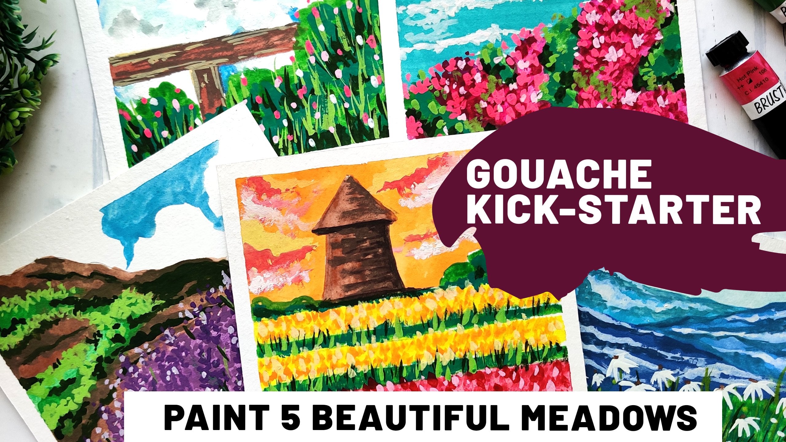
1. Life is a Beach!: Hey everyone, thank you for joining me for yet another gosh class here on skin share. Amrita. I'm an artist from India and this is my second class. And cosh, The first one was more of a Kickstarter where we covered all the basics about this media, comparison with watercolors and academics, etcetera. But this one is all about being been beautiful cityscapes in guage and only that little bit of sunshine right now, right? So we're going to cover the medium in detail. So even if you're a beginner who is never tried wash before, you're welcome to join in the habit of freshman section in this class where we cover all the basics between basic differences between watercolors and the water be squashed. So this class is all about water we squash. And it's if a marriage between what, ls and acrylics, because it's as beautiful as watercolors. And you ask for giving exact list. So it's a great WAS that I needed for you to try out, even if you're a beginner. And I hope you will enjoy painting these projects and this minimise vacation with me. So let's get started.
2. Materials Needed: So for the materials of this class, you'll need water-based squash. You can also go for post two colors. They just slightly lower in quality in the sense that the additives that get added to the colors and the pigments, etcetera, are not as good as they are when it comes to the artist grade or professional grade course. So I'm mostly using the plus rho gorge. But you can go for any brand of post two colors or wash, just make sure that you have one good tubal white cosh, which is usually available as a standalone piece. And most of the brands, it's one of the most used colors when it comes to girls. So I always talk it up, but that's about it for brushes go for any synthetic brush. You wouldn't really need the natural head rushes that we use for watercolors because we don't want as much water when it comes to worse. So synthetic pressures work better. Believe the pencil for some very basic sketching that we're going to do. And papers, I am using the mixed media papers, but you can go for any watercolor paper is with something with not a lot of 2p and masking tape. So coming back to quash, I recommend trying out different brands. You can also go ahead and post a colours like I mentioned earlier. Maybe just go for a good quality white course. Because even if your colors are streaky when you're using beginner, Great supplies for gosh, adding a bit of white can help a lot in making them non streaky are smoother. So just invest in a good white washed you and that should help you a lot. And that's it. So just try out different papers as well, which are not as toothy because you really don't want the layers of guage piling up on, say, a textured paper which can lead it to crack. But that's it. See you in the next section.
3. Gouache Techniques Refresher: And here's a quick refresher on the differences between watercolors and water-based cosh. So I do cover this a lot of detail in the first class, which is the quash Kickstarter. But I just wanted to do a quick recap so that anyone who's just joining in a still has the basic idea about all the differences that are there between these two mediums. So in case of water-based squash, in addition to the pigment binder and a few of the basic things, there are a few additives that give it that Matt, chalky texture. Watercolors are much more translucent to most of the watercolors are. There may be a few PQ colors, but most of them would be a kind of transparent, too translucent. And even in their milestone, you'd see that one say dry, they are not really uptake. But when it comes to quash and when, when we use it at the right consistency, which is like a primi consistency, not really what watercolors, you'll see that the dry much more peak much of it in a map kind of texture and the dry faster. So as compared to what the colors wash dries much faster. It helps in a way when you are doing illustrations, you're doing layers next to each other. So since this dries faster, it is easier to work with. But like I said, it's because of the way these mediums are composed. Matt texture that the Bush gets when drying is because of the additives that are there. The titanium oxide or zinc oxide that gets added to the beads gives it that texture. Now, the next one that I wanted to discuss about the technique that I wanted to share was about the blending part. Now in case of watercolors, blending happens quite naturally. So if you keep two watercolors in their normal watery format next to each other, they will blend on their own so you really don't need to help them. They are quite friendly in that sense. But gosh does not do the same thing. So in case of goulash, you'll need to put in that little extra effort to get them to be friends with each other. So here you can see that in case of watercolors, that blue has started spreading onto the red side and it is just blending on its own. I really didn't have to put in much effort you, but in case of garage can be used it at that creamy consistency. You'll see that if I put this similar color next to this red, you can see that it is not going to blend in when it is at this consistency, the creamy consistency that cautious at that they don't blend it, blend with each other. So you'll have to take in a little bit of effort and blend them in. But it works for you in the sense that when you have adjacent layers to color, and you really don't want the colors to bleed into each other like the width watercolor does. It is helpful in this context also, gosh, dries faster. So working on layers that are close to each other is much easier when it comes to Bush. And then again, we have to discuss about the way we paint these two mediums. So in case of watercolors, you always have to go from light to dark. So you have to kind of plan it out. And you cannot just leave glider parts per liter. Like for example, in this case, if you want to be in these clouds are these waves, you have to actually either mask them or paint around them. You cannot just be in this white on top of the blue when it isn't watercolors, but with quash, it really doesn't matter. You can easily paint a darker, lighter color on top of a darker color. It's just that we tried to keep the Beasley is thinner so that we don't end up picking pigment up when we begin the next later on. So in this case, like I have this red piece over here and I'm going to just being some things with white on it. And you can see that it's quite to peak. And you can actually see that white pop up on the red is when. So this is possible because of the way the beam disc warm. So you can choose any color to go first. Another thing that we have to keep in mind is squash usually dries darker, whereas watercolor dries much lighter. So you can see here that washes cried much darker. And it's got Achmat texture as compared to watercolors. And that's, it's, I tried to cover most of the basics. The differences and the properties wash in this one. So I hope this served as a quick refresher. In the next one, we will see the color palette that we're going to use for the projects.
4. Color Palette: Now let's discuss a bit about the color palette. Now you could be using any brand, of course it really doesn't matter. I just wanted to share this section so that you know what kind of colors I have used. And you can see that it's mainly all about blues and deals and greens. So Altis share the major colors that we've used in all the projects. So this being julian, It's very vibrant one, the one that I'm using from construe. You could also go for a muted spirulina if that's something you like, try to keep these cityscapes very vibrant. So that's the reason I choose the colors like these. So most of the sea and the sky part is done using Silurian and t. So in this project, for example, are these, like all of them have a mix of Cerulean and t. Some of them have just ruling as well. So it's mainly a mix-and-match of these two colors for the sea and the sky is with. Now for the vegetation, I have used mainly three greens. A very light lemon yellow, Sap green, kind of slightly darker than lemon yellow. And the olive green, which is kind of the doctest. Now, if you don't have any of these shapes, you can just mix and match some yellow or black to the green to get a similar shape. But for most of the projects where we have vegetation, I've just used these three colors for all the layers that we need. So for the highlights, I'm using the light green and for all the shadows of used the darkest run. And since we earn shadows, I'll mainly be using black for all these cliff, rocky surfaces, along with a hint of grey, they can just makes a bit of light very little right into the black to get some nice shades of gray. And that's it. These are all the major colors that we're going to use for our projects. There may be a few of the colours like a yellow ochre for the beach or a little bit of red here. And therefore, this, these details on the boat and there's this small flower patch where I've used a bit of red as well. But apart from these, the only major color that you'll need is white. We need loads of white for all the waves and highlights, etc.. But this is more or less the color palette for all the projects. So you can just match this up with whichever brand you're using, or crisis mix them up using the colors you have.
5. Project 1 : Warmup: Starting with our first project, it's going to be a very simple warm-up kind of project cell. Have a very simple beach view with a few sticks in the foreground. So that's my horizon. And, and have the sticks over here just placing them because we're going to paint over them as it is. But just to give an idea of what is going to be the composition, starting with this guy, I'm going to use a slightly lighter warships Cerulean. So this is not going to be as thick or creamy consistency as the rest of our painting. Because this is going to be the B's layer for the sky, we'd be painting the clouds on top of it. So if you paint a very thick layer, right now, you'll be picking up this blue when you pin the cloud. So that's the reason that this is a slightly thinner or what layer. And I'm going to leave it at that and let it dry a bit because that was a lot of water for the first layer. So once that is done, once that is dr. We start with the C part. Now this is the consistency that I was talking about to the creamy consistency. Again, I'm using a civilian, but you can see the difference when used with water and when used at the actual gosh, consistency can see that the same color looks pretty different. So I'm just going to start with the Rousseauian towards the horizon. And then as we come towards the foreground, we'll switch to peel. So I'll just show you how to go about blending this as well. So start with T and as you can see that it is not as such blending on its own. You just use the same crash or a clean brush to blend it upwards so you can see that it caught blended well with these unruly. And that's all you have to do is you can use a clean version. You can use this. Any one of the tunes were whichever direction you want the blending to happen, and just move your brush in the same manner, the same stroke. So here I'm just giving a kind of left to right strokes mostly so that we don't have a lot of streaks. But if you're using it at a CRT consistency that the goulash is supposed to be used at. You'll see that there's not much of streaking happening as such. Also, like I said, you can add a little bit of white if you feel that there are some streets happening because of the pigment or because of the color that you're using. So simply use a little bit of white and that should fix it. But for the blending part, you can use this technique. You can use either a clean brush or a lighter brush to blend it in. Now starting with the sticks in the foreground. So I am using a nice query for the base layer. Now the ones that I drew at first have banished two. I'm just redoing them. So this is going to be the B's layer. On top of this, I'm going to add a black and white for the highlight, et cetera. But this is going to be the Lighter or just dislike what we did for the sky. The Firstly the lighter layer. Now, for the mixed layer onwards, like this black that I'm using, it's slightly more thicker or premier inconsistency. So I'm just going to be dropping it on top and then blending it with a clean brush. So here we are mainly trying to create some textures, shadows with this black. And now I'll use this almost dry brush to just blend it in with that CRE. So we have this rotten would kind of texture here. Now we'd start with the sky. I'm using white quash, very thick consistency, minimum water, and just having it end like this. So I really didn't want to move the brush a lot, so simply dabbing it then to give that clouds affect. So use a thick consistency and see if, if in case the first layer was thicker as well. And if you're picking up some pigment, tried to not tap the brush too much and keep cleaning it in between, so that might help. But overall, if the first layer is not that thick, you should be able to layer it up like this in subsequently as without picking up much pigment. But gosh, has, as its property does get reactivated. So if you're going to put some water on top of the C part that we've painted right now. You'll see that the pigments in both leaders get reactivated. So you have to take a little bit of care about that. But overall, it's much easier, medium to work with to be honest. So you can just clear it up like this, correct your mistakes and everything is forgiven. So here we are done with the clouds. Now since we have picked up white on the brush, I'm going to fix the waves and a little bit of highlight here and there as we go. So just adding some simple waves on the sea. And at the base, just near the stakes, we're going to have a splash of waves. So again, if this were in watercolors, you'd have to mask this area or, you know, paint around it. Since this is gore, she can even do we just painted the whole c part at the base. You can still just paint the waves on top of it. And that's the beauty of this medium. The kind of layers that you can get and the kind of colors you can go to. Also, if you notice in the background, the C that we painted has tried and it's much darker than what it was when we were just painting it. So just keep this in mind so. A good thing to do about this would be to swats your colors. And that's something which we already do when it comes to watercolors or acrylics as well. So when you sort your colors and you use the paper that you're going to use for your projects, you'll get to know exactly how the dry. So they may look entirely different in your palate. They may look entirely different on the label that they have. And then on the paper it looks entirely different. So now coming to these takes, what I've done is I've just picked up some pigment and clean the brush a bit using the tissue so that the brush is almost try and this is tabbing it in like this. So sort of the tribe bridge technique that we use for watercolors. So use a clean brush, tap the debited big vent a little bit, and then just almost dry it using a tissue. And you can just use it to create this kind of a texture. So even with a little bit of white, you can see that how, what kind of an opaque texture you get with just a good-quality white paint. So now I'll add the final round of shadows and do a little bit of blending using black. So I'm just creating this rotten wood texture. So we pulled it up in layers like you saw that we started with agree. We added a bit of shadows using black, then added the highlights using white, and then just finishing it up with some more details and shadows with black. So when you're kind of layering in, Gosh, you just have to keep in mind how thick your beans are. How did the previous Spinoza? So in this case, since I'm going from a lighter color to the darker color. So even if I pick up a bit of white is just going to end up becoming gray here. But you do have this chance of reactivating the previous layers. So I that's the reason I don't recommend. You're initially as to be really pick, just tune them down a bit. And finally, as can be the proper creamy consistency that we have. Just working on a few more details. Using a clean brush. So fixing a few edges and adding in a bit of shadows here and there. But that's about it we have done with this project actually. So you can see that the background has got such a beautiful blend. And that's exactly what I wanted to try out in this warm-up project. So I just wanted to cover the basics or for blending and layering with girls so that we can move on to a little bit more detailed topics in the next sections. But I do recommend trying this out just for fun. Even if you already have tried this medium, this is kind of a fun warm up exercise. So do try this out. And in the next section we'll go in for a little detailed project.
6. Project 2 : Jungle View: Onto our next project. And in this one we're going to be in a little bit of jungle and the water body attached to it with a small boat. And it's going to be a fun project. I personally would really enjoyed making this one, and I printed this before in my sketchbooks. So I really thought that this makes up for a very good postcard or landscape. So just wanted to try this out in the classes will. So with very minimal sketching, restart with painting part. So in this case I'm going to paint the water in a different way. So we will still be blending it in. So towards the upper part we have DTL because this is the area closer to the land, so it will be lighter. And I'm just placing the tail over here, not really trying to go streak free or very, very blended kinda look, I'm just pleasing the deal here. And you'll see why, because we are going to blend it in with the blue later on. So right now just trying to avoid the boat, you really can paint over the boat as well. But since I'm using a thicker consistency of pain, I don't want to put it in there so that later on it gets picked up by the subsequently. So just using thick consistency of several lid over here now and doing the same thing, we're just putting the paint in there. Kind of color blocking phase. And we'll blend it all in in a minute. So don't be worried about how the artwork looks at this point. Because in most cases, in most of the squash landscape, there will be 1 wherein we just in the color block, blocking stage and everything just looks like a big blob of color. So don't worry, it's all right. So now I'm starting to blend it. And so what I'm doing is I'm taking the peel and just dragging it towards this ruling. So you see that I end up picking a little bit of Silurian, so I'm just cleaning my brush in-between. But the idea is to drag that down with a clean brush so it's still a little moist. It's not like a completely dry brush since the cars are already drying up fast. So I've taken a moist brush, but I'm just dragging the deal from top to the Silurian part. So you can see that it starts to blend right this moment. So even though the initial arrows all streaky, now you can see that the blend is happening between the steel and the subtle Lynn part. And since the basis still a little lighter, I'd like to add a little bit more settled into the beast so. We'll do a little bit of reverse blending as well. So we will just wrap this up the tail to Silurian blend and fix any small patches that may have been left. And once that is done, we start with this rule in at the base again. So here I'm using a slightly darker or rather more augmented as routine as you can see. Also because it is being layered up, it looks much darker. So I'm blending it from the edges to inverts. And I'm just going to use these streaks and just let it blend into the deal now. So just use this quick motion from the outer part or the edges towards the inside of the painting. And at the top part where we are closer to the land, I'm adding a few batches of this grayish blue. These will be like the underlying rocks. So since the water is much shallow, shallow at this edge, these underlying rocks will show up. And that's what we're trying to paint over here. So adding lightly darker pad onto these, just using a hint of black with the same blue. Not trying to make it dark black as search because we still want to show that it's under the water. And next we start with the vegetation or the jungle part. So again, I'm using the Sap Green or the mid tone for the first layer. And not really being careful with the streaks or the kind of strokes that you're putting in here. Because we're going to layer this up again. We are going to have all the shadows with the dark green. And then we'll have the highlights with the being clean and another round of detailing with black, et cetera. So at this point, this layer need not be as smooth and again, not as thick as your subsequently As are going to be. So just adding a bit of darker green here and there, just for texture. And we're going to let this dry for a minute. In the meantime, we can start working with the board. So I leapt at white area as it is because I didn't want the thick layers that are that's the PLNs rule M to be picked up. You can very well being on top of it as when like right now, I am fixing the edges on top of the tail and the blue. Just make sure that if you are picking up the pigment or the color from the previous layer, you clean up your brush frequently and use a thicker layer of white or whichever color you're using. For the subsequent layer. So the first layer can be a little lighter and then you thicken the layer as you go. So just adding a few details on this undergoes boat. And also since I have started with a white, I'll add the waves are a little bit of splash here and there with right going to have a few waves like this hill. And in case you don't like that, you can just use a clean brush and fix it like this. I kind of started with it and I felt that it is too sharp of a wave. Moving back to the jungle now. And I'm adding the darker tones of green. So the darker green that I have, a dark olive green that I have in the boost reset. And it works really well for these queries are the vegetation that you're painting because you mainly need just these three sheets. A dark green like this one, kind of a midtone or Sap Green, and then a lighter green. So even if you don't have that light cream, you can just add a hint of yellow to your Sap Green and you'll get some water similar color or rather the other way round, add a hint of sap green to the yellow and you'll get a nice vibrant yellow green. And as for the dark green, you can just add a little bit of black or very dark blue to get a darker green like this that you can use for shadows. Now, at the base to show the shadows I am using a black. So this will kind of serve as the partition between the C and the jangled from the top. But you can see that this is mainly just the shadows a handler, since we are building a top view, you wouldn't really be able to see a lot of beach unless it is moving quite out of the genital area. So in this case I'm just printing shadow directly close to the water. And while we're at it, we'll also add a few shadows in the jungle areas. Well, because right now we've just added the olive green, the dark green for all the shadows. So you can also add a hint of black here and there just to add to the overall effect. And this is something that I cover in the first classes. Well, where did we paint the meadows? So when it comes to painting vegetation, you will have to follow these steps to get that effect of light and shadow. So you start with a midtone. You mainly color block the whole area. And then you add in a few details with the darker tone. Then add the highlights, etc. So you have to do it in the steps so that you get the desired outcome if you try to blend it all in just like what we do in watercolors. It won't really look layered the way it should in quash. So just try to be patient and try out all these layers one by one so that you get the same effect. And just wrapping up the shadows here. So this jangle is slowly starting to take shape now as compared to the blob of green that it was a while ago. So just adding that to the shadows. Time to add a few more details to the board as the Django tries. So it won't take long for the paint dry also, it depends on the various days. So the weather at your place may just influence it a bit, but usually quashed dries really fast. So you can work simultaneously on parts like this. So in this case i, as the jungle part is still a layer up or layer up and wet and just trying to finish the detailing on the boat. And now we'll start with the highlights. So I'm using this nice vibrant yellow green for the highlight part. So I'm trying to capture these top of the trees where the light is hitting them and other areas where we painted the shadows. We'll just work on a little bit more detail on them later on. For now, I just want to add in the highlights with lighter green. You can see that each subsequently trying to add more depth to this. And mostly because this is a top view. So we just creating these layer to add more depth to the overall subject. So for this highlighting part, you can use a small brush, just dab it in like this. I'm not trying to create any specific shape or motion, just dabbing the brush. Adding a few more details here with a darker green so that it doesn't become too highlighted. Just adding it at the Bs here and there to create the sense of depth. Remember that we shouldn't be loading up the layers too much because if your overall painting ends up becoming too thick, there's a chance that the Gershwin crack and that kind of becomes a problem. So we still want our leaders to be not extremely thick. So thick that they end up cracking. We still want the consistency to be somewhat similar to the end result that we get with say, acrylics for example. You really don't want it to be too piled up, too thick like those textured pains. But he still wanted to be loaded and looking with that no, finishing with that Matt texture. And that's it. We're done with this project. You can add a little bit more detail to the board if you want. I just stopped because I thought I was overdoing it. But I hope you enjoyed this project. I hope you enjoyed the layering up that we did for the jungle. Will be trying out a few other projects in which we discuss this layering in a little more detail. But for now, I hope you enjoyed this and see you in the next one.
7. Project 3 : By the rocky beach: So we start with our next project and this time we have a rocky beads. Now I'm just going to sketch the horizon over here. The sky part is not that important for this project. We're going to meet the concentrate on creating the rocky part of the beat more textured and the CMO via print. So just doing some extraordinary scattering over here. I know that I haven't included a lot of scattering in the projects for this class, but that was kind of intention. So now I'm just going to end the sketching here, just placing the tree here and get n. Now for the sky part, I'm just going to leave a little bit of white and paying the rest. I'm not really going to add a lot of detail here because like I said, the sky is not the prominent part of this painting. So just going to leave it here, not bothered about the detailing on the sky or the clouds, etcetera at this moment, we'll just add a few patches of green later on towards the end. But for now I'm just going to leave it at this. And then we start with the C. So I'm starting with a very dark blue at the sort of Prussian blue or an ultramarine To start with, instead ofs ruled in. You can also add a small amount of Black, certainly end to get discoloured as well. Just won the horizon to be much darker. And then we start with a normal Rollin. So getting that creamy texture of growth and we add in these Rollin and then we'll add the TT. So I'm just blending it on the goal, not trying to have any specific we're blending just going to add the t Next. And I'm just going to blend it in like this on the rule with t. So we'll have a smooth blend. You can pick up a little bit of color from the base layer, that's fine. Just want to create this kind of a blend here. Now towards the bees, where we are closer to the rocky part, we are going to have slightly rippled or textured kind of water. But till here for most of the top and mid part, we want kind of calm water, so not much streaks for just simple clear blending. And as we come this side, I'm trying to keep my stroke's random and circular like this. So we have the rippled water or the water in motion kind of. Effect with this, just blending into in a bit towards the right term because there were a few streets here, so I am using the tilde to blend this in. You can also use a clean brush to do this. And towards the bees will leave some space for yellow ochre. Now for the rocky part, I am starting with this light brown or burnt sienna. And this layer, as you can see, is not really thick. It is not the garage consistency, but more towards watercolors. So I'm going to just add on top of this all the texture or the tree, etc, that lead into the crater sketched in the first part. So we're going to add all that on top of this. While it's still wet. You can also add a leap but of dark brown or black mix to create some texture. We will definitely be adding on the layers later on with the shadows and highlights, et cetera. But for now, since this is still the base layer, and just going to dab in the brown like this. Like I said, just creating the base texture. And next we will start with that little plant on the right. So taking my Sap Green and painting in ten. Now we add some dark leaves on top of this and just adding some shadows on this plant. And while that cries. And we're going to add the three here on the left. So using a black to paint the stem and the branches, the crank of the tree. Now using a thin brush to create some of those hanging leaves over here. You can also use your normal round brush that has a good tip. You can use that as well. Moving on. I'm going to use a yellow ochre mixed with a little bit of light for this part. And just going to leave a little bit of white here. We'll add the wheels in a minute, but just creating the bees for the beach part. Next we add texture to drugs. For this, I'm using a bond to create this darker patch on it. You can also use sienna mixed with a little bit of black. I believe he's just trying to create a dark patch on the rocks. So in this case a darker brown because our firstly a was point Sienna. And now we've started adding the highlights. So for highlights I'm using again brown mixed with a little bit of white, just tapping it in when that Dr. restroom kind of technique and dabbling in the semi dry or cry brush with a little bit of pigment on top of it on these rocky parts of the beach. Now fixing the shadows in these areas. Now, after this, we move on to this plant on the right. I'm using the green, the yellow. Create these highlights or beliefs. Also adding a few shadows to mainly using the technique next week. And detailing to this part. It's very similar to the beaker had taken her reference. So just continuing with that. Just use a smaller brush or something good and very nice tip. And then we want the clouds. So just adding a little bit of green here, not going to do anything elaborate because the focus here is on the sea and not the cloud. So just keeping it like this and working on the weaves that hit the beach. So for the waves again, I'm just using my white growers and not really liquidy consistency. You can see that it's kind of dry. So I'm just dabbing the brush1 here to get that wave effect. And on top of this father rocks, where the water meets rocks will add a little bit more, right? So we'll just show the reefs, I think here using a slightly more pigment, it or structured white here. Now we'll add a bit of highlight planned as well, just to get some highlights. And over the rocks as well, I'm going to use sort of a dry brush to just drag the textures here like this. Not going to use a lot of pigment and white, just a very little amount of pigment and a dry brush. And for the last part, I'm just going to add some more details to this plant on the right. And that's it, we're done. So I hope you enjoyed this little project. See you in the next one.
8. Project 4 : Rocking waves: Alright, for our next project, we're going to try out another rocky beach. So in this one we'll have a nice patch of rocks over here. A bit of vegetation here similar to what we did in the Django project. And then a few more over here, smaller rocks. So in this one, the water that we're going to try out is not going to be uniform. It'll be more of a ripple effect if I can put it that way. But we'll have the waves hitting these rocks and the bit of vegetation at one end and rebuild water. So once you're done with this beautiful sketch, we could start with the color blocking stage. Now, I'm starting with the peel and it's at sort of creamy consistency. But then again, I'm not trying to keep it smooth, the base layer and just making the circles with a flat brush. So a bit of redundancy here, but still, you can use any brush to just use the circular motion to add the first layer of peel here. And I'm leaving a little, little bit of space around the rocks here so that we can add the waves. You can always add it with white on top, just adding, leaving a little bit of space, extra space for us to work with. That's it. So we will be done with this D park ones. And then we'll add so Rollin on top of this. Even if it is dry, the previous layer, if it becomes dry by this time, it's all right because we're working with course so we can easily reactivate layer as well. But specifically for this creating the c in this particular project, all we need is a little bit of blending and that I guess we can do with this rebellion anti Lazarus. So just making sure that all the teal part is covered. Next, I'm mixing a little bit of several million and I'm going to drop it in right there, like this. Again, not a very structured plan, just simply by having it in here. And if you feel that the batch of Boolean is not really going well with the bass. Just use a clean, fresh and blended in a little bit of here and there. It really doesn't matter. So you can either use steel to blend them or you can use a clean brush and just blend the Silurian and teal inside. But you can see what I'm trying to do here is to create that shallow kind of water near the shore where it hits the rocks, hits the beach, and then adding a little bit of texture to it with this little alien. Coming to the rocks now will be painting them slightly differently as compared to what we did with the previous projects. So these, for these, I'm using gray as the base layer. So on top of this I'll be adding a few details with black and white highlights with white or light agree? But to start with this particular fourth for these drugs, I'm just using a nice Cray. And same here for the batch of rock that is here. I will be using this grade and then we will be adding the vegetation part of it, which had been the layers of green. But for now just color blocking the place for the rocks. Again, right now it may be looking like just blobs of color, but it's fine. Keep working on it. It's fine to build that up in layers. So I'm just going to finish this base layer of gray for all these rocks. Now coming to the vegetation, I'm starting with the midtone. So here I'm using a nice sap green to start with. Again, not too worried about the texture here or the streaks that I'm creating because there's going to be the base layer. On top of this, we will be adding a darker green for all the shadows and another green or white for the highlights. So just covering this ways would lead with the light green. Now, while this is still crying, I'm just going to add a slightly pigmented green on top of this. You could use the same Sap Green or had a hint of blue or black to get this kind of shade. Just putting some crease in there, the top view of the grease. And next we will start with the beach itself, the rocks. So adding the shadows here with black. I guess that's enough. So next, I'm going to add the same kind of shadows to the other rocks. As always tried to use not really fully loaded kind of brush, but sort of semi dry or drivers. For all these detailing that we do. So that it gives a natural drugs show without you having to do much about it. If you take much take-up implemented pigment loaded brush, it'll be more difficult to walk with it or add the smaller details to it. So that's the reason I suggest that we have when it comes to all these details, go for assembly, dry or dry brush, and had these textures in. Now next we're going to add a bit of highlight using right? So again, I'm using my brush rather the tissue to dry up the brush a bit and then I'm just going to add these highlights onto all the rocks. So for anything that is texture can very well use the same approach. Pick up a little bit of pigment on the brush and then just dab it in a tissue. And you're good to go to create all these beautiful textures will add another round of shadows to this, just to heighten the drama over here. But before that I'm just adding the highlights onto these trees as well. So I'm using the lemon yellow, green that I have to create the highlights on this. I'm just blending it in wherever I feel that it's gone a little overboard. And just adding in more details on the shadow part. So you can use more pigment. Black. Now adding a wave part, so right where the water hits the rocks. Hi, I'm adding a little bit of splatter here so you can use a smaller brush with good add this factor to the water hitting these rocks. So we just used space, right part and just build up such as these details on top of it. The last part. So I hope you enjoyed this little project. We tried to cover a bit about the different types of rocks, vegetation as well. So see you in the next one. Really dive in a little bit more detail in creating some sunshine with a board and see.
9. Project 5 : Sunlit Boat: Starting our next project by sunshine and boards on a sunny day here in for me. So I'm fixing my horizon somewhere here. And I'll just draw a very rough sketch of the board. Again, nothing we, like I said, the sketches in this class are kind of bare minimum. But we've been good so far, I guess. So that's going to be my board. A little bit of detail over here. And a few flags. And then also a little bit of shoreline somewhere here, and some bomb leaves hanging out like this. And we'll have one query at the top, or rather the view through a tree at the top. So just placing the area here. And now we'll start with the sky. Again. This is one of the projects where the sky is not really the most important part of the picture is going to be covered with the foreground tree. So just leaving a little bit of whitespace and having a nice dark. Again, adding this darker color to the sky so that the light that we're going to capture in the foreground, in this landscape itself. It stays in-focus, so this part is slightly darker and leaving a lot of white-tailed, therefore the sky, or rather the clouds. Now starting with a C, Again, I'm using a nice dogs ruling. I am going to paint around the boat trying to match the horizon line properly over here. And again, this is going to be one of the projects where we have sort of a calm water towards the horizon and as we come closer to the foreground, the water gates or so in this case, I'm just putting this Boolean neatly over the spark. And then I'll start adding the deal. Again, blending it on the go. Okay, so we have a beach part towards foreground. So I'm going to just use sort of a dry brush technique to get the water to look somewhat like this. So then I'm leaving a lot of white in between. And just fixing this shape here, a few strobes to blend everything together and written. So for the beach itself, I'm using a little bit of yellow ochre mixed with white for the foreground part. And we're going to draw the palm leaves on top of this analogist. Fixing this part. We paint all the leaves in right on top of this. For now, just left a few white gaps here in there to show the weaves. And while that tries, we can start with the boat. So for the base layer of the board, I'm using this cre. You can go with any color for that matter. Just trying to pick up a color that will actually highlight the lightly to run. So when we add the shadows with black and highlights with white, it will actually pop up. So using this color combination. And I just realized that I left a little patch of water on top that I hadn't painted around the boat. So we fixed that with this ruling later. For now, I'm continuing with the details on the boat. So little bit of red here for the roof and also for the flag. Now, when the prize I'm starting with the palm leaves, starting with the Sap Green First. We'll add on to the darker green Lee drawn for the shadows for now, just pleasing the base layer for each leaf. Another one on the left side. So now if you look closely, we can start to see the kind of light effect that we wanted in, wanted to capture in this painting, shaping up slowly. Now, as you start adding the shadows, you'll see that it starts making much more sense. Now for the created top, I'm just using this brush and painting this leaf like structure. So here again, we'll do it in three different layers. Starting with this midtone of Sap Green. Then we'll add darker green for all the shadows. And then top it up with a light yellow, lemon yellow, green for the highlight. So we're going to follow the same process, just that here we are actually beating the leaves instead of just dabbing the brush and creating some random strokes like what we did for the vegetation in the previous projects. So here just painting these leaves with the brush itself. Now using dark black to add the details to the boat, the shadows. At the base, you will add a slightly darker color like this to show that there are shadows on the spot. And I'll just fix that glue that we left earlier while painting. So just going to fix that part. And you can see that it is easier to fix these things in. Gosh, I just spent it on top of it and used a little bit of clean brush to blend it around in a watercolor. This would have resulted in hard edges. So you just have to be careful about what patches you're leaving for later. In Gosh, it's easier, you know, like I said, it's a more forgiving medium. So you can just correct your mistakes are color out any area that it left out earlier, easily like this. So I have started with the next layer for the foreground tree. So using the darker green now. And again, painting leaves on top of the previous layer. I really liked this view. Beeping through these queries on Google, this board with sunlight all round. It just felt so nice and vibrant. I just had to try it out. And now adding the darker green onto these palm leaves as well, that they're in the foreground. So just the same strokes but adding them at slightly different angles so that the standout. Now starting with the highlights for the boat. So again, using semi tribe who brush with a hint of white to give this dry texture onto this. Also, since we started with a twilight as just being the waves over here, damning it in. I think I'm going a little overboard with the waves, but let's see, we can always fix this as well. So for now I'm just adding them Hill. Next, we'll add the shadow of the board towards the left. Again, a very important thing to show the light. So as soon as you add the shadow, you can see that it gives the effect of light falling from the right side. So it's really important to capture this little bead deal. It absolutely adds to the overall composition. And like I said, I just didn't like the way parties who I've just blend it in with a clean brush. I could do a complete class with how to correct mistakes in Gosh, I feel because I keep changing things when it comes to girls. But I feel that since the medium offers so much, you can definitely make use of it. And I feel that being able to correct these mistakes itself is a great thing when it comes to wash. So this fixing the waves here and adding a little bit of in this case so that we show that the water is reaching up to this point. Now we have one final round of detailing left. So I'm using this nice vibrant yellow to add to the boat. And the flag over here. And adding the same yellow to green to get this very nice. Light green. I also added a bit of white to it to make it more opaque. And I'm going to add that too. The foreground tree does adding set of leaves with this color on top of all the other leaves that we've drawn. For the sky here. I'm not too worried about it, just used a very light gray washed to add to these clouds. But like I said, that's not really the most prominent part of this particular postcard. So it's just there in the background. So I'm not going to do much about it. Just that for the clouds, since this is giving kind of a very sharp edge, I'll use the whitewash and just soften the edges a little bit so that it looks like a nice fluffy cloud. And one final round of editing for the reasons I feel just adding a little bit more detail towards this part. I just feel that it is too white right now. Maybe I could have left it like that but just wanted to fix this a little bit. So that's it. That's a sunny beach with a boat. And I feel this is one of the more beautiful projects that we have out of the six projects, I really find this one to be vibrant and full of sunshine. So that's it. So I'll see you in the next one where we paint a little flower bed and a couple of cliffs. And the beautiful view and Gosh.
10. Project 6: Cliffs and Flowers: Onto our last project. And in this one we're going to paint a very beautiful view. So we'll have a few mountains in the background here. And clipped here with beautiful flower bed and the foreground. So we'll paint a nice patch of flowers in the foreground. And then we'll have another cliff over here. So this is kind of the most catching we've done in this class of art from the board one. So let's get started with the c. So for this one, I'm not gonna use any pill. I'm just going to use through Lynn and create a uniform, come kind of see in this one. So not trying to rush this, not trying to make it streaky, just covering up the c part completely insulin and avoiding the cliffs. So since we are going to be in them later, leaving a little bit off white speeds between the cliff and so that we can work on the Weasley drawn by blocking stage here. So just making sure that the c part is covered onto the right side as well. We have a batch of water here. Now starting with the background mountains. So these are going to be dukkha in comparison. So you could use a maybe Prussian blue or an ultramarine to pin these. So we'll have the bees like this. You could also use, use Boolean mixed with a hint of black for the bees. So since this is going to be the base layer and we're going to add more layers on top. I'm not too worried about this being streaky, just blocking the color at this stage. Next, we add in a bit of shadows using Black onto these mountains. So to start with, I'm just dabbing it then. Then we blended than to the blue. So the idea is to keep these mountains in the background. So that we have a nice wife when Pope of colors in the foreground. So it gives a nice contrast in that sense. So for that, we are going to paint them in this darker tone, darker blue. And next for the cliff, I'm going to use the screen as the bees. It's kind of sap green mixed with a little bit of black. So this is going to be the bees for it. Then we add black and white for texture on top. This is going to be my bees for the glyphs specifically. Just trying out the same on this one as well. The flower bed in the foreground is going to be of a different shade of green to start with. So here we're going to build up same kind of sap green and olive green. And then unlike Creon, kind of combination of Layering For the flower bed. This what we did for the cliff was basically build up basically to work on rather texture. Now starting with this little file that we have in the foreground, I'm adding the Sap Green in, again, a circular motion. This is again going to be the base layers. So we are still in the color blocking stage with does make all of this look like just drops off. Rather blobs of color please next to each other. But it's fine. It's going to take shape super soon. So just keep adding the leaders here. For now. Let's just finish up this part with nice vibrant sap green. So this is your midtone for the flower bed. And as you can see, it is pretty streaky for now, but that's fine. I'm not too worried about that. Just going to add a little bit of darker green here is established Triton while it's still wet so that I don't have to use another branch for blending and just using the same brush and blending it Triton. And while that is crying, let's start working on the cliff and the mountains. So for the Clef, OK, and I'm using a dark green for the shadows. You could make CR, Sap Green with a hint of black to get this kind of sheet. So basically I'm just building up the shadows here. And for the background mountains again. Building up the highlights using lights or Boolean mixed with a hint of white. So we're adding in the highlights like this. Kind of a semi dry brush and blending it right n. Now for the sky. Again, this is one of those projects where I'm not too concerned about the sky. But since we have the white background, a lot of contrast with the blue, dark blue mountains. I'm just going to fill this up with a very light layer of blue like this. Just to make sure that we have colored the sky and not left it completely blank. So that's all I did. Just added a very light, almost watercolor ish, kind of slowly into the background for the sky. Now coming back to the foreground flower bed and I'm adding in the shadows with the dark green. So just creating these little shrubs or leaves with the tip of your brush. So stabbing them in. Next we add in the light tone, the highlight with the yellow green. Again, just dabbing it in close to where we put in all those shadows. So just next to that. So we're trying to make sure that all three layers are usable. So even the sap green that we paint it first, still peeking through these subsequently is I'm just standing. Just pops out out in comparison to the cliff that is their head. So you can see that it stands out like this and it's looking really nice. Now, adding a few more details to the cliffs. So using a nice dark black to give the shadows and texture. On both these clips, we're going to do the same thing. We're going to add this black blended in and then add the highlights for the clip. So for the blending, we can again use a clean brush, or you could use the green that is there below to blend it in. So it's a nice texture. That ending again. I guess we're done with the texture part on the cliffs. Same for the background mountains here. Suddenly and mixed with a hint of white to give that highlight onto those mountains. And next we start with the little beach. That is, they're just attached to this, these glyphs. So adding a very light nero of yellow ochre mixed with white for the beach part here. And using the same with a dry brush for the cliffs, for the highlight on the cliffs. So just using a dry brush and then blending it in R3. And for the foreground. Now just so that we have on little Sharon here, I'm adding the red dots as Fleurus. You'll also add some white ones here just to show some nice vibrant flowers in the flower bed. I do cover the topic of medals in great detail in my first class. So there we've been five beautiful metals of different kinds and different colors. But it's just that it's such a beautiful topic to explore that I can really stay away from it in this class as well. So I decided to add, adding those white flowers. Again. Adding edges can really see that it pops up in the backdrop. Now, let's add the leaves so where the water just hits the shore. Make this. You're adding a little bit of extra weight to show that movement, show that motion. Same on this background Cliff. You'll have a little bit of motion over here. Also adding a few streaks of white on the still water swell. Just show some movement. Final round off. Adding highlights onto this background mountain because it just felt it looked too boring and too dark. So just adding a little bit of texture onto these using a dry white. And we're done. So that was our last project. I hope you enjoyed painting this legacy that I really enjoy being medals and greenery in quash. So this was again another one of my favorites. So I'm so glad that we tried this out and I hope you would like it to and try it out. So see you in the next section.
11. Adios!: So thank you for watching this class. I hope you enjoyed this quick tour of beaches in guage. It's a beautiful was that aisle medium. And I'm glad that you decided to take the leap of faith and try this medium out. And I'd love to know your feedback. So please do reach out to me with any kind of feedback that you have, positive or negative. And I hope you'll try these projects out. And if you do and if you do share them on social media, please do. Tag me, you can find me as bad crazy dude LA on Instagram, Facebook, and Pinterest. And I do have some beautiful boards and Pinterest related to beaches and almost everything under the sun so you can check these out. So I'd love to connect with you and I hope we stay in touch so until next time. Bye bye.
 Vinita, That Crazy Doodler