Transcripts
1. Introduction: Thank you for the stress is for all of the beautiful lighthouses. Now the reason I've read for this class and these be fascinated by line tells us that even though most of them I'm not up on snack insistence still are structured, just had to repeat. So this is a big enough to be covering all the basics of watercolors. Some amazing techniques like dry brush technique, just some ways to get it right. And then we're moving on to in projects of UPnP, all lighthouses in different landscapes. I hope that with Jordan's class projects. So let's get started.
2. Materials Needed: Alright, so let's get started with the materials for this class. Now it's quite simple, will be the basic paper brush and what colors. But I'm just going to dive in a little bit more deeper into the texture of the people here. Because we're going to explore the dry brush technique and that it helps if your people has a certain texture. So for our cortex, I'm using the ash rough train people. Now, the graph clean helps in a way that your brush already have that great of a dry brush technique embedded into it unless you're loading it with a lot of pigment. And we have all these cliffs, rocks, etc. We're going to use this. And this. It really helps if we have our agree people and they need a board just to keep the people onto it and then delete it as well as to keep it to be so that we have a slight incline on the good. This really helps in getting a nice wash, is the flowing downwards and it won't collect on you people creating puddles. If it's there at the base, you can just wipe it off. Then you need watercolors. Again, any brand of watercolors is fine. I usually go for Daniel Smith because it's really pigment it and has loads of beautiful color options. Also because most of the pigments are granulating and it's something which I definitely enjoy. Now for the brushes, you'll need a couple of brushes, one for the washes, so it could be a flat brush or mop brush and one for detailing. So I'm using this size of people, so it's kind of almost a four, slightly less than that. So the size of the brush will vary based on the size of the paper that you're using. But you'll only need just one for the washes and one for detailing. So that's about the brushes. Back from this, you need a pencil, a mechanical one, or an odd one for the sketching part, you'll also need a ruler or a scale to just keep the measurements proper for the lighthouse. And tell me the two jars of water and a pallet. And that's it. That's all the materials that we need. Now I'd like to come back to the People bit because it's slightly more about it, especially with the kind of techniques that you're going to use. So for people, again, the brand that I mentioned was just my personal preference. Go for any brand that sees a 100 percent cotton entry entities. And about the texture. Since we are exploring the dry brush technique, it helps a few people has a certain group. But if that's not the case, if you're more comfortable with a smoother paper. I'll also be sharing some techniques about how to use the, or how to go about the dry brush technique, honest motivator as well. But I personally prefer the roughly people for the landscape because it gives a beautiful effect. Also, it helps the granulation bit. But in either case, just go with any brand of paper that you have, preferably a 100 percent cotton because that is definitely something that can speed up the process, can help you with the whole techniques. So go for something that says 100 percent cotton, and that's it. That's all the materials that we need. Now let's jump onto the techniques.
3. Basic Techniques: Alright, so let's get started with the techniques that you'll need to know to get started with these projects, along with a quick refresher for the watercolor basics. So if you're somebody who's already doing a lot of what colors, it may kind of sound repetitive, but I'm just trying to include as much basic stuff that I can so that anybody is joining this class can just dive into the projects. So couple of things about the watercolor washes. So we have a wet on wet and wet on dry technique. So wet on wet is when your paper is wet and your adding another layer of paint onto it. It could be a wet with water or you could have a layer of paint. So I'm just going to add a layer of paint over here and we'll see how the paint blends when it is wet on wet. So wet on wet is mainly used for all your background washes are covering mainly the basic layers of any, any, any project or any landscape that you're going to try out. So we start with a layer like this. And now that we already have a batch of wet paint over here, I'm going to add in another color over here, or even the same color, slightly darker value, and just drop it in here. And you can see that it just blends, it just spreads. So based on which pigment you're using, what colors you're using, the way it's crazy spreads and the speed of spreading may vary. But basically you can see that once it is wet on wet watercolors doing its own thing, It's just, you're just leaving it to the watercolors too. Do the blending and everything. And you can definitely give it a little bit of direction. You can lift the paint off, which we'll be covering in a minute. But it's mainly watercolor coming to life wet on wet. Now we don't dry is when your paint is wet and your paper is dry. So we don't rise mainly used for all your detailing. So any project that you'll see over here for all the base washes, like the Skype here, for example, or this ground part that we've done. All of this is done first wet-on-wet. We add in all the layers and then all this grass and all of the smaller details that you see and, and wet on dry. So essentially that's how they classify these two things like wet on wet is mainly your base layers and a lot of area that you are going to cover where you need a lot of blending to happen. And wet on dry is mainly just about adding the details. A bit of glazing as well, which I'll cover again in a minute. But that's it. So wet on dry is mainly for the detailing. Now, going back to the lifting with that I just shared. So if you feel that you have a certain patch of a bean that you really don't want it to be there. You can use a clean tissue and just try to lift it up. Now based on how staining your pigment is, how which brand you're using. It. Color you're using. The amount of paint that is lifted up from the people may vary. So if it's a staining pigment, it will get absorbed faster and it will stay on the people. Whereas if it is something like this, you can see that the white here is much more prominent. Also another difference is that the previous layer was almost trying, whereas the one that I just applied was quite fresh, so I was able to lift up more color. So all these factors do come into picture. But lifting is a very nice technique to try out, especially if you're going to try out some clouds or if you want to create a little bit of texture, you can just use a clean tissue and just lift the color up like this. Also, you can do the same thing with a precious with. But like I said, this is a great technique to try out. Like in this case we have the sky, so mainly painted the whole thing blew, adding a little bit of variation with the values of glue. And it just lifted this, these white parts off with a tissue. So for the cloud effect, you can just do that, just lift up the color with the tissue. And like I said, you can do the same thing with a brush as well. So if you have a patch like this, what you can do is you can just clean your brush completely. So you can just tap it on a tissue to remove some excess water if your layer is already wet and just press the brush on this layer and you will see that it lifts up the pigment again based on how staining the pigment is. And if you're late, it's already dry. You may need to have a little bit more water on the brush itself. But if it's a wet layer like this, you can just simply lift it up with a clean brush. So this really helps in adding a lot of details on, to the sky, for example, or on the rocks, et cetera. And that's it. So that was a quick refresher for the lifting technique with both the tissue and the dry brush. Next, I just wanted to quickly refresh about pleasing. So here you see that I added a bit of shadow just below the roof and next to this wall. So what we're gonna do for this is to create a sense of light and shadow. We're going to try out a couple of techniques. Like one is the simple addition of shadows, which then comes later. But another one is the glazing technique where you, wherever you want to add that kind of an extra shadow. We're going to add the dark color like this. Now we have a hard edge on this one, right? So we are going to use a clean brush and just blend the edges in. And once it's dry, I'm going to add another layer just here with a much darker taco value of the same column. So this kind of gives this effect where you can see the shadow, you can see the edges well. And it's spherically, can just play around with this technique to just create those beautiful shadows and come into shadows. And B will have a source of light in each project. In most of the projects. So you will be aware of which side the light is on. And on the opposite side, you're going to make things a little dark and make, in this case, I've added a bit of gray to the lighthouse, the white part. And even in the top part, we have a little bit more red on the left side. So essentially we're creating the shadows so that the other part gets highlighted. Now coming to the drivers technique, which is the most important one in this case because we're going to play with a lot of textures. So here I'm using a rough green paper. So you can see that if I just move in brush like this, you can see that it's already creating that kind of a broken streak. So this is what we're trying to achieve with the dry brush technique. So in case you're using a smoother paper, you can just tap your pressure on a tissue and then just roll it on a surface or on your hand to get a similar effect. So let me just load it with a little bit more pigment so that I can show this to you. So if you're using a rough green paper, this will come naturally. You don't have to put in a lot of effort to get this texture. But if you're using a smoother paper, you can try this out, just dab the brush and dry it up a little bit and roll it on a surface so that the bristles are spread apart. And then you can use it for these textures on the rocks, for the cliffs, et cetera. So this is really helpful in essentially creating the texture. The dry brush technique is mainly for creating that kind of a rough texture and having a rough green or people that has a little bit of to kind of help since speeding up the process. But don't worry if you don't have a brain paper or you're not comfortable using one and you're more comfortable with the smooth, clean, briefer can always tie up the other technique that I just showed so that you can achieve the same kind of texture or same kind of result. So we're going to implement all these techniques in all our projects. So I keep going back to the first one because in this one I have tried to put in almost all the techniques including Dr. rash, lifting, etc. But even in this one, you can see that we are using the same dry brush technique for the texture. And then in this one again, or The Rock Part VI is in the dry brush technique. And we Here, we are also playing with the light and shadows here because it's more of a sunset view. So it's not a direct source of sunlight. But you can still see that we are doing a little bit of extra wet on dry for the flowers. And this one is the last one which is the most detailed project. All here we are again trying to incorporate all these techniques that I just shared. And that's it. So let's get started with the projects.
4. All about Lighthouses: All right, so this is just a bonus section to discuss a bit about the structure of lighthouses will not be going into a lot of detail like architects in details as such, it's more from a layman's perspective, but I hope you'll find this helpful by going about the sketching, because we do have a little bit of sketching in all the projects. But then again, it except for this one wherein these testing for about five to six minutes, all of them are very small sketches or not. So it's not going to be a lot of sketching, but just to cover the basics, I thought I'd just have this section. So usually you would, lighthouses will have this kind of structure. You'd have a tall tower and it would be pleased, usually on a cliff or a higher level of ground. And then you lack the main panel group or the lactone room at the dock which kind of of reads the lights. And this is where it's all controlled. So this structure is quite simple to say, but when you grind it, you'll have a few types of mitosis you mean and have a square one. But this is kind of the general structure of the lighthouse. This kind of a circular rings all the way down. And then you have some of them which could be like this. So you have part of it which is kind of straight line, then it goes on to slopes. We have different walls. Side of the wall has kind of a curve at a slope like this. It could be something simple again, like this. This is quite similar to what we had over here, just that the rings are not dead. And then we have this one, which is kind of just having those slacking lines to it. So the easiest way to draw it, to mock the central line. Again, I'm doing this freehand. Doing this on a bigger scale. We'll use proper scale or a ruler to do this. And then you can just mark the points so you can have the main mean paneled room over here. And then from here onwards you can just mark these points. Bookie sides would be kind of equal. And you can just connecting. The easiest way to do this now based on, from the viewing angle, this drawing those circles, it might change. So this could be like the SEC, it won't be a straight line like this if he's slightly curved like this. So for this one, but you could offer something like this, at least is simple structures, so it'll just be lines. You won't have these curves. And also you will have some readings over here. And then the top path or the room, the lantern light Obvious, That's about it. Then the rest of it is mainly the cliffs and C, etc, which we're going to mostly painted directly, not going to sketch it a lot, but only the lighthouse part is what we'll be sketching it out. And any structure that is close by. So you can, could have a smallest structure just next to the latest. So you'd just be sketched that but you can absolutely go free hand if you're comfortable with that. I have used rulers for most of these are because they just wanted to get the structure right. But that's about it. That was just a quick section to government structure in detail. And I hope you're as excited as I am to get to the projects.
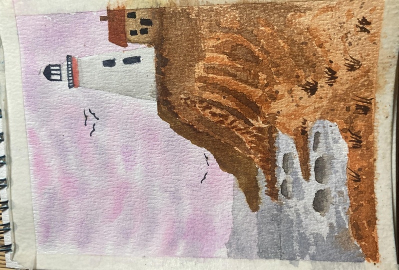
5. Project 1 : Sunny Day Part 1: So let's get started with our first project. Now in this one we're going to paint a relatively simpler composition. So we're going to have a bunch of frogs, little bit of a structure over to the right and the main lighthouse. So not too many elements, not complicating it too much. So I'm just starting with a very simple sketch, rather just fixing the places of all the elements. So we have the rocks here, just trying to create the overall shape. And we have a structure here, a 1-bit, slightly touch through and just a very simple house kind of structure. And the rest of the path towards the bottom would be kind of dry grass or mainly just the ground. So we'll be painting it accordingly. And here we'll have on my Tau. So this being the main structure or the main focus, we're going to draw it slightly bigger than this one. So while drawing the lighthouse, we're going to try and stick to the basics. We have the central line. Now in this one we have a structure wherein we have substrate while still here. And then after this it's kind of a slope so there'll be slanting lines towards the base. So I'm just trying to capture that over here of the, trying to mark all the walls that you would see from this kind of a viewpoint. And there'll be some which are partially visible. So not as much light would fall onto them and tried to create that shadow light kind of effective swim. And from here onwards, like I said, I'm drying those clamping lines. Just trying to make sure that we have the overall shape, correct? Not so great at architecture, but I'm trying to capture the structure in the way we would see it when you're at this viewpoint, what you'd exactly c of this lighthouse, that's what I'm trying to capture. So at the top part we have this little bit of railing over here. And again, this is going to be mainly colored red at the top. So when we're painting the sky, you can actually paint over this and just, you know, in the end add the details with threat. So this is kind of easier when you're trying it out this way. We have some other projects wherein it's not so straightforward. So you get this and just letting you know that this is not going to be in that DAF, it's going to be a very easy project. So I'm just adding the dark part of the light goes over here. So everything apart from the lighthouse and the small house like structure that you have over here, the dark bar does mean these guys. So we'll be mainly painting it on blue with subtlely and our cobalt blue, whichever one you're using. So that is again, the main backdrop that you have here is of the sky will try experimenting with DIY backdrops in the other projects as well. So here I'm just adding these little windows and we'll be done so and just erase this quickly so that we don't have a lot of lines. And we'll get started with the painting part. So here I'm keeping the masking tape just below the board that I'm using so that we have a slight incline for the wash. Again, this helps in just making sure that your wash is uniform and there are no patterns on your people. So in most cases you'll just have more to add the base which can be just wiped off. Now around the lighthouse, I'm being a little extra careful so that the part of the lighthouse, the walls are not wet. I don't want the water to seep in there because when we use the blue next to, you know, add the sky. If you lighthouse walls are also read, the blue will seep in debt so you can all be lifted up with a tissue or a clean brush later on. But I'd suggest trying to be just a little bit careful that the walls at right in case you end up adding a little bit of water here at this point, we can just use a clean tissue and dab it so that the walls become dry. Sounds more like a plumbing issue, but it is something that just a little bit so that we don't end up missing the white part of the lighthouse liter. So we've done with reading the paper completely. And after this we're going to add in the cobalt blue or the Silurian, whichever glue that you're going to use. I'm using a sertraline, so I'm just mixing it in my palette here. It's a nice vibrant blue. And we're going to add it to the sky. It's going to be a nice blue, clear sky with a little bit of clouds here and there. So for the clouds, you can either leave them so innocent type in your adding this paint can leave white patches that symbolized the cloud. Or if you feel that you've added too much blue, you can just use a white tissue and just lift the color up. And depending upon which color you're using and how staining it is, you should be able to easily lift these colors are. So I'm just going to add in the blue here. Right now I'm using a very watered down like value. I'll be adding a few patches of dark blue as well in a bit. So like I said, for the top part, I've just painted blue as well. Since we're going to have the readings and the dark colored in red. So it's going to be easier to just map it on top of this blue. Now I've just had a little bit more pigment so that it kind of a slightly darker blue like this. And I'm just going to drop it in here in debt now, we're working mainly wet on wet. The previous layer is still wet. So we just start dropping this blue end for it to blend with the previous layer. Alright, so now I'm going to use a clean tissue and lift up some of the colors to kinda gave the Cloud like appearance. You can either leave it as it is or just do this lifting part. Either way, it's fine. In my case, I'm just doing this because I still wanted the main white area to be that of the lighthouse. So I just tried to color it as blue as possible, the skies as low as possible. So you could go for a very clear skies. With that, it highlights the lighthouse completely. So now we'll start with the rocks and using a nice warm gray you can go for any mixed gray mix that you have. And we'll start with a light wash and then add in the details on top with a darker gray or even a black. So mainly this is just the base layer for the rocks. And a lot of the deal or the texture that is going to be there on the rocks has to be added with a dry brush technique. So that is what we're going to dry out here for now. We just add this base. Leo had a little bit of variation here in the little flavor, the values. But that's about it. Once again, I'm using the tissue to just lift up some pigment over here. Now, depending upon the pigment that you're using, it might look slightly different. So now we're just going to let this dry. Now, we'll start with the ground. I'm using a very light wash of yellow ocher to start with. And then we'll build this up with different browns. So this kind of showing a very dry, patchy kind of crown. So not going to be a lot of greens and browns. So we start with a yellow ocher, or you could go for a very light wash of brown as well. And just vary the values here and there to create a little bit of texture. And now adding in a burnt sienna or any lighter brown that you have nice vibrant kind of grounds. So just, this is mainly for the base layers. We're going to top it up with a darker brown, maybe a burnt umber or even you can just mix a little bit of black or indigo to the ground that you have to create a slightly darker ground. And we'll be using that for a lot of detailing with the grass, et cetera. For now this being the base layer and just making sure that it doesn't look very clean and kind of monotonous. So trying to add a little bit of value, darker value here and there to create this kind of texture. Now we'll play around a bit with the splatter, not a lot because I really don't want to mess up the lighthouse walls. But I'm just going to add it at the base like this and other details like the kras and all later on. For now, since this layer is already wet, I'm just dropping in to just create a bit of texture. So I'm gonna do the same near the rocks as well. Just adding the same color. Dark brown or the burnt sienna, a slightly pigment did rarely make this, and we just let this dry completely. In the meantime, we can start working on the rocks. So here I'm just adding this dry brush kind of texture. Now, the separation of the rocks where you know, the two rocks me, that we're going to add in a little bit more detail with a darker black. For this one, I'm using the same warm Cree, but much pigment and value and very little water. So to get that dry brush kind of effect, and I'm already using rough paper, so it's not that difficult to get this effect. But in case you're using a smooth people or something with very less, you can definitely just use the same technique that I showed in the technique section. You can just use the brush, dry it up a little bit, and just press it around on any surface, even your hand for that matter. And just get this kind of texture. And now we'll start adding in the details for the separation where the rocks kind of meeting. So I'm just using a slightly darker green indigo mix. So you could go for a black as well. And just adding to these areas to just create this distinction between these rocks. The next step, adding in a little bit more texture here and there with this darker color. So this is the same color that I've used for creating that separation between the rocks. I'm just using the same co-creating a little bit more texture that the dry brush technique. Now my paper is great mostly, so I'm starting with the crossbar, just adding in these little strokes with the darker brown. So we could start with a burnt sienna or slightly warmish kind of ground. And then add in a little bit more detail with a darker brown like but for now I'm just using the bug CNR, a nice pigment degree, and just the simple strokes adding in the class. Now I'm going to start with this little structure over here. So for the roof, I'm using brown, which is kind of slightly lighter because this is where, this is the part that is exposed to the sun. So we want this part to be slightly lighter. We can use the same column with a little bit of indigo or black added for the actual walls of the structure, but for the roof specifically, I'm just using a slightly watered-down value like this, so that we can show that sunshine on the roof. So we start with the main structure of the lighthouse. Now in this one again mean have a few walls where there's no light hitting indirectly. So for these walls, we're going to use a slightly greenish kind of color. We are going to paint it a little bit so that it appears darker than the mean walls which are fully white. So the light-year is from the right. So we're going to leave those walls plain white without much shadow, except for a little bit of shadow from the main, the top light room. But for the rest of it, for these words which is going to completely paint them with a slight light green like this. So this is creating the shadows and when you keep it right next to that white wall, it gives the illusion of that sunlight hitting those walls. So that's what we're trying to achieve here, the light shadow kind of effect. So adding in a little bit more pigment here and there to create those shadows. And we'll have a little bit of shadow here from the main panel room at the top. So because of the readings, we have batches here of the shadow, so just adding those. And we then so once it is dry, you can see that it dried much lighter. We'll start working on the other structure that we have over here. So for this, I'm using the same ground that are used for the roof, but a much more pigment in value so that we can show the light shadow here as well. So for this, again, we're going to just paint it like normally, just wall first. And then we'll add in a little bit more detail to the structure using darker color.
6. Project 1 : Sunny Day Part 2: Now I'll be adding a little bit more shadow to the lighthouse. This part, the last one that you see over here towards the left. Now, that is not going to get much light at all from this viewing angles. So you're going to have bad as the darkest wall over here. Having some more details onto this one. Again, using the same green, I'm using a light here that we used for the first layer of the shadows, just adding onto it, giving it a little bit more detail, do the shadow walls. And we let this dry after this. All right, so we'll start with the top structure now. For this, we're going to use nice vibrant red. So I'm using the organic 1 million. And we're going to just follow the same structure that we drew with the pencil. And you can use a thinner brush for this, a smaller brush. To just add in these details. Once again, we will be adding the shadows to bit. This part is fairly drawn with a darker red. But for now, we're just trying to create the overall top portion of this lighthouse, the glass bamboo and the main area from where the lighthouse all proceeds. So we just trying to read that. So I'm just trying to follow the same lines that I had gone with the pencil. It's quite light great now a and B also been blue and talk through it. But you can see that it really doesn't matter because of the way to encrypt that we have at the top. It's not kind of a problem with even if you've painted blue. On to the roof of the panel again, be going to have a slightly lighter red towards the right. And we'll add a slightly darker red or brown. And what's the left? Again, we're trying to show the light that is coming from the right. So for that, we're adding in shadows towards the left-hand step, just trying to highlight the right part. Now when that price we'll get back to the base structure, Sam creating another wall over here, which is slightly darker, so I'm using a dark pigment, brown over here. So again, you can go with any color that you have or the one that you've used for the structure, you mainly using just one color and varying the values over here. We'll add in a little bit of black to create little bit more shadows. But it's all about just being with that one color that you have over here. So now I'll be adding in the slightly darker brown that I mentioned. So I've just added a hint of indigo to this to get this darker brown. And I'm adding it towards this wall to create a few more shadows on the structure. Now onto the roof, we're going to create a plan and pattern of diodes over here. Just using my brush to create these lines. We'll be adding a few more details onto this structure later on. But for now, let's just leave it. In the meantime, we can be in the windows on. So I'm using the dark gray that I had, which is almost looking like black ratio. Just painting these two windows that the mom during the sketching stage. Getting back to this one, again, adding in shadows using nice black mixture. And for all shadows here on the agreeing to add the same color, a little bit of black or a dark blue headed to these existing colors, existing sheet that you're using for the structure that sense. Now soften any hard edges that we have here with a clean brush. Now we'll go ahead and add the shadows on the lighthouse as well. So far this stopband have these railings and just beaten the same brown. You can just make a hint of integral. We trying to create a slightly darker shadows on the spot. One last round of the tailing to this structure. So baby had created those blend or salt from the hard edges. I'm just creating a little bit of shadow or stock edge over here with this dark color. And just adding a few more strokes at the BSW, same color. It's kind of a dark brown, blue, red. That's it. That's our project. Then we try to raise some broke off physician and I tried to include a lot of the techniques that we discussed in the technique section into this project. Now next one is going to be a very moody kind of landscape. So we'll try another simple structure, another simple landscape in the next project. So let's get onto that one.
7. Project 2 : Moody Landscape Part 1: Onto our next project, and this one's going to be a little bit more D, but I'll try to share up the next two projects with nice vibrant colors. For this one, we're going to be using mainly tone down muted colors. And we'll try and keep the mood in tag and just focus on getting the colors right. So here we have a little bit of a cliff, which I'm trying to just mark over here with the benzyl. So most of this is going to be a dark brownish mix, a brown, yellow ocher kind of area. And over here they'll be a lighter patch and most of it, the other part, that the top would be much darker. So just creating these separations over here, we'll go in and add all the details later on. And then we have the main lighthouse. So in this one, the structure is not that dominant. So you can see that most of the area in this landscape is covered by the cliff itself. The lighthouse in itself is quite small in this one, but the idea here is to explore different landscapes with these lighthouses. So I tried to incorporate one rare, the actual dominating thing is not really the lighthouse, but it could be something that is surrounding it like in this case it is the cliff. And we'll have a moody sky and sea as well to go with it. So that's it. Just following the basic rules of creating the lighthouse, just marking the center, and creating these different points so that we can have an overall structure that kind of conforms to the norm of lighthouses. So the towers mainly. And we have another smallest structure like this one over here, similar to what we did in the first project. But again, this is not that prominent. It's quite small because it's at a distance. So we're just going to market over here. And then we have the main panels at the top over here. So again, just gonna mark them with the pencil and creating the overall shape of the lighthouse and the tower. And afterwards we're going to erase this as it is. So don't want a lot of pencil marks and the don't want it to be a lot darker because it gets a little tricky if you're going to paint the white house, white, sorry, a lighthouse white. But in this case it's not going to be stuck, right? Like I said, we're going to create a moody kind of atmosphere. So for that, we're going to even paint the lighthouse, but not too dark. It's just going to be a little bit of shadowing kind of effect. And that's it. So let's get started with the painting part. So just like the first project, we're going to wet the area for the sky. And I'm making sure that I don't try and get the water integral items itself because we're going to make the sky purple. So we really don't want that color seeping into the vital Lighthouse. I gotta get this right. But here if we have a kind of a mix of the sky and the sea. So towards the left what you see is an area where you have both sea and the sky. So we're going to try and create a nice horizon over here and a nice blend of sea and sky. I'm going to use mainly a poeple and imperial purple to start with. So for the sky and religious dropping the color in. So since we already have with the people, is just about adding these colors and letting them blend in. So not much of an effort here. And just try not to paint the lighthouse. But apart from that is just about letting the colors flow, letting the magic unfold on its own. Now, I'm going to add a little bit of pink to this. So I'm adding a little bit of opera pink and just dropping it here towards the edges. So creating a little bit of variation in the sky, That's it. So I know that this looks quite light right now, but I intend to keep the skylight will add a little bit more detail on the C part here. But for now, we're just going to let this guy blending. And I'm just holding it like this and keeping that masking tape at the back so that we have the incline. And we'll just let this flow, let the colors flow, let the colors blend in. And in the meantime, we can start working on the C part. So for the C here, I'm using the same color but slightly darker value. Now, this was already wet as part of the overall initial reading, the paper kind of exercise that we did. We already wet this area as well. So in case it has dried up, we can just use a clean brush and wet this area of the sea. And then just add in this purple color that we used for the sky. Maybe slightly darker value, going to add in a little bit of gray or black towards the sea as well. And just add in here, blending it in. So my previous layer is still wet, so I'm just going to add this here. So trying to create a slightly darker kinda water. So in case your paper is dry, you can just use a clean brush like this to blend in. And I'm lifting a bit of pain from the horizon so that we have a very clear horizon over here. So in case your sky and sea is kinda getting blended in, just use a clean brush and lift the colors from the specific spots from where you can see that the colors are just blending into each other. Now once this is dry, we'll start with the cliff. So for that, I'm mixing a nice brown over here. And we again start with wetting the area of the cliff. So this has to be after these C part is completely dry because you don't want the brown to seep in back into the sea. So just wait for the C to dry and sky to dry. And then we can start with the cliff. So we'll start with a lighter brown and then add in the details using a darker brown and black, et cetera. So here I'm using a burnt sienna to start with. You can see that it is nice. Light value, not too dark at this point. You can keep mixing in slightly darker values here in there. To create texture, we need to create a lot of texture on this cliff as it is. But just trying to create that first wash of colors, first base wash. And again, you need to be careful around the lighthouse itself. You don't want to be in that drown. But apart from that, just go with the flow. And in the batches here, in there where we have slightly darker color, just a slightly darker value of the same color for that matter. Dropping in a little bit of darker brown or rather darker value of the same brown here and there at the base. And we're also going to create the texture at the top of the cliff using the same brown to start with those features. The first round, we're going to add a lot more detail to this later on. But right now we're working mainly bet on it. And a lot of details that we went to add our end to be wet on dry. So at this point we just creating the base texture for this clip. Now starting with a slightly darker brown while in the previous layer on grounds as thin red. So we're just trying to dab the brush here and let the colors blend in. Now I'm going to create a little bit of rocky structure over here using the same color. Once again, we'll be adding the details onto this using black. But this is kind of more of the base layer or the placement layer where we know that this is where the rocks are. And since this is giving quite hard edge over here, we're going to use a clean brush and just blend in the bass part of these rocks. So now using a paint brush and just blending the base in like this. And we let this dry completely. All right, so now my paper has dried. So I'll just start with adding the details on the cliffs or mixed a nice dark brown over here. You could either use your same brown and add in a hint of indigo or black. Or if you have a burnt umber, you could go with that. Just that it needs to be darker than the base layer that we have over here. So adding a bit of indigo or black really helps to get this kind of a nice sheet. So here I'm just dabbing the brush again, not trying to create a lot of texture or strokes with this itself. Just dabbing it in. And after this, we're going to add in a little bit more detail later on. For now I'm just creating these separations are just working on the areas off the cliffs. Next, I'm going to use a slightly lighter brown. So it could be the brown that he'd used for the base layer here. And just blend these hard edges in, make this seal still leave a little bit of the base layer intact, which is showing up almost as the lightest brown over here. But we're trying to blend in the hard edges here that we created with the second kind of layer. And then using the dark brown again, we just dropping it in here and creating this nice texture. So to get this kind of an effect on the cliff, we'll have to work in layers. So we'll start with the base layer like we did, adding in a slightly darker value and then just blending it in and working for the width, the details with the darkest brown you have, or even black in this case. And just trying to work in those details over here. Now towards the BCE, we have a batch that is quite light. So I'm going to leave it like that just in the base layer. We're just trying to work around that batch and just build up on the darker patches and adding in all the details over there. If you feel that there is a hard edge forming because of the strokes that you're using for this, just use a clean brush and try to blend it in. Now here we're using the dry brush technique with the dark brown and just dabbing the brush here like this and create this texture. And then we add in the darkest brown or a hint of black as well for the shadows or the depths of this area.
8. Project 2 : Moody Landscape Part 2: So again, I'm mainly using a dry brush technique for the texture. So a quick revision in case your paper is smoother, you can just wipe the brush on an issue and then just on your hand or on the people. Just roll it like this so that you can get kind of a dry brush effect even on a normal paper. But if you already are using a rough green paper or a paper with a slight tooth, you'll notice that it's much, much easier to get this kind of a technique even without dabbing it on the hand like I did. Just so, just let it go tissue soak up the excess paint will do the trick. You'll be able to get some dry brush technique if you're using a slight little bit of clean. Now, I'm using a light brown again and just working in the areas between these dark patches that we created. And just going to blend this in here with a clean brush. You could either use a clean brush or you could use the same brown and just blend it into these darker patches. And now we'll let this dry completely before starting off the next part. Once the people described the start with the C again. So we're going to add a little bit more detail onto the sea, make it slightly darker and add in a little bit of depth to this part. So I'm just reading the people once again, you can also with stones that are the rocks that we had here. And we can just paint along with them. It'll kind of blend in so there'll be no hard edges related to the water itself. So I have fixed my horizon over here and just making sure that it is clear and distinct. And now we add in the light gray onto this just simple patches, mainly towards the left, so the depth will be more on that side towards the right. We just giving these simple strokes and letting the water flow onto the clip like this. And you just lift up a little bit again from here so that we kind of have that waves splashing effect. And we start with the lighthouse. Next, I'm adding a little bit more of the same purplish gray over here on to the Lighthouse. We'll add in slightly darker values here now, make this just kind of matching the overall mood of this landscape. So this lighthouse is not going to be stacked right? Or, you know, the nice vibrant red is just going to be this moody little thing. So I'm adding in the gray hill like this and in case uses the spilled over onto the sky is to use a tissue and wipe it like this. So Miletus giving in a little bit of depth and texture onto this lighthouse. Once it's dry, we'll start with this structure at the base. So I'm adding in the roof over here with a nice vibrant red something to just Dino shift your focus to just using a smaller brush and adding in the details onto this one. Now the reference I took had some nice red flowers over here. I wasn't too sure about adding them, but now that I see that rule fan, How nice that red lobes. Just going to add in a few flowers here and just dab your brush in and let it be. That's it. Not, not a lot of details, not making it the most prominent part of this landscape at all. Just dabbing the brush given there and leaving it. Now we'll start with the detailing. So I'm using a dark mix of brown and black over here to create this kind of very dark blackish brown color. And the wind to add these frogs and all the other details onto the cliff using this color. So you could mix your brown with a hint of black or indigo, any dark blue color for that matter. And read this dark color. If you already have a dark brown in your palate, then all the better. Now, I'm just using a clean brush to blend in the BSW of these rocks just like what we did for the first layer. Now we start with adding the details on the glyphs. I'm using the same dark color and just adding texture here and there with this color. So what we did earlier was building up the layers. Now via just adding in the details, the final round of details onto this one. Most missed adding the base through these flowers here. So using the same brown and just adding in these, looking at graphs like strokes. And now we start working on the dog bought this lighthouse. So for this one, I'm going to use the dark gray mix that I had. And just working on the same detail set you already sketched as part of the initial sketch. So I'm just going to follow the same lines and just added these details. If you're comfortable, you can use the same brush and just add in the details with the depth. I usually go for a smaller brush. This is a size 0. So that this is the kind of makes it easier, adding the details onto the smaller parts. Adding that little window over there. We do the same for this other structure. We just add in the bins using the same blackish brown that we have as small brush. Final round of the dealing for the C bar. And it almost done with this project. It's quite a contrast from what we did in the first project, which was all bright and sunny. This one's quite moody and the next two are going to be much more vibrant. So I'm just gonna go into that dive into bad. But this one's done. This is just adding a little bit of detail here and there. I hope you enjoyed this little moody project and see you in the next project where we're going to paint a beautiful sunset and Lighthouse.
9. Project 3 : Sunset View Part 1: Alright, in this project we're going to be nice, beautiful sunset with the lighthouse in the backdrop. So here we have the cliff or the lighthouse. So this one's going to have a lot of nice vibrant yellow, pink, and green, much in contrast to the others that we've done so far, I realized that we haven't used green in any of the two projects that we did so far. This one's going to have a lot of greenery and that's going to be the case with the next one is well, so here we'll have the lighthouse. So going to be a slightly broader structure for this one. So just trying to make it that way. So we have the slanting edges solution and an extra wall over here. So that's it. That is going to be the main structure. And then we'll have a little bit of the dealing at the top. So just doing it three and over here, the panel and the readings, etc. So this one's relatedly, simplest structure, quite similar to the first one that we did. Here, we're going to have the overall banners and the top part off the towel. And rest of it is going to be mostly a little bit of cliff greenery. And we have a few plants in the foreground, and that's it. So we start with the painting part. We'll add in the sky and the water first. So for that we're just wetting the paper completely. Again, avoiding the lighthouse because we're going to have a slightly darker pink sky. So you don't want that to get onto the lighthouse. So just avoiding bad and painting around it. I'll just keep the masking tape at the piece now. And let's get started with this guy. So I'm using an hour prepping a very vibrant, bright pink to start with. So we'll have this as the base layer for the sky and learned a bit of yellow towards the right. But mostly it is going to be this pink as the base layer. So again, we avoid the parts of the lighthouse that need to remain white or a shadow color and just paint around them. Now towards the right, I'm leaving some space so that we can drop in the yellow. But most of this guy, as you can see, is in the shades of pink. And for the water, I'm going to mix in slightly darker pink seed or prepping, but a darker value and just drop it in here. So again, because the paper is fully vet, it is easier to blend these colors in. And towards the base, we're going to have those flower bushes in the foreground. So we're going to not color it a lot because you need those flowers to pop up there as well. So just leaving it as it is like this. And now we mix in the yellow and add it towards the right side like this. Again, since the paper is wet already, you don't need to do a lot of blending. Just drop it in and give it a nice stroke and it should blend on its own. Now, at the horizon of this one, we have a nice blue mountains and we really don't need to worry about creating that separation at the horizon since gone to work it out automatically. For now I'm just blending into yellow and leaving it at that. Once this is done by the paper is still wet, I'm dropping in slightly darker pigment did opera pink like this? Just to give a few cloud kind of effect. Not gonna do this for the whole part. Just dropping in at the base of this guy, just near the horizon. Crank to make this horizon is straight lines and just using a clean brush, just lift up the color from here so that its streets. And now we add a little bit more detail wet on wet onto the water part. So same thing. But again, not taking a lot of it, just dropping it towards the edges of where the water meets the cliff became a little darker. So I'm just going to blend that in. So mainly giving that what is the kind of effect. Adding in a few more details here, just with that same pink in the sky. Just dabbing it then letting it go and blend in. And if you feel there aren't any hard edges on the paper has dried, just use a clean brush and blend it in. So now toward the base, I'm going to drop in the green. I know that the paper is still a little bit, but that's okay. We're just going to let blending into that pink. And we're going to have the leaves and plurals over here. So it's not going to be a lot of problem. Just let it blend in and in case there is any excess water like in my case, because the paper is at an incline, that might happen. Just lift the excess water off using a tissue or a clean brush and then just drop this green in vectors. After this, we'll just let this dry a little bit. All right, so now I start with a cliff. And here I'm using a light brown to start with. So you could go with burnt sienna. And again, we're just going to leave some patches here so that we can mix it with the green. And the base of this would be rock. So it's going to be black. So mainly I'm just placing the brown and this much portion and then just dropping in the green as it is. So in case there are a few colors spreading in like this, just use a clean brush and lift them off. So for the dream again, I'm letting it mix completely with the brown since Cree giving this nice yellowish kind of mix up because I used a burnt sienna. So mainly we're just going to drop in the green and the black at the base of the cliff. Now, while it's still wet, I'm going to crop in a slightly darker green like letting it blend in to see him at the BSW going to have those flowers just dropping it then. Now for the rocks, I'm going to start with this nice dark tree. And then we'll add in the details with the black. So I'm just again making the base layer here are the rocks and really letting it blend in with that green to encase all these colors are blending into each other. That's fine because this is the first layer. After this, we're going to add a little bit more detail to the clip later on. But for now, if they are just blending in together, it's completely fine. Working on a little bit of reflection on the water column, maybe a slightly don't, don't value. Now once we cry, we start with the mountain at the back, some using an article marina. Just going to be in the desert is not going to add a lot. And now we start with the shadows for the lighthouse have mixed a little bit of pink into that ultramarine and created this purplish kind of color. And this will go in as the shadow for one of the walls of the lighthouse. We have a little bit of light on Monod's be otherwise. So towards the left we're going to show that there's some light glaring up from the base of the tower. So not going to add the shadow to that wall a lot. This one's going to be much darker as compare to the other worlds. It became a little door dots. I'm just going to lift up the color using a clean brush. Just leave it that back. A little bit of color to want some. And for the left one is the one. A little bit of light. I'm just going to wet the paper first and just read for the other wall to dry completely. If you're worried about the colors seeping in minus nights, I'm not too worried about it. So just picking up the color from that one and adding it here. And then adding a little bit of yellow spot. Just going to lift a little bit of color from that one on the right. And now we add in another round of shadows. Now, I'm trying to be careful around the edges here again. And if there are any hard edges, you can just blend them in using a clean brush just like what it did. And adding a few more details on this base. You can use the same color and a clean brush to spread it on. And this one, they've already had a lot of shadows. Just darkening it a little bit. Was looking to pale in comparison to the other wall where we have the light. So just trying to add in or rather highlight that wall by creating shadows on this one. And we just wait for this one to dry. In the meantime, we'll start with the flowers and leaves at the piece. So for the leaves, I'm using a sap green, and we can use another green, slightly darker one later on to add more depth. So for that one, what I usually do is I use a perylene green or I add indigo to the sap green to make it slightly darker. So either we can just try out a combination of a light and dark green. Now, adding in the flowers at the top. So I'm using a smaller brush and the same all prepping for this guy. But as you can see here, it's a much, much darker value. So I'm using a lot of pigment and water to get this kind of writing. Now, adding in a hint of darker pink which is acquitted. And just dropping it on the flowers to create some beat. Now, start adding the darker green leaves over here. Just simple strokes and lifting the brush like this. Now I'll add in a little bit more detail on these stems, adding the darker greens that we have some sort of continuity on these flowers.
10. Project 3 : Sunset View Part 2: We let this dry. In the meantime, what we can do is we can start with a. So I'm going to use the darker green and discrete this texture on the glyph for some vegetation. For the rocks. Again, we're going to use the similar technique what we did in the first project. We just going to mark the separators, adding the texture and the mud separators for the rocks. So I'm adding in the picture here that dry brush kind of technique. Taking in the darker black or green and adding a little bit of detail or depth onto these frogs. Now for the cold part, I'm going to use organic mammalian by Daniel Smith so you could go for any nice vibrant color. So even though it's not the mean ETL focus for us, it gives a nice add-on to the sky that we have over here. So I'm using this vibrant red for the top part of the towel or the actual EDR from bed light is controlled. So mainly just following the lines that we already do as part of the sketching that we did. So just following that same thing and adding in the details. There's this little group that just adding that while that dries, we start with another layer of the leaves here. So I'm using the dark green. I have added a lot of indigo onto the green, so you can see that it's almost a blackish green that I have some just adding it TO for some more depth on to the bushes. So just adding in here simple strokes, and that's it. Now we use the Docker black to add in a little bit more depth to the rocky part of this clip. So just dabbing it in the black color onto. Now we start with the top part of the clip. And for this we're going to add in a little bit of extra green at the ages. Next we start with another round of detailing or shadows for this part. So just going to use this small brush and add in the purplish mixture ratio. Again, we're going to blend this in so we won't have any hard edges like this. But mainly trying to create that depth effect for the lighthouse tower. On to the final round of details. So I'm adding the shadows or the details onto the top, top part of the lighthouse tower. And anywhere that you see a hard edge, you can just blend it in like this. And that's it. So that's our project. The third project and very nice pinkish white print one at that. So I hope you enjoyed this project. This was quite a refreshing change from the last two that we did, which had no green or the vibrant colors in them. So I hope you enjoyed this one. See you in the next one where we paint a slightly different kind of lighthouse.
11. Project 4 : Waves and Light Part 1: Onto our last one. And this is going to be the most DBN project of all. So we have a little bit more sketching in this one. And the lightest will be here, and the remaining portion will be glyph and the C at the top. So instead of sky that we've had in the other three, you'll have the sea as the background for this one. So I'm just trying to start with a cliff, the easier part of the hill. So we have a little bit over bees for the lighthouse here. This one's going to be more often. Usually going to have the lighthouse hill. And it's not from ground level, is you're probably standing on another cliff while watching this. So that's what we're trying to recreate here. And the lighthouse here, it is going to be the traditional white and red lighthouses that you may have seen on Pinterest. So we're trying to create something similar. Adding the landing lines here. Now for the top part or the main controller is going to have a lot more detail in this one. So just sketching it out here, adding all the details as possible. And then we're going to market in black and readily drawn. Even for the doors and the windows. We going to have to match the angle of the DAO as well as the viewing angle here. So even though most of the lines so here appearing as creed, they're kind of on the goals, so we have to prod them accordingly. Moving on to the dark portion here, you just have another set. Then the mean of the Dao. And we're done with the Lighthouse. I know it looks a little daunting at first that there's a lot of scattering in this one. But it's actually just about six to seven minutes of sketching and that's it. So but as compared to the other projects, he has it slightly more. But it's fun. This is going to be a lot more detailed in terms of the way we compose this landscape. So I hope you're going to try this project out and you're going to enjoy this. So just adding the final rocks it to the beach, and that's it. Just adding a few more rocks over here. And I'll just erase this to lighten this now. All right, so now we're ready to start with the painting. So I'm just going to keep the masking tape below the boat. And we'll start with the C part. So again, we're going to wet it in a way that it doesn't quite come onto the lighthouse. So I'm trying to avoid that area. In case a little bit of water has come on. You can just use this clean tissue and just wipe it off. So that there's no water on the lighthouse itself. Now for the CP, start with cobalt teal. So we're trying to start with a lighter color and then we'll add in the darker turquoise to create the deck, to create kind of a variation or motion in the sea itself. So I'm starting with this light cabal t value. And you can mix up a little bit of darker value here and there to create a little bit more variation. And extra careful around the lighthouse. You don't want to get that deal in To the Lighthouse. So just trying to be extra careful over here. But for the rest of it, it's kind of a free flow. So you can just add in a nice light to medium wash off by T and just drop it in. Now while this is still wet, I'm going to drop in Taylor turquoise. So we're working mainly wet on wet, so not a lot of blending required. And I want to keep it kind of Louis spontaneous when it comes to the mix of this cobalt, teal and turquoise. So I'm just going to drop it in like this and let it blend. Not going to mix it a lot, not trying to actually create any waves at this moment. Just letting it blending onto the Cobalt Teal that is there at the BSW. Now, taking it a slightly darker value of phthalo turquoise. And now we're trying to create that motion or the leaves. So just dragging your brush. And again, we're doing this all wet on wet. So on the previously as a still bed, you're trying to create this motion with the red layers in the background, adding the cruelty at the edges. And now we're just going to let this rest a bit and then add in the payload blue, turquoise mix again. So we're trying to create that motion in this water. So for that, we started with multi, added a tailored turquoise and then with this 3D motion, we're just adding the two yellow blue. After this. We're going to let this dry completely and then work on the remaining cliff part. But for now, you just bring these simple strokes. That's it. So now my b plus dried and then start working on the cliff here. So just wetting the area here towards the foreground. So this is going to be the first part that we pry out. And the background rocks and the little bit of a lift bag there. You're going to work on it separately. For now. We're just trying to cover this particular area that you can see at the front. So I'm starting with a nice warm green. You could go with an olive green, or in my case, I'm using the green gold, but you can see that it's more awful, beautiful yellow, green to start with. And this is going to be the bees Leo, for the lift, you're going to add in a hint of brown onto this itself. But for the very starting layer, it's going to be this one. V add the seam at the back here. So mainly it's thin. You just trying to get a continuity here with the same color. Now, while that's still wet, I'm going to add in a little bit of stab green radon bet, just dropping it in and let it blend it together. Now I'm dropping the burnt sienna or any nice way Brene Brown on for this again, we're working wet on wet. So the previous layer of the greens are still red where you're dropping the same. So this helps them creating the depth or the texture or the cliff. And we can work on the details later on. But this is kind of the bees leaders. Are we just trying to get the overall color dried and towards the back as well, I'm using the same burnt sienna and creating the bees Leo for the rocks. On the rocks we're going to add in a much darker brown and black lead drawn for the DeBeers. So he's just add in a slightly darker brown on this. Just need to make slapback. Be creating a little bit of variation for this one. Mocking the rocks over here. And we also added a little bit more texture onto the base speed did. Now you can put it onto the values for this a little bit prettier as it is going to add a little bit of brown and black leader for the detailing. So start with a cliff again. Now that it's dry, we try and add the darker brown. Now we start with adding a little bit more detail on the vegetation with a darker green. So I'm using a perylene green over here, but you could go with any dark green or just mix a little bit of indigo onto the sap green that you have. And it should give you a nice dark green is where we're adding in the details here. Towards the edge, I'm pulling up the vegetation and a reef. Hello.
12. Project 4 : Waves and Light Part 2: Now while that is drying, we'll start with the lighthouse. I'm using an organic mammalian from Daniel Smith to walk on the red parts of the lighthouse. So it'll just be in this directly wet on dry with a smaller brush preferably so that the beam doesn't go out. So what do you know? So the systems to repeat the same flawed three or five passed through the doors. So let's see. Now this base structure that had, I'm just going to use a very light wash off burnt sienna to fill this up. So locking it non-white, so that's going to be something like a light brown. Now we start looking into belt body devoured again. I'm using a beans green to start with. So this is going to be a slightly blackish color for this one. And to do that. So starting in the details and the local what Smith slightly smaller crash. In this series, kind of done with this round of detailing. So just adding in a few touches here and there. Now we'll start with the detailing on the rocks. So I'm using the dark brown black mixture and just dropping it in here. And we broke on it with the same dry brush kind of technique and adding in a bit of texture here and there. So I'm going to do the same for all the rocky part that is there behind the lighthouse. Okay. Yeah. Hello. Adding in some details onto this base part. Now that we're done with the lighthouse, but we can add in a little bit more to this station that is there with the darker green. It's time to add shadows. So for this, I'm using the dark, but a lot more pigment and values are the same that we used for the roof of this tower. I'm using the same one, just adding very little water in the pigment that value. I feel it's a little too sharp, so I'm just going to blend this in with a clean brush and maybe add in a little bit more detail onto this. Next we start with adding a little bit of leaves on to this. So for that I'm using a white, or you can also use white watercolors, but try and use less water and a lot more pigment. So that will definitely help you get better white. But if you have a quash, then that works much, much better. Adding some splashy behaves near the rocks. So use a small brush to create these little splashes. Or you could just try to cover the area of the lighthouse. We're going a little bit of scapula. I wasn't sure if I should go ahead with that. So just adding the waves manually like this. Yeah. Adding some more beefs. Rto, again using whitewash. So mainly just dabbing in the press like this and trying to create that. We've kind of texture. Adding a few details onto these windows. I'm just going to add that using the clean. So just using the small brush and adding a few shadows onto these windows. Doing the same for the top part, just adding a little bit of green to create some texture or ratio. We could do with a little bit more white on the beef. So just adding the white quash, a little more pigment and white. And that's a, that's a final project done. I know this was a lot more detail and a slightly different composition is compared to the others. What I wanted to grow preterm thing like this with a C in the background. So I hope you enjoyed this and you'll give this a try. See you in the next section.
13. Thank you and beyond!: And that's a wrap. So I hope you enjoyed this class and you'll get the projects, the triangle. You've got something new out of this class. And if you do drive the projects, please do upload them in the project section. And if you have any impact positive or negative, please do share it with me. I'd love to know how you felt about this class and what that be true because it helps me in public the future classes accordingly. And if you're on social media and you're uploading your projects that you can find me as that President on Pinterest is ooh. It's about possibly every bit. So who do you add? We add dots. So I hope to see you soon in the next class. After them. Well Bye.
 Vinita, That Crazy Doodler