Transcripts
1. About this class: Hello everyone. Welcome to relaxing and class on painting medals and watercolors. As an artist, I've always been fascinated by flowers and metals. Such a great source of inspiration. I'm going to either, I'm an artist and educator from India. And in this class you're going to be covering three beautiful metals with soft backgrounds using some simple tips and tricks in watercolor. So we do have a separate section for all the basics about this medium. So even if you're a beginner, please feel free to join in. And let's explore this beautiful medium together. So I'll be covering all the basics about the medium, all the techniques that are needed to create these soft, flowy backgrounds. And then we'll apply all our learnings into three fun projects. Will be painting three medals, a contract, I do a lilac medical and a dandelion metal. So I hope you will join me on this creative adventure. And B, these beautiful meadows with me. So waiting, see all your projects. Now let's get started.
2. Materials Needed: For the materials of this class, you'll need watercolor people. I'm using 300 GSM, 100 percent cotton paper version. So you could go with any brand of paper. But I do recommend something that is at least 300 GSM because we're going to use a lot of wet on wet technique. And this would mean that the people has to hold a lot of water and a thick people usually helps with this. You need a beep and a board produced deep down the people. And you can also use a glass board and the people come back and get the same effect. Well, either way, whatever is comfortable for you, for the brushes, you need one big flat brush and a couple of round brushes. The flatworm is for spreading the water, reading the people and for the just the post-war. You could alternatively use a mop brush that serves the purpose as well. Just need some big brush that can cover the area of the people. Then you need a liner for some smaller stroke. So in this dandelion painting can see that there are a lot of them strokes I've used a liner for that. You can also use a good round brush that has a great depth. And just use the tip to do the same thing. Equally good. So it's totally up to you. If you just want to go ahead with one brush, it's fine. For the watercolors. I'm using the Daniel's Merv, professional watercolors. Again, you could go with any brand of watercolors and we'll be mixing a lot of colors using some basic color. So It's going to be fun and you can go with any brand you have, mix the colors with me during the projects. And that's just a word of caution about the paper. Again, make sure you're using something that is 300 GSM and 100 percent cotton. This is because for the wet-on-wet technique that you're using for the background. To achieve the same level of softness, you'd need a people that can absorb that water. Law, DSM may give different results. So that's about it. Let's get started.
3. Basic Techniques: In this section, we'll be covering the basics of watercolor and the flowers that we're going to do. So to start with, the very basic technique in watercolors is wet on wet, which means that your people is wet and you drop in a wet layer of paint on top of it. So it could be just plain water like this or another layer of paint. But it basically means adding wet paint on wet layer of paint or water, just like this. I'm just dropping in this color and you can see how it spreads. And that's the beauty of watercolors. It just has a life of its own. So that's the technique that we're going to use for all our background washes to get this kind of softness. Then we have wet on dry, which means that you're adding wet paint on dry paper. It could be a dry leaves or maybe just the plain white paper like this. So for all your background elements, we're going to use wet on wet. And for all your foreground elements, you're going to use wet on dry because the background is kind of more blurry. So we want it to be loose. And that's the reason we be going wet on wet first. And then as you move towards the program, start becoming more detail, things start taking form. So for that, we're going to use the wet on dry technique spec. We can create solid shapes and details onto the flowers, et cetera. Then to add a little bit of fun to the background will be using these plateaus technique. Now for this to work, you'll have to read for a little bit like you cannot really do it while the people believe it. So while it's in the drying process, you could either use water or another color and just use your brush to splatter click this. So depending upon the colors that you use, or do, these colors react to water being added? You'll see that plateau has some beautiful effects. And you can explore this by painting just we're clear of any color. And trying out described a technique to see how the colors are reacting to the water. But it's just a fun way of adding a little bit of texture to the background. And next I'll start with the flowers that we are going to try out. So the first one is the dandelion medal. For this, I'm using the liner brush because it is just easier to get these small pens, books versus script line up. So we're going to follow the basic shape of the dandelions. Not going to add a lot of detail except for the few foreground flowers. Mostly it is going to be just fun, warmer kind of projects. You've just using two colors for this. And we'll be having a lot of time. Next, we'll be painting lilacs. So for this again, it would be good to use a very simple dabbing motion with the brush and pulling the overall shape of the flower. So for this, we'll be using a couple of colors, which I'll be sharing a bit more detail in the class itself. But mainly it's just going to dab brush like this, adding different values of the color and then add in a few shadows so that it looks kind of more detailed. This is mainly for the foreground flowers, background, worms are going to be blurry and so on. The foreground one's a little bit more detail. So once again, for the petals features to use this simple dabbing motion and follow the shape. And that's about it. Next we'll be painting a flower middle. So for this, again, will be using simple motion like this list of flickering motion and kinda follow the overall shape of the flower. And that's it. So just to show this to you again, it's like this. So we paint petals individually like this. And then just join them together, add the piece with a little bit of green. And Dan. So afterwards we'll mainly be adding a few darker petals or shadows, same color and a slightly darker value. Or you could go for a darker blue is we're just creating a little bit of variation and the same color that, yeah, So that's about it. That's how we're going to be in the flowers, the background, et cetera. So let's dive into our projects.
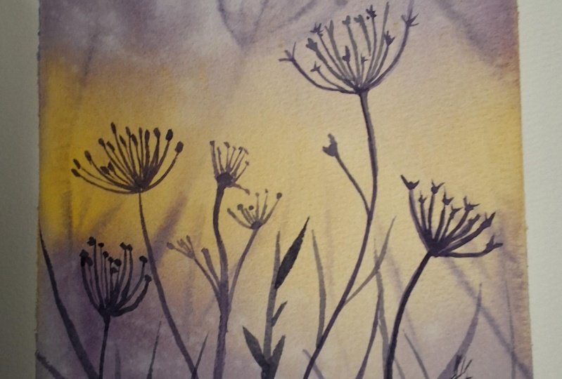
4. Project 1 : Dandelion Meadow: So we start with our first project and we are painting a dandelion meadow in this one. So I'll start by wetting my people completely. So you want your paper to soak up a lot of water in the Costco and we're Tibet it completely and then just let it rest and soak up the water. And in the meantime, we can get our colors ready. So I'll be using two colors for this particular project. One is the Hansa yellow medium. So it's a beautiful yellow. And I'll just show you a swatch of this on a separate piece of paper so that you can get an idea of what I'm using. Again, these are optional. You could go with your own color combinations as well. So this is the yellow that I'm using. And in addition to this, I'll be using shadow violet. So it's a nice muted while IT and IT graduates well, so that's the reason I picked this up. You could replace this with a paint scree or an indigo as well. Something that would not really muddled up the yellow. So just try out the swatches ones and see if it is creating a green with the yellow. That's something that we don't want. A little bit of. Darker body color is fine. Just keeping the dawn of this project very subtle. So I've just wet the people once again, just letting it soak in a little bit more water. Mainly, I just wanted to have a lot of water soaked up. Not really on the surface may be, but mainly on the people itself, inside the people. And then we start with the yellow. So I'm just applying it diagonally in the middle and just random brushstrokes. We don't want it to have any specific shape and since the paper is so we're just going to flow as it is. So I'm not too worried about the kind of shape. It's going to be just adding a slightly darker value in the middle here. And you can see that it's all flowing down, which is fine. It's really not a problem because we're looking for that kind of effect. Just that if you have a lot of water pulling up, you can just use a tissue and clean it up. I'm just tilting the paper sideways and up and down just to get the beam flowing in both directions. And next, while this is still super wet, I'm going to add in the shadow violet. So again, just going to let it flow. You add it using these random brushstrokes. And since the people saw with most of the blending is going to happen on its own. You don't really have to do much. And I'm just going to let flow downwards as well. You'll do the same thing with the other side of the people. Again, just wiping any excess water that is flowing out of the people. I just want wanted to create puddles or blooms at the edges. So just taking care that don't have any excess water there. We do the same for the lower part. Just add in the color and let it blend, let it flow. So for this to flow, you just have to invert the paper a little bit. You can see that there's a lot of water pooling up at the base. I'm just going to wipe it off once again. You may have to do this a few times because we have had a lot of water in the first place. So it might try to flow off like this, but it's fine. We'll just let the flow and B also, not really looking to create any shape. You just add, add the b's. We're going to add in a slightly darker value. You just going to create an illusion that this is closer to you. You just want it to be slightly darker. That's it. You can see how beautifully that violet is flowing into the yellow. And that's the kind of effect I was looking for. I didn't really want the background to have any distinct shape. We will be adding a few flowers on this one, but mainly going to be very soft and blurry because the paper is still wet. So I'm just giving it a little bit of direction like this, letting it flow and just up and down. And this will just add in a few flowers and a bit of splatter as well. So I'm just going to create a little bit of leaves like this, just flickering of crash. And let's add in a little bit of splatter on to this. So I'm just going to use clean water and I'm just using my hand to get this plateau done. So by this time your paper is already in the drying process. And you can see that with the shadow violet specifically, when you add water, it just creates this beautiful glow effect. And that's why I said just try the splatter effect with the color that you're going to choose for this meadow so that you can see how the splatter works on the color. But that's going to be, firstly enters, we'll be adding a few flowers onto this layer while it's still bad. So I'll just use a little bit of shadow violet. And using the liner brush, I'm adding a few flowers here. Again, these are in the background. They're going to be, so they're going to be blurry. And that's the reason I'm adding it on a wet layer because I don't really want a very definite shape at this point. I'm just looking for something in the background that kind of gives the impression that there are flowers, but not really a very clear, distinct shape is going to add a few more. Now you can see that the people already in the process of drying and you can also see those splatter effect. So all these little blue, these white dots were created because of that splatter. So just fun effect to try out gives a little bit of depth. And so there's something called, I'm just going to add a few more here. Again, all of these are going to be super light, not so detailed and kind of blurry as well because they're all still being painted on a wet layer. Just adding one last novel. And after this, we're going to let this layer dry completely before we move on to the foreground flowers, because those are going to be, we want them to be showing up pretty well on that blurry background. So we'll just wait for this layer to dry completely and then move on to the next step. So my paper is dry, so I'm going to start with the foreground. Just make sure that your paper is completely dry and not even slightly weird because that would make the flowers blurry. And you really don't want that because that will kind of blend them into the background. So for the foreground layers, since it is closer to you, it is going to be more detail because you can see more clearly as well. So we're just going to follow the shape of the dandelion and add it in with a lot more detail than what you did for the background layers. And also you can see that I'm using a much darker value of the shadow violet. This is again because the background elements that are there in any picture are going to be lighter because they are far away from you. And in this case it's just a meadow in the background. And the foreground ones are much darker. So here you can see the difference in the shapes that I'm using, the same color. So again, just for the background, we used a lighter color and let it flow and blending. But for the whole ground, we're making sure that it's more. You can see clearly that the reason it will be darker as well. Here you can see that the darker shadow, violet and yellow in the background, the bright yellow in the background. It's creating some very nice contrast. So you can play around with the colors that you're using as well. Because we're going to be sticking to just two colors to Central Park usually would be lighter so that you can show the contrast with the foreground in this way. Kind of adding too many petals to this one. I kind of mess this one up. I guess the sheep still doesn't look right, but you're going to fix it a little bit like this. And then add the stem. So again, put the stem with the liner. It's quite easy. I can just drag it all the way down like this. If I'm using just the tip round brush, then it becomes slightly tricky if your brush cannot hold a lot of pain because you need to keep refilling it. Rather taking the paint in the process, you cannot just get the street lying or kind of curve that you're looking for. But with a script liner, this one is slightly easy. So that's the reason I went for this. So it's just a very simple motion like this. A few stems. Now, I'm not really looking to fill up the whole area because I still want that soft background to show up. So I'm still leaving a lot of space between these so that the background Joshua. But just to have some contrast with the foreground, the adding some leaves and some stamps here. Still can't get enough of this to answer. I'm just going to fix this a little bit more. I think I'm going to leave it at that. Going back to the leaves at the BSW. Just add a few more and a few more flowers as well. Adding a few more flowers. Again. These are in the foreground, so they have a lot more detail and brushwork. And Walt, while the background ones were pretty easy, you can see that by this time they just blended into it. So you can really focus on the foreground part while knowing that there are clouds in the background with that color. Adding last few strands of leaves and stems like this. Always start at the base of the paper so that in fact on the masking tape, so that there is continuity in this one. Otherwise they'll be a little bit of gap left at the base that I should stop and just fixing those gaps that I was talking about. So I'm going to do the deeds done. So that was our first project. And I hope you enjoyed this. It was fun. It was kind of simple as well because we just have two colors. And of course, the main clobber itself was quite simple to be. So I hope you'll give this a try and I'll see you in the next project.
5. Project 2 : Lilac Meadow: All right, moving on to our second project. And in this one we're going to paint lilac meadow. So the background again has to be solved. And so what this will be vetting our people completely, letting it soak up all the water. It may walk a little bit in this process, but once the people usually gets back to its original shape. So I'm using a lemon yellow to start with, and then adding a little bit of pink. So again, I'm using When rows. Let me show you the color here. So beautiful life ping. You could even go with a combine or an opera pink for that matter. And then we'll be mixing apples to apples. So we'll be needing two different kinds of blue pink mix. One would be heavier on the pink and the other would be heavy on the blue. So in this one, I've added the pink here. You can use a combine or anything that you have in your palette and add a little bit of ultramarine to it. So you get this beautiful purple color. So this one's a little heavier on the pinky side, it's beautiful purple color. And I miss watching the yellow cell just added in here quickly. So this is the lemon yellow that I'm using, the light yellow for the background layer. And then we'll be mixing again the same ultramarine and the pink can use a carmine or crimson, and we'll be adding a lot more blue this time. So the mixing the same two colors, but the proportion of each color in these two mixes is different. So the previous one was heavier on the pink side. This one is going to be heavier on the blue side. So this is going to be a much darker purple, violet color. So I'll just switch it out here. We can see the difference. So this is much darker and more bluish. So these are the two purple sadly when to use for the flowers. And that's about it. We'll need, oh, yes, will be the few greens. So I'm going to be using this light green for the leaves. You could go with any blue, yellow mixes. Well, so since we're already using lemon yellow, you could go with a little bit of glue added to it to get a nice warm green. Now, which is that the people, once again, this so that it has a lot of water absorbed. So even though it buckles up a little bit now, it straightens out completely once dry. So that's the thing about using the right people and also taping down the paper because you don't want these to create puddles of color on it. So I'm just holding the paper at an angle and using the yellow. So I'll be adding it diagonally again. But in patches, we have a couple of patches where the yellow will be visible clearly. One of the pieces work right here. So here it's much darker because we're going to have the leaves as well. And this is kind of the foreground, so it's going to be slightly darker over here. The background, as you can see, is kind of just blending into the paper. Now, I'll add my Quin rose again. You can use a pink or anything. You can go with opera pink or anything that you have in your palette and just add it in here. So again, going for a very light kind of clue background. So we want p first wash to be much lighter like this. We don't want a lot of dark colors in here, so keep your mixes super watery. Just add in a lot of water to the colors before you apply it onto the paper is already wet, so it is actually going to dilute it as it is. But still we want it to be super close. So I'm adding the lighter purple that we created just in batches like this. Guess I need to mix a little bit more of that and just adding the pink and then adding the ultra marine. And I've just added in here. So these are just the clouds in the background. So you can see that I'm just dabbing my brush. I'm not really creating any proper structure even because these are the lightest one. So I'm not going to add any level of detail to this. Just going to wipe the excess water off so that it doesn't create puddles at the edges. And now we'll add the leaves again. This is the first layer of beliefs, so I'll just take the green and add it in here. Simple trickery motion. And not a lot of it, just a few here and there. And now we add another layer of flowers. Again, these are in the background so you don't really want to add in a lot of dealing on to this and keep tilting your paper like this, that all the excess water flows off and you get that soft blended effect as well. So for the next layer of flowers, again, I'm going to be using the same blue, pink mix, more towards the pink side. And I'll just add in the clouds over here so you can see that it's still pretty wet. So when you dab your brush, It's just going to blend in and just going to spread a little bit. But that's fine. We're going to have these in the background, so we're not looking for a lot of detailing. You want them to be blurred like this. So since the paper is already pretty bad, don't really have to do much about getting them blurry. So you can just dab your brush and he's following overall shape. And you'll get these background colors. So you can see that you creating layers over here. Within the first layer itself. This is the first wash and we have a few flowers that are in the background without much of a shape. We did just there, you know, from an Impressionist perspective that the clouds are there. Then you have the background. We're not adding strokes. I'll add a few at the BSW. And even for the ones that we painted now you can see that they're all quite flowy. They just flowing down, blending into the background. And that's the effect that we are looking for. And a little bit of splatter with the same color. And I'm going to let this dry before we move on to our next clear. I'll write my paper has dried and dried much lighter as you can see. So the background is pretty blurred and fluid. Now, for the foreground flowers again, I am taking the same mix of pink and blue. So we'll start with the lighter purple, or rather the pinkish purple. And then move on to add in the shadows and darker petals with the darker purple or the one with more blue. So since this is your foreground layer, we're going to take a little bit of care and how we been the flower. So we're going to add in the details slowly, not really going to rush into this and simply dabbing the tip of the brush and following the overall shape of the clavicle. Add in a few over here, make sure that you don't cover the background flowers completely. So the blurry one's still show up from between these foreground flowers because that will add to the depth of the composition. So it really helps that these flowers show up in the background. Now this being a slightly bigger flower, I'm going to start with a lighter value of paint first and then slowly add in the purple or the shadows. So this is again synthesis and plow and much bigger in size. We will have to add in the details accordingly so we can play with the values. You can start with a pin, can move on slowly to the purple and in the end add the darker one for the shadows. Or you can call with a few simple strokes of purple directly to clean your call is just about how you want to build up this foreground layer. Now here I'm adding a few smaller ones directly. And at the same time adding a few shadows here and there on the biggest flowers. Just add a few more at the BSW. Now we'll start with the stem and the leaves. So for this again, I'm using the same light green. We could go with a slightly darker value as well. That's perfectly fine. All you could, as I said, just mix a little bit of blue onto the lemon yellow, which we're already using for the background. And then get this nice, lighter green Israel does adding all the stems. And now we go ahead with the leaves again, I'm just using a simple dragging brushstroke. Not going to add in a lot of Docker. To start with. Taking a slightly darker green and just adding leaves on top of it. So if they are completely bad, maybe a little while before you add in the other set of leaves. If you want to blend them together and just tap into that, then that's fine as well. I just wanted to keep it more defined for the full drum. So that's the reason I went call these, please. Yes, we can add in a few flowers here. I just use the darker blue and adding a few more just for that. Good. As you can see, these are much darker. So I'm using instead of one because we're not really sure. One last round of doing it using the darker starting a few shadows here. I just added in-between these slightly darker green. So I hope you enjoyed this project and the color palette that we tried for this. And I hope you'll give this a try. See you in the next project, which will also be large project for this class.
6. Project 3 : Corn Flower Meadow: Onto our last project, the compliment rule. So once again, I've taped my paper down. I'm going to wet the paper completely using clean water. So again, this is something that helps in creating that soft background. So just make sure that you put is sufficiently bad. Now for the colors, I'm going to be using this green for the leaves and the stem. I'm using sap green and a slightly darker green mixed with a little bit of indigo, you could go with any green that you have. Just need a slightly lighter one and a bit of a darker green. So you could go with one green and just add in a little bit of glue to make it darker. Now, for the flower petals we need nice blue. You could use, you could use cobalt blue as well. And we need something like this. So I'll just show you the ratio of what we are trying to achieve. So for vowels we need a nice vibrant blue like this. So that's what we're going to add a wish you. And that's it. So that all the colors that we need for this project, I'll just read the people once again. Now we start with the background layer. We'll start with green. You're going to have a bunch of flowers in the background is. So for that, you'll be dropping in the blue along the screen in this layer. For now, mainly looking at adding the green and, and a little bit at the top as well. Now, playing with the values of the green. So I added a slightly darker green at this point. Again, this is again the sap green, not the one with indigo, so that I'm going to reserve it for the program. But the background is going to be this nice light. While the paper is still wet, I want to add a few flowers as well. For these again, I'm not following the proper shape because these are going to be just blobs of blue in the background. So we do need to add in a lot more detail, even the shape of patterns, etc. We just want to show that there are a few flowers in the background. So for that, we're just adding these blocks, just extending these streets. Okay. I think I did end up giving it a little bit of shape. But that's fine again, since this is all in the background and it's going to be all blended together. I'm not too worried about getting a definite shape on these. And as you move the paper, you can see that the beam flows from this flowing down. In my case here, I'm just going to, I put o. And once again, we will have to let this layer dry completely. But before that, I just wanted to maybe add in a little bit of splatter onto this. So I'm taking the same blue that I'll be using for the cone flowers and just dropping them in here. The rigorous plateaus so that it gets blended in. And again soon suffers a super wet layer. All these plateaus are also going to be blended into the painful. So we just have to let it dry. Now my paper is dry. I'm using a hairdryer to speed up the process, but the whole background quite so. Well, that's fine. We are looking for. But if you're using a hair dryer, maybe use it from a distance so that it doesn't get all mixed up. So I'm starting with the first flower. Again. Since we are doing foreground, we have to give more details on the flower. Now, for the bees, I'm using another brush and just adding this green Applebee's. Yes. Motion from the center, the flickering motion to add the petals lectures. And you can add the stems on the group so that the kind of feeling connected because when the petals are still wet, the stem where you try to blend in a little bit at the bees. That kind of gives a nice effect. But if you like, you can always wait for the petals to dry and then add them. While the previous layer is still wet. We'll add in a slightly darker blue just here in the shadows. So again, this is going to be blended into this layer, but that's fine. Maybe adding one final kind of rounded at the end. Continuing with my flowers at the b's. So using same motion and building up slowly. Since my layers are staying bread for longer because of the letter. And just painting a few flowers that we can just add a new Stan Lee Twan all at once. Under the stems. Now, with the green. I'm adding darker blue here. The shadows. After those mean, just join them all together. Now we start with the stems, so we are trying to connect them. You could get them in any direction. It's okay because they're kind of flowing with the wind. But make sure that the center of the power is aligned. So you don't really want a stand that is not and same for the center of the flower because parting kind of make it look. So just a few bytes. So starting them in these gaps because we wanted to be all in sync. Okay? Now, these are the fulcrum. So we just need to make sure that they have a certain height again in sync with the flowers that now that we have more space, we'll just add a few more flowers using the same blue. Again, not just seems empty to me, so I'm adding these flowers in the gaps. You don't want them on the leaves because we still want the leaves to show up in the foreground. But these are in the foreground, but not adding another flatter because the previous one kind of runners who just adding another round here so that it shows up on top of this. Now adding those shadows with a darker blue. So again, just a little bit of detail into starting a little bit of depth. I'm using just a darker value. So that was our last project in this class, the con flower meadow. These projects in the next section.
7. Thank You!: Thank you for joining me on this wonderful adventure movie, being beautiful medals. And I love the style and the soft background, and I hope you enjoyed it as much as I do. And you'll get these projects that try. If you do, please do upload them in the project section. And if you're sharing them on social media, you can cry me as that crazy, do a glow. On Instagram, Facebook, and Pinterest. I do have loads of Pinterest boards and one of them is specifically for soft metals. So you can take it out as if you have any feedback positive or negative. I'd love to know more about it. Please do reach out to me and until next time. Bye bye.
 Vinita, That Crazy Doodler