Transcripts
1. We Gouache This!: Hi everyone. I'm beneath that. I am an artist from India and this is my first gosh class on skin sheds. I've tried to put everything about this medium ended. Now Gracias, a very versatile and different kind of medium in the sense that it has got all the properties of watercolors and still as beautiful and forgiving as acrylics. So I've tried to include all the comparisons with different mediums. All the techniques related to cosh like color blocking, glaring, blending, and then we move on to paint five beautiful metals together. So I hope you enjoy this class if you are a beginner, I guess this would be a great starting point for you to start with this medium. And if you're already using gosh, let's just paint some fun metals together. So let's get started.
2. Watercolor vs Gouache vs Acrylics: So guys, I thought we'd start first with the differences between watercolors, squash, and acrylics. So simply put, wash is kind of a marriage between watercolors and acrylics. So it is as beautiful as watercolors and yet as forgiving as acrylics. So you can correct your mistakes easily and layer it up just like you do in acrylics. For example, if this artwork had to be done in watercolors, I would have to mask the Florence first, then do the background and then redo or be the floaters. Whereas an squash, you could simply just do the background's color blocking and then layering, and then just layer these plurals up. And just like you do in aqueducts. And if you do a small mistake here and there, it can be layered up again, just like academics. So for example, in watercolors, you have to plan it all out like in this case, if I have to do these labs which are lighter in color as compared to the background aftermath them. Buddha background, then remove the masking and being these lamps again. Whereas in wash, I could have done this on by simply using the color blocking and layering technique. And that's the beauty. Of course, you can go from light to dark, or dark to light based on how you want your artwork to shape up. You just have to take care that your base layers are thin and not really thick so that you don't pick up the color when you layer it up later on. But that's about it you can do, you can choose any order of colors to go for. And that also brings me to the reweighting property, of course. So even though this has gripe completely when you're using water-based squash, you can use a wet brush and still regret this layer to pick some color or blended. So that's another property, of course, which is very specific to the water-based squash with Jacqueline guage. Once it's dry, you cannot do much. Because ACLU squash once it dries, it's kind of permanent just like your, how your acrylics are. It's just that while you're blending them, while you're mixing them, you can add water initially. But once the dry on ballot or people, they cannot be rewrite again like normal, what do we squash? And this is also dependent on the way these mediums are formed. For example, watercolors mainly have pigment and binders in professional great deals, so they can easily be stored in bands. Now when it comes to wash, you would usually find them in these tubes or dubs because you wouldn't want to store them in bands as the grad, because in addition to the pigments in binders, we haven't watercolors, squash also have some extra additives like zinc oxide or titanium oxide that gives them this map kind of finish. And this is called the water-based gorged. Accurate, on the other hand, is very similar to your academics in the sense that it is made up of polymers and it is kind of permanent once it dries. But for this class we'll mainly be talking about the water be squashed. So all the tips and tricks and techniques that I'm sharing for the, in this class are all based on the water-based squash. And I'll be sharing a little bit more about how to use the water-based squash and how to store them separately in another section. But here I'd like to highlight a few more differences between watercolor and cosh. So I made the swatch cards using similar traits from both Guassian watercolor. And you can see that quash tries in a matte kind of texture, whereas watercolors are more translucent. Also with quash, the lighter colors dry darker, whereas the dark colors me dry lighter. So you'd need essentially sorts them out. But that's about it. Let's go to the next section where we discuss a bit about how to store and use the water-based squash. And then we will also be discussing the blending part.
3. Storing and using Gouache: So guys, I thought I'd just put together a few quick tips and traits related to storing and using the water-based squash. So usually these squash come in tubes or tabs. So if you're using a tube and this may sound like a very simple div, but make sure that you close the gap every time you use it tightly. And even if by chance you leave it open and the Guassian riser don't try to take it out using a good brush because it's going to damage the brush. So maybe just try to loosen it up by adding drops of water or leaving it in a bit of hot water. Also, like I said earlier, you cannot really store quash and bands like this. So this is watercolor. But for quash, if you try to store it in a band like this, you will see that it cracks and may move to the other bands and the set. How I usually store it is just squeeze out the desired amount onto a plastic palette like this, and then lead flat. So whenever I'm starting with an artwork, I just take that you do take out desired amount, not leave a big dollop of paint on the ballot, rather flatten it out like this and then leave it. I do most of the mixing on these ballot itself and whatever is left, I just leave it like that because gosh, the waterway squash can easily be Reeve it. So if it is laid down like this, then you can just use a spritz a bottle to reward those bean. Or even if it is tried like this, you can simply use a wet brush to revert it. So like this one has been there for a couple of days and I'm just using a wet brush. And you can see that how easily it is getting re wet. So just use palette like this and Leo beans flat. Don't try to store them in big chunks because like I said, I didn't crack and it will get all messy. You can also try the spirit kind of ballad that we use an actual expert. This is basically how I store them, because it is easier to use it this way.
4. Techniques : Blending: So let's get started with the techniques and start with the basic blending techniques and, and show you a slight comparison between watercolors and guage In this respect. So the streetcar that I shared earlier, now, this one's a crimson color from watercolor, and you can see that when you use less pigment and more water, it's almost kind of a transparent watercolor look that we get. And also with more pigment and less water, you still get a kind of translucent color and not really opaque. So this may vary depending on the kind of color you're using and its capacity, et cetera. But in quash, in general, if you have like a light layer with water, they would look something like this. And then we have a minimal water kind of layer and then adding white. So you can still see that all these are kind of opaque, kind of matte finishes compared to what we have in watercolors. Also the sister kind of texture that we're trying to get from guage. So you can vary this by adding a little more white and we'll play with this part a little bit more in our projects. But that's what differentiates quash from watercolors mainly. Another point to consider is how these mediums blend. So for example, watercolors. When I take two water color pigments like this, I'm putting in the crimson here. And if I add another color, picking a blue Hill, and I'm just link them next to each other. And you can see that the blue has already started blending with the Crimson. So this happens naturally in watercolor. So if you put two colors close-by, wet on wet, they will try to blend with each other. You can use a simple clean brush to help with the blend. But this mostly happens naturally with watercolors. Now, when it comes to pause because of to weed, the are formed. A quash does not blend easily if it's in the right consistency. So for example, we talked about getting a creamy kind of consistency with course. So I'll take a similar sheet from Ghosh and have put it in that creamy consistency. Now, if I take a similar blue and put it down next to this Crimson, we won't see the same kind of blending happening as we saw in watercolors. Like I said, it's because of the way these, this medium is formed. So for wash to blend, you'll have to help it out a bit. So what you can do is you can use a clean brush and go with the colors. Or you can choose one of the colors and then try to mix it with the other one. But this kind of blending has to be done by us. And it won't happen naturally in gosh, like it does with watercolors. Another point to notice is that gosh dries much faster than watercolors. So even if it is wet, it won't blend much, but once it's dry, it's even easier for us to lay down colored blocks next to each other, which is the next step that we're going to discuss. In the next section, we're going to talk about the color blocking part, wherein we will be blocking the sections of colors using wash. And when you covert this technique, you'll notice that it's easier for you when the wet on wet thing is not happening just like a dozen watercolors. For example, in this one, I did the color blocking for both the mountains and the water body together. And I don't face an issue of these two blending in B each other even when they're wet. But like I said, since guage dries much faster than what the colors it is easier to work with with the proper steps like gala blocking and layering. So let's get to that in the next section.
5. Techniques : Color Blocking: So let's get started with the next technique that is Scala blocking. Now, I'll try to explain it simply first by giving you an example of this one. So here, for example, we have this picture of a car, the background that we et cetera. But what we do first is prepare an outline and block these colors first, and then build on the details later on. So everything that you see over here, along with the lighter leaves and the grass, et cetera, was added on top of the blocked Galileo. So the first step is always to block the colors. And then next we'll build on the details. Similarly for this one, I blocked all the colors over here. And then later on I added the details, the fish, the highlighted part, etcetera. So this is something like a basic step when it comes to wash. So let's try it out in a simple landscapes. So I'll just draw a very simple one here that do mountain, something which we all used to do as kids. And let's try to do the color blocking technique here. So for the sky, I'm believing a bit of white for the cloud. Now, you can beam the whole sky blue as well and then add white guage on top. That's fine as well. I just leave a little bit of white for clouds and then maybe add the white blending separately later on. And notice that the consistency of the paint here or the thickness of the beam, this very light. So it is kind of this shade. And later on we'll move on to the darker or the premier sheets. But the Firstly layer that you're putting in here has to be slightly thinner than all your other layers because you'll be building up on this particular layer. So you'll be adding more layers on top of this, including the darker tunes and the highlights. So this has to be slightly thinner or the one from all your leads. And then later on we can build it up with the others. And then do the same thing for the mountains. I am using a light brown color. So this is not a project. I'm just trying to show you some simple tips and tricks related to building up a guage landscape. We will be doing some pretty fun projects later on. So I'm using a very light or thin layer of brown for the mountains and be blocking the remaining part is well like line for the crease and then the middle. So I'm using a light green over here. I'm just laying them down next to each other. I'm not too concerned about any blending that might happen at this stage because we're going to add all the details on top of this layer. And the last part, the middle. So I'm using a light green for that. So because of the consistency I'm using, you can see that a bit of the green is getting merged, but like I said, it's fine because at this point, your overall artwork is not going to look really good because it's just blobs of colors. But once we start adding the deep deals, you'll see the artwork sheep up. So don't be too worried about how it looks right now. We'll just let this layer dry completely and then move on to adding on the deep Danes and highlights in the next section.
6. Techniques : Layering: So now that my first color blocking layer has dried, and start with adding the details. So how I go about this is usually I take kind of a midtone next. So for the next layer, I'd be using slightly dark ocean but not the dark is because I add the shadows after the step. And then for the highlights, I either use white or the suitable column mixed with white. So really tried this out. We'll try out both the shadows and highlights lead drawn in this particular section. So for the mountains, I am using a darker brown. It's kind of burned down below. So for the first layer we had used burnt sienna. So for this one I'm using bone Dumbo and I'm trying to picture the shadows on the side of the mountains. So we're taking our light source towards left. And you're trying to show all these shadows on this mountain. We'll do the same for the next round and a square. So for this, I'm using a slightly creamy consistency as compared to what I had used for the color blocking layer. Next we start with the trees, so missing a darker green again. And just putting an outline of some of the pie increase over here. Since we will be adding more details later on to this, you need not really worry about the shape of the trees at this point. So don't worry too much about getting it perfect in this layer. But you can see that the artwork is now shaping up. Do something ends as compared to what it was in the caliber of blocking stage. Just add a few more details over here. Next we start with the detailing of the metal. So I'm using a slightly darker green as compared to the base layer that we had, but it should be in continuation. So your colors that you're using for leering have to be in sync with the colors that you used for color blocking. So here I'm using a slightly darker and Premier version of the same green that I used for blocking the color in the middle. So we'll try out a few layers of this grass. And then we add on the shadows are the dark dunes. I'm just building up on the leaves of grass. Words the foreground, I have used a slightly darker green as compared to the previous layers, but we're using the same kind of strokes to build up the grass. Again, this is not going to be the darkest green that I'll be using, that kind of reserve for the shadows. But we're trying to vary the color so that we can add some depth and texture to this meadow. And for the further apart the medal, I am just going to be painting it with this kind of dark green. Maybe give it a dry texture here and there, but not much of a detail on that part. And now we start with the shadows or the darker tone. So I have used a very dark green. You can add a bit of black if you want to create this kind of darker green. And we just added Healon dare to create the shadow effect. This gives kind of a depth to your overall pin. We also add the same kind of darker green to the pie increase. So we'll be doing this mainly on the right side since we made our source of light towards left. So we're just adding a bit of detail towards the right side of each of these trees. And further to this later on, we'll also add some highlights to each of these trees towards left. Next time I mixed up some white for the meadow. So we'll be adding that some random plural cylinder. So this is kind of a high life. You're just building up on the layers that you've already done. So this gives kind of a wildflower Mamadou look to this whole artwork. And for the highlights onto the other elements like the mountains and the trees. We won't use directly the WIP, we will kind of mixed a white with the base Carlos to get a different kind of highlight. And for example, for these crease, I mixed up the base screen with a bit of white so that we can add these highlights showing where the light is coming from for these trees. So here, instead of using right at, just used green mix, red-white, and the same kind of highlight. Now for the mountains, I'm using similar yellow or a very light brown mixed with white for creating the highlights. So instead of going for white directly and just using color that is in sync with whatever we have done so far. So in this process, what we're doing is we're building up layers to create this kind of debt or texture within the painting. So that the reason we have to do it in layers as because unlike watercolors, like I said, if you have to blend these colors, you have to do it manually. Also, the, this kind of color blocking and layering is what exactly give squash its uniqueness. So here I found that the highlights were a bit too much. So I'm just adding a little bit of Docker tune that burnt umber at the end to fix it. And after this, you could go and maybe add a little bit of clouds onto this. But that's essentially how we will be shaping up our artwork. So it'll be blocking all the necessary colors, the next three elements. And then we'll be building up on these layers, starting with a very light kind of layer for the details and then building up on it with a darker tone and the highlights. So like I said, the highlights could be white or maybe a color that goes well with this. Like in the case of Greece, regard the green with, mixed with white. And for mountains we had the brown are the yellow mixed with white. So this is going to be our approach for all the projects. We start with the color blogging and then add on the details and the highlights. So see you in the next section where we start with our projects.
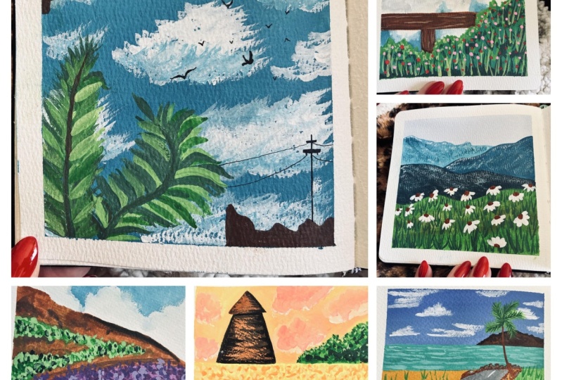
7. Project 1 : Simple Meadow - Part 1: So our first project is going to be a very simple one. We'll be doing a very simple kind of sky and medal for this one. So I'm just trying of fence over here. Just a place holder. And we'll start directly with our color blocking stage now. So for the sky, amusing, several Lynn blue and I'm leaving the white space for the clouds as it is. We will blend them Leto with whitewash. But for now, I'm just building around it. As always, notice that this layer is thinner as compared to the final layers that we will be doing. So this one is quite similar to watercolors in the sense that it's a very light then kind of layer. But since we are going to be building on this later on, the clouds, the blending, et cetera. It's good that we keep it that way. Not really thick, just to thin layer. Now, we do the same for the fence. So I'm using burnt sienna to start with the base layer. So for the color blocking and reusing the burnt sienna and lead Tron VDB, adding the details using a bone Dumbo or a lighter one for the highlights. But for the color blocking is just the simple brown color. And notice that the pencil lines that I had drawn are no longer visible. So that's another advantage of wars that once you sketch, you really don't have to worry about erasing or making it light. Whereas in watercolors you have to be really careful about this because depends on lines show. Now onto my third color, the green one, so abused to sap green for the color blocking speech. Now you can see here that the blending is not happening or you know, this slight mismatch over here which can easily be corrected in the upcoming layers. I am repeating this again, but don't worry about how the article looks at this stage. I know that right now it does not make a very pretty picture. But once we fill in the details, once we fill in all the remaining layers. It's definitely much, much better to fix that Skype because right now it was looking a little too monotonous wherein the sky, the shrub meat. So I'm just adding a little bit of blue here and there. And now we'll start with the next layer of green. So especially for the greens. For example, this is the kind of rule that I follow. First start with a very light SAB dream, kind of mix them a good viridian then do a darker, reinvent, olive green. It almost looks black on the cam, but it's just about dream. And then bumping it up with the highlights using a very light yellowish Crane of green. So that's what I follow. Usually for greens, I'm ready to do the same for all the different elements are layers as well. So now I'll start with the viridian there of the shrub. I am not trying to cover the entire area. I'm still leaving some of the color blocking layer visible. I want to retain that. Notice that this layer is much thicker than the previous ones that we tried out for this project. So this is kind of the creamy matte finish consistency that we're looking for. Now while my green partners crying and start with the blending of the sky from using a slightly below kind of white and just fixing the edges that do sharp. Using the white to blend in. You can add in a little bit of wispy clouds. Maybe I should add a little bit of gray here so that we had some texture or depth to the cloud. So I've taken a little bit of gray and just mixture then towards the center. The lower part is dries. Start with adding these shadows using the olive green that I have. These are just simple strokes, kind of what we do to make grass. So just flickering or feathering kind of stroke using your brush. I guess that's done. So we'd move on to part two of this project.
8. Project 1 : Simple Meadow - Part 2: Now we add a few more. With DR. liquid, that's the darkest green crystal seem simple strokes. So this gives kind-of shadow texture to the overall green barred layer that we have now. And just fix the cloud a bit more. So using your kind of white and just adding it at gave financial Luca with pure white. And now really start with the fence. So for the fans, I'm using darken frowned upon bamboo for adding the deals. Next, we'll add the highlights to the green part. So amusing. Yellow, green color. And we'll start with adding seem kind of strokes. But with a lighter Carlo For the highlight. If you don't have the yellow-green economically is mix a little bit of yellow with the brightest screen that here. Or you could go for a below kind of highlight by mixing white over the green that you have. I think it's shaping up now it looks much better. Just adding some final rounds of strokes for the highlights. Now we start with a fence or for the highlights of the friends. I've just begun the lighter brown, the bond CMA that we took earlier and mixed it with a little bit of white to give this kind of detection. Okay, now I'll start with the floras. So I'm using a hot bank. It's a beautiful, vibrant bring from the Bruce rosette. And I'm to stabbing the brush. Since this is our first project, we're keeping it really simple. So really just dab this heartbreaking to resemble the plurals in this one. And for the next part, we will just add a little bit of white to this heartbeat. We continue with the same kind of dabbing motion for this as well. And for the last round of flow rules, we the simple white. No other Colorado. So I'm just taking a good enough thick mass of the white. And that's it. That's our first project. I hope you liked it and see you in next one, baby being a different kind of sky.
9. Project 2 : Tulip Gardens - Part 1: Now for our next project, will try out a different kind of sky and being a beautiful meadow, something like this, but with a sunset sky. So let's get started. I'll just put some placeholders for the different layers or the rules of flowers that are going to be there. And now let's draw the Tao. And the other one that I showed the artwork had kind of a windmill. Here. I'm just drawing a very simple dour because this is a smaller people and it'll be difficult to fit in all the blades and this one. And that's the piping will have a few more bushes over here. But I guess we can beam them directly. So I'll start with my sky. I've taken kind of orangeish mix, yellow, orange mix, and avoid the dao for now, you can also be into over it and then paint with brown. That's fine as well. But I tried to avoid it and being only the area that is needed because gosh, can take a lot of layers like, like I've said before, you can correct all the mistakes again, Lear it up. But if you add way too many layers, then this chance that it becomes too thick and it can crack. So we don't want that, so we'll avoid that wherever possible. So here I'm just been thing the area that is for the sky. And in this one we'll add the clouds on top of this layer. So I wanted to share both the techniques wherein we leave the space for clouds as well as readonly added on top. Now I'll start with the Garden or the middle below. So I'm, I'll have two rows of yellow flow rules. And then the last one with a pink. So I'm just using a very warm kind of bright yellow. So this is much more brighter in comparison to the sky that we'd been. Did I intentionally kept it source so that we have a nice contrast in artwork. I am leaving those small gaps in between to add the green bush and later on, once it lately Dre I don't want mix it up right now. So I thought I'd just let it rest for a minute. And by the time you're done, been doing the last layer of Fleurus. First one should be dry enough for us to go back and add the green soon. Now for the green health, start with Sap, Green. Again, it's kind of like not too dark and I'm not using a very thick consistency for this layer since we still have the color blocking stage. So I'm just going to be adding this Sap Green to all the green areas for now. Okay, we have covered all the greens. Now. Let's just do some color blocking on the tower. So I'm using burnt sienna, light brown, any light brown to start with. And then in the next layers will fill in on the details with a darker brown. But for this one I'm just using light and not so thick consistency of ProM. Now we'll add some clouds to the sky. So I'll start with yellow mixed with a bit of white. So it's kind of the yellow that we used for the first few layers on tableau rules. But I've added a bit of white to it to make it more opaque. And you can see that the consistency is again, much more ticker than what it was for the first layer of the sky. So I'm just randomly adding a few clouds here and there. Next we lit up to cloud with a bit of crimson being that you have. So we just add this to the bees, need again, be blending this further. For now we just placing them next to each other. I'm using a similar consistency for this crimson as well, just like what I did for the previous one. The white and yellow. Now do blended further. I'm using a white mixed with a bit of Crimson, had the very base. So I'll just add this at the base and blend the scholars in. And we move on to the next part of this project.
10. Project 2 : Tulip Gardens - Part 2: Now we start with the be dealing part. So for the yellow fluorine is, I've just taken a slightly darker yellow, kind of orange and I'm just dabbing the brush. This is kind of the first layer of the daily. We'll be adding a lot more to these Florence later on. But for now we just do this simple dabbing motion. Now for the two loops, I'm using a much darker pink to create the same motion off, simply dabbing the brush, but doing it. So we creating draws of flowers over here. Okay. Now we'll start with the greens. So for this, I'm using a slightly darker green kind of readin mixed with Sap Green. And we're doing the same kind of feathering, flickering kind of strokes. Okay. I pressed a little too much, but that's alright. Its squash SUV can correct it later. So I'm just going to add this leafy bark. Now we move on to adding details to the Dowell. So for this, I'm using the darker brown amber. So you can use maybe the same Brown though that you have and add black to it, or maybe a dark blue to get a much darker shade. Now we add the darker tone for the greens. So I'm not trying to cover the entire layer that with delight agreed to doing some random strokes here and there. Now we add more details to the rules. Once again, not trying to cover the whole layer, we just add the darker, pink or crimson, too few areas, that's it. Now I'm using black for the shadows over here. On to the last bug where b add the highlights. So I've used crimson mixed with white For this particular layer of plurals. So am just dabbing my brush onto some of the fluorophores that we had. For the yellow, since we already have a nice bunch of colors over there. I'm just using much lighter yellow by mixing it with right? And lastly we add a few more highlights. Green, leafy bullshit, using light yellow, green kind of color. Okay, these clouds spin, look a little bill to me. So I'm taking a bit of white, kind of the purest way and adding them to the bees, just blending them in. And that's it. That's next project. I hope you like this and I'll see you in the next one.
11. Project 3 : Wildflower Meadow - Part 1: Onto our next project. And this time we paint something similar to the initial exercise that we're done with the mountains and the metal. So we'll try to be in something like that, but with a bit more detail. And the flowers would be somewhat more detail like we will paint some wild flowers and this one. So I'm just drawing an outline for the mountains where the mountains will be. So we start with our sky again. This time, I'm not going for any clouds as such, just using a simple wash of blue for the sky. Because the sky is not much in focus over here. There's a very small portion where we are having the sky, where most of the artwork is covered with the mountains and the medals. So I'm just going to leave it like this. And now we'll start with the mountains. So for the one that is further away, I'm using kind of a light blue color blocking. And as we come closer towards the full prompt, will try to use somewhat darker shades of blue, going slightly darker for this one. And now since this one is closest to us, I'm using a much darker blue for this mountain. And now we start with the base layer for the meadow. So I'm using a Sap Green, rather thin consistency. Just to give it a bit of depth and texture, I'm adding some rounds here. Not trying to blended MOOC, just dabbling in the Brown. Really cried work on that later on. But for now, I'm not too concerned with blending these two colors. Just dabbing it here. And then we let this guy. Now let's add some snow on top of these mountains. So how I admission this MOOC was like, we have all the snow-capped mountains in the background and some fresh, nice wild flowers in the foreground. And I'm trying to do achieve that by using all these lyrics. We'll be adding similar, the fields on the mountains and the shadows, et cetera, for now. Placing the snow. Okay. It's kind of giving a nice effect. Now we'll add a lot more detail using the darker colors Lee trod. And just for the foreground as well and add some weight here. Showing some melting snow maybe. But let's just keep it here. Maybe. Governor, WE drawn but now and just add a bit of weight to the meadow elsewhere. And we'll move on to the next part of this project.
12. Project 3 : Wildflower Meadow - Part 2: So now we start with adding the beans. I'm Skyping with a darker green. Continue with the same simple graphs kinda strokes for the first layer. Now let's add the shadows. So for this I'm using olive green. Same motion, simple crass, kind of feathery strokes. Add a bit of extra shadows here under this bit of snow that we created. Now, while the meadow dries, let's just add few shadows to the mountains. So far the mountains, I'll be using the b sheet that we use slightly darker or and they go for all the shadows. Maybe if you want, you can make it a dune darker for the shadow part. Same for this mom been using a slightly darker blue than what I used for the base? Just fix the edges over here. Now we start with dropping in the floor rules. I'm doing a quick round off using the same dabbing motion. And on top of this speed adds some nice viral flowers. Adding some extra dots of white. Now after this and just be adding a bundle for CNR, the central part of the flowers. Let's add some fixture. A bit of snow. It's just adding some shadows and some brown. And now I'm taking a bit of our lift and just adding a few more details on to the same rock. Last part we add the highlight. So for this I'm using a very light green, yellow, green bit of blending Hill. Next project. So I hope you like to see you in the next one.
13. Project 4 : Lavender Meadow - Part 1: Now for our next project will be painting a beautiful lavender meadow. We'll still have a mountain somewhere here. Maybe I should have called this class being, being Mountains and medals. But I guess the guru, well together. So in this one, our main focus will be on the middles. We'll just have the mountain and the backdrop. And just making an outline for the middle. Now we start with the sky, so I'm back to the fluffy clouds. So leave some space for the white clouds and just being the remaining area blue. So we have very limited space for the sky in this one. So I'm just not doing going into too much detail. Now for the mountain, I'm going to be mixing a bit of green and brown. So beam some patches of the Sap Green Hill and then add in the brown side-by-side. I'm not too worried about the blending part. Um, just blocking the places hill because we'll be adding a lot more detail on to both these green and brown blocks of Galilee drawn. So for now and just placing them here next to each other. And not too much of blending happening here. Now this problem looks a little blue light for me, so I'm just adding another layer of slightly darker or rather pick a crown on top of this. Next we blocked the middle, so I'm using a light bulb bu bi's Carlo for this medal. And I'll also add the green leafy borrowed over. Using Sap green. I'll start with my next layer for the green. So I'm just adding the darker side over here. And now coming to the shadows off the mountain itself. I'm using bond Dumbo, adopt prone to create the shadows on the mountain. And now we move on to the next part of this project.
14. Project 4 : Lavender Meadow - Part 2: Now I'll start with the highlights onto the mountain. So I'm using very light, yellowish green over here. Nice and my proof. Next we add the shadows using olive creep. So I'm using a nice thick consistency of this column. And we just had to create depth on this. And now I'm using dark bone Tambo mixed with a bit of olive green for the deans or the shadows on the mountains. Next we start with the leaves or just a piece of this metal. So I'm, I'm not adding too many details or do mini strokes to spank. Just random ones like this. For the first layer, because our main focus would be to go with this with the lavender flowers. K. Now we start with the flowers, so I'm using a slightly thicker consistency of the same purple shade. And just doing this dabbing motion to make the first layer of the flow rules. You just follow the overall shape of lavender. But I'm not filling in too many details at this point. I'm just using the dabbing motion to create this flow rule and will be creating this whole layers similarly with the same color. Okay? Yeah. Okay. Now I'll start with a darker layer of purple. So this is much, much darker than the previous layer that we used. And I'll be repeating the same motion to create another layer of Flourens over here on top of this. And since these are closer to us towards the foreground, they'll be darker is when and then. Okay. Okay. Okay. Now I'll start adding some highlights to this. Leaves just adding a few strokes here and there. Nothing much detail. But just to show that we have some radiation over here. And now V at the glass round of leaves with a much darker olive green. I'm also adding them in between the fluence like this. Now we start with the highlight for the flowers. So I mixed with a lot of right to create this kind of lighter shade. Now since this bowl is so vibrant, it took a lot of white to mix this kind of a color. But we'll just add these dots here and the highlight on the floor. And the sort of reversing the process here a bit. But I'll be adding dark Bobo. Not, not like indeed Dale, just a few dabs here and dared to create the kind of depth in the floor roots. So these are kind of shadows on Docker battles. And just one last round of the dealing for this mountain. This part blank. So I'm adding a few lines for texture and this mountain. And that will be like this one. And see you in the next section where we go on to our last project.
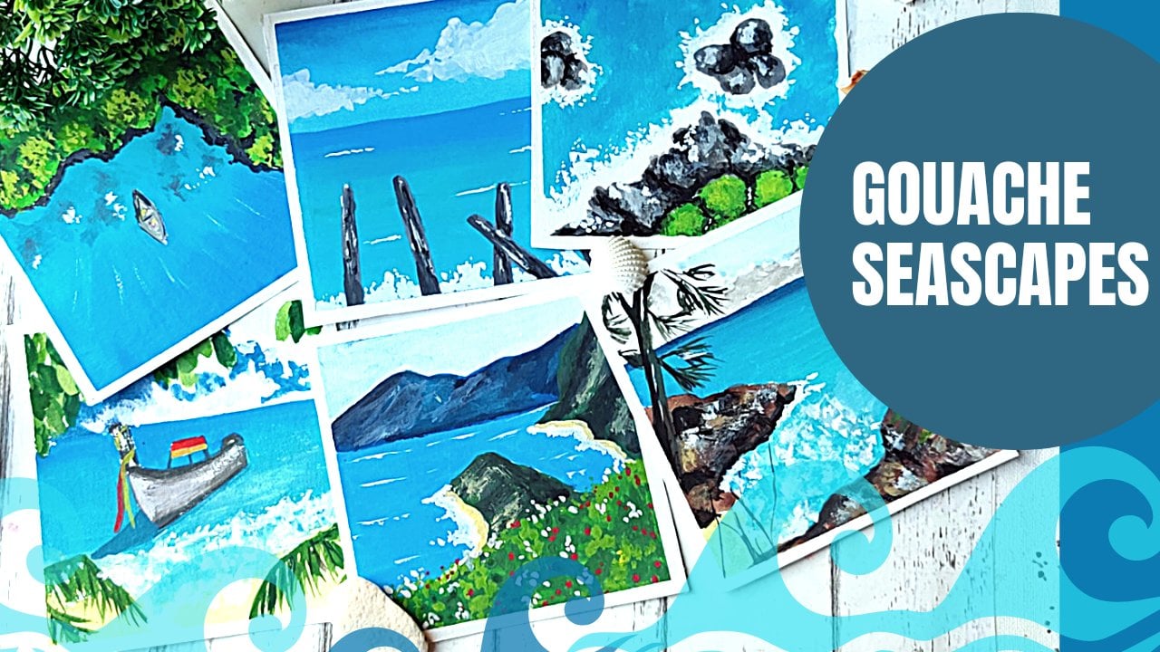
15. Project 5 : Beach Meadow - Part 1: Onto our last project, and this time I ditch the mountain spot some c. So we are going to have the background of a C or a beach in this one. And we'll have a nice floral Bush and the front. Once again, for this one, I'm not going to be focusing much on the sky. So we'll just lay down a very simple layer of blue. So I'm going hill with a nice Suilin blue. Now for the C, I'm using a dihedral and I'm using a thicker consistency here because I am not going to be working much on this part. So we'll just be maybe adding a few waves with white. But that's about it. You're not going to layer this much. So I am directly using a much thicker consistency as compared to the sky, starting with the bush. So I'll block a few patches for some using a premium and really do the same with the fingers rent. Maybe a slightly lighter pink. Add a bit of crimson over here as well. So we'll just be leaving these patches next to each other. Now adding the bank live. So I'm using a slightly darker pink. And we adding on to this with crimson. And for the highlights, I'll be using hot pink and a bit of mixture of white and pink. And that's our color blocking stage. We let this dry and move on to the next part.
16. Project 5 : Beach Meadow - Part 2: Now my fulcrum, this still crying and just add a few reefs at the back. And this, I am doing it with slightly lighter version of white. It's not as bright white as it usually is. So I'm just using a stone down version of White for this. Now we'll start adding the deep fields to the full round Bush. So I'm adding a bit of green and breathe in mixed before the green portion. Now we add some olive green to create the shadows on the screen. Now for the gum starting with darker crimson kind of colors, for the shadows, we add the hot pink and the white pink makes on top of this as highlights. But for now I'm just using this symbol dabbing motion to create this basically with a darker color. Next we start with adding the hot pink. Now, as we move up in terms of layers, the details are getting slightly better as well. So this time I am trying to combine a few stroke to create that floral kind of effect. So this is mainly building above layers. Yes. Okay. Adding a few extra strokes on top of the sea view that BP into it. While the spin hot pink layer tries, Bill, add the highlights to the leafy part. So I'm using the lemon, cream kind of cholera, yellow, yellow and green mix. And suddenly feel the plural Parr does a bit grabs and just add a bit of green over here. And thank you said before this is kind of the beauty of gosh, you can do this. You know, you can just add this kind of later vibrant color on top of this to change the composition. If you, midway through, through, if you feel like it's not working out. Now onto the highlights for plurals. So I have used whitish pink over here. And I'm trying to put in a little more detail into the plurals. And now I'm using a bit of pure white to create some effect on these reefs. Initially, I had used a very toned-down versions and just trying to add a splash over here. And that's a final project where we did not paint any mountains. So I hope you have enjoyed this class. See you in the next section.
17. Thank You and Beyond!: So once again, thank you for joining me in this squash Kickstarter class. And I hope you learned something new. I hope you enjoyed the projects with all the medals and mountains. I can't wait to see all the beautiful stuff you create, so please do upload them in the project section. Also, if you are on social media, you can find me on Instagram, Facebook, and Pinterest as that crazy dude, look, I'd love to connect with you and know your feedback about this, this particular class or any of the other classes. Because it really helps me in creating better classes, better content. And if you have any topics that you'd like me to cover in the future classes, I would love to know about that as well. So let's connect. And here's wishing you a very happy and creative journey ahead until next time.
 Vinita, That Crazy Doodler