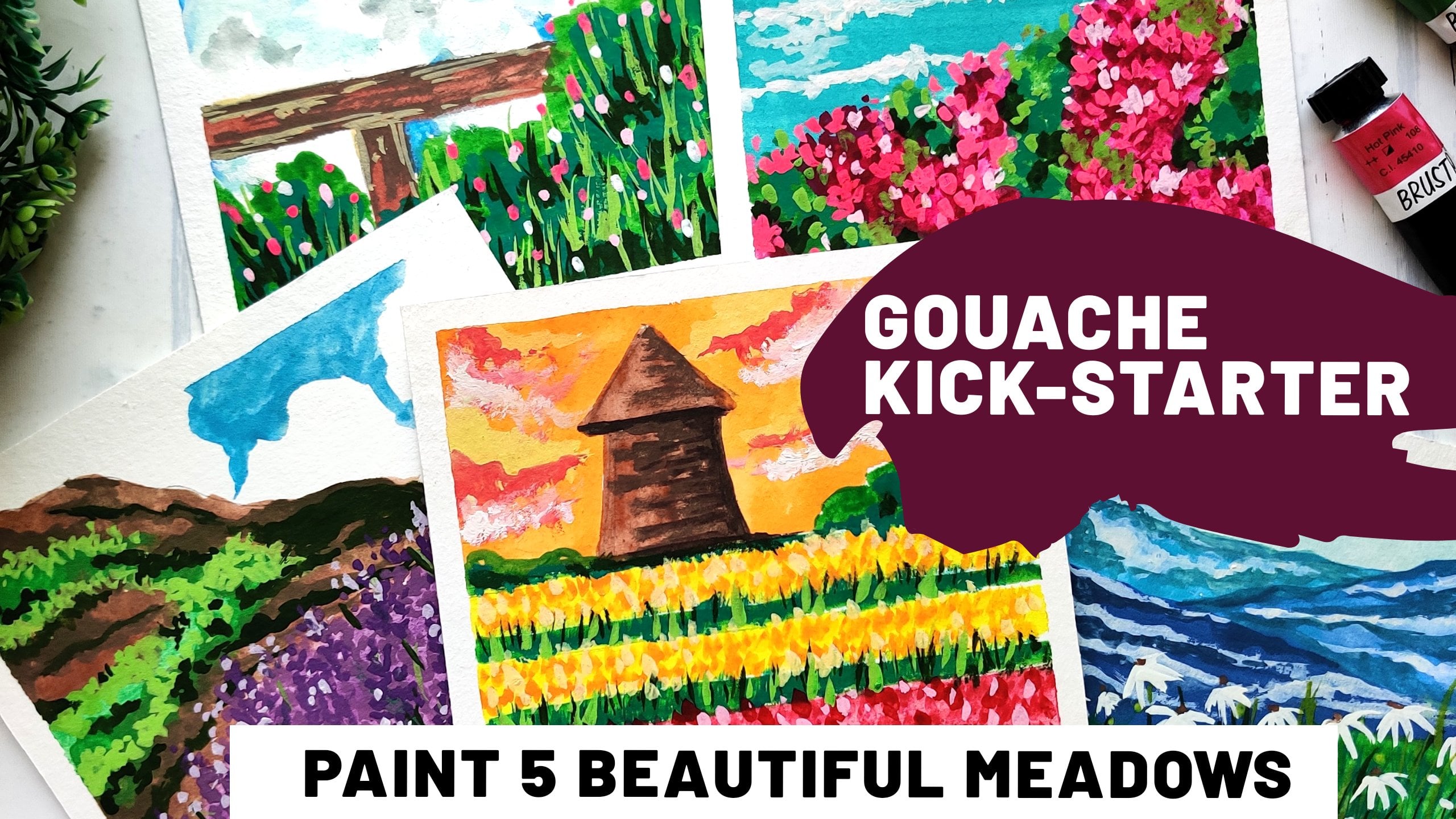
Transcripts
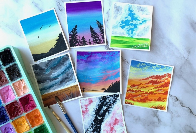
1. About this class: As kids who grew up in the NADH Instagram era, Cloud spotting was one of the most fun things to do for us. So just lying down on the grass, looking up and finding shapes in the clouds. And again, if pass that onto my kid. So she enjoys it to, and this class is all about clouds and skies. And gosh, I'm Anita, I'm an artist and educator from India. And in this class we are going to be painting seven beautiful skyscraper. Now I do have two other classes on gosh, where did your painting see escapes and metals. But this again is a beginner friendly class. So even if you've never tried this medium, you're welcome to join in. We be covering all the basics required to get started with quashed, including the comparisons between watercolors and guage, how they differ in terms of blending, layering, et cetera. Now, I usually call quash as a marriage between watercolors and acrylics. Because as forgiving as acrylics, but yet as beautiful as watercolors. So you'll be exploring the properties of this medium in DT, covering all the techniques that are required to get started and then be in these beautiful skies together. So I hope you're going to join me on this fun adventure and being the skies with me. So let's get started.
2. Materials Needed: So to start with the materials of this class, you lead people. Now I am using the mixed media paper. I prefer something that has kind of a smoother finish. You could also go for any watercolor people preferably hot press or cold press. Not really roughly because you don't really want the guage to be stuck in those creases. So go for something that is moods so that it's easier to work with. But for the type of people you could go with mixed media paper or any watercolor paper. Also, in terms of thickness, usually watercolors. In watercolors you'd go for something like 300 GSM or above with quash, since you're not going to use as much water, you could go for a slightly lower GI seemed like maybe 200 plus. But I do recommend going for something that is suitable for watercolors because this is what a be squashed through. Essentially you still want it to be an absorbent paper and something that is workable. Now, I've got my paper down into the smallest squares, so I'll be doing my projects on these. You're free to use any size of people that is comfortable. You don't be too worried about the size itself because we're going to try out sky. So you could even do bookmarks for that matter. Whatever is comfortable. Now for the brushes, you'll need a couple of brushes, flat brush and round brush mainly at just use these two brushes for all the projects mainly. So the flat brush is for all the background washes and the round one is for adding smaller elements or all the fun things that are there on the clouds. So I do recommend using synthetic brushes when it comes to quash because in terms of watercolors, you go for something that holds a lot of water, like an actual head crash. But when it comes to guage, you don't really need your brush to hold a lot of water because your layers, I'm not going to be as watery as it is in watercolors. So you need something that is easier to work with when it comes to picking up a lot of pigment and link down a thick layer. So I do really recommend using a synthetic brush for that. Now coming to the Guassian itself, I've used a few brands over the years like Bruce row center here and of course the Newton one. So all of these are great. Br2 is creates for starting out because it's really Pocket friendly. And if you're based out of India, you have a similar version in Artesia. So either way, this is a great starting steps that you can get acquainted with the medium and it is not too heavy or new pocket suddenly has a great range. It's really creamy and it has a lot of color options, so it is fun. It comes to these big tubes. So the last really long, and then we have the Winsor and Newton tubes, which are like the professional grade, really expensive but super creamy. So if you're just starting out, I recommend something like breaststroke because it has a great range. It's really good quality. And you do get a lot of options in these colors as well. It comes in a pack of 24. And apart from this, if you don't have gouache colors, you can also try it out with postal colors. Now, the main difference between these wash brands and the poster colors in fact, is the kind of additives that go in, so impose the colors, the quality of the additives is really cheap because these are student grade paints, so they will come off when you rub your hand on the paper, et cetera. But if you're just starting out, these gave more or less, the same effect may not be as vibrant, but still you can get the quash effect with post alkalosis well, but when it comes to upgrading your palette, maybe you can go ahead and try out different brands. You can also buy individual tools just to see how they differ in quality. But it's worth trying out, even if you don't have to wash brands right now, you can definitely do it Poster colors. And that's that. Let you lead a board to tape the paper down and masking tape, and we're done. So let's get to the next section.
3. Watercolor vs Gouache: In this section, I'm going to be talking about the key differences between watercolors and gosh. Now please note that we talking about water-based squash here, because the actual cost differs and its properties, it is more leaning towards the actual exam watercolors. But when it comes to water-based squash, its properties are very similar to what colors. But we do have a few enhancement as we'll be seeing in a minute. So I'll start with the watercolors. So in watercolors, the primary driver is water as the name itself. So you're going to be adding a lot of water to the cameras. Even if they are like copper saturated colors will still be wanting to have sort of transparency or translucency in the colors for your layers. So that's going to be how you paint with watercolors, with adding a lot of water so that you can have that lose transparent effect. Also when it comes to blending. If you keep two watercolors next to each other, they will cry to blend into each other on their own. So depending upon what type of pigments you are using, they tend to be more or less friendly. Now in this case, you can see that the ultramarine is trying to go into the ping, but it's not aspirin D. But if you use a pigment like maybe Permanent Alizarin crimson, you'll see that it just flows into this, so I'll just try that out as well. Now here you can see that the crimson is just running into that blue. So depending upon the pigments are using, the watercolors will be blending more or less bleeding into each other. But in any case, if you keep two what we colors next to each other, they will blend on their own. Wash is not as friendly, so you need to give them a little bit of nudge to get them started with their friendship. Now this is because we use quash at a much thicker consistency. So I'll be going for sort of a creamy finish over here rather than having a lot of water. So I'm not going for the translucent effect. You can get it. When it comes to Bosch, you can use it as watercolors, but they won't be as why imprint because the men to be applied in picoliters like this. And when it comes to blending. So if I pleased this thick layer of carmine and then add certain color next to it. Maybe, let's add this violet. So again, I'm using this add ticket creamy consistency. So if I use this at the consistency at which squash is supposed to be used at the, you'll see that they don't blend. So I'm keeping it right next to each other and none of the cards are trying to blend into the other. So in this sense, we need to push squash a bit so that they are friendlier. And we do have a separate section where we cover all the blending aspects. Also, wash, dries faster and has a matte finish as compared to what colors. And you'll see that it can be easily re-wet. So in blending, we're going to use that property where we're going to revisit these layers and blend them together. And you'll see that adding a little bit of white does change the streakiness of the color as well. So if you're feeling that You can just super streaky, just add a little bit of white and it'll become quite smoother. So we'll be covering all the details about blending and layering in the next section.
4. Blending Techniques: Now, for living when it comes to watercolors, you have to be extra careful. So you have to go from light to dark. So if you have C represent water or clouds in the sky, et cetera, you'll have to leave all the whitespace that is there and paint around it or mascot. So that's how it works in watercolors. But when it comes to wash, you can go from light to dark or dark to light. We just have to keep in mind the kind of consistency we use, which I'll be sharing in a minute. But basically there is no restriction as to which color needs to be done first. So you could go with the darkest color and then layer it up with the lighter ones as well. It's perfectly fine. We just have to make sure that your Beasley is not really take. So by this, I mean that it's slightly more watery than the foreground layers. So here you can see that I applied a violet and then I'm adding this white on top of it, the white clouds, sort of clouds. So you can see that it is coming off. The violet is trying to come off with the white. This is because quash can be rewarded. So even if it has dried completely water-based squash can be easily read it. And this is the reason we need to go with a slightly thinner consistency for the base layer, the first layer. And as you layer it up, as you add layers on top, you can make it thicker. So we really don't want it to be like super thick the first layer, because you'll end up picking up the pigment in the subsequent layers. And also when it comes to the streakiness of the layers. Like I said, you can add in a little bit of white and you'll see that the main colors like there are a few blues and purples that no matter what, which brand you're using, will end up being a little streaky. So you can just add a drop of white to it and they will be much smoother. So while painting, you just have to make sure that you go from one direction to the other. So either left to right or right to left. But he should not be doing it both ways unless you're blending it because that is what causes the streakiness. But otherwise there is no such restriction or as to which color to go with. First, you can go with any dark color, all light color based on what you're painting at that point and layer it up. So in this case, for example, I added the blues first. I did leave a little bit of white space. But all these little fluffy ness of the clouds that you see at the end was done with white on top of this blue. So we have to make sure that the base layer is not really thick so that it doesn't come off with the subsequent layers. Now coming to blending, I won't go into another color theory detail. But we do know that when you try to mix some purple with an orange or maybe a blue and a yellow, you'll get up colors that are not really sky colors, right? So you don't really want a green or a muddy brown in the sky. So for that, what we're going to do is we're going to blend it in a way that these colors can still go together. For example, here I have the purple, the yellow, and pink in between. So if you have to see go from yellow to purple sky, but you can do is you can have intermediate steps like having a pink or blue in-between and then blending them together. Or alternately, you can use white to blend the colors together. I'll be showing both the techniques over here. So I'll be doing a purple, pink, and yellow sky over here. Now this is a rough sheet I'm using. The blend may not be as smooth, but I'll just share the process over here. So I'll start with the purple, I'll just leave it that and then adding the next layer. So we're not really going ahead with the blending right away. So I'm going to leave the purple there and go ahead with the next color. Next we'll add the pink here. So again, I'm using a Muted Pink. I've added a little bit of white to it. And I start with it right away like this. And I'll just blend it up all the way to the purple. And you can see the tiny strokes I'm using here. And since the purple is being reweighted this point, you'll see that the color comes off a little. So you would want to go from light to dark so that you don't end up picking up the purple and putting it down towards the yellow. But if you feel that it's not really mixing up, you can use a hint of white and then start over again. So here I used a little bit of white and started from the yellow backup to the pink. And then you can do the same with the pink and the purple as well. So essentially you're trying to create a harmony between the colors that are there. So the blending itself can be done using a simple white quash and a clean brush. You can mix the two colors together. Or you can just go step-by-step using these different colors and blending them together. Either way, you're going to use your brush, clean brush to blend them together. And it's not going to happen on its own. So just to give you another example here, I have this bright vibrant orange, yellow. And if I want to mix it with, say, a blue, for example, to start with, and I'll be adding the white in-between these two. So you'll start with the lighter one. Okay, my brush is really messed up. So you'll start with the lighter yellow part. You'll be mixing the white there and then going up towards the darker color. Now in this case, you have to make sure that your brushes cleaner and not like this, so that you don't end up picking pigment from the dark layers and putting them on the lighter ones. Because gosh, As you can see, can be reversed very easily. So if you want to have a smoother blend, you'll have to clean up your brush frequently so that there are no muddy overlies in terms of the layers. And again, if you feel that any of your pigments streaky, but you can do is add in a little bit of whites that the not as tricky white add a lot of chalk or additives to the colors. So even the darkest colors, if you add in a little bit of white to it, you end up getting a much smoother color. So for example, if I have this violet color, so this is the actual color. Now I'm going to add a little bit of white to this just to show you how the color changes. So again, it's not a lot of white, we're just adding a few, just a hint of white. So you can see that the color remains more or less the same. Yes, it is slightly lighter, but this one will give you a much smoother finish when it comes to laying those background. Rather the background wash about the sky. So I do recommend adding a little bit of white to your colors if you find them to be streaky, but they still have the right consistency of the color. And also to have the right color combinations as we will be trying out. So let's get started with our first project.
5. Projects 1&2 : Simple Skies: So we'll be starting off first, second project together. Now these are simplest case, so I just plugged them into one video so that it's easier to show you the blends and differences. So we're going to have a nice blue over here to start with. And I've added a little bit of white to the cobalt blue, and this is the color I'm getting over here. So I'm just going to use a simple stroke like this to add the color. I don't have a lot of water added, so you can see that it's already in the drying process and it's not streaky a search. You can see that even though I'm applying a clickers, you don't see a lot of streets. It's quite smooth. So we're going to have this blue at the top. Now for the bass part, I'm going to use another yellow. Again, this is going to be a mutant yellow. So I'll be adding a little bit of white to media law to get this kind of color. So this is, as you can see, it's very toned-down yellow. So we'll be adding it at the bees. Tell about like midway. And now after this we'll be using a little bit of white to blend these two together. Now if you go in and blend directly, it may give you a very different kind of color. But when you're blending it to white, it makes it much more simpler. So I'm using the white here. I'm starting with the yellow part and just slowly moving up and blending it in. So the blue again, when we apply it in this manner, it starts to reactivate and we just have to blend it in with the white like this. Remember that while you're doing this, you have to make sure that the blue doesn't come off to the yellow part. So we'll just be using the white from the base to the top so that it doesn't get into the other colors. And just use a clean brush or white to blend it in like this. All right, I'm going to let this dry and in the meantime, we can start working on the sky. Now for this one, we're going to have the blue, pink kind of combination. So I'm going to start with a very muted pistol, kind of pink. So I've added a lot of white to the carmine. So you can see that this pink is quite tone down. Next we add the blue. Here again, I'm using the cobalt blue with a little bit of white added. And I'm leaving those spaces in between as well so that we can blend them together later. So again, you could use the blue directly to blend in with the pink and then at the top with the purple. Or you could go with white blender. So in this case, I'm going to add the next color over here, the purple color right now we'll go about adding the blending. So I've used a little bit of white and a few strokes of blue as well. Just get this blend together from the blue to the poker. And we do the same for the pink part. I'm adding a little bit of white along with that pink. And we blend from the base to the top. So we keep adding color and blending it upwards. And then we let it dry. Now once the people describe, we can go ahead with adding smaller details onto these guys. Or you could keep these guys and or at clouds to it. We do have five of the projects we're in. We're going to add Cloud. So this one, I wanted to keep it super simple sky like this. And we'll add a few elements in the foreground. Maybe some trees or some wires, et cetera. For this one, I'm just going to start with these words. And then we have a few mountains over here. Now here you can play with the colors. So by adding the dark part, you could add in a little bit of white so that it is slightly lighter. And towards the base, of course, you can go with the dark color. Also may be added towards the right so that it doesn't look as MD. Here, we'll be smaller. Just select something shows up here so that it's not left completely empty. Here again, you can either play with the values like you can start with the darker one and keep adding up the lighter elements or just keep it simple. Black silver. Totally your call. Now, coming to this one, I'm just going to be painting some simple pine trees. Again, I'm using the black and I'm just adding the pine trees over here. So there are numerous ways to increase. A lot of people do this, the central blog post and then add in the details. So I'm not adding the trunk over here, but I kind of have an idea about how the tree is going to be, the shape is going to be. So I'm just using that and adding in the detail. Whether you're always, if you find it easier, you can always add in those little stems are trans in the middle so that it helps you get the direction of the tree. Now when it comes to painting pine trees, make sure that you're using a smaller brush. I feel that most of the times we go wrong with the pine trees because we're using a much bigger brush. So if you're using a smaller brush like this, we should be able to get a much clearer. Now you could add in as many trees as you want. You could also use a lighter black and being done. Just keeping it simpler here, not to add in a lot of the things. You could also add in snow or status on to this just by using a toothbrush. And we are done. So I just added a few more trees in between. Now, like I said, if you want to add in stars to this, just cover this area and add them on top. I'm just leaving it like that. So that is the combo of first, second project, simple skies. Now, from the next project onwards, we'll be adding a lot more detail in terms of clouds and land, et cetra. So I hope you're going to join me on this and try out these projects. So let's move on to the next project.
6. Project 3 : Candy Floss Sky: In this project, we're going to paint a sky ski with nice cotton can be fluffy clouds. So we're going to use a light blue for the sky. Now, I'll show you a quick technique about how I will be going about painting these clouds. You can either be in the whole sky blue and then add the white clouds on top. But I prefer leaving the white as it is like just leaving the white part. White and not being blue. Because when you're painting with a nice creamy layer, there's always the risk of lifting up the previous layer when you're building the white later. I just leaving the white part as it is because I know that I'm going to have clouds over here. But we will be painting on top of this blue later on to add a little bit of blending and fluffiness towards the end of the clouds so that we're going to do on top of the blue. But for the medial portion like this where we know that it's going to be mainly white. I just leave it as it is. And I'm just painting around them. So I'm just painting the sky here with this blue. And we're almost done with the sky. So once you're done with the sky, you don't really have to wait for it to dry before you go to the land part. So that's the beauty of, gosh, I'm not really worried about this mixing or blending asset because it, et cetera, consistency when it won't really plan. So I'm using this green for the land since it's a nice and vibrant skyscraper, I thought I'd go for a nice green like this. Yellow green mix. So you could go with any green that you have in your palette and add a little bit of yellow to it to make it a bit more vibrant. So we'll just add this in clean strokes and cover the whole land part. This point I feel like I'm going towards that Windows wallpaper, but we're going to paint a little bit more onto this, will add a few green patches on the side as well. I'm just fixing the horizon over here. And now I'll use a slightly darker green. Just add it in here and speaks like this. So it is trying to build up a little bit of texture on the land so that it doesn't look boring. Simply, big patch of green. So I'm just adding a little bit of variety to that. For this, I'm using a slightly darker green. So you could go with the sap green. So earlier we mixed a little bit of yellow to it. Now we're using the green hazardous. And at this edge, maybe I'll have a muddle e-tron. Now I'll just add a slightly darker patch and leave it because this is closer to you, so this will be darker and much more detail as compared to the land that is further away. And now we'll add some details on the clouds. I'm using this query over here. Maybe I'll go for something slightly lighter. So I'm adding a little bit more white so that it becomes like this. And we'll add these inside those white areas that we left for clouds. Now you can see that the brush is not really loaded with pigment. So I'm using more of a dry brush techniques, something, something similar to what we use in watercolors. So it's not really full with pigment or water, just this kind of a rough brushstrokes. Because we went to blend the score though with white wash later on. And even the edges that you see between the sky and white clouds. We're going to blend this in with the white quash. So there's a reason I'm not going with a lot of details strokes for the scary part. Now once you're done with this, we'll clean the brush thoroughly and then start with the white. Now as you start using gosh, you realize that white is the most used color when it comes to course. So you'll be using it or a lot of purposes like blending, making color streak free. Of course, all these white patches. So when you're using white, I prefer to keep it in separate sections so that it doesn't get mixed up with the other colors. And also, while you're picking up the color, like in this case, I've blended it in with this blue. But you can see that a little bit of blue does come off to the brush. So if I just use this brush here, you can see that I've picked up the blue from the previously. So for this reason, if you're picking up wide, keep cleaning your brush off and just dab it on the tissue, just wipe it clean. Then pick up the white against that. It doesn't get mixed up with the other color and it stays white. So here I'm just using white gouache directly, not with a lot of water. And just blending these edges. And with every few strokes you'll see that you start picking up the blue. So at this point, you just add in the clean water and just wipe the brush. Click on the blue from it, and then add the white again. So we're displaying to create a nice edge to these clouds distilled globe fluffiness. Now, if we had gone directly with a full blue sky, then you would have to add a lot of white quash to get a proper white cloud on top. So that's the reason I left quite some area blank. I didn't paint like I didn't add any color to it. I just left it white as it is for us now it's easier to blend it this week. Now once we are done with blending all these edges, we can go ahead and blend that create years where you have the same technique will be using white concentrated, right, with very little water and just blending it in and these circular motions. Now I'm done with the edges, so I've cleaned my brush and I'm picking up more white, the standard blending in the gray part. Now, again, I'm not using very definite strokes here. It's more on the rough side, but basically it's in circular motion so that you can blend these pre and white together. And we do that for all the four big clouds. All right, I'm done with the blending. Now we again clean our brush and the bureau way with very little water and just add it at the edges over here. So this time I'm not really blending, so I'm using a lighter hand. So you can see that it's much easier to be. This way. You're just dabbing the brush like this. You just put into being done there. You're not really trying to blend anything. And therefore you won't be picking up any pigment lever. In the previous one, we were trying to get that hard edge that was there between the blue and the white area that we were trying to get it blended. And that's the reason we were using those circular strokes to get it blend together. Bird in this case, we just adding the little fluffiness around the Cloud. And for that, we just directly using the white and just dabbing it slowly like this with a very light hand. Now just adding some more white little clouds in here. That's it. We're done with the sky and the clouds. Now for the land here, I'm thinking of adding a middle. So something really simple, like these white dots that it looks like there are some flowers in here. Maybe we can add in another color as well. And we'll just go with something that's already on my palette. So I have an orange here, so just adding a hint of white to it to make it a little paler so that it goes with this white. I still want the attention to be on the sky and not on the lab. So this is just an add-on to the sky. That's it. The project is done. So I hope you enjoyed this simple and fun project and go give this a try. See you in the next one.
7. Project 4 : Stormy Sky: Our next project is going to be a stormy sky. So we are going to have a little bit of land, as in the previous projects as well. But this time we're going to be in the lab. So I'm going to use a very muted colors. So just basic yellow ocher and burnt sienna for the land part. So I'll just show you the mixes as well. Alright, so this is going to be okay plus let me just separate the projects. So this is going to be the base layer of yellow ocher. And we'll add in a little bit of burnt sienna on top of it. So we're going to have this much of the land part. And we'll start with that. Starting with the yellow ocher first. And again, since we are not going to layer this up much except for that burnt sienna which will be added sort of n layer itself. The creamy consistency stays for this color as well. So I'm using it as a slightly thicker consistency than the normal base wars that you'd go for. Now. I'm adding the burnt sienna and blending it right away. So this is further enhanced texture and bring in a little bit of depth to the land part because this part is going to be closer to you. So making it a little darker, we'll add a few elements later on maybe, but for now, we're just making sure that the base layer is done right. And now without having to wait for this to dry, although it's almost cried, the yellow part is almost dry. We'll start with the sky. So for the sky, I'll be using a mix of colors. So I'm adding a little bit of cobalt blue and of black to it. And then to just make it a little more opaque, I'm adding very small hint of white. So this mixture is cobalt blue plus a little bit of black and a very tiny hint of white. So let me just show you how this looks like. So I'll be using this mix mainly for the sky part, will be adding the Cloud on top of it with white, etc. But for the sky itself, I'm just going with this dark tone down blue. So I'm just adding two to three patches like this. And leaving a lot of space in between for us to work with the clouds. So now we'll start with the clouds. So I'm using one of the grease that we mixed in the previous project. And so if you run out of that gray, you can simply add in black and white good, so we still need it to be lighter because we'll be adding black later on. Still needs to look like a grid. And in this case, I'd like what we did for the sky. We're going with these circular motions. So I want to give this cloudy, stormy clouds effects. So I'm doing this circular strokes and stove simple straight strokes. And again, I'm not really loading the brush. You can see that it's more of a dry brush kind of stroke. So we still will be adding a little bit of white and black onto these clouds. So you don't really need a lot of pigment in there. It's mainly about just creating this effect, this gray area before we move into adding the shadows, the dark clouds, and then all the white highlights. Now I'm going to create a slightly darker green mix. And for this, I'm going to just add a little bit of black to the next step we already have. And then we lift it up on top of this gray cloud that we have painted. So you see the slightly darker, we still have room to add black. So it is not like the darkest color in here, but it just varies a little bit from the grid that we used earlier. Once again, I'm not using a very loaded brush, still quite light, and I'm still using those circular motions. Now I just blend this area in here because I really don't want a stop white sky. So just blending the paint, just blending it in with the white. Now we add the black clouds. So for this, again, we have those darker gray cloud. You can just add it right next to it so that the continuities mundane and really blending this again with white. But for now I'm just adding all the black clouds first black area and then just blend it in. Now, I'll start with the blending. So for this to start with COVID agree, same grid that we've used to you, but just that we're using it to blend this black. So you'll see that the black pigment gets picked up. And also because it is not fully dry. So it will be bidding debate, but that's okay. We're trying to get that kind of blended effect. So it's finding even a little bit of black is coming onto the brush. You can just blend it in like this. Hello. Now we'll blend it a little bit with white. So I'm digging, not soap your way. It's still got a little bit of gray over here, but I'm just using it again to blend this black. So you don't really want any dark hard lines. So that's the reason we are blending it down like this. So you could either go with a gray or white, depending upon how your clouds are looking at the moment. Now we continue blending with the white. So any white patches that are left are any hard edges that you can see, either of the blue or the black or the quiz. We just try to blend it in with white. So again, we go with the circular motion and we're not adding a lot of pigment. We are keeping it light and we are using a light tab and circular motion and just get this sort of a blend. Now for the land part, I'll just add something over here, maybe a little bit of grass. So just use this darker brown, that is the bond damn book. And started a few streets like this. Adding detail. I just felt that we could maybe add in a little bit off something, some sort of an element that will add something to the lab. The focus is still on the sky, but this is just like an add-on. Now I've mixed a little bit of white to that burnt sienna. And this is the kind that I get. And I'm just adding it to the end. Streaks over here. And the remaining part I'll just add, just rolls off the CMA. Just adding some textures, some variation on the land because it was looking at the asic. So I hope you enjoyed this one and you'll get this a try. See you. The next one.
8. Project 5 : Sunset Sky: So our next project is a pistol sunset. So again, the sky will be the more prominent part in this painting and we'll have a few elements at the BSW. Now for the colors, we're going to go with colors mixed with white or mainly piece two colors. So we'll start with a yellow at the base than adding a pink, blue and then popup. So for the yellow itself, I'm going to mix mid yellow bit white to get this kind of a very muted yellow. And then we have the pink. So I'm using a common mixed with white over here. So this is again going to be a very toned-down pink. And to give you a comparison, I'll just share the original carbon next to it so you can see the difference it is making. And I got separators, so I'm just adding it here. After this we have a patch of blue, so I'm using a ruler and mixed with white over here, as you can see. And just to give you the actual color, you can see that it's much more vibrant, but we're going for a more subtle pistol kind of sky this one. So I'm going to be using mainly the ones mixed with white. And then we'll end this with violet. So this will be the darkest part. And we'll be mixing a little bit of white to it to add the clouds later on. But that's about it. These are the colors that we're going to use for this project. So we start with the b's, and here I'm adding the yellow. So we don't have a specific land area and this will just maybe add in some silhouettes later on, but mainly painting the sky directly. So my yellow part is done. Now, I'll add it the pink to this. Here again, we are using galoshes property to remove it and just blending the pink into the yellow part. So you can use a clean brush or use yellow to blend it all the way up. I think it became a lot lighter. So I'm just going to add a little bit more thing to this part. Now here I'm doing these angular strokes, so I'm trying to create a little bit of a blend in the sky itself. So just adding in these darker colors here so that you can already see the sky shaping up. And next we have the blue, again, blue mixed with white. And we use the same strokes and create a slight angle here and add in the blue. So even after mixing white, it's quite vibrant. This blue. And I kind of like it. And while mixing, you can see that it kind of creates a very light purple in here. But that's fine. And I'm also adding these strokes so that it kind of looks like the small clouds. We will be adding the clouds later on, but for now we just blending the same. And at the top we have the purple or violet. So this, I'm not going to mix it with white right now. I'm just using it as it is, a very saturated color and also I'm using it at a very normal thick consistency. Consistency is not not like we've created any light layers here. All of them are at slightly thicker consistency. And now we use the blue and white mix to blend this in. So I'm just going from the blue part to the purple part or the wild part. And that's it. So after this we're going to add the clouds. Now for the clouds, we added the same violet but with the head of white. So I'm going to go with this color so that it shows up on that dark violet background. And COVID this one. So just to show you the difference between the mean violet and this white mixed while it, you see that this one is much more lighter. And the more white you add, the lighter or more bacon kit. So I'll start with adding the clouds over here. So here again, I'm adding them at an angle and not really following any pattern as search. I'm just adding them in like this at an angle. We use the same mix to add the clouds at the top as well. So here because Brian, it in the background is much darker, you'd see that it kind of blends in our picks up the pigment to an extent. But that's fine. We're just trying to blend the area over here. We're not really looking at creating stop contrasting clouds. We just wanted to blend it in with the sky. And for the lower part, you can go ahead with the same mix. And you can see that it shows up much better over here. Just a little bit of blending. That we don't have any stock hard edges. Now for the bees, since it is looking quite empty, we'll add a few elements over here. Maybe lamppost or maybe a tree. Let's see, we'll just add something that makes it look a little bit more interesting. So I'll start with a tree over here. So I'm using a dark black color here, like this, has smaller brush so that we can do the dealing properly. Just adding this conduit of a tree. Now it looks quite empty on the right, so I'll just add something over here so that you can add it properly. And we're done. This is hands down one of the best projects from this class for me because I really enjoy sunset and this was such a peaceful thing to be. I know I shouldn't discriminate then all the other projects agreed to, but this one just has a little extra space in my heart. So that's it. See you in the next one.
10. Project 7 : Night Sky: Onto our last project where we being the magical night sky. So this will again be following similar techniques as to what we did in the first, rather the third project in which we painted white cotton candy clouds. So we'll be using a similar technique to pin the pink ones in this. So this is the color I'll be using. Just take a little bit more pigment so that I can show it to you properly. All right, that's for the Cloud, so we'll start with that again. Bb, marking the area for the clouds and building the black rounder. You can always been the whole thing black and then pin this on top of it. But then it may not be as vibrant because it might end up picking the black color. And for that matter, we're not even going to use black for this sky part. You'll be mixing your own colors. But for this cloud, we leave, you're just reading the Cloud hill and not really can't covering the whole cloudy area. I'm again using this simple blending motion, a circular motion like this, so that we can have the blend with white added later on. Now, for the night sky, you could either go with black, but I wanted something with a little bit of blue undertones. So I'm mixing Prussian blue hill with little bit of black so that I can get this kind of a color. Again, this is something that I'm doing so that we don't end up creating a very black sky. I wanted to do on the blue side as well. So I'm not sure if this shows up clearly on the camera, but this is the caliber and you're going to use for the sky via again painting around the clouds. But this time we leave, leaving a little bit of white space in between so that we can blend it in together. This again, is that a creamy consistency? So it is not really my dog loaded report though. So we'll just leave a little bit of white space next to the thing that we did and being the remaining sky. And then we let this dry for the clouds. We will start with blending the banquet white. So I'm using very saturated right over here and just doing the circular motions again so that we get a nice blend with the pink. So I'm not loading my brush, I'm just using a very light hand and just blending the pink in. We don't want those hard edges that we can see right now. So we'll just be using white to blend those edges like this. Now on top of this, we'll add a few white clouds later. But for now we'll go ahead and mix this one as well. Blenders one with light. Now since we are done with the blending, we will start with adding the white clouds of this. I'm using the pure white and very little water uses wanted to be as white as possible, so we don't want to tone it down with water. And we start adding this at the edges where we have that white eating the dark blue sky. Now the idea here is to remove that hard edge that was dead, the white edge between the sky and the ocean we left for the Cloud. So here again, you might end up picking up the pigment of you blend too much. So arenas to just add in a liberal white towards the edges and just make it feel like it's part of the sky and doesn't have any hard edges. And in between these two big clouds will be adding smaller clouds like this with white. Again using a very light hand. Otherwise you'll end up picking the pigment up from the previous layer, which we don't want. So just add in these clouds with a very light hand and not so low blood pressure as well. Because you don't really want it to be fully loaded over here. We wanted to be kind of this streaky. Now we blend the other cloud letters again, just blending it that white portion that he had left. So using y two blended and with that sky color. Now adding highlights after this. So on the clouds where we have the slot thing, we will be adding a little bit of white so that it blends in. Again, we're just trying to remove all the hard edges so that nothing is too much and contrast. Keep cleaning your brush before picking up the whites that you don't end up smudging it with the sky color or even the pink for that matter. So I just keep cleaning your brush in between and then adding this white. So it shows up as much more vibrant when you're using a clean-up brush. Now, almost done with the blending. And I'm thinking of adding a more into this like in between the two clouds where we have the sky. Basically add an illusion of magic to this. All right, looks so much better. Now I also add a few stars. Now, since we have a lot on the sky part as well. So we don't really want to use a brush or just randomly drop the stuff. So I'm using my smaller brush. Just add these thoughts that resembles stars. And we're done with our final project of this class. I hope you enjoyed the ending, this magical night sky and you will definitely give this a try. So see you in the next section.
11. Thank you!: I hope you had fun painting these beautiful skies and clouds and girls. And you'll give these a try. If you do, please do upload them in the project section, I'd love to see all the beautiful stuff and appears on social media. You can find me on Pinterest Instagram. Peaceful. And I've talked with you. Please share your projects with me if you have any feedback, positive or negative about this class or any other classes with me. Making better classes, who I reach out to me. So I'll see you soon with another class. Then. These beautiful clouds and sky.
 Vinita, That Crazy Doodler