Transcripts
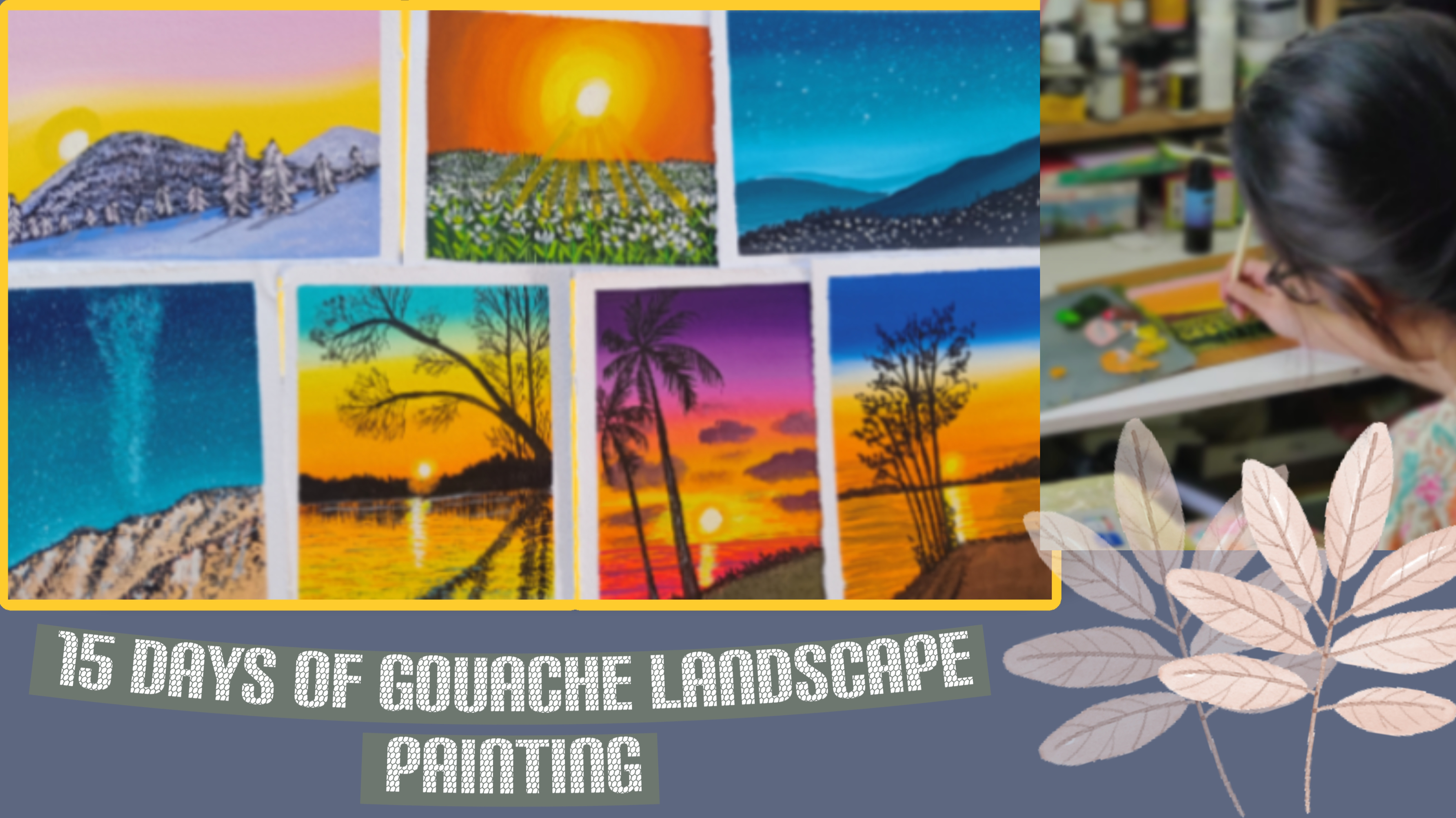
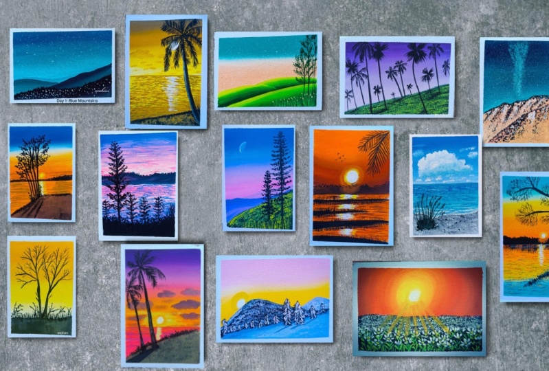
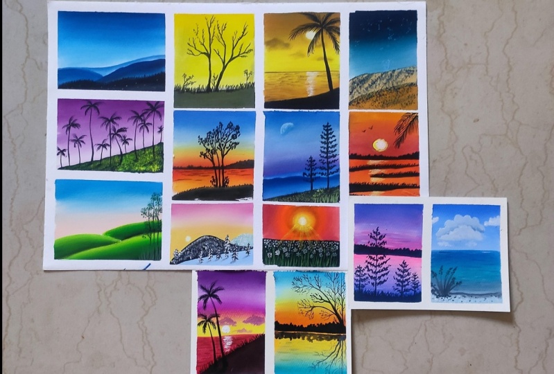
1. Intro: As truly said in nature, nothing is perfect,
and everything is perfect. Hello, friends. My name is Mohani Sina, and I am an acrylic
artist based India. I mostly do landscape painting and animals and bird
portrait painting. Many of you know me as Mini Art Gallery from
my Instagram account. In this class, we will be painting 15 different
landscapes, which is specially
designed for bignes. I will be posting the
tutorial every alternate day so that you get time to complete each and
every painting. In this class, you will be learning how to do perfect blending with two
colors, three colors. Then comes the mountain painting
with different textures. Also, we'll be learning
different tree forms, the pine trees, the palm trees, and different varieties of trees here we will be learning. Here we will be learning
how to make perfect grass. Without wasting any time, let's start with our
day one painting, and I hope you will enjoy this
whole 15 days journey. No.
2. Materials Needed: Let's first discuss about the materials which
we will be using. The first thing is the
paper which we need. This is the A five size paper. You can use A five A six size,
whichever size you want. This is 100 GSM Sorry, 300 GSM paper, 100%
quatern pressed. Like this, I'll just place it on the acrylic sheet with
the masking tape. And this is the acrylic
sheet which I will be using, especially for this as
a base for this paper. You can use any base
whichever you want. Now, let's talk about the color. This is the ach color from
Brostro which I will be using. It has 24 shades. You can use any brand ash
colors, whichever you have. This has 24 set of colors. Variety of colors are there
inside this in a tube form. These colors I will be mostly
using in my paintings. You can use any brand colors, whichever brand you
have, you can use it. Now let's discuss about the brushes which
we will be needing. These are the brushes
which we will be using. First, the flat brush, then the round brush, then the rigger brush, then comes the filbert brush, then fan brush, this
is Bristol fan brush, then the pencil, the technical
pencil, then the rubber. All these things
we'll be needing. And then the palette. This is the glass
palette which I will be using for keeping my colors, and the lease two containers you will be needing one for clean
and one for dirty water. So two containers you will be needing for the painting and the tissue or cloth for
cleaning the brushes. Apart from that, let's
see how we can do the taping of with the
help of masking tape. So this is the sheet. I'll use this masking tape and half masking tape should
be on your paper. And half masking tape should be on the base, whichever
you are using. So my base is the acrylic sheet. So here half is on paper
and half is on the sheet. Likewise, you have to
place it all around. The four corners so that you can give a nice border
to the painting. This is completely optional. If you want to paint it
on the entire sheets, you can paint it
on entire sheet, but I like to create borders
when I'm doing the painting. So I mostly use these masking tapes to give a nice border
to this painting. All the four sides, I will just apply this tape half on the sheet and
half on the paper. Let's discuss some
techniques that how we will be
doing the painting, especially the blending part. Let's start with that. Oh.
3. Blending Technique: So welcome back. Let's start with some techniques
that is blending. I here I will show you
two blending techniques, one with one color, and one with two color. So I've taken just two colors, one blue, and one, this is yellow, ocher and white. So here I will be using my
flat brush for blending. So first blending, which I'll
show you is with one color. Dip it in water nicely. Remove excess of
water like this, and then take the first color. That is the blue color
which I'm taking here. So First, I'm applying a single layer of this
dark color first, and I will show you the
transition from dark to light, how the transition goes and how you can
blend it perfectly. Here I've used the color. Now I will just take
a little bit of white and I'll mix with this blue. Again, I will apply the color. I'll try to blend
the colors first. Always when you are blending, take the colors
from light to dark. I'm just washing off
eye brush, and again, taking a little
white and mixing it with this blue little bit. Then again, I will
apply this color. Again, I will mix and I will blend the colors
and I will take the colors towards up
so from light to dark. This is how it goes the
transitions with one color. Wherever I will do
the blending of this, this is how we have
to blend the colors. Now I've taken
again more white to this color and I'm trying
to blend the colors. Now first, I'll just
fill in this area, and I'm taking just
white and again, a little more white
and I'll just fill the entire this area. So you can see the
lines are there right. First, I will wash off my brush. Nicely, I will just
wash off my brush, remove excess of water, just like wiping it off and just try to blend it very gently, very light touch of the brush. Now, every time whenever
I'm going towards darker, I'm just washing off my brush, removing excess of water, and then you have to
go from blending part. Because when we go
above the colors comes inside this brush. Now again, I will just add a
little bit of darker color. I'll try to move the
color downwards because I want a little
more darker color. Like this, I'm just taking
the colors still down down and since the lower
area is white in color, when I will pull the
color little down, this will turn into a
little lighter blue. This is how we have to do the transition from
dark to light. Now let's start with
again, blue color. Here we'll try not to mix blue and yellow color
together because whenever you blue and
yellow color mixes, it turns into green, so that we don't want. How we can avoid it. First, I've added blue color. You can see I've added to the one layer of blue
color on top of it. Now I will just wash
off my brush nicely, and then I will
take yellow ocher. Before that, I'll just add
white in between and I'll try to blend the color first
with this white color. When white is added
to this blue, this color becomes a
little lighter in shade. Just mixing a little
more white and I'm just mixing and blending the
colors from light to dark. So don't put too much
pressure on your brush. Otherwise, there
will be brush marks. Now I've taken just
this yellow ker. I'm trying to put it below. Just covering the lower
part of the sheet, and a little bit white, I will add to this yellow, and I will try to
first blend this both yellow color because I don't want too dark
color to be there. You can see there is
a space in between this blue and yellow. In order to avoid making
the color turn into green. What I will do is, I
will take white color, and I will just first
apply it in the center. First, I will blend the
lower part of the page. Then again, I will take the
brush to the top part slowly. This is how we are
going to blend the colors from when there
is yellow and blue mix. This is very important. We don't have to make the
colors turn into green. Again, I'm adding
a little bit of darker blue color on top
of it and I will pull it down so that in
the white portion, and I'm not going towards
the yellow so that again, it will turn into green. So I'm just mixing
the colors slowly, and this is how when
blue and yellow comes, we use white to avoid
them turning into green. In most of the cases in
background, we use white, but here we use a
separate white in between them so that it
don't turn into green. This type of blending we'll be using in some
of our paintings. I hope this will help you in doing these coming paintings. So just blend it very lightly and there
will be no brush marks. Lightly means with light
pressure on your brush. Just let's remove these tapes and see how the
blending has come up. Whenever you are
removing the tape, remove it very slowly and at an angle so that the paper doesn't come
out and very slowly. You can see At just taking
out the paper at an angle. So if you will take
the paper at an angle, your paper will never, and you can easily
take out tape. Now let's start with
our first painting. So that is the Blue
Mountain paintings. Let's start our first painting, and I hope you will like it.
4. Blue Mountains Part One: Welcome back. So let's start
with our day one painting. This is the sheet which I'm
using in a landscape form. So I'll just draw a rough
sketch of the mountains. These are all
overlapping mountains, which I'm drawing here, very simple sketch,
not much to do. A simple and basic sketch, which I'm drawing one mountain, overlapping on top of the other. So I hope it is visible. So Try to draw it in
a very light manner. Whenever we draw
anything on paper, try to draw it with
very light pencil. So I will just darken it up so that you can see it properly, that what I'm trying to draw. These are some four
overlapping mountains as you can see one
on top of the other, which here I have drawn. And after that, we'll
discuss about the colors, which we will be using. We'll be mostly using the
blue colors, different blues. Here we will be using. So it is a painting of all
different blue colors. So first is white color, which is needed, of course, and then comes the Sralim, blue, Prussian blue and black. So all these colors
we'll be using. So let's start
with the painting. So I've just taken out the
colors and the palette. So all these colors, black, serum blue,
Prussian blue, white. Now my flat brush, I've taken enough of
water on my brush, and just grabbing my
colors, the two colors. That is Prussian blue
and cerliu blue, and I'm just trying to
first add the darker color. So the transition will
be from dark to light. So this is how we
are going to do. So the first thing here, I have added more of Prussian blue and
less of cerliu blue. And as I will go down, I will add cerium blue. A little more than the Priscian blue and also
a little bit of white. And I will add again
this second color, and I will try to
blend both the colors. Always try to blend the
colors from light to dark. Here, the lighter color is
where I have added white. Try to move the brushes
from light to dark color. Now I'm adding a little
more white to it, and I'm just trying to
fill in the lower part. Likewise, I will move and I will start adding more
and more white to these blues so that it gives a transition from
dark to light color. Let's add little water
and little more of white, and again start just by
adding more lighter color. Just blending the colors
from light to dark. Now I will just take
white color. That's it. I'm not taking any blue color here because blue color is
already there on my brush. I've just taken white
and I'm just trying to blend this lighter color
with the above color. Very slowly, the color
which is near to the mountain is
the lighter color. I'm just blending
from light to dark. Again, I will just take
a little more white to it so that it becomes a
little more lighter in color. Oh. This is how I'm just
trying to blend the colors. When you are blending the color, don't press your
brush very hard. Otherwise, there
will be brush marks. Now the first upper part
of the blending is done. Now I will just do
the first mounting, which is a little
darker than the one, which is the above sky. I've just added a little
bit p brushian blue and I'm just painting it
with my round brush. Very slowly, I'm
just painting it and I'm just trying to give
a little shape to it. So it should be a very
neat and clear lines. So that's what I'm
just trying to do. This is my smaller size
brush round brush, which is of size four from Princeton, which
I'm using here. And now I'm just adding
a little more white to give a little transition
from dark to light color.
5. Blue Mountains Part Two: So similarly, I will be taking a little bit of prussian
blue and cerium blue. And I'll also take a little bit of black to it to give a
little different color. Little black, very little amount of black you have to add, and just mixing a
little white also to give a muted shade of color. And I'm just trying to fill the second mountain
with this darker color. As I will go down, I will add a little
more white to it, and I'll start blending
the color simultaneously. You can see water is
only on my brush, and I haven't mixed any water
in these colors because these colors are already
in a quite liquid form, not liquid, at least
creamy form, water, which is on your
brush is more than enough to blend the colors. Suppose if your
color has dried up, you can obviously use a
little water in this. Just blending the colors
a little bit more. Now, in this painting, my most focus is on
the blending part, that how you can blend the
smaller area as well as the bigger area as we have seen in the techniques which we have used
in the blending. Now let's do the third mountain, which is a bit more darker
than the one which is above. I will here add
more of cerium blue and black to this a
little bit of white, not too much, just
to mute the color. That's why I have
added white in this. Little bit more of black
because this should be a little darker color than the one which we
have used above. Just first outline the mountains and then start
filling the colors. This will be easy for
you to fill the colors. First outline it nicely, and then try to blend the
colors and fill the colors. Upper part is dark
and as we'll go down, I'll add a little bit
of white to this mix, and then we'll start
blending the colors. So we are blending not
only on a bigger a, that is the background, we also blending the colors
in the smaller area, which is these mountains. Everywhere blending is needed, even in the smaller area, also, we need blending. Always take the blending from the lighter version
to the upper part. Slowly blend the colors, and you can see how nicely all the three
mountains are looking when we use the dark
to light colors. Now the lower part
of the mountain, I will use simply black color. Simply I will be just filling
it with black colors. It's a very simple painting,
yet very beautiful. Like I really enjoy
doing such kind of painting where we only use
only one color that is blue, but in different forms. Now you can see my
brush has dried up. Just add a little
bit of water in your brush and then
again start doing it. When we are covering
the lower part, I'm just adding a little
bit of white to give a little gray touch
to the lower part, not too much gray, but
it should be a darker gray and I'll try to
blend that color. This type, you can give a little variations
to these mountains. Similar techniques
are used when we use acrylic colors as well. But here in Gach that
you can do the blending easily because these colors
reactivate with water, but not in the case of acrylic. This thing you have
to keep in mind. It's much easier when
we use gauche colors. But when we use acrylic, we have to take care that
both the color has to be wet. Now, I've done all
the mountains. I will just add a little
bit of tree shapes on the top just by depicting the lines and dots on top of it. Some bigger lines,
smaller lines with my round brush to give a reflection of the small trees which are on the top
of the mountain. Now let's add a little bit of smaller dots in
these black areas. It will look like that there are small huts and houses
which have small bulbs which are lightened up in when it is evening or it
is the night time. You must have seen in
the mountain areas, that there are small
lights which are visible in the far mountain
areas where there are small houses and huts
which have small bulbs and lights that twinkling
on the mountains. That's what I'm trying
to create over here. You're just bigger
and smaller dots. You have to fill it
up in this area. Here I'm using my rigger brush for doing this and thick color. Don't use thin colors. Use thick colors for doing this. Now you can leave the
painting like this or you can create some
stars on top of it. I would like to create
stars on top of it. So before that, I'll
just cover this below area with my note
pad or something. You can cover it with
anything, whichever you have. Just make sure that the
color has dried up. Then only put a note pad
or a paper on top of it. So I've just covered
the lower part of the area with my notebook. Just covering it up, and then
I will use my flat brush. And with lots of water
on my flat brush, I will just take
this white color and lots of white colors, lot of watery white colors
I will take on my brush, and then I will just sprinkle it with my finger and with the
help of finger and brush, just sprinkle it on top of it. Try to keep it at a
distance so that you get a crisp and clear dots
especially on above the sky. Just a few stars here
and there on top of it. I'm just trying to create you can see already this painting is
looking very beautiful. I really liked the
whole outcome of it. So just adding a few more stars, bigger stars with
my rigger brush. So do try it out. I love to see this if you
are trying it out. It's very simple and
beautiful painting. I hope you will
love this painting. This is just Tan painting. We have 14 more to go. This is the whole painting, just few dots here
and there and we are done with the painting and now comes the most soothing
part that is the removing the tape
out from this paper. Very gently take out
the tape at an angle, and when you will
take it at an angle, the paper will never tear off. Try to take it very
slowly at an angle. And you can see how nicely
the borders have come up. This is it, and let's start
with our next painting.
6. Bright Summer: So let's start with
our d two painting. So this is the portrait shape
paper which I have kept. Now, let's start
with the discuss about the colors which
we will be using here. So this is a bright
summer background which I'm trying to
depict over here. So mostly the colors
which I'm using here is the medialo
and lemon yellow. And apart from that,
neutral colors. So all these colors
I've taken out, that is white, lemon
yellow, medialo, and black. Let's start with first the
blocking of the background. Again, the flat brush
I'm using here. First, I'll just
dip it in water, and then I will take
first to the color, which is the mid yellow color. You can take mid yellow cadmium yellow or chrome yellow,
whichever color you have, you can take it and just apply on the first layer
of color on top of it. The first layer is
the darker color. Here you can see, I'm
just applying a half of this with this
medi yellow color, and then I will apply
the lemon yellow. First, I'm applying just this in the half page till
the mid section, I've applied this med yellow. Then I'll just wash
off my brush and then I'll take another yellow, which is the lemon yellow, which you can see here, and I'll just apply in the second coat and I'll just try to blend
both the colors. Again, blending should be with a very light pressure
of your brush. Don't bend your brush
and don't press it. Otherwise, there
will be brush marks. Just try to blend it very
nicely with your brush and always move the brush
from light to dark. Now I will use the same brush and I will take this color
and I'll just try to blend it more This is how you
have to blend your colors. Now, let's use our
white color and this yellow color together
and just trying to mix it. A little more. Whole of this from dark to light transition I have shown
with just yellow color. Now I will take this black
color and mix it with this mid yellow to make
it a little color, which is the little sap
green color or olive color, you can say this color comes up, and I'm just filling
this lower portion. Just with my flat brush. You can see here I
haven't drawn anything, and I'm just trying to fill just trying to shape
it with this flat brush. Just trying to fill
in this pillow area. It's a very simple and
easy painting where we are just focusing on
the background part and the textures which
are on the ground. I'm not bothered about to be a very nice blending at the bottom since this
is a ground part. Now I will start doing some more textures
with my rigger brush. This is a rigger brush
which I'm using here. It comes in three different
sizes that size 02 by zero, three by zero, any size you can use whichever
size you feel like. Now, I'm trying to create
small grasses just by mixing this black and
mid yellow together. I'm just trying to create
some small grasses. Just fine lines below. The small small grasses you
can see in the below section. Just make it quite
close to each other so that there will be
less gap in between. When I was doing this painting, I was still thinking
whether to put this painting in
this section or not, but I thought to put it down. Then I thought to just
put it down so that And I'm just creating
some more tree lines. Now, this is a summer season
where all the leaves are fallen and just the branches are there. So it's like that. First, I'm just trying to create the tree trunk and the
whole shape of it, and then I will do the s, tiny, tiny branches
and stems over there. This thing, you can draw it first and then you
can outline it. It's up to you how
you want to do it, or you can just do it
directly with this color. It's your choice. Simply making a little
bit of not a smooth line, some thick lines in
between and then flat. Now I'm just trying to first
give the shape of the tree, and then I will try to make more and more
branches out of it. Simple tree lines. I never make the tree
in a straight line. I try to make it a little
more in a zig zag form, a little more in a wavy form. So just I'm trying to do that. Slowly, slowly, I'm just
making all the tree lines. It's a very simple
and easy painting, and any one of you can do it. Even a Pigner who
has never tried it can do this painting. The main focus here
in this painting is the tree branches and the stems, how it is coming out. All these paintings you
can do in any medium. You can use your gauche medium, you can use your acrylic medium, you can use your oil medium, whichever medium you feel like
you can use these mediums. Just creating the branches slowly and giving the
shape to this tree. You can also create
your own style of tree, just see any trees which are nearby your house and try to copy that tree
branches and structures. This is how we get to
know that how we can create the branches
and the stems. Now, this tree I'm just
doing like in my own form, just creating some
branches here and there to make it a realistic. Just add adding one more
tree beside this tree, which is having a
slanting tree trunk. It is not straight.
Making the lower part a little more thicker. Whenever you see any tree, the lower part of the tree is more thicker than the
one which is above. As the tree becomes
taller and taller, the more it becomes pointed,
especially the branches. So that's here what I'm
trying to depict so that you can get an idea
that how to create the tree branches and
the tree structure. Whenever you are trying
these fine lines. Always try to use a little
watery color, not thick color. It should be in liquid
form, not watery, also, but it should
be in a liquid form. Then only you will
be able to move your brush nicely and
make some thin lines. If you will use thick
colors, this will not work. It should not be a creamy color. It should be a thin color. Then only you will be able
to create these fine lines. You can see I've just
created these two trees, and I'm just adding
small small leaves here and there, which are there. You can say it a leaf or you can say anything, whichever
you feel like. I'm just trying to
create small dots here and there on
the branches to depict the are a few leaves
which are there on the tree. Small dots here and
there on the branches. Very simple and easy painting, where here we are focusing on the trees and tree branches. Also adding a little bit
more of some bushy area below with just the rigger brush and creating it with dots. Just dots and I'm trying
to create the shape. These dots are very
close to each other. This is how you can
make some more bushes and grassy texture below, especially at the ground area. Simple dots here and there
I'm just trying to create, as you can see, few more lines where I feel that there
are empty spaces. I'm just adding
more tree branches. So more grassy texture below This is it. I'll not do much of it. You can add birds in this, you can add more tree, more grasses in this. It's your choice, but I
will leave it like this. Slowly, I'll just
take out the tape and our second painting is done. It's very simple painting. Any one of you can try it out, if you're trying it out, do share it. I would
love to see it. This is the entire painting. Thank you for watching.
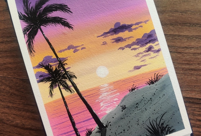
7. Purple Sky Part One: Hello friends. Welcome
back to Day three. These are the colors which we'll be using for our
day three class. That is the purple sky. Here, violet, color
is the main color, black, lemon yellow,
and olive green. All these colors we'll be
using here for our painting. This is the landscape
shape which I have taken. L et's start with
first the background. But before that, let's do
a little drawing first. I'm just creating a pathway
which is below the area. It is mainly the purple sky, which I will be painting and which is
filled with palm trees. I'm just creating the land, just the land area, that's it. After that, we'll start
with the painting. I've just taken out the
colors on my palette. That is lemon yellow, violet, white, and olive green. Let's start with a
painting, also black. Let's start first
with the background. I've just dipped it in water and I'm just taking
the color first. The first color is the violet
color which I'm applying. This again is the transition
from dark to light. This is how we will be moving. First, the dark color, then I will be mixing a
little white to this violet, and I will be slowly going downward by adding
more violet to it. And simultaneously, I'm trying to blend
the colors as well. Whenever you are
blending the color, always blend the colors from
light color to dark color. Don't blend from dark
to light, otherwise, the entire color will
become the same color. So just keep on blending. Don't use too much water. Water should be
only on your brush. And if your color is
dried, of course, you can add little
water in your color. But if your color is like mine, which is creamy color, just water on your brush is more than enough
to do the painting. So now you can see I'm
slowly just filling the color and simultaneously
blending the colors as well. I really like this violet color. It's very vibrant
and it's very light. So I've just applied
a little more of this light violet color, which where there is more of
white and less of violet. So like this, there will be a nice transition from dark to light colors,
as you can see. Just making it a
little more dark the above part because
all the colors are looking a little same, so I'm just trying to make it
a little more darker color. Just blend it very softly when you're doing especially
the blending part. Now you can see how perfectly
this has been blended. Now we will do the lower
part, which is there. Before that, let's first do a little bit more
of the blending of the colors because I want a little darker color because all the things
are looking very light. I've just applied
a little more of the purple to the second area, not to the top one
to the second one, and I'm just moving the colors
to the above part as well. You can see now it is looking a little better than the
previous blending. Now the above blending
has been done. Now we will do the lower part. For this lower part, we will be using our black
color and a mix of green, green, and it's
quite dark green. If you have dark green, you
can directly use dark green. Otherwise, you can mix this
olive green with black. And just filling this area, I'm not bothered about that it should be a perfect blending. I'm just trying to blend
I'm just trying to fill in this area with the vertical
strokes of the brush. Oh It's a very simple painting, yet it's very beautiful. I really liked the outcome which has come up the entire outcome. I hope you will also
enjoy doing this. It's simple and easy. You just have to do
a simple techniques and the background will be
filled with the palm trees, and you can see there will be two different types of
palm trees in this. Now you can see
both the background and the foreground
has been filled. Now here I'm using my fan brush, just taking green and Now, again, whenever you
are using fan brush, use a damp fan brush. Don't use a wet fan brush. Otherwise, these textures
will not come up. So I'm just applying little
textures on the above part. This is this bruh fan brush
is Bristol fan brush. It is not synthetic fan brush. Bristol fan brush gives a very nice textures when we
apply all these textures. I mostly use these brushes
in most of my paintings, if you have seen my paintings. So just adding little grasses. This is the best technique
to add grasses using a damp fan brush and taking thick colors and applying
it to the ground. Try to make these textures
as close as possible. I'll try to zoom in a little so that you can see it clearly, that how I'm doing the
texture part, especially. Just damp brush
and thick colors, this lemon and green
and you can see how nicely these
textures are coming up. This is how we do the grass textures and almost
the grass texture is done. This is how we are going
to do the grass texture in most of the paintings
where we will be using this texture with our fan brush. Now comes the lines, which first I will
draw for the trees. I'll just use the rigger
brush and thin black color. So don't always whenever
you are drawing any lines, use thin black colors. Thin colors means it should
not be totally watery, and it should not be milky, should be in between that. So I'm just trying
to create lines first where I will
put the trees. So some bending lines,
some straight lines, some lines are in between the
grass, some on top of it. So different varieties of trees, will be there on
different positions. So I'm trying to show that when we are putting the
line on the top, that means the tree
is very far away. When we are putting the line
totally in the bottom part, that means the tree is
a little closer to us. So like that, I will be
trying to depict the trees, especially the
palm trees because here we will be mostly
drawing palm trees, which the two types
of palm trees. You will see how we are going to draw these two types
of palm trees. So first, I'm just
locating the area where I will be putting all
these palm trees. Almost I'm done with
the lining part, and now we'll create the leaves.
8. Purple Sky Part Two: Now, let's start creating
the leaves first. Now I'm using my
rigger brush again, and this color should be in a liquid form if you
are drawing the lines. We'll be creating two
types of palm trees. One is this and one
is another one. These palm trees are
mostly you have seen in the ocean areas and where
you can see the sea waves. Mostly these palm
trees are there. The second palm tree
we'll be creating in a different form that we'll see, and you can see this will
be completely filled with all two different
types of palm trees. What I'm doing is
I'm also creating another small tree over here, which is half visible and just creating the lines
and small leaves. Once you will do these
many palm trees, you will see that you are now an expert in
doing palm trees. So there are so many palm trees. You can see. The
more you fill it, it is filled with this land is filled with palm trees
of different varieties. Make sure that your
color is thin. Don't take thick colors. Otherwise, you'll not be able
to paint thick thin lines. Now this is another
type of palm tree, which I'm drawing here. This has actually
a shaped structure and the leaves are coming
out of it. It's like that. When I will do the bigger one, maybe you'll see it more clearly because this
is a smaller tree, so I'm just making
the smaller leaves. This is how I will
be just making some of these palm trees,
some of the other one. Alternate, I will
be doing the trees. Just make it a bit longer. It's like the bushes
type of thing, which the lines are coming
out of this V section. First, I've created
those V section, and then I have done the lines. Now again, one more small tree. Again, you have to make
very small trees here. Structure it is. Try to use your rigger brush
size two by zero or three by zero for doing
this type of line textures. Now, this is again the
same second palm tree, which I have shown you. Let me show you a little closer. You can see how first I
have done the V section and then I'm trying to take
the lines out of it. Like this, you have to create these palm trees in this manner. This is a different
type of palm tree. Oh Similarly, I will be filling up these all areas of
filled with palm trees, and you'll see how
beautiful it looks when this entire section is filled
with these palm trees. It's a very simple painting. I have tried to first start
with the simple ones. As we'll proceed further, then we'll go to a little
difficult ones so that you get a practice of
doing the paintings. That's why I have started with very simple simple paintings,
which you can do it. Slowly, slowly, I'm just doing
one by one the palm trees. Now here I'm doing
the first one. This is simple lines
first I have drawn, and then the vertical lines which are falling
down like that. This is a very common type of palm tree which we
can see everywhere, especially near the sea area. I'm trying to cover each and every part especially in this landscape paintings. Slo slowly, I will be
taking one topic so that you get to know how
to create such things. After that, you can create
your own imagination of your landscapes once you know the techniques
and the tricks, how to do it. When I started with
these paintings, I mostly used to see the paintings or the images
and then I used to do it. But now with my own imagination, sometimes I create the
landscape. This comes with time. It doesn't come like
all of a sudden. It takes time, but when
you will start doing it, automatically, it will
come into your mind. Let me keep this thing,
I will look more nice. This is how we do
the practice also, and it is so mindful and it is so meditative that when you start doing all these
paintings, you will just Go inside this and you'll
not think anything. So try to do it regularly. At least 30 minutes
of time is more than enough for you to
do these paintings. Even if this painting is
not being completed in one like 1 hour or
one day, it's fine. You can begin this
painting in the next day. You can stop it at that point, and then you can start this
painting. Another day. Don't worry that you have to finish this painting in one day. Don't think of that. Otherwise,
you will not be able to complete the painting
as you have thought to. And there may be chances that
you can ruin your painting. So If you are not
in a mood to paint, don't paint, just sit and relax, have coffee, tea,
whatever you like. And then whenever you have you want to paint,
then only painted. But at least try to
paint 30 minutes. That's it. No more than that. You can see I made
half tree on the top. Now I'm making smaller
ones in the below. You can also fill
this with more trees, but I thought not to
fill it too much. Otherwise, it will look very crowded and you will not be
able to see it properly. So that's why I try not
to fill it completely. But yes, you can add
more trees in this. Different trees also
you can add in then. You can see already
this whole thing is looking very beautiful. You can use different
background. If you don't want to use
this pilot background, you can use any other background whichever background you
like. It's up to you. It's up to your
own imaginations, how you want to create it. It's just the technique
which I'm telling you, and you can create your own Just an idea I'm giving that how you can put in the trees and everything, and then you can do it by
your own imaginations. You can also add a little
bit of flowers in this area, where I have put the grasses, anything, whichever you
feel like you can do it. So And slowly you will start enjoying this
process. Like I did. I also started with one
painting like 30 minutes or so. And then slowly, slowly, I started enjoying this, and then I am like into this. Now, I made this
as a profession. Earlier, it was just my
hobby. I started with it. Then, slowly I started
enjoying and I thought, why not to put it
in a profession. So like that, I have started
this painting thing. This painting is almost done. We are done with the trees. You can add more
trees if you want, or you can leave it like this. You can add here birds which
are flying in the sky, whichever thing you want,
you can just add it up. I'm just trying to
create little shadows with this fan brush bla, shadows with black color. Now, this is completely option. You can and you can leave it
like this. It's up to you. This painting is almost tan and we'll now take out the masking
tape and see how it looks. You can see how
vibrant this violet is looking especially the sky
part. I'm really liking it. I hope you will also
enjoy painting this. Oh.
9. Yellow Reflection Part One: Hello friends. Welcome
back to Day four. Let's start with first drawing. A little bit of
drawing is needed. The base, which
is the land area, it's a bit of slanting line. Then comes the middle area, which is the middle line, especially in the center. That's it. The drawing part. Now comes the colors
which we will be using. The colors which we will be
using here is the black, yellow, cer, lemon
yellow and white. These are the colors. I have just taken out the
colors on my palette, that is black, yellow, oc, lemon yellow, and white. Let's start with the painting. First, I've taken my flat brush, wet the flat brush, and then take yellow cor and a little bit of
black because I want a little darker shade on the top and a little bit of
white to mute the color. It's like this shade of color, which I'm using in the top part. So here also, we'll move towards the transition
from dark to light. So I'm just now applying
this yellow occur only, and just now see the black
was there on my brush. That's why that
black has come up. So I'll just remove
it just by adding more this yellow occur and I'll try to blend
both the colors. So here, it's not like
acrylic that you have to wait for both of
them to become wet. Even if one has dried, these colors get
reactivated with water. So this is not an issue
in this gauche painting. So I've just added this
nice lemon yellow color, which is very bright color, and just adding and
trying to blend the colors with yellow ocher. Same thing we will be
doing in the water part, but it will be opposite
since it is a reflection, al first to the lighter color, and then as we go down, it will be the darker color. Likewise, we will be moving. Always, the reflection is
the opposite of the sky. This I have done, the top part. Now, the same thing I will
be doing in the lower part, but in the opposite direction. Now let's take first
the lighter color. Just adding a little more
of white towards the line, which is joining
the middle area. Now the first upper
part is done. Now we will be doing
the lower part. Little bit color, I need to
take out this lemon yellow. Now again, I will be
using same brush, that is my flat brush. First, I will put this
yellow color below, and then the yellow ocher. Then the color, which
is the darker color, where I've mixed black
into this yellow oc. Slowly, we will move
down from light to dark. I'm also blending the colors just putting yellow ocher first. Actually, I'm dividing all
these areas into three parts. First is yellow,
then yellow ocher, and then the darker color. Likewise, you have to
also divide the area, and then you just need
to fill the colors. It is a very simple and very beautiful and bright painting. Just adding more of black in this and just
adding this area, which is the lower part
with my flat brush only. Mostly, we have covered the entire blocking
is almost done. We need to now do the little bit of detailing clouds
water effect. So here I'm just adding a single line with
yellow ocher to give a division between the background
and the middle ground. Now we will add
some more details, which is the cloud details. Then comes the water detail. Let's first do the clouds. Now here, I will be using my round brush or you can
use this filbert brush. This is very nice brush. Just adding a little more of
yellow ocher to this black and just dabbing my brush
and creating these clouds. Since this filbert brush
has a round tip on the top, you can easily create
nice clouds with this. Now, these are very simple
clouds and very easy to form, and don't take water
when you are doing this, use a damp brush and thick color and don't
mix the color too much. Otherwise, the below color will reactivate because these are gauche colors which
reactivate with water. These things we have to
take that we don't have to overdo the round part. Otherwise, the background
color will get reactivated. Simple small clouds, I'm just adding here and
there and I'm just trying to fill more and
more little little clouds. Very simple and easy
clouds are these, not too much of detailing
I'm doing to these clouds. Now I will add a mix of white over here to make a nice
round sun with my again, this round brush,
and just adding the outer highlight
with lemon yellow. And I'll just try to
blend the colors. I'm putting the sun in the side so that when the
tree will fall on it, the sun will come in between. Like that, I have
placed this sun part. Just adding a little more of this lemon yellow
to the outside. And you can just plant
the colors just with your brush without any
color with a damp brush, and taking more of this white and putting in
the center because I want to take vibrant
white sun in center. This above part is done. We'll now do the
water detailing. W
10. Yellow Reflection Part Two: So now let's make the brush a
little thin with my finger, and I'll just use the same color and a
little bit of black. And just with this
tip of the brush, I will be doing the
detailing of these water. Just the tip of the brush, don't use too much
of water in this. Make that brush pointed with
your finger and then use it. Then these textures will
automatically come up. Don't use too much of water
when we are doing this. So just adding these details, these textures very
closely to each other. This is a little time
consuming process, but this adds a real, very good effect
to the paintings. I have done in most of
my paintings where I do these sea or the water part, especially I do these
types of textures in that, and it looks really, very beautiful once it is done. You'll also see
how this has come up when we'll complete
this entire painting. Don't give too much
gaps in between, do it very close to each other just with the tip of
the brush and just dab, dab, dab, and then that's it. You have to do the texture part. Just covering the entire area of this water part and almost
we are done with it. So now let's add a little bit
of lighter color to this. So in between, I'm just adding the lighter color so that I
can get a little blend of these textures between
bright and dark color so that it doesn't look like they're two separated things. So that's why I've added these lighter textures as
well in the darker portion. Now you can see how beautiful
this water is looking. Now when you will add this
reflection details as well, the sun reflection, it adds
more beauty to this painting. Just adding a few more of yellow architectures
on the above part. So try to make it as
close as possible. These lines don't give
too much gap in between. You can see how bright and beautiful it is looking when
we add lemon yellow to it. Lemon yellow actually adds
beauty to this painting. Now let's do a little bit more of the detailings of this
part, which is the land part. I've just mixed a little bit yellow to this yellow
ocher and just adding a little
bit dots here and there and filling these spaces. Just a few dots and a little
bit of black dots as well. Just a little bit
of small textures. I'm adding here and there
to this lower portion. I hope you guys are enjoying this series of gauche painting. I'm trying to cover as much as I can so that you can learn
the basic techniques. Now here is the fan brush, again, a little bit of
textures on the top, I'm just adding to
give a nice effect, like we did in the
painting of T one. Just a little bit of textures
here and there in between. It's a very good brush
for adding textures. Whenever you want
to add textures, use Bristol fan brush. Now we will do the
palm tree here. Let's draw a nice palm tree. Already we have drawn
so many palm trees. I think this will be
an easy palm tree for you because in
the last sections, we have already drawn
so many palm trees. But here we will only
draw one palm tree, which is a simple palm tree
of one type and That's it. You can add palm trees, you can add different trees. It's your choice. But here I
felt like that we should add palm trees because it is a
river side or the lake side. So the palm tree
should be there. So that's why I added, you can add any tree
whichever tree you feel like, any tree you can add. Or you can simply add
these this palm tree, which is a little slanting
line, which I've drawn. And same process
I will be using, which I have used in
my third painting. Let's draw the palm trees, the lines of the palm
trees which are there. Before that, let's first add
the reflection of the sun. Otherwise, that area
will be covered. Just adding a few
white textures with my damp brush and using the just the edge
of the flat brush. And see how it is looking beautiful when you
add the reflections. It add more brightness
to the painting. Now, I'll just create the
palm tree lines first. Using my rigger brush, I'm just creating
the lines first. Make sure that your color is in fluid form when you are
drawing these lines, otherwise you'll not be
able to these thin lines. Try to use liquid color. Don't use thick color. Then only you will be able to draw some nice beautiful lines. The yoke, you can see at the tip it is thick where it is joining, and as it goes down, it becomes thick thin. Like that, you have to make
the lines in the curve form. And try to use a liquid color. Don't use thick color. Otherwise, again, the
lines will be very thick. We don't want that
thickness in the lines. That's why I'm using
here fluid colors. I have just added a little
water with my brush only and just drying the lines. Now, just draw some
diagonal lines, some curvy lines to
these, leafy areas. Now you can see it
is covering the sun. That's why I tried to draw it on the side so that this tree covers a little bit
of sun as well. Simple process you have
to do just drawing lines very close to each
other, fine thin lines. All these lines add
beauty to this palm tree. Just follow the process
and draw the lines in all these lines which
we have drawn already. And just keep in mind that your color has to
be in fluid form. That's why I told you that when you are doing
day three painting, you will get so
much practice to do these palm trees that you
will be an expert in this. When you will do this painting, it will be very easy for you
to draw these palm trees. That's why I've made the class in such a way that you don't face any issue when you
are doing such details. You can see already we have covered the lower
part of the tree. Now we are doing the
upper one upper half. The direction of the
line changes according to the movement of the lines. Suppose if lines
are above upward, then the lines of these
leaves will be also. If the lines are downward, then the lines will also
be downward directions. Like that, we make the lines. Don't make small lines,
make bigger lines, then only it will look
like a full crowded, and it should not have too
much gap in between one leaf. There should be very
close to each other. We're almost done with
this leaf part and few are left and we are
good to go with the leaf. You can see how beautiful
as it is looking when when the sun is behind that tree and that reflection is
coming below the water. So that only I'm trying to depict in this entire painting. I feel that this little bit of of grasses
we'll add below. Again, here when you are
drawing grasses, make it. The colors very thin. Then only you will be
able to draw the grasses. One more line I will
add here because I feel like this is empty here. Just trying to add one
more line over here. Just adding one more
a falling leaf. I'll not cover the
upper part and just cover the lower
part of the leaves. Now it is looking like
it is full of tree. Let's add a little more of
the lines towards this part so that it adds the blight is falling on
these tree trunk area. I'm just adding a little
white to this part. It should not be too much white, otherwise it will not look nice. I can just add a
thin line over here. This is completely optional. You want to do it, you can
do it, otherwise, leave it. We're almost done
with this painting. Let's take out the tape
and see how it is looking. I hope you did enjoy
this painting. I really enjoyed it. I
hope you will also do. Do try it out and share your. I would love to see it. You can share it on my Instagram also, that does Mohit gallery.
11. Pastel Landscape: Hello, friends. Welcome
back to Day five. So this is the landscape
shave which I'm using here, and these are the colors,
white, flesh tent, tee, lemon yellow,
green, and black. So Green, you can use any. You can use sap green. You can use Vadian green. You can use olive green. It's up to you, whichever
green you want to use. Here, the green which I'm
using here is the Sap green. So just I have
applied a little bit of overlapping land area, just drawing it, and then
we'll start with the painting. A bit of these sloping lines on top of one another and then we'll start with
first the blocking. I've just wet my brush and then we'll start with
the blocking part. First is the teal color, which I'm using here. Just taking a teal color
and putting on the top. Very beautiful color and
specially used in the sea area. But I thought why not to use in the sky area and
see how it looks. Just putting this first color. And then I will be
using the second color, which is the flesh tint color. It is actually a mix of yellow and pink color
and white color. It is like a pastel color it is. You can make this
color by mixing all this orange and white
and a little bit of yellow that also
you can make just here the more area is white, that because it is
a pastel color, so your white is used
more than the colors. Just applying the first at the bottom part where the foreground and
the background joins. Now I will apply white color in the center and I will first
try to mix this color with the lighter color and then I'll start making the brush move
towards the darker color. I'm just trying to
blend the color with this white color and
moving the brush int and fro direction and just trying
to make the lines which divides the two colors
to a little blurry. You can see I have just
added more of this blue, and I'm trying to just make
the area more blended. A little bit more of white. Again, just blending the color first from down and
then I'm going upward. Just blend it with
very light pressure. Don't press your
brush very hard. Otherwise, you'll not be
able to blend the colors. All these things you
have to keep in mind when you are doing
the blending part. Now, we'll just
remove the excess of color and remove
excess of water. Then again, I'll just
take a little bit of white and Again, I will just spray on top of it. Just like stars, small stars. I'll just spray on top
of these sky area. Just sprinkle it with my finger. Again, I will add a little water to mis wide, and then again, I will try to spray
at a distance, such that it looks like
there are small stars above, just spraying it like we did
in the our day one painting. Now we will do the lower part. I have not done
the lower part yet because we needed
to sprinkle it. That's why I left that area. Now I'm adding this lemon
yellow color first. Now here I'm using
my round brush. I have just wet my round
brush at directly taking the color and first I'm
applying this yellow color, and then I will take
the green color. Just on half I have
applied yellow, then the green color. And then I'll start
blending both the colors. I'll just take
more of yellow and I will blend this color
with this green color. Just slowly, I'm just
trying to blend it, and then I will make the
color a little dark by adding black to this green and I
apply at the lower part. This whole painting, I have just divided into three parts, that is lighter, a little green, and then darker green. Like that, I have divided this land area and I'm trying to blend in
this smaller area. So this is how we
blend any object or anything when we have to use
so many different colors. Now I'm taking yellow
and I'm trying to blend all these colors and pulling
this lighter color down. Every time whenever
you have to blend it, try to blend with lighter color. That will be easy for you. Now let's start with
the second which land, which is the overlo
lapping one, the last one. Again, I'm applying this
yellow color first, and then I will apply Just
applying this yellow color. You can see how much
water I have taken. I have taken just the water, which is on my brush. That much amount of
water I need because water is only for
moving the colors. That water is only needed when
we are doing the painting. Now let's again blend the colors like we did
in the first part. First, I will just
wash off my brush, then just blend it with
the damp brush first, and then I will blend
with yellow color. I'm just taking a little
bit of yellow and then I will start
blending the colors. You can see when you
blend with lighter color how nicely the color is blended. In the above, also, I used white color to
blend the above part. Just nicely, you have
to do the blending, and it is a very bright color when you add lemon
yellow and green. It looks very bright. Just the last part
of the pathway. That is the green mountain, you can say or a
green grass landscape where the above part
is more yellowish, and as it goes down,
it becomes darker. Just adding again the
green color first. Now adding a little darker color and just trying to fill in it. Now again, I'll take yellow
when I will blend the colors. Everywhere you have to take the same process and
same lighter color. Wherever you are doing, take the lighter color and
try to blend the colors, then the whole blending
will be very perfect. You can see have just blended
it with yellow and how nicely the blending is being done when we blend it
with lighter color. Just almost done with
this lower blending part, and then we will add
a few bunch of trees and we almost done
with this painting. Now let's add a little
bit of trees over here. Again, I'm using here my rigger brush for
making the trees, making the color fluid and
then first drawing the lines. Some of the lines
which are actually, there are quite a lot of
trees together in line. That's what I'm trying
to show over here. A little bigger lines. Three, four lines
I'm just drawing, and then the V lines where where I will where I will
add the leaves. Simple trees, straight,
simple thin trees are these. Now I will add with my fan brush a little
texture to these trees. Now see again, damp brush without any water and
take black color, and with the tip of the brush and with the side
part of the brush, I'm just creating the textures. Don't take too much
color on your brush. Otherwise, there
will be patches. Take very less
quantity of color and then add these small details. Then it will look very
nice and realistic. Don't take too much
color on your brush, take very little
color on the tip of the brush and just add a light pressure on your brush, and just adding few more of these textures here and
there, and that's it. I'll not add too much.
Otherwise, it will look like it is full
of these textures. So L et's add a of the lines a bit
lighter color I'm just making and drawing some
grassy lines below. I'm making the color a
little lighter so that it is more visible because
that is a darker part. Just filling small
grasses below. You can fill it entirely or
you can leave it like this. It's up to you and a little
bit of flower dots here and there to give a nice
look to the area. Now this is also optional. You can do it or
you can leave it. Now let's take out the
tape and see how it looks. You can see how vibrant
that land part is looking. I really loved this outcome
of especially the land part. Do try it out and don't forget to share
your project work. Slowly taking out the
tape and this is it.
12. Starry Night Part One: Hello, all. Welcome to Day six. These are the colors that
is white, Prussian blue, radian, and black,
yellow and red. These all colors
we will be using. Let's first draw a little
bit of the mountains. Today we will be doing
some starry night. First, I'll draw the mountains, and then we'll start
with the painting. Very simple sketch
of the mountains like from above and I'm
going a little downwards. Little slanting and little
wit lines you can add in between so that it will be helpful when you will
do the coloring part. Just one more
mountain below that. I'm trying to draw at
least two mountains, one on top and one
below, like that. Now, let's start
with the painting. First color which we will be
using is the Prussian blue, taking my flat brush, taking radian and just
applying first above. When you add this
radian green color, it turns this prussian blue into a light like a teal color
blue, like turquoise blue. If you have that color,
you can directly use that. Since I am not having in gauche, so I'm just mixing these
this green color to this prussian blue and
trying to make that color. Just adding more of this
Priscian sorry radian, and just mixing a little white. And then again, I'm applying. You can see the color
now, how it is. It is the color when I
have added white to it. It's like a turquoise
color, you can say, If you have turquoise color, you can use it if
you are not having, then try mixing
these colors and you will be able to make this color. It's a very beautiful color
and very vibrant color. I really like this
texture of color. Especially when you're using
for C painting and all, you can use this type of color. I'm just applying again the lower part and I'm just
trying to blend the color. Again, I'm applying a
little darker color on top and pulling it down because I want a
little more darker color to be more than the lighter one. Just trying to do that. So you can see how the
background has come up. But still, I'm not very
satisfied with the background. So what I will do is, I will take more of this. I will add more of the
prussian blue because I want a little darker side of
this whole background. It is a starry. So that's what I'm trying
to do with over here. Again, I'm adding a
little Prussian blue, and I'm pulling this
Prussian blue a do. Just taking a little water,
my brush has dried up. Again, adding this
pression blue and taking this color
to the lower part. Just mixing it with
the lighter color and adding more of this shade and just
adding this color below. This is how we can change
the color as well. Since these colors
are water reactive, you can easily change
the colors from dark to light and from light to dark. Just trying to first
blend the colors now, adding a little white to
that mix and just applying the color and trying to blend the colors so that the
brush marks are not there. Just washing off my brush, and then just taking this round brush and applying just white color on top of this. This one, I will blend it
with my same round brush. Just trying to blend this color. Sometimes we only need damp
brush to blend the colors. That is also very effective. We don't need color every time
to blend the entire thing. Sometimes we only use the damp brush and we can
easily blend the colors. I'm adding a little more
white to the section, which is joining the mountains, and I'm just blending this
part to make it more bright. Now once this background
part is done, we'll now make the stars. I'll use my flat brush with
lots of water in this, white color, and I'll
just sprinkle it. How we did sprinkling in the first day one
class, same thing. We'll do sprinkling
over here full of stars here and there,
as you can see. Now you can see how
beautiful it is looking.
13. Starry Night Part Two: Now, let's paint the mountains. First color, which we will
be mixing is the yellow. This is again med yellow, and a little bit of
crimson and white. Actually, we don't want
a very orange shade. It should be like more
towards the yellowish side. Just adding more of
white to this color. First, I will fill in
this entire thing. Now, one thing you have
to make sure when you're using gauche is that
the color darker color should not go inside
these outlines because all these colors
react with water. Suppose if the color has
gone inside this shape, then what you can do
is you can just take the thick color off this
paint and then use it. Then it can be hidden. Like that, you can just
correct your errors. All these things you
have to keep in mind when you are doing
such type of painting, especially the
lighter color one. I'm just filling this
upper portion first, the upper mountain, and then
I will do the lower one. Lower one, I will make
it a little darker in color than irrespective
of the upper one. So I've just fill in the colors. Now I will take again, the nice crimson
color, then yellow. Here you can see
I've applied more of the crimson and
less of the white. So I don't want a very
dark color, but yes, a different color than the one, which I have used the aber one. Just filling the color with a little darker value than
the one which is above. The above one is towards
more of the yellowish side. And then I'm adding a
little yellow on top of it and and trying to
fill in the colors. Just taking a little
more of yellow, and then I'm trying to fill it. Above one, I've just added
a little darker shade, and then I'm making it a
little darker shade of this yellowish and
brownish shade you can say and filling this up. Now I'm almost done
with the filling part. Now we will do some textures
on these mountains. But whenever you
are doing textures, make sure that your
color has dried up. First, I will use
this black color and a little bit of blue mix. And taking my rigger brush, I will first do the
outlining part, and then I will start
with the textures. Here see how I am
doing the outlining. I'm just creating small
small textures on top of the mountains with my
blue and black mix. Very small, small
textures and lines I'm trying to create
on top of it. Again, this will not only
create the line formation, but also the textures
inside the mountains. There are some textures which are in between because these are small mountains which are overlapping actually each other. Whatever lines I've drawn, I'm just making those textures. Now drawing a simple
line on top of it. Lots of textures are
here in this actually. Some more lines to
the other side. Now I will be using
a different brush, that is my round brush for
creating more textures, just blue and black mix, and a bit more textures
of round textures. This will add with a
help of round brush. Every brush has their
own uniqueness. Now when I was using
the rigger brush, it was giving me a
nice line texture. Now this is giving varieties of textures with this
round brush. We can add. So now we will start adding more textures with my fan brush. Now again, use the damp
fan brush when you are creating these textures. Some bluish texture I'm just
adding to this entire thing. Again, the damp brush, don't use wet brush. Otherwise, these small
textures will not come up. Every time whenever you
are using this fan brush, use a damp fan brush, Dam fan brush means
it's dipped in water, remove excess of water
and then use this brush. Oh. You can see how the texture has come up so beautifully when I'm
using this fan brush. This fan brush actually adds a very good texture and details, especially for the ground
level and the mountains. Now again, I am taking my
rigger brush and trying to give more lines to this more dots
and lines here and there. Some lines on the top. Little little lines on
the top. I'm just adding. Some more textures I
will add below as well. You can see this as
just random textures, some lines, some dots, mix of lines and dots are there. It's not any rule here, so you just have to fill in with lines and dots
here and there. Where you find you
want a larger texture to be there, larger,
darker area. Just add more textures there, where you want lighter area, add less textures there. Like that, you can
add the textures. Now I will be using
my white color and I will be adding some
white textures in between. Just small textures,
especially in the areas where it
is the lighter path. Just taking these colors, thick colors and just add here
and there, small textures. Always use thick colors. Don't use very thin colors when you are adding
some textures in this. Just taking some colors and just adding the textures on
the top, then below. Likewise, these textures have
created in these mountains. You can add more textures if
you want to the below part, that will also look good. Now if you want to add some
more lights on the top, then I'll just add white
to this mix of color. First, I will create
same brush, again, the fan brush with a lighter color of
the background color, which I have used earlier. I have just added this texture. It will look like
there are full of stars there in a bundle,
which is in a row. It will look like that. So just added the
lighter texture, then making a little bit of V
type like a V type section. Also I will add a little. I think it's almost done. Now, I'll just take out the
tape and you can also add a little bit of white in
this texture if you want. But if it's completely option, you can leave it like this also. This is the complete painting of the starry night with
glowing mountains. I hope you enjoyed
this painting. Let's meet in the next class.
14. Orange Sunset Part One: Hello, friends.
Welcome to Day seven. Now we will be doing
another painting, which is in portrait shape.
Let's start with it. Let's first do a little
bit of sketching and then we'll start with
the coloring parts. A little shape of the land area, diagonal and the straight
horizontal line. Line, which is in the center. Just a much drawing we
have to do and rest, we'll do with the colors itself. Let's talk about the colors. These are the colors which
we'll be using black, lemon yellow, ultramarine blue, medi yellow, pink and white. All these colors
we will be using. I have taken all the colors out in my palette,
as you can see, ultramarine, white,
flucent pink, medi yellow, lemon
yellow, and black. Let's start with first
the blocking of the sky. Again, the same brush
we'll be using. This is the flat brush. Tip in water and just
take the ultimarne blue first and apply it
first on the top. Just first on the top and
then we'll go downward. I'm just trying to
make it a little more round shape, not straight one. First, I'll apply
this ultimarne blue and then leaving
some gap in between. I will apply another
color because you know that ultramarine
blue and orange, they are complementary colors. Whenever we mix
those two colors, the color will become
gray or muddy, so that we don't want. First, I'm making this nice vibrant orange color
with this pink. First, I'm doing at
the horizon line, and then I will move upward. It's a quite dark orange color, which I've applied
here, as you can see. Then I will take more
of med yellow and apply more of this color
upward direction. Also a little bit of a more. I don't want to
keep too much gap in between blue and orange. A little gap I will leave, and then I will apply
here in between white color and I'll
start blending. Because again, if we will
mix these two colors, these two colors will turn
into a different color, which I don't want
the color to be. That's why I'm trying
to avoid that. That's why I used
white for blending the colors to blend
between the two colors. I don't want the
colors to be changed, I want the color to be
like that, whatever it is. Just trying to
blend first upward, then wash off my brush and
then the downward potion. Now you can see the color
has not mixed up also, and it is looking like blended. Likewise, we have to do the blending of whenever we are using such
type of colors. Now you can see how nicely
the blending has been done. A little bit of clouds I
will add here and there. It's some little darker color. I've added black to it to make it a little
brownish color. Just with my flat brush only, I'm just making some random
lines here and there to give a little cloud
effect to the lower area, which is the horizon line. Just a little bit smaller
clouds which are visible. There are different
ways to add clouds, but gosh, you have to be
careful that don't overdo it. Otherwise, there will be chances
that the color will come out because the colors
are reactive with water. Now I will add again
small sun sunset. Small sun with my lemon yellow
color, very small circle. You don't want a
very big circle. Very small circle in the center. I've drawn and making it a little thin the
color and making the shadow of the sun
with a very light color. Again, that also
don't overdo it. Otherwise, again, the color will react
with that orange color. Very carefully and with
very light pressure, you have to do all these things. Now let's do the water area, that is the middle ground. Again, I will make
mix the same color. But again, that will be opposite because whenever we
draw any reflection, every time there will be
opposite shade of color, what you have done for the sky. So I'm just putting
first the orange color. Here I will not show
the blue color. It's just the orange color
which I will show here because only that part is
visible and rest of the part is not visible
like I have created here. Just the orange reflection of
the water I will show here. Just filling it with same color. Very slowly, you
have to do specially to the lines with
joints the two. Then I will add a little
black to this to make a brownish color and
I will make first the small lines to
both the sides. Just with very light
pressure of your brush, I'm hardly touching the brush. Like that, you have
to make the texture. Just some water ripples,
which I'm showing here. You can see now. Now I
will add a reflection, which is a little bit more, and then I will add
a little reflection of the sun in the center. I've left that area. Now taking
thick thick yellow color. Try to just give the reflections with
the tip of the brush. Always use thick color when you are adding certain textures. Don't mix any water in that. Then I will add a
little bit of white also to this texture
with my rigger brush. Again, thick color,
don't make it too thin. Otherwise, that that
brightness will not come up. Just add this
reflection of the sun.
15. Orange Sunset Part Two: Now let's do the foreground. I will be taking black. First, I will be just
outlining the area, which is joining the background
and the middle ground. I'll create small grasses
like textures above. Then I will just
fill in the colors. I same rigger brush, I'm just trying to fill it up, giving some textures
above and just filling it with my rigger brush. You can also do first the
drawing with your pencil, and then you can
fill the colors. It's up to you your choice. It's completely it's
how you want to do it. I feel like I want
to do it directly, so I'm doing it directly. I don't want a very
high back mountains. That's why I've created
smaller in size. One side it is a little bigger and other side, it
is a little small. Now again, I'm
mixing this pink and black together and just creating a nice brownish shade color
and just filling this area, which is the foreground. Mixing of this pink and black
and just filling it up. It's okay if there is
a brush stroke in this because we don't want a
very smooth finish of this part which is
there, just filling it. It gives a little natural color of the orange shade as well. You can see and little bit more black
textures in between. Now L et's take more
of pink and just add here and there to give a little texture to this for
ground which we are doing. Now I will create the trees
with my again ga brush. I'll be using ga brush. Here I will be creating few
trees which are together. Two, three trees which are
standing together one side. These are very thin trees, not very thick, creating
first the line. Now here also I'm directly doing with the colors, but yes, you can do with
the pencil first, the drawing part, and then you can do the coloring with black. Because again, when we do
any mistakes with black, it is very difficult
to cover it up, especially when it is sash. If you are afraid doing
it directly with black, just first do the outlining with the pencil and then do
it with black color. First, I'm just
drawing the lines. Whenever you are
drawing all such lines, make sure that your
color is liquid formed, not very thick color. Otherwise, these lines
will not be created. If you will use
very thick color. It should be a thin color. Not that much thin that
the color changes to gray. It should be thin and
it should be moving, that it is easily moving
with your rigger brush, that much thin it should be. You can see there are a number of trees which are together, some are big, some are small. Already I've created four, one more I will create and
one to the side branches. Little branches here and there
for the whole tree part, just some more smaller branches. Just putting branches
here and there. You can make different branches
and different tree forms. You can add this
tree at the corner. It's up to you where
you want to add. It's not like whatever I have
done, you have to also do. You can use your own
imaginations and your own creativity
to add your trees. I've just given you
the techniques, how we can add and how
we can do the painting, but it's up to you. You can change the branches, you can change the number of trees or you can
make more trees. It's completely your choice. This is what a
creativity is about, that changing your techniques
and what you are learning, you are changing something and then you are making such things. Just adding few dots with again, the same brush to create
some leafy effect. This is how we can add some leaf effect
with rigger brush. You can see I'm just trying to add wherever I have
created the branches. The same technique I will use everywhere wherever
I have created branches full of
leaves, dots and lines. Random dots are these. These are like textures, which I'm filling it up. Ways use milky color when you
are doing all such things. Don't use very thick color. Try to use milky color and use your smaller
size brush here, I'm using my rigger
brush size two by zero. You can use zero size two
by zero or three by zero. It's your choice, but try to use smaller size brushes
for creating such textures. Now, you can see
I'm just trying to fill all these areas
with the leaves. Now again, I have created
these leaves with black color. You can create with
dark green color, and you can add more
textures to these leaves. It's completely up to you how you want to
make it more creative. Just filling the middle
area and a little bit of the just adding a little more branches and a little bit more textures below where they're joining. So more dots and textures where the trees
are, that some trees are. So trees are small,
which are growing. Now with my fan brush, I will take more of black, and I'll just add a little
textures on the lines of this foreground to give a
little texture of the grass. Again, damp brush
without any water, don't use thick color. Now, I'm just creating some
shadows of these trees. Not every shadow is visible. Some of the shadows are visible, just creating the shadow. Now this shadow is also
completely optional. You want to create it
or not, it's up to you. If you want to create
it, it's good. If you don't want to create the shadows, it's
completely fine. You want to leave it like this. It's completely fine. You want to create grasses in this part. It's your choice. How you want to create your own your own painting or your own creative
idea, it's up to you. You can see there's a
very vibrant painting of the sunset. It's look very vibrant
when you'll complete this painting with
the combination of ultramarine blue and orange. This is almost done. We'll just take out the
tape and see how it looks. I hope you guys are enjoying
this gauche series. To try out the project
and share with me. You can tag me on my Instagram
that does Mi art gallery.
16. Pine Tree Magic Part One: Hello, friends. Welcome
back to day eight. Today again, the portrait
shape I have kept, and let's discuss
about the colors, which we will be
using. Olive green. This is yellow green. Then this is the rose
color, ltmarn blue, White. All these colors and black. All these colors we will be
needing for our painting. Let's start first. Let's I have taken out all
the colors on my palette, as you can see, all the colors
are there on my palette. First, I will draw a rough sketch and then we'll
start with the painting. We are only going to
draw the mountains which are a little bit
of in a diagonal shape. One mountain on
top of the other. It's a Another one. There are actually
three mountains one on top of the other. Let's first to the sky part. Again, flat brush
I'm using here. First, I will take the color, which is this ultramarine. First I'm applying
ultramarine on top of it, and then slowly we'll go
down with rose color. It's a very dark blue
color, which you can see. I will cover 34 suppose
it is in three parts. I will cover the one part of it and the rest part
with another color. I've just added whit and I'm
trying to blend the color. Just adding more of this white and a little
bit of rose color. Again, I'm adding
this color below. Now you can see my
brush has dried up. I've just taken
water on my brush, and again, I'm taking the color. Simply, I've just added a
little bit of rose color and I'm just trying
to blend the color. Always move the brush
from light to dark. Don't go from dark to light. It will be helpful for
you to blend the colors. Again, a mix of rose, and I'm just blending
the colors and pushing this rose color upward little so that it becomes
a little lighter in shade. I've just taken tel
up so that that blue also becomes a
little light in color. You can see I'm just trying
to remove the brushtrokes, which have been there on top and by applying
again ultramarine. Again, I will take white, and again, I will
blend that color. Like that, you can
remove the brush lines. Whenever you are
blending the color don't give much
pressure on your brush, otherwise, there
will be brush lines. Try to do it very lightly. Just mixing this rose again
and adding to the area, which is near to
the first mountain, as you can see, just the
rose color and white color. Again, I am trying to blend
with the upper color. Again, I'm taking the
color upward and just trying to blend
the entire colors. Now you can see whole
blending has been done. After that, we'll start
with the below part. But before that a little bit
of brushtrokes are there, so I'm just trying to blend it nicely with my
very light hand. That means very light
pressure on your brush. Don't press your brush, otherwise, there
will be brush marks. Now let's do the mountains. In this mountain, I have
mixed a little bit of ultramarine and then I'm just filling the color
in the first mountain. You can see I'm using
the same flat brush and just filling
this first mountain. Gradually, we'll go towards
the second mountain. Now I'm using my round
brush because it's a little difficult when you
do with your flat brush. Making it more neat and nicely
color filled with color. Now I will do the
second mountain with ultramarine
and this rose mix. In this, I have not added white. There was already a little
white on the palette. That white I have used. Little bit more darker color. You can see it's
such a vibrant color it is when you add
this rose color. Just trying to mix more of the colors and trying
to fill this area. You can see how
bright the colors. Now I'm adding a little
bit of white and then I will try to blend
this both the colors. Like we did in our day
one painting, like that, only we are doing these
mountains as well, but with different colors. Just adding more of
this darker color, just blue color, and just trying to blend that color
with the lighter one. Because I don't want very
purplish color. That's why. Now we will do the lower
mountain, which is there. The lower mountain, I will
be doing with my flat brush, mixing olive green and black. Both the colors I
will mix and I'll just fill in this area. In this, if there
is brush marks, it's okay because we will
be creating small grasses, so it will be covered. It's okay if there are
brush marks in this area. Actually, we want a
very darker color. Just mixing a little bit of
more of this yellow green, and just adding
the colors to it. Here I will be making grasses. I'll show you how to do the
grass by using the fan brush. Just filling this area. Now we will be using the lighter color for
creating grasses. Again, the fan brush,
damp fan brush, then olive green and
this green yellow mix, and just adding a
little grasses. Just taking more of this color, and you can see how nicely
this texture is coming up. Now I'm adding a little bit
of white so that it becomes more visible because
these colors are a little transparent. Now I'm just filling this whole area with
this nice fan brush. This is Bristol fan brush, which I'm using
here from rosemary. Just try to fill it up
this area and this brush actually creates very nice
and beautiful grass texture. I really like this brush and I use in most of my painting. You can also use it for creating
some beautiful grasses. You can see I'm just filling this area with these
small grasses. If you don't have
this yellow green, you can use lemon
yellow and green mix to create this color. Once we are done with this, we'll also create some
trees which are there. First, I'll just fill in
this with small grasses. Now above, I'm using
a little bit of of this yellow green to give a more brightness to the
upper area, especially. Now you can see the entire thing is filled with green grass.
17. Pine Tree Magic Part Two: Now let's start with
the tree formation. Here I'm using my rigger brush, making my color a little
thin and one straight line. This line, you can also
draw with your pencil, or you can directly do
with the black color. It's your choice. I am doing it directly. You can first draw the line if you're unable to
draw a straight line, or you can just do it
directly like I am doing. But whenever you are
drawing these lines, just you have to remember that the color should
be in fluid form. It should not be
very thick color. Otherwise, you will
not be able to create some nice
thin fine lines. Here I will be creating two
trees that are pine trees. I really like doing
this type of pine tree. I thought to share
with you guys as well. Starting from the top, these are just dots which I am
trying to create. Just small dots and
I will take it down like a triangle shape and just small dots very
close to each other. This type of process takes time, but when you will complete
the entire tree part, you will see that it is looking like stanning
like a real tree. That's why I like
this technique. Slowly, as I'm moving downwards, I'm making these leaves, these dots a little bigger. What I'm doing is I'm
starting with first, the thicker dots
means multiple dots thick and as we go to the
outward, it should be thin. Then it will look like a
step like a triangle shape. As we are going down, the size of the leaves
should be increasing. Then only that triangle
shape will be formed. All these textures should be
very close to each other. Same process we have to
do for both the trees. I'm just trying to make the
trees and going downwards. Likewise, you can also do it. Let me show you a
little closely so that you can understand
what I'm doing here. You can see I'm just
creating dots and I'm making it in a upward direction. It is like a half circle which is moving in
upward direction. And I'm just making dots
and creating these leaves. Just dots and lines,
textures like this. I'm just adding, and I'm just trying to make the textures. Here I'm using a black color. It should be very thin
like milky color. It should not change
the color to gray, but it should be a milky color. Then only you will be able
to create this textures. Don't take thick colors. Otherwise, it will not
be formed like this. Take thin colors, not so much thin that the
color changes to gray. So Similar color, which
should look like black, don't add too much water
also that the color changes. Just like that, I just adding some lines and this
tree is almost done. Few lines here and
there, I'm just adding. Now let's start with
the second one, same thing we have to do repeat. Same tree pattern, like
we did in the first one. Just enjoy the process. Oh I hope you guys are enjoying
such type of painting. I'm really enjoying and sharing my painting techniques
with you guys. I hope you guys are
enjoying it too. Adding some more black lines
like a grassy effect below. This, you can do it or you
can just leave it like that. It is completely up to
you if you want to add some grasses some long grasses. First, I've added black Now reason behind
adding black is, if you'll not add black, that lighter color
will not reflect. That's why white
is necessary when you are adding certain
lighter color. Background should be
dark and on top of that, you can add the lighter
color and it will be clearly visible when you will be doing
any textures out of that. You can see I've added
little grasses below. Now I will just add one
moon that is the half moon above one half circle like this, and I'll wash off the colors, remove the, wash off my brush, and with my round brush, I will just blend this color a bit so that it looks like
a shadow which is there. Half shadow, which is there. Don't mix the color too much, otherwise that blue color
will start mixing to it. In this type of painting, especially cache painting, we
have to take care of this, that we don't have to do
too much of smudging, otherwise that the
color which is below, it will get reactivated. Slowly, I'm just trying
to make the half circle. Again, with my rigger brush
and just trying to blend a little color with
my round brush, making the lines at thin. Still this moon could be better, but let's see, we can add a little bit
more outline to it. I've just outlined it. And again, with
this round brush, I'm just smudging the
colors a little bit. Yes. Little bit to look like that it is just a half moon which
is being reflected. Now let's take out the
tape and see how it looks. You can see how
nicely the border has come up when we
take out the tape. This is it and thank
you for watching.
18. Vibrant Sunset Part One: Hello friends.
Welcome to Day nine, and today we will be painting something right orange shade. So this will be a sunset painting with
orange reflections. So first, I'm drawing
the middle line. You can take a scale and then you can draw
the middle line. It's your choice. Now bushes which are there at a distance
that I'm drawing, very small small bushes, and then the area, which is there in
between the water, where there are grasses and grasses and little
little land area is there in between
the water area. That I'm drawing here. Just some triangular lines. And this is it, we'll
not be drawing much. In between in the center, I will create the sun. This will be an orange painting full of orange colors
of different value. These are the colors which we
will be using white, black, medallo, this is florescent
pink, and lemon yellow. Since I don't have orange color, that's why I'm using
fluorescent pink, which I will mix with yellow
to create orange color. But if you have orange color, you can directly use
your orange color. Now again, the flat brush. I will vet my flat brush first. First, I will start
from the center. I will first add white
color in the center. Simple white color in the
center with my round brush, then med yellow to the
outward of the circle. After that, I will try to mix the color a little
bit more towards outer part. Little bit of water I've
taken on my brush to move the color because you can see there are dry marks on my brush. That's why I have added
water on my brush. Now I will start creating
the background sky first. For this, first, I will use this medi yeow and a little bit of pink
to make it orange. If you have orange, then you can directly
use orange color. So I'm just mixing a
little bit more of this pink and medi yellow, and first I'm applying above. Here I'm just moving
the brush like a half circle direction, not straight, but
in a half circle. As you can see. Just filling this whole area with
first one color. As we will go down, the colors will be a little d. Adding a little
bit of black to this. I'm just making the color a
dark and first applying it. Since it is difficult to mix the color and blend the color when you have created the sun. What I will do I will first
since I have started earlier. I'll just remove that sun and I'll just start
blending first, and then again, I
will add that sun. Because it is a little
difficult when you add in the center or sun. If you haven't added it, you can directly do first the background and
then start with it. I've taken a little bit
of red also over here. You can take any red, whichever red you have with you. I have taken here scarlet red. You can take any red,
whichever you have. I've mixed red, black and
this fluorescent pink. First, I will add to the
lower part because I want a very dark color of It is like an orange,
dark, you can say. You can see it's like
a Burn sienna color. No more towards Burn
Siena, but yes, it is like burn Sienna color, but more towards the red side. Here I'm just first applying
this hole in the lower part. Now I'm adding a
little bit yellow. After that, I will try
to blend the colors. I'm still thinking if I can
protect the sun or not. Let's see. If I can do
the blending correctly, then I will leave that area. Otherwise, I will
just cover that area. This type of blending where
there is only one color and you have different
values of color. It's very difficult
to blend actually. What I will do is here, I'll just take
yellow and pink mix, and I'll try to blend the
above color, which is there. A blending of color is very important when it comes
to the background part. That's what I'm trying
to do over here. Take thick colors, take water on your brush and just try
to blend the colors. First, I'm just adding
this color above above, the blending is almost done. It's the lower part, which is
we have to do the blending. I'm just moving the brush
in to and fro direction. Now again, taking a little
black red and this pink. Again, I will add
in the lower part. Just putting this color
and then taking just red and first trying
to fill this color. After that, again, a little bit more of red and mid yellow, and just trying to blend it. Now, I think I will
cover this area. I'll do it again,
this middle part. That will be easy when you
are blending this area. I've just covered that area. I'm just focusing on my
first blending part. That would be much easier for me rather than protecting
that middle area. Just adding more of this yellow and just
blending the colors. Now, once we are done
with the blending part, we'll now move towards
the lower part. Lower part, again,
I will be using mid yellow and pink and
red mix, black also. I'll just cover this
lower part first. I want a very vibrant
orange color, which is the that
triangle shape. I will be covering
each and every area. Slowly, I'm just
covering the area. All these areas which are there, which are in like
steep triangle shape. These are all the land area, which is there in between the
water part where there will be long grasses with
their reflections. That's what I'm trying
to create over here. Just taking this pink color and this orange shade color and just blocking this
whole area up. All these areas I've just
covered with the orange color. All these orange
part is mostly done. Now the middle part
which is there, which is the land part. I will first fill that
area with black color. But before that, we'll
do the above part, which is the back bushes which are there with
red and black mix, and a little bit of
pink also because I don't want it to be a
very blackish color. Just filling that area, making it more dark color
than the one which is above. First creating the shape, and then I will
fill in the colors. So you can see I've
just filled the colors.
19. Vibrant Sunset Part Two: Now, let's add further
more details to it. I'm just using my rigger brush, making it a little thin. Very thin color you have to make when you are doing
certain detailings. On top of this back bushes, I'm just adding small textures on top of it so
that it will look like there are
little trees which are very far away at a distance. Just trying to create small
dots and lines here and there to give a nice
look to the background. Use your rigger brush or
lineu brush for doing this. Now I will take my flat
brush to fill in this area, which is blank with black color. Just filling this whole
area with black color. You can use your round brush
also for filling this, but it is easy when you use a flat brush for filling the straight lines
or a triangle line. It's much easier with flat brush rather than the round brush. That's why I have used
here the flat brush. I'm just using the tip of the brush to cover
this entire area. You can see I'm slowly just
covering the entire area, which is the land area in
between the water part. The last one. Also, the four actually land
part, which is there. T are in between the water
and one is in the land area. Just I've just filled it with black,
complete thick black. Don't mix too much
water in this. Water should only
be on your brush. Now, using the same bruh, I'll add certain textures with
the pink and yellow maxs, making a little
brownish shade color, and I'll add a little watery
textures in these area. Like we did some
lines here and there. Taking this color and
a little bit mix of black to it and just
adding these textures, certain lines here and there. Now you can add
that textures also, which I have taught you
in this yellow landscape, which was there,
that texture also you can use here or you
can use this texture. It's completely
your choice option, which texture you want to use. Here I'm using some
different textures so that I can show you
that this texture also, you can use for your painting. Just filling with the tabbing
technique, the textures, just filling all the
areas here and there, wherever I feel that there
is a gap in between. Now I will be creating the main part which
I just removed it. The sun. First I'm adding
this white color. Just thick white color, it should be with
my round brush. Don't use thin color here, use thick color because we want vibrant sun to
be visible there. That's why first I'm
using the white color, and then I will be doing the shadowing with
the yellow color. Now using my lemon yellow, I'm just doing the outer part of the sun to make
it more vibrant. When you use yellow lemon
yellow and white combination, it looks more beautiful. Just taking now this medi
allow and applying it outward. Now, med yellow don't take too, very little amount of mediow. It should be a very thin color and don't overdo the coloring, otherwise, again, the
back color will come out. Do it with very light
pressure of your brush, then only that round
texture will come. I will also give a
little highlight to this area where the bushes are with the color same color. Just giving a little
highlight to this area as well that the sun rays are
falling on this as well. You can see I've just made a round circular
base over there. Now I'm taking a little
pink and yellow mix, and I'm just adding a little
more of this roundness over there to give that shadow that light is being
reflected on that area. I just adding more of black to the outer part so that that
area becomes more vibrant. You can see I've just added
a little darker area and just trying to mix
that color first. Just with the brush, I'm just trying to
blend that area.
20. Vibrant Sunset Part Three: Now we will be creating the
grasses using our fan brush. Again, the dam fan brush
we will be using here. Let's start with it,
taking black color. And first I'm creating
the reflection. Use a damp brush
without any water, then only these
textures will come up, otherwise, if you will
be using wet brush, these textures will not come up. Try to use the dam brush, then only these
textures will come. Just pulling the brush
down using the tip of the brush and creating these
reflections of the grasses, a little bit more of
the grasses above Now I will create
the above grasses with our rigger brush. Some nice pointed brush, if you have use your liner brush or rigger brush size any size, any of these size 02 by zero, three by zero, any of
these size you can use. Just with a thin paint, you have to create these
lines, these fine lines. If you will use thick colors, these lines will not be created, you will end up
creating thick lines. Use water in this, mix a little water in
your black color, and then use this liner brush to create some nice fine lines. So just adding some
grasses above on all the pathways which are
there in between the water. U Just adding the lines here and there in different directions and just filling it. Also drawing one line in
between the horizon line, which divides the horizon
line and the foreground. Just drawing a single line and a few more grasses
on the third pathway. O a little bit of then the last one. Here you can add
two pathways also. It's completely your choice. You can add these three also, or you can completely leave it and just add the water body. That also you can
do. It's up to you, your choice, how you want
to make your own painting. This is just an idea which
I have given to you, but it's your choice, how you are going to
paint your own thing. Just adding a few
more grasses below. Now almost I have done
with the grasses. Now I will do the reflection
with white first, just below the circle, just adding thick white color. Now, whenever you are
creating these textures, don't use any water in this, take your raw brush and make
it pointed and then use your raw raw white color and
then create the textures. Then that brightness
will come up. Oh. You can see how bright
this white is looking. Now adding yellow both sides, both the corners of the whites. You can see when you
mix white and yellow, the vibrancy of the whole
reflection comes out so. Now again, a little bit more white I will add to this sun. You can leave this painting like this or you can draw some trees, some falling trees, some birds
flying. It's your choice. Now, this painting
is also complete, but I want to add some trees
which are not full trees, just few leaves which are falling from one side
that I will show you. Mostly the palm tree
I'll show here, the falling leaves, two to three leaves I will
draw here, and that's it. Just one line and long
lines of the leaves. Now, this is completely option. You can leave it
here. You painting if you don't want to
draw anything else, or you can draw these
falling leaves. Again, here, the color should be thin and you have to
use your liner brush. Then only this nice wavy
lines will come up. This tree actually adds a
little beauty to this painting. I don't want to keep the
upper area very blank. That's why I have added
this fallen leaf. One more I'm adding
to the other side. Just simple lines. You can see how nicely
this leaves are looking. Just adding few birds which are flying at a very far
distance, very small shape. We almost done with the painting and we'll just take out the
and we'll see how it looks. I hope you guys are enjoying this 15 days series of
Cache landscape painting. Do try it out and share
your project work. You can also tag me
on my Instagram, that is Moi Art Gallery. This is the complete painting
after taking the mask. Thank you for watching.
21. Seascape Part One: Hello, friends. Welcome
back to Day ten. Now let's start with
first the drawing, and then we'll start
with the color details. Simple drawing here, we are
doing the s scape painting. Very simple drawing we need, first, the middle line, which divides the background
and the foreground. And then the waves,
simple wavy lines, first, and then
the second waves, which will be below. So I'll be creating two
wavy lines, first one, and then the second one, a
little more towards the side. A little bit of wit
between the two, and rest is the foreground. Metal is the sea above is
the sky and the foreground. Now, these are the
colors which we will be using the black teal, cobalt blue, white
and olive green. All these colors we will
be using for our painting. Now, let's start
with the painting. So the sketch is already done. Now, I've just taken Cobalt
blue and white first to first do the background
that is the sky color. So first, I will take Cobalt
blue and with my wet brush, I'll just apply the
Cobalt blue on top of it. If you don't have Cobalt blue, you can use lium blue also here. Or you can use ult Marine. It's your choice, whichever
blue you want to choose. I have chosen here
the cobalt blue. With white, I'm just trying
to blend the colors. As I will go down, the
colors will be light, so it will be a transition
from dark to light color. As you are going down, try
to blend the colors also. As you are moving
down, you can see, I'm just adding more and more
white as I'm going down. Water is only on my
brush. That's it. That much amount of water is required for moving the colors. I don't think apart
from that you need too much water
on your colors. If you take too much of
water on your color, these colors will become like water colors,
which I don't want. I want a thick
color to be there. So that's why I'm not mixing
too much water in this. Water is only required for
just blending purpose. So again, I'm adding a little more of this
blue color on top. And again, I will
move the brush down. My main focus is to blend the colors and remove
the brush lines. That's what I'm trying
to do over here. Now you can see the
brush lines have been totally removed
after I've applied another layer of it and now
we will do the lower part. Let's block in the
lower part first, and then we will
do the detailing. Now, the colors which
I've added here is teal and black, as you can see. First, I will apply the
color which is cobalt blue, that is a bit of
mix of teal to it, and you can see the
color which is formed. It is a very beautiful
color which is formed when you mix
cobalt blue and teal. As we will go down, we will add more quantity of teal to it and white also to it. First, I've started
with dark color. Now to the same makes
I'm adding more teal to it and a little
bit of white also, and I'm moving down. A little bit more white. I want a little lighter color. That's why I'm adding
more white to it. Now you can see my
color has dried up, that dryness has come up. So I'll just add first
a little bit of white, and then I will wet my brush, and then again, I will
apply the colors. You can see I've
added more white to it and then I'm just applying that color
first to the line, the first line, the wavy
line which I've made, again, mixing a little water, and
just applying the color. After that, I will
blend both the colors. Again, for blending, I need
a bit of blue and again, I will just blend the colors. In gosh, it is really
very easy to blend, but when you are using acrylic, you have to remember that
both the color has to be wet, then only you will be
able to blend the colors. Just making the upper portion
by adding more blue to it. Slowly, the background,
the middle ground is done. Now we are doing the foreground, that is mixing a little
black to this color, and I'm just painting
first the line, which is in between,
that is the wave line. Just mixing to that color, a little bit of black and white. It is like a grayish
green color, which I've added over here. After that, I will add
just the gray color. This is the line
where I will make the waves. This is the area. Now let's add more white to this and a little bit of black to make it a
little grayish color. Then I'll just add to
the below portion. Little bit more white, I will add to this, and just adding to the
lower ground area. Almost we have done with the blocking part
and after blocking, we'll be doing the sky first. That is here, we are
making some clouds, one big clouds and
some small clouds so that we will be making. Almost the blocking
has been complete. Now let's do the detailing part. A very simple form of cloud
we will be doing here. And for this, again, we will be needing white color. You can see how much white is used when we do any painting, either it is gauge or acrylic. White is needed. That's why you should buy a
bigger size white color tube. Now I'm here I'm using my filbert brush to
create the clouds. Taking white thick
white color first, and just A. Creating the shape. Now when you're using
this filbert brush, it is easy to create the
clouds because you can see there's a half circle
on top of the brush. Now don't smudge the colors, otherwise the colors from below, it will come out, so you don't
have to smudge the colors. You have to be careful that
don't smudge the colors. You have to do it very
lightly the colors, especially the shapes,
and don't smudge it, otherwise the color
which is below, that is the blue color. It will start mixing with this
white color because as we know that gauche color
reactivates with water. That's why I'm trying to
use here thick color. Now, first, I'm trying to
create the bigger cloud, which is there, and then I
will create the smaller one. Now you can see, I've just added the first layer
of the cloud part, and then we'll add
the second layer. Sloly slowly, we have to
thicken the color and start adding a thicker color so
that it becomes more bright. Don't smudge the
colors too much. Otherwise, again, the color
will mix with each other. You don't have to smudge
the colors too much. To little little parts, I'm just adding these
white highlights so that it gives a little bit of roundness and fluffiness
to these clouds. That's what I'm trying
to do over here. You must have seen the shapes in small quantas and
between the clouds. That's what I'm trying
to create over here. So add little little
clouds in between, little little shapes of round
shapes in between to give more three D look to more
realistic look to the clouds, and some small clouds
which are below this bigger cloud,
very small clouds. This is one of the easiest
way to create certain clouds. After adding all these details, we will now proceed
towards the water part, and then we'll start again
with the more detailing. You can see, I've just added the bigger clouds and rest
are small clouds beside. Now with my round brush, I'll just try to give a
little shape to these clouds, especially the upward shape, giving a bit more
roundness to the clouds. B. Just giving a
bit more brightness to the upper portion, adding to it and just blending the
colors and smudging it. Till you feel satisfied that
the clouds are looking good, try to add little details
of white details to it to give a more three
d look to these clouds, epi especially the bigger one.
22. Seascape Part Two: Let's start with the
foreground detailing first. Just taking white first and use damp brush when you
are using fan Bristol brush, and a little bit
black and white mix, and I'm just creating some
textures below first. Just very small small dots and textures here and there.
I'm just adding it. A little bit white
textures as well. Whenever you add any texture, use damp brush, don't use too much of
water on your brush. Otherwise, this type of
texture will not come up. After doing the texture part, let's do the part, which is the water part. Just I'm using first
the white color. First, a little bit
black tots here and there to give a little
effect of these stones. Just a little bit of
tots here and there. I'm just adding that
there are some stones and pebbles here and
there on the ground. Then mixing a bit
of white and black, adding some more Just adding a little bit water to it because my color has
almost dried up. Just adding first the line, which divides the foreground and the middle ground, the wave, just outlining the wave first, and adding a little thicker
color to the sides of the waves and then I
will just smudge it up, just giving a little
bit more shape to it. So just taking my flat brush, I will just smudge these colors. Now see when we are
smudging the colors, this black will react. What I will do, I'll first
just smudge the colors, and then again, I will
redo these textures part. I should have done
this first earlier. But since I want to give a highlight to the area
which is near to the sea, I have to first give that and
then give the texture part. I'm just covering
the whole thing first and just giving
the highlight where the actual the sea waves
meet the land area, and then I will again add
a little texture to it. This will not happen if you
are using acrylic colors. You can easily smudge
the colors and create some nice shadow and some nice glazing
effect of it. But when you are using gash, you have to take
care of such things. Now I'm just outlining this area with white color,
thick white color. Adding some waves,
just shaking my hand a little bit and adding
some horizontal waves. Just little little
waves I'm just adding. Now let's do the detailing
of the water first, just taking my teal
and white color. I'll start adding
the water details. Just same technique as we did
earlier for the water part. Just using my flat
brush and taking the color and with the tip
of the brush, I'm just it. As you can see, Now, this creates a very nice texture of water when you use
this type of technique. Just filling it up first
with the same color. Then I'll use a
little darker color, and I'll start adding
more textures to it. The more texture you add, the more beautiful
the water looks. You can see I'm just
adding some darker color, just mixing a little bit of this steel and a little
bit of black to it. Again, adding these textures. Just filling it up
below also so that it mixes up with the
lighter color as well. Taking again blue and a
little bit of black and teal. Again, adding some
more textures to it. You can see I've just filled the textures entirely over here. And a little bit of lighter
textures above as well where you feel that
you have added too much of dark color. Now let's do a bit
more addition to the cole bit of that color and adding
the line on the top. It should be a straight line. So you can see the water
detailing is a little bit done. Also, we'll add some
more textures to it. First, with my felt brush, I will add a little bit bluish
color on my that sky part, especially which
is the cloud part, just a little bluish
texture below to give a depth to the clouds
and just it up. Just adding a little
bit of this color. You can see this has added
a effect to these clouds. Now again, using my fan brush, I will create the
textures which I've already removed when I was
doing the background of it. Just taking a little bit more of white and now I will
create the textures. Taking white first, adding
some textures below, like we did earlier. Filling all these
things with textures. Now the black color and just
adding more textures to it. Again, use dam brush, don't use too much of water when you are creating
such textures. You can see I've already filled this area with full of textures. Now I will take that
olive green color, and I will add here some n greenish grass,
which is there. So just taking that olive
green and black mix. I'm just adding some
of the grass texture, some horizontal textures as
well with my round brush, and a little bit of dots
here and there to give more textures and to the area, just looking like some
pebbles and stones are there. Now I will add a little
bit more grassy texture to this with my round brush. These are very small details, which I'm trying
to add over here. Now I'm adding more
of olive green and trying to create
some long grassy lines. Now again, when you're
creating these lines, your color has to be a
little bit of semi fluid. Then only you will be able to create some nice fine lines. Otherwise, it will be
very difficult for you to create lines if
you use thick colors. Here you can use
semi fluid colors when you are trying
to create such lines. I've added a little
white to it so that it becomes more prominent
in the black section. You can see how I have
just highlighted it with a little lighter color and little light colors below as well to give a little
texture to the grasses. So I will add small
lines to these grasses. Already I am very
loving the painting, especially the clouds
which has come up. I really like painting the
clouds and the nature beauty. So if you have tried it out
to share your project works, and you can also me
on my Instagram, that is Mohit gallery. So I'm just creating
more small grasses here. We almost done with
this painting, just few more grasses
and we are good to go. And then we'll take out the masking tape and
we'll see how it looks. Just a few more grasses
I'm just adding. It's your choice if
you want to add it, or you can just
leave it like that. This is almost
done a bit more of these white lines to these
waves, just thick lines. I'm just adding. Now let's take out the tape and
see how it looks. This is the complete painting. I hope you enjoyed this
while you are doing, so let's meet in our next class.
23. Pink Clouds Part One: Friends, welcome back to day 11. These are the colors which
we will be using black, pink, ubalt, blue, and white. All these colors we will
be using for our painting. Again, something about
related to sky and water. First, let's draw
a little bit of sketch and then we'll
start with the painting. First, the middle line.
Which I'm drawing. And then a little
bit of detailings, and we are then done
with our painting, some small mountains which
are there on the top, and a little bit more towards
the ground side as well. And that's it. Not so much
of drawing we have to do. After that, we'll start
with the coloring. These are the colors which we will be needing for a painting, that is black, hot pain,
cobalt blue, white. Let's now start first
painting the sky. Now, here the sky,
which is it is filled with clouds and very
overlap pink clouds. That's what we'll
be painting here. I've just mixed Cobalt blue and hot pink to create a
nice violet color. If you have violet
color like this, you can just use it directly since I'm not having
that violet color. I've just mixed it up
and I've just made it. So just adding a
little bit of white to this and blending
the color first. Taking more of this while
pink and just adding below, and again, blending the colors. It's a very vibrant
color which will come up when you will add this hot
pink and cobalt blue mix. Very vibrant and very
beautiful color. I like this combination
of colors a lot. Now let's use this hot pink first and just apply
it to the area, which is just joining these
mountain scapes below, just the hot pink. That's it. After that, I will just blend
this color with hot pink and white mix
and I will move upward. First, I've just
done the background. After that, I will create the overlapping clouds
on the background area. You can see how vibrant
this background is looking when you are using
this hot pink color. I'm just trying to blend
the colors first together. And then I will be doing some overlapping sky that is overlapping clouds are these. Let's now just wash off
my brush, and after that, I'll just take the same thing, which is above to the
below water part. Reflection is always the
opposite of the sky. That's what I'm doing here. First, I'm using pink because opposite of sky here is pink. Then comes the lighter pink
and then comes the blue part. Like that, I will be
creating this water part. Reflection will be always
the opposite of the sky. Just creating this middle
ground and just blocking it up. Oh, no. Similar colors I'm using
what I have used above. You can see I'm just
trying to blend the colors as well with
the lighter color. In each and every painting white plays a very
important role. Each and every painting
white is there. Yes. I have done the sky
and the medal crowd. Now we will be just adding a little bit more of this pink because my pink
has got finished. So I'm just adding this
pink a little bit more. Then again, I will after
this base has dried, I'll try to create some
overlapping clouds. Just taking my damp brush and
with the tip of the brush, I'm using this and
just trying to Create some nice white clouds, some pinkish white clouds. It is the lighter color
of the background. You can see how I'm adding. I'm just moving the brush
int and from motion in a very light
pressure of the brush. Don't press your brush. Otherwise, you will not be
able to create such effect. Always use a damp brush and
with very light pressure, you have to create these
clouds. Don't press it. Otherwise, the color which
is below, it will come out. Initially, it will look
like it will be very like smudgy or what you can say, will not look good,
but eventually when you will start painting it, the effect of these clouds
will look very nice. I'm just adding a
little white to this. Just thick white and with a very light
pressure of my hand. I'm just adding these
colors, just whitish clouds. So you can see the cloud
effects, which is coming up. These are all overlapping clouds which I am trying to
depict over here. Some darker clouds I'm adding in between to these lighter ones. Same technique I'm using here. I'm just moving my brush on
to and fro direction and just creating some nice lines
with the tip of the brush. Again, I will just use the lighter color a little
bit white and pink mix. Again, I will add some
more lighter clouds in between the darker one. This is how I've just filled
it with full of clouds. Now I will just adding a little bit more of these
and I'll not do much, otherwise, we will
have to overdo it. Let's take again a bit of white. Thick white and just add
ale bit of white below also ale bit of pink
in between the whites. Here my mom mostly the
focuses on the clouds, which are the
overlapping clouds. Now let's add some
water effect below. Just adding white and same
technique of water effect I'm adding over here like I added in the previous one previous
paintings, same technique. You can see I'm just adding
some more water effects, just filling it up with same dark color and some light
color, some pinkish color. Just adding a little black to the lower part to
make it more dark. This is a very easy
form of creating some nice beautiful
texture of the water. Now let's add a little bit
of lighter color as well to the darker mix so that
it blends together. Just adding some pinkish
and whitish mix of color and just adding some more textures
to the water part. You can see almost we have
done the water detailing now the middle part which is left
and the foreground is left. Before adding the middle part, I'll just take a little bit
white on my liner brush, and I will add few more clouds, which are thin clouds and with a dry effect of brushes semi, and I'm just adding some more whitish
texture on top of it. It gives a very nice
texture of clouds when you use the liner brush and just
add these thick colors. Also a little bit of pinkish
texture here and there.
24. Pink Clouds Part Two: Now let's paint this middle
part, which is there. Just taking my round brush, black and a little
bit of blue mix. I'll just first cover this part, which is in the middle part. Just adding a little more
blue and a little bit of white to make the color
a little more muted. I don't want it to
be completely black. That's why I've mixed a bit
of bluish color to this. Just first outlining
the upper area, and then I will just fill
in it with this color. A little bit of blue I will
add to the lower part. Filling it up with
my round brush. Now, you can see,
I've just filled it and with my liner brush, I'm just adding a few details on top of it so that it
will look like there are small bushes and
trees which are above and just trying to create the shape of
that small trees above. M O Now we will be doing the
lower part also. Again, for the lower part, we will be I'm just
taking this pink. I want a little pink over
here to be reflected. Just adding a little bit
of pink to this side to make it a bit of
pinkish color to the mountains so
that the light is reflecting on the background
mountains as well. Now let's do the O a more just mixing
the colors first. First, I'm just doing
the outlining of the upper part of
this foreground, and then I will
fill in the colors. For filling the colors, I'll just use my flat brush and I'll just fill in this
whole below area. O Now just filled all the colors. Now just adding a
few more details to the portion which is below. Small textures, like
we did on the above, just small textures
of grasses are there. All these small textures actually adds beauty
to the paintings, just adding small textures. Some bigger textures as well. Now I'll create some pine trees which are of different shape, one pine tree, which we
have learned earlier. Now, this is a different
shape of pine tree. So I'll just fill in this area with small and big pine trees. First, I've created a line
with my rigger brush. You can use your pencil
to create lines if you're having difficulty in creating
lines with your brush. Now, after that, I'll just make the color a little bit thin. Means you have to use
your fluid color. Don't use thick color. Otherwise, it will be
very difficult for you to do these entire detailing. Use the fluid color and a little bit small and big
trees I'm adding here. Simple trees. These are not
so very complicated trees. Simple trees which I will
be adding over here. Just adding some more lines which are like a
V section lines. These leaves are actually
on the upward direction. That's why I'm first creating the lines in the
upward direction, and it will be like a
triangle in shape so that as we will go
down, the lines will. Means the lines size. Then only it will create a rectangle shape,
triangle shape tree. And don't keep the
distance between the lines very two gap in between, I should be a very
less gap in between. I'll first create the lines and then we will add the leaves. O You can see I've just added the
lines everywhere. Now with the same brush, I will be adding some textures, which we did earlier also
in some of our paintings, as you remember, if
you have done it. Just adding a few textures here, just small small textures. You can see just
small small textures, I'm just adding to these areas. Texture should be on both
the side of the line. Then only it will look nice. Just add to textures
dots like this. As we will go down, we will be filling these textures both the
sides of the lines. Also in between the gaps which are there in
between the two lines. The main line, which has a
gap in between there also, I will be adding textures. I will not give a lot
of space in between. If you will leave a lot
of space in between, it will not look good as a tree. Try to give less space in between the tree and
whatever space is left, just add a little bit of
textures to there also. So it's a very beautiful
and vibrant painting. So I wanted to share this
painting with you guys. So doing that. I hope you are enjoying this
15 days cache painting. Types of landscape I'm
trying to share with you. If you have any suggestions, you can definitely tell me. I would love to hear that. Just adding a few tees
as I'm going down, you can see the size of the
lines are also increasing. A. And similarly, we will do for the rest
of the trees as well. It takes a lot of time when you do all these textures,
but the output, when you do it completely,
it's very beautiful, as you can see for the first
tree, how it is looking. When you will do this
type of texture, ultimately, the end end product, which is formed is
really very beautiful, and it looks more a real tree. So just adding the textures
to all the smaller trees. So we have almost
done with trees, almost the last tree is
left, and let's do it. Take your time and do it slowly because all
these things take time. Just adding a few more dots
below to fill in this area. I don't want it to look empty. I'm just showing that some
more trees are coming, small trees are there below. That's I'm trying
to show over here. Now, just tick out the
tape and see how it looks. It's already looking very
vibrant. You can see. I hope you enjoyed
this painting. And just taking my tape out. And this is it, the painting. It's almost the tape. This is it and see
you in next class.
25. Reflection Part One: Hello, friends.
Welcome to date 12. Let's start with the painting. This is again, the
portrait shape. We'll draw a few lines and then we'll start
with the painting, one middle line in the center. Here we will mostly focus
on the reflections. Here in between,
there is a land area, which I've drawn, and one
straight line in between. A little bit of
background lines. Now let's discuss
about the colors. Here are the colors,
black, teal, med yellow, lemon yellow, hot pink, and titanium white. All these colors
we will be using. I've just taken out the
colors, as you can see. All these are colors, black, yellow, pink, yellow,
teal and white. Let's start with the painting. First, we will do
the background, and then the foreground and then the mid
area, which is there. Let's start first
with the background. Now, I've just wet my brush. I will be using again
my flat brush here. In most of my painting, I have used this brush only. First, taking teal and a
little bit of white mix. So you can see the water
is only on my brush, and I have taken thick thick, milky color, and I'm just
applying this steel color. Just also to the below
area because again, the reflection is the
opposite of the sky. Whatever we will do upside
up, we will do below. It will be just
opposite of that. First, I added teal color. Then we will add
some yellow color with a mix of medi yellow
and a little bit of white, and I will apply
first over here. I will try not to mix this steel and this blue
color because again, when we will mix
these two colors, it will turn into green. That's what I don't want. That's why I've added
white in between and I'm trying to blend the
colors, as you can see. So whenever you are
with the two colors, there are two
complimentary colors, make sure that they don't
interact with each other. Otherwise, that colors will
turn into a different color. So again, I'll go downwards. And we'll add some pink to it. So more yellow and lemon yellow, and a little bit more of white. And first, I will add to the below par the same
thing which I did above. Now again, this is a reflection, so it will be just opposite of the top background
which you are doing. Again, just I'm adding white
and blending the colors. Whenever there is orange
and blue or blue or yellow, mixing and blending
should be done with white color or
some light color. Then your blending
will be perfect. So you can see how I have done the blending of
these two colors. Now we will do the above part with some orange shade color. I'm mixing this pink since
I don't have orange, so I mix this hot pink
with this yellow, and then I'm just applying it. If you have orange color, then you can directly use it. So you can see I've just applied this orange color and just a little bit
more of this pink. So I want a little darker color. So that's why I've applied
a little more pink to it to give a little
more orange shade, and I will try to first blend the colors with
my lighter color. Again, I can see the line
which is there on the top. So that also needs
to be blended. So I'll just take this color and I'll slowly blend the color. This is how we do the
blending in gauche. Even you're using
acrylic blending is same but in acrylic. It's that both the color has to be wet when
you are blending it. Otherwise, you will not be
able to blend the colors. Because in acrylic
colors dry very fast, and you have to take care
that both the colors are wet to blend the colors. Just applying again this
darker orange shade and then adding a little white, and just trying to
blend the colors. Again, there's a line in
between the orange and yellow. Just take yellow and
then blend the colors. Every time whenever you're
taking lighter color, just wash off your brush nicely and then take
the lighter color. Just perfect blending
has been done over here. I really like the blending
which has come up. This is a simple blending which is there with three
colors, as you can see. Now we will add the middle
part to the middle part, just washing off my brush, and then we'll start
with the middle section. For the middle section, again, the rigger brush, making this black color
more fluid just by adding a little water with my brush and first outlining the shape. First, I will outline the shape, and then I will
fill in the colors. You can see I've
just outlined it, and now you can
fill in the colors. Either you can fill this with the same rigger
brush or you can use a bigger size brush to
speed up your painting. It's up to you, whichever brush you want to use,
you can use here. But for the detailing, use your rigger brush or
liner brush for this. Now, you can see I've
just outlined it, and now I will use a
little bit bigger brush and I'll just fill in this area. Oh. Slowly, slowly, you have to
just fill in this whole area. It's better to take
round rush instead of flat brush to
fill in this area. Just making the color
a little bit fluid, and I will just try to fill
in this up the whole section. You can see I've just
filled the sections.
26. Reflection Part Two: Now let's add some tree
lines with my rigger brush, making the color a little fluid. First, I will draw the lines. These are mostly
like tilted lines. These are not straight trees. These are the branches are
a little bit downward. That's what I'm first doing. First, I'm just trying to draw the lines where
the trees will be. There are two to three trees
which are there together. What I'm just doing is, I'm just first
drawing the lines, and then I'm just
thickening it up. If you face any issue while drawing it directly
with the black color, you can use your pencil
and draw it first, and then you can
draw the black lines because we cannot correct the black lines once it is
drawn in Gash specially. It's difficult to
correct the lines which are darker color. I'm making the lines first. Similarly, I'm just
thickening the line first, and then we will
draw the detailings. Just thickening all the
lines which I have drawn. There will be multiple branches which I will be
drawing over here. This is the main branch first. I'm just making it a
little bit more thick. Taking more of this black color and drawing a few more branches. Just simple thin branches on the one which
are on the sides. Lots of branches I'm trying
to draw over here first. Just small and thin branches, just to make it more dense. All the branches
in some branches which are overlapping
one another. Now, a few more branches
on this main tree. You can see I'm just adding
the branches here and there. Take your time and
do it slowly because all these things take time and make sure that
your color is fluid. It should not be very thick. Otherwise, you will not be
able to draw these thin lines. It should be a thin color. Then only you will be able
to draw these thin lines. If the color is thick, these thin lines won't come up and you will end up
messing your painting. Make sure that the
color is fluid. Fluid in the sense, it
should not be gray color, but yes, it should be fluid
so that it can move easily. You can see I'm just filling all these areas up with
small tin branches. Similarly to the other branch. This is the sub branch, trying to draw some more stems. I'm trying to show
you different types of trees so that you get hands on to it and you get
a practice of how to draw the branches
sub branches, stems so that you can do it. If you are doing any
paintings of your own, you don't get any difficulties. That's why I'm
trying to show you e and drawing that how
it is being done. Just keep on adding and slowly, you'll see it has
started looking like beautiful trees filled with
lots of branches and stems. After that, we will be drawing the reflection
of these trees, and here, there will be a
reflection of this tree. First, I'm just drawing
the line, how it is above, and then I will draw
this straight line, and after that, I will
give the detailing. Just giving a rough idea that, these are the reflections, and then I will draw the lines. Using my fan brush here, Just taking the damp fan brush, don't use a wet fan brush. First, drawing little
little textures on the top of the stems to look
like there are a few leaves. Small, small leaves are there. Use here a damp brush. Don't use a very wet brush. Otherwise, again, this
texture will not come up. Very small, small textures I'm adding over
here, not too much. I don't want it to
be very crowded. So just few textures,
very few textures. I'm just trying to add it. Now again, taking the same brush and adding some textures below just few textures below
of the reflection of these back mountains which
are there with my fan brush. Again, damp brush, it
should not be very watery. Otherwise, this texture
will not come up. Now I will use this filbert
brush or you can use a flat brush to give these
lines straight lines, small, small straight lines
to give a little reflection. Be reflections are mostly not in the same shape which
you see on the sky. It's different
than the land one. It's like a zigzat line, which is being
shown in the water. So just I'm trying
to first create the lines which are very
close to each other. All these are lines
which are very, very close to each other. And then and just taking a little bit more
of my rigger brush, and then I will start
creating more lines. Now, make sure
again your color is fluid for creating these lines. We'll not create reflections of all the branches and all
the sub branches and stems. Only the main branch I
have drawn the reflection. Now, just adding a
few lines there. Now we will be using
our again flat brush and the steel and white mix and a little bit of black to make it the color a little bit dark, and then we'll start
adding the textures. Now, the textures
are same as we did earlier in many paintings
as you have seen. Just applying this dark color
with the tip of my brush, just adding all over this blue section,
just covering it up. Also some more textures in this yellow and
orange shade also. You can see now the
actual pictures of the painting is coming up. Now I'm just using this
pink and yellow mix. Here there is more
of pink than yellow. And adding a few more textures
in this lighter part. I'll not add too
many textures in this I think we are
done with the textures. After that, there
will be one sun, which is there, which I'm
trying to create over here. Again, I will be using my
liner brush or rigger brush. First to create the
lines which are there, just to give the idea that
these are under the water, very thin white lines on top of this black texture which we have made
the reflection. Now with my rigger brush, I will just take a
little bit of white first and add it in the center. Same as we used to
create the sun. Same thing I'm doing over here. Just adding first with this
white with my round brush and then yellow onto the sides to give a little
highlight to it. And then a little bit more
of orange texture below, especially to the area, which is blackish in color, to show that there
are some lights which are falling
on this part also. Yes, a little bit more of this. Don't smudge it, otherwise, that black will come out because
it will get reactivated. This thing you have to
take care and a little bit more of reflections
in the water part. A little bit yellow, you
can add to the sides to give more brightness
to this painting. This painting is
almost complete. We will take out the masking
tape and see how it looks. Just me. Let's take out the masking
tape and see how it looks. Do share your project
works if you are trying it out and we'll meet
in our next class.
27. Snowscape Part One: Hello, friends. Welcome
back to Day 13. Now here we are putting
in the landscape shape. Let's start first with the drawing and then we'll
discuss about the colors. It's a very simple
drawing, first, we'll draw some slope thing, which is the land part, and then on top of it, we'll draw some mountains. Here we are mostly doing
some snowy effect. How the snow falls on the
mountains and landscape. That's what here I
will be resembling. This is mostly the snow
scape, you can say. Just adding a little more
darker line so that you can see it clearly,
and this is it. We'll not draw much in this. We'll just draw two
mountains and one landscape, and then we are good to go. Let's now discuss about the colors which we
will be using here. The first color is
the cobalt blue, then the med yellow, then rose color, and black. And white. All these colors, we will be using for this entire painting.
Let's start with it. I've just taken out all
the colors on my palette, as you can see, all the
colors I have just taken out. Let's start first with
blocking off the background. Wet your brush, again, flat brush, same
brush I'm using here. Just wet your brush
and grab some colors. First, I'll take a little bit of white and a little bit
of this rose color. If you don't have
this rose color, you can use pink color also. Now, first, I will apply
this color on top of it. As you can see, my
brushes only wet. I haven't used so much color and creamy texture paint
I'm using here. Every time don't use
very thin paints, otherwise, you'll
have to overdo it. Try to use little thick paint so that it becomes
a little opaque. Don't try to make the
color like water colors, since these are opaque colors. Just adding a little
more of this color, and then we'll add some
more lighter color. First is mostly the pink. Or the rose color, if you have. You can use that. Now, this medi yellow
and white mix, and I'll apply first on the
corners of the mountains. That is the boundary,
which is there. Try not to take the
color inside that. Otherwise, we will when you
will apply another color, it will react with that color and it will change into
a different color. Try to make sure that these colors doesn't go
inside that mountain part. I'm just filling this color, and then I will try to
blend both the colors. So again, I'm washing off
my brush and then I'm taking the fresh
color that is white, and I've applied
it in the center, and I'm just trying
to blend the colors. You can see white
is so important in this that everything is
related to white color. Wherever you need some blending, white color is there. That's why I prefer a
bigger tube of white than the other colors because
everywhere white is needed. Blending the colors nicely. Now, you can see I've
just blended the colors. Now, I'll just make
a little bit more of this blending part
because I don't want to see a little white
color in the center. So just blending it more to
make it more nicely blended. Just you can see, I've just blended the whole
entire background. It's looking so vibrant. You can see very vibrant color. Now we will do the mountains. The mountains, again, I will use my round brush and black color. Just adding a little bit of
water to my black color, and I'll just fill this
whole area with black color. Do it very carefully
when you are doing it especially with darker color. And first try to make the outline and
then fill the color, that will be easy
for you and use some nice round brush and start first outlining it
and then fill the colors. When you outline it, the task is half done
because the main task is to not take the colors
outside the boundary. That's what our
main task is here. Once we have done with the
outline, tick outline outside, it is easy for us to
fill in the color. I'm just filling up this
whole thing with black color. It's a very simple yet
beautiful painting. Once you will see
the whole painting, you will realize how
beautiful it looks, and it's a very easy painting, which every beginner can do. You can see I've just blocken
this up with black color. Now the other mountain
I will do with a little bit of blue
and this pink mix. Very light color it is. I'm just applying first this
whole to the other mountain. Just blocking it
with the same color. Now, both the mountains
are being blocked, the background has been done. Just the lower path is left. Again, I'm adding
a little blue to it and little bit
of this rose color, and a little more of white, and I'll just fill in
this entire thing. This entire land area. First, I will just outline it, and then I'll start filling up the colors with my flat brush. As I'm going down, I'm adding more white to it
and also blending the colors. The upper part is a little
dark and as we go down, it is a little lighter in color. That's what here we have
to do for the ground part. This is it. The blocking is ten. Now we will be doing
some detailings of the entire painting. O.
28. Snowscape Part Two: Welcome back. So I'll
just add a little bit of white because my white
has been finished. So lots of white is used when you do a
snow scape painting. So I have taken my white, and now I will use
my round brush, and first, I will make the sun, which is setting
behind the mountain. First, just taking a
thick white color and first applying it to the
side of the mountain. As you can see, it's very thick, and don't smutch
the colors again. These are reactive colors. They react with water. Be careful when you're using it. And very little highlight
to this now see. I've just added that color there and a little bit
of black has come there. Just with water, I'm just
removing that color, and this is how you can fix it. When some thing happens. This is how I have done the sun, and a little bit more, I will just add the outer part, just the reflection of the sun and a little bit more
of this black I'll put over here because white has gone inside this little bit dots here and there where Black
is not being covered, so I've just covered it. Now we will do the detailing
with our fan brush. Again, just adding a little
bit of blue and white, and a little bit of
this rose color, making it a little
purplish color. It's a little lighter
than the color which you have done the background. I'm just applying the
textures with my damp brush. Now here, you have to
use your dam brush, don't use your wed brush, otherwise, this texture
will not come up. You can see the textures I
have applied over there. I'll make the color
a little light and add a little bit
more texture to this. Just to feel the snowy effect
that is on the mountain. Now I will add
some more textures to this bigger mountain,
which I have done. Just very small textures
with the tip of the brush, we have to add It's
like a violet color, but more towards white side. So it's a little
lighter in shade, and just applying these
textures first on the top, and I will fill this whole area with this texture so
that it will look like these are filled with small trees which are
covered with snow. So that's what I'm trying
to depict over here. It's a very easy technique of doing the snow
snowy mountains, and just adding some texture, very small small textures. Now, the most
important thing here is that you have to
use your damp brush. Don't use your wet brush. Otherwise, these textures
will not come up. And the brush which I'm
using here is the fan brush, which is bristol fan brush, means the quality
of it is bristol. It's a very hard brush. That's where that
texture is coming up. You will do with the
synthetic brush, this texture will not come up. Try to use Bristol fan brush. This is from rosemary
size one brush. You can use of any brand, but make sure that it
is a bristol fan brush. You can see I've just filled the whole thing with
these textures, and you can see it's
looking like it is filled with the whole trees. Now, adding some
textures below as well, little lighter in color, to give a little snowy
effect to the ground. Now I will add some trees
with my round brush. First, I will add give
shape to the trees, and then I will add some snow. Just simple shapes like how the pine trees are
like a Christmas tree. Just giving triangular
shape to this whole tree, which are of different sizes, some are small, some are big. The sizes may vary. Now here also you can add one tree bigger and all
the tree smaller. It's up to you how you want
to create your painting. This is just an
idea I'm giving and technique that how you can paint the snow
scape when it is. You can see I'm just first
just making the shape of the trees with
my round brush. And different sizes of
pine tree I'm adding here. So big, some are small. Mostly, I'll fill
this entire pathway with these trees. Same process. Some more smaller trees. Just to add variation in trees, the sizes I have changed. So the smaller size
means they are very far away at
a very distance, the one which are they
are a little closer. That's why I'm adding little varieties of
sizes of trees so that it gives a nice look
to the entire painting. Now I will add some snowy
effect to these trees. Here I will be using
my rigger brush and nice white color mixed with both these colors to make
it a little violet color. Then I will be using these thick colors to
create the snowy effect. Just some snowy effect
I'm adding over here. When you're adding these
effects, use thick color. Don't use too much water. When it adds a little dryness, dry effect to these snow, it looks more beautiful. That's why I'm not adding
too much of water in this. I don't want the
color to be thin. It should be a thick color, then only that snow
effect will come up. It's a very easy and
very easy technique to add these textures. I'm adding it again
diagonally so that it looks that the leaves are
like the diagonal shape. Just adding it and
filling it with these colors is white
vibrant colors. We mostly don't use white color. We mostly use violet
color for the snow, some light violet,
pinkish color. You can see I've just filled the trees with these textures. Now I'm doing for the smaller
ones, the same thing. Now, for the smaller ones
also same thing, be careful, do it slowly and give a little shape to
these smaller trees. You can see already this
painting is looking so beautiful and vibrant
with pinkish background. I'm really loving it. I hope you guys are too and
to share your project works. I would love to see them. You can also tag me
on my Instagram, that is Moine Art Gallery. You can see I've just
added all the textures. Now I'm adding a little
bit white texture to the trees to add a little variation of
snow, some are white. A little bit of white
here and there. Oh. Now let's add
some shadow below, just taking both the colors and a little bit
of black also to make it a little
darker color and just adding some shadow
effect of these trees. You can see just few shadows there and we are done
with the painting. We'll not do much of this. Little bit more round
I will make this sun. And we almost done
with this painting. Just adding a little
bit more shadow effect to the outer part, and yes. Let's now take out this
tape and see how it looks. So this is it, and we'll meet in
our next class.
29. Sunset Magic Part One: Hello, friends. Welcome
back to Day 14. So let's start first
with the sketching. So again, the landscape shape, and we'll draw a little bit
of a drawing, not much. So a straight line first. And this is it. We don't have to draw too
much. These are the colors. First is the medieow, vermilion, lemon yellow, olive green, yellow, green, black and white. All these colors
we will be using. Let's start first
with the background. These are the
colors, medi ellow, lemon yellow, ermion
U, and white. Let's start first
with the background. Here I'm using my filbert brush. First, I will draw a
circle and here we'll try to make the background
in a circular motion. Then I'm adding lemon yellow. As we will go outwards, the color will darken. Now this is med yellow, which I'm just adding it. Currently, I'm not bothered
about the blending, I'm just filling up the colors. First, I'll just fill up
the colors and slowly, we'll do the blending. Again, you can see, I've just added lemon yellow
a little bit more, and a little bit white, again, I will add and I will try to blend this color
with lemon yellow. Whenever you are blending any
color in circular motion, try to blend it from
light to dark color. Now again, I'm apply this medi yellow color
and just to the outward. After that, I'm just
taking vermilion and this lemon yellow and medallo
mix to make it a little orange shade. It's dark. I'm just adding a
little white to it to make it a
little lighter color. I'm just applying outside this
medialo in circular form. I'm trying to use
thick color here. First, I will take
again this medialo, and I will try to blend
it with the darker color. Here the lighter
color is the medialo. Just moving the brush
in circular motion and trying to blend the
colors simultaneously. Now, again, a little bit more of this medialo and blending
it in circular form. Now, I'll take this mid lemon yellow and make it a
little more circular. Just moving the brush
in a circular manner. Now in this case, you can use your round brush also if you
don't have this filed brush. But make sure that it is a little bigger brush so
that you can blend it. Now just adding a little
more darker color outside and first
making the line. Whenever you see this, it means that the
color has dried. Just take a little
bit of water and then grab some color and
then start painting. Again, I'm just adding this darker color to
the outward part. It's mostly in a half circle
form which I'm painting. I'm not painting in
a straight line, t half circle in
vertical motion. It's a very beautiful
and vibrant painting, and it looks very good. Just have taken black. So I will add a
little black also to this red to make the outer
part of the background, a little bit more dark. Now I'll just take a little bit of the yellow color medi yellow and make
it a little bit more. Just you have to
make sure that it is a little bit in round formation. Just making it a
little bit more round. Again, taking a little bit
more med allow to make more roundness to
this lighter area. Until unless you
feel that it is fine that the colors are perfect,
then you can stop it. Just adding all the three colors and a little bit of black mix, a little bit more red to it, to little brownish
color it should be, and a little bit
white to add a bit. Now you can see it's a perfect brown color which we have made, and I'm just applying to
the outer both the sides, and then I will blend it
with the lighter color. This is how we do the sunset painting when there is a very bright
light in the center, and it's really look good. Now you can see I've
just taken white, red and yellow mix, and I'm just trying to fill this area with this
lighter color, and I'll just blend this
with the darker color. Again, blending should be in a circular motion like half circles in
vertical direction. We can now see the
brightness of yellow, which is coming out
when we have added so many different
values of these colors. It looks very nice when you will do the
complete painting. Slowly, slowly, I'm just trying to blend the colors as well. Just adding a little bit more of this mid yellow to
the outer part. O Now, taking this
lighter color, that is the orange color and
I will blend the other side. Very lightly, you have
to blend the colors. Don't press your brush too much. Otherwise, blending
will not take place. Try to blend the colors very softly and you can see how
the background has come up. It's looking very
vibrant, very beautiful. Again, a little bit of white, I will add in the center
to make it more bright. Just making the white a
little bit more and taking this lemon yellow and adding
to the outer part now see. The red was there, so it
got into it. It's okay. We can always remove
it by just taking more of this yellow
and applying it in the outward direction. All these things you
have to be careful when you're using
the lighter color, and just moving the brush
in a circular motion. Again, taking a bit more of this lemon yellow and
just moving the brush in a circular motion because I want a very bright
sunset to be there. Now, you can see how bright
the color is and it's so bright that especially
that white and yellow, mid yellow, and the
lemon yellow is popping out of
this orange color. Almost our background is done. We will now do the lower part. We'll just cover it
with the darker color. Just adding a little
bit to the sides, and we are done
with the top part. Now we'll start with
the lower part. Little bit of more of white, I will add in the center
to make it more dark, just thick color, just thick
white color in the center. And that's it, I will leave it. I will not blend that color. I will leave it as it is.
30. Sunset Magic Part Two: Welcome back. So now let's
start with the lower part. So first, we'll take
the olive green color. And then we'll just mix this olive green
color with black, and I'll just cover
this whole area, which is below with
my flat brush. So just vet your
flat brush and grab those colors black and
this olive green color, and just fill in this whole
area, which is below. It's okay if the
color is not very, If the painting,
which you are doing is not very smooth, it's fine. But just first I'm
covering the upper area, and then I'll just
fill in this area with this co together. Make sure that the color is dark because here we have
to apply a lighter color. If this background will be dark, it will be easy for you to
do the lighter color part. Just mixing black and
this green together and just filling this
whole area with my brush. Now, once this entire foreground is filled with this dark color. We'll wait for this
to dry and then we'll apply another
color on this. So it's kind of layering
which we are doing. But in gosh, you
have to take care that all these colors
reactivate with water. So we have to keep in mind
that we don't add too much of water when we are
doing any layering technique. So I'm just filling this entire area with
this dark color. Make sure that you do
the edges properly so that the whole borderline
comes up nicely. Once done with this below part. Now we'll start
creating some flowers. But first, I will
use this fan brush. Again, a damp fan
brush you have to use. Just taking black and a
little bit of green in this. A little lighter color, then this we will
apply to the textures. But first, I'm doing
the upper part, giving a little texture to the upper part with
the same color. Then we'll apply a
little lighter color by mixing this yellow, that is lemon yellow, and this olive green color. If you don't have this color, and if you have this
lemon green color, you can use that color also, and you can mix this color olive green with this lemon
yellow color also. I'm showing you how
to mix the color so that you can create a
nice lemon green color. I'm just filling this whole area up with these
textures. You can see. Again, the damp brush, don't use wet brush, otherwise, these textures
will not come up. Whenever you are doing
any texture technique, try to use damp brush, don't use wet brush. Now, I have pulled this
area with this texture. Now I will take a little
bit of white and apply on the top so that they are small flowers which are
at a very distance, which are seen as dots, that what I'm depicting here. As we will go down, the dots will change
into flowers. When we see from far, the flowers look like dots, and when it is a little
closer towards us, the flowers are little bigger. I'm just filling the above area with these dots,
not the below one. We can see I have
just filled this above half area with
this white color. Now I will be creating
flowers, but first, I will create the dots where I want to
create the flowers. Again, I will use a
lighter green color and just make some dots here and there where I
want to make the flowers. Just random dots here and there. I'm just applying it
with my round brush. Now I will start adding the flowers with my
same round rush, taking thick white
color and just making some nice petals like this. When you create
this type of shape, it looks like the
flowers are looking. Very simple technique
of creating this flowers make four lines above and a little to the sides. Like how we create the
leaves, it's similar. Just using the tip
of the brush and make sure that the tip is outward in the
direction, not inward. Then only that nice flower
texture will come up. Just adding a few
flowers here and there, where I've kept the dots. A little closure look how
I'm doing the flowers. Just creating on top and then on this below
and to the sides. Like this, you have
to just apply and create some of these
beautiful flowers. All I have to fill it up this entire section
with these shapes. Just enjoy the process
and use thick color when you are laying any
color on top of this. Thick color, not thin color. You can see I've just added the entire area filled with
flowers here and there. Now I will start adding some more lines of
grasses and some leaves. First, I will add the lines
a little lighter color. Just adding a few
lines here and there. Oh. Now, whenever you are
drawing any lines, again, use your liner brush and a
little bit of fluid color, not so much thick color. Now here, I'm just
adding few leaves. Now, since I'm adding leaves, so I'm using a thick
color because again, we are doing some
layering over here, and I don't want the back color to get mixed with this color. Use thick color and don't
use too much water in this. Just adding few leafy
textures here and there. Oh. Very simple painting, but yet very beautiful. I really like this background effect which is coming up and these flowers which are looking so vibrant
and so beautiful. I hope you will also enjoy this painting when you
will be doing this. If you are doing this painting, do share your project work. You can also tag me on my Instagram that
is Moi Art Gallery. So you can see how
nice this is looking. Now I will just create
some more effect. From the centers, the
ray will go outward, that's what I'm taking my brush, one of the brush sides and just taking thin color
of this mid yellow, and I'll draw first the line. So you can see every time
you have to wash off your brush because
when you're moving the brush towards the area, which is the greener
area now see here, the green color has come up because it has gone
towards green side. So every time you have to wash
off your brush when you're creating such lines, see. When it has gone in
the greener side, a little bit of green
and black comes up. So what I will do, again, I will wash off my
brush and remove that with my round brush very slowly. Again, I will wash off my brush. And then again, I
will take this color. White color, mix it with this uh every time you have to wash when you
are creating such rays. Just taking my roh
and some lines. Again, I will wash off
my brush, and again, I will grab the colors, and again, I will
create the lines. Like this, you have to
create the lines when you are creating some nice sun rays. We're almost done
with the painting, and you can see I'm using
a very transparent color. Don't use thick color. Use a transparent color. And every time when
we're doing one ray, wash it off your brush
again to the second ray, every time you have to
wash off your brush. And doing the blending on the sun part and just
creating a round circle. This is done. We'll just take out the te
and we'll see how it looks. So I'll add a little bit more of white because it is not
looking like circle. I'm just adding a
little bit white to make it a little
more circular. Now let's take out the
tape and see how it looks. Just take out the
tape carefully, and this is our foe painting. Now we'll do the 15th painting, which will be our last painting. This is it. The
31. Beach Vibe Part One: Hello, friends.
Welcome to Day 15. So let's start first
with the sketch, and then we'll be
doing the painting. So again, the portrait shape. So first, I'll just
draw the land area. This is a little bit
of in half circle, or a straight line, which will be the water part, and above will be the sky area. In the center, there
will be one sun, giving a round shape
to it, and this is it. Let's discuss now about the colors which
we will be using. The first color is
violet, then rose, hot pink, medialo, lemon
yellow, white, and black. All these colors
we will be using. I've taken all the colors out on my palette,
as you can see. The first is black, violet, rose, mid yellow, lemon
yellow, hot, pink, white. So let's start first with
the background color. So first, we'll start with dark, and as we'll go down, it will be more
towards the pink side. Let's start with first
the background painting. For the background painting, I will be using my flat brush. Let's take a flat brush
and wet my brush, and then I'll grab
this violet color, which is a very
beautiful violet color, and I will apply on the top, and just first the violet color. As I will go down, I will start adding
the pinkish color. First, I'll applied this violet. That is thick violet color. Then again, I'll just
grab in this rose color, which is quite dark
color, I think. I just add a little
bit of white to this. And then I will apply this rose color and I will blend both
the colors together. After that, again,
I will wash off my brush and take this white. Again, this violet.
Sorry, not violet. This is the rose color
which I'm taking, and I'm just trying to blend this color with violet color. So if you don't have
this rose color, you can use any pink
color, whichever you have. Now, again, I will take
this rose color with mix with this hot
pink and white mix. And again, I will apply below and blend with
this darker color. Likewise, we have
to go downwards. So basically, our half of the sky is mostly like
pinkish and violet color. And then as we go down, it will become more orange
and yellowish color. So that's what our
background will be. So again, I'll just
add a little bit of this yellow to make it
a little orange color. Just mixing this hot pink, this lemon yellow, a little
bit more of hot pink. Again, I'll add this nice
vibrant orange color and I will try to blend
it with the upper color. Every time as I'm moving down, I'm blending the colors and I'm just moving the brush down. Now I'll use, again, I will wash off my
brush and grab some of this mid yellow color
and apply it below. Just mixing a little bit of
hot pink also to make it a lighter yellowish orange
color, not too orange, but yes yellowish
orange and more of this orange color, a little bit dark orange, and just applying to the area, which is the background. The background is almost done. We have just filled the
background and now we will do some more detailing
in the background. But before that, we'll do the whole background than the middle ground and
then the foreground. Just applying first a little
bit more of this color, this violet color
to make it a little more towards the violet side. Just adding this rose color and then just blending it
with this violet color. Just adding more of this
hot pink and adding this And blending the color. As we go down, we have to blend it
like this till we feel that the color
is very perfect, and the color should
not be very thin. Otherwise, you will not be able to look like the opaque color. We don't want a
transparent color. We want a opaque color. Take a water on your brush and grab the
colors and just do it. Like that, you will get a very nice and
opaque background. Again, the below part, I've just mixed the hot pink
with this lemon yellow, and I'm just filling it up. Just a dark, nice color, which is orange color. And as I will go down, I will add a little bit
more of pink to it. I'll not mix the colors, and I will directly
add pink to it, and I will just apply this
color to this s area, which is a very pinkish color. Now let's do the lower
foreground in this. We will be using. Again, a flat brush, the mix of this yellow black and a little bit
of the rose color. You can see this color,
which has come up. Very olf type color it is. It's just filling this whole
ground area with this color. Just making the color a
little bit more dark so that it looks more brighter. Just adding the colors below. Finally, our whole
background has been done, whole blocking has been done. Now we will start
with the detailing. A little bit of detailing. First, I'm just grabbing this
pink and this rose color, and I'm just creating a line, which divides the background
and the middle ground. And taking a little bit more
of this violet and adding these water textures
as we did in many of our paintings
previously, as you have seen. Just adding some textures
in this water part. Little bit more of
darker textures, making a line in between
to give a little w thing. Just creating lines. O
32. Beach Vibe Part Two: Welcome back. Now let's
do this detailing. Again, I will be
using my fan brush, and with black color. I'll just add some
more detailing to it. Just taking some darker
color on top first. Again, damp brush, you have to use whenever you are
using for textures. If the color is very dry, you can add a little bit
of water to your color, but if the color is not dry, it is a little bit of milky. No need to add any water to it. Otherwise, you'll not be able
to create such textures. Dam brush and Some textures
I've just added here, just to look a little
bit of grassy, and then we will be
creating some clouds. Very simple clouds,
these are very simple with my same brush, that is the filbert brush, I will be creating some clouds, mixing some violets, some
hot pink, and some black. Making a little darker in color. So a little darker texture. And with my filbert brush, I'll just create some
nice beautiful clouds. Again, here, don't
use too much water. Because if you use
too much water, since you are laying
on top of one color, the color, which is below, it will start reactivating and don't smudge
the colors much. You can see I'm just
dabbing the brush since the brush is round
in shape from above, so you can easily create some
beautiful clouds with this. So don't smudge the colors if
you're trying it with cau, if you're trying
it with acrylic. You can always smudge it. But when you are
doing it with cauch, all these precautions
you have to take because these colors get
reactivated with water. I've just added a few
clouds here and there, some simple clouds, and then I'll add one sun in the center. You. So you can see, I have just created some clouds. Now I will add a
sun in the center. So let's take some colors, that is the lemon
yellow and white mix and just add it in the center. So taking a little bit more of white and just adding a
little bit bigger circle. And just adding some
nice reflections below with my white and a
little bit of yellow color mix. Thick color. S. Whenever
you're creating any textures, try to use thick colors, don't use thin colors. So now again, I'm taking
my flat brush and creating some nice clouds which
are yellow in color. Some few little clouds
here and there. So I'll just take a little bit
more of this lemon yellow. And with my flat brush. Again, the damp flat brush
because you don't have to overdo it on top of the
colors which you have used. I think this brush is a
little bigger in size. So just taking again this color and just
applying it on top of the sides of the this
sun to the sides, just adding a little bit
of this yellow color. T to the sides, mixing
a little white and just adding and
dabbing the colors. You can see I'm not smudging it much because if I smudge again, the colors which
are below it will get reactivated, so
don't smudge it. So now using my round brush, I will add a little bit
more of this medi yellow to the outer part and this lemon yellow and white
mix to the lower reflection. You can see how bright and
vibrant it is looking. So this is our last painting
of this 15 days session. So just taking my
black color and my rigger brush to create
some nice palm trees. So palm trees, I
think all of you know how to create
now because we have created so many palm trees in our previous classes,
as you have seen. On of the palm trees
we'll add here also. And Yes, I'm making a
little bit thick. So one good news for you guys, that this is not
your last class. One more class, I
will be adding, that will be the
bonus class for you. Don't worry. This is
not your last class. I will be adding one
more bonus lesson so that you get more hands
on to this gh painting, especially the
landscape painting. So I hope you guys are
enjoying this series. It's mostly I have tried to use the vibrant
colors because I love doing landscape which
are very vibrant and with sunset and sunrise. So I've tried to cover each and every part
in this so that you get all hands on to the
entire landscape details. Just adding few lines and
then I'll create the leaves. Same way which we
have done it earlier. Similar way, we will be
creating some lines. Again, it should be in
liquid form, the color. If you're using the
color in the thick form, it will not create
such fine lines. Try to use the colors
which are in liquid form. I just simple fine lines
I'm creating over here. So I hope you guys enjoying this series of 15
days challenge. 15 days cosh painting. I will be coming up
with acrylic painting also so that you gets hands onto the
acrylic paints as well. Mostly, that will
be for bigners. I'll be doing the
whole scratch from the color mixing to the
color blending, everything. I will be doing in my
upcoming classes after this. So just enjoy this
class for now. If you are trying
out this painting, do tag me on my Instagram, that is Mini Art Gallery and
share your reviews as well. Just outlining and creating some nice fine lines,
some curvy lines. The more you practice all
these types of painting, the more you get
hands onto this, the more you will see every day you will see some
improvement in your painting. Like it's an experience
which I have been through, which I used to paint every day for almost
two, three years. And then the painting, which I've done on the first day and the painting till now, what I do, I see a
drastic change in them. If you will practice
it and if you'll do it daily at least for 30 minutes, I think you'll be able to do a really good painting in
about six months or so. It all depends upon
your practice. Just adding the final details. You can see how vibrant
this painting is looking when I have added this
lemon yellow below. Little bit textures I'm
adding to this tree trunk. Adding some reflection
of this tree. Simple reflection, not too much. So it's almost complete, and I'll just add a few more
nice reflections to it, and a little bit of
grassy textures. Little details matters
in the painting. Yes, this painting
is almost complete. Just adding a few more small
grasses here and there. Yes, it's almost done. Just a little reflection. I want to make it a
little triangle in shape. So it's done. Let's take out the tape
and see how it looks. I hope you guys enjoyed this 15 days painting challenge to share
your project work, and of co, there's one bonus
class coming up after this. Thank you so much,
each one of you who have joined and who
are still watching, so really means a lot to me. Yes, this is the
entire painting, and thank you so much.
33. Bonus Class Part One: Hello, friends. Welcome
to our last class. That is the bonus class. These are the colors, which we will be using, ultramarine, Bonsiana, hot pink, medio, lemon yellow, black and white. Let's first draw a rough sketch, and then we'll start
with the painting. Again, the landscape
shape I have put and let's start with a simple drawing first
with the middle area. I'm just drawing
a straight line. Just a straight line. You can either use
your scale or ruler for drawing straight line or
you can directly draw it. Now we'll draw a little
bit of land area, both the sides of the line, the below line which
we have drawn. Both the sides, there
are some areas, which is the land area, and in between we'll draw the water part.
This is like this. Let's first start with
our background painting, and these are the colors
I've just taken out. All the colors I have just
taken out, as you can see, black, blue, pink, yellow, and burncana, and white. Let's start first
with the blocking. Here we will again
use our brush. We'll just let's see what brush
we'll use here because we have to do some circular
motion painting. First, I will do
the middle circle, which is the sun
with my round brush, just taking white and
drawing a nice round sketch. As you can see, thick color. When you take thick colors, it is easy for you
to blend the colors. That's why I have
taken thick color. Now again, this lemon yellow. I will apply all over
this white circle. Just a thick color
which I'm using here. Then comes the mid
yellow, which again, I'm applying and also I will blend all these
colors together. But first, I'm focusing
on applying the colors. Then I'll just take
my pink color, which I will mix it with this mid color to make
it a little orange, and you can see
this orange color. When you mix hot pink
with this mid yellow, it turns out to be a
very bright orange. As you can see here, it
is so bright the orange. I've just drawn the orange part and giving a little
line below also. And just creating a one line which I have made
with my pencil. I'll cover this again, this area with this
nice orange color. Little bit of white also I will mix to mute the
color a little bit, and just filling this area
first, the below area. Here you can use
your flat brush, but it will be very difficult for you to create
the round circles. That's why I have used
here the round brush. I've just created
the below part, and after that, we'll start
doing the above part. The above part, it is a
little darker in color. I'll just take my flat brush
and this timarn color. Mixing it with a
little bit of hot pink to make it a little
bit of purplesh shade. Not too much towards
purple side, I want. I want a little
bluish color only. I'm just covering the
above area with this. Now, I need some
water, as you can see, the color has dried
a little bit. This is how we decide how
much amount of water we need. When we see that the color
has started becoming try, then we take water on our
brush and then we use it. Above, I have just
applied this blue color. Then we'll take this
pink color and first, we'll wash off our brush, and then I'll just take
this pink color mixing with this white and I'll
apply below this blue, I will try to blend this
color with this blue. As you can see, I'm
just trying to blend this color with this blue color. When you blend this
with blue color, it will become more
to the purish side. Just again, washing off my brush and I will cover
this area, which is below. Again, I've taken my fiber
brush for blocking this. Just using this pink color. I'm just trying to mix
it first, the colors. Now taking little
pink and yellow mix to make it a little
orange color, and I will blend this color
with that pink color. Just trying to blend this
color with this pink color. Just making it a
little bit more round. Now again, my color has dried. Again, I will apply some
water and mix more colors. Again, I will apply below and try to blend the colors
with this pink color. Slowly, slowly,
we are completing the background and just making a little colorful
background and sky with different colors,
different background colors. Now we will do this
middle portion, which is the circular part. Little bit of blending
is needed over here. Just taking a little
white and pink mix and trying to blend it
with this orange color. Blending is necessary. We don't need a sharp line
between any two colors. That's why I'm just trying to blend the colors with
some lighter color. This is how we blend the
colors, especially in gauche. Now we will blend this
part in the middle. First, I've started with center, and then I will go outward, and I'll start
blending the color, taking a little bit
more of yellow. Very slowly, I'm just
blending the color. Now you can see it has become
more of a yellowish color, so I will just add a
little bit of more yellow and a little
bit mid yellow mix. Again, I will add towards the outer side to make
it more circular. Just moving my brush in the circular direction
and just taking this little pink also and just applying it in
the circular manner. Just to give a little
circular shape in the center. Taking this pink
and white mi and just trying to make it
in a circular shape. Now I will just add a
little bit of brushes, just damp brush, and I'm just
making it more circular, and a little bit of yellow, making it a little more
circular inside also, then white in, thick white, I will add it in the center
to make it more bright. This is the background
which we have done. Bit of blending is needed. Just with your dam brush, also, you can blend the entire area. Don't use too much of color if you have already
applied thick colors. If you have applied thin color, obviously, you have
to need more colors. But if you have
applied thick colors, you don't need any color. You can only use your dam brush and just blend the entire thing. This is how we do the blending. Now we will do the lower part
as well as the detailing, Little bit of the lower
part. Let's start.
34. Bonus Class Part Two: Welcome back. Now let's
add the water background. First, we'll use again this blue color mixing a
little bit of black to this and little white because I don't want
a very dark color. I'll just fill in this
area with this grayish, bluish color, which is there. First, I'm just
using the edge of my flat brush so that I
keep that straight line, which is coming above. With your flat brush, first try to create that
straight line, and then you can start
filling this color. Just a simple straight line, which is there above. Then after that, you can
just fill in this color. Just taking this nice bluish
color and filling it above. Again, I will just wash off my brush and I will
add a little bit of lighter color that is that orange color which is there in the
sky because again, the sky water is the
reflection of the sky. I'm trying to create that. Just adding this
orange color below. Just filling the
colors, and after that, we will do the detailing. Just filling the colors. Just make sure that the blue
color is not on your brush. Otherwise, whole thing
will turn out to be green. These things you
have to keep in mind when you are doing,
especially the color, which are opposite
complimentary to each other because when they
combine with each other, the color turns out to be gray. Keep that in mind when you
are using such colors. Now I'm just taking this mix of this light color and
just filling the area, which is a little bit empty. I'm not smudging the
color over here. I'm doing it very lightly so that the color doesn't
mix with the other color. Now I will add some
details to it. Just with my same flat brush, like we did earlier,
the detailing. Again, I will make
the color a little dark and I will start
creating textures on this. Just same technique
which we used earlier, same technique I'm using here, and I'm adding small
small textures first on top with this
darker blue color. In all the landscapes, most of the techniques are same. You just have to use your own creativity and
add your own textures. Just you can see
I've just fill in this whole area with
this darker blue. I will also add some
textures in this area, which is the orange one. Adding some textures over here
as well, just filling it. Now, this is one of the way to combine the two colors together, how we can blend the
colors with textures. This is the way
how we can do it. I've just filled
this whole area with this texture, as you can see. Now I will create the
reflection of the sun below. Just taking a little bit
off again this color. I will first add the textures which are there
just below the s, some nice light textures, just below it, and then I'll start to more textures onto it. First, I've added the
same color texture, which is below so that it gets a little bit blended
to each other. And then just few textures
in this light area as well. Filling it with these
small small textures. Now taking this lemon
yellow and white mix, I will add a nice texture
just below this sun part. Just taking it down. Now this texture
should be thick, then only this will
be more vibrant. Again, adding a thick white
texture onto this part. What we are doing here is we are just the layering the colors one over the other so that the texture
becomes more prominent. That's what we want over here. Now I've just added
the texture of this. Now I will add a little bit of color to both the sides just by using burn Ciena
and black mix. Just taking again
this flat brush and just covering this area. With thick color of
this burn Ciena and black mix. Just filling it. It's not a smooth finish. We don't want a very
smooth finish of this texture because
this is a land part. Same thing we will be doing
on the other side as well. One side is done, we'll do the same thing the
other side as well. Almost a blocking is done, little bit of more of
detailing is left, and then we are good to
go with this painting. Just filling this entire thing
without leaving any gap, just filling this area with
a nice texture of this.
35. Bonus Class Part Three: Welcome back. So let's start
with further detailing. Again, I'm taking
this darker color, a little bit more
darker and just adding few more
details to the sides. Adding a few more details
so that it looks a little bit more vibrant and
a mix of different colors. Little more darker
values I'm just trying to add to the sides
of the water, which is blue area. The more laying and the
more detailing you do, the more real and beautiful
your painting will look. It's very small, small details, which matters a lot when you
do such kind of paintings. Do it very carefully
with patients. Don't do it in a hurry. Every time whenever
I do one painting, every time I always tell you guys that do it
with full patience, don't complete it in a hurry that you have to complete it. Just take your time and do it. If it is not
completing in a day, take one day, two day, three day, it's your choice. It's your creativity, that
how long you are taking. That it's how long you
are taking to do it. It's okay if you're
taking one week of time to do this painting,
it's completely fine. But do it with full
th and patients. Then you will see the result. It will be really
very beautiful. You can see I've just covered this entire upper area
with darker color. Now again, I will take a mix
of this yellow and pink. Again, I will add a little
bit more brightness to this yellow orange
area, which is there. Just adding a few
more orange part. Every, small details
matters over here, I'm just adding a
little more white to this to make it more bright. Now let's take a
little bit more of this yellow and orange mix and add a little
bit to the sides to make the water a
little bit more towards a little bit area is this orange shade is
there here and there. That's what I'm just trying
to reflect over here. This is the background of the water painting,
which we have done. All these small details matter. Now we will do these all grasses which are there on
both the sides. Just adding white and this burn sienna and giving some
textures of grass to this. Make a color little fluid because I don't want
the damp color, little fluid and just with the tip of the brush
use this texture. Don't do it too wet, it should be semi
fluid, not too much. Otherwise, it will
not give that effect. Very little fluid should
be like a milky color, then these textures
will come up. Just adding some textures
to the outer area, and then we will be doing
more textures in the center. As you can see, I've just added
small textures like this, and then I will create some bigger grasses
which are there. So I will just take a little
bit more of this color, which is this orange and
orange color and add little textures to this area to give more vibrancy to this area. I don't want a very dark color. So just giving a
little bit textures of orange so that it looks like that some orange light is being highlighted
over here as well. So that's why I'm giving a little orange
texture to this area. Now, when you're
adding this texture, make sure your brush is not wet, it should be a dam brush, then only add this texture. Now we will add some grasses
over here so that it looks more nice when some
big big grasses are falling like this. In this area, I'm just mixing this orange color and this brown color and a little
bit of black is also there. Just turning my painting upside down and using
my rigger brush. I'm just making nice fine lines, some small, some big lines. Both the sides, I
will be filling up with these fine
lines, some are big, some are small, like this, which are bending
towards the sun. Like this, I'm just
making very fine lines. Now, make sure when you're
making these lines, your color is a little liquid. It should not be thick color. Otherwise, you will not be
able to make this fine lines. Color should be liquid when you are doing any liner thing. Just make fine lines. I hope you guys enjoyed this
series of 15 days challenge, and this is the bonus lesson, which I'm teaching here. To share your reviews, try out your project. I would love to see them, and don't forget to share
your reviews as well. Just adding some bigger lines. You can also tag
your projects on my Instagram that is
Moheni Art Gallery. Just you can see I
have done on one side. Similarly, I will be doing
on the other side as well. Again, taking my colors and
just drawing the lines. I don't want very darker lines. That's why I have mixed this
brown color with this black. If you want to use perfect
dark brown color black color, you can use it, but I wanted the color to be similar so that it looks like that these lights
some orange lights are being reflected on
these grasses as well. That's why I don't want this
to be a perfect black color. This was the reason why I have
mixed this brown to this. Just adding a few more
lines and we will add some details to the long
grasses which are there. When you do upside down, it is a little easy for
you to make the grasses. But it is not possible when
you are doing it on a wall. But yes, if you're doing it on a paper or canvas,
this is possible. Just rotate it in correct position and
just lines on top of it. Very small lines on top of it. I will be filling all
these grasses with these small lines,
small textures. Some are having textures
on both the side, some are having on one side. It's your choice, how
you want to do it. We're almost completing
this painting and with this painting, we will end our 15 days,
this landscape painting. I hope you guys enjoyed this, and if you haven't tried it out, please do try it and do share
your reviews and projects. I would love to see them. H and we'll soon be
meeting in our next class. Just added few textures here, and this is almost one. Just a few more
textures are left, and you can draw on the
smaller ones also if you want, or you can just
leave it like this. It's your choice,
little bit of this white I'm adding in the center
to make it more vibrant, especially on the
top, more orange. This is a never ending task. You want to correct
it and correct it. We'll leave it like this.
I think it's quite good. Just remove your tape nicely and for this landscape painting, you have to decide your name, what name you want to give it. With that name, you can just
submit your project work. I'm not giving name
to this painting. I'm just giving a
bonus class name, but you can decide your name. This is it. Thank you.
 Mohini Sinha, Acrylic and Gouache Artist- Nature Lover