Transcripts
1. Intro: Mother Nature is the
ultimate inspiration. When you are feeling sluggish, simply walking
outside and getting fresh air can do wonders
for your mood and outlook. Often Nature, Beauty can
take your breath away. I always feel attracted
towards nature, especially mountains,
valleys, trees. Hello, creative people. Many of you know me
as the art gallery, throwaway, Instagram,
social media. My name is more units Anna and I am an Equity card,
exist and maintain. This nature level has created
one exciting tutorial for you guys that is easy seascape painting
with acrylic medium. You will love the
outfile if you follow each and every step
that I have shown you in the complete in this glass as
shared with you guys. What all tools we will be needing for the
complete painting. Then the blending
of technique to give a smooth texture
to the background. Then the detailing of the
water using layering method. Then two types of clouds, creating splash water texture. Complete detailing of
realistic bumped three. Finally, our painting is ready. This is the painting
which we will be creating an art class into
step-by-step technique. And I hope you guys like it. I'm really excited to share
this painting with you guys. I hope you are also. Don't waste their time
and start with it.
2. Materials Required: Hello friends, welcome back. So now let's discuss
about the materials which we'll be using
for this painting. This is the final product
which will be making. So let's start with
first the Canvas. This is the 100%
A's primed canvas, and this is medium grained. This is of size eight inch. You can say. This is the completely
primed canvas. And so this is the palate, which is self-made palette
is a glass palette, which I'll be using
for this painting. Palette is very nice. It's Beni, we use
this glass palette. You can easily remove the
colors when it gets dried off. Now, this is the easel, small easel which will be
needing for keeping our Canvas. It's not compulsory If you
don't have, it's okay. Now let's talk
about the brushes. So these are the brushes
which we'll be using. Let's start with first the
bigger size flat brush. This is which we'll
be using for painting the background and the
smaller size flat brush for some detailed things. And then again, more
smaller size flat brush. There are three
different sizes of flat brush than this
is a mop brush, which we'll be
using for creating clouds than the liner brush. And then this is the
Bristol round brush. Then the parrot night
for mixing the color. Apart from that, these are
the few brands which I'll be using for painting. These are different for different brands which
I use for painting. In acrylics. Whatever brand you
have you can use. And this is the container
which I use for removing the paint from the brush and the
clot or the tissue, whatever you feel
like you can take it. Apart from these
materials will be needing the masking tape. And depends on if needed. Then this is the main painting
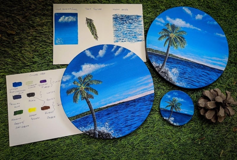
which we'll be doing. Now let's start with the
colors which we'll be using. The first color which
is Windsor Blue, Titanium, white, green, purple. These colors we'll be
using for the clouds, that is for the background
and for the clouds. The next color is
Prussian blue and black, which will be using and
also the Winsor blue, which we'll be using
for the water apart. Then comes the
hookers, green, lemon, yellow, and burnt
sienna for three-part. If you don't have hookers green, then always you
can use sap green. This Prussian blue,
black, hookers green, lemon yellow bond
embodies all of the colors which we'll be using for the c and
the three-part. So let's start
with the painting. So default the clouds, these colors which
we'll be using, then comes the water part, then the portion blue and black. And for this, these color, we'll be using it. For this drug part. I'll be using that black
color and bond umbo, these two colors,
which we'll be using. So let's start now.
3. Some Basic Techniques: Welcome back. Let's first discuss about the
basic techniques which we will be using here
before starting the painting. This is the painting
which we'll be doing. Let's plot start with the
color blending technique. So here I'm using the flat
brush for color blending. The colors which I'm
using is Winsor blue. First layer will be benzyl blue and a little bit of white. So the first top
layer will be dark. And as we move down, the color when lightened up, exactly what we're doing is we are adding tend to the color. That is, we are adding
more whites as we go down. So first clear, then
second layer which has more lighter than
the above layer. And then as we go down, we will be adding more of white and will be start
blending the color. Moving the brush to
and fro motions. This is how the
blending is done. Now here I'm just adding white, remove excess of blue color, and I've just added
wide and I'm just starting to blend the color. Since this is smaller area and
I'm using a bit quadrants, paper's wet will not come
as smooth as it does. But whenever you are using
any Canvas or any, any board, the blending will comes, come perfectly fine when you
are applying this technique. This is by using just one color. But when you are using
two different colors, you have to use the
same technique. But more of white toward especially you have
to make sure that when you're using the blue
and yellow color because it dawns
or greenish color. So in that case you have
two blended very carefully. You have to use more
of white so that, that both the color
does not mix and dance and do complimentary
color that is green because we
don't want that. If you see that the
color is drying up, then you again take
more amount of color and then again
start blending it. This is the technique
which we do for most of the blending of acrylic medium. I'm just what I'm
trying is to remove that line which divides
the two different colors. You can see I'm just
trying to remove that line and making it a smooth finish. Same technique we will be
applying on our canvas painting it there also will be using the same
color and same technique. I hope you guys got it. But if you feel
that the blending is not perfect and again, you apply one more layer
on the painting and, and again start repeating
the same technique you can use to three
layers of painting. But when you're
using the layering, makes sure that the
color of witches In, used in the first layer
is completely dry. And then start with
the second layering. Then you will get, get a nice
finish off the background. Do three layers are
perfectly fine when you are blocking the background. To give it a nice smooth finish. Once we are done
with the blocking and we will be doing
the the texture, how we are creating the tree, how the lines will be created. This is, you can see how
nicely the blending is done with a flat brush. So try to use bigger
size flat brush when you are using this
blending technique. Let's start with the
tree leaves creation. So here I'm using the
liner brush and just find liquid color to
create fine line. And I'm not pressing the brush, I'm just using the tip of the
brush to create the lines. And you can see the
tree leaves are of different shapes and in different directions to give it a more realistic tree
leaves structure. First we will apply
darker color, and then as we will be doing
the layering technique, we will be applying
the lighter colors. For us. This is black and green mix, then little bit more of green and yellow mixed
and again green, yellow and white mix. So this is how we will be
doing the complete layering. And this is the process
of making the DRI leaves. Same technique we will be
applying on the palm tree, which will be creating
on our painting. I'm just showing you one
tree leaves structure how we will be creating so that you
don't feel any difficulty. Then you are creating the palm tree on the
main canvas area. Before starting the painting, make sure that you try this out before starting that
canvas painting so that it will help you to make your painting more perfect
and more realistic. Practicing as always good. Before starting any painting. You can see how I'm applying
the green layers on it. So likewise, we will be applying the lighter version of colors, and we'll be doing the
layering technique. Now since this area has dried, we'll be creating the clouds. For creating the clouds. Before creating the clouds, Let's create the water splashes. So this is the blister
brush which I'm using an am just using the tip of the brush
to create these textures. Just the tip of the brush
and dry on dry technique, dry brush technique and dry
color and creating dots. This is the technique
which we'll be using for creating the splashes. Now let's start
creating the clouds. So this is the blender brush which I'm using from Princeton. And I'm just taking very
little amount of color. And it's completely dry brush removed excess of water
and then started creating, moving the brush in
the circular motion. You can see how smoky effect it is creating because
the clouds are never very solid or opaque. They always translucent types who I'm just trying to
create that effect. And creating small,
small or darker shades in between that
lighter smoky shade. Not cover the entire area
because I have clouds are never off same coloring shapes. There are some
Contoso in-between which are quite bold and bright. This is the technique
which we will be using for creating the main
clouds in our painting. There are two types of clouds. This is one of them, which I am showing you, highlighting few portions of
area which is little bright. Now these two techniques we will be using on our paintings. So this is the Cloud
which we will be using. And there's another area
which is the water area. So let's show how we will be
creating that water details. Here also, I'll be using my flat brush to create
the water details, just the tip of the brush. And this is the wet brush but or excess of water
has been removed. And just taking
the dry color and using the tip of the brush
and creating those textures. For us, the texture is
a little bit cloudy. And then as we go down
the texture of the brush, the texture becomes
little bit far apart. There will be spaces
in that textures. In this texture technique also, we will be using the
layering technique. For us, the brighter color than the lighter color and
then more lighter colors. So this way we will be creating the whole water formation so as to create some
realistic water effect. Look, I'm just
trying to show you here so that you
don't get confused when you are doing
the actual painting. Because this is a little
bit tricky and takes time and practice to complete
the entire painting. That's why I've created
a special section of showing you how we will be using these techniques in
our main painting. You can see as we're
going down the lines are little far apart
and spaces are there. This is the technique
which will be applying same on the water
area on that canvas. The far away areas bit cloudy and as we move down
its bit separate. Just try this on your sheet or paper or
whatever you feel like. And before doing
the main painting, now I'm applying
the lighter color. That is the layering technique
which I'm using here also for painting the sea. Everywhere you have to use
this layering technique. The darker color and
then the lighter color. Just creating some
light shadows on the above dark area also
just here and there. This is the few techniques which I have shown you and this
we'll be using on a painting. This area. This is done. Let's start with our
actual painting. Just remove this masking tape. I hope you guys got
the basic techniques. So we are now we will be starting our main
painting for us. We'll start with blocking
and then further, we'll move with
the water details and then the trees and
the main tree details. So let's start with a painting.
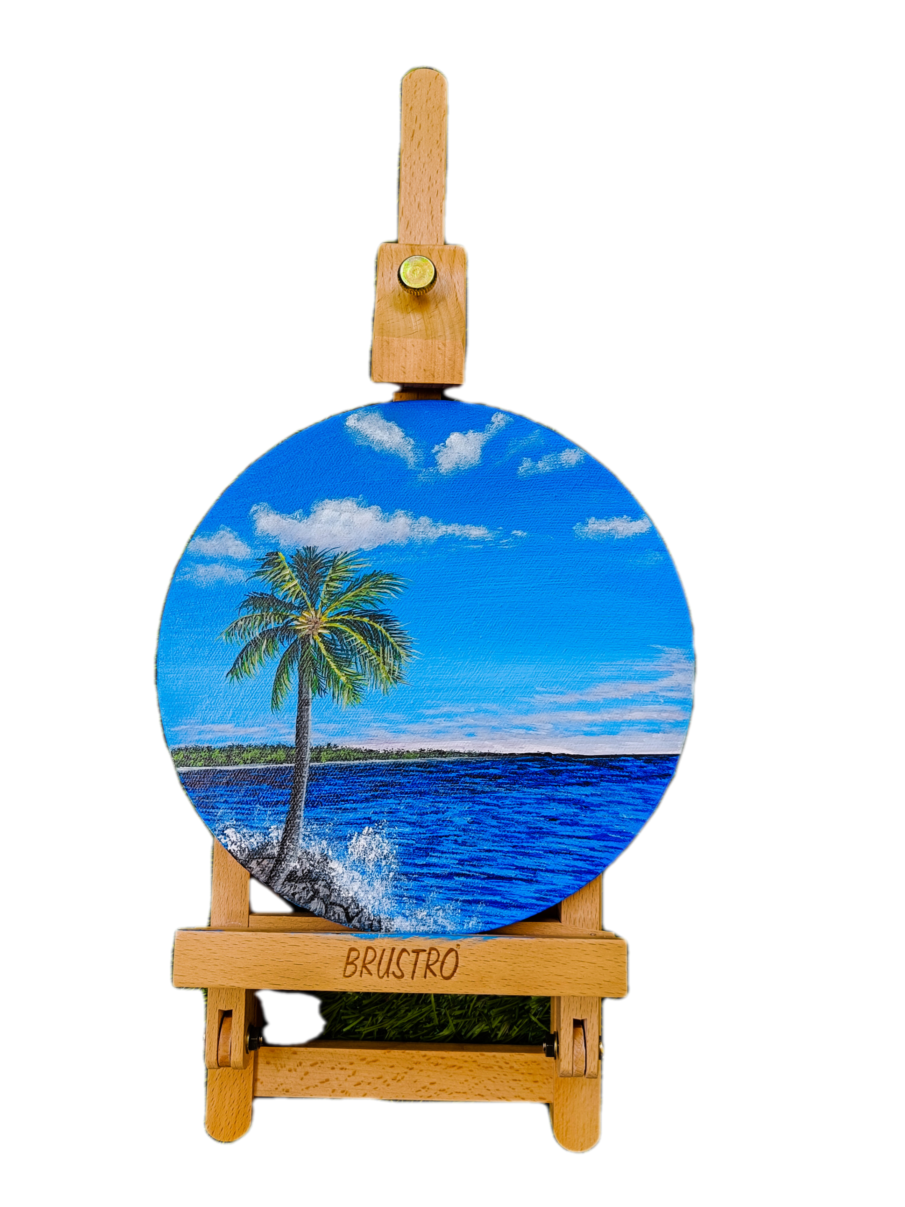
4. Blocking The Background: Hello friends, welcome back. This is the Canvas on
which we'll be painting. It's off eight inch around. So I've just placed
it on the panel. First, we will just put the
masking tape will divide it, the frame into two
parts, not equal parts. The water part will
be less, I think. 3, fourth part, we
will divide it. I'm just using my masking
tape and dividing the canvas. This is a pre-programmed
Canvas which I have used here. I'm just placing
that masking tape. Make sure that
this tightly taped so that the color doesn't
come out on the other side. Once we are done with this, now we will be doing the
blocking of the background. For this. We will be using
just two colors. That is to Daniel white and in Windsor blue for
blocking the background. Let's start with the blocking. I've taken this color
into three parts. First, a little bit more amount of Windsor blue,
then little less. And this third part is white. In three parts, we will
be dividing the colors. First part, I'm adding
little amount of white and your little
more amount of white. And then third one,
it's complete white. This is the technique and the paints which
I'll be using here. Let's first mix these
paints with our palette. If you have a brush, you can use brush
also for mixing. But I avoid using
brush because when the colors sticks
to the brush tip, it's very difficult
to remove it. That's why I use palette
for mixing the colors. You can see I'm just
mixing the color, totally all the colors and
just mixing it properly. I think the first colored
little bit light. So I'll just add more amount of Bluetooth it because
I want a darker color. I'll add a little bit more
amount of Winsor blue to it. You can see I've just added a little bit more amount of
the Winsor blue because I want the background to
be darker and as we go down to it'll
be lite version. So I'm just adding more of
blue and just mixing it. Once we are ready
with the colors, we'll start with the blocking of the background as well
as the water part. Now we will use a bigger size flat brush does
have fringe brush, which I'll be using here. So I've used this a
bigger size brush because it is easy for blocking
in the background, especially in acrylics,
which tries very fast. And you have to take
quite a lot of amount of colors too, the background part. So take a lot of
color on your brush. I haven't used any water. Have just wash the brush and just wipe out the extra water and just using that raw color. And I'm just blocking it. Slowly. Pause the darker color, and then as we go down, the color will lighten up. Now I'm using the
lighter version. You can see how much
thicker amount of color I am taking it so that the color remains wet and we
can easily blend two colors. It is very important that what
background you are using, the base you are using
it as an MDF board, or a canvas or a paper. So it's very important to choose the best background that is the base for the any painting. Now, I'll use the lighter
version of color. I'm just removing excess of
that blue color and using that white color
and just blocking the lower part because
I wondered lighter. Shade of color on
the lower part. That's why I'm using just draw white and that blue
is on the brush, so it is coming up as blue. I'm just trying to blend
the color with my brush, moving the brush and
the twofold direction. If you see that your
color is drying off, take again extra amount of color and then
start blending it. Whenever you are
blending two colors. But don't use water
in this for now. When the color is semi dry, otherwise, color can break. So don't use water
when it is semi dry. The background can be
completely dried and then start doing one more layer
of code of background. I'm just blending it properly
since my background is wet. So I can blend it easily until unless I'm completely satisfied with
the background color, still blending it, taking little amount
of white and again, moving it in the
upward direction and blending the colors. This blending part
comes with practice. The more you practice
blending with any color, the more it will be finished. Now we will do the lower part. Here. We will use
the darker color to completely blocking
the Bellow area, which is DC area. Here. I'm just taking one
color and just blocking in the entire sea area. As you know, that
acrylic dries very fast. So it's better to take
thick amount of color so that the dryness of
the color decreases. When you use thick color. The color doesn't dry very fast. So take, take amount of color
and then do the blocking. And you will see a very
fine blocking effect with acrylics. Now we are just done
with the blocking, and now we will be
creating the clouds. So let's start with
the second part of it, where we will be
painting the clouds. Let's start with it.
5. Creating Clouds: Hello friends. Welcome back. Now this base has, this background has
completely dried off. So now we can start with
the cloud painting. For the cloud painting, I'll be using the blender brush. And there's one
color which I have added apart from the
three color which were, which we were using
earlier for the background is the DAG seen purple. This Gallo will be using for the clouds and rest three colors which we were
using for the background. This is the blender brush, which I'll be using. This is a very nice brush
from Princeton, size six. So let's start. I'm just taking very little
amount of white color and just very little amount
and very light pressure. And you just have to move your brush in the
circular motion. Just circular motion and
very light pressure. You can create a smoky
effect of the clouds. If you feel that there
are very excess amount of color is on your brush, just remove excess amount of it and then start moving the brush in
the circular motion. I think my color has dried off, so I'm just adding
little water to wet and removing
excess of color. Then again, starting with
the quantiles that is just moving the brush in the circular motion with
very light pressure. This is the best way
to create clouds. Just take very little
amount of color, then start just creating
small, small circular motions. You can see how just bit
off-color am just taking. And I'm just moving the brush. In the circular motion. Very light pressure, you
have to apply very light. You can see how that smoky
effect is coming up. This is one type
of cloud which I have done, this painting. That different types of clouds. I'm still thinking of
creating one cloud painting, some cloud challenge
where you can learn seven or 15
different clouds. Let's see. When we
published that glass. You can see how the
contours are coming up. Just very light pressure, very light pressure and
just moving the brush. Just removed if there's
a little darker, just remove it with the finger. And you can see that
smoky effect coming up. Trig cloud plays a
very important role when you are doing any
landscape painting. Really, it's
important to create, it's very difficult or hostile to create other
realistic clouds. This is just the basic Cloud
which I'm teaching here. We can see how
nicely that smoky, translucent the
clouds are coming up. So this is one of the technique of creating these quantiles. It's giving me two little small, small clouds here and there. Just removing the excess
of color with my finger. Now just taking little bit
of digoxin purple and white. Just very little amount
of digoxin purple, very small amount and wide and just adding
to the bottom of the clouds to give it a
In depth to the clouds. I'm just taking a
little bit of blue and not very much mountainous, very little amount of blue. And just adding to it. I think it's very dark. So I'll just add more of
fight toward remove excess of color and just start
creating again the contours. Now, the clouds which
are very far apart, we have to create
at the bottom part. So just adding a little bit of just remove the color to wash off your brush. Now for the bottom part, we will be using the
different brush. Just digging a little bit of white and adding a
bit of dark color. The clouds not
everywhere, just to some, to some areas so that it looks like the 3D effect
of the clouds. Now once we are done with the just adding little
darker color to the clouds, that is just white. Just tearing their little
bit of cloudy shapes. Spit off some shady clouds. Urine, they're just spit
off a little bit of clouds, which are small, small,
small, small clouds. Now let's begin with the
lower part of the clouds. So for this we'll be
using different brush, that is the flat small
brush, small size brush. This is the small size
brush which I'll be using. I'm just using the
tip of the brush. And I'm just adding
a little bit off or digoxin, purple and white. And I'll be just using
the tip of the brush. And we'll be
creating the clouds, since these clouds
are very far apart. So these will be very small, small clouds which are scattered in the lower
part of the sky. You can see I'm just
using the tip of the brush and creating
lines here also, I'm not pressing the
brush very hard. It needs to be press
very lightly and you don't have to use any
amount of water to the, to the color or a brush. It's completely dry. On dry. It's dry
technique which I am using so as to create
a smoky effect. And just creating small, small lines and I'm
just shading it. These small clouds will
create a depth to the sky. You can see how very lightly I'm just pressing my brush
and creating the clouds. Just straight lines and
just mixing the color. Take very small amount of
color and then create small, small lines, shade you in. And then in the shady form. You can see it's giving adapt to the background as it
is very far away. The clouds are very
far away from us. Just repeating the
same technique and creating the clouds. Again, this is another form of Cloud which I'm
creating here. One form was above
which I created. And the next form is this one, which creates a depth
to the background. So this is one form
of Cloud you can say, which gives a very nice
depth to the painting. Just adding little
bit more of depth. Dioxazine purple to white. And it's not completely white. Those clouds there. It's a little bit of tags
in purple added to it. Dame, same dry on dry
technique I'm using here. Without any water,
just the color and the dry brush which I'm creating the clouds on this as almost done, the
cloud formation. So I'll just wash off
my brush and again, take that blender brush since
that part has dried off. So again, I'll add a
little bit more of depth to the clouds. So I'm just adding row wide
and creating little depth. Just adding row white, not to every part, just to some parts and creating
the depth to the Cloud. So same thing I will be doing
for the rest of the clouds. Also. Just adding little bit of white planters there
and creating the depth. Adding a little bit
tough small clouds and a little bit of
smoke here and there. This is it. Let's start with our next
part of the painting.
6. Water Detailing: Hello friends, welcome back. Now the Cloud partners, Dan, we'll start with
the water apart. So let's start now. Here, I have just taken a
little bit tough black. This is just adding it to
that same background color. I'm just using my flat brush and creating small, small lines. The starting to bit of
tags in purple also. Just creating lines. I guess this small brushes
not so comfortable. So I'll use a bigger
size flat brush for creating the waves of tc. I'm just using the
tip of the brush and creating the lines. This color is
actually very light, so we need little bit, or I guess, darker
version of color. Let's see. Let me add little bit more amount of
black and see how it looks. Still not completely
dark enough to create. Because we need a
little darker color, darker blue color for the C, which is far away. Let's use Prussian
blue color for this. So let's take Prussian
blue color and then we'll be creating the leaves. Let's take little bit
of Prussian blue. And this we'll be using for
creating the waves detail. Just a lot of water
in this prejudice, remove extra amount of
water from your brush. Removing it. And then using
the same that Prussian blue color and just applying
the depth of the brush. These are just small lines
which I am creating. Just creating one line which
divides the sky and the sea. Again, taking Prussian
blue and creating, dabbing the brush tip
and creating the lines. Let me put a little
bit closer so that you can see it properly. You can see just
dabbing the brush, just the tip of the
brush I'm using to create those lines. Just dabbing the tip. It's quite dense. Area over dy see line where
it is meeting the clown saw. These lines are very close by. So I'm just creating these lines using completely raw
color without any water, using the tip of the brush and creating the lines
very close to it. These are random lines, does not in one order. Just filling that area. Just take your time and do
it very slowly so that it gives a very nice
and perfect look. Dc. Because if you
created in a hurry, the whole NRG and the
artwork will be wasted. So take your time and
do it very slowly. Due to three layers
will be doing for this. Does see paintings. So this is the second for
us towards the background, and this is the second. Which we are giving the
details to the sea. You can see. The third we'll
be using the lighter color. Seg fault will be
the final detailing. So just just enjoy the process
of creating small lines. And when this whole
thing will be complete, you will be able to see a
realistic view of the sea. The upper area's quite
close the lines of men, but as we go down, the lines will be
little far away. It will not be so closer. As we're moving down. The lines will be
little far apart. It will have more spaces. You can see the upper little
area which I've used is, is very close by. And the dot as we
are going downwards, the lines at a little
bit farther apart. Same thing we'll be doing
for the complete area. I'll be leaving little area
here because you'll be, you'll be creating the rocks. You can see these lines are
now a little bit far apart. Just small lines, just using the tip of the brush and just
dabbing the brush, just dabbing the tip
of the brush that said to create those lines. So I'll be leaving the area. Just a little bit of waves. I'm just creating it. Just small waves. Again. Whole process we'll be doing
on the entire sea portion. It's a very good technique and forth creating some
realistic sea waves. This is the one color
which I have used here. Now we will be using
the second color also for creating much
more depth to it. There's the first color
which we have used. Now I'm just lightening the color by adding
the lighter color, a little bit more light. So I'm just adding little bit
more white to it because I want the lighter blue, little bit more white. Just creating the lines. You can see how nicely, how realistic the C is looking. Just putting that
small lines to it, Just little bit lightening the color and
creating those lines. Now it's more wide, so I'm, I'm just adding a little
bit more of blue to it. Just creating small same lines in between the darker ones. So just enjoy the process. You can see I'm not
covering the entire year. I'm just using
laterality portions, which I didn't between
the darker ones. And I'm just applying
that lighter color. These are all same colors which
we have used for the sky. And I've just added Prussian
blue to it. That's it. A little bit of lighter colors
also on the upper part. As to blend the color. Again, see that there are
some darker lines which have been overlapped
by the lighter ones. So you can always overdo with
the darker color and just apply it on the top to
create some darker lines. Some of the darker waves to it. This is almost done
the lines spot. Now we will be doing
the rock part and the above area which is being
taped by a masking tape.
7. Shaping The Rocks: Hello friends, welcome back. So now let's create the rocks. First. Let's create the shape. This is my flat brush, which I'm using smaller
size and I'm just taking the black color. And I'll be just creating
the shapes randomly. I'm not creating it with pencil if you want,
you can create it, but I'm just creating
it directly with black and I'm just
adding little bit of white to it to
create different shades off rocks because rocks are
not all off same color. They are of different colors. Some are brown, some
more gray or black. I'm just trying trying to create that rock shapes with
different geometrical shapes. You can say, I'm just trying to create it with black
and white color. This is a little area
which is rocky form. You can see these
are not same shaves. These are just random
shapes which I am creating. Just random shapes you
need to create the rocks. When order to differentiate, we'll be dividing,
there'll be coloring, or we'll be doing some
details on the rocks as well. But just now I'm just
trying to create the shapes and the area which
will be for LOF rocks. Now, I'll be using
my liner brush. You can say rigger
brush and just adding a little white
to the black color and creating the lines so as to distinguish the
rocks in-between the two. Just outlining the rock
shapes you can see you. I don't want it to
be completely white, so I've just added black also do it to give it a grayish shade. After outlining, I will
be doing the detailing. But first we'll do
the upper part, witches taped with masking tape.
8. Shaping The Middle ground : Hello friends, welcome back. So now this painting has
completely dried off. So now we will take out the masking tape which
we have put earlier. This is the whole painting
has dried off completely. Now we will remove
the masking tape slowly and we'll start with
the middle area painting. So let's first take
out the masking tape. And I've also taken
a fresh pallet. I'm just taking out
the masking tape from the middle area which divides the foreground and
the background. Now we'll see you
can see how nicely the perfect line has come up. So these are the
colors, hookers, green to Daniel, white, lemon yellow, Winsor blue, dioxazine, purple, and black. These are the colors
which we'll be using for the middle area. And this is my liner brush
or rigger brush you can say, which I'll be using for creating the land in-between
the sea and the sky. It's far off lands where it
is very, very thin area. So it's not does
take black color. Have taken fluid black. If you don't have fluid black, then just make that black
little bit fluid form by adding water and then start
creating the details. Because we need fine details. I'm just creating
a landscape which slides down words
and become narrow. So just drawing the outline. You can draw it with pencil
also, it's perfectly fine. But I'm directly drawing
with the liner brush. I'm just filling this area or with the liner brush itself. But black color. Let's
complete black color. Here you can use
small size flat brush also for blocking in
that black color. You can see I'm also
trying to create that line in-between
that land and the sea. Just perfect straight line. I'm doing it with.
That's why I'm using here the liner brush. Because I want the
perfect fine line to be created below the land area. Liner brush plays a
very important rule in painting something realistic. So use better quality liner
brush or rigger brush. You have it. Because we need a
fine quality brushes to create some
realistic paintings. So this is the Princeton brush. Much I'm using. You
see how slowly I'm just gradually filling the black color
in-between that area. Take your time and do it slowly. No hurry. Just do it slowly. If the color dries off, just add a little
amount of water to it or add extra color
to it. That's it. Just do it very slowly. Don't be in a hurry
that my color will dry of how I
will finish it. Just do it very
slowly and patiently. See we almost done
with the blocking. There are some areas
which are left white. I'm just covering it. Black. Just creating the lines which are joining the Sea. So now you can see that
white area is left. So here I'm using my flat brush. This is the flat
small-sized brush which I'll be creating
clouds above it. So I'm just taking white
and a little bit of the Winsor blue and digoxin, purple, little bit, very
little amount of it. And I'll just fill in
the area which is white. You can see I wanted to
just remove that line which is dividing that
sky and that white area. So I'm just making, making sure that that white area comes above that area so that. It mixes with the Cloud
and it looks like, okay, it has a nice cloudy effect. It creates. I'm just first
covering that area. You can see it's not
as straight line. I'm just covering above it. The line is straight
but I'm just covering the area above that line. That white line. Just slowly fill in
that area because it joins the sea and
disease sky also. You need to be very careful. Even if the color
comes in the sea area, It's fine, perfectly fine. Who can always overdo it? Now? I think I'll use the
liner brush for that. Part. Goes, we need quite
a lot of detailing. That is very narrow
area which needs to be covered nicely. Just slowly cover that area. I hope you guys are
enjoying this painting. I really enjoyed while doing this painting a lot
because I really like doing nature painting and I loved doing the
greenery part also. But this is completely
blue, blue, blue suits. My Most of the paintings
are related to nature. Does giving a final touch
to that cloudy area. Now let's take our blender brush and create some cloudy fact. Because we need some cloudy,
smoky, smoky effect. Just creating that
because I don't want that line to be visible. Just adding little bit off dioxazine purple and just
adding little bit of details. These are the, another type
of clouds which you'll see in most of the paintings
when they're far away. Again, I'm using that
flat brush, small size, using same color,
adding more amount of tags in Bhopal and
creating some effects. Because I don't want the
clouds to be completely white. Just a little bit of lines I'm creating
on those wide-area. Little bit more of white because the scholar
has been lightened up. So I'm just darkening it more. Just giving final
touch to the clouds. Because Wendy color dries up. The color becomes
less dark enough. So I'm just overdoing that area which we did
earlier for the clouds. Just making it a little
bit more darker, more wide and more bright. Just final touch I'm
giving to the clouds. We are done with the cloud part. I'm just give
outlining that area because I think the white
color has come down also. This is done. So we will now we'll do, we'll do the area of witches, which we have colored
black because that is the green part,
Greenland visible. So let's start.
9. Detailing The Middle Ground: Hello friends, welcome back. So now let's start with
the landscape detailing. Here. I'm using the
Bristol round brush for creating the details. It's already hard
brush and you can easily create nice
small details with it. I'm just adding
Hooker's green and lemon yellow and a little
bit of white to it. If you don't have hookers green, you can use sap green also. Just creating small,
just using the tip of the brush and
creating small dots. I hope now it is will
be visible to you. I've just zoomed in and just
to taking Hooker's green and mix off lemon and wide
and creating small dots. I'm not covering the
entire black area, I'm just leaving few areas also in-between so that it gives a nice realistic look
to the landscape. You can see I'm just
using the tip of my round brush and I'm not
taking too much of color. I'm being very small
amount of color. So now I'm just creating
a little bit of texture on the top of the
area with black color. Just adding little bit
of texture so that it looks like some green. Because the landscapes
are never smooth. They are a little
bit off textured. So I'm just giving a
little texture to it. Just using the tip of the brush and creating small towards, as you can see, look like as if they're
small trees far away from the sea area. All let's use the
same color and create small textures on
the black portion. So you don't have to cover
the entire black portion, just leave few spaces
in between the dots. That black area is also visible. Just taking more of
yellow and hookers green. Just adding little white to it. Again, creating the textures. It's a very small
portion of area which is green, which is visible. Now you can see how
realistic it is looking. This is how we create the
landscape, the realistic way. Now again, adding little
more of focus green and more of yellow and white. Just little light shade than that we used
for the first layer. This is the second layer
which we are using. In this way, I have
added more of white and yellow and just adding
textures to it here. And they're not everywhere. Just here and there. That it looks. It shows different
shades of green. Because you must have seen
that reason on, off one shade. You can see that this
portion is almost done. Let's create the
line which divides the sea and that land area. I'm just using white and my
flat brush and just creating the line which divides the
sea area and the land area. Just using my tip
off the flat brush, I'm creating that line. If the liners take just
remove excess of color, just drag that line
towards the end. Not complete end, but where that land is falling
down till there. I'm just removing blending
the colors with water. I'm just removing the
excess of color which is there with just my brush, is not having any
color here right now. Degree, create a smooth finish. This is almost done
the upper part. Now we will be using again this bristle brush
to create the rocks.
10. Detailing The Rocks: Hello friends, welcome back. Now let's start
with the rock part. Here I'm using Bristol brush and one color which
is bond Dumbo. Here I have added in. So let's start just
take little model of burnt umber and white mix. A little bit of black, little more amount of burnt umber and just
start creating details, just creating lines and
blocking in the color. Adding more of white. And creating the texture. Just creating small lines to it. Adding a little bit more
amount of white and black. Now creating, again a
little bit more details. You can see how this
texture is coming up. Some dots on the other rocks. Just you have to create
the textures of the rocks. The texture of frogs are
not same in all the rocks. Your new tick need to create
variety of textures to it. There's a mark somewhere,
lines, some dots. This way we create some
realistic rock shapes. Now let's create the
lines of the rocks. Now with the liner brush. I'm just creating the lines
which divides the two rocks. Just adding little
bit more of black, creating the shapes, just
outlining the shapes. There are some areas which
are completely black also. So I'm just covering
that area with black. Just creating some area
which divides the rocks. And all the rocks are
of different shapes, none are of same sizes. Different textures. Just creating little
bit of shape. Stuart. Just outlining and
creating the shapes. So you can see how the rocks are looking
so realistic and, and so on way and
not of same size. They are of different sizes and all are overlapping
each other. Now let's use a
little bit too white and burnt umber and
create some textures. Just dots and lines
here and there. To create nice texture
to it. Does dots. Because when we create
these textures, then only it looks like
the realistic rock form, just adding white or
black also in-between. Now once this rock part is done, we'll create the water splash
with our Bristol brush. The same round brush
I'm using here. Just the dry technique. Completely dry brush and row white-collar
without any water. And I'm just using the
tip of the brush and taking very little
amount of white-collar, very little amount just
on the tip of the brush. And creating small textures,
status, small dots. You can see small
dots are appearing. There are some dots
which are on rocks also. Some water splashes
on rocks also. This is a very great technique
of creating what does splashes on any rocks
or on an EC area. Just creating these flashes. Just using my tip of the brush. This is the Bristol brush. Again, I'm saying that this is the Bristol brush
which I'm using here. These are these brushes,
completely hard brush. And you can easily create these textures with
these brushes. This is from Bruce
draw which I am using your you can also get
it in rosemary and Princeton brushes also, but I think does booster brushes nice? So I told of using this just trying to create the splashes which
are heading the drugs. Just complete white color. Again, taking little
more amount of white, creating some more splashes. Don't press the brush very hard, does press it very lightly, then only you will be able
to create those fine dots. Otherwise, if you
press the brush hard, it will not come up. So try to press your brush very lightly when you are
creating such details. Now, I'm using my flat brush for creating little more
textures in the water. Just adding Prussian blue. Just adding more details
to the water area. Where I can see there
less of just creating some more details and
layering of the water. Can say, this is one of the layering technique
which I'm using. I'm just layering the
colors to give it more realistic look. Integral x. The more you layers the colors, the more it brightens, brightens up and more
realistic the details look. Layering is very
important technique in doing any realistic painting. Whatever you are doing, either it is portrait or landscape or any
other still-life. You can see I'm just
using that Prussian blue and creating
more lines to it. That area which is far
away, it's completely dark. As we go down. The darkness. Slightly decreases. That's why the lines
a little far apart. I'm trying to explain every bit off the painting
so that you don't get any trouble by doing
this complete painting. That's why I have created
just step-by-step painting, whatever I am doing you, you can see I'm creating
random lines here and there. But I see that there
are less borderlines. Guys. I'm already
loving this painting. I hope you guys
all to loving it. Just now adding the
little lighter texture by adding just white. That same bigger size brush. And with the tip of the brush
creating the fine details. You can see this fine
details which are coming up fine light colors which are
reflecting on the water. This is the same technique
which we have used earlier for creating
the first layer. Same technique I'm using here for creating
the second layer. This is almost done
the water part. Now we will start with the tree, but whenever we're doing any acrylic painting,
it takes time. So it's a little
realistic painting. So any realistic painting takes at least around one to two hours to complete the entire painting. Half patients drink
lots of water and juices and start getting ready. Just blending into
the blender brush. This. Finally, the lower part is done. Background foreground is done. Now we'll create the tree.
11. Creating Tree Trunk: Hello friends, welcome back. So now let's create
the tree trunk. Now. Here for us, beauty, create the trunk
and here I'm using my rigger brush for
creating the lines. You can use pencil also
for creating the lines. If you have difficulty in directly creating the
lines with the color. What I'm creating, the
lines with my rigger brush, just using black color
and creating the lines. Parallel lines I'm creating. For the palm tree. What we'll be doing is that
one side we will create the darker shade and the other
side of the trunk will be creating the lighter shade with the grayish and Dutch
grayish, brownish touch. Just creating the details first. And then we will be doing
the blocking of the colors. You can create with pencil. Also, if you're not
confident enough. Just adding burnt umber, white and black McCullough. This is the light color
which will be applying on one side of the tree trunk. Whenever you are creating
any details with your brush, your rigger brush
makes sure that the color which you are
using is in liquid form, not in the solid form. Otherwise you'll not be able
to create define lines. So whenever you are
creating any fine line, make that color in little fluid form by
adding, what did I do it? Again, I'm adding
little bit of brown and creating the dark shade. That is the light
shade on one side. On the other side, I'll
be using darker shade. So I'm using complete black, that is the raw black. Creating dark shade on the other side with
my liner brush. Just taking black and
creating the darker shade. I'll be using my flat
brush to blend that color. That's flat brush
off small size. And I'm just taking
that light color and I'm just overdoing on that black part so that
the color is blended. If the color has been dried on your canvas and you can
always overdo the color. We can always over
apply the colors on it and start blending it. Just one stroke and
it does blended. Now just adding white
outline, the area, lighter area as defined outline. So again, I'm repeating whenever you are creating any outlines, make the color in fluid form. Just adding white and creating horizontal lines
on the lighter area. Again, taking little
white and creating lines. So taking a little bit of
burnt umber and just create, removing that line because
this is the extra line which has been drawn
by me by mistake. To just removing that line. We can see you can always
overdoing acrylics. Now again, creating
small horizontal lines on one side, the top. Once this is done, we'll again creates more
lines with black color. Small lines, black color. One shadow area,
which is in-between. Again, a little bit
more dark lane. White line will be required because that black is
coming out a little bit. Just overdoing that white line. Blocking the upper bond. That bond amber, yellow. Just blend number
and yellow mix. Blocking the upper body. This is almost done. So that tree trunk pod. So we'll start with
the next spot.
12. Creating Tree Details: Welcome back. So now let's
start with the leaves spot. So I have taken a
fresh pallet now. Same colors are there. Let's start with
our rigger brush for creating fine
leaves structure. These are the colors, black, lemon yellow, hookers, green, burnt umber, and white. These color I will be
using for the leaf part. So let's start for us creating the lines that are the
details of the leaves. Yes, you can definitely
do this with your brush or your pen or
pencil, whatever you like. But I'm directly doing
with my liner brush. You can also do it directly
with your liner brush. I'm just creating an outline of the leaves where it will fall. Leaves are never
in one direction, they are in different
directions. In order to create
something realistic, you need the leaves to be
in different directions. Palm tree or realistic
painting comes with practice. You can definitely create the basic palm trees
with one color. But when you add
layers to the colors, it becomes more original
and more realistic. That's what we will be
doing in this painting. I'm just first drawing
the lines there, the leaves will fall. So try to use fine
details brush for creating such details for lines. And the color should
be in liquid form. Here I am using fluid black. It's easy for me to
create the lines. If you don't have any
fluid black color, then you can always mix water and make it
a little soluble, not much soluble,
but yes, soluble. That it's in liquid
form and you can easily create fine lines. Once the leaf outlining is
done now we will create the leaves that are small, lines which are falling
in different directions. This is the first layer of
painting which I'm doing. I'm just adding
little hookers green because I don't want it
to be completely black. So just a little
amount of focus green, I'm adding, creating lines, diagonal lines. These are not straight lines. These are some guidelines, some straight lines
so that different, different formations of
lines I'm creating here. Because you can see
that palm tree leaves are not in one direction. It has different directions. Some are torn up, some
are more in depth. As far as create
this outline area. Then we will start with
the layering part. Just enjoy the process
of creating lines. Leaves pattern basically depends upon where the wind is blowing. So data also you
need to take care. Then you are doing any
realistic painting where the light is falling, where there is a bright
leaves are falling down. These things you
have to take care. Just take your time and
do it really slowly. Don't be in a hurry. Just do it very
slowly and patiently. Because to create some magic
painting, it takes time. You have to keep your patient's level
high because you are doing something
realistic painting. It's not an abstract painting. So it takes time and
slowly you will see the creative creativity within you and you will be able to do this painting completely
by our own, someday. Many other classes of
palm tree painting, which is already
there in the classes. So you can watch that
also if you want. Here I'm just creating the directions of leaves
where it will fall. And then we will apply the layering technique
on those leaves. In this process, I'm not
using my brush very hard. You can see I'm just
using my tip of the brush to create that lines. Don't press your brush
hard, otherwise, you'll be creating
thick lines and we don't want to declines
in the early formation. Tree actually add beauty
to this painting. And it really looks
awesome venue, create this greenery in-between those blue sky and bluesy. It looked amazing. This was just a starting off
the painting of the three. There are two more lessons. Then we'll be able to complete the entire
the street painting. Can see how the different directions I am
applying the lines. Because the tree is an evidence same directions as
I said earlier. In my class project, I will be adding two paintings
of the same project. Whichever palm tree you like, you can draw it and you
can share it with me. On my Instagram. It is Mooney art gallery. You can share there. You can share here also as well. This is done almost the
first detailing part. And now we will start
with our next part. And the same colors
we'll be using.
13. Layering Of Tree Leaves: Hello friends, welcome back. Now let's start with the first
layering of the painting. Just taking a little
bit of lemon yellow and creating small lines
which joins the leaves. I'm using same rigor brush for this and dire leaf painting. I'll be using this brush
only adding little white to lemon yellow
because I wanted to more brighter form of lines. Now, few more lines below. I'm just outlining
the area which creates doors leaves
that middle area. Muller-lyer, I'm creating
fine line for the above and also now adding green
to that lemon yellow. Just mixing the color and
adding little water to it. Just making a little
light greenish shade, adding a little white. Then just overdoing the leaves of which already we
have drawn with black. Just overdoing the leaves, I'm not covering the
entire black area. I'm just leaving few of them because I don't want it
to be completely green. There should be shadows
behind it also. I'm leaving some areas of
black also on the leaf part. So same thing I'm doing
for the upper one, also. Using the same color. Doing for the upper leaf part. Also. Whenever you are doing such a fine
line detail work, makes sure that you use fine liner brushes or
any liner brushes. Treaty dealing is always
time-consuming and you need to have a lot of patients
when you are doing this. Because we need to keep on layering the colors underneath unless we are satisfied
that okay, fine. This is it because
we're never satisfied. So we keep on doing
the layering. And layering plays a
very important role in creating such
realistic painting. So layering is very
important when you were doing any
realistic painting. I'm just adding a white
highlight to the end to give it a nice
shine to the leaves. Can see that what I
do of colors add the, add more realistic look to the trees or do any
nature painting. I have almost 15
to 16 classes on my Skillshare and most of
them are related to nature. Adding only few one on two
are of different topics. But most of them are
related to nature. So you can try those as well. You need to slowly
progress one-by-one, taking one leaf at a time and
then creating the details. Now here I'm adding
bond number and it'll clean to give another
shade of green to it. And it'll yellow. Greens are of many shades. There are Sap Green,
Hooker's green. They are permanent green than tallow green and differentiate
some greens are there. The more differentiates of
greens you use in your trees, the more realistic
your painting looks. You have to decide
which Greenville suits that tree which
you are painting. So color choosing is very important when you
are doing such paintings. Now for the lower
part of the tree, I'm just creating
some dry leaves, so I'm adding little bit of
bone number and wide to that. Below drip leave area. Some leaves on the above
leave also some dry leaves. Mix of dry leaves, bright leaves, some
yellow leaves. You have to create a mixture of different shades of leaves. Slam just trying to capture that realistic look
of that palm tree. Just applying layers and layers of colors to make
it more realistic. Still, the other side
of the leaves are left. We haven't touched
that and we're just doing these one
side of the leaves. Let's take more of a
yellow and little green. And then again apply
another layer of lanes. Again taking little Hooker's
green and black color and then again applying, just mixing the color properly. Just creating lines. That's some green lines because this is really
very dark black. So I'm just adding
little green texture to that black part. Now actually the
little tree shape is coming and the leaves
are coming alive. Just adding little bit more of green texture to the other
side of the painting. Now I'm using the lighter color, that same light
color, yellow, white, and green is already
there in my brush a little bit green on.So
I'm just creating lines. Feel color is trying of
just added water and make it fluid and against
start creating the lines. It's almost coming.
In this process, you don't need
variety of brushes, just few flat brushes
and liner brushes and bristle brush mix
the painting perfect. But whenever you are
using the brushes, please use good quality brushes. Then only you will be able to create such beautiful painting. So I hope you guys are
enjoying the process. And if you have any doubt, you can always ask me or
DM me on my Instagram, that is Mauritania gallery. I'm just creating small
fruits in-between. Blonde Dumbo and wide and again adding more of
bond amber, do it. Now you can see how different
textures or four colors and coming up when you are doing the layering technique
off the leaves. And one of the best advantage
of this acrylic painting is acrylic medium is that
a dries very quickly and you can always
layer the painting. You don't have to wait
for default layer to dry and then you need
to start the other. There's always a chance
of getting spoiled up. When you are using oil painting, you have to wait for us and us to layer first layer
to get dried up. But when you're using
acrylic painting, you don't have to wait for it. It dries so quickly. Every medium has its
advantages and disadvantages. Saw this. I feel this is the best
advantage of acrylic medium. Again, I'm creating one
more leaf that is coming from what the top
off the lower leaf. I'm trying to create that. The back areas black, so I'm not using
the black color, I'm using the lighter color so that the lines are visible. Here. I'll not use or
completely black color. So you can see here I'm using little white and yellow mix
and adult create the lines. Now after that, we can always overdo an overlap
with the dark colors. But first I have used
the lighter color. When we are using the darker
color am not overlapping with the light color
in-between spaces. Then there's spaces
in between that line. So I'm just filling those line
with with a darker color. I'm trying to explain each and every step to you guys so that you don't feel any difficulty when you are doing any painting. So I hope you guys are understanding the whole
process of painting. Just few more detailing and fewer more final
Dutch up is left, then our painting
will be complete. So just enjoy the process
of entire leaf painting. The middle area, I'm
just creating more bright so that these
fruits are visible. Then we'll do the outlining
also off that DO area for us. I'm waiting for it to
dry and then we'll start with the outlining
of the middle one.
14. Final Detailing: Hello friends, welcome back. Let's start with our last
part of the fin painting. So just final detailing is left and we are done with
the complete painting. Here. I'm just adding
a little bit of green to yellow and white color. We will be doing same
layering technique. I'm just adding a few details on the leaves which
are still left. You can see there
are few leaves, we're just still
black and colors. I'll just add a little
bit of layering to it. Just enjoy the
process of painting. And leering happens sometimes that you don't feel like repeating the same technique
and again and again. If you are, if that happens, then just stop
painting right away. Take breaks, watch TV, and do whatever
you like the most. And take a break. Don't complete the
painting in one go because it's rarely very
difficult when it is a one to two
hours of painting. If you're not in a habit of doing two to three
hours of painting, then take a break. Go out, enjoy with your
friends or family members, and then start again. Don't be in a hurry to
complete the entire painting. This is my personal experience. I also sometimes feel like
not doing the painting, so I'd take a break and I stop
in-between that painting. And then again, after
doing my favorite work or doing some dancing or some watching TV
or binge-watching, or meeting my friends
and family members, then I start doing it again. Because depends highly on what mood you're in when
you are doing the painting, your mood, your painting is
the reflection of your mood. I can say that it's
better to take your time, take extra breaks,
have a cup of coffee, tea, and then start
with the process. Most of us have
nature to complete the painting within an
R or within 30 minutes. We don't take we don't want to do the paintings which lasts for more than a week or more
than two to three years. So it's completely fine. It depends upon your
choice, what you are doing. If you are doing some
realistic paintings, keep in your mind that
it will take time to complete the entire painting. But when, at the end you
will see the output, you will just feel, what did. Trust me. This also, we are finally
completing the painting. Only few little details
are left in-between. Also have to create
that outline. You need to take
care of what all is left and what you
need to create. So just adding more of white
highlights to the painting. I have drawn this painting on the canvas which
isn't so glow form. You can take any
Canvas, any MDF board, or any square canvas, rectangle Canvas,
whatever you like. And you can do this painting. It's not necessary that you
have to do it on a circle. Circular canvas or some
shape is required. So it's not necessarily
whatever you feel like you can do
it on paper also, but makes sure that you use thick paper when you are
doing this painting. And if you're using
any MDF board, then make sure that
two primate with JSON, then you start painting. This acrylic painting. You can also use
paper, but on paper. Jesu is not required, so you can directly
do it on paper also, but use better quality vapor, 300 GSM and above
paper is recommended. So try to use better
quality paper. Finally, this class
is already ending up and we're doing
the final details. So this is your
project work to paint this beautiful seascape and
share your project with me. On the project section. I love to see your
project work because it keeps me boosted to create
more and more creative things. I love to see your
project works. If you have any doubts
related to anything, you can always feel
free to ask me. I'm ready to help you here. Once you are a complete, I'm done with this painting. You can protect your
painting with the varnish. You can use any one niche, sat in one niche or mad
varnish or gloss varnish, whatever you feel like. You can use the varnish. But varnish is necessary
because it protects your painting from dust
and from being damaged. So it's better you want your painting
completely after doing, after doing this painting. But your color should be dried then only you
apply varnish on that. Guys does painting
is almost complete. I hope you guys
enjoyed this painting. This beautiful
seascape painting. Because I really
loved making these. I hope you guys
also loved it too. Thank you for having patients and watching
this entire video. Step-by-step, waiting for you guys to
share your project works. So this is the
complete painting. And thank you and
have a nice day.
 Mohini Sinha, Acrylic and Gouache Artist- Nature Lover