Transcripts
1. Introduction - 12 Days of Gouache Challenge: I really admire nature for its soothing and healing powers. It gives the assurance that the light comes after
the darkest night. Isn't that amazing? If you are a nature lover, then this class is for you. I have curated these beautiful landscape
paintings just for you. Hello there. I'm Shannon to ban, an artist and art educator and also an
NGO based in Bangalore, India, has always been my passion for as long
as I can remember. I used to paint and
color a lot as a kid. You can have a look
at all my art works. I go by the handle, watercolor. I regularly share about my art, live updates and
behind the scenes. If you are interested, you can follow me on Instagram. Lately, I have started loving painting with gouache because I can combine watercolor
and acrylic techniques in one single medium. Here I get to experience the
beauty of both the mediums. Pens I thought of making this
goes landscape challenge that you too can experience the thrill of
painting with gosh. This is going to be a 12
day challenge where we will create one painting each
day for the next 20 days. Even if you're a
beginner and gouache, you can still join
the challenge, as I have explained
briefly about the required techniques
and simple and easier way. Also, I'll be showing
you some examples to gauge the subject and break
it down into more doable way. All the class projects
will be shared in real time so that you can
follow along with me. So join me in this
talent so that we can together create
stunning masterpieces. I cannot wait to see
you inside the class. So without any further
delay, let's get started.
2. Overview of the Class: Welcome to the class. I'm so glad that
you decided to join this tenant and invest your
time to level up your skills. Before we begin, I'll walk you through the class
syllabus. First. I'll walk you through the art supplies that
I'm going to use. Then in the next chapter, I'll be talking about
the techniques, the examples of color blocking, layering, and the brush strokes. Then we have a chapter on
color and color mixing, where we learn to
mix our own colors. I'll show you some
examples on how to achieve depth in the element. I'll also talk about the importance of
good-quality papers. Finally, we will hop onto
the painting challenge. So let's get started.
3. Art Supplies: Let me walk you through the art supplies that I'm
going to use for this class. Starting with colors. I'm going to mix my
colors on this palette. So it has multiple wells in it. It becomes easier for
me to mix the colors. And the colors that I'm using are brushstroke, gouache paint. Don't worry, you don't
need all of these colors. I'll be mentioning
about each and every color before I use. Next comes the paper. I'm using, Saunders
cold press paper. This is basically
watercolor paper. The hundred GSM, 100%
cotton, cold press texture. You can use any similar cold pressed or
hot pressed paper. Next, the brushes that
I'm going to use, our graft or more size ten, large brush for the washer. Then they have graphed a move or size seven round brush
with pointed tip. I'll be using this brush
for the regular strokes. Then I'm using filbert
brush, size six. And a size two round brush. Next to my fine liner
brushes would be size three by zero
and size triple zero. Both of these are
how a fine tip, which is ideal for
detailing works. Jars of water, one for cleaning the dirty brushes and other one. Take the clean water
for the washes. Some napkins, clean, palette, and wipe off the brushes. A water spray bottle to
keep the colors moist. And also it can be used
for wet Ingo papers. So this is an optional thing. It is really helpful
if you have it. If you do not have
going, it's okay. I'll be using this hard cover of the book to tape down my paper. While painting. Social
tape down the paper, you would need masking tape. I'm using masking tapes
of two different sizes. For the sides, I'm using half-inch tape and
for the bottom part, I'm using 0, 0, 1 " tape a ping it this way. We'll give it a
Polaroid appearance. Next, we would need pencil
and an eraser for sketching. Alright, so these are the
supplies that I am using. You can go with any
alternate supplies that you already have.
4. Techniques + Examples: Alright, so before we start
the painting challenge, let me walk you through some of the basic techniques that I'm going to use for this class. I'm going to keep it
very simple so that you don't get overwhelmed
with a lot of techniques. Let us start with the two
widely known techniques, wet on wet and wet on dry. These two techniques will be used across all the projects. In wet on wet technique, wet paints are applied
onto the wet layer. So we need to have a
wet surface first. As you can see, the colors
played really well, creating a soft and
blurry background. So this technique is
ideal for the base washes or painting the skies. Next one is wet on dry. This means we are applying
wet paint on dry paper. As you can see, it creates a nice crispy lines
when applied on paper. If you see these ripples, then it is the result of applying wet on dry
in multiple layers. So each and every element in all these paintings
can be broken down into simpler steps like
wet on wet or wet on dry. Painting trees,
ripples, or any defined the detailed work can be
done using wet on dry. Next is color blocking. Color blocking is
nothing but preserving the area for certain
shapes or elements. This helps us pain too. The elements layer
by layer, e.g. let us consider these
mountain ranges. I'll be color blocking it
with the base colors that I want so that I can distinguish my elements
in the painting. Once I blogged these
colors, later, I can come back and add
the details that I want. This will just be the base layer for us to
identify the color blocks. Now, if you observe
this example, I have preserved the grayish or bluish tone for the
distant mountains. And for the foreground area, I have a lowish brown and a darker brown for the
foreground mountains. So this way I can
choose an allowed the colors to specific
elements in the painting. Next is layering or detailing. Let's say we have done
the color blocking. Then what is the next step? So here, layering or
detailing comes into picture. I'll use the same example
for this one as well. Layering helps in achieving depth and dimension
in the painting. Like it adds shadows
and highlights. Here. For these mountains, I'm adding darker color. So when you add darker colors, the lighter color gets
highlighted by itself. Also, there is no rule that you have to apply one single color. You can add as many
colors you want. Next, we will talk about
the brush strokes. I'll be using this craft a
more size seven round brush, and it also has a pointed tip. So I can use this
pointed tip for painting the trees
or any fine lines. It can also be used as medium brush stroke or
thicker brush stroke. I'll be using a mix of
all these brushstrokes. Next is fine liner brushes. So here I have two brushes
for tiny detailing work. One is three by zero and
other one is triple zero. So this creates
very minute line, which is ideal for detailing work as our painting
size will be smaller. So we would need these brushes
for tiny detailing work. Then go with any
alternative fine liners. The next brush is filbert brush, which means flat brush, which has rounded edges. Or you can even
use a flat brush. This is an optional brush door, but you can use this
for creating textures. So it is really helpful to get you even textures
in the painting. This is called on dry. On dry, which means we are using dry paint on a dry surface. This technique can be used for creating
snow-capped mountains. So I have snowy mountains here
in some of the paintings. I'll be using the same
technique or late. Also, I have used the
same technique to create texture in
the muddy pathways. Alright, let's talk
about the next brush. Here I'm using this makes you would
need a larger brush for the washes to perform
wet on wet technique. Having a larger brush
would be very helpful in covering the base
layers very easily. Next, we'll talk about
splattering technique. Use any rough paper to cover the area that you do
not intend to desktop. They take ample
amount of paint in your brush and splatter
the paint on desired area. This is very helpful to create some texture
or noisy effect. It can also act as filler
element in the painting. Now, I'll go back to
the layering technique. We had applied one
layer of darker color. Now that is dry, we will apply another layer. So as you can see, we have
three different colors here. Lighter brown,
mid-range of brown, and now it is black. So you can see it has
created a nice depth. In the mountain. Chapter, we will talk about the tonal values and how we can make our own shades using the
basic colors that we have.
5. Color Study - Tones and Mixes: Tonal value refers
to the tonal range starting from darkest all the
way till the lightest tone. So I personally approach
it in two different ways. One is with the water and the one is with
the white color. So let's say we have a color. So I'm taking viridian hue. So the darkest shade will
remain theme for both of them. We are using the color directly or with a
little bit of water. Okay, let me demonstrate the entire tonal
range with water. So as you can see, the color intensity has reduced. We'll keep doing this as long
as we get a watery tone. So this diluted version
is lightest shade. It has minimal colors in it. 90% of it is water
and only 10% is. You can even dilute it
by adding water to it. Next one is with
the white color. So you're in this approach, you add white in order to
make the color lighter. In watercolors, we go with the water method
and with acrylics. Whereas in acrylic, white color to make it
lighter in tonal value. So that's why it is
said that gosh can be painted in both acrylic
and watercolor style. So I use a combination of both, and that works
perfectly fine for me. I hope you to figure out
what works best for you. Okay, back to this. So now you can see we have
achieved this lighter tone. The lightest tone in
the range has more white and less of viridian hue. Now let's say you want to
achieve darkest value of green, then you can add black to it. So I add black to some colors to achieve
depth in the painting. If you are painting
does not have a right amount of
contrasting colors, then it is going to look flat. So make sure you have well-balanced tonal
values in your paintings. Okay, So let us discuss
about the color mixing part. In this challenge, we are going to use a lot
of moody colors. So let's see how we can create our own moody shades without having those
readymade colors. Okay, first we will
start with moody blues. So I'm going to take
ultramarine blue. You can even go with the
cobalt blue as well. Thickness, shade and mix
it with the burnt amber. And next week been Tiana. And you will get
bluish gray color, which is quite moody. Then you can add white
or water it down. We will see the lighter color. So you can even add black
to make it darker in color. Next, I'm mixing
it with the blue, mixing different colors
and see what you get. So you might have completely
different colors from mine. Next, let us make some greens. So first I'll take olive green. Now to this, if I
add yellow ocher, it will give me a
yellowish green color. Now suppose you do
not have olive green, then you can take sap green, the regular green that you get, and mix a bit of red. So we'll get a similar color. If you add more red, you will get a brownish green. And adding white to it makes it a little
opaque and paste. Helen Keller, you can always combine a yellow ocher
with any shade of greens. Now for the distant areas
that have hazy green colors, you can mix blue with green
along with some black. So this will give a
distinct hazy appearance. For the darker green color are the shadows of the green color. You can use green color
mixed with black. For the grasses. You can use yellow
ocher, burnt umber, one sienna, yellow ocher
mixed with the burnt umber, black or any similar
brown shades. Now if we mix white
with this color, we will get a pasty yellow, like a desert sand color. Alright, Next, let us see how we can achieve using layering. Let's say we want
to paint or water. So what we will
do is we'll first paint the base layer
using a lighter color. So here we will go
from light to dark. This is also like
color blocking. And then adding the layers. You would have to wait
for the colors to dry. But I'm being a
little impatient. Yeah. I'll just add it
on the wet layer itself. So take any darker color. I'm mixing a bit of red onto the same color and apply some horizontal lines
depicting the ripples. So you can see it has created
this depth in the water. Had we painted it
with only one color, it would have looked just flat. Absorb it when you paint. Next time applying black color. I'll be using a
similar technique for the painting as well. Next door, let's say we
want to paint a mountain. I'm painting this base layer. Next we will apply darker color. This adds a sense of shadows and creates a dimension
in the mountain. In the lower part, I'm
adding the shadows and upper part has this
highlighted green color. Next, we will demonstrate
some mountains. Here. I'm painting two
layers of mountains. Now this difference
in tonal values uses an illusion that the mountains
are away from each other. The mountain that is
far from the viewpoint appears slightly hazy or dull. And the one that is closer to the viewpoint appears darker. These simple things you need to remember why I love painting. Alright, so let us move on
to our painting project.
6. Importance of Papers: In this chapter, I'll discuss the importance of paper quality. Most of you might not
get desired results even after following all the
instructions in the classes. So paper is the most important
thing in the painting. Now I'll take three
different papers. First one is diary sheet, which is one-ninth to GSM. Then I have my Saunders 300 GSM, which I use for all the project. Then the third one is by
Bruce true mixed media paper, which is 250 GSM. These papers works good if
you follow acrylic method. But if you want to combine
watercolor techniques, and you should opt
for a better paper, which is at least 72 or 300 GSM. Now let's see how it goes. I'm taping it down using masking tape so that
it doesn't buckle up. Now I'll apply some water, will show you the
capacity of the paper. The paper is wet. Now let's apply some palace. This mixed media paper tends to accumulate the
colors at one place. Whereas in Saunders you can see how the color
spread equally. Now when it comes
to the ivory paper, the initial wash will be good. But as you run the
brush over the paper, you can see the
fibers coming out. If you are using a watercolor paper of at
least two or 300 GSM, then it would be easy
for you to work on layers and get the
desired result. But with non watercolor papers, you can still go with
the acrylic techniques. However, you will not
be able to achieve watercolor results for
the background washes. In my gouache paintings, I prefer using acrylics
and watercolor techniques. So this is the
paper that I would recommend if you're
following my classes. In the initial days
of my gosh journey, I would only follow
acrylic technique, which would make me a bit frustrated because
I was not able to achieve the beautiful
effects of watercolors. I wanted to combine methods of what a pillows and
acrylics so that I can bring out the best
of both the mediums. Okay, back to our papers. I'm just randomly
adding the colors. And you might feel that
it is looking fine. But while painting they
experience will not be good. So always go for better papers. This is what it happens
with the ivory paper. I hope you have got a better
idea about the papers.
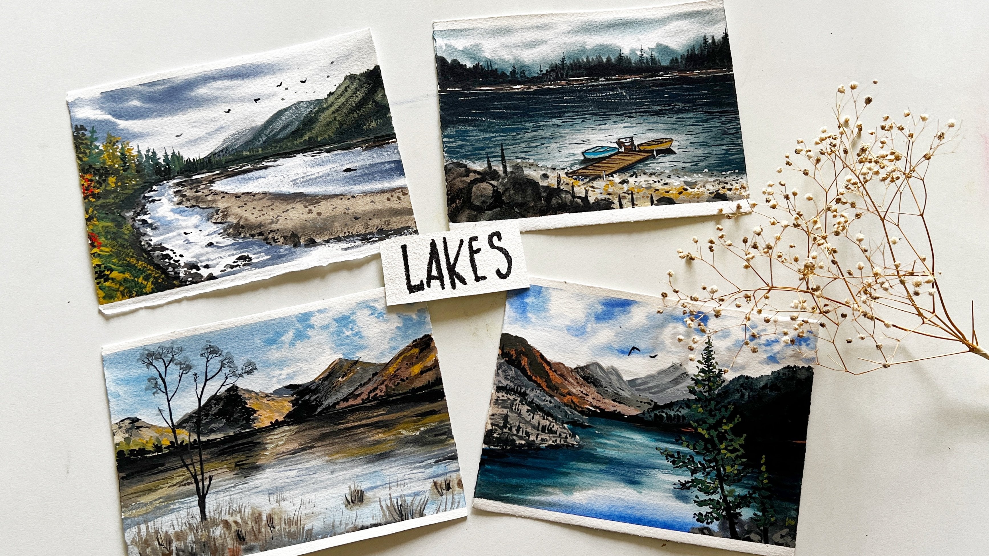
7. Day 1 - Color Pallete + Thumbnail: Let me show you
the color palette for our first class project. First guy, it is going to
be a Boolean and crimson. Although you can go with
any alternative color. Next, further distant mountains, I'm going to use ultramarine
blue and burnt umber. If you do not have
ultramarine blue, go with cobalt blue. What are similar? Next for the hills, I'll go with olive green. If you do not have olive green, then you can make sap
green plus bond number. It will result in
a similar shade. Now for the darker
colors in the hill, I'm going to mix black
with olive green. Okay. Next comes the next
for the mid one, I'm going to use burnt
umber and black. For the foremost tail. I'll use white, black, and blue. When you mix these, you'll
get a bluish gray color. Next for the reward. I'm going to mix it
in with the blue. You can directly use a
teal color if you have. For the shadow
part in the water, I'm going to mix a bit of burnt umber to these two colors. On the boundaries of the water. I'm going to use black. We'll also need L0 or go. Alright, that's all
about the colors. You can go with any alternative
colors that you have. Here's a small thumbnail
of the painting. You can try this on a small
piece of paper before attempting the painting so that you get confident
with this object. I'm shading some of these areas
to represent the shadows.
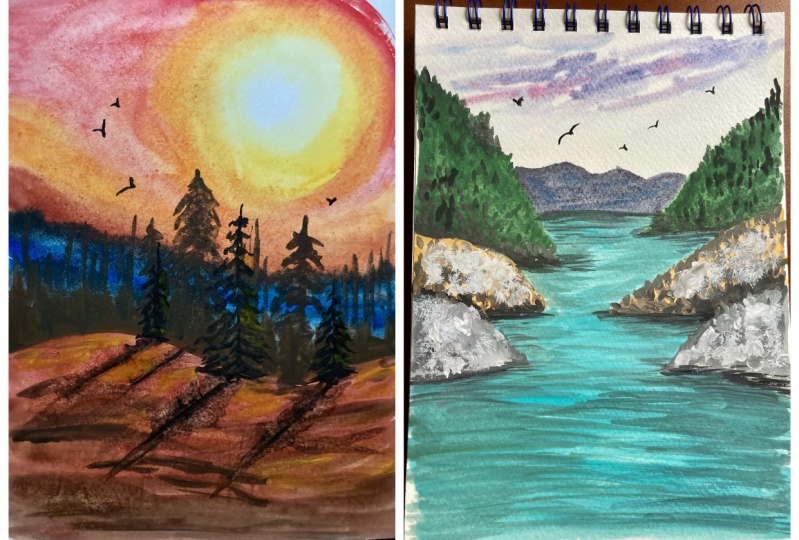
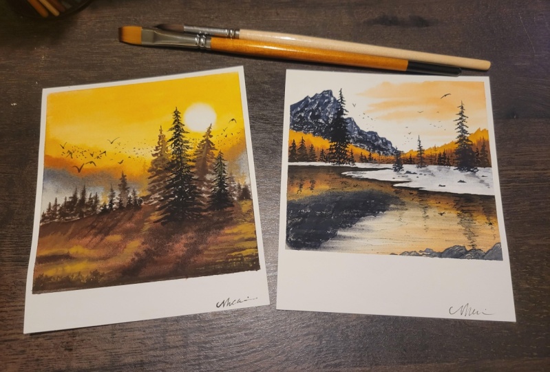
8. Day 1 - River through the Hills: Welcome to day one
of the challenge. Today we are going to learn
to create this painting. So let me explain the
elements briefly. There's a peaceful sky and hazy distant mountains
in the background. In the mid ground, we have a range of hills, each one with its
unique characteristics. Then there is a river flowing through these steep valleys. The color of the water
is really refreshing. The boundaries appear darker because of the custard
shadows by the hills. And there are some
pretty birds in the sky. Okay, let's get started. Apply masking tape
on all the sites. On the sides. I'm
applying this half-inch deep and I'm using a 1 " masking tape
for the bottom part in order to give it
polarized APRNs. Alright, let us start
with the sketching. Draw the horizon line. I'm just marking the area
that will be visible. And we will draw hills
on either sides. Draw these overlapping shapes. And then it is the part
that is not required. So it is a very
simple sketching. You need not add all
the details right now. We will do that as
and when we paint. Let us move on to the
painting process. I'll be going with
wet on wet technique. So I'll apply clean water
using my larger brush. I'll start with
painting the sky. I'll take blue and crimson. Dilute these colors and
credit across the sky area. We are using the
lightest tonal value. You can do anything
you want with the sky. Next, I'll mix some
blue, black, white. So this gives all
very dark blue color, which is ideal for
the distant hills. Also, I'm adding some brown and the darker blues in-between. This adds a sense of variation. Moving on, let us paint
the midground or hills. I'm taking olive green plus
a bit of brown and blue. So you need a very brownish
or darker green color. My paper is still moist, so it is easier to
spread the colors. This is why I prefer
using watercolor paper so that I can go with
watercolor techniques. So I'm basically doing
the color blocking right now in the lower
part of this hill. Applying not good, like
very darker green color. This is closer to black. This will act as the shadows, enhancing the lighter
part on the upper area. We will come back to this
later once it dries. But for now, you can
focus on color blocking. Moving on, let us paint
the next adjacent or Hill. I'm going to use yellow ocher. Wait, a bit of blue in it. So this makes a very early dawn and apply it on the main
hill that we have here. You may not achieve
the same shade. You can even use. White with the bond
Dumbo open Tiana. That is also fine. Now, moving on to
the foremost hill. I'm using grayish
color for this. Currently we're just blocking
the colors. Later on. We will add the details
and everything or leg. Now, let us move on
to paint the water. So I'm using this is like a blue-green color. Also mixing it with a bit of
cerulean, blue, and white. So it gives us a cool
aqua blue color. Moving on, we will add
details in this green area. So I have taken a very
darker green color. Here. I'm adding some dots and vertical lines so that it's still an illusion
of pine trees. Even some spaces in-between
and keep adding these lines. This on the other side as well. So I had some places. I'll add these clustered
three shapes so that it looks natural and breaks the uniformity and
symmetry in the painting. Notate brown color and repeat the same steps on this
main door, hilly area. You can use a darker brown
by mixing black to it. And I'd asked
shadows in-between. I'm applying some darker
shade at the bottom area. Next for the foremost hill, I'm using darker gray color. So you just have to
follow the gradation. It goes from light to dark. In the bottom part, I'm adding darker colors. This is to create an illusion that the water is
touching the hills. It appears darker. Next, I'm switching to
my fine liner brush to make these tiny details on
the green colored Hill. I tiny lines depicting the weeks and branches
of the trees. Also adding some extra, on the other hand says, well, moving on. Let's add some birds. So I'm using darker gray color. Next, let us paint the
shadows in the water. So I'm mixing blue. We read in hue and some burnt
umber make kind of Palo. If you have a ready-made color, you can go with that. I'm mixing my own cheered here. Okay. So we will apply this
color around the hills. You can go with horizontal
brushstrokes here. When we are painting
around this main areas, we will apply zigzaggy
brushstrokes. The next thing black and apply it as the borders for the hills. And some darker shadows. So we can do it very randomly. Now, apply black in the
shadow part of the water. This is a reflection of
these hills in the water. And the mid area is
reflected by the sky. It is very bright
and lit in APRNs. We have to visualize
before you paint. Makes them mixing black
with the viridian hue. To create a darker
turquoise color. Apply it on either sides
of the water shadows. In the mid areas, we will apply very
minimal amount of these darker lines because
it is brighter in color. We do not want darker
shadows in the mid areas. These darker lines will only
be prominent in the sites. Next, we'll take thick
white paint and apply it on the hill here in
the midground area. So here we are adding final
details on the hills. Next we will add some details onto the green colored hill. So I'm taking black
color and applying vertical lines to
define it shape. So I think there's
a darker color, creates a nice sense of contrast in the
overall appearance. We have lighter color, we have mid tone green, and then here we
have black color. So this creates a nice balance. So let me add some more darker greens to
make the shadow is wider. Now we will take
white and apply it on the water to high dose and so highlight and
chin in the water. Adding some distant boards, making them very small
in order to create the illusion of distance
in the painting. So we are done with
this painting. Now let us remove
the masking tape. There you go. This is how
our painting looks like. I hope you enjoyed this project. Do share your class projects
under the projects gallery. I would love to see them. I'll see you on day too. Bye bye. Apply this color on the empty spaces. We will leave it here for
now and come back to this. Once the layer dries. Next, we will mix
cobalt blue and brown. So this gives us a
darker moody blue color. I'm adding this on
the distinct area. I applied. I need dogs. So that is the detailing work. Again, there's no compulsion to add details in the distant part. You can leave it as it is.
9. Day 2 - Color Pallete + Thumbnail: Before we begin, let us talk about the painting and the
colors that will be used. In the top part we have sky and some misty mountains in the mid ground that are
again misty mountains, but we can see the
trees as well. Towards the foreground,
we have this mountain. Since it is closer, it demands some detailing work and also some pine trees
in the foreground. Now let us talk
about the colors. First guy and the
misty mountains. I'll be using Persian
blue and burnt umber. Now, if you do not
have Persian blue, then you can go with the
ultramarine or cobalt blue. And as we move towards the
mid ground or mountains, we will add black along with the ocean blue and burnt umber. For the foreground mountains, I'll be using yellow ocher, burnt umber, and black. And there are some
pine trees as well. Now, let us draw the
thumbnail of the painting. This is just for
your understanding. So first, I'll be marking
the distant mountains. For the midground or mountains, there will be trees as well. The shape or need not be same. Since it is a part of nature, it can be of any shape and size. And towards the foreground area, we have this mountain, since it is closer to us, so we can see the
details as well. There are some pine
trees around this area. We will also add some free
flying birds in the sky. So yeah, that's all
about the thumbnail.
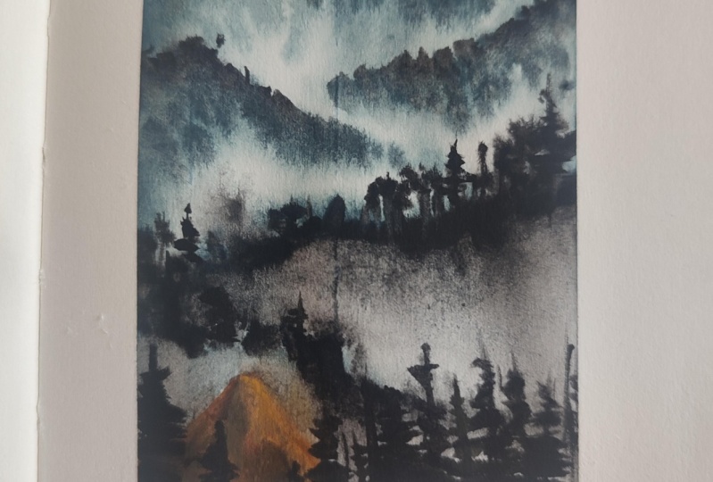
10. Day2 - Misty Mountain Ranges: Welcome to day two. Before we begin, let me explain the elements
of the painting. Firstly, we have sky. Then in the distance, far away area, we
have misty mountains. And in the mid ground, again, there are more misty
mountains mature. They look slightly bigger
than the background ones. In the foreground area. We have a closer view of the mountain and some
trees around it. Okay, let's get started. I'm going to apply masking
tape on all the sides. Make sure all the sites
are tightly sealed. Now, let us get started
with the sketching. As you can see, there are a lot of distant mountains
covered with missed. So I'm roughly mocking the
outlines for the mountains. In the foreground. We
will have this mountain. This mountain is closer
to the viewpoint, so we can see the
detail on this. Okay, so let's get
started with painting. I'm using my larger brush
for applying water. We will go with the wet on wet technique for
the base layers. Next, lettuce mix the colors. I'm taking Persian
blue and burnt umber, mixed them together. And then we'll start applying the paint
from the top part. This will depict the sky. Next, we will take black and
mix it with Persian blue. Now, apply this darker blue, suggesting darker
clouds in the sky. Moving on, let us start painting the distant mountains
covered with the midst. The whitespaces will
leave in between, will depict the midst
in the painting. Paint as many layer of
mountains you want. There isn't no fixed
number as such. Next, for the midground area, that is the mountains
in the midground area, I'll paint the base layer first with the diluted version
of the same color. Applied, different tonal
values of the same color, so that we get a nice variation and in the mountain ranges. Next, let us take this darker color and apply
on the peak of the mountains. Next, I'm mixing burnt umber
Bush in blue plus black. So this is a very darker color. You can even use black. But if you mix these
colors together, it will give you undertone
of blue and brown color. Here we are painting the
next mountain range. Here. I'm intentionally moving my brush in order to get
these wobbly strokes. Next with the help
of another brush, I'm applying this
lighter blue color so that it creates a
nice misty effect. Similarly for the
previous one also, I'll do the same thing, being some tiny dots depicting the trees
on the mountains. Next thing, the same
darker color again. And swiftly apply the paint creating another
layer of mountain. I'd vertical lines
suggesting the tree line. If you notice, I'm painting
the lines in different sizes. In order to avoid
the uniformity. Right below this, we will paint another layer of mountain. Apply clean water and paint
down to create a gradation. This will help us achieve
a beautiful misty effect. If you have followed my
previous watercolor classes, you might already know how
I create misty effect. So here also, I'm using
the same technique that is pulling the paint
down using clean water. And any kind of trees you want to make the
mountains look organic. Audio can keep
them flat as well. So we have already painted
or three or tongues. Now, let's add the foliage. You just have good dab
the brush in order to create the impression
of the foliage. We will repeat the same for
the lower mountain as well. I'd watch and pull
the paint down. So you can already see the misty effect being
formed by the paint. Moving on, let us paint
the foreground mountain. I'm using a yellow
ocher plus one Tiana. And tiny bit of
burnt sienna applied on the right side because I'm considering it to be
the highlighted side. The other side will
be the shadow. On the other side, I'm applying burnt umber mixed
with 0 tiny bit of black. So you can see this
is very darker brown. And on the lighter side, I'm also adding
this darker color. It doesn't have to be exactly the same replica
of what I'm creating. You can go ahead with whatever shape you want
for your mountain. Now, around these mountains, I'll be painting
some pine trees. Just the regular style of
pine trees that I create. Straight line and then
some zigzaggy shapes apply vertical lines as
filler elements here. So whenever you want to have
the area filled with trees, you can just add some
more lines in between. Next, I'll take black and add some random lines
on this mountain. You're so it creates a definition
in the mountain, right? I think some more pine trees. So for the highlights, I'm using a yellow ocher in a thicker consistency and just dabbing over
the mountain area. Since it is closer
to us so we can see all the colors and a
tiny details as well. Okay, So we're almost done. Now, I'm going back to
this previous mountains and filling in these
white areas that we have. And also adding some shapes. It's optional if you want, you can do it or you
can leave it as it is. So this is the time when you
analyze your painting and see what is missing or
how it can be improved. Okay, let's add some free
flying birds in the sky. I'm using black, yellow. Also, I have a class
on Skillshare where I teach the basics
of painting words. You can check that
out if you have any difficulties
painting the birds. We are done with this. Let us remove the masking tape. There you go. This is how our painting looks. Gorgeous, right? With all
these misty mountains. If you have painted
along with me, go share your class projects
under the project gallery. I would really love to
see your recreations.
11. Day 3 - Color Pallete + Thumbnail: Before we begin, let me show you all the colors that I'm
going to use. For this guy. I'm going to use
brownish blue color, which can be achieved
by mixing cobalt blue, burnt umber, and a
tiny bit of black. You can even go with Persian
blue or ultramarine blue. Next for the mountains, I'm going to use burnt
sienna, burnt umber, and black, and also some
shades of olive green. Next in the foreground we
have this grassy line. We'll use a logo and
olive green for the same. Then we have a tiny
house. For that. We will use black for the roof. You can either go with
yellow ocher or mid yellow. Now for the water, you can use cobalt blue and
a tiny bit of burnt umber. That's all about the colors. Now let us have a look
at the thumbnail. In the faraway area, we have horizon and some mountains
overlapping each other. In the mid section, we
have water flowing through this part. In the foreground. There is a tiny house. You can draw simple
shape as well. There will be friends
right behind the house. That's all about the thumbnail. Let us move on to the
painting chapter.
12. Day3 - A Hut by the Riverside: Welcome to day three. Before we begin, let me explain the elements
of the painting. There is a cloudy sky
and distant mountains. There is a river flowing in the mid area through
the mountains. And in the foreground we have this grassy lines and a heart. That's all about the elements. Alright, let's get started. I'm going to tape down this
paper using a masking tape. For the site. I'm using a
half-inch masking tape. Okay, let's move on
to the painting part. I'm using a mechanical
pencil for sketching. Draw the horizon line. Somewhere on the upper
part of the paper. We will start drawing the mountains lab, these mountain shapes
so that they appear like they are located
closer to each other. Wipe off the extra lines
that we don't need. Now it has created
an illusion of mountain range and
mid valley part. We will resolve it for
the flowing water. Then in the lower part, Let's draw a boundary
for the foreground area. Inside this area, we will
draw a tiny heart or a house. Simple shape house,
nothing fancy at all. Make sure you're creating a
symmetry on both the side. Draw some windows. Then in the backside we
will draw some fence. Okay, now let's get
to the painting. Now take clean water and
apply above the horizon line. So we are going to paint the sky using wet
on wet technique. Let us mix the colors I'm using, or by blue plus a bit of black to make a very
darker blue color. You can even use Payne's
gray if you have. As you can see, I have applied the darker paints
on the upper area. For the area closer
to the horizon. I'm applying these tiny
strokes depicting the clouds. You need not achieve the
exact same result as mine. Just play around with
colors and how fun. You can try and use
other colors as well. There is no restriction as such. In my painting. My idea is to have darker clouds
on the top part. And the word is the horizon. It will be slightly
lighter in color. Okay, Let us move on to
pain, distant mountains. So you can directly take
been sienna or one number. I'm mixing the colors by myself, so don't get confused with this. So the color that I mixed yours looks similar to one Tiana. I played on distinct mountains. It is really helpful
if your brush has a pointed tip so that you
can paint these tiny areas. Alright, so we have painted
all these mountain ranges. You can pause the video
if you need more time. Moving on, let us
paint the river water. So I'm using or throughline and cobalt blue mix of these two colors
plus a bit of white. You can use any
blue that you live. Gently apply the paint
around these mountain areas. If the mountain
layer is still wet, there are chances that the color might bleed into the water area. So be very careful. So this will be like a wet
layer for the water area so that we can paint another layer of wet paint onto
the same layer. I hope you are getting my point. The reason behind doing this is to read in the
whiteness of the paper, to depict it as the highlight
on the river water. Next I'm mixing a
bit darker blue and apply it on the sides
of these mountains. So as you can see, I'm applying this darker blue around
this mountain area. And also in the mid part, creating a sense of ripple
or a moment in the water. Adding another
layer of blue here. And this time it will be a bit darker than the previous shade. This creates a sense of
depth in the painting. Your painting will not look flat if you create multiple layers, adding depth and
dimension to it. Next we will make so
one Dumbo, less black. Achieve darker brown color. Apply this darker brown at
the foot of the mountain, where it is partly
submerged in the water. I'm adding these darker paint to create texture kind of
effect in the mountain. So next, I'll take filbert brush or you can
even take a flat brush. So clean this brush, wipe off all the extra water. So we'll go darker brown color in this brush and apply
it in upward direction. And apply the paints
in upward direction. So as you can see, I'm gently adding some extra
to the mountain. The idea is to have an uneven appearance on
the mountain surface. Next, I'm switching to
my size two round brush. And we'll take black color and paint around
these mountain areas. We will paint these tiny rocks partly submerged in the water. As many as you want. Okay, so we will leave
it here for now. Let us move on to the
foreground elements. So here I would be using
yellow ocher plus olive green. As you can see, I'm
applying both the colors. Having a variation
of L0 and green mixed, mix, olive green plus black omega darker green color, and apply it on this
foreground area. This creates darker nipped
in the ground level. Next, we'll move on
to pin the house. So I'm using a yellow
ocher for the roof. You can use any color
of your choice. Next, lightest spin the walls. So I'm using dark and
concentrated black. Also, I'm using a fine liner, which is size two round
brush for better precision. Because I don't want to
paint outside the walls. You can either paint a
very simple house or you can add details just like
how I'm doing right now. Switching to my fine liner
brush for this tiny line. Now, a darker green or black and swipe
your brush more Li. This kind of breaks
the symmetry in the new pane windows. Next, let us add some
dimension in the roof area. So I'm adding these
tiny dots and lines. Also adding shadows
under the roof. And the color I'm
using is darker, yellow ocher, which means I've added a bit of black to it. Adding tiny lines and
dots on the roof. Effect. In the foreground area. I'm adding this darker
green color, grasses. This prevents the painting
from appearing flat. I'll add these lines and connect them together,
making a fence. Then we will add some rocks. We will add some free
flying birds in the sky. So this step is optional. Some people do not like to
have words in their painting. So it's up to you. If you want. You can add them or
leave it as it is. Now moving on, we would need to add some ripples
in the water. I'm using a fine liner
brush and adding some horizontal lines depicting the ripples closer
to the foreground. Because since it is closer, we can see the details
or the ripples, Right? So yeah, you can use diluted blue color similar
to that of the background. Now, let us add some
dark colored shadows in the ground area. So you just have good nap narco green or black color
on the grassy part. Okay, So we are done
with this painting. Now let us remove the
masking tape. There you go. This is the final
look of the painting. I hope you enjoyed
painting this with me. Go share your projects. I know the projects gallery. I'll see you in the next step. Until then. Bye bye.
13. Day 4 - Color Pallete + Thumbnail: Before we begin, let us have a look at the colors
that we would need. So you can take any
blue, cobalt blue, ultramarine blue, and mix it with a tiny bit
of burnt umber. Get a moody blue color. For the water. We will use the diluted version
of the same color. For the dried prices
around the lake, we will use yellow ocher, burnt umber, and also black. In for the heart PR. I'm going to use scarlet red. You can go with any
alternative red color. That's all about the colors. Now let us move on to
draw the thumbnail. In the upper half, we
have horizon line, and then below that we have
this distant mountain. Then there is the stream line. Then we draw a small hut. Then the boundaries of the leg. So you already have
dried grasses and or some Bart Lisa moist or
grasses in the water. Yeah. That's all
about the thumbnail. Let us move on to
painting chapter.
14. Day 4 - Gloomy day : Welcome to day four. Let me quickly explain the
elements of the painting. So here we have this clear
sky and a distinct mountain. Then there is a tree line. Then we have lake in the center and around the
boundaries of the lake. That is a heart and some partly submerged
land and some grasses. So that's all about the
composition of the painting. Alright, let us start by
taping the masking tape. Now, let us start
the sketching part. I'm going to roughly mark the composition of the painting. So draw the horizon line in
the upper half of the paper and we will mark the
boundaries for the land. The major part is for the leap. And then we have the
boundary for the land. And some parties are
most grassy area. Then above the horizon line we have mountain and some treeline. Closer to the horizon line, we will have a tiny hut. So yeah, that is pretty much
it about the sketching. We will add rest of the
details while painting. Now let us move on to
the painting part. So I'll be applying clean
water using my larger brush. This is because I
want to go with wet on wet technique
for the base layers. Now, let us mix the colors. So here I'm mixing a low aka plus a tiny bit of burnt sienna. Along with that, I'll also makes ocean blue plus bit of black
for the darker blue color. So these two shapes will
mix and keep it ready. I'm applying this NACA, bluish black alert
on the sky part. Also apply the same color
for the lake water. And on the boundaries of the lake and towards
the foreground area, I'm applying a bit darker color. Moving on. Aco, ocean blue, one Dumbo, and a bit of black. Let's white. White because we want to make it
a little opaque. Now we will apply this
for the distant treeline, since it is away
from the viewpoint and more towards the horizon. So we're trying to make it
a bit hazy and less detail. So you already, you can try to create the impression of trees. Makes sure that you are leaving a tiny white space
for the heart. Next we'll paint this mountain, which appears very hazy. So you can use any blue collar. Makes knock up closer to black. Now with this darker tones, we will paint some trees
in the distant area. And dab the pointed
tip of your brush vertically so that it creates
the impression of trees. So this way it will
be easy for you to create these shapes, right? So go with whatever feels
easier or comfortable to you. Next, I'm going to
take this brownish, yellow color that
we mixed earlier. So you can mix burnt umber and yellow ocher or yellow
ocher plus burnt sienna. Anything that you'd
like in your painting. So I'm applying this
on the boundaries and also on the partly
submerged area. My paper is currently
a bit moist, so it is easier for me
to apply this color. If your paper has dried, then you can maybe
spray some water or apply some water
using a larger brush. If the paper is not moist, then there are chances
that you will get very hard edges and that might
not look very appealing. Next, I'm making this
darker brown color mix and applying underneath
these grassy areas. So this will act as the
shadows of the grassy part and also adds a sense of depth and dimension
to the painting. Next, we will be adding some
grasp layers in this area. So like I said, this is a
grassy lined by the lakeside. We're going to have a
lot of grasses here. Use a fine liner brush
for better precision. If you're using a thicker brush, you will end up getting
thicker strokes, right? Also apply a mix of brown and black grass
blades so that we have a nice combination of
lighter and darker colors. The objects in the foreground will appear slightly larger than the objects in the
midground area because it is closer
to the viewpoint. You will. So when we are
approaching the midground area, we will draw a slightly
smaller grasses. Now, black or
darker brown color, and swiftly apply
some brushstrokes in the foreground area. Towards the foreground,
I'm applying some zigzaggy brushstrokes
using brown color. So adding these random textures acts as the filler
elements in the painting. Again, applying some black
brush strokes at random areas. Moving on, let us add some
ripples in the water. So I'm mixing motion low, wide and one number
to form the seed. Now, let us add some
horizontal brushstrokes. I don't the boundaries
of the leg. This acts as the shadows
near the boundaries. Moving on, let us
paint the heart. So I'm going to use red color. Will only paint the walls
and leave the roof as it is. I'm using black for the
door and the window. I'm also towards the horizon. I'm applying this black
color in order to create a separation between
the sky and the water. Next to using my
fine liner brush, I'm adding some tree trunks
from the lower part, some darker color and on the boundaries of the
lake abuse some dimension. Now it's time to add some
free flying birds in the sky. I'm going to paint
very tiny birds. Also. I had some
dotted lines near the horizon depicting
the shadow of the trees. So take a rough paper and
cover the upper part. On the lower part, we are
going to splatter some alos, mostly darker brown color, and splatter the paint
near the grassy area. This creates a very raw and natural effect
in the grasses. Alright, so we're done
with this painting. I hope you enjoyed this session. So this is how our finished
artwork looks like. Mary Moody and gorgeous, right? Would it be endings
are my favorite. If you have painted along with me or if you are
intending to paint, then share it under
the projects gallery. I would love to see your works. Okay. I'll see you
tomorrow. Bye bye.
15. Day 5 - Color Pallete + Thumbnail: Before we begin, let me walk you through
the colors that are required for the
sun and the sky. We are going to use
mid L0 and Scarlett. And for the mountains. I'm going to mix made
L0 and burnt sienna. And pushing for domestic effect and the darker shadows
in the mountain. I'm going to mix
Persian blue and black and some burnt umber.
For the ground. I'll use colored red, burnt sienna, and yellow ocher. For the trees. I'll
be using black color. And also for the sunlit effect, I'm going to add some
burnt sienna on the trees. So these are the colors
that I'm going to use. Next, let us have a
look at the thumbnail. Here. On the right side, we have the right
sun in the sky. And there will be Mountains
which will be sunlit. And in the lower half, we have the ground level. The ground will be reflected
with the sunlight. And there are some pine trees. And the shadows of
the pine trees.
16. Day5 - Sunlit Mountains & Trees: Welcome to day
five of the class. I'll walk you through
the composition now. So here we have bright sky
with glowing sunlight. In the distant area, there are mountains and it has bright sunlit effect due
to the presence of sun. At the foot of the
mountain that is Misty APRNs their arteries and the shadow is being
tested on the ground. So that's all about
the composition. Let us start the painting now. Let's get started
with the painting. I'm going to apply masking
tape on all the sides. Once you have aimed
down the paper, ran your fingers on all the sides will make
sure it is tightly sealed. Now let us mark the
composition of the US up until now in the lower
half of the paper, I'm marking this ground level. Then I'll mark some vertical
lines for the trees. So that is it for now. But I stopped the details we will add as and when we paint. Okay, so let's get started. I'm going to apply clean
water throughout the paper. Okay. I'm going to follow
wet on wet technique. Let's start the painting. I'm going to paint
the sky first. So here I'll take a low and
paint or circular shape. Now take clean water and
soften the inner part. As chi has a bright sun. Next door, it red and yellow mix it together
to form an orange shade. I played around the sun. Since we are going with
wet on wet technique, it is easier to
blend the colors. Now for the rest of the sky, we will apply diluted
shades of red and yellow. Moving on, let us paint
the distant mountains. The mountains that
I'm going to paint will be sunlit in appearance. So first, I'm applying this L0 ACO midtone
consistency of yellow color. Next big burnt sienna
and mix it with yellow. Apply it right below
that yellow color. The next color would
be pushing blue. So when we apply person
Lou over the yellow tone, we will get a greenish tone. Do not panic when this happens. I have done it
intentionally to get a mix of bluish greenish tones. Next, I'm trying to
create a misty effect, the foot of the mountain area. So here I'm using a
diluted black color. Next I'll apply another layer. So I'm applying mix of
Persian blue and black. So when we darken
the upper areas, no misty area automatically
gets highlighted. Also applying another layer
of a low tone when densify the sunlit effect and darker colors in
domestic area so that you create a nice variation and it doesn't look flat. Next, let us makes bone Dumbo, and this will give us 0. Louise Brown don't apply this shade right below the misty area on
the ground level. Now, I'm dragging the
paint in upward direction. So that it creates the
illusion of trees. Next day, black and apply it right below this ONE
that we have applied. Again, drag the colors
in upward direction. So here we have a mix of
brown and black layer. Next I'm going to mix
the red with Montana. So we are trying to create a sunlit effect on
the ground as well. In the lower part, I'm applying some brown shades. So we have painted the ground. Now in order to create some
depth and slope effect, I'm going to add some shadows
using a darker brown color. Not worry about the shape. You just have good
dab your brush and create some horizontal strokes. No paper is still moist. Okay. So now on this moist area, I'm going to paint artery. Since the paper
is not fully dry, we will get a blurry
effect in the tree. Let us paint another tree. I am using the
simple zigzag shapes to create the pine trees. No fancy trick as such. Okay, now let us give some sunlit effect on
the trees as well. So I'm taking one
Tiana and a bit of red and adding on the
branches of these binaries. Adding them on the outer ends will create that sunlit effect. Then, in order to create
that fuller effect, I'm going to add
some vertical lines. As filler elements. You can add as many
straight lines as you want. No strict number as such. I loved the paper
to dry completely. Moving on, we will paint
some more pine trees, which are closer
to the foreground. The previous layer of pine trees where further
away from this point. Moreover, this will be done
using wet on dry technique. The background is
completely dry. We will get crisp and neat. Raise your paint the branches in irregular and random way. Make sure that you're not creating symmetry
on both the sides. I'm taking my time to add these tiny little
branches and leaves. This will help it
look more organic. So you can add as many
pine trees as you want. There's no specific
number in my mind. Okay, So we are done
with these pine trees. Now, let us paint the shadows. Since those Andres
or from behind, the shadows will be on
the opposite direction. So let's paint the shadows
using darker color. Here. I'm using water spray to water it in the
foreground area. If you do not have water spray, then you can gently
apply a coat of water. Applying the paint on wet area
helps spread really well. You can see how the colors are spreading on the ground area. Now, take a yellow ocher and
apply over the brown areas. This creates a
vibrant sunlit effect on the ground as well. Alright, let us add
some birds in the sky. You can use black for
the other parts of the sky and for the
areas near the sun rays. I'm going to use brown color
to create sunlit effect. Also, adding the brown color
on the pine tree as well. The reason is same,
creating sunlit effect. Next time adding some
actual on the ground level. So apply some black or
darker brown color. Hi, I drink some more
voids in the sky. Alright, so we're done
with the painting. Let us remove the masking tape. There you go. This is how
the painting looks like. Isn't this gorgeous? I hope you enjoyed creating
the sunlit painting with me. Louis, share your
paintings with me. I would love Odisha them. I'll see you in the
next painting session. Until then, bye bye.
17. Day 6 : Color Pallete+ Thumbnail: Let us have a look at the colors required
for this painting. For this guy, I'm
going to be using. Once you are non scarlet, you can even go
with bone number. Now for the trees, I'll be using these four colors, burnt sienna, burnt umber, Scarlett, and L0, and
black further tree shapes. Next for the mountains, I'll be using black
and cobalt blue. You can also use white for
the snowy patches here. But I leave the blank
area for the snow. Now let us draw the thumbnail
to understand the elements. I'm very in the main area. We have horizon line. Then we will resolve the
area for the snowy ground. Next we have the treeline. And behind that is the mountain. So below the horizon
is the water. And we can see the reflection of the elements in the water. In the foreground,
there are some rocks. That's all about the thumbnail. Let us move on to the
painting chapter.
18. Day6 - Autumn Reflection: Welcome to Basics of the class. Before we begin, let me walk
you through the composition. In this painting, we have
mirror image of the elements in the water that are partly
or snow-capped mountains. And same is the reflection. Then we have trees, which gives autumn wipes
with all the orange shades. In the mid section we have
snow-capped ground area. And then in the foreground, there are some rocks. So that's all about
the composition. Let's get started
with the painting. I'm dipping down the
paper using masking tape. In the bottom part, I'll be applying to
half-inch masking tape instead of
one one-inch tape. Run your fingers over the edges to make sure
it is tightly sealed. Okay, so now let us get
to the sketching part. I'm drawing a straight
horizontal line in the center. Then resolve the area
for the snow part. This will be the area
for the treeline. Behind this will be
the snowy mountains. The same thing for the
reflection as well, because this is the
mirror image right? Now let us start the painting. I'll apply water above
the mountain area. And same in the
reflection as well. So we will paint the sky first. It goes scarlet red and
mix it with Monte Alban, Dumbo will get a
brownish red color. Apply some angular strokes in the sky as well
as in the water. Moving on, we will paint
the tree line section. Apply water to perform
wet on wet technique. It's okay if your water is
with dirty because anyway, we are going to paint
some brown colors you're in the mid section. Make sure you leave this
tiny white gap for the snow. Thick L0 and mix it
with scarlet red. This will result in
an orange shade. Now take this color in medium consistency and
apply on the wet area. Do not apply the paint
on the mid area. This will be resolved
for the snowy part. Next we will paint
another layer. Now, the bond Dumbo
and scarlet red. Apply this shade on the
lower part of the tree line. Repeat the same for the
reflection as well. Next we will paint
the third layer. So take black, one, Dumbo, and scarlet red. So this will form a
darker brown color. Apply this on the lower part. So now you can see there are three layers in this treeline. One is a lowish and then
we have reddish tone. And the last one is the darker brown or closer
to the black sheep. Being vertical lines
depicting though tree shapes. Okay, so we will leave
it to you all for now. Moving on, we will
paint the mountain. So take cobalt blue
and mix it with black. We will get a very
darker blue color. Make sure your brush does
not have too much paint. Brush, remove the
extra paint and or glided on the mountain area hard to achieve
this snowy extra. So as you can see,
we have achieved this snow-capped
mountain effect. Repeat the same thing for
the reflection as well. In case you're not able to
achieve these whitespaces, then you can apply white
go screens separately. Next, you can apply black color for the darker shadows
in the mountains. Next, we'll take black and apply on the boundaries
of the land. And this node, this creates
depth in those snowy area. And with this black, I'm adding some horizontal lines depicting the ripples
in the water. Now let us spend some pine trees aren't straight lines and
then add branches. You can even use zigzaggy strokes to
paint these pine trees. My brush has pointed tip, so I'm able to paint
these pointy branches. You can go with any brush
that is comfortable to you. Moving on, let us add some
more depth in the snowy part. Two, I'll apply clean water and then apply diluted cobalt blue. For the shadow and depth
effect in the snowy area. I'm using black color to define the shape
of the mountain. So this will be
an optional step. Now, I'll be adding a pine tree. So after painting the trunk, I have switched to
my fine liner brush. So I'll only be painting the
branches with normally use. Add some vertical lines
in the treeline area. Act as the filler elements. Moving on, we will add some tiny rocks in
those snowy area. Just paint some dots to create
the impression of rocks. Add as many pine trees you want. It's totally up to you. Now. Been some rocks in the foreground area apply
any darker color first. So this is the base layer. Next, we will apply some
highlights using lighter colors. I'm using lighter
blue color yellow. Lastly, we will add some
free flying birds in the sky and also paint the
reflection in the water. Alright, so we are done. Now, let us remove
the masking tape. There you go. This is the
final look of the painting. I hope you enjoyed
painting this with me. Bushehr, your class projects
under the projects gallery. I'll see you in
the next chapter. Until then, happy
painting, Bye bye.
19. Day 7- Color Pallete + Thumbnail: Hello there. Let us talk about the colors that I'm going to
use in this class project. For the green color
that you see here. I have mixed varied in
Persian, blue and black. I'll be using this in
different tonal values. Now for the pathway, I'm going to use burnt umber, black for the tree
foliage on the left side. I'll be using black color
for the lighter tones there. I'm going to mix viridian hue, version blue and black. Now for the water droplets here on the sides
of the foliage, I'll be using white. Now, let me show you
the thumbnail part. In the upper half, almost around 60% of the paper. I'm going to draw this pathway. You can just draw this C shape. On the distinct area. We will have some trees. The foreground
trees will be much darker when compared to the distance or the
background trees. On the side. That is the left side, we have the tree foliage
covering the frame. That's all about the
colors and the thumbnail. Now, let us move on
to painting chapter.
20. Day 7 - Atmospheric Pathway: Welcome to day
seven of the class. Now, let us discuss the
composition of the painting. In the distant area, we have a foggy atmosphere and there is a pathway heading
towards the foreground. Some pine trees in
the mid ground area, and some tree foliage covering
the sides of the frame. That's all about decomposition. Now, let us set up the
paper for the painting. I'm taping down the paper on all the sides using
masking tape. Once you tape the paper, just run your finger on the sides so that it
is tightly sealed. Now let us mark the
composition of the painting. So I'll first draw
the horizon line. And from there I
mark the pathway. Draw a C shape to
depict the pathway. Another set of lines to
suggest the boundaries. Alright, so this
is enough for now. The rest of the details
we will add as we paint. Okay, so let's get started. I'm applying clean water
throughout the paper. We will be following
wet on wet technique. Hence, I'm wetting the paper. No lightest mix the colors. I'm going to take viridian
hue and Persian blue. Now, let us mix a
darker turquoise color. I'm taking pushing blue, black and viridian hue. Now a paper is wet. So I'm going to apply thicker
paints on the left side, right next to the pathway. As very approaching
towards the right. Apply very minimal
amount of paint. Apply the paint fully on the left side and leave
some gap for the pathway. Now, drag the colors in the upward direction to
create a graded effect. These graded colors
will help us. Hu of foggy atmosphere, bit of white sky. No, while the paper
is still wet, we will paint some pine trees. This will result in
a blurry appearance. Paint pine trees of
different sizes. You can see how foggy
it is turning out. Apply darker paints at the
boundaries of the pathway. Next, I'm going to mix black
with the existing color. And all will apply on the
boundaries of the pathway. Now we'll apply it on the left side as the base
for the tree foliage. Moving on, let us paint though. I'm mixing burnt umber
and a tiny bit of black. This will create a very
darker brown color. Apply this shade on the pathway, go with medium
consistency paint. Since we are applying on a wet surface that is
wet on wet technique, it is going to appear much
lighter when it dries. Apply some C-shaped strokes. Now on the boundaries, I'm applying black color. I love this layer
to dry completely. You can even use a blow dryer. Alright, the paper
has dried completely. Now let us move on to paint
the foreground element. I'm mixing black in consistency. Now let us paint the
pine tree foliage. I'd curved shapes. Then I use. Next we will mix slightly
lighter tonal value by mixing a tiny bit of
white and green to black. Use this tone for the midground. I'm sorry that my hand is
covering the food page, but you can just paint
the pine tree shapes. The left side will be
covered with darker trees, and the right side
will be brighter. Now, let's paint or darker tree on the
right side as well. I'll paint the tiny tree in
the distinct area as well. Now, let us add another
layer of foliage. On the left side. I'm using my size two round brush with
a paper black paint. So we will paint some
pine tree branches here. Earlier we painted
the base layer so that we don't have
to add all the details. Now this is the final one. And that's how the
layering works. First we paint the base layer. Then we add or fewer
final details. Pain some more
branches outside of the tree structure so that it appears on the pathway
and also on the sky part. Next I'll draw some
branches on the right side. The three parts of these
branches are outside the frame. Next, using black color, we will define the
boundaries of the pathway. So just apply some dotted lines. Next to create a sense of
texture on the pathway. We will use the dry
brush technique. So take a damp brush and
some paints as well, and glided over the pathway. This will create a rough
texture on the pathway. Next, ACO, thick white paint and apply it on the
tree on the left side. This will act as
the water droplets in the three branches. Now, I'll add some
final details. Using my fine liner brush. I'm painting some
pine tree branches, defining the brown part. Now let us add some free
flying birds in the sky. Let us remove the masking tape. There you go. This
is the final look. I totally love the atmospheric
vibe of the painting. I hope you enjoyed
painting along with me. Do share your class projects
under the projects gallery. I would love to
re-share your work. I'll see you in
the next chapter. Until then, bye bye.
21. Day 8 : Color Pallete + Thumbnail: Let us talk about
the colors that I'll be using for
the class project. For this guy and the
distant mountains, I'll be mixing cobalt
blue and a bit of burnt umber to get
a moody blue color. Now for this, so
snow-capped mountain, I'll use black for
the darker colors. For the Green Mountain. Yeah, I'll be mixing cobalt
blue, and yellow ocher. For the darker shadows on that. I'll add black. Now for the brownish mountains, I'll be mixing one number plus scarlet red for the
darker shadows. Again, black for
the highlight here, you can use white. Now for this yellowish mountain, I have mixed yellow ocher
and white as the base. For the shadows. I'm mixing one tamper
with a yellow ocher. And for the darkest shadows, I'll be adding
black to brown mix. Next for the road, I'm going to use a mix of black, cobalt blue, and white. Then for the river water, I'll be mixing blue
gradient you and wipe. You can also use steel as an
alternative for the birds. I'll be using black. That's all about the palace. Next, let us talk about the
thumbnail of the painting. I'll start with the
midground mountains, so that I have a base for
the distant mountains. So once we have this area, we will also add the
distinct mountains. We have added the
mountain on the site. Now we can add the road. And then this area is
for the river water. We can see some parties
are most rocks. That's all about the thumbnail. Now let us move on to
the painting chapter.
22. Day 8 - Vivid Mountain Ranges : Welcome to day
eight of the class. Before we start, let me walk you through the composition
of the painting. We have a very subtle sky, and then there are some
distant mountains. Each one has different
colors and textures in it. Then there is a road. And on the other side, we have a river flowing
to the mountains. And there are birds
flying in the sky. Let's get started. I'm taping down the paper
using masking tape. Once you apply though, you run your fingers on all the sides just to make
sure it is tightly sealed. Now let us start the sketching. I'm mocking the horizon line
somewhere in the center. I'll first draw the
distinct mountain. Then I'll be drawing
the mountains that are in the mid ground and which are closer
to the foreground. This will be the road. And then we have a ground
section in-between. You can pause the video and take your own time to
make the sketch. I looked at a picture of final painting in the
resource section. You can take that as
a reference. Drawing. Another mountain range
in the midground area. So the stream that
you see here will be the reward flowing
through the mountains. And I'll draw some tiny
rocks on the rewards dream. That's all about the sketching. Now let us move on to
the painting part. We'll start with the
sky. Apply what? My water is a bit
dirty, but that's okay. I'm going to apply cobalt blue mixed with a bit of burnt umber. I'm keeping the sky very subtle. Moving on, we will mix the
colors for the mountains. I'll take medium consistency of cobalt blue and a
bit of burnt umber. Applying this as the base layer for the mountain on the left, I leave the upper part
of the mountain as is, to apply another shade. Next, I'll lighten the
color by adding white. So this is the color for
the farthest mountain. Next time, adding some
dots and lines using darker colors to create a
sense of depth and dimension. If it is plane, then it is going to look flat. So just add some
random lines and dots. For the next mountain range, I'll be creating
a snowy texture. I'll be applying some lines, leaving some spaces in between, and also gliding my brush to
create this snowy effect. Also add some darker
blue or black in-between to highlight
the whiter part. Next, I will mix cobalt
blue, and yellow ocher. This will give a greenish color. And I'll apply this on the empty space that
they had left earlier. Also, I'm taking
some yellow ocher directly and
applying it on this. So now we have a mix of
three different colors. Mix. I'm going to
take bond Dumbo, and mix it with red. I'll apply this on the
mountain in the right side. Next, make so white
with a yellow ocher. I leaped like this on
the left side mountain. So right now we're painting the base layer for these
midground month binge. I'll also apply the same
color in the middle area. Next, let us take black color and apply the bottom
of this mountain. This will act as the
shadow for this mountain. As we move towards the
upper part of the mountain, we will add tiny lines. Next we will add darker colors. On the brown mountain. I'm baking black. And in the lower part, I'll add the boundaries. Then for the upper pipe, I slightly add these tiny lines. I think this brown
on another mountain. So painting these mountains with different colors
as the base layer helps us distinguish and paint
each mountain separately. Next, we will paint
the river water. So I'm going to mix
it all in blue, viridian hue, and bit of white. You can even take it a color. So take this color mix in a very diluted form
and apply the paint, leaving some white
gaps in between. Moving on, we will
paint the road, mix white, cobalt blue, and a bit of black. This should look like
a bluish gray color. Apply the paint on
the boundary first and then apply water
inside this area. Next, we'll go back
to the river water. And on the boundaries
of this reward, I'll apply darker
concentrated paint and also apply it
on the media areas. Okay, Next, let
us make SO brown. Hello. This should be
a mid-range brown. Apply this on the left side. The mountain ways. We'll apply some dots and lines creating a sense of texture
and depth in that mountain. There is no particular
pattern that I'm following. I'm just randomly
adding these lines. On the mid part as well. We will draw these
zigzaggy lines coming towards the foreground. Next, mix bond Dumbo with black and apply around the
boundaries of the road. And also around the
boundaries of the water. I'm randomly adding
some dots and lines in this section to create a sense of depth and or
illusion of shadows. You can even glide your brush to create a textured effect. Next we'll move on
to the left part. Here also, I'll do
the same thing, adding these lines, creating
a sense of shadow and depth. Right now, it might
look a bit darker, but when it dries, it is going to appear a
little lighter in color. So we are following
layering technique. That is, we are
painting details on the base color block area. Now let us add some rocks
in the river water. On the sides. I'm
adding tiny dots. Now we will go back to
other mountain ranges and add some details
wherever required. I'll go back to this green
one and add some black lines. When the paints are all dried, we can see the actual
appearance of the painting. So we will get a better
understanding of where we need the shadows and the
highlights are going to go. You can add the darker and
lighter colors at the end. I'm roughly sliding my
brush on the mountain ranges to create
the texture defect. Next, with the help
of lighter colors, I'm going to add the highlights. So with the help of
white or lighter color, you can add though, these highlights
on the mountains. So here I'm defining
the shape of the road. Now let us add some
birds in the sky. If you are drawing bigger size, but that means they
are closer to w point. And if the board Scipio smaller, they are further away
from the viewpoint. In this green colored mountain. I realized that after drying, the shadow appears a bit dull. So I'm adding more black. Alright, so we're done
with the painting. Now let us remove
the masking tape. There you go. This is the
final look of the painting. I hope you enjoyed
painting this with me. Do share your class projects. The projects gallery. I'll see you in the
next class project. Until then, bye bye.
23. Day 9: Color Pallete + Thumbnail: Let us discuss the colors that we would need
for the class. For the sky, I'm going to use
made a law in diluted form. For the mountains. I'll be using black and cobalt blue
for the white snow. I'll preserve the white
color of the paper. Next for the road, I'll mix black, blue, and white. For the tree line, I'll be
using these five colors. Yellow, Scarlett, burnt umber, burnt sienna, and
black separately. So as you can see that
a lot of colors here. And for the tree trunks, I'm going to mix black
and white to make a gray mix for the words
I'll be using black. Next, let us discuss the
thumbnail of the painting. So somewhere in the lower
part we have this horizon, line and vanishing point. From there, we have this
reward and treeline. In the background. There will be distant mountain which
will be covered with snow. We have three trunks and branches spread
across the treeline. The lower part will be darker due to the
presence of shadows. So yeah, that's all
about the thumbnail. Let us move on to the
painting chapter.
24. Day 9 - Road through the Trees: Welcome to day nine
of the challenge. Let us discuss the
composition of the painting. We have a yellow sky and a
snow-capped distant mountain. There is a tree line and a road going towards
the horizon, and it vanishes at that point. The trees, your autumn wipes. And there are birds
flying in the sky. So that's all about
the composition. Let us start by
taping down the paper on your finger over the edges to make sure
it is tightly sealed. Alright, now let us
start the sketching. I'll be marking the
basic composition. Somewhere around the
lower half of the paper. Margot vanishing
area for the record. And from this point
I will connect two lines towards
the foreground. So this will be the
road in the painting. Then a mocking the area for
the treeline. The reward. And the tree is moving further
away from the viewpoint. So as it goes away, it tends to appear smaller. In the distant area,
we have mountains. These mountains will
be snow-capped. Okay, so that is it
with the sketching, rest of the details we
will add as we paint. So let's get started. I'm taking my size
seven round brush and I'll wet the paper
for wet on wet technique. You can either go with the water spray or you
can use a large brush. Now, let me start with the sky. So I'm applying a
load for this guy. Apply very diluted paints as you move towards the horizon. Cobalt blue, black. We'll mix these two colors
to form a darker blue hue. Now, I'm going to paint the snow-capped mountains colors with damp brush and gently glide the brush
to create this texture. Make sure to leave
some white gap in-between that will suggest
the snow in the mountains. First, we are adding that
extra with lighter color. Then we will add some
concentrated paint. Okay, So we are done painting
this snow-capped mountains. Next, lightest spin the road. I'll be using cobalt
blue, and black. Apply this mix in
medium consistency. Okay, next we'll take once Yana and mix it with a
darker mix we have. So it will create
brownish, blue mix. I'm going to apply this on
the boundaries of the road. Next, big black, and we will apply second
year on the road. We're trying to depict
this as a concrete road. So let's make it very dark. Notice my brush strokes here, I'm not fully
applying the paint. You can see some tiny gaps
in-between the brushstrokes. Okay, Next we will
paint the tree foliage. So I'm mixing red, yellow. This will give an orange shade. But that makes, I'm adding
a bit of burnt sienna. Now, apply this on the top
part of the foliage area. Here. I'm also dabbing
my brush on the sky, but this will be
the loose foliage. Next, lettuce mix darker brown color for the shadows
of the foliage. In the lower part,
I'm going to apply this darker brown color. This will be the base part. Later on we can add the details. Next, I'm going to mix scarlet, red, burnt sienna, and yellow. Orange-ish red
color, which we will apply in the midsection
of the treeline. So here we are trying to achieve upgraded effect on the crown part of the trees. I'm adding these loose foliage
using the tip of my brush. So here, there is no
fixed shape as such, you can randomly
add tree leaves. Next, let us makes red, yellow, and brown color will
make it a little darker. I'm mixing a bit of black to it. Alternatively, you can use
any darker brown color. Now, we're going to add the darker shadows
in the foliage part. We already have
lighter tones, right? So now let us add
this darker foliage. This will make the
tree look organic. I'm using my size seven round
brush with pointed tip, so it is easier for me to
create these leafy shapes. Paint leaves off different
shapes and sizes. Also tried to read in
the orange color in the background for the
highlights in the tree line. Next we will add some more
black to the current mix. So this will become
darker brown color. We will apply this on the
bottom part of the artery line. Shadows in the foliage. Next, we'll take a yellow
and a little bit of red. And I'm dabbing the
brush to create these lighter colored foliage. Moving on, we will mix
a bit of white with the current mix and then apply it in the middle of
the tree foliage. This will act as the brighter colored
leaves in the foliage. I'll apply some more
darker colored leaves to create a sense of
nipped in the foliage. Next, I'll be mixing white and a tiny bit of black
to make gray mix. With this gray mix, we will be adding three tongues. Indoor tree line. Use a fine liner brush. We will paint these
trunks on either side. As we move towards
the horizon line. Though size or the height
of the trunk decreases. Because of the rule
of two perspective, the elements that are closer
to the viewpoint appears larger and the ones that are far away from the
viewpoint APR smaller. Next time adding
some branches on this tree trunks so you can
paint them in any shape. I'm leaving some gaps in
the middle of the trunks. That is to create an illusion that it is
covered with the foliage. And it suggests that the tree
trunk is partly visible. Moving on, we will
take a black color and apply this on the road. To add shadows of these trees. You can glide your brush
in order to achieve this extra effect on road. Next, I'm switching to my fine liner brush
and using black color, I'll be adding some
tiny twigs and branches at the crown
part of the trees. I'll also be adding some trunks and branches at the lower
part of the tree line. Alright, moving on, we will create a pattern kind of
effect on the tree trunk. I'm adding these tiny lines on the gray trunks that
we have painted. I think these lines creates an organic impression
in the tree trunk. Next, I'll add some more tree
trunk using black color. I had some branches randomly on the top and the lower part. It's totally up to you. Now let us add some
highlights on the tree trunk. I'm using white color
and applying it on the sides of these
are tree trunks. So now we have a mix of
shadow and highlight. Adding some leaves in
the foreground, trees. Moving on, let us add
some highlighted foliage. I'm using a low. I just dab it on the upper part where I have created
these tweaks. Next, let us add some
details on the road. So I'm adding the boundaries
using gray color. I'll also paint a
divider in the center. Next with the same color. Paint some dots near the boundaries of the
road and the tree line. Next, I'll be doing the
same thing with black. This creates an
impression of noise and some texture on
the ground level. Now let us spend some
boards in the sky. Now, the graph paper covered on the upper
part of the painting, some gray or white paint on the brush to
sprinkle the paint. So you have the splattered paint all over the road
and the bottom area. Next, I'll do the same
thing with black color. All right, so we're
done with the painting. Now, let us remove
the masking tape. There you go. This is the
final look of the painting. I hope you enjoyed
painting this with me. Do share your class project
under the projects gallery. I would love to
reshare your works. I'll see you in
the next chapter. Until then. Bye bye.
25. Day 10: Color Pallete + Thumbnail: Before we begin the
painting chapter, let us discuss the
colors that will be required for the sky. I'll be using yellow ocher with a mix of burnt umber and black. For the pathway,
I'll be using black in diluted and
thicker consistency. And I'll also use the same
for the trees as well. Next, for the grassy area on
either side of the pathway, we will go with a yellow ocher, burnt umber, scarlet, and black. So these are the colors. Now let us have a look at the
thumbnail of the painting. We will draw a pathway
in the center. And there will be a slopey area on either side of the pathway. When we will have some
pine trees on the side. So you will have partly
visible three branches. The road we'll have
some rough texture. So yeah, that's all
about the thumbnail. Now let us move on to
the painting chapter.
26. Day 10 - Grassy Slope: Welcome to date
and of the class. Let me walk you through
the composition of the painting before we start. So here we have clear sky and towards the horizon we
have atmospheric dust. And there is a pathway. And on either side of pathway we have this brown grassy area. And there are pine trees. And on the sides we have
some partly visible trees. So yeah, that's all
about the composition. Now, let's move on
to the painting, but let us get started. I'm going to tape down the
paper using masking tape. All the sides. Once you have applied the tape, just run your finger on the edges to make sure
it is tightly sealed. Now let us mark the
composition of the painting. Here, I'm drawing two
doors to mark the pathway, and then I'll connect it
towards the foreground. Next we will draw a slopey lime and some vertical lines
for the tree trunks. That's all about the sketching. Rest of the details we
will add as we paint. Firstly, we will wet the paper to perform
wet on wet technique. Next, take black in medium consistency and apply
it on this white layer. A yellow ocher, and add a bit of brown or black to make
it a bit darker shade. Now, apply about
this sloping line. This will act as the
atmospheric dust in the background area and we will blend it
into the clear sky. So the upper part of
the paper we will keep blank and no colors. Next, lettuce mix yellow
ocher and scarlet red, and also a bit of burnt umber. So this will be a kind
of reddish brown. I'm going to apply this around the boundaries
of the road. Now. I'm going to
apply second layer on the road, supply black again. Now in order to create some
highlight in the road, I'm lifting the paint
using my damp brush. Next, I'll add some
darker color as well. So it will be a
nice combination of lighter and darker
color on the pathway. Moving. Okay.
Alright, moving on, we will apply this
yellowish brown on either sides of the road. This brown color will act as the grassy area in order to create some depth. Or I mentioned in the grasses, we will add some darker brown
color in the form of Dodge. Now let us add
some distant trees using diluted black color. I'm simply drawing
some vertical lines in a wobbly manner. Next I'll be adding some black patches
in the grassy area. So whenever we see
anything in nature, it is never uniform
or perfect in shape. It has some unevenness in it, which makes it even
more beautiful. There is no strict to
brushstroke as such, I'm randomly dabbing my brush, creating unique impressions. Now, let us cover the sky part of the
painting and splatter some darker paint onto the pathway and also on them
and also on the grasses. Now, if you observe the yellowish brown color that we initially
applied as the base, now acts as though highlights
in the grassy area. So that is the beauty of
the layering technique. In the next step, I will apply scarlet red on the grassy area. This is just to add a sense of contrast in between no
L0 and darker brown. Moving on, we will paint
some distant trees. So I'm using my fine
liner brush to paint these tiny trees which are
away from the viewpoint. If you observe the
brush tip is very fine. And I can paint very tiny lines. If you have such brush, you can go ahead with that. Else. You can use whatever
is available with you. Next, I'll be painting the
trees in the mid ground area. I need branches and leaves on the ground
part of the tree. As you move towards the
bottom part of the tree, you can increase the size
of the branches and leaves. I'll paint some random
lines on the pathway to create a sense of noise
and textured effect. On the side of the painting, I'll be adding some
leaves and branches depicting the tree which
is out of the frame. I'll repeat this on
the left part as well. Adding some free flying birds in the distance area so
they appear very small. Next, I'll apply some red
color on the tree foliage. Now that we have added red
colored leaves on the trees, it will also justify the red
color on the grassy area. It will suggest
that the leaves are falling on the grasses. All right, we're done
with this painting. Now let us gently remove
the masking tape. There you go. This is how the
final painting looks like. I hope you have enjoyed
painting this with me. Do share your class projects
under the project gallery. I would love to see your works. I'll see you on day 11. Happy painting.
Until then, bye bye.
27. Day 11: Color Pallete + Thumbnail: Let's talk about the colors
required for the sky. I'm going to use ultramarine
blue, black, and white. You can also use cobalt blue. For the sign. I'll be
using yellow ocher, ultramarine, burnt
umber and wipe. And in some areas, I'll also use scarlet
red. For the seawater. I'll be mixing viridian
hue and white. In for the darker green shrubs. I'll be mixing olive
green and black. For the distant mountain. You can make some
burnt umber and cobalt blue or ultramarine blue. Now, let us discuss the
thumbnail of the painting. Around the mid area. We have horizon. On the left side, we
have slopey signed area. The right side is
for the seashore. There is a mountain
in the distance. In the sky. We have
beautiful clouds. In the foreground. We have
some shrubs and bushes. So yeah, that's all
about the thumbnail. Let us move on to the
painting chapter.
28. Day 11: Seashore and Sand Dunes: Welcome to Day 11 of the class. Let's talk about the
composition of the painting. We have a beautiful cloudy sky. There is a distant mountain. And on the left side we
have a slopey sand dune. On the right we have a seashore. In the foreground signed area. We have these darker
green shrubs. That's all about
the composition. Let's get started. I'm taping down the paper
using masking tape. Your finger on the edges to make sure that it
is tightly sealed. Now let us draw the
composition of the painting. Somewhere in the mid area. I'm drawing horizon
line. Right above that. I'll draw this slope b or another distant
mountain like shape. Next, I'll draw the
marking for the sand dune. Towards the foreground.
I'll mark or slopey area. Here. I lightly mark the
area for the seashore. Alright, that's all
about the sketching rest of the detail we will add
as and when we paint. So let's get started
with painting. I'll apply water
on the sky part. So here we are going with wet on wet technique to paint the sky. For that, I'll mix a blue
bit of black and white. Now, apply this mix
on the wet surface. Applying this makes on
the wet surface gives us a soft appearance
in the clouds. The blank whitespaces resembles the white clouds in the sky. As you move towards
the horizon area, apply tiny blobs of paint. Next I'll apply a black eye
shadows of these dark clouds. Medium do diluted
consistency of black color. Next, let's paint the sea. So what I'm going to make viridian hue plus
a bit of white. Now at the shore part, I'm going to apply some white. Will. I just offer me
texture in those seawater? Next, let us makes
the sand color. So I'm going to
use yellow ocher, ultramarine, blue, and white. If we mix these three colors, we will get mutated
alloys. Greg, hello. Apply this on the
area by the seashore. So here I'll just erase the
horizon line that I had drawn so that we get a nice
slope area for the sand dune. Next I'll mix a similar shade, but I'll also add a bit of L0. I'll apply this as the
base for the dune area. Next big bond, Dumbo and apply on the distant
mountain that we have. You're also applying
some cobalt blue. Blend the two colors in-between. On the upper part, we will apply clean water
to soften the hard edges. Now to the same time, makes sure I'll apply
a bit of scarlet red. I'll apply this in
the form of dots and lines to achieve a
sense of depression. We will get lighter
highlights and darker shadows when we
apply these darker colors. Next to mix a bit of
black and burnt umber to the same mixture and apply on the boundaries of
the sand dune here. And also in the inner areas. Eight black and apply
as darker patches. We will also have some darker green plants
in the sandy area. Next, I add a bit more of a yellow ocher to
the sign mixture. Apply it in though
foreground area. Leave some white spaces. Apply clear water to
soften the heart. I just hear. The lighter area
will act as the highlight. Next, I'll mix burnt umber with the sand mix and apply
in-between these signed areas. I think this will prevent the sign from looking
flat and dull. So we are trying to create mixture of lighter
and darker colors. Next, mix olive
green with black. This will give us a very
darker green color. Now, I'll be adding some foreground plants
on the signed area. Also add some horizontal lines to create a sense of boundary. Apply black around these plants to create the cast shadow
on the leaves itself. Adding more white on
the seashore area. I had some white color in the middle of the sea
depicting the whales. Next I apply this darker mix, the white area, to create a
definition on the sea whales. Using the same mix, we will apply some texture on the signed area to
create the definition. Then apply black in
the foreground area. Next up, light black
around the horizon area. Now makes very didn't heal
with a bit of burnt umber and create a darker texture at the district area of the sea. This creates an illusion
of depth in the seashore. Now, let's add some
definition to the sky part. I'm using ultramarine white
and a tiny bit of black. And adding some darker
and opaque clouds. Spray some water. Or you can apply some clear water around
the darker clouds. The clouds in the upper
part of those Chi, will appear bigger compared to the clouds in the
lower part of the sky, which is towards the horizon. Now let's apply some
darker shadows on these clouds using black color. Alright, so we are done
with this painting. Let us remove the masking tape. There you go. This is how our
final painting looks like. I hope you enjoyed this class and had fun
painting along with me. Do share your class projects
under the projects gallery. I would love to see
your recreations.
29. Day 12 : Color Pallete + Thumbnail: Let us talk about the colors that we would need
for the class. The sky is clear, so I'm just using the
color of the paper. For the distant mountains. I'll be mixing by the
blue born Dumbo, white. For the other mountain, I'll be adding a bit of black to all these colors.
For the rocks here. I'm going to use burnt
sienna, cobalt, blue, and black as the
base for the water. I'll be mixing want Dumbo and cobalt blue plus a bit of white. And for the foreground, plants, I'm going to use black, olive green, and red. So that's all about the colors. Now, let us talk about the
thumbnail of the painting. The horizon line is
on the upper half. Above that we have
distant mountains. Below the horizon
is the lake water. And we have some partly submerged rocks in
the lake water. In the foreground, there are
some plants and some wishes. This area is mainly filled with shrugged nurture all
about the thumbnail. Let us move on to the
painting chapter.
30. Day 12 - Plants by the Lakeside: Welcome to date, wealth
of the challenge. So let us talk about the
composition of the painting. We have a clear sky
and then there are distant mountains
with different colors depicting a sense
of perspective. Then we have lake water. Parties are moist rocks.
In the foreground. We have these
plants and flowers. That's all about
the composition. Let's get started. I'm taping down the paper
using masking tape. Once you are done,
run your finger over the edges to make sure
it is tightly sealed. Alright, let us mark the
composition of the painting. In the upper half, I'm going to draw this
horizon line above, which will be the
distant mountains. In the midground
area, we have these. Below the horizon
is the lake water. In the midground area, we have rocks that are partly submerged
in the lake water. Alright, let's get started
with the painting. So I'm mixing or by blue with white and a bit of burnt umber. I'll use this muted blue color
for the distant mountains. And for the next
layer of mountain, I'll be using slightly
darker color. This adds a sense
of perspective. The lighter one being
the farthest mountain. Moving on, I leaped like clean
water below the horizon. So now I'm going to
paint the lake water. So let us mix the colors. Cobalt blue, bit of
black and white. So this will be a
muted blue color. You can even go with any
other color of your choice. I'm applying horizontal
brush strokes, leaving some white
spaces in between. Moving on, let us paint some foreground elements
on the same **** surface. I'm using a black color. I'm creating the impression
of leaves and grasses. There is no strict pattern
or any shape in my mind. I'm just randomly
filling the space. Next, I'll use a
slightly lighter color and fill in the gaps. Next, let us paint
the rocks that are partly submerged
in the lake water. I'm painting with black
as the base color. No, the bottom area, I'm going to play burnt sienna. Alright, we will leave
it here for now. Moving on to the horizon area, let us add some details here. So I'm going to add some
wishes and grasses. Using black color. Next we will be adding some
highlights on the rocks. So makes Montana white
and a bit of blue. So we'll get a muted
color for highlight. Apply on the top
area of the rocks. Next, we will take
slightly darker color. This is to paint the reflection of the
rocks in the water. Next, olive green. If you do not have olive green, and then you can take
some green and black. I apply some leaves
of green color. In the bottom part, I'm
going to just fill up this blank area with black paint, some tiny lines in
upward direction. The big thing though, short of these plants. Next aches scarlet red. And we will paint some flowers. Alright, moving
on, I'll be adding some ripples in the water to
depict a sense of movement. So I'm just adding some horizontal lines
using my fine liner brush. Next, let us add some
details on these rocks. So I'm using black color. Also adding some
other rocks that are partly submerged
in the lake water. Next, I'm going to add some
highlights on the rocks. So using gray color, it makes white and scarlet red to add highlights
on the flowers. Lastly, we will add
some birds in the sky. Okay, So we are done
with this painting. There you go. This is the
final look of the painting. I hope you enjoyed
painting this with me. Boucher your class projects
under the projects gallery. I would love to see your works. Also, please share your
review or feedback for this class. Thank you.
 Shanan Subhan, Watercolor/Gouache | Art Educator