Transcripts
1. Introduction: Are you someone who feels curious every time you
see a new art medium, but also a little
unsure where to begin? NUL is the perfect time to try something new, especially
something creative. If you've been wondering
what exactly G is, why so many artists love it, or whether it's right
medium for you, you are in the right place. And if you felt
excited about Goh but also confused or overwhelmed
before even starting, don't worry. You are not alone. That's exactly why this
class is creative. Wh can look
intimidating at first. Is it what color? Is it acrylic? Why does it behave differently? These coins often stop people before they
even pick up a brush. In this class, we will gently clear the confusion and help you truly understand
the medium step by step without pressure. I am Variga an
artist and teacher. And in this class, we will focus on building a
strong foundation with Goh. We will explore the
materials you need, understand how Gach behaves and learn its unique
properties or techniques. All explained
clearly, so you feel confident before jumping
into full paintings. Once you are comfortable
with the basics, we will paint two
cube wash artworks together using simple
techniques to help you experience the
joy of working with this medium without
overthinking or perfectionists. This class is meant to gently guide you into the
Gauche, a calm, supportive introduction
that prepares you to explore Gauche comfortably in your sketchbook
or illustrations. And when you are
ready to go further, I have more BikinaFriendly
Gauche classes waiting for you on my profile to
support your journey. By the end of this class, you will understand how he work, how to control it,
and how to enjoy painting with it confidently
and comfortably. So why wait, pick
up your brushes, grab your sketchbook,
take a deep breath, and let's begin this
che journey together.
2. Materials Used: Before we start painting, let's take a moment to look at the materials we will be
using for painting with wash. One of the
beautiful things about wash is its versatility. It's a very forgiving
and flexible medium, and you don't need a huge or
complicated setup to begin. With just a few basic supplies, you can create bright, expressive and
satisfying paintings. Let's start with the most
important material, the paint. Guache paints are
available in many forms. You will find them in tubes, small bottles, and
even jelly cups. All of these work
perfectly fine, gouache is highly pigmented and known for its
bright opaque colors. So no matter which
format you choose, you will get vibrant results. I personally started with
the Jimi Mia jelly cups, and honestly, there
was no training pair. They are easy to use, beginner friendly and very
satisfying to paint with. But remember, there is no
right or wrong choice here. Swat wash set you already have or feel
comfortable starting with Next is the paper, which plays a big role in how your
painting stands out. For Gauche, I recommend using watercolor paper,
this light texture. That gentle texture
helps enhance the fresh strok and adds
character to your painting. Make sure the paper
has its mad finish, avoid glossy papers as Gauche
doesn't sit well on them. In terms of thickness,
try to use paper that is at at least 100 or 200 GSM. Anyway, I usually
choose papers for my paintings with thickness
around 200 or above. I also like to use
handmade papers for wash. This helps the
papers taste stiff and reduce buckling
when you paint. Ticker papers always makes the process more
enjoyable and stressry. Now, let's talk
about the brushes. While wash is water
based watercolor, I find that acrylic
brushes work better for Woche than
very soft brushes. Acrylic brushes are
slightly firmer, which gives you more
control over the page, especially because gosh is
thicker and more opaque. To start with the gosh, we mainly need three brushes, one flat brush, one round brush, and one small detail brush. These three brushes are more
than enough for a beginner. You can create a wide
variety of brush strokes and textures with just
these brushes. As you continue painting, you can always expand your brush collection
based on your preferences. Sometimes I also use a thick basil acrylic
brush to create bold, easy strokes or texture effects, but this is completely optional. Next is the palette. A palette is
essential for mixing your paints and adjusting
their consistency. Wahpk best when it's mixed to a smooth creamy texture before
applying it to the paper. For this, you just
need a flat surface, and you don't need
anything fancy, a plastic part, a ceramic parte, or even a simple plate
works perfectly fine. You will also need
two jars of water. One jar is used to rinse off
the paint from your brush, and the second jar
is used to clean the brush properly before
picking up a new color. This helps to keep your colors fresh and clean while painting. Keep a cloth or tissue
paper nearby to wipe excess water or
paint from your brush. This wall habit make
a big difference when working with
wash. For sketching, you will need a
pencil and eraser, and to secure your
paper while painting, you can use masking
tape or washi tape. And finally, most importantly, bring a genuine interest
and curiosity to explore the medium that's truly the most valuable
material of four. With these simple supplies, you are more than ready to
begin your wash journey. In the next lesson, we will explore the properties
of wash one by one. So let's move on to
the next lessons.
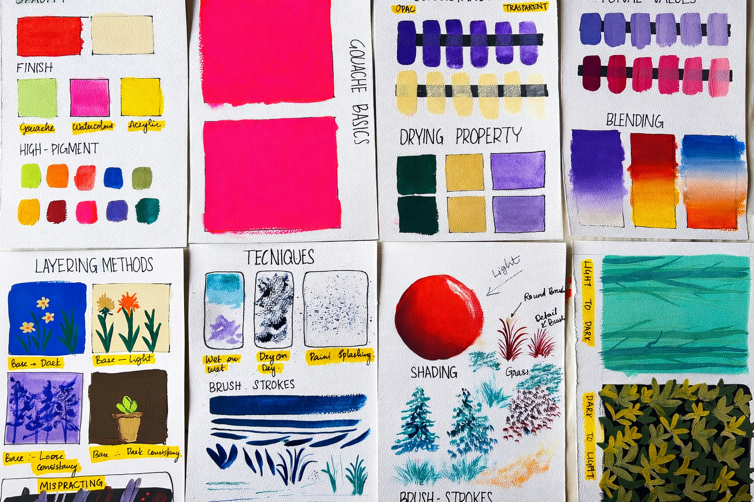
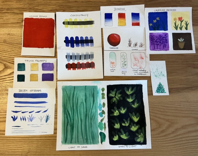
3. Gouache at a glance : Now that we are familiar
with the materials, let's take a closer look
at the properties of Gach, what makes this medium unique and why so many artists
love working with it. We will go through
these properties at a glance so you can understand how Gach behaves
before we start painting. The first and most important
property is opacity. Unlike watercolor, Gach
is naturally opaque. This means you can paint
light colours over dark ones, cover mistakes, and
layer confidently without worrying too much
about what's underneath. This opacity makes
Gosch very forgiving, especially for
bigness and allows you to work more friendly
and intuitively. The next property is
the finish of wash. When wash dries, it has
a soft made finish. This is very different
from watercolor, which looks tansparnt and logs, and acrylic, which
is often dries with slightly shiny or
plastic life circles. Wash sits beautifully between mate velvety and easy on es. This finish make it
perfect for sketchbooks, illustrations and flat
clean looking artworks. And next is high pigment ratio. Guash is made by a high
concentration of pigment, which is why the colors appear so rich,
bold, and vibrant. Even with a small
amount of paint, you can achieve strong
bright colours. At the same time, you
can thin it down with water to create softer
uter tones when needed. Once you understand these
properties, opacity, mad finish, and
high pigmentation, gouache become much easier
to control and enjoy. In the coming lessons,
we will explore more properties and start applying these properties
through simple techniques. So you can see how oh truly
comes alive on paper.
4. Mixing and Applying on Paper: In this lesson, we are
going to explore one of the most important and
comforting properties of gosh. It's water soluble natural. Gosh is completely
water soluble, which means it can be
reactivated easily with butter, even after it has dried. And the good news is your pain will almost never go to waste. Any excess paint left on your palette can
be reused later, even after a long
period of time. To reactivate Gosh, all you need to do is add in a little
water and mix it well. The pain comes back
to life beautifully. If you're using jelly cup gauche paints like the one I use, this property become
even more helpful. These paints can be left
completely in their cups, which actually helps
to prevent mold. Even after weeks or months, you can simply add water mixed thoroughly and use them
again without any problem. Now, let's see it is
reactivating property inaction. Here, I'm adding water to a guh layer that has
already dried on paper. As you can see, the pain starts
reactivating immediately. Because wash is
highly pigmented, a lot of color gets lifted and spreads across the paper
when water is added. This is something to be
mindful of while layering, but it's also what makes Gach very
flexible and forgiving. Let's quickly compare this
with watercolor and click. Watercolor is also
water soluble and reactivate easily
when water is added. However, its pigment ratio
is much lower compared to Gach which is why watercolor looks more
transparent and lighter. Acrylic, on the other hand, behaves very different day. Once acrylic paint dris, it becomes permanent and does not reactivate
with water at all. This makes wash a unique medium. It sits comfortably between
watercolor and acrylic. Now, let's move on to mixing wash and
applying it on water. I'm taking a small amount
of wash on white palette. Using a slightly wet flat brush, I mix the paint well until it reaches a smooth,
creamy consistency. This step is very important.Guah should never be too
thick or too watery. It works best when it
feels creamy and smooth. If at any point, the
paint paints too thick, don't worry, add a little
water and mix the key. While adding water
to this gently, you can use a small spray
bottle or simply dip just the tip of your dish into the water jar and bring a
little water to the palate. Continue mixing slowly until the paint turns into a
smooth, creamy texture. This consistency helps the
gauche flow easily on paper, gives you an even
application and prevents rough or
patchy areas vi page. Once the paint is
steady, load your brush, well with paint, not
dripping, but nicely coated. Place the brush gently
on the paper and start applying the paint using soft
back and forth movement. There is no need to press hard, let the brush glide
across the surface. These gentle strokes
help the paint spread evenly and create a
smooth opaque layer. If you see dry
patches or streaks, it usually means the brush
needs a little more pain. While the paint is still wet, continue moving the brush
in the same direction. This is important because
changing direction too often can leave visible
brush or distal marks. Consistent strokes help the
paint settle nicely on paper. Try not to go over
the same area again and again once it start dry goes dry scuply and overworking can disturb the surface and
create uneven textures. When the paint is mixed to
the right creamy consistency, you will notice how easily it flows and how naturally
it covers the paper. With little patience,
this moment will start to feel very
natural at relaxing. Now I'm filling another
box on the paper. This time, the paint left on
my palette is very little. Instead of taking more paint, I'm trying to fill the box
using whatever is left. Mostly at this
second painted area, you can see uneven patches
gaps and visible brush marks. This usually happens when
there isn't enough paint in the mix or when the paint becomes too
thin, wine spreading. At this stage, the
solution is very simple. Just take a little more paint, add to the palette, and mix it again to a
smooth creamy consistency. And then reapply it
until the paper. You will immediately
notice the difference. The paint spits more evenly and gives you a
clearer opaque clear. And that brings us to
the end of this lesson. In the next lesson,
we will continue exploring more
properties of wash and learn how to use them confidently in our paintings.
I will see you there.
5. Consistency and Tonal Value: In this lesson, we
are going to explore two very important concepts
in gauche painting, consistency, and total values. Understanding these two will give you much more control over your paintings and help you use Gauche confidently
in different ways. Et's start with the
paint consistency. Here I am beginning with a
thick consistency of Bosch. You can see that paint is
dense, rich and diopic. I'm applying the
first brush strop directly onto the paper, both over a black line
and over white area. So you can clearly see how Bosch behaves on
different backgrounds. Now, without taking more paint, I dip just the tip of
my brush into the water or mix it into the
paint on my palette. Slightly loosen the paint, I apply another
strokes on the paper. I repeat the same process, adding a little water
each time, mixing well, and then applying strokes until I have six brush
strokes on the paper, each one slightly more diluted
than the previous one. Notice how the paint
changes with each stroke. When the consistency
is thick and creamy, wash stays opaque even
over the black light. As the paint become looser, it slowly turns more transparent and start behaving
more like watercolor. I repeat the same process
using lighter shade. With a creamy consistency, the lighter shade
is almost opaque. But as more water is added, the paint becomes
increasingly transparad allowing the surface
underneath to show through. This is one of the unique
qualities of wash. I can behave like ac when thick and like
watercolor when diluted. Learning to control
this consistency is the key to
mastering the medium. Now let's move on to
the tonal values. Tonal values simply means how light or dark
a color appears. Understanding tonal values
is very important in paintings because it helps
you create highlights, contrasts and dimensions
in your artwork. Even with just one color, different tonal values
can make a painting look more understanding
and realistic. In wash, toning values are created by adding
white to a color. This allows you to achieve
lighter versions of the same shade while still
keeping the paint opaque, unlike adding water, which
makes the paint transparent. Here, I'm starting with a base color and gradually
adding white to it. Just like before, I'm
creating six strokes, each one lighter
than the previous. You can clearly see
how the tone changes step by step as more white adds. Repeat the same process with two colors first with
purple and then with red, so you can see how
different colours respond when white is mixed in. Its small addition of
white creates a new tone, giving you a wide range of
shades from just one color. This is how you can
create highlights, softness and
variations in wash by controlling
transparency with water and tonal values with white. Once you understand
these two concepts, wash become much
more predictable, flexible, and enjoyable
to work with. In the next lesson, we will
start applying these ideas through simple techniques and paintings. I will see you there.
6. Gouache Technique -1: In this lesson, we are
going to explore one of the most useful gouache
technique, the layering. But before we begin layering, it's important to
understand how gauche dries because this directly
affects how your layers look. Gauche dries quite quickly and settles into a smooth,
opaque match finish. One thing to remember is that wash often changes
slightly as dries. Dark colours usually
dry one step lighter, and lighted colours tend
to dry one step darker. This completely normal
and something you will naturally get used
to it with practice. In this video, you
can see two boxes. The top box shows the brush
stroke that has old dried, and in the bottom box, I am applying the same color
while it's still fresh. When you compare them,
you can clearly see the difference between
the wet and dry paint. So while painting, keep
this in your mind. For dark colors, choose
a slightly darker sheade than what you
want in the finals. For the light colors, select a shade that is a
little lighter. This more adjustment help you achieve the
exact color you are aiming for once the paint
dries. Work anyway. Now let's move on to layering. Layering in wash works beautifully because
of its opaque nature. Once base layer is
completely dry, you can paint another color on top of it without disturbing the layer at as long as you
apply the paint gently. To show this clearly, I have divided the
paper into four boxes, each with a different
base condition. After the base dries, I will be layering both light
and dark shades on top of each box so you can see how wash behaves in
different situations. The first box, I have filled the area with a dark base color. In the second box, I'm
using a light base shape. In the third box, I'm applying the base layer in a loose
or diluted consistency. In the fourth box,
I'm using a thick, tight consistency
for the base layer. After the base layers dry, I'll be layering both light
and dark shades on top of each box so you can see how Gach behaves in
different situations. In the first box where I
used a dark base color, over these dark base, I'm laying both lighter
and darker shades. You can see how
the lighter colors stand out clearly while the darker layers still remain visible because of G's opacity. In the second box, I work
with a lighter base color. Here, both darker and lighter
layers behave differently. The darker shades appear
bold and strong while the lighter shades blend
more softly with the base. In the third box, the base is applied in a loose or
diluted consistency. When I add both light
and dark tones on top, you will notice that the
colors interact more gently creating softer
planter effects. In the fourth box, I'm using
ethic tight consistency for the base layer because
this layer is solid and opic. Both light and dark
lays it cleanly on top, giving sharper and
more defined stops. By comparing four boxes, you can clearly see how base color and paint
consistency affect the layering wash and how light and dark shades behave differently in each case. Layering allows you to build depth contrast and details
in your wash paintings. With patience and
gentle brush work, it becomes one of the most
enjoyable technique to use. Before moving on, here are
a few important things to keep in mind while
layering with wash. Always make sure
the base layer is completely dry before
adding another layer. If the paint is
even slightly damp, the new layer can reactivate and cause unwanted
smudging or lifting. Try to avoid using very loose or watery paint on top unless you are
confident in catolic water. Too much water can
disturb the layer underneath and make the
colors mix and intensitive. Be gentle with your brush. Do not apply too much
pressure while lair. Pressing hard can reactivate the base layer and leave
rough marks on the surface. Also, avoid too many brush
strokes in the same area. Wash dries quickly, and working on the spot can make the
surface uneven corbaty. Instead, let the brush glide
softly over the surface. Use light confidence
ropes rather than scrubbing or going back
and forth repeatedly. This helps the new layer sit
cleanly on top of the base. Keep these simple points in mind will help you layer more
confidently and achieve cleaner, more controlled result
in your wash paintings. In the next lesson, we
will continue exploring wash techniques
and start applying them in simple paintings.
I will see you there.
7. Gouache Technique -2: In this lesson, we are going to explore two very important
gauche techniques, brush strokes and blanching. As we discussed earlier
in the material lesson, you really don't
need many brushes to get started with guh. In fact, just three
basic brushes are enough for most
painting a flat brush, hair outbush and a
small teil brush. Let's begin by exploring brush strokes using
each of these brushes. Flat brush, we will start
with the flat brush. This brush is mainly
used for flat brushes, blending and covering large
areas quickly and smoothly. Because of its flat shape, it helps spread the
paint evenly at its perfect background skies
and smooth colour taxisions. You will notice that
flat brush creates clean broad strokes and is especially helpful when
blending two colors together. Round brush. Next
comes the round brush, and this is the brush I
personally use the most. The round brush
is very vesatile. You can create lines of different thickness
using the same brush. When you use the entire Brazil, you will get thick strokes and when you use just the
tip of the brite, you can create very
thin delicate blights. This makes the round Bish
perfect for outlines, shapes and jar paintings where you need both
control and flexibility. You can make leaf
shapes, flower petals, and many other shapes just by adjusting the pressure and
spread of the brazils. Detail brush. The third
brush is the detailed brush. This brush is smaller
and more focused, making it ideal
for fine details, highlights, and
finishing touches. Even though it's small,
you can still create slightly thicker lines by
using more of the bristle. But most of the time this brush is used when you want
precision and control. With just three brushes, you can create a wide variety of strokes and textures in gouache. Now let's move on
to the blending, which is one of the most
commonly used techniques for creating smooth backgrounds and soft transition in cash pentik. I'm going to show you three
simple ways to blend. In the first example, I'm blending a single
color using white. I start applying violet at
the top and paint outwards. At the bottom, I apply
white and paint upward. Where two colors meet, I use gentle back and forth
strokes with a flat brush. Then wipe my brush clean and continue blending the
middle area softly. This help both colours merge
smoothly into each other, creating a soft
tonal transition. In the second example, I'm
blending red and yellow. Red and yellow are
closely related colors. When they mix, they
naturally create orange. So I play red at the top
and yellow at the bottom, and then I place
orange in the meting. Using gentle back
and forth strokes. I blend all three
colors together. This method helps to create a smooth transition without
muddying the colors. Using a metal color is very effective way to
blend two colors plainly. In the third example,
I'm blending two contrasting colors
blue and orange. When contrasting colors
are mixed directly, they can tap turn muddy. To avoid this, I place white in the middle
between two colors. White act as a buffer, giving both colors a space to blend softly without
spoiling each other. I start by applying blue on one side and
orange on the other. In the center, I add white. Using a flat brush, I begin blending with gentle
back and forth strokes, allowing the colors to
slowly merge into the white instead of mixing
directly each other. It's important to keep
the brush clean and well wipe on cloth or
tissue while blending. If you notice the color starting
to soil or become dull, clean your brush again and
return to blending gently. If at any point, the
transition feels uneven, you can always add a
little more white or even touches in small amount of original color to
balance the plaint. Blending is a flexible process. Adjusting as you go
is completely normal. Continue using soft
control strokes rather than pressing hard. Let the paint move gradually and allow the transition
to build slowly. This method helps you
achieve a smooth blend between contrasting colors while keeping the colors
fresh and clean. Act. Blending in guh works best when the paint is at the right consistency and
work gently without brushing. With patients, these
blending techniques will start feel natural
and very satisfying. In the next lesson, we
will continue exploring more wash techniques
and start applying them in simple paintings.
I'll see there.
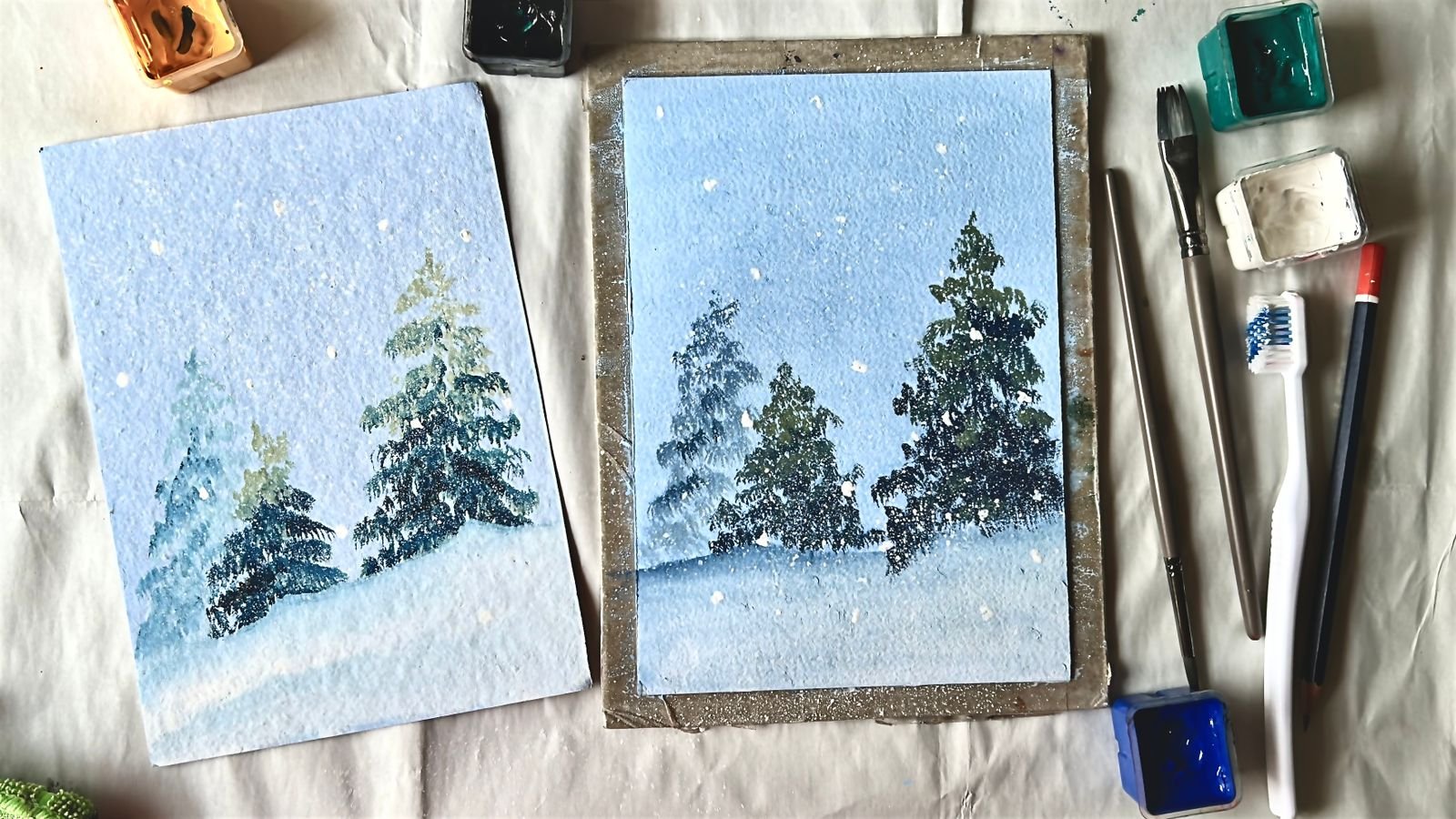
8. Gouache Technique -3: In this chapter, we will explore some essential
gouache techniques that will help you paint more
confidently and expressive. These techniques are simple but incredibly powerful once
you start combining them. Let's begin. Wet
on wet technique. First, we have the
wet on wet technique. This is done by applying
paint onto a surface that is already wet because the paint
and surface are both wet, the colors spread softly and blend naturally
into each other. This technique is great for
creating soft background, smooth transitions, skies
and atmospheric heat. The key here is to work gently and let the paint
move on its own. Don't our work coat. Next is dry on dry. Here we apply paint onto a completely dry surface using a brush with
very little washer. The strokes remain
visible and texture. I slightly tilt
the brush and use gentle slanted strokes to
create cloud like textures. This technique is perfect
for cloud textures, highlights and rough surface where you want the
brush marks to show. Now, let's try something
fun, paint splashing. You can do this using
a regular brush or even a toothbrush. Load the brush with
slightly loose paint and tap or flick
frick it gently. This technique works
beautifully for stars, dust, abstract textures,
foliage effects, or expressive backouts. Always control the amount of water so the splashes
don't spread too much. Let's shade a circle here. We will be using the
blending and layering to create a nice shaded
effect for this circuit. I start by applying
red as the base color, filling the entire circle
evenly before adding any shade. I lightly mark the direction from which the light is coming. This helps me to stay clear about where the highlights
and shadows should fall. Next, I add brown on the opposite side of
the light source. This area represents the
shadow and help create depth. I blend the brown
gently into the red so the transition feels soft
and arhable not harsh. This tape gives the circle a three dimensional appearance
instead of looking flat. Now, let's add a light sharing for the area where the light falls directly for that. I took a lighter tone of the red and applied and
blended properly. M once the base layer
is completely dry, I move on to the highlights. Using the dry on dry method, I take a small amount of white paint in a thick
tight consistency. I apply it carefully on the side facing the light where the light hits the surface most sharply. I use minimal strokes to create a subtle texture and
natural looking layer. Adding highlights only after the base layer has
fully dried helps prevent the colors from mixing unintentionally and keeps
the white crisp and clean. This simple exercise
is very important. It helps you to understand
light direction, shadows, highlights, and form. Which are essential skills for painting objects
realistically. Once you grasp this concept, you will find it much
easier to paint fruits, objects, and even landscape with a sense of
depth and realism. Now, let's paint grass with a round brush and
a detailed brush. First, I am painting grass
using a round brush. I use only the tip of the brush, slightly rolling it to
keep the point sharp. With light pressure, I create simple upward and
downward strokes. The lines are slightly
thicker and softer. This makes this brush great
for basic grass sheep, loose strokes, and filling
larger areas quickly. Now I will paint another
glass using detail brush. This brush gives much
finer and sharper lines. With cube controlled upward
strokes and gentle pressure, I create thin, delicate
grass strands. Because of its size
and precision, the detail brush is perfect
for adding realism, fine textures and
subtle variations. By painting grass separately
with these two brushes, you can clearly see
the difference. The round brush creates
broader software strokes, while the detail brush produce
finer, more precise lines. Using both help you build natural looking grass with
depth and variations. Now, let's paint a pine
tree using a round brush. I begin from the top of
the tree using tip of my brush to make
small short strokes. These strokes paint slightly
outward and downward, forming a narrow top of the pie. As I move downward, I gradually increase the
width of the strokes. I allow the branches
to spread out more, making the tree wider
towards the bottom. This natural wide
wing helps create the classic triangular
shape of the pipe. To depth and realism, I introduce a darker
tone in some areas, especially close
to the center of the tree and in
overlapping scis. These darker shades
suggest shadows and make the branches
feel layered at full. Now, let's see painting a tree with the same brush but
in a different way. I press the brush firmly against the palette to make the
bristle slightly stiff. Then using gentle tapping
and dragging strokes, I apply the paint to the pepper. These strokes help creating the needle like
texture of pie trees. The same technique
can also be used to adapt to the trees, forest shrubs, and
distant foliage, making your landscape feel
fuller and more layered. Now, let's create a
small flying clouds using the dry on try technique. I start with the dry surface
and make a small amount of paint in a thick
dry consistency. Using a round brush, and that is slight
slanted angle. I gently drag the
brush across the paper with light broken strokes. I avoid pressing hard, allowing the texture of
the paper to show through. These soft, uneven strokes help creating the light airy feel of clouds floating in the sky. I move the brush lightly in one direction,
lifting it off it. Instead of overworking the area, this keeps the clouds
looking soft and natural rather than
heavy or flat. And finally, I would like to show you one of
the brush that I'm using a brush with thick rough brails because
of its natural texture, this brush creates broken uneven strokes
without much effort. This makes it easy, especially useful when
painting large areas of grass, tree tops, and foliage, where you want an
organic and natural lo without focusing
on tiny details. With just a few light
tapping or dragging strokes, you can quickly suggest
depth and variations. I avoid pressing too hard and let the brush texture
do the work for me. This helps prevent the painting from looking stiff or over work. This brush is great for
adding final touches, building layers in landscape, and creating sense of movement and fullness
in trees and glasses. It's an efficient
tool for achieving expressive natural
texture in gouache. And with that, we have covered the basic coach techniques
you need to get started. But don't wait, try
on tries, flashing, shading, blending, and
explosive niche work. I hope this chapter
help you feel more confident and
comfortable with the coach. In the next lesson,
we will start doing some simple exercise to apply these techniques and bring everything together.
Let's see there.
9. Exercise - 1: In this chapter, we will be
doing two simple exercises using all the basics and techniques we have
learned so far. One important thing to remember
that wash can be worked both ways from light to dark
and from dark to light. That means you can start with a light background and
build darker deters on top or begin with a darker base and
lighter elements later. For this first exercise, we will work from a lighter
shade to darker shades. I'm choosing a bright
green as my base color, but you are free to choose
any color you like, blue, brown, purple,
black. Anything works. The idea here is to create painting using multiple
tones of a single color. We create these tones by adding white to the
original color. I start applying plain background wash
using my flat brush. The paint is mixed to a
smooth creamy consistency, and I use gentle back
and forth movement to blend and fill the
entire box evenly. Once the base layer is dry, I take a slightly darker tone of the same color and begin
adding the second layer. Using a round brush, I paint symbol vertical
lines to represent trees. These are the distant trees, so they are lighter, softer and less detailed. I also add a few small
branches on both sides, changing their size and direction to keep
them looking natural. Next time, I want to third layer by taking
another step darker tone. I repeat the same process, vertical strokes for
trees and few branches. But this time the shapes are slightly sharper
and more defined. These trees feel closer to us, so they appear
darker and clearer. This contrast between
lighter and dark tones help create depth and distance. Distant elements look
lighter and softer while closer elements appear
darker and more detail. And finally, we move
on to the last layer. For this, I take one more step, darker shade for the same color. This layer present the trees
that are closer to us, so they appear darker, boller and more defined. Just like before, I
repeat the same process, adding vertical strokes
for the tree trunks and extending small
branches on either sides. This time, you can make the
strokes slightly thicker and more confident to emphasize that these trees are
in the foreground. Gradually increasing the
darkness with each layer, we create a clear sense
of depth and perspective. The lighter trees recend into the background while the
darker ones come forward. This final layer brings the whole exercise together
and complete our light to dark, study using Cow. And that's it, we have completed our first symbol exercise. In this painting, we
practice creating thrones using a single
colour and white, working from light to dark, using layering to build depth, using brushtrops to suggest
trees and branches. I have used only a out
brush for this exercise, but you can take it
further by adding tiny details with
a detailed brush to make it more
realistic if you like. This exercise is all
about understanding how Bosch behaves simple,
calm, and effective. Now let's move on to the second exercise
on the next laset.
10. Exercise - 2 : For this exercise, we are doing exact opposite
of the previous one. Here, we will work
from dark to light, starting with the
dark background and gradually adding lighter
foreground details. I'm using black as
the background color, but you are free to choose
any dark shade you like. First, take black paint
onto a palette and mix it well until it reaches a
smooth, creamy consistency. Using a flat brush, start filling the
entire back down. Flat brushes make this
process easy at stress way, allowing the paint to spread
evenly across the paper. Use gentle back
and forth strokes to cover the surface smooth. Once the background is complete, let's move on to the next line. For the foreground,
I have chosen gray, and I'll be working with different tones of
the same color. You can choose any
color you prefer blue, brown, purple, and even red. You create different tones, simply add white to
your base color. This is very simple
exercise designed to help you understand some
key properties of coche. Now, I start with the
darkest green tone, mix it well on the palette
until it's creamy. Load your brush with pink, then lightly removes the excess, don't overload the brush. To paint a leaf shape, gently touch the tip of
the brush to the paper, apply some pressure
and pull back. This motion actually
creates the leaf shape. Continue adding these
leaves across the surface. Because of the
background is very dark, you will notice that this dark green up
is slightly muted. You can also see how gauche
dries a little lighter, especially in darker shapes. Once this layer is done, I move to slightly
lighter green tone and repeat the same
leaf making process. I keep the strokes smooth and clatched allowing the
brush to move naturally. There is no need to rush. Enjoy the rhythm of the strokes
and let the shape flow. As you add lighter tones, you will notice how beautifully gosh responds to a darker black. This is one of the
reasons many artists love this medium because quasi is
opaque and highly pigmented. Even lighter colours can
stand out clearly over darker layers when mixed
in rye consistency. With each new layer,
the painting stony builds depth and interest, the darker green stay subtle and recede into the background. While the light greens
start to come forward. This layering process
helps to create a sense of richness without
needing complex detail. Gah is very forgiving. If something doesn't feel right, you can adjust the tone, soften the edges, or layer
over it, once it twice. This flexibility makes the
Gauche wonderful medium for beginners and
experienced driest. At this stage, focus more on enjoying the process
rather than perfection. Avid layer you at help you understand Gauche
a little better, and that confidence grows
naturally with practice. Next, I switch to even lighter yellow green
sheade and again, paint the same leaf shapes. At this stage, you
will really notice how the lighter tones stand out clearly against a
black background. I have intentionally
let some of the leaves extend beyond the edges
of the composition. This helps create movement
and visual interest, making the painting feel more
natural and less waxtry. So I'm stopping here. But if you like, you can continue by adding
more highlights, lighter tones or even subtle
paint splashes using white. Through this exercise, we
have worked from dark light, lighter shades over
a dark background experienced the opacity of wash, observed how light colors pop up on a dark surfaces noticed how dark colours try lighter
and light colours slightly dark practiced
simple leaf shaped washropes. That's it for the exercise. I hope this helped
you explore wash more confidently and understand
its unique properties and basics as a medium. You are doing great.
Keep painting, keep experimenting,
and enjoy the process.
11. Conclusion: Thank you so much for spending your time with me and
choosing this class. I truly appreciate you being here and exploring wash with me. In this class, we have covered all the essential
foundations of Gosh, from understanding
the materials, properties and
consistency to working with tonal values,
layering bridge tookes, blending and practicing
both light to dark dark light
painting approaches. You also tried
symbol exercise that help you understand
how Wh behaves, how to control it, and how to use it confidently on paper. My goal was to make Guoch feel less confusing
and more enjoyable, and I hope you now feel comfortable and excited
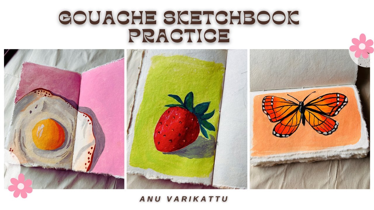
to work with this media. If you'd like to go further, I have more gouache painting
classes on my graphite, including 15 days of sketchbook practice to
help you stay consistent. As well as several
single painting classes where we apply these techniques
in calm step by step by. Feel free to explore them, and don't forget
to follow me for future class updates and
your creative content. Once again, thank you for
painting along with me, and I'm so happy to be part
of your creative journey. Happy painting until we
meet on the next class.
 Anu Varikattu, Artist l Gouache & Acrylic Instructor