Transcripts
1. Introduction: Winter is already here, and it's perfect time to capture a quiet peaceful
moment on paper. In this class, we are
going to paint a simple, dreamy winter landscape using just a minimal palette and
a few easy brush strops. It's a quick project
under 30 minutes, but the result is soft, elegant, and
absolutely frameworky. Whether you hang it up, give it to someone, or keep
it in your sketchbook. This little winter scene brings such a calm,
cozy feeling. I'm Anu, and I love
creating simple, soothing painting that anyone can enjoy, especially beginners. If you've been wanting to
build confidence with gouache, or you have been
feeling a little intimidated by the medium, this class is a gentle
place to start. I will walk you through
everything slowly and simply so you can never
feel rushed or overhelm. In this class, we will
paint a soft winter sky and a snowy foreground and build explosive trees using
easy layering technique. I will also show you
how to use a toothbrush or paint brush to create that
magical snowfall effect. Even though this is
a quick project, it's surprisingly
beautiful and you will lay techniques you can use in many other gouache paintings. So grab your brushes, sit somewhere cozy, and let's paint this calm
winter landscape together.
2. Materials Used : Friends will come back
before we begin painting. Let's quickly go through the materials you will
need for this class. We will start with the
paints for today's painting, I'll be using gouache colors. If you don't have gouache,
it's absolutely fine. You can use April
colors as well. As you can see, I have mainly used three colors
for this artwork, Persian blue, light,
Saprit and white. If you don't have these exact
shades, no worries at all. We can easily mix
everything using black, blue, green, yellow and white. I'll guide you through
that as we go. Now let's move on
to the brushes. We need only two brushes
for this painting, one flat brush, and
one round brush. I'm using flat brush size tall and a round
brush size eight, but exact sizes are critical. Anything similar
will work just fine. The flat brush will be used
for the background wash, and the round brush will be perfect for painting
trees and details. Next is the paper. I'm using watercolor paper
with a nice texture. This texture really helps
balancing the painting, especially for winter scenes, but it's not mandatory. You can use any made paper of 140 GSM or above if
that's what you have. For mounting the paper,
I'm using a cardboard. Instead of masking tape
along the borders, I have rolled a small piece
of masking tape and used it like double side tape at the back to stick
the paper down. This way, I get a botterless painting and
can use the interior sheet. You can absolutely choose
whichever method you prefer. Next, we will need a
palette for mixing colors. You don't need anything fancy, a palette, a plate, or even a glass surface
works perfectly. I am using the palette that comes along with my gauche set. We will also need a pencil for lightly marking the
sketch on the paper. And finally, keep two
jars of water nearby. One for rinsing off the paint from your
brush after painting, and another for cleaning the brush before
picking up a new color. This helps keep
your colors clean and fresh. And that's it. These are all
materials we need to paint this simple
cute winter art work. Now let's move on to some color mixing and little
practice before we begin.
3. Color Mixing: Hello, friends. Welcome back. Now let's pay some color mixing. For this practice, I'm
using one of my skichbw. This is not watercolor paper. It's a mad paper with
around 200 gsm this. However, I highly
recommend practicing on the same paper you'll be
using for the final pat. This really help you to understand the correct color
intensity and water control, which makes a big
difference when you move on to the main artwork. Now let's do a
simple color swash of the three main
colors we'll be using. First, I'm starting
with light sappy. Just take a small amount
of paint and apply a straight even wash
using your flat brush. Once that's done, clean your brush and wipe
off the excess water. I usually use a cloth for wiping my brushes untas this is something we will be
needing while painting. I think I forgot to mention it in the previous
material section. You can use tissue paper or any soft fabric to
wipe off your brushes. Next, I'm taking Prussian blue. In the same way, I'm adding a
gentle swatch beside green, keeping the strokes
simple and even. So these are the two main colors we need for this painting, and of course we
will be using white. Now let's move on to create
similar shades using our primary colors. Alright. Now let's take small quantities
of the primary colors. We will need to create our main shades and place
them on the palette. I will start with white, followed by a little yellow, and then green, and
finally the black. If you're using the same
brush to pick up each color, make sure to wash it in between. This helps keep
your colours clean and prevents unwanded
mixing on the palette. Once the colors are ready, we can slowly move into
mixing our shades. First, let's mix
black and yellow. We need more yellow and
just a tiny bit of black. This will gives us an olive
slightly muddy green tone. I'm making a gentle
sage with the color. If you add a little more yellow, you will notice the olive green becoming lighter and warmer. Just adjust it slowly, a small amount at a time and observe how the
colour changes. Now, let's move on
to creating sacre. I'm first adding a bit more yellow to make the olive
green lighter and softer. I forgot to make
a swash with it. Once that feels right, I will introduce a touch
of cream into the mixture. As you gently mix it, you will see the color gradually shift setting into
a natural ape. Next, add some white to this sub green to lighten the value. This gives us a
light toned screen. In the finished painting
I have already done, I used a very light
version of this color. But this time, let's go with a slightly darker tone
and see how it turns out. You are free to choose any tone you like lighter or darker, depending on the
look you prefer. Now for the Prussian blue, I'm taking a primary blue and adding a small
amount of black toot. This creates a deeper, darker blue like shade, which is used for the tree. We also using the lightest tone of this color for
the background. You will get that lightest shade by adding a lot of white toot. We will practice some
trees on the next lesson. Let's move on to that.
4. Practicing Trees: Hello, friends,
and welcome back. In this section, we
will practice trays. As I mentioned before, we
are keeping this painting very simple using just
a few easy techniques. This is meant to feel
calm and effortless. There is nothing to rush here. Let's begin by practicing
the brush strok. Take your round brush
and load it with paint. Let's take the green paint now. You can practice with any color. I took green, which is
already on my palette. Notice the consistency. It shouldn't be too
loose or watery. A slightly thicker paint works
beautifully for this step. Now instead of smoothing
the brush on the palette, softly, tap it down, press just a little more firmly and observe how the breast
tress began spread. They are no longer knee
or perfectly aligned. That's exactly what we got. These uneven edges will help
us create natural textures. When you are ready, bring
the brush to the paper. Use gentle light taps, no pressure, no force. Let the brush barely
touch that surface. Even the softer tap creates small organic sheets that
quietly resemble pine needles. Continue tapping
slowly and mindfully, allowing the tree to take
shape one stroke at a time. There is no need to think too
much about the perfection. Simply stay with the movement of your hand and the
rhythm of the strokes. If the paint on your
brash start to fade, pause, load the brush again, tap it once more on the palette, to open up the bristles
and return to the paper. You can always test
a few strokes on the palette or a scrap
paper before outlining. Once I got a small tapering
shape in place, I moved on to the second goya. I chosen Prussian blue, and I continued using the same gentle
tapping press strokes. This is a lovely way to mix and layer colors without
overthinking it. Now I took a third color. This time, I'm using black. Just like before, load
your brush with paint, then give it a few
rough taps on palette, pressing slightly
so the bristles open up, can become uneven. You can try if you practice
tabs on the palette itself or on a scrap
piece of pepper, just to get comfortable
with the texture. When you are ready, gently apply these stalks to the
lower part of the tree. Let the colors blend softly
into the previous layer. There is no need to rush, allow the colors
to met naturally. Now let's paint the second tree. For this one, I'm using black. You can choose any
color you like. I'm using blastb because
it's already on my palette. We will repeat the
same steps as before, load a round brush with paint, then gently press the
brush against the palette. So the brise will spread
out and become uneven, just like we did earlier. This helps create that
natural texture effect before moving to the paper, lightly tap the brush on the palate or on a
scrap piece of paper. This helps you get comfortable with the texture and
the feel of stroke. Once you feel ready, bring
the brush to the paper. This time, pay a
little more attention to the overall shape of tree, start from the top and slowly
guide the stalks downwards, forming a soft
triangular pine shape. There is no need
to apply pressure. Gentle taps are
more than enough. Let the strokes
stay light and erat even the softest touch creates beautiful
texture on the paper, continue in the same way until
the tree feels complete. Now I have taken a fresh page of the sketchbook and let's
pase one more tree together. Or the steps remain the
same as the previous trees, load your round
brush with paint, then press it gently
against the palette to make the pristine spread and
feel a little rough. This help create those
natural textured marks. Before moving onto paper, make a few trial stops on the palette or on a
scrap piece of paper, just to get comfortable
with the brush. When you're ready,
start shaping the tree on the paper using
soft gentle tabs. Let the strokes guide the form naturally
without forcing it. Continue slowly,
building the shape, one stroke at a time until the tree feels
complete to you. There is no such thing
as a perfect tree here. Each one will be unique, and that's what
makes it beautiful. While practicing the paste, we use two colors, one for the top and
another for the bottom. At the place where
the colors we, we gently blended the same using the same typing
brush strokes, letting the transition
happen naturally. Now we can create the
same two color effect in another way by layering
one color over another. For this tree, I'm starting with a darker base color
that is black. Once that base is in place, let's take a lighter color. I'm choosing grey. Using the same gentle
tapping strokes, I'm adding the green over the black mainly towards
the crown of the tree. This creates the feeling that the top part of the tree
is catching the light. There is no need to
cover everything. Just a few soft
strokes are enough. Let the darker colours stay
visible underneath and allow the lighter green
to sit on top naturally. This laying gives the
tree depth, light, and a beautiful
sense of dimension, all with very simple strokes. So that's it. I hope you
are now feeling comfortable and confident with this one simple technique
for painting trees. It may to minimal, but this single brush stroke can create so many
beautiful variations. Take a moment to practice it
a little more if you like, and enjoy the rhythm
of the strokes. When you are ready,
we will move on to the real painting in
the next lesson where we will bring everything
together into a complete winter landscape.
I will see you there.
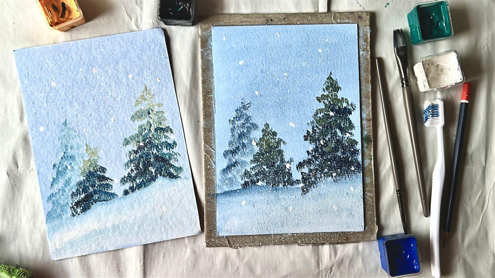
5. Painting the Background: Hello, my dear friends, and welcome to the
class project. We are going to bring everything together and paint our
winter landscape on paper. I have my paper ready here. I have secured it onto
my board just the way I explained in
the materials lesson. This helps keep the
paper steady and gives us clean
edges as we paint. So once your paper is fixed, we are all set to biking. Let's start with
the background sky. For this, we will need a
very light blue shade. You are free to use
any blue you have. It could be the
Persian blue sterila or a regular blue from your pet. Today, I'm using
a normal blue and mixing in plenty of white
to create a soft pale tone. Take your time while mixing. We want the color to feel
light, airy, and calm. Once the color is ready, pick up your flat brush and
load it with the paint. The paint should be
creamy and battery, not too thick or not too watery, so it glides smoothly
on the paper. I'm applying the color
directly onto the paper. The sky will cover a little more than three by
fourth of the page. So we will leave a small section at the bottom unpainted
for the snowy ground. If it helps, you can lightly mark the ground
area with a pencil, or if you feel comfortable,
you can paint directly. Both ways are perfectly fine. Now using gentle
horizontal strokes, move your brush
from left to right, and then right to left. Let the brush glide softly
across the surface. There is no sh here, slow, even strokes will help
avoid streaks and marks. Moment to enjoy this process, the paint spread evenly and allow the sky to
slowly come to life. If you need more pain, simply reload your brush and continue keeping the
strokes smooth and relaxed. By the end, we want the
sky to feel calm, soft, and open, a peaceful winter sky that sets the mood
for the entire paint. As you work on the sky, remember this part doesn't
have to be perfect. If you notice any brush marks or uneven areas, that's
completely fine. Simply load a little more paint onto your brush and go over that area again using the
same soft horizontal strokes. Gentle or repeated,
passes will naturally smooth things out and
help to hide the marks. If your paint starts to
run out, don't worry. Mix another small batch
using the same colors, the same blue and plenty of
white, and continue painting. The slight variations actually add a natural
softness to the sky. Take your time
here, work slowly, breathe and allow
the paint to settle. With a few calm strokes, the sky will come
together you free. Oh now let's gently move
on to the ground area. For this, I'm taking the
Persian blue we mixed earlier using blue
at a touch of black. Pick up a small amount
of this color on your flat brush and lightly mark the
outline of the ground. We don't want this
line to be strike. Let it be uneven with
soft rises and dips. These little ridges help suggest the natural
uneven surface of snow. Once the outline is in place, take a bit of white on the same brush without
washing it gently, pull the persianble downward, blending it softly
into the white. This creates a
smooth transition, and notice how the ground area becomes slightly
darker than the sky. That contracts helps
separate the land from the background and
gives depth to the sea. Work slowly and let the color switch
naturally on the paper. There is no need
to overthink it. A few generous strokes are enough to create a
calm, snowy base. And finally, I'm adding a few gentle touches of
white back into the sky. This helps soften the tone even more and makes the sky
feel lighter at Caffo. Use just a small amount of white and apply
it in few places. There is no need to cover
the ended area with light, horizontal strokes
blended smoothly into the light now beneath. Let the colours melt into
each other naturally. Take your time here and keep working softly until the
shading feels right to you. There is no fixed point
where this has to stop. Continue until you feel
that poet sense of satisfaction when the style looks calm, balanced,
and complete. So I stop here and
let's move on to the next lesson to add trees. H.
6. Painting the trees: Hello, friends. Welcome back. Now it's time to paint the
trees in the foreground. We have already practiced
this technique together, and you have done
such a wonderful job preparing for this step. I hope you are feeling
ready and confident now. Let's take everything we
have lent and apply it here. Slowly and calmly, we will
paint the trees together. One gentle stroke at
ata. There is no rush. Just follow Hello,
that's a process, and enjoy watching the trees
come to life on your paper. So. Before we start
painting the trees, let's prepare the two
main colors we will need. We will be working with
Prussian blue and light api. I will begin with the blue. Take the normal blue
you already have on your palette and add just a
small touch of black to it. Mix the two colors
slowly and evenly. Watch how the blue deepens
and the black blendsing. Keep mixing until you reach a shade that
feels right for you. Once you are happy with
the color post there, there is no need
to keep adjusting. Now let's move on
to the sap green. Start by mixing grain with a tiny bit of black
and a little yellow. Blend these together well. Then add some white to soften the colors and bring it
to the lighter down. At this stage, observe
the color closely. If it feels too pale
or too close to white, gently add a bit more
yellow and green, mix again slowly until the shade begins to resemble
a soft light sable. Take your time
with this process. Color mixing is very personal. Stop when the colors feel balanced and satisfying
to your eyes. There is no exact formula here. Gentle adjustments
until it feels white. Yes. Oh, All right. Now that our colors are ready, let's gently move on
to the painting trees. We will take this step slowly
just like we practiced. Let's begin with
the green colour, load a round brush with paint, then press it lightly against the palette to let the
bristle spread down. This creates that rough
uneven texture we want. Before touching the paper, tap the brush a few
times on the palette or scrap piece of paper
to touch the texture. Once you are comfortable,
move on to the paper. I'm starting with the smallest
tree on the left side. Begin right at the
crown of the tree, and gently tap the
brush onto the paper. Notice how the textures start
to appear almost naturally. Follow the triangular shape of the tree as you work
your way downward. There is no need to dresh. Just let the shape slowly
build with each soft tab. When the top section
fails complete, let's move on to
the second color, pick up prescient blue and
repeat the same stips. Load the brush, press
it against the palate, to spread out the bristles, test the texture, and
then return to the paper. Use this darker color towards
the lower part of the tree. As you move downward, gently widen the shape to give the tree its natural
grounded form. Now, let's bring the
two colors together. Take the green again and add a few light taps in the middle area where
the colors meet. Gently tap over the top
edge of the blue section. This creates a soft transition
between two colors, helping the tree feel more
natural and dimensional. Once the colors blend smoothly and you are
satisfied with the shape, we will pause here
and move on to painting the large
tree on the right. Now let's move on to the
larger tree on the right side. We will follow the exact
same steps as before. Just allow this tree to
grow a little taller. Start by taking
the green colour, load it onto your round brush, press the brush gently
against the palette, you spread the bristles and tap a few times to
check the texture. Once you are ready, begin
at the top of the tree, placing the ground slightly
higher than the previous one. Use gentle tapping strokes, letting the texture form
naturally on the paper. Slowly work your way downward, keeping the shape
soft and triangular. Take your time and allow the
tree to grow layer by layer. When the upper portion
feels complete, switch to crescen blue, load the brush, press spread the breast tails and taste
the texture just as before. Now, continue the tree
downward using the blue, gradually widening the base to give the tree a
strong grounded fork. To bring everything together, take the green again and lightly tap a few strokes where
the two colors meet. Add these gentle
touches over the top of the blue section to create a
smooth, natural transition. Once the tree feels
balanced and complete, pause for the moment and enjoy the depth and
texture you have created. This large tree helps anchor the foreground and adds a beautiful sense of
scale to the painting. Now that tree is complete. Let's move on to add final
details in the next lesson.
7. Adding Final Details: Hello, friends, welcome to the final detailing
of this painting. Our background and foreground
trees are now complete, and they are already
looking beautiful. To add a little more
depth and atmosphere, let's feed a third tree
in the background, a soft misty winter tree
that feels distant and calm. For this, we will create a moody light shade by mixing
Persian blue with white. Take up white paint
and gently mix it into the Persian blue until you
get a soft light blue top. This lighter color will help the tree sit quietly
in the background. Now, just like before, load your brush with the paint, press it gently against
the palette to spread the bristles and create texture. Do a few test taps
on the palette or on a scrap piece of paper until the brush
feels comfortable. Once you're ready
move to the paper on the lem side slightly behind the smallest
foreground tree, begin adding this
background tree. Use the same gentle
tapping strokes following a soft
triangular shape. Keep the strokes light
so the tree feels distant and misty almost
fading into the background. When the shape is in place, take a touch of darker blue and add a few taps
here and there. This adds subtle depth without bringing the
tree to forward. And that's it. Our final
background tree is complete. It quietly sits behind others, adding softness, depth, and a peaceful winter
mode to the painting. Now, let's add the final
magical touch the snow. For this step, we will
splatter some white paint across the painting to create
a soft snowfall effect. I'm using an old
toothbrush for this. But if you don't have one,
that's absolutely fine. You can use a flat
brush instead. Both work beautifully. Load a little white
paint onto the brush. If you are using a toothbrush, gently run your fingers across the brist to spray the
paint over the paper. Let the snow fall naturally without aiming for perfection. If you're using a flat brush, follow the same idea, load it with paint,
and lightly flick the petels to create splats. Once the snow spread, let's add a few
larger snowflakes. Take your round brush,
load it with white paint, and gently place a few bigger
marks across the painting. These don't need to be perfect
circles or oval sheets, so irregular marks works bet. Scatter them over
both the darker and lighter areas of the trees
and even into the sky. This helps the snow feel natural and balanced
throughout the painting. When you feel comfortable and satisfied with how it looks, pose there, there is no need to add more once it feel
complete to you. And with that, our quick and easy winter
painting is finished. In the next and final session, we will take a moment to reflect and wrap things up together.
8. Thank you!: Thank you so much for
painting with me today. I truly hope this class
help you feel relaxed, inspired, and more
confident with wash. If you enjoy this lesson, you will find a few
more gouache tutorials on my profile as well. They are designed to
be simple calming and perfect for daily
sketchbook practice, helping you build
consistency and improve your gouache
skills step by step. Do take a moment to explore them whenever you feel like
painting a little more. Thank you once again
for being here, and I can wait to see your beautiful winter landscape
in the project section. See you again very
soon with another fun and exciting class
until then, bye bye.
 Anu Varikattu, Artist l Gouache & Acrylic Instructor