Transcripts
1. Introduction: Hello, everyone.
You know how they practice makes perfect.
Well, it's true. When you keep practicing
something over and over, it gets better and becomes
a regular thing for you. One cool way to get better at art is by keeping
a sketchbook. You can drow it every day and
see how you are improving. It's pretty motivating
to see your progress. In this class, we are going to paint for
two weeks straight. The s for 15 days in total. By the end of it,
you will feel more confident in your art skills
and see a big improvement. I'm I and I am an artist, an architect from India. I restarted painting
from Scratch in 2018 after a long 14 years. So I know how tough it
can be in the beginning. But with practice every
day, I got better. And now I want to help
you to do the same. For this class, we
will be using gouache. But if you don't have that, you can try acrylic insta. We'll start with some
basic tapes on using gage, and then we'll dive into
painting for 15 taste. Don't worry if
you're new to art. We'll keep it symbol at ease. You don't need any
experience to join. Just bring your enthusiasm
and love for art. Over the next 15 days, we will cover lots
of fun topics. And I know you'll
enjoy a bit top. And the best part is, at the end of these 15 days, you'll have a book
with endings done by you with a self
satisfaction and quotas. Most of the project, except f will take only around
15 minutes to p, which will very well fit
into your busy day schedule. So why wait? Let's get started on this awesome art
journey together. O.
2. Class projects: Hello, friends in this section. Let's look into the
class projects. By the end of this class, we will have 15 class
projects in our hand, which have 15
beautiful paintings. Let's have a look at all
of these class projects. Day one, the celebration with beautiful hanging
lights on the trees, and Day two, we will
paint a beautiful. Day three, the sky with
a dramatic clouds, and Day four, the
hanging lights. Day five, the beautiful
nature painting. Day six, we will study and
paint the shadow past on a building with a little
play of light and shadow. Day seven, a beautiful water
life with lily plants. Day eight, the reflection
on a rainy day, Day nine, a Sunrise painting, and on day ten, paint
Day beautiful sunset. Day 11, a street side view, simple but beautiful
composition. D, an interesting
signage on the beach. Day three, a paradise on
Day four, the powerful, the mighty mounted,
and lastly on Day 15, the beautiful and abstract and. I hope you are all
excited as I am. Let's move on to the next
section and start painting.
3. Materials Needed for Painting: Hello friends. Let's go over the materials needed
for this class. First and foremost,
you'll need a sketchbook. I recommend using a
sketchbook because it will serve as a
record of our progress, and as an album to
keep the paintings, we created over the next 15 day. I am using this handmade journal for this 15 day practice. These are around 100
GSM in thickness. The paint I'll be using is Gach. And I am using Gach
jelly cups from mea, but you can use any brand. Next are the brishes. Basically, we need a flat brush, a round brish, and
a detailing brish. I am using these
brushes from me. And I'm also using these big flat brushes from
stro to cover large areas. We also need some su ting
items, masking tape. If you want to tape the
edges of the canvas. Then two jars of water, one for removing
paints from the brush, and the second one is
for washing the brushes. A cloth or tissue paper
to wipe the brushes. A pencil and eraser
for sketching. That's all. We are all
ready for the paint. Let's move on to the
next section now.
4. Tips and Techniques for painting Gouache: Hello friends, I'm so grateful that you have
decided to join this class. Let's start with the paint. Before we begin, let's prepare the gauche
by hydrating it. First, spray some
water onto the paint. Water will reactivate
dried gauche and make it usable again. You can also use dried paint on the palette by adding some water and mixing
it with a brish. Mix the paint until you
get the right consistency. You can use this rehydrated
paint for your painting or remove the paint from the palette using
a cloth if needed. Oh. Now, let's start with
some techniques. Take a good amount of pain
onto the pallet and mix it with your brush until it
has the right consistency. Let's practice
painting with the fh, start from the top and
simply fill the area. Flat brushes are for covering
large areas quickly. Now, let's try using
a round brish. Flat brushes are better
for large portions because using a round brish may create harsh lines
and take more time. Now let's fill the area
with a flat brush. Blend the paint smoothly by moving the brish from
one to the other. Layering is one of
the unique quality of gauche bearing with watercolors. The gauche is opaque, so you can paint on
top of bottom layer so that the bottle layer won't be visible
over the top layer. Now let's start
with the layering. First I made a rectangle
box with paint. This will be our base layer. Next, I painted
another rectangle box, but left a triangle
portion blank inside it. Let's wait for these
two dry completely. Now that the paint is dry. Let's make another
shade of color for the second layer and paint on the top of the
base layer with it. B patient while layering
with another cover. If the second color is too
thin or we blend too much, the paint on the
bottom layer might reactivate and mix
with the top layer. So be careful when layering. For the second rectangle, paint the inside
quotient with ne color, carefully paint the sides and make sure to paint smoothly. This way, the nuclear
will blend nicely, but only the edges
of the triangle will be layered, creating any defect. These are the two ways
to layer in gauge. Let's practice some
brush strokes now. We'll make thick strokes using both a flat
brush and round brush. First, take the flat brush and draw a line using the full
thickness of the brush. Notice how the
line is wide even. Next, let's use the round
brush with the round bh, draw a rectangle and then
blend the paint inside. Now, let's make some strokes
with the round brush. Load the brush with as much
as pain as it can hold, and draw lines
using just the tip. You'll get thin, smooth lanes. The round brush can
make very thin brokes. Now, apply a bit of pressure while drawing lines
with the same brush. You'll see that the lines become thicker as you apply
more pressure. With the round brush,
you can create lines of different thickness depending
on the pressure you use. Finally, let's practice
with a liner brush. Liner brushes are
perfect for getting the finest lines and adding finer details
to your painting. After each usage, wash brush properly and wipe it with
a cloth or tissue paper. Gach can be used in different consistencies from
very dry to very loose. Let's start with a dry
consistency and gradually add water to see the changes. We will use these
different consistencies at various levels and in layers. Loose consistency is used in the very first layers of
a complicated painting. When guage paint is
in loose consistency, it will lose its opacity
and acts like watercolor. Dry consistency
is mainly used in the top layers or for the
final finishing touches. Let's create different tones of a color by adding white
paint little by little. We'll start with the
red. First, take some red paint on your parage, then add a small amount of white paint to it and mix well. You'll notice the red
become bit lighter. Next, add a little
more white paint to the mixture and mix again. The color will
become even lighter. Continue this process,
adding a bit more white each time and mixing well. You will get various tones of red from deep red to light pink. O O. Let's try some
painting techniques. First I made two
rectangle water. Then I used paint with dose consistency for
the first rectangle. You can see how the paint
spreads out the wet area. For the second rectangle, I used a dry met. Notice how the paint behaves differently
on the bet surface. Now let's move on
to the second part. Paint a section
of the paper with a loose consistency paint first. Then add another section, you say dry consistency paint. This way, we can practice
different techniques. Et on wet, apply loose paint
on wet surface, wet on dry. Apply loose paint
on a dry surface. Dry on wet, apply dry paint
on a wet surface, dry on. Apply dry paint
on a dry surface. Gaca has a unique
clime property. Dark colors, trile lighter, and light colors dri
a little darker. Let's explore this by
painting two boxes. First, paint one box
with a light shape, then paint another box
with a dark shape. Once the paint has dried, take look at their hues. Notice how the light shade
has become slightly darker, and the dark shade has
become slightly lighter. This change can
affect your painting. As the paint dries, the colors may look different. Always keep this in mind when
choosing your color pal. Choose the right colors considering the drying
properties of the ch. Make your color
slightly darker for darker shades and slightly
lighter for lighter shades. But for the
techniques and dates. Let's move on to
the next section. Oh. Oh.
5. Before we Start: Hello friends before we start. Let's prepare our canvas, which is our sketchbook. I have my sketchbook here. I used a paper clip for my sketchbook to keep still
during the painting process. And I have also used
a masking tape to define the painting area
and to get perfect edges. You can use any masking
tape or washi tape, or you can choose not to
tape the edges at all. This is not mandatory. If you decide to
use masking tape, it is a helpful tape. Stick the tape onto any surface for a second
before applying to the paper. This will adjust the glue
on the tape and help prevent it from tearing the
paper when you remove it. Oh Now we are all to paint, it out, and start painting. See you all for
the next section.
6. Day 1 ; The celebration: Hello, and welcome to
your first class project. This is the simplest of fold. For this painting, we will
be using only three colors. That is black, white, and a little bit of yellow. As you can see, I'm reusing
my dried white paint here, as Gauche will reactivate
while adding water, even the dried paint
can be reused. Add a small quantity of water to your dried paint and mix
well with your brush. Paint will reactivate and you can use it in your
record consistency. We are going to paint the
entire background with gray. If you have great color, you can use it directly, otherwise, mix white and
black to get a gray toll. S. Fill the entire
background with gray, paint it even and smoothly. I'm using my big flat brush
for covering the entire area. Smoothly finish the background. I'm speeding up the video. I'll be painting two trees, one from each side. And I'll be starting
from the trunk. Then I'll be adding
a lot of branches. I'm using my round brush
for drawing the trees. Since you have two trees, you have to add a
lot of branches. And when you add branches, add it in different directions
and sizes as the trees will have branches running into different directions
in various sizes. Now, fill the trunk region. Do the same for the
next tree also. As I said earlier,
let's add branches in various sizes and directions. I'm going to add load branches and fill the entire
area with the branches. For random lines varied
in size and shape, starting from the trunk
and the main branches. Once the branches are over, let's start with the lights. For lights, we are using
white and very light yellow. If your yellow is dark, then mix it with white
and get a lighter to. Add lights on the tree
trunk and branches in a linear pattern to feel
it as a chain of lights. Lights will be smaller
on the top portion, which are away from
our eye and lights, which are on the
bottom portion will be bigger since they
are near to us. You don't need to
draw all the lights in uniform sizes
to look similar. There will be some
dbstructions or reflections, or we will be seeing them in bouquet effect at some places, so a dots randomly and free. You don't have to add
lights on all the branches, some smaller branches as it is, and add the lights on the
trunk and bigger branches. When you draw the lights closer to our eyes that is on
the bottom portion, increase the distance between the lights and also their sizes. Add two near each other
to have a bucket effect. First first first first Oh. And that said, we have
completed our first project. This is very simple,
but looks elegant. Now, let's remove the tape
and see the final look. I hope you have
enjoyed the class, and let's see you
on the next class.
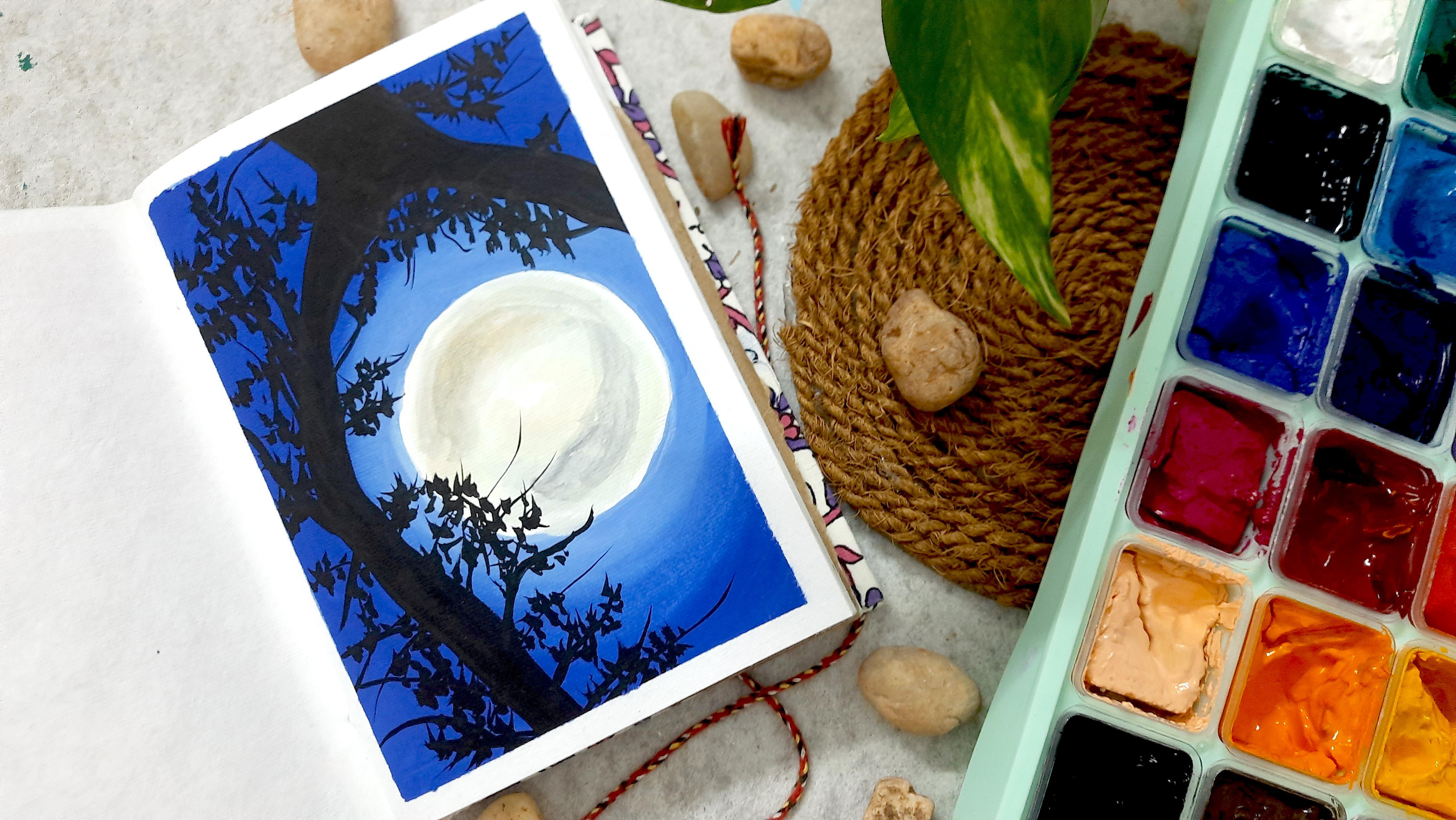
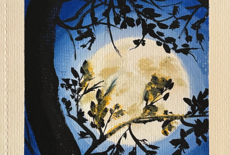
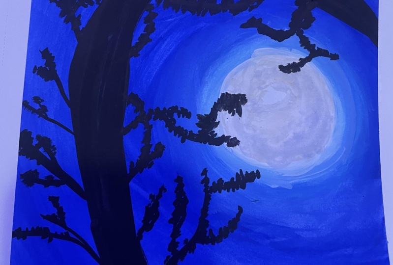
7. Day 2 ; The Moonlight: Hello, and welcome
back. Today, we are going to draw
a moonlight sky. This is also symbol, but one of my personal favorite. Today, also, we are
using a minimal palette. Let's start with a rough
outline of the painting. Draw a circle on the middle of the paper towards
the right side. Leave some portion of the
left side for a tree. So the circle is our mode. Follow along with me to draw the tree part for the reference. Draw the curved lines
on the top and left. You don't need to
draw the sketch. This is only for the reference. We are anyway going to
paint on top of the skage. L et's start painting
the sky around the moon. I have made a lighter shade of blue for the portion
around the moon. Paint on the edges of the moon, be stro, smoothly
blend the paint. Use light shades
of blue for this. If you don't have light shade, add white color to your blue and make a light shade of blue. I'm making it more lighter
by adding white to the blue. Remember, lighter shades ds, so we need to make the lighter lighter to be dris
into the right shade. Now, our darker shade
towards the outer potion, blend both shades nicely
with your flat brush. Complete the sky
with a smooth blend. Oh Now for the moon, I am washing and adding a little bit of yellow
ocher and blue for the dp. Oh. Now move to the tree, paint the tree in black, and once it done at branches. I'm using my round
brush for the tree. If you want, you can use the detail brush
for small branches. I have started with the
outline of the tree, and then I filled
the inside portion. Now, let's start
with the branches. I'm extincting a few branches to the moon to create a
little drama and depth. Add many branches randomly and organically to
all directions, add small strokes on the
branches to paint leaves. Add many branches randomly and organically to
all directions, add small strokes on the
branches to paint leaves. You don't need to follow any
pattern for adding branches. Add branches randomly in all directions as trees will have branches to all directions. Complete the portions
with branches. I i. First. The first first Finally, the leaves are done. Okay, we are done
with this painting. Now, let's remove the
tape and see the final. Hope you all enjoyed painting this beautiful
moon painting. Met you all for the next lesson. A
8. Day 3; The Sky: Hello, welcome back. We are
on our third day of painting. Today, we will be
painting a dramatic sky. Same like last class. This one also symbol, and won't take your time. For the sky, we need light
blue, violet, and orange. The combination of
these vibrant colors will make the sky dramatic. I have mixed orange with yellow to get a
lighter orange shade. Use flat brush for the sky. Start painting with orange from the bottom
portion of the sky. Then we will add
blue on the top, and we will blend them together. Oh. Mm. To blend colors which
are contrasting, let's use whites, to make the colors blend
together smoothly. We use a little to white paint. Imagine a acid bridge between the blue and
orange or violet. This will help the
color transition smoothly without
mixing into a mes. Next step. Let's
paint some clouds. Clouds are fluffy and d ight, so we'll mix black, white, and a touch of fillet
to get a nice gray color. Use round brush for
painting clouds. Make endle strokes
with round brush, do it in a single directions, add strokes side by side, keeping the continuity, make strokes to
different directions. To. Now, here comes
the exciting part. We are going to add
some orange strokes to our gray clouds. This will give
them a fairy touch and make the sky look
even more dramatic. Don't worry if it
looks a bit messy. Once the foreground plants are drawn, they
won't be visible. To ground painting, let's
paint bottom part black. This will represent the ground, making our sky look
even more impressive. Lastly, let's add some
plants to our sea. Use short quick strokes
to create leaves and s. You can add some curved lines to the small leaves to make it look like there is
a breeze blowing. Complete all the plants
with a small leaves. Oh, O. And Daria, you have
it a beautiful dramatic sky painting that
you created all by yourself. Let's peel off the masking tape and see how beautiful it is. Hope you enjoyed creating
this beautiful dramatic sky. And let's met on
the next lesson.
9. Day 4; The Lights: Hello, everyone. Today, M's our fourth day of painting
together. Let's start. First, let's create
a light tone of Persian blue by adding
some white to it. This will be our sky color. Grab your flat brush and start covering the sky with this
lovely night blue tone. Let's start painting from the top portion and gradually
cover the entire area. Take as much as quantity
of paint needed. I am trying to make the most out of my dried white
paint, as I always say, gas will reactivate
by adding water, and we can use it effectively
even if it is dried. Starting from the top portion, I am applying prescient blue
smoothly and blend smoothly. Remember to blend
the paint evenly on the paper towards the
bottom of the sky, add to make it lighter and
create a smooth transition. O. Now our sky is complete. Let's move on to the next
part, that is the trees. For that, let's make a
slightly darker shade of blue by adding a bit of
black to a portion blue. This will be our
color for trees. Using a round brush, add random strokes and
lines to outline the tree. Once the outline is defined, fill in the inside portion. Add nice drops with
a round brush, both short and long to
define the tree foliages. Repeat the same to
complete the trees. If you notice your paint trying out over the
consistency changing, just add a bit of
water and mix it well. Once the tree outlines
are completed, fill the inside as
mentioned before. Oh. Now, let's create an
even darker shade for prescient blue to
add depth to the traes. Add strokes inside the traes to give them more dimensions. Don't forget to add
a few details on the other side of the
painting to balance it out. I'm adding few foliages
on the other side to Now it's the time to create
the chain of flights. Grab a finer bridge liner or detail bridge and
start drawing lines. Make them lose and parallel. I'm rotating my
sketchbook for easiness. You can also use a pin
for this if you prefer, you'll get finer
lines with a pin. If you're comfortable with
brish, you can use it. I made some uneven lines
with the brush here. But that is okay.
Anyway, we are going to paint the bulbs on the lines. Next, let's add some
hooks for the lights. I'm using an add liner pen, but you can use a
bridge if you like. Add small triangles
random for the hooks. Once it is done, let's move to the most important
and last part of this painting.
There's the lights. Four lights, we will
use yellow and white. Start by drawing the bub
with yellow and then add a glow effect with white
or slightly tinder yellow. Repeat the same process
for all the whiles. Oh complete all bulbs in the same way, and done. Wasn't that symbol? Now, let's remove the paper
and reveal the final. I can't wait to
see how dined out. See you all for the next class. A
10. Day 5; The Nature: Hello, everyone. Today. On the sixth day of our change, we are going to paint a
beautiful tree together. Unlike day's painting, we are going for a
morning place site. So I have chosen a brighter
groove for the sky. I'm using tamarin blue and
my big flat bh for ease. Let's mix the blue pain without brash to get
the right consistency. Now, starting from one corner, let's paint the sky
in angular slopes. Add some wind paint from other side to create
a smooth transition. Blend nicely to get an even and smooth
transition from blow to eye, leaving more space for white. Oh. Next, let's add some
black to the ground, which will really
make the whole scene. Using our ground bridge, let's adds to
create some plants. Add some stocks to the small plants and
straps on the ground. Nicely add the black strokes, and neatly Mitch on the town. Now it's the time to add a tree. I'm drawing some curve lines, making sure to consider
the composition. I've chosen to make the
tree the foc point, so it takes up most of the area. Let's start by drawing the
main trank and branches. Then adds or smaller branches going in different directions. Once the branches are done, let's add some leaves. I'm adding the
branches randomly, but complimenting each other. There should be some
patterns to follow. Repeat the process and
complete the branches. Once the branches are over, let's move to pine leaves. We will use small, shaky random strokes to
cover the tree, making sure to leave some
spaces between them. O. I Once the tree is complete, let's add a sand in
between the plants. We will throw a circle with yellow paint and add
projections all around it. Then we will add a
lighter yellow or a yellow tint inside the circle to create
a glowing effect. H. And there you have our painting is complete. It's simple, but the final
look is truly amazing. Now let's peel off the tape and see the
beauty of our painting. So we have completed five days, and I hope you are enjoying
painting along with me and hoping to see
you on the next class.
11. Day 6; The Shadow: Hello, everyone, and welcome back to our painting session. Today, we are delving into
a fascinating subject. The interplay of light and
shadow with a special focus on capturing the
intricate details of shadows cast upon a building. Let's kick things off by
preparing our Canvas. I have divided it into sections, mirroring the architectural
structure of a building. Complete with the
windows and a door. Take your time with this sketch, paying close attention to the small protions
at the window sets. These details will lend tip that relay to your final pace. B. Today's section will
take a little more time than usual due to the
amount of details, but you won't regret it. I firmly believe that this will increase your
confidence in painting. Let's continue with
the sketching. With the sketch complete, it's time to dive into painting. Onto the painting process, we will begin with
the building itself. I have blended orange and Ciena to achieve
a brick like hue, paint the entire building, except for the windows. O. Oh Moving forward, let's add definition to the windows and door
using burn umber. This deep shade will help
emphasize these features, giving them depth
and prominence. Pay attention to adding delicate details to the,
enhancing its appearance. Using the brick color and
the burned up Mermaids, I am giving a small
detail to the door. You can change the detail part. You can make it
complex or symbol. We are going to use
the colors which are in our pant for the rest
of our painting purses, which will give the
painting a tone. O. Next, we will
address the windows. Using burned dubber, we
will sell them in with varying shades to denote the
different levels of shadow. Some areas will be
darker suggesting the influence of
nearby structures while others will remain. This contrast add
visual and composition. A O. O. Now let's apply the
finishing touches to the windows and the door, using white to highlight certain features
and add dimensions. Be sure to revisit the sera level projections
to ensure they are well defined and seamlessly integrated
into the composition. Ooh. Oh. H. Moving on to the focal point
of our painting. That is the shadow cast by tree. I have mixed the colors on my pant to achieve a
lighter shade of burned er. With careful strokes with a, we will outline the branches of the tree as they cast their
shadow onto the building. Take your time with
this step as it is important in conveying the interplay of
light and shadow. T. Once the outline is complete, carefully filling
the shadowed areas, ensuring a smooth
transition from light to. This will make the shadow
look more like it out. Oh. Finally, let's add the finishing touches by
incorporating shadows onto the window glass using burned. These darker areas will make
our painting more realistic. Finally, we are done with it. Let's peel the mask off and see the beauty of the painting. I hope you have
found this one as I have until next
time, painting. Oh.
12. Day 7; The Life: Hello, everyone.
Today marks the end of our first week of
painting together. We are diving into a
beautiful water scape, one of my fabric. It is simple. At the end result will
surely amaze you. Let's click off with the water. Cover the whole page with
ultramarine blue paint, making sure it is spread and
blended together nicely. I have started from the bottom. You can start from the top also. For this, I am using my bigger flat brush
from the presto, and that will make
my job easier. But you can use any
flat brush for this. Oh. Next, let's add the reflection of vegetation on the water edge. Generally incorporate
the reflections. Remembering that since the
entire canvas represents water reflections should mirror the top portion of the plants onto the bottom part of canvas. Use random strokes to de the surrounding swam adding strokes from the
top to the bottom. Rather than opting
for larger trees. Today I'm going with smaller decades like
creeper stem or sheps. These can add intricate texture and visual impers
to our composition. Fields read to experiment with different thickness and shapes to create depth and dimensions. Remember, there is
no right or wrong. You can choose a tree
reflection or add small ss. O Oh. Once that's done, take a
detailed bush and dab in it and lines with the damp bh
on the partially painting, creating things strokes that
overlap the reflections. I'm truly stunned by the
result after this death. The painting has
taken on a new life, and it's truly amazing to see. Every stroke has breathed
fresh energy into the canvas and the
transformation is remarkable. It's the moment like this
that reminds us the beauty and power of art and makes
me for being an artist. Also art somethin white
lines for added details. Moving on to painting
water lily leaves, I have prepared two
shades of grey. One is dark and
other one is light. Start by painting symbol leaves following the shape of
the water lily leaves. Make some leaves
lighter and others, creating a variation of tones. I have placed lighter
leaves towards the bottom and darker
ones towards the top, giving a sense of
light and shadow. And the Continue the process and as a until you feel that
the composition is perfect. Once the leaves are in place, our painting is complete. It's surprisingly easy, yet
the result is stunning. You can add flowers if you like, but I have kept it
simple for now. Let's peel off the masking tape and reveal our masterpiece.
13. Day 8 The Reflection: Hello, everyone, and welcome to the second week of
painting Together. Today, we are exploring the
mesmerizing reflections captured on a water logged road after a refreshing rain shower. But before we jump
into our paints, let's catch out a basic outline. A figure of a person
with an umbrella. Remember, perfection
isn't our aim here. Just a simple guide
to get us started. Now on to the fun
part. The painting. I'm beginning with the umbrella, using a blend of white and burned number in a lighter tone. You can change the
color to red dolla to get a vibrant painting
if you prefer. I've chosen a minimalist
color palette for this piece, so I'm proceeding with
the natural tones. Let's fill in the umbrella area. We will return later and
add the finer details. I have extended the same
color to the top of the canvas symbolizing the reflection of
surrounding structure. You can add this acid
tree or a building. Now onto the sky, I have opted
for a soft gray blue hue, by mixing, black,
white, and blue. O. When I started working
with the color, I felt like it should
be more grayish, so I blend an additional
black and white. I continued with
filling the area with a gray blue color when I
felt comfortable with it, excluding them excluding the human figure
and the umbrella, I have painted the sky
varying shades of clay blue, aiming for a smooth transition
to add depth and realism. Oh. Now, is the time to revisit the reflections
we painted earlier. Using a round bridge,
let's create repels. Add concentric circles with
pin lines in a light shade of burned umber near the
umbrella and other reflections. Draw circles on the edges, such that the half portion
of the circle falls on the reflection of object and the rest on the
reflection of water. Leave the portion
on the umbrella and the other structures now. Let's finish that later. Add these circle details on the edges of the reflections
to make it real and. Once it done, we will
highlight the inner parts of the circle with a lighter shade
of gray blue for the sky. D Now, let's paint the human
figure with black. We do not need the perfect edge, make a shabby finish. And I'm adding few
circular lines on the edges of the reflection, so that it feels like ripples. I am highlighting
some portion of the circles now with
the darker shade. After that, let's move on to
the circles on the objects. Now let's complete the ripples by adding the other portion of concentric circles which falls on the
reflection of objects. That is, the umbrella and the structure we painted
on the top of a canvas. I'm using a lighter tone of the grayish blue we
used for the sky. Now, highlight some portions
of the ripple with black. With that, we will complete
our painting for the day. Now, you can remove the masking tape to
reveal the painting. I have already
completed that step. I hope you enjoyed this
process and look forward to exploding yet another painting technique with you tomorrow. O. Oh
14. Day 9 The Resurrection: Hello, everyone.
Today, we are going to create a beautiful
sunrise paint together. Let's start by painting the sky, using gray and orange colors. To make gray mix black
and white paint. Use a flat brush for this. I am using my big flat brush
to make the ope easier. Apply gray color to about a quarter of the
top portion of the paper. Then for the bottom portion
of the sky, let's use orange. Make sure to mix the
paints before applying to the paper for
better consistency. Now begin applying
the orange paint from the bottom of the sky, leaving a space in
between the colors. In this space, apply
white paint and blend the gray and orange
colors smoothly around. By blending these
three colors together, we create a seamless transition without mixing them too much. Now let's apply white on the middle portion and
start blending together. In this way, let's create a smooth transition
between any two colors. If you feel like you need
more color or intensity, add extra paint and
blend them together. Once the sky is done add black
paint to the ground area. Now, I'm adding black to the ground portion and covering the entire
area with the black. Now, the sky is dry
and looked a bit dark. So I'm going to
rever C. I'm adding a coat of white paint over
the sky and blended smoke. Gas has a unique
quality colors can appear and dark colors will
appear lighter when they. So this will help
balance the colors. Now let's move on to
painting the sun. Make a circle on the sky
close to the ground. I have used the cap of
my paint to to create a circle and filled
it with white paint. M Now for painting the plant, e black cut and a round brush. Draw a curved line
overlapping the sun, leaving a portion
of the sun now. We will come back to that. Complete the scene by adding
plant with branches, and Complete the scene by adding
some grasses on either side. Small strokes with
the round brush. Now, let's highlight the
portions of plan with a white. For the area above the sun, let's CNA to represents the light filtering
through the plant. Once you're happy
with your painting, carefully pillows the masking tape to reveal the painting. Hope you enjoy the process and
see you on the next class.
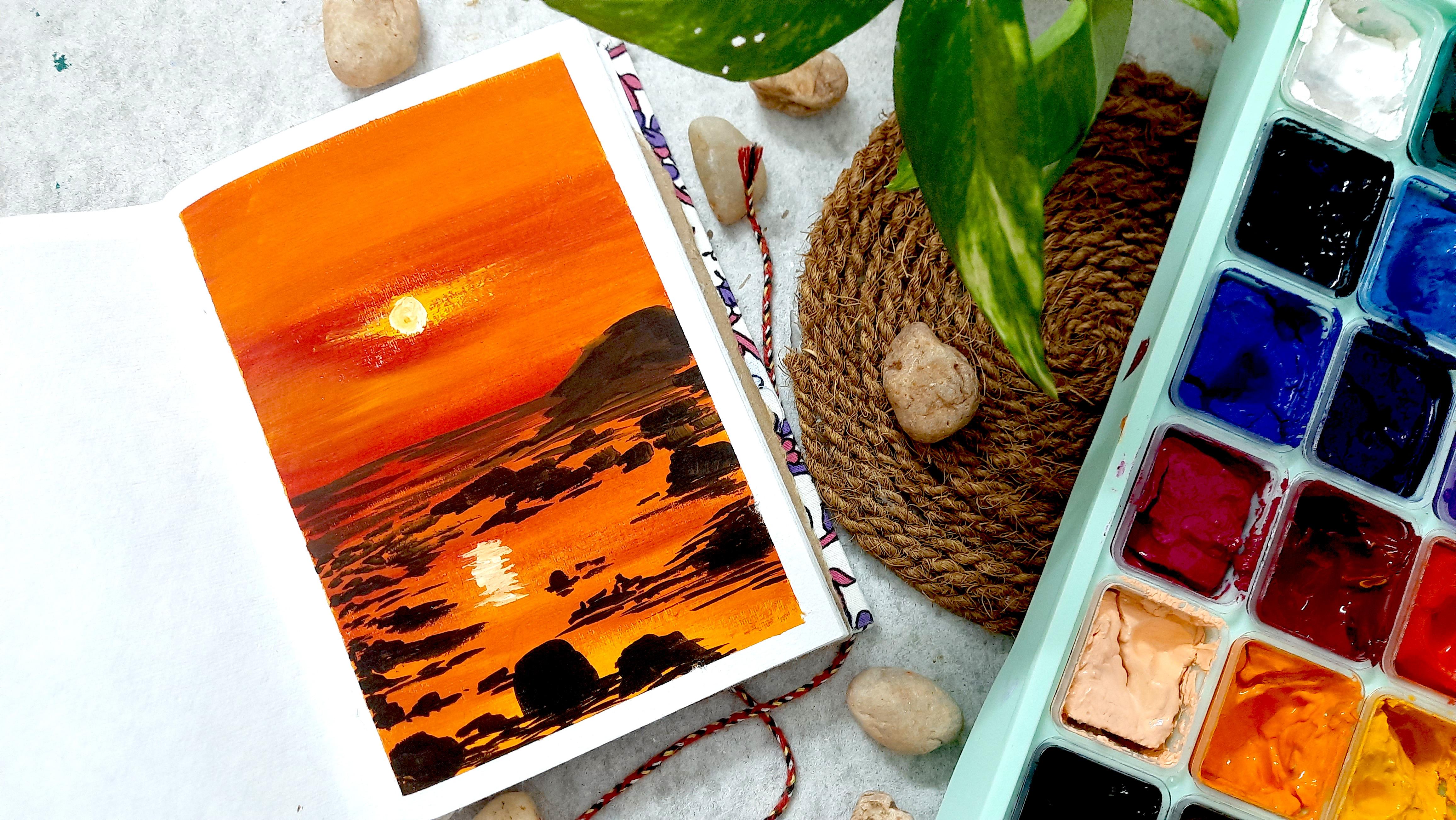
15. Day 10 The Sunset: Hello, everyone.
Welcome back today. Let's dive into creating a
standing sunset painting. We will begin with
some sketching. Draw a line just
below the middle of the canvas to
represent our horizon. Above this line, we will paint the sky and below we
will dept the sea. I have added few lines and
curves to denote rock details. But don't worry if
you're not doing them, it's all just for reference. Now let's fill the entire area with orange using a flat brush. Blend the paint together nicely, leaving some areas untouched for sun where we will add
some lightness later. Painting is bursting with
vibrancy and beauty. Once it finished. I wasn't quite fond of it
while I was painting. But once it was completed, I found myself
loving it immensely. Moments like these that
remind me why it's crucial for every artist
to trust the process. Once the orange wash is complete, let's
move on to the red. Apply red from the
middle to top at bot. But don't worry about
blending it even. Keep some areas
and others slight. This will create floating
clouds on the sky. Remember to leave the area where we plan to paint the sun. I'm also adding
orange where needed. Now, using a round brush, add a yellow straw
for the sun area, and with yellow tinted color, create a sun by making a circle. Also add reflections on the bottom portion to give
it more realistic touch. Moving onto the water
and fork ground details, loosely apply burnt above to paint the background
rocks and sat tides. Add some strokes to represent
the background sat tides. Using the same flat brush tight details and rocks
on the background. Add circles and vel shaped to represent the
rocks on the background. Also add lines under these circles to represent
the reflection of rocks. Now let's add foreground
rocks to with black paint, paint some rocks and their reflections on the
water simultaneously. Add a few strokes below the rocks to represent
their reflections. I'm adding small rocks
and their reflections. Adding more on left and bottom, take care of the composition. I'm intentionally left an area around the sun's reflection and added rocks around it to satisfy the overall
composition of the pin. Once you're satisfied
with the composition, let's finish up by painting of the masking tape to reveal
the final painting. I hope you enjoy creating this beautiful
sunset painting with me. See you in the next lesson.
16. Day 11 The Reality: O one welcome my friends to the 11th day of
our journey together. Today, I decided to bring forth a random street scene
for us to explore. Let's learn how to paint
a beautiful streetscape, the playful interplay
of light and shape. To begin, let's start
with the sketch. I started by outlining the rope and the cloth
hanging from it. Just follow along as I do
through the sketching the outl. Next, I have added a
window to our scene. Now, let's dive into painting based on a sketch
we have prepared. I'll start with the window frame using white paint for the frame. Similarly fill the outline
of the window frame that we. Moving on to the fabric, I have decided to
give white color. Fill the entire area with, then add gray f foldings. Use a round brush to highlight the lines with the
thin gray strokes. Now, let's prepare and
apply g for the folds on the fabric to depict the shadow falls on the
fabric due to the foldings. Y Now a play gray carefully with soft edges to the places where
the fabric is folded and add thin gray
lines on the foldings. Next, take Ciena for the window, fill it, leaving the
central area er in shape. Oh. Now let's add shadows
with burned above. Considering our light source
fixed at the right top part, there will be shadows
of the frame on the window for the
top and right sides. Highlight these areas
with burned sienna. Also add burned on the windows
and frame below the cloth, where the shadows
of cloth may fall. Moving on to the ward area, I am using light blue paint to create a contrasting
composition for the painting. Fill the entire wall
with a blue color. Now, on to the last step of this painting, the
shadows of the. As we have drawn the
outline on the paper, paint the shadow using a shade
made by mixing blue and. This blue is the same one that we used for
painting the wall. If One last final touch, the robs. Draw two lines, one for the reel and other
for the shadow. And that's it. We have
completed the painting. It's such a lovely composition that can be used in interiors. Let's now peel off
the masking tape and enjoy your creation. I hope to see you all tomorrow
for the next section.
17. Day 12 ; The Signage: Hello friends, welcome back. Today's painting
is a simple one, but involves a lot of detailing. So today's video might be
a bit longer than usual. Let's start with a sketch. First, draw two
lines for the post. Leave some space on the
bottom for the ground. Begin drawing with
the signage boards. Change the direction
and shape of the boats. You can draw arrows, angles, rectangles, or any shape you'd like for the
signage boards. Once the sketch is complete,
let's start painting. We will begin with this sky using light blue
carefully paint the sky, pay special attention to the areas between
the signage boats. If you find this
step too tedious, you can use the
layering technique. Paint the entire sky f
and then when it res, paint the boats on the top. This method is easier and fast. Now let's move on to the ground. Paint the ground with burnt
umber in a dose consistency. Add dark shades to the rods, highlighting some portions
with a darker burner. For the post, use burned
number on the left side. Mix a light ton of
burned umber by adding little white paint and use it on the right
side of the post. And there's O. Next, we will paint the ocean in
the background. Use blue to paint ocean area above the rock portions
on the ground. Then add a few light blue
stocks to create waves on the backyard. D. H. For the bicker waves
hitting on the rocks, use a round brush to add
small dots and strokes or the rocks in very
light blue color. Also add few white strokes to depict the mighty waves
crashing on the seashore rocks. With this, we have completed our background for the painting. Retouch the painting if you want and add some high
lens on the ground. Let's move into the
foreground details once the corrections are made. Now it's time for the most
interesting and detailed part painting the signboards. Paint each signboard
in different colors, making sure they point
in different directions. Make them as
colorful as you can. These colorful boards give
life to the painting. Oh. O. It under under. Under under. Dodd. The signages are finally over. Let's add a shadow of
the post on the ground. Using burn umber, I have created the shadow
of the post and then added few lines randomly to represent
the signage boats on it. The painting is not over yet. I got to Et and peeled
off the Musk one. Now, let's add place
names to the boats using white and black pints
and a fine tinder tres Ad different country names. You can also use pins for this. Write the names
on the old boats. Finally, peel of
the masking tape to reveal the
completed painting. I hope you enjoyed creating this colorful
signage board with me. See you all for
the next section.
18. Day 13 The Paradise: He. Hello, everyone.
Welcome back. Today, we are using a large
canvas that is both sides of the sketch book to paint a beautiful
evening at the lake age. We are going to start
without a sketch this type. First, let's make
a light shade of orange by mixing orange
and white paints together. Start applying this color to the paper around and
below the center portion, but leave some space
at the bottom. Add a drop of water to the paint if you think you
are losing the consistency. Next, let's add light blue on either side of the
orange color area. I'll start with the
bottom portion, blend the orange and blue smoothly by adding white
color in the middle. Once the bottom portion
is done, move to the top. Add light blue above
the orange area, then apply dark blue to the top. Blind all the colors smoothly, so there are no harsh lights. Like on the bottom,
here I started with orange color
and then applied. Blended both of them together, and then moved to
the light blue. Blended white and
light blue together. Next, I went to further by adding dark blue and
blended all of them. This is also a
blending technique, which we can apply painting. Now, let's add some
mountains in the backdod. Mix bird number with the pastal orange we
made for the sky. Using colors from
the same palette helps keep the painting. Paint a low profile mountains in the middle of the
orange sky area. With the background de, we have a nice and beautiful evening scene at the lake edge. Now let's focus on
the fork ground, where we will add pine trees. Drawing pine trees are simple. It is best to practice once if you are a
beginner in pine trees. I'm using my round brush and
black paint for the trees. For adding your first tree, draw a line on the left
side of the paper. We will start painting
the tree from the top. Add stalks on both sides to create small
branches on the top. Then coming to the,
increase the size of branches and add
leaves to each branch, making sure to cover both sides. Make the branches larger and larger as you move
towards the bottom. Also evenly add branches
on either sides. Oh I'm adding two more trees to the right of the first one, placing them close together
for a balanced composition. Then add one more tree on
the right side of paper, just like before start
from the top and add branches to both sides. Oh. Under under under. Once the phrases are complete, it's time to peel off the masking clap and
reveal our final painting. I hope you enjoyed these process
and love the final rest. Save the next section. Do.
19. Day 14; The Powerful: Hello friends. Welcome back to your second last date
of painting together. Today, we are using
both sides of the sketch book to paint
a mighty mountain. Let's start with
a simple sketch. I have drawn a horizon line and a rough outline
of the mountain. This is just for reference. Then I have divided the
p into two portions, the top portion for the sky and the bottom portion
for the water body. The mountain is sketched on both the top and
bottom portions. The top part represents
the real mountain, and the bottom part
is its reflection. For the sky, we will use
Persian blue and orange. Start by applying Persian blue to the top and
bottom of the paper. This will be the sky
and its reflection. Then add white
towards the middle to lighten the toll
of prescient blue. I am using my bigger flash
for the lard spread. Also, you can see
how I have pinned my sketchbook using paper
clips on either side. This will keep your sketchbook straight during the
painting process. I have just added some white to the blue to
get the light that Next, we will apply orange
to the center portion. Take some orange
paint on your plant and mix it well
with your flat ish. Once it is in the right
consistency, start painting. Leave the mile an, that is where the
mountains will be, leave it, and also leave a small portion near the
blue color for adding white. To blend these
contrasting colors, that is blue at orange. Use white paint in between. Add white at the intersection to smooth the transition without
mixing the colors too much. Don't forget to wash your
brush when switching colors. Dam your brush as needed and wipe it with a cloth or
tissue after washing. I have completed
the top portion, now moving to the bottom, doing the same process
for the bottoms. Once the blending is done, let's move to the mountain part. Start with a skin color, lighten by adding w. Paint the top and
bottom portions of the mountains simultaneously. Then use burned number to finish the bottom part of the
mountain and its reflection. For this, I'm using. A Do the same both reflection also. Now, let's use burned to finish the boat portion of the
mountain and its sleion. Blend the area between
the light top and the burnt umber bottom to
create a smooth transition. Next, use Persian blue to do a horizon or land area between the real mountain
and its reflexion. After the land, let's
add some clouds, using white paint in
a dry consistency, make strokes, to de clouds. Repeat these rocks or the
reflection in the water also. Go Oh. Under. Now, let's add some vegetation. I'm using black and Persian
blue for painting vegetation. Use vertical lines on both
sides of the mountain and mirror them at the
bottom for the reflection. Finally, add some
thin white lines on the water to make it
look like roping. F. To finish, add some dark spot to the
mountain for more stick. D. That's it. Our painting is complete. I hope you enjoyed the process. Let's peel off the masking tape and reveal our masterpiece. A. See you all in
the next section.
20. Day 15; The Carnival: Today marks the last day of our painting
journey together, and we are wrapping up our class with a cool and
straightforward project. I have used an easy
technique for this piece. To start, cover
the entire canvas evenly with black paint
using a flat brush. I opted for a large
flat brush to ensure though age and to
make job easier. First first For the foreground, I created pasted hues by
mixing white with yellow, orange, red, and
two shades of blue. Feels read to select
uron palette, aiming for vibrancy as we
depict a carnival seed. Once the paint is prepared,
let's begin painting. Today, we will be using ear
buds for their unique effect. Since we are aiming
for book effect, we'll be painting with circles to convey our
subject abstractly. I began by randomly adding blue and white circles with a few yellow ones to represent
various types of light, anticipating the placement of the giant bear in this area. Moving on, I continued adding circles in both vertical and
horizontal arrangements, suggesting elements
like holdings or or street lights in
an abstract manner. After completing one side, I turn my attention to the heel, using shades of orange,
white, and blue. Feel free to experiment
with different colors. There is no right or wrong, but do consider the
composition as you. Oh. Once the intel and its supports are painted, I have done some final
touch here and there. And now it's time to
unveil the finished piece. Personally, I'm quite
satisfied with this painting, though I detained
the idea of adding more detail such as the supporting structures
within the GNV. However, considering the
overall minimum theme, I felt it didn't detract from
the pieces completeness. I invite you to
share your thoughts on the painting in the
discussion section. Additionally, I am eager to see all the paintings you have created in the project section. With this painting,
our two weeks of painting together
officially draw to a close. I hope you have enjoyed it, and I look forward to
our conclusion section.
21. Conclusion & Thank You: Hello, everyone. A big
thank you to all of you. It has been a dream to complete
this two week challenge, and I'm so happy that I
could finally achieve it. Now, I have a book full of fresh paintings that inspire
me every day to do more. I hope you enjoyed it as well, finding some time in
your busy schedule to create beautiful paintings and
see your self improvement. Keep the spirit alive
and find some time every day to paint and
embrace your creativity. I'm so happy to be a
part of your creatively, and I will try to bring
more classes that fit perfectly into
your busy schedule. Once again, thank you
for your support. Please share your project works in the class
project section. Attack me on sticka. I would love to see the results. If you have any
questions or doubts, please contact me through the discussion section or
my social media handles. See you so and le
then a painting.
 Anu Varikattu, Artist l Gouache & Acrylic Instructor