Transcripts
1. Introduction: Most people don't stop painting
because they lack talent. They stop because they
don't know how to practice. A sketchbook doesn't
need perfection. It needs a little time, consistency, and a place to pay. This class is all about building a simple, sustainable
painting habit, one more sketch atta, I'm Mu Viga an artist,
an art educator. Through years of teaching, I have seen how short
daily painting sessions can quietly build confidence, improve skills, and turn
creativity into a steady habit. In this class, you
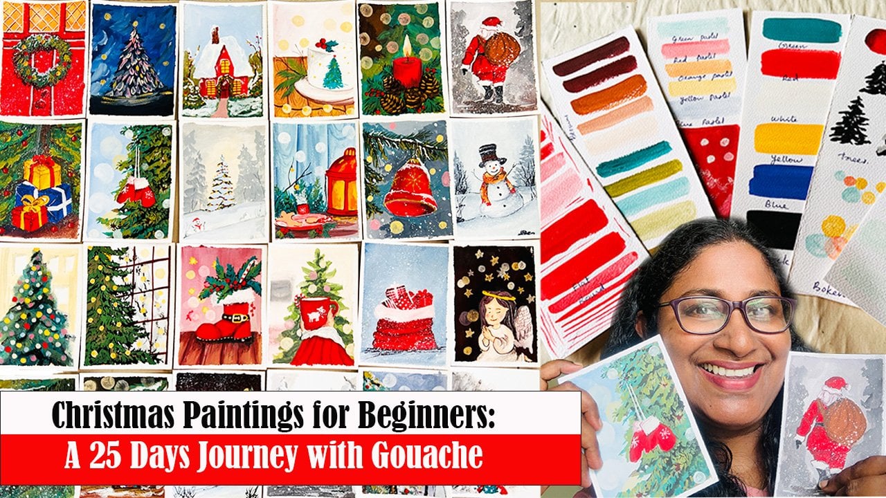
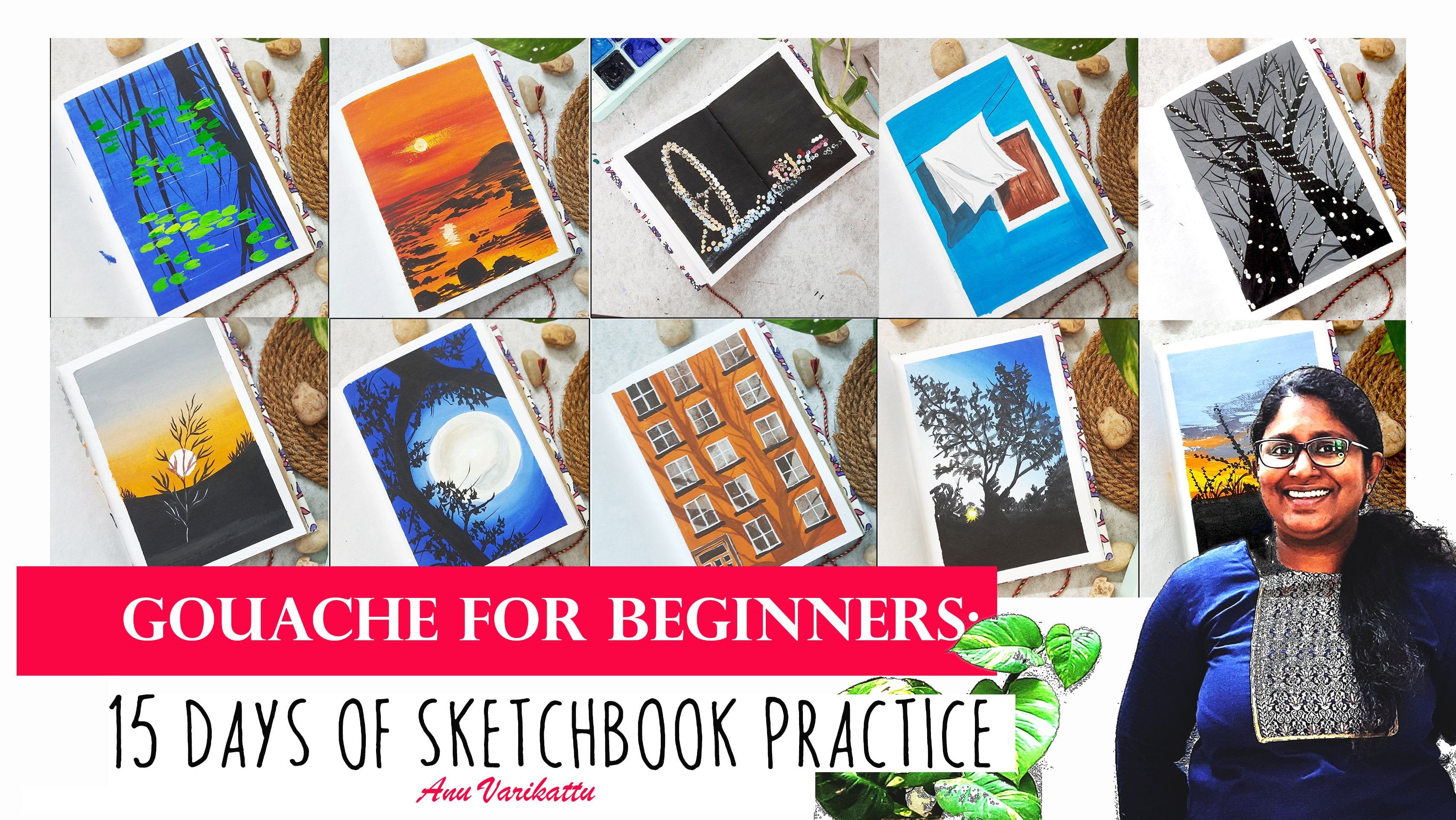
will be guided through a 15 day gouache
sketchbook practice created for absolute
beginners and busy lives. Each day focuses on one small painting completed
in just 15 to 13 minutes, making it easy to stay consistent without
feeling overwhelmed. The lessons focus on simple beginner
friendly subjects while gradually introducing
gauche color theory, color mixing, shading,
highlights and shadows. You will expose simple realism,
understanding light, dep, and form through clear
manageable studies that build skill naturally. No prior painting
experience is required. Just a sketchbook, some gauche
paints or acrylic paints, if that's what you have, and the willingness to show up
for a few minutes each day. By the end of these 15 days, you will have 15 completed
paintings in your sketchbook, and more importantly, a
stronger understanding of wash and the confidence to paint simple realistic
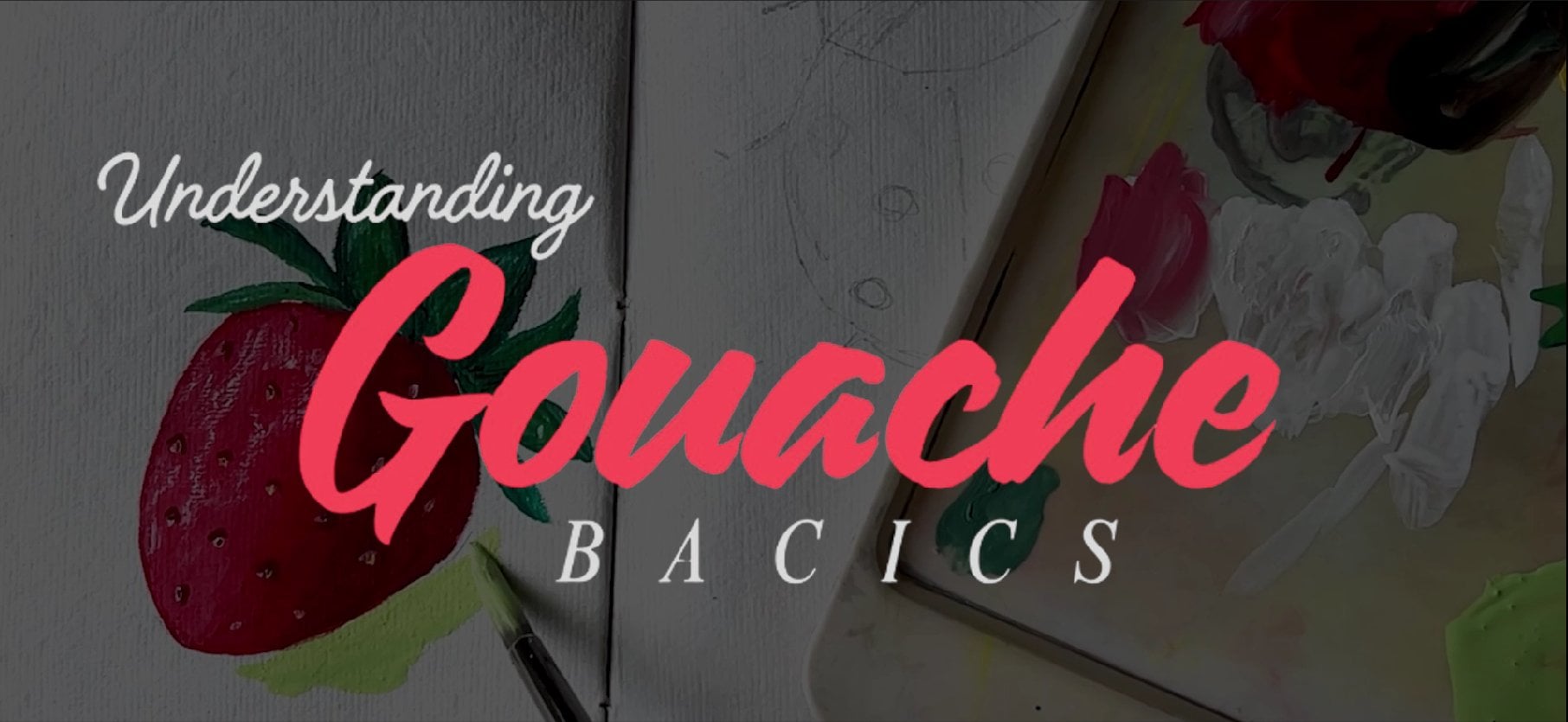
subjects with As. If you'd like deeper foundation, you can also explore my class understanding
wash basics on my profile. Completely option.
Take your brain, open your sketchbook,
and let's begin.
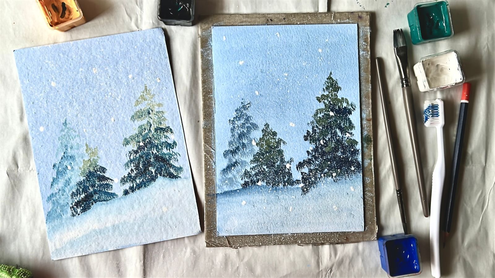
2. Before we Start: Before we start painting, let's take a moment to look at the materials we will be
using for painting with wash. One of the
beautiful things about wash is its versatilty. It's a very forgiving
and flexible medium, and you don't need a huge or
complicated setup to begin. With just a few basic supplies, you can create bright, expressive and
satisfying paintings. Let's start with the most
important material, the paint. Guache paints are
available in many forms. You will find them in tubes, small bottles, and
even jelly cups. All of these work
perfectly fine, Guach is highly pigmented and known for its
bright opaque colors. So no matter which
format you choose, you will get vibrant results. I personally started with
the hii Mia jelly cups, and honestly, there
was no tailing pack. They are easy to use, beginner friendly and very
satisfying to paint with. But remember, there is no
right or wrong choice here. Wart on wash it, you already have or feel
comfortable starting with Next is the paper, which plays a big role in how
your painting stands out. For Gauche, I recommend using watercolor paper,
this light texture. That gentle texture
helps enhance the fresh strokes and adds
character to your painting. Make sure the paper
has its mad finish, a glossy papers, as Gauche
doesn't sit well on them. In terms of thickness, try to use paper that is at
at least 100 or 200 GSM. Anyway, I usually
choose papers for my paintings with thickness
around 200 or above. I also like to use
handmade papers for wash. This helps the
papers stase stiff and reduce buckling
when you paint. Ticker papers always makes the process more
enjoyable and stress fe. For this class, I'll be using a small sketchbook made of handmade paper
with itty texture. I have chosen a small size, so each painting feels
easy and manageable, making it less intimidating
to package daily. Now, let's talk
about the brushes. While wash is water
based like watercolor, I find that acrylic
brushes work better for Bosch than
very soft brushes. Acrylic brushes are
slightly former, which gives you more
control over the page, especially because Bosch is
thicker and more opaque. To start with gauche, we mainly need three brushes, one flat brush, one round brush, and one small detail brush. These three brushes are
modern enough for a beginner. You can create a wide
variety of brush strokes and textures with just
these brushes. As you continue painting, you can always expand your brush collection
based on your preferences. Sometimes I also use a thick basil acrylic
brush to create bold, easy strokes or texture effects, but this is completely optional. Next is the palette. A palette is essential for mixing your paints
and adjusting their consistency.Guhbk
best when it's mixed to a smooth creamy texture before applying it to the paper. For this, you just
need a flat surface, and you don't need
anything fancy, a plastic parrot, a
ceramic parrot or even a simple plate
works perfectly fine. You will also need
two jars of water. One jar is used to rinse off
the paint from your brush, and the second jar
is used to clean the brush properly before
picking up a new color. This helps to keep your colors fresh and
clean while painting. Keep a cloth or tissue
paper nearby to wipe excess water or
paint from your brush. This wall habit make
a big difference when working with
wash. For sketching, you will need a
pencil and eraser, and to secure your
paper while painting, you can use masking
tape or washi tape. And finally, most importantly, bring a genuine interest
and curiosity to explore the medium that's truly the most valuable
material of four. With these simple supplies, you are more than ready to
begin your quash journey. In the next lesson, we
will start day one of the 15 day painting practice and begin our first
painting together.
3. Day 1; Butterfly: Hello, friends, and
welcome to day one of the 15 day Ghost
painting Challenge. Today we will be gently making our 15 day
journey with Ghost. For Devon, we will be painting
a beautiful butterfly. I have kept the first
two very simple. Think of it as a
warm up section. There is no pressure at
all, so don't worry. Let's ease into the process
and enjoy painting together. I have added the sketch on the screen and on the
resource section, and you are welcome to try
it easily if you would like. The focus today is simply to get comfortable with Gosch and
enjoy the act of painting. You can use acrylic
pin instead of Bosch. So let's dive right into Devon calmly and
without any tension. Once the sketch is ready, let's start painting
the butterfly. For this butterfly, I'm choosing yellow
and bright orange, but you are completely free
to choose any color you like. You can go with red,
green, or any combination. There is no restrictions. Take some yellow
paint on your palette and mix it well using
your round brush. Once you achieve a smooth
creamy consistency, you can begin painting. I'll be using my round brush to paint the inner portions
of the butterfly. Carefully load your brush with paint and start applying it from the inside areas of the wigs,
working outward gently. Paint the yellow color from the inside of the
wing to outward, covering about half of
each wing, and then stop. Now let's move on to
the second color. I am using bright orange
as mentioned earlier. But you are welcome to choose a different color if you prefer. Just like before,
take some paint, coat your palette, and
mix it using a wet brush. Avoid adding too
much water at first. Begin by mixing the paint with the moisture
already in your brush. If the paint reaches a smooth, creamy consistency,
you can stow. If the paint still
feels too thick, dip only the tip
of your brush into the clean water and
continue mixing. Repeat this step gently until you achieve that
creamy consistency. Now start painting with
the second colour, working from the outside
of the wings towards the inside and fill the
remaining wing area completely. I have completed the first wing. Now let's move on
to the second wing. We will follow the same step for this side as
well and completely. Now comes the blending. For this, I'm using
a dam bridge. I have washed off the paint and wiped away the excess
water using a cloth. With this dam bridge, I have blend the two
colours together. Generally, we brush back and forth along the meeting
point of two colors. Since the paint is still damp, the colours will blend
easily and smoothly. If you feel the
yellow has become too orangish or the orange
has turned into yellow, you can pick up a little
more of the color that is lacking and add
it to those areas. Keep checking in Between to make sure you are getting
a smooth transition. Once you're happy
with the blend, you can stomp and move
on to the next step. In the next step, we will add the butterfly wing design
using black paint. For this, use a detail brush. Just like before, take
the paint on your palette and mix it well to get a
smooth, creamy consistency. Let's begin with
the butterfly body. I'm painting the
entire body in black. Don't worry too much
about this step. Think of it like carefully
filling a coloring peach. Slowly fill the body and
the antenna with black. Once the body is done, we will move on to
the wing detail. I'm using a simple
common butterfly patty, starting from the top
of the left wing, I first add the outline and then move on to
the edge designs. These are actually very easy. I'm using a detailed brush here. But if you are completely
new to brushes, you can also use a
black gel pin for this tip that can
make it much easier. Otherwise, feel free to
continue with the brush. Remember to rotate your brush
gently on the parrot in between strokes to sharpen
and smoothen the bristles. This helps you get
thin clean lights. Use very light pressure
and paint using just the tip of the brush to achieve the thinnest,
sharpest lights. Now let's start with
the wing design. I'm adding a thin parallel line close to the outline
of the wing, keeping it as light and
delicate as possible. Then I add a second
parallel line, leaving a small gap between two. Take your time here and try to keep these lines
smooth and even. Along this second line, I'm adding small oval shapes to mimic a common
butterfly wing party. These little shapes help bring character and
movement to the wings. Remember, there is absolutely no pressure to copy
this design exactly. You can change the size, spacing, or even
shape of the deity. This is your butterfly, so
feel free to make it your own. Next, I'm adding a few
short perpendicular lines to connect the two
parallel nights. These small connecting
lines help complete the edge design and make the pattern feel more
balanced or finished. Now, I will connect this
edge design to the body of the butterfly using a
few soft random lines. Don't overthink this step. Just let your brush move naturally from the wing
edge towards the body. Once the left wing is complete, let's move on to the right side. For the right wing,
we will follow the exact same steps
to maintain symmetry. Start by adding a thin parallel
line near the outer edge. Then draw the second
parallel line with a little space in between. Are the small oval shapes along the line followed by connecting
perpendicular lines. Finally, draw a few gentle lines linking design
back to the booty. Work slowly and carefully using just the tip of your brush
and avoid pressing too hard. If needed, rotate your brush on the palette to keep the
tip sharp and clean. Please repeat the same
process for the right wing, and with that, we complete the top portion of the
wings on both sides. Now let's move on to the bottom portion of
the butterfly wings. Before adding any new design, we will first strengthen the overall sheet using black paint, carefully outline
the bottom wings again and gently darken a few areas to create
more depth and codast. I'm making the central
area slightly bolder, so the wings don't look flat. This contrast help the butterfly look more defined and
visually balanced. Next, let's focus on the
lower edge of the wings. I'm adding a thicker black line along the bottom
part of the wings. This board line gives weight to the lower section and makes
the design feel complete. Do this for both left
and right wings, trying to work side by
side so they look similar. But remember, symmetry
is not necessary. Now we will continue
the design from the top wings and bring it
down to the bottom portion. Near the outline of the wing, throw a parallel ine that
follows the curve of the wing. Think of this as an
extension of the design. We already created a boo, repeat this step on both sides, keeping the spacing fairly even. Once the parallel
lines are done, let's connect the design to
the body of the butterfly. Add few thin gentle
lines extending from the body output
towards the wing patty. These lines help visually tie the body and wings together. You don't need to
overthink this. Just a few simple
strokes are enough. To finish the black detailing, add short perpendicular lines between the outline
and the parallel line. These small lines
add texture and make the wing design
more interesting. Take your time here and use
only the tip of your bridge applying very light pressure
for thin clean lines. Now let's add some white
spots to the black design. Use white paint to fill
in the oven shapes we left earlier and a few areas
near the thicker outlines. If you'd like to add new white spots, that's
completely fine. Just remember to outline them lightly with
the black first. This helps the white stand out clearly and keep
the design neat. On the top portion of the wings, I'm adding two ropes
of white spots, and on the bottom
portion just matro. Keep the sports
small and simple. There is no need to overdo it. These tiny details add a
beautiful finishing touch. And with that, our simple and
cute butterfly is complete. Now let's move on
to the background. For the background, you can
choose any style you like. You can go for a bright
contrasting color, a warm tone, a cool tone, or even leave with play. I'm choosing a warm
tone for my background. I'm painting it using a soft skin tone or a
light pastel orange shade. You can create this color
by mixing white with orange or by mixing white
with little red and yellow. Feel free to choose
your own shade. Keep the background
simple and clay. There is no right or
wrong choice here. Yes. This is a simple project. You can turn this
into a handmade card, fran it or hang it on your wall or simply keep
it on your sketchbook. This marks the day one of
our 15 day ghost journey. Tomorrow, we'll start
a brand new project and continue this beautiful
painting practice together.
4. Day 2; Egg : Hello, friends, and
welcome back to day two of our 15 day wash
sketchbook practice. Today, we will be painting
a realistic egg omelet. Sounds interesting, right. So let's not waste any time and move straight
into the sketching part. The sketch for today's omelet is very simple and easy to follow. We will start with a
basic outline and add a circle inside for the yolk. The outer shape does not
need to be perfect circle. It can be slightly
uneven and organic, just like a real omelet. I'm composing my sketch
from one corner of the page and using the full
stretch of sketchbook. This helps make the painting feel more dynamic
and interesting, even though the
subject is simple. Once you're comfortable with your sketch and
everything is in place, let's move on to the
omlett together. First, I'm painting the egg white area
using the white paint. Take some white paint on your palette and
mix it well with a damp brush until you get a
smooth, creamy consistency. If the paint fades a little dry, you can add more water, but be careful not
to add too much. Just dip the tip of your brush into the water
and gently mix again. Once the paint feels creamy, carefully cover the entire egg white area with the white paint. Don't worry about making
it perfectly flat. We will add depth
in the next steps. I'm using my flat bridh for
filling the egg white area. Now, let's take a very small
amount of yellow and mix it with white to create a
light pastel yellow shade. Using this colour, softly paint over the
white in few areas, especially near the yolk. This adds warmth and makes the egg white look more natural. M Next, take a little orange and mix it with white to create
a very light toe. Apply this shape along the
edges of the egg white to represent the slightly over
fried edges of the omelet. For now, focus mainly
on the bottom bad. We will add more depth later. Remember, all these corners
should stay soft and light, we are building subtle
layers not strong contrast. I used my round brush to outlay paint along the
edges of the egg white. After that, I switched my flat brush to gently blend
the colors into the white. Now I'm taking a tiny
amount of black and mixing it with white to
create a light shape. Using this gray a gentle shadows in few areas of the egg white. These shadows help to show
the uneven texture of the omelt and give it
a more realistic look. I have added the shadows using light gray shade around the yolk area where the
shadows naturally form. And so in a few places within the egg white to show
its uneven texture. You can easily follow
along with me, and I have also added the final image of the painting on the screen for reference. I'm applying all these layers in a smooth, creamy consistency. Just a cute correction. I have been saying omlet, but this is actually
a bullseye egg. The steps stay exactly the same, so you can continue
painting along with me. The edges of the
bullse egg tend to fry a little more
and slightly bend. So we add light gray
shading in those areas to capture the shadows and give
it a more realistic look. We will also add a slightly
darker tone around the yolk area because this is a place where shadows
naturally appear. Don't worry about getting
it perfect right now. We will slowly build and deepen these shadows
in the next layer. Finally, I am going back with the pastel orange shade and softly adding it to the
opposite edge as well. Gently expand and
blend the color, so the transition
smoothly into the white. Take your time and keep
everything soft and septile. Now, let's move on to
painting the yolk. First, I'm creating
a lighter yellow by mixing yellow with white. Using this light yellow, I'm filling half of the yolk. Remember, we always apply the lighter colour in the
direction of the light. The opposite side of the
yolk will remain darker. For my painting, I'm choosing the light direction from the bottom left
to the top right. So I'm applying the
light yellow on the left side of the yok and a deeper yellow on the right side. Now, take the darker yellow and apply it to the right
side of the yolk. Before painting. Make
sure the paint has a creamy consistency so
it applies smoothly. To add more dead, I'm placing a small
amount of orange on the right side where the
shadows naturally fall. Now gently blend all
three colors together, light yellow, yellow and orange. So the transition looks
soft and natural. This gives us a
bright highlight on the side where the light
is heating and a richer, deeper tone on the
opposite side, making the yolk look more
round and realistic. Now, let's take a brown
or bad sienna color to defend the edges
of the egg white. The overcooked edges of a bullseye egg usually
turns slightly brown. So this step help to add
realism to our painting. I'm using a detail brush for this as it gives better control. Carefully outline
the egg white area, keeping the line
sharp and clear. You can rotate the
breast gently on the palette to smooth
and sharpen the bristle. This helps you to get
thin crisp light. In some areas,
especially where we added the light pastel
orange earlier, you can make the line
slightly thicker to show variation and
natural frying marks. Once the main outline is done, let's add some brown spots to
represent our flat texture. Are these sports
in varied sizes, some, some slightly larger, focus more on the areas
where the outline is thicker and where the pasted
orange base was applied. This layering makes
the surface look more natural and uneven. They do not need to
be perfect circles. You can make the
shapes and sizes of these marks different. There is no pattern to follow. Make some areas crowded
as they are fried more and add some random spots here and there for naturalty. Alright. Now let's move on to adding highlights and
depth to the yolk. On the darker side of the yolk, add a deeper shade
using dark orange. Apply this as a single bold
stroke over the shaded area. Now bleding at this stage, this creates contrast and depth. Next, on the lighter
side of the yolk, add a small stroke of white
to create a highlight. This bright highlight makes the yolk look glossy and draw. The contrast between
the highlight and the deeper shadow instantly adds realism and brings
the yolk to life. Now, let's deepen the
shadows of the yolk was ten. Keep using the detail brush and take the gray shade
we used earlier, apply a thicker shadow on
the darker side of the yolk. Paint it in a crescent shape, slightly thicker at the center, and thinner towards
starting and ending points. This shave helps the yolk look more round and three dimension. I'm also iring a few gentle
strokes and small spot, using gray shade on
the egg white area. These are added
randomly to deepen the shadows and enhance the uneven texture
of the egg white. Next, I'm adding a few
more small brown spots to complete the egg
portion of the painting. This finishes the main
element of our painting, and with that, the
Bulsai egg is cup eight. Now, let's move on
to the background. For the background, I'm choosing a pastel red or light pink tray. This is completely optional. You can stop here and
just at the shadows, or you can choose any color
you like for the background. Before painting the background, make sure your paint has a
smooth, creamy consistency. Makes the paint very
on the palette using your brush until it
feels easy to apply. Once ready, start painting. It's always a good
idea to paint along the edges first and then
fill the remaining area. I'm using my flat brush
again for the background, since it helps cover a large
area quickly and evenly. Now comes the final
step of the painting, adding the shadow of the
egg on the background. For this, I am using a great
shape that is slightly darker than the gravy
used for egg white. This time, I made the
gray using black and the pastel red instead of
mixing with the white. This makes the tone little more towards the
background shape. And the shadows on
the right side, which is opposite to
the light source. The shadow doesn't need
to be a straight line. Since the egg has uneven edge, repeat that same uneven
profile for the shadow as keep the center of
the shadow thicker and let the edges
gradually become thinner. I'm first outlining
the shadow area using my detailed bridge. This helps me control the
shape before filling it. Just like the egg, the shadow doesn't need to be
perfect or smooth. Keep the edges uneven too much the natural
shape of the egg. Once the outline is done, gently fill in the space
inside with the same color. Finally, make any small
retouches if needed. I'm slightly deepening
the brown edges of the egg once more, and with that, our
painting is complete. And that's it for day two. This shows how we can bring
realism in simple ways. A clear understanding
of light and shadows can make even simple
objects look real. Let's meet again on day three
with a brand new painting, see you tomorrow. Mm.
5. Day 3; Balloons : Hello, friends, and welcome
back to day three of our 15 day gauche
sketchbook practice. Today, we will be painting a realistic heart
shaped balloon. This painting is simple, but it helps us understand
how the right placement of highlights and depth
can make an object look realistic through proper
use of lighter share. This lesson will help you
build a stronger understanding of techniques used in
gauche and acrylics. Instead of painting
objects flat, we will see how a little
detailing and lift the painting and give it a
more realistic appearance. The sketch for today's
painting is very simple. Just draw two herd
shapes side by side, slightly overlapping each other. Exactly as shown on the screen. At the bottom, add a
small triangle shape to represent the tight
portion of the ballot. We will refine and adjust the shape variations
while being take. So the sketch doesn't
need to be perfect. That's all for this sketch. Now let's move on
to the painting. We will start by using
a bright jet colour. First, apply a plain
wash over both shapes. I'm using my round
bridge for this take. Before you begin painting, take the red paint on your
palette and mix it well with a damp brush until you get
a smooth, creamy texture. If the paint feels dry or thi, add water little by little. Mix again until the
paint flows easily, but it is not too watery. These tests are very important, and that's why I
repeat them often. Getting the right paint
consistency make a big difference in how smoothly the
paint apples and bends, especially when
working with gouache. So now I have completed
the first balloon, and let's move on
to the second one. For this balloon
also, we will start with the same way with
a simple flat wash. Using your round bridge, apply flat wash evenly inside
the second heart shape. This flat wase
layer will help us later when we added
highlights and shadows. Once the base wash is done, let's start adding
depth and sheets. This is where the soul of the painting really
begins to come alive. Adding shadows is
what gives the object a realistic look instead
of making it appear flat. For this tip, we will
need a darker shade. You can use brown
or burnt sienna to create your own brown shade, take a little black and mix
it with red on your palette. You will notice it immediately turns into a warm brown toe. If you prefer, you can also use brown directly
from the tube. Just like before,
make sure to mix the pane well and
adjust the consistency. Once you get that creamy
smooth consistency, let's start applying the
tip to the balloons. For this step, I am
using my detail brush, as it helped me
place the shadows more precisely and
with better control. Let's carefully add the shades using the brown
we mixed earlier. I'm applying it along the
edges of the first balloon. I have also added AOV shape in the center area where the
balloon is bulging out. Since this portion is
projecting forward, it naturally creates
a shadow around it, and that's what we are
trying to capture here. I'm applying the brown using
very small strokes almost as if I'm gently blending it while placing
the paint itself. This creates the color settle softly without
creating harsh lines. Once the paint is applied, wash your brush and
wipe the extra water. So the brush is
just slightly db. Now using only the
tip of the brush, gently blend the brown
into the red base layer. While blending, make sure not to blend away
the central brown. We still need that
strong darker shade to remind for depth. Focus only on softening the
edges of the brown into the red use very gingle back and forth movement with the tip of the brush,
taking your time. This way, the darker brown shade stays intact while the edges of melt into red creating a smooth transition and a
realistic sense of boom. Now, do the same process for
the second balloon as well. Start by applying the brown shed along the outer edges first, just like we did
for the first one. These areas naturally
fall into shadow, so placing the darker tones here help define the
form of the balloon. Next, add the brown shade to the central areas where the
balloon slightly bulges out. This area also create septal
shadow partition and adding a soft weaker here help enhance the three
dimensional loop. Once the brown
strokes are in place, take a clean brush, make sure it is slightly damp and remove
the excess water. Using the tip of the brush, gently blend only the edges of the brown strokes into
the red base layer. Let the darker brown
remain strong at the core and softly melt
the edges into the red. The major deep work is done. Now let's move on
to the background. For today's painting,
I'm choosing a contrasting color
and ath yellow che. As we did in the
previous paintings, the background color is
completely up to you. You can choose any
shade you like, but a contrasting color really helps the main
subjects stand out. First, I'm using
a detailed brush to carefully paint around
the edges of the balloon. This step is very
important because it helps us protect
the main elements. By painting closely
along the pion edges, we create a clean border. So the background color doesn't accidentally mix into
the balon shape. Take your time here and move
slowly around the curves. Once the outline
around the ballon is done and they are
fully protected, we can safely move on filling
the rest of the background. Now, using the same
earthy yellow color, fill the remaining
background ea. You can use either a flat brush or a round brush for this step, but a flat brush works best
here because it covers a large area quickly and help you achieve a
smooth even blend. Apply the paint with a
creamy consistency and use gentle strokes to complete the background neatly
and efficiently. So now the main
objects are done, and the background
is also complete. Let's move on to
the detailing part where the painting really
starts to feel more realistic. For this step, I'm switching to my detail brush and taking
a little brown paint. Make sure the paint is still
in creamy consistency, not too dry, so it flows
weakly from the psh. Now I'm adding a
small curvy pattern all around the edges
of the balloon. These curves represent
the tiny bulges formed by the air
inside the balloon. Real balloons are never
perfectly smooth. So the subtle uneven detail help break that flat look
and add realism. Work slowly and gently following the outer
shape of the balloon. Keep the inner soft and organic. Do this deterring all
around both balloons, but avoid the tide in for now. These small touches
might look minor, but they make a big
difference in giving the balloon a three
dimensional inflatet field. Now let's add the
strings to the balloon. For the strings, you can use
either brown or black paint. I'm choosing the brown itself. So the strings stand out
clearly against the back down. Check your detail brush and make sure the paint is
not too watery. It should be smooth and controlled so the
lines don't spread. Start from the tight end of
the balloon and gently pull this brush downward
to create the string. I'm keeping the lines smooth and slightly curved instead of perfectly straight
because the strings naturally bend and slow, This small curve adds more
realism to the painting. Wow. Add a bit of shading on
the tight end earth swell. This area usually gathers more shadow because of
the whole sand pressure. So a slightly darker tone here will help to define
the shape better. Take your time with this tape. These tiny details
are what elevate the painting from simple
to more realistic. Now let's move on to the
bright white highlights. This step adds the glaze from the light source and gives a shiny realistic
look to the balloons. These highlights are
what really make the balloon feel glossy
at three dimension. So grab a very small
amount of white paint. For this step, we don't need to blend the paint or
make it creamy. In fact, we want a slightly
thicker consistency here. First, make sure the brush is dry by removing all
the excess water. A dry brush will help
the white paint sit nicely on top of red
without spreading too much. Now now take some white paint on your retail brush and gently add strokes along the edges where
the light hits the Blow. Think about where the light
is coming from and the price, the highlights only
on those areas. Use light confident stops
and avoid overdoing it. Because the paint is thicker, it will leave beautiful
crisp marks on the surface, which naturally look like light reflections
on a glossy bellow. This small step instantly adds shine and realism
to the painting. And with that, our day
three painting is complete. I hope you enjoyed this exercise and learn how simple highlights and shadows can transform a flat shape into a
realistic object. See you tomorrow with
another simple object and a fresh painting. Until then, happy painting.
6. Day 4; Strawberry: Hello, friends.
Welcome to day four of our 15 day gouache
sketchbook package. Today, we are going to paint a realistic strawberry in a simple and peguer
friendly way. Let's start with this sketch. This strawberry outline
is very simple, and you can follow the
sketch shown on this screen. Once your sketch is ready, we can begin painting. Now let's start painting
the strawberry. I'm taking rent and white
paint on my palette. First, I will fill the
entire strawberry with red. Before painting, mix the kernel well to get a smooth,
creamy consistency. Load your brush, and
fingihingevenly. Use smooth, steady straws and follow the
shape of the strawberry. Try not to leave any yards and spread the paint
evenly across the surface. If the paint feels too thick, add just a tiny drop of
water and mix again. Keep your hand relaxed and
let the brush glide softly. Take your time with
this base layer because a smooth foundation makes
the next steps much easier. Now, the base layer is done. Let's add depth. Take a little brown
or mix tiny touch of black into it to
create a deeper shape. I'm a blink this darker colour on the right
side of the strawberry. I'm imagining the light
coming from the left. So the left stays brighter
and the right become darker. If your night reduction
is different, feel free to adjust. You can now see two tombs, a light side, and a dark salt. Wash your brush and wipe off extra water so it
stays slightly dark. With a clean brush, gently blend the two
colours typetal. If your brush gets muddy, wash it again and
continue glinting. This helps create a
soft, smooth transition. Now, let's add a so glow on
the side or the left side. Take in lighting
or paste in red, and gently aplach
on the left side. Now bnd it softly, so it looks natural and mse. Next, let's paint the seeds. Using a detail brush, take white page and add
small oil or dough shapes. Scatter them naturally so
they don't look too even. Where the spacing slightly and change the size just
a little here and there. Try to follow the curve
of the strawberry, so the seeds wrap
around the flume. Now, let's add a
soaked highlight. Take a tiny touch of yellow and genly place it on
each white seed. Just a small dart is enough. This makes the seeds look warmer and gives
them a slight glow. Do this for all the seeds moving slowly
across the surface. Now take a brown or darker red and add tiny shadow
morts around each seed. Don't outline the full seed, just a partial
shadow for real sum. You can draw small
half circle shapes on the darker side of each seed. Make sure the shadow sits
opposite to the light source. This small step
instantly adds depth and makes a seed look slightly
embedded in the surfers. H. Now for extra
enhancement and depth, take a slightly darker brown, add a few deeper shadow
bltches around some seeds. Not for all of them, just a few for variation. This creates dimensions and prevents the strawberry
from looking flat. You can also add a few
tiny texture marks to make the surface
feel more texture. Keep everything sub
til small details makes big differences. M Let's again. Now, let's paint and
reuse using two greens, N green and eta three. The light green is made by mixing yellow with
my regular tree. For the darker three, I'm
using my regular tree. And also a deeper green made by mixing a tiny touch
of brown into it. The darker mix will help us create soft shadows
and define the edges. First, apply the lighter
green as the base. Cover this entire leaf
area gently and evenly. Smooth strokes that follow the direction of the leaf shape. Leave some areas
slightly lighter, so we have space to
build shadows later. This base layer will act
as south foundation. Now let's move to
the darker free, add it on the opposite
side of the light. Since our light is
coming from the left, the right side of the
leaves would stay darker. Then, apply the tarpin slowly, focusing near the base and
allow one side of each leaf. That's the right side. Mix a little brown to the green to create an even deeper toe. Start with a very
small amount of brown and adjust tony
if you need more depth. This richer shade will
define the shadows areas. It also makes the names feel more dimensional
instead of night. Now take your detail brush, not it lightly with
a darker green, begin adding thin vein
lights from the citter out. Keep the lines so,
and slightly curved, fol on the natural
shape of the leaf. Let you hand move gently. Theres no need to ah. Add a few gentle shadow
strokes near the darker areas, especially close to the
base of the leaves. You can also deepen one side slightly to ah the
light direction. Then with a slightly
dampshblend it very lightly. Now, let's add the final
hyenad on the strawberry. Take slightly
thicker white paint and a clean tretin plish, add so hyenads on
the night side, especially around
the seed areas. This gives the strawberry
a fresh glossy finish. Our strawberry now looks
bright, juicy, and realistic. Let's move to the
background now. I'm using a light lemon tea, but you can choose any color you pay carefully around
the strawberry first, using a smaller brush. Then fill the zest with a archer brush for
smooth coverage. This step is
completely optional. If you like the
clean white look, you can stop here and simply add a shallow without
background onion. But if you want a
brighter finish, a soft background will
really make the strawberry. Take your lemon
yellow on the palate, or you can choose in a cannon
and mix it well first. Make sure the paint
is smooth and creamy. If it feels too thick, add a tiny chop of
water and mix it. Now start painting carefully
around the strawberry. Use a small English
near the edges, so you don't over
your mean sub chip. Move slowly along the outlin
and keep your hands steady. Once the edges are protected, you can switch into
a large English in the remaining area
with smooth avid strobes. Try to keep the
layer cut strain, so there are no patchy areas. Let the colours spread
gently across the page. This soft and you adds warm and give safeh cheerful
feel to the painting. Take your time here.
There is no fish. And once the background is done, we will move on to the
final shadow details. Finally, let's add the shadow, mix black and white to make day and tint it slightly
with the background colour. For that, I have added the
lemon green to the gray. Add a salt shadow
on the right side, keeping it septing and natural. And with that, our day
four painting is complete. It's a simple project, but the result looks
beautiful and realistic. Thank you for painting with me. I will see you on day five with an ago flash painting.
Happy painting.
 Anu Varikattu, Artist l Gouache & Acrylic Instructor