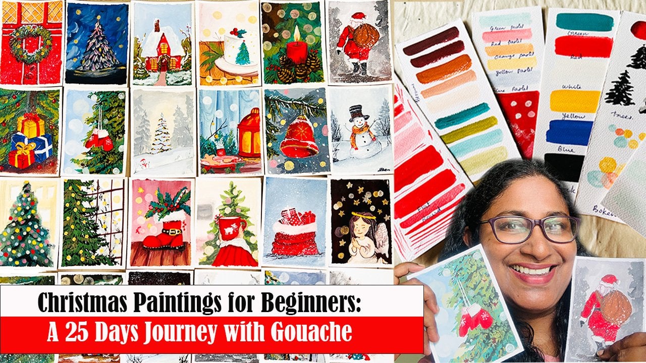
Transcripts
1. INTRODUCTION: If you have been grabbing a
quiet moment for yourself, a gentle bos in the middle of everything, you are
in the right place. Sometimes we all need is a
little space to breathe, to slow our mind, and to let our hands move without
pressure or noise. Today, we are going to paint a peaceful sunset
forest, a glowing sky, a so fading mountains, and still trees that capture
the calmness of the evening. This is not just a
painting exercise, but a small invitation to slow down and enjoy the process. One gentle brushwork at a time. I'm Anu Baigat, an architect, artist, and a mother from India. For me, painting has always
been that safe quid corner of life where I
can step away from the rush and reconnect
with myself. Through this class, I want to
share not just a technique, but that same sense of calmness and comfort that
painting has given me. In this class, we
will be painting this beautiful sunset
forest in gouache, a simple yet stunning
composition that captures the calmness of nature. When the sky glows orange and purple and the
world feels still, we will start by learning how to build soft gradient skies, blend warm and cool tones, and layer distant
hills to create depth. Then we will add trelhus and details that bring the
whole painting to life. Even if you are a
beginner, don't worry. I will guide you step by step, explaining each brushwork and techniques so you can
paint along confidently. By the end of this class, you will have a peaceful
forest sunset painting. You can proudly frame your gift. So if you are ready to unwind, pick your brushes and
join me in this class. Let's create this
glowing sunset landscape together and let the colors remind us to pause and breathe.
2. MATERIALS USED: Hello, everyone. I'm so happy that you have decided
to join this class. It truly means a lot. Before we begin,
let's take a look at all the materials you will need for this beautiful
sunset landscape. Let's start with the paints. As you know, we'll be using
gouache for this case. Gauche comes in many
forms and brands, so feel free to use
you already have. I'll be using He
Mia jelly Gauchet which has loudly vibrant colors. For this painting, we will
only need six basic colors, red, yellow, blue,
green, black and white. Now for the brushes, we will only need
three a flat brush. I'm using size toll for painting the sky and blending large
areas, a round brush. I'm using number
eight for painting the mountains and trees
and a detailed brush. I'm using size number
one for adding finer details like the
branches and birds. You will also need a pencil
for sketching rough outlines, a palette for
mixing your paints. Next, let's talk
about the paper. I'm using a handmade
textured paper with a beautiful torn edges. I sourced mine online, and this is 150 GSM thick. You can use any match
or textured paper, but make sure it is
at least 90 GSM or thicker so that it can handle
the layers of gauche well. Keep a cloth or tissue handy to wipe your brushes in between. And we will also need
two jars of water, one for washing of the paint, and the second for cleaning
the brush well so that you won't soil your lighter
colours when using them. I'm using this old board
to tape the paper. I'm not going to
tape on all edges. I would like the painting
to have these torn edges. So, that's it. That's
the old material you need for this class. Once you have gathered
all the materials, you'll be fully ready to
start painting alone. So set up your
workplace comfortably, take a deep breath,
and let's move on to our next section where
we do some practice.
3. LET'S PRACTICE: Hello, friends. Before we
begin our main painting, let's do a little
practice exercise. I'm doing this in one
of my sketchbook, but if you can try using the same paper you'll be
using for the final painting. That way, you will get familiar with how the paint
reacts to the surface, and it will help you to control your brush
strokes better. All right. Let's start by creating a beautiful
orange shade. Mix a little yellow and red
together on your palette, blend until you get that
warm glowing sunset orange. Now, using your flat brush, let's start applying the
colour to the paper. Keep your brush moving
in one direction only. Smooth horizontal
stroke back and forth. This helps create a soft
even layer for your sky. Blend gently until
you get a smooth, even gradient across the paper. Now let's brighten the
middle portion of the sky, add a bit more yellow
paint to the central area. This will create those lighter
glowing spots in the sky. Once you are happy with that, let's deepen the bottom of the sky with a richer red tone. On your palette, mix some red paint to a
workable consistency, not too thick, not too wttery. Then apply to the
bottom portion of the sky using the same
long horizontal strokes. Now wash your brush, wipe off the excess water, and gently blend the red
and orange areas together. Take your time,
blend until you see a smooth transition
between the two colors. Now, let's bring
in some cold tons to balance all the warmth. Add a little blue to
the left or red on your palette to create
a nice purple shade. Apply this gently to the
very bottom of the sky, blending upward
into the red area. Use the same technique, horizontal back and
forth strokes and soften the transition with your clean, slightly damp brush. Let's add some soft clouds now. Using your flat brush and
the same purple colour, paint a few uneven lines across the upper
part of the sky. These will be our clouds. Then wash brush,
pipe of extra water, and gently blend the edges of the cloud to make them
look soft and dreamy. The Perfect. Now that our blending
practice is done, let's quickly create
a color chart for paints we will be
using for this class. We have already mixed orange
by combining red and yellow, purple by mixing red and blue. We will also be using a few different shades of
purple throughout the painting, lighter ones for the
distant mountains and darker ones for the foraph. So keep this color chart handy, it will help you stay consistent and confident with
your color mixes. And and and and and Take your black paint
and round brush ready. Now let's move on to
practicing some trees. Let's start by drawing a straight line for the
main trunk of the tree. From the top, I'm adding
branches to either side. For each branch, I'm
using my round brush to create small spiky leaves
with short strokes. Make sure to check your
paint consistency. If it's too watery, the strokes will spread
and lose their shape. If it is too thick, the
paint won't flow smoothly. So find that perfect
middle consistency that gives you crisp fine lines. Take your time and complete
the whole tree patiently. I call these hand sharing
strokes as if your hand is gently trembling while
making the tiny leaf strokes. It gives a beautiful natural
texture to your tree. Once the tree is done, let's practice some grasses. Take some paint on
your round brush and sharpen the brush tip by gently rotating it
on the palette. This helps to create those
fine narrow strokes. Now starting from the bottom. Put long upward strokes in different directions as if the grasses are growing
out from the same road. Let's try making dasses
using the detailed brush. The detailed brush gives you even finer lines and works
great for long thin glasses. Finally, let's paint some birds. I'm using the detailing
brush again for this step to get
neat narrow lines. Try drawing birds in different shapes and
directions to add variety. And lastly, let's practice mix this beautiful sap
tree by mixing green, black and yellow, which we will be using for the ground
areas and grasses. And And that's it. With that, let's wind up
our practice section. Now that we have warmed
up our hands and brushes, let's move on to our
class project where we will bring everything together
into a beautiful painting.
4. PAINTING THE SKY: Now that we are all warped up, let's begin our main project. We will begin with a light
sketch. Nothing too detail. Just a few guiding lines to help us place the main elements. Start by drawing the outlines of the mountains using simple
smooth curve lights. I like to begin with the
mountain in the child first and then add the
distinct ones behind it. Try to vary their shapes
and height slightly. This create a nice sense of depth and harmony
in the composition. Now, let's add the trees. I'm sketching a
few straight lines wherever I want the
trees to be placed. Take a moment to look
at your composition and decide where newer trees
will balance the scene best. I'm going to add three
trees of different heights. The one on the left will be the tallest and the main focus. As we move to the right, I'm keeping the tree
slightly shorter so that the distant
mountains remain visible. The mountains and
the foreground, and there are three
trees on the foreground. Once our sketch is ready, it's time to prepare
the colours. Let's mix a bit of yellow and red to create a warm
orange tone for the sky. Using a flat brush, start covering the sky area with the orange shade we made. Keep your brush strokes moving
gently in one direction. I'm brushing side to side, keeping the strokes horizontal to achieve a smooth event blend. The I add Next, let's add a touch of red
towards the bottom of the sky to bring out
that rich sunset glove. If your paint feels too thick or starts to
lose consistency, just dip the tip of your brush
lightly in water and mix the page that will help the color flow
smoothly across the paper. Finally, I'm adding a few
light uneven strokes on top of the orange area to create a dramatic and dynamic
effect in the sky. These subtle variations in color and texture
will help bring your sunset to life and make the sky look more
natural and glowing. Now it's time to make
your sky even more dramatic and vibrant by
adding touches of purple. To achieve that, I'm
mixing a bit of blue into reddish orange tone
already on my palette. This gives a beautiful
transition shape that's perfect for the
lower part of the sky. Next, I'm adding a little more blue to create a
deeper cooler tone. Then I'll mix in
the touch of white. This can soften the color and makes it easier to blend
smoothly on paper. Now, take your flat brush and blend the two
colors together, moving the brush softly back and forth in
horizontal stops. I'm also adding a pinch of red to enhance the area
where the sun to be. After blending, wash
your brush and then wipe off the excess water
using a tissue or cloth. Use this slightly damp brush
to go over the area again. This will help blend
both colors seamlessly, creating a smooth
gradient in the sky. Now let's arts and clouds
for extra texture and more. I'm using the same color
mix and technique. Apply the paint in soap
uneven strokes across the sky like slanting lines where you want the
clouds to appear. Once the paint is on the paper, clean your brush again, remove the excess
paint and water, and generally blend the edges of the clouds to make them
look soft and natural. After that, I'm adding a
slightly darker shade on top of some of the area to create contrast and depth
in the clouds. When you're happy with
the colour transition, move to the other side of the skin and repeat
the same process. Uh, Um Uh I have created about three cloud form machines, one on the left and
two on the right side. Once you're satisfied with how the sky looks and the
balance of the colors, we are ready to move on to the
next step of our painting.
5. PAINTING THE MOUNTAINS: Now it's time to paint the distant mountains
in our background. For this step, I'm switching
to my round brush, which gives better
control for painting, smooth mountains, edges,
and curved lines. You can see there
are several layers of mountains in the distance, and we will paint them
one by one to create a nice sense of depth
in our painting. All the mountains will be in
different shades of blue. So let's start by preparing
our first color mix. Take a bit of blue pin and
add a bit of red to it. This will give you
a soft purple tone. Since the lower part of our sky already has
a purplish blue, this mix will help the mountains blend beautifully
into the background. Add a drop of water to
adjust the consistency. We want the paint
to move smoothly on the paper without
being too watery. Next, take a small amount of white paint and mix it
into the purple shade. This lighter tone
will perfect for the mountains that sits
further back in the landscape. Go ahead and paint this Bmose mountain using
the light purplish shade. After finishing, if
you feel the tone looks a bit too bright, you can add a hint
of red over it. This will bring the sky
and the mountain into the same warm harmony and make the transition
more natural. Let's now make a darker shade for the next layer of mountains. I'm still using my
roundish, and this time, I'm adding bit more blue
to deep at the top. Let's start painting this
mountain layer carefully, following the outline
we skeched earlier. Once you are filled
with this deeper blue, take the lighter shade
we used before and gently blend it along the
bottom edge of the mountain. This will create a
soft misty effect, making it look like
the mountains are fading beautifully
into the atmosphere. The Okay. Now let's move on to the
next layer in front. Here, we will apply an even darker tone because as the mountains
come close to us, they appear deeper
and more defined. Notice how the distant
ones were lighter. That's because they are
slightly covered in mist, while the one in front are
clearer and stronger in color. Oh, looks like I forgot to darken my mix
before applying it. But don't worry if
that happens, you too. You can easily fix
this by adding a little red into the blue to deepen the tone and create
that beautiful rich shape. Just paint over the entire mountain area with this new mix, and then as before, use the lighter tone at the bottom to bring back
that misty transition. The now let's move on to the pain. Now, let's move on to paint
the hills in the foreground. For this section, I'm
using a bright blue colour because the hills that appear closer to us naturally
catch more light, especially from the warm
glow of the evening sun. This helps create a
beautiful contrast between the distant misty mountains and the more vivid
hills in the front. I'm gently applying
this blue tone across the entire area
of the front hill, making sure to keep the
breaststrokes smooth or even. Don't worry about being
too perfect here. A few uneven textures will actually make it
feel more natural. Et's add some small
detail to make it came. Using my round brush, I'm lightly adding small spike like strokes upward to create the illusion of tiny trees and foliage rising from
the mountain slopes. These little vertical strokes at so much depth and texture. You can vary the heights a bit, some shorter, some taller, to make it look more organic. I'm repeating the same kind of detailing across the top region of the hill just to tie the
whole landscape together. With that, our
mountains are complete. Now let's move on to painting the foreground landscape
in the next part. This part will really bring
the whole scene together.
6. ADDING THE FOREGROUND: Our hills are done, Let's shift our focus
to the foreground area, the part that is closest to us. To create a rich base color, I'm mixing green, yellow, and just a touch of black. This gives a deep, earthy sublne tone that's
perfect for this layer. Starting from the top
edge of the down, I'm applying this
darker shade first. I'm using the paint in a slight
lighter consistency here because we will be adding more layers and details
on top of it later. To make the tone even darker and blend
with the mountains, I'm adding bits of blue to the top portion of
the ground layer. As we move towards the bottom
portion of the painting, let's start lightening the tone by adding a bit of
yellow to the mix. This gradual transition from dark to light gives
a lovely sense of light hitting the grass and makes the whole
composition feel balanced. Once you have
applied both tones, take a moment to
blend them softly. Just enough so that you can see a smooth shift of colors without losing that
textured brushe. There is no rush here. Enjoy the process of
watching these tones merge and create that
peaceful evening feel. Now, let's mix an
even darker tone to build the next layer
of our ground cover. For this, I'm taking the
same green mix we used earlier and adding a bit more
black and a touch of blue. This will give us a richer, deeper shade that helps create a sense of shadow and
depth in the landscape. Once your color is ready, start applying it on
top of the ground area, but not too evenly. I'm placing this darker tone rampantly across the surface, especially around the middle and upper part of the ground. This irregular placement helps make the landscape
feel more natural like patches of dense vegetation or shaded areas where the sunlight
doesn't reach directly. Use your round brush and
lightly dab or stroke in short moment to
mimic the texture of grass and bushes.
Don't overthink it. Just let your brush move freely. You can even vary
the pressure a bit, pressing harder for
darker bolder spots and lighter for softer areas. As you step back,
you will notice how these darker patches instantly add dimensions to our painting. Oh. Now, for the next step, let's start by adding some
lighter shade strokes to bring depth and
light to our landscape. Take the same color
mix we used earlier and add a bit of yellow
to make a lighter toe. Using your round brush, gently add shot
scattered strokes in the areas where you
want that soft glow. These are spots
where the light from the evening sun is gently
touching the ground. Now, let's make the
shade even lighter. Add a touch of white
paint to the color mix, and let's use this
tonee to paint small grasses and tiny
plants in the foreground. These lighter details really help bring the painting to life, adding variety and a sense of sunlight across the feeling. And And that's it. We are done with the
foreground details. Now let's move on to our that is adding trees and
birds to our painting. Okay.
7. ADDING THE TREES AND BIRDS: M Now, let's move on to our main
elements, the trees. Using the round bridge, paint three straight
vertical lines on the spots we marked earlier. These will be the tree tongues. Before that, let's
take your black in the palette and mix it well
for the right consistency. Now, let's start
drawing the trees. Once the trunks are in place, start adding branches
to either side. We will do this one by one. Take your time here. Now for the leaves, I'm using what I call
shivering strokes. It's a fun little technique. Just show uk strokes as if
your hand is gently shivering. These tiny irregular
moments help create the natural look of leaves
fluttering in the breeze. Continue adding these strokes on both sides of each branch, layering them as you go down towards the
bottom of the tree. You'll see how your
trees start to look full and rich with texture. Any and you and Repeat the same process for the other two trees, trunks, branches, and those lovely shivering
strokes for the leaves. Once done, you will have
a beautiful trio of trees that frame your
sunset landscape perfectly. Now that we've done
with our trees, our painting is
already starting. Let's now add small
grasses on the ground with same dark black color to add
to our painting. Thank you. Now it's time to add the most magical part of
our painting the sun. Take a bit of yellow paint on
your round brush and let's carefully paint a small circle right between the two trees. This will be our
glowing evening sun softly shining through
the landscape. Next, load a little more
yellow paint on your brush, and using gentle strokes, add a few soft pass
or light cloths on either side of the sun. Now let's move on
to the final step, adding a few birds in the distance to complete
our sunset scene. Take your detailed
brush and load it with bit of black or dark paint. Start adding tiny bird shapes one by one over the mountains. Just more simple V shapes, so to suggest the
birds flying far away. You don't need to add too many. Just a few scattered
ones will make the painting feel more alive and peaceful. And that's it. We have finished our beautiful sunset
landscape in gouache. Take a moment to look
at your painting, the warm sky, the glowing sun, the layers of mountains, and the little birds all come
together so beautifully. Now it's time to clean
up your brushes, rinse them in the first jar
of water to remove the paint, then dip them into the second
jar for the final clean. Gently wipe them dry
with a soft cloth, so they are ready for your
next painting session. So that's it. Yes, we did it. Thank you so much for
painting along with me, and I'll see you in
the next section.
8. THANK YOU: Congratulations. You did it. Take a step back and
admire your painting. Look at how warm sunset
glows across the sky, how the layers of
mountains create depth, and how the little trees and birds bring the
whole painting to life. We have just created a
vibrant sunset landscape in gouache filled with color,
light, and emotion. Through this class,
you learn how to sketch and compose
a balanced landscape, blend colors smoothly to
create a dramatic sunset sky, paint distant and
foreground mountains with a misty effect, and texture and detail
to your ground layers. Bring life to your painting with the trees, sun and birds. Each step you took added something special to the
story of this landscape, and I hope you are proud of your work because it truly
deserves an appreciation. If this is your first
gouache painting, I want to say thank
you for trusting the process and
painting along with me. Remember, every brushstroke you take builds your confidence
and skill as an artist. So keep painting,
keep experimenting, and most importantly,
enjoy the journey. I would love to see your
version of this painting. Please upload your artwork
in the project gallery. It's always such a joy to see how everyone arts
their unique touch. Thank you so much for
joining me in this class. If you enjoyed this lesson, don't forget to follow
me here on Skillshare, so you'll be notified
about my upcoming classes. I have more gauche and creative painting lessons
coming your way soon. Until next time, keep creating, keep exploring and keep
painting your world with color.
 Anu Varikattu, Artist l Gouache & Acrylic Instructor