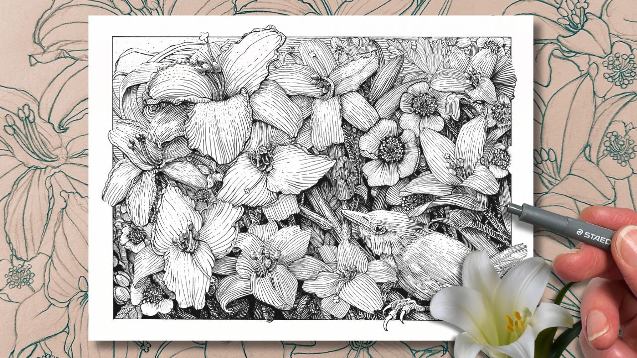
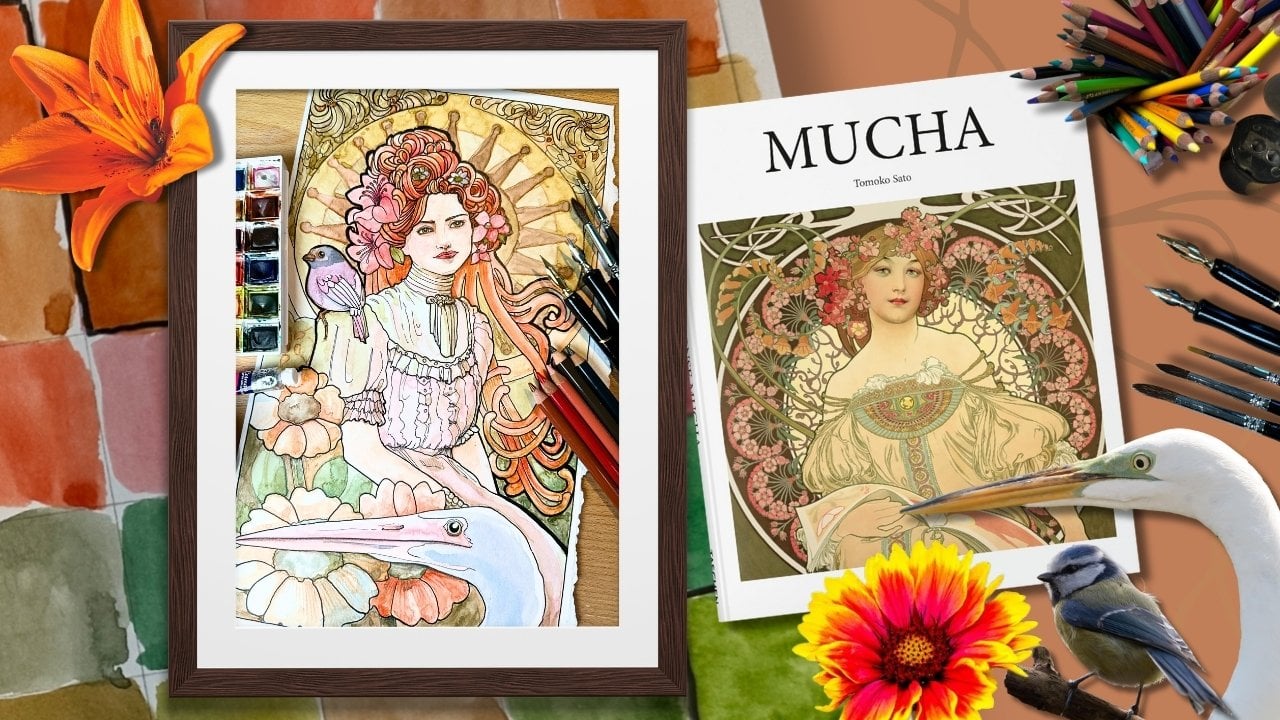
Transcripts
1. Welcome: If you're curious about
drawing with dipens or don't know how to progress with your
pen and ink skills, by the end of this class, you'll know exactly what to look for when purchasing supplies
for dip pen drawing. You'll also learn how to control the pressure on your nib to
create realistic illusions, how to be successful using different mark-making
techniques to shade in a convincing way and methods to explore how to organize a
black and white illustration, so that it's legible. This class is all about enjoying
the process of creating interesting compositions
and rendering subjects in pen and
ink using I'm Chloe, a learning specialist,
turned full time artist. I'm a professional member of Speed Ball's Artist
Network for Illustrators. My work is featured
regularly in social media, magazines, and contemporary
art galleries. Pen and ink is my passion. And to answer what I get most
asked about on my YouTube and from students I've structured the lessons
in three sections. The first is about the supplies, choosing the right
combination of materials and how to use them to
get the results you want. In the second part, we apply the fundamentals of penk
directly to mini projects. We'll render a series of subjects to practice
key techniques, really focusing on what makes
dip pens really special. This class is for all levels, even if you've never rendered in Penank you'll be able to
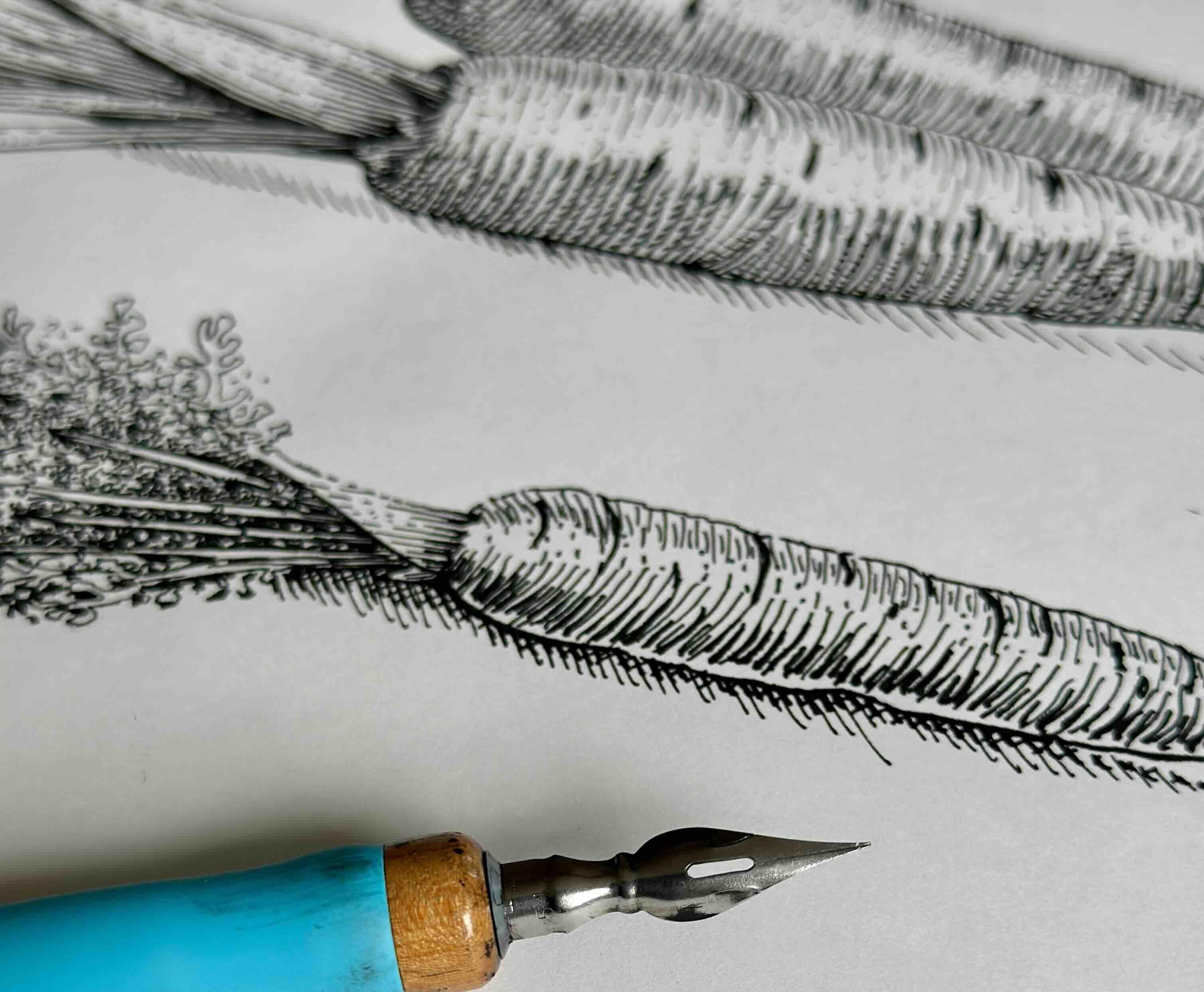
follow along just fine. We'll be Carrots.
A simple subject. So we can focus on
the skill building. And if you're more advanced, you'll get my best
tips for planning professional looking
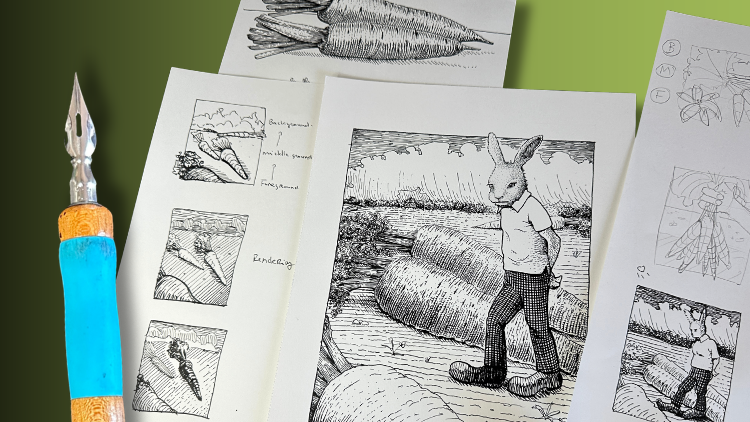
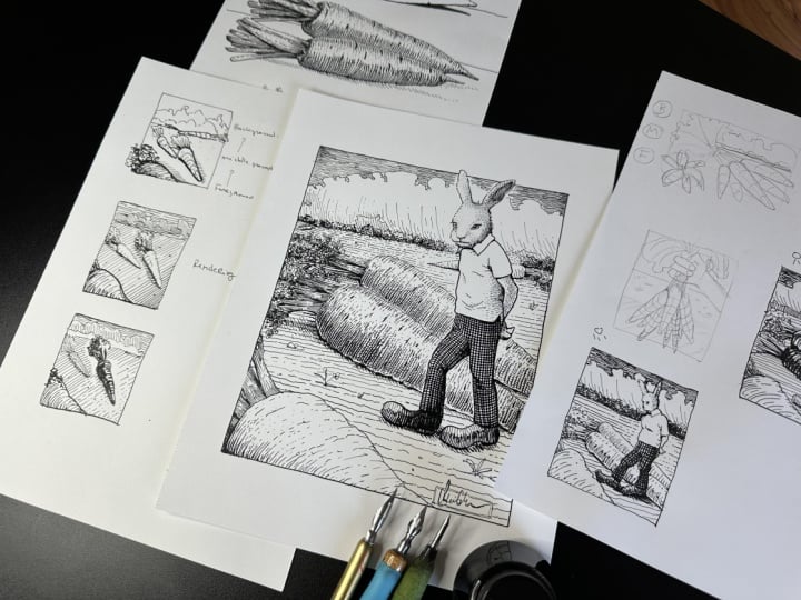
illustrations using my five stage approach. For the final project, we'll create this fun carrot
them composition together, building on the skills
from previous lessons. I'll explain the how and
the why every step of the way so that you can develop your own composition
alongside the lessons, following the same principles as for the carat illustration, so you can get as creative as you want
and get great results rendering your black
and white composition using traditional
dip pens and ink. Download the zip file that has all the references
and PDF workbook. The workbook has progress shots, lots of bonus resources, such as a glossary of terms, explaining the key fundamentals, a list of influential
master artists that you can browse through, and some guiding
questions to help you progress further
with your art goals. Have a look at those
first. Then join me in the next lesson for a deep dive into
dip pens supplies.
2. Supplies: When you're first starting
out drawing with dip pens, the first challenge is
knowing what to get. There are so many different
kinds of nibs, pen holders, ink types, and then
there's the paper, and they all have
to work together. In your workbook, you'll find the list of supplies
that I recommend. However, these are
what's best suited for my inking style and
what's available in my region within my budget. Another hurdle you might
face when trying to find suitable supplies
is availability. Depending on where you live, your local store options
might be limited. Ordering online can
just be as daunting because comparing options
can be overwhelming. If you've tried dip
pens in the past and did not get the results
you were hoping for, most dip pen issues can be fixed by one of three things
your nib choice, the or the paper. In this lesson, I'll
guide you through what to look for so that you can
have a smooth start. A dip pen is a pen
that you dip in ink, as opposed to say a fountain pen that has ink
cartridges built in. Just like fountain pens. So dip pens are intended
for calligraphy writing, and those have a broader tip. The dip pens that we want have nibs that taper into a
sharp end at the end. For dip pens that are
labeled for drawing, sketching, mapping,
or illustration. As mentioned, dip
pens have two parts, a nib and a nib holder. It's also called handle. If you can find a dip
pen that comes as a set, a nib, and a handle
together, I would get that. But more often than not, they come separately, and that's when it can get
a little complicated. Here's why. The nibs, they come in different sizes,
shapes, and materials. Let's start with size. Similar to a set of
fine liner pens, the size of the nib determines the size of the line width. This small croquil pen would be equivalent to a tip size 01. This bowl nib size h three. And this big spoon
nib maybe an oh five. Oh, but here's the cool thing about dip pens. Check this out. Each nib can give you
a range of line width. I can render a line from thin to thick or thick to thin
in a single stroke without having to
switch pens simply by increasing and
decreasing the amount of pressure on the pen. This is really handy,
for example, linework. Where the outlines
are thin in areas of highlights or grow bold
in areas of shadow. It's great for shading using lighter marks to render
areas of highlight and gradually increasing the tone using thicker marks in
the areas of shadow. Let's talk about the different
shapes and materials. Nibs are made of
stainless steel or brass and some have
a chrome coating. The material of the nib and its shape effect how
stiff or how soft it is. So how flexible the nib is, how much it will
bend under pressure. Adding pressure on the nib
makes the tines spread out, which releases more
ink onto the paper. If you're really heavy handed, you'll want a stiffer nib. If it's too soft, you'll
either get leaks, blobs, sloppy marks, or
even break your nib. If you're light handed, an overly stiff nib, will be difficult to
flex, and therefore, you'll have less control
over the ink flow. The ink might not flow at all, and then it will flow
suddenly all at once. The nib shape and material
also affects its elasticity. The elasticity, that's how
quickly the nib bounces back to its original shape after you've released
the pressure. If you're a beginner,
a highly elastic nib will feel unpredictable. You'll find it difficult
to make marks evenly, you'll get jittery
strokes because of the bounciness as you progress with experience
using dip pen, will want a more elastic
nib because of how responsive they are to the
slightest change in pressure. So when shopping for nibs, consider the size for the format and the style
that you prefer to draw. Do you typically like
rendering artwork with a lot of detail in
smaller dimensions, or do you prefer big artwork with big bold marks
and lots of solids? The level of flexibility. That's how softwa or stiff. So are you heavy handed? Do you like doing lots of fast dynamic lines or are you more light handed doing
more precise work? And the level of elasticity
by your level of experience. So low bounce for beginners. For example, a lot of
the manga specific kits, like Japanese style nibs are typically very stiff and bouncy. So I don't recommend those as your introduction
to dip pen inking. Let's talk handles. And handles also come in different shapes,
diameters, and materials. Some are wider in the grip and offer a rubber section
for added comfort. This Tashi kawa model 40
has a classic mount with two holes that fit Japanese
and most Western brand nibs, and it's also my favorite. This way, you can have
just a single handle and change out the also holders
with a universal mount, the ones with the four prongs, which have good compatibility for different brands
and sizes and nibs. Though you might find that
they have a really tight fit, which makes switching nibs in
and out very inconvenient. Some of the Western made smaller cylindrical
shaped nibs like this croquil is compatible only with its own
croquil holder. Myself, I prefer to have a dedicated handle
for each size nib. We've reviewed the
different types of nibs holders if you're
buying them separately. What about the ones
that come as a set? Speedball makes a
great sketching kit. It comes with two pen
holders and six nibs. If you're not sure about
choosing just one pen, kits are a simple way to test. Lots of different nibs. In this particular kit, you'll find that one oh two
cro quill and a 112 bowl nib. Those are the ones
that I'm using. I also use the larger
spoon nib, the 513 EF. This one is not in the kit, but it's very
popular and easy to find as a nib and
handle set together. Those are the three pens
that I use most of the time. If you're looking for
just a single pen, the ones that I recommend
beginner friendly pen, the brows steno purple pumpkin, if you have a light touch. Another beginner friendly pen is that Speedball 512
bowl nib that I use. It's a good generalist pen, and it's good for both
heavy and lighter touch. A more advanced pen, I would say the
Tashi kawaGNib make sure that it's a Tashi kawa
and not a zebra brand. The zebra brand is
very, very stiff. Your workbook is a
list of the brands to look for a nib rating guide, and a few guiding questions
to help with your search. Next, we'll look
at ink and paper. You do need a special ink
that will flow just right. Never use fountain pen
ink with your dip pen. Look for waterproof
pigment based India ink. This ink sits and glides on
the surface of the paper. You'll want waterproof, so it can be mixed with other mediums. It's also good for
doing ink wash efts. And if you're wondering
about colored inks, avoid the dye based inks. Those are more like a stain. You'll find there are
more color choices with the acrylic inks than there
are with the India inks. Acrylic inks are
okay with dip pens, but they're a little bit more
translucent, less viscous. It's similar to applying
like a watercolor. India ink is ideally what
we want for rendering line. That different brands vary
their pigment formula, which affects the drying
time, opacity, and viscosity. The pigment based inks that contain shellac are very thick. I don't recommend shellac
mixes for beginners, but a carbon mix is great, and that's what I use. Read the labels carefully
before you buy. And just to note,
shape of the bottle. I prefer a bottle with a wide opening so that you can dip your pen directly in it. Some are just a bit too
narrow and others come with an eyedropper for dropping
the ink directly on the nib. That's not my preference, but some artists really like it, so don't rule that one out. I'll typically use two
categories of paper. One is your good paper
for final projects, and the other is a more
economical Stono grade paper for practice exercises
and studies. Either way, look for
hot press paper. Hot press paper has
a smooth surface, and it's more
resistant to bleeding, lifting, scarring
from the nib action. You'll get cleaner marks and
your nib will last longer. For projects, I recommend a heavier weight bristle
paper in the 300 range. Bristol paper comes in two
surfaces, smooth and vellum. Smooth is best for
precision drawing. It gives you really clean, sharp edges, but it
requires more hand control. It is best suited
for advanced inkers. Vellum is more versatile
and beginner friendly. The marks won't be
quite as crisp, but the surface will
be more forgiving. Different brands will label their vellum finish as a satin or a semi smooth
finish. All are good. If you're interested in dip pens for pairing them
with watercolor, then you'll want a fine
satin watercolor paper or paper labeled
as a mixed media. Be warned that a rough
textured cold press paper does interfere with
the ink application when you're using a dip pen. It will wear your
nibs out prematurely. However, cold press does prefer as if watercolor is
your primary focus. So those are the compromises
with paper choice depending on the medium
that you prioritize. So for practice exercises
using dip pens, I use a lighter weight
hot press paper. Some come in
individual sheets like this deleter comic book paper or in pads like this
Canson inking paper. Studies, I also will use my
moleskin art sketchbook. If you favor a higher
quality paper and wish to keep your artwork bound together in a
handsome book format, then the moleskin
is a good choice. You can use any all of these options to
complete the lessons. There is more information
about ink and paper in your workbook to help you
narrow your the next lesson, we'll get more familiar
using the supply. So grab your dip pen or pens
if you have more than one, your ink bottle, your student grade paper,
a metal roller, an H or HB pencil and needed eraser because they're
more gentle on the paper, a jar of clean water, a rag or paper towel, your workbook for
reference, the references, and a bit of mildish soap
if your nibs are brand new.
3. Getting Started with Dip Pens: New nibs out of the
package are covered in a protective oil
or a waxy coating. This is to prevent nibs from
rusting in the package. It's like an invisible
shrink wrap, and it needs to be removed for your new nib
to work properly. Submerge the nib in hot
water with mild dish soap. Or it's good to have on hand the speedball cleaning agent for approximately 90 seconds. Not too long, or
it could shorten the life of your nib
and then wipe it dry. Never let a nib air dry. It will rust. Wipe it dry anytime
you clean it, so there's no moisture
sitting on the nib. You may have heard
of other methods to prep or clean dip pen like spit, toothpaste, a potato,
or a hot flame. Just don't. Nibs are delicate, and if the tines get
bent or damaged, it could ruin your artwork. Waterproof quick drying inks accumulate and cake on
the nib while in use. So it's really important to keep a jar of water
in a rag nearby. Depending on the dimensions
of your student grade paper, you'll need several
sheets for the exercises. We'll use one of the sheets
to cut into smaller sheets. Tear it or cut it if
you have a knife. We're using these mini
sheets to prime the nib throughout the lessons and
later for our final project. The dimensions are
not important. Just a few rules of thumb before we get started
on the exercises. We want the tines to
face the surface of the paper at a 25
to 30 degree angle. Not vertical like you
would hold a brush. Hold the pen loosely
with the hand, high up on the shaft,
away from the nib, lock your wrist and
aim to move with the whole arm from the shoulder and elbow for longer strokes. For details, I rest or glide
my pinky on the paper. You want to avoid a tight grip. To avoid smudging the ink
as it dries on the paper, something to keep in mind
is to travel left to right, if you're right handed,
or if you're left handed, travel right to
left on the paper. The key is just to remember that ink takes a
few seconds to dry. If your ink is brand new, give it a vigorous shake
so it's mixed well. I have a larger bottle and fill a smaller bottle with one with a large opening
for easy dipping. If like me, you have
three nib sizes, I'm using my speedball nibs. Start with the middle size pen. Dip your nib halfway
up the eyelet, then use the mini sheet to prime your nib with
a stroke or two. I do this each time I
dip the pen to make sure there's flow and to
remove the excess ink. Avoid wiping your
nib on the side of the rim or shaking it
to remove excess ink. Use your sheet instead. Keeping the tines face down, pull a series of vertical
strokes towards you. Aim for evenly spaced apart
using no pressure on the nib, enough for the ink to flow. Then repeat. Now pushing
the strokes away from you. Remember to hold
a pen loosely at that 30 degree angle from
the paper, now diagonally. Pull the strokes towards you, keep the pressure even so that your marks are all
the same thickness. Then again, in the
pushing motion. Do another set moving
horizontally this time. Pull and push, keeping the tines face down
towards the paper. When your pen is out of ink, give it a swirl
in the water jar, wipe it dry, then
reload it with ink. I've learned the hard way that it's best to rinse
and wipe each time, rather than continuously
dipping it in ink. After you load it with ink, remember to do a few strokes
on your spare sheet. Now for some more advanced pull and push marks in
a curving motion. Try a few marks where
you're varying the speed, the distance between the
marks, and the direction. Let's repeat the same marks now using pressure on the
nib to make older marks. You'll need to reload with
ink sooner than before. Try varying the pressure going thick to thin
and a single stroke. If you have several nib sizes, repeat the mark-making
exercise with your other nibs. Let's take a moment to consider. Was there a motion that
felt more comfortable? Do you prefer the pulling motion or pushing the marks
away from you? Was there a stroke direction
that felt more at ease, top to bottom, side to
side, on the diagonal? Have a look at your strokes. Which ones turned
out better so far? Brand new nibs do need a
bit of a break in period. So not only does this
exercise warm up your hand, it also improves your
nibs performance. A few last tips about dip pens. Make sure that you have
a cup or a holder to set your pen down so that it doesn't roll around
and get damaged. Nibs do last a long time, especially if you
keep them clean, dry and rust free. You'll know that
a nib is ready to retire when it becomes
overly flexible. It leaks ink, is
visibly misshapen, encrusted with ink or rusty. It's best to just
replace a worn out nib. All right, continue to
test your dip pens. Just save a bit of room on the bottom half of
your exercise sheet, and in the next lesson, we'll apply what you've
practiced to a subject.
4. Linework: Just a reminder that in your downloads are the
reference photos, lots of them. And in the PDF are
the drawings and the finished ink pieces for you to refer to
follow along with. You can print them
out. I've just got them on my iPad here. Pull out a new sheet
and your pencil. Take a rough measurement
for the proportions. The carat is twice
as long as the stem. Put a dot to mark
where the carrot tip starts and estimate
the distance to the head and then mark
that with dots for the carats with another mark
where the stem will end. Draw a line across the
middle as the guide. Then connect the dots to build the outer edges
of the subject. The subject, that's the carat. Estimate where the stem bunch
fits on the carat head. Then start pulling lines
to build the stems. Here we want to be
mindful of the overlaps, so what sits on top
and what's underneath. Define the stems that
are on top first. Then clean up the remaining
lines from there. Add curved strokes as a reminder that the carat
is three dimensional. It has a tubular form. Let's talk about the art
fundamentals for a minute. With pen and ink, shape
is the foundation. That is the most
important thing to get right for the drawing
to look convincing. Form, that's what gives our
drawing volume and depth, making it look
three dimensional. And composition, that is, if shape is the most
important and the foundation, composition is the most complex. That's organizing the things so that your drawing is legible. For our first subject, we'll focus on shape with an
outline to define the edges. For form, we use line quality. This is what we've
practiced so far, making thick and thin strokes. Adding a horizon line will automatically
anchor our drawing, also giving it a sense of
space and perspective. Grab your midsize pen. The source of light is on
the top left hand corner. That means the side of the
subject that is closest to the light will make the
outline appear thinner. So we use no pressure
on the nib and outline very lightly
with a broken edge. The side of the subject
furest from the light appears thicker as it
falls into shadow, which translates
to more pressure on the nib for a bold outline. The small lines that curve up help create the
illusion of form. Since this is line art
only, there's no rendering, it helps to really emphasize
details in the outline. Same idea with the stem bunch. The outlines closest to the light source are
broken and thinner. The outlines farthest or locked from the light become gradually thicker and bolder. We can emphasize the
line quality with a bigger nib and increase
the contrast for more depth. You erase the pencil marks
when the ink is dry, and let's not forget our top tier
fundamental composition by adding that horizon
line and a cast shadow, so it's not floating in space. This immediately gives a
sense of dimensionality, a foreground and a background. All of this with just a
few thin and thick lines. Next, we render using
different shading techniques.
5. Shading with Strokes: We begin the same way. First estimate proportions
and mark your sheet with dots to draw the carat that sits in the front of the tube
in the photo reference. Decide where the stem
bunch will start and end, then draw the center stem
that's wider and in front. It has an odd shape and
these broken bits on top. The other stems
shoot up from there. After the initial sketch, we clean up the lines. Estimate the negative space in between to add the carat
that's above and behind. The second carrot
stem looks similar. It has a wider branch
in the middle, two on either end of the head, then the remainder sprout out
from the layer underneath. We'll ignore that third carrot
that's in the reference. Save the cross contour guides, but erase the center line. We'll outline the shape, then use line quality to
give our subject form. Plus add volume using values. So we are shaving our line art. We'll render it including cast shadows for
additional depth. Grab your earlier exercise sheet and join me to create
a value chart. Here is the sun. In our first box closest to the source of light
is all white, and that's a value number one. The box beneath it, still close to the light
gets a bit of gray value. We're using broken lines
in a diagonal direction using no pressure on the
nib, evenly spaced apart. Values three and four
are solid lines. As we move further from
the source of light, there's less space
between the strokes. The light gets choked
out with more ink. Switching to a bigger nib for the darker values
going even bolder. When we reach a
nearly black value, we can build a tone
with a cross hatch. This gray tone chart
has seven values, but it could range anywhere
from three values to 12 using any direction
for the marks. This chart is a helpful
guide to remind us how to render the shading in relation
to the source of light. Dip pens make it a little
easier to build the values in a smooth gradation simply by controlling the
pressure on the nib. We'll use those principles
to render our subject. Let's map out where
the highlight will go, the horizon line. And the case shadows. In relation to the
source of light, we begin with a broken
outline values one and two for the side of the
subject that gets more sun. There's two subjects now. Maybe the carat closest to the front is further
from the light. So between the two
and a three value. As we continue
with the outlines, the principles remain the same, leaving broken edges where
we estimate is a highlight. This is why it makes sense
to start a little lighter. We can always go darker,
but not lighter. There's more info about broken
edges in your workbook. Let's practice the
rendering for a minute. The carrot stems have
a tubular shape, the carrot more like a cone. For either shape, we can give them volume by
rendering with strokes, traveling parallel to the form. The gradation of values
describes the tubular shape. Both shapes are rounding and the light lands on
the shape gradually. Whether we're rendering
along the form or across the form,
contouring the subject. These are the curve marks
that we practiced earlier. Now they're in a gradation. We'll go along the
form for the stems, mindful of the gradation effect and cross contour
for the carats. Starting with the stems
closest to the light source, we begin with our
broken outline. Open edges between a value one, a white and a value
two, dashes and dots. I'm careful to keep the values rather light on the first pass. At the same time, it's
safe to assume that the stems that are tucked underneath are blocked
from the light. We already know from our previous study
to make that bold, the outlines that are in shadow. Adding some contrast
now section by section, that helps us keep track
of what stems are on top and which are
tucked underneath. For the carat closest to the viewer, depending
on the angle, you could decide that it's below the other carrot and
render it in shadow. Or in the reference, the carrots are more stacked. But in our drawing, by giving the front
carat more light, it informs the brain that it's not sitting directly below, but at more of a forward angle. For the carrots,
you could go with a smaller nim for
the finer detail, but I will continue with the same size because it
has a good enough range. We'll start at the top.
I'm traveling left to right so that I don't
smudge the ink, using curve strokes, evenly spaced apart, but
irregular lengths. The length variety gives
it a more natural look, fading with broken lines, dashes and dots towards
the center highlight area. Above the highlight are
the lightest values, and below the highlight, the rendering gets darker using bolder strokes
closer together, just like we practice with the horizontal fade effect
going thin to thick. Next, we'll address the darkest values
around the carrot top. Then smooth out the
transition of tone where the highlight
is using dots. Because the carrot
is more cone shaped, where the form rounds, there's a reflected light. To make that reflected
light seem brighter, we bump up the contrast there. So a bit away from the edge, we add a bold dash, and we mirror this
on the lower half. It's darker in the lower half, so our dash there is
slightly thicker and longer. This makes the carat
appear more round, and we finish off with a little dark dense
in the carrots. Now I see the lower carrot needs more tone
in the stem area. We can repeat the same
process to render the carrot, starting with the curve strokes, evenly spaced apart
of irregular lengths. Fading with broken lines, dashes and dots towards
the center highlight area. I'm going ahead rendering
below the highlight area, going a little darker using bolder strokes
closer together, just as before with the horizontal fade effect
going thin to thick. We address the darker
values around the carat top and use bold dashes to create the illusion
of reflected light. First at the top, above the
highlight area and below. Finishing with those dense, the little blackish marks
along the length of the carat. To really make our carats
pop three dimensionally, we'll bump up the contrast in the areas of shadow by
adding a cross hatch, four in nearly black value six. It's not a full cross hatch. It looks more like this, adding a small dash perpendicular
to the curve strokes. Repeat on the lower carat. Now we add the cache shadow with a light diagonal,
even spaced hatch. Another loose drop shadow for the second carrot to give
it a sense of distance. We can also darken the section immediately
under the front of the carrot to reinforce that
it's sitting on a surface. With your larger nib, we can thicken the bolder
outlines for added contrast. Let's not forget our horizon
line to anchor the subject. Erase the pencil lines, change your ink water,
and in the next lesson, we'll get into shading
with textures.
6. Shading with Textures: We've given our shapes a form. We accomplish this by
building the volume, shading the shapes with values, rendering values with strokes, and now we'll render our
subject using texters. On your exercise sheet, join me in creating a
texture with squiggly marks, starting with a
value number three. Meaning we're not
just using pressure, but our strokes are
continuous and unbroken. They're not broken.
They're continuous. Then we can gradually bring the squiggle marks closer
together progressively, using more pressure
for a bolder texture. Value number three was to
establish the pattern. Value number two, fading to white is the same
pattern, but broken up. Squiggly marks like this are
great for organic textures, such as foliage, like a
tree or a carrot top. A quick measurement
shows that the carrot is of equal length to the stem. So make a center
mark on your paper and estimate the length and width of your
carrot from there. Then the length of the stem and a rough outline of
the bushy edges. Add the stem bunch using
the same steps as before. In the reference, there's a bigger piece that
wraps around the front, the remainder shoots
out from underneath. Then the leafy stuff
sticks out here and there. Our job here is to show just enough detail that the viewer can
identify what it is. And the remainder will be
an illusion that we create. That means we're not drawing every single little
branch and leaf, just a few so that it's visually convincing
that it's a carrot top. I'm not even looking at
the reference anymore. For the carat, we'll once again map out
the area of high light and also the boundary for the bounce light at
the bottom's edge. Add a cow shadow that will
double as our horizon line. We'll outline the carat first. Business as usual with our
thin and thick strokes. To render the top
portion with light, evenly spaced apart strokes
that vary in length, curving towards the
highlighted area. We'll repeat for the bottom
with thicker strokes, but mindful not to ink all
the way to the bottom's edge. We leave that white as our
reflected bounce light. This will make the
carat more three D. Now smooth out the transition with a value two in the highlight area
with dashes and dots. And to make the
form more obvious, we once again increase
the contrast using short old dashes in
between the strokes. And on the bottom half with slightly longer
thicker strokes. Then the little
dents on the carrot. This will look even better
with the cast shadow. But first, let's move on
to the leafy texture. I'll be working on this
section tip to head, starting with the outer edges. Then the branches to
define the main shapes. I'm using light, even
pressure on the nib, basically working with a
value three to start with, and we'll render the very top of the branch with strokes
for consistency, then start the leafy bunch using the same principles as
our previous practice. We start with the value three in little clusters that
go light to dark. This tells the viewer there's more leafy stuff underneath. And there's also more at the top closer to
the light so we can add the broken texture above
what we just rendered. Then counter that with
more contrast where there would be shadow from
leaves blocking the light. And just like our
squiggles are quite simply describing a step bunch without having to
draw everything out, we give just enough hints of the subject with our
play of light and dark. For the very bottom, we can add broken
texture here as well. But this time we make
them solid black. Then add just a
bit of black like a cashedo under some of the squiggles that
look like tiny leaves. Then just like we
did with the carrot, we smooth out the transitions
where it's overly white, filling the spaces
with dots and dashes. Then add a few strokes
to render the start and end of the branches so
that they look more bendy. Go ahead with the
cast shadow now. Again, with even space
diagonal strokes. Then a second pass with
shorter old strokes over top. Then the third pass with cross hatches to get the full
effect of the bounce light, making the carat
appear more round. Once it's dry, erase
the pencil lines, and in the next
lesson, we'll talk more about composition. And
7. Composition: Now we'll cover a few more important aspects
of composition, and then we'll be ready
to begin our project. Position is where
objects are placed in the picture plane in relation to each other and the horizon line. Arrangement of values
is how the values are distributed in the picture
plane to render your subject. And all of these fundamentals work together to frame
the main subject. And lead the viewer
through your composition. The picture plane, that's the boundary of
your composition. In this picture plane, we have
some carrots lying around. The position and size
of the carrots in relation to each other
and the horizon line, give us a sense of depth, a bigger carrot is likely
closer to the viewer. We talked about line widths
for highlights and shadows. It also works for near and far. Old means closer to the viewer. Fin means further
in the distance. If I were to place another
subject in the very forefront, I'd make it even
bigger and bolder. The rule of thumb in a composition is to
aim for a foreground, middle ground, and background. To make this perspective
more obvious, we use techniques like size, placement, line
quality, and details. Bigger, bolder, more visual information of the objects
in the foreground, then gradually lighter,
smaller and less detail as we move back
past the horizon line. Our first practice was line art. So now what if we add
shading with rendering? We're still using all the rules from the previous example, but now we need to think
of the foreground, middle ground and background as overlapping layers of values. And we need to arrange those values in a way that
helps clarify those layers. The carrots have a cross
contour curved hatching, and I want them to stand out from the ground
that they're laying on. So we can still use
hatching strokes, but we change their
direction going diagonally. You can also change the
value level like here 3-4. Then with the background layer, I'll go with horizontal strokes. Then the layer behind
vertical strokes, then back to horizontal, but just a different value. So changing the
stroke direction and tonal value guides the
viewer through composition, making it more clear what is
in front and what is behind. Also texture. How you arrange the values
in the composition can also help you put more
prominence on the main subject. In the scenes above,
there's carrots lying around in the dirt with clouds
in the distance. So what? What if this middle carat
is the main character? And you want the viewer
to look there first. You can make this carat
the key point of interest by rendering it super detailed. Or super dark and framing
it with lighter values, then use sparse detail to render the remainder
in the composition, or the reverse make the
main subject super light and frame it with darker values. The key takeaway
here is that for your pen anding composition
to turn out the way you want, it helps to plan ahead
because there's a lot of options and not all combinations
will work out well. In the next lesson, we'll bring everything
together following a five stage process for our final dip pen
anding project.
8. Project Start: The pen and in projects
that I'm most proud of are the ones that turned
out better than expected. And that's thanks to this
five stage approach. The stages are
research, thumbnails, a subject study, a
pencil underdrawing, and knee incaplication. Each stage is an integral
part of the final artwork. It's a good system as it weeds out potential issues early on because ink especially using dip pens can be an
unforgiving medium. As mentioned in
the introduction, you can join me to create
this composition together or a version of your own creation in the dimensions
of your choice. By following this
five stage process, you'll have a great
framework to be successful with your
future projects. First step is finding
a suitable subject. So the first stage
naturally points to doing research for inspiration
and to collect references. Followed by doing thumbnail
sketches to test those ideas, either you come across things that you're
inspired to draw, and then you sketch them out, or if already have
something in mind, do a rough sketch of it, and then look for references
to support those ideas. Of course, we're not limited to what's online
when doing research. You can use live objects or take photos from
your surroundings. If you're planning to design your own composition
for this project, go ahead and gather
a few images, look for landscapes,
a main subject, and a few other
supporting images. Next stage after research is assembling those references
in a harmonious composition. On a new sheet of
paper and pencil, join me now for the
concept thumbnails. We'll start with
landscape orientation. This carrot bunch image
can be our main subject. With no pressure on your pencil, draw a light grid. This is the rule
of thirds model. The idea is to
position the subject on any intersecting
point of this guide, and it should give us a pleasing
composition in the end. First, roughly draw the outer
shape of the carat bunch. The main carrot will
be in the middle, another below, and one above. Just like in our
previous drawings, build the carrots from
the center lines. Let's add more
carrots underneath. Keep the drawing very
loose and basic. Our mission with
these thumbnails is to figure out the
best composition. This means our focus is
on the placement and proportions of the objects
together on the picture plan. So don't spend too much
time making it nice. Something important,
a foreground, a middle ground,
and a background. We know to add a horizon
line to anchor the drawing. There's a gap in the foreground. We could put another
carat there, or why not my garden lily? Then layer in the landscape
and the background. Mm. It's not bad, but it would be nice to see more
of the background. Let's try it on the
portrait orientation, starting with the
main subject carrots. Now we know about the
flower in the foreground, so we can place that next. A bigger flower here feels
the space way better. Next, are the carrot cops. And we have more space for a defined horizon line topped
with a cloudy landscape. The second thumbnail is
visually more appealing. We could use this as a
composition for our project, but let's keep exploring ideas in case we land on
something more exciting. The second image
will naturally look best in portrait format. This time, I'm starting
from the center grid. The carrots, they
spread out from there to the
intersecting points. Leaving enough space for
the hand, that's above it. Draw the little V
shape for where the top of the thumb and
the index finger meet. From there, it's easier
to estimate the size and placement of the fist
and then draw the arm. From here, we can construct the thumb The index is hidden, but there's another finger here. Just a rough estimate. Looking at the negative space
in the photo reference, it's fine if it looks
a little cartoony. Again, think of this
as a proof of concept. Will this idea work, and is it worth pursuing
as a final project? It's okay. Maybe not the most
interesting composition. I mentioned earlier that
at the research stage, you can either
search for images, then sketch your thumbnails based on the references
that you've gathered, or you can reverse the sequence. In that case, start with the thumbnail concept,
drawing from imagination. Then look for references
to support your ideas. For example, I liked
this concept of the carats in the field like
a Salvador Dali painting. Carrots also make me
think of bunnies. This is way more fun. We already have the
carrot references. We just need to search for a man walking hands behind
his back, looking down, and this image is free if we download it in low
resolution, which is fine. We just need the general
pose of the gentleman. So our subject takes
up most of the page. I'll position the
head high above. Ears can come out of the frame a bit, eyes facing downwards. Use the reference to estimate
proportions of the body, approximative that
works for now. I want more space at the
bottom of the picture plans. So rather than redraw
the character, we can just move
the frame a bit. And bring in the carats. One in the very forefront. And two from our
previous exercises. Okay The horizon line, cloudy sky, a tree line, more carrots in
the faraway field to enhance that sense of depth. I still prefer the vertical
to the horizontal layout. So let's stick with the
portrait orientation. Now that the placement and
proportions are figured out, we need to decide on the distribution of values
for this composition to work. Do we want the character or the carrots to be the
key point of interest? How are we to layer the stroke direction and the
textures in our foreground, middle ground and background? M
9. Subject Study: That brings us into stage
three, the subject study. The study stage helps
us figure out how to ink our composition so that
it's clean and legible. Let's draw our thumbnail again so that we can test two
different combinations. Also, I think Bunny Man needs to be a little bit smaller
in composition, and we'll keep the carats in the frame just for comparison. Grab your dip pen, and we'll
start with the outline. Don't worry about line
width at the stage. We're still working with
a thumbnail sketch. Our priority is to
figure out the values and how to orient the stroke
direction and textures. Okay, so far we've practiced value gradations with
strokes and a leafy texture. But now we have a new subject, so let's create a new texture. Grab your exercise sheet and
wherever you have space, start with a value three. No pressure on the
pen, short dashes, stagger your marks randomly so that the texture
looks natural. This pattern works
well for fur or grass. Add more pressure, bring the hatch marks closer
together for a darker value. Then back to the top
for the value too, using spars, broken
dashes and dots. White fades to solid black, value number one to
value level seven. Next, do a variation
of the same texture using slightly longer dashes
in a horizontal direction. This texture works
well for clothing or different elements
in the environment like dirt or a moody sky. When you change the direction
of the hatch marks, it affects the illusion. For example, applying
the same texture, but in a cluster
formation now creates the illusion of a hairy
sphere or a distant shrub. So now we have a variety of hatch marks that we can
use for our project. Let's not forget
about line quality. All of these techniques
combined help create realistic effects
with our dip pens. Example, using curved marks can be a carrot texture
or clouds as well. It's all about the context. Back to our subject studies, we can apply the fur
texture as we practice. Be mindful of the
direction of light, plus, most importantly,
the arrangement of values. For this study, let's say we want Bunny Man to
grab attention. Our option is to make him
really dark framed by lighter values or really light
framed by darker values, and we'll test both options. He's mostly let's make him
mostly a value one and two. Except for the pads
in the reference, they're a bit too
dark to begin with, but it's better to
make mistakes in the study than in our final. So we have enough contrast between the pants
and the carrot. We need to make the carrot
a couple shades darker with strokes going in a different direction
than the pants. The pants have vertical
strokes in a value three. The carrots have
diagonal curved hatches in a value five or six ish. Hm, should be okay, right? I had switched to my bigger
nip for the darker carrot, but the second carrot should be lighter because it's
a bit further away. And next to the dark carrot, we can see it rather well. Carrot heads, same rendering
technique as before. The carrot in the
front is tricky. We don't want to divert
attention to it. Even though it's in the
very forefront, and I said, front is bold, the rule would be to make the objects in
the foreground more bold. But because it's in the extreme foreground and
it's not the main focus, we do want to keep it light
without too much rendering. Otherwise, it will
steal the show. Let's add the background
elements to gauge if our values arrangement is effective leading the R
through the composition. Extreme foreground, foreground, middle ground and background. Yeah, the pants are too dark, so bump up the contrast
on the carrots so that the overlaps
are more distinct. Then pick a stroke direction
for the remainder so that all the overlaps differ well enough without competing
with the main subject. It needs more contrast still. Adding the kind of shadows
will help with that. The tree line on the horizon
line would look good, dark against the white shirt. Change the stroke direction, so the layer is more obvious. We could have used, we could have used the
leafy texture here. We'll use the cloud strokes, though, against a
darker moody sky. It's good. The layers are clear. We can see what's in
front and what's behind. You erase the pencil lines and take a moment to reflect on what's effective and
what needs more clarity. The pants overlapping the carat is the crux in this
values arrangement. A solution could be to leave white space like a halo
all around the character. The top portion of the character works well. It's the pants. We could make them
lighter or go even darker so that the halo is
more effective in contrast. That would really
get our attention. Okay, if we make him all
white like this example, then he won't pop off the page. Not enough contrast. If we look back at our carat
references, basically, they're more of a mid tone, nowhere near as dark as the
carrots in our thumbnails. Plus, if we include our prior exercises as part
of this subject study, here's proof that they look best rendered using
middle values. Now that we have done
a thorough analysis, let's render our
second thumbnail to verify our assumptions. We'll begin the same way using the fur texture in
the character's face, mindful of the source of light, and that we want to keep the
top half of the character in those lower level values one to three because it worked
well in the previous study. We might as well go
ahead with the outline. Let's keep the shirt a
tad lighter for now. Then go super dark
with the pants, starting with the vertical
stroke that follows the form. Lots of pressure on the pen. Et's build a toe with
a curved cross hatch, starting with the back half of the pants because that
part is more in shadow. The front, just a few dashes
so that it appears lighter, making the legs look more round. The shoes sort of disappeared
in the first study. Let's make them darker
for comparison. Yeah, that's an improvement. We sent the carrot and
the extreme foreground needs to blend in more. So let's keep the rendering
even more subtle there. The border first, good. Moving on to the carats in the middle ground using the same technique
from the exercises, just a tad lighter
and less detail because this is a thumbnail. But we can still capture the correct pnovalue
that we're after. We're aiming for a middle gray. For the field, we said to leave a white hallo around the character to attract
the attention there. Then the cast shadows, based on the
position of the sun, already, this values arrangement
is way more engaging. We said to use the leafy texture for the trees on
the horizon line, which contributes to framing
the character and really delineating the
background boundary adding to that sense
of scale and depth. Some light hatching
in the clouds. So here's a summary
of what we did. Stage one and two,
we did research and concept thumbnails and
these go hand in hand. You gather references,
then organize a harmonious composition by
doing thumbnail sketches, or you start with an idea, then look for
references to support your concept in a
thumbnail composition. The objective there
is to position the objects on the picture plane with the main
subject foreground, middle ground and background. We use the o thirds
to build our layout. Stage tree is your proof of concept by doing
studies in ink. The objective there
is to explore the most effective way to
lead the viewer through your composition using
hatching techniques. So mark-making in an
arrangement of values that frames the main subject and clearly communicates
what's in front, what's behind in
that composition. Stages are extremely helpful
to resolve shading and rendering problems early on so that your projects
have a happy ending. Those were the steps leading
up to the final artwork, whether you are creating your own concept
or if you like to render the composition
that we've developed throughout the
lessons in the workbook, you'll see the
underdrawing that you can refer to or trace to follow along with
in the next lesson.
10. The Underdrawing: After all of this preparation, the rest is really
straightforward. We tested our ideas, we practiced our techniques. We made a solid plan,
and we're ready for stage four the underdrawing. I'm switching to my
bristle smooth paper. I'm using an 8.5 by 11 piece. You can go smaller or larger. It's up to you, ideally in the same proportions as
your thumbnail study. In pencil, draw a border
to frame our composition, and very lightly, pencil in
the Role of Thirds grid. This will help with
proportions and positioning. From here, I have all the photo references
ready on my tablet. But for the initial sketch, you'll want to refer
to the mini study, since that's the
composition we want. I'm opting to make Bunny
Man slightly larger, so his ears are out of frame. The head is about here. Then the feet to end in
the bottom half here. That means we need
to fit the body in between those markers, starting with the shoulder, arm, belly, pelvis, then a couple
of lines for the legs. Oh, it's Atman. Atman. That settles approximate
measurements. Now we can roughly construct
the character from there. First, define the edges
of the main shapes, and we'll add the details after. Glancing at the photo reference, let's correct the pelvis. Now we can mark
where the knees go. Actually, where do we
want the feet feet first. Then estimate the distance for the knees about
halfway to the pelvis. Let's just confirm that we like the placement before going any further with this
part of the drawing. Okay, he's a bit bigger. Check. There's space
for the carrots. Check. Good view of the horizon
line. Yep, check. All good. Now we can improve the shape, the outer contours. In the reference, the
fellow wears loafers, but we can use the
placement of his feet. Our bunny has bigger feet. That looks good for
now. Let's move on to the extreme foreground, middle ground and
background from here. Let's have a look at
our carat references. I like the angle of this one. Let's add some of the
circular guides just as a reminder to hatch the
shading in that direction. We can include some of the surface detail
at a later time. The underdrawing stage
is a delicate balance. On one hand, we want
to draw the details so that we don't improvise too
much at the inking stage, on the other hand, we want to keep the inking surface clean. Too much graphite
residue and erasing on the surface interferes with the ink application
when using depends. So it's important to
keep pencil traffic at a minimum and treat
the paper with care. You'll notice I'm
holding the pencil up high and very
loosely to make marks. Gently erase some of
the building marks and the rule of thirds grid where
we don't need it anymore. And the stems of the carat tops. Same method as we did
in the exercises. I liked how there were more carrots laying around
in one of the thumbnails. Let's try a few of those. Let's separate the bushy
trees into clusters to remind us to texture this
section at the inking stage. Great. Now, all the
elements are in position. Sharpen your pencil. We can now refine some of
the key details, starting with the
character's face. Check the final underdrawing in your workbook to
follow along with. Here I make a few edits
as I work on his face. I'm aiming for in between, less cute than Peter
Rabbit and not as creepy as Donnie Darko,
somewhere in the middle. Okay, that's coming along. In the study, I had
him looking downwards, but looking directly at us is more inviting for the viewer. A few marks as indication
of the fur in his face, then some folds in the shirt and pants is all we need here. Guidelines in the carrots to help with the curve hatching
for the ink application. Then pull a few more lines
for the carrot top stems. And we'll ink the leafy texture the same way as we did before. Go ahead and draw the outer
edges of the leafy part. Include only the information that you need for
the next stage. One thing we do need is to map out where the
highlights will go. We're keeping the sun on the top left hand
corner as before, and we need another line at the very bottom for
that reflected light. Let's add a bit of vegetation, rocks and pebbles
in the landscape. This adds to the illusion
of scale and perspective. Draw the objects bigger in the front in relation to the
smaller ones in the back. Now let's begin the
ink application. I'll be using all
three nib sizes here. However, it's
entirely doable with a single nib by
varying the pressure.
11. Ink Application: Starting on the frame using a large nib with pressure
for a bold line. Because the ears are out of the picture frame
as a style thing, I like to also leave an open gap somewhere in the frame
for visual balance. For the character,
we want a bold line. Either use a large nib
with no pressure or a medium nib with
heavy pressure. Also, this section
is facing the sun, so ink bold, but
with a broken edge. Plus, his face is furry, so we use little dashes around his face and head to
indicate the texture. A solid outline
for the clothing. Slightly bolder lines
on the shadow side. Then wait a few moments for the ink to dry
before moving on. We'll go ahead and render
the character right away. For the face details, the smaller nib is
perfect for that. This is when we use
that other piece of paper that we
cut at the start. We had one for priming the nib, and this one I use
for protecting the artwork from my hand. We'll start with
the eyes. A note. If you're nervous at all
about the eyes and face, you can switch to a
005 fine liner pen for this section of the artwork. The key here is to leave a small white circle for a reflective highlight
at the top of the pupil. If the pupils are all black, he will look like a demon. If we make any mistakes while
inking, at the very end, we can use the white gel
pen or guash for touch ups. Just working around the
key features of the face, gently dabbing the tip of the
nib to create light marks. It's easier to add ink
than to remove it. So less is better on the
first pass with ink. Once you've captured
the features, have a look at your
values textures chart. Well, start on the lighter side, dots and small dashes. Thinking about where
the sun is and where there would be
shadows or darker sections. Use longer dashes closer
together for those darker areas. I'm not using pressure
on the nib at all yet, patiently, carefully building the tonal
values to create volume. If you're finding this overly
challenging, don't worry. This is the trickiest part
of the entire drying. Once we've completed the head, the rest will go quicker. We've already practiced
the other sections, so you know what to expect. We'll build his cheek area in a cluster formation
to make it look more round below the cheek
towards the neck and at the chin is where
the values are darkest. Use a bit more pressure on the nib for those
darker marks there. Then smooth out
the transitions of tone where the highlights
are a bit too strong, like around the eyes
and on top of the nose. Use very light vertical strokes to shade the tip of the nose. The change in hatching
style for the nose tells the viewer that it's a
different surface texture. Same for the inside of the ears, which is also darker in tone. I've switched back to my
medium sized pen and adding more contrast on the shadow side to finish up the head section. Moving on to the
shirts and pants. First, the fold
lines on the shirt, using no pressure
on the pen so that these marks are thinner
than the outlines. Going very light with
the application of the horizontal dashes for the
shadow area on the shirt. Sprinkling a few more
dots near the bottom of the folds to emphasize
the drapery effect. It makes sense to continue with the fur pattern on his arm, so we do that next. Concentrating the intensity of the values on the
top of the arm, making it look like it
wraps around the arm, leaving a high light
on the sunny side and a narrow reflected light
on the shadow side. Going ahead with a bold vertical stroke
pattern on the pants, using more pressure on the nib means more
frequent dipping. You'll note that I'm
going in sections. This is to emphasize
both the folds and the creases in the cloth and also to create
volume in the legs. The stripes run
parallel to the form. They spread and gather where the fabric would
naturally bunch up. On the second pass with
the curved cross hatch, we're mindful of the form, and placing additional emphasis on the highlights
and low lights. The strokes gradually
stop before the sunny side of the edge of his pants on the leading leg. The leg that's towards us is situated further
from the sun, so the marks are
therefore darker. Change the direction of the curved hatch for
the leading leg. The curved hatches are traveling
in an upward motion now, following the tubular
form of the pant leg. Then we smooth out
the transition of the tone by adding short dashes, where we left white spaces
for the highlighted areas. Then a few more dashes to
emphasize the shadow areas, intensifying the darker
tones gradually, one small dash at a time. Going ahead with the boots, they're shaped like peanuts. And we'll shade them using
the same techniques we used on the carrots and in
the previous mini studies. Just adding a bit of case shadow below the hem of his pants. Then rounding the boots by adding contrast to
define the core shadow, which bumps up the highlight
and reflective light. As squiggle over top
of the core shadow, it's also called a
terminator line. We'll make the soles of
his boots solid black. The case shadows will add later once the
background is all done. This is a good time to take
a break from your project. Once the ink is completely dry, we continue on to
the background. The extreme forefront,
as mentioned, needs to blend in. The idea is that we
notice it later. That means that we'll keep
the outline and rendering subtle using sparse
detail with no contrast. Keep it bland. Just working
the rendering in curved, irregular length strokes, contouring the form above and
below the highlighted area. The bottom is more in shadow and therefore has
additional marks. Before we make any
adjustments to the values, we'll render the
carrot top stems. In real life, the color of the stems are darker
than the carat, so we can make them
a darker value, not with line weight, but by bringing the marsh closer
together comparatively. So we will get a darker tone without adding too
much contrast. We save the contrast for the bottom half of the
carat that's in shadow. Plus by making the
corner a little darker, it helps to frame the
composition as a whole. You'll render the middle
ground carrots on your own, using the same process as we
practice in the exercises. Then I'll join you for
the leafy texture. Just a few pointers to remember we want a subtle
hallo around the character. So keep your values
lighter in that area. Render one side of the carrot first with irregular
length strokes, evenly spaced apart
using even pressure. Remember that the marks
are slightly thicker on the bottom part
than the top half. Staying mindful of the areas of highlight and reflected
highlight on both carrots. Also, remember to smooth
out the transition of tone in the highlight area
using dashes and dots. Then layer in thicker strokes
of irregular length to help emphasize the illusion of roundness at the top and at
the bottom of each carat. Then add those little
divots in black, intensify the darker values on the shadow side with the
tiny cross hatch dashes. When complete, you'll have
a subtle lighter value halo around the character and will return later for
the cast shadows. Good job, everyone. Now
we begin the leafy stems, starting with the outlines, a broken edge at the
top for the stem. Then just noodle your way
through the leafy bits when deciding on the line
thickness and value density. Keep an eye on what's in
front and what's behind, what's in the light, and what's obstructed from the light. This will inform your
inking decisions. Once the stems are shaped, start the squiggly texture, working in small
circular clusters, building your texture
from light to dark, making it look
three dimensional. Okay, the bits of white
space that show through the carrot top will be rendered once we add the
field in the background. So leave those
spots open for now. The faraway carrots
will have a thin, broken outline, lighter
values, less detail. This communicates that
they're far away. And so as well, the trees on the horizon line are darker
to anchor the composition. However, we keep the
texture very basic, as basic as possible. It's like they're
blurry in the distance. We can only make out shadows
and abstract shapes, going super light around the character for
that halo effect, then doing the opposite, doing extra dark
around the carats in the faraway field so that the contrast frames
the shapes better. Also, you'll see that we're
aiming for darker values as we near the edges of the picture frame as
mentioned before. Clouds done. Wait for the ink
to dry and gently remove the pencil marks
that we no longer need. Sign your artwork at the bottom corner here
where there's space. Then we can add dynamic, irregular length curve strokes using no pressure on the pen, giving a bit of
movement to the clouds. We did say darker
for the moody sky. For this texture,
bring the marks closer together without
changing the weight. Keep them all the
same line weight as the marks in the clouds. Closer marks builds
the tone more evenly. Changing the plane
angles of the marks, creates movement and texture in the sky without being
overly distracting. Well, darker the
corners the hoo, using thicker marks there,
framing the composition. Okay, we're on the home stretch. The last tricky thing is making sure we nail the
tone for the field. We're aiming for
a level like 2.5. Use squiggly, broken
horizontal strokes, keeping a halo of negative
space near the character. The strokes gradually
start to spread further apart as we travel
closer to the forefront. This creates perspective
on the picture plane. The last steps are the case
shadows and then addressing any areas that need smoother transitions of tone or more contrast for clarity. First pass for the case shadows
using a diagonal stroke. Then a second pass, layering shorter,
bolder strokes. Now I'm switching to the
bigger nimbF solid blacks where shadows would be deeper. Those subtle touches of solid
black really add volume. But, too much of a
good thing can be bad. Here, I went a smidge
overly dark on the boots, and that's a mistake
I could fix by darkening the pants for a
less abrupt contrast there, but I will leave it
as is on my project. Maybe don't go as
dark as I did on your boots if you're doing
the same project as I am. Okay, we're all done here.
12. Conclusion: You're welcome to do as
many projects as you like. You don't have to nail it. If you made an attempt
on any of the exercises, mini projects, I would
love to see them. Now that you know more about
the combinations of supplies for inking with dip pens and how to troubleshoot
with your nibs, if they're not working properly, I hope that you'll
continue to build your skills rendering
with pen and ink. Continue to practice how to control the pressure
on your nib to create realistic illusions
and experiment with different mark-making
techniques to create different effects
in a convincing way. Remember to plan ahead how to organize the placement of your subject and
arrangement of values. So that your composition is engaging and
inspiring to others. If you enjoyed this class, please take a moment
to leave a review. I really appreciate
your time and suggestions for more
tips on Penn and ink, check out my YouTube channel
and the other classes here. I wish you all the best
with your projects.
 Chloe Gendron, Pen and Ink Illustrator