Dip Pens for Realistic Drawing - Chole Gendron
Using some of Chole's recommended artists, I discovered that I am a big fan of Durer, Franklin Booth, Gustav Dore, and John D Batten. I plan on devoting some time trying to deconstruct their techniques!
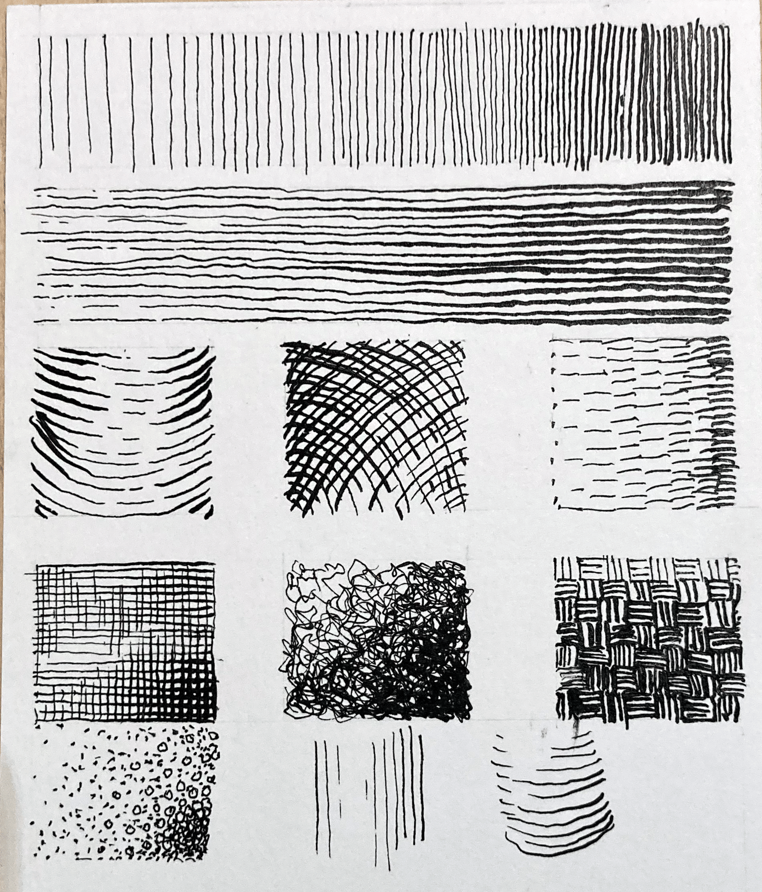
For the textures, form, line quality and value practice, I used Strathmore Bristol 300 series paper, a Speedball 102 crow quill, and Yasutomo black sumi ink (because I had it) :)
Obviously, these are not without some mistakes and messiness (which were great learning tools also) But the more I used the crow quill the more I liked the range of pressure dynamics it provided to make my thick to thin lines. Of course there are many nibs to explore but so far I like this crow quill more than I liked the Speedball 99.
So...i have to admit, while I did start to thumbnail an idea that I am working on, things weren't going very well, and I just couldn't get my initial designs to not look cluttered. I guess I was using too many elements or the sizes weren't quite jiving. As I was doing research on the subject matter of my drawing, I came across this photo on pexels.com. I immediately had to draw it! :)
I used a decent resume paper (120 g/m2) and drew out my underdrawing. Just like Chole, I think I lie somewhere in-between heavy detail and just simple outlines, but still leaving lots of room to let the pen talk, not just parrot my pencil. Because the paper was a little thin, I DIDN'T use dip pen, as I was worried that the quill would score, or even tear the paper, so I "cheated" and used micron (08 and 01) pens, except for the black area, in which I brushed with a #2 red sable brush. Still...I think it still shares similar techniques that Chole's workbook describes - line following form, hatching, cross hatching, missing edges, etc. What do you think?
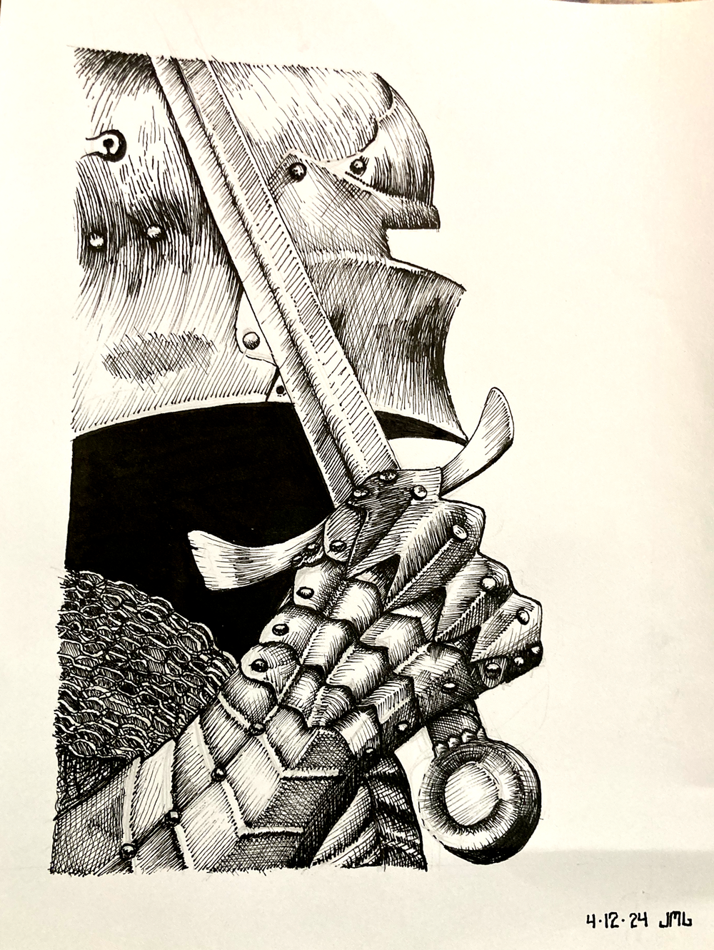
I still have plenty of questions, and hindsight, I can see many mistakes or things I could have done better, but still...I'm proud of the work!
Chloe - feel free to offer up any critique, but also...
It seems I struggle with representing convex and concave shapes. In the sword, the fuller (center part) is supposed to be concave but it looks convex. Same with the hilt - the center is supposed to be convex but it looks concave. Any tips?
Anyway - I look forward to other classes you plan on doing concerning pen and ink art, and I plan on doing deeper dives into your PDF and trying to find ways of incorporting more of these steps into ALL my pen and ink projects.