Transcripts
1. Intro: Hello and welcome.
My name is Wilson, a content creator and a graphic designer with
seven years of experience. I'm going to share with you what I've learned in the years. And we're going to use
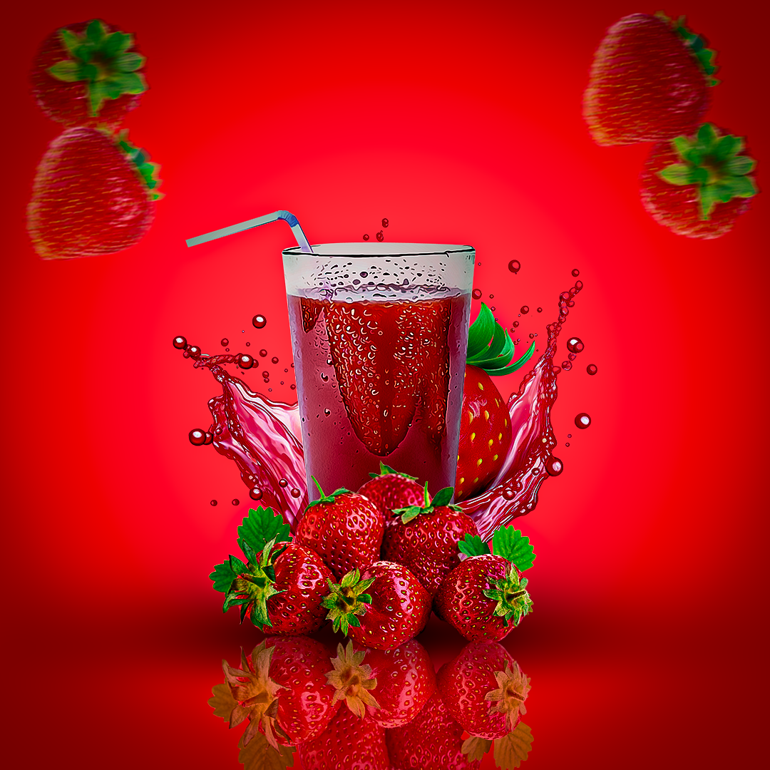
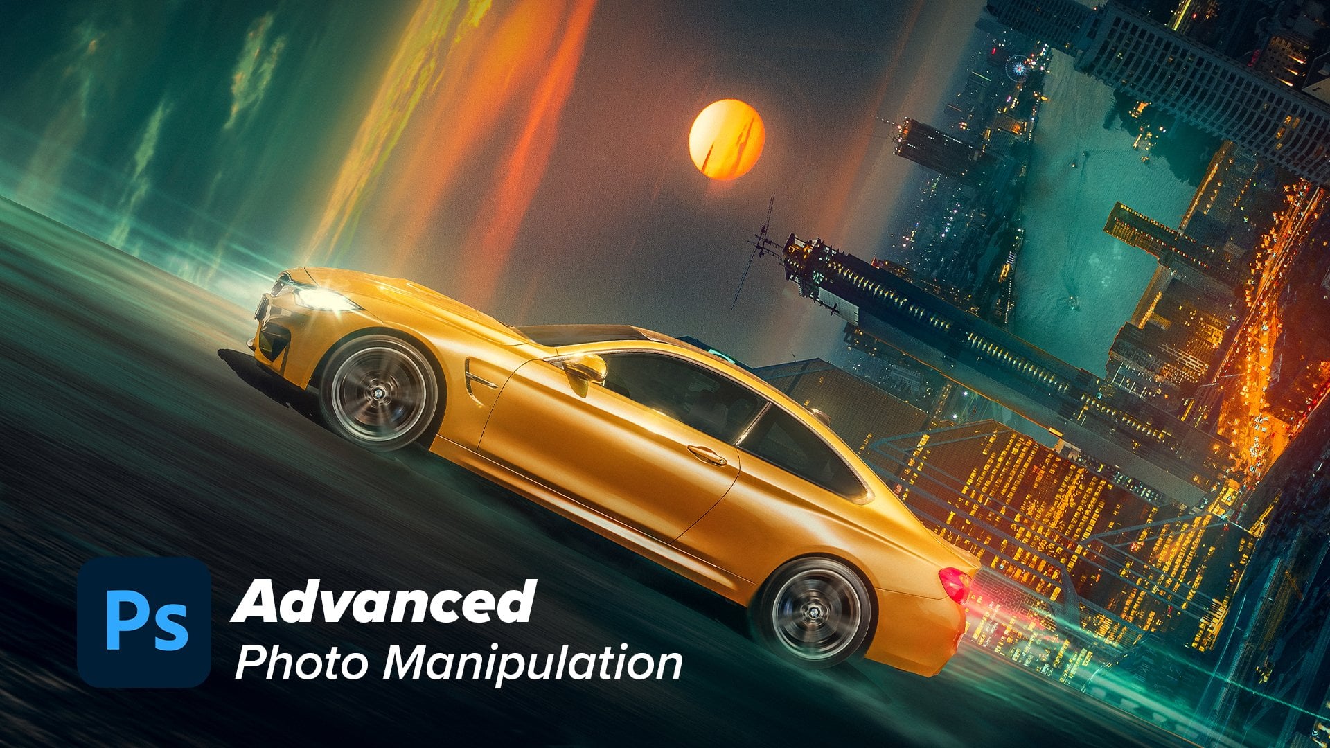
this cues to create a photo manipulation just like what you're
seeing on the screen. This course is going to
be step by step tutoria. And starting out we are
going to start with the color fuel which happened
to be the background, and then we're going
to go ahead and add a little bit of gradient. And once we have ingredient, we're going to add a
little bit of curve to reduce the sharpness
of ingredient. And once we've done that,
we're going to go ahead and insert the by this berry
with the splanche. And once we've done that,
we're going to go ahead and add a cup to again to
adjust the highlights. And once we've done
that, we're going to go ahead and add this cup. We're going to go ahead and add adjustments to the curve
to reduce the brightness. Also, once we done that, we're going to go ahead
and add the berries. Again, we need to create
a mirror efforts. You're going to
know how to create this mirror efforts if you
don't know how already. And once we've done that, we'll add an adjustment layer again, berry, to make it a
little bit darker. And once we've done that,
we're going to go ahead and add this fluting bearing. Okay? It's going to be as
if they had emotional. We're going to go ahead
and add all of this. And at the end of the day, once everything is like this, to summarize and to give more
depth to what we created, we're going to go ahead and
add a shadow just like. And at the end of the
course, the last thing we're going to do is to go ahead and coocorate and
colo, grade our composition. And at the end, the
result is going to look something just like this. I'm going to walk you
through step by step. And at the end of the
day, I'm going to give you all the material that
we use in this course to allow you to go out there on your own and repeat
the same process. You're going to have
everything available. And the last thing
I would like to tell you is that after
washing this course, I don't want you to
fold your hands. I want you to go out
there and recreate a photo manipulation
just like this. And having said this,
let's get it started. Hope to see you on the course.
2. Background: The first class of this course, we're going to start by
creating our template canva. In this case we are going
to be using this square. In this case I'm going to
be using tent by tent. Pus. Once you choose
it like this, you want to come
out to Ss Create and you want to
hit an up button. We're going to have a
Canva just like this. Firstly, we want to create
a background using Colt. If you come about this
place and hit an Up button, you're going to
have solid color. And if you hit an Up button, you're going to have your
color change just like this. You want to change
this color to be red. And to do that, you
want to come out to the colopica and
select the red color. If you have it like
this, just hit, okay. Your Canva is going
to be like this. And the next thing we
need to do is to add some gradient to this background to add some dirt to the color. And to do that we want
to come by gate to the same place where we
initially selected our color. If you hit on bot in
the gate you convert to SS gradient and you're going to have your
gradients just like this. But this is not what we need. We need some white
or some pick, okay? And to do that you want to
come over to SS gradient. If you hit on that,
you're going to have this window right here where you can customize your color. I want to start by hitting
on this black color. I come over to SS color. If I hit on it, it's going to bring out the
color, picking Gay. And then I'll just
go ahead and hit on here. You can potentially choose
any color of your choice. I'm going to be using
this right here, that seems like a pink color. And once you do it this way, you want to hit on, okay, I want to repeat the same thing with this one right
here, the black color. If I should hit on that,
it's going to bring up a Colopicka and I'm going to choose the exact same
color and hit on. Okay, once we have
a color like this, you want to go ahead and close this gradient editor
by hitting on. Okay, now we want to make
our color to be at the center of this image. And to do that you want
to combat SS linear, our combat S radia. Now our color is B, positioned at the
center of our canva. If you want to spread it out. If you want to spread it out, you want to combat S skill. If you drag it odd way up, it's going to feel
everything like this. If you drag it odd way down, it's going to reduce
inside spots. You just need to fit it
in a place that it will nine to you, like
this is already okay. And once you've
done that, you are satisfied with what
you've choosing. You want to go ahead and hit on. Okay. And now I want to reduce
this color a little bit. I will go ahead by coming to the adjustment layer and
add the curve adjustment. Okay. In this case, I will just go ahead
and clip it to the two color I just
created to the gradient. And now I can reduce the
size of the brightness, just like this
deliting that I need. And with this, our background
is already served.
3. Composition: Hello guys and welcome
to this class. In this session, we're going to start by adding an element. And we're going to
start by adding our berry splash right
here, don't worry. At the end of this
course, you're going to have the whole
material that we use in this video in creting what
we're about to create here. Okay, now I'm going
to add this berry. And what I need to do is to hold down the shift button and resize it just like the way
I'm doing it, like this. Okay? And once you
resize it to the center, I can still resize it again
and let it be just like this. And once you are satisfied with the dimension and the
size of your element, you want to go ahead and hit on this button, the okay button. And now you're going
to have it like this. And again, I want to
add the cup in case if you're wondering where I'm
dragging my photo from. It's just that I'm
using two monitors. I'm dragging it from
the other monitor. And if you're so
curious about it, I can just show you like this, This where I'm dragging
the image from. Like I said, at the
end of the video, you're going to
have all of this. But since I'm working
with two monitors, I don't want this to be
a distraction to me. So I'll just drag it
to the other monitor. Now I want to hit
okay, from the cop. And we're going to
have it like this, just like we did before. We want to go ahead
and resize the cop. There is no rules to this. You can just do it
the way you feel. It's okay in your eyes. And most of the time, instead of me zooming in and zooming out, I can just be seeing
my work right here. This little canva is still showing the same thing
that I'm doing here. Okay? And once you know
that, you can then hit on this arrow button or just hit on Enter from
your keyboard so that you can be able
to move this around. Since it's like this, I
want to make this drink to be at the front of
this berry right here. And to do that I want to hit on the cop and make it
to be at the top of the berry in the
way that I can have my cop at the front
of the berry splash. And the next thing to
do to make your work organized is always to
rename your layers. And once you have
it like this, now I want to go ahead
firstly to add the shadow and the contrast
to the arbery right here. And once you hit on the layer, you want to come back to
the adjustment panel. And here I want to
add the curve to. And once you hit on the
curve to remember to always clip it to the particular
layer in question. And now I just need to
add a little bit of contrast by removing the
highlights just like this. And that's okay for
me and for the Cop. I will still go
ahead I come back to the adjustment layer and
add the curve adjustment. And again, I will just go ahead and heat on the clipping man, so I can clip it only
to this Cop layer here. What I need to do is to decrease the highlight
of the Cop like this. And once you have it like this, I want to go ahead to the mask and once you heat on the mask, convert to the brush to and
choose the black color. If your four grand color
has different color. Just to go over these
two color right here is going to
return to the default. In this case, I'm going
to be using the black to erase some of the parts
of this scope right here. I want to hit on B on
my keyboard so that I have the brush to hold
down the alternative. And right click, drag to left or right to increase
the size of your brush. Something like this is okay. The next thing you
want to do is to increase the opacity
of your brush to 100% and increase
the flow to 100% as once you started painting, you're going to see the color
is becoming more bright, just as we are doing right
here. Just like this. We want to increase
the brightness of this part just
by doing this way. And this same part as well, increase the brightness just by doing what I'm doing right
here, just like this. And now we are set
with the two images. But that's not all.
I want to hit on V again to have the select two. I want to hit on the cop and
then add layer mask to it. I want to go ahead and
hit on the layer mask. I come back to the
same brochure again, select the same black color. I want to erase some part of
this cop, and by doing that, I will go ahead again and
hit on B from my keyboard, reduce the size a little bit. And now I want to start
painting this part right here, this part that I don't
want to show up. I want to start painting
it just like this. If your brush is too harsh, you can decrease the
opacity and the flow. That is the same thing
that I'm doing here, decreasing the flow in the way that it's not
going to be too sharp. Just like this. It's
looking a little bit okay. It's as if the cop is
already inside the splash. That is all for this video. I'm going to see
you the next video and we'll continue
from where we stop. Hello guys and welcome
to this video. In this video, we're
going to continue from where we stop
this time around, I'm going to be adding
these berries right here. That's going to
cover all of these. Firstly, I'm going to hit
Enter from my keyboard, and I don't want this
berry to be at the bottom. I want to drag it to be at the very first line
of layer panel. And if you have it like
this, you can see there are some whitish
color right here. We don't need those
whitish color. And if we want to remove this, we just need to come
over to S layer mask. You want to add the layer
mask to the berries. And double click on
this layer mask. You're going to be on
this window right here. You can just convert
to the smart radius. Hit on the smart radius, increase the smart
radius a little bit. And now you want to
come overt to SS, select Subject with a little bit and lead Photoshop to
remove this whitish color. When it's done you can see
the whitish slow is no more. Always make sure that your
output is set to layer mask. Once you have it ladies
you want to hit on, okay, and then you're
going to have a ladies. Now I want to go ahead and
resize the strawberries. At times I might
call it Fragoli. That is the Italian name. But don't worry,
it's the same thing. I speak Italian every day, so I might be mistaken
some ways from strawberries and frag
body and the same thing. Don't be confused once
you have it like this. I want to go ahead and reduce the size a little bit again. And remember, if you're doing it this way, you can
still be seeing your on this window right
here, and this will give you more clarity of
what you're doing. I want to go again
and reposition it in the way I believe
is going to fit. There's no rules in doing it. Okay? Just do it the way you like and the way it
looks good in your eye. And once you have it like this, I want to go ahead again. This already renamed strawberry. I want to go ahead again and
add the adjustment layer. I'm going to be using the
cove adjustment as always. And always remember to clip it to the layer in
question and now what I'm still going to do is
to decrease the highlight. Okay, I want to
decrease the highlight just like this, don't worry. Even if the color
is not matching up. Right now at the
end of this course, everything is going to match up. I'm going to have
it just like this. The next thing I need to do is to duplicate these
berries right here. And by doing that, I'm going to hit on Contro J
from my keyboard. Or possibly you can
just hold down the opt and drag this, but
I'm going to use control G to be
on the sale line. And this just a copy of
what we just duplicated. And now what I'm
going to do is to hit on control from my keyboard. And once I done that,
I'm going to write click and converts,
flip vertically. Once I done that, it's going
to be on the sale line. With this, I'm going to
drag it down to resize it. Okay? Drag it down
just like this. But I want each of them to be touching at least each other. For that I'm going to hold
down the control button. Okay? And I'm going
to make this to at least be close to the
upper one, just like. And then I'm going to
have it like this. The next thing that
I need to do is to combat to the layer
of the flip berries. And then I'm going to
come over to the mask. Once I'm here, I'm going to come over to the
four ground color. I make sure it's black. I'm going to select black. I'm going to hit on
from my keyboard to select the brush to hold
down the hot button. And right click by dragging to the left side is going to decrease the size
of the brush two. In this way I want to erase some part of the flip berries. And what I'm going to do
is to make the opacity to be at least 100 and the
flow to be at least 60. And now I'm going to paint over, measure for grand
color is set of black. And now I'm going to paint
over to delete some part of the berry that is flipped so that you should not be
shadowing the upper one. Do it like this, it makes
a little bit sense. Now it as if the upper one is at the top of the
flipped berries. And now I'm going
to hit on V from my keyboard and convert
to the opacity. I want to decrease the
opacity just like this. If you are looking it here, it might not be like
mirror inferred, but if you check it over here, you're going to see that it's exactly like a mirror inferred. You can still
decrease the opacity a little bit, just like you can see the way it looks. There are many ways
to make this effort, but this is one of the simplest
way that you can do it. This is it for this video. And in the next video we're going to continue from where we.
4. Floating berries: Hello guys, and welcome to
this session of this course. Here we are going to be
adding the floating berries. And to do that, I will
just go ahead again to my file and drag one
of the berry out. Just like this. Firstly,
you want to hit on A, and you can decrease the size
of this image right here. And once you have it,
just hit on again. Now we want to select, I want to select some
of the besse berries. And not this splash right here. I want to select it one by one. I don't want everything
to be joined together so that it can be
customized eble later on in the video. And
for me to do that, I want to convert
to the selection two and hit on the
quick selection two. In that way I can be selecting
everything individually. And if I hit on this,
I'm going to have it just like this already.
It has selected this. What I need to do is to write, click and convert to
says layer via copy. In this way it's going to
be on it, layer alone. And the same thing, I'm going to select this one right here. And once everything is
selected, I want to write, click and convert to
As layer via copy. The same thing with this if
you want to select this, but this two is
already okay for me. Once I done that, I can hit on Selection to again and delete every Latin just like this to remain this tool that we can
use for the floaty design. What I need to do right now is to decrease the size of this. Do it in the way it
looks good in your eye. There's no rules in doing this. I'm going to decrease the size and place it just like this. And again, I can hold
down my hot button, drag this in that way I'm
duplicating that layer. And the same thing with this. If I hold my O to, I'll just drag it, is
going to be duplicated. And what I need to
do, I want this to be in front of this odallayer. To do that, I want to drag it down and have it just like this. The same thing is going to apply to this and the other one. I want to drag, make this
to be up in that way. It's going to look
as if it's floating, as if it's falling gradually. Now what I need to do, I need to first select
the very first one and go back to the Feta
and combat to SS Blue. And once you hear you want
to combat to Gasha Blue, you can use the Gausha
blue or the Motion blue. I'm going to be using
the motion blue in the scales, okay? And I want to decrease the distance and the
angle a little bit. Something of this
nature is okay. I want to go ahead and hit on. Just going to repeat the same process for the four berries. Stay on. Okay. Sell
this one right here. Go back to the Fear Blue. Mhm. Blue. Okay. It's
okay, like that. And convert to the last one. Again, convert to fears
blue, mushem blue. You're going to have
it just like he. Okay. Now it's
looking a little bit okay and that is
all in this class. I'm going to see you
in the dance class and we will continue
from where we
5. Shadows: Hello guys and welcome
to this video. In this action, we're going
to be adding a shadow to this image right here to add more depth to
our composition. Okay, and to do that firstly, I want to go ahead and
hit new layer right here. And this layer, I want to
make it to be the very first. I want to drag it down. Started from the first very, I'm going to have the layer
right here, just slides. And what I need to
do is to hit and from my keyboard to
have the brush to. And I want to go ahead and hold down the hot button,
right click, drag right to increase the size of my button,
just like this. I want the size to be
very big, just like this. And what I need to do, firstly, you must make the four grand
color to be black, heat. Okay. Now come over to
the flow and make it 100% And the opacity two should be 100% The smoothing doesn't
really matter in this case. And you just want to click
once, just like this. You're going to have
it just like this. And now I want to hit V again from my keyboard to
have the move to. What we need to
do is to decrease the size of a shadow
by doing it this well. Okay, I like to drag it from the P. You want to drag it this way, and the same time it's
going to be complex and make it in between
everything your like this, you can still squash
it a little bit and make it fit in
like this and heat on. Okay. Now you can see there
are some lines in this, our shadow of which
we don't need. It doesn't make sense
until remove this line, you want to go over to Victor. Okay, I convert to blue. And once you here,
you want to convert where it says Gha blue. If you're increasing the size, the line will be gone. The shadow will be expanded in that way is going
to be more natural. You do it like
this. The line has gone and the shadow
has expanded. Those, we need it. You can see there are a lot of depth already on
our composition. You can have it
like this and heat. Okay. The next thing
you can potentially do is to decrease the
opacity of your shadow. You can decrease it a little
bit and not too much. Not too much. Just like this. You can see how the shadow is. I can still, again,
move it a little bit. Just like this with
the mirror efforts. Everything look beautiful to me and I don't know about you. What I need to do right now is to hit on these strawberries. Once I hit on these
strawberries, I unaccompa to the
adjustment layer and add the curve adjustment. Firstly, I'll go ahead and clip it to the strawberries
in question. And now I want to decrease
the Highlights Jr, like this. One of the highlights
is something like this. What I need to do is
to hit on the mask of the adjustment layer
and convert to the brush to Michel is black. Michel is black On. Okay, hit on from your keyboard. In this wheel,
you're going to have the brush to minus too big dies, mirrors in its showing floors. Hold down the opt button
and drag to the left. Right click and drag to the
left. It's still very big. The same thing now
it's too small. Drag it just like this, you're going to
have it like this. Both the opacity and
the flow should be 100% And if you're painting
over it like this, the color is going
to be revealed. A Gale, We just want the shadow, the bottom shadow to match with the shadow that we inserted. That is my reason why we
decrease the color at first. And once you're
on this position, the next step we can potentially do is to go at to the flu. In this case, I want
to decrease the flu to be like 20% and test it, the opacity if it's
being natural. And what I can do again, is to convert to the opacity and decrease it to like
50% just like this. Now I can in some of the shadow and I don't
want it to be very sharp. So at the mid shadow
we add is going to make everything
to look natural. You can see the
damp part is dark and the upper side
is very bright. This is the result we want to achieve in spite of seeing it. If you zoom out, you're
going to see how it look. You can see how it
looks very beautiful. To me, it look beautiful,
but I don't know about you. Once we have it like
this, we need to go into the last step
of this design.
6. Color correct and color grade: For the last step
we are going to be color cout and color
grade our design. You can do it individually or just use camerao
to do everything. In this case, I'm
going to be using the camero in Colo
and Colo grade. In most case, you
can use some of the adjustment layer first and then go over to the camero. Both since I have had some
adjustments during the design, I will just go ahead to Camerao. For me to have
everything collectively, what I need to do is to first
hit on the first layer on the layer panel and you want to hold shift control alternative. If you do that, everything is going to be in a single canvas, just lines this is here, these are all our layers. This is the single representation
of what you created. Firstly, I want to write Click a Combat Web says
Convert to smart Object. We want to have it at a smart
object so that we can only adjust the color that
we are about to use. Okay, if I hit on Zed, I want everything to be
on the screen just lines. Now I want to
combat Wess fitter. If you want to add
some round design to what you just created, you can double
click on the layer and you're going to
have the layer style. You can just go ahead
and see something like inner shadow to make it
be as if it's a frame. And on the inner shadow, you can choose any
other color from here. But certainly not the same
color of your canvas. Red. And if you choose
something like green, this is not necessary. This is just for
personal preference. Okay, I'm just doing this
in case you might want to. On Ok and come over
here and hit on Oke. Now convert to the Feta and convert to camera Fetter
on the camera Feta. You want to talk
about this button. It's not compulsory,
but I like to see my work before and after
of what you're doing. Firstly, you can come
over to the light. There is no rules in doing this. You can list, play
around and see what is good in your eyes. That's what you're
going to follow. And in spite of that, all images are on the sale and
convert to the white. Increase the white a little bit. And the black, I can
decrease it a little bit. Come back to the color. I want
to increase the vibrance. I don't need the saturation and the tint make it a
little bit more green. Come back to the first
come to the first, I want to add more
texture, okay? And add some clarity to give
you that sparkling look. And once you have it like this, I want to come back
to the color missile. And once you hear, I want to increase the
green for the leave. The red is already okay. You can increase the
green a little bit more, but again, I want to
come back to the light. I want to increase the contrast a little bit, just like this. And now the next I need to do
is to come back to details. And for the details I want
to increase the sharpening, The sharpening to be something just like this and
before and after. There is a little bit different, but it's still worth it. And once we do it that way,
you want to hit on, okay, And you're going to have
your design just like this, this boat we just
created right here.
7. Outro: And this is our final
result of our design. I'm going to leave you these images right here that you can potentially use to recreate
the same thing on your own. If you're already a pro,
that's an advantage. But if you're just starting out, don't just watch this video. Unfit to relax.
Watch this video. And go out there and create the same thing using
just these four images. Just as the way I showed you
in the video step by step. And I can't wait to see
what you come up with. And don't forget, once you make your project,
you make your design, don't forget to
upload it so that we all can see what you are
able to come up with. Having said this,
we're going to call it a Chase piece out.
 OBJ Graphics, Digital Artist and a Content Creator