Transcripts
1. Welcome to a wonderful class: Welcome to a new and refreshing
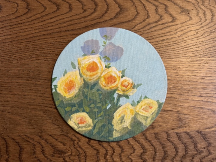
acrylic painting class. Today you will be creating this wonderful garden of roses on a round
canvas. Don't worry. If you don't have
a round canvas, this design works on a square or rectangular
canvas, as well. Hi, my name is
George, and I've been a professional artist
for over ten years. Six years ago, I've fallen
in love with teaching. And ever since then,
I've done both online and in person classes
with children and adults. Developed a very interesting
way of teaching that focuses on making engaging and fun
projects such as these, while at the same time, learning about key concepts in painting, such as composition,
brush handling, color harmony, and many more. If you are ready to explore your creative side and
have a lot of fun, let's jump into the class.
2. Materials needed: And welcome to another
beautiful painting session. Today, we will paint some roses, a garden of roses, just around this area. And for this, you will
need some materials. You will need a cup of water. You will need a mixing plate, and, of course, some paints. This is Amsterdam acrylic paint. This is titanium white. Brilliant blue. Carmine red. This is a red that works
very well with yellows, and this is Azo yellow medium. In case you don't
have azure yellow medium, use lemon yellow. This is just a yellow,
a lemon yellow that has a bit of red into it. And of course, burnt umber, also known as brown. You will also need some
brushes a big flat brush, a small flat brush, and a bit of a flat
brush that is rounded. If you don't have
this medium brush, you can also use
just the two brushes or use a medium flat brush. This is just so we have
an assortment of brushes. You'll also need a sponge. You can use a kitchen sponge or a painting sponge
just like this one. Just be careful not to use a
very huge sponge like this. Size does matter in this case. Small, nimble, and fast. And some paper towels. This design works on round
canvases or square canvases. You will just have to add a bit more background
to the corners. This is just a square canvas or a rectangular canvas with
its corners cut out. So it's not difficult to adjust the composition if you
don't have a round canvas. Okay. Optionally, you will need a hair dryer in order to
dry the paint faster. It really helps speed up
the painting process. And that's all you
need for this course. Before we go into the course, you will need to understand some key concepts in
regards to materials. This sponge is very good at making very soft and
nice backgrounds, super, super fast and easy. You just go like this
and you start to fill in all of the painting
quite easily and fast. The big flat brush
is used to make big, nice cuts and create
interesting designs. The smaller one should be used just in 10% of the painting just to add a few details that make the painting
more interesting. And the medium brush
is just for having other brushes in order
to change color palette or have a lighter color that
you can already use in case the big brush is filled with
a darker or lighter color. So you can change either
hue or shadow and light. The beautiful napkins
are used to clean up the brushes and
also to clean up some of the paint off the canvas in case we do some mistakes, okay? And that's all you need
to know about materials.
3. Light brown wash and sketch: Can use the beginning
of the painting to get familiarized with the
brushes and the sponge. To do that, we will need to add some brown to
the mixing plate. Not a lot of brown, just a little bit
of brown over here. And let's jump into the sponge. Get some water, just
a tiny bit of water, and some paint, not
a lot of paint, and start making the
wash onto the canvas, using one side of the Sponge, you can start to move around. If you need more
color, just add it. It's very easy to create this wonderful light brown wash. This is just because
you will need to have a different color
than the white that is on the canvas so that
your mind doesn't get tricked into painting
darker colors than you need to. Light colors will seem very
light on this brown wash. I don't know why it has this
texture, but it's fine. We're gonna it's probably
because of the canvas. It's not a very
expensive canvas. Just fill in the canvas with
this color with the swash. And then you can squeeze some of the water
out in case there is any, and then go ahead and take some of the water
out of the canvas. You can go side to
side in order to create a better texture
onto the canvas, more homogeneous texture, not to be confused
with homoclous. Okay, can start to see the beautiful textures and the beautiful speed that
this sponge gives us, and it can be a very
good tool to just paint and make very fast and
loose gradients and washes. I don't think the small
dots are an issue, so we're just going to start
by taking the medium brush. In case you don't have
the medium brush, just take the big brush
so that it's easier to create to do faster sketches. We're going to start
by doing the sketch. The sketch is very simple. We're going to have two
roses right over here. Notice how the paint is darker. This is the middle of the rose. And then on the side, we're going to
start to have cuts. Just geometric cuts just going like this, but
notice how they are. This one is a bit curved.
This one is like this. And we can use this corner to add a bit of a
corner like this. Just creating more
interesting shapes. Now here, you can go with
a different kind of line, a C shaped line going this way and going back
towards the end, connecting those
lines like this. That's the first rows in case
you want to make it bigger, which I will, just add a
double line just going around. Perfect. Now, this
is the first rose. The second rose will be next
to it and in front of it. So we can start right
over here over. Let's determine the
beautiful center of the rose right here. And taking some of this paint
because it's way too dark, let's take it from
here and start adding it around the rose. We can add it and make
some more interesting. Like, this is rounded this way. This is rounded this way, and it makes a beautiful
corner right over here. We can even accentuate
it and make it bigger. And we can go down with a line making another
corner over here, make a round shape over here, go the opposite way
and connect it. Can add more color to accentuate
the middle of the rose. These are just the two roses, the sketch for the two
roses, simple and easy.
4. Getting familiar with sketching: Let's go and create some more loose and easy roses right at the top,
starting over here. This is a very simple shape. It's like a cup, just like this and add
it to the outside. Let's make it a tiny bit bigger. It has a bit of an
angle over here, a bit of an angle over here
and a curve on this side. Now, this one is going to be the same but a bit more fanned out. And it's going to be very close, almost touching and
actually touching this. So it's a cup. It's
more like a bowl. It has this shape, two sides, and then on the top, going like this,
covering it all. We can also add a
bit of a circle at the bottom and make
it more interesting by making this edge be a little bit more jagged,
like make Jagger. Let's add some more brown and a touch of water with
the corner of the brush. And this one is almost the same, but it has like a petal
just going this way. So let's start it, but
it is angled like this. So it's going to have two sides a beautiful circle
at the bottom. And then it's going
to have on the top, it's going to be a
bit more different. It's going to have
a round over here, a value over here and
a round over here. Let's make this a bit taller. And now for the petal, just to make it
different from this one, we're just going to add one
petal just going this way. And then maybe let's add another one in the
background here. Perfect. Now, these will be
connected with some stems. We can indicate them, but you don't really need
to indicate them. Let's make another beautiful
rose this time on this side, but a bit more small. And it's behind this. So let's add the center. This center will be like American football going and making an American
football over here. And then going with some edges. It's going to have an edge
over here. It's like a cup. But we can see
inside of the cup, and it has a bit of
a petal going up. And then let's do the
cup. So it's simple. Let's make another
petal just going this way and another one
going this way. These are very simple shapes. It's just a beautiful
shape just like this, and this one is more
of a triangular one and another one
going this way. That's the rose over
here, and of course, we can add another
center on this side. This will be an angle like this, and it will have a center
of the rose like this. Maybe let's make
it a bit more far. This is a very good
way to familiarize yourself with the marks that
you can make with the brush. Like the big brush
can make cuts. It can make C shapes. It can make big interesting
shapes like this. It can also take
some paint away. You can take it away by
scraping it on the cup. Just take it away,
add it to the cup. You can also use some napkins. Just make a small little
ball and you can add some interesting highlights if you want. You don't need to. I just showed you what you
can do with the sponges and the brush so you can understand some brush
handling techniques, the secret brush
handling techniques. Okay, and the step is over. For the next step, you're
going to do a bit more sketching on this side, making two more roses and
a few more over here.
5. Finishing the sketch: Okay. Continuing with the sketch of the roses onto the left side, let's take some brown. Let's accentuate the
middle over here. And it's the same cup design just on an angle
and then like this. And maybe this one has a petal over here and
it closes like this. Okay, perfect. It's a very simple shape. It's just like almost
an American football, but it is more rounded. Okay. And let's make another petal going behind
and over here. You can accentuate by taking a little bit of a darker color. You can accentuate
the edge of the cup. The edge of the cup, and let's make another
petal over here. Okay. And now let's
focus on this area. Let's make another football just going this way and
making it like this. Let's add a petal right over here and another petal just
over here and make the cup. The cup should be a
bit bigger so that this petal is also a
bit onto the side. Let's connect and
make this a bit more round. It's not visible. The center of the rose
is not that visible. So you can take some napkins. Rather than making it darker, you can take some napkins and
erase some of this color, go back with the dark
and add it like this. You can also break down the brush marks and make
them more textured. Even though it's the same shape, you're just breaking
it down so it has more of an interesting look. Maybe it's the middle of a rose. In fact, it is quite
the middle of the rose. This is a very simple way
to create complexity, even though you're
basically making the same shape so instead
of adding complexity, you are taking it away and
putting it back the same way, but with a broken brush
mark, a broken line. Instead of a flat wash. Now, that's right over here. And let's add a bit more of
a petal just going behind. And another rose. Let's add it over here. And add a simple
round and going down. This is just a very
far away rows. It doesn't need to
be very complex. We can add some complexity
by taking the middle away, building some of
that texture there, and then we can add the
complexity by making some cuts. Just some cuts over
here and over there. Just making a beautiful
cut like this, one like this, and then
following the middle. If you cannot see it, I'm
going to make it a bit darker so you understand
what was done. So it's a small
little shape here, another line over here. Notice how the brush is open, but it doesn't
really need to be. And then another one over here, and then continuing to
add some of these shapes, going to the side, remaking
that metal more interesting. Now on the side, let's
focus on the edge, making it more weird. Instead of a round,
it's a bit more weird. You can do that
over here as well, creating this jagged line, this weird, interesting edge. And over here, let's
take some water and make almost the same thing just going and creating some more
interesting outlines. So notice how it's not
a round shape anymore. This is all the shapes of
the roses that you need. Maybe we can make another
one over here very fast, making a round shape like this. That's all you
need for a sketch. Okay. And those are all the sketches that
you need for the roses. In the next step, we're
going to start to add some darker and lighter colors.
6. Blocking in the dark: Now we're going to focus a bit more on the dark and light. You can take the middle
brush or the big brush. It doesn't really matter. The light will come from
the right hand side, so we need to add some darkness, some geometric
darkness to the roses. You can start to make it
as a patch like this, just to notice how the dark sides compare
to the light sides. It's easier to just go down
with some brush marks. And create some dark this
way so you can group them around and understand
what is the light? What is the dark in a
more coherent manner. You can make it even
darker if you want, but it's not really
necessary only in parts that are not so evident. So this one has a dark
part in the middle and on the lower side,
this one the same. It's quite a repeating pattern. Let's make this circle a
bit more like smaller. It's squished. I
squished it like this. So we make it more
different than this one. This will be straight
looking at us. Now on this side,
this one is going to have dark onto the
left and bottom. Basically, all of them
have dark in the middle, the left, and the bottom. I'm just covering it all
up and I'm going with light up and down motions to create a more flat dark side. Notice how this is very round. We can change that up
and add a darker side, just maybe adding just
a small little corner you can start to
work a bit more on the edges into the dark side. Welcome to the dark
side. We have cookies. Okay. At the top, we don't need to do
any of that because those are gonna be
a different color, and basically they are just
going to have the dark side. They're gonna be shadowy, a bit more light
than these ones, they're going to have
a lot less contrast. So that's why we don't need
to put any shadow on them. Now, for this one, we're
going to have to add into the middle and then the
bottom, and then the side. Accentuating just a bit
more of this petal, sticking out and
this one over here. So we can have a beautiful rose. Now, this one is going
to have a bit of a more tricky shadow. It's going to be lines and
then a flat over here, and then just add some squiggles just to make the shape a
bit more different. It's going to also have
some shadow in the middle. You already have done that, but you can do it and accentuate it a bit more at the bottom. Perfect. Now, taking some
more brown to do this one. This one is going to have
like a round over here, and the shadow will be onto the bottom and a bit
onto the middle. And maybe it's going to
have a petal like this. You can also do some cuts. These will be very
interesting to make. You're just going
to add some cuts around the rose
in the dark side. Just to make it more
rosy and over here, making it darker and over here. Now, this one, the same way, cuts, overlapping
almost like zig zags. And in this one, we can have just going around the shape to create
a beautiful rose. And that's all that
you need to do for the sketch of the roses. In the next step, you'll add the background and some
foliage with the sponge, so we can create a
very fast background. You don't need to let
the painting dry.
7. Cerulean blue sky: Okay, now we need to find a way to clean up this brush
by taking some napkins. It's always good to
clean up the brush. And then for the plate, the cool trick you can do is take some water with the napkin and erase all the watery brown that you've added over here. For the background, we're
going to use some blue, some white, and a
touch of yellow. Let's make sure we have all the paint at
the bottom of the thing. Don't put too much. You
don't need this much blue. You will need more
white than blue. It's gonna be a very
light baby blue. The yellow is there just
to mix up the paint. We're going to do
the mixing with the brush, the big brush. And then afterwards, you're going to apply
it with the sponge. Okay. Even though it
has a bit of brown and the water is a bit browner,
it doesn't really matter. It's actually indicated because this brown will cut out
that color a tiny bit. Let's add gradually
add some blue. That's a lot of blue. We need a very, very light
colour, light blue color. Let's add some yellow. Just making this blue
baby beautiful blue. Now, you're not
going to use water. We've already added
a bit of water, but in the sponge, it needs to be
completely dry and it needs to have a clean side. You can also add the color with the brush like this
onto the canvas. I'm not going to
worry too much about these speckles of I
don't know what it is, and taking some of this paint
and adding it to the side. As you go towards the roses, you can go a bit
inside of the rose, just a tiny bit
inside of the rose. You might need to do two
layers of this paint. Don't worry if you cannot
match it perfectly. Add it. In case you don't have a sponge, a brush will work as well. Okay, so the speckles are
gone almost entirely. So they go away. Oh, no. I've taken a bit of
blue on the sponge. Let's add it there. It doesn't matter because we're gonna do two
layers anyway. Just going around
these roses and making the paint just overlapping
the sketch, just a tiny bit. I've taken some blue. This is why the
sponge is so good because even if you
have some blue on it, you can notice how easy it is to blend it in the painting. If you don't want
to make two layers of paint, you don't have to. You can have just
one layer of paint. Let's go a bit lower. Maybe we have some light shining
through the foliage. You can have one layer
of paint, and it's fine. You can also take the brush, make the color once more, and have the second layer, add it with the brush. You've done the big
part with the sponge, and now you can do the
lighter parts with the brush just going
around the roses. Let's make this
petal once again. And focus a bit more
on making a clear, nice transition and not
having streaks like this. Gently go with the brush over so you pick up
some of that color. Can do this with the brush. If you want to do
only one layer, it's way more Easy. You've done the big
part with the sponge. You have some blue already
present on the canvas. Don't worry too much if you
went to inside of the roses. It's fine. You're going to add some colors over it anyway. Let's continue a bit onto
the lower right side. You can take some
more white and add it to the lower side
of the gradient. The sponge acted as a sponge, and it has taken away
all the moisture. So now when you apply the
second coat with the brush, it's way easier to just blend, and it already has cut all
of the brown in the canvas, so you have a more coherent
gradient and color. You can go a bit more
blue on this side. Notice how it's not a
very intense gradient. It has some variations,
but not a lot. It's a very nice
and clean gradient. If we can clean these speckles, these unknown entities, let's
focus in on the right side. And at the bottom right
over here to finish the wonderful color
from the palette. We're just adding it.
If you have streaks, try to brush a bit over so you don't have any
because texture will be used in the end to add to the roses some
beautiful textures. Okay? So it seems like we've done the whole background with just one layer if you use the sponge and the
brush. Perfect. That's all you need to do for the background at least for now. And we're going to start
to add some foliage. You don't need to
let everything dry, and you actually
need to have it wet. So let's go and add the
foliage in an easy manner.
8. Painting cheat codes: Before we start on the foliage, notice how you've
done almost 30, 40% in a gradient. That's a way to
cheat at painting. You only have to focus on these parts to make
the painting nice. And the foliage is going
to be almost the same. It's going to have a dark
green and just a few details, just a few leaves. And that's all you
need to create. You're gonna have less than 50%. Like, 40% is just going to be
the roses and the details, and almost 60 or more percent is going
to be the background and the easy details that are not going
to be hard to paint. Let's take the big brush, take a bit of water over this white. Let's
take some blue. Some yellow to make a
green and some brown. You might be asking
yourself, why some brown? Well, we're going to need
to make a dark green. So let's take more brown, more blue, so we
can make it darker. Keep in mind that acrylics
dry a bit darker. Okay, let's take some water, just a tiny bit of water and
start adding this color. Maybe make it a bit
brown, a bit more brown. It's way too blue, so the
brown will cut that blue out. And focus in on adding this. You can also use the sponge
if you want to go faster. It's actually better
for beginners to use the sponge because
it forces them to focus on getting everything
wet and beautiful and not focus too much on the details and the covering
of the whole canvas. Because the brush can leave like white areas like exposed canvas, especially if you
don't use it this way. Let's add just a few touches. Let's leave a little bit of bird opening over here and
another one over here, maybe make this one smaller. And as you go here, you
can add another one, a bigger one and underneath, just focusing in on
the beautiful layers. Just have a few holes
here and there that are going to indicate the fact
that this has a beautiful, nice interesting
look and design. Let's focus in on making this dark color more
apparent. You can also edit. Notice how here, we've edited the shape a bit to
make it more interesting. This is called
negative painting. It's where you go
from the outside. It's just a fancy way of saying, I'm going from the outside
of the shape inside. So you're editing the side. I'm taking some water
just so I can make this color run a bit smoother. Not a lot of water
because then it makes it transparent and we don't want transparent colors
at this stage. Here, I'm going to leave
and make imagine this is a cup and add the colors
over on this side. That's a good color. Now, let's add some
more brown to it, add some more yellow and a touch of blue to
make a darker version, to make some interesting
new designs, let's call it, not designs, but just focusing in and making a bit more
color diversity. That's how it's called.
Color diversity. We're adding some
color diversity to the painting by making a
darker version of this blue, this green and now
we're going to make a lighter version just by
adding yellow to the pile. And let's make some leaves. This is a good time to practice some leaf making techniques
with a big brush, just adding some leaves. These will be in the background. So take your time and
practice go slower. You can notice how
easy it is to go slow. Notice that it has a
beautiful edge and a corner. The brush has a corner
that you can use to make some beautiful,
interesting leaves. You can also make smaller ones. And bigger ones. You can also erase
some of them if you want and go from the outside in. It's very important to add some leaves just coming outside. Okay. And that's
all for this step.
9. Faded distant roses: Clean up the brush at the
bottom of the water container, just cleaning it up,
swirl it at the bottom, and then take not
sponge, but napkin, clean it up, put some more water and squeeze
the paint out of it. Now for the next step, you will need to
focus on these three. If the paint is still
wet, that's good. If it's not wet,
then you are going to need to add some of
that blue back again. It doesn't really
need to be wet. It just needs some color to create some
interesting edges. I've accidentally put some red onto my plate, onto my table. I'm going to wash
it, take it away. And you can use the medium
brush or the big brush. In my case, I'm going to
use the medium brush. You can use the big one.
Don't use the small one yet. We need to add some
white, as well. Forgot about the white. So red, white, brown and blue. These are gonna be
some beautiful purple, like, light, very
light purple roses. And to do that, we're going
to need a bit of red. Be careful red is very intense. And I've picked up some
green, but that's fine. We can add more color. Add a bit more red. Add a bit of blue. Maybe
that's too much blue. Let's add a bit of yellow. This is a good color. It's a darker blue than the background. It is a bit gray purposefully because it's
red, yellow, and blue. So it's a dark gray,
a darker gray. It will seem a bit more
red once you put it. And now what you
have to do is just imagine the sketch if you
don't have it completely. This is just we're just
remaking the sketch. So it's a cup that has a top that is bigger
and then a valley, and then another top and fill it in with this color with
this beautiful gray. And it has a petal onto
the right side or not. It's just a corner, like this. Let's fan out this
a bit more and make this a bit longer.
You filled it in. Now you're going to change the color to be a
bit more purple, just a tiny bit more purple. I've taken too much blue, but that's fine.
We've made it purple. Let's take a tiny
bit of yellow and a tiny bit of white,
a bit more white. To make a gray. Now, this gray is a bit darker, and it needs to be a bit
more just a tiny bit red. Don't make it very, very red. Okay? Needs to be a bit
darker and a bit more red. Now, focus in on the
petal on the side. Just the petal and
the lower side, remember the light
comes from here. But these are
completely in shadow. The light is behind
them, let's say. So we're just adding this newly
found color to the roses. Now, the top rose is
just going to be a cup. So it's going to
have a little bit of an angle here, and
then like this, you can fill it in
with this color, very, very loose and fast. So the cup, and this is where the blue of the
background comes in. Notice how if I
go over the blue, I'm just picking up
some of that blue up. You can also have the same
effect by adding a bit of water and going on the
edge with a bit of water. It creates the same effect. It softens the edge, just adding it on the edge. You can start to see how
it softens that edge, even if the blue is
not wet yet anymore. And now let's go onto this side. Remember this is
also a cup that has a bit of a top over here
and then going down. So I kind of like this corner, so let's accentuate it. We've added over here and
connected to this rose, you can go inside of the
rose a bit more as well. And that's all you need
to create these roses. We're going to add
a bit more color to them in the next step.
10. Faded pastel harmony: Or you change this color, this is a very useful
color that you can add onto the roses. Like, for instance,
on this rose behind, it's a very cool and
nice shadow color. Just add it over here. And you can also add it on
this side as a cut a triangle. Notice how it's a
curved triangle. Let's take a bit
of water just to make this go a bit more. You can also add
it on this side as a cut and on the top
right over here, right where it meets the shadow. I can also go a bit
into the shadow. Don't worry if you picked
up some of the brown. You might be saying, Why
are you making gray roses? Well, they're not gray. They will be yellow orange. So right where it
meets the shadow, just adding some of this color. You can also add it over here as cuts right where it
meets the shadow. So adding it onto the
bottom over here. Perfect. Once you've done that, you can add a touch of
yellow to this color. Just a touch of yellow and
some white, a bit more yellow. Now it's too yellow, so
let's take a bit of red. And a bit more white. These will be kind of the
highlights of the top roses. You don't need to
touch it very much, add it over the purple and
blend it in just at the top, maybe a bit on the side. And you can notice how the
colors are mixing together, creating a interesting gray. Once you've done that,
once the gray is created, you can add a bit more
on top as a clean color. And add it to the
rose right over here, but this time only on the right side because our color comes from
the right side. Once you added the first
layer, add another shape, another color just at the
middle of the light side. Now, for this one, it's going to have just on this side and on this
side some of this color. And then once you've added it, you can add another one more intense to the side over here. Now, that's absolutely perfect. For the shadows of these roses, you're going to use
a more green shadow just because we have a lot of
dark greens at the bottom. So they're going to reflect. Those shadows are going
to reflect the green. These ones have just
sky around them. Now, you can go and
soften some of the edges. If they seem like they are
too much like stickers, just grab a bit of water, just add it to the
side of the cup and start to add just a
few touches here and there to soften these
edges a bit more to create a lighter transition in between the Notice how this one has some reflected light
maybe from this rose. And you're softening
that edge into the blue, so they don't seem
like stickers. Notice how this edge is now softened in this one, as well. You are softening it by adding some transparent color
right next to the edge or some water which will
dilute this paint and make it more
transparent on the edge. I know they don't
look like roses, but once we put the foliage, it's going to look amazing. And that's all for this step.
11. Shadow of the roses: 's clean this medium
brush at the bottom of the mixing water container. And now, if you have this green still available, that's good. But you can also
recreate it by taking some yellow, some blue, and some brown and making a wonderful green that is a
bit more brown than green. So it's a bit more muted. And then taking some
white and mixing it in this will be
the shadow color. Notice how it's a bit gray. This will be the shadow
color of the main roses. I know it's green, but
let's add a bit of red into it to make it even more gray and a bit of yellow. That's perfect. Notice
how it's much more light. And let's add a bit
more white to it. It's too dark, and it
will dry even darker. And let's add it
to the dark side. Remember, the dark
side of the roses, it's on the bottom and
sometimes on the left side. So let's add it over here. Not in the middle. The middles
will be much more orange. Just on the sides, filling in and focusing
a bit more on the edge. Notice how we're creating an interesting edge
right into the green. Don't worry if you pick up some green, that's actually good. You can go a bit into the gray, and let's focus in
on this one as well. Going to the side, creating a petal over here, another square petal over here, and just adding this and making the round around the
center of the rows. And the connection can be
a bit blurry if you want. Now, let's focus in on blurring some of the
edges by taking a bit of water and scraping it onto the side of the brush
onto the side of the cup. And let's make a bit
of a transparent edge. Let's make this one pointy. Notice how it can show if
you have a cleaner brush, if you swirl it at the bottom, and then go onto the side, you're just going to have water. And because of this green
being this light light green, being interesting and light, you're going to pick up some of the green and soften
some of the edges. Not all of them. I've gone a bit too far, but that's fine. Let's go over here and soften this edge and maybe
this edge, as well. Over here, if the
edge is too soft, it will create a
more coherent edge. Like, for instance, here, it created a more coherent edge. Oh, let's take some
more of that paint, the shadow paint and go over here with some cuts like this, make those petals a
bit more visible. I picked up some water,
but that's fine. This petal goes a bit further, and then here we
can add the middle, the side of the cup. Let's not cover all
of the gray purple. Now we can notice it how purple it is once we've
added the greens. Now on this side, let's add a flat and going
and adding it to the side. And we can also add it in the
middle in this case because this shadow this rose
is almost all shadow. And now very, very fast, let's cover this
in shadow as well. We're going to have to focus
on this and this one next. After the small little break because I need to
drink some water, even though paint water
makes you a better painter, I'm not gonna drink
any paint water. I'm gonna go to the kitchen
and drink some water. So tap, beautiful water.
12. Middle of the roses: Clean up the medium brush. And after it's clean, we can take some more of
that paint, that green. If you don't have it, we can
recreate it by adding blue, yellow, brown and white. If it's too green, we
can add more brown, more yellow and a touch of red. Maybe that's too much. No, yeah. Just recreating that color, adding more white to it because
it tends to dry darker, more white, a bit more yellow. It's a lot of paint
in this brush. So let's squeeze it out
and add this color. We can also add it to
some areas of the roses, maybe over here because it's
a bit of a different color. Let's add it to the bottom. If you don't have it,
it's a bit more yellow and more it doesn't
have a lot of brown. It's almost the same hue
if you squint your eyes. It's a bit darker, just
a tiny bit darker. Now, let's create
the cup over here. Let's create the cup
and the shadow part. We can go outside. It just a tiny bit. I'm noticing that
it's way too green. So let's add some brown to it and add this color over top. It's fine. We can
also create a darker. So you need to make it a bit
more pale than you want it. You don't want extremely colorful nuances
from the beginning. You need some muted
colors first, especially in the shadows. I'm adding some of this
color because it's a bit darker onto the lower
side of the roses. And you can add it as well. Now, over here, just to make
this a bit more apparent. And on this one, just
adding it at the bottom, focusing a bit on the edge, creating another
petal over here, maybe going behind it. I know it seems like we're making green roses, but
they are not green. They're going to be orange.
Speaking of orange, let's clean up the
brush and create a beautiful orange for
the middle of the roses. Now, this is not going to be a very intense orange just because it's the first
layer of orange. So red over here, there is some color yellow. Be careful not to pick
up some of that blue. Let's add more yellow. It's gonna be just I think, 70% yellow and some
red, less than 30%. I think 10%, because
red is very, very intense color, and
it's less transparent. Now, this color, we can
just add it as a shadow. This will be kind
of the shadow of the roses and fill it in in
the middle going around. You can also use that trick where you just go
with broken edges. Or you can just fill it in. It doesn't really matter because this is the first layer of the beautiful middle
of the roses. Now, here is going
to have some of this orange into the
shadow parts as well. This one is going to have a
little bit less orange just because we want some variety
in between the roses. Now, this one,
we're going to make the middle just a bit smaller. Let's make it a bit smaller. Don't worry about this line because that's where some
of the light will come. And this one over here, let's add it to the middle. Because you have a good sketch, now it's easy to add the colors. Notice how these colors
are very, very different. Now we're going to work
on the middle tones. Let's add just a tiny bit
of this orange over here. Just a tiny bit. Not too much. And that's all for this step, you've added the shadows, you've added the
middle orange colors. And in the next step, you're going to focus
on the mid tones, and hopefully we're going
to finish the mid tones.
13. Fancy midtones: Okay, now with the small brush, this is the first time we're
using the small brush. Over this orange,
you want to take the white and add
some white to it. Not a lot of white. Add
some water as well. This is what we call a mid tone. It's literally in the name. It's the middle
between the dark side, the shadow side,
and the light side. That's how you have
to think about it. It's in the middle of
the light and the dark. Now, you can imagine
the light over here being some sort of,
like, almost white. So add white. To the orange, maybe add a bit of yellow to make it a
bit more interesting. Now, water, just to make
it a bit more runny. And now you can go inside of the rose on the side over here. Notice that this is yellow. It's a bit more yellow. So now it integrates it works together with the greens as
well, which is very nice. So it is very close to the green and
very close to the orange. So it integrates nicely. You have a lot of water in
the brush just so you can blend in some of
these edges inside, just only on the
inside over here. Like, notice how it's blended
and going in between, almost picking up some of
that beautiful orange color. Now, at the bottom,
you can also do an intense yellow just
going around the rose. You're basically making that interesting
thing that you've done when you've broken
the middle of the rose. But this time you're
doing it with a mid tone. Okay. Don't cover everything. Just keep your brush marks
more secure, very angular. It's more impactful that way. Notice how it creates a more
interesting beautiful color. You can also go a bit
inside if you want to create a middle of
the rose just like that. And over here, the
same exact idea, just going around and adding these broken edges
into the green. You can also go a bit
more into the green, adding some of these colors, going around the orange, taking some water, and adding
another line at the top. Notice how it's so separate. So we need to create. If you have too much color, just take it off on the side of the Cup and soften
those edges inside, keeping the crisp edges at the top and on the
outside of the shapes. You can even recreate them
and make them more coherent and more intense as you
go along onto the edge, onto the outside of the rose, not outside because the
outside is actually here. So like, it's over here. You can use this color to make the sketch once again so
you have it if you want. It's not really necessary, but it's a beautiful way to add some of this color at
the edge of the roses. Now going inside
over here onto this rose and adding cuts, I picked up some
red from somewhere. Let's add some more yellow
and some more white. Oh, no. Too much red. Where is this red coming from? It's a sign. I'm telling
you it's a sign. Let's add some white, some yellow, a bit more white. Now, this is a very
intense yellow, so we have to be
careful with it. Let's add some white some
beautiful water to it. And let's actually
go on the top first, clean up the brush a bit, take some water, and go inside now because
it's more transparent, so it doesn't really notice
how it's almost the same. And let's fill it in right over here just
to clean up the brush. You can start to see how
they look like roses now.
14. Soft midtones: Take a bit of a breather and
realize what we've done. Like, notice how the outside of the middle tones are crisp, and the inside are not. They are softened
with some water. Not a lot of water,
put it on the side of the cup and soften those edges. But you have to notice also that these are very precise cuts. It doesn't really matter
the cuts you are making, it's just going a
bit on the outside. Notice how this one starts a
bit inside and goes outside. It fans out that way. This one the same.
This one can fan out this way or it
can fan out that way. Doesn't really matter.
It's the same over here, but on a smaller scale. These are smaller cuts. Geometric cuts. Roses are very geometrical. Now, on this one, you
can do the same thing. Can add some of
this color and go around the middle like this. And notice the first cut, starting inside, second cut. Notice how we've
lost this outside. So let's add it, add it. You can also add a
different type of thing, which is starting small with the edge and pressing
down to make it bigger. Now notice how it created this interesting shape
we can break it down a bit by sometimes softening
the corner or we can just add another
line going this way. So now it's different. We can go this way and you can start
to already see the problems. We have hard edges
on the outside, hard edges on the inside. The answer to that
is take some water, scrape it on the edge, and start softening
some of the edges. Now, on this rose,
let's just soften only the top side edges. You can also go with
some lines going towards the middle like this,
towards this middle. And let's take some more color, go back and recreate some more of that
texture on the top. So we softened and now we
can add some more colors. Now you can go a bit further and make this
one like this way. So it's different. I've taken a bit of
red by accident. Don't worry. It just creates a bit more
interesting colors. You can also add it over
here because this is a transition area between
the green and the light. Let's add more yellow
and recreate this color. But this time, let's
add a touch of blue just because we're going to work on this
roses on these roses. Let's add some white and a touch of water to make it more transparent.
It's a bit more green. You can start to
see it. Not a lot, but because it's on
this shadow side, it's going to look
a lot more green. So going around with
cuts like that, you can go a bit more
inside over here. A bit more inside over
here and start to soften just the inside because
this is going to be a highlight that is going
to break the middle, dark part, and color. Let's take some water and add some water to
soften these edges. Okay, that's a simple brose. One cut, one cut, one cut, one cut over here, one cut over here,
and another one here, and then taking some water
and softening these edges. I'm noticing this is very round. So let's take more color
and add some petals, some edges, some jagged lines. And we can also add some
of this metal tone with water just on the
end of this petal. Just over here, take some of that water, some of that paint, and let's finish it
off by adding some of this wonderful
interesting softening. Let's add some more color over here to make this
middle tone complete. And in the next step,
we're going to focus on this one and on this one
with the middle tones.
15. Last of the middle tones: This next step, you'll
need to continue with the middle tones on this
rose and this rose. Now, this rose is going
to have some mid tones, a cut over here, a bigger cut over here, another cut, another one, and some smaller ones. This one is going to have some smaller ones just going inside. So it's a different rose, different kind of rose. Just a few caligraphic things, just one like here, one that's square, one
that's going this way, and one that's going this way. And now accentuating this one. And let's make One
just going like this and one going like this and maybe color in some of this
and make the edge a bit more interesting by going with a cut here, another one here. Now over on this side, this one is going to
have some outside cuts softening it inside. Imagining the middle is
here. Now we can go back. Oh, no, I picked up
some of that red again. It's a red day. I've spilled some red over
here. You cannot see it. And I've picked up twice
the red on the ballet. I'm adding some water just so
I can make some cuts going around this rose,
maybe not that. I'm changing the angle a bit. If I make them parallel, they will look artificial. So I'm notice how
if I go like this, it's going to be
parallel to this one. So I'm going a bit
more like this. Okay. And let's add some
more textures in the middle, some caligraphic
textures in the middle. Okay. Perfect. Now, we're going to start on the
highlights in the next step.
16. Highlights go last: Step, we're going to focus
on just two highlights, just adding some white, touch of yellow. No water. The water is not necessary for the highlights because the
highlights need to be thick. We're not going to
put it right where it is necessary to have it. We're going to put
it because this is not the most
intense highlight. We're going to put it
somewhere to the side over here and notice how
they are cuts again. But I'm going a bit slower, and it should be going
a bit slower, as well. You can go over the area that is going to have the
final highlight. The final highlight. And you can go around
Notice how it's right in the transition where
the middle tone meets the other colors. You can also go a bit inside and make a beautiful
light line over here, and you can go and fill in those beautiful contours
with this color. So this is the light side. This is the middle tone, and this is the dark
side, very simple shape. Now going in and making
this one as well. Cut. Beautiful cut. We need
more color white, yellow. Thickness. Cut, another
cut going this way, and the edge and now going down, we can imagine
another petal here. These are very simple shapes. Go over here, and
for the last oh, no, I picked up some of this
green, but that's fine. We're just going to
have to focus on some areas right over here. Notice how it's a bit
more transparent because it doesn't have a
lot of thickness. So we can add another
petal over here, and going inside, making
this one a bit more jagged. And then cut, cut, and let's make the last
beautiful highlight on this rose over here. Perfect. We've added the
first layer of highlights.
17. Softer highlights: And right now, we're
going to need to add a bit more highlight
to the middle pile. Remember to make it a bit
thicker, add some yellow. Maybe this is very, very yellow, a very
yellow highlight. It's very good that it's very yellow
highlight because we're going to add it to this
rose right over here. Notice how yellow it is. And we're going to
add it over the top, going inside a bit. And making another
cut over here, making this rose very
beautiful and yellow. This is a perfect color to
add an intermediary between the wonderful middle
tones and the highlights. These are not the
finished highlights, but this is a very
good color to just add some wonderful lines just over on this side, and some dots. Don't make them all lines. Make them dots line, dot, creating these
interesting middle tones, intermediary middle tones, just going around
with another cut, going closer and closer and
then a bigger cut over here. And a cool trick you can make. I've already taught
you this trick, but now it's way
more interesting because you are understanding
it at a different level, a clean brush with
a bit of water, just a tiny bit of water,
and then softening. Softening this
edge and this one, and maybe this one, you've
picked up some color. So let's clean it just with a tiny bit of water just
almost entirely gone, and you can start
to see how much you can soften these edges. These are the inside edges. And it creates some of
that reflected light. You can pick up as you
gradually pick up some of this lighter color, you can go and add a
different cut like over here. You can even accentuate it
by going the opposite way, going with color on top of it. And then on this side,
let's create some more. And we're going to need to
focus in on this left rose just slowly creating
that edge and going in. Notice how if I go like this, it doesn't create cuts. So let's add some more white
to the color and add a cut, another cut, and
another one over here. Remember, this rose only
has some light over here and a bit more
on the inside. Cut, cut, and another one. And we need to
soften it by adding a tiny bit of yellow and going in between to soften
these colors a bit more. Maybe add some yellow over here. Maybe it reflects this light from over here and
yellow on the inside, cleaning up the brush just so we can soften those
edges a bit more. On the inside of the rose. And in the next step, you're going to add
some of this highlight. Well, let's actually add it now. Let's add another
beautiful highlight. Notice how these are a
bit more transparent, just because they are roses
on the edge of the canvas. So they are a bit more
subdued than the middle ones. Those are the
center of interest, and these ones are the
right side of the canvas, so they shouldn't take as
much of the visual interest. We're just adding highlights. We're filling in the space
for the highlights with cuts where is on the left. And over here, let's add a bit more white just to have
a tiny bit more color. And let's add some
highlight over here, maybe add a petal going this way and another petal
going this way. And going inside, going
with more cuts inside, taking some water,
cleaning up the brush, and then softening just a bit. And there you go with
this wonderful step. We're going to go
into the next one, which will be adding even more vibrancy and
some highlights over here.
18. The key to vibrancy: You've learned about highlights. You've learned about shadows. You've learned
about middle tones, and you've also learned how to use the brushes to create cuts. Notice how simple everything is. It's specifically designed
to make it feel easy. We're not focusing
on how roses look. We're focusing on shapes
that create roses. Cuts, light, dark, middle tones. And now let's take
this small brush, take some water and add
it to the highlight, just to add some highlights
on this rose as well, with some cuts going inside, and maybe add some yellow
and some more thickness, just to add some of
these highlights onto the rose over here. Let's create a beautiful petal over here and another one here. This doesn't need
to be very intense. We can also add some
more yellow to it. Just to make it
more interesting. Now notice how these calligraphic
cuts are too intense. We can add some water and
blend them a bit and then add some more white to this yellow to add some
beautiful highlights. We can take this highlight
and add it here also. Perfect. And maybe on
this rose as well. And then creating
some more edges and some more cuts for this one. It doesn't have to be too crazy. Let's clean up the brush. Now we're going to do something
way more interesting, which is just
taking some yellow, a touch of red, red and yellow. Let's find another area
on the plate over here. And we've created
this orange color. We need to take some water. And we're going to play with vibrancy in the middle tones. A lot of the middle tones need
to be very, very vibrant. But wherever we see orange, we can create some of these these lines just going around and
creating more vibrancy. They will dry very beautifully, and notice how you've
done some highlights. Now you can go over
the highlights a little bit with the color. Be careful not to take
some of the highlights off and go in between
the highlights, creating especially
where there are middle tones to
create some vibrancy, some orange vibrancy,
not too much. Notice how it's just
one cut over here, one cut over here,
one cut over here, and maybe let's add one here. Now, over here, let's add some more vibrancy onto the dark side and the middle
tones just going around, maybe add one here. And inside over here. Now, this one is going to have a bit more vibrancy
on the outside. And as we go down, it's going to be
a bit more dark. I picked up some of that
white, but that's fine. We're just mixing it in
and adding it over here. Keeping that middle
clean, adding vibrancy, you can also add
some yellow and do a yellow wash also over
here and maybe over here. Notice how changing this
beautiful hue changes the rose and adds
more color variety. Okay, can also go over
the middle tones. Notice how middle
tones are very prone to having this color
look amazing on it. Or you can go onto
the highlight part, adding some vibrancy
here and there. Now, these ones don't really
need that much vibrancy. And we can add some right
over here if we want to. Just add some of this
vibrancy over on this side and maybe
on this side as well. And maybe in the middle, just a tiny bit of vibrancy. Yellow, it's a bit more yellow, so let's add some
of this over here just because we've made
these cuts on the top, we can just blend them
in a bit like that.
19. Organic foliage: Okay, now let's take the middle
brush, clean it up a bit, just because it's dry
and rusty like me. And let's take
some of the green. We can make it by adding blue. I'm always remaking the colors, even though I have them
on the palette just so you have an idea of
how to make them. Taking yellow and blue, taking a bit of red
too much. Bit of red. A bit more red and
a bit more yellow. And we're going to make just
a bit of white into it, mix a bit of white into
it and a bit of yellow. We're basically making
a light colour. Let's take a light green color. It's too green, so
let's take more yellow, more red. And some water. And we're going to
make some foliage. Now, this foliage needs to
cut into some roses as well. So let's make a big, beautiful leaf over here. Notice how it's just
a bit of a triangle, and I'm focusing on the edge, making it a bit
more interesting. Okay, making another
one going down. And, of course, we've made two big ones, so we
need a small one. Same over here, big
one. Small one. Don't worry, we can
edit these later, and we're actually
going to edit them. Now, remember that
we need to go from the outside in as well on
the canvas. So like this. You can also go
close to the blue, and maybe over here,
it just goes this way. Okay? Let's add one over going this way and
a smaller one here. Perfect. Now, that's all you need to do with
the big brush. Well, let's make another
one. Just one more. Just going this way. Perfect. Okay, now
taking the small brush, even though it has
some yellow into it, let's mix it in and add some
sticks sticks and stones. Sticks going over. Let's add another stick
over here and going over the beautiful leaf. And you can also
add some corners, some beautiful corners
to these leaves. You can also make smaller leaves like this and add more sticks. And a leaf going this way and
another one going this way. These are very simple marks. You are just adding the brush like this with
the corner and then pop. And you've added another leaf and also add some
sticks going this way, maybe a leaf over it, a smaller one next to it, and another one over here. Notice how the color is a bit more transparent. I'm
taking some water. This is just so we've made
some interesting foliage. And you can also change
the color by adding some yellow into it or some brown. We're going to do both
yellow and brown. So this is yellow first. And notice how this one
is way more different. We can also put it
on top of this, add a leaf over here. And let's add on one over on this side and make
this more interesting. Going on the outside over here. And in the next step, you
are going to focus on making some different colors
and maybe going into the top side
to make the roses. These roses have a
stem and some leaves. This will be a good time to just also edit some of the
edges of the roses. You're going to see it's
going to be amazing.
20. Balancing colors: We're going to continue
with some foliage, taking some water and
some of this color, and starting right
over on this rose, making now imagine this is
the center of the rose. It's not over here. It's here. And we're going to have
to make a leaf going this way and another one
going this way. And then the stem,
put a finger down, so you have a lot of
interesting Control and going with another
leaf going down, and then the stem, barely
touching the canvas. Making a beautiful stem. Now, it's a bit too straight, but that's fine because we
can add a leaf just over here going this way and
another one over here, just so we can have This will dry differently because
it has some more water. It will dry a bit
more transparent, and we're going to
add some more leaves afterwards that are
not so intense. Same here, middle. A leaf going down. And then this one is going
to go like this way. Let's make it a bit
more interesting. Let's add a leaf here and
another one right over here. This one is going to have
the middle just over here. And now we're going to add
some brown to this color. There's some brown and some blue to make a darker
version of these colors, just so we can add
it over the top, accentuating the middle and maybe some of the
interesting petals. Well, not petals.
Eaves. Let's clean up the brush and mix
in just on the leaves, not on the edge of the just
on the leaves and mix it in. Now, we're going to need
to add a middle tone. So leaves that are
a middle tone to between the leaf color
and the background color. So the middle is just
white, blue, and green. A bit more green. I know
it looks quite blue, but it's going to be amazing to add some leaves
of this color. Like, look at this. Look at how integrated
it is on top of these wonderful colored
different leaves. Let's add another one over here and maybe one just
going out of this rose. And you can also add just
a corner to this one, create an edge over here. Speaking of that
negative painting, we've created this edge. Now, let's add some water to this color and create
some more leaves around this area over here
and going around these roses, you can add a lot of diversity
by thinking of the corner. So if the corner of this leaf over here is
going to go this way, you can add a lot of
diversity by going with a leaf that goes this
way with the corner. So you can have cute
and interesting leaves. Let's focus in on making
some more over on this side, some stems just going out. And adding a leaf over
it and another one over here can also
add a stick going up, a leaf and one on top. You can edge that
and make them more interesting and make
another small one. And that's all for the step. We're going to take a step back and then we're going to add some more foliage
with this newly founded color around here. We're going to
recreate it actually, and then go further with
the painting, finishing it.
21. Greenery details: Okay, let's create some more
foliage with this color. Let's add some green, some white, and some
blue to recreate it. And we're gonna have to make some more leaves this is a
very intense and light color. So we're going to need to make it a bit darker by adding
some more green into it. Let's focus on these
sides as well, creating some more interesting dark and light foliage areas. And another one just
over here and maybe one that goes from here
to here over this one. Let's add some yellow to this
color and a bit of brown, creating a more earthy green. That's too much brown. Let's add some more yellow. Over this green, and we've created a
beautiful earthy green. Take some water, add some blue, just so we can make it
a bit more integrated. It's not too perfect right now. Okay. Let's add it over and create some more diversity
of color so that the background just becomes this beautiful mess and
it's not so homogeneous. You do that by
focusing on the edges, right where it shows that it's
a flat wash, a flat color. So if you focus on the edges and then go a bit in the middle, you can really hide the fact that this is
a different color, that is a homogeneous color. Let's take a bigger
brush just so we can add this a bit faster. Let's take some blue
and some brown, mixing it over the brown, take some yellow over it to
recreate this darker tone. We're just adding
some of this blue. I wish I had more brown, but I'm going to take
a bit of red and some yellow and trying to
hide the fact that this darker color underneath is such a flat color
and focusing on the areas that show
a bit of canvas. Okay. Now, going back to some
highlights for the leaves, let's take find some
yellow and some blue and focusing on
some areas that are close to these blues over
here just to add a bit more a bit more of
a touch of color. You can also go over here
and add another leaf, just building a beautiful, dark and light contrast and
maybe over on this side, making a leaf so you can better accentuate
those leaves and make them more apparent. Let's make another
one over here, just going out and another
smaller one over here. And on this side, let's not
forget about this side taking some water to make them
a bit more transparent. Maybe they come from the outside and also over here
from the outside. Maybe we have some stick
just going this way and another leaf and
another one on top. And let's add another
one smaller leaf over here and maybe one
just over here. Now, this is the Perfect time to just see if this is
dry completely. It is. And we can add the
final highlights, which is going to
be an amazing step. This is the point that if you see something that
it needs to be touched, like, for instance, let's make this shadow a bit more green. You can do things
like that or soften this edge by adding more green at the edge, this one, as well. You can do those things or add more vibrancy by adding a
wash of yellow or orange. But for now, the
painting is almost done. So we need to put
the highlights, and it's gonna be finished.
22. Thick color and texture Thank you: Okay. And for the lat step, you need to clean the
beautiful small brush, you're going to use
the small brush to add some very textured highlights
onto the let's not, keep the wooden handle
brushes into the water. We're going to have to
clean it thoroughly, even though the water
is a bit muddy. We are not going
to use any water. We're going to have to
use an area of the plate, which is clean or almost the same color we
want to recreate to add some white and we're going to mix the white over here
where we have yellow. We're going to add white
over on this yellow. If you don't have the
yellow, just add it. Mix it in thoroughly, and then pick up as if this
brush is like a shovel, pick up some of that color, and we can start to add this beautiful highlight on the top of the rose over here. Notice how much more
light it is. Perfect. And in the middle,
creating one cut, one cut, another cut over here. And as it loses
some of that color, you can go with cuts that
are connective like this. Then pick up some
more color like this and go and move
to the next rows, adding a cut on the
side, one on this petal. Notice how the paint is slowly
diminishing in the brush, so we need to recreate it, take some white.
Touch of yellow. It's a small little
touch of yellow. And creating this
thick line over here. And let's create some
more over on this side. Notice how little
these highlights are. They're not overpowering
everything. They are just a few lines, a few dabs of color
here and there, focusing on this one
and maybe making this light color over here. Now, let's add a
bit more yellow. And and we can add a few more cuts just going from these highlights onto
the middle tones. Like, from here, it can go down. From here, it can go this way. And here, we can add some more textures at the
top and maybe over here. And with the color, we can also add the highlights on this rose. But notice how this rose
is way too circular. So we need to add some interesting shapes on the side and the
line going down, we can soften a little
bit and go inside, add a bit more yellow
to the highlight, so we can add it
into the middle, just focusing on the edge
of the highlight. Perfect. Now clean up the brush, and we need to do
a little bit of a trick to blend in
these highlights. These highlights take some
yellow with some water. The same trick you did with the beautiful middle
tones and the shadows, we are creating some
beautiful vibrancy, some wonderful
vibrancy right close to the highlights and in between them just
over like this. If you picked up some of
that white, that's fine. You can go lower with it. Just creating some vibrancy
with just water and yellow, just so we can add some
separation in between the cuts. Like, notice this is just
one big brown shape. We can add the cut over
it, add the cut over it, and also create some more
separation in between the shadow part and
the highlights. Okay. And now it's
time for some white. The final highlights
with just white, which is just adding
texture over top, only the highlights
on the middle roses. Just adding a lot of
texture just slowly adding this wonderful textured
petal like highlight. Texture is very great for
highlights and roses. It just makes it
more interesting. So let's add some over here. Barely touching the canvas. You don't want to
touch the canvas. You just want to lay down
the wonderful paint. Notice how here I've touched it. But if I go and just
place some of that color, it creates a ridge, which is very good
for highlights and gives this
interesting texture. Now, over here, just a few more And at this
stage, if you want, you can do a lot more
foliage or, for instance, create some yellow
watery goodness with some red and touch more yellow to create an
orange that will be very interesting to add
some more vibrancy around the roses in
the shadow parts. And create some
more color variety. Like, for instance, over here, we can add some of this
beautiful reflected light or pass through light. You're doing exactly the same as you did with the yellows, adding vibrancy around the
roses and in the shadows, just adding vibrancy to those middle tones and
adding more color variety. Notice how this orange is
very intense right now, so you can add some yellow and with this watery
goodness of a yellow, you can go and add some of this yellow water over
top of the orange, and it will dry
and look amazing. This is how you add more
vibrancy to the colors. It's a very unknown trick and a secret technique
for adding vibrancy. Most people don't use this way
of painting with acrylics, just because they don't have any experience with watercolors, but acrylics can be
turned into watercolors, and you can do
beautiful washes to bring forth the vibrancy. I'm just going around in the
middle tones and creating some more vibrancy where it's needed or just where
it's not needed, as well. Let's add some highlights
over on this side, as well, just to
finish the painting. With a few cuts,
just going this way, let's add some water
so the cuts are more visible and some white and a touch of yellow
to create a bit more texture. And over here and
over on this side, making this petal a bit more interesting and
this one as well. And that's all for this course. It's been a beautiful course, a very interesting one, focusing on shapes and colors and creating
without thinking too much. That's the whole
goal of painting. You shouldn't think of
roses as being roses, but as abstract round shapes that all have a different
texture and certain colors. That's one of the
secrets of painting just seeing what the colors
are and what you can do. Like, for instance, you can
also go with your finger. That's another secret technique and add back some of
that yellow on top. Mix those areas together. You've learned a lot and you've went through a lot of steps. So you can analyze what happened
and what you've learned from each one of them in
order to get some takeaways. Like, for instance,
the shadow parts and the middle tones, the way you've transitioned
in between them, and then how you've added a preliminary highlight and then added the highlight on top, how you've built texture
on the highlights, how you've done a
background very easily with the
sponge and the brush. How you've learned
to make foliage more interesting and diverse
by changing the color, brush handling, beautiful cuts, and how you kept the
original shadows still intact and focused on just the middle part
of the painting, and you've kind of cheated
on the other 60% of the painting by making it more blurry and not as detailed. And you can do and keep all of the things that you've
learned from this course. You can apply to other courses or other paintings as well. These are principles that are applied to all of the paintings, just in a different type of way by just using different
colors or different mediums. I'm just going to clean
all of the surface and drink some beautiful tea. Thank you for watching and
being part of this community. If you are gracious enough, please leave a review. It really helps others know that this course is for them as well. Thank you for watching and
see you in the next one.
 George-Daniel Tudorache, Together we will create amazing things.