Transcripts
1. Welcome to the class: One, welcome to a new and exciting acrylic painting class. Today you will be
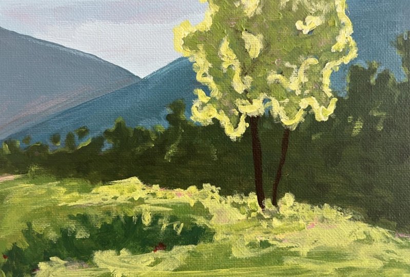
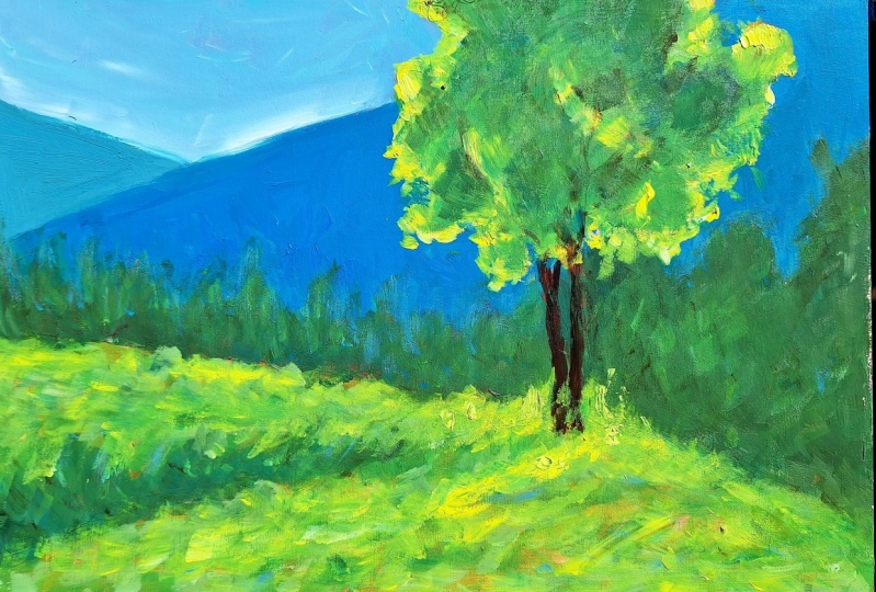
learning how to make this gorgeous backlit landscape. Hi, my name is
George, and I've been a professional artist
for over ten years. In the last six years, I've
fallen in love with teaching. Both online and in person classes with
adults and children, I've developed a very
interesting way of teaching. That focuses on fun
and engaging projects such as this while
learning about key concepts in painting. If you have never
painted before, then this composition
might look intimidating. However, with the proper
guidance and encouragement, you will finish it in no time. Not only that, but you will be amazed at your own creation. So let's just jump
into the class.
2. Materials : Hello, one. Welcome to
another beautiful course. For this course, you
will need a canvas. This is 30 by 20 centimeters. You will need a plate
to mix your colors. You will need some water
and two beautiful brushes, a big flat brush, and
a small round brush. Wow, it's quite a bit
bigger than small. And you will need
some acrylic paint. This is Amsterdam acrylic
paint, Titanium white. You will also need some brown, also known as burnt umber. So yellow. You can
use lemon yellow. This is Azo yellow medium, but you don't need
this specific yellow. This is brilliant blue
and some red carmine red. And you're going to also
need some paper towels. Just like these ones. Let's put them over here. Before you start the course, you should have one of these, which is a rehearsal board. It's just a canvas that is beautifully put
on a wooden surface, and you can wipe it down
and try many things on it before it gets too
dirty to work on. This is very important
because it teaches you how to do things in a way that you don't have to
risk the whole painting. It's a very good
learning device. And whenever you don't
feel comfortable to do a certain technique or
put a certain color, just try to do it
on this surface.
3. Pink wash : For the first step, you will need some brown. Let's put it right here. Not a lot, and some red. For a beautiful wash.
We do this wash, very wet, just grab some water, mix it with the brown. This has many reasons. The wash, the flat
brown reddish wash. The first reason is to cut the white because
it's too intense, and it can make you paint colors that are
not very pleasing. They will be too dark. If we add this red
brownish color, we know that we've
covered all of the surface and all of the
little pores of the canvas. It can be very, very generous with the water and
very fast as well. Go from side to side to
have a smoother surface. And you can also vary
the color if you want, just to have an excuse to use a bit more brown
or a bit more red. Okay. And once you do this and you have your whole
canvas together. It's very important
to do it very fast just so you get
the hang of painting quite a bit faster and to get some more loose movements
when you paint. So this is also a
psychological trick to get your brain a bit adjusted
and ready for painting. It's like a warm up
set for the painting. And it is mandatory to let it dry after you do
this. It's important. It's also a way to
practice your patients. Let's clean out the table because we moved a bit too fast. And we've done a bit of a mess, and we don't want this
paint to dry on the table. So it's practicing being a bit loose and understanding that acrylic
can take a lot of water, and you can do a
lot of washes like this to cut the
white of the canvas, and it will prevent you
from painting way too dark. Okay. Don't forget to add some water to the
paint brush and squeeze it out so that
you kind of have it moan. Let it completely dry, and then you can start
with the next step.
4. Composition and sketch : Okay, now that the
painting is dry, you can use also a hair
dryer to dry it faster. And let's sketch
with the big brush. Let's take some brown. We only did a pink and red wash just because I was kind of
bored of doing a brown one. So let's this time, let's add a bit more color to this brown and start
doing some diagonals. We are focusing on the
composition right now, so we want the main
subject to be around here. So we're going to have to do some mountains in the distance. So we're going to
have to have some interest over here as well. And adding a small
little point like this, you can add a
diagonal. Diagonally. And then going from about here. So a bit further than the
corner, connect them together. These will be some
mountains in the distance. And just to balance out a
bit of the composition, you can go from here, slowly do a slope to about here. So it's these corners
are you can start to see how much more interesting it looks just with these diagonals. And now we're going to have the main center of
interest on this side, so we use the rule of thirds. And before we do the main tree, the main tree of the landscape. We can add some more
interesting things in the background over here, some trees and bushes, just to make it easier
to create that distance. Okay. And going up, you can also add a bit of a
kind of a slope like this. I'm going to draw it, but
you don't have to draw it. So the trees are
going to add a slope. These are simple sketches. This is a very simple sketch. You're not actually
drawing trees. What you are focusing
on is the edge, doing a very articulate and very calligraphic
edge of the trees. The way you do that, to simplify the idea is that you change the brush and be cognizant of the way you use the tip
of the brush and the corner. And go higher, lower. Notice how here there
is a bit of a gap. So that's how you do it. And then you scrape
these things to make the color look a bit more flat. Doesn't really matter
because it's going to be completely gone by the end. Okay? And continuing, notice
how here is very flat. So we need to add some texture, and by texture, I mean,
outline, and continue. Notice how here,
it kind of creates a beautiful slope,
a beautiful valley. I shouldn't say value
because these are trees. You made a beautiful thing. Now, these ones are
two much of the same, so we can make this
one a bit higher. It's like a guide, like a round shape,
goes like this. Even though this one goes
a bit more like that. Let's focus a bit more on
the foreground as well, doing kind of the same thing. But this time trying to
go in this direction to add some bushes or some
things over on this side. Notice how you can be a bit more fast once you understand
the concept that all it matters is the edge and continuing until
we reach the tree. For the tree, we are
going to switch to the small brush and
taking some brown, adding some water to it. And rule of thirds. So we have a third over here
and another one over here. We divide the canvas into tree. So it should be around here. Now, if you never
ever painted trees, you should always have
your pinky on the canvas, even though you are
touching the paint, it doesn't really matter. If you make a bit of a mess, and you start slowly. And go upwards. You don't have to be super precise and make straight lines. All you have to do is
do one branch until you notice that the paint
is running out, so you need a bit more. You need to take from
the color palette, and then you go
higher and higher. Try to add a bit of a
wibble wibble wobble a bit of a wobble because that's how nature works and divide it. And we should go outside
with the branches. Okay. That's the first
branch of the tree, and we're going to do another
one right next to it. This is going to be
like a collection of trees right on this side. You don't have to be
perfect with them because you're going to paint
them a few more times. Well, at least once by
the end of the course. You just need a bit of
an idea where they sit. And. And this is just to practice
the hand movements and what you're going to do when you go and do the
actual branches in the end. Notice how I'm holding
the brush this way. It's much easier to
go with the brush in the direction to hold the brush in the direction
that you are going, because if I do this,
the bristles will go inside and the branch
will become very thick. Okay. And going on and making a few more they're not necessary, like just these three
stumps would be enough. And now let's actually do
a bit of a different take. We're not going to color in, so color in the whole
tree because it's easier to understand the concept and make the sketch if
you do like an outline. And the outline is it
starts about here, and it's very cligraphic. And then it's not
an entire outline. We are just adding some patches, and your brain will
create the entire te. And notice how this
is very straight. So we need to add a few
more distance over here, and let's exaggerate
now the line that we have it more interesting, more evident, and over here because this one
is very beautiful. And now notice how this is interrupted and still it
gets the idea across. And it's fun to just move
around the subject and move around the tree just so your brain doesn't
go very analytical. To get a bit technical
about the subject, you have two types of shapes. You have an indent
and a mountain. But this is way too analytical. You just have to think about it like you go outside, inside, outside, And outside,
notice how this has created a bit more
shape this way. So you don't want to
create just a circle. You need very, not abstract, but very varied, very
interesting edges, and you create those edges by having little pockets that go inside the
shape like this. See or go down and create this very interesting
dynamic outline. I've connected it all, but that doesn't really make
a huge difference. And you can be a bit more loose. If you want, you can
just go like this and do a sketch that way. And that's all you need
for this beautiful sketch.
5. Blue sky overlaping: This next step, let's
clean out the brushes. We need clean brushes, especially the big one. So dip into the water. Never hold brushes that have
a wooden handle in water because they're
going to become bad. The paint and the wood
is going to get damaged. If you have plastic handles, you can leave them in the
water as much as you want. Let's take some white. We're going to focus on the sky. And by white, I mean blue. That's a lot of blue. For the small amount
of sky that we have. And let's add a bit
of white over here. That's a better amount of white. And let's take the big brush
and a tiny bit of water. Actually, that's too much water, so let's take it
off on a napkin. Take some blue, never mix in the same spot that
you put all the colors. So never go with the
white and the blue. Always test it out, see if you like the color. Like, in this case,
this blue and this white needs
a bit more white. We need a very light sky. Okay. And we are mixing and
getting a beautiful color. If your blue is not like this brilliant blue in case
you used ultramarine blue, you can add a bit more white and a tiny amount of yellow
to make it more cerulan. I think that's the
name of this color. I like to color baby blue. And then you start to add it
very flat onto the sky area. This is going to be very,
very easy because it doesn't need to be You already have
the drawing, the sketch. All you have to do is make
sure that the color is opaque enough to get rid of that
pink, but not entirely. Notice how It can look very beautiful if you
have it in the background. You can go over the tree. Don't worry too much about that. Just get over and over the
mountains a little bit, just because you want the
sky to be in the background. So the edges that are going
to be created because you went over the mountains are going to be
entirely different. Then if you didn't go like that, because the paint will sit, like if you just go until here, and then you go
with the mountain, they're just going to
touch instead of overlap. So we tend to think of paint as something that is not really
tree dimensional, but it is. And it really matters which color goes over and
overlaps the other color. Okay. And once you've done this whole area with
the flat color, you need to make a bit of a lighter color just
to add it over on this area where the mountains
go with each other. This will give you a bit more, let's say, atmospheric
perspective. It's a fancy word for things in the background tend
to have a hazy look. Okay? And that's
all for the sky. You don't need to let it dry. What you're going to do now
is paint after this step. You are going to
paint the mountains.
6. Creating depth in the Mountains : Okay. For the first mountain, you don't need to
clean the brush, just take some blue
and a touch of red. This will become a very,
very intense Turquoise. Well, it's not turquoise. It's purple blue, but we need to add a
bit of brown into it. And notice that if
you clean the brush, you can just add some
white into it just so you make this color
a bit more flat, a bit more actually, let's add more white into it. So we make it even more hazy. So we give that
atmospheric perspective that the background and y, the background of the
landscape should have. So now, just a tiny
amount of water, just to make it
run a bit better. And we're going to
do some mountains. Don't be very exact. They don't need to
be straight lines. You can do a bit of a curve. And then let's paint the whole of the triangle going this way. Don't worry about the sketch. You already know if
you did it once, you already know how to do the things
that you need to do. For the next side
of the mountain, we're going to add some brown, and by brown, I mean
blue and some brown. I was thinking in advance. Now, this is interesting
because we are now going a bit more
towards turquoise. So this is a different color. It's a bit more dark,
as you can see, and it will create
a different effect. Going over the sky and three. Don't worry about the three. You need to create
quite a bit of color. Don't worry if you cannot precisely match
what you've done. Notice how mine is a bit darker still than the first
layer. That's fine. You don't need to be so
exact with the colors. You can have them be
a bit more imprecise. That creates color variety, and color variety
is very important. Notice how as I go down, I go into the trees,
just a little bit. And I think we should make this mountain a bit
end up over here. Okay. And so that the composition is a
bit better balanced. And because this tree
will be back lit, the darkness of the
mountains, the mountain, I should say, because
it will only be here, will contrast very well
with the edges of the tree. If you want, you can
also add some brown at the bottom of the mountain
and mix it with the blue, just to make it a bit
more interesting. And focus in on the
edge just a little bit so that you have a better
edge of the painting. That's all for the
mountains for now, let's go into the next step.
7. Trees and what you’ve learned so far: Next step, you don't need
to let the painting dry. All you need to do is clean up this brush, not
extremely thoroughly, but notice how there is a bit of a area here that you can paint, and that's exactly
what you're going to do is add some yellow. That's quite a bit of yellow. And with this yellow, let me see if you can
see the color, you can. Let's add it to the middle. Notice how it's already
becoming a beautiful green. Let's actually extend that to become a bit more of a green, and let's add some brown into it just so we make
it a bit more. Okay. And after you do this, take some water and go over
this patch on a diagonal, take a bit more water
and go over Okay. Just you don't need
these textures, but they are nice to be created. This is only possible because the paint is a bit watered down, and you can add multiple layers by taking a bit more color and adding a bit more
over the diluted paint. Okay. Let's focus on the edges. Notice out here, I left
a bit of a space for the darker bushes
and take some blue, mix it over and some darker brown to make
it a bit darker. And from the tree, let's start to add this
darker version of this color. And now it's time to do like you did in the
sketch and focus in on the edges and the height
of these beautiful bushes. Let's add a bit more brown. I've added a bit more brown because the color was too wet, so it didn't really it was mixing too much with
the light green. So I added. This is not really
the shadow of the tree, so we can accentuate that by making some darker
versions over here. So it doesn't seem like it's
such a shadow we a thing. Let's add and finish this, even though there is a bit
of a brown orange red color. I'm trying to I'm trying to
take a hair off the canvas. Even though there is a bit of this brown still showing
in the grass, that's fine. We're still going to add more
colors to the whole thing. And because we have this green, We have the chance to make a bit more color
by adding blue, yellow and brown, and
a bit more yellow, to make a bit more
color in order to make this beautiful
line of trees. It doesn't matter if you
pick up some of the blue of the mountains. That's fine. So again, try to
focus in on the edge. Notice how because these
trees are in the distance, they have smaller dots. So the edge is a bit
more fragmented, let's say, and they
have smaller things, and you can also have detached little dots because maybe some parts of the
trees are floating. And let's create slowly, and at the bottom, you can
just go into the green a bit. You don't have to make a line. You can lose that edge by just going a bit faster over
it with some dabs. It's dabbing on them haters
and going and adding. You can also do something else, which is take some water and
just do the fill in first. You don't have to be perfect, and it doesn't have to cover all the brown. Just cover it. Like that, and then take
some more and continue to add this green over the blue. It's important to go over
the blue of the mountain, the darkness of the mountain. Once you've done all
of these sections, you need to take a little bit of a break Oh, I'm liking this. I like this quite a bit. Maybe we will recreate it
around here in the next steps. I like the fact that this is a bit more white at the bottom, the mountain, and it creates this interesting
effect. That's nice. It's a bit of an easy way to just add a bit of complexity. So the idea that I was putting out right now is that
after you've done this, you need to take a break and look where is the
pattern repeating. Like right over here, we need
to make this a bit higher. And also over here in this area, make it a bit higher. And right over here. Okay. And try to avoid 90 degree angles because those will
take too much attention. Now, I'm noticing
there is a bit of Canvas showing too white. So let's cut that down. And that's all you need
for this beautiful step. Let's go over what you've learned because it's
quite important. I'm told that that's
the way people learn. You do something, and then
you understand what you did. I don't know if it's
always the case, but in this case, first
of all, you did a sketch. You did a wash and then a sketch to understand and get
familiarized with the tools and also
the composition and understand what you are
going to do in the end. And then you did a
beautiful wash of, well, not wash, but flat color
of blue, light blue. And then you've added some atmospheric
perspective by adding some white lighter
color at the bottom. You went over the mountains because that's an important
concept in painting where you need to understand that the way the paint overlaps
is important as well. Then you did these
beautiful mountains. You did one that is a bit
more light in the background, so you create that atmospheric
perspective once again. Things in the background
tend to be a bit more milky, a bit more bluish, milky colored, especially if
it's very, very, very far. And then for the next one, you've added a bit
more yellow and brown to it to make
it a tiny bit darker, but still blue, so we
create that distance. You understood this idea of
diagonals and how to create a very interesting
composition by focusing and dividing the
canvas into three parts, the part where we have
the main subject, and then the part where we have another subject or
point of interest. We have two points of interest. And then you also understood a bit about how to do
washes and how to be a bit more painterly by
adding a bit more water to the paint so that it creates
these interesting textures. And you've added some
bushes in the foreground. So you've created
some separation in between the background and
the foreground that way. And also you added
some trees that further that distance
and that effect. In the next step, you will learn more things about painting.
8. Brighter colors: For this beautiful next step, you don't need to let
the painting dry. All you need to do is
clean up the brush. Not very thoroughly,
just a little bit, a few squishes here and
there, squishy, squashy. And we need to add some
white to the color palette. Closer to the yellow, because you are going to make a beautiful yellowish
color for the grass. You need a big flat
brush at first. We can mix it over the green. If you don't have that green
over there or it's dry, you can take some blue,
add it over some brown, add it over and make
a very light green. Now, take a bit of white
and mix it in over this. Let's take a bit more
yellow to make it more Nice and
beautiful, more light. We are adding lightness
both with yellow and white. And this is a very nice and interesting green,
very light green. You're going to use this to create a bit more separation in between the layer of trees over here and the layer
of bushes over here. So let's do this. Notice that there is
a bit of water into this color just so
it's more transparent, and To create a
bit more texture, try to use the corner and
the side of the brush and rotate it as you
paint as you dab. You can also add some lines
if you want, like this. Try to concentrate the textures. Let's cut this so it doesn't seem like it's the
shadow of the tree. Okay? Try to concentrate the
most texture just around the tree and around its shadow because now we have a bit
of a shadow over here. So try to concentrate
more texture. The way you create texture
is by actually leaving, like noticed here, it's the most amount of texture.
We should take it out. So trying to make
this connected areas, that's how you create more texture because you're
not actually adding texture, you're implying the idea
of texture by dabbing. Okay. And let's go
over on this side and add some more separation
at the bottom of these. Once you've done this,
beautiful green, you can add a bit
more to the color. And just a touch. Notice how it's just the corner
of the brush. Just a touch of yellow. And let's add over top of this first color a
bit more texture. So this is another way to create texture by adding another color. And this one, we're just
going to create it and add it just close to the tree
and underneath its shadow. Okay. Just nab. And we can go a bit in
between these brushes. Perfect. This is too straight, so let's fix it a bit. Let's add some lines
in the foreground, just going with the brush
like this so we can clean it up and over here, Perfect. That's all you need
to do for this step. In the next step, you will be focusing on making
the actual tree. If your painting is dry, if not, we're going to use some blue to make these kind of lights.
9. Microcontrast secret: Okay, so it turns out that my
mountains are not yet dry. Here is another beautiful
concept to learn about, which is the fact that if
you have analogous colors, analogous colors are just
colors that are very close. Like, for instance,
this light green and even though this
is quite yellow, it seems green because
you've added it over a green, a darker green. So it's the same idea that you are going
to use over here. Let's grab some blue
and mix it together. It's almost entirely blue. But the idea here, if you have ultramarine blue, you can add a bit
more white to create. Let's just test it out. We are going to test
it out over here. So we're going to
see how it looks. Notice how it's way to blue. So we need a bit more white
and a tiny bit of red. So that's how you test out colors and you make
the right decisions. Notice how now
it's very close to the color that's over here. In fact, if we add
a bit more water, it's not going to
look amazing at first until it dries because it's going to look
way too out of place. But when it dries, because
it has so much water, it will look Amazing. So let's try to add in between these
trees, not everywhere. Notice how it's not everywhere. It's just around some of them. So we want to add some of
this light and create it. You can end the
shapes with a bit of a line that goes a
bit around the tree. But not everywhere. Try to
use this color sparingly. And only at the
intersection between the blue and the beautiful trees, the green of the trees, you can add this because this is a very
transparent color, so when it dries, it will
become less visible. So if it has green underneath, it will not look as great. Okay. And another trick
that you can use is go with your finger and
smudge some of the areas. In case you cannot smudge them, add a bit more color like this. And then smudge. Smudge smug. Smudge smug. Just go
up with the smudges. Just up. Don't go to the sides. Just up and away. Let's add a bit more because the smudges kind of
make it look very nice. Okay. Just go up
with the smudges. Okay. Perfect. You can also add some lines
over the mountains and some dots just to clean up the brush and add a bit more
variety to the mountain, so it's not so flat. And a bit of a smudge
with the brush over here. And that's all you need to
do for this beautiful step. You need to use
the hair dryer to dry completely the
whole painting, and then we're going to
make the beautiful tree.
10. Pet interruption: This beautiful step,
you will focus on making the beautiful,
wonderful branches. Let's take some brown. And this time, just
a tiny bit of water. And just like you
practiced in the sketch, you go with the bristles, not against the bristles, of the brushes, of the
brush to be more exact. And we start right over
here, and we go up. We add a bit of that
wiggle, not too much. And we need to get
outside of the painting. It's quite important. Notice how the branch goes
on a curve over here, and then it ends
into a curve going the opposite way
towards the right side. Don't worry if you added or made the branch
a bit too thick. Now let's go and add
another branch that goes from this other one
and another beautiful tree. Next to this one. T. And going up and to the right, maybe not so thick. The dog is a bit loud. She's playing with a toy. So excuse the sounds. So let's divide this over here. I need to take her toy. Okay. Now the dog is calm. I gave her a beautiful
treat as well. Let's give her another
beautiful piece of bread. So she's a bit more interrupted. She doesn't interrupt our
beautiful time together. And let's branch out
a bit more from here, and from here, and
from this side, Okay. And let's decide
if we need to make another tree or we leave it
at two trees just like this. I'm counting two trees,
two, three, four. And now going outside and dividing these branches
a bit more. Okay? You don't need to focus too much on the branches because
you're going to paint them a bit
more afterwards. You just need an overall idea
of where the brushes are. And in the next
step, you will be making the crown of the tree.
11. Backlight first: Okay, for the next
beautiful step, you'll need some water, some yellow, quite
a bit of yellow. You will be making the
highlights of the tree because it's important to put the highlights behind
because the light is behind. So we want to add
that overlapping. We're going to go into
the tree as well, so we create a more
interesting wrap around light. You will see. It's a fancy word. It doesn't mean much, but it's nice to use fancy concepts. Once you do it, you
will be able to see exactly how easy it is. So let's make this beautiful
yellow light green. And let's add some white into it to make it even more light. You will start to
see that this color is super light compared to the background of the
mountains and the trees. And just exactly as
you did in the sketch. Although this time it
has a lot more paint, so it's a thicker, so you can't do
small little lines, even though you might need to, depending on your brush, this will be a lot
easier or harder. So let's start. Remember,
we have these shapes. In these shapes. So one is a valley and one is a mountain or
however you want to call it. But these are very,
very precise. We need to also make them smaller and see how this one
right over here is smaller, and then we make
this one bigger. And then you continue
as if you are writing. And remember not
to go everywhere. And even if you feel like
you have done a mistake. Like, for instance, this
one is way too flat. You can always go a
bit more outside. To the inside, you
cannot really go because that's going
to still show up. Okay? And continuing over here, it's very important to change the space where
you paint and the area in which you paint so that your brain doesn't have time to make very analytical
painting strokes. Or painting marks. Notice how if I jump over here, then it's going to be
way more different, and it's going to be
whips. That's fine. And it's going to be a lot more interesting for our
mind to just go and add these small little colorful dots and lines in other places. And you don't need to really
do the whole outline. Just a tiny bit around it, can even have small
little holes, especially right
against the branches. It's very nice to have
them around the branches. No over them, but it
doesn't matter because you're going to paint
the branches once more. Okay. And let's try
to connect this one. Now let's take a little
bit of a breather and see that this is a
very homogenous, let's say, or a
very regular shape. It's like a big u. So let's add a bit
more color like this, so we we branch it out this way. And also, I would like to
branch it out this way. Notice how now it's
more like this, and it can have a bit
more maybe over here. Just a tiny bit. Perfect. I know it doesn't seem like
a tree right now, but it will quite soon
in the next step.
12. Green depth: Now with the big brush, let's take just a
tiny bit of water. Maybe not that much. Let's take it out a bit. The brush is clean. Let's
take some blue, some brown, and some of this green to create a beautiful,
vibrant green. Quite a bit of it. Notice
how this will be much more different than the color of the trees in the
background, these trees. Now let's focus in on going
and doing the big shapes. Even if the highlights
that you've just put in are not completely dry, and you pick up some of
the yellow, that's fine. And let's create a bit more
over on this side and maybe leave a little bit
of a hole over here so that it
looks much nicer. Okay. And let's go over. You can go over the branches. You're still going to be
able to kind of see them. So that's fine. Oh, whips. I went over the
little yellow bits. That we've created over here. I'm going to add them back. You can add them as
well if you want, or if you actually went over. This is the step of mistakes. I've even put some white on the handle of the
small brush. Oh, my God. Okay. And going back
and adding this color, right in between the colors, filling in the space, and making it look much nicer. Of course, the tree
is not finished. This was just a preliminary
sketch, let's say. And once you filled it in, we can go back to
the small brush. Clean it, get some brown, if we have some, we still have and start
adding the branches over this color. Okay. Add them once again. If they are still visible, that's good. You can still add
the branches over, and they will look
very, very nice. Be careful not to
take too much water because it might happen
exactly what happened to me, which is that I kind of ruined
this area of the painting, but that's perfectly fine. Doing mistakes is good. Okay. And now we actually
need some vanishing branches. Like, notice how all
the branches are now outside of the tree. And it's like the tree is just behind the foliage is
just behind the tree. So that's not what we want. What we want is to
create a bit of depth and we create
that by going over with some of that green
that you've created earlier to make it seem like
these branches go backwards, and there is a lot more foliage. You can also dab to
create some texture. Okay. They don't need
to be so visible, an idea of branches, okay? And now, to finish
off these branches, we go over with the brown, not with a lot of water, with the brown, once again, and we go a bit over so we can
make some more complexity. And let's make this tree
a bit more interesting. Okay. And in the next step, you will go and finish the
highlights even better. You're going to see
how we do that.
13. Shape and size : Go a little bit over what
you've learned about texture and how to create
colors and how they overlap. It's very important
to understand the overlapping of colors. We tend to think about
colors as being just flat. But it matters what kind of edge we create from
that overlapping. So that we give this impression that the
light comes from the back. We've put the highlights around the tree in the background, basically, and now we've
put the green over it, and we did the same
with the branches. We've put the branches, and then we added
some green over, so we give this
impression that the tree has foliage over the
branches as well. Now, going and adding some
more of this light color, if you don't have it,
you can recreate it. Even if it's not the same, if it's almost the
same, that's fine. And now we're going to
start to dance a bit more. Notice how we are dancing
with the and also dabbing to add a bit of this color on the edge
starting on the edge. Then slowly, you can
go inside of the tree. To create these kind
of pockets of light, the idea that the light kind of goes in to the tree a bit. Try to keep those highlights that you've originally
created intact. So you don't need
to go over them. All you need to do is
create a bit more around them and just outside the shape, can even go as far as to add some small dots to
create some texture, especially in darker
areas just like this, to give the impression that
this is a broken shape. It's not just a full shape. You achieve that by first not
going all around the shape. And the second way is
by dabbing and making little textures and
marks all around, well, not everywhere, but
in some places. Okay. And over here, notice how
everywhere where you have, and we have, and the painting has some round shapes like this. We can break that down by adding another small divot or however you want to
call it, a small mark, changing that shape
to be more organic, even though it's quite illustrative and
painterly, that is fine. It's actually good. And the same thing happens
because we've used these shapes which are
very curved and round. Let's just add some small
dots right where they meet the sky and the background to add a
bit of complexity to them. And you can go inside
the shape to add some interesting diversity of
shape and color over there. Okay. And going a bit
more inside over here, maybe we connect this side. Like that. We can also Just
smudge some of the color. Let's add a bit more
white to the color and start to add some
of this thicker color, just in some areas, in a few areas, just as dots, especially
where you have round shapes. It's very important
to get rid of some of those construction lines that you've created in the painting. The sketch basically. Okay. And once you do that, you need to add some of this green into the color
so that we can create some light textures next
to the trees over here so that we make the
foreground a bit more interesting and seem like it's from the
cinematic universe, from the same painting. We add this highlight around the tree and around
the whole scenario. And that's not all. We still have to take this color and now mix
it with this green, and this will be kind
of the last step.
14. Finishing touches : Going into the last step, you need to add some of this yellow highlight
into a darker green. If you don't have it, let's
remix it with some blue, some yellow, and some brown. And we need it somewhere in the middle so that it's
a bit of a highlight, but not so much, so it doesn't really contrast that much
with the actual tree. And with this color,
we're going to first start to add on the sides. This is just called
the middle tone, and it softens the whole tree, and it makes it more complex. It adds a bit of three
dimensionality to the tree. Okay. And once you've done that, and you've added some of this, and you feel happy with the texture on the
tree, just a few. Not a lot of. You don't need
to spend too much time. You can also go
over the highlights and to soften some of them. Okay. And let's create some highlights for
the background trees. But these ones need
to be very delicate. Notice how again, we are
not making an outline. It's just an idea of an outline. We are going around the shape, and you are creating
these broken lines. Because nature is
not formed by lines. It is very organic and broken. But in that broken
organic state, we can find beauty. That is what we try to
capture in our paintings. Going around, maybe
this is too much. Se, now, my brain wants to
create beautiful lines, symmetry and roundness and
all those kinds of things. So let's get rid of that logical part of our brain and move
somewhere in this space. So we move more around
the shape so that it's easier to create to
not think of the line. We don't even give ourselves the opportunity to be
able to make a line, so we don't start from here and finish here, we
just jump around. Once we feel like the
highlights are good enough, we stop and we finish
the beautiful painting. You can also add some of
these highlights onto the actual trees,
just like this. Maybe there are some trees in the foreground in
between the two layers. And as an optional step, you can go back to the highlight and start to add a few more of these dabs of very
intense highlight and some lines right
next to the tree. And you can also
add some yellow to this color to add some more interesting
texture around the tree, and you can also add it right
near the edge to create a bit of texture and separation in between the foreground and
the background. You can also try to
smooth it out with your fingers so that it doesn't
take so much attention. Now, let's add just a few more, just to make this bush
a bit more interesting. Let's add some
beautiful highlights. And some of them
right next to here. And to clean up the brush, let's go at the bottom
of the canvas and maybe over here to smudge this
color in these places. Okay. And that's it.
This is the painting. Look at how beautiful
and what you've been able to achieve
in this course. You've learned so many
things about colors, about atmospheric
perspective, about textures, about how to make trees, how to think about
texture, transparency, and light and dark, and all of that without being
overwhelmed by information. Thank you for watching. And
if you enjoy this course, please leave a review. It will help others know that this course is for them as well. See you in the next one.
 George-Daniel Tudorache, Together we will create amazing things.