Transcripts
1. Welcome to a wonderful class: Hello, and welcome to another
marvelous painting class. In today's class, you will
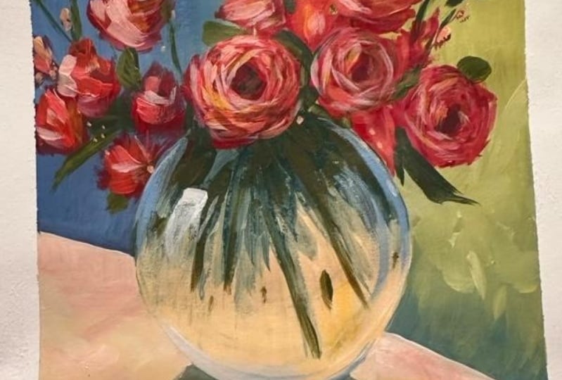
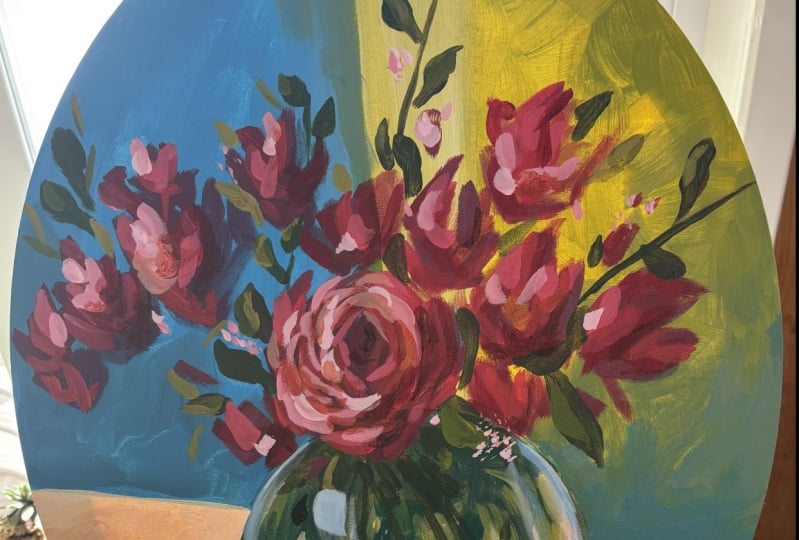
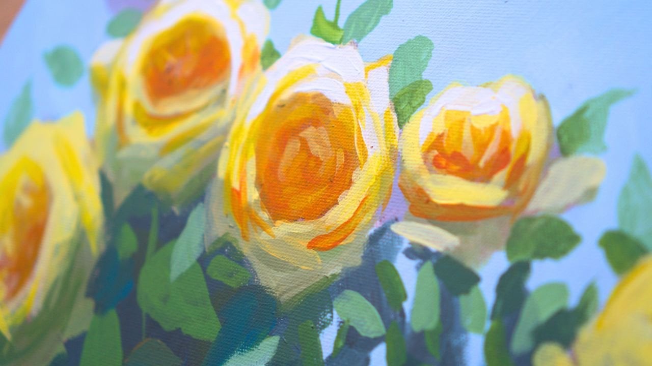
learn how to make this rose composition with a vase. Glass can be one of the most difficult and
challenging things to paint. But in this class,
you will get step by step encouragement
and the knowledge to create all kinds of reflections on glass
and glass objects. Hi, my name is George, and I've been a professional
artist for over 11 years. Five years ago, I've fallen
in love with teaching. Both online and in
person classes, working with adults
and children as well. In these five years, I've developed this
interesting way of teaching that
focuses on the project, on the experience, and
having a lot of fun. Leaving the learning part and the theory part after
you have the experience, focusing on the
fundamentals and breaking everything down in easy
to follow, encouraging steps. This composition
might seem complicated. However, you will
have all the guidance and encouragement to create
a successful painting. You will learn about
light, about color, about shadows,
about reflections, about textures and mark making. And you will have a lot of fun making this wonderful creation. If that sounds like
something you want to do, let's just jump into the course.
2. Materials needed: This course, you will need a
30 by 40 centimeter canvas. You will need some paper
napkins, some paper towels. You will also need
one big flat brush and one medium flat brush. You will need a water container. This is a recycled
water container. You'll also need a
plate for the colors. You will need acrylic paint. This is Amsterdam acrylic paint. This is white,
titanium white. Brown. This is burnt umber, also known as brown. This is yellow. You can use lemon yellow or
Azo yellow medium. It makes no difference. This is just some yellow
with a bit of red in it. You can use carmine red. This is a very nice red. It plays very well with the
blue and at making purples. But as you can see, there's
not a lot of purples around, so don't worry too
much about that. This is a brilliant blue, a very nice and intense blue. You will also need a round
shape to create the vase. You can see it's not
really perfect anymore. I went outside of the borders,
but it doesn't matter. It's still round enough. And that's all you need
for this painting. Now, let's go into the course.
3. Abstract background : Into the first step.
We're going to need some brown, burnt umber. Just a tiny amount. This will be just
because I don't have a pencil to
make the circle. I'm going to try to position
it as center as I can. Maybe this is the center. And the trick here is that right now 30% of the painting
is just this vase, which makes it a lot more, let's put it a bit lower, which makes it a lot
more easy to paint. Because you now have
30% with this vase, and this vase will be
very easy to paint. Okay? It's a glass vase. I know that sounds intimidating, but it's a glass vase, and it will be very
easy to paint. I'm just going to
take some brown. Don't worry, we're going to
cover all of this brown. And I'm going to make a
circle around the shape. Don't be two, precious about it, put some brown and make
a beautiful circle. The vase will be inside the
circle, not on the outside. And that's probably the
last time you're going to need the circular plate. Now, we're going to focus
on building the background. For the background, we're
going to use some yellow. Be generous with the yellows. And if you want to make the whole process of
painting a lot more fast to not have to wait so
much for the paint to dry. You can use a hair dryer. I have mine over here. This is a normal,
simple hair dryer, and you can already see
it has some paint on it. Oh, no. We're already
making a mess. Don't worry. Messy is good. That's why we have gloves. Okay. We still have some
brown, yellow and blue. We're going to have to
also add some white. We're going to start
with some blue. And the reason we're going
to start with the blue is because we can move from
the blue to some green, and then probably we're going to see where
we go from there. We're going to go
from some blue. With a touch of brown, we're going to create
this beautiful color. It's a bit dark, so don't worry. I should be using the big brush. We're using primary
colors in order to really understand
how color behaves. We're muting down the blue. This is a very good technique
that beginners overlook. They put paint straight
out of the container. And mix this blue, try to add a bit more to
have a generous amount. We're going to paint from
here to a over here, maybe and over here. We're going to try to
really position this and make a line that
goes towards the vase. And from the top, just going down with this color
over and start to add it. This brush has a lot of water. It shouldn't be like
that because now I'll probably have to do two
layers instead of one. As I go towards the vase, I can be a bit more careful. It can go as fast as you want
and as slow as you want. Let's say we're going
to have a table right about here
that goes like this, on a diagonal, so we create
a bit more interest. I've looked a bit onto the because I'm
painting from here, I cannot really
see if things are straight or if they
continue like this. Now they continue.
Let's check once again. And we have just created a
beautiful color over here. And because this color
is it's a Prussian blue, beautiful. It has some texture. We can even texture it more. But what we can do is
something very interesting. We can create some
more visual interest by adding more paint. In my case, it's
totally necessary because I had some
water in my brush. So the paint was a
lot more translucent. And I'm just going to go and add some light lighter
blue over here. Press harder a bit on
the brush to just create this wonderful texture.
Brush it around. Now let's take some brown
and do the opposite. I'm just going to
make a darker version of the first blue and
add it over here, maybe around the vase, so the vase will stand out more. And I'm just going to add
it over here as well. Notice that you need to be a bit more careful
around the circle. This will save you
time in the long term. This will save you a lot of time because you will not need to do a lot of
painting over stuff. Look at how interesting that looks at a bit more over here. And now that the brush
is almost clean. I can also do some shadow
over here. With this blue. It's a nice, beautiful
shadow color. Don't worry. You don't have to
think too much, it's just going to go
from this side and plus. We're going to, some
pillage was done. We're going to go with
other colors over here, but we're just developing
a bit the composition. So think of the
shadow as a mirror, just going and rounding
out this color. We're probably going to
use that shadow or not, we're going to
figure it out later. But now we're just
focusing on adding color, a bit more dark
color onto the side, playing with this
wonderful Prussian blue. Okay. Now, let's clean the brush just a tiny amount with
some paper towels. Maybe not these this many. We want to save the turtles. And let's squeeze
some of that color. We're going to You can still use those napkins later
for other stuff. I'm just going to go
over here and notice how this line is
not really perfect. That's okay. I'm
just going to take some white with some blue. Mix it in with a big brush. You don't need to
mix it perfectly. With some more blue. We are not trying to go with this color too much
into the white. We want it to be still a
nice, beautiful blue color. Now we're going to
just add, like, a beautiful light, array of blue light just
here like this. See how the brush creates this wonderful Interesting line. And then I can even take more. You can take more color
and accentuate this line on the side to add even
more interest and light. Don't blend it too much. You don't need to
blend it as much. Add another line next to it. The paint is still dry, so it's blending
into the background. And then you can even
go a bit over it and ruin it a bit and
then go back over it. To understand that you can
move paint around and you have the freedom to really play with the paint while
it's still wet. Let's focus on this
edge, and Okay. Perfect. Now we're going
to clean the brush. Well, with the
same paper towels, just cleaning up the brush, squeezing that blue out.
4. Green light background : And taking some more napkins, maybe a tiny amount of water and squeezing
that paint out. It doesn't need to be perfect. And then we can
take some yellow, add it over here. It still has some of that
blue which will create. If you don't have enough blue, you can always go and add more, mix it in very thoroughly. We're trying to create
a beautiful green, and we're going to start to
add some of this brown into it to make it a bit more muted. This will be the darkest
side of this green. So we're just going to start
over here and press real hard on the brush
to get this color. Maybe we should make more color. So we don't have to
press that hard. I'm adding I'm slowly adding
some of this blue over here. This is not the main blue. This also has a little
bit of that brown. And I'm just pressing down. It doesn't matter if they're
not the same colors. It doesn't have to be. This is an abstract painting
at this point. It doesn't really need to
be completely perfect. It doesn't matter that
this blue is still wet. We can go a bit
inside it and clean that edge with the side of
the brush just like this. Take more paint,
go around shape, press a bit harder to create
some of that texture, go into this blue until it blends a bit
more with the green. If your blue is not wet anymore, you can take some more
from the palette and add it pressing harder. Now let's create a
more vibrant green. This time, we're
going to use the blue straight out of the tube. It can go over it to blend it. We're going to need
more of this yellow. Okay. Let's add it over here. Press it hard. It's a tiny
bit more light and vibrant. It can go as fast as you want
and as slow as you want. Right now it's very
uniform. The color. We're going to change that
in a bit by adding more yellow to the color
and some more white. Just go from top to bottom. Don't worry if you go a little
bit inside of the shape. It doesn't really matter. We're going to take some white. Add it to this green and some more yellow
to bring some of that vibrance back and then go over here the same
way as you did with the blue, this time we're going to do
with the yellow green. Okay. Let's add some more
white. Just over here. Let's now add some more
yellow into the color. You don't need to
blend them that much. They will blend nicely
into each other. See. And now there is
a white line here. I can accentuate some of those beautiful lines and
create some abstract shapes. See? You can create some abstract shapes like
this, maybe one here. Okay. Can also go on the edge, maybe blur it a bit. Tiny bit. And now we've
picked up a bit of blue, which means we can go and scrape some of it off and
take more white, add it to the pile of yellow, take some more yellow. And now we're going to go
with another beautiful line to accentuate this
wonderful light. Perfect. You can go around the vase creating
some more visual interest. Maybe there is a
plant over here, and it goes in the background. Wonderful. For the next step, you don't have to really
wait for the paint to dry because you're going
to work on the vase. You're going to
paint on the vase. Let's focus a little bit on what you have
learned until now. You've learned that you can add a beautiful background
and make it in five or 7 minutes
and add a dark side, some textures, play with the
paint while it's still wet. So it creates interesting,
very nice textures. This will create complexity
in the background, and it will make it
a bit more blurry, a bit more interesting. And you have a darker
side and a lighter side. You've also learned
that you need to clean the brush in between changing colors to have the
colors be more clean, but not very clean because we need to create harmony
in the colors. You create harmony by having a little bit of
this color in this color. So Se right over here,
right over here. And also, you've learned
that adding colors straight from the tube is
a little bit of a mistake, depending on what
you want to make. So you can go from the paint
container if you want to create very vibrant and
really intense colors.
5. Simple table: Now, picking up the small brush, it has some blue, some
of this beautiful blue. But if you don't have it, you can always recreate
it with some blue, some brown, and some yellow. This is a very intense green. We need to add more
brown to it and more blue to make it darker. Let's mix it over here and
add a bit more blue over it. It's still like a Prussian
blue green color. This will be for the sticks, for the leaves and the sticks
that go inside of the vase. And we're just going
to draw some sticks. Imagine this is the center. Well, it is the center. And we're just going
to draw some sticks in like this and like
this, and like this. We have one over here. Let's take a bit of water, just a tiny amount of water. And now let's put in some
leaves, some foliage. This is the moment where you can edit a bit of the shape of the vase and go
over And over here, leave some room
inside with the hit, don't go overboard
and clean everything. You're just going
to need to paint some of this beautiful sticks. Maybe some of them go lower, maybe some of them go
higher and creating more lines and dots. And then you can go
over just on this side, take some water,
clean off that edge. Be careful not to go
over the edge, go slow. And as you practice, you can go faster and looser. We're going to go with
another green over it. Right now, by adding some more yellow just to add
some textures. I'm just dabbing. You're
just dabbing some paint over the sticks and color and
start blending a bit of this. So you don't need to
think of it as foliage or as sticks or plant materials. You're just thinking
of it as color. Let's make this
stick a bit longer. Let's add another one
just going like this. Let's add a bit more yellow. Don't go too light. If it's too light
and too intense, you need to take
some of that brown. We're actually going to do this because this
area is too light. You want to keep it very dark, especially around this side, because this is where
the big highlight will come and play a big role. You can add some blue
with that brown and add just a tiny amount
of color variety. Color variety is very important in painting
because it gives it that interesting and
nice professional look. Okay. This is all
we've done until now. We're going to take
this beautiful brush. Since we have this yellow,
we can make the table. All we need is a bit
of red. Just add it. Right here in the corner. Usually red is very intense. You're gonna need to clean
up this brush a tiny bit. Just a tiny amount. And then take some of this
red and go over in this area. Let's take some more yellow and create this wonderful color. You might call it an orange, a green, whatever it's called. Until now we've painted
with kind of cool colors. This will be a more warm tone, and you're going to
see how much it pops, and it really gets interesting because you can see it
over here with the brown. But once we add it, it's going to really change the whole composition,
the whole painting. See how beautiful and
nice and warm it is. It's not too warm. We're
going to go even warmer. All you need to do is
really play around. We're creating this space
to add the pink roses, which will make the painting just really interesting
because you've built this dark
moody, cold colors. You're gonna have when
you add the roses is just going to go and create
this wonderful contrast. Just the tiniest
amount of water. It's very simple. What I'm doing right now is
creating a bit of a table. Filling it just like kids. Just going and filling it in just over here on the corner. You can go a bit faster
once you are not touching colors or you are not
touching any of the vase, get a bit more comfortable
with adding this color.
6. Color variety : Okay. We're going to add a
bit more red to this color, and we're going to
start to go inside the vase with this
beautiful orange. Just over this color, see how now the color
that you've created, you've just changed from blue. You're now going towards
the orange reds. And it's a very easy
and nice transition. You can you can start by
adding this color also onto the sides to create a bit more visual interest
onto the painting. Now going inside of the
vase in between the stocks. You need to be a bit careful
not to touch the green yet. So cover everything except
be careful around the green. You don't need to be perfect. We're not touching it yet, because we want to
blur it up a bit more as you go around. And as you go to the edge, you can be a bit more careful
or not because the color, this color is very
interesting in the sense that it blends almost perfectly with the background
of the table. Let's connect this over here. Even if it's not perfect, just going around and
making this layer opaque and trying to not leave any of the white
on the sides of the vase. And on this side, going
and adding a bit of a cut And now you can start to go over the green a bit and blur it
down just a tiny bit, leave some areas more unblended
and some areas blended. The goal is to get rid
of that harsh white, and then you can
lose into the color. You can also go like this a bit. Look at how interesting
that looks, and just take more color. Notice, I've taken a bit
of this green as well. Maybe there is a
bit of a hue shift, a tiny bit of color variety. Make it a bit more complex, add a bit more over here. Don't be afraid to go in the green and create
some textures. You can always bring back the green at a later
stage if you want. See, this is a simple
and easy painting.
7. Table harmony : Now, I'm just going to
blend some of this color. This blue is very, very harsh. So we need to take
some of this green. If you don't have it,
you can create it, add some yellow and some blue. Let's just add some yellow, add some blue, so you
have the reference. And then you can go over
in between these colors. So you're blending a bit of that background table
into this blue. And then slowly, just
with some nice textures. Don't get rid of
all of the blue. This is such an easy
painting to do. Now we're going to clean
this brush, just a tiny bit. Maybe I used way
too many napkins. And we're going to
take some white, put it over here, where it's a cleaner area, and some red, and some yellow to create
a more vibrant pink. Orange color, to add
some of that highlight. Let's add some more yellow into the color to create some of
the highlight of the table. We're going to want to edit
this shape of the vase onto the side and then go
and add a bit of an edge. And then you can lose into the color blend a bit more if you have
a lot of color here, or if you find that
it's very difficult to add this color because you have a
thick layer of paint. What you need to do, because
it's blending too much, you need to take a
lot more color on the brush or wait 5
minutes for it dry. But if the layer you've just
put down is a bit thinner. If you go a bit thicker, you can add color. That's a bit of a rule. If it's thicker, it's
going to consume all that color because
you're going to have a lot more paint on the brush. So even if it blends, the fact that you
have a lot of it, it will mean that this color will stand out
more in the blend. Adding a bit of this
interesting thing. And now let's imagine
this is a light like a garden or a window. So if light is here, we're going to need
to have a bit of light just passing through, and now the finger technique, the famous finger
technique, squiggling. If you got a bit of white,
that doesn't matter, add a bit more color, doesn't matter how
it looks that much. Just needs to be a bit
whiter on this side. And now let's go and add some
more finger technique just going down because
this is a glass vase. It has some transparency. So the light comes like that, and we're just going to edit it a bit later if it's needed. But if in the end, we don't really need to
edit it, that's fine. Another cool trick
with shadows is that you can intensify them
by going around the shadow. Not too much, just barely
touching the canvas. You're just creating
a bit more light ad the vase can even go a bit into the shadow just to pick
some of that green up. And you can also blend by very, very gently pressing and
going over the green. You can blend a
bit of this color, just going around it. Perfect. Now you're
going to need to let this dry completely
for the next step.
8. What you’ve learned so far: Fore the painting is dry, let's go over a little bit
of what you've learned, and you might have not
noticed that you've learned. So adding colors, that's easy. Blending them together
to create harmony. We went over that, of course. Now, you've also played around with a different
type of thing, which is negative painting. Negative painting means
we're going from the outside into a little bit of the
shape to edit the shape. You've also played around a
little bit with contrast. So you have dark here, light here, dark
here, light here. You've also learned
how to create some harmony by staying
very close to the colors. This is a very cold painting. It has some yellows and some greens, especially
around here. It has some orange, so it has some warmth, but you're building up
to something greater. You can change the
vase, make it square. You can also play
around with the colors. Maybe you don't want this blue. You've learned how easy it is to play around with the brush, and there is a point at which a painting
looks at its worst. Every painting has this, but go beyond that, and it only gets
better from there. If you feel any kind of
emotions where you are discouraged or you feel like this is not
going to end up well. Don't worry about them. Continue on the process
and don't look down. As in if you're always
afraid of falling, just don't look
down, look forward. Try to understand
that the painting will become better and
better as you work on it. Even though sometimes
it might feel like you're making mistakes. Those are not mistakes, and usually in painting, you can really fix things up. So right now, the painting
is almost dry and notice there is new water The paint brushes are
completely clean, but the painting plate is not. That is for a reason because you still want to use some of
these colors and still want to get some of this mess onto the canvas before you go into some more vibrant colors. We don't clean the palette, and we usually
clean the brushes a bit to get a bit more harmony. We don't want to jump
straight into some red and some purple and some pinks because that will create
a lot of disharmony. You need to create a
substrate for the colors to really have a place to live, to sit, you know?
9. The secret of round shapes: And let's go into some red. Let's add it over this red. Maybe add a splotch
just over here as well. We still have some blue, but we need some brown. Brown is a very
interesting color because it makes other
colors a bit duller. Brown is like a
very dark orange. So it makes blues and
greens a bit more dull. It can make the reds a bit duller depending on
what red you are using. But it doesn't do that
because it's a bit more worm. It's an orange with
a red will create a bit of a different
more orange red. Take your big brush. Always start with the big brush. Take a tiny amount of
water. Take some red. See how it already blends
with some of that blue. We're actually going
to add it as well. So even if yours, you didn't put the
red over the blue, This is just a good color, but it's too intense. So you need to put
some brown into it, creating this very
interesting brown, dark red. There is an interesting
phenomenon. Whenever you want to paint
like really round objects, if you paint them a
bit more squaish, they look more interesting. They look more painterly. Painting is about
emotion, about vibration, about complex things, about
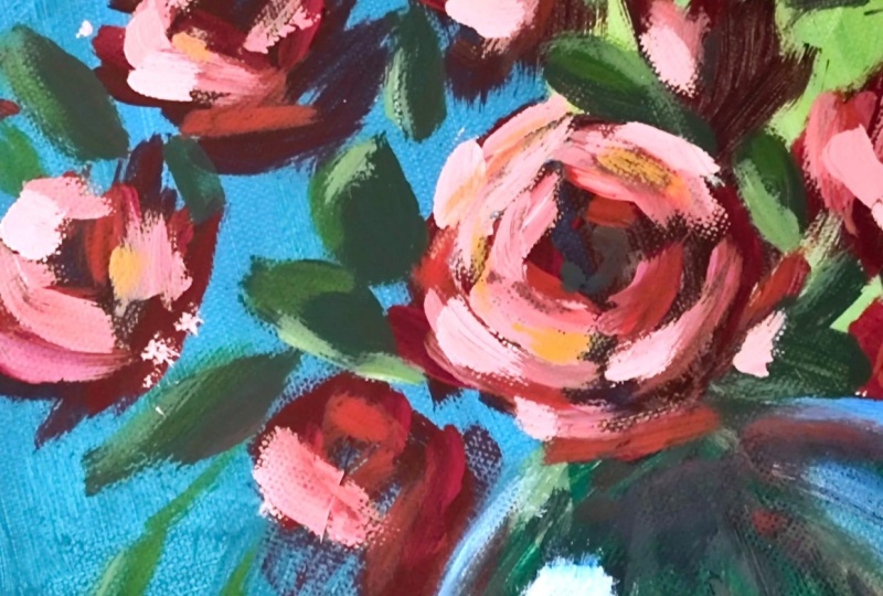
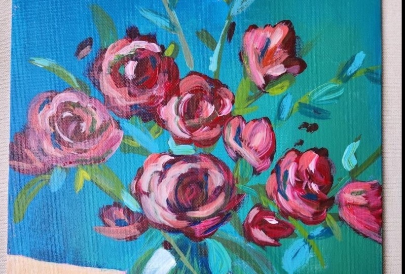
paint playing with itself. So just over here, we're not going to start
with the middle rose. This will be a rose. We're
going to start with the side. Let's go just over on this side. It's almost at the edge. And that's all you have to do. One simple little triangle. Now, we're going
to imagine a bulb. We can even paint it
right next to this petal. Notice how they're
barely touching. The bulb is like a triangle
that's rounded at the bottom. See, a triangle. And it has a bit of a
more rounded shape. Now, let's make it a bit bigger. Start to paint from small and then see if
you like the shape, and then you can make it bigger. Let's add another petal
over the triangle. And now let's go
to the next rose. Very easy. Add a bit more water. And now next rows, we can go over this
one with a line. Make the bulb like a triangle, add another petal, and maybe this one has
a petal behind it. They've both merged. So we need to make this one clear that it's a
different rose. So we've created a bit
of a mouth to the shape. I've made it a bit bigger. This is one. Now, let's
put one a bit higher. Same type of thing, triangle, like a tulip, a bit rounded. You can go a bit more square. And as you go a bit more square, notice that the petals
just go outside. See? And maybe I want
to put one behind. You can go a bit
faster if you want. I know this looks like
a tree right now. So let's change that
and make it like this. Okay. This is a
very simple shape. It's a triangle. And then it has a few petals on the side. Don't worry too much. Now we're going to go
with the middle rows. This rose is a bit
more different because this rows
will look towards us. So one line over here, one line over here, one line over here,
one line over here. And then on the top the same. You don't have to fill
it in completely. We're going to do
a few more layers. And then after you
have this hexagon, you can start to add a bit
more petals to the side. So it's a simple hexagon, and you've added a few
more petals to the side. Now, you can accentuate the middle by making
a darker version of this red and accentuate
the middle of the rows, which is a little
bit of a square. Se? Square hexagon, add
complexity to the side. You are not really
drawing the roses. You are now looking
at the shapes. Don't worry too much about them. You can edit them. You
can go a bit bigger. So try to try to go a bit smaller so you have
space to out of them. Let's connect this with
another rose over here. Notice how much more contrast there is on the right side
because there is green. This is a very simple shape, one, two, and three. Maybe it's a different
type of flower. Let's add some in
the background, just a little bit of a shape. Okay? And let's add
another one over here. This one needs to go a
bit towards the vase. We want them to come
towards the vase like this. Rhombus petal, another petal, and maybe rounder bottom
bigger bottom on the rose. Now, let's add the
mouth of the rose. It's just a shape. It
looks like a frog, like a little red frog.
10. Cleaner edges: And now let's add another
one just over here. I'm just starting to paint, and then I go into a triangle. Mouth of the rose. Maybe I make it bigger, so it connects a bit, and then add some petals. Another beautiful frog. Maybe this is a plane. Okay. And let's go a
bit outside over on this side with a
more open rose. See? Oop. Just like a
little grabby hand. Okay? We can add a few
more just behind the vase. See how you can go behind the vase with some
more abstract roses, being careful not to
go over the edge. And now it's the time to
look at what's going on. Look at the interesting play
that's going on right here. If yours are not so organic, take a bit more
color and just start to focus in on making
abstract shapes. To make them seem a bit more organic and adding some
edge to the roses. See. It's easy. You just have to add and fix some of these edges
that are very furry. Roses are not very furry. They have very strong edges. Don't do it on all of them. You can do it later as well. Furry edge over here. Maybe we add a bit of another beautiful,
interesting petal. This hand started to
shoot lasers that way. Let's add a small
little plump over here, a small little
plump plumpy plump. Maybe it's a different type
of flower and a smaller one here and a smaller one here
with the corner of the brush, you're just adding big shape. Small shape, and maybe one here. Perfect.
11. Details on the roses: Now, taking the small brush, with a tiny bit of water, not too much, just a tiny bit. Go with the red and start defining some of
the petals a bit more. So they stand out. See? So the way you do that
is by taking a bit more red, a bit more color,
and adding cuts. This is a very interesting
way of adding petals. You're just adding cuts. One cut over here, one cut over here, following that
shape of the rows, being a bit more
abstract with it. Just a few. And around
here, it's even simpler. We're going to focus on having the light from the left side, so you can add them on a bit more of this
red on the left. Notice one, this is small, this is a bit bigger, this is a bit smaller. You're playing
around with shape. Now, one behind
it, one over here. If you're having a
hard time doing this, take a look at the reference image or look at some roses
on the Internet. You can also go because
this color is quite dark. You can also go on and add
in the shadow side as well. This is just a very abstract
rose in the background. It doesn't need to
really do anything. Let's add some color to this. And now let's add on the
other side, some more cuts. Maybe this rose is
a bit more open. Maybe it has some interesting
things over here. You can also complicate
those cuts by going around the edge and creating
more lines and dots. Creating a lot of complexity. On to the left side, the light comes from the left, so we're going to add this color to the
left side of the rose. Maybe this one has a bit
more red in the middle. Onto the side, Don't
think too much. This is abstract. This
is still abstract. We're just adding a
bit of structure to the abstract
painting. That's all. See? Notice how when
you're going to this side, the cuts start to become
a bit more to the left. I can also add some
of this color inside. It doesn't really
matter that much. It's not a high light. It's just ale bit of light, a little bit of different color. Okay. Now we can
go even lighter, add some red, a touch, just a tiny amount of white. The tiniest amount of white
will make all the difference. Tiny tiny corner of white. Look at how
interesting it looks. Notice how it brings
everything out. And you can go over these cuts to make them more
interesting this time. You can add new
ones if you want. Don't worry, these are
not the highlights. These are just adding to
the colors going around. I just see how this
has become so round. You can add back some of
that hexagonal shape. Even if it's not perfect, so it looks a bit better. Notice this cut and this cut, and now this one, take a tiny
amount of water, some red. Now over here. Now over here. On this side, going and
adding a bit of a cut on the beautiful lip of the rose, and on these sides, you can go a bit more abstract.
12. Simple foliage: Next step, you don't need
to let the painting dry. You don't need to
clean your brush. You're just going to go
with some greens and add some, some dark foliage. To do that, you're going
to need some yellow, some blue, some brown. Foliage is even
simpler than roses. This is a lot of red, so we need to clean
a bit of it out with some of the paper
towels we used earlier. Eco friendly painting. Yellow. It has some of that red, so it acts just like the brown. It cuts the chroma down. We are also going to add some brown to make
this darker color. This darker green. Notice how everything is very
dark right now. This is so that you build
the light out of the dark and you build those interesting
colors and variety. Okay? Right over here,
you can start to cut some leaves
around the roses. So you get some of those little holes that are
very close to the middle. You can close them up. These are very simple shapes. This is a cut that goes
down in between the petals. This is another
cut over here and another one over here that has a little bit
of a corner to it. Let's close this up a bit more. That's why you're
using flat brushes. If your colors are mixing
too much with the red, you need more green on
the wonderful brush. L et's go behind these and
create a leaf over here, maybe one over here. You can also start
to think about big. Take just the tiniest
amount of water. The brush just
flows a bit better. You can go as fast as you
want and as slow as you want. Try to make the edges
a bit more clean on one side and a bit
less clean on the other. Okay. Let's go with
one stick over here. Out of this stick, let's add a beautiful and let's connect it. Now let's add another one
over here, super easy. Stick and a leaf
and another one. Let's make it a
bit more organic. Now, big medium, small. Wow, still medium. You are opening up the
composition by going this way, you are opening up
the composition and also putting those
rows is a bit behind. Let's open up the
composition on the top side because there is this
big hole over here, right in between these leaves, add a little bit of a stick. Even if it's not perfect, even if it's not
perfect, it's fine. You can add a leaf
and another one, maybe I'm making this
one a bit more round, and another one just going out. You can connect them
if you want or not. This one I'm just not
going to connect. And now one behind this can
go a bit more abstract. And because it's
green, it's creating this beautiful play of colors. Let's cut another leaf over
here, behind this rose. One over here. Easy shapes. They are very simple shapes. Now, an interesting
thing that you can do is kids draw these
kind of leaves. They are simple. What they don't draw is
this kind of leaves, like a squaih kind of leaf. And now if I go with
a stick out of it, see how it goes over the stick. And now, you can go with another one here and
a smaller one here, maybe make the
stick a bit higher. They don't do this kind of more organic, more abstract shapes. Notice how everything
here is like that. I can add another one a bit
more squish and different. Maybe add a cut
to it, like this. See? It's a bit different. Let's go onto the side
over here and add a leaf. Maybe we can add a leaf just
over here and one here.
13. Famous finger technique : Okay. Now, let's add
some more yellow. To this color, a bit more. Not too much. A bit more. Now let's add some highlights. Remember the light
comes from the left. You can also add a few
leaves of this color. If you find it too strong, right here, you
can add a bit more brown and a bit more blue. If you still find it too hard, it means you have
too on the brush. Just adding a bit of a
highlight onto the sides. Don't go overboard
making a of leaves. You might be tempted
once you find out how easy it is to put a lot of them. Just a few. You can
count them on two hands. Maybe more. Let's add
a highlight here. Another leaf over
here, this color. Maybe one behind this, so we are editing. You can also edit at
this point these roses. Notice how there was a little
bit of a thing over there. You can add one here. Let's add another
small one here. Add a highlight to this,
a highlight to this. Maybe a highlight to this one. Add some highlight to this one. This one as well.
This one as well. A cool trick you can do
is the finger technique, the famous finger technique. Another one just over here. Maybe it's too light the color, so we're going to try not
to go with this color on this side yet because it is
too close to the background. You can go over
the leaves but not really create some edges. We can also go on this side, create more visual
interest, maybe a stick. That goes like this outside
and maybe a beautiful leaf that goes over here and another one that goes
over here, small one. They don't have to be connected, you know? They really don't. Now, let's add a bit more yellow and a tiny
bit more white. The paint is still wet, so it creates this
interesting effect. You can also go with the side of the brush and add
just a few dabs. Go with the back of the
brush to create a line. You can start to
see how interesting you can make this whole paint. You can use your
pinky finger like this and to get more precision. Very high end
painting technique. Only the greatest
masters. Know about this. The famous finger technique. Let's go with a lighter
leaf over here, maybe another one just
coming over this rose, and then going over
this leaf again. If it's too light, you
can always go and add more brown and blue
and edit the color. Sparingly. Using this
color sparingly, let's connect this over here. Maybe I'm connecting
this beautiful leaf that goes outside and adding some highlight to this one and this one as well
on the side, this one. If you are not
creating textures, like if all your highlights
are very blended, like this. Just go over with the finger
and try to unblend it or try to make the shape
a bit more abstract. Look at how interesting
that looks. If I just dab. Se Notice, maybe I'm
creating some texture. You're creating some texture, and then you can always
go and blend it over. You create the
texture like this, and then you can go over
it, recreate a bit. So you're not just putting
simple little leaves. They have a bit of complexity. You can. And I think that's
enough for this step. You don't need to let
the painting dry. All you need is a little bit of a space on the palette,
a clean space. You need a clean brush.
14. Dark of the vase: Don't need a lot of things to make an
interesting painting. All you need to do is
really play around. You've learned how to create
from abstract shapes, more roses and petals. You focused on the dark and then created some more light
out of this dark, and you're going to create
even more light as you go. But before you do that, Going into the next step, you're going to need some brown, some blue, and water, and some yellow to
create a dark green. Just a dark brown green. If it's too brown, just add a few dabs, and then go a bit lighter. Now, let's add another
one over here. Super easy. This is just to get a bit more
interplay and to get a bit more
interesting shapes happening in the vase and also prepare the vase
for the highlight. We're going to
focus on this side, making it darker, this
area, add a bit of water. Water is your friend
right over here, but not too much, so you can
still add the sticks back. See, you're adding the
sticks back over the orange. So it's back and
forth, back and forth. You can also edit some of
the shape of the vase in case you have wobbly sides. Don't go overboard
with this stage. It can also go and
add at the end, even if it's not perfect, some of this color, see? Notice how just at the end
of the stick on the side, and then going towards the top. Add some abstraction,
just some dabs, and you can also erase
with your finger if you don't like what's
going on too much. Don't go overboard. This is just an intermediary
step just to prepare this area
for the highlight. Speaking of the highlights,
for the next step, you will need to
clean the brushes and the palette to add some
highlights onto the roses, even if they are
not completely dry.
15. Secret wash technique: The painting is dry completely. Make sure you have a
nice clean surface for your new colors
and some water, and the brushes are
thoroughly cleaned. This is going to get
a bit more messy in the sense that you will
create light on the roses, and It's going to feel a bit out of
place, but don't worry. By the end, it
will feel amazing. I have this one secret technique that will make the
whole painting amazing, and you can add with this technique color variety
in all the paintings. It is one of the most
interesting ways to add dimensionality and color in a different way
using acrylics. You can unlock this
secret technique only after making 500 paintings. So today you're going to be lucky and you're going
to get this technique that only people who have painted 500 paintings
know about. Let's add some red
to the palette. So yellow, and some white. Until now, you've been using quite a light amount of color. You haven't put a lot
of intense thick paint. This time, you're going to
need to be a bit more thicker. Notice, red and yellow
creating a very red orange. This is the first highlight. There are going to be
a lot of highlights. But this is the first one, and it's a bridge
between the color you're already having and the one you're going to
create in the end. Always on the left, let's not start with the middle, so you can get a bit more comfortable with
adding this color. You can go over the
areas and still keep some of that red
or create new cuts. Just one cut over here, one cut over here, maybe make it a
bit more complex, add a bit more over here. Let's get closer to this leaf. And then just a
square in the middle. Maybe add a bit of a puzzaz
over here, and then 123. Notice it's so simple, so easy, and one over here. You don't have to go fast. You might see that I'm
probably going a bit faster. You shouldn't go fast. If you want to have
control over the brush, you should go a bit
slower actually to gain more control go slow, go slow. And as you practice, you can go faster and loser. As you understand
how much control you can have over the brush. Noe just one line in between
just going over that blue. There was a bit of
blue just showing. There is a bit of water so
that the paint flows better. But actually, it's always better to have a bit more
paint instead of water to make it flow because
the paint already has this interesting watery texture, this color to the left
side of the rose. Maybe this one has
a bit more red. You can also go on
to the right side because this is an
intermediary color, so it can have a bit
more onto the side. Let's add some visual
interest by adding some dabs and cutting and connecting these
cuts a bit more. Not too much, just
a tiny amount. Let's add some of this color
here, maybe over here. And on this side, these roses might end up just like this, a bit more abstract. So they connect the
more abstract things of this painting with the roses that will be more interesting. Let's add a bit more red into this orange and
start with the white. Add white and red to a new area to create
this rose color. Notice that it's a bit
more rows than the orange. And go over these marks you've already made
with the orange. So they blend a bit with the maybe don't start with the middle rows, but
it doesn't matter. You're already an
expert at this. Go over the marks
you've already made. You can also create new marks or angles the
Communist manifesto. Okay. And notice how interesting these marks are becoming because they are blending
into each other. Perfect. Just a few touch ups.
16. Final rose highlights: Now, going a bit lighter
with more white. You want to build some more
contrast, make them thicker, make the paint
thicker because you already are putting
down thick paint, so you need even more thick
paint to have this wonderful. Now we're going to
focus a bit more onto the left side of the canvas. See? Notice, it looks
like a candy color. Just adding it
over and focusing, making with the flat brushes, can always go like this on
both sides and create an edge, so you can really go
in and add that cut. Maybe add one here, and another one here, and another one here. Don't worry about the middle. You can let it darker
like that for now. Now let's add some more of
this candy color over here, and maybe over
here, let's connect these areas, going at the top. Onto the left side of this one. Notice how easy it is. Let's add some over here. And some over here. Now
going even lighter. Don't be afraid to make it very, very light, very, very light. Now going over on top
of the left side. Just a few of these touches. Maybe don't even touch some
of the other ones too. See notice here,
I don't like it. Just going to erase it a bit. Now, maybe this one and on
here and maybe one behind. Let's accentuate it like
that and like this. Okay. Now it's the time to look around and with the other
side of the brush, you can go and create some more interesting
textures and a bit of lines. Don't be afraid at this step. You can go get make some lines. You're only creating abstract
more abstract shapes because the brush just created
these interesting shapes, but you can also create some lines and maybe
some more texture. And after you've done that, you can also calm
them down a bit. Notice. Beautiful. You can take some of that orange or red, add it back in,
just a tiny amount. L et's add a bit
here and a bit here. Let's add some beautiful, small little flowers,
pink flowers. Over here, rotate
the brush a bit so it creates some more
interesting flowers. Maybe on this one a
bit and next to it, a few other ones. Perfect. Now, clean
up the brush. You're going to need
to clean up the brush.
17. Vase reflections and highlights: For this next step, this is going to be
a very short step. You're going to need
to clean up the brush. The small brush, add some
water, squeeze it out. The roses are still wet. You're going to
work over here onto the This area of the vase. You're going to add the
beautiful highlight. For the highlight, you're
going to need a bit of blue. Just add it to the
plate. A tiny amount. And you're going to
need some white. You're going to need some white. Mix it in with a
tiny bit of blue, just the tiniest amount of blue. Okay. And you're going
to go and create this beautiful square shape just going a bit round on the edges. Going to the side like this to create the top and
the corner over here, make it a bit bigger. On the lower side, you can
have it a bit more textured. But on the top side, it
needs to be very squish, and it so follow the form
of this side of the vase. Now going way lighter. Just take a lot of white, mix in just a bit of blue
and on top of this one, add So lines just
going this way. So paint just going this way. You can make it bigger at the top and as it goes
down, it's a bit less. If it blends too
much with the blue, just wait for it to dry
and add a bit more. Perfect. Now, go
with the finger, take your finger,
make sure it's clean. It doesn't have any
green or anything, and start blending
a bit of this. Maybe take a tiny amount
of water onto your finger. And you can blend some
of this edge over here, just going down to make a little bit of a
reflection just going down. Now, the brush, clean
it up on the side of the on the side of the plate, and add more blue to this
brush and some water, and you're going to create
a beautiful reflection just over here. This is too white, so you need to add
more blue add it, and then finger technique. It works very well against the blue dark accent
onto the right. You can also add it just a
little bit over this texture. And then maybe go with
the finger as well. On this side, you can add
a big one, a big one. Then with the finger. Then you can add another
one just over here. Maybe there is a
reflection of something. With this one, with
the central one, one over here, you can go
a bit lighter on the edge. And maybe add a bit of a
sparkle over here as well. Maybe it needs to start
at the same exact spot. Can always go back with the green dark green and just change the
shape of it if you want. Let's add a bit of this
lighter highlight. Don't go overboard. They need to be subtle. Let's add some of it
over on this side. Just to clean up that
edge over here as well. Notice that on the yellow it's not really creating
the same effect. But that's fine. To create the
same effect on the yellow, you can add some
water to the brush, take some of that white, add it to the side of the plate where you
don't have anything. The tiniest amount of yellow
mis it in very thoroughly. It still has a bit of blue. So it needs a bit
more yellow. K? It's not going to really
create the same effect because this is way too light, but you can still just dab a bit onto the bottom
right next to the shadow. And then with your fingers, you can go over it to blend it. Once you have blended it, you can go add a more
intense one just over here and maybe over here
to accentuate that color. Look at how
interesting it looks. Maybe we can add this
color as an accent. Let's say here. Maybe there is something
just reflecting on the side. Okay. Notice how
beautiful it is. You're not even thinking
of what you're doing and you're creating glass.
Glass is simple. You just have reflections
on top of a dark area and then reflections around and a big highlight on the side.
18. Dark reflections: This next step, we're
going to focus on the secret technique
that you can only unlock after you've
made 500 paintings. And it's a very easy technique. We're going to start
slowly with some brown. You will need a clean brush. So let's use some
of the old napkins, going to start to add water. This is going to be a more
water based technique. The brush is not clean enough. So let's clean it a bit more. Add some brown to an area where you don't have
a lot of color. Starting with brown, Let's
fix this brush a bit. Starting with some brown, you can add it in the
middle just as a wash and make some cuts
on the opposite side if you lost some of the shadows. You can also go and edit some
of the go with the finger. It's a combination between the finger technique
and water technique. This is just adding a bit more different colors here and there to add
more color variety. Now going into some blue, and some brown, focusing
first on the dark colors. T on the dark colors. Let's accentuate
this leaf over here. And this one over here. Also add some of this
blue over in this area. It will create just a nice
and interesting contrast. Don't go overboard. I know it doesn't look as
impressive as you might think, but this is just the start. Let's take some fresh
napkins, add some water. Clean up the brush with
some fresh expert napkins. Now, yellow. We're going to add
some yellow to this side and the touch of red, maybe too much red,
but that's fine. Let's add more yellow, and then water it down. Can you see the water? Yeah. You can take some of
the water out by going on to the side of
this recycled bowl. Just going over some of this
ros and maybe over here, and maybe over here a bit more. Just a few touches to
add more color contrast. You can also go on
the side of the bowl. And if it's too intense, you can go with the
finger technique. Notice how it just changes that color changes and
makes it more interesting. You can go over the
brown, the blues. You can go over these flowers to make them a little
bit less intense. Again on the side. Can also go onto the lower
side of the painting. Inside here, maybe making
this a bit more yellow.
19. Finishing touches: Now let's go a bit more red. S. This one, you can use
on the darker sides to add some more darker highlights. Just simple touches, just a few different splotches of color and let it play a bit. Notice how it
intensifies everything. If you had a very white area, like let's say this, it will
just become more intense. And you add more and you
make it more intense. L et's add some more red. This time, let's add some
white as well to make a pink, and let's go over this. It's still a bit transparent. But it gives just a little bit of a interesting highlight. And you can go on the side. You can scratch a bit with
your finger if you want. If you don't like some areas, maybe they're too green
like on this side. And then you can go
on to the brown, add some brown to the red, make a darker red. Just so you bring back some
of those darker sides. And once you let it dry, it will have so much
more intensity, so much more color. Notice how beautiful
this oh, no. Oh, no. Here is where the napkin
strategy goes very well.
20. What you've learned, Thank you!: You can notice that
after it dries, you can start to
see how much more complex and subtle the
transitions and everything is because you've
added a thin film of paint and just adding in
the middle of the rose, some blues, and some
yellows and some oranges, and some purples as well. Added some reflection
of the rose over here, some red over here, over here, some more complexity down here, with some yellow. You've just made the painting
a whole lot more complex with a simple wash of
paint in different colors. Look at how interesting
this one is. After it dries, it looks
much more organic and nice. It creates this depth, this interplay between colors. This red goes very well
with the dark green. Now over here, some red, right next to the blue, some blue over here, some
orange, orange here. A bit of dark, a bit of light, It's interesting to
play around with these washes at any stage to build more
complexity of color. It just makes it
more interesting. And you can go as far as
you want with these washes, and you can also go over with some more
highlights if you want, or whatever it feels
like the painting needs, if you lost the
shadows over here or you don't like an area
over here or over here. Just think of the colors
that are underneath or adjacent and just start editing
maybe some of this shape, like this with the
color underneath, maybe add another leaf. You can go back and forth in between stages
to play around. You decide when the
painting is done. In my case, this is the
level of detail that really still adds that vibration,
that painterly feeling. And you've started
from abstract, and you've ended up
with a nice glass vase and roses in a very easy
and free flowing manner.
 George-Daniel Tudorache, Together we will create amazing things.