Transcripts
1. About this Class: Hi, I'm Elizabeth, then
Italian watercolor artist. I have a passion for
food illustration. That's my main source
of inspiration. That's why today in this
class we are learning together how to sketch it. Fun. Sushi. While Sushi, because sushi is not only
for the palate, is also feast for the eyes. Most Japanese food that is not only good,
but also beautiful. Sushi is so much fun to sketch movies in a
very friendly way, suitable for the Guinness. First the sketching pencil, and then when we apply with and then we will
apply watercolor. That's my usual way
to illustrate food. It's fun, it's easy, and it will give you a
very beautiful result. I hope you will join me in this class and let's have fun together
and stenting sushi.
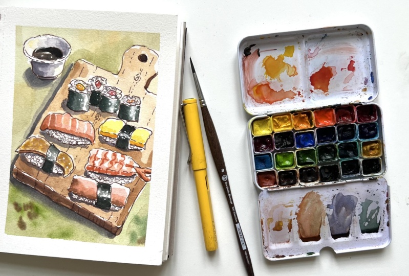
2. Supplies for your Project: Great. Now we talk about the
supplies you will need for the sushi project. Though. I, as usual, I have
limited myself to very basic budget
friendly supplies. Very easy to have at home. Stuff from paper. It's important to have
a watercolor paper. This paper is cellulose. You don't really need cotton
paper for this project. I always catch on
plain cellulose. I keep a cotton for projects when I use
a lot of wet and wet and it's not a case of common food illustration is more for landscape or flowers. The important thing is that
the paper is for watercolor, and it must be ideally 300 GSM. Paper is teaser, but
you can have any brand. Of course, the important thing, it is safe, it says
for watercolor. Then we need colors to. I have a passion for color, so I have many unique colors. I collect different watercolors, but for my classes, I will limit myself to the most common
colors that you can find in any basic
watercolor set. Here, I am using my
Paul Rubens set. These were originally
tubes that I have squeezed the inner sector. I show you this was
the original set, and I suggested the
two squeezed them. As I have done in this a pans. You can buy the empty pans so that it's much more
convenient to use. It's very easy. These are smaller
watercolor teens that you can buy easily online. Have a lot of mixing space. So you have everything
you need in a small portable box and you
can always take it with you. So this is how you
can buy ready-made set like this small Cotman
set, its very basic. It's the first one
I had in my life. So as you see, it's
almost finished that we're using
very basic colors. We are using purple,
orange, yellow, using some purple,
using some gray, we using some burnt
sienna with tambour. So all the basic colors,
Alizarin crimson. So if you don't have the
exact color that I suggest, you can replace it
with a similar color. It's not very important to have the exact color in watercolor. It's much more
important the values. If you follow my advice about shadows and light and values, you can really replace any
color with a similar color. You shouldn't have
orange, for instance, you just mix some yellow with some Alizarin crimson
or some vermilion and you will have a perfect orange to use
for your salmon, sushi. Then you will need, of course, the third
most important thing. You will need some brushes. I'm using round
synthetic brushes. And the important
thing is to have different sizes according
to the size of the paper. You have. I have sketched on it A5 papers, so I have the larger
medium and detail brushes. The very important thing is
that they have a sharp tip, so you can do details. So with the tip of your brush, you just hold it vertically and you can make all the
details that you want. They must be watercolor
brushes because they hold a lot of water compared
to other types of brushes. So it's important to
have watercolor brushes. Of course, then we will need
a pencil for sketching. Pencil, ideally a to B pencil. I don't keep my pencil too sharp because it's
easier to erase the little bland,
the software eraser. And a fountain pen
or a fine liner. This is a CPR fine
liner by Faber Castile. You can also use
these fantastic for sketching uni-ball Eye Micro. The important thing is that the ink must absolutely
be waterproof. Please do test it before. You must be 100% sure
that it is waterproof. These are waterproof. So Pitt Artist Pen
fineliner is waterproof. This uni-ball eye is waterproof. And in this fountain pen, I have put a waterproof ink. You must be completely sure
that it is waterproof. If you're not sure, stay
away from fountain pen. You use a waterproof,
fine liner. You can also use this very
good brand of fine liner. Microns, Saqqara, this is
completely waterproof. Then you will need
some mixes space. You can use the mixing space
on your watercolor set. Or you can have a lovely
dedicated palette like this one that
I recently bought. Then you will need a white
gel pen for final details. Then you need some washi tape or some artist's tape either will do a ruler. For the pencil phase, I don't use a ruler with a pen, but with a pencil. They do jar. Jazz for water, one for clean water in the other one for printing your dirty brush. So you always have
one with clean water. The other one,
we've got two water and some kitchen
paper, very handy. You need these to fix mistakes, blot your brush,
absorb excess water. Fantastic to have some. And that's it for your supplies. Easy. Ease. Go to the fun part.
3. Paper Preparation & Pencil Sketch: The first thing I do, I would stick some washi
tape around the corners, around the edges
of my paper so we have the crispy, nice finish. Washi tape is less sticky
then Artist's tape. And so if you use artist's tape and you have cellulose paper, just make sure that you
don't tear off the paper. You can. I show you how to stick it on your table
or on your genes? So sometimes there will be less glue and it
will be less sticky. Okay? Otherwise it might tear
off your paper if you're using plain cellulose,
is undoing. Cotton is much less dangerous. I have put some washi tape
and I'm starting the sketch. And for the pencil face, I will use a ruler. I want to be using a ruler
for the ink outline. So there will be more
organic, but I will, for this face, I'm sure
that they are straight. So now we simplify this
nice reference schema and we started with
the bottom edge. And then it goes
out of the drawing. And then we try to
be perpendicular. So this angle, same angle, try to be consistent like this. Very nice because we will have to erase many of these lines. I like to have a
pencil not too sharp, so it's softer. That's my feeling. And we start with
what is towards us. And then we draw further away. So she pieces. And we start with the
I keep on my iPad. Here. On the right-hand side. I draw exactly what I see. I started with this cell. Here. I see there is a shape. I like this. I think
it's omelette, this one or maybe hearing. There is this stripe of sushi with we just some pencil line. I'm not drawing in
this pencil phase, the rise or I'm
not getting crazy. Just some indication,
then I will refine it a lot with my ink. Here. I have some Salomon, my rice and wheat. Then I have some shrimps and I have a corner. Rice. And the, I can simplify and just change
what I don't like. Here. I have put some Salomon. I'm changing the order because I draw what I think is nicer. To see that we have
this moon will rise. And then we have this herring. Herring is maybe more like this, more leaning towards the bottom. Then I will put some omelette here. Nice. And then I will put some roles. So remember that they're
not perfect all of us because they have the
weed around the rice. Then we will sketch rice rolls hidden here. Okay? And then I wait for
the end of this dish. With the handle. Here, I want to draw
some soy sauce. So we'll make an ellipsis. To make a perfect ellipse. I draw across. I can even measure that they
are of the same length. Let's say this is the center, 2 cm. The center. I make the four corners and
then I draw the ellipse. The ellipse, be careful, not a sharp angle here, not like this, but it must be very round in the continents. Have an edge here. And small ball below. A base. Can be very loose, very sketchy. This phase, we will refine
it with a pen, with ink. Okay, I think that we
finished for the pencil.
4. Ink Outline: Now I will refine my
drawing with some ink. You can use a pen or you
can use the fountain pen. The only important thing
is that you must be 100% sure that you
have waterproof ink. Otherwise, it will smudge during the drawing when you
apply your water color. I'm using my phantom type
because I like it so much. I'm using a waterproof
ink in brown. Sketching with Browning. You can also use, of course, is sepia, fine liner. It's also very nice choice. But I'm using my fountain pen. I start from the top left
in Diigo down right, because I'm right handed and I don't want to
smudge my drawing. If you are left-handed, you start from here
and you go this way so you don't smudge
with your hand, your fresh. Okay, so I start with this line. Don't be afraid to be sketchy. And this line can be broken in certain
point, in certain areas. In these edge towards you, can be just dotted. Here. You go down. Remember that the
center is here, is the lowest point. Then you'll base like this. Then we want to draw
some soy sauce. Here. You go around the room
and you come back. Okay, Sure. Then we can draw
these nice Hendel. Don't be afraid to be
loosened, sketchy. This is going to be a no vote
more than around like this. Then the corners don't make
them too sharp like this. And just break your lines. Okay, so this is done. Now we can start drawing sushi. Once again, we start from sushi, that is the roles that
are on top left-hand. We go down bottom, right. So remember to be very organic. Rice. So basically, because it's some seaweed around sunrise is going to
be very, very irregular. And here, some
perspective, Same here. And we would put stripe
of fish, same here. Stripe of salmonella
indenting somewhere. I liked that scene dented, hearing their little
square stripe. It can be all different. Then we can draw this one. And this is omelette. This is going to
be like this. Now. Always here, just a dotted
line where there is a plie. Here we have the seaweed beating irregular. These two goes slightly upward. Irregular, downward. Here, dotted, ply. The rise, we will
come back later. Salmon, someone goes downwards. Goes upwards. You see I can refine with my
ink pen and downwards again. Here we will have the rice, no seaweed on Salomon. Here we have these
herring sharp angle here. And certain thickness here. Going up, down. It's fish soft plastics. So certain irregularity is not totally acceptable,
is desirable. Here we have our shrimp. Always a bit sketchy. Not too straight lines just vary the direction
here we have a line. I'm watching my reference
image like this. Here we have apply. So I have a dotted line. Here. I have not, I'm not
sure what fishes this one don't think is
Solomon sort of stripe. Downward. And seaweed curve here, sharper angles and
here we have the rice. Now we can finish our border. You make this angle seeker because it's towards the table. And I think I will take
away these perspective. This is going to be dumped
to it because it's wet. It curves the border
here like this. Now the rise. For the rise, I will just fill these lines
with pencil with some just few grains
here and there. And because of light, we will have some lights
coming from a corner. And I always decide that
light is here from top-right. Very consistent is much easier. Of course I will have, I will have shadow on
the opposite side. We'll put my cursor
towards that direction. And I will fill it maybe in different directions
and it's more organic. You can put some
whole grain rice, Same here, different directions. But remembering the
charter will be the sides. So you put the majority of my screen with the shadow
towards the bottom left and then you fill it with the smaller rice in a
different position. Same here. Remember that the direction
can be different. Fill it with smaller rise. Remember to be sketching
the organic Same here. Doesn't have to be completely
full, just some grains. Summarize screen here in there. Okay? And here there is also the end of this
board and there is some thickness that shows here. Okay, I forgot. Summarize here. Have to be perfect sketches. You know, I'm not
sought to be perfect, just That's why it's
called a sketch. If I wanted a perfect you're
hyper realistic drawing, I would take a picture
with my iPhone. I don't just because
they wanted these to be obviously a sketch bit messy, just have fun with it. And we ready with the ink, just let it rest
for 5 min or so. So you're sure that when
you erase you want smudge. You can also use a
hairdryer for them.
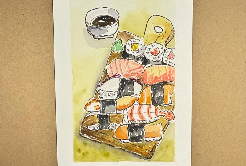
5. The Soy Sauce: Just make sure that your ink is completely dry and you can start erasing pencil sketch. In this phase, you can
see if you have forgotten some ink and you can
finish applying your ink. And yes, always, I always
forget something here. And just to be careful not to paint directly on fresh ink, otherwise,
you smartly. And the magic
moment has arrived. Queens start
applying our colors. Once again, I will start from top-left and go down
to bottom right. I take and I water
my watercolor. I'm spraying my
watercolor because it's chiefs of fresh paint
that I had squeezed these. Tina, I like to activate my colors before
I start coloring. I'm only using colors
that are usually included in a basic watercolor set. So I'm not using any
fancy color that I might be using in my
everyday sketches. I keep my kitchen paper handy and they start
applying some color. So first of all, I will color the soy sauce. For the soy sauce, I will take some black and some brown
because it's warmer. It's a warm black. You can also take some
burnt sienna to warm it up. You can always darken it later. But don't use just straight black because it's
not straight black. It's a warm black with the I'm putting some burnt umber
and some burnt sienna. So I have these warmer black. If you have second, you can use SIP. Yeah. I have reached a warm darker and I'm trying
to reserve some white, which means I'm trying
to leave a white stripe. They see in the reference
image, be careful here. Just be careful not to
paint the edge of the bowl. But if you don't leave the white stripe is
not really a problem. Because we can apply later with a white gel pen how it applies some pure brown fur
color variation. And here I have left
my white stripe. Here we are. And we
leave this to dry. And we go on to my roles son.
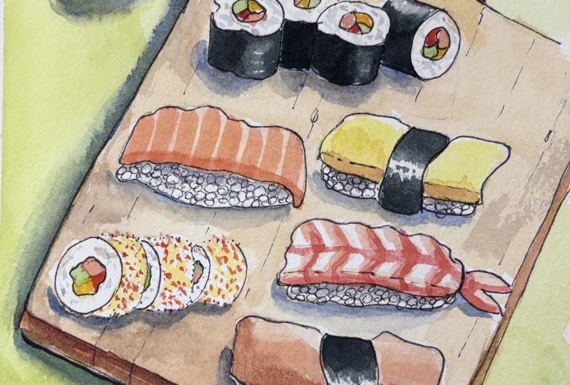
6. Fish First Layer: Now we color the center of the roles and
then we'll come back later for chandeliers of
rice and for darker colors. But I'm starting applying the lighter colors of the
fish inside the roles. And on top of the new
gt sushi, we have some, some yellow to dark and
we add some lemon yellow. Any yellow? Stress out if you don't have exactly the same
color, roses me. So I'm having some yellow here. And then start mixing
my salmon color. I have these orange is
very bright orange. If you water it down, it looks very much
like a salmon color, but any orange we do, you can take a warmer red
and mix a touch of yellow. But any orange diluted. When I start diluting
this, that will apply. I can always go darker
later here and maybe here. Then I would put some rosy, some Alizarin crimson and Tuna. I don't have tuna in
my reference image, but because I liked ra2 have
very much, I'm doing it. I'm drawing, I'm drawing
my slice of Salomon here. It's the one that it's actually below the roles
in the reference image. But I'm putting this here. So I take my diluted orange, I will start applying
some yellow, maybe here in the center
where I have light hitting. And then I go with
my diluted orange. This is just the first wash, especially to be very, very light here and go
darker later. Okay? This is the effect. We leave it. We leave this like this. Now, this is going
to be the omelet. I take some lemon yellow. We applied. You can, if you like, just not touch the upper border. Makes it more interesting. The upper end. Here we can apply some darker yellow because see this
in shadow like this. And don't touch it here. Then we go to the, I
think this is Herring. I'm not sure it's
this brown stripe, but it has a yellow undertone. So we'll take some yellow
ocher, put it here, and just paint this
undercoat, yellow ocher. Then we go back and
make it more precise. Just an undercoat. Here I have more salmon, looks like almost
a smoked salmon. Take again my urine. I start from bottom upwards. I don't touch. You have to start with my first wash. And I have some shadow here so I can start seeing how it
works as some burnt sienna. Very slightly some dots
here away from light. Just like this. Then this is going
to be my shrimp. But for shrimp, I
will take once again the same orange that I have used for Salomon and apply heat here. And start drawing
with my russia. The waves that I see
on the body simplify. This. We looked supplies
this yellow, orange. Or maybe I can slightly
darken with a warmer red. These, and I can go here. And also I will just
touch in the center. It's dark it. And I will also
mixed a different orange, more orangey, just to
differentiate from Sun, Moon and touch it
here and there. I have mixed it with red and yellow just to make it
different from Salomon. Otherwise, it's too
much the setting. Let's try this first wash.
7. Nori Seaweed: Now, if the first washes dry, we can paint the seaweed, the naughty seaweed that
is around the rice. So I will take a color very
similar to the soy sauce, But it is colder, so I will add a touch
of green like this. Use viridian or shallow green, a very cold green
touch of green. So it will be different
from the sides saucer. And tastes this cold. I see like town. I take my brush. I can even take a smaller brush for the seaweed
because they need to reserve the right to
be slightly more precise. And that will take these rash
that have a very sharp tip. So not too much water because
they need to be precise. And I start with the omelette. And here I will try
to leave some whites. So I will paint here. Strokes I go towards yet. I leave some white. And I go down. I will put some dots here. Because CCS, what
I see, Same here. Same color. Start from here. I can give strokes towards
the center of the seaweed. Goes like this. Then I rinse my brush
with just water, will take down some
of these strokes. Same here. I will add
some white gel pen here. Now. Same here. You see the green underpainting, so beautiful. Here. This direction. Then with just water, you pull some thoughts. I hope I have mixed enough
paint for the roles. So I start from
these left corner. And although I don't see
in the reference image, I will imagine here
some white reflections. So just water. Okay. To mix some more. Doesn't really matter
if it is not identical. I will not send you the
watercolor police to arrest you if you haven't mixed just an identical column
is going to be all dark. Then we skip these
because it's too fresh. The color. We start here again. And then just water. And I pulled the color. Now this missing
one, same technique. Then we can go dark and
with the second layer, just want to pull it.
8. Wooden Board: Now, the seaweed should be dry and we can start
painting the board. I take a middle sized
brush once again. We'll mix some yellow ocher
with some burnt sienna. I can also not
completely mix them, so we have a color variation that can also add some
pure yellow here, so it can give some touches of color yellow
towards the light. So I wouldn't start darker. Burnt sienna here. Try not to be too
wet so you have more control on your color. Don't work it too
much and just try to use as little
strokes as possible. Keep a mixing the colors so you have some color variation. You don't have to
mix it all together. Here I have a hard edge that I don't like
because it's cellulose. So again, I keep filling the space. It's like coloring for children, the coloring book for children. I remember I loved them
when I was little. My mom would by them to me. I was wonderful. The word before internet,
simple pleasures. But if we had no Internet, we wouldn't be here, right? So Internet has its advantages. Just keep painting,
keep varying the color. Add some yellow where you
have a heart digests. Just put also some pure
water or more color to soften these edges. Here we have a lighter
colored towards light. So more water, more yellow,
especially more water. Just keep filling the spaces. Here we will have a hard
edge but really big deal. How digests can be fun. In whatever colon here, you can just go towards the
edge without touching it. Fill this hole because it
will be darker. Same here. Also, we can put a
darker edge here, and I will put just burnt sienna without I turn my sketchbook so it's easier for me. Yes. It's easy for
me if I turn it. When you are in a
difficult position just to your sketch book, you didn't have to
fill it completely. You can leave some white here. It's pretty actually. Then you also take
some pure burnt sienna and you some dark here. And inside here. You have the Shandong. That's done. You have done the board.
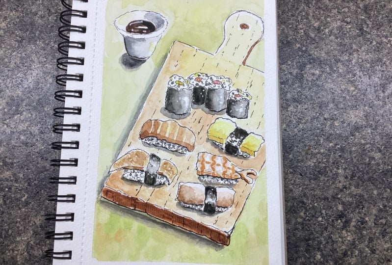
9. Background: Now we can do, before we fix
definitely our sushi, we can put the nice tablecloths. So we should choose a color
that contrast that with the overall colors that we're using for distortion doesn't
have to be overpowering. So maybe a very light
green would be ideal. I take a bigger
brush like this one. And I will choose a green, usually green straight
from the palette. Bride. This is immunity drawing. So use some muted down so we can mute it down with a
touch of alizarin crimson, for instance, or a
touch of burnt sienna. Okay, you see this
is diluted a lot. This is muted and we also
dilute it very much. And I will turn my
sketchbook once again. I will feel that table
cloth like this. While it's wet. We can also put some
touches here and there. A pure color like this. That Chase or maybe
some burnt sienna. Why not? Only if it is wet, I continue with my muted green. Careful here. Just some care, some difficult in even if you are wrong here. There's nothing wrong with it. It's part of the journey towards the light that
I will not add touches or thoughts of green, but I will let touches of yellow because we are
towards the light. More water. And we let to let this dry. You can also add, I
don't know. Yeah. Start adding some shadow here. Remember that? Like this from here. So you can start adding some
shadow here. In purple. I have taken some purple and I have dotted along the room. Just dropping some
shadow when it's wet. Okay. We let this layer dry
and we'll come back.
10. Add Details to Fish: Now we can start adding definition to our
eyes and our sushi. I take these finer brush. You see this one is
better for details. Stuff too small, just
has a very fine tip. And let's start from nori. You have light from top right. So we got some darker value. I will add a darker value here. On this side, here, behind the others
here. And here. Just slightly blended. So there we have any regular so that we have
an irregular texture. You don't have no one
to straight line here. So just with clean water, just slightly blend it. Even slightly
harder edges, nice. Here we will have to
draw some stripes. So some stripes we
take our orange and we will apply in cold, darker here, and
lighter towards light, leaving some white space or some lighter space between them. Ahead, some burnt sienna in the first two layers
mix with them. Now. More pure orange. You see I just painted
these stripes, leaving lighter
value between them. It's good if they are slightly different one
from the other here, just slightly more
water like this. And then we will have
some darker here, but we need to wait for
these is completely dry. Now, when we add the sum
definition to the shrimp, I would make some warm
red and some yellow. I have my different orange. I'm taking a finer brush with the tip of my brush
kept vertically. I draw some lines like this. Go down. Go down. Here is like a
scallop like this, then go down like
this and goes on. Here. We have like
a stripe here also. Some dots. And here just go
slightly darker. Because he's in shadow. Also on this side, darker and darker here
because you have shadow here. And here we are. I think we'd done
with this stylized. I think that the omelet, you can slightly
reinforced the shadow here with the darker yellow, or you put a touch of
salmonella or yellow. And you can accentuate here. It's nice like this. Even here in the roles, you can slightly accentuate
colors because they, when they dry,
dried much lighter. This is my hearing, I think is a herring and
it has some brown in it. So we'll mix some burnt
sienna with a larger crash. Here. There is some purple,
but it's perfect. Then I will drag
my brush against the kitchen towel and dry brush, just some strokes like this. So it gives the idea of
any irregular texture. Then I take my fine brush, I take some pure burnt sienna, and I paint the shadow here. Same with this stripe of, I don't know, maybe
it's smoke, Salomon. I dot some burnt sienna
along the stream. Starts like this. And then with water, I slowly go towards the center. Then I take some of my son. My urine, dilute it here, but I have shallow
will mix the two and that will leave lighter
value here towards the edge. I would do the same
here now along this ray and take some
burnt sienna and some soma. And then we just three lightly
draw shadow on this side. And I think you need to track
and also the naughty here. On this side of the Geary, I take one more layer, and here I'll give a
second layer on this side. And we let these dry and
then we add shadows.
11. Add Shadows: So now I have to add
shadow to these night. It's white, so we
leave it white. I will just add some shadows where you
don't see the light. Because light is
coming from here. You will have shadow on this side and on this side
of the cup and below. To meet your gray, all you have to do, You take some blue, I will take some
ultramarine blue and some of your burnt sienna
until you get a nice gray. Just keep adding blue and
burnt sienna until you find the the gray that
you're looking for. I prefer to add more blue than center because
it's getting colder. What I like to do, I also add a touch of purple. You see purple. Show you the purple.
This purple. You are probably find
it in any basic set. And I add some
purple to this gray. So I have this
beautiful shadow color. And I will add some here
and immediately blend it. You start from the
right end, Hugo. And blend it. You just pull it with just
water towards left so that you have a graduation like this. I will do the opposite here. You start from the left to the sun and you go
towards the light, this little base completely. Then also what you can
do is you take some black and you rainfalls shadow of your soy sauce on the side like this. And we'll let this dry. And you can also slightly
diluted with your brush. Now you need to apply shadow. So you keep recreating your shadow color
blue, burnt sienna. Touch of purple. More blue. Here I have a nice
dark and I can add shadow around my
bowl of soy sauce. Here. Dies inside mixer
half circle here. And then you can
leave it like this, but it gives you the other
very sunny day or you can also slightly blended, which is nice and maybe, okay. Same here. We will have some
shadow color here. And then you take some
water and you pull it. With cotton is easier
with cellulose, you might find
some heart damage. It's not too important. Then. Also I think that they want
to make this edge rounded. So it takes some burnt sienna
and they make this edge. And then I will fix
it with my ink. So I need to add
some shadow here. You can also add
some shadow color. Here. Now, we can add some shadow to rise and behind
our kidneys to shin rolls. South for rice, I will just put some shadows
here and there. Just an irregular texture because we have rice grain. Same here, especially
below the fish. The fish. And here and there. Below the fish, below the fish, and on the left of the notary. Seaweed. Here and there, just to hint, to
accentuate light, we can take some yellow and slightly add some touches of yellow towards the light. And the basically here, because our brain
decodes yellow light. Here, we don't have any lights, so we don't need to do so. But we can handle it here. And here. Just to touch. Then you blend, it doesn't
have to be really visible. That will work. Now, what will really make
your sushi is shadow. Underneath your roles
or sushi Nikki. Here you have Shanda. Shanda. Okay. Same here. Of course is on and
on the left side. Here. You can also add
a line shadow here. Make it a curve ball. Seems to be very dark now, but it will dry, lighter worry. You can hear my dog snoring
once in a while to worry. Really makes it pop. The formula. Here we have it. And also I think that we
need to add some shadow. This side, very thin. This side of the border. You can turn it
and just blend it a little stronger
Chandon just here. Because the shadows really
make your drawing pop. Heroes. On this side. Second layer of shadow on the, just on the corner
below the regime. And here. Okay, Now we let these dry
and we add the final touches. If we need to.
12. Final Touches: I think vector this pairing, it's not different enough
from the wooden board. So what I will do, I will add more yellow. Cadmium yellow is quite opaque, but most yellows
are quite opaque. So you can just add touches of color here and
there so that you make, make a texture and it pops
against the wooden board. Then what I can do is I take my pen and I will add some
wooden texture here and there. Very likely just some hints. Some broken lines like these show called and around some broken lines. Because it has a texture. Just want to give a hint
or this texture, an oval. And then around, we
have some broken lines. Here and there in here
the broken lines go down vertically
because of purpose. Perspective can put more because it's been
challenging here we have these corner that I told you I was
perfecting my pen. Okay, So this normal, then what we can do, we can add a second line, two lines that are in shadow. I'll give you an instance. For instance, this is in shadow. This awesome. So these lines will
be more in shadow. We lacked a darker line here. Here. Yeah. Just if you
have a thicker pen, you can use a thicker
pen or you can just maybe reinforced existing line. This is going to be thicker. Just some rice, you
make it more obvious. And here below these, these will be thicker. Just second line
with your pen or a thicker pen. A wavy line. Rise to reinforce
the idea of shadow. And then you take your white pen if you have it is optional. But if you have it, it's nice. And you can just
add some patches of light on soy sauce
to begin with. A line against this. And a couple of dots
here and there. Okay, this will keep light. Then you can add some. Here. We didn't reserve enough. So some white dots here,
naughty, naughty seaweed. Add some dots here and there. Also you can reinforce this. These lines, salamander natural
strikes with some white. Puts a dot on fish here. To add glossiness. You can also add some
dots on in fish. Here also. Can add some dots. The dots make it what texture. If you forgot to, to, to leave white here, you can now do now
along the rim. Can put the second layer. If your gel pen is
not opaque enough. And I wouldn't touch
it any longer. We just now peel
off the washi tape, but which is very
exciting moment, what you can do, you can use your heating
tool and heated. These will dissolve the glue so very slowly away
from the drawing. So if you tear the paper, you can always put it back in place but you don't tell
the drawing at least? Okay. I heat it. Okay. So no tape. Asda, my paper is
almost perfect. And I think I'm finished. Normal final touches to
act unless you want to. And I hope you that date.
13. Wrap Up & Thank You: You have sketched
your sushi with me. I hope you had fun
as much as I have. Thanks a lot for having
joined my class. Now, you can do two things for the other
students and for me. You can upload your project in the project gallery so that
I can give you my feedback. And other students
can see what type of results you can achieve
with this class. And also, I would be very glad if you could write a
review about these glass so I can understand what
can be improved and you can make it easier for other students to
find this class. Thanks a lot. Don't hesitate to post
it on social media. You can find me on Instagram. And my name is Yvette, that for I also have a YouTube channel where
you can learn a lot about watercolor pigments and died a few different
brands of watercolor. So thanks again, and I'll
see you in my next class.
 Elisabetta Furcht, Anyone can paint!