Transcripts
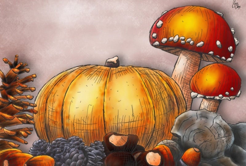
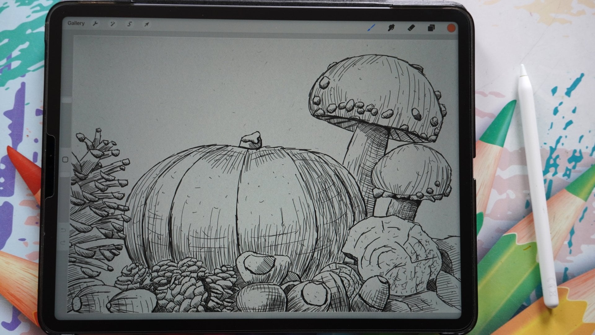
1. Introduction: This pumpkin is
getting rather heavy. What are we going to
do in this class? We can create a
pumpkin pie or it is the season for it
while I'm filming it. Or pumpkin soup will do well. But no, we're not
gonna do any of that. We're going to create a
beautiful drawing with this. What we've created already, a drawing with the pumpkin. That drawing definitely
has no color in it at all. In the previous classes, we've gone through
all the techniques to draw a beautiful drawing,
an autumn scene. But in this class, I want
to create some color. I want to add some color to the drawing we've
created before. Now, before I continue, I want to put this pumpkin down was getting ready to heavy. That's better.
We're going to add some color to our
previous drawing. Now if you have not
done those classes, you could, of course ketchup. But if you don't want to draw, don't worry, everything
is supplied. I've supplied the
sketch drawing, even the procreate file
you can use to color it. So my file is included and that's not
all that is included. I've also included
the brushes will need we're going to
work with alcohol, Marcus, What is
also supplied with this class are the colors. We're going to use some
nice real autumn colors of real market. So everything you
need is supplied. If you have done the
previous classes, then of course this is
just the next session. If you haven't done
the previous classes, then whatever is
needed is included in this section too often has
some beautiful colors. And since we already have two
beautiful autumn drawing, why not add some beautiful
colors to it too? And that is what this
class is all about. I'm going to show you how to use alcohol markers
in Procreate, how to add the color to
create really nice blends. We got a little bit
of light and shadow, even do some effects and just play and have fun
with the beautiful colors. In the next video, I'm
going to talk about what's all included,
how to use it. And then we're going to start coloring beautiful
autumn scenes together.
2. What you need for this Class: Before we start drawing, let me quickly share with you what you're going to
need for this class. Of course, you're going
to need Procreate. I'm using the Apple
Pencil, but technically, you could get away
with it without the Apple pencil to then
included in the project section, there are some extras you
might need or might not need. Some, you need, some
you may not need. That depends on if you have
done the previous class. If you have not done
the previous classes, then I've supplied the sketch. So you can sketch it if you
don't want to sketch it all. I've also included my file, my drawing, so you
can use that and then only focus on the coloring. That's all we're gonna
do in this class anyway, we're going to focus
on the coloring. And for that, I
supplied some brushes, alcohol marks, a small
set of alcohol markers. We're going to use
the color swatches to reference photos and anything else you need are included two, that's all we're going to need. Once you've got those installed. If you have done the
previous classes, then get those
brushes and swatches, and then you're ready to go. If you haven't done the
previous classes and either sketch or get my file, and then you're ready to go to.
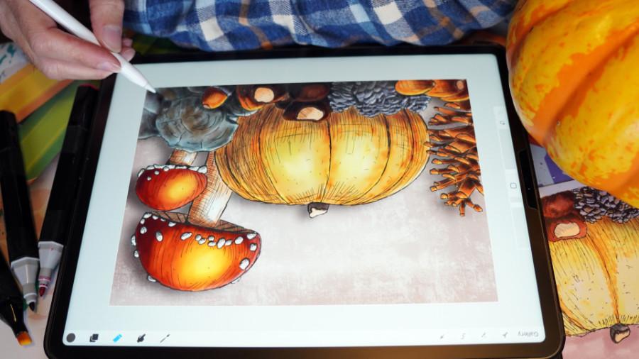
3. The Pine cones and Acorns: In this first lesson, I'm just going to run you
through the supplies. We have supplies. Do I really say supplies or
other kinds of suppliers, aren't they the
materials for Procreate, Let's call them supplies. And we're just going to show you how to use them a little bit. And we're going to just
color right away to, alright, let's do that. I've started a
Procreate already. Here's my pen drawing, art, pen drawing, edu, download it or you
created it already. Know if you've created the
last time, the previous time, or if you downloaded it, the first thing you need to
do is find the background. So I've got three layers, my drawing, where
everything is in there. I've got a start here. Now if you have
done this yourself, you don't have that start here. And you have the backgrounds
now above the background, you just add a new layer
and all the others. If you have done
the previous class, let me show you that you
have all these layers. You could select
all these layers. And then you could group
them into one group as IF and that makes it
easier to just get rid of the height them
and then show them again. You could do that and tap
the group, rename it. And from there go going
back to this one. I've done that already. So I'm going to
hide my background. That is the color the drawing. No, sorry, that is the
background. That's the paper. And above the background, I have a new layer and
we're going to do that. I've supplied a
number of brushes. They're called ABB market. And you see a number
of brushes here. Classic flat, grainy sketch, grunge, play with them. The only one we need
for this class, really a dish to a blender
and the classic market. And we may use this
grunge at the end. I'm pretty sure
we're going to use this crunch to then I've supplied swatch to
with the colors in it. It's called Real alcohol
markers. Awesome. And these are actually swatches from real alcohol markers. And you find the pellet. And what we're gonna do is
you need to find that pellet, install it, find it most likely it's somewhere
down at the bottom. If you install it,
mine is on top. Make it easy. And we're going
to press on cars. If you press on
catch, what you get, you get older names and I'm going to make
use of the names. Instead of saying
I'm using this, I'm using that color
on this little disk. I'm going to just
use this and I'm going to call out which
marker or electrical. And these markers are
actually called DPLL, chocolate, fresh
yellow, and blue. And I don't want to
rename them, and so on. So I'm going to call
out these Marcus. Alright, now let me show you the original sketch for this. Actually. There you go. You should see it nicely. This is the original
market sketch with the market colors in it. Now, Marcus work slightly
different than Procreate works. So some of these colors, I've compensated the reds, but namely the reds I've compensated a little bit
to get nice bright reds. But the rest are actually
the same colors. And even the original reds and yellows and oranges I used
here are in the swatch, but we might use may use slightly different colors
to get a nicer results. Now, what alcohol markers normally do is once you
put them on your paper, they stay wet for a while. And if you put your
next color in it, you get nice blends like here. This blend very nicely. These are two colors
and they blend in nicely as long as
the paper is wet, the ink you put on the
watercolor blends in nicely. Now Procreate cannot do that. It can simulate
that a little bit, but it doesn't do
that perfectly. The Procreate color engine, the painting engine
is not made for that. There are actually other
programs that do that perfectly, that simulate what a
Procreate doesn't. So we're going to need the
blend brush a little bit. In real life, I would
not use a blender with alcohol only to lighten
something but not to blend, but here in Procreate,
we're gonna do that. Now we're going to mimic reusing alcohol
markers a little bit. So we're going to use
them in color sets and blends in these
color sets together. I'll show you how to do that. Alright, Now, what
we're gonna do is I'm going to show you that
how we are going to use this, how we're gonna do this. And I'm going to take you
step through step. Actually. What we're gonna do with
these alcohol markers. First thing we're
gonna do, we're gonna select that classic marker. Now it should be
on a certain size, probably around ten
somewhere, right? We're going to start
on a new layer. Above your background. You need a new layer. And if you have
downloaded my file, it's just start here. We're going to start
here at this acorn. I don't want to do,
I'm going to zoom in a little bit now for the acorn, we already need to
change the size. The first room we're
gonna do is we're going to put down the light color. And then secondly,
we're going to add a darker color and blend that in a little bit like you see
here on the acorn here, if you look at the acorn, you see this very light color
and you see a darker color. Now these have blended
in very nicely and we're gonna just try
to accomplish that. Alright, so the first
thing we need is a color and I've
arranged them on. A little bit on the way
we're going to work. Some are grouped together, some not, some should have
been grouped together, but to make it easier, we're going to start
with this one, the deep yellow, that is the
first color for the acorn. And we have the classic brush and we're just going
to start coloring. Now this probably is way
too large as you can see. So we need a brush that
suits us better on this one, 2%, that is even that
is pretty large, but we can work
with two per cent. And we'll just kinda color
not with these markers. If you press likely you're
going to get a light color. If you press harder, you're gonna get a
slightly darker color. If you go over it again
as a marker would do, input layer next color. And you can do pretty much free for colors you
could accomplish, just as Marcus would do. The only thing which markets in real-life will do
is this will blend in into the next color and
make it even nicer blend. You would go a second time
with a lighter color, but with these
markers you just get a darker color and
not a nice blend. So we're gonna do
that differently. But for the first one, put it on two per cent, but I might actually go to 1% that is even too
large for that one. Let's go to the smallest, Let's make it smallest. And coloring this part. Now you can see my
marker is too large, but it's not a problem
because this part here we're going to color into and we've got an eraser now in real life that
wouldn't work at all. So we're just coloring
this n, All of it. I'm going to color all of
it with one color. Now. I imagine you don't want to watch me call it
the whole thing. So what I'm going
to do from here, I'm coloring that first layer
and I'm speeding it up. Once I've done
that, I'll be back. I've done that. Let's
check one thing. See if I'm somewhere outside, I'm going to just erase
them a little bit. Smaller eraser, please. Foreign eraser. I'm using the raw
data, the airbrushing. You could use the airbrushing or whatever you have for array
razor, those work best. I've got a soft brush. You can use a medium
blend and hard blend. Hard blend just erases
very hard without edge. Soft blends. A little bit of a nice edge from using
the soft blend for that. Wherever I've gone outside
a little bit too much, I'm just going to erase that. I think I'm pretty much okay. Alright, Now, the second
thing which I'm gonna do, I'm gonna take
that second color, chocolate, that is
quite a dark color. And what I'm gonna do is
with that dark color where I've added in my
drawing the dark part, that is where I'm going to
add the chocolate color, but not on these ends. Oh, and I'm looking at this
end and I'm going to say, Okay, I might erase
a little bit here. Not on these ends,
but only here inside. That's where I'm going
to use that chocolate. I've still got the same brush. And I'm just going to put
that color over it like this. So not their only
on here where I've actually used the pen. So I'm going to add it everywhere now, when
you're coloring, Let's make sure if you do a part that you
call it and don't lift the pen because otherwise you get this darker color on it. You want to avoid that. If you do an area, just keep on coloring, try not to lift the pen. So that is why I'm
coloring actually in each area and then lift the
pen and go to the next area. So if I will draw here, I'm lifting my pen to
go to the next area. May want to have a
little bit up here. Definitely want some here. I want down here a little bit. And as you can see, I'm not too worried how neat and
nice I'm doing this. I just want to
have that color in it where it actually is. And in the next, the next step which I'm
gonna do is I'm going to actually with the blender brush, blend this in a lot,
nicer and better. A little bit. They're not on the ends, but everywhere else where it is. I want to add that a little
bit, and there you go. Now, that looks a little
bit sloppy, doesn't it? I missed one here. But we're
going to do that now better. The next thing is
you're going to pick your the hands, the blender, tap on the blender
and go to find the Markus and select
the alcohol marker. I'm not supposed to do that. So if you have whatever
marker you select, the alcohol marker blender here. If all is well is this
should be on a certain size. We're not worrying
about that yet. This one is the
most important one. This one should be
on 65 per cent, around 65 per cent. Now, this is gonna be
way too large too. So I'm going to put that
on 1% for these two, and I'm going to blend that in. And what we're gonna do is. Depending on how
you want to blend. So you can blend from
the lighter color, blend that into here, or you can blend the darker
color into the lighter color. In this case, I want to
blend the darker color. So I started the dark color. And I just blend them in. And at the bottom a
little bit better too. And that is what I'm
gonna do with Dead Sea. And now you get a nice
transition from dark to light. And I want to push this
actually all the way up. There you go. Now, see, that was quite easy from
doing this one too. So I'm starting at the dark and I'm pushing that all the way. So sometimes you need to
go into the dark again. And let's blend this in nicely to hear a little bit
to the edge here, and I can blend this in. And now you get the nice look that a blend on an
alcohol marker has to go and I'm just
blending that in. Alright, I've done this. Let me do this one too. And blend it in nicely here too. And now it looks a lot
better, doesn't it? That's what I'm gonna do
basically with all of these. So I'm going to speed
this part up to, I want to blend in all
these parts and then I will be back for
the next part. Alright, I'm now done. I think I've said acorn, but this is actually, this
is not an acorn, is it? This is a pine cone. I've now done the
pine cone mistake. Now I'm going to the acorns and then we're going to
do these pine cones. But let's go for the a chord. Now, the acorns have a
nice interesting color. We're going to use two colors
that fresh yellow here, and the one-on-one yellow ocher. So fresh. And these two colors,
we're going to start again with
the lightest color. I'm going to do a new layer so that this layer I'm happy with, except now I'm looking here, I'm not happy with this. So let's go back to that layer. And let me blend this in with
nicer here to there you go. Now, the background will
get behind it later on. So it's not a real issue
if we miss some parts. Now I'm going back to my, well, this layer, you could
rename the layer. I could call this acorns. You tap on the layer,
say Rename acorns. There you go. It gives me
a suggestion. Start here. Recall this then. Pine cones. Pineapples, pine cones,
please. I know that. That's two words and
pine cones. Pine cones. Now I'm going to the
acorns and we're going to go for the fresh yellow
and let's see is 1%. Okay, we can go now
a little bit larger. I'm going two to 3%. 3% is good. Okay? What I'm going to do is I don't want to
call it these ends. I only want to call it
the acorns themselves. So I'm starting with this one, making sure I'm not
really lifting that pen. And there you go. So that's a nice different color
than the previous one. And the next. I'm gonna go for this one. And even if you go over that little end
here, that one here, it's not a real huge
issue. There we go. So that's the first layers. Now that's not all the acorns. There are some more. Does an acorn here
coloring dead into? There we go. This is not
an equal. This is woot. There's no These are paying us RHS not so I'm
going to do that, but this one is
definitely an acorn two. And there we go. And that's the first layer. So that's easy. The next thing what we're
gonna do is I'm going to go to that one-on-one yellow ocher. And I'm going to add
that here in at the end. That's a nice dark color. And I'm switching to
the blender brush. And as long as you
haven't touched anything, you should be fine blending
this in nicely and we only need to do nicely the edge here. And then I'm going
back to my brush. Do this part here. Might do a little bit around
here to there you go. Get that blender brush. Start blending this in. And what did you do this from the dark color or
from the light? Math doesn't really matter that much as long as
you get a nice blend. And going to this one here. Alright, and do this one too. Now to the blender brush. Alright, good. Bit better there. Blend
this in a bit nicely. Right? There we go. Alright, now we only
need a little hat. I'm not sure what that's
called in English. I'm calling it a head
and we need the ends. Okay. Now, as you can see here, these are a lighter color. These are gray color
and this is quite dark mixed with
that lighter color. So what we're gonna
do is we're going to find those colors. And what we're gonna
do is we're going to do this a warm gray. There's a warm gray, 0.5, that is this color. So that is a very light color. We're going to use
that one due to brush. Let's see if that is
now way too large. I'm going to put
that on 1% again. Color that in. There you go. And I'm gonna do
that right here two. And around the
edge a little bit. Don't need to do all of it. Let's see. Let's go to these
ones right away too. And this one just tap that
a little bit. There you go. It's a bit dark, isn't it? Let's do this again. That's
not that data a little bit. Let's just color it in. There you go. We're going go, going to go back to this one. We need a second darker
color here. So let's see. We're going to take
a darker color, this one here, that's
called 99 brands. We're going to use that one. And we're going to color this in where they
immediate shoulder. Now we're going to take the hand and it should
have a blender brush. And I'm thinking I
might go from the dark, push the dark up a little bit. And there you go. And we're done with that one. Right? Now, they're looking nice. Now for this color I'm
used to warm gray. You could have picked, Let's see, this called
the raw silk, e.g. or down here, the barely base. You can pick that too for a color that would
have looked nice too. Let's do that. Let's pick that barely beach,
beach, this one. Go to the brush and we
can add that to it. Now it's getting too dark, probably see because
there's a color under it. So if you wanna do that, oh, that's very small. You're going to
need to get that's fairly large. A
little bit of a mess. Here. There you go. Go to the barely beach
and now add that to it. And I might be a nicer
color, isn't it? So let's do that one. Let's swap this color. That is now a way to large. Used it on here,
making it smaller. I'm erasing this. There you go. I'm taking the brush, adding that color that
is nicer color for it. I'm not going to do light
shadow on that one. I like that better. Yeah,
that is a better color. Okay. The barely wasn't the bailee is the nicer color is
I didn't make up these color names that
actually caught like that. Okay. Fruit, pink. Pink fruit, which pink ring
through to so many, much Yamato, greatly I
like light old rows, not my name's they're
actually called like that. These markets. Yes, no, I really did not
make up these colors, great names and these are not even the most
craziness I've seen. Really crazy names
and wondering, how did somebody even
think of these names? Alright, we're gonna
do one more thing, and that is the other pine
cones that are there. We're gonna do them
too in this lesson. And then in the next lesson, we'll do some other parts. But first, the
missing pine cones. They're missing pine cones. There are a number here. I'm going to take
the drawing with it. And destroying is
made from photograph. And you can look at the
photograph to and see that this pine cone and these
have quite different colors. There's a lot of gray in it, and we're going to just do that. Alright, so I'm gonna do, go back now I'm going back to my pine cone layer,
not a new layer. Go back to the pine
cone layer because these pine cones and these
are very much separated. If I go wrong here somewhere, I can just recall. Erase that and do it again. I'm going to use the same layer. Alright, I'm gonna start
with a light gray color, and that is that same
warm gray are used for these acorns and then
erase the warm gray. That's the color I'm gonna do. We're gonna do this whole area. So I might just as well go
to about five per cent. I think. Five per cent is nice
and I'm going to color this whole area n.
And if I go outside, I don't mind, I'm going to
do this slightly sloppy. Show you a different
way to color. This is under it. So these are not
transparent colors, so these are quite opaque. So even if I go under it, unless you have very
light colors like there, most of the time it
won't do too much. Alright, this is the warm gray. And there you go. I'm gonna take my eraser. And definitely erase
this where it is light. Don't want it there. And just erase my mistakes
basically where I've gone out. Now, you could do it
very nice and accurate. I'll leave that up to you. What do you want to call it? Really nice and accurate, or whether you rather erase
a little bit afterward. That's totally off. Off, that's totally up to you. And even if it is
slightly sloppy, it's not gonna be huge disaster. We're going to put a
color behind it anyway. So this is not, this is something else. I'm going to erase
this here too. And that's it. I missed a little bit of a
spot there. Do that again. And then I have to
erase around it. Good, That's it. Alright, and that's
the first color. The second color, which I'm
gonna do on the dark parts. I'm going to use
a color 90 to 92. Let's find colonized T2. And colon 92 is the
chocolate color, again, that which we used in
the previous acorn, or sorry, in the
previous pine cone too. I want to make my
brush small ends. I'm lightly going to add
some of these colors here. And as you can see, why I'm not too worried
about accuracy here, just add some of
this color here. We're going to blend
it in minutes anyway. So this goes rather quick. Alright. So now we have some
brown in it to, Let's do this dark here. Where it's dark, we're gonna do pretty dark or
here, this sum here. Okay, good. What we're gonna do next, I
want to add another color, a little bit of a blue tone in this to get a little
bit of a nice effect. For that, we're going to do
this one, the blue-gray one, we've got two blue
tone to blue-gray one just on some of the
spots, not on the tops, but like this, perhaps
on some of the areas. We're mixing in
this color tool to get a nice colored nuance. Just a number of tones on here. Oh, I missed this one. I got to do this one steel. Alright, I missed one of the, I erased something which I have colored this one,
but I gotta go back. Okay, I missed one. Let's see. Let's do here a little bit. Little bit. There you go. Just adding some dashes off
this color here and there, just to get a nice color tone. This one, I gotta
go back to that. Was it 92 chocolates? And add that at the bottom here. A little bit there. And I think I'm okay, I wanted to inherit this
is dark. There you go. Now I'm going to
that blue gray one. And on some of the parts at some of it. Alright, good. Now that looks pretty
decent already, but I want to make this nice. Of course, that's why we have that Hi hand and
the blender brush. And we're just going to
blend this in a little bit. And as you can see, now I'm just making a circular motion. I'm really going
to blend this in. So blend all of it nicely. Making some nice
color tones here. From dark to light. There you go. And not worrying about this being accurate or
anything like that. Now I just want to have
a nice color tone. There you go. Good. Now let's check. If I've gone
outside somewhere too much. I think I'm okay. Yes, I am. Alright, good. Now I've got three
of the parts ready. I've got the pine cones though, the two pine cones, and
I've got the acorns ready. Next stop will be the
chestnuts and the hood. But that's not for this lesson. That will be for the
next lesson where we're going to do those
chestnuts together.
4. The Chestnuts and Wood: We've got the start, we've got a couple
of the elements. Now we're gonna do
the chest nuts, probably the war
to end this one. But let's start with
those chestnuts first. Alright, the chest nuts k, We're gonna give them
some different colors, of course then the other parts, because we want to make
sure that everybody sees, hey, those are just nuts. These are nice, nice, very nice R&D, nice
color for these acorns. It looks good. We've got some different
pine cone colors, which is nice too. Alright, now the chest nuts. Let's start with that
light color here, on here we doing a light tone, actually doing two colors
on here too and there too. And then we're going to
go for some darker tones. Alright, what are we gonna do? We're gonna go for this
light scholar we have. And that is this raw silk C, that is the lightest
color in this set. We're going to
select the raw silk. And I think my brush
is still on 1%, which is fine, could do
with a slightly larger, but let's go with the 1%. This is the lightest
color we have. I'm only going to do this part of the chestnut with it here. And then I need to do this part here to that is that same color. And of course, this one. Now, this shouldn't
take too long. I think you can see the
pumpkin shaken now. Go really quick. Eggo, good. Now we're going to
mix in, of course, a little bit of a darker color. Now we can do two things. Now we can mix in a
little bit of gray. Or what you could also
do is just go over with this darker color again on which we're gonna
do in this case. And just add a shadow like
that, see if that works good. We're gonna do that here too. That synthetase
really in shadow. This one, I think I
forgot a little bit, should have had
some shadow here. So what we're gonna do is,
while it might not be on here, and I'm not going
to add it anyway. We're going to do it like
this at that a little bit. Now we're going to take our
blender and I'm going to start at the darker part and blend it in
nicely, smoothly. And here the same. Push that in a little bit
and then blend it in. There you go. Oh, that
looks good, doesn't it? Right. The next part. Now we've made a mistake. I realized that I've put this on the same layer. I
don't want that. So what we're gonna do now, I'm going to select these parts. So therefore we
take this ribbon. I put the ribbon on freehand minus pretty much
always on freehand. And I'm going to draw
a line around this, making sure I only
pick these colors. Now I'm going to go
to the wrench C and C to add the wrench plus
Ed Prescott, not a gun. Now we're going to say Paste. I'm good with that. And if all is well, they're in a new layer
called inserted image. I'm going to rename
this to just not. Thank you, plural, good. Safe myself from creating a
huge mistake colon on time, because if I would
have thrown this here, then it would have
been slightly tricky. Alright, the next thing
we're gonna do is I'm going to pick a different
color for the chestnuts. And what I want for the
chestnut is to color 97, that is the row space and
the column 92, chocolate. I'm going to mix these two. This will be my
main light color, while light, the
light of this part. So that will be dead color. But what I'm going to
do, I'm going to add another layer under it first. I'm not going to rename that
layer because we want to, if I go accidentally in there, see it doesn't influence that. So that is what I want. And I can erase that. So I'm going to color this in right now. I don't think you can
hear it. I'm quiet. But the tree in
front of my house is full of sparrows and then
making a nice lots of them. And it's a cold autumn day here. So I think they're trying to find the last food and that tree still has some food, apparently for them and
the row chattering away. Good. Now around here. And let's do this in the
dark color to know this is on top of the other
layer. As you can see. I'm gonna make sure I erase
some of that later on. Alright, and here. And the last one. Okay, I'm probably going to have to erase a little bit there. Stick the eraser. See if I went outside. Not too bad, but here, I want to erase this for sure. Don't want this to be
on the pine cones. Alright, good. Next
thing we're gonna do, we're gonna take that
very dark column, 92, chocolate that
is very dark brown. And on the shadows, where the shadows
are at the bottom, around here a little bit. And I'm going to add that
around here too a little bit. And there you go. A
little bit there. Now should have this
should be dark. That one I'm not going
to do dark, otherwise, this will all be
very dark blend. That will be too dark
little bit up here. And let's add around
here a little bit. I'm okay with debts
could do to top, but I think I'm
going to leave that. Next thing is going
to take the hand. And let's see, I want to go from the light color into the
dark color. In this case. Just blending this in nicely. And want to create a
little bit nicer here too. And around there too, There's a very
light color there. See that's on top of it
from the other ones. So I need to erase
that later on. Later on. And there you go. I'm going do this to blend this in nicely. Degas and HER2. Making sure I blend it a little bit at the edge creates
some light effect there. This, I think I'm
okay. Let's see. I'm okay with this, right? This is okay, Only this one. And there we go. Alright. Now, that looks good. Nice, very nice. Alright, now I need to
correct my mistakes. Go to the layer above it, which is called chestnuts. Erase around here where it goes into a dark color on
where I don't want it. Here too. And around here a
little bit too bad, is it? Alright, cool. Yeah,
I think I'm okay. And now what I can do
next is let's see, the acorns are on
the radar robot for the acorns are above it. So I want to erase this, this edge a little bit too. Okay? Now here is white. I don't want white,
so I'm going back to my layer where the chestnut, so I'm going to take
that blender brush that is not a blender
brushes, that is. And eraser. And I'm
going to blend this in just a little bit
better here too. Let me check. That is better on me here. This edge, I don't like it here. Good. Alright, good. Blend this in. Create a little bit of a light edge around there just to create
some light effect. And I might do that.
Alright, that go over it with that
blender brush couple of times to create
a lighter tone. Alright, and now I
can merge these two. So I'm going to
chestnuts tapping on it. I'm saying merge down and now
I should have a new layer. It's called layer eight, but I'm going to rename that and call that chest nuts again. And plural, please. Just nuts. There you go. Alright, Those are
the chestnuts. Now we can do the E2 in this lesson while we
easily make that. Yeah, we've got the chestnuts
now, we've got a lot of it. Now, let's focus
on the word dude. Alright, let's see.
This layer gun. There you go. This is
what we have so far. We're gonna do the root
here, this part here. And for that, I'm going
to add new layer, but I'm going to do that behind everything because
this is more in front. So either above the pine cones because the pine cones are
there or under the pine cones, it doesn't really
matter above or under. And I'm going to
call this the root. And that will be my next layer. The world here now in the photo also has
some gray tones in it. So what I'm gonna do first, I'm going to add that gray tone, but I'm not going
to pick that same gray tone as I have here. I'm going to go for the
blue gray tone as a base. So the blue-gray one will be
my base tone for this one. And I've got my brush, I can go to about 56 per
cent, probably seven. Oh, easily, slightly land. Let's go for 12%. Make it myself really easy. Color this in a lot quicker. With this one. I'm going to try to apply
as less pressure as I can. Not too much pressure, although once you go
over it a second time, it's going to blend
this in any way. Alright, good. I think I'm fine with this. I need my eraser. Erase a little bit
here where I've gone outside and definitely
gone outside. Go for a slightly larger eraser. And there we go. Good. Alright, that's good. That
will be the first color. The second color which I'm
going to add is a warm gray. I'm not going to use brown. These are not these brands, but I'm going to take the warm gray and warm gray
is a nice brown color. Now, in my original drawing, I've got a warm green five, but that is quite dark
here on Procreate. I'm going for this
warm gray free. We're going to start
with that one. And I'm going to just add some
tones here with the brush, but not at-large, please. Let's go to about four per cent. What we're going to do
is I want to add some of that color around here, around there, where
the shadow is. Now, definitely in there. I might go larger than seven
and add some here and there. And just added a little bit randomly because I'm
going to blend this in any way just to get
a nice mix of colors. And let's do some
around here too. Alright, and definitely
on the shadow here. That's the first
one, the warm gray. Now I'm going to that very dark, warm gray and warm gray five-note that really dark
on the warm gray five. And where there is
really dark shadow. I'm going to add in
just a little bit more. And around the edge here too. And perhaps in here
and this edge, a little bit here.
Slightly there. Good. I'm fine with this. And the next thing
which I'm gonna do, I want some brown into two. Of course. I'm going
to pick a brown. Let's see this 97, this one, this brown,
good mixing nicely. Let's pick that and
going to a large brush, about 20 per cent. And now I'm going
to add that in. But I'm not pressing too hard. Just here and there. A hint of brown in
it. There we go. That looks good. Now we're going to take
the blender brush. I'm actually going to make a
larger brand blender brush around seven per cent the same as I've done
with the color. And I'm going to
basically mixing these colors and just create a nice interesting
blend with that. Her2 probably need to do
some erasing at some points. And once I've gone everywhere, Diego, I got an
interesting piece of what I want to go here. A little bit nicer
here to degas. Here following the
direction. Haven't been. There. You go. That's better. All right, good. Now I'm going to take my eraser. Let's check. It's rather large too. So I'm going to do
the outsides first, where I've gone outside on
erase that a little bit. Now I'm going to go smaller. 1%, 2% should be
fine. There you go. And I want to make
sure that around here don't think
influences this color. Too much. There you go. That's my woods. Only here I've seen
I missed a piece. Kind of blend that with the blender a little
bit. And there we go. Alright, and that
is my root C. And that is a quite different
tone from this part. Still quite nice to quite
interesting blend here. Now I realize your blend is not going to be exactly
the same as mine. That depends on where you're
going to put the color. And you could go in with a
lighter brown color now too. And that in a little
bit. So let's do that. Alright, slightly,
slightly different. Tone. Eat one of these
ogres. Let's lost. Let's pick this one, the
one-on-one yellow ocher and mix that in a little bit. Yeah, has a brown bit more root. And then let's blend
it in carefully now. Just as a little bit of water color with
it. There you go. Now I liked that bit of
hint of color with it. And now I am happy with this. Well, we're getting there. The next thing
we're gonna do are these toadstools don't do that. We're not going to do
them in this lesson. We do those in the next
lesson, the toadstools. Then we're going to do
pumpkin, the background, and then we're
pretty much finished except for one
thing we might add a little bit of layer effects to it totally at the end,
but that's for the end. Alright, first dose, dose tools. In the next lesson.
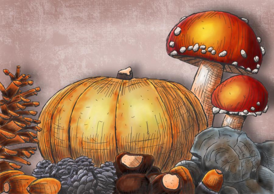
5. The Toadstools: Time for those toadstools, the main attraction
together with the pumpkin, definitely because
of the colossal. The rest is very nice. So far what we have, it looks pretty good, right? Toadstools, let's do them. The toadstools, alright, now, here are the toadstools
in the original drawing. We're going to try to get as close to these
calls as possible. But for that, we're
going to need to pick some different colors. Now what the
original colors are, and I'll show you
that in Procreate, I'm going to do the
toadstools behind the roots. That's definitely
what we need to do. Add a new layer, call
it TORC2. There you go. Now, in my original drawing, actually you might not
see it, but there's, there's four colors in
here for colors and then the blended in a certain
way from light to dark, and then going back to light
colors and mixing it in, in a certain way only here
there's four colors here. There's about three colors here, but we're going to not
do it exactly like that. Now, the original colors, what I picked is the
first color is this one, the analyze 164. And I'll show you that
color is on large. So I want to demonstrate
that that will give you this color because this
does not blend in any way. So it stays this
really strong color and I don't want that. If you look here, this
has blended in nicely. The color is still there. You can see that greenish
color that is still there, but not as strong as here. So what we can do is either lower the opacity
or in this case, what we're gonna do definitely
is pick a different color, a lemon yellow for this. The first thing
which I'm gonna do, I'm actually going to just
color this with lemon yellow. And as you can see, the scales, I really don't care about those girls were going to do
them with white later on, or at least a nice light color. There you go. That's
the first part. What we're gonna do, we're gonna create some highlight
effects, so we need that. The next column
would be some red. And I've used in the
original drawing, I'm going for this
apical than this familiar and then this French and mix them in,
in a certain way. What we're gonna do,
we're going to use this familiar and this deep red. We're going to start
with the familiar. You could play with the French familiar into which
is more orange, but we're gonna do now
not as large Please. Around 5%. Let's see what our work. That's nice. I'm gonna go around
the edge here. And what we'll do is
I'm going to color this in actually where
those shadows are. Alright, Now, lift my pen
because I'm out of room. And I'm doing that here too. And I'm gonna do that here too. And you go. And again, if you wanna do with
it, It's neat and nice. Do that please.
If you want to go sloppy as I do to
that, please do. I want a bit more here? The next color I'm
going to use is this very dark, deep reds. And I'm going to use debt
basically at this end. And a bit at the bottom. Right, I'm following a
little bit of the contour of this totes to Diego. And now we're going
to blend these colors in with the blender. What is it on? Seven per cent, I
think I might be fine. And we're going to
start at this red. And I want this red to go into this yellow because there's
way too much yellow now. So I'm going to push this
red into the yellow. Diego. Bit sloppy at first,
just push it in. And now we're gonna
go from the outside, do this slightly nicer. And today you go, here, you get a nice blend like this. So there we go, good. Now, blend this in nicely
to around the edges. And now we're going to just randomly blend the dark
color in a day you go. Now, should we bring back
these skills in a minute? Let's go around
the edge to here. We're going to end up with
something more interesting. I'm going to blend in this. Just a little bit more. There you go. That
looks very nice. Alright, next thing, I'm
gonna get my eraser. Erase the outside. There you go. Now with the scales. If I erase this here, then the background will
come through because we're going to add
background later on. So I don't want that. I need some color on the scales too. But let me first. Erase everything
I've done where I've gone outside and now I need to definitely erase a little bit there because I don't
want that color here. Don't erase that. Alright. Why don't want to do is probably do that second toe to
now should be okay, could do the second toe
tap on its own layer. Alright, the next thing
is, I need white. Now, I don t think
I've white in here. Definitely not. I could use that
raw silk for that. Let's give it a try. I'm going to add a
new layer on top. And I'm going to call
this the skills. And the skills are
these white spots on a toe two are
called the scales. So what I'm gonna do,
I'm gonna do that. That will work well. We can also do is
go to the color, make her own color. We pick that scales color. Push this to the white
as much as you can. So this is great. This is nice and white. Going back to our palettes and
just add that right there. And you can call that, It's
called now light gray, so it's not perfectly
white, but that would work. You could pick another
palette to add the white. Alright, so I'm going to color in the white not that large. About now, let's go to the 1%. That is good. And there you go. I'm coloring in this color. Bring back these scales. Now if we add a
background later on, we are sure that the right
scales will still be there and not this
background color is coming through it even
here on neatly do this. Since we don't have this
completely white collect, I can actually see
what I'm doing. Take my eraser, smallest eraser, erase this here a little bit. Don't like that, good, and not here neither. And I'm gonna do this
slightly better. Alright, and now we've
got our TORC2 back. See another red.
Totally looks different to very nice like
this. Alright, Good. Now this one, what
we're gonna do, we're gonna use some
different colors for this one we're going to use, we're going to start with
the wave done the yellow. Then the next color
I'm going to use is that bright apropos. And my brushes on 1%, which is too small, Let's go for four per cent. And I'm going to go around here. Now. I'm hardly using any
pressure around there. So there's a little
bit of pressure. And then we go Nice
and they're good. Normally, when you
use real blend, real alcohol markers
and you do this yellow, you put the red on top of it, that the red really
start to pop, gets a really nice bright red. Now in Procreate, the effect
is a little bit less. But the next color I'm going
to use is the familiar. And add that little bit around the top here
to a little bit. And the back here. And I'm okay and the last
column, I'm going to use this, this French familiar on
add that right here. Might add a little
bit around here. And at the edge
around there, too. Good. Alright, now I'm going
to just blend this in. I'm starting at that
familiar and working my way back in here. And around here too. I'm blending this in a bit
nicer, need some more red. So I'm pushing in that red again as we've done
with the previous one. And now we're blending in. That looks good, doesn't it? A bit toned down color, but still quite nice. And less of this yellow
in there you go. I like this better
around the edges. All right, time for the eraser. Might need slightly larger. 2%, 2% is fine. Don't want to erase, of course, where
I've done there. But I do want to erase
this a little bit. Alright, and that's
the next TORC2, Maria, I'm good with that. And I'm pretty sure I'm
on the wrong layer. Yes, I am on the scales layer. So what I'm gonna do is we're
gonna select that ribbon. Select this again. Caught this out. Go to
the toads to layer, say past and let's see if it passed onto the tote to layer. And now it didn't too bad. What we're gonna do is. We're going to put
these totes to layer above this layer on
and you can't do that. No, No, That goes wrong. It now, sorry, Deco
is totally wrong. That's why the yellow
didn't blend in nicely. Alright, I'm going to merge
these two down. There you go. The skills I'm
leaving on their own. And we're gonna do some
scales on this one too. So I've corrected this again. Need to pay attention that I'm not doing everything
in the wrong place. Now I've got a white steal, that light gray which we made. And I'm going to get
my brush smaller size. And I'm going to
add these skills. Now. There is a
skew right there. There's a scale right there. And there are some
scales right here. Since they're not totally
white. I can see it. So I went over there a
little bit too much. But we can correct that. Let's do that here too. Alright, that's it.
No, that's not it. We need still this stem or
the stock of the mushroom, and of course the bottom
of the one mushroom. Let's do that. We need the stock. What we're gonna do first is add a new layer under
the toadstools. Call this, rename the
stem stock or stem, whichever one you prefer Stock. And we're going to do the
stock and the bottom here. For the bottom, we need a color. Apparently we need a color. We're gonna do, Let's
see this one that mushy, mushy at all color. Let's pick that one and
add that and-a-half still, I'm still on 1%,
I'm fine with 1%. And there we go. And we've got that
under it. Good. That's a nice dark color
for the stocks itself. What we're gonna do, we need
a bit of a lighter color. We're going to start
with this raw silk, but we're not going to
paint the whole stock. We're going to start right here everywhere were shadow is, we're going to paint it in. And we're going to create
a line there and rest. We're going to lift and that
middle spot, totally whites. But since we're going
to have a background, we cannot leave it white
because that wouldn't work. I need to make sure
we're doing everything. Otherwise. There's going to be the
background shining through. I want this to be white, so we're gonna go to that light gray and actually added
here in the middle. There you go. I'm gonna
do that here too. At that light gray there, go back to that raw silk. At wherever you are aware of
my shadow is around there, but that part, I'm
going to leave light on purpose
inside of it now. And then the next
thing I'm gonna do is create that shadow
a bit stronger. And for that, I'm going to
pick which one should I pick? Let's see, um, well, whereas a nice color
on this, it is, it is quite pink
one and that pink, if I pick this fruit pink, that's not too bad, that's slightly too dark. So I'm going to pick
that barely beach. And I liked that a lot better. Okay. We're gonna go for the
barely beige color. And wherever the shadow is, a little bit around
the edge here too. Not all the way. Well
here we do need it, but not as far because we're going to blend it in any way. And let's do that on the here and back here and down
there a little bits. And the next thing is, we're
going to take that blender, blend these colors in. And let's make the blender 1%
blend in all these colors. And here too, but make
sure you leave some of that white color there. See, and that looks good. I want to do the same here. I'm going to want to blend
in first these colors. So are everywhere. These two tau we go. Nice blend here. That's blending that she had so much macchiato
color to a little bit. Well, I think I've
been everywhere and pushing the mafia to
color a bit lighter. So I'm pushing this color
into that macchiato color. And dare we call much
Seattle, whichever. However, you say that, There you go, we're getting
somewhere looking good. Alright. That's the toadstools.
They're looking nice. What we're gonna do next
with the toadstools. We could group them. Oh wow, we don't need to do. Now. Let's leave. Alright,
that's the toad stool. Now, normally what we do here, we'll do is put a little bit
of a shadow around here. But we're not gonna do
that because we don't have such a small pen and it
looks pretty good like this. Alright, that's the toadstools. We're getting there,
the pumpkin and the background and
some effects probably. And then we're done, right, let's do the pumpkin
in the next session.
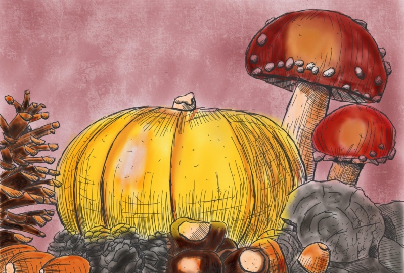
6. The Pumpkin and background: We are going for the pumpkin. Yes, we're going to
go for the pumpkin. Now I still have
that pumpkin here. Video, nice color. We're going to try to
mimic this colonized. Once I'm done with this class, I'm going to make some
soup of that pumpkin know, pi to this year, but a pumpkin soup, although now I'm
saying Pi, tempting, tempting to do a pumpkin pie, but I think it will be a pumpkin soup might change my mind. Alright, good. Well, but that's not for now. We're going to draw, no, we're not going to draw a color that's colored the pumpkin. In this original pumpkin, that's the nice color under it. We're going to use the yellow. We're going to see what we're
gonna do if this pumpkin, let's play a little
bit with the pumpkin. Alright, so we could use
this fresh yellow color. Let's see what happens. I'm going to zoom
that in and I'm going to put that
pumpkin next to it. I'm going to say termite
actually would nicely. But what we're gonna do instead, we're going to use that column. We're going to go for
that lemon first, or should we use that? Nice? Let's see. First we need a new
layer not on the stock. We're going to need a layer
behind everything now. So under everything
there's gonna be a pumpkin on top of
the background though. Pumpkin. There we go. Okay,
pumpkin is there. If we have that nice color, that's gonna be really green. I'm going to lower my brush
larger. What do I have? Around 13%. So this would be an
interesting color onto it. But if you press too hard, it's gonna be green like this. So this might be a very
tricky collar to do. Well, we're going to
use lower the opacity. Let's go to about 50% and
then add this column. And then even if you press hard, it doesn't really matter. Let's add this color as a base. The lightest parts, so
where there is no shading, I'm going to put this color. That's my first layer. The next one I'm going to do
is did this lemon yellow, I still get gutted on 50
per cent to that's good because then it mixes in with
this color a little bit. Add just a little bit to it. There you go. Nice. Next column we're gonna do
is this lemon, fresh yellow. That is a very nice
pumpkin color. Now I still got it
on 50 per cent. There. You go. Up two fingers, which I which I don't know now is
what can happen when we what's going to
happen when we put a background behind this is the background can shine
through OR 50 per cent. Or won't it be too bad? So what we're gonna do
is we want to test that. Now. I'm going to
add another layer. I'm going to call this
layer the backgrounds. Backgrounds. There we go. I'm actually going to add
my background right now. What I'm going to do
for the background is I'm going to pick
this color here, the old light roast. There you go. I want to pick a
different brush. I'm going to pick that
alcohol marker crunch. I want to put that
grunge all the way up. And what I'm gonna do,
I'm gonna just go in one goal at a background. So I'm starting at the top. No change in pressure, if you are possible, is it that is possible? And just in one go, there is my background. And I'm going to check
with the pumpkin. That looks great, doesn't it? It doesn't come through. So I can keep my
pumpkin as is here. If you look at that,
that is actually quite nicely close to the pumpkin. Now we're not done
yet, almost see. Now we've got the background
and this is the way it's going to look quite
interesting, isn't it? We could even do
that paper under it, see the paper through
a little bit. That's very interesting,
but we don't need to do. We could leave it light
and strong like that. Let's go back to that pumpkin because the pumpkin
is not ready. So we've done the pumpkin. I want to blend in these colors. Of course, I'm picking
that blend blender. I'm going to go to
about ten per cent. And blending these
colors nicely, just might circle a little bit. And there we go. Nice. There you go. Now we've got some interesting
plants on the pumpkin. Got some nice yellows. A little bit of a
greenish tint in a two interesting pumpkin. Looks good, doesn't?
It looks very nice. Now, this pumpkin, Of
course, as you can see, not only has this
yellowish orange, but also has a strong orange,
we need to get there. Then for that, I'm
going to go to a new layer above the pumpkin. And later on, I'm going to
merge these layers probably. And for that, we're
going to pick that same fresh yellow color. But now we're gonna go for 100%. Alright, let's see if that, if we can get that on top of it. Well, we've got a
huge brush now. We don't want that. We can go back to our classic marker brush
Diego, that is better. And put that on 100%, right? And the size, I don't know. Let's see. Let's start with seven. Let's see how large. That might go. Lightly bigger, ten per cent. And let's start at the bottom. Let's get in. And we're going to blend
it in in a minute. Right? I'm going to add
that color right there. And then around here. And at that color
in a little bit, this is a little bit of
random strong color. Now, for blend that in Diigo. Nice bit on the top. There you go. Back there. Alright. There we go. Bit more here. And some spots here and there. Alright, Good.
Take that Blender, make it nice and large. Let's go for it. Let's see what happens if we do this 100%. And then when I would work on that today
you go blend it in. You go, Now we've
got our pumpkin. Alright, nice. Okay. And I've still got a mess. So what I'm gonna do with this, I'm going to just blend this, sorry, merge these layers, say merge toe tap on the layer, which is that pumpkin
on, say Merge Down. Now the pumpkin is one. I'm going to use my eraser. And I definitely need slightly larger free per
cent over That's nice. Erase where it shouldn't be. And that's it. Alright, and
that's my pumpkin actually. Except for the bit on
top, we need to do that. Let's take the brush and
we need this part here, the color we're going
to use for this. What are we going
to do? We're going to start with that
row silver again. We're gonna go to my brush 1%. And I'm going to add the raw silk collar
right in, right there. That should work nicely. Good. Alright, the next color, which I'm going to take that as a lilac color
here, the gray lilac. And I want that around
there a little bit. And let's add a
layer stronger too. Let's get the two applications, one application and a
second at the bottom. And then I'm going to
the blender brush, going to go small with debt. And I'm going to
blend this color in a bit nicer day. You go. Actually push it slightly into
the shadow color above it. That should work. There you go. Now, I'm happy with that.
Yeah, that is good. Alright. And that's basically also create the whole drawing. We're done. Except for one bit. I want to add some
effect layer on it. Now, if you are happy
with what you have now, if you're fine with it and say, I like it this way, then the next part, if you want to add
some light effects on it, then I would say, join me in the next part, the final part of this
lesson of this class.
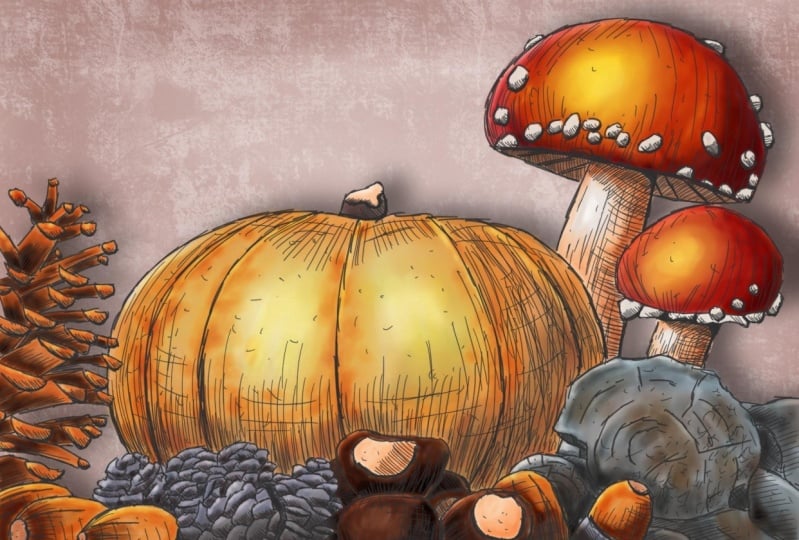
7. Adding layer effects: The final part. Now,
this is something I wouldn't do with
my alcohol markers, but since we have procreate, we can add a little bit of a light shadow effects on this. I'll show you how to do that. Alright, for that, the
first thing we need is a layer above everything, but not the drawing above
my acorns as my top. I'm going to add
an egg and layer. I'm going to call this light. Let's call it Light. Yeah, that's good. I'm going to put this layer too. I think I'm going to use
overlay for this one. We could do soft
light, hard light, but I'm going to use
an overlay for that. I'm going to that lightest
color, the light gray. Now, if I have this brush, I'm going to change
brushes for this, I want to do a bit
of a light effect. I'm going to get that sketch. Margarines are the crunch to consider scan. Now
let's go further. Or you want to grind
out the sketch mock-up, the sketch marker for this
with this brush and white. If i'm, I'm not
changing anything. Let's say I'm going to add some light here on the pumpkin. I would get that. See, it lights up the pumpkin. Now you could use actually
bloom effect for this too. There's a bloom effect in it. But I'm going to use this. And it is quite nice. I would put it here
to a little bit, but way too strong. So I will take that
blender brush, actually make that
blender brush large. And blending that light
a little bit like this. And you get a little bit the idea that light
shines on this pumpkin. If I now hide this layer,
keep looking there. So there's a nice
light shine on it. I want to do exactly here too. I'm not changing
anything except for now. That's okay a little bit there. And then I'm going to take
that blender pen again. And I'm blending this light
in just a little bit, create a little bit
more interests. Aco, right? That looks good. Now with the wood, what
I wanna do if the woods, I'm gonna go back
to this same pen, but I'm going to
make it smaller, 1%. And at the root,
what I wanna do is add a little bit
of light effects. Right at the edge. There you go. And here at the edge x2. And now that is very light. I realized that therefore
we have the blender. But now I need to
put a blender on small and blending the
edge a little bit better. And especially around here, blended in a little bit c, and now you get a
nice edge of light. We're going to do the
same here to want to add. Just around here. Create a little bit
of that effect. And now blended in. And just a little bit of
a light edge there, C. And that looks good.
Let's do that here too. Around they're only here on top a little bit and blend
this in as much as we can. There you go. Alright, now look at that. See, now you get some
nice, interesting parts. Now you could do that
around here too. Create a little bit of
an edge around here. And I will do that
around there too. And obviously around there. And let's do take the acorn
with a two and this side too, and they're a little
bit light effect. See that it looks really
good, too strong. We are going to just
blend it in with the blender a little bit. Here to our desk, looks actually pretty good. You could do it
around this edge too, but I think we're
fine with that. Now let's do it
with these acorns here to just at the top. Just a line and now blend it in bit nicer than we have it. Day you go see, and that creates a very
nice, interesting effect. Now we could do it
here in the middle of these toadstools to just create a little bit of light effect and that
lights up everything. If we do rim, Let's go. So when H naught
and H Then let's do some edges around there too. And there you go. Then let's add a
little bit there too. But this we need to
tone down a little bit. And here we're going to
spread it a little bit. Told me down slightly here to, there you go. That is better. Blend that in a little
bit c and now you get some nice, interesting edges. Now, technically could do it around there, tapping carefully. But that would work. And now I'm not pressing hardly. I don't want to blend all
of this. It takes too long. I'm just hardly pressing. Just creating a little
bit of an edge. Light comes from here. So where are these
lighter parts are? I'm just creating
a little bit of light c and that
makes it interesting. Let's do that on here to
carefully. There you go. See around here some of
the edges around there. Now if this is too tricky, what you could also do is of
course, lower the opacity. And then you could paint it in. I got the opacity around half, makes it a little bit easier to add that
edge around there. Then you get a little bit of a light shadow effect going on. Here too, a little bit. And that looks good. Now, we need some
more around here too. And there we go. I think we've got everything. This is light, it's
pretty much enough. Might add a little bit extra while we have that
50 per cent around there. The rest, I think I'm okay
with C and just a little bit of extra around there to
create some nice edges. Let's put an edge right
there and here too. And even slightly
on top of this. And in there. A little
bit. Let's add a few. Around here too. Just create a little bit
of light and shadow play. Alright, now we could
do some shadow to, you, could add a little bit of
shadow under the lights. I'm going to add a new layer. I'm going to call this Shadow,
rename shadow. Shadows. That's fine. I'm going to put that
to pressing on that and put that to multiply. I need a nice dark color that would be the
darkest and unthink. I'm going to use this
blue-gray free for it. Or you could use a warm gray. That's tricky. Now let's see, I'm going to
go for the blue-gray first. Let's see what happens. Still have that same brush, that alcohol marker
sketch brush. I'm on a large in it, make it larger a
little bit. It is on. Let's go for 100% first, want to show you what happens
if I do on the percent c, I get really dark,
shadow like that. Now it's way too dark, of course, remove that. Let's try that warm gray. Let's see what that
gives four color. I like that better. Let's stick to the
warm gray five. That is a nicer color. But what I'm gonna do,
I'm going to lower the opacity to
around 40 per cent. And there you go. Just at the pumpkin
starting there, add a little bit
of shadow there. I've got quite large brush. Though, retail about,
what do I have now? Six per cent here. And a little bit around
that edge to here too. Just a little bit of shadow. And dare to, good. Alright, and that creates a
nice shadow and light effect. Here. I'm going to put a little
bit at the bottom. The rest, I don't think I
want to touch this quite some light shadow going
on only on the pumpkin. Just add a little bit of
shadow like this and the rest. The only thing you could do, technically, do it around
here a little bit. Then I have to go
with a second one, create a little bit
of shadow there. And definitely around
here that you go through. And I'm not gonna do
anything more on this. At least not for the shadow. Now there's one more
thing I wanna do. I want to create a cast
shadow onto the background. For that, we need to do
a little bit of a trick. Let me show you that. I could paint in that shadow by hand. But there's a little
trick for that. I'm gonna go, first of all, go to my gallery. I'm going to say. Slide this one to the left, say Duplicate, I'm going to
make a second version of it. If this goes wrong, then I know for
sure I can go back. What I need to do for that
is I need to first of all, merge all these layers except
for the light shadow layer. So everything which I call it. So what I'm gonna
do, I'm gonna select the first layer and then I'm
going to slide every layer, which I call it to the right. That's it. And we're going to say group, this group, I'm going to keep, and I'm going to
duplicate this group. So I'm sliding now to the
right or to the left. I don't want to say duplicate. It makes a new layer for that. And the one on the bottom, I'm going to tap on it and
we're gonna say flatten, this is now one layer. I'm going to hide the original. Now I'm going to tap on here and we're gonna say alpha lock. I'm going to take a brush
and we're going to take that warm gray seven. And I want to put
it all the way up. Don't care which brush I
have 100%, Hundred percent. And I'm going to make
it nice and black. I want it to be gone. And now you can see that the light spots That's
funny are staying. I may need to press this
brush a couple of times. This gets really,
really nice and dark. The color basically
pretty much gone. There's close to here. Let's make sure that it's gone. Good. Old color is now gone. And that's gonna be my
shadow behind everything. I'm going to now bring
back my original one. And I'm going to get my arrow. And I'm going to move this. Now. See, I'm gonna get create a nice cast shadow like this. There you go. That is good. That is it at the right place. Nice. Now I'm going to tap
that arrow again. This is of course,
way too strong. The next thing which
I'm going to do, make sure I'm on that layer. Yes, I am tapping
this magic wand. I'm going to see caution blur. I'm going to slide to
adjust now this way. No, I cannot do that. I'll go back to the layer. First of all, I need to
switch off the alpha lock. Yes. Now we're going to tap
that magic wrench. I'm going to say co-gen blur and now it blurs way too much. Good. And I'm going to blur it till I'm still seeing the shadow. This nice and blurred. Alright, tapping that
magic wand again. And this is what I do want, but it's too strong. So I'm going to say the opacity. I'm going to slide that
until I like it actually, I like it like this. Probably go for 55 per cent. Let's take a look. Yes, that is nice. There is now all shadow in here, so I could take that eraser and start
erasing wherever it is, actually in the way and lighten it up ad that is okay, right? Now only on this part it
might be tricky to do. And definitely
there, make sure I don't accidentally erase what I don't want to erase form
back to five per cent. Like that. I don't want that. I'm pretty okay with this. Yes. This should be working
nicely. There we go. Alright. And Harris, my torso. There it is. Now we could do D backgrounds, but you will see a
little bit of it. But I don't think I want
my background with it. I think I'm okay on the drawing, it looks great. Under here. It doesn't look as great. Now let me hide the drawing
and then you get this effect. You could play with
this to and create some nicer edges and
add some details, but that will take awhile. We're going to just
leave it as is. And we're done with this good. And as it, right, we're done. We're having only
the project left. So I'll see you in that video.
8. The Project: The project. Now what my project will be
is of course, pretty obvious. I'm going to create pumpkin
soup of this pumpkin. Should I do pumpkin pie? I'm not sure yet. I'm going to think about
that after the class. But whatever happens, I'm going to really enjoy this pumpkin. And I'm putting it down again
because it's getting heavy. It is still having a pumpkins. It's not a huge
one, but it's still heavy for such a pumpkin. Now your project, what is
your project going to be? I've got two projects for you. The first one is very obvious. Just post the result
of this class. I just love to see
what students create. And of course I will
comment on it and just show to all of us to enjoy it. The second thing I would love some feedback on this class are not only this class
and feedback on all of my classes
would be great. So the second project is, please either start
a discussion and give me some feedback on
the class or post a review. That way I also know
Think of it or do both. You started discussion
and do a review. Refuse really helped me to get an idea of what people
think of my classes and also helped me to
determine the direction I'm going to take with
these Procreate classes. I do want to create plenty
more Procreate classes. And if you follow me for awhile, you know already that at least once a month there
is a new class. But I would love some feedback to know whatever I'm doing well, whether I'm doing terrible. Oh, I'll leave that up to you because I would
love some feedback. So that's the dual project
posted for all of us to enjoy. And then post a discussion
or even better, give a review so that I know
which direction to take. Well, that's it. Alright. I'm looking forward to your
projects and your feedback, and thank you for being
with me in this class. If you want to do some modest, there's plenty of
Procreate classes here on Skillshare for you to enjoy. And since it's autumn,
I got some nice autumn, other autumn drawings, paintings you have
the more paintings, oil paintings too, but
also some summer fun, whatever season you're
watching this in, whatever you would like to do, there's plenty of
Procreate class. And so perhaps I see you in another class here
on Skillshare.
 Benjamin A, Art Teacher, illustrator Art by Benjamin