Transcripts
1. Introduction: Have you ever want to develop a modern website
without knowing code? Then this class is for you. Hi there, my name is Tim see, Webflow developer at
Victor flow Agency, which is a professional
partner in Webflow. I will share my experiences on how we are building
a web sites here, I will let you know the practical website
building process that is from figma design
workflow development. Workflow is a powerful
tool that led us to build websites
visually with no code. This goes at anybody who
wants to build websites. Even you may be a beginner
or you may be a designer, or maybe you want to become a full-time web
designer for you, Webflow is the answer. This class is totally
from scratch. Each and every steps on building a website is shown completely. We will go through
the flow elements, styling, and so much more. Here I have explained about the comment box model
in each lessons. For the better
understanding of how we are building on being a beginner, you get easily learner process. I have explainable
the CMS on creating the blog post listing page
and a single blog post pitch, being Overflow Developer
and illustrator, I thought of developing
and portfolio website, which has all the
necessary elements needed for the drawing. Noticed. Once we have finished
the development process, we will make our website, which is responsive to desktop. Tablet. Mobile is also, we will check with
tips and tricks for finalizing the Webflow
project perfectly. Like better SEO settings, performance improvements to get a green results on Google
Chrome lighthouse. Finally, what we're
building is free for you to clone and customize it
to change by your needs. In this class, you will
get the resources or Figma file and clonal
portfolio website. You take this class, one of the unique free icons
or Figma and Webflow. So if you're ready
to become a no-code Aleppo and to build
a standing website. Let's get started.
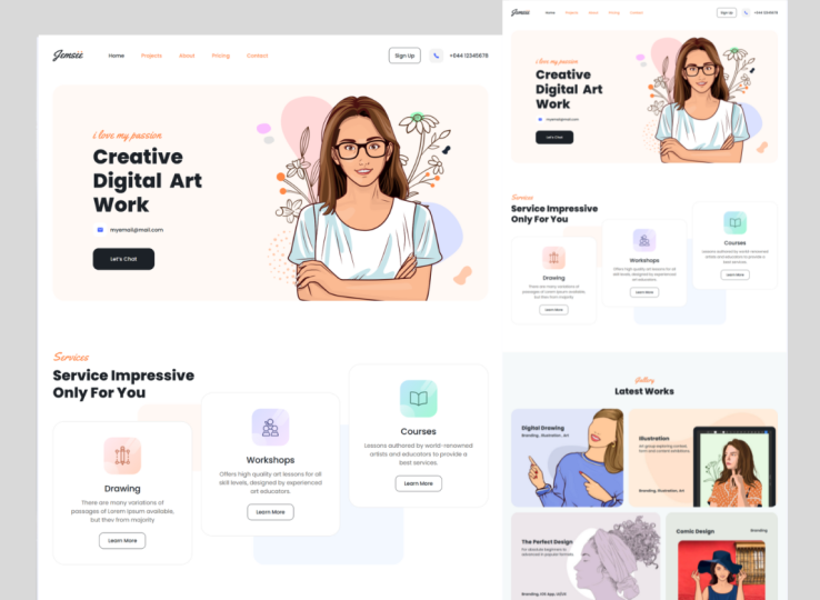
2. Figma Design We're Going to Convert: In this lesson, we will analyze the figma design that we're going to convert it in overflow. You can get this with my
design in the results section. And you can import this
file in your Figma. Let's get into the lesson. So this is our figma design for our artist's
website template. In the left-hand side,
we can see the bunch of layers that we have used. Now coming to the design. At first, we have header. Inside the header
there is a logo and the properties regarding
to it can be fine. Another design, which is
on the left-hand side, we have a use this
logo as an image. We can set the file
type in the export. It can be PNG,
JPEG, SVG, and PDF. So by choosing the file
type in the export, this particular file
will be exported in our local file and can
be used in overflow. Now, under the preview, we can see the preview
of this image. Next, there is a menu. The menu is in text format. When we go to the inspect
in the left-hand side, we can see the properties
regarding to the menu text. In the properties we can
find the width and height, the topography that is used, that is foreign weight
style, line-height. Even we can see the
CSS properties. In the header. We have a sign
up button to check the box. We have used a text. By clicking on the sign-up. Again, we can find
the text properties. Next, we have a contact number along with the icon
and a phone number. In the header, we
have a logo, Meno, which is an addict
format, and sign up, and a contact number with
the icon and a phone number. So the header is over. Next, we have banner, that is the hero section. Inside the banner,
we have two parts. One is for the contents and
the second one is for holding the image coming
through the content. But we have subtitles, died Dose, a mail
icon, and a mail ID. And let's check button. Coming to the second part, we have an image add-on to that. There is a background for the
both content and an image. Now we have seen the banner. Next, let's see the service. In the services, we have
a title and subtitle. This design will be used in all over the sections
in the workflow. So on clicking on each thing, we can find the properties
regarding to it. In the inspector. Below the heading,
we have these items, boxes, Each of the
boxes, one MOD adult. In the workflow, we will see how to download this type of design. One of the services has
a background shadow. Even we will see how to
make this in our probe. Now coming to the
individual service, at the top we have icon and as always title and below it there is a
description about it. And at the bottom there
is a learn more button. The same design as applies
to other two. So visas. Behind these three
services items, there is a background image. We have analyzed the services. Next, let's move
on to the project. Here do we have used a title and a subtitle
which is at the top. The same design as
in the services. That is a box which holds all
the title and the content. With the background column. Below the heading. We use four parts, each with separate block. Inside each block we have a title, description, and image. Along with the background. The same pattern will be
followed for other three blocks. That is the same gap we
doing each of the blocks. Next is the workshop. The workshop there is two parts. One is further content and
another one is for the image. Coming to the first part, that is the content part. We have a title and subtitle, as in the previous two layers, along with a
description about it. And below it, we
have a QR code that QR code is for to pay the
amount by the visitors. Near to the QR code, we have icon along with the description about the
usage of this QR code. And below the everything,
we have a button. For book mine time. And in the second part, we have images along with
the background. Next one is about me. This about me has the other image in the
left and below it, there's the social media icons. Next to it. A small description about the author along with
this in my work link. And at the lost, there is a video along with
the Play button. Next, we have OT license layer. In this odd license layer, we have a two columns, that is the two parts. The first column is
to hold the image. The second column
is for the content. In the second column, it has a tab option for art licensing and a commission on clicking on this first step, the content related
to it will be displayed on clicking
on the second half, that is the commission related
conduct will be displayed. We will see how to make
this enough blood flow. Coming back to the design
for both the tabs, the content design will be same, but only the content changes. For the content of the tabs. It has a title at the top
and a description about it. And below it,
there's a two parts. One is to hold a percentage. And in the second part
as small description, we have seen the
OT license layer. Next is a testimonial layer. This testimonial layer
has two columns. One is for the title
and the subtitles, and the second column is
for the testimonials. The same design will be followed for each of the testimonials. Let's see the individual
design of this testimonial. At the top, we have
used the quotation mark and a command given by
the visitors or the loss. We have the image of
the visitor next to it with the name along
with the resignation. And in end corner, we have a rating
given by the visitor. The same design will be
followed for others, one leaf with changes in
the background color. And there is a background image. This testimony earlier. Now, let's see about
the price layer. This price uses the box along with the background
color inside it. That is the title
and the subtitle, or the dog, as we have used
in the previous layers. Below this, there
is a two columns. One is for the free and
one is for the probe. Coming to the first column
to hold the heading, we have used the
block on one end. There is a heading on in another n. That is the
mentioning of the rich. Below this title,
we have a bunch of lists regarding to
the free motion, along with the
heading on the top, on one corner, to
another corner, there is an emoji and below it, that is a list of
the free version. At the end, we have a button
to access the free version. Inside this listing, we have highlighted
some of the woods. The same design is followed in the second column with the
changes in the pricing. The pricing a layer has
the background image two, we have seen over
the price layer. Let's see about the blog. The blog has that title
and the subtitle at the top and below
the title section, that is four bytes. The same design will be
followed on each of the parts. Let's say the design of the
individual parts inside it. We have used the two blocks. The first one is to hold the
image and the second one is for the content coming to the content that is a
heading at the top, below the heading, that
is a published date and author name
and a blog extra, along with the read mode link. The same design as
follow for three. After the block, we have FAQ. It uses the box with
the background image, and also it has the two columns. The first one is to hold the title and the
subtitle of it. And in the second one, there's a bunch of
drop-down list. Here we have a USDA question modal along with the arrow icon. On expanding this
drop-down list, the arrow should be up
and also the content regarding this
question should be smaller than the size
of the question, along with the changes in color, the next one is subscribed. It has two blocks,
the oneness for the title and the
subtitle at the top. The second one is
for the input to get the email address along with
the button at the right. The whole thing of this input and a button has the
background color. The next thing is contact. And the contact, that
is a two column, the one list for
the contents and the second column is for the input fields coming
to the first column. And the dog, that is a
subtitle and the title, along with unnecessary
spacing on all the first sites belonged to the title
and the subtitle. We have no data main, along with the mail, ID, phone, along with the phone number, and also with that address
coming to the second column. That is unnecessary spacing
on all the fruit sites. And also it has the input
fields of name, e-mail, company, phone, and message, along with the send message
button at the bottom. Now we have come
to the last part, that is food in order
to know it as a photo, that is a line at the top of it. So now inside it we have
a heading at the top, below it. We have a logo. Below these two, we have a
bunch of social media links, that is for the Facebook, Instagram, Twitter, and YouTube. Each of the social media link is accompanied with a related logo. And what type of
social media this, along with the link, the same design as follows
for other three in each of the social media link that isn't appropriate. Yeah. And also there is a
background color for the box which holds all
your social media links. At the bottom, that is a
menu links or the left. And the right corner, we have a copyright text. So this is the
design of the Figma that we are going to
convert it in a workflow. In order to develop this
design in a Webflow, we need to know about the
basics of the Webflow. So in the next lesson, we will see about the basics of the Webflow which is necessary. Let's see you in
the next lesson.
3. Webflow Basics: Webflow is a cmos, which is content
management system. It's a system that allows
to manage content. But it's not only this, but it's one of the best
because of the designer. And this is a way
for us to visually manipulate the HTML
and CSS in the page. We will be working a lot with
the designer in this class. So far, the user interface, we can divide it
into four section. Those four sections
are the left toolbar, the canvas, panels on the right, and a top toolbar. So now let's start
with the left toolbar. When they open the workflow, we will find the left toolbar
on the left-hand side. So from the left toolbar, we can access most of
the important sections. We have a menu here on the
top that allows us to switch to the dashboard or the project
settings or the editor. Then we have the add panel, which allows us to add elements and the
components in our page. At first, we have the layout, the sections, container
grade in columns. If we need any help, just click on the question
mark, which is here. So we get a small
description about. Next are we have
a basic in here. We have the dog, list, list, item, link, blog, and button. Next is the type of Rafi. Here we have heading,
paragraph, text, link, text block, blog, good and Rich Text. Next, we have a CMS in here, we have collection list. We will see about this later. Next is the media. Here we have an image, WE DO a YouTube, and all of the animations. Next, uh, we have forms. Here. We have from blob, labor, input, file, upload, text area, checkbox,
radio button, select, recapture, form button. These are all the main element. Therefore for the prompts. And also we have a competence in zeta components or we have a background new
video wrapped down. I'm Bud Light, Box
number, search, slider, taps, Maps,
Facebook and Twitter. So these are all the things available in the elements panel. Next, we have a layout. In the layout, we can use any of the pre-built layouts
come with Webflow. So on hovering over
the pre-built layouts, we could see the small a
description about that layouts. If we run this ticking now bar, we can use the sticky now. If we need the hero section, that is the content
of the image heading, body, and a prominent call
to action button itself. We can use this fatal privilege. Add onto it. We have here overlay
Code Section, main content, feature
section, gallery section, called to action,
subscribe form, contact form in food
or in the ad banner, or we have seen him with the
elements and the layouts. Then we have access
to the symbols. Here, we could able to see the, a small description
of all the symbols. The symbols let you reuse
content in your design. You add a symbol,
Right-click on an element on Canvas and select
Create Symbol. And also it has a guideline about to create an
unlinked shortcut. Just use Control Shift eight. So here we have a
description about the symbols and health
regarding the symbols. To create a new symbol, just click on this plus button. And if the symbol
has been created, we can view a list of all
existing symbols here. Next, we have Navigator. This allows us to browse
the contents of a web page. So here we have the body in the left panel and
selecting body all pages. So by selecting this body
all pages tag and setting the styling on this tab will cascade down all in
the entire project. The next page. By clicking this icon, we will have access
to all the pages in a Word document and we can
easily switch between them. So here we have static
pages inside, we have home. Next is the utility
pages inside it. We have password
for not for error. And third one, as CMS
collection pages. All the CMOs collections
pages will be displayed. Here. We have a
e-commerce pages. If we wish to
create a new pages, just click on this icon. On clicking on this
Create new page, we get nu settings. With the help of it. We can give the
details regarding our pages and create
the new beach. And then we have access
to over CMS collections. To create a new collection, just click on this icon. At the top, we have a
collection templates. So from here we can choose what type of collection we need. So here we have blog posts, authors, categories,
projects, clients, team members, listing a wins, a menu items, songs,
shows, recipes. These are all the
templates available here. Next, we have a
collection settings. Here we can give the
collection name. And next we have collection URL. Next year we have collection falls apart from the
existing fields, or we can add the new fields. In the custom fields. We can choose what type
of the field it is. Here we have blind days, rich takes image, multi image. We delink, link, email, phone, number, date, or time, switch, color, option file, even though we have the option
to delete the collection. Next, we have
e-commerce collection. When we turn our
website into store, this option can be used. Next, we have the
access to the assets. To add a file in the assets, we can simply drop
the files here. To add the files
inside the assets, we can use the Cloud upload
icon in this assets panel. And finally, we have some
access to the settings. Here we have search and backups. That is all we could able
to backup our project. And then we can
create a new backup by clicking on this
new backup option. In the left toolbar at the
bottom, we have audits. This audit panel flux common accessibility
related issues. So we can arrest name before
going live with our site. Some of the common issues
are missing alt tags, nondescript, the link
content, script heading low. We look to the audit, we have quick fine. So with the help of
this quick fine, we can add elements
onto the canvas. Below the quick fine, we have video tutorials. If we have any of the
doubt regarding this, we can access the tutorials by using so I'm clicking on this
week get editorial page. And finally, we
have helped in it. We have keyboard
shortcuts. From it. We're able to find the plenty of keyboard shortcuts in order
to reduce our workload. Along with it, we have CSS preview and raise
it, walk through. So we have completed everything
in the left toolbar. Next, I'll let see
about the canvas. This is the biggest
section in the UI. It this right here. We can see a preview
of our project. In order to be more detail, let me select with the body
with the help of add panel. I'm adding a section on adding this section
in the canvas. Or we could able to see the
section has been created. Now over this
election of section, let me add a container so that the container will be
created inside this section. Now in the Canvas, that container has been
created inside this section. Now I'll let a move on to
the panels on the right. Instead of our offering as
the right hand side panel, we can also call it as
inspector because inhale, or we can inspect the various properties of
the select an element. Here, we have
selected the section. All the properties related to
it will be displayed here. Coming to staff, we have a controls for layout
of the element. Under it. We have the radius displace. Next, we have spacing in
spacing weekend and give them oxygen values are our and also the padding value of
the particular element. Next, we have the
control for the size. Inside it, weekend, uh, give the width
value, height value. Even a weekend, set
the minimum width, minimum height, maximum
width, maximum height. The overflow. We have the option to
hide scroll, and we, when we have the option
to fit, next, uh, we have position where a DDA minds and element's
position on the page. Instead of position,
we have static, relative, absolute,
fixed and sticky. And also we have the option
for float and clear. Coming to the next,
that is typographic. Here we can set the font type
of the particular texts. And we can say the weight to it, a size, height, color. So we can say the
alignment of it. And also it has a more
styling for the text. And coming to the
more type options. It has letter spacing, text, intend columns, and a weekend and choose the
option in the capitalize. And also it has a
breaking options. Even a weekend said
that text shadows. Next, we have backgrounds. In order to set the
background image, use the plus option in
the image and gradient. Here a weekend choose what type of background
we need to add. And also we can set the background size that is
customed cover and contain even a weekend position the background image even or we can set the background
image tiles. The background image can
be fixed or not fixed. Coming to the type
of the background, we can set the type as linear gradient and
radial gradient. Finally, we have our DBA
and another background, or we have colors. And also there is
a clipping with the auction
background to batting glove background to Canton
Club background to text. Next, we have borders. We can set the border to
be around the corner. For that, we have
the option radius. By giving the pixel value. The rounded corner
can be created when we can say the border
on a particular site. There is this tiling
for the borders too. The thickness of the
borders can be provided by using this with the color
can be given to the borders. After the war is we have ethics. Ethics are we have
a blending modes. Even a weekend, set the opacity. Even a weekend and said this
tiling for the outline. We can give the box shadow here, or we have the two
types there is for the outside and inside. Even a weekend, I set the angle of the box-shadow and undo it. We have distance,
Blair, size, and color. Next, we have duty
and really transform. This is used to manipulate
an element appearance and positions without affecting
surrounding elements. To bring the 3D appearance, we have the option of move, scale, rotate, and scale. The next one is transitions. This transition helped to create a smooth animation between different states of an element. We can set the type of the transition needed
for an element. Here are all the types
of the transitions. We have a common transitions. Background transition. Next is the size
transitions, borders, topography, coefficient,
margin, padding, flex. And also we have
advanced transitions. A duration and easing type can be customized to create
a unique transition. Next, we have full dose. Full dose give us a
tendril over which will effects that can
apply to any element. The options of the filter are, that is a gentle
filter and we have color adjustments
and color effects. Finally, we have, because we can customize our Gaza by
using this option. So now we have some
additional options. Then by clicking
the Settings icon, we can set ids to
various elements. And also we have
custom attributes. Next from here. We also have access to
this child manager. And this will show us all the classes that are
being used in the project. And then finally, this is
the panel for interactions. This is where we can create
animations in Webflow. Inside this instruction,
we have two triggers. One is element trigger. Inside the element
trigger we have mouse click, mouse, mouse move. Our elements, scroll into
view while scrolling in. And finally, we are moving to the top toolbar where you
can find here on the top. At the top, we have the
icon to export our HTML, CSS, or JavaScript code. Then we have the option
to share our project. At the end, we have Publish. So by choosing the domain, we can publish to
the selected domain. And also we have
advanced options. We have the options
for undo and redo. And we have controls for the responses side
of web design. We can switch between
various breakpoints by clicking on each one to preview our website in
different screen sizes. And by using this option, we can also add large breakpoints than
the base bid points. In this lesson, we'll learn
that Webflow is a CMS. Okay, so now that we have all the information
about the basics, in the next lesson, we will see about how
to set up our website.
4. Class Project: In order to be
familiar with Webflow, post unique to
clone the website. Replace pictures, customize
colors, and content. You create your own
portfolio website, which is super easy. Once you get familiar with it, find the Figma file from the resources
section imported to your Figma account and start to create the website like what
we're doing in this class. You can also modify the design
according to your wish. After finishing all this, make sure to submit
your projects so that I can able to analyze
your project works.
5. Getting Started: In this lesson, we
are going to set up a website which is
needed for our project. Let's see how to do that. On opening the workflow, we get this screen, just
click on the new project. Now, we will get a
screen like this. To create a fresh project. Choose the blank side
option now selected, now give the site name to it as I have already
created a project. So I'm closing it. Now you can see the project I
have created in this green. Now I'm opening this
artist's website project and so it taking us
to the designer. Now we get the blank canvas. Now we're going to import the fonts and it's
waiting for you our project in order to do that and selecting the
hamburger symbol here, we can find projects setting
from here choose fonts. Now I'm going to select the font Poppins and the waiting for this popping fonts or 300,
regular 500600700800. And now I'm adding this point. Now again, I'm adding in
another phone with a name. And now let's add that font. Now mine publishing it
to the selected domain. Now let's go back
to the designer. Now we get the screen. I'm going to the navigator
and I'm selecting the body. So the body is selected
under the selector. I'm choosing the HTML tag, body, All Pages and
another typography. I'm choosing the font as Poppins and size
between the pixels. I'm giving the color
in hexadecimal value. And let the height
be 1.4 hyphen. This typographic styling as applied to the body,
All Pages tab. So now I'm publishing it
to the selected domain. So in this lesson, we completed on how to create a website, and also we have added a
font which is required. So in the next lesson, we are going to start up
with the header navigation. Let's see you in
the next lesson.
6. Header Section - Part 1: In this lesson, we
are going to see about the header
section of our website. Now we need to know about
the box model planning. The box model planning is for to understand the
structure of the header and also the how
they deal with logos used for the structure
of this header. Now we have that
total header area. And inside it, that
will be two section. That is a left section
for a logo and Minow. And the right section for
button and the phone number. This is the Desert
we're going to implement for our website. Let's move on. Before getting into the lesson. Let's see a Buddha
common box model, which will be applied for all the sections
inside the body. We need to add a
section and we need to provide the appropriate
class name for this section. Next is the spacing
for this section. That is, we need to give the top and bottom padding value for it. After creating a
section inside it, we need to add a container and the class name should be
given for this container. Now we can add the
element inside the container which is appropriate for the
necessary section. Check whether the board is
selected in the navigator. Now I'm adding this section. Now I'm giving the
class name as header. Grab. That class name should
be understandable. Always be conscious on that. Now under the header wrap, am adding a container. You the size that is maximum
width as 15, 20 pixel. So this particular size value will be stored in
the container class. So whenever I'm using
the container class, this size will be
applicable to that element. Inside the container. I'm going to add a
logo and a minimum. In order to do that, I'm going under the
Component and inside it, that is an elbow. So select this now, but on selecting the now bought, the default menus will be
added inside the container. In the navigator, we could
see the container inside it, that is a navbar. And again inside it, that is a container which holds brand now middle
and menu button. Whereas the brand logo, the purpose of menu button is viewing the site
in the mobile, whereas it will be displayed as a hamburger symbol
in the mobile. I'm selecting the container
which is under an hour. On the other side, I'm choosing the existing container class. So that size, which is
applied in the container, will be applied to
the navbar container. To at first, I'm
going to add a logo. So I'm choosing the brand. So inside it, I need to add
an image that is for a logo. Instead of going to the Add
Element again and again, I'm using the shortcut for the quick fine
that is controlled plus E for Windows and
Command plus E for Mac OS. So you will get the
fine anything pop up. Now you can search for an image. After selecting the image, you will have a pop-up that you can choose
the needed image, that is for the logo. I have placed the logo
for my header section. So you could see the
image under the brand in the navigator under
the container to create a total header area, I'm adding a diblock by
using the quick fine. I'm dragging the
develop to the top. And I'm naming the class
as header full width. Under the header, full width, we have two section, that is a header lip section
and a header right section. So I'm creating a developed
by using a quick fine. And I'm giving the class
name as header Left section. In the header section, we have a logo and a minimum. In the header lip section, I'm dragging the logo now
amino, an amino button. We need a header, right section. So on selecting the
header full width, I'm creating a diblock
by using a QuickFind. So the header section will be the child of
the header full width. Create the class name as
header, right section. Now we're going to
do the alignment for the handle full
width by selecting the header full width on the right-hand side,
under the layer, you the display as flakes
and the alignment to the center and justify as distributing the space
evenly from start to end. Now for the minnows, we need to set the typography. I'm choosing the font as
Poppins and the weight as 500, medium size S, 18 pixels. Now for the color, I'm giving the color value from the figma design for that
color and creating a swatch. If I create a swatch. So that particular color can
be used whenever I need. All these typographic values will be stored under
the nav link class. So if I use this nav link class for
the other existing menus, these values will be
applied to that menus. Do. So we could clearly see how the class is used based
on the figma design. We have total of 5 min. So I'm duplicating the
two extra minutes. Now I'm renaming the menus
as a projects and pricing. I need to give the spacing
for a woman who's so on selecting the nav link
glass under the spacing, I'm giving them a left
padding as 30 pixels. For the right padding, I'm giving the 30 pixel. Now we need the spacing
for the entire menu. So I'm selecting
the noun menu under the spacing and giving the
padding value as 60 pixel. For the entire nav bar. By default, the background
color is great. But in the figma design, the background color is white. So we need to change the background color
for the network. I'm selecting the neighbor. I'm going under the topography
in the color section, I'm choosing the transplant. So the color has
changed in the novel. That is no sufficient spacing on the top and
bottom in the novel, I'm giving this spacing
for the network. So under the spacing, we could see the panic for
the top and bottom padding, I'm giving the
value as 40 pixel. In the next lesson, we will see a modal header section which consist of sign-up button
and a phone number. Let's see you in
the next lesson.
7. Header Section - Part 2: Now we're going to see about
the head right section. Previously we have seen with the header section which can
destroy a logo and aminos. Now in the right section, we will have a sign-up button
and a contact details. We will be using
the dev or dividing the sign-up button from
the contact details. Again, in the contact details, we will have a two section, that is for Gall icon and another one is
for the phone number. The navigator, I'm selecting the header section with
the help of quick fine, I'm searching for the button. The button is added in
the header section. I'm renaming this
button as Signup. Now I need to give the topography
for the sign-up button. I'm setting the font as Poppins, weight as 500 medium
size with 18 pixel. And I'm giving the line
height as 1.3 hyphen. The hyphen is used for exclude the units Asper in
the figma design, I'm giving the color
value in the typographic. Now for the background
of this button, going under the background, I'm choosing the white color
now for the borders and going under the border
section in this tab, I'm choosing this solid
with one pixel and the color is taken from the big Madison as
there is a black color. Next the radius, that is the rounded corner
of the button. I'm giving the value
as 12 pixel to give the spacing for the button
and giving the padding value. For the top and the
bottom has 15 pixels. And for the left
and right padding, the value is 20 pixels. Now I'm moving to the
selected section in order to select the class name and
selecting the button class. Now I'm renaming the up button. If I didn't change the
class name of this button, then the style which
I have given will be affected for
other buttons too. That's why I'm
renaming the class. Now we could see the header button and
the header section. Now we need to add
a contact details, decide the sign-up by choosing
a header section with the help of QuickFind,
adding the block. And I'm giving the class
name S head that contact. Inside the head that contact
rep. We have the two section that is for phone icon and another one is
for phone number. I'm adding a developed with
the help of QuickFind. After adding the giving the class name as
contact icon, wrap. Under the counter, I can wrap. We're going to add
the phone icon. So I'm searching for the image. The pop-up will appear from it. I'm choosing the image and then placing the phone
icon in the desert. We have added the phone icon. So the size is very small, so we need to change
the size of this. So under the size, I'm giving the 50 pixels for the width and 50
pixels for the height. Now for the background
color for this phone icon, I'm giving the color value
from the figma design. Now, we need to bring
this icon to the center. So I'm moving to the
layer under Display. I'm choosing flux, and I'm aligning to the center
and justifying it. So the icon comes to the center. Next, this tiling the border, I'm going another border and giving the value as 15 pixels. We have added the icon, but we need a phone
number to be added. As we know, the phone
icon is another contact. With the help of QuickFind. I'm adding text to link. In the link sitting. Choose the phone icon. Now rename it with
a phone number. Now, choose none from this
tile for this text link. Now for the class name for
this text tiling and renaming, it has header phone, Nick. No one moving to the topography, I'm setting the font as
Poppins and weight SY, medium size with 18 pixel, the line height as 1.3 hyphen, and the color values taken
from the figma design. Here, the phone number should
be next to the phone icon. Inside the header contact web. We have the phone icon and
also your phone number. So I'm selecting the
header contact rep, and I'm moving to the
Leo in the display. I'm choosing S flex and I'm
aligning it to the center. The spacing on the header
phone link is not sufficient. So I'm selecting the header
fondling and for the Padding, I'm giving the value
as 20 pixels and also the header right section is not aligned as per the design. I'm selecting the
header right section. Another layout in the display, I'm choosing flex and I'm
aligning to the center. We need the spacing between the button and the
contact details. So I'm selecting the
header contact wrap. So under the spacing, I'm giving the left
padding to 30 pixels. Now I'm selecting the
published project. On selecting the published
to select a domain, you can able to view a
design in our website. So whenever you need to see
your design in a website, just click on the Publish
button hovering on each menus. Nothing else happened. And also that is no sufficient
spacing at the top. So I'm going back. All the elements
are in the novel. So I'm selecting the navbar
under the spacing section. Lets the padding for the
top and bottom be 40 pixel. Let's publish it. Now we can able to see the sufficient spacing
for our level. Now we need to make the
transition effect on the menus. Now I'm selecting this
now linked class. Now, what are changes
I'm doing on this class? It will be affected
to the elements which are all using this class. Now, I need to do what
transition should take place. So in the normal
state, that is not. I'm moving to the transition. I'm selecting the
type as font color. Now, moving back, I'm changing
the state to overstate. On hosted, the color
should change. So under the typography, I'm changing the color. And I have given the color
value from the figma design. Now I'm creating the
swatch as secondary color. Now, let the state,
we Nan again. Now all menus will
get this properties because all menus are
using this nav link glass. Now we need to give the transition effect
to the phone link. So I'm selecting this. So under the transition, I'm choosing the tide has fallen color under
the topography. After finishing the non-state, I'm moving to hover state. So while I'm hovering, let the color change
to our primary color, then choose the non-state. Now I'm publishing it. Let's see how our
transition works. While hovering over the menus. Invokes very perfectly. Even the phone link
works perfect. But we didn't do any transition effect
to our sign-up button. So let's do that too. Now I'm selecting the header
button in the non-state. Let's do the transition
for the sign-up button, we will be doing the tree
transition in total. Let's see it one by one. I'm going to the transition. I'm choosing the
type as font color. And again, I'm
going to transition and choosing the type
as background color. The final transition
is watercolor. These are all the
transition effort. We are going to a play
on the sign-up button. Now we need to specify
what effect which is going to be happened while
hovering over the button. So I'm choosing the hover
state under the topography, I'm choosing the color to white. We give it three
transition effect. So for the second transition, that is the background,
I'm choosing the background color as black. And the third transition
is border color. So I'm choosing the border
color as secondary color. Again. Let's publish it to
see how it works. Now we could able to see how
smoothly the transition is happening for the minnows and the sign-up button
under fondling, everything is
working very great. In the next lesson, we will
see about the hero section, which consists of two columns. The first column
is for the content and the second column
is for the image. But in the next lesson, we will be developing the
content of the first codon. Let's see how we are
going to make this.
8. Banner Section - Part 1: In this lesson, we are going to see about the hero section, which is under the
header section. For this hero section, again, we are going to use
the box model plan. So now for the plan, we will have a total
hero area inside it. We will be having a to section I left section and
a ride section. In the left section,
we will have a div blocks for each contents. That is for the subtitle, title, e-mail, ID,
and follow button. In the right section, we will have a image. So this is what the planning
we are going to execute. So let's move on to develop. Before getting into the lesson. Let's see about the
common box model, which will be applied for all the sections
inside the body. We need to add a
section and we need to provide the appropriate
class name for this section. Next is the spacing
for this section. That is, we need to give the top and bottom padding value for it. After creating a
section inside it, we need to add a container and the class name should be
given for this container. Now we can add the element
inside the container, which is appropriate for
the necessary section. Now, click on the body under it. We're going to add a section
by using the quick fine. I'm giving the class name
as hero rep section. Under the hero rep section, I'm adding a container. So for this container, grading a class as container, which is already exist. So I'm using the existing
class under the container. I'm going to add a div blob. Now I'm giving the class
name as hero Alia content. This the block will hold
the entire hero content. Now in say the
hero area content, I'm going to add a
grid which plays as a two section for
content and image. By default, the grid will have
two columns and two rows. So now I'm going to delete
a row from edit grid, which is under layout. So now we will be having only
two columns with one row. First column will be the
area for the content, and the second column will
be the area for the image. Now I'm renaming the
class as hero area grid. Now again, under the Edit grid, I'm adjusting the size of the first column
inside each columns, we need to add a div look. So it will be the place for
holding the content image. Now to the blocks are ADA
into the hero area grid. Now I'm giving the class
name for the first developed as hero lifts section. For the second block
as hero section. Now I'm going to give the content for the
hero live section. So I'm selecting the hero
live section under it. I'm searching for heading, which will be for the title. I have chosen the heading
type as hedge one, Asper in the figma design, I'm given the title to it. Let's see the topography for
the title, for the phone, I'm choosing Poppins and
for the height as extra bold 800 and the
size as 70 pixel. I'm adjusting the line-height till I get that require height. Now I'm renaming the
class as hero area title. Now I'm choosing the
typographic color as secondary color. In the left section, I need to add a subtitle. So I'm adding another heading, the heading type B, H2. I'm giving this subtitle content as both in
the figma design. Now let's assign the type
of graph V4 over subtitle. I'm choosing the font type as a low tide and the
weight as 400, normal size as 40 pixels and
the height be 1.3 hyphens. I have changed the type of graphic color as primary color. I need to keep the
subtitle about the title, so I'm dragging it about
the hero area title. Now I need to change
the class name. Let the class name be
hero, area subtitle. For the subtitle Under more type options
in the typography, I'm choosing lowercase
for the letter spacing. I'm giving us 0.0 to m. Let's adjust the
spacing for the title. So I'm giving the
margin as zero, so it will be closer
to the subtitle. In the left section, we have finished a subtitle
on the title. Next, we need to
add an e-mail id. So under the hero left section, I'm adding another diblock. For this, I'm giving the
class name as hero may wrap, this diblock will cover
the boat mail icon, and I'm a lady to hold the
space for the mail icon, I need to add another develop. Under the hero male wrap. I'm adding and another
diblock. For that. I'm giving the class name as
he wrote mail icon graph. Now let's add the icon under
the hero mail icon grab, I'm adding an image here. We can include the mail icon. Let's adjust the
size for this icon. I'm giving the width as 50 pixels and the
height as 50 pixel. Let's do the alignment for it. So under the layout, choose the display flex and then align center and justify it. Let the background color
for it be the white color. And for the borders, Let's Gilda 15 pixel
as the radius. Now we need to add an e-mail ID. So I'm selecting hero mail, which holds both the
icon and I'm a lady. So under hero main wrap, I'm searching for text link. The next link is created. And after that, I'm
adding and may lighting. Let's assign the topography
for the mail ID. I'm giving the phone as
Poppins, weight as 500, medium and size as 18 pixel, the line height as 1.3 hyphens. I'm choosing the
color for this type of Ralphie as secondary color. I'm choosing none
in the styling. Another typography to
avoid the hyperlink. Now I'm renaming this link
glass as hero may link, we need to bring this made
ID besides the main icon. So I'm selecting the
entire hero male wrap. So under the layout, I'm choosing flex in the display and I'm
aligning it to the center. We need the spacing
for the mail ID. So I'm selecting hero main link. I'm adjusting the left
padding ten pixels. So it will do the necessary
spacing between the icon and the main lady to add a
button in the left section, I'm selecting the
hero live section. So under it, I'm
searching for the button. The button is added. Now let's assign the
typography for this button, the font as Poppins, wait, is phi handle medium, and the size is 18 pixel. Let's choose the color as white. We need to give the background
color for the button. I'm selecting the background
color as secondary color. Now for the spacing
for the button, I'm giving the padding value for the top and bottom as 15 pixel. For the left and
right as 40 pixel. I have forgotten to give
the line height value. So now I'm giving the
value as 1.3 hyphen. Next, I'm giving
the border value, that is 20 pixels. We have to give the
watercolors do. So, I'm selecting the border
color as secondary color. The padding for the
button doesn't seem fine. So I'm going to change
the padding value. Let the top padding
value be 25 pixel. Same applies for
the bottom and for the left padding on
the right padding. And that the value
for the left and right padding be 60 pixels. And let's give the
letter spacing as 0.0 EM under the typography
for this button. Now let's rename this button. The mail content and the
buttons seems to be very close, so we need to create a
gap between these two. So to do that, I need to create a margin
space for the male rep. I'm choosing the hero
male wrap and giving the margin value as 20
pixels for the bottom. This spacing doesn't seems fine. So again, I'm changing
the value to 40 pixel. Now I'm changing that top
margin value as 40 pixel. Now the spacing between
these two seems very fine. In the next lesson, we will
see about the right section, which consists of an image
and also we are going to add a background image
for the entire section. Add on to that, we're going to add a transition
effect for the button. Let's see how we're
going to make this.
9. Banner Section - Part 2: We have seen a
Buddha left section. Now we're going to see
about the right section. In the right section
we're going to add an image which is anamorphic Madison, let's
start to double up. I have selected a hero, right section in the background. I'm choosing contained
and the size. And also let the tile be none. Now I'm choosing the image
for this background. Let our position
be at the center. As we have seen in the design, we need to add in another image. So I'm choosing an image
under hero right section. If I use the image directly, which is used in
the figma design, the size will be high. In order to compress the size. I'm using tiny png.com. From it, I'm getting
the compressed image. So now you can able to see
the size has been reduced. If I enable the option
image in Hetchy DPI, that clear image can be
viewed in the retina display. Also. We need to add the background color
for this hero section. So I'm choosing the
hero area grid. Now under the background. I have given the color value
from the figma design. In the design we have
included the rounded corner. So I'm moving on to the border. I'm giving the
radius S 40 pixel. The padding space is not enough at the top of
this hero area grid. So I'm giving the padding
value as 40 pixel at the top. We need to align this
content to the center. So I'm choosing
aligned at the center. That is no padding spacing for the content of the
hero live section. So I'm choosing the
hero left section. So for the left padding value, I'm giving us 140 pixels. That is a little
bit more spacing between the title and
the mail content. So I'm choosing
the hero male wrap and giving the margin
value as 20 pixels. Let's preview the site. In the preview, I could
able to see that as a slide spacing issue for
the title and the subtitle. So let's rectify it back
to the development. Now I'm selecting
the hero area title. Let me change the
line height product, am giving us 1.2 hyphen. So now let me change the
spacing for the subtitle to the top margin value. Let the value be zero. Now we need to add the transition
effect to the mail ID. So I'm selecting hero may link. Now in the non-state, I'm moving to the transition. I'm choosing the type for the type I'm choosing
as a font color. So while I'm hovering, the font color should change. After finishing this. Now I'm choosing
the whole state. In the harvest j, the
color should change. I'm going to the topography
in the color section. I'm choosing S primary color. We have finished the mailing. Next is the button. Let us do it in the end. Under the transition in the type I'm choosing
the background color, we are going to give the tumor transition
for this button. So again, I'm going
to transition for the type I'm choosing
at the border color. Again under the
transition for the time, I'm choosing the font color. Now I'm changing
the state as HOH. Now under the typography, I'm choosing the color
as secondary color. Now for the background, I'm choosing the color as white. Let's preview this. In the preview, the whole
ring is working very fine for the link and
also for the button. I have added the
transition for the border, but that is no need
for the border. Just keep it. Now, let's add the spacing on the top
of this hero section. So for this, let me give
the top padding value as 30 pixel so that you can able to view the
spacing at the top. Okay, now let me preview this. So in this preview, I can able to see the space between the header section
and also the hero section. Let me give the padding
value at the bottom as 40 pixel for this
hero section two. In the next lesson, we will see about the Soviets section, which consist of
titles at the top and three service
items at the bottom.
10. Service Section - Part 1: In this lesson, we
are going to see about the service
section for a website. Before moving on, let's see about the planning for
the service section. At first, we will be having
a two sections as a main. The top most section is for
the title and the subtitle. The second section is
for the area for holding the services which we are going to provide
in their website. In the second section, we will be having
three services, whereas with three blocks, that content model will be
similar to one another. In the first develop, we will be having a space for
icon and below it at item. And again a below it, a description about
that services. And again below it a
button for learn more. It's a place for
other div blocks to. So this is the planning we are going to implement
in our website. Let's move on to create it. Before getting into the lesson. Let's see about the
common box model, which will be applied for all the sections
inside the body. We need to add a
section and we need to provide the appropriate
class name for this section. Next is the spacing
for this section. That is, we need to give the top and bottom padding value for it. After grading section inside it, we need to add a container. The class name should be
given for this container. Now we can add the element
inside the container, which is appropriate for the necessary section
under the body. Let's create a section
by using a quick find. Now I'm giving the class
name as wheezes section, the top and bottom padding value for the Section 100 pixel. Now by selecting the
Services section, let's create a container under the Services section for giving the class
for this container, let's select the existing
class container. Inside the container. Let's create a div block
for holding the titles. Let's give the class name for this diblock as
section titled wrap. Under the section titled Brad, I'm searching for a heading. So let's create it with the
heading type as hedge three. Now I'm renaming that
heading as services. So under the typography, I'm searching for a low tail and let the width be 400 normal. Now coming to the size, Let's change it as 40 pixels for the height as 1.3 hyphen. I'm selecting the font
color as primary color, and let's give the letter
spacing for it as 0.02 EM. Now I need to change
the class name for this heading because it should not affect the other headings. So I'm renaming this heading class name
S section subtitle. Next, we need to give the title. So I'm selecting this
section title rep. So under it, I'm searching
for another heading. Now I'm choosing the
heading type as H2. Now I'm giving the title
name as in the design. So under the typography, I'm searching for the
Poppins for the font, type. Next for the weight, I'm choosing 800 extra bold. Now I'm giving the size as 50 pixels and a height as
a one-point two hyphen. Now coming to the
color for this title, I'm searching for
the font color. I'm giving it as
secondary color, as we have discussed already, we need to change the class
name for this heading. I'm giving the class
name as section title. We have finished the title part. And next, we need
to concentrate on the services content
and other container. Again, I'm creating a diblock which will be under the title. Now I'm giving the
class name for this diblock as content wrap. So it will hold the every service content
inside that div blog. Now we have created the space
for holding the services. So I'm going to create a grid which is under the
service content wrapped. By default, it will consist
of two columns and two rows. Here we need a three columns because we are using
the three services. So I'm deleting one row and
I'm adding in another column. Now we are changing
the class name for this grid because it will
not affect the other grids. So now I'm changing
the class name as. So he says grid. We have greater grid
inside that each column, we need to add a blog
to hold the content. And also, one thing
we need to understand is that content designed for the services is
similar to each other. So I'm going to concentrate
on the first service item. If we clearly developed
the first is service item, then it can be duplicated for twice for the other
two. So visas. So under the service grid, I'm searching for a diblock. Now, I'm renaming
that diblock S. So with item under the service item, I'm creating a div
which holds the icon. Now I'm giving the
class name for this diblock S icon grad. So this holds the
icon effectively. Now we have created the
space for holding the icon. Now I'm searching for an image. Now I have chosen an
image for the icon. Let the width and height for
this Eigen be one pixel. For the correct
alignment for the icon, I'm choosing the flux
in the display and aligning it to the center and justifying it to the center. As in the design,
we need to give the background
color for the icon. So I'm selecting the image and gradient in the background. And I'm selecting the cover as size and positioning
it to the center. Now I'm choosing the
image from the asset. We need to give it a rounded
corner for this icon, I'm going under
the borders. Now. I'm giving the
radius as 30 pixels. We have finished the icon part. Next, we need to
add a title for it. So I'm selecting the
service item under it. I'm searching for a heading. Now I'm giving the title for it. Moving to the type of
Roffey for this heading. Let the phone we
Poppins for the weight. I'm choosing as 500 medium. Let's give the size as 30 pixels and the
height as 1.3 hyphen. For the font color, I'm choosing the secondary
color from the swatch. Let's rename the
heading as we stated. As the title is not
aligned properly. So I need to align it to
centre in our established that I'm selecting the service
item under the typography. I'm aligning it to the center. We have created an icon. Next is a description
under the service item, I'm searching for a paragraph. Now, I'm choosing
the old paragraph HTML tag for this
paragraph element. Let's move on to the typography
for this bottom graph, another type of graph V, I'm choosing the font as Poppins for the
weight as 400 normal, and let the size
between the pixels. Now I'm going to choose
the color for this font. So as in the design, I'm giving the color in
the hexadecimal value. Now I'm creating as
gouache in order to use it again and again. Now I'm giving the height
value as 1.3 hyphen. Now, let's see it
in a preview mode. We haven't added a button
for it, so let's add it. Click on the service item. So under it, I'm
searching for the button. Now I'm moving to the
typography for this button, I'm selecting the
font as Poppins, weight as file handle Medium. And I'm giving the size
as 18 pixel and height as 1.1 hyphen for the font
color for this button, I'm choosing secondary
color from this wedge. Let's move on to the
background for this button. I'm choosing the color
as grants splint. For the rounded corners, I'm moving to the borders. I'm giving the radius
value S 15 pixel. Let the style for the
Bordeaux be solid line. And for the color I'm choosing
the second big color. Let me give the padding value
as valid pixel at first. So it doesn't seem as good. So now I'm giving the, another value that
is as 15 pixels. Now for the left
and right padding, I'm giving the value
S Duan De pixel. I feel to change the
height of the font. So under the dipole graphy, inside the height, I'm
changing as 1.3 hyphen. So I feel now it's good. The bad thing for the left
and right doesn't seems fine. So again, I'm selecting the padding value for
the left and right. I'm giving the
value as 30 pixels. Now, I'm renaming this glass
as transparent button. Now inside the service item, the icon should
be in the center. So I'm selecting this image. Now under the spacing, I'm selecting center
Element button. If you select that button, the left and right margin
will be set to auto. To get this sufficient spacing on all over the syllabus item, I'm giving the padding
value for the top and bottom as 55 pixels. For the left and right padding, I'm giving the
value as 50 pixels. So now we get the sufficient spacing for
all over the service item. I need to give the border for the service item
as in the design. So under the border, I'm giving the styling
as solid for the color. I'm using the hexadecimal
value as in the design. To gain the rounded corner, I'm giving the
radius as 40 pixel. For the sufficient spacing between the title
and the content. I'm choosing the
service content wrap on choosing the
service content rep, I need to give the
padding value. So I'm giving the padding
value for the top as 60 pixel to get the spacing between the
icon and the title, I'm changing the margin
value for the icon. So I'm selecting this
always icon wrap. I'm giving the margin value, that is a bottom margin value as 30 pixels for the spacing between the title
and the paragraph. I'm choosing their
service title. Now, I'm changing
the margin value. That is the bottom margin
value as 15 pixel. So we get a little spacing between the title
and a paragraph. Now I need to give a little bit adjustment in the phone height
for the paragraph. So I'm selecting the
paragraph before that. Let me select that tag for this paragraph as all paragraph. Now, under the height, I'm adjusting as one
point phi hyphen. Now for the spacing
between the paragraph and the button and
selecting the button. Now I'm creating another
class that is service button. So the styling which we have undergone will be stored
in the both classes. That is a transplant button
and this always button. Now I'm giving the top
margin value as 20 pixels. So this value will be stored in a Transparent button and
also in a service button. Whenever I'm using the
service button class for the, another button, this styling
will be applicable to that. Now, let's see it
in the preview mode to that, I'm publishing it. So now I can able to view it. So now everything is fine. Now I'm duplicating twice
for the other two services. So on duplicating
the Soviets item will be placed in the
corresponding columns in the grid. We need the gap between the, each of the column
under the Edit grid. I'm giving the value as
30 pixel for that gap. So now we could able to see that need spacing between
the each columns. In the next lesson, we will be doing the necessary styling which is needed for
the service items of the service section. Let's see you in
the next lesson.
11. Service Section - Part 2: Now we're going
to do the styling which is necessary for
our service section. As per the design, we have completed the
titles and the subtitle, but also we have completed the basic structure
of the service item. Now, we need to do the
styling Asper InDesign. Let's move on to develop it. We have completed the
first service item. Next, we need to concentrate
on the second service item. So in the second list item, I need to change the
background color on the icon. So I'm selecting that
particular icon. And I'm moving to
the background. Now, I need to choose
the background image. So I'm choosing the
background image. Now you could see by changing
the background image, it's affecting the other
two service items also. Let me do it once again. Again, I'm choosing
the background image. Now also you could able to see it's affecting the
other two service items. Also, the main reason behind is we are using the same
class name for the, all the three service items. All the styling which
we have done is stored in this service
icon wrap glass. So the elements which are all using the service
icon wrap glass, the styling will be
applicable to those elements. So this is the reason behind it. In order to avoid this, we need to give
another class name along with this service
icon wrap glass. So both the styling will be applicable to this
particular element. Why we are using
the two class is the existing styling and also the new styling will be
applicable to this element. So along with the
service icon wrap, I'm creating a class item two. Now I'm going to the background. Now I'm choosing the
background image. You could see the
background image has changed in this
second service item. Now, we need to change
the icon image. I'm using the Replace Image. Now I have replaced the image. We haven't created any class
for this particular image, so it will not affect
the other icons. Now I'm moving to the
third service item with the existing
service icon wrap glass, I'm creating another class with a name, service item three. Now under the
background image I'm choosing and another
background image. Now, let's replace
the icon image. The image having replaced. Let's take it in a
preview mode by using the Publish so we could
see how it's viewed. I have already
done the harvested as we did in the
previous lessons. Now, we need to rearrange the position of the service
items as in the design. So I'm selecting the
second service item with the existing
service item class. I'm creating an another class with a name service second item. Now I need to change the position of this
second service item. So I'm moving to the position
I'm selecting as related. If we use the
relative positioning, that particular
element can overlap the other elements without
affecting its position. In the design. We have seen each service items are little
bit talk to one another. So I'm using the
pusher S related. By default, the
positioning will be in R2. In order to overlap the
element to one another, I'm using the value
as -100 at the top. Let me do the same process
for the third item. Now, I'm selecting the
third service item with the existing
service item class. I'm creating an another
class with a name. So we stood item for this too. I'm changing the
position as a relate to the third service item is little bit at the top
then the second item, so I'm giving the value
as -200 at the top. Let me publish it
to see the preview. It's fine. Now we need to add the background for this
entire service item. So I'm selecting
that content read, that is week's content wrap, which holds these three items. Now I'm moving to
the background, and now I'm choosing the image. I have chosen the
image from the asset. Now I'm selecting the
position to the center. Let me give the
size as contained. So it will be contained
within that diblock. Now we could see the, all the background of the particular service
item is transparent, so we need to build a background color to
the service items. So now I'm selecting
the first service item, and I'm moving to
the background. Now I'm choosing the color as the background color will be affected to the
other service items because it using the
same service item class. Let's publish it to
see as a preview. Now, it has came out as
we're in the design. But on hovering over
the service item, it doesn't make any sense. So we need to give some of the transition effect to the
service items. Let's do it. Now. I'm selecting the service item. Now, I'm going to choose
this state as Howard. Now on hovering state, we need to give this tiling. So while and hovering over it, I'm going to give the
shadow effect behind it. So I'm going to the effects. In the effects, I'm
choosing the box shadows. In the box-shadow, I'm
adjusting the angle for it, and I'm adjusting the
blurring effect to six pixel. Now I need to adjust the
opacity of the color. I'm going to the color and I'm adjusting the
opacity for it. We have done the transition
effects while on hovering. But before that,
we need to select what transition is taken place. But in order to establish that, we need to set the transition, but it's not working because still we are
in the hover state. Now we need to change
the state to none. Now I'm moving to the transition and I need to select its type. That is the box shadow. Now I'm adjusting the duration which is a required
for this transition. And under easing, I'm
adjusting accordingly. Let's publish it to see it in
a preview. Ireland whoring. It is working perfectly. I have already a renamed the titles of these
service item 2.3. So we have completed the
service section successfully. In the next lesson,
we will be seeing about the gallery section in it. We will be developing
the title at the top. And one of the gallery item, which is inside the grid. Let's see you in
the next lesson.
12. Gallery Section - Part 1: In this lesson, we are going to see about the gallery section, which is under the
service section. In the gallery section, we will have the latest
work which we have done. Let's see the design planning
for this gallery section. First, we will have
a section which hold this entire
gallery section. Inside it. We will be having a three boxes. The first diblock is to hold the title for this
gallery section. The next two will hold the latest works
which we have done. We will be using the grid
model for this latest works. The first one, we'll have a great model with
the two columns. Same applies for
the second one to, inside the, each column, we will be using
that they've block. Inside each div. We will be using the image and
the content for it. This is the design we're
going to implement. Let's start to develop it. Before. Listen, let's see
about the common box model, which will be applied for all the sections
inside the body. We need to add a
section and we need to provide the appropriate
class name for this section. Next is the spacing
for this section. That is, we need to give the top and bottom padding value for it. After creating a
section inside it, we need to add a container and the class name should be
given for this container. Now we can add the element
inside the container, which is appropriate for
the necessary section. At first, under the body, we are going to
create a section. Let's give it a class name for this section as gallery section. Now, under the spacing, let me give the
padding value for the top and bottom as 100 pixel. Now inside this section, we are going to
create a container. The container I'm
giving the class name as existing class container. We are going to develop the title pot for
this gallery section. Here. I'm going to use the title part from
the service section. So I'm moving to
the service section and selecting the
section titled wrap. And I'm duplicating it. And I'm dragging that section titled wrap to this
gallery section. That is to be inside the container, we
need to create the, another class name along with the section
titled rub glass. I'm creating a class
named as center. Now I'm moving to a
typographic section. Now I'm aligning to the center. So the content will
come to the center. Now I'm renaming the
titles and subtitles. Hasbro in our design. We don't need to
do the styling in the topography because we're already using the
existing class, which is in this OB section. Now under the container, I'm grading and diblock. It holds the gallery content. Now I'm going to
give the class name as gallery content wrap. Now I have adjusted the padding value for this
gallery content wrap. Now inside the
gallery content wrap, I'm going to create a grid. The grid has been greater. Let me delete a row. So now we will be
having a two columns. So let's adjust the size of this grid according
to the design. We need to rename the
class name for this grid. Let me rename this
class name as gallery first grid because we are
going to use the two grids. So I naming this grid
as gallery first grid. Now inside the first column, we need to create a div blog. And I giving the class name as gallery item inside
the developmentally, we are going to give
the content for it. So now by selecting
the gallery item, I'm searching for heading
and I'm creating it. Now I'm giving the heading
type as hedge three. And now I'm renaming this
heading as digital drawing. Now it's time for
changing is typography. I'm going to the
topography under the form. I'm choosing as puppets and choose the weight as 700, bold. Set the size as 30 pixels and
the height as 1.3 hyphen. We need to change the
color for the font. So I'm choosing the color as secondary color
from the swatch. I'm going to the
mall type option. Under the letter spacing, I'm giving the value as 0.02 EM. We need to change the
class name for this. So I'm renaming this
class as Gallery title. We have given the title, and we need to
give this a title. So I'm selecting the
gallery item under it. I'm creating and heading. Let this heading type B, h4. Now I'm renaming this heading content as
branding illustration. Let's move on to the topography. Set the font as Poppins and
the wait S 600, semi bold. Set the size as 20 pixels
and the height 1.3 hyphen. Now for the font color, I'm choosing the secondary
color from the swatch. Let me give letter spacing
for it as 0.01 EM. We need to give the
background color for this gallery item with a
selection of gallery item. And going to the background. And I'm selecting the
image and gradient. In this, I'm selecting
as cover another size. Next, I'm positioning
this image to the center. Now I'm going to choose
the image from the asset. Now we need to adjust the
size of this gallery item. So I'm going under the spacing. Let's give a padding value. At the top to 90 pixel. To the left, I'm giving
the value as 60 pixels. And in the Canvas we can able to see we need a much more size. Again, I'm changing the
bottom padding value, do 90 pixel, make it
as a rounded corner. I'm going to the
borders and giving the radius to 40 pixels. Still we need a more size
for the gallery item. So I'm going to give
the height value. In order to do that, I'm going another size
in the minimum height, I'm giving the value
as final two pixels. Coming back to
this gallery item, that is more spacing at the
top of this gallery title. We need to reduce it with the selection of
a gallery item itself. I'm teaching a padding value
at the top to 60 pixels. But again, I feel
I need to change the value because it needs
a little more spacing. So I'm changing the value to 70 pixels in order to be in the same value for
the top and the bottom, I'm changing the bottom
value to 70 pixels. In the background image, we can see the head part. So I'm going to the background. And with the selection
of the choosing Image, I'm selecting the
position to top center. Now I'm going to preview this. As in the preview mode. It's look fine. In the next lesson,
we will be working on the next two Gallery items
in the gallery section. Let's see, in the next lesson.
14. Gallery Section - Part 3: I almost we have
completed everything in the gallery section along with the title and the
gallery items 123, only the last part remains. Let's complete the
development for that too. Now I'm going to the
gallery first grid. I'm choosing the
first gallery item and I'm duplicating it. Now I'm dragging
the gallery item to the second grid and
do the second column. Now we have to gallery
item, second grid. We need to create
a new class for this gallery item along
with the existing class. Now I'm giving the
class name as a gallery for the background image for the fourth gallery item
should be changed. So I'm going to the
background and I'm choosing the image from the
asset as in the design. Now we need to concentrate on the content of
this gallery item. So I'm creating a diblock
under the gallery item. I'm giving the class name
as Gallery title align. Now I'm dragging the
gallery title and the gallery category title
to the gallery title align. Now with Gallery title
or line selected. I'm going to the layout and I'm choosing flux
in the display, and I'm aligning to the center. Justify. I'm choosing
space between where the items will be
distributed from edge to edge. As we could see, the category title is
not aligned correctly. So I'm choosing the
gallery category title. We need to give the spacing on the top of the category title. So along with the gallery
category titled class and creating an another class
with a name dot space. And I'm adjusting the top
padding value for it. And let's finalize
with the 15 pixels the right spacing for the gallery item four
is not sufficient. And I'm giving the right
padding value to 60 pixels, and I'm renaming the content
as well in the design. Again, the alignment is not
correct for the branding, so I'm selecting it. And I'm again adjusting the top padding
value to 20 pixels. To get the even spacing, I'm selecting the gallery title, align and giving the bottom
padding value as ten pixels. Let's publish it to
see it in a premium. Or here we could notice we haven't given the background color for
this gallery section. So I'm selecting
the gallery section and I'm going to the background. Now, I'm giving the hexadecimal
value as in the design. Now I'm publishing it. We could notice the spacing
at the top is not a vision. So I'm going back to get the spacing between
the service section and the gallery section. I'm selecting the service
section and I'm giving the bottom padding
value to 140 pixel. So now we have completed the gallery section,
as in the design. In the next lesson,
we will be seeing about the workshop section. It consist of two columns in it. We will be developing the first column content
in the next lesson. Let's see you in
the next lesson.
15. Workshop Section - Part 1: In this lesson,
we will be seeing about the workshop section. So now let's see about
the planning of it. At first, we will be
creating a section and then the grid will be created
with the two columns. Each column will
hold the div blocks. The contents for this
workshop section will be in the d-block
of the first column. In the second column,
we will be placing the image now coming back
to the first column, it consists of the
subtitle and a title, and below it, that
will be a paragraph. We will create the
do block below the paragraph which holds the QR code and the icon image
and the QR code content. And finally, we will be having a burden in order to book
our workshop timing. Now again, the clear
idea about the design. So let's start to develop it. Before getting into the lesson. Let's see about the
common box model, which will be applied for all the sections
inside the body. We need to add a
section and we need to provide the appropriate
class name for this section. Next is the spacing
for this section. That is, we need to give the top and bottom padding value for it. After creating a
section inside it, we need to add a container. The class name should be
given for this container. Now we can add the element
inside the container, which is appropriate for
the necessary section. Now inside the body and
creating a section, we have to give the class
name for this section. So I'm giving the class
name as workshop section. Let's adjust the padding
value for this section as 100 pixel at the top and
100 pixel at the bottom. Here we will use the
section titled rep from the service section to
our workshop section. Because a boat this title
rough have the same design. Before doing that, let's create a container under the
workshop section. So for this, let's select the
existing class container. I'm selecting the section titled wrap from the surgery section. And now I'm duplicating it. Let's drag the duplicate
ID section titled wrap to the workshop section which
is under the container. Now we need to rename the title contents as in our design. Now I'm creating the paragraph under the duplicated
section titled wrapper. We have done the basic thing for the title and a paragraph. And we already know that the
design has a grid model. So I'm creating a grid
under the container. Now. I'm deleting a row. Now I'm adjusting the size
of the first column to 0.9. We already know that we
need to rename the grid. So I'm renaming the
grid as workshop grid. Inside the grid, we
have two columns. Inside each columns, we
need to create a div log. So I'm creating a diblock
under workshop grid. Now I'm giving the class
name for this diblock as workshop content wrap. This is the area for hold all the content of
this workshop section. We know that the content should be in the first
column of the grid. So I'm dragging
this section titled grab inside the
workshop content wrap. Now I'm creating a diblock
under the workshop content grab that is in the first column to hold
the QR code content. Now I'm giving the
class name for this as clear coat rack. We have graded the QR code wrap. So we need to add
the QR code image. Under QR code wrap, I'm creating an image where I have placed
a QR code already. You can see that on further, we have placed the
QR code inside the QR code a rep.
And beside it, we need to add other image. So I'm creating a
diblock and I'm giving the class name as
quote author rap. As it is a wrap, we need to add an image into it. So I'm searching for an image
and I have created that. So let's choose the
image from the asset. The image has been placed here, we need to make the image
as a rounded image. So I'm going under the borders. Now, I have to
give a pixel value for the radius as hundred. Now in the canvas, you can able to see that it has been rounded. Spacing all over the
image is fully occupied as we need to give the spacing
on all over the image. So instead of
selecting the image, I'm selecting code or the rep to give the width and
height under the size. Now I'm giving the
value for the width as 60 pixels and the
height as 60 pixels. As we could see that
it's not fully aligned. So I'm going to the
layer and I'm selecting the flexbox and
let it aligned to the center and justify
to the center. Now it has been
aligned properly. We need to do the styling over the image as in our design. So under the borders, I'm choosing the
style as dashed. I'm giving the color as
endeavor figma design. I'm giving the value
in hexadecimal. And I'm adjusting the
width value as two pixel. In order to be rounded
dashed circle. I'm giving the radius as 100%. We have finished the QR
code and an author image. Next, we need to add
the scan code content. So inside the QR code wrap, I'm adding a paragraph. Now. I have given the
content as in the design. Next for the typography, I'm changing the font type
as Poppins and the weight as 500 medium size as 16 pixels. Now we need to rename
the class name. So I'm giving the name
as scan goat content. Now I have changed the font
color to secondary color, to change the color of the
name and selecting the name. And they have changed the
option as rap with span. So now under the font color, I'm giving the
hexadecimal value, as in our design. Now I'm renaming the class
name for texts bad ***, scan, or the name. Now in the topography
under the More option, I'm giving us capitalize. Now for the alignment
of this whole content, that is the QR code content
and selecting QR code wrap. Under the layout, I'm
choosing a flex in the display and aligning
it to the center. And now I'm crying for space
between in the justify, but it's not as expected. So I'm choosing start, so the items will
be left aligned. The spacing is not enough
between the QR code and image. I'm selecting code or the rap. Now under the spacing, I'm adjusting the margin value
of the left to 15 pixels. For the spacing in
the code content, I'm selecting scan code content. Under the spacing, I'm adjusting the left margin
value to 15 pixel. Again, we have the
background color for this QR code graph. So I'm selecting your
code, grab the background. Let's choose the color, as in our figma design to gain the spacing
inside a QR code wrap, I'm giving the padding
value or lower as 15 pixel. We need a rounded
corner for this. So under the borders, I'm giving the value as
20 pixel for the radius. The author image and the code content is not aligned properly. So I'm selecting this can
coat content and I'm giving the mortar modeling value to zero to get aligned properly. We could notice that it
comes to the center. According to the design, this area is not occupied fully. To establish that, I'm selecting the workshop content
wrap inside it, I'm going to create a div block. Now I'm going to place that QR code wrapped
inside that diblock. We need to give the class
name for this diblock. So I'm selecting the
diblock and give it a class name as QR code area. Now, under the layout, I'm choosing the inline
block from the display. The width and height will be determined by the
content inside. So now we could see we get the structure as in our design, to get the spacing or the
right of the QR code wrap. I'm giving the
padding value under the spacing as 40 pixel. Let's do the checking
in the preview. In the previous movie,
we could able to see everything is perfectly. Only the button reminds.
Let's develop it. We will be adding the button
inside the first column. So I'm selecting the workshop
content wrapped inside it. I'm grading a deathblow, and I'm giving the
class name for this as Q button wrap to
hold the button. That inside the drop, I'm creating a button. Now we need to give the
class name for this button. So in the selector, I'm choosing the class name as button as it is
existing already. So unclicking the existing
class name button, the styling which we have done earlier will be applied
to this button. You could able to notice the changes which have
done in this canvas. Now I'm renaming this button
name to book my time. So for now we have completed the basic thing which is needed for the
workshop content rep. So in the next lesson, we will be seeing about
the enhancement to this content wrap under development that should be done in the second column, two.
16. Workshop Section - Part 2: We have almost completed the necessary things that is needed in this workshop content. That is the subtitle title, the description, the cure
good content and the button. The one day some
of the enhancement that needs to be done
in the styling reminds. And also we need
to concentrate on the second column of this grid. Let's start to develop it. We need to give the
equal spacing for the title subtitle,
and the description. So I'm selecting
this section title and I'm giving the margin
value to ten pixels. As we have copied this title
graph from this OB section. The changes that have
done here will be affected in that
service section two. Now we have completed
the tidal part. Next, I'm selecting this
paragraph and I'm giving the class name S
section titled content. Now we need a spacing on the
top of this content area. So I'm selecting this and giving the padding value or
the top as ten pixel. And now for the spacing
inside the QR code area, I'm going to the spacing and then giving the
top padding value as 25 and the bottom
padding value as 40 pixel. Now we get the needed
spacing or lower. Let's publish it to see
it in the preview mode. In the preview mode,
we could able to see every spacing is correctly
aligned as in the design. So now let's move up
on the second column. Under the workshop grid, I'm creating a developer. And now I'm giving
the class name for this diblock as
workshop image rap, as we have created the
spacing for this image. So we need to create an image and the image
element is greater. Now I'm clicking on
the Choose image and I'm selecting the
image from the asset. We need to give the background
color for this image. So I'm selecting
the workshop image, a rap, and going
to the background. And I'm selecting the image
and gradient inside it. I'm selecting cover for the size and I'm positioning
it to the center. So now let's choose the
image from the asset. In the design, we have
the rounded corners. So I'm going to the
borders and giving the radius value as a 20 pixel. We need to align it. So under the typography, I'm clicking center align. So you could able to see
that it is aligned center. Now I'm selecting
the workshop grid, as we have seen in the design. The second column is larger
than the first column, and also there is
no sufficient gap between these two columns. So I'm selecting this grid and I'm going to the Edit grid. So by selecting
the first column, I'm giving the size as 0.7. And also let me give
the gap value between these two columns as 60 pixels. The workshop content,
that is the content in the first column
is way at the top. So we need to omega
to the same dog. So by selecting the center
alignment under the layer, you could able to see the
content comes to the center. Let's publish it to
see how it works. So we could able to see that everything is
perfectly developed. In the next lesson, we will
be developing this section, we'd say is about the author.
17. About Me Section - Part 1: In this lesson, we
are going to see a boat About Me section. This section about the author that you can see the author of other and the social
links of them out there and some of the
details about the other. And also you can able to
see the author works. So these are the
purpose we are going to make this about me section. So coming to the
box model planning, we will be creating
a section for it. And inside it that
will be a diblock. And by using the grid, we will have three columns. The first column
will have the octet are there and the
social media links. In the second column, we will have a short description
about the author and also there will be a link
to see the author works. And in the third column, we will have some video. So this is the planning we
are going to implement. Let's start to develop it. Before getting into the lesson. Let's see about the
common box model, which will be applied for all the sections
inside the body. We need to add a
section and we need to provide the appropriate
class name for this section. Next is the spacing
for this section. That is, we need to give the top and bottom padding value for it. After creating a
section inside it, we need to add a container. The class name should be
given for this container. Now we can add the
element inside the container which
is appropriate for the necessary section
with a body is chosen. Now I'm going to create a section after
grading this section, the class name for it will
be C, my work section. The padding value for
this section will be hundred pixel at the top and
100 pixel at the bottom. We have created a section. Then under eight, we will
be creating container. Now the class name for
this container will be the existing class container. Under the container, I will
be creating a diblock so that the diblock will hold all the content which we
are going to develop. Let's give it a class name for this diblock as
see my work wrap. We have created the space
to hold this content. Now, we're going
to create a grid. In the design we have already
seen that is three columns. So I'm deleting a row
and adding a new column. We need to rename the
class name for this grid. I'm renaming the class
name as my work grid. So now let's create
the content of the worst column for that
under the My World grid, I'm creating the blog. Let the class date for this
diblock be author intro rep. So the introduction
content of the ATO will be wrapped inside the
author intro rep. We have created the space for the entire order in progress. As we can see, there's a space to hold
the image of the author. So we need to create a separate developed to hold that image. So under the author intro
drab and creating a div. And I'm giving the class name as author of other wrap inside it, the image will be placed. We have to place the image. So I'm selecting the author
of other wrapped inside it, I'm searching for an image. Now with the help
of choose Image, I'm choosing an image
from the asset, so the image has been
placed successfully. Now we need to give
the correct size for the author outer wrapper
which holds the image. So I'm selecting the
author of other wrap, and I'm giving the width as 253 pixels and the
height as 253 pixel. So it will be in Esquire size. We need to give the background
color as in our design. So I'm going to the background, I'm giving the hexadecimal value as the number figma
design the background of the image that
is the author are the rap should be in a circle. So under the border, I'm giving the value as 100
percentage in the radius. So that the circle
has been created. In order to make the alignment
properly for the image. I'm selecting flex
from the display. I'm aligning it to the center and I'm justifying
it to the center. But in the Canvas
we could able to notice the image is overlapping. That so good. So we
need to adjust that. But in order to establish that, I'm moving on to the
size under the overflow. I'm selecting Hayden. Now, you can able to see in the Canvas that the
overlapping is hidden, that the image is
slightly a bird. In order to make it
down under that layer, I'm selecting the,
aligning it to the bottom. We have completed
the other image. And next below that is
a social media league. In order to create that, I'm selecting the author
intro wrap under it, I'm creating a div block. So this developed
will create the space to hold all the
social media links. Let's give the class name
as author, social rep. We need to create the links. So with the help of QuickFind, I'm searching for the link. After the link block is created, we need to add which type of social media image that to be included inside
the link block. So with the help of quick fine. I'm searching for an image. Now under the asset, I'm using the Facebook logo. We need to create the spacing all over this Facebook logo. Under the spacing, I'm giving the padding value to
ten pixel or lower. I feel the spacing
on the left and the right is not enough. So I'm giving the
value as 15 pixels. Now, let's rename
the class name for this link as author social link. The same design is applicable to the other two
social media links. So I'm duplicating this
author social link twice. Now I'm replacing the image with ***** and the third
image with Instagram. In order to make the content of the first column to
be in the center. I'm justifying this
content to center. Even if we make the whole the content to be
aligned in the center. But the social media links
is not centered align. So I'm selecting
Auto social rap, which holds all the
social media links. Now under the topography, under the elaine, I'm
selecting S center. Now you could able to see in the Canvas all the social
media links is center aligned. The spacing between
the author image and the social media
link is not enough. So by selecting the
author social breath, I'm giving the padding value, that is top padding
value as 20 pixels. We have finished the content
of the first column. Let's jump into
the second column. To do that under
the My World grid, I'm creating a new blob. Let's give it a class
name for this diblock as author bio wrap. That is same for the content in the author bio rep is same
as in the previous section. I'm moving to the
workshop section and I'm selecting the
section titled rep. Now I'm duplicating that
section titled wrap and I'm dragging that
to the author bio wrap. The same content is
duplicated here. Now we need to give the content
according to our design. Apart from these condense, we need to add a link with a selection
of section titled rep. I'm creating a link. I'm renaming that
link as semi work. So unclicking to that link, we can able to see
the author works. We have created
this link as new, so we need to change
the typography for it. Now let's rename this
link as work link. Now we need to create a diblock
that will hold this link. Inside the author bio wrap. I'm creating a new block. Let's drag the diblock,
The Work link. Now, place that work
link inside that block. Now we need to give it a
class name for this div dog. Let's give the name
as walk linked wrap. So Wanli on placing some of the elements
inside the diblock, we could able to
create the spacing. That is, the unnecessary
spacing which we needed. So now, in order to make
the spacing between the paragraph and the link with wool cling wrap a selector, I'm giving the
padding value for it to the top as 20 pixels. So we have finished the
content of the two columns. Let's see it in a preview mode. So I'm clicking published. But while hovering
over the link, it doesn't make any
of the transition. So we need to make the
transition to that link. Let's move back. Now we are selecting
the world playing. Please note that we are not selecting the world cling wrap, just selecting the link. Now in the non-state, by default, the
state will be in it. Now I'm moving to
the transition under the type I'm selecting
s, form color. Let's change the state to WHO. As we have selected the
transition is a font color. So another type biography, I'm giving the font color to primary color
from the swatch. Now, let's take
whether it works. Now in the preview,
we could able to see that link is working perfectly. We have complete the
content of the two columns. In the next lesson,
we will be see amble the content of
the third column. Let's move on.
18. About Me Section - Part 2: As far now we have
completed the contents of the first column and the
second column of the grid. Now in this lesson we will be seeing about the third column, that is the video content. And also we will see about how
to style the third column. And also we haven't given a background color to
the entire section, and also we haven't styled it. So these are all
the thing we are going to see in this lesson. Let's dive into it before concentrating
on the third column, let's create the div block
under the My work grid. Now for the class
name to this div log, I'm giving us work video rap. We need to create the
link for the video. Under the Work video rap. I'm creating a link blog. Where does link block will
redirect us to the video. Let's start with the dummy link. Now, inside the link block, we need to add an image. So we'll choose Image. I'm selecting an
image from the asset. We need to give the appropriate
size for this image. So I'm selecting this link blog. So another size, I'm
giving the width as 75 pixels and the
height as 75 pixels. Now let's make it as
flex from the display. Align this image to the center and justify
it to the cento. In the design, we have seen a background image
for this link block. So I'm moving to the background
and I'm choosing a desk what as it should
be in a circle. So under the broader, I'm giving the radius
value as 100% each. I haven't renamed the class
name for this link block. So I'm renaming this link
block as video link block. Now we need to give it
a background image. So I'm selecting the
work video, rap. With that a selector, I'm moving to the background, another image and gradient. I'm choosing the size S cover on by clicking
the Choose image, I'm selecting an
image from the asset. And let's position this
image to the center. We need to create
a dialogue to put this video link block inside it. Now we need to give the
class name for this develop. So I'm giving the
class name S video. I'll wrap this developed purpose is only to align
this video link. Now with the selection
of video aligned, grab. Another layer. I'm selecting the flex
from the display and aligning it to the center and justifying it to the center. To make the video linked
to come to the center, I'm giving the padding value
for this video aligned grab. Let's give the padding value as 120 pixel at the top and
120 pixels to the bottom. Now we need to make the
image to rounded corner. So I'm selecting the video
wrap under the border. I'm giving the value to
40 pixel for the radius. We haven't used the
background color for this entire content. So I'm selecting
this EMA work grab. So on selecting that, I'm moving onto the
background under the color, I'm giving the
hexadecimal value. Now I'm giving the
padding value at the top to 140 pixel
on the bottom, to 140 pixels on
the left and right, I'm giving the value as hundred pixel spacing and the left and right seems a
little bit large. So I'm changing the
value to 80 pixel. Again, the background
have the rounded corner. So with the selection
of see my work wrap, I'm moving to the borders and giving the radius as 40 pixel. So the content in the
first column seems to be so closer to
the second column. So I'm selecting
the first column, that is the author in grow wrap. And I'm going to justify
and choosing to the left. All the contents of the three
columns has a same spacing, but in the design, it doesn't like that. So let a restyled
these contents. Now, I'm choosing
the entire grid, that is my world grid under it. I'm choosing edit grid. Under the Edit grid. Let's resize the first column. Now I'm resizing the
second column two. Now we have made the adjustment
as in our figma design. Let's publish this to see
it in a preview mode. In the preview mode,
we could able to see all the social media links. Doesn't do any of
the transition. And also the video link
doesn't do any transition. So we need to give the
transition to all this. Let's go back with a selection
of video link block. Also in the non-state, I'm moving to the transition
and I'm selecting the type to background color. Now, let's change the state to how're we have given the
transition to background color. So under the background
and in the color, I'm choosing as secondary
color from the swatch. Let's see it in
the preview mode. To see how the transition works. The same process will apply
for the social media links. Follow the same steps for
the social media links to, for the transition effect. In the next lesson,
we will see about the licensing tab
section with two taps. And also we will see how
to make the tabs workable. Let's see in the next lesson.
19. Licensing Tab Section - Part 1: In this lesson, we
are going to develop the licensing section
for our website. Before that, let's see
about the planning. As we have seen in
the previous lessons. We will use a section and inside it there will
be a container. Again, inside the container, we will be using a do block
to hold the entire content. And inside that div, we
will use the Greek model, which consist of
the two columns, whereas the first column will be smaller than
the second column. The first column we will
be placing an image. And in the second column, we will have the
licensing content. And at the top we will have the tab that is with a two tabs. One is for art licensing and another one is
for Commission. And below the tabs, we will have the licensing
content with a title. And some of the paragraph. And below the paragraph, we will have the two parts. That is one for the
Alpha pose and h. And the second one is the
content about that alpha. So this is the planning that
we are going to develop. Let's move on to develop it. Before getting into the lesson. Let's see about the
common box model, which will be applied for all the sections
inside the body. We need to add a
section and we need to provide the appropriate
class name for this section. Next is the spacing
for this section. That is, we need to give the top and bottom padding value for it. After grading section inside it, we need to add a container and the class name should be
given for this container. Now we can add the element
inside the container, which is appropriate for
the necessary section. Now, with the selection of body, let's create a section. I'm giving the class
name for this section as licensing tab section. Inside the section, Let's
create condyle now. As we did in the
previous lessons, I'm again going to give the existing class
container to this one. We haven't given a padding
value for this section. So I'm selecting the licensing
tab section and giving the top padding and bottom
padding value as 100 pixels. Now under the container, Let's create a diblock. Let's give the class
name for this diblock as licensing tab rep, but the whole content of
his licensing will be wrapped inside this
licensing tab. Let's create a grid under
the licensing tap rap, as we have seen in the design, as we already know, that it has only the two
columns and one row. So I'm deleting a row. And also the first column is smaller than the second column. So now I'm adjusting
the first column size. As we need to rename
the class name for this grid as it should not
affect the other grid, which we have done in
the previous lessons. So let's rename this
grid S licensing grid. We have created the grid, but inside the each column, we need to add the diblock
to hold the content of it. So let's create a
div, look under the licensing grid where the D-block we'll place
in say the first column. Let's give it a class
name for this def block as licensing image wrap. Now inside this wrap, searching for an image
by using a quick fine. And let's choose the
image from the asset. Let's again create a div to put the image
inside that develop. Now I'm dragging
the diblock about the image and placing the
image inside that block. Let's give the name
as licensing image, as the image has
a rounded corner. So by selecting the image, I'm going to the
border and given the radius value as 40 pixels. Now I renaming the
class name for this image as a licensing image. But the class is already exist. Now I'm going to change
the name for this image. So let's give it as a
licensing border image. We have finished
the first column, now we need to concentrate
on the second column. So I'm choosing the
licensing grid inside it. We need to create a duplicate. Let's give the class name
as licensed content rep. We have seen in the design. At the top, it has two tabs. So we're going to add a tab
by using the quick fine, I'm searching for tab. Now tab has been created
with three tabs, but in the design we
have only the two tabs. So we need to delete add tab. Now go to the navigator, just click on the tabs. We will have two things. That is tab menu
and tap content. The tab menu is for what are the menu we
are going to provide. That content is for when
clicking on the first step, the related content will
be displayed below it. We click on the second tab. The related content will
be displayed below it. If we expand the tab menu, we will have two links that establishing one
and dabbling do. Again, expanding that dabbling, we will have the textblock. That is to rename that tab. Now I'm going to style
the tab linked to. So I'm selecting the dabbling and I'm going to
the type of Roffey. I'm selecting the font as
Poppins, weight as 500, medium size with 18 pixels and the height
width, 1.3 hyphen. Let's change the font color. Let's rename the class name for this dabbling, S, dabbling. Now we need to change the
background color for this tab. So I'm going under
the background, I'm choosing the color to white. Let's adjust the top and
bottom padding value for this traveling to 20 pixels. On the left and right padding
value, true 40 pixels. Let's make the rounded
corner for this tab. So I'm going another
borders and giving the radius value S, 20 pixels. And let's give the styling
for this border as solid and then giving the border color in
hexadecimal value, we have finished the tab. Do, Let's move on
to the tap one. The class name for the step
one will be the doubling, that is the existing class. So the styling which
we have done in the class name dabbling will be applied to this tab one
also in the selector, you could able to view that
is a new class current. The reason behind
that current class is we are using the tab. So one of the tab
will be active. So by now, the tavern is active. So by default, we are having that current class in a green. So we could able to understand that we are working
in this active tab. In short, if you see
that current class, then you could able
to understand that particular tab is
the active tab. So we need to set how the data should look
when it is active. With dabbling and current
classes selected. I'm moving on to the topography and I'm selecting
the font color. I'm choosing the
font color to white. Now let's change the background
color for this step. So I'm going to the
background and I'm giving the color to
secondary coil from the swatch so that we
can see when it is active that that color
will be like this. We need the spacing
between these two tags. So with the selection of tap do, I'm giving the right
margin value to 20 pixels. The value which we
have given will be stored in the dabbling class, the tab one, also using
this dabbling class. So the value will be applied
to that tab one also. So it's creating a space. The margin value will
be applied to that tab. And also that's why it's creating a space between
the Taiwan and tap. Let's rename this tab menu. For the tab one,
I'm giving us art licensing for the tattoo. I'm giving us commission on grading the tab that tab content will be automatically
created under the tab section into
the tab content, we will have that tap and
for the corresponding tabs. So let me show you. Now I'm clicking
on the tab and tab one in the right hand side, I'm going to say things in here. You can able to see
that is a radio button, that is to say active tab. If I click on that tab one, tab one will be activated
with the corresponding tab, and that is the tab content. If I click on the tab
to as active tab, then the top two
will be enabled and the corresponding tab
button will be enabled. This is how we are going to develop the content of this tab. In the next lesson, we
will be seeing about the licensing
content, indeed debt. Let's move on.
20. Licensing Tab Section - Part 2: In the licensing section, we have completed
the first column and also the tab section, along with the transition. Now we're going
to see about the, the content for this
particular tab. That is, if I click on
this art licensing tap, that content of that will
be displayed below it. If I click on the
commission tap, the particular content will
be displayed below it. So let's see how we are
going to make that. Let's move on. We are going to develop
the content of this tab in the navigator you could able to see under the tab content, we have to tap pan. That is for the tab one. Tab to the tab on
the tab content is so close to each other, so we need to create a
spacing between them. So I'm selecting
the tab content. I'm going under the
spacing and I'm giving the top margin
value as 20 pixels. Now, the selection of tap pan, that is for Tab one, I'm going to make it
as a rounded corner. I'm going to the borders. I'm setting the radius
value to 40 pixels. You the spacing
for this deaf man, I'm moving to the spacing and then giving the top
and bottom value. That is for padding S, 90 pixels and for the left
and right as 70 pixels. Let's change the
border color for it. So I'm going another borders and giving the color in
a hexadecimal value. So now let's start to create
the content inside it. Under the tap band. For the top one, I'm searching for the
heading. Inside it. The heading will be
created and let's change the heading type-2, H2 and a renaming
that heading content, listing the typography for it. So under the typography, I'm setting the font
type as puppets. Wait, S 800, extra bold
and size as 50 pixels. And with the height
as 1.3 hyphen. We need to change
the font color. Do so under the color, I'm selecting secondary color. Now I'm selecting
the more type option under the capitalize. I'm selecting the second option. Now let's rename the
heading class name as that content title. Now we need to add a
description about that. So under the tap pan, I'm searching for paragraph. The paragraph will be created. Now below the paragraph, we need to add offers in R to create a block which is
below the paragraph, I'm selecting the top band. So now I'm searching
for diblock. So the do block will be created. So let's change
the class name for this diblock as Alpha
goes and h bar AB. So the offer percentage
and the content related to it will be stored
inside this rat. Now instead that
offer percentage RAB, we will be having to do blocks. That is for the percentage for the content that is
related to that. So at first, let's create
the first div dog. It will be under the
offer percent H Rap. Let's give the class name for
this diblock as offer wrap. Now inside this, we
can able to give the percentage value in
order to establish that. Let's search for heading
under this offer wrap. Now the heading is greater. Let's change the
heading type as H3. Now I'm changing this heading
content to 80 per cent h. Let's change the
typography for it. So I am going under
the topography and setting the font as
Poppins and weight same as our hundred bolt and sizes 50 pixel and hybrid 1.3 hyphen. Now, let's change the font
color to primary color. In the color section, we need to change the class
name for this heading. So I'm giving the Rename and I'm changing that as
posing the h value. We doesn't need any of the margin value for
this percentage value. So I'm setting the
margin value to zero. We need to make that
percentage value to be inside the box. As we already know
that personage value is inside that they'll dock. That is the offer
wrap so that we can able to set the size in
order to get that box. For that, I'm selecting that offer wrap and
giving this size value as 170 pixels for the width and 150
pixels for the height. Now I'm selecting the flux in the display and then I'm
aligning it to the center and justifying it to the
center so that we could able to see that percentage
value comes to the center. Now, the background
color should be changed. For that, I'm going to the
background and I'm setting the color in hexadecimal
value as in our design, to make it as a rounded corner, I'm going another
borders and giving the value for the
radius as 30 pixels. We have finished the offer rep. Now inside that offer
percentage wrap, we need to add the content
related to that inside it. Let's create a div blog so
that the block is created. Let's give it a
class name for that as offer content grabber. We have made the wrap inside it. We need to create the content
for that with a selection of offer content wrapped inside it, I'm
selecting heading. Let's give the heading
type to hedge three, and let's change
the title content, that is the heading content. Now for the topography
of this title, I'm choosing the font as Poppins and weight
as 500 medium. Let's give the size as 25 pixel and with the
height as 1.2 hyphen. Now we need to change the
font color to another color. I'm choosing secondary color. We haven't changed the class
name for this heading. So I'm choosing the
heading and I'm renaming the class name for the
heading as offer subtitle. We have added the
subtitle and below eight we need to add a
description for that. So I'm selecting
offer content wrap, which hold every
content. Inside it. We need to create a paragraph. Now we have created the
paragraph for the content. The content is not
aligned as in our design, so we need to make the
correct alignment. For that. I'm selecting
all four pose and each breath on selecting
this offer percentage wrap. Under the layout, I'm selecting flex and I'm aligning
it to the sender. Both offer percentage on the offer content is
close to each other. We need to make the
spacing between these two. I'm going to create the spacing on the offer content prep. For the left padding, I'm giving the
value S, 40 pixel. So now we have made
the spacing for that phasing of the tab
content title is not good. So I'm selecting the tab content
title under the spacing, I'm giving the margin value for the top and the bottom to zero. As the spacing between
the paragraph and offer percentage rap
is not at all enough. So I'm selecting
offer percentage RAB and giving the top padding
value to 20 pixels. So now we get the
spacing for that to make the offer subtitle
to be at the top. I'm giving the top
margin value to zero. Now I'm making the bottom
margin value to zero. I feel that subtitle and the description is so
close to each other. So I'm giving the bottom
margin value to five pixel. To get a small spacing
we're doing them. Let's publish it to see
it in a Peruvian mode. So in the preview mode, everything for the
licensing section is fine. We have build the content
for the first step, that is the art licensing. Now we need to move
on to the second tab. We have the same design
for the second tab. Do so under the tab content, I'm selecting tab band for
the top one inside it. We could able to see what are the things we have developed. At first, I'm duplicating
the tab content title. And I'm dragging that to the
tap pan, that is for tab. And then let's duplicate
the paragraph. And let's drag that to
the tap went for the tab to annex this offer
percentage rub. And again, duplicating that
and dragging it to the tap. And for the tab to every
content of the tab, one is duplicated to the tab to now I'm going to go say
things under the tap setting. I'm selecting tab to, that is to say the active tab. The content of the first step is one lead duplicated
in the second step, but not the styling. In order to apply the styling of the one content to
the tap to content, we need to give the
same class name. But in the Navigator
we could able to see that it has to
various themes. So I'm selecting the
tap pan for the top one and I'm renaming that
class name to tap back. Now I'm selecting the
tap pan for the tab2 and I'm giving the class name
as the existing class, that is tap pan. So on giving the existing class, you can able to see
all the styling is applied to the
tab to content. Now I'm changing the
title of this content and then I'm changing the
percentage value of it. Now, let's publish it to
see it in a preview mode. Now, let's see whether the tab is working correctly or not. So I'm clicking on the E-step, the content related to the
tab is changing respectively. One, do we need to change
some of the spacing for this licensing section? Now I'm selecting the
tab content title and giving the bottom
margin value to ten pixels to give the gap between the first
column and the second column. I'm moving on to
the licensing grid to select the entire grid. Now under the ADA grid, I'm adjusting the
gap to 35 pixels. Now with the selection of
the licensing grid itself, let's align it to the center. Let's publish it to
see how it works. In the preview mode, we could
able to see everything of the licensing section is
Dan Asper in our design. In the next lesson, we will see about the testimonial section, which consist of two columns. The first column
is for the titles, and the second column
is to display the, all the comments given
by the visitors. Let's see how to dial
up in the next lesson.
21. Testimonials Section - Part 1: In this lesson, we are going to see about the
testimonial section. Now, let's see
about the planning of this testimonial section. At first, we will
be grading section and inside it there
will be a container. And here again, we will
be using a grid model. This grid will have
a two columns. The first column will have
a title for the command. In the second column we
will have the content of the testimonial as much as we have needed
for everything. That is even for the
subtitle and a title, we'll be using a separate
diblock coming to the content for the image
and for the paragraph. Here too, we will be using a separate diblock so that everything can be
organized very well. Now we get the idea
about the planning. Let's start to develop it. Now under the body, I'm going to create a section. And let's give the
class name for this section as
testimonial section. Under the spacing, I'm
giving the padding value for the top and the
bottom as 100 pixel. We already know we are
going to add a container. Another section, I'm going to give the class name
for this container as existing class name container with a selection of
container, let's add a grid. Android. As we already know, we need only the two columns, so I'm deleting a
row and let's adjust the gap between these
two columns to 60 pixel. Let the class name for this
great big testimonial grid. We have created a grid. So let's concentrate on the first column to start to
double up the first column. Now I need to add the do block. Now the class name
for this div will be testimonial title wrap. We have seen in the design. The first column
will have the title, the styling of the
title content. It's same as the
previous section. So I'm moving to the
workshop section and I'm selecting the
section titled wrap, and I'm duplicating that part. Now let's drag it to the testimonial title rap as it will be the title for
our testimonial section. As we need to rename
this title as in our design with a selection
of this section title, I'm going under the typography, I'm selecting more type
option under the capitalize. I'm selecting the second option. Now, let's make a line break, as in our design. Now we have completed the
first column of this grid. Let's move on to
the second column. For that, I'm selecting that
testimonial grid under it. I'm searching for a do block. Now I'm giving the
class name for this diblock as
testimonial content wrap. The content of this
testimonial section will be like a command. And below it, that
will be an image, a name of the author
and the destination, and along with the rating. So now let's create a
quotation mark at the top. And below it, there
will be some command. Let's start to make it. Now under the testimonial
content wrap, I'm creating a blog. Let's give it a class name for this diblock S testimonial item. Now inside it we will
be adding an image. Choose the image from the asset. We need to add the command. So under the testimonial item, I'm adding a paragraph. Now under the typography. I'm making this
tiling, do it Alec. Now I'm giving the font
color for this content in hexadecimal value as
innovative design. I'm doing the class name for this paragraph as
testimonial content. Now I'm adjusting the
height of this content to 1.6 hyphen to add an outer
image and the author name. I'm creating a div, which is under the
testimonial item. I'm giving the class
name for this diblock as testimonial client RAB. We have made the wrap
which holds the image, the author name, and the rating. But for the image to be added, we need to create a Duplo
to place the image. Let's create a do block under
the testimonial client rep. So inside this
testimony and client, we will be adding an image. Let's search for an image to be added you to some of
the technical fall. The next part is not recorded. So at the end of this content, but I have a re-recorded
this choosing Image part again on because of adding
this clip in the middle, you could able to see the
contents tilings change. So please ignore it. Just concentrate only
on choosing the image. So now I'm choosing the
image from the acid. To make the image to be rounded. I'm going to the borders and I'm giving the
radius value 200. The class name for this
image as client avatar. So this is the part
we have missed. Let's go back to the normal for the continuation
of the development. Inside the testimonial glycine, we need to add the
content of the client. We have the client image
and the client detail. So for the client detail, I have created a blog and named the do block
as client detail wrapped inside it to give the name of that client
I'm using heading. The heading is a
renamed to the name of the author to change
the typography. Choosing the font as Poppins, the weight as several
hundred bowl. And the size will be 20 pixels and let the height
be 1.2 hyphen. I'm choosing the font color to secondary color from the swatch. Now I'm giving the class
name for this heading as Klein need to give the
resignation of this blind, I'm adding a heading under
the client detailed ramp. Let the heading type B H Phi. Now I'm giving the
designation of disclaim. To make the styling
for this heading, I'm going another typography. I'm changing the font to
Poppins way to 600 semi bold and the size to 18 pixel
with a height 1.2 hyphen. To give the font color for this, I'm giving the hexadecimal
value from our figma design, the weight for this heading
seems to be very bold. So I need to change
the weight of it. Let's change the
weight to medium. Now I'm renaming
the class name for this heading as client job. To make the client name to
be closer to the image. I'm selecting the client
name and I'm giving the margin value to zero at the top and zero
at the bottom. The name of the client and the designation of
disclaim to be closer. So I'm selecting
this client job, the bottom margin value
is adjusted to zero, and the top margin value is
adjusted to five pixels. In the upcoming lesson, we will be developing the
remaining of the design. Let's move on.
22. Testimonials Section - Part 2: We have completed the
development of the first column. And also in the second column, we have done the a basic
content, which isn't necessary. In this lesson, we will be
seeing about the most styling which have to be done in the content of
the second column. Let's start to develop it. We have a decline in each client name and
the designation. Then we need to add the
rating of the client. So under the testimonials line, I'm adding a do block. Now I'm giving the
class name for the diblock as
Klein rating wrap. Now I'm adding an
image from the acid. Now inside the
client rating grab, I'm adding a heading. Let the heading
type B hedge six. I'm changing the heading
content to the rating value. To change the typography
for this rating value, I'm going under the typographic, choosing the font
type as Poppins, weight with phi handle medium
and the size with 18 pixel, then the height
will be 1.2 hyphen rating value that to be
close to their heart image, I'm adjusting the
margin value of it. I'm changing the top value
on the bottom value to zero. Let's change the class name for this heading as rating value. To make the rating value
next to the heart image, I'm choosing the
client rating grab. I'm selecting the
oxygen as flakes to get the spacing between
the image and the value. With the selection
of rating value, I'm giving the padding
as ten pixel or the left to make the details of the client to be
in a single row. I'm selecting testimonial plan. Then let's choose
flex in the display. Let's align it to the center. And under the justify, I'm choosing the option space between the item
will be distributed evenly to make the
client image and the client name and
the destination to be closer to each other, I'm going to create
a diblock and put this Kline image
and the client detail inside the div
blocks so that I can make the adjustment
according to our design. Now I'm selecting
testimonial client under it, I'm creating a diblock. Now I'm dragging the
diblock at the top. Now I'm placing the
client image rap and Klein detail wrap
inside this div blog. Now I'm going to give
the class name for this diblock as Klein detail. With the client
details selected. I'm using flex for
the display under the layout and aligning
it to the same dose. To get the spacing between
the image and the detail, we need to give
the padding value for the left of the
client detail wrap. So with the selection of Klein detail wrap for
the left padding value, I'm giving us Duan De pixel. The entire testimonial item
spacing is not enough. So with the selection
of testimonial item, I'm giving the padding
value as 70 pixel on all over the sides to give the background color for
this testimonial item, I'm going to the
background giving the hexadecimal value in the color as
involving my design. To get the rounded corner, I'm going under the borders and giving the radius
value as 40 pixel. The spacing for the
testimonial content at the top and the bottom. I'm going under the
spacing and adjusting the padding value at
the top 30 pixels. For the bottom padding
value as 30 pixel. But we need a more
spacing at the top. So again, I'm going to
change the padding value to 40 pixel in order to make
the content to be bigger, I'm going under the
topography and I'm changing the size to 28 pixel, the height be 1.4 hyphen. Let's take whether everything
is working fine or not. In order to do that, I'm going to publish it so that everything
is looking good. We are going to add more
comments just beneath it. So we need to give the
appropriate spacing between the commence with a selection
of testimonial item. I'm giving the bottom
margin value to 60 pixel. In the next lesson, we
will be seeing about the more commands apart
from the first one. And also we will be doing the styling for each
of the commands, along with the bathroom design. Let's jump into it.
23. Testimonials Section - Part 3: As of now, we have
finished the title and the subtitle of the
testimonial section in the first column and have developed with the command
design in the second codon. And furthermore, we will be developing the command design, as in the first
command is the loss. That will be a background image. Let's see how to do that. As we already know, the same design follows
for the upcoming items. So I'm selecting the
testimonial item and duplicating it for twice. Now I have selected the
second testimonial item along with the existing
testimonial item class, I'm adding another class
with the name item to differentiate between
their first and second, I need to change the
background color of it. So I'm going another
backgrounds. I'm changing the color. The color of the
content should matches with the background color. I have selected the
testimonial content along with the existing
testimonial content class name, I'm creating another class
name, client to content. Now I'm changing the
color of this content. Has like in our figma design, the image for the second testimonial item
have to be changed. So I'm selecting
this client image and I'm replacing the image. And then to change the
designation of this Kline, I'm selecting this claim job along with this existing class. Let's create a new class
with the name client to job. I'm changing the color as
like the content color. Next, I have changed
the client name to now the designation of this client also
change do design. Now, let's see about
the testimonial item. Along with the existing
class name testimonial item, I'm adding a new
class. Item three. Let's change the
background color for this third testimonial. Item two. As we already know, the content of this
testimonial should be changed as per the
background image. So I'm selecting the testimonial
content and I'm creating a new class name along
with the existing one as Klein three content. Now under the topography, uniform color in the hexadecimal
value as enough of it. Madison. Now I'm selecting the climb job along
with the existing one. I'm creating an
another class with a name Klein three job. Now I'm giving the color
as like the content color. Now I have to replace the image, so I'm selecting the client mh. I'm replacing it
with the design one. Let's change the
name of this line and also designation
of this client do. Let's publish this
to see how it looks. Now on scrolling the window that the title
section disappear, we need to make
the title section to be sticked in the window. Let's go back to
develop that one. To select the title section. I'm going under the
testimonial title rep, and I'm selecting
section titled rub, along with the existing class
name section titled wrap. I'm adding a new class with
the name sticky title. Now I'm going under the
pollution instead of static, I'm choosing sticky. So while scrolling the website, this title, but we'll
stick to the window. And now I'm changing
the value to zero for all the three sides. Now I'm moving to the layer and choosing the inline
block from the display. So the height and width will be adjusted according to
the content inside. So now one scrolling, we can see this comment section
is stick to the Canvas. Let's publish it to check
whether it is working or not. In the preview mode,
we could able to see this working as we think the top spacing for this title is not enough
as it looked like. It is so close to
the search bar. So we need to create
the space at the top. Now I'm selecting the
testimonial title wrap. Now under the spacing, I'm giving the top margin
value, do 20 pixels. Let's make the little
spacing for this content. And I'm giving the margin value, that is a top margin
value to 20 pixels to make the title
section to stick to the window with
appropriate spacing. At the top, I'm selecting
the section titled wrap. I'm going into the position. Now for the top position value, I'm giving us 40 pixel. Let's publish this
to see how it looks. So while I'm scrolling this, we could able to see
this title pipe is sticking to the window with appropriate
spacing at the top. We have done all
the necessary thing needed for the
testimonial section. Let's add a background for it and giving the size to cover. And let's make the
cohesion to center. We don't need any tile, so I'm selecting none. So now let's choose the
background image for it. So we have add the
background image, Let's publish it to see
it in the preview mode. In the previous mode,
we could able to see the background image and
the command of the clients, and the sticky note and exedra, it's everything is looking fine. So we have finished the
testimonial section successfully. In the next lesson, we
will be seeing about the pricing section of this website. Let's
see about that.
24. Pricing Section - Part 1: In this lesson, we are going
to see the pricing section. Now in the design, we could see we have a title at the top, that is the subtitle
and a title. And just below the title, we will be using a grid model, which consists of two columns as the boat designs are
similar to each other. So let me explain the
first column itself. In this pricing section, we have the free version and the pro version and the pricing. In the first column, the top-left corner we
have the title. The same applies for
the pro version two. And just below this title, we will having an
another diblock with the titles and the list
of items and a button. As we could able to see
that this list of item do blog is overlapping
its parent diblock. In this lesson and in
the upcoming lessons, we will be seeing
how we are going to develop this design. Let's start to develop it. Before getting into the lesson. Let's see about the
common box model, which will be applied for all the sections
inside the body. We need to add a
section and we need to provide the appropriate
class name for this section. Next is the spacing
for this section. That is, we need to give the top and bottom padding value for it. After grading section inside it, we need to add a container and the class name should be
given for this container. Now we can add the element
inside the container, which is appropriate for
the necessary section. Now I'm grading section under the body and I'm giving the class name as
pricing section. And coming to the spacing, I'm giving the padding
value on the top and the bottom as 100 pixel. And now the selection
of pricing section, we're going to add a container. Let's give the existing
class container to it. In the design we have seen
that is a title at the top, as in the gallery section, we have a title that's
similar to our design. So in the navigator, I'm selecting section
titled rep. Now I'm duplicating it and I'm dragging it under
the pricing section, which is also under
the container. All the styling will be inherited
to the pricing section. One leader thing
we need to do is to change the title
and the subtitle. Now inside the container, we are going to
create a diblock. Write it holds the grid. After creating a diblock. Let's give the
class name for it. Under the pricing rep, we're going to add a grid. We need only the two columns. I'm deleting a row.
Let's rename the class for this grid as pricing grid. At first, we are going to
develop the first column. So under the pricing grid, we are creating a new block. Let the class name
be pricing item. One way inside the pricing item, we will be adding a title and a list of items and the buttons. So we have created
the spacing for it with a name of pricing item. So under the pricing item, we're creating a diblock. And given the class
name as pricing title. We have great space to
hold the title, the price. Now we need to add a title
under the pricing title rep, and another d-block is created. Then I'm giving the class
name as pricing title. To give the title under
the pricing title, we are adding a heading. Let's give the
heading type as H2. Now I'm changing this
heading as in our design. Now we need to give the pricing. So under the pricing title, I'm grading and other diblock, I'm giving the class
name as price wrap. Now with the selection
of price wrap under it, we're going to create a heading. Now I have chosen the
heading type as hedge do. I have given the pricing
value has in our design, Let's change that epigraphy
for this pricing. Let's see the heading
class name as price. Another tidal. We have
created a paragraph, sorry for not showing that. Now I'm going to rename that paragraph class
as price duration. Now I'm clicking
on this heading. Now we are going to change
the class name for this. Let it be as price dated to make the title in the left corner and the price in
the right corner. Let's sell it pricing
tidal rep. Now, under the layout, Let's
choose flex from the display. Now I'm choosing space between in the justified, in the Canvas. We can see it's
aligned properly. Now I'm coming to the
price Tidal to make the price title
and the paragraph just under it to be
close to each other. I'm going under the
spacing and I'm giving the value for the
bottom margin as zero. So now we have finished
the pricing title. Just beneath it, we need to add a list with the selection
of rising item. Let's create a diblock. Now I'm giving the class
name as pricing list wrap, and inside it, we need to
add the listing title. So for that, we need to
create an another diblock. That will be as a wrap with the selection of
pricing list wrap, we're going to create a diblock. So now let's change
the class name as a listing title rep. To
give the title content, we need to add the heading. Now I'm choosing the heading
type to hedge three. Now I have given a
title for this list, and then I'm going to
jump on the topography. We need to change the class
name for this heading. Let the class name
we list title. Inside the listing title, we have the content. And also one of the emoji. I'm choosing a
listing bridle wrap. So inside this RAB, we are going to add the image, so the selection of it, I'm searching for an image. I'm adding an element image. I have chosen the
image from the acid to make the listing
title aligned in a row. I'm selecting listing title rep and selecting flex
in the display. Now I'm choosing
center alignment and then space between
another justified. We know need a margin spacing inside the
listing title wrapped. So I'm selecting the list title. I'm giving that top and bottom margin value
to a zero pixel. In the design, we have a line
under the listing title. So with the selection of
eliciting tidal wrap, I'm going under the borders and I'm choosing the
border at the bottom. Let this child be solid. And I'm giving the
hexadecimal value in the color from
the figma design. As the line is so close
to the listing title. With the selection of
listing title rep, I'm giving the bottom
padding value to 15 pixel and also
the margin value, that is the bottom margin
value to 15 pixels. The remaining
development will be continued in the next lesson.
25. Pricing Section - Part 2: In this lesson, we will be
covering the furthermore developing in the first
column of a workday. As of now, we have created a title for this
pricing at the top, and just beneath it, we have created a grid
with a two columns. As in the first column, we have created do block to hold the first column content. And also at the top, we have developed with
the rising tidal. And also beneath it, we have developed the listing
title along with the MOG. In this lesson, we will
be adding a list of items needed for this pricing section
and also a button to it. Let's move on to develop these. Now we need to add
a listing items. So in order to create that, we need to add a diblock
which holds the list items. So under the pricing list wrap, I'm creating a div
and I'm giving the class name for
it as pricing list. With the selection
of pricing list, I'm searching for a list. So the list is added under it. Now in the canvas, you could able to
see the list item is added with a pop-up
list settings. By default, the type is
selected as an order. We doesn't need any bullets. So I'm selecting the
style S, no bullets. Now we're going to add the list of items inside this list. Now I'm selecting
the first list, and now I'm giving the list item content
as in the design. The typography for this list
item should be changed. To give the tick mark at the left corner of
this list item. I'm going under the backgrounds. I'm choosing Image and gradient. Let the tile being none. Let's choose the
size to contain. Now I have chosen the image from the
asset which has stigma. I'm going And at the
position and I'm choosing the middle left corner, you get the spacing between the tick mark and the list item. I'm going under the spacing. I'm giving the value
as 40 pixel in the left padding to change the font color
for this list item, I'm going another type of graph V. Now I'm giving the color in the hexadecimal value
to get the margin spacing for this item with a selection of
first list item, I'm giving the top margin
value to ten pixel. On the bottom value
to ten pixels. In the Navigator,
we could able to see by default the two
list item is added. But we have already designed
the first list item. So I'm deleting the
existing to-do list item. Now I'm duplicating
this for price. Now I'm going to the background. Now I'm choosing the
size to custom here that is more spacing between the tick mark and the
list item content. So I need to change the padding value with
the selection of it. I'm going to the spacing and I'm giving the value to 20 pixels. But it is so close
to each other. Let the value beta D pixel. Now, now I'm selecting
the first word of second list item and
then changing IT S span. I'm going into the typography. I'm selecting the weight as 700, bold color be primary color. I'm changing the class
name for this text disband to pricing highlight. Now I'm going to the Navigator. Again. I'm duplicating
this list item for price. In the Canvas, I have changed. Or the content of
this list item. If we concentrate the styling on the one off the list item, this styling will be applied
to the other list items. Let's change the spacing
value for this list item. So I'm selecting the
first list item. Now I'm going under the spacing. I'm giving the margin
value as 30 pixel. I'm choosing the
second list item. Now I'm doing the
margin value that is about a margin
value to 30 pixel. So these values will be applied
for the other list items. Do. Now I'm going to
the fault list item. I'm choosing the plus
nine illustration. I'm changing it as text to span. Now I'm giving the class
name for this text Japan as pricing highlighted. We have finished the list
item and mini thing. We need to add a button. Before adding a button, we need to add a block, which will be under
the pricing list rep. Now I'm giving the
class name for this diblock S
pricing button wrap. So I'm selecting
this pricing button. Now I'm searching for a button. So this element will
be created under this. Now I'm giving the
class name for this button as
brands brand button, which is the existing
class button. So the transplant button styling will be applied to this button. Now I'm adding the another
class pricing button along with the existing
class a transplant button. In the design, we have seen that this button is occupied
the full width. I'm going another size. I'm giving the width to 100%. To make the content of this
button to be at the center. I'm going under the topography and aligning it to the center. Now I have changed the
content of this button to S. It's free. Now let's change the
color of this border. So I'm going under
the borders and changing the colors with
the hexadecimal value. In the next lesson, we
will be seeing about the Furthermore development and the styling that is needed
for the pricing section. Let's move on.
26. Pricing Section - Part 3: In this lesson, we are
going to finish up this pricing section with styling up the first
column content and the second column content. And also we are going to see how to make the list of
items to be overlap. Let's start to develop this. In the design we
have already seen, there is a background color
for the pricing item. So in the navigator, I'm selecting the pricing item, the block, and I'm going
to the background. Now I have given
the color value in hexadecimal in the Canvas, we could able to see all
the content is left align. We need to make the spacing
on all over the sides. So I'm going another spacing. Now I'm giving the value or the dog of the binding as empty, but it doesn't seem as good. So I'm changing to 60 pixel and let the bottom
value be 60 pixels. Now I'm giving the left
padding value to 70 pixel. It seemed a place for
the right banning. Do. Next in order to do
the rounded corners, I'm going another borders. Now I'm giving the radius
value to 40 pixel. Now we need to give the
color for this pricing list. So I'm selecting
this pricing list, grab another background. I'm choosing the
color as white light. Again, use the radius value
as 40 pixel and other orders. As we could clearly see, the spacing is not appropriate. So I'm going to the spacing. Now I'm giving the
value at the top and bottom padding as xy pixel. And for the left and
right 50 pixels. To get the spacing between the pricing title and
the pricing list. I'm selecting the
pricing list wrap. If I give the margin
value at the top, then we can able to
adjust the spacing. So I'm giving the top
margin value as 40 pixels. Now I'm selecting this button to gain the spacing between the
list items and the button. Let's give the padding value for this button wrap to
40 pixel at the top. Let's publish it to
see how it looks. We could able to
notice the spacing for this pricing item and the
title content is not enough. I'm going do the navigator, I'm selecting the pricing grab. That is the entire thing. Let's give the padding value
at the top to 60 pixel. In the pricing item. I feel that is little bit
more space at the top. With the selection
of pricing item, I'm giving the padding value
at the top to 40 pixel. Again, I'm going to adjust the margin value for
the pricing list wrap. Now I have given the value
as 50 pixels at the top. Let's again at this, the margin
value for the list item. Now I'm giving the value
or the top margin as 35 pixel and bottom margin
value as that if I pixel. We have done the necessary
development which is needed for the pricing
section in the first column. The same design is follow-up
for the second column. So I'm going to duplicate
this pricing item for once. So this duplicated item is automatically will
be placed inside that second column to gain the gap between the first
column and the second column, choosing the pricing grid. Now, under the Edit grid, Let's give the gap
value to 50 pixels. Now I need to change that
content in the second column, as in our design. When I come to the pricing list, we have two more list item. So in the navigator with
the selection of list item, I'm duplicating it for twice. And also we need to change the emoji in the second
column, as in the design. So I'm selecting the image. Now I'm going to replace
the image from the asset. Let's publish this
to see how it looks. We have done every
necessary during which is needed for
the pricing section. Next thing we need to do the styling according
to our design. As in the design, we have seen the list item
is overlapping its parent. But if all the portion of
the diblock is static, this design cannot be
implemented to it. So the parent do blog
should be interrelated. So I'm going to choose the pricing section and I'm setting its
position to relate to the immediate parent element of this pricing list
is pricing item. So we need to set the
position as related. Now, let's go to the
pricing list wrap. Now let's set its
position S absolute. In the Canvas we could able
to see this pricing list. Rap is a free from
adjusting its position and also it will be one li
inside this pricing item. The main reason to change the position to
absolute and relative is it will not affect the other elements position
or its properties. As we can a freely adjust the position according
to our needs. And also this pricing
item taken up with space according to the
content which is inside it. In order to omega its size
according to our design, I'm going under the size and setting the minimum
height to 600. So now you can able
to see it adjust its size without affecting the position of
the listing item. In order to make the pricing list wrap to the
center under the position, I'm going to adjust from Otto. Now I'm setting the
left pollution to 8% each and the right
position to 8% H. So according to the value it
has adjusted to the center, the height of this pricing items seems to be a little bit small. So under the size, I'm going to give them
minimum height to 700 pixels. In order to highlight this pricing list
from the background, we need to set the shadow, that is the box-shadow to it. So I'm going under
the box-shadow as we need a box-shadow
outside this listing. So by default, it has
been said to outside, we're only adjusting the
angle of the shadow. And the blurry effect, which
I require another color. I'm adjusting the opacity of it till I didn't feel satisfied. So again, I'm clicking
on the box shadows, I'm adjusting the blur angle. Delight feels satisfied. Now I'm going to publish it
to see it in a preview mode. So we have made everything, as in our design. For the button, we have
used the existing class. So the styling which
we have given to that class will be
inherited here. Do. That's why you can able to see that transition effect
of this button. At last, we have completed the pricing section and
daily in the next lesson, we will be seeing
about blog section. Let's see you in
the next lesson.
27. Blog Section - Part 1: In this lesson, we are going
to develop the blog section. Just need it for our website. Let's see about the planning. At first, we will create a section and then a
container under the drugs, which are all in city. At first, we will have the
title that consists of a div. And inside it, that will
be a title and a subtitle. And again, just
beneath the title, we will have a div inside it. We will use the collection list. That is, we will
be using the CMS. The styling that we
are going to make in the one item will be
affected on the other items. Also, we are not going
to edit it separately. Just we are going to get
the content from the CMS, that is content
management system. So all the blog related datas will be extracted from the cmos. That's why we are using
the collection list. So let's come back
to the design. You could see in each item, it has an image on
the left corner. And in the right corner we
have a title of the blog. And below it there is a date
when that blogs publish, although that is an
extract of this block. And again, we need it. That will be a read motoring
to redirect to the blog. The same design, a place for the remaining collection items. So now you get some of the ideas on how we
are going to develop. Let's see how we are
going to make this up. Before getting into the lesson. Let's see about the
common box model, which will be applied for all the sections
inside the body. We need to add a
section and we need to provide the appropriate
class name for this section. Next is the spacing
for this section. That is, we need to give the top and bottom padding value for it. After creating a
section inside it, we need to add a container and the class name should be
given for this container. Now we can add the element
inside the container, which is appropriate for
the necessary section. At first, under the body, we're going to create a section. Let's give it a class name for this section S blog section. Now create the container under eight and select the
existing class name for it. We need to add the title
for this blog section. We have created the titles in
the previous sections also, I have gone to the service
section and I duplicate it, the section titled wrap. And they have dragged
that section titled wrap under the container
in the blog section. So now you could able to change the content of this
title as our knee. We haven't given us spacing
for the section at first. Now I'm selecting
this blog section. I'm giving the
padding value as 100. At the top and the bottom. I'm selecting the
container under it. We are going to
create a diblock. Let's give the class name for this do block S,
blog content wrap. One li inside this
block content wrap, we're going to add
a collection list. I'm selecting the CMS, that is content
management system. Here, I'm selecting
the new collection, which is at the
top right corner. Now in the window, you can able to see the
collection templates, collection settings,
collection fields. So by default, we have
the templates in here. We're going to create a block. So I'm selecting as blog post. On clicking the blog post, the fields which is related to it will be
automatically created. Just below the
collection fields. You could able to see
in the collection name, the blog post is greater
and in the collection URL, the post is created. By default, we will
have the basic info as name and slept under it. Or there will be a
custom fields where we can able to customize
our fields. I don't need this feature films, so I'm selecting the sittings
and I'm deleting it. And also I don't need
this color fields, so I'm selecting the settings
and I'm deleting it. Apart from the existing fields, I need another field. On selecting the add field. We could able to see the
plenty of field types. Here. I need to add the author name. So in order to store
the author names, I'm choosing plain text. Now you can able
to see the label. That label will be
act as a field name. Let's give the label
name as odd though. We need the help text. That is a description about
the use of this help text. That is, this helped
x will appears below the label to guide
collaborators to be in detail. This help text is for to know what is the
purpose of this label. Now I'm going to
enter the help text, enter the author of this post. Next, there is a text
field type from it. We can choose whether it is a single line or
a multiple line. Let's save this field. After the auto. I need the date and time field to save the
published data of the block. So by clicking the Add Field, I'm going to select the
field type as date and time. Let's give the label
name as published date. In the help text I'm writing as select the published
data of the post. Let's save this field. Now we have made all the necessary field
needed for our collection. All the data's related to this blog post will be stored in their
corresponding fields. Now let's click on the
Create collection. So the blog post collection
will be created. Now we want to select how many
sample items that we need. As of now, I'm
selecting five items. After selecting that, the phi sample items of
blog post will be created. Now, these are all the Phi
sample items of the blog post. As in the design, we need
only the four items. We doesn't need one of the item. So I'm selecting the last
item and I'm deleting it. So now let's do the editing
on all of the post. Now I'm selecting
the first pose. Here you can able to see the
basic info name and slept. In the custom field. We are having all the fields that we have created earlier. By default, we will have a dummy contents on
each of the fields. We need to change all these things
according to our content. Let's move up on the basic
info under the name. I'm giving it as how to develop your drawing skill. In this lab. I'm giving as in the name field. Now we get the warning message
as changing the URL will break external links to this
item beach in the slab. We shouldn't have a
broken links. For that. On each of the word ending, we need to add a hyphen. So let's add a hyphen in
between the two words. Now coming to the custom fields, Let's take the post
body to our content. Same for the post summary. Next, I'm going to the author. Let's give the author
name of this blog post. Let's save this. So all of this data will be stored on
their respective fields. We have to do the same thing on the remaining three items. So now we have made all
the data's to be stored in their respective fields and
other blog posts collection. On accessing that
blog post collection, the datas from MIT can be
retried to our Canvas. Let's see how we are going to make this in the next lesson.
28. Blog Section - Part 2: As till now, we have created the title section needed
for our blog posts. And also we have
seen about the CMS, that is content
management system, whereas it is like
a database that has the fields with the data's that is needed for
our blog post. We will be using in the
terms of collection. So one leaf from
this collection, we are going to retry
all the blog posts, a data from it to our Canvas. So in this lesson, let's see how we are going
to retrieve all the datas from the blog post
collection to our Canvas. How we are going to style
our blogposts grid. Now with the selection
of blog content, wrap, let's create
a collection list. Now the pop is displayed. Here. We need to
choose the source. We have created a
blog post collection. So the source for
the collection list is from the blog post. Now we need to select
the layer which is needed for us according
to the design. We have the two columns, so I'm selecting the
layer with two columns. The collection list is
created on the canvas. So here we can able to retry the data's needed
for our blog posts. In the navigator, I'm
choosing blog content. Inside it there will be a
collection lists wrapper. Again inside it, that
recollection list. And again inside it that is a collection item as that is
the each individual item. Now, inside this
collection item, I'm going to add a div block as we are
using the collection. If you make some of the
changes in one of the item, it will be a factor on
all other items too. So I have added diblock
inside this collection item. So the logs are all created on all other collection items. Let's change that
diblock class name as blog image rep. Now we're
going to add an image. If I add an image on
this blog image wrapper, automatically, the
images will be created on all other
three collection items. If I use the Option, get image from blog
posts collection, the images which are all stored in this
collection will be retried and will be displayed on their respective
immediate element. As we have selected the blog
post collection from it, we need to select the field. As it is an image in
the field we have used to image that is a main
image and a thumbnail image. Hello, We need a
thumbnail image. So I'm selecting the
field thumbnail image. The images are stored in an order under the
thumbnail image fields. So on accessing this, all the thumbnail
images are read Drive and stored in their
respective collection item. We have added the image. Next, we need to create a space to hold
the block content. Now I'm selecting
the collection item. Inside the collection item, I'm going to create a diblock. Let's give the class name for this diblock S
blog content area. We need to add the title
for the blog post. Under the blog content area, I'm adding a heading and let's choose the
heading type as H2. As we are using the
collection list that we need to choose the field
name from the collection. Now under the getText
from blog post election, I'm choosing the field name, name, so that the heading of the blog posts will be
retrieved and placed here. Next, we need to give the author name and the
published data of the post. So under the blog content area, I'm again creating
a new block which holds the published date
and the author name. Let's give it a class name for this diblock S blog, metal wrap. With the selection of
the block Metal Wrap, Let's add a textblock, enable the getText
from blog posts and select the field
name, published date. So the publisher, the date of the posts will be
displayed here. Apart from the published date, we need an author of the post. So again, under the
blog meta wrap, I'm adding a text block. Now let's choose
the field as auto. So the author name and
the published date will be added on all
other collection item. Now under the blog content area, I'm going to add a paragraph. Now, let's use the
field as post summary. As a summary of the post will be displayed on all other
collection item. As we have added only
the summary of the post. In order to read
more about the post, we need to add a read more link. Under the blog content area. I'm adding a text link. Now in the pop-up, I'm choosing collection page. And then under the
page drop-down list, I'm choosing current blog post. So if we click on this link, the content related to this current blog post
will be displayed. Let's change the text
link to read mode. Now we're going to add all the blog item inside
one particular diblock. So under the collection item, I'm creating and diblock. And I'm dragging
the diblock on EPO, the blog image, rap
and blog content area. Now let's place the blog image, rap and blog content area inside this newly
created div block, Let's give the class name for
this diblock S blog item. Inside this blog item, we will be having an
image and the content, as we could see in the Canvas. In each of the collection item. The images is at the top
and the titles, the date, the author, and the post summary
or below to one another. But we need the image
to be in the left and all the titles and the
content to be in the right. In order to establish that
I'm choosing blog item. Another layer, I'm selecting the flex and aligning
it to the center. Now let's change the type
biography of the blog content. Now I'm choosing the heading of the first content item and
going under the typography, I'm choosing the
font as Poppins. Next, the weight will be 500 medium and the height
is 1.2 hyphen. Now, let's choose the font color as secondary color
from the swatch, as we need to give the class
name for this heading. So with the selection
of this heading, I'm giving the class
name as blog title. Next, I'm selecting
the block metal wrap into that is there
is two textbooks. Now, I'm selecting
the first textblock as it holds the published
date of this blog. Let's teach the topography of it do for the font I'm choosing as Poppins and the
weight will be 500 medium as a size for this
date shouldn't be big. So I'm giving the size as
16 pixels and the height as 1.2 hyphen as a date and auto
will be in a subtle color. Lets the font color
be content color. From this swatch, we need to give the class name
for this textblock. So I'm renaming this
class as log metal value. The styling for this
author text block will be same as the publisher, the date text block
as we have given the class name for that
S blog metta value. So now we are going to give the same class name
for this text block. So now all the styling
which we have done in this class will be applied
to this author name. Also, we need to
make the date and the author name just to
be next to each other. So I'm selecting the
blog metal wrap. I'm choosing flex in the display and aligning
it to the center. We need to make the separation between the date and
the author name. So inside the blog Mehta, I'm creating an
another text block. And I'm using a line as a
separator between these two. Now I'm giving the
class name for this text block as
block metals separator. To change the topography of it, I'm going another typography to create a space
of the separator. I'm going to the
spacing and then giving the padding value of the
left and right as ten pixel. We need a little
bit spacing between the blog content on
the blog metal wrap. So with the selection
of blog metal wrap, I'm giving the bottom
padding value S, ten pixels. Again, we need to make
the separation between this blog Metal Wrap
and Roll content area. So with the selection
of blog metal wrap, I'm going under the borders and I'm choosing the
border at the bottom. I'm changing the color
for this separator. Now coming to the
blog content area, which is the paragraph, and adjusting the
height of it under the topography that finalize
it with 1.3 hyphen. Next, I'm choosing the link. Now under the typography, Let's give the font as
Poppins and wait with 500 medium and the
size with 18 pixel. Let's give the color as secondary color from the
swatch and the height width, 1.2 hyphen as here we are using the link as it doesn't
seem so good to see. So under the style
I'm choosing, none. Let's change the class
for this link as blog, read more on, read more link. While hovering, we need
to make the transition. So in the non-state itself, I'm going to the transition and I'm choosing the transition
type as font color. Now let's change
the state to haul. We need to change
the font color. So I'm going another typography, and I'm choosing the font color as primary color
from this swatch. Now, let's choose the
state to none again. So now we have made the
transition effect for this link. We have added the sample image
title of the blog, indeed, auto and sample content and
a red modelling as of now, in the upcoming lesson, we are going to finish up
the entire blog section. Let's see how we are going to make this in the next lesson.
29. Blog Section - Part 3: This is the last part
for this blog section. As of now, we have completed the sample image
needed for this block, and we have added the title or the name and date
as small Content. And I'll link and
everything we have done in the previous
lesson in the design. And we will be making
the adjustment for the spacing that is needed
for this block design. Let's see how we are
going to make all this. In this lesson, we
will be changing the background color for
each of this blog item. Let's see how we are going to make these all in this lesson. Now, we are going to change the background image
of this blog item. So under the collection item with a selection of blog item, I'm going under the backgrounds. Let's change the color from transparent to the
color in our design. In order to make the
rounded corner on all four sides
under the borders, I'm giving the radius
value as 32 pixel. The content and the image of this blog item are so
close to its sides. So we need to make the
spacing on all four sides. Now I'm going under the spacing. Let's give it a padding value
for all sites as 40 pixel. Now to give the spacing between the image and the content, we have to choose the
entail content area. So I'm choosing
blog content area. For the left padding value. I'm giving it as 40 pixel to gain the spacing for
this published data, not the name. I'm choosing. Block metal wrap. I'm giving the padding value are the top 210 pixel and bottom
padding value as 20 pixels. And again, I'm giving the bottom margin
value to 20 pixels. So now we get the
considerable spacing between the content
and the date. We haven't changed the class
name for this paragraph. So let's rename it S
block extra product, considerable spacing between
the paragraph and the link. Let's give the padding value for the bottom as ten pixels. Now we need to
change the immediate of the block has
in their design. Here, I'm using the tiny png.com site to get the
compressed size image. Let's upload the image
that we have now. Now I have selected the
whole image that is for the main image and
a thumbnail image. The image which has
largest size is considerably reduced due
to its smallest size. Now I'm downloading each of the image to change the
images of the block. Now I'm going to the CMS
collection under the blog post, I'm selecting the first block. Under it. We could able to see the main image and
the thumbnail image. Under the thumbnail
image, I'm deleting it. Let's drop the image
which we have downloaded. Now. The same thing I'm going to
do in the main image as that. I'm deleting the
existing image as I'm replacing it with large image as like the thumbnail image. Now I'm following the same steps which I have carried out
in the first blog post. To the remaining
three blog post. In the Canvas, we could
able to see all of the image of the blog
posts have been changed. Success willing to make the rounded corner on
each of the image. I'm selecting the image
under the border. I'm giving the
value as 25 pixel. We haven't seen the class
name for this image. So I'm giving the class
name as blog listing image. Each of the blog
item is touching each other and also it's
so close to each other. To make the spacing
between each of it. I'm choosing collection item, which is another
collection list. Let's go under the spacing. Now for the padding value, I'm giving 15 pixel on
the left and right. And let's give the bottom
padding value as 30 pixels. Now I'm changing the
collection item class name as blog collection item to gain the spacing for the
content area at the top. Choosing blog content, rap as it has everything inside it. So the spacing will be applicable to all
other thing inside it. Let's go to the spacing. I'm giving the padding value
or the top as 60 pixel to make the image to use the hundred percentage
width of the size. I'm selecting the
blog image rap, but it holds the
image under the size. I'm giving the value as 100
percentage under the width. And let's again do the blog listing image width
size to 100 per cent. Let's publish this to see
it in a premium mode. We have developed
the block section, as in our design. Even the transition of the read mode is
working perfectly. At last, we have successfully completed the block section. In the next lesson, we
will be seeing about the FAQ section and also
the drop-down list. In the drop-down list will
be doing the animation. Let's see how we're
gonna make this.
30. FAQ Section - Part 1: In this lesson, we are going to see about the FAQ section. Before that, let's see
about the box model plying. As usual, we will create a
section and then a container. And inside it we will
be using a grid model, which can just show two columns. Inside the d-block
of the first column, we will use a To Do blogs, to hold a heading and subheading and coming to the d-block of the
second column, we will use a drop-down list. We will cover the animation which is a needed for
the dropdown list. On clicking the arrow, it should rotate while opening
the content inside it. And also it should rotate
back and closing this list. And the upcoming lesson
of the FAQ section, we will cover the animation needed for this drop-down list. In this lesson, we will cover only the basic
structure needed for the drop-down list. Lets more. Before getting into the lesson, Let's see about the
common box model, which will be applied for all the sections
inside the body. We need to add a
section and we need to provide the appropriate
class name for this section. Next is the spacing
for this section. That is, we need to give the top and bottom padding value for it. After creating a
section inside it, we need to add a container and the class name should be
given for this container. Now we can add the element
inside the container, which is appropriate for
the necessary section with a selection of body and
creating a section. Let's change it to FAQ section. Now, inside this FAQ section, I'm creating a container. Let's use the existing
class name container. Now, with the selection
of this container, I'm creating a do block, Class Name produce tilde
log S FAQ content read. So this will hold all the content and needed
further FAQ section, as we discussed earlier, we are going to create a grid
under the FAQ content wrap. In the edit grid,
I'm deleting arrow. Now I'm renaming it as FAQ grid. We need the grid spacing. So I'm selecting the FAQ
section and I'm giving the padding value at the top
and the bottom 200 pixels. Going back to the FAQ grid, we have seen the fourth column is smaller than
the second column. So I'm adjusting the
column size to 0.5. Now we need to create a dialogue
for each of the column. So the selection of
FAQ grid and gradient. There we go. So it will automatically
goes to the fourth column. Now I'm teaching the class
name for this diblock as FAQ section title rep, as is do look is to
hold the titles. Now I have copied the
section titled rep from the block section because here to the same
styling follows. Now I'm creating an another
diblock product content area that is to hold a
drop-down list. Now I'm giving the class name
for it as FAQ content area. I'm bragging about the
FAQ section title. In order to be the
second dev blog, I'm dragging it again below
the FAQ section titles. In the second column, we have graded the block
would FAQ content area. Inside the steel block, we are going to add
a drop down list. So with the selection
of FAQ content area, I'm searching for
grabbed down so that the drop-down has
been created inside it. No one expanding
this a dropdown. By default, we have everything which is needed
for the drop-down list. We have a drop-down DOE
and drop down list. So now I'm going back to
the grub down in order to occupy the full spacing
of this parent element. And going under the size, and I'm giving the
width to 100%, so it occupies the full width. Now let's change the
class name, a product, this drop-down as
accordion item. Now I'm selecting
the drop-down dog. We want the content inside the drop-down list
and the dog will, to fill out the space. And making this entered
area clickable. We need to change the
display setting to Flexbox. Let's rename this drop-down
dog will do accordion double. One thing to note as we build, we are preparing our
dropdown to collapse. We want our interaction to collapse behind the toggle
to hide the answer. Since we need that,
Let's add height here that we will later use
to hide that answer. So I'm giving here as a pixel. Now I'm aligning the
content to the center. As we already know this toggle, we'll hold our questions. So let's put a question and say, I need to change the
typography for this question. I'm changing the
font to Poppins. Wait to 500 medium size with 30 pixels and a height
width 1.2 hyphen. I'm changing the color
to secondary color. Now let's change the
class for this textblock. Do accordion question. Next, welcoming to
the drop-down list. We cannot able to see the
content inside the drop-down. So I'm choosing the accordion
item and I'm going to settings and choosing
show under domain. So the default content of
this dropdown list out of it. But of course, that's
not what we want. But this happens
because the default for the drop-down list is
set to position absolute. This is great when
using a navbar, like creating a drop-down menu. But we doesn't need that. And so we want our
answer to take up space and not to be removed
from the document flow. So we're going to
make a few changes here in our position. Let's change it to static. And second, we need to make sure that display setting
is in block. Now let's change the background
color of it to white. The ego, the accordion item. Let's set this to
overflow hidden. And that's a major point
here because we will want to hide content that spills
outside of this area. So what we have made all the
unnecessary things that is needed for the FAQ section
and for the drop-down list. In the next lesson,
we will cover the animation that's to be
done for the drop-down list.
31. FAQ Section - Part 2: In the previous lesson, we have completed
the basic settings, neither for the FAQ section, along with the dropdown. In this lesson, we will be
covering the animation. There has to be done
for the drop-down list. That is to rotate the arrow
while opening the content, and to rotate the arrow
again back on closing it. And also we will add the
content inside a random list. Let's see how we're
going to make this. We're going to make something functional with an infraction. The key here is according item. Make sure that accordion item a selector in the navigator to make it at rigor over to
our interaction panel. Since we are using and
robbed on element, we can select a trigger
specific do it, dropped down, opens here. We will be doing two different
things, menu or bends, and the according item expects and menu closest to
collapse our end. Let's create the first
animation when a menu opens. And I'm going to name
it S According open. And as we know, we want to animate that rigor. And that's what we
want to make sure it's currently selected
in the navigator. That is the accordion item. So we will go in and add
an action to set the size. As we will go down and set
the high care to 80 pixels. This means we're collapsing the content as the same
size as in the toggle. We already know that the
double size is 80 pixels. And since we set the
overflow hidden, the answer won't be
shown initially. And that's why we set
it to overflow hidden. Speaking up initially,
let set this tip as initial state so that
it's initially closed. So now to really
customize our accordion, let's spin the drop-down icon, the arrow here, when it's open. Now with icon selected, I'm giving the name
as according icon. Now I'm again selecting
the accordion item. I'm going to the interaction. Coming to the menu opens. And now make sure we have
selected according icon. And let's add a rotation
with this initial action. And we will set the
initial z-axis rotation. We will spin it from
here to zero degrees. This is where it will start. The changes that we have made
should affect the class. So make sure we have a selected the class
and effect and also choose the option in the glass as Wanli children
with this class. That is, we want it
to rotate the icon, only four icons that
are inside of it. Now over in the navigator, I'll let select according item. And let's add an action
as size animation. That is to open the accordion size in
the height it as auto. The reason for giving the
ATO is the element expand, uh, based on the
content inside it. Now let's go back for
the collapse effect. Now under the amino group versus let's give the action
and start an animation. Now I'm giving the name as accordion gloves and
selecting the action sites. So now according
item as selector, I'm giving the
height as AD pixel. So it will take the height
size of the according with, according icon is selected. I'll let select the rotate. Again. I'm giving the
z-axis value to zero. So we have made the according
open and according close. And now coming to
the drop-down list, I'm adding in paragraph that is the content inside
the drop down list. Now let's delete all of
the drop-down lists links. In order to show the paragraph. I'm selecting the according item and the setting I'm choosing show the content of the drop-down list
will be shown here. Now I'm changing the
content of this paragraph. Now I have selected
the accordion double. In order to reduce the
spacing on the left, I'm changing the padding
value or the left to zero. I'm copying the same
drop-down list twice. Now let's preview this. On expanding the H off
the drop-down list. That is a mismatch
and the spacing. So we need to correct it. Going back now at a mistake
we have done is we did spacing a Discman while on
opening in the closed state, we need to give the
spacing and dismissed. So again, in the accordion item with a selection of
accordion toggle, and let's change the
padding value to zero. So even in a closed state, the spacing and this man
has been understood. And now let's preview this. Now it's working perfectly. So in this lesson, we have complete the
required animation I needed for the drop-down list. In the next lesson,
we will accomplish everything I needed
for the FAQ section.
32. FAQ Section - Part 3: This lesson will be the final
part of the FAQ section. We have amid unnecessary
structure needed for the FAQ section and also the animation for
the drop-down list. In this lesson, we will complete everything which is needed
for the FAQ section. That is the background
image of it. And some of the
adjustment needed to it. Let's see how we are
going to make this. We need to change the equation
of this drop-down lists. So I'm changing the questions. And also we need an
another according items. So again, I'm duplicating it as or we haven't a grid spacing at the top
and the bottom. So with the selection
of FAQ content wrap, I'm giving the padding value at the top and bottom 200 pixels. And for the left and right, I'm giving it as AD pixel. Now, all we need to give
it a background image. So with the selection
of FAQ content wrap, I'm going out at the backgrounds and I'm changing the
color to our requirement. Let's the border radius
before the pixel. Now, I'm going to
imagine gradient. Let's add a background
image in the options. Select the color from the size, make the position to
be in the center. Now I'm going to choose
the required image. Now we can see in the paragraph that is
a background color, we need to change it. Even with the selection
of the paragraph, we could able to see the
background color is transparent, so it must be something else. So in the navigator, I'm selecting the
drop-down list. In it. We're able to see there is
some color in the background. And now I'll make
it to transparent. Now let's preview it. In the preview, we can easily expand and collapse the
drop-down list with an inks. And also we need to
change the arrow below. So with the selection of recording icon and
other topography, I'm changing the color
to our environment. Now. Again, I'm previewing it. To see whether it
has been changed. We need to make this
slight adjustment between the two columns. So in the FAQ grid, under the Edit grid, I'm changing the
column size to 0.6. And let's give the
column gap do 60. So in the preview mode, we can see the spacing
between the two columns. So we have completed
all the FAQ section, but in the next lesson, we are going to see about
the newsletter section. Let's see in that.
33. Newsletter Section: In this lesson, we
are going to see about how to create
a subscribe from where we will give the
e-mail ID in order to subscribe so that we could able to get the
newsletter to our main. Now coming to the
planning, at the top, we will have a title
and subtitle with the name newsletter and
subscribe to our newsletter. And many did. We will use the subscribe form where it has an input form in
order to get the mail ID. And on the right side, we will have a
button to subscribe. Each of the thing will
use this upright diblock. Let's dive into the lesson on
how to develop this design. Before getting into the lesson, Let's see about the
common box model, which will be applied for all the sections
inside the body. We need to add a
section and we need to provide the appropriate
class name for this section. Next is the spacing
for this section. That is, we need to give the top and bottom padding value for it. After creating a
section inside it, we need to add a container and the class name should be
given for this container. Now we can add the element
inside the container, which is appropriate for
the necessary section. Another body with a quick fine, I'm searching for
subscribe form. On expanding the subscribe form, we could able to see a container where it named
as centered container. As in the design we have seen, there is a title and a subtitle. We are going to use the
title section style, which we have already done
in the previous section. As I'm copying this section
title from the price section, and I'm using it in
the subscribe form. So same style is used here too. Now, let's change the title and a subtitle for the
subscribe form. We have finished this
title section coming to the subscribe form where
it has a center container. I'm choosing that on expanding
that center container, we could able to see the elements which is used
in the subscribe form. Inside this, we have a heading, but according to our design, with doesn't have
any of the heading. So I'm deleting it. Next. By default, there
is a paragraph. Again, we doesn't need any of the paragraph as in the design. So I'm again deleting this inside the
subscribe form flakes. There is an another
developed with the name subscribe
form input wrapper, where this wrapper is to hold the email and the
input text field. And again on expanding this, there is a field label and
a subscribe form input. As in the design, we doesn't have
any of the label. So I'm dating this field label. Now, we only have the input
text field and a button. Now I'm selecting
the Submit button to give the class
name for this button, I'm choosing the existing
class name button. In the Canvas. We could able to see the
styling which are stored in this button class is
inherited to this button. Next, we need to concentrate
on the form input. So with the selection of
subscribe form input, I'm going another
borders in the design, we have a line at
the bottom cell. I'm selecting the
border at the bottom. I'm giving the color, as in our design, we only need line at the bottom, but not other three. So I'm choosing
other three bottles. I'm choosing the style to none. To gain the spacing with the selection of
subscribe form input. I'm going another
spacing and I'm giving the right margin value as 20 pixels to gain
the full width. For this form input, we need to select the wrapper, that is subscribe
form input wrapper. And another size I'm giving
the width 200 person. So the width will be occupied
to the hundred person. We have made the size
adjustment to the width. Now I'm selecting the
subscribe form input. And I'm going to this
input text field setting. And we could able to see a text field with the
name place holder. What are those?
Browse our website. We need to specify what is the purpose of this text field. In order to do that, we are using this place holder. Inside this place holder, I'm typing as enter your
email. In the Canvas. That content, which
we have typed in the setting is a
replicated here. And now all we need
to give the type of graph or this placeholder text. I'm choosing this
time to italic. We made this tiling to
the placeholder text. So we need to set the state. Now I'm going to the
selector and I'm choosing the state
to place holder. The purpose of choosing this
placeholder is it allows us to style the place holder ticks separately from
the type to text. The title text will inherit that typographic styling
of the default state. Now, we have selected
the place holder state, as we have already done the type of graph G
for this placeholder. Now, let's come to the ninth. Did you get the spacing
between the title and a form? I'm choosing the
same tone container and I'm giving the
padding value on the top to 20 pixels as this form log is
occupying lot of space. So I need to adjust the width of this form log to 600 pixels. So the width is
considerably reduced. We need to set the
background color of it with the selection of color I'm giving has a hexadecimal value. And in order to make
the rounded corner, I'm giving the
radius value under the borders as 20 pixel. That text fields and the
buttons are so close on its h, we need to give the
spacing on all over it cites the
selection of formula. I'm giving the padding value
at the top and bottom as 30 pixel and a left and right
padding value as 40 pixel. The color of this text field is not appropriate as a designer. So I'm selecting this
subscribe form input. I'm going another
backgrounds and I'm choosing the
color to transparent. Now, let's make the height of this form input to the height of the button under the size. Let's give it a height
value as a pixel. To again gain the spacing we doing the title
section and the form. I'm choosing the
center container and for the padding
value at the top, I'm changing the
value S, 25 pixels. Let's rename this form law
class as subscribe form block. Now I'm going to publish it
to suite in a preview mode. In the preview mode, I could able to see
we have developed, as in our design and everything is working
very perfectly. We have developed the
subscribe form in order to get subscribed and
to get the newsletter. In the next lesson, we will be seeing about how
to create that contact form.
34. Contact Form Section - Part 1: In this lesson,
we will be seeing about the contact form section. Before going into that, let's see the planning for it. That will be a grid
with the two columns. In the fourth column, we have a title and a subtitle which specifies about the usage of this section. And beneath this title, we will have a set
of contact details with me for an address. And coming to the second column, we have a set of input
fields with name, e-mail, company for MSH. And with all this detail, we can able to
contact the artist. So now we get the idea about
the contact form section. Let's see how we are going
to develop this design. Let's move on. Before getting into the lesson. Let's see about the
common box model, which will be applied for all the sections
inside the body. We need to add a
section and we need to provide the appropriate
class name for this section. Next is the spacing
for this section. That is, we need to give the top and bottom padding value for it. After creating a
section inside it, we need to add a container and the class name should be
given for this container. Now we can add the
element inside the container which is appropriate for the
necessary section. At first, I'm
creating a section. Let's give it a class
name for the section as contact form section. And inside the section, we are creating a container. I'm giving the class name for this container as
container itself, as the existing glass. Now inside the container, we are creating a blog. Let's give the class
name for this diblock S, contact form rep.
As in the design, we have a grid model. So inside this rep, we are creating a grid. And I'm dedicating
one of the road. I'm giving the value for
the gap as 50 pixel. In the design we
have already seen the first column is smaller
than the second column. So I need to adjust the grid with the selection of edit
grid and adjusting the column. Now we need to rename
the class for this grid. Let's give it a class name
as contact form grid. With the selection of
contact phone grid, I'm going to add a div, which will be created
in the first column. Let's give it a class name for this diblock S Contact
Form detail rep. Now I'm creating an another div, which will be created
in the second column. Let's give it a class name for this diblock S
contact form, rep. As this div is to create a
form with the input fits. We haven't adjust the
spacing for the section. So I'm selecting the
contact form section and given the padding value
on the top and bottom, s 100 in the first column. At first, we have the title pot with a
subtitle and the title, as we have done a plenty
of titles section. So here let's copy the title
from the subscribe form. And I'm duplicating
n and dragging this section title to the
contact form detail wrap. This title section
is greater here. We could able to
see in the selector we have used an
underclass named center. Because in the previous thing, that is a subscribe form, we have a use this title
put in the center. We have used and another
class name, center. But here we designate this. Let's delete this center class. So this title content will
be indented to the left. Now let's take the content of
two subtypes and the title, as in our design. We help finish the title and then we need to
give a contact detail. So with the selection of
contact from detail rat and creating a div which will be greater.
And at the title. Let's give it a class name for the steel block as
contact detail item. We have made the spacing to
hold the contact details. And inside this
contact item detail, let's create a heading. Let's choose the heading
type S, H three. I'm changing the
heading content to May. And now we need to change the typographic
for this heading. Now I'm changing
the class name for this heading as detailed title. We have created a heading and then all we need a
link which leads to the mail ID cell inside a contact detail item
and creating a link. So let's change the text
link to the main lady. Coming to the typography
for this link, I'm choosing the
font as Poppins, weight with 400 normal
and a size with the pixel that the font color for it be content
color from the swatch. And height will be 1.2 hyphen. Or we don't need this hyperlink. So I'm going to this chat
and choosing the none. As we have used the link, we can just keep
it as like this. We need to give the
transition for this link. Under the Effects, I'm
choosing transition and also I want to choose what type
of transition it should be. I have selected the
type S font color. We need to give the
font color transition to this may link. Now in the sector, I need to select the state
that is the whole state. So while hovering, we need
to change the font color. Now I'm going another
typography and I'm choosing the color to primary
color from this watch. While I'm hovering
over the link, the color will change. Now, let's see in
this gene to none. Now I need to change the
class name for this link. The class name be contact link. We need to give the
spacing at the bottom of this contact retail
item in order to get the necessary spacing for the upcoming contact details. So I'm selecting the
contact detail item and I'm giving the padding value at
the bottom, S, 20 pixels. The same design will be
followed for the upcoming contacted him over the
selection of this conduct, either item itself,
I'm duplicating it. Let's change this heading to form the texts linked
to the phone number. Now, again, I'm duplicating this contact detail item and changing the
heading to address. Here we are using the address so we doesn't need
the text link. So I'm deleting this. Under this contact detail item, we are creating a text block. The next block is greater here, and I'm giving the address
content as in their design. Now we need to change the
typography for this text block. Now I'm going to change the text block class
name, S, address, detail. We have finished
the contact details which is necessary
in the first column. In the next lesson, we
will be seeing about the contact form creation
in the second column. Let's see how we are
going to make this.
35. Contact Form Section - Part 2: We have finished
the contact details in the first column of the grid. In the second column, we're going to create
a contact form, fields along with the name, e-mail, company, phone
message, and with the button. In this lesson, we will see how to develop
this contact form, as in our design,
Let's dive into it. We have already created
this contact form fields wrapped with the
selection of eight. I'm searching for a form block. Now, this form log
is created inside this contact form fields wrap by default
in this form lag, we have the template of name, e-mail address along
with the submit button. Or expanding this contact
form fields wrap, we could find this form block. Again on expanding it, we could find a form the block, a success message and
an error message. This is the default template
for this form block. Now I'm coming to the form
and I'm expanding it here. We could able to find a field
label and a text field. And along with the
submit button, now we have seen what are all the things are
here inside the form. I'm going to create a diblock where it holds that text field. Now I'm dragging the
diblock at the top. Now I'm placing the
field label and the text field inside this
newly created the blog. Let's give it a class name for this div log S form
input wrapper. Now I'm expanding this
form input wrapper. Here. I'm choosing
that text field. Let's give it a class
name for this text field as input field in the design, we doesn't have the label. So I'm deleting
this field label. The same styling will be followed for all
other texts fill. So I'm duplicating the form
input wrapper till I needed. So the changes we
are doing inside this input field will be affected on all
other input fields. Now I'm choosing the
first form input wrapper, and I'm selecting
this input field. Now I'm going under the borders. We need a bottom line. So I'm choosing the bottom line and I'm choosing
the style as solid. I'm giving the color
as in our design. So in the canvas, you
would able to see the styling is applied on
all other input field. Actually, we doesn't need a box. So we need to select all other
borders except the bottom. I need to choose
the style to none. So at first I'm selecting the right border and
choose the style to none. The same applies
for other models. Now the bottom line is
created in the canvas. Now we need to give
it a placeholder for this input fields. With the selection
of input will, I'm going to the settings
under the text field settings, I'm giving the
placeholder as name. Let's tease the typography
for this placeholder. Under the typography,
I'm choosing the font as Poppins leather wait before normal and size with 20 pixels and the
height is 1.2 hyphen. Now let's give the
font color for this S content color
from this wedge. The same process will be applied for all
other text field. I need to make all
the placeholder takes intend to the left. So in the spacing, I'm giving the left
padding value to zero. The spacing between these
texts fill is not enough. So I'm selecting this
entire form input wrap, and I'm giving the margin value at the bottom as 40 pixel. Now I'm selecting
the submit button. Now in the selector, I'm going
to give the class name for the submit button as the
existing class button. The styling, which is stored in this class name button will be inherited to the submit button. In the design, we don't
have a full width offline for each
of the texts fail. So we need to make it
shorter to the half. So I'm selecting this form input along with the existing class. I'm creating a new class
with the name half width. Now under the size, I'm giving the width
value as 50 per cent. The line gets shorter
to its 50 per cent. Now I'm selecting
the second form input wrapper and I'm using the existing class name for this to the styling will be applied
to this form input grep. The same process will be applied for this
company and a phone. We need a full width of
line for this message, so I'm not changing it. We need to make this input
field to reside next to each other under the form
and creating a diblock. I'm dragging the
diblock at the top. Now I'm giving the
class name for this as input fields wrap. Now I'm dragging the first
to form input wrapper inside this input fields rep. Now we could able to make the
changes as we desired. Now the selection of input
fields wrap under the layout. I'm choosing flex
under the Display. The same process will be applied for other two text fields. Now under the form
and creating a dog, dog and dragging it below the input fields rep.
Now in the selector, I'm giving the class
name for this diblock as the existing class input fields rep. Now let's drag
the next two fields, that is company and
a phone into it. We need to make the spacing on the left for all
the input fields. I'm selecting this form input
wrapper under the spacing. I'm giving the margin value
for the left as 40 pixel. So the changes that
we are done here will be affected on
all other fields too. Now the button is not
aligned properly, so I'm selecting
the Submit button. If I do any of the changes
in this button class, it will be affected
to the other buttons. So I'm grading and another
class name, form button. Now I'm giving the
left margin value for this button as 40 pixel. Now it is aligned properly. We will have a lot of
words for this message. So this particular
textbook is not enough. So under this form
input wrapper, I'm creating an
element text area. Now I'm giving the placeholder
text as a message. We have created the text area, so he doesn't need this message takes when I'm deleting this. Now let's give it a class
name for this text area as existing class
name input field. So the styling will be
applied to this text area. As we need a little more
height for this message area, I'm creating another
class name along with the input field as text area. Let me give the height
value as 110 pixel. But I need a little more height, so I'm changing the
value 240 pixels. We have done now. But in all the input fill, the placeholder text is
so close to the line. For that, we need to make a spacing between the line
and the placeholder text. So I'm selecting
this input field, I'm giving the padding value
or the bottom S 15 pixel, but I need a little
more spacing. So again, I'm changing
the value to 20 pixels. So in this lesson, we have completed
the contact form along with unnecessary
styling to all the fields. In the next lesson, we will
see about how to create a background color for
this contact form detail and a contact form
field along with the alignment for these
two, as in the design. And finally, we will see
about the success message, an error message for this form, Let's dive into it.
36. Contact Form Section - Part 3: In the previous two lessons, we have completed the
contact form details and a contact form fields. In this lesson, we are going to complete all the development
as in our design, along with the background
color and alignment, error message and
a success message. Let's see how we are
going to make this. The contact form details and the contact form fields
is not centered align. So I'm selecting this
contact form grid, another layer, I'm
selecting the center line. We need to give the
background color for this contact form detail. So I'm going under the
background and I'm choosing the color as
interval figma design. In order to make the
rounded corners, I'm giving the value as 40 pixel for the radius
under the borders. So with the selection of
this contact form fill, I'm going another
background and I'm giving the same color as in
the Contact Form D did. And let's give it
a radius value as 40 pixel under the borders, all the input fields has a
background color in white, but we need to make the
color as in the background. So with the selection
of this input field, I'm going under the background, under the color, I'm
choosing S transplant. So now the input field, background color
will be transplant. And also it take the color
from the background. The spacing for this
contact form detail rap is not sufficient with
the selection of debt. I'm going another
spacing and I'm giving the padding value or
desktop as 90 pixel. The same applies for the bottom. I'm giving the padding
value for the left and right as 80 pixel. Let's give the same
padding values for the contact form field. But still the spacing for the contact form fields rap is not same as the contact
form detail wrap. I'm selecting the grid, that is the contact form grid. Another layer I'm choosing
stretch in the aligned. We could see in the
contact form detail wrap the spacing and
the top is more. So I'm changing the top
padding value as 70 pixel. To gain the spacing between
each of the input fields, I'm selecting the
form input wrapper on giving the changes
to this class. That value will be inherited
to all other input fields. Now, with the selection
of form input wrapper, I'm giving the margin
value at the bottom as 60 pixels in each of the
contact detail item, the spacing looks more. So with the selection of
this contact detail item, I'm doing the bottom
padding value to ten pixel, spacing it reduced to
all other detail items. Let's publish this
to see how it works. The transition for
the submit button is working perfectly, and the transition
for the male and the phone also working grid. Now let's go back. Under the Form Block. We have another div log with
the name success message. On successfully
submitting the form, we need to receive
a success message. And let the design that do. I have selected the
success message, the log. Now I'm going to descending and under the Form
Block sitting. Now I need to do the
state to success. Now I'm going back to this tiling with
his election of it. Let me change the typography
for this content. I'm choosing the
phone as Poppins. The color with a secondary
color from the swatch. Let the size between the pixel. Now to change the
background color, I'm doing another
backgrounds and I'm choosing the color as primary
color from this watch. The black doesn't, seems good. So I'm changing the
font color to white. We have finished the
success message. Let's move on to the error
message in the navigator. I'm selecting the error message. And under the setting, I'm setting the stage to error. So if there is any error
while submitting the form, we will get the error message. Let's do this tiling
for this error message. Now, let's give the font
type for this content as Poppins and a
size with 20 pixel. To get the, all our spacing
for this error message, I'm giving the padding value at the top and bottom as 20 pixels. And to the left padding value, I'm giving it as
20 pixels to gain the spacing between
the submit button and the error message, I need to give it
a margin value. So let's give it a margin
value on the top as 20 pixels. Now I'm giving the
font color for this error message to secondary
color from the swatch. To make the correct alignment
for this error message, as in the Submit button
and the input fields. With a selection
of error message, I'm giving the margin value
at the left as 40 pixel. We have finished
the alignment now, but for the input field, we doesn't specify the
type of that input fit. So let's do that too. For the name input, we have the type as plane. Let's jump to the e-mail. I'm giving the type to email. And also in the form setting, I'm giving the name to emit
in the text field settings. Again, I'm giving
the name as email. Now for the company fail. Let's give the type S plane, the name for the form settings
and the text pulsating. I'm giving it as company. Now for the phone, Phil, I'm giving the name as phone on form setting and also
the text field settings. And let's give the type S phone. Now I'm selecting the
message field and I'm giving the name in the form
setting S message. We have used the text area. So here we don't have
any of that type. Now I'm going to publish this. So now we have
developed everything as in our design and
also it's looking great. In the next lesson, we will be seeing about the footer section.
37. Footer Section - Part 1: In this lesson, we will be
seeing a boda food dissection. Before that, let's see the
planning headfirst heading, an author name which will be
in the center. We need it. We will be creating a diblock to hold all the social medias. For each of the social medias, we will be creating
a separate diblock. Again inside it. That is a diblock to hold logo. And another develop
for the name of the social media
and the link to it. The same procedure will be
followed for the remaining. This is how we are
going to make. Let's see how we are
going to develop this. Before getting into the lesson. Let's see about the
common box model, which will be applied for all the sections
inside the body. We need to add a
section and we need to provide the appropriate
class name for this section. Next is the spacing
for this section. That is, we need to give the top and bottom padding value for it. After creating a
section inside it, we need to add a container and the class name should be
given for this container. Now we can add the element
inside the container, which is appropriate for
the necessary section. Now, under the body, with the help of quick
wine grade section, we need to give the class
name for this section. Let give it as
food dose section. Now we need to
create a container. Now I'm assigning the
existing class container. This container. Now
inside this container, I'm creating the blog. Let the class name for the
steel block B Photo Grab. To know that as a photo, we need to add a
line at the top. So with the selection
of food or rap, I'm going to the borders and I'm selecting
the top border, and I'm choosing
this tile as solid, then I'm giving the color
in a hexadecimal value, as in our figma design. We haven't specified the
spacing for this section. So I'm selecting
this photo section and giving the padding
value at the top and bottom as 100 pixels so
that we could able to see the spacing on the
top and the bottom. Now coming back to
the folder grab, let's add the heading. Let the heading type B, H2. We need to make this
heading to be the center. So under the typography, I'm choosing the center align. I'm changing this heading
content to stay connected, to change the topography of it. I'm going another typography. I'm choosing the
font as Poppins. Weight with 500,
medium size with 30 pixel and the height
width, 1.5 hyphen. We need to change
the font color. So I'm going another color I'm choosing as secondary color. Let's capitalize
all the letters. We need to rename the class
name for this heading, that the class name be
photo connect title. We need this heading. We need to add the author name. So I'm creating an image. By clicking on Choose image. I'm selecting the
author name from the asset to make it as center. I'm choosing center align
and other type of graphene. We have completed
the heading section along with the order. And then we need to create the all the social media items. Just beneath this. We create a footer
wrap for this heading. Under this container, we
are creating a div law with the name photo social
rep. Again, inside it. We are creating an another
diblock footer social items. For each of the social item, we need to create a diblock. So under the food
or social items, we are creating a diblock
with the name Social items. Inside each of the social item, we have an icon that is a
logo and a social item name. And along with that link. So at first, let's create a div look to hold the icon
and other social item. I have given the class
name for this or the blog as social icon. Wrap. Inside this icon grab. I'm creating an image. Now I'm choosing the
image from the acid, that is a Facebook icon. Now we need to set the size in order to constraint
to this logo. So I'm selecting
this social icon and I'm going under the size. I'm giving the width as 60 pixel and height
with 60 pixels. To give the background color. I'm giving the color and hexadecimal as in
the figma design, we need to make it as around. So under the borders, I'm giving the radius
value as 100 pixel. We need to place this
logo in the center. I'm choosing a flex
as a display under the layout and aligning it to the center and justifying
it to the center. We have finished the
social icon wrap. Now inside the social item, we need to give the
social item name with a selection of social item and creating an another diblock. Let's give it a class name for this diblock S Social Text
Wrap inside this rep, let's create a
heading that is for the social media name and let the heading type B has three. Now I have changed the
heading content to Facebook. Now under the typography, I'm choosing font as Poppins. Weight as 500, medium
size with 18 pixel font, color with secondary color from the swatch and height
width 1.3 hyphen. We have added the
social media Name. Now we need to add a link. Under the Social Text Wrap. I'm adding a text link. Now. I'm changing this text link. I'm coming to the typography
for this text link. Let's give the font
type as Poppins, weight as file handle Medium, sites with 16 pixel and
height with one hyphen. Let's give it a color in a hexadecimal value as
interval figma design, we doesn't need any
of the hyperlink. So I'm choosing
the style to none, to radio spacing on the top
of this social media texts, I'm choosing this heading. I'm giving the margin
value to zero pixel, which is at the top. And now we need to rename the heading class
name as social title. Again, I'm going to reduce
the spacing, the bottom. So with the selection of the social title
under the spacing, I'm giving the value as
zero at the bottom margin, we need to make the logo
and the social title, that is to be next
to each other. We already know these two item
is inside the social item. So I'm selecting
the social item, do blog, and I'm
choosing a flexbox. I'm aligning it to the center to create a spacing between the
icon and the text. I'm selecting the
social text grab. I'm giving the padding
value, which is at the left, as 20 pixels, to create a slide spacing between
the Facebook and the link. I'm selecting the social title. I'm doing the margin value
at the bottom as phi pixel. It seems the spacing between the social icon and a
social texts is more. So I'm selecting this
social text wrap and I'm giving the
padding value, which is at the
left to 15 pixel. But I feel the spacing between these Facebook and
unlink seems more. So. Again, I'm changing
the margin value to zero. Again. The same design will be followed for reminding social item. With the selection of social
item, I'm duplicating it. To make all the social item
to be next to each other with the selection of food or social item where it holds
all the social item. Now I'm choosing the
flex under the layout. I'm aligning it to the center. We need to create the spacing between each of the social item. So I'm selecting the
social item and I'm giving the margin value that is
at the right to 60 pixels. We need for social items. And again, I'm duplicating it. Till now we have finished
the food that tidal with the author name on all
other social media items. In the next lesson, we will be completing an entire
footer section, as in web design.
38. Footer Section - Part 2: In this lesson, we will complete the food or bad,
as in our design. That is, by changing the social items and the
icons and also the links. So let's finish this up. At first, I have selected
the photo social items. As it has taken up
the full width, I need to make the fixed of it with the selection of
the food associate item. Under the size, I'm
giving the width value S thousand hundred pixels. And in order to make it to the
center, under the spacing, I'm choosing center and also I'm justifying
it to the center. Now we need to set the background color
for the social items. So under the backgrounds, I'm giving the color
value in hexadecimal. We need to make all the
four corners as rounder. So under the borders, I'm giving the radius
value S, 20 pixel. Now let's give the
spacing at the top and bottom of the
food or social items. So I'm going under the
spacing and I'm giving the padding value on
the top as 40 pixel. Again, I'm giving
the padding value at the bottom S, 40 pixel. We have made the basic
setup needed for the photo social
rep. Now we need to change the icon texts and links for each of
the social items. For the second social item, I'm going to change it
as a drug rep. For it, I need to change the
background and an icon, a text, and also a link. So at first, I'm selecting
the social icon wrap. This social icon rap has been used for all of
the social items. So if I do any of the changes, it will affect the others. So along with the
social icon rap class, I'm going to create an
either glass Instagram. So now we can give it
a background color. Now I'm going into the
background and I'm giving the color that is suitable
for the Instagram. We have made the background
color for the Instagram. Now we need to change the
icon which is inside it. So I'm selecting this image which is under the
social icon drag, and I'm going to replace the image which
is the Instagram. Now let's change the social
title as the Instagram. Now, I'm choosing the link
for each of the social items. We need a separate link. Before that, let's change
the class name to social. Along with the existing
social linked class. I'm going to add an
another class as we are going to use a separate link
for each of the social item. Let's new class
named B Instagram. Now I'm changing the color of it that is suitable
for the Instagram. Now I'm moving on to
the third social item, that is for the Twitter. Now we need to change the color
for the social icon wrap. So along with the
existing class, I'm adding an underclass
with a name twiddle. Now I'm changing the
background color, which is suitable
for that window. Now let's change the icon
image for the Twitter. Let's change the social
title for this S to Edo. Now I have selected the social link add-on
to the social link. I'm adding in another class, widow, and I'm changing
the color of it. Now I have selected the full social item
that is for the u du. Now the selection of
social icon wrap, I'm adding a new class along
with the existing class. And under the background, I'm changing the color. Now, let's replace
the existing image. Do you do image? Now I'm changing the social
title text to YouTube. Now I'm selecting
the social link. Along with the
existing social link I'm adding and YouTube class. Another color and changing the color which is
suitable for the year. Do we need to create the spacing and the
bottom of this content, either the selection
of the footer content I am giving the bottom
padding value to ten pixel. We need the spacing between this footer wrap and a
footer social items. So I'm going to change the margin value at
the top to 40 pixels. So we have the considerable
spacing between these two. Now I feel like
there is a lot of spacing inside this photo reps. So again, I'm resetting this. Now I have selected
the footer section. Now let's deduce the top of this padding value little bit. So I'm teaching the pixel
value to 60 pixels. Now I'm publishing it
to see how it looks. This folder path looks great. We have completed
the entire foot up, but in the next lesson
we are going to see about the copyright section. Let's move on to
the next lesson.
39. Footer Section - Part 3: In this lesson,
we will be seeing about the copyright section. Let's see about the planning
for this copyright section. Now, we will be using
a section which consist of two blocks
on either side, and then they block
on the left side. There will be a link for home projects about
pricing and contact. And inside the div work
on the right hand side, that will be a
copyright content. This is how we are
going to make this. Let's see how we are
going to develop this. Now, we're going to add a
diblock and other container. Let's give the class
name for this do block as copyright section. Inside the copyright section, we are going to add an another
diblock to hold the menus. Let's create the d-block. And I'm giving the class name
as copyright menu wrapper. We need another diblock
for the copyright content. So again, under the copyright section
and creating a diblock, and I'm giving the class
name for this developed as copyright content wrap. Coming back to the
copyright menu wrapper, we need to add the links. The link will be created inside the copyright menu rep. Let's change the typography
for this text link. We doesn't need any hyperlink, so I'm choosing
none for the style. Let's give it a class name for this text link as
food domino link. Totally, we are
having fight x lnx. So I'm duplicating this folder
menu link for four times. We need to add the spacing
between these texts links. So I'm selecting this
foot domino line and then giving the modern value
at the right as 40 pixel. Let's change the each of
the text link as home. Projects about
pricing and contact. For now we have finished
the copyright Minnow. Let's jump into the
copyright content inside this copyright
content wrap, I'm adding a paragraph. Let's change the content of the paragraph as a copyright
content in our design. Now, we need to align the copyright menu and the
copyright content in a line. So I'm selecting
the n dissection, that is the copyright section. Now let's choose a flux in
the display under the layout. I'm aligning and do the same dough in order
to make the menus to be in the left corner and the copyright content to
be in the right corner. I'm choosing space between
another justified. We didn't change the class
name for this paragraph. So I'm selecting this
paragraph and then giving the class
name as copyright. Copyright texts is not perfectly centered
align as in the menu. So I'm going under
the spacing and I'm changing the modern value
at the bottom to zero. Now, both the menus and
copyright text is centered align to gain the spacing between the footer social rep
and a copyright section. And I'm selecting the
copyright section now, and I'm giving the margin
value are the top 240 pixel. The footed part will be
at the end of the upside. So we doesn't need this
much of spacing at the end. So I'm selecting this
footer section and I'm giving the padding value
or the bottom 40 pixel. Let's publish this
to see how it looks. The spacing and the top of the corporate section
is not enough. So with the selection of
corporate section and giving the margin value
at the top to 90 pixel. Now, we have completed the photo section with a
folder title out the name, food or social rap and
a copyright section. In the next lesson, we
will be seeing about the spacing adjustment which is necessary for each
of this section.
40. Spacing Adjustments: In this lesson, we are going
to make a fine tuning for the spacing in each of the section as
interval figma design. Let's see in this
lesson how we are going to make the
spacing adjustment. At first, I have
chosen this section, the padding value for the top and bottom
for this section, I have given it as 100 at the
top and 140 at the bottom. Now I feel I need to give
it a little bit spacing on the top and the bottom
for the top padding value, I'm changing it as 110. Now I'm coming to the
spacing of the bottom. Again, I need a more spacing. So I'm changing the
bottom padding value from 140 pixel to 160 pixels. I have finished the
service section. Now I'm choosing the
gallery section. Again for the top padding value. I'm changing it as 110. Now I'm coming to the
bottom of this section. We could visibly notice
the spacing is not enough. It's look like it's so close
to the end of this section. Now I'm changing the bottom
padding value for it. Let the value be 140 pixels. It seems fine at the top. But for the bottom, I feel it needs a more spacing. So I'm changing the
value to 160 pixels. Now I'm coming to
the workshop section to get them more spacing. At the top, inside
the workshop section, I'm going to the batting
value and I'm changing the value as one
pixel at the top. Now I'm coming to the
bottom as I feel, I need to reduce the spacing. So I'm changing the
value to 80 pixel. Again, I feel I need
to reduce the spacing. So I'm changing the
value to 60 pixels. We have finished the
workshop section. Now I'm moving on to the
licensing tab section. In this section, I
feel like I need to reduce the
spacing on the top. So I'm changing the
value to 80 pixel. The spacing for the bottom for this licensing tab
section seems fine. So I'm leaving as like that. And now I'm coming to
the testimonial section. The spacing and the tub
seems little bit high. So I'm changing the
value to a two pixel. Now, an exam coming to
the pricing section, let's increase the
spacing on the top. So I'm giving a padding
value for this as 110 pixel. Coming to the bottom, we
need this much of spacing, so I'm leaving as it is. After this, I'm choosing this blog section to increase the spacing
on the top, again, I'm giving the padding value 210 pixels at the bottom
of this blog section, which doesn't need
this much of spacing. So I'm reducing the spacing to a two pixel, which
is at the bottom. Now I'm coming to
the FAQ section. Let me change the padding
value at the top to 80 pixel. On comparison with
the figma design, we doesn't need this much
of spacing at the bottom. So I'm changing
the padding value at the bottom to 20 pixel. But again, I feel I doesn't need any of the spacing
and the bottom, so I'm changing
the value to zero. Now coming to the
subscribe form, let me increase the
padding value at the top to 120 pixel. And to reduce the
spacing the bottom, I'm changing the
value to 60 pixel. But again, I feel like I
need to reduce the spacing, so I'm changing the
value to 40 pixel. Next, I'm selecting the
contact form section. The spacing at the top
for this seems fine. So I'm going to
the bottom of it. Now I'm changing the
value 210 pixel. But again, I feel I need
to increase the spacing. So I'm changing the
value 220 pixels. Next, I'm selecting
this photo section. Here. I feel like I need to
increase the padding value. So I'm changing the
value to 80 pixel, but I feel like the
70 pixels seems fine. So I'm changing it. Let's publish it to
see how it looks. Let's analyze all the spacing
starting from the home. The Services section
looks good as like the gallery section,
workshop section, licensing, tab,
testimonial section, pricing section, blog section. Everything seems fine
as like in our design.
41. Single Post Page - Part 1: We have made the blog listing in our blog
stories section. In this lesson, we
are going to create a single blog post on clicking on this
individual blog list. Let's see how we are going
to double up this as a, we are going to create
a blog post page. So I'm choosing the
pages panel under it. You could able to
find a static page, CMS collection page, you delete the page and income of speech. We are going to use a CMS
collection page. In here. We have already bird the
blog posts templates. So I'm selecting this
blog post template. We use the collection
pages because we are going to drive the content of the blog from this
EMS collection. Now the page has been created. In the navigator. You
could able to see all of the section we
have created so far. From this navigator,
we're going to use the header section
and the food dissection. As we already known
that we are going to create a single
blog post page. Inside the blog post page, we need to add a header section and main content of the
blog and a footer section. The header section that we're
going to use here is from our double-up the
project as we could able to copy the header section
and place it in the page. But if we do any of the
changes inside the pit, it will not affect
the main content. And also if we made any
changes in the main content, it will not affect the pH. So what we're going to do now, we need to use the symbol. The symbol is used to turn any elements and
its child elements into a reusable component. So that symbol can be used
anywhere in our project. That is, the particular
elements with all of the styling can be used
anywhere in the project. So let's greater symbol. Now. The element which
is needed is selected. Now, that is the header rep.
Now choose the symbols. I'm giving duck symbol
name as header area. Now in say the header
area symbol or we have the header
wrap elements. Now, uh, we need a photo section inside of our blog post page. So I'm selecting the
element footer section with the element selector. I'm going to assemble
and creating a symbol with a
name footer area. Now I'm going back
to the instance in the page under the
CMS collection page. I'm selecting the
blog posts template. So the page which
we have created, as shown in the Canvas
in the navigator, you could able to
see one liter body. As we have discussed earlier, we are going to
develop this page with the header section and main
content and a footer section. At first, we will be
having a header section. So I'm going to the symbol and I'm selecting
the header area. In this page, the
header area is created. We need this header section. Let's create a section element. Let's give the class name for this section as blog
details section. Inside it, Let's create a container and use the
existing glass container. Under the container, Let's
create a duplicate and name that the log S
block detail wrap. We need to create an image
under this block detail rap. As we already know, we have used the CMS
collection page. So in the image setting, you could able to see
the checkbox with a name and get image from
blog posts collection. Just select that and add it. You could able to
find select field. In the select field,
choose a main image so that the image
will be retried it from the
collection blog post. Make it as center aligned. We have added the main image. We need it, we need to add
the title of that blog post. So inside the block detail, Brad, I'm searching
for a heading. Now, unable to get texts
from blog post under it, select the field S name. The title of the
blog post will be displayed here from our
blog posts collection. Let's change the
font as Poppins. And sizes 40 pixel. We need to give the class
name for this heading. So I'm teaching the class
name for this heading, S blog detail heading. Now we need this heading
of this blog post. We need to add the date and
the author of this blog post. So for that, another
blog detail wrap, I'm adding in another dude blog to hold the date and
the author name. Let's give it a class name for this diblock S
block detail metal under the blog needle meta. Let's add a text block. Enable that get texts
from blog post. Under the select field. I'm selecting the
published date field. So now the data has been added under the title
of the blog post. Let's give the font as
Poppins, weight as 500, medium size as 18 pixel
and hide with 1.2 hyphen. And I'm choosing the font color as content color
from the swatch. We need to change
the class name for this next block as blog detail. Did. We need to add the
other name for this blog post,
another blog detail, Mehta, I'm adding an another textblock enable the
get text from blog posts. Now I'm selecting the field as odd that the author name has been retrieved
from the collection. Now I'm changing the
font as Poppins. Wait as five-hundred,
medium size as 18 pixel and height
width 1.2 hyphen. Let's change the color
to content color. We need to make the
published date and an author named to be
next to each other. So I'm selecting the
entire blog detail, Mehta. And I'm choosing the
flux in the display. In order to make these
two in the center, I'm justifying it to the center. I'm renaming the class
name as blog detail order. To create the spacing between the published date
and author name. I'm selecting the blog
detail date and I'm giving the padding value for the
left and right as ten pixel. Let's apply the same value for the blog detail author two. Now I'm going back to the
blog details section. And we need to provide the
spacing and the bottom. So I'm giving the padding value at the bottom as 100 pixels. As we have graded the header section and
the main image at title, published date, and
an author name. Now all we need
to add the entire contents of the block and
the block detailed wrap we're going to add at the block. That is to hold the
content of this blog post. Let's give it a class name for this diblock S block
detail content. I'm adding an element Rich Text. Now enable get texts
from blog posts. And I'm selecting
the field post body. So the entire content
which we have saved in the collection will be retried and displayed
in the canvas. Now we need to create
the appropriate spacing for this post content. So I'm selecting this
blog detail content and I'm giving the padding
value S 60 pixel. It has a lot of
spacing on the top. So again, I'm changing
the value to 40 pixel. I feel like I need to add the padding spacing
for the heading. So I'm selecting the blog detail heading and I'm giving
the padding value S, 20 pixels at the top, ten pixels at the bottom. We have completed
the block content. Now, we need to add
the footer area. So I'm selecting the body. I'm going back to the symbols and I'm selecting the food area. So now the food that area
is added at the bottom. Let's publish it to
see how it looks. I'm reloading the page. The head that area, the main
content and the footer area, everything is perfectly placed. In the next lesson, we will
finalize our blog section.
42. Single Post Page - Part 2: In this lesson, we will finalize the entire
block section. So in say, the block section, we have the blog list on
clicking on the image, the heading, it should redirect us to the
single blog post. So I'm going to the navigator. And under the blog section, I'm selecting the
blog image breath. And I'm creating a link
block elements as we need to redirect it to
the single blog post. So I'm grading this
link block and I'm placing the image
inside the link block. So if we place the image
inside the link blog, wherever we click
over the image, it will redirect us to
the single blog post. With the selection of link blog, I'm going under the settings. In the link settings, I'm selecting page because on clicking on the
image and the heading, it should redirect to
the blog post page. I'm selecting the page and another choose
a collection page. I'm selecting current blog post. From the current blog
posts collection page. The appropriate blog post, that is a single blog
post will be displayed. We have created a link
blog to the image. Now, all we need to sit for the heading under the
blog content area. I'm adding a link blog. Let's drag the link block over the blog title and place the blog title
inside that link blog. So wherever we click
over the title, it should redirect to
the single blog post. Now with the selection
of linked block, we need to go to the setting. Under the link setting, I'm choosing the page, under the collection page, I'm selecting the
current blog post. Now we need to change
the styling of the heading which is
inside a link blog. Now with the selection
of the link blog, I'm going into the topography
and I'm choosing none for the style in order to avoid the hyperlink and
for the font color, I'm choosing the secondary
color from this wedge. Let's rename the class
for the link block as blocks single link. We need to set the transition for the heading of the block. So I'm going another
ethic and I'm choosing the transition as a transition should take place
for the font color. So I'm choosing the font color. Now we need to
change this state. I'm selecting the state as Hobo. As I have already set, the font color should
change in the hover state. I'm going another
type of graphy, and I'm choosing the
color as primary color. Let's publish this
to see how it works. Let's reload it. I'm hovering over the title. The transition is
working perfectly. Now I have clicked on it. So unclicking it take
us to another page. In the new page, we could able to see the single blog post. Let's take one scenario. In the collection field. If a thumbnail image, the published date, the
author is not available. So in the absence of
the value in the field, the entire styling of the
block list will be affected. In order to avoid that, we need to set the
conditional visibility. Let's see how to make that. Now, I'm selecting
the blog metal value. Now I'm going under the setting. Under it, you can able to see the conditional
visibility under it. Let's add a condition. In the pop-up. You can able to see
element is visible. One leave when the
condition we are going to apply is true. At first, I need to
choose the field. Here. It is a published date. So I'm selecting the field as published date and then set
the condition S is set, so the element is visible. One Lee went published
dataset inside the field. Let's do it again
for the author name. For that, again, I'm
choosing blog middle value. And I'm going under the conditional visibility
and I'm adding the condition. Now I need to choose the field. So I'm choosing
the field as auto, and I'm choosing the
condition S is set. So the element is
visible when Lee, when order is set
inside the field. Let's do the same
for the separator. That is blog meta separator. I'm choosing the field as ADA, and I'm setting the
condition S is set. Now I'm choosing the block except let's add the
condition for that too. Let's choose the field as post summary and let
the condition b is set. This element one only visible when the post summary is
set inside the field. Let's again do the
conditional visibility for that block image. For that, I'm choosing blog image wrap lets the field
name be thumbnail image. And the condition b is set. So far in the lesson, we have made a link blog to the thumbnail image and
the title of the blog. And also we have made the
conditional visibility for the published date or the blog except for the block
thumbnail image. So in the next lesson, we will be seeing
about how to make the smooth scrolling on
clicking on the menu links.
43. One Page Menu - Smooth Scroll: In this lesson, we are
going to see how to make the smooth scrolling on
clicking on the menu links. That is, we're going to assign the section to each
of them and rulings. Let's see how we are
going to make this. In the beginning of
the development. We started with the
header navigation in it. We have used the now Vo, which consist of nav links. So on clicking on that link, it should redirect to
the assigned section. At first, let's work
on the home now link. I'm clicking on this home link. It should take us to
this halo section. Let's see how to assign this hero section to
this home now, linked. First, we need to assign an ID to this element in
R to set the ID, I'm going under the setting and giving the ID name as home. Now we have assigned the
ID name for this element. Now, let's go to the home
leveling another link settings. I'm giving the URL as hash home. We have specified the URL
to this home now link. On ticking this home link, it will search for
the thing inside the URL as we have
specified as HOH. So it will search for an
element which has this ID, and it will take us
to that element. We have completed the home link. Let's jump onto the projects narrowly on clicking on
this project now link. It should jump to
the gallery section. So I'm selecting this
gallery section and I'm assigning the ID for this
element as projects. Now let's go back to
the projects nav link. Now, under the link setting, we need to specify the URL as we have created
the id as projects. So I'm giving that name inside
the URL as hash projects. On clicking on this projects, it will take us to
the gallery section. Let's publish it to
see how it works. Let's click on the project. Marilyn's, it take us
to the gallery section, coming to the home now. It has the color of blue, but we need to
change this color. Always on a loading the website. It will be in a homepage. So that home link will
always be in black below. So we need to change
the color to black. So I'm selecting the link home. Let's do the styling for it. So under the typography, I'm choosing secondary
color from dispatch. We have complete the first
two links, home and projects. Let's see the about link. So on clicking this link, it should take us to
see my work section. So let's give the ID
name to this element. Now, I'm going another setting
and I'm giving the IDS about as we have given the
ID name for this element. Now I'm coming back to
the about naphthalene. Now inside this link setting, we need to give the URL as
we have given the ID name, as about, that name
should be specified here. Now I'm giving the
URLS hash about. Now let's jump to the
pricing now link. So I'm clicking this link, it should take us to
the pricing section. So I'm selecting this
element and then giving the ID name S pricing. Now let's give it a URL
to this pricing now link. I'm giving the
URLS hash pricing. Now I'm going to the
contact now link and I'm giving the URL as hash contact. Unclicking this contact,
it should take us to the contact form section
on selecting this element. I'm going to give
the ID as contact. Let's publish it to see
how the links work. Now I'm loading this page
on clicking on the project. It take us to the
gallery section on ticking on this Ebert. It take us to the
CMA work section On clicking on the pricing. Now lean it take us to
the pricing section. Now we need to
concentrate on the links which is in the photo section. As we know, those
are all the links. The same process will be
applied for this link. Do I have selected
this home link? And I'm going another
link sitting and giving the URLS hash home the
same I'm doing for the projects about
pricing and contact. Now I'm clicking
on the Home link, which is in the footer section. It take us to the home. I'm clicking on the link. It takes us to the
appropriate section. So the, every linkers
are working great. Now I'm moving on to
the blog section. Inside the each block, we have a header section
and the footer section. Let's see if the links inside this block is working or not. Now we are inside
the separate blob. Concentrate on the URL address. Now. Now I'm clicking on
the project links, but it doesn't work. Because in the URL address, you could able to notice that is no slash between the blog
name, the element ID. So we need to make the changes in the URL and then
the nav links sitting. Now I'm going back
to the canvas. Now I'm selecting
this project now link another leveling settings. I'm giving the URL as
slash ash projects. So we need to add a
slash at the frame in the URL for every nav links. Let's check if it works or not. I'm reloading the page and
I'm clicking on this blog. Now I'm clicking on
this projects as now it take us to
the gallery section. Now I'm clicking on the about
is it's perfectly taking us to the necessary section as he could able to see
in the URL address. It's perfectly fine.
In the next lesson, we are going to save our file
icon and a web Clip Icon.
44. Site Fav & WebClip Icons: In this lesson, we
are going to see about how to set the Fab Icon, an icon for a website. Before getting into the lesson, Let's see what is the fairway
gone and web clip icon. And a fabric as a
small icon that cells as a branding
for our website. Its main purpose is to
help visitors locate our page easier when they
have multiple tabs open. In Webflow, we will be using 32 by 32 pixels for
this fairway gone. Now let's see about
the web Clip Icon. Flip resembles an app icon. But instead of launching
an application, a web grip takes a user
directly to your website. We will use to 56 by 256 pixel image to
set up a flip icon. I need a file with
extension where P that I'm using the
Cloud convert.com. In order to convert
the JPEG file. At first, I need to
select the necessary. I have the JPEG file with the
name, it tastes web clip. So I'm selecting that
as it is a JPEG file. I need to convert
this file to webpage. Before converting
this, I need to set the width and
height for this image. So under the settings and
giving the width and height as 256 as this is the resolution which is needed
for our web globe icon. Now our JPEG file gets
converted into webpage file. Let's download that. I'm saving that file as
web clip hyphen oddest. Let's go back to our project. Click on the project sitting
under the general setting, you could able to see icons. Let's upload the Fab Icon first. The file icon should
have the resolution of 32 pixels by 32 pixel, as I have already have that
file with this resolution. So I'm selecting that file in the description
you could able to see the PNG or JPEG file is
enough for the fab icon. Now the fairway
icon is uploaded. Now let's upload
the web Clip Icon. For this web Clip Icon, we need to upload the webpage file as we have
already converted the file. Let's select that file. We have uploaded the both
fairway con Anna web clip. Let's publish this to see if the fairway Kahn
gets uploaded. I'm reloading the site. So yeah, we could able to
see the fab icon here. In the next lesson, we will
be seeing about how to make our site responsive to the
tablet, mobile and desktop.
45. Webflow Responsive Basics: In this lesson, we are
going to see how to make our website responded
to the desktop, tablet, mobile in landscape, and mobile input right here
at the top of the canvas, you could able to
see the viewports. That is, the breakpoints. The desktop with a star
is a base breakpoint. As of now, we have completed the development in
this base breakpoint. So all the elements
which we have used in this base breakpoint will be passed down to
lloyd breakpoints. So we doesn't need to recreate this element
again and again. For it's a lowest breakpoints. One day the thing is
we need to adjust all the elements according
to its breakpoints. E1, a weekend, and make the highest breakpoints
than the base breakpoint. In order to create the
highest breakpoint, click on the three
dots in the puppet. We could able to see the largest break point with
a value those into AD pixel, thousand for 40 pixel
and thousand 920 pixel. Here, I'm choosing
those and 920 pixels. Now we get the pop-up
message. To create. The breakpoints are not. So click on the Create so that the highest
breakpoint will be created. Now, we could able to see
the difference between the highest breakpoint view
and the base breakpoint view. This highest breakpoint
will be used if we have a largest desktop
than the base breakpoint. Now I'm coming back to the base breakpoint and I'm clicking the header area grid. In the layout, you could
able to see the two colors. That is one with the orange
and other one with the blue. The orange color indicates the selected elements style is inherited from a tag
or a base class. If the style indicator is blue, it means this element styles comes from the current class. That is, if we do any of the
changes to this element, then the indicator
will turn to blue. Let me explain in detail
what other example. Now I have selected
the service section. Under the spacing, you can able to see the indicator blue. That means we have
did the changes in this section class and also
in this base breakpoint. Now I'm going to the highest
breakpoint which we have created now in the
survey section of this highest breakpoint, under the spacing,
we could able to see the color
indicator is orange. Now, because this value is inherited from
the base breakpoint, if we do the changes here, then the value will
change to blue. One only if we do the changes
in the base breakpoint, it will be affected in the highest breakpoint and also to the lowest break-point. But if you do any of the changes in the
highest breakpoint, it will not affect
the base breakpoint. So always be cautious on that. As of now, we have seen about the base breakpoint and
the lowest break-point, and also we have created
the highest breakpoint. In the next lesson, we
will see how to make our website respond
to the tablet.
46. Tablet View Responsive - Part 1: In this lesson, we
will be seeing how to make our site responsive
to the tablet. That is, we will be styling our entire website based
on the tablet view. Let's see how we are
going to make this. At first, I'm checking the, all the elements which we have developed in the
highest breakpoint. So everything we have created is perfectly aligned
and perfectly now, let's move on to the
base breakpoint. Again. In the base breakpoint, unchecking the,
all the elements. Now let's move on
to the tablet view. So in this tablet view, all the element is not
aligned properly as the values we have created in the base breakpoint is
inherited to the tablet. So we need to adjust the values
according to the tablet. Always keep one
thing in your mind. If you do any of the
changes in the tablet, it will affect the
mobile landscape and mobile port, right? But it will not affect the
base breakpoint as well. If you do any of the
changes in the mobile, it will not affect the tablet
and the base breakpoint. So keep these things
in your mind. Let's start to do this
tiling and the tablet view. In the header area, I'm choosing the container
which is under the header rep. Here we could able to see the contents are so close to the edge of this tablet view. At first, I'm changing the maximum width size
of this container as 100 per cent so that it will take the 100
percentage of a width. Now I'm going to
the spacing of it, and I'm giving the padding
value to the left as 30 pixel. Now in the canvas, you could able to see
the other elements is also affected because
in all the section, we are using the container with the same class
name, container. So if we do any of the
changes to this container, it's also affecting
all other elements which are all using the
class name container. Okay, coming back
to the styling, now we need to give the
spacing and the right. So I'm giving the padding value
or the right as 30 pixel. We helped create the spacing. Now under the navbar, I'm choosing a container. We doesn't need this much
of spacing on its each n. Now, I need to change the value. But note that here too, we are using the existing
class name container. If you do any of
the changes here, it will affect the other
elements which are all using this
className container. In order to avoid that, I'm creating another class name as header minimum padding. Now let's change the
padding value to zero on the left and
zero at the right. Now, it doesn't affect the other elements which are
using the container class. We have finished
the header area. Now I'm moving on to
the hero wrap section. In the hero section, I have chosen the
hero area grid. So here, if we use the columns, the elements inside it
seems to be so small. In order to avoid that, I need to delete
one of the column. So the content of it will be
looked like a one-by-one. To do that, I'm going under the Edit grid and I'm
deleting one of the column. Now, let's adjust
the column sizing to one so that it takes
the full screen width. Now I'm selecting the
hero live section. Now, you could see that is a
lot of spacing on the left. So under the spacing, I'm giving the padding
value or the left as zero. In order to make the content
to be in the center, I'm justifying it to the center. And also we doesn't
need this much of a big size for the
hero area title. With a selection of
hero area title, I'm changing the
size to 50 pixel, but it looks so small. So again, I'm changing
the value to 55 pixels. The content of the
hero section and the image looks so
close to each other. We need to create a
spacing between these two. So I'm selecting this
hero lift section. So in the spacing, I'm giving the margin value
at that bottom as 40 pixel. Now, I feel like the content
of the hero section to be in the left hand side
with some of the spacing. With the selection of
hero left section. I'm choosing the left
in the testified. And then I'm going to the
spacing and I'm giving the padding value at
the left as 40 pixel. So we have finished the header area and
the hero rep section. Let's move on to the B section. In the Services section, we need to make the adjustments
for the Soviets content. Here, Let's make the
content of the service grid S with the first two content
to be next to each other, and the last content to be
beneath the first two content. For that, I'm choosing
this always as grid. I'm going under the Edit grid. As we have said, we need one leader to
continue to be at the top. So I'm deleting
one of the column. The third column will comes
under the first two content. Now we could see
the second content is little app than
the first content. We need to make a correct alignment to the
first and second content. I'm choosing the second one and I'm going under the position as we are given the value
for it as a -100 or the top. Let me change the value to zero. Now coming back to
the third content, I'm going to the position
and I'm changing the position value
as zero again. So we have omitted the
services grid neatly. Now I'm jumping to
the section title. Here. I'm going to change
the size of this title. Let us be 45 pixel jumping
to the section subtitle, that is a services, I'm changing the
size to 30 pixels. So now we have completed the
Services section styling. Now let's jump to
the gallery section. In the gallery section,
we couldn't able to view the content which
is inside the grid. So let's make the, each of
their content one below the other four that at first I'm selecting the
gallery for straight. Now, I'm selecting the edit
grid and deleting one of the column in order to make the content to take
its full width, let me adjust the column
size to one effort. We have completed
the first grid. Now let's select the
gallery second grid. With a selection of edit grid. I'm deleting one of the column. Now I'm going back to
the Services section. On the top of this section, we could see that it's
a lot of spacing. The spacing, I'm changing the padding value or
the top as 80 pixel, the bottom as hundred pixels. Now I'm going back to
the gallery section. Even here, we have a lot
of spacing on the top. So let me change the
padding value or the dog as 80 pixel and for the
bottom as 100 pixels. Now let's go to the
workshop section. There is a lot of
spacing on the top, so I'm changing the
padding value 200 pixel now in order to make the content
and one below the other, I'm selecting this workshop grid and I'm deleting
one of the column. And let's change the
sizing of the column to one FOR to create the spacing between the workshop content
and the workshop image. I'm selecting this
workshop image wrap. I'm going under the
spacing and I'm giving the margin value at
the top as 40 pixels. We have finished the
workshop section. Let's go to the CMI work
that is the mode mean. I have selected the CMA
work wrap here too. I'm going to make every
content to be below two. And then for that, I'm selecting its grid. I'm going to the Edit grid
as it has three columns. So I'm deleting two columns
to take the full width. I'm adjusting the size
of the column to one. This section has lot of spacing on the top
and the bottom. So I'm selecting a CMA
word wrap and I'm changing the padding value of it for the top and the
bottom 200 pixels. Now we need to create
a little bit spacing between the author in
draw an author bio. For that, I'm selecting
other bio rep. And I'm going to the spacing. I'm giving the margin
value to 20 pixels at the top and 40 pixel
at the bottom. To reduce the spacing. And the bottom of this section, I'm selecting, see
my work section, that is the end dissection. I'm going to the spacing
and let me change the padding value on the
bottom as 60 pixels. Again, let's change
the padding value at the top to 80 pixel. We have finished this section. Let's move on to the
licensing tab section. In licensing tab section also, we have used the grid model. Here too. We are going to make each of the content to be
below to one another. For that, with a selection
of licensing grid, I'm going under the Edit grid and I'm deleting
on off the column. And let's give the
column value to one to create the spacing between the image
and the content. I'm selecting the
licensing content wrap, and I'm giving the
margin value on the top for it as 60 pixel. We could able to see, we need to edit the spacing
for the tab content. For it. I'm selecting the tab bad and I'm going
to the spacing. Let's adjust a
padding value for it. At the top, I'm giving
it as 70 pixels. For the bottom two, I'm giving
the value as 70 pixels. So now we could able to see
all over the spacing is even. But I feel like the spacing on the left and right
to be reduced. So I'm giving the
padding value for the left and right
as 50 pixels each. Now I'm choosing the
tab content title. I'm going under the size
to reduce the size value. Let me give the size
value as 40 pixel. Now I'm choosing the
paragraph of it. And in the selector, I'm choosing all
paragraphs and I'm changing the size
value to 18 pixel. We have a finished that
licensing tab section. Now I'm moving on to the
testimonial section. In this section two, we are using the grid model. In this, we need to make each content to be
below to one antidote. For that, I'm choosing the testimonial grid
with the selection of edit grid and deleting one of the column as it has a lot
of spacing and the top. So I'm selecting the
testimonial section. I'm changing the padding
value at the top to 60 pixel. As inside the testimonial item, it has a lot of spacing. With the selection
of testimonial item. I'm changing the padding value
on the left, 250 pixels. And for the right to, I'm giving the
value as 50 pixels. Now again, I'm changing the padding value for
the top and the bottom 250 pixels so that the content inside
the testimonial item is evenly distributed. The testimonial content
seems to be baked. With a selection of
testimonial content. I'm changing the topography
size to 25 pixel. Now, undoing the changes
to first testimonial item, it will be inherited to
other testimonial items. Now, in order to
reduce the spacing and the bottom for this
testimonial section, I'm selecting this
testimonial section. I'm changing the bottom
value for the padding as 80. Now let's jump onto
the pricing section. As in the pricing
section at the top, the spacing is more. So I'm taking the padding
value at the top as 80 pixel pricing section. We have used a grid model. So I'm selecting
this pricing grid. Under the Edit grid. I'm deleting one off the column. As we need to adjust
the pricing list wrap. So I'm selecting this
pricing list wrap and I'm changing the position
from absolute to relative. Pricing list content
has been understood. Now we could able to see there is a lot of spacing
and the lived. So again, in the position, I'm changing the value
to 0% at the left. The same I'm doing right? Now we need to adjust the
size of the price title. I'm changing the
size to 45 pixel. Again, let's change the size
for the price to 60 pixels. To create the spacing
between these pricing item. I'm selecting the pricing rate. I'm going to the Edit grid. And I'm giving the value for
the rows gap to 50 pixel. In pricing section, there is a lot of spacing on the bottom. So with the selection
of pricing section, I'm changing the
padding value at the bottom as 140 pixel. We have finished the
pricing section. In the next lesson, we will be completing the
remaining section. We just need it for the
tablet break point.
47. Tablet View Responsive - Part 2: In this lesson, we will be
finishing all the styling needed for the tablet breakpoint
in the block section, let's do the styling
for the blog item. As here, we have used the
data collection list. So doing the changes in
one of the blog item, it will automatically
affect the other items to that is no need to
child individually. So now I'm selecting
this blog item. Now I'm going to do
the styling for it. By default, the direction of this layout is in horizontal. Let's make it vertical. Now I'm selecting the
blog content area as there is more
space or the left. Now under the spacing, I'm giving the zero pixel value
for the left padding here we could notice that one of
the blog item is pushed down. So we need to make the
older blog item to be aligned properly with the
blog title is selected. I'm going to reduce the size
as it looks much larger. Let's change the size
to it to 28 pixel. We could see in the Canvas all the blog items are aligned. Now we need to do the styling for the published
date and order name. So I'm selecting the
block metal wrap. And let me give you
the direction of the layout to vertical male, The aligned to a left, aligned as here, we
doesn't need a separator. So I'm setting the blog
metal separator and I'm choosing none under the display so that all the elements
will be hidden. In order to create
the spacing between the published date
and the author name, I'm selecting this
blog metal value. I'm going to do
the padding value at the bottom, S, N pixels. Now let's reduce
the spacing between the blog metal wrap
and the blog extra. So I'm selecting this
blog metal wrap. And I'm going to change
the margin value at the bottom as ten pixel. And let me change the padding
value on the bottom pixel. Now let's deduce the spacing on the bottom of the block section. To do that, I'm reducing the bottom padding
value to 40 pixel. We have completed
the block section. Let's move on to
the FAQ section. In the FAQ section, we have used the grid model. Inside the grid, we have a section title and
a content area. We need to make the content area to be at the bottom
of the title. So for that, I'm choosing an FAQ grid and I'm
deleting one of the column. And let's change
the sizing to one. That is a lot of spacing on
overall of this FAQ section. So I need to reduce the spacing. So with the selection
of FAQ content wrap, I'm reducing the left
padding value to 40 pixel. Unfold the right to 40 pixel. And let's change the
padding value at the top and the
bottom, 260 pixels. Now, let's change the size
of this according items. But the selection of
accordion question, I'm already using the
size of it to 28 pixel. We have used the same class
name for the remaining items. So it's automatically, I
forget to all other items. We have completed
the FAQ section. Let's move on to
the subscribe form. In the subgraph from that is
a lot of spacing at the top. So I'm going to reduce the padding value or the
torque JHU AT pixel. The content inside the subscribe
form seems to be good, so I'm leaving as it is. Let's jump onto the
contact form section to reduce the
spacing on the top. Let me change the
padding value on the top 280 pixel to make the content inside the grid
to be in a one-column. I'm selecting the contact form
grid under the Edit grid, I'm deleting one of the column. And let's change the sizing to one to occupy the full width. Now I'm selecting
the Contact Form D Delbruck to reduce the spacing
at the top and bottom. Let me change the padding
value and the top 250 pixel. And for the bottom
value as 70 pixel. Now we need to reduce the sizes for mail, phone, and address. So I'm selecting the detail tidal, going another typography. Let's change the
size to 28 pixels. Now, let's do the styling for the contact form fields rep, with the selection of
contact form fields wrap, I'm going to adjust the
spacing or lower inside the rep. Now I'm changing the padding value or
the left to 40 pixel. Now I'm changing the
padding value at the top and bottom to 60 pixel. As there is a lot
of spacing between the contact form section
and the footer area. So with the selection of
contact from section, let me change the
padding value at the bottom to 80 pixel. Between the contact form, a detail and a
contact form fill. The spacing is less. With a selection of
contact form grid. I'm going to the
Edit grid and I'm changing the rows
gap to 30 pixel. For the column gap, I'm
changing to 16 pixels. Now let's see the
footer section. Inside the footer section, we have a fruit or social items. As some of the social
item is going beyond the limit with the selection
of food or social Items. I'm going under the size and I'm giving the width to 100%. So that content inside
the social items will occupy the full width of
the tablet break point. Now we are going to make all the social items to
be in a vertical order. For that, with the selection
of food associated item, I'm changing the
direction to a vertical. Now we need to
create the spacing between each of
the social items. So I'm selecting the diblock
with the name Social item. Under the spacing, I'm giving the value for the margin
at the bottom as 20 pixel. Inside the footer section, we have the copyright section. So let's select that copyright
section as the content inside the copyright section
is in a horizontal position. Now, we need to make
it as a vertical. So with the selection
of copyright section, I'm changing the direction two vertical to create the spacing between the menu wrapper
and the content. I'm selecting the
copyright menu wrapper. I'm going under the spacing. I'm giving the mater
margin value to 20 pixel. At the top of the
food restriction, there is a lot of space. So I'm giving the padding value or the torque to 50 pixels. Let's take if every section
is aligned properly. Now let's do the styling for the middle button
inside there now, but for the menu button, I'm going to make the borders. So I'm going under the borders. Choosing this tile,
do solid line. And let's change
the border color to primary color
from this swatch. Now let's create
the spacing between the name and the Menu button. Under the spacing, let me give the margin value or
the left to 20 pixel. Now I'm selecting the menu
button setting in order to show the older Menus
inside the menu button, let me enable show
under the menu. So all the menu items will
be displayed in the canvas. Now we need to change the background color
for this now amino. So with the selection
of now Minow, and I'm choosing
the color to white. That is lot of spacing on
the left for the nominal. So I'm changing the padding
value or the left to zero. Now, we need to change the background color for the menu button in
the open state. So now I'm going under
the backgrounds and I'm changing the color to primary
color from the swatch. Now we need to hide the content inside the menu
button with a selection of minimal Dann am going under the setting and enabling
the option Hide. So in this lesson, we have completed every styling which is needed for the
tablet break point. In the next lesson,
we will be doing the styling for the phone
landscape breakpoint.
48. Mobile Landscape View Responsive: In this lesson, we will make a website responded
to the mobile phone, which is in landscape. Let's do that. First. Let's do the styling
in the header area. In the header area, we are going to make the brand and the button
on the left-hand side, the menu button, and
the phone number on the right-hand side. Let's see how we are
going to make this part. First, I'm selecting
then outward. And there is a lot of
spacing on the top. So I'm raising the padding
value at the top to 20 pixels. And again, I'm changing the padding value at the
bottom to 20 pixels. We need to create
the spacing between the brand new menu button and the button and
the phone number. So I'm selecting the
header Left section. I'm giving the margin
value at the bottom to ten pixel in order to make the brand or the left
and the Menu button. On the right, I'm choosing
the header full width. I'm going at other layer. I'm choosing stretch
alignment so that the items are stretched across the width
of the container. Now we need to make
the sign up button to the left and the phone
number to the right. So I'm selecting the
header section and I'm going to the layout
and choosing space between under justify
that the items inside it are evenly
distributed from edge to edge. So now we have made the
styling to the header part. Now let's concentrate on
the hero wrap section. Here, we need to reduce the size of the title
and the subtitle. So I'm choosing the
hero area title. I'm adjusting the size at lost. I'm finalizing with 40 pixel. Let's select the
hero area subtitle, and let's reduce the
size to 30 pixels. I'm coming to the button. It has a lot of space all over. So I'm selecting the button
and I'm going to the spacing. I'm changing the
padding value at the top and the
bottom to 20 pixel. For the left and right, I'm changing the
value to 40 pixel. Now we get the desired style. The hero rep section
is completed. Let's jump onto this
OB section here the title size
should be re-used. So I'm selecting the
section title and I'm adjusting the size until
we get a desired size. Now I'm selecting
the section subtitle and I'm adjusting
the size of it. In mobile landscape break point, we're going to make the
service item to be look one-by-one so that I'm selecting the Soviets
grid under the Edit. I'm deleting one of the column
and I'm giving the rows gap to 30 pixels so
that we have made the, each service item to
be loved one by one, has inside the service item there is a lot of
spacing or lower. So let's change the
padding value or the lift to 40 pixel. And same applied for the right. Let's give the same
padding value for the top and the
bottom as 40 pixel. In order to reduce
the spacing between the icon and the service title. I'm selecting the
service icon wrap and I'm giving them Audion value at the bottom to 20 pixel and coming to the service title, it changed the margin value
at the bottom to ten pixels. And also, let's adjust
the size of it. Let's do the styling for the
paragraph in the selector. I'm choosing the
old paragraph tags. I'm changing the size
of it to 17 pixel. Now we're going
to do the styling for the gallery section. Inside it, we have
a gallery item. Inside the gallery item, the title is overlapping the picture and also
it is not visible. So here we are going to remove the background
image and we'll do the styling for the content
which is inside it. Here, I have selected the
gallery item in the selector, we could see there
is a two classes as gallery item and gallery to. If we do any of the changes, it will be applied for one
liter second gallery item. Now I'm going under
the backgrounds in the image and the gradient. I'm choosing Hide. Instead of the transplant color. I'm giving the color
in hexadecimal. Now I have selected the
gallery titled wrapper. Inside it there is lot of
spacing on the bottom. So under the spacing, I'm teasing the bottom
padding value to 40 pixel. So now we have a
considerable spacing. Now we need to
reduce the height of this gallery item.
Under this size. I'm giving them
minimum height to 400 pixels in order to reduce the overall spacing
inside the gallery item. Let's see the padding values. At the top, I'm changing as 50. At the left, I'm
taking the asphalt. And at the bottom I'm
changing it as 50 pixels. But again, there is
a lot of spacing. So now I'm going to change
the minimum height value. We are going to make
the same styling for the other gallery item. Here, I'm selecting the
third gallery item and I'm giving the minimum
height value, do 300 pixel. Now we're going to hide
the background image. So under the backgrounds and under the image
and gradient, I'm choosing height for
the background image, and let's give it a
background color. Now I'm selecting the
fourth gallery item. For it to, I'm going to
hide the background image. And again, let's make the minimum height
value to 300 pixel. Let's give it a
background color for it. The content inside the
photo gallery item is in horizontal position. We need to make it as vertical. So I'm selecting the gallery tidal align and I'm
going under the layout. I'm changing the
direction to vertical. Let's align it to the left. We have finished the styling
for the three Gallery items. Let's move on to the
first gallery item. Here do we are going to
hide the background image. And we'll set the minimum
height to 300 pixels. And also let's give it a
background color for it. Now let's adjust
the overall spacing in the first gallery item. Spacing, I'm changing the top
padding value to 50 pixel. Same for the bottom. For the left, I'm
changing it to 40 pixels. So now we have completed
the gallery section. Let's move on to the
workshop section. In the workshop section, that is the spacing on the top. So let me reduce the padding
value at the top to AD pixel on the content inside the workshop
section seems to be fine. Let's jump onto the
CMA work section. That is the About Me section. In this section, I'm going to reduce the spacing at the top. Let's change the padding
value on the top 280 pixel. And again, I'm going to
reduce the spacing and the mortem to reduce the
spacing on the left. Let me change the value to 60. Now I'm moving on to the
licensing tab section. Inside it. I'm choosing the
tap bend of the tab content. And let's reduce the overall padding value for the turbine. Here we need to reduce the
size of the tab content title. Let me give the value of
the size to 35 pixels. Now I have selected though
for person-days wrap, this rap direction
is in horizontal. But here we need to make the
content to be in a vertical. So under the layout, I'm choosing the
direction S over ethical, and let's align it to the left. Now we need to make the offer content drag to be in the left. So let's say the padding value on the left to zero in order to make the spacing between the offer value and
offer content wrap, I'm giving the margin
value at the top. Do 20 pixels for this offer content rep. Now I have move on to the
testimonial section. Let's reduce the top
padding value to 40 pixels. Now coming on to the
testimonial item, as for the mobile
landscape view, we designate this big
testimonial item. So we need to reduce the
spacing all over it. For that, I'm reducing the padding value at
the left 230 pixel. I'm giving the spacing
or lower to 30 pixels. Coming to the
testimonial content, we need to reduce the
spacing and the toe. And also we need to reduce
the font size for this. So under the typography, I'm giving the size value
to doing the pixel. As this is in the mobile view, we need to make this testimonial inclined to be in
a vertical ladder. So I'm making the direction as a vertical and I'm
aligning to the left. And also we need a
spacing between the client detail wrap and
a client waiting wrap. So with the selection of
client writing rap and giving the padding value
at the top to ten pixel. Now coming back to the
testimonial content, we need to reduce the
spacing at the model. So I'm giving the padding value and the bottom to ten pixel. You could able to
notice that is a lot of spacing between the
testimonial items. So I'm changing the water
margin value, do 40 pixel. We doesn't need to achieve
each testimonial item because we have used the same class name for each
of the testimony lighter. We have finished the
testimonial section. Now I'm moving on to
the pricing section. Inside the pricing section, I'm selecting the price tidal and I need to reduce
the size of it. So I'm giving the
value as 30 pixel. The same will be
applied for price. I'm changing the
size to 40 pixels. Next, coming to the pricing item that is the whole loop block, we need to reduce the spacing
on the left and right. I'm making the padding value at the left and right as 50 pixels. The same thing we need to do
at the top and the bottom. So I'm changing the
padding value to 30 pixels at the top
and at the bottom also, we need to reduce the spacing. So I'm giving the
value as 50 pixel. Now coming to the
pricing list RAB, let's change the margin
value or the D2, 20 pixels. Now I'm going to reduce
the padding value Oliver, for the pricing list rep. The pricing button wrap
is far at the bottom, so we need to reduce
the spacing on the top. So I'm teaching the padding
value or the dog to 20 pixel. For each of the list item, I'm reducing the size
still 18 pixels. Let's see in the margin
value for this list item at the top to bottom to 20 pixels. We have made the changes
for the pricing item. It will be automatically
inherited to the next pricing item because it uses the
same class name. Now I'm moving on to
the blog section. Another blog section, I have
selected the blog title. The size of this blog title seems to be a little bit small, so I tend to increase
its size to 30 pixel. Let's increase the
spacing we're doing the blog metal wrap
and the blog extra. So with the selection
of blog Mehta, I'm giving the modern value
at the bottom to 20 pixel. The changes we have done will be automatically inherited
to the other blog items. Now I have come to the
FAQ section in here. I'm going to reduce the padding value at
the top for the section 240 pixel and coming to
the FAQ content RAB, let's change the padding value. Here I have made the
same value or level. And at the beginning,
the section titled size seems to be fine. Let's jump to the
accordion double. We need to reduce the size of this question which is inside. So I have selected
according question. I'm going into the
topography and I'm reducing the size to 20 pixel, it will automatically
affect the other questions. Do we have made the changes
to the FAQ section? Now I have come to
the subscribe form. The form is so
close to the edge. We need to do the appropriate
styling for this form. At first, I'm creating
a spacing between the subscribe form,
an FAQ section. So I'm giving the margin
value at the top to 40 pixel. Now I have selected the
subscribe form flakes. We need to make the
content which is inside a subscribe from flex
to be in article. So with the selection of
subscribe form flakes, I'm choosing the direction to go vertical and let's
align it to the left to create a spacing between
the input field and a subscribe button and selecting the subscript
form input wrapper. And I'm giving the margin value at the bottom to 20 pixels. The underlying of
this input field is so close to the edge. We need to make the changes. In order to do that with a selection of
subscribe form block, I'm going to the size under it. I'm changing the width to
100% on making it as 100%, the content inside it will
be within the 100% width. This section is L word. Let's move on to the section,
contact form section. For it, I'm changing the padding value or
the dog to 40 pixel. And now I have chosen
the contact form detail. Rob, I'm changing
the padding value, 60 pixels for the
left and right. And for the talk, I'm changing
the value to 40 pixel. We need to reduce the sizing
for the mail phone address. So I have selected the detailed
title and I'm changing the size under the
typographic to 25 pixel. Now we need to change the
size of the e-mail, ID, phone number, and address, which are all we need
that detail title. So I have selected the contact
link and I'm going another typography and I'm changing
the value to aid in pixel. We need to make
them all the input field to be in a vertical order. I have selected the
input field wrap, and I'm choosing the
vertical direction. So all the input fields comes
to the vertical direction. In order to reduce the spacing. On the left, I have selected
the form input wrapper, and I'm making the margin
value at the left to zero. We need to do the same thing
for the form input wrapper, that is for the message. So I'm giving the more
devalue on the left to zero. Again. It's, again, make this admin button
to be in the left. So I'm changing that margin
value on the left to zero. So now we have made our site responsive to the
mobile landscape. In the next lesson,
we will be doing this shining in the
mobile code, right.
49. Mobile Portrait View Responsive: In this lesson, we'll be styling for the
mobile port right? Breakpoint. At first, I'm starting
from the header area, that is header wrapper integer. I need to make the
sign up button and the phone number
to be in articles. So I'm selecting
the header section and I'm choosing the
vertical direction. Let's give the spacing
for the header button, for the top and the bottom. With a selection
of header button, I'm doing the modern value
at the top to ten pixel. Again, I'm giving the value
as ten pixels for the bottom. In the header area, we could
notice that is a spacing that is little bit more
spacing on the left and right. We need to reduce
a little bit on selecting the container
under the header wrap, I'm changing the padding
value for the left and right. The value beat 20 pixels. We have used the
same container class in all the following container, which is inside this section. So if we do any of the changes
to this particular class, it will be automatically of a debt to all other containers. Now I have selected the
header contact wrap in order to make this header contact
wrap to be in the center, making the padding value
at the left to zero. We have finished
the header section. Now I come to the
hero rep section. Inside it we have
hero male grab. The malate is so
close to the edge. So we need to make the icon and the mail
ID to be in Article. I have selected this
hero main wrap. I make the direction as
vertical under the layered. In order to align it correctly, I'm aligning it to the left
to give a light spacing. Be doing the mail icon at a mail ID with a selection
of hero may link. I'm giving the padding
value at the top to five pixel going to
the hero area title, Let's reduce the
size to 35 pixels. We have finished the
hero rep section. Now I have come to
the service section. In it. I have selected
the section title, and I'm changing the size
to 30 pixels as the same. I'm reducing the size of
the section subtitle. Now I have move on to
the Soviets item in it that is lots of space
all over the service item. Under the spacing, I'm
reducing the size of the binding or lower
the value beta D pixel. All the services item inside the Services section
seems to be fine. Let's move on to the
gallery section. In the gallery section, I have selected the first
gallery item inside it, or we have gathered it idle. Let's reduce the size. At the same time,
reducing the size for gallery category title. Now we could able to
see the content inside the gallery item is
not aligned properly. So let's make the padding
value at the left to the pixel as the same
for the right padding. And also there is a lot of
spacing and the bottom. So I'm going to reduce the size by giving them
minimum height value. Let the value be 250 pixels. Now I have selected the second gallery item in this tool in order to
align it properly, I'm changing the padding value
and the left to the pixel. Let's reduce the height of
the gallery item by giving them minimum height as 250
pixel and other sites. As we have done before, we need to change the size of the gallery title and
gallery textblock. And we need to
reduce the spacing of the bottom of this paragraph. So I have selected the
entire gallery title row, and I'm changing the
value of it to 20 pixels, which is at the bottom. Let's repeat the process for the gallery item with a minimum
height value to 50 pixel. We have completed
the gallery section. Now I have move on to
the workshop section. Inside it, I have
selected the QR code run. We need to make the content
which is inside this rap. Do we know what deacons, so have selected the
vertical direction, another layer, and let's
align it to the left. We need to give the spacing
for the goal or the rep. So with the selection
of code or the rep, I'm giving the margin value at the top and bottom
to ten pixels. Now I have move on to the
scene, my work section. Inside it, we could
able to notice the content inside it
and so close to the h, it is not centered. For that, I have
selected the CMA. What Grab, that the pixel
value be 20 pixel at the left. And now again, let's give the value or the
right to 20 pixels. Now I have come to
the video aligned, grab it, look like it
is stretched too much. So I'm changing
the padding value at the top and the
bottom, 200 pixels. Now I feel like I need
to do the changes in the author or the rap
with the selection of it. I'm going another size and I'm giving the width
and height of it. And let the value
be 200 pixel each. But I feel like I need to change the width
and height value. So I'm changing the value
as 220 pixels each. Now I have move on to
the author bio rep. As I feel like I need to
reduce the spacing on the top. So let's change the margin
value at the top to zero. Now I'm moving on to the
licensing tap section. Inside it. Let's reduce the size for
the tab content title. Now we could able
to see the design is adjusted as per our need. And also there is
a more spacing for the left and right
inside a tab pane. So I have selected the tab Ben, and I'm changing the
padding value on the left and right to 20 pixels. Now I'm changing the size for the offer subtitle as it should be smaller than
that tab content title. There is no spacing between the art licensing and commission. That is a taps. So we need to make the spacing. So I'm selecting the dabbling and I'm giving the margin
value of the top ten pixels, so the space is created. Now again, I'm changing the
tab content title size. With the completion of
licensing tap section, I'm moving on to the
testimonial section. Now I have selected the
testimonial section. Let's reduce the
spacing at the top. So I'm changing
the padding value at the top to 20 pixels. Now I'm going to reduce the
size for the section title. Now it's looking fine. Now I'm moving on
to the blindly do I need to make the content inside that line details
to be no article. So I'm choosing a vertical in the direction,
another layout. In order to be in the left, I'm aligning it to the lift. Coming to the client
detail rap as it is not straight to the
image and the reading. So with the selection
of Klein detail wrap, I'm changing the
padding value of it. Now let's reduce the size
of the testimonial content. And also I'm changing the
padding value at the top. Now I feel like I need
to change the size of the client name
and client job. So I'm changing the size. Inside the pricing section. I need to make the pricing
title rep to be no article. I'm choosing a vertical
for the data section. And also the pricing item seems to be
overlapping the edge, so we need to make
it aligned properly. I'm changing the right and left padding while you do 20 pixels. After this, I'm selecting
the pricing list rep, as that is a lot of spacing Oliver inside the
pricing list wrapper. So we need to change the padding value and let the value between two
pixel on left and right. Now I feel like
the content inside the listing title rep
to be now a decal. That is, the MOG should
be under the title. And I'm choosing the
vertical for the direction. Then let's align it to the left. And let's create the
spacing between these two. So I'm giving the margin value at the bottom for
the list title. Now let's reduce the
size of the list item. Add on to that, we need to
reduce the size of the button. The completion of
this pricing section, I'm moving onto
the blog section. Instead of block section, I have selected the blog item. Inside this blog item, we need to reduce the
unnecessary spacing all over it. So I'm changing the value of
the bearing to 20 pixels. For all over. After that, I'm selecting the blog title
and I'm giving the height as 1.2 hyphen and the
size to 28 pixels. Now let's move on
to the FAQ section. Inside the FAQ section, all the content is
overlapping the edge. So at first I'm selecting
the FAQ content wrap. And I'm already using a padding value at the
left to ten pixel. Somewhat the content
comes inside it. Now I'm changing the
right padding value to ten pixels on the top
and bottom to 20 pixels. I have already
reduces the size of the accordion question with a selection of according
question itself. I'm going another
more type option. With the selection of breaking. I'm choosing normal. Again, I'm changing the
size of it to 16 pixel. Now we need to adjust the size which is inside
the drop down list. The content of the
drop-down list will be inside the
garden double. So I'm selecting the
accordion doorbell and I'm going to
the setting of it. Under it, we could find
the drop-down Setting. And I'm choosing the show. Now with the selection
of the paragraph, I'm changing the
size to 14 pixels. Now I'm going back
to the setting. I'm choosing the option Hide. The subscribe form
seems to be fine, so I'm skipping it
and I'm moving onto the contract from Section eight, Let's reduce the spacing of it with the selection of a
contact form detail wrap. I'm ready using the padding
value to 20 pixels. Let's change the size of
the male phone and address. So with the selection
of a detailed title, I'm giving the size S 22 pixel. Now I'm choosing
the contact limb, which will be applicable for the e-mail area and
the phone number. And I'm giving the size S 16 pixel with a selection
of contact form fields rag. Let's reduce the
spacing by changing the value for the
padding all over. And also we need to reduce the
size for the input fields. So I'm changing the size
value to 18 pixels. And coming to the
spacing between the, each of the input fill, I'm choosing the
form input wrapper. And I'm changing
the margin value at the bottom to 40 pixel. Applause. We are coming
to the footer area. In it. I'm choosing
the copyright section. The copyright mins are
overlapping the edges. So I'm selecting the
corporate menu wrap in, say the copyright menu wrap and choosing the food domino link. And I'm choosing S block
and other display. So everything will
be in a block. And with the selection of
whole copyright menu wrap, I'm choosing center in the
aligned under the typography. In order to create the spacing between each of the menu links, I'm giving the padding value
are the top 210 pixel. On the bottom do ten pixel. Now I'm choosing
the copyright texts and I'm choosing center in the aligned and
other typographic in order to reduce the spacing between the copyright section
and the footer social item. With a selection of
copyright section, I'm reducing the margin value
at the top to 20 pixels. And now let's reduce the size of the footer content
Tidal to 26 pixel. On taking the photo section, we find the address detail
size should be reduced. So I'm changing the
size to 17 pixel. And also we need to reduce
the spacing on the bottom. So I have selected a
contact form detail wrap, and I'm giving the bottom
padding value to 40 pixel. Coming to the blog section, we need to reduce the
line height of it. So I'm selecting the
blog title and I'm giving the height
value to 1.1 hyphen. And I'm changing the
size with 26 pixel. On coming back to the
testimonial section, there is a lot of
space at the bottom. So I have selected
this section and then changing the bottom
padding value to 60 pixels. I'm scrolling back to check whether everything is
looking good or not. So in this lesson, we have made everything which is needed
for the mobile code, right? In the next lesson, we
will be completing the, all the necessary styling, a needle for the
mobile port, right? And also we will do the styling for the
single blog post page. In each of the breakpoints.
50. Responsive Finalize & Single Post Page Responsive: In this lesson, we
are going to complete the old unnecessary
styling needed for the mobile
portrait breakpoints. And also, we will complete the styling needed for the
single blog post page. In each of the breakpoints. Let's see how we're
gonna make this. Again, I'm starting from the first in this hero area grid. I feel like we need to
reduce the border-radius. So I'm going under
the borders and I'm ready using the radius
value to 20 pixel. Let's do the same thing
for the service item so that it will be applied to further reminding these items, Let's change the radius value
for the gallery item 123.4. Inside the workshop section, it seems to be fine. Let's move on. Now I have selected
this e-mail or graph, and I'm changing
the radius value. I have selected the
video aligned rap, but in the Stein manager
there is no radius value. We have given the radius value
in some other developed. This thing is inside
the work video row. Here we have given the radius
value, so let's change it. Next, I have selected the
licensing model image. Here we have given
the radius value. So let's change it in tap and I'm changing
the radius value. Even for the offer rap, I need to change the
radius value to 20 pixels. Now I'm changing to
the testimonial item. Next in the pricing section, I have selected the
pricing items and I'm changing the radius value
to doing the pixel. He'll even we are
going to change the radius value for the
pricing list rep, right? It should resemble the
pricing item radius coming to the blog item. Let's change the
radius value here. Even for the FAQ content wrap. And next is a contact
form detail wrap. And finally, for the
contact form fields wrap, we have completed the styling in the mobile port
right breakpoint. Now I have come to
the collection page. There is for the
single blog post page. We have already designed
the base breakpoint. Let's move on to the
tablet breakpoint. In here we need to reduce the size for the
blog needle heading. Here, I'm changing the
size value to 35 pixel. Now I have come to
the last breakpoint, that is the mobile
product, right? Breakpoint. Because in
all other breakpoint, the styling seems to be fine. So I have come to
the last thing. Now I have selected
the blog detail heading because we need
to reduce the size of it. So I'm changing the
size to it to 30 pixel. Now I have selected the
block detail Meta because it's hold the both published
date and our tonic. I need to make this
to be in a vertical. So I have gone to the direction and I'm
selecting the vertical. So let's grid spacing
between these two. So I'm selecting the
blog detail author and I'm giving the
padding value at D2. Then pixel, as in the
blog, need a heading. I feel like there is
a more line-height. So I'm teaching the
height to 1.2 hyphen. Let's make the spacing on the top for the
Broglie Dell rack. So I'm giving the padding
value of the dock to 40 pixel. That is more spacing on the bottom for the
blog details section. So I'm changing the
value to 60 pixels. So in every breakpoints, the single blog post
page seems to be fine. So in the next lesson, we will be finalizing our website by correcting
the class name. Workflow audit results. Website is EL, seeing the performance
of the website. And finally, we'll make
the contact form workable. Let's see all about this
in upcoming lessons.
51. Correcting Class Names & Clean Up: In this lesson, we are going
to curve the class name and also we'll clean up
the unused class name. Let's dive into the lesson. On your right-hand side, you could able to see the
three drops like structure. That is less child manager. Inside it. We could able to see a bunch of classes which we
have created so far. Now I'm scrolling all the
classes to check if we have created correctly with
the first letter in cats. So I have found that
block section grab in it. We need to make a W in gaps. Now I'm clicking on
the spanner icon, which is corresponding
to this class name. Here, we could
able to rename it. Now I'm changing
the W2 capital W so that we can view that
class name has been updated. Let's check the remaining
classes if everything is fine. Now, I'm going to do
the cleanup option to clean up the unused
to classes or styling. Here I found the one who had this particular child or a not associated with
any page element. So I'm going to remove this. The next, I'm choosing
the interaction. Here, we have our element, Rico and a pastry go. Now I'm clicking on
the cleanup to erase the unused elements
and the pastry go. But here we doesn't have any of the unused triggers
and animation. We have Garreta, the class name, and also deleted
the unused detail. In the next lesson, Let's see about the workflow
audit results.
52. Webflow Audit Results: In this lesson, we
are going to see about the audit results
in the Webflow. We can find and fix accessibility issues
in the audit panel. In the bottom left corner, we have the Audit panel
with the square shape. On clicking on this, we could find the bunch
of audit results. This audit planet will flex
the common accessibility related issues so we can address them before going
live with our site. Here we have a critical
errors and moderate errors. The critical errors
or the audit panel, the red square, the
moderate errors, or the audit panel with
the yellow triangle. So now I'm going to see the
audit results of our site. In this audits, we have
a 29 critical errors, that is with the
red square and to moderate errors
with the triangles. Coming to the first one, we get the audit
results with missing alt text so that we
have to rectify that. Before that, we want to
know what is alt-text. We may have the
scenario, the people, those who are blind having low vision or may have
a visual disability. We'll use the screen
reader option in order to know the function of our
image content in the website. Screen readers will
renders the text and image content as speech
to those people. Missing alt text means we have included the image without
descriptive alt-text. If an image conveys essential information
not available anywhere else on the page, a person who can't see the image will miss
out that information that we need to give the
alt texts to each of the images which we have
created in this site. Now I have selected the missing alt texts
that is in the 24 places. If we click on the arrow, then it will take us to where
we need to do the changes. In the hero section, we haven't given the alt text
for this image. So I'm clicking on
this image and I'm choosing the custom description
under the alt-text. And I'm giving the alt-text
S hero area women. Again, I'm going back
to the Audit panel and I'm choosing the
next critical error. We haven't do the alt
text for this mail icon. So I'm choosing the alt
text as custom description and I'm giving the alt-text
as hero mail icon. Next, I have selected
the, another error. It's taken us to this
OB section in it. I haven't a Gilda all takes
for each of the service icon. So I have selected the first icon and I'm
giving the Arctic's S. So with icon, I'm doing the same process for
the other two images. Let's do the same process for
all the missing alt text. So finally, we have completed
all the critical errors. Let's move on to the
moderate errors. That is, with the
yellow triangle icon. This model errors show the error with skipped
a heading level. Let's see what is the
skipped a heading level. Three heading level means
our heading elements, that is H1, H2, H3, etc. Don't use the proper
heading hierarchy. Which is the most
important heading. To heading would land
underneath the H1. So on. So the heading hierarchy breaks. If we skipped a
heading level that we need to rectify this
skipped a heading level. Now I have selected the error. It's take us to the
service section. In this section subtitle, we need to change
the heading tag. In the pop-up message. It shows what error has been
a good, let's read it out. The previous heading
level is H1, so the next expert
or level is H2. So it's expecting us to change
the heading level two, H2. And also we will have an
option to fix this error. We can choose the
unnecessary option which is appropriate for us. Now I have selected this
oasis and I'm going to the Settings and I'm changing the heading
type to hedge tool. Now I'm selecting the next era. It's taking us to the
testimonial section. In this, it's showing
the client name. Here. It's instructing us to change the heading level
two, hedge three. So I'm going to change the
heading type do history. Now we have another
arrow in the client job. It's directing us to change
the heading level two, h4. We have an another error
that is in the rating value, expecting us to change the
heading level two hedge phi. So let's change the heading
level two hedge phi. Now we have finished
all the errors, so we get the message
as known issues farm. In the next lesson,
we will we see about the SEO settings of a website.
53. SEO Website Settings: In this lesson, we
are going to do the title tag and the
meta description, which is the essential for the SEO search
engine optimization. So let's see how to do that. Title tags and Meta
description for this website. Coming to our project here, we doesn't have a title tag. We need to add a
title tag to it. Our title tags and
Meta description or on display in
search engine results. The title tags and description
provider takes preview of our page content that we need
to add a title tag to it. Let's see how to add a
title tag to the website. To add that, I'm going
to the page say things, and I'm moving on to
the SEO settings. In it, we could able
to find a title that meta description
in the title tag. I'm going to give it a title. I have given it as artists, Webflow, HTML, website template. We need to give them
Meta description too. The Compelling meta
description copy can help drive more clicks. I have given them
Meta description. Let's cut out the
errors and say we need. Now I'm going to publish
it to see how it works. Now I'm loading
this side so that now we could able to
see the title debt. Now in the page sitting, I'm selecting that
blog post template because it will take us
to the another page. As this is a separate page, we need to check whether it has a title tags and
Meta description. So here we can see
that is no title tag. I'm going to use this blog
heading as that title tag. So I have selected the blog post template sitting
under the SEO setting. I'm going to the title tag. On the right-hand side. We can find that fit
in the Add Field I'm choosing name on because
of giving the field name, it will retrieve the blog heading from the collection
add-on to the field. I'm adding is a Webflow,
HTML website template. I'm saving it. Let's publish this. I'm reloading this page. Now I can able to
see the title debt. So in this lesson, we
have given the title tag and the meta description
for this website. In the next lesson, we
are going to see what is the performance of the website
which we have created.
54. Website Performance: In this lesson, let's see what is the performance
of our website. First, we need to minify CSS. It will reduce the
file size without changing how the CSS
file execute in the row. So by striping the unnecessary
data from the CSS code, this ammonification helps
the browser download and process the files faster and increase the
page performance. Let's see how to modify the CSS. I post. I'm selecting the
option under it. I'm choosing the
advanced option here. I'm enabling minify CSS. Now let's publish this. Now I'm loading the page. Let's scroll on how
everything is worth. So everything seems good. Even we could able to
scroll the page smoothly. Now in order to see
the performance of the side in the browser, I have loaded our website. On the right-click. We
get the option inspected. We will have the bunch
of options in it. I'm choosing a lighthouse. Now let's click on
the generate report. In the report, we
will have the score. We get the score for the performance along with
the details regarding it. The details and the score
for the accessibility. The same for the best
practices and SEO. In the next lesson,
we will see about the contact form
submission and providing the male to get a notification about the contact
form submission. And also we will see a border
forms of mission data.
55. Contact Form - Getting Proper Emails: In this lesson,
we will be seeing about the contact
form submission and how to set the e-mail to get a notification on submitting
the contact form. To start with that, I'm going
to the project settings. Let's now get on over
to the form step. And this will give us all the
options related to what's done with the data that resides on a
successful submission. Now the character data will
be emailed by default. Option starts with a firm name. The email is sent. What firm
name do you want displayed? Next, we have the e-mail
address or e-mail addresses. You want submissions same due to add more email addresses. Just use comma at the end of the email address and
add other email address. Next the subject
line for that email, the replay to address this bill with email address that's used. If you receive a forms of
patient e-mail and hit replay, you can copy the name and
email variables to the right of this field and paste them
and I'll reply to address. And this will ensure that
replies to this e-mail go right to the email address
that's captured on the phone. And finally, we have
the email template. You can leave this as is, or you can write your
own motion using any of the variables to the right and can even put custom
HTML in here. So now we are going to submit the contact form and
let's see how it works. So in the name, I'm giving it as a Webflow. And let's give the e-mail
ID as a gmail.com. For the company. I'm
tabbing us workflow. I'm giving some numbers to the phone number and I'm diving some of the
messages here. Let's submit it. So now I
get the success message. So when the form is submitted, that submission data
will be listed below. And other forms of vision data. So now we have seen what happens when a user
submits the form, why the data is stored, and how to get them
mailed notifications. So we have completed
everything which is needed for our artist's
website template. As we have developed
with the template, we need to know how to change the content color and do some
of the necessary editing. Let's see it in the next lesson.
56. Customize Your Website Based On Your Needs: We have completed the
artist's website template. The users who use
our template may wish to change the color
of this content and also they will change their
content so that we need to check whether those are
our working properly or not. Let's do the checking for this
content and color change. So now I'm going to check for the content which has
the orange color. We have used this, the primary color for
the nav links and for the hero area subtitle for the
services, for the gallery. Percentage value
commands, pricing, and some of the wordings in
the list item for the blog and support newsletter
and contact me. So these are all, uh, using the primary colors. Now I'm going another
type of graph, G. I'm choosing the color. We have used the
swatch primary color. Now I'm going to
change the color so that I had changed the
color for the primary color. So now we could able to notice the color
has been changed. To edit the content we have. And our other option, that is edit auto, we could able to access this editor in the
project setting. This editor, let's ask to update an ad content
in a simple interface, which is great for clients or teammates who don't need the
complexity of the designer. So that is mainly used to
add or update the content. Now we are in the editor. I wish to change the
subtitle that is allowed. My passion as drawing
is my passion. Even I'm changing the title to digital art,
make more gradient. Let's take, if we can
able to change the image, I'm double-clicking on it. I'm going to choose another image so that the
image has been updated. Now I'm going to publish it. We have a definite
reaching this here. To do the ticking one
spore in a new tab, I'm loading our website
template so that we could able to see the
changes we have done. If we want to do
the more editing, just click on this Edit Site.
57. Conclusion, Thank You!: Congratulations on finishing
the course successfully. It was a long journey
for both of us. Now, you can able to build
an amazing websites. I hope you enjoyed this class
and I would appreciate it. If you could leave a
review of this class. If you have any queries, don't forget to ask me in
the discussion section. I have causes about the illustration and
the graphic designing. If you're interested,
you can take this goes. It wasn't harnessed to
be your instructor. And I wish you all the best. Thank you.
 Jemsee, Webflow Designer & Digital Artist