Transcripts
1. Intro Video: Hey there, I'm Kai. And together we will be learning
all the fundamentals of Webflow by building your very
first website from scratch. Now, Webflow is a no-code
web development tool that allows you to build complete end custom
websites without the hassle of having to learn
HTML, CSS, and JavaScript. Instead, we'll be
creating the website completely visually using
Webflow editor interface. Now, in this course, you will learn the ins and
outs of how websites are structured and how to create all the elements needed
for a good website. We'll be covering the
difference between sections, containers, margin and
padding and so much more. This course is project-based, meaning that we will learn
all the fundamental features by building a complete
landing page from scratch. We will be working with images, CSS classes and combo classes,
color and typography. But we will also be
learning how to create a more complex layouts
using grid and flexbox. Of course, we will
also learn how to create a contact form and how to make our website responsive so it's usable across all devices. Want to learn workflow. If so, I will see you
in the first lecture.
2. What is Webflow?: Now before we dive
into our project, Let's talk about what Webflow is and what can you do with it. Our workflow is not
exactly a page builder, but it's also not full on
coding like development. We're not going
to type any code. It's a so-called
note called tool. Now what we upload does is
where we use the designer, the interface of
Webflow to make all of our style changes
and the design and develop our side visually using the so-called style panel.
This one right here. So as you can see,
we have access to all of these
different options. We can add a type, backgrounds
and stuff like that. And using that, we can build
up our website visually via Webflow in the background
rates very clean HTML, CSS, and JavaScript code for us. Now, we have access
to that code. And we can also export
our website as code. But if you don't want to, you don't have to
touch that side. And that's really
great about Webflow. So you always see exactly
what you are working on. Everything is visual, which
is perfect for designers. And that allows us to build pretty much every
website. But we want. Now, there are a few things that we can do with that
flow specifically. Now, Webflow is perfect for simple static websites like this one that we are going
to build in this class. However, we can also build CMS, content management system driven websites that are more dynamic. You can also build online stores as well
as membership websites. So we have a lot of options. We can build a large variety
of different websites. And all without writing a single page of code,
which is perfect. That's what Webflow it's it's a no code development
tool that allows you to build and develop websites without the
writing of code.
3. Class Project: Alright, so before we
dive into Webflow, let's take a quick look at
what you will be learning. So this class, we are going to build a complete website
from start to finish. Now you will learn how to
build these navigations. You will take a look at
our typography work. So you're going to build
this entire website. So we have a three
column layout. So we have two column layout, meaning that we are
Every going to work with the so-called
grid component. You will learn how to create
the button hover effects. You are going to build these more complex pricing sections and even how to build a
working contact form. And at the end, you're
also going to add these light in animations, as well as linking together the entire
website using our links. And that's what we're going
to be building in this class.
4. Creating and Managing Sites: Alright, so once you've made you overflow account and
you are ready to go, make sure that you go
to your dashboard by simply clicking on the
dashboard navigation item. And now we need to create
our first project. So in your dashboard, you have right here a list of the project
that you're working on. Now you can put them into
folders to create a new folder, you can click on this
button right here. This allows you to
create new folders so you can organize your
documents a little bit better. Now to create a new document, a new website, simply click
on the new site button. Now, when it comes to
starting up a new project, we have a few different
ways to go about it. Now, my preferred way is simply using the
blank side preset. It's a website with no content whatsoever,
no classes, nothing. A clean slate. We can start from scratch if you want to have
a starting point, but flow does have some
free templates ready to go. But you can also purchase templates from the
template marketplace. Who will start a new project. You simply hover over the template that
you want to choose. In our case, blank side
and click on Select. Now we can give it a name. Let's just call it
Skillshare project. Like so, and click
on Create site. And just like that, our website is,
has been created. And now we can start taking
a look at the user interface and how to actually
work on our websites.
5. The Interface: Alright, so now that we
have our website created, let's take a quick tour of the
user interface or Webflow. Now, let's start right here
on the left-hand side. So up here we have this
workflow local vet switches to the burger menu when we have a bird that gives us
access to our menu. So right here, we can access the dashboard or the
site settings, e.g. whenever you need to go
back to one of these, just use the menu up here. And then below it we have a
bunch of different menus. So e.g. we have this plus
I can add elements menu. And here e.g. we have access to all the
different elements, but we can add to our page and we can use to
build our websites. You also have this
component menu. You have access to V Navigator, which shows us the
page structure. Whenever we work on our project, we always want to have
feed navigate to open. So if it's not
pinned to the side, you can pin it to the site
by clicking this icon in the navigator until
it looks like that. You can also resize it if we hover over the edge
of it, like so. Now, if you work on
a very small screen, you can keep it
floating like that. Make sure that whenever
you search for an element, you want to check your
structure of your site, make sure to use the
navigator for that. I'm going to pin it
to the Navigator. You love it. We also have access
to our pages. Now, this menu allows us to manage and search
all of our pages, but we have in our website
to create new pages, we simply click this, create a new page
button up here. You can also structure them into folders to keep
them more organized. And below that we
have free icons. One is the CMS menu, one is V Users menu, and one V e-commerce menu. And this will be used to work with either
of these options. So if you want a content
management system, so if you create a blog, e.g. you want to use the CMS. If you create
membership websites, you're going to need the
user menu, and so on. Now, below this, we
have the assets panel, and that's where we
upload all of our images, are our icons and
stuff like that. You can manage all of
that in the Assets panel. And of course, we have some
settings that we can use. Now that's not
something that we care about right now.
Let's close that. Alright, now let's
move on to the middle. We have this large right area. This is where we build
our page, visits, our website right now, it's a blank slate. Nothing is honored yet. Apart from the body element, which is pretty
much just a holder for our content,
for our website. Up here we have a few icons. So these are the breakpoints. Using this, we can switch
between tablet mode, Enscape, mobile or mobile view. We can also use the
standards to decide to change should be size. I'm off the canvas. And using these breakpoints, we can quickly
check how something looks on different screen sizes. And it's very modern web. Everyone has a
different monitor. Most people look at a few websites using
phones or tablets. So all our designs
need to be responsive. And using these breakpoints, if we can make sure to make our website
work and look good, actual different screen sizes. Now, to the far right side, we have our panel. And here we can apply all the different styles and make our websites
actually look good. This will behave very similarly to working in Figma
or Photoshop. And the way you adjust entry topography and
stuff like that. Now up here we have
some more tabs. So we have some elements
settings which will change depending on the
element you have selected. We have a Style Manager
which will show us a list of all the
different clusters but we are using in our project. And we're activity can
also clean up our product, our website, from styles, but we are not using
and fat are not used. We can delete these very easily by clicking
the cleanup button. And then also interactions menu, which allows us to create interactions and animations
for our website. Now events it about
the user interface. It's not too much. It's simple. And I will see you
in the next lecture.
6. Adding custom Fonts: Alright, so before we start working on our website project, we need to do a few things. So first of all, we need to add some custom
fonts to our project, which is what we will
do in this lecture. Now to add new fonts
to your projects. Or you don't only want to use the basic fonts that are already pre-installed
and Webflow. Now to add new fonts,
it's really simple and we have a few
different ways to do it. We go over to our site settings. So if you click on the Menu icon and van on site settings. Now in this site settings, you can change its name, e.g. right here in the
general settings. And we can add a favicon
and stuff like that. If a lot more
options right here. What's interesting to us
right now is the font step. So right here, click on fonts. Now right here we have three different ways of actually adding new fonts to Webflow. First of all, the easiest way
is just use Google Fonts. So right here we
have a large list of different fonts that we can
easily add two workflow, we have custom fonts. So if you already have a font
installed on your computer, or maybe you want,
you want to use your own fonts that
you've made yourself. You can upload them right here. And then we can also connect our Adobe account using the API key and at Adobe
fonts if you want to. Now, we're going to install
two different fonts. One will be Open Sans
and one will be railway, which will be we'll use for
headings and stuff like that. I like the combination
quite a bit. So let's go to Google Fonts. And once you click
on this drop-down, you can start type in the name of your font
that you want to add. Let's type in railway and search for
railway right here. Right here it is. Right now, we have a lot of
different variants, are a lot of different font
weights, but we can add. Now I want to use we found
mainly for headings. So what I'm going to
do is I'm going to take the 700 bucks, which is a bold weight. I'm going to keep the regular version
as well just in case. Now the reason why you
don't want to enable all of these is to keep
it to a minimum. The more fonts you
have installed on your website with longer it
will actually take to load. So choosing the ones we
actually going to need is will increase your speed of every slowing speeds
of your website. So we're going to choose
irregular and 700. And then we simply
click on Add font. And just like that, we have added the railway
fond to our Webflow project. Now we also want Open
Sans and I provide that. I have it. You can
install it via, via Google fonts as well. But to demonstrate how
we install custom fonts, you can find this in your project files
in the font folder. So what we're going
to do is click on Upload under custom fonts. And then search for the font folders in
your project files. And right here we have Open
Sans Light and Dracula. Select both and click on Open. And now as you can see, we
have our two fonts right here. And we will need
to click on Upload font file or both of these. And just like that,
we've installed Open Sans and railroad
to our website. If you go back to our designer, which we can do by clicking
this purple part right here. And let's just select
the body element. Roll down to your topography
settings in USD manager. And up here you can
see the custom fonts, which is Open Sans. So as you can see,
if we select it, we have a blight and normal. And we also have
Railway right here. We have normal and bold
editorial website. And that's how you add custom
fonts for your project.
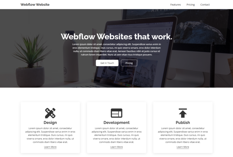
7. Building the first Section - Working with Sections & Containers: Alright, so in the
following lessons, we're going to build
our first section, which will be this nice
and clean hero section. We're going to add some padding
to the section element b, r. Well, at first going to learn about how to add new elements. And we will also talk
about CSS classes. And then we're going
to add some text like this heading right
here, this paragraph. I'm going to show
you how you can actually send out this
paragraph as well. And that's what we're going to cover in this first lecture. We're going to create the
actual section element, going to build this container. And then we're also going to
add all of our typography. This section. Let's start building
this in our project. Now. First of all, let's let me delete
this right real quick. All right, now we
have a clean slate. We had a cluster created by
workflow because I showed UP Typography settings
the previous video. Now, first of all, we need to create. You need to tell our
website what fonts to use and the basic
settings for type. Whenever we add a new
paragraph element, e.g. so make sure you have
your body selected. And up here in this
style selector, now, in the style selected,
we can create new classes and we can
also edit the HTML tags. Now, HTML tags, e.g. you have the body all pages tag, edit V and tire. So all the elements
on this website, on all the pages where we
make trade in this website, all have the body,
all pages tags. So e.g. if you say We want Open Sans, a regular and a size of 16
pixels on all body pages. You can do vet
right here and have a clean and consistent. I actually, our
project and classes are pretty much all style changes we make on an object
are stored in a class. So e.g. if you make a button and we assign
the button, cluster it. If it wreck in a novel button
from our elements panel, you can simply assign
that button class and it will look
exactly the same. Alright, Enough talking. So let's click on the body. All pages tag up here. And under font, I won't
be Open Sans font that we've added to our
project earlier. So go over to custom fonts
and click on Open Sans. I want to keep it at a
normal default font weight. However, I want to increase
the size to 16 pixels. Like so. The font color is fine
for now, the gray color. One thing that I do need
to change the font height. Now, in this case, I don't like working
with pixels. What I'm going to do is I'm
going to type in 1.5 e m. Now that we'll use EM units, one is 16 pixels
because we said that our body all pages tag is
16 pixels in font size. But one m equals the size of the topography that
you've said in your body. All pages tag. We want it to be one-and-a-half
of 16 pixels. So 1.5 e M. And now we have
a good, a good font height. Be text is readable. Now vets VET for now. Now, let's add our
first element. Go to the plus icon
we elements menu. And under Layout, we're going
to add our first section, MPD click and drag
it onto your canvas. Or you can also drag it
directly in the navigator. Now right here we have
our first section. Now let's give this
section a class. Now this would be our hero area. So let's call it hero section. And to create the cluster, simply click Enter
on your keyboard. Like so. Now let's take a quick look at what kind of settings we want
to give this hero section. So in this project, if we selected the hero section, you can see that we
want a padding of 150, both on the top and the bottom, just so we have a lot of breathing room
around our content. We add wet. It's really simple. We go to our spacing options in the side panel with your
hero section selected. And then we can either click
and drag on the padding. If we hold shift all
sides, we get padding. And if you hold Alt Control
or Command Control, you can apply that
to both sides. So we top and the bottom. For left and right. Now to remove a style
that you've made, you simply click
on the blue type. And then you can click on reset. You can also, as you can see, Alt and click few shortcuts. So hold Alt key. And that's how you can remove
styling from something. We can also type it in. So click on the numbers. So 150.150, like so. Now we have 150 pixels, both adding on both the
top and the bottom. Now we don't want margin. So I haven't explained this yet. So padding is the space that is inside of the element
and margin is v space, but we give it outside
of the elements. So if you want to
put something down, the entire section down, we can do that by
adding some margin. Alright, now, one
important thing is we want to add a container. Now the reason for that is since not all screens
are FE, same size. So some people have really
large displays with a really high resolution
or an ultralight monitor. We need to contain
our content and limited to a certain width just so we can
keep it contained. And actually, one good-looking and to actually accessible
and readable information is well structured. Now to add a container, you click on the
plus icon and we add V container element
from B layout panel. And we want to direct read
into our hero section like so. Now as you can see, we
have the padding applied, so we container sits
nicely in the middle. And now we want to
add some size to it. Because right now it's actually completely empty and nothing. It's not really there. This border is trust
Webflow telling us, hey, there is a container there. We see it while editing. Now let's go to besides panel
and give it a max width of 1,340 pixels, like so. Now, why do we use max-width? Max-width simply
means that this is the largest the container
can get. It can shrink. So if we go to a
different break points, you can see it actually
scales really nicely like so. So it is responsive. If you would have
done that irregular, but it wouldn't be responsive. And if you bought a
few SV, minimum width, it would simply scale all
the way to the edges, but never below that point. That's why we use max width, min-width in some cases as well. Now, what do we want to add? Next? We want to add a
heading and some texts. And we want that to be
centered in the middle. So let's add some
topography to our website. Click on the plus icon and search for the
topography settings. Now we want a heading. So let's click and directly
heading inside our container. And here, as you can see, we have some options with popped up will then
be direct veteran. So we have H1 all the way to H6. Now that's just the, how important is the elements? So each one will be the
most important element. H2b, second most
important, and so on. So with this being
our hero heading, this will be set to one. And then we also want
to add a paragraph. Alright, Next to be heading
is the paragraph element. Simply click and drag that below your heading inside
the container. And as you can see, it
always fills up with some placeholder text,
which we can keep. You can work with it. Now, let's look at
our example project. You can see this looks
completely different. So we need to add a
class to this heading. And also we need to style it. So we need to give
it a different size, a different font, a
different font weight. And let's do that. Let's start with vet. They'll select the heading. And first of all, we need to give it a class. If we don't create a class
when making slight changes, Webflow automatically
create a class for us, which is useful. However, it's not. It doesn't allow our website
to be very clean. So e.g. if it's a class
called main heading, and we want to
reuse vet class on a page later on is simply no. Okay, this is the main heading. We can apply that
class to this text. With our class for our
heading traded. Brought down. And 44. And we've installed the railway font-family
right here. And we want the rate
to be bold and v size. We want to be at 56 pixels. And let's give this a
1.5 e m font height. Like so. Now let's also
give us some text. So Webflow websites that
work, Let's type it in. We can edit the content of our heading by simply
double-clicking on it. And now we can edit
the text just like we would in Google Docs or Harvard. So Webflow, websites that work just like mad and vets, our heading class done. Next up, let's take a look at this paragraph, this
main paragraph. So as you can see, it's smaller, it doesn't reach the edges of our container like
the heading does. And it's contained
to 650 pixels, so it can't grow
bigger than that. Let's build this. Elect your paragraph. Give it a class. So let's just go
for main paragraph. Let's call it hero paragraph. We know exactly where it's used. To actually make this smaller. You can go to max-width
and type in 650 pixels. As you can see, it shrinks. Now, one very obvious fact right now is this is not centered. So if you look at our
project right here, this text is in the middle. Now to achieve that, simply select first of
all, the main heading. And let's center it by
clicking on a line and center. Now, that's the easy part. The only reason
why that works is because the main heading takes up the entire space all the way to the edges
of the container. As you can see. The same can't be said that for
the hero paragraph, if you were to make it centered by that is
something that we want. It does not push your
paragraph box in the middle. Now, one way to achieve that, you can go over to
our margin options. If you click on that, you can see we have
this Auto button. Now what auto does is simply pushes the elements all
the way to the side. And if we apply IN
marginal for auto, it's being pushed perfectly in the center of our container. Just like that. Now, vets, VET for this video. In the next lecture, we're going to add some images. So we're going to add
this background image. You're also going to
add this dark overlay. And then we're very
quickly and easily changing the color of our font. This white color. You're going to take a look
at the buttons after that. First of all, let's start
with the hero image.
8. Optimizing & Uploading Images - Adding Images to your Background: Alright, next up and let's add V image to this background. We're also going to change
the font color to white. And we are giving the
background image versus dark overlay so we can read the texts better to increase
the contrast a bit. Now, first of all, when it comes to
images in the web, if you need to optimize them, we want the images to be
as small as possible. So we loading times are
reduced to a minimum. Now how do we achieve that? With websites like image
compress our.com e.g. now, vis a vis website e.g. allows us to drop our
image right here and then it compresses a debit and
reduce the file size. Now in your exercise files, you can find the image folder. And in here behalf
the hero image J peg. Simply click and drag
that into optimism. And then you can
see it starts to compress our image like mad. So as you can see, it
removed 55 per cent of the entire data. So it basically cut
the size in half. Downloaded. I already have made
this optimized folder and save it to your computer. Now, next up, let's put this image in the back
of our hero section. First of all, let's upload that image to our
Webflow project. Now how do we upload images to Webflow in the Assets panel? Of course, open up
the assets panel and click on this Upload icon. Go to your images folder. Make sure to use the
optimized version and upload that to Webflow. Now, one very important thing, the web design is where not
everyone can see and some, some people use screen readers. So if they can't see, if they have a
visual impairment, we get the screen reader
reads feed website for them. So we need to give this image, some texts, a short
description of what it is. Just so some people can experience our website
just like anyone else. Let's just call this clean desk with a computer a
computer on it. I'm thinking like bad. Now, one thing that we want
to do as well, you want to first
expand V Assets panel. We have more options right here. And when we want to select our hero image by clicking
this checkmark right here. And then clicking on compress. This further reduces
our file size by turning it into a p.sit file. Just like that. That's something
would be just want to get used to just so we can optimize our website
as much as possible. But now let's add this image to the background of
our hero section. Now to add an image to be
hero section, the background. First of all, select
your hero section, and then scroll all the way down to backgrounds in
your style manager. Now here we can give it a
background color if you want. Let's remove that style. You can click on this plus
icon here, image and gradient. Now here we have a few
different options. We can add some images. We can give it a gradient, radial gradient,
or a solid color. We want the image. Now. Choose V image, which
will be our hero image. And then under size
we want it to cover the entire section,
so like that. But the positioning
is a little bit off. So right now, let's click on
the middle dot right here. Centered. Just like that. You also want to
turn tailing off. So we don't want, if you don't have
if the image does not fill the entire section and tiling is off, it
will look like that. If tiling it will
simply repeat V image. Our vets VET for the
background image. However, we can also add an
overlay the exact same way. So click on the plus icon again. This time we click
on Color Overlay. Now we can simply go
into our color picker, maybe increase the opacity a
little bit like that to 70. And now we have two
layers right here. We can move these around, just like the layers panel
in Figma or Photoshop. You want the color overlay to be on top of the image, like so. Now we have the
image but our text is unreadable, not like here. How do we change variable one? Extremely easy way to do that. Select your container. And under Topography
and under color. Change it to white. Now why does this block,
these two styles? Take that color
from the container. So CSS, cascading style sheets. As long as we don't
overwrite this color, it will take the color
value from the container, from its parent element. Like that. That can save us a lot of time. And I would recommend that you work like that whenever you can. So you can make your life
a little bit easier. Now, that's pretty much how you upload, optimize your images. How you can add them to the
background of a section. And we've also learned how to make di tri and just read
quickly and very easily. Now, in the next lecture, you're going to be building
these two buttons. Here. I'm going to add some
animations to them. And we're also going to
use something called combo classes to create multiple
variations of a single object, like this solid button
and this outline button. That's what you're going to
trade in the next lecture.
9. Creating a Button Element: All right, so in this lecture, we're going to be building
this button from ground up. Let's get started. So in our Webflow project, you want to add a button. Now, we could go if
the elements, however, a faster way to add new
elements would simply be to press V keyboard shortcut
Control E on your keyboard. And that opens up
this search bar. And now we can simply type in v element that
we want to search. So in our case, then you can simply click on the element
and add it to our page. Now, if depending on what
element you had selected, it may not be inside
the container. You can simply drag it into a container or into
a disk block by simply going to
use Navigator and dragging it inside the container
where you want it to be. Just like that. Now, we need to
center this button. If you want to center
something or aligned stuff. The first thing you should do is look at its parent element. We have this container element, but it's not set to
center everything. We sent out all these elements ourselves with the
respective elements. So in this paragraph, if we use the auto
margin and who is heading the use the
align into typography. Let's do something
different for this button. So select your
container and venue, go over to typography and align it to the
center. Just like that. Now, all topography in your
container will be centered. Alright, let's build
the actual button. So make sure to
select your button. First of all, we have
to give it a class. So in our style selector, Let's call this button. Now, we can change the text
of this button just as with the other types of topography by simply double-clicking on it. And now we can type in our text. Let's go with get in touch. Like so. All right, so what do we want
with this button? We want V typography to be
this black color or gray. And the button
itself should have a white color and some corners, so a corner radius
applied to it. So select the button and
let's start with the. We go to our typography
options and now we can adjust everything
how we wanted to. We could change the font, we could change the size. In our case, we only want
to change the button color. Let's type in the text
field, Free, Free, Free. And that will
automatically select this grayish black color. Now, we are going to use
this throughout the project. So make sure to click
on this plus icon, which will allow us to add
a swatch to our website. Now, using this swatch, we can apply this
color very easily and very quickly to pretty
much all elements. And if you make a change
to the swatch itself, all the colors, all the elements that have bad colored
light will change. So it's pretty much like global swatches in Figma if
you're familiar with that. Now, one really important
thing to keep in mind is the contrast
ratio right here. Right now, we have
a very bad score. So it says fail. And vet just means that there is barely any contrast between the background and
the typography color, but we can't see it very well. Now that's not a problem
for us because we want to change the background
color to white. Let's go to backgrounds.
And our color. Drag the slider all the way to B edge in the corner
and make it white. Now, if you go back to
our typography color, you can see that we
have this triple a green rating heading us, but be conscious
ratio is really, really good and it's
extremely readable. Okay, so now we have the white background and we
have changed our text color. How do we make these
rounded corners? It's really simple with
deep button selected, wrote down two waters. And here we can give
it a border radius. Now, we can adjust all
borders at once like so. What if we wanted to adjust
each one individually? You can click on this icon. And now we can adjust all bought us depending
on what we need. We want to change all
bought us individually, all bottles at the same time. And let's go eight
pixels border radius. Now, one more thing that
I want to change is the, you want to give this button a bonus for our hover effect. When we hover over the button, I want to make the background transparent and it takes
to change to white. But that means we need a
border around V button. To add a border, an element, you simply go to Borders. And here we have five
different options. We can set a border
for all sides, or we can change
them individually. These options, let's give it a width right
here of one pixel. And make sure to change
the border color to white. Like so. Now, if we preview
our project with this icon, you can see that our
button looks pretty good. We may want to adjust the
padding on the inside, so give it a little bit
more breathing room. But if you hover
over the button, only the cursor change tells us that it's an
interactable elements. We want to create
a small animation. So we have that
feedback that says, hey, you can click this element. First of all, let's
adjust the padding. Now, if you hold Alt
Control or Command control, you're using a Mac. You can change both
opposing sides. Like that. Let's
go with 30 pixels. And now we want to
create a hover state. Now, hover states are
actually very easy to create with our button elements selected in our style selector, you click on this
drop-down arrow. And vet gives us
access to our states. Though we click on hover. This greenfield,
the screen texts say is that we are currently
editing the hover state. Now, if you scroll down, let's make the changes. So for this animation,
for this hover state, I want the text
to turn white and the background to
become transparent. Let's change the typography and then change the background. Just make it
transparent like so. Now as you can see, if we
hover over the element, text changes and v bit
pattern becomes transparent. Now one thing that you
want to do is we want the transition to be a
little bit smoother. Right now. It's instant. It doesn't feel
very nice, right? We can see that, Hey, you can interact
with this element. It's not the cleanest
way of doing it. Now to give this
button a transition, let D button and make
sure that you are simply editing the buttons class
and not the hover state. If you're still in
the hover state, simply click on none in
your state selector. When we scroll all the way
down to the effects panel. Here, be careful this small
section called Transitions. Click on the plus icon. And now we have this large list of all the different
transitions that we can edit. We could add the
background color and typography color,
both individually. However, if we
scroll all the way down in the advanced section, we have all properties. Vet rates, a transition for every single property
change that we made. Now we can change
the duration of it. So let's, let's go
with 400 milliseconds. And we could also change
the easing right here. I want to keep it like that. Just leave it at default. Now, if we preview our project and we have
our overview button, you can see that
it's much smoother. It feels really nice. And it actually feels
like an actual button. And that's how you can
treat these buttons. Now, in the next lecture, we're going to learn how to
use something called combo classes to create variations
of certain elements. So as you can see, we have
this normal button right here. But next to it, we also have this button vets we outlined but changes to a solid button when
we hover over it. And as you can see in
our style selector, we have feedback class, invent, combo class outline. And I will show you
in the next lecture how we can create bad.
10. Combo Classes - Make Variations for different Elements: Alright, in this lecture, we're going to talk
about combo classes. Now we are going to
learn how to use combo classes by creating
this second button variation, which will have the
outline and when it will change to be solid color. Now, let's build it. In our Webflow project. You can start out
by simply making a copy of this button element. So the flip button
selected e here, we could go in and simply right-click and
copy or duplicate. You can also simply
press Control C and Control V to duplicate objects, just like just like
in other software. Now, before we make
the combo class, I want to clean this up a little bit because
as you can see, the buttons are
squashed together. But in this example project
that I have right here, there is a little
bit of spacing. Now how do we achieve that? My preferred way of making
this spacing is to simply wrap both buttons in a disk
block and then give it a little bit of a
gap using Flexbox. Now, that sounds
really complicated, but it's actually not. So let's build this
wrapper really quick. Go to your Elements tab and add a disk block to our
container, just like so. And when we want to drag both buttons inside
this stiff block, click and hold on
your first button, drag it into the disk block, and then repeat the process
for the second button. Now makes sure to
select this def block. And let's give it a class
called button wrapper or hero, Hero button rapper. Like so. Now how do we create this, this gap between both buttons? Under Layout, you can
simply click on flex, which is the second icon. And now as you can see, we have much more control over the
positioning of the items. Right now. They are justified to V.
Start off the rubber. If you click V center icon, we can center them again. And to create a gap
between two elements. You can use this
area right here. Yep. And then in columns. Let's go with 18 pixels. Yes, I think that seems good. Alright, and now we
have the gap traded. Let's talk about combo classes. So select the second button. And what a combo class
is, it's pretty much, it allows us to
create a variation of classes that
we've made before. There'll be want on a button, but we won't be styling and
overall the button to be the exact same with minor
changes applied to it. So select the button and
go to your style selector. And as you can see,
it already says new combo class type to
create a new combo class. Now in our case,
we want to call it outlined because it's
an outline button. I've been outlined and
click on trade outline. Now we have a button with
the combo class outline. Now, if we make a change
to this button element, it will only be applied
to the outline class. This button, this class
will be unaffected by it. Now, that just saves
us a lot of time, but we don't have to
duplicate a bunch of classes. We have to build it
from the ground up. It's Arabic, clean way of reading deviations
of certain elements. Alright, next up. First of all, let's
take a look at this. This is the outline state
from the hover animation. That's what we want
it to look like. But let's change the
typography to white, like so. And the background color
to transparent like so. Now if you preview it, you can see we have two
kinds of buttons. One is the solid button, which will change
to the outline. And one is the outline button with no animation right now, because we animation is
the outline button itself. Let's turn that into
this solid state. So the editing via hover
states for combo classes works exactly like the
previous button element. So in this drop-down,
go to hover. And now we can edit
the hover state of the outlined combo class. So let's draw it down. Change be typography
to our gray color, and make the background
100 per cent. Like so. Now previously in
our button class, we already have a
transition supplied, so we don't need to
do any work here. Let's preview that. And as you can see, our outline button changes
into a solid button. And the other way around. If the solid button. And that's how you can use
combo classes to create revelations of buttons
or off paragraphs. Contain us pretty much
everything where you need slight variations on
already existing class.
11. Working with Grids: Alright, so now that we have
finished our hero area, next up, let's build this
free column service section. In this lecture, we're
going to learn how to use the written component to create
this three column layout. And we're also going to create the VCE service
cards with blocks, which will hold our content. We're going to add some icons and a heading and
some paragraph text. You're going to take care of this animated link
in the next lecture. All right, let's get
to building this. So in our project, first of all, let's
close up all of this. So if we click this
icon right here, it can close all of
our open sections. And now with the body selected, use the keyboard
shortcut Control E. Open up the search bar and search
for the section component. You can simply,
once you have it, once you found it
in the search bar, and it's the only element, you can simply hit Enter on your keyboard and it
automatically adds it. Now, the reason why we
want to have the body selected is because it will simply add the element at the very bottom
of our navigator. Like so. Now, one additional
shortcut where it's really helpful in terms of
speed is Control. Enter automatically selects
the state selector. So if you have an
element selected e.g. this section right here,
and you hit Control Enter. You can instantly select the style selector and
search for your class. Now since we don't have
a section class yet, Let's make that and
give it some padding. Let's go with 100 at the
top and 100 at the bottom. Like so. Now if we go back
to our section, we can see it's a white section. And now we need the container
to hold our accountant. So once again, control E and search for the
container components. Just like bad. Control Enter to select
the style selector. And then we can simply
select the container class. All right, so now let's
talk about grids. Now in our elements, Elements, panel layout, we have
this grid component. Simply click and drag
that into your container. And now we have this
area right here. And it's can see on this side, you also have this new menu. Now here we can edit our grid. Up here we can change the
gaps between these grid. So let's increase V gap right here to like
48 pixels maybe. Yes, I think I like that. Since we are going to work
with a three column layout, Let's add a column or columns. Simply press the
Plus icon, like so. We don't want to growth. So let's remove it. So if you hover over one
of these rows down here, you can see we have
this garbage icon. Simply click on Remove. Once you are done, click
on, Done right here. And we finished trading
our basic grid. Now as we made some changes, you can see the workflow automatically
created this class. If you click on this
drop-down arrow, you can click on Rename class. Let's call this service grid. Right next up. Let's create our hearts. We're going to create
one of them and then simply copy and
paste it two times. Now to create a
service cut like that, simply add a disk block, which will be v cart itself. And let's call this
service block. Well, let's call
this service card. Always name your classes. Now, we do want some padding, so hold down the Shift key and then we can adjust
the padding on all sides. Let's go with 31 pixels for now. We can always adjust that later. Give it a background
color of white. And as you can see, we also have this color on
the outside with drop shadow. Now, that's actually really
easy to add in Webflow. In our Effects section
of his style panel, we have box shadows. Click on Plus. And here we have all
these different options. Now we can increase the
blur of it, like so. It could increase the
distance as well. Let's go flag for pixels. And we can also increase
the size if we want. Now under color, we
can change the color. So let's make the opacity a
little bit less, like ten. And now we have this
very basic drop shadow. Now, let's add some
content to this. But we do want an icon. So you want this icon, a heading, and a paragraph. Let's start with D icon. Now, for the icon in
your elements panels, simply look for the image. Under media, we
have image element. Click and drag that
into your Scotland. As you can see, it gets
a little bit trickier. So what we're going to do, simply drag it directly into the card in our
navigator like so. Now we also want a heading. Once again, go to your elements panel and wreck the heading
below the image. Just like so. And then we also want some
paragraph texts like that. Now, right now, all
the text is white. Let's change that by
selecting our service card to typography and selecting
our color swatch that we've read it before. Alright, now we need our image. We need to upload our icons. Let's go to the Assets panel. Click on v file icon. And in our project files
and our exercise files, we have the icon's folder. And here we have all
these different icons. Simply make a selection
and open all of them. As you can see now we have
our icons ready to go. Now, this will be the
design service block. So let's click on. This. Will appear p
elements settings. And when they can
choose an image. Let's go with v Design icon. And just like that,
we've added our icon. Now let's get to style the
heading and the paragraph. If you take a look at
this project right here, you have this service heading. And the font is railway, and it's 28 pixels in size. Select the heading,
give it a class name. Control, Enter, and call
it service. Heading. Your typography options. And look for right
away, right here. And 28 pixels? Yes. Like so. Let's also change the font
height to like 1.3 EM. Yeah, sounds good. Let's also change
the text of this, so double-click on it. And one more really important
thing about headings. Click on the real
and change it to H2. H1 heading is always
we wanted the very top and then it cascades down. So let's go with H2
to not skip anything. Let's also remove
a little bit of this texts that's
a little bit much. Then let's get to
adjusting some of these spacings distances a little bit much between
these two objects. So let's select the
service setting. This can see we
have this margin of 20 pixels automatically
applied to it. Let's put that to zero. And I think I like the spacing between
these objects for now. One more thing is we can round these corners on
this service cuts. Select your service
card, go to bought us. And for all the corners
just a little bit. And that's now we
want to give the service text a class in case we make some
adjustments to it. So it gets translated
to be our blocks. And now let's select the
service card and duplicate it. Right-click duplicate
and duplicate. S can see the spacing between these columns is
exactly the same. And v, one thing
we need to do now is we need to adjust the icons. This will be development. First of all,
Change movie title, and then click on the element
settings of your icon. Replace image and
use v development. I can feel that. And when we have published and also change V icon, like so. Now, that's it for now. In the next lecture,
we're going to take a look at how to work with texts links and how we can make this nice
little animation. So as you can see, if
we hover over the link, it moves up a little bit. Ie, color changes of you will be building that hover
state in the next lecture.
12. Styling Links: Alright, now that we have built the basic service cuts and our three columns service grid, the only thing left to do is to add this link with
animated links. So if you hover over it, it will become a lighter
color and move slightly up, giving us the
indication that you can click and interact
with this element. Alright, so let's
add a link first. Before we add the link, let's select the service
card and we need to make sure that all
elements will be centered. Also be elements that
we're going to add. Movie service cuts. The easiest way to
do it is simply transform it into a flexbox. The few service card selected, go to your layout options
and click on flex. Now that initially it will break the layout because we
first need to say, you don't want it
to be horizontal. You want it to be
vertical, like so. And then we want to
align it to the center, which will fix our
icons like so. And this will just
make sure that no matter what element we
add to this service card, it will always be centered. Alright, so let's
add the texts blink. Now, one fastest way
to add a new element, this service card is
select the service texts. Advanced search
for the text link. And the reason why we
selected the service text first is just so V element that we're going to add
will be pushed below. The selected element, stays
inside of our service card. Now, there are few
things we need to do. First, first of all, all links in Webflow
have this basic styling, the blue text and we underline. And one way to get
rid of it is to edit the HTML tag itself, just like we did
with the body tag. So select your link, go to your style selector and select the All
links HTML tag. Now if we scroll down,
we can remove in the typography section
we underlined. And we also want to change
it to our black color. So now we have this link. It's indistinguishable
from the paragraph text. That's not a problem. We're going to take
care of it right away. Now, select your link and
let's give this a class. Let's call this Serb slink. And we want to add
an underline to it. So if you look at this project that I've built previously, you have this nice underlying over, underneath our element. Now, we could just
give it an underline. But I think that we, it does not It's a
little bit too close. Who the actual texts. I don't like that. But
let's remove that. And what we're going
to do is we're simply going to give this link a bottom border. Make sure to click on bottom
in your bottle settings. If David, of one pixels
and also a color of black. Just like so. Now we have the underlying also. Let's change the text of
this. You will learn more. So now next up, we want to create the animation for this
link V hover effect. If you take a look at this
project, as you can see, if we hover over the link, it gets slightly lighter and it will move
up a little bit. Now, let's build this. First of all, go to your
state in your link class. And let's change
the color first. Typography. Elect a
slightly lighter color, maybe this one right here. For convenience sake, let's also make a swatch out of this. We can easily be applied
to our border as well. Now, if you hover over a
button, the color changes. Next up. Let's make sure that it
will actually move up like it did in the
example project. Now, we can do that
in our hover state. Under the Effects tab, we have 2D and 3D transforms. Here, we can move our
object a little bit. As you can see, if you
click on the y-axis, you can move it up and down. Now we only want a
little bit of movement. So let's say minus two
pixels, a little bit up. Now, if we hover over this link, it will move up by two pixels. Let's make it smooth by
adding the transition. Let's just go with all
properties and 400. Now, it's a smooth
transition to our animation. And it gives us, just
like with the buttons, a visual indication that hey, you can interact
with this element. Now next up, let's
copy and paste this link to this service cuts. We could copy and paste it, just selected right-click copy, and then simply paste
it into with Control V. It's sometimes it's a
little bit finicky if it doesn't let you pay stuff
in before Right-click. But we control the
shortcut always works. Now one way we can also add this link is we simply
add a new texting. When we simply give it
the class service link. That's like that. And all the properties are
carried in this class. So we link works
exactly like this. You only need to
change your texts. Alright, and that's how
you create these links. Now, how do we actually
link stuff together? Well, we're going to do that once we finished
building our website. But if you click on
the element settings, you have a lot of
different options. We can add an URL to it. We can link to pages, you can link two sections. We're going to do
that at the end of building our project.
13. Building a 2 Column Layout using Grids: Alright, so in this
lecture we're going to start building up our
feature sections. We will start with this
two column layout. It's pretty standard. We are going to be creating this dark variation
of our section. And then you're going to
create a two column layout, one holding some texts and
one holding our image. Now let's get building. In our project. Let's select the body
and add another section. Control E to open up the search bar and add a
section to our website. Of course, with Control Enter, we can select this type selector and select the section class, but we've made previously. Now, this time, we don't want this section to
have a white background. You wanted to have a
darker background. So let's create a
combo class format. Select your style selector, and simply create a new
comp class called dark. And now we can change both the topography and the background color
of our section. Since we are going to
create a dark background, we want to contrast to
be as high as possible. For our typography,
color will be white and our background
color will be black. We're going to use
the color swatch that we've made previously. Alright, now, in this section, of course, we need to
add our container. Let's add a container and
give it the container class. But as you can see,
the more sections, but you build the more
components you will have finished to reuse
such as B section, the container, links,
buttons and all that stuff. Now next up, we need
to add our grid. You have a two column
layout and we're going to use a grid to
create that layout. So let's search for the grid element and add
that into our container. Now, we don't want, we can leave the, we get
the same that 16 pixels. We want to remove the
second row, like so. Let's rename the
class bad workflow created for us just to
keep things organized. Let's say to call read. Now, next up, we want to create, we want to add some text. Who? Our section. Now, if we were to
simply add the heading, Let's add a heading. And we also want a paragraph. So if you add the
paragraph element, you can see that it
jumps to the second row, to the second
column of our grid. Now, what we need to
do is we need to wrap our content inside
of a disk block. So we def block will hold the content in one
row of our grid. Just like we use, we
serve as card format. Let's delete v heading, likely to coagulate and
add a simple div block. Let's give it the
class of service. Next rapper. And inside of this div block, we can add our heading as
well as our paragraph. And as you can see, we also want to have a button and bell. So let's add the button as well. Now, we don't want
this to be centered. It was taking the it is taking that style
from the container. If you select the
service wrapper and you scroll all the way down, the style is, as with orange, background is orange color
and you click on it, you can see where the
value comes from. So it's taking that style
from the container. We can override that by simply giving it a different
style, just like that. Align it to the left. Next up, let's see
if this button, our class, just like that. And also let's start
working on v heading. Now, first of all, we need
to create a heading class. Now let's just
call this heading. And now we're going to
give it a combo class. Before we give it
the combo class, Let's change the font of
that heading to railway. One pole and to EM in
height, just like that. And what you're going to
do next is we're going to give it the
combo class of H2. Now, why H2? Because it is the second most
important type of heading. So we have top H1 and then for each section
we have the H2 heading. And the reason why we've
added the combo class to be heading class
is now we can just change its size and manipulated without having to always come back and change
the font color, the font itself, the font
weight and stuff like that. Now let's take a look at the setting that
I have right here. So eight pixels,
one point to EM. You can leave it as it is. Let's change the text office
by double-clicking on it. Something like this.
And then let's, if this paragraph a
class, I have a graph. And we want this to be a
set size of 650 pixels. Now we paragraph class itself. We can keep it as
it is because it's taking information from
the body, all pages. Well, let's give this a
combo class of 650 pixels. And with this combo
class selected, we can go to max
width 650 pixels. And now it will always be set
a max width of 650 pixels. Now, next up, let's change the button text to get in touch. Like so. If we look
at our project, you can see that we have
this image rapper as well. Though. Let's go select V2 called grit. At a negative derivative, blog, automatically jumps
to the second column. And this will hold our image. Let's call it image Rabaa. And inside of this image rubber, we're going to put
v image element. Now let's just use the hero image that we've
uploaded previously. I simply selecting
it and now we have a basic two column layout. So we have our text on the left side and an
image on the right side. What I want to do is I want to push this text
down a little bit. Just so it's a little
bit more interesting. We service tax trapper selected. Go over to your padding and simply push it
down a little bit. Like so, like let's go
with like 38 pixels. And I also want to increase some change the spacing
between these elements. Now, one way of doing
that is we could apply the heading directly to
VI paragraph element. Whenever we use the
paragraph class or the paragraph 650
pixels combo class, the padding or margin
will be taken as well. So what we're going to do is we're going to add
a, another disk block. And we're going to track our paragraph inside
of this div block. Now, nothing has changed. We be difficult,
simply wraps around the paragraph without trading more spacing between
the elements. What we're going to do
is now we're going to add some margin
to be deaf block. Let's say like renting
pixels at the top. And let's see. Let's go with 28
pixels at the bottom. Now the reason why we wrap this into a difficult is
because now we have a very non-destructive way
of writing these margins. Now let's change the class
name of this def block. Empty click on the drop-down, rename and call it margin. We have 20 pixels at the top, so top and bottom radiate. Now, the reason why an emphasis, so if it lands in the navigator, can instantly see, okay, this different gifts,
severe margin. Our elements. Alright, now we have this
basic section traded. And as you can see if we go to our preview project
that I've made, you have two more
of these sections. One will be exactly the same and the other
will be flipped. And the text color and the background color
will also be flipping. Let's build this really quick. You can simply copy
and paste V section. So control Z section selected and Control
V to paste it in. One very fast way of simply
changing the section. So let's just remove dark. Now, as you can see, we
have some things though. These elements have
the right color. They taking these
from the container. Now one quick fix
for that would be to simply take the
service tax trapper, go to color and change
the text right here, and change it to
our black swatch. Now it's not taking the
information from the container, but from our service
tax wrapper. Now, one thing that we need
to change is the button. We need to create a
new combo class for a darker button with the button selected
at the combo class. Ok. And now we can simply change
the colors of red button. We want the text to be white and the background of the
button will be our gray. And of course we need to change
the hover effect as well. Click on the drop-down. States hover event. We want to use typography too. The leg background
should be transparent. And we bought a will be black. Now let's take a look at it. Looks pretty good, but I
think we need to change, yes, we need to change
the border color of the dark combo class
to plague as well. Perfect. Now we have a walking
pattern for this section. And one quick way of yeah, and that's why you need
to really be careful when it comes to changing
these classes. So as you can see, this section looks really good. I'm going to leave this
in just so you can see what you have to look
for when you create V. And you'll make the
style changes with class because I exit and you
can break a lot of stuff. So as you can see, the text
color changed as well. So it's not as not white texts anymore because we serve
this text wrap up what we've used in both of these
sections was changed. So the class itself, have you made the color
changes to v class itself? One quick fix for this
would be to just add a combo class and call it white. Now, there are more
elegant solutions to this. But that's just one quick
way of fixing this. So with the combo class wide, Let's change the
typography back to white. And as you can see,
now it's fixed. These are just some of
the little things but you have to look for. And just be conscious
about what you're doing and what class you
are editing. Alright? But what we want to
do is we want to flip the image and the text. Yes, nothing easier than that. Hello to you and navigator. And simply click and
drag your image on top of the service wrapper of a switch places just like that. And now we also want to have a third section of
the Publish area. We're simply going
to copy and paste the darker section
and paste it below. One new white section. That's going to be
the same anyways. Now we have these free recognize
who call them sections. Let's adjust the
content really quick. So let's interests to
quick development. And this will be
fast publishing. Just like that. We will change the
images later on. When we add some more and
optimized some more images, they can leave and
the same for now. Now, that's it for this lecture. And I will see you
in the next one.
14. Complex Layouts - Creating a Pricing Section: Alright, so now that we have our feature sections finished, Let's build a more
complex layout. We're going to build a free
column pricing section. Now to get started, once more, direct
your body element and create a new section. We're going to do it
the fast way with our keyboard shortcut Control. Looking for the spectrum. And when using Control, Enter the search for
our section class. We're going to use the
lite version of this. When once more, control E, look for your container and
quickly apply the clustered. Now as you can see, if
you have these clusters prepared and if you know
the keyboard shortcuts. Building the base layout
is incredibly quick. Alright, next app, and we
want a free column grid. Now, we do have one already, and we could actually
use this one. So it's service grid class. Let's go to our container
and search for a grid. Simply click on Done here. So we have access to
our style selector. And our group is
called a service grid. So let's look that up
here, this service grid. And just like that, we have a free column grid. Alright, next up, if you want
to create V card itself. So the background for our pricing section or
the container for it. Let's add in a block and Control Enter to
select the style selector. Give it the name of
pricing card. Like so. Next up, let's start with just a little bit before
we add some content to it. Well, let's go down
and add typography. We want it to always
be black. We could. Let's make the topography of
the discard our black color. And the background will be a
solid white, just like that. Now, next up the way I want to structure
this pricing card. Now let's look at this
example project right here. You're not going to build
it exactly like this. So I want to have a little title for our pricing card
as well as a subtitle. Then I want to well, first we need to know
how much it actually is. So we're going to make
this price level and v per month or per year depending
on your use case. And all of these are
wrapped around in different diff blocks that we can align them a
little bit better. We want a button, and we also
want this list right here. Now, we're going to build
everything apart from the list. The list is going to
be the next video. All right, so let's start
with this. Add our div. First of all, let's make
sure that this is a flexbox. Now scroll all the way up to the layout and under display. Make sure that it is a flexbox. The alignment I want to align it to be center would look good. And then we want to align
it to the top as well. So aligned to the top
and justify to vCenter. We will play around
if Center looks better off right alignment, the left alignment looks better. You can play around with it. All right, so now if we have a our pricing card set to flex, we have the alignment
options ready. But first of all, let's
change it to two vertical. That was my mistake. Make sure that it's
set to vertical, line to be center and
justify to be top. All right, Now I want to be headed to have a
title and a subtitle. I'm going to wrap both of
these inside of a disk block. Let's look for a
simple def block and give it the name pricing. Now before we continue, let's give this pricing
card a drop shadow as well. Just so we can actually
see what we're working on. Maybe something like this. Distance to blow 15, size 5.0, 0.15 in V opacity value. Alright, now we have
our pricing header. In wet pressing harder, you want to labels. One will be the name and the
other one be the subtitle. Now the way I'm going to
build it is I'm going to use a heading element for the
title of the pricing card. I'm going to set
it to age three. And we're going to add a little
bit of text on top of it after we're done building
the actual pricing section. Now for the class
of this heading, you're going to use V
basic heading class. I bet you're going to create a new combo class
called h three. Now, let's style
with a little bit, make it a little bit bigger. Maybe like eight
pixels seems fine. And we will give it
the name of brewery. Just like that. Next up with the pricing,
either select it. You're going to look for a simple text block element,
this one right here. And make sure that you place
it inside V pricing header. Let's just call
this. Just type in. Perfect, too. Perfect for beginners,
something like that. And also give it the
class of pricing. Subtitle. Something along those lines. Increase the size
to about 18 pixels. And we can leave it at Open Sans just to make it a
little bit different. We heading element. I don't like the spacing
between these two. So what we're going to do
is we're going to go to our spacing and remove
the spacing value. Instead we margin,
bottom margin to zero. Let's consider now it's a
little bit closer together. Now what we can also see is that there is no padding applied
to this pricing card. So select your pricing card and go to your padding options. Hold down the Shift key and apply some form of padding
like 18 on all sides. Maybe we can play
around with that later. Alright, and now we have the pricing header
pretty much finished. Next up, let's build this. The price itself. So once again, the
lecture pricing card and a disk block to
it, just like so. And this time we're going
to call it v def blog. Just simply price or price tag. Well, let's keep it at a price. That's going to be
our disk block. And invert the flock. We want a textblock
and another textbox. So let's Control C and Control V to add two
texts blocks to us. Now, let's say the base
price is going to be three. And this is going
to be whatever. It's free forever. Now, let's give this textblock a class like besides selector. And let's call this
price tag like so. We're going to give
it V railway font. Again for just some variation. I want the bold version. And for besides maybe
32, maybe even 36. Yes, this looks better. And make sure that it's 1.2 E m for the
height seems fine. Now, the second textbook, we will be this one right here, the one that says per month or per year depending
on what you want. So let's call this rising time. Yeah. Pricing time. As long as you know what you're working with, your team knows. It's fine as long as you know exactly what each
class represents. Alright, let's keep
this at Open Sans. Maybe make it a little bit
bigger, like 18 pixels. And 1.3 EM seems fine. Now, one thing that I don't like about this right
now is that we have no spacing between the header
and the price tag itself. So select your pricing header and apply some bottom
margin to it, like so. 28 seems perfectly fine. Now we have the name
of our pricing card. We price tag, and now we want to add a
simple button to it. And that's just basically
select the pricing card, search for the button
element at vet. And when we add our
button class to it, make sure that it's
the what looks better. We could go with the dark
version or the outline. Let's go with the dark
version and learn wall. Like so. Now of course we need
to add a little bit of spacing between
these two elements. You can apply some bottom
margin to V price element. That's flexible. Maybe a little bit less
when on top, 24 pixels. All right, now we have
pretty much everything done. The only thing that
we are going to need to do with pricing card is at a list of features
this pricing category has. And that's what we're going
to do in the next lecture.
15. Working with Lists - Unordered & Ordered Lists: Alright, now to finish
our pricing section, we need to add a small list of features to
this pricing card. Now, in Webflow, we have
on web design in general, we have two types of lists, ordered lists and
unordered lists. Now let's take a look
at both of them. So open your search bar
and simply type in list. And that will give you access to V list element to
your pricing card. Now as you can see, we
have these bullet points. And here we can double-click and we can type in some content. Now, behalf, however,
some more options, of course, in the list settings. If you click on this wheel right here, you have some options. So we have two types of lists. We have D unordered list, which is the list
of bullet points. And then we also have
the ordered list, which is simply going
down 1-3 and the like. And we also have the option to remove the bullet completely. If you just want a list. We don't need bullet points
or numbers on the side. We can remove it that way. Now, in our case, we want to
create an unordered list. And if we double-click on this, we are going to simply type in list each other
just as a placeholder. Now we can simply I fit in for each point, like so. And to style these list items, we have a few ways to do that. So in our state's electoral, he can eva, we can create a
new class for the list items. While what's even easier, we can go to the HTML
tag, all list items. And now we can make the
adjustments however we need them. And as you can see, every
single list item in our website changes accordingly to the changes that we make. So let's say we want
this to be 18 pixels. And I think the d, We can
leave the rest the same. Just like that. Yes.
What I want to do, however, is I want to
have this centered. So I want it to be
perfectly in the center, as you can see right now. It's kind of a little
bit off to the right. And that's because
the list element has some base padding of
40 applied to it. Let's remove that
padding, make it zero. As you can see, Webflow made our matrix V class that
perfectly centered our list. Now a vet does not include
the bullet points. Maybe we need to push it in, just needed to eyeball
it pretty much. Something like this, like ten. This looks pretty
centered to me. And also we want to
give it some margin as well to separate it from
the button, a little bit. Like 24 maybe. And just like that, we've built this very
basic pricing card. Now, if you want to
have more list items, you can simply copy
and paste a list item and add as many as you
like or remove them. And that's pretty much it
for this pricing card. Now, let's opiate and paste it, so it automatically
jumps to the second row. Let's change the text as well. So this will be basic. And it will be, let's just say $4 the other
way around and per month. So copy that. And that will be zero. That will be $9 per month. Perfect for the basics. And perfect for rows like that. Now, since we added mate
v heading an H field, we want to have an
H2 tag above this. Let's make this grid
a little bit smaller. And with our container selected, let's add a heading. Make sure that it's on top of the container,
on top of the grid. And we also need to
give it the class of the heading H2 class. And now it's set to right, so bad because our container
has the base color of white. Let's change that. Now
let's double-check if everything is still working. It's not. If you
make these changes, you always want to keep a
look out for these things. So because we had just the basic
container class in our hero section and
we made that white. We need to adjust
that accordingly. So let's say
container and give it the combo class. Or for right? Now we can fix bad,
rolled back down. And now for each
container that we have, the color will be black. That's called this pricing. And let's also add a paragraph. The paragraph class. And I think 650 combo class
should look pretty decent. Yes. Let's make sure
that it's centered. Now, if we change these margins, of course it will also change right here where we
use the same combo class. Now one way to combat
that is to simply wrap it in a disk block. Like so. Let's call this center and make sure that it's aligned
to the left, not working. Do we need to flex it? Sometimes you think that
something should work. If something does
not make sense, just try out a different way, play around with the settings. It could fix your problem. Most of the time, you will
be able to find a solution. I'll start trying some different
ways of doing something. Now. I want to create
some padding to be, so let's just add
it to the center. If some margin. So push that down a little bit. So with our center, this push back down. And I think I like this. We could remove some of the base placeholder text like that. And just like that, we created a pretty decent
looking basic pricing section.
16. Building a Contact Form: Alright, so now 50
pricing section done. Let's talk about one of the
most important things of every single website or contact from the customer or
your potential client. They need to have a way to get in touch with you
for your service. So of course, we need to add a contact form to our website. Now creating contact forms is actually incredibly
easy in Webflow, and it's just a few steps. So first of all, let's
build a section just as we did with our section,
section element. If it our section plus. Now, since we've used the
white background here, I want you to alternate
between dark and light. So let's add the
combo class, dark. And of course we need
to put in a container. And that container
or container class. Now, in that container, I want to have a heading
and a paragraph. Let's add the heading
just like up here. And make sure that you
choose v heading type H2. And as you can see, the text color is the exact same color as
the background color. So go to your container and add V combo
class white to it. That just just be typeof for hypertrophy settings
from black to white. Now, let's name this and
let's say get in touch. And we also need to apply our
heading class, heading H2. And we also want to add a
small paragraph below that. So once again, oatmeal
search bar graph. Give it feed paragraph class, but we've made and we want to use V 650 pixel
combo class format. Let's elites some of
it Placeholder Text. And we want to have it centered. So we're going to
do the same setup here with this center class, but we've made, Let's
rub in a def block. Put the paragraph inside our def block and gift that
the block vCenter class. And just like that, we've centered our text. Alright, next up, let's talk
about the contact form. Now, we have access to all of our contact elements
in the elements panel, the panel down here in forms. We have access to all
the individual elements, but we can have we also
have this basic form block. By adding it, we add a form
block element to our website. Now let's take a quick
look at the settings. We have three different
states to this. Efd normal state, which
is B form itself. The success state,
which shows up if the email was successfully sent and if something
goes wrong, you of course have
an error state. Now, we can also give
our former name. You're going to leave
all these options, SVR. Now, if we open up the form
block in our navigator, you can see we have
three different divs. One is V form itself, which actually helps us vi labeled text fields
and the buttons. And when we have two motifs, while the success message
and the error message. These are hidden right now. And they are the
exact same thing, but I've shown you before different states, they
are simply hidden. Now what I want to do is I don't want the form to
stretch all the way. So what we are going to do is we're going to add
a new disk block, ragged on top of
the form block and put the form block
inside that div block. You're going to
give that def block a class of form wrapper, and a max width of, let's say 750 pixels maybe. Yes, this looks good. And of course we
need to center it. So let's apply some auto
margin to both sides. Like vet. Alright, now we have centered our element,
our form block. And let's dissect
this a little bit. So for each text field we usually have a label
and the field itself. This field simply
tells us, is labeled, tells us what the
field is about, what kind of information
we need to put into it. And that's how these Individual fields
are structured, and of course at the end, we have a simple submit button. Now, even though this is called a submit button right here, we can simply apply our
button class to it. Just like that. Now the pattern matches all other buttons. You can even change
the text offers of cross double-click on it. And here we can type
in V button text. Let's get sent message, like so. All right, now one thing that I want to
change as I want to, all of these aligned
to the left. So the Form Block selected. Let's go to the
topography settings and line it to be left. As you can see,
Webflow automatically created before class for us. Now, with this field labels, the great thing about
them is we don't actually need to create
a class for them. If you select the field label and go to the site selector, you can see we have an
all labels HTML tag. We can add it. So let's do that. Select the normal weight
of the Open Sans font. Let's keep it at 16 pixels. I think this looks good for now. Now what I want, the first form, I want to click the
name, the email address. So these two are perfectly fine. We can keep them as PR, but I also want a message field. Now, let's go to our Add
menu and under forms. Firstly, let's drop in a
new label. Around here. Let's call this message. And let's add in the
text area element. Now this element allows you to type in your actual message. And let's drop it below V
message, just like that. Alright? Now, one thing that
you instantly see is that we have with
placeholder text in here, but not in the e-mail
address or the name field. Now how can we add
placeholder text is simply click on
the Settings icon. Right here we have access to our field settings that
we can give it a name. And then we can declare the type of input that we
want this to be. Right now. It's plain texts,
so anything goes. So you can type a name, so you can type in messages
and stuff like that. But we also have email password, phone number. For this. Since it's just a simple name, you're going to
keep it at plane. And we can give it some
placeholder texts. Just go with something basic, John Doe, dot, dot, dot. And then you have two fields. One is required. So the form can't be sent if the information
has not been filled in. So we want that. And
we have autofocus, which we don't
want in this case, autofocus focus simply
selects to be formed for you. Once you go onto the website, we can instantly start typing. You don't want
that in this case. Now let's edit the settings
from our email field. Change the type to email. I've been a placeholder email. Let's just go with something fictional like John
doe@gmail.com. Keep it at required,
and that's it. Now, we can of course, edit these fields, but we have full design
control over them. One thing that I want to do is I want to change
the placeholder text. So first of all, let's give this a class called text field. And to edit the placeholder text ego lifted text
field selected. We dropped down. And since this is a text field, we have this placeholder state. Now it immediately
closes a lot of windows. And here we have access
to the topography of it. And as you can see, we can
style it like any other. Let's go with something
like this, like 30, 30% in V opacity value, and maybe make it a
little bit smaller, like 14 pixels.
Yeah, I like that. It's not too intrusive, but not too little Eva. Now, let's add V TextField class to the other text fields. Like that. Now one thing that
we still need to design is the different
states of the success state, as well as v Aero state. Now select your form
block and you can toggle the success and
our state's right here in our form block settings. If you simply click on Form
Block settings up here, you can click on success. And let's just make a
really simple style. Let's make this a
green background. A little bit darker, just this, it goes green tells
us, okay, it worked. Also. Let's round the
corners a little bit. Like so you can leave
your text as it is. This would be our success state. And to edit v Aero state, once again, the
inactive form block. And click on arrow right here. And let's style the error state. Now here we just want a
slightly darker red black so and also round the corners a little
bit just like that. And I think that
looks pretty decent.
17. Building a Navigation: Alright, if the contact
form done for now, there's only two sections
where we can't really call them sections
left for us to build. And one of course, will be the footer, and the other one will
be the navigation. So let's start building a
navigation for this rep site. Now a Webflow makes
this really easy and convenient for us because if you look at the Elements panel, and we scroll down some variety, right here at the very bottom. In the advanced category, you have a pre-made
Navbar component for us to design and style. So let's drag that in and make sure that it's on
top of the hero section. That's like so. Now let's
get to style this nav bar. Now, if you look at this, as you can see, the nephron
is its own little icon. And then it's just has a
container, a branch block, a link blog where we
can put in our logo, as well as a div
called nav menu, which will hold our nav links. These bonds right here. And when also an
invisible button. On a smaller screen size. You can see we have
this Berg I can. Now for this lecture, we're going to style the
desktop version of this navbar. Let's start out with the top. Now I want this to be
a simple white color. So first of all, give it a style, a class, and we're going
to call it navigation. Then we're going to change
the background color from gray to white. Next up, you're going to
select the container. And we're going to give it
the basic container class. So it's exactly the same width
as the remaining website. Next up, let's look
at this branch block. Now, we could, just, in an image, we could also add some basic
topography into it as well. If you don't have a
logo ready right now, let's do that actually. Let's throw in,
actually let's just use a text block and put
that into the brand. Like so. Let's just call this
workflow website. Now, one thing we
need to fix now is we need to make it
actually sent out. So if you will select
the container, we want to, we could flex it actually and then just align
everything to be centered. So 50 container selected. Let's give it a
combo class called nav and put it as Flexbox. And we're going to do that horizontally and align
it to the center. Like so. Alright, Now what you've
probably realized is that we Nav Menu was pushed all
the way to the left side. Now that's very easy to fix. Menu select it, let's
give it a class nav menu. Simply apply some auto margin to it and it gets pushed back
to the right, like so. You can also style
this logo text. Let's just call this logo bench. We formed two railway. Make it bold and increase the
size until you are happy. 24 pixels seems fine. For now. All right, Now we have our logo. The, everything is centered, and we have this nav
links right here. Now let's take a look at these. First of all, as you can see, no style has been applied to it, so no class has been applied. So let's change that before
we make any changes. It's called nav link and
apply the class to all links. Like so. Now, if you make some changes, since we are using
the same class, everything will be
the exact same. Let's actually make
this like 18 pixels, just a little bit larger
than V or the text. Now since we're used, since these are links
we want to style, make some hover effects to them. So let's make some basic. Let's add a basic hover state. Drop-down, go to hover states of the naphthalene class and
make it a little bit lighter. Let's use this gray color. We could also move it up a bit. I think. Let's go to 2D and
3D transforms. Minus two, maybe minus two
on the y-axis of move. Let's add a transition to bed. At a transition or properties, Let's go over 400 milliseconds. And now we have this
nice little animations in our Netflix. Right? Now. That's pretty much it. However, there is a way
navigation elements. So if you go to Elements settings and
you select the nav menu, you'll see we have a bunch of new settings in the
navbar settings. Now, you can toggle the mobile
menu as you can see you, you can also hide it. Now, we're going to take a look at these in the next lecture, where we are going to make
this mobile responsive. What I want to show you
is this right here. The F is neat little
option called Add link, which will allow us to
add a new navigation link to the nav bar. Now keep in mind that
no class has been applied to it yet we need
to apply that class. But the option is always
where you could, of course, also copy and paste as many
of these links as you need. All right, now let's
edit these links. So we don't need a
home link because that will be our logo itself. So if you click on the logo, we will go back to the
home, to the top here. You want, however, features, which will draw down right here. And then we want a link
for pricing and contact. Let's iPad in. Pricing. And contact has already failed so we can keep it as it is. And that's how you create a basic navigation
or your website.
18. Making the Mobile Navigation: All right, So in the
previous lecture, we've made this basic
navigation bar, the website. Now we need to make
it mobile responsive. So if you go to a smaller
breakpoint right here, you can see the icon change, burger icon, and the
menu itself disappeared. So our nav venue is gone. But we have this
button right here. Just like you know, from
other mobile websites. Now, first of all, I don't think that
it's necessary. Have the menu button
and tablet view. Now how do we adjust that? In the settings of our navbar menu icon
for tablet and below, you can simply drag that
slider to the next breakpoint. And as you can see now we have our main menu visible
on tablet size, but invisible, and VFD icon
on landscape phone and below. And that's exactly what we want because we don't have many
elements and one f bar. That's perfectly fine. Let's switch to the
mobile landscape mode. And let's start styling now. First of all, gases before
we want the icon right here. So the easiest way to do
that is to simply give it some margin on the
left from auto margin, push it all the
way to the right. Just like that. Now, next up, how to style this. Because if we preview
this and if you click on the menu, now, we see demand you now, but not in our design of view. So let's go to back
to V f bar settings. You can show the menu right
here using Show and tight. And now you can go back to the Style Manager
and style this menu. First of all, we need to change the background color
of the menu button. So let's go select the element. And let's change that. Let's close it. Actually, I know we
can hide it like so. And let's close to
the background, ventrally background
color to white. And select the icon. Now you can import
your own icon. Forget if you want to. I think it's under
Typography. Yes. You can change the typography
color of the icon. It's an SVG icon right here. And change it to black. Now that's taken care of. And when we need to change
this pretty ugly gray box. Now that gray box is
actually the Nav Menu def. Now I want this to cover
the entirety of the screen. Now, how do we do that? We select the Nav Menu
and height value. You can change that to 100
vh and vets viewport height. If you do that, no matter
what screen you're looking at it from the viewport, height is always
the entire height of the screen of the viewport. Using this, this measurement makes sure that the menu covers
the entire screen. Now let's also change the background color,
white, like so. Now if we want to increase
the size of these nav links, Let's select a nav link
and increase the size. Now you don't have
to worry about it making any changes
to our desktop view. Since we are essentially
working with HTML and CSS, with C and F CSS
cascading style sheets, we change will only be made
this breakpoint and below. But as you can see,
the changes be same. If we go to a larger breakpoint. As you can see, it's
still the same as before and knows diet
change has been made. That's the great
thing about CSS. Let's open up the menu again
so we can keep editing it. Now I also want to
center these buttons. Let's click on Align Center. And we could also add
padding to the top. But let's go select the nav menu and add
some padding to the top, push it down a little bit. 100 pixels. We could also increase the
spacing between these, give it some padding,
bottom margin. So they get like 48 pixels. And now we have with pretty
nice-looking mobile menu. Now, if you take a look at it. So as you can see, we
have the desktop version. You have the tablet version. Once we hit the
landscape version, the landscape mobile version, we have our icon. And if you click on
that menu slides down. And we have our menu items. Same goes for the mobile
version like that. And that's how you
create a service, mobile responsive navbar.
19. Creating & Editing Components: Alright, in this video, I want to show you a
very useful feature of Webflow and that
is components. Now, a component is simply a reusable element
that you've made. So you can, you can turn pretty much everything
into a component. And you can make changes
to that component. And every component that's used, that same component can be used multiple times
across your website and all changes made to it
will update each component. So it's pretty powerful. E.g. we can make in
navigation into a component. And if we add a new link, e.g. we don't have to
worry about Upload, updating v Neff bar
for every single page. It just updates automatically. Creating a new component
is very, very easy. Selecting navigation. And when we click on Create component in our
side panel up here. And now on the left, we can give it a name. Let's call this navigation. Click on trade. And that's it. That's how we can
create components. Now, as you can see, everything outside of our components, outside of our nav bar is dark. You can, can't really
edit anything. If you want to go back. You can go and click
back to instance. And now as you can see, the outline of our
navigation has this green color and it also
has this component icon. Now, you can, as you can see, we can't really
edit anything right now to edit a component. But if I double-click on it, and then we have
complete design control, click on this icon
next to its name. Once we made a change here, that change will be
updated actual us all web pages where
that component is used. So really powerful and
time-saving feature.
20. Building the Footer: Now there are some
one major element missing on our website, and that is the footer. So let's get right into it and build a simple photo
section for this website. Now, let's scroll
all the way down and select our body
tag, body element. And we're going to
add a simple section. The way we built this
photo is going to be very similar to how we
build our other sections. Select this side selector
and give it class. You're going to make
this a white photo. And you're also going to add v basic container and give
it to the container class. One thing that I want to change is with the
section selected. I want to give it a
combo class of footer. And I want to reduce the
padding a little bit. So let's let's go with 50 at
the top and at the bottom. Just so it's not taking
up so much space. Now, next up, let's look at how we want to
structure our foot up. So I want my logo right here. And then we can have a few rows, like two or three columns
with some nav links. Right? Now, the way we can build this
is actually really simple. First, we're going to add
a grid to this photo. And the vet grid
will have a one row. But now we're going
to take a look at this fraction units right here. So as you can see, we have
these handles on the grid. And if you click
and drag on them, you can see you can actually adjust the way the grits look and how much space
each row takes up. That gives us a lot
of design control. So now if you click on done, we have a red with
a larger section on the right and a smaller
section on the left. Now, let's put in a simple def block and
call that logo wrapper. And inventive block. I want to put a simple
brand block, a link block. That one right here. And inside that link blog. He wants to have a
simple text block with our local class
applied to it. Now, if you're using an
image for your logo, you can simply drop in
a image and that's bad. Like so. One thing that we need to make sure
is that it's right, left aligned to
your logo wrapper. And make sure that all texts
is aligned to the left. Now we have our logo in place. What we could do to add a little bit more
character to it. We could add a paragraph. So that could be just some text telling us more about
who this website is for, what you are doing, right? What service you're often stuff like that. We
could put in there. Now I want to increase the
marginal at the top right here to give it a little
bit more breathing room. So let's add a div. Put in our paragraph. And I've already, or we have already created
a class for that. So let's select the style
selector and type in margin. And select margin,
top 20, bottom 28. And that just makes it a
little bit more spacing right here. All right. That's the first
part of the photo. Now to something a little bit
more complex is we're going to put in a block
inside this grid, picking up the right column. And we're going to
call that Neff grid. Because there's two
ways to add grids to a Webflow website. One with the grid element. One. If the display
options in the layout, you can simply click on
the first option grid. And that allows us to
turn any div into a grid. Now, let's delete this row and let's keep it
at two actually. So now we have two grids, we have one grid and we
have another grid inside. At grid, it sounds
really complicated, but it will help out a lot when we make the
website responsive. Alright, so in this grid, you're going to put a div. Let's call this nav wrapper. And in here we want to
have a small heading. Let's go with H for
that will be website. And let's make sure
that it's left aligned. Like so. Let's keep it V heading class and the combo
class, age four. Let's style this a little bit, make it a little bit
large, like 22 pixels. We could bench be color and a kid Don't be opacity
to like 70%, like bad. And also what I want to
do is remove the margin of the heading just so it
aligns perfectly with this one. And now it's perfectly
aligned at the top. And now what we're going
to do is we're going to create a new div
inside the nephron. Now as you can see, we are
going to be working a lot with a bunch of different div blocks just to wrap around our content. So we have a little bit more
control over everything. You're going to call
this def block. What are Neff? And inside this disk block, you're going to put
in some texts links. And this will be our navigation
items. This will be home. Let's give this a class. We could just keep it at. Let's actually, let's
give it a class nav link. There'll be used for the
same class as up here. And you're going to give
it the combo class photo. Because on mobile view, we don't want it
to be very large, so we're going to take
care of that later on. But we don't want this. I
change from the photo to take effect in the
navigation at the top. So we're going to
do it that way. And then you're
going to simply copy and paste this nav link. A few times where
we have services. Then we have rising and
we also have contact. Now, you immediately see that something is
not right here. We need to change
the display option. And the easiest
way is to just go, go to Layout, Lex
it and vertical. That was the wrong object. We don't want this to
be in the nephron. And just to be in the photon F. We want to flex
that vertical line to the right, like that. And in the photon F13 flexed it. You can also add a gap tooth. 18 pixel. This a little bit much. Let's go with 12 pixels
between VCE element. That's even a little bit too
much. Let's go with eight. Yeah, that looks good. And as you can see, since we
used the naphthalene class, all the animations, every ova. Alright, next up, let's simply copy the nephron
and paste it in. And now we have a second
row for navigation items. It's called this services. Depending on what you need
your website to look like, you can of course, completely designed the
photo in a different way. This will be design. This will be development, and this will be publishing. And you can delete
the final one. And that's pretty much
it for our photon. One thing that I
really want to change row is the alignment of this. I think it would look better if it's actually aligned
to this side. Let's see, how could we
fix that? Like that? You can simply align
it to the right, select the Neff grid, and align it to the right. Because now it's actually
aligns to our container. It just looks a lot cleaner. But we could also do
is apply a paragraph plus this paragraph right here. And maybe 350 pixels
would look good. 350 pixels max-width. Yes. Does not take up all
the space right here. It's just a little bit cleaner. Now. That's it for now. That will be the photo. So it's very basic. We can do a lot more of it, of course. But I think it's looks
pretty decent so far. One final thing that
I want to do is to turn it into a component. So click on Create component. And now whenever we
need to use this again, we have a component of it.
21. Making our Website responsive: All right, Now it's
time for something extremely important
in our day and age. Every single website
needs to be responsive and it needs to look good
on all screen sizes. Right now, it looks pretty
decent on desktops. But as soon as we switch to a smaller size like
the tablet mode, you can see this does
not look very good. It's not supposed
to look that way. Now, let's actually fix that. Now, the great thing
about CSS is wet. Once we select this
breakpoint and we make style changes to all
of our elements. These changes will only be carried down to the
lower breakpoints. They don't affect the
higher breakpoints. Breakpoints that are
larger than itself. If you make some changes
on the tablet mode, a will be carried over
to the mobile views, but not to the desktop views. Let's get started
styling our elements. Now. First of all, let's start
with the Services section. Now, a three column
layout does not look good in this mall
of a screen size. And as you can see, he also don't have any
breathing room at all. Right here. Now, how
do we change where? It's super simple? First of all, let's start
with this breathing room. Select our container and we simply give it a little bit
of padding on both sides, like ten pixels, maybe
2020 pixels on both sides. And now as you can see, all containers updated
and everything, that's a little bit
more breathing room, it looks a lot cleaner. No elements are touching
the edges like we wanted. Next up, let's change this grid right here
we serve as Gretchen. So as I said before, a free column layout, I don't think it
will relax too well. So let's change that. Now to edit a grid, you can click on this Edit
grid button or you can click on the red icon
up here in the corner. And the best way to do that, I think we're just going
to add another row. And when we delete one
element right here, and vet automatically pushes down the object into
the second row. And it increases the amount
of space V elements have. If you click on Done. Now we have this
two column layout. And the remaining firmware
card gets pushed down. I think that looks
pretty good for now. Maybe we could even make
it a one column layout. So when we actually just
give this a max width, select the service card, give it a max width of 350. Maybe a little bit more
like 450 pixels like that. And when we need to push
this into the center, now how do we do that? We select the service grid and align them to be
centered up here. Now as you can see, it looks
much cleaner than before. While we do have a lot of breathing room on
all these sites, you don't have the problem
that it's unsymmetrical. If you have only two columns, there will be empty space right
here. We don't want that. One additional great
thing about that is if you go to a
smaller screen size, as you can see, it still looks really good and it just works. Alright, let's go
back to tablet view. Scroll down, and let's
add it V sections. Now, the best way to
do that, I think, is just edit the grid, add another row to it
and delete one row. And as you can see, now we have this nice
one column layout. Now, one more thing that we
could do is we can separate these two elements a little
bit more from each other. So let's go back to
our grid settings. And while we could type in
a set value right here, you can also asked about over the space
between both rows. Click and drag. To increase the spacing. Let's go with like 42. And that just gives everything a little bit
more breathing room. It's just looks a
little bit nicer. I think for the tablet view, I want to keep it at I want to keep it
left aligned for now. Maybe we can change that later. What we also want
to do is we could remove the padding from the top. I think that looks a lot better. If we set the padding to zero in our service
text wrap up. Just like that. Now if you scroll down here, I think we want to do
the same right here. Yes. So let's go to this
service text wrap up. This does not have the
right combo class applied, so let's that we padding
to zero here as well. And as you can see,
since we've edited the grid itself, the class, the distance between the
columns between deferrals is in each section. Now, this looks perfectly fine. Now let's take a look at
this pricing section. Now, as you can see, this doesn't look
good at all. Why? I am a fan of the
one column layout. Heavily have to adjust
the pricing costs itself. Everything is already left
align, center aligned. We just need to increase
the size of this. So select your pricing card
and go to your size menu, to your size options. And let's go with a max
width of 450 pixels. You have to adjust the
minimum bid for as well. We'll set the minimum width n V, maximum bid through
both of these elements. Now, everything has a little
bit more breathing room. What we also could
do is we could increase the padding
to the top and bottom. Let's say the f flag,
a bottom padding of like maybe if more like 48, E can keep it at 18 at the top, I think that looks
pretty decent. And if we increase the size, everything looks perfectly fine. Yes, I like this
pricing section. Now, let's take a
look at this form. At the contact section. I think we could
leave it as it is. It's pretty nice.
It's looks this, this responsive Avi tablet view, we can keep it as it is. Now, one thing left
is the footer. Now let's go into components. So click on Edit component. And now we're going to see
why we wanted to grits. First of all, I want these two to stay next to each
other in the tablet view. But I want this
block at the top. So select the grid that we've made and we
go to its options. You're going to add another row. And we're also going
to delete v is 0.5 fraction rho from it,
the column from it. And now if you click on Done, you can see this grid
is still at the bottom. And this logo rapper right
here is now at the top. Now let's set them. So select the logger rubber and simply click on
justify to be center. And do the same. Your typography options and click on the line to be center. Just Toby text is
center aligned. Now what's left is we need
to go to v Neff grid. And right now it's
aligned to the right. We want to align
it to the center. Just like that. One more thing
that we want is we want to actually go
into the foot and F Now and align that
to the center as well. So let's go to you
epigraphy options. I think we need
to edit the year. You need to edit
the nav link in. Let's see where does it take V? Yeah, we've got an F and
align it to the center. Like that. And of course do the same. Are we heading H?
Just like this? Now, everything is nicely
aligned to the center. Now of course, a vet snot, it. Not finished yet. While most of the website
looks pretty good, even on really
small screen sizes, we have a few things that we
need to adjust. So here e.g. You could actually, yeah, we can do it in the tablet view. The spacing between these lines is a little bit too much for me. Selective main heading while
in the tablet break point. And go to your height
options in V topography. And let's reduce
that line-height. Like 1.21. Looks pretty decent. Let's check that on
the other breakpoints. Yes, that looks good. Although the smaller
the screen gets, I think if we heading needs
to be a little bit smaller, it's a little bit much. So into mobile landscape view. Make we're adding size
like maybe like 48. Yes, that looks
pretty **** good. Let's check that on
the smallest size. I'm happy with that. Now, one thing that I
want to change now, these patents to Berg next, Well next to each other. In the landscape mode, you need to adjust them in the
actual mobile view though, I don't want them to get
squashed together like that. Let's go to our hero
pattern wrapper. In our mobile breakpoint. Let's see. Justify them. Change the direction
of the flexbox to vertical and line them to
be centered just like that. Let's see how the rest
of the website looks. I think I want to actually, I think they look pretty good on a smaller size
like that as well. The pricing works as well. The only thing that
we really need to adjust is the footer. So let's go back to V0. Click on Edit component
on your photo. And now one thing. First of all, we need
to make sure that we, Netflix are actually
staying the same. So 18 pixels, 1.5
e m. Right now, it takes the information
from the Knaflic value, which is from our mobile menu that we've built previously. But since we have the
footer class applied, we can change these
values again back to 18. And I also want to remove the remove maybe like make
the bottom margin like six. That looks a lot better. I think for the
mobile landscape, we can keep it at two columns. Immobile version however,
I want to be great. Not so two columns but 22
rows instead, like that. We also want to increase the we kept between both routes
to like 36 pixels. So now if you preview it, it looks pretty decent
across all screen sizes. And that's how you make
your websites responsive. As you can see, it's a pretty
straightforward process. You'd simply walk yourself
through your sections. Now, you can even do that
at the end of your project. Or you can do that at the end of every single section and
adjust along the way. Let's all up to your preference.
22. Adding Basic Animations - The Interactions Tab: Alright, so now that we finished building our
website, Let's preview it. You can see it looks
pretty decent, but something is missing. And that something is
some basic animations. Once we scroll down, we want this section to smoothly
fade in from the bottom. Just so it's a little
bit more interactive. Now, how do we do that? Now, when I showed you ve style manager
and the interface, quickly talked about
the interactions menu, which can be found up here
in your style manager. Now, using vet
into Actions menu, we can very easily create
some basic animations or very complex animations
for each of our sections, for each of our elements. Now, the way I like to do it, at least in this example, makes sure to select
your container. Now, we're going to
make this really basic, so we're not going to
spend too much time on these animations with a bunch of slides and effects and such. What we want is we want
this to slowly fade in. So first of all, we need to think what exactly
do we want to animate? Now, in our case, we want the text and the
buttons to slowly fade in. We don't want to fade
and the entire section. So the select our container. And then in our elements, in our actions panel, go to element trigger and
you click on that plus icon. And here we have a few triggers. Trigger our animations. That can be a mouse-click, that can be hover effects. For most of us. What we want is
scroll into view. As soon as the element
is in our viewport, the animation will start. Now, when we click
on scroll into view, we have this new
menu right here. First of all, we can
select the action. So what should happen when the element is
scroll into view? Now as you can see,
we have a bunch of pre-made animations
to pick from, but we can also create
a custom animations. Now for the sake of this course, we're going to use the pre-made animations As we only want to
touch on the basics, reading custom animations can be extremely time-consuming, and it's a little bit more
complicated and complex. Alright, so we want this to
slide in from the bottom. So in this drop-down, we're going to pick
the slight animation. And now we have a bunch
of different options. You can make it slide in, we can make it slide out. And as you can see, we also have this
preview button. So right now it's
set to from left. And if you preview it, it slides in from the left. Now we wanted to slide
in from the bottom. So you're going to pick in
this drop-down from bottom. Let's preview it. Let's add
a little bit of delay to it. So like 200 milliseconds. This looks much better. Now, we can also add an animation when it's
scrolled out of you. Now, that's not something
that we want in this case, but the option is always there. And of course we can also limit v animation
to certain break points. Now, below that, we have the
element and class buttons. Now we can pick what should the animation only
start on the element, or should it be on
the entire class? So all classes with the
oil container classes will have that animation innovate. We also have this drop-down. And as you can see, we
have our two classes. So container,
entity, class white. If you click on that, you can select the simple
container class. Now what that does is now every single element with the container class
applied to it. We'll have this
slide in animation. Let's close it. Now. If you want to edit
the animation, you simply select the
element with the animation. To click on this
animation right here. And now you have all
your editing options. You can also see
if an element is animated by this green
icon in the top right. In your navigator on the side. Now let's preview our website. As you can see. The elements
get this growth in. And once we scroll down, since all of these USB
same container class, they fade in slowly. And that just gives
v entire website a little bit of a more
complete feel to it. Now a visa, just the very
basics of interactions. If you really spend
a lot of time, you can create some amazing
and unique interactions for your website. Now one thing that you
may have noticed is that the navigation as well as
our footer also fades in. Now that's not
something that I want. So what we're going to do is the quickest way
to do it is to simply duplicate the container class for our navigation and follow our footer and change its name. So let's click on your navigation and
click on Edit component. And look for the
container class. And what we're going to do is we're going to
simply click on this drop-down and click
on Duplicate class. And let's call this nav
container. Just like so. Now if you preview
it, as you can see, the navigation
will not slide in. Let's repeat that
same process for our Footer component,
B container. And let's just give it the
same class nav container, like that EC2 instance.
And let's see. As you can see, it does
not fade in anymore. Exactly like we wanted. And that's how you create some basic animations
for your website. Now I recommend
that you just play around with these
different options. Because we really have, there's really no limit to what we can do using
the interactions. So whenever you have an idea for an animation that you want, gas, try it out and
try to build it.
23. Linking our Buttons to different Pages & Sections: Alright, so in this lecture, we're going to talk about
linking buttons and our links. Now we finished, we pretty
much finished our website. We have the animation ready
and everything is done. It's mobile responsive. The only thing that's left is actually make
these buttons flag. As you can see, if
you click on any of these links of the
Andes patterns. Nothing happens because we haven't said what
should happen yet. Now, what do we actually
want to achieve? I want, if I click on
the feature button, I wanted the page to scroll
to be Feature sections. And the same goes with
pricing and contact. And if these two
buttons right here. Now, let's start with
the hero section. So if I want, if I click the get
in touch button, I want the pattern
to bring me all the way to the contact
form that we've made. Now how do we link this? So if you select your button and you go to your
elements settings, here we have the link settings. We can link the pattern
to a specific URL. We can link it to a
page on our website. You can link it to a section
which is what we want. And we can also, could also say that you want
to open an email from a phone number or
even a file download. Now, we want to link
to a specific section. So let's go here to the section tab and
choose a page section. Now as you can see, we only have this e-mail sections and these come from
our contact form. They are pre-made into bed. So first of all, we need to tell Webflow
what each section is. We need to give them
a so-called idea. So the few hero
section selected, e.g. in the elements settings. The first option is with ID
field for in page Lincoln. And here we can give
this section a name. Let's call it hero. And now this hero section
will be called hero. If you go to our button and
we choose a page section, we have the hero
section right here. Alright, now let's repeat
that process and let's give all of our
sections a and an idea. So this would be the
feature section. Don't need to give
this one to n. Do. We want to link back to
our pricing section? And as well as our
contact section. Like so. Now one
more thing that we want is if you
click on the logo, we want to scroll all
the way to the top. So we need to give our
navigation and ID as well. So let's edit this component
and give it an idea. Let's just call it nav, like so. Alright, now let's start linking
these sections together. So let's start with D, get in touch button and
MP elements settings. Section Lincoln. And let's
look for the Contact. And now with the selected, the contact section
for the link. If you preview it and we click on this
Get and touch button. As you can see, we
scroll smoothly all the way down to the contact
form that we've made. And just like that, we can link together all
of these sections. Now let's repeat that process
for the remaining links, like the pricing button or
to you in section linking. And look for the
pricing section. Actually we could link
these together as well. Let's give these
sections and ID. So let's call this design. We can link these
buttons as well. This will be development, and this will be publishing. Just like that. And now select V design link. And choose V design section. Development link will be linked to the
development section. And the published link will be linked movie published section, all the way at the bottom. Alright. Now we have some
market and touch buttons. And we can link this to
our contact section. So now we're not going
to link these buttons. Let's work on our navigation. So edit the component, select the features nav link. We want this to
link to a section. So in this case, you go to the Knaflic settings and under type you simply select section and choose a page
section that will be feature. Let's do the same for pricing entry type from external
URL to section. And go and link it to
be pricing section. And the same for contact
as well. Like so. Now we also want
to link that logo. Select the brand block in your
navigator is a link blog, meaning where we can
connect a link to it. Here in brand settings, entry type from
external URL section. And let's set that to Neff. Once we click that button, we will automatically
stay on this side. Actually could make it and
simply link it to be Paige. Paige home. So if
you click on this, it will reload the page and bring us all the way
to the homepage. And now let's go to the
footer edit component. And let's link the
nav links as well. This time, the Home link
will be the section Neff. So all the way at the top, the services will link to be Services section,
feature section. That's what we called
it, rising Foucault to pricing and contact. We go to the contact section. Now, let's link these services
links together as well. So a design, we go to be The
sign section, development. We go to the
development section and publishing will go to
the publishing section. Now of course, we need to edit our link block from the
logo, from our photo. And wet we'll link to the page. Just like that. Alright, now let's see if
everything is working law. You can do pricing section. It brings us to pricing. You click on Get in touch. You scroll down here. If you go to our footer
links and click on Home, you are going to be
at the very top. And our navigation
links should also work. So let's go to the
feature section. Yes, everything is nicely
linked together now, that's how you link
together your buttons and all of your links and bring
your website together.
24. Publishing the Website: Alright, so in this
final lecture, we're going to make some
tweaks to our design first. And then we're going to talk about publishing the website. Oh, it's live and
available for everyone. Now, first of all, let's go
through this website and look at some of the things
that we may want to change. E.g. in this hero section, something that bothered me from the beginning is the spacing
between these elements. I do want to make some moss add some more spacing between the paragraph and
these two buttons, and also reduce the spacing between the heading
and the paragraph. Now first of all, let's
select the main heading. And we use the margin to zero. At the bottom, margin
to zero, like so. And next up, let's select the hero button wrapper class and apply some top margin to it. Maybe like 24, 24 pixels
seems perfectly fine. Next up are one more thing
that we want to change is the distance between
these two columns. So select you to quadrate. And the reason why I'm doing
this in the white section, because we just have
a little bit of a better view of how close
they are really together. So select your grid and increase the
spacing a little bit. But it two pixels seems fine. Yes, it looks really good. And I think that's it for the final touches with
I wanted to make. And now let's talk about
publishing deal website. So you have this
Publish button up here. And if you click on that, you can see we have
this staging domain, this sub-domain, but we can
publish our website on. So right now it's the
Skillshare project and this number dot
Webflow dot io. Now we can publish this website to vet
domain and it will be live on the internet and
everyone can access it. He can also connect a
custom domain to it. However, that's only
possible with a site plan. So if you want to stay free, so if you don't want to pay for hosting or if this is
just a practice project, you can't connect a
customed to manger it. Now to publish the project
on this staging domain, you simply click on publish
to selected domains. Now we wait for a little
bit while it's publishing. And now as you can see,
published successful. Now, if you click
on this right here, you can open up the
project on that domain. And as you can see, everything is working
perfectly fine. Just as we wanted. Now the great thing
about Webflow is we can make really
quick changes. And once we publish it, it's actually completely, it gets updated
incredibly quick. So let's say we want to change
the color of this heading. Select the main heading, go to the Color tab. And let's just go. If this light blue color, it does not look good, but it's all just
for demonstration. Go back to publish, publish, to select the domains. Now, let's go back to our project and
refresh the website. As you can see, the
change is already live. Let's go back to all
that flow project. Move that change and publish them on small to
get rid of that blue color. Alright? Now, if you want to connect
a customed to do it, what you have to do is you have to go to your site settings. So click on this
menu, site settings. And then we have
lands and billing. And here we have all the
different site plans. Now, as you can see
with the startup side. So we do dollar per
month with free version. We have the Webflow
dot io domain. Now, once you go, once, starting with basics for
$14 per month, if Bill, ideally, you have access to a custom domain and you can connect a custom domain to it. Now, once you, if
you go that route, if you want to create your own blog or your
own personal website, there are a few ways of
connecting a domain. The easiest way is to just
do it through Webflow. So if you click on publishing, you will have some options
for a custom domain here. And you can either
purchase a domain directly through rep flow
using Google domains. It's set up is incredibly quick. Or your type in the domain you have
purchased somewhere else. And then it will give
you like a onboarding. Depending on your hosting
or where you purchased, your main steps will be
a little bit different. It's not difficult at all. It's actually incredibly simple. Now for this website
that we've made, you're going to stick with
the backflow dot io domain. And that's how we
publish our website. Now, one more thing that
I want to show you is back in the designer
panel. We designer. We also have the
Share button and that allows us to share a
read-only think toggle this. We have this new link, but we can send to our
coworkers are our customers. And that will give
them this editor view. And we will be able to make
changes to this website. However, they will not be saved. So pretty much after this
event flow editor open, they can inspect all different elements
and stuff like that. Out, destroying anything
in man-made change stuff. So these are the
read only links. So maybe you need
help with something. You can provide a
grid only link and let someone take a
look at your project. And maybe you can find
the arrow that way. That's really important as well.
25. Conclusion: Alright, so now that you have built your very
first to Webflow website, and you have reached
the end of this class. Now, what's coming next? Well, I highly recommend
that you play around with Webflow and you try
out different layouts. And you're simply work on a
bunch of different projects to get more used to be the workflow editor and how
websites are constructed. Now, if you have any
questions, restaurants left, you can simply send
me a message or ask in the FAQ section. And I will come back to
you as soon as possible and try to help you
out. With that. I thank you for watching this class and I will
see you next time.
 Kai Pruin, Webflow, Framer & AI Automation Instructor