Transcripts
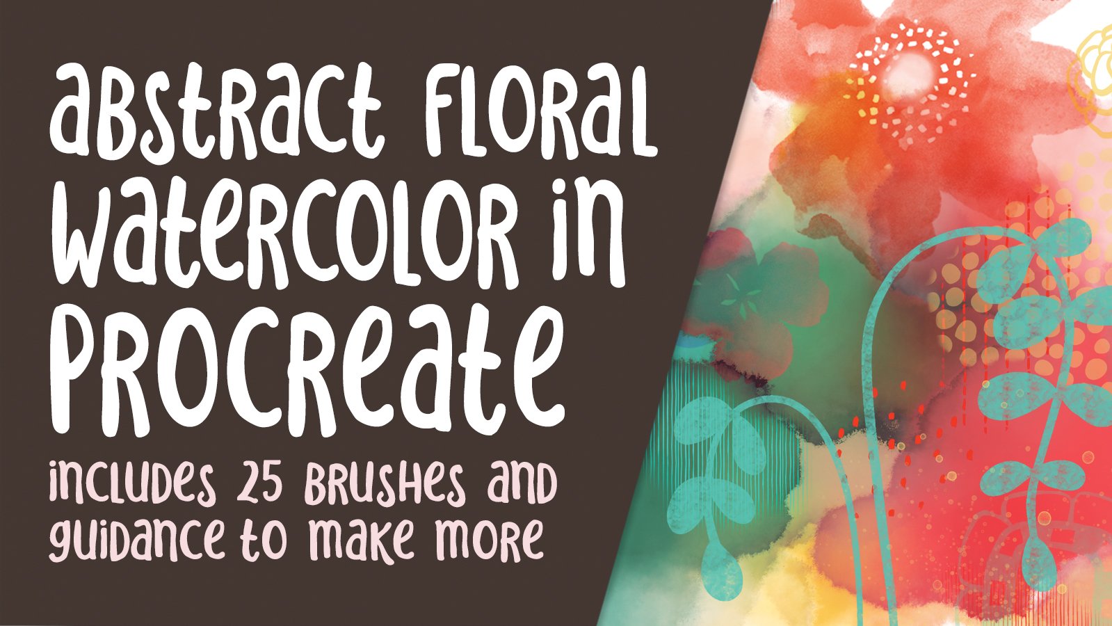
1. Intro Fantasy Garden Watercolour Abstract: Guys, welcome. My name is to learn to master it. And I'm coming to you from sunny, Manitoba, Canada. Sunny and hot. We're going through a major heats fell here and the humidity is just out of this world. We really need some rain. But anyhow, let's get to this or eight. So this class I'm bringing you today, I'm calling fantasy gardens. The reason I'm calling it that is because they're kind of out of this world. Not something that you're going to see in nature unless maybe you go to an aquarium. Jellyfish can be real good inspiration for something like this. We're actually going to be taking a look at a bunch of inspiration. So we have really given me the idea for this class. So we're going to look at artists like Joel and that Yelena James and learn loot Check, as well as a few others. From that inspiration, we're going to be able to figure out some really great elements to add to our compositions. This class is going to focus a lot on the procreate brushes. So we're going to be doing a bunch of customizing. And we're going to maybe create a brush or two. And I'm going to work with you with learning a little bit of layering techniques so that we can build up these really weird looking plants. So it sounds a little bit crazy, but I think you're going to really enjoy it, especially if you've been using Procreate and really want to learn more about brushes. Now she'd been in my other brush courses. This'll be sort of an additional thing that you can learn to do some stuff that we haven't done in the other courses. And if you've never been in my Procreate classes, this is a fine one to start with, don't worry, it's not as hard as it looks. Now I want to ask you to take a minute now to just hit that follow button up there. Or you can wait till the end of class just to see if it's something that you might be interested in doing. If you follow me, I definitely can give you all the information about my courses as I publish them. And you'll also learn about freebies that I give away. If you've been in my other brush courses, you'll recognize some of the brushes that we're using. So you probably have a fairly good set already, but we're just going to add a few more to it by the end of this class. The first thing we're gonna do is take a look at that inspiration I was telling you about our eight. So let's move on into that first lesson and get started right away. I'll see you there.
2. Overview and Examples: Hi guys. Welcome to Lesson 1. I'm so glad that committed. So as promised, we're going to go and take a look at some of the artists that have been really inspiring be for this kind of project. It's super addicting to look at this stuff. You could probably spent hours really just taken a good luck. Let's just try and get a bit of an overview before we get started. As always, I'd like to start my classes with a little bit of inspiration. I know for myself this artist can be wrong, is one of my all-time favorites. I specifically went to Santa Fe, New Mexico so that I could see his work in galleries. And that's exactly what I did. I you can purchase the piece. Now his work is amazingly detailed and these pictures can't even do with them justice, honestly. I'll see if I can find one for you to take a look. Yeah. So I don't know if you can see all of this in the background, but every object that he's caught here, every element is covered with intricate designs that really add a lot of texture and interests. Seeing these up-close is amazing. And I actually went to a bar incentive fee that the actual Bar Top had been painted by hand, by he him. And it was like 30 feet long and really thickly lacquered. And it was just a gorgeous, so intricate, really amazing. So he's one of the people who I love to take a look at when I'm embarking on a project like this. And of course, I went to Pinterest and there were a few artists there that I wanted to show you is Studio has a lot of the same sort of detail in the background. And of course, what's interesting is as soon as you do search out and artists, you'll see a bunch of related sort of work. And of course, the work of Helen garlic comes up. It's not exactly what we're going to be doing in this lesson class, but it can still be very inspiring. Another artist that I came across when Laura Luciana, her work is also just really intricate and the detail is amazing. And I also really loved her use of color. There's a ton of depth in her work, and she's got both hand painted work and digital work. So if you check her out, you'll be really amazed. So here is a piece that she's done digitally in Procreate and just check out that layering them. And that's super amazing. The whole point is this kind of research is to get ideas for brushes and how we can use the brushes that we have to create really fantastical sorts of fantasy landscapes. Now another artist who comes to mind as well and whose work probably is closest to the samples that I use there for the title, my course titles is this artist here, yellow and genes. And I've also mentioned her a few times in classes because her work has been quite an inspiration to me as well. And it's super details. She works both analog and here's a great picture of a beautiful mural she's painting. Imagine the amount of time that would take into the detail that she's putting in mirror. She also works digitally, which was very interesting to me and I covered a little bit of her staff in the abstract class that I did in Adobe Fresco. So I've used Adobe Fresco myself for watercolor. It's just absolutely wonderful, but we will be using yet to, simply because there isn't the ability to make brushes quite as intuitively as we would in Procreate. So I'm going to show you a little excerpt from the video that I featured in that other class. Can love the process of community. I think my artwork, it's the only place it actually lets me kind of wondering, explored. I don't have any rules or laws, right? Everything else disappears. And you're learning this just clear. There's no interrupting gods to snoring or anything. It's just the year totaling the moment. I hate to cut it off because it's just so great to watch his video. I'll put a link to this video in the course materials so that you can check it out in its entirety. There is a point at which you'll see here that she switches and we get to see her working in Adobe Fresco. So here she is creating the background. And then you see here putting in all this little fine detail. Now we're going to be using Procreate because we can make the brushes that we would use. And I can show you some methods to beat brushes that makes it a lot faster to create an artwork like this. We're going to adjust a lot of the brushes that you may already have. Mine from the last two or three classes. But overall, the whole point of this is to be able to create these really fantastic super detailed sort of compositions. So we'll be going through a lot of steps to get to the actual finish stage here. But I think you're going to enjoy this one. It's really fun and therapeutic exercise. All right, so let's meet in the first lesson here where we're going to start talking about the steps that we're going to take to accomplish this goal. All right, so I will see you there.
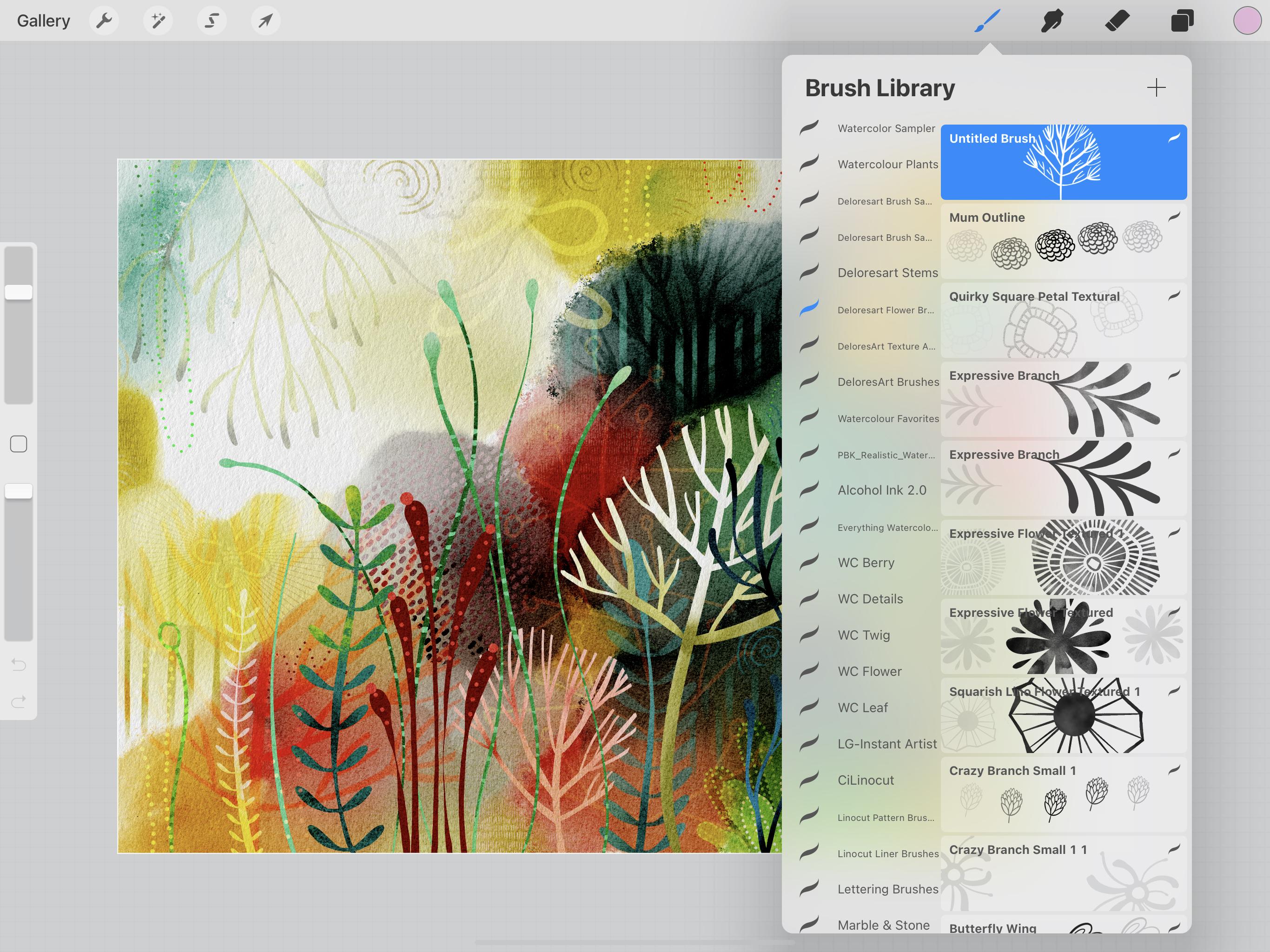
3. Brushes and Document Set Up: Hi guys, welcome to Lesson 2. In Lesson 2 here we're going to talk a little bit about the brushes and we're gonna get our document setup. Let's get started. So there's three things I kinda want to cover in this class, and that's number 1. To figure out the structure of the document, number 2, we're going to take a look at the brushes. And what was number 3 talking about that watercolor that we're going to set up in the background. So the other thing was the import of the paper texture and whatnot. So I've actually got my document already set up, so I've got a painting layer, then I've got the texture. So I'm not sure if you'll be able to see it here, but there's a good texture in here that I imported from a photo that I took myself. Maybe that one will show up a little bit better because I've also got in here some texturing effects that you'll see kind of inaction as we work on this. The texturing is actually something I've done with a brush and it's just a resident Procreate texture that I created. So I'll be explaining to you how I did that. But this is basically the structure that we need for the documents. So we need to have the team which will be underneath and anything that we do on this layer will be affected by what we've gone over top. I've got blending modes here, and this one is Color Burn, this one is multiply. And all of these things, you don't really need to know too much about that. I can give you all the components to do this so that it'll make it easier for you. And maybe I'll even give you this master document just to make it pretty much fool-proof. Actually, what I'll do right now is I will just duplicate it, which is something that I suggest that you do as well. So if you get this document downloaded, make a copy of it so that you've always got that original that you can go back to as your master. So we're in the painting layer here. We can actually post those and less. Take a look at what that texture does. So you can see here that it totally applies to whatever brush I have. So even if it's not a textural brush, a little bit lighter here. And I'm going to reduce the streamlining on that one. So this one actually has no texture normally. But you can see here that the texture is added just because of those blending modes. So I've my canvas, Let's take a look at it here. See the settings to be 4800 pixels by 3600 pixels at 300 dpi. So it's a fairly sizable document, which gives us the option to be able to enlarge edge if we need to have the end. And I find that this watercolor texture is very forgiving of that the enlargement doesn't look all pixelated. In fact, what I usually do is I'll take it into Photoshop. I'll enlarge it and then I'll add the paper texture at the high resolution. And hopefully I can cover that at the end because that really helps to make it doable to enlarge without losing too much detail. So where else do I have to tell you about this, this point to get started on that background, we're just going to lay down a bunch of different colors and you can color based on a color scheme. I've got a bunch of different palettes here that I use that I've either purchased or created myself from a photo. It's really up to you the way you want to go on there. So you might want to possibly create a mood board. I'm going to choose this palette here. So I hit default here, and I'm going back to my disk and you'll see that that will be the palette that's shown here at the bottom. I guess I should have named it, but it doesn't really matter. I'm not going to be necessarily married to all of these colors. I may change it as we go along, but we'll see how it goes. So at this point, I'm just going to just lay down randomly a bunch of color and let's see what brush would work nicely for that. You don't even really have to worry about. The type of brush. Honestly is what we're gonna do next is going to make all the difference in the world. So a big wash brush can work really nicely. I like going with some deep colors in my composition, and this is so totally random. I can't even tell you how to do it. You're basically just laying down areas of color that you're going to be blending and creating just sort of some base structures for the design. So I kind of like that one that I did that kinda left a bit of the corner really light because I've found that that really gave it depth. So I'm going to just do some really light colors up in this corner, but leave a lot of it just kinda blank and they don't have to be round. So it's completely up to you how you want to do this. And basically we're just preparing this document. And in the next lesson, what we'll do is do the actual blending to create that background layer. So I'm thinking I'll put a little bit of this color in here as well. Maybe a brighter yellow. This is going to change a lot. So be don't worry too much about how you're putting it together. I'll go back to my sample here so I can show you kind of what I am aiming for. So this is the document. I'm not going to end up with anything that you're like this, but this is the idea. So we're going to have kind of a darker, what looks like a foreground area and then some feeding off into the distance at the back here. And that's achieved by just this change of tone. And then you can see here that there's some light areas in behind. Let me hide all the paint layers here. So this is what we're going to be creating. And so just imagine that with those colors that you're laying down now, like I said, you're going to be able to change them a lot and they look so different once you add all the details as you can see here. So don't worry about it too much. Just have some fun with it. And I really wanted to try this different color scheme just so that I could have just a variety of these different sort of looks. So I think at this point I'm pretty much ready to start that other scap, so I think we'll carry that on into the next unit. So I will see you there.
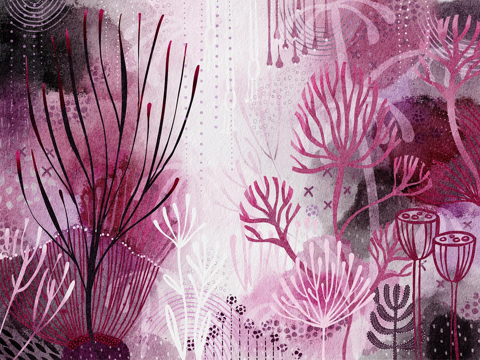
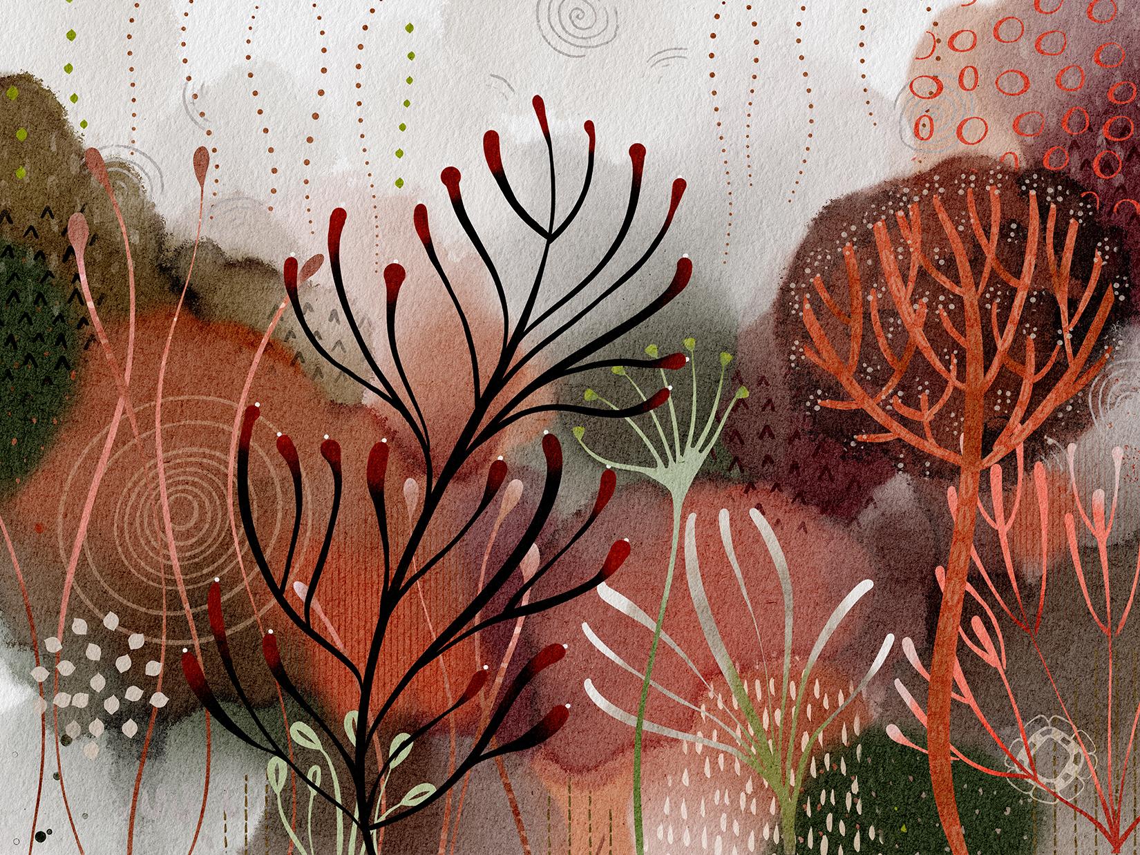
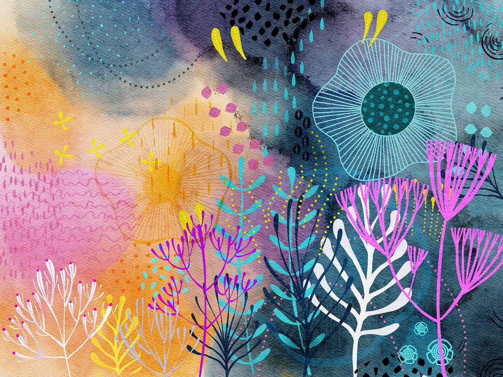
4. Creating the Watercolor Background: Guys, welcome to lesson 3. So in Lesson 3 here we're going to take a look at creating that watercolor background. We want to make it really dramatic. Let's get started. Okay, so we've got all our color lay down here and we're ready to start doing some of that blending. So here we're in my other watercolor classes. You'll know about this blend horrific brush that I've created. Here it is here. This brush will a lot of our blending and you can see here how cool it is and how it leaves or gives you this really interesting edge. So we get a lot of real texture in there. And you can also see here once I enlarge all those little flaws and things that I have in layers here to add special effects. So we're going to go through here and blend some of these colors. I've got that lender. And one of the things that's really cool about it is the harder you press is, the more dramatic it is. But you can really faded off nice and softly as well once you reduce your pressure. So there's that one. And then there's this watercolor blend texture, which also works in a similar way, but gives even a more dramatic textural edge and see that there. So we're kinda trying to create not too many shapes. So we're going to definitely reduce down from what I have by just kinda blending things in together. So think about, you know, you're sort of foreground, middle ground background. And I like to keep the foreground stuff quite dark. And then, you know, sort of US softer middle ground and then the really light background. So here I do have a slight yellow elected, but I could go to white and gold and then just pull from the white area into the color. That's one way I could do it, or I could drag from the colored area and out into the darker area. And you can see that as soon as I move from the one color into the other, that the brush picks up whatever color that is and helps to spread it around. So I'm loving this already. I don't know about you guys, but to me this is just so satisfying. I could sit here and do this for a 100 hours. I'm sure my husband could attest to that. He thinks I'm always working, but I'm not working secretly, I'm playing. So I found that when I was working with it, it was nice to have these sort of big hill light shapes. So I'm kind of creating that now. And what you'll find is that, you know, you go in here and do your sort of initial blending, you can definitely leave some areas really dark. And then you can actually go back and kind of overlap but one area over the other if you know what I mean, like this. So now that kind of has drawn that this 1 over top of this one. So that one looks like it's in behind and I want to keep that color. So I'm going to select that first and then kind of do this. And what I really love about this brush, I mean, it's like a million things I love about these brushes. But what I do really like is how these other colors pick up unit and give that really great multi-color feeling. So look at that like a mean is not just delicious if you do something and you actually lose a spot that you had really liked, just undo. That's perfectly fine. So I kinda like that little red blocks there is. I kinda wanna keep it and it's not just so nice how you can just blend it, right? Okay. So I, I really get that feeling of distance looking at this. So that's to me a real positive fuel thing I don't like at the moment is straight diagonal here. So I'm going to give myself a little bit of interest in that line. I think that gives me a little bit more. I don't feeds my imagination. So I can These with plants or whatever I'm gonna do with them after. And there's no law that says you can't go back right now with one of your colors. Even a different type of brush like this is the pastel. And you can go in and drop some of that color back in or something that you really like. So I'm going to grab that red and go in here and a little bit of dimension. And this is such a soft blender, I could actually just leave this. I mean, it works because that paper texture kinda ties it all together. But I could go back to my blend terrific here. And you don't definitely add more of that watercolor sort of texture and bring that up a little bit. So I've got three different blenders that I use. A blend horrific that I created, the watercolor bland. And it's a textured one, which is the one I was using. And then I've also got a smooth one, so it doesn't have that texture. So let me just go back to this one since that's when I've been using, and I just love those sort of florets that it creates. Experiment with using different colors as your base or a pure white makes any difference for what you're trying to achieve. And I think I could call it quits at this point and be happy that my background is this interesting already at this point. Pick a really good look at it, close up to, to see some of the textures that created in here. And along with those little flaws that we've got from that overlaid and the paper texture. We've just created a really fantastic backgrounds that we can use as a backdrop for all of our fantasy plans. So I will meet you in the next lesson. I guess we're going to start. The plants. Were good to go. I'll see you there.
5. Plant Construction Tips: Guys, welcome to lesson 4. So I'm going to try to cover a few of the plant structures so I can give you some tips that I've learned along the way. Let's get started. So I wanted to start you off by showing you all the different precious of abuse. So I've opened up this other documents of mine and I'll explain to you the different brushes that I have you in my set here of brushes. Okay, so for this, I've used the Posca pen. Now, posca is a brand of markers with the POS because you get a really clear and clean, sharp line that doesn't change in thickness. So that's how I designed this brush. I've used what I call my lineup cut blunt, which is a very basic kind of aligned brush. Show. You know, I've got one that's textured and I've got, Well, I've actually got a couple of textured ones. And it's also got a texture. And then I have just a very smooth one. Oops. Which of course under this paper texture it looks very textured anyhow. And then I've got these texture brushes that you've seen me use. And I've created a whole set of them though these which paint on an actual pattern. So that's a very quick way to fill in spaces. And then I've got some actual brush stamps. So Floral brush stamps. So these be a complete predrawn sort of r elements. So I've not used that many of those in my composition. And I'm probably going to do mainly just the line drawing to show you, but I just had to show you a little bit of what I did to actually accomplish with this look. So let's go back into the document we were working on and just talk about the construction of our plants. I don't know if they're plants or coral. I don't know you tell me. So I'm going to get my smooth brush that I showed you just a minute ago. And we can start with white. I mean, why not? Now what do you like to do is take a look at this background and then use it as kind of a starting point. And I am not sketching this out. It is something that is super intuitive when I'm working in my sketchbooks. Oftentimes I just do it layer by layer. One day be doing the backgrounds the next day I'm doing block marker. Then the day after I'm doing white detailing, you know, it kind of just happens intuitively. I don't pre-plan the drawing. So that's exactly how we're going to work here. But I liked that these backgrounds kind of help you just think of ideas for creating your plans. So this one here really has a kind of a weird, I guess you'd say tree shape. So let's start with that one. So this brush is very sensitive to pressure again, that I can press hard to get a thick line and softly to get a thin line. So I'm going to start by just making sort of a main trunk here. And then I'm going to draw it just some quick branches. Now with the brushes. Remember that you can go in here and go to the stroke and set the streamline quite high for the program to help you draw really smooth lines. So, I mean, we all know how to draw a tree. Like one of the very first little art projects that you do as a kid rate. So we're going to try and get my brush. Just rate. I'm going to go through and just do some quick here. And that works in perfectly with my tree shape in the background. Now we're going to add some branches and then don't worry that you're going past the end of it because I'm going to show you a really neat trick to smooth out your brush. Strokes are the ends of your brushes here. So maybe I'm just gonna do it super messy, just so that you can see. So I'm going way beyond what I would have considered the edges here for myself. So this is what you'd call it. What kind of tree this would be, would be fun to name these. So I've got a pretty cute little shape there. Now I'm going to take my eraser and I had accidentally switched to it anyways, I have this habit of double pressing on my pen, and that will switch me to the eraser and sometimes it happens accidentally. So what I'm gonna do here is I'm going to just, oops. Oh my goodness. I can't believe I just did this whole thing on my background layer. First thing I should have told you is lock your background and add a layer. So let me just time-lapse and do this tree. Again. It actually goes pretty fast with this technique. Another thing that's really satisfying about this project is what a great look you can get in a short amount of time. I can't believe I made that mistake. Nobody's perfect rates. Okay, now we can erase. So I like this look to, and this is something that I observed with Yelena, with her graphics, is that she often has this really hard edge, which to me looks like it could only pitch huge with an eraser. I have literally watched her though, painted that accurately. But that's one of the advantages of digital, is that you can do things a little bit more quickly. Now you can go back in and make little corrections. I don't think it's really that necessary with this kind of project. It's very forgiving, but there we go. We've created one little tree already and that was super-quick other than my big boo-boo. So yes. Make a new layer for each of your plants and you're going to want to do that because sometimes you can use the plants again elsewhere in another document, you can make a brush out of it. There's all kinds of different things that you can do. And I'm just going to create a couple more. And let's pull in some of these other colors that we had in our palette. So now on this new layer, I could easily go over top of one of the brushes that I have there or one of the elements I have there. So I think I'm going to go a little bit thinner and create one here. Now don't feel like you are absolutely having to stick to the shapes that you've created in the background. Because I've done a lot of them where literally a new tree or new shape or new kind of graphic that has nothing to do with the background and it still works. So here let's make the branches a little bit more sweeping. I'm doubling up on some of those branches there. I think that's quite interesting. And I think it's nice to vary your thicknesses as well. Don't be afraid of having some that are not as consistent. I mean, it works and we're going to do some that are super consistent with that Posca marker. But it's really, it's a fantasy, right? So it can be anything that we want it to be. So then take your eraser to reshape and then don't feel like you're stuck. You can do any shape that you want. So the larger your eraser is more that you'll take off obviously. And their immediate kind of a weird alternate shape. And we've got two cute little trees. They're already know with this one that could flip it. I could move it. I could make it smaller. These are all things that we're going to be doing when we finesse the pattern. And I actually don't mind it right there. Now if you feel like it's either too light or too dark can also go into your adjustments in here. You could brighten if necessary. I'm going to saturated little bit more and brighten it so that it really stands out in that spot. So let's try another brush type. This one is another one that I really like. Now this is a different type of a taper. This one allows me to do kind of rounded, that they're rounded ends. And that's a really great one for doing some of these really sort of fantasy looking elements. I want to say plants, but they could be coral. So I'm not going to say it. And I'm going to remember and we make my new layer. And let's try one in yellows. Let's sample that yellow there. So press down, your color will come up here. You can go in and make it later here if you want. And for this one I'm going to make I'm going to press really hard at the beginning, maybe not that hard. And then I let go of some of the pressure as I'm extending the branches. So that makes for a completely different look. And the brush is doing all the work for me. I think I'm going to make these really long. So you can just get lost in this process. Believe me, know, I think I'd like to do a couple of sort of free floating kind of elements here. So let's switch to that Posca paint marker. And I'm going to try with a light kind of a greenish color now for this one, and what I'd like to do is use the Draw Assist. So we'll go into the Canvas here, set up a drawing guide, go into editing. Symmetry is what you want and you want a radial symmetry. Definitely assisted drawing. And now let's just move this so that you can see when I'm doing, hit Done. And now my drawing is going to be automatically reproducing it in a really symmetrical radial format. I know you probably can't see my guides there, so let's just go in and I'll make them heavier and more opaque so you can see them. And I'm basically just drawing a line from the outside down into the middle here. If you want it to be super, super accurate with your lines, you could draw and hold, and that would make a straight line. I'm kinda looking for a more organic field. So I think this is going to be okay for me. Sometimes that very last one is tricky and achieved a little bit there. But now we've got basically what we need. We can turn the drawing guide off and we're going to use the marker slightly larger to draw kind of an outside who were not have that off. Okay, and go into the layers here too and just turn off your drawing assist. And here, actually you don't want I'm gonna do is I'm going to erase it first big eraser, and I'm going to reshape it here a little bit hard for me to do this because of the position my iPad isn't normally I have it kinda tilted with an icecap video tape heads. So bear with me. Might take a couple of tries here, and we'll do that. We'll do. So I've got that all cleaned up. Now. I'm going to grab my brush again and have it a little bit bigger. And I'm just going to go through and add an outline here. Rotate to get your arm in a better position. We all kind of have our perfect curve and perfect, which call it the perfect distance that we need to be. And of course, feel free to, to clean up some of the lines if necessary. Sometimes I like doing it like this where you've got some areas thicker. I think that really adds to the dimensionality to, for example, if you do it in all of the depths of your fix, that one with the researcher B, see how I'm doing the dip a little bit darker. And I've created sort of a jellyfish, I guess you'd call it. I would also, in this case, probably take out the middle, use my bigger setting on my, on my pen. And yeah, I've created my first sort of little jellyfish, which I can put elsewhere. I'm going to actually fill this with a texture and I'm gonna be showing you that as time goes along here. But I'm actually pretty happy with the fact that we've got just many drawn in, you know, whatever it was, 15 or 20 minutes. We're darn I see that I at some point I smashed a bit of it there, but I think that's going to be OK. Now, when you're repositioning, just remember not to reposition it off the page because once you commit than that is cut off. Now in my case, I am leaving it like that because I had smudge that area anyways. So for now I'm just going to leave that there. So it's just kinda like Saved by the Bell. Alright, so let's move into the next lesson where we're going to do a little bit of work with additional brushes. And I want to start adding details to some of these. So I think we're going to make use of the alpha lock. Okay. I'll see you there.
6. Effects and Using Alpha Lock: Hi guys, welcome to lesson five. In less than five here we're going to cover the Alpha Lock and I'm going to show you how you can use it to really add some great detail and dimension to your plant structures. Let's get started. Hey, we're back in this other document. So I wanted to show you a couple of the things that we can do with the alpha lock. So this one here, this plan, as you can see, has some highlights and some dark areas. And that was accomplished by creating the alpha lock on that layer. So which one is it here? This one here you can see it's an alpha lock because it's checkered here. And you see I've got that checked off. And what that allows me to do is to paint within the canon, just grabbed a blender, of course. Let's go back up to the super soft pastel. And you can see here that I can go in and paint without affecting the background. Okay, so we were like that. This is exactly what I'm going to do and just to expedite matters a little bit, I'm going to scale this one from this document. So and this one hasn't had any detail or anything done on it. So I'm gonna go to that layer. I'm going to copy. So three fingers down and copy. And then we're going to go into that other documents, three fingers down and paste. So now we've got this and you can see how they could be interchanged between documents like that one looks wholly amazing like right there in that spot. So that's something to really think about is interchanging. And I would make some of these into brushes myself, Let's anyways, grab or make this an alpha lock. So into alpha lock there. And let's think about what we can do to make this even better here in this documents. So we're going to sample the color, which is that kinda of a stormy blue. And I think that down here we actually have to go a little bit lighter to have it stand out. So I'm going to move up here a little bit and I've got that Lindy super soft pastel, and I'm painting it in here now. That's not even light enough. Let's go a little bit later. But here you go. I'm just lightly painting in that area to brighten it up against that background and that's working out great. So I think I'm just gonna do it over this dark background because if I do it up here, it kinda seems to get lost. So I think we can work with it and do kind of the opposite where we take black are really, really dark and darken up on some of these n-bits. And maybe even in some of these where there would be a shadow normally like where the branches meet the main branch with the trunk. So what do you think? I mean, it's not just so cool, so I'm going to do that here too. I think that can stand out nicely on that and I love that. I really think that that's a really neat way to help fill out the pattern. So I've stolen, Let's go see if we can grab something else from one of these other documents. Boo yeah, I want to show you this one here. So I've got this brush. Let's go back in here and trying to remember which one I put it in here. In this texture. Yes. So I've got these funny little leaves that I created and I've got them set up so that the draw following your stroke. So let's try and other blue. I want to do blue because I think it's going to really stand out over here. Maybe we can go even a little bit kinda Grenier, and I'll show you how this brush works. Now, I was on that Alpha Lock, which is good because it just reminded me, make a new layer. I should have that written up here on my iPad because it's so easy to forget. But you see now when I drag that brush, how it creates this amazing little set of leaves which we can join easily with a stem afterwards. So I don't know what color to go. Let's do let's try this one. We can always change it and medical bit lighter. And I've got two of them. I've got this one and I've got this other one that's spaced more tightly. So lets me caught when different in color as well. Now this one needs to be adjusted and that would be under shape. And I'm going to bring the rotation back to ninth. I must have used it somewhere in a different orientation, but it's very easy to adjust. So I've got this one that's just a little bit more tightly spaced so that can make it look like it's further in the distance because the perspective would have it getting smaller in the background. So actually maybe what I'll do really neutralize it as well. And I'm painting more softly so that I can get it almost transparent. You see that? So that would make it look like it's got some distance. The other thing you could do, of course, is put it on its own layer so that you could either use a blending mode or something to make it look like it's further away or closer. And let's go back to this one and we'll just make it a smaller brush. And so you can see there that that would be an easy way to make another plant. So we'll just grab that tapered pen pressure because that's the one that can be thicker with it, just a little bit of pressure. And those are on the sampling rate. Yeah, and then this one is on the other layer. So we're going to make this one a little bit darker to match. It's a little bit too dark. Sometimes it's hard to sample and get the correct color when you've got one of these overlays on it because the texture will make some areas there look darker than others. And you know, I think I'm just going to work with it or another idea. Add a layer printed on its own layer, and then go into hue and saturation and adjusted a little bit. There we go. That's almost perfect. So that's a good way to do it. And that actually gives me the opportunity to adjust its position slightly. Okay. So we've got I'm just showing you all kinds of stuff. I'm probably overwhelming you with ideas here, but I think it's kind of the way you have to do it with this. So let's add another layer and color could be used more of you people try little bit more red. So I'm going to sample this dark red in here. And because we're on another layer doesn't really matter too much where I start and I'm going to go fairly big with this brush. And we set the streamline high because I want to do a little bit more alpha lock stuff here. So what we're gonna do is alpha lock this. And then we're going to grab this noses Posca paint marker. I mean, honestly it's nothing spectacular. It's literally, I'm going to show you how easy this is to create, add a new brush, which is the basic brush that procreate gives you. You don't have to do anything else other than space. Space it out like this. And you've got this basic dotted brush. I'm going to go back to my because I've already adjusted it. You can of course go in and make adjustments to the jitter, to the shape, how it behaves, the size, the opacity. If you want them to all be exactly block, you can do all this kinda stuff. This will give us a brush settings that I have that draws it in a perfect line. We can undo that. And let's color in on top. Now we've got that alpha locked, medical back to it. So when we work here, in course, we're going to go away smaller. When we work here we are. Even if we were to start off on the side here, we're not going to affects what we've got. It's only going to paint within the alpha locked area. So if Matt phon, like how easy was that? I don't think I've ever created a brush that has, now once you're done, you can turn the alpha lock off. And I'm going to do that because what I want to do is go back to my brush and just add some little dots here. Now this reminds me of drawing succulents. I had done a bunch of succulents. I don't know if I did that in another class or if it's just something that I have to do for clients. But I decorated the edges of the succulent only it was the other class. Know what? My memory is so bad right now. It was right here in this in this document. So I can show you and do that real quick. I'm sure you can just by looking at it, kinda figure it out where it would be drawing. What is, let's even do it in green. So you're going to be drawing some, Oops. No, no, no, my research that match that. Well, oh my gosh. Temple you that matched that well. Okay. Well, they'll get later. Let's draw some. So we're going to draw some dark ones to start out with, just to make some kind of layering happening here. So this is my, what are going to be my cacti. And I can go ahead and draw some more over top or whatever. They don't have to be exactly positioned over top because it would be like the foreground, different than the one I just showed you from the other document. But this would be equally as interesting, in my opinion, will go back to that Posca marker. We're going to alpha lock just in case we're going to go later. And here we can just add some of that detailing and planet going around the edges and then maybe two lines down. So this might be somewhere where you would want to adjust the spacing so you could go in here and bring them closer together. So it just kinda depends on the look that you're trying to achieve. I can't really tell you exactly how you want to do it, right? You're going to figure that out for yourself. I'm going to erase this one. Oops, don't have to backtrack here because I like this tight, tighter spacing and this is like those cactus have, have those little finds. So they have darker areas, are deeper areas, and then they come out like a wedge kind of a shape and that's where the little spikes would be. So these aren't exactly spikes, but you get the idea. So then I would go a little bit darker for this next level. And the Alpha Lock may not have been a 100 percent necessary in this case. I might even turn it off to do those back ones. And there's no law that says you have to do four rows of these. I just did four. But if I come to one that's a little bit too skinny for four, then I'm just going to put three and then a little bit darker. And I'm going to turn off the alpha lock just so that I can put these kind of on the outside of them and ungroup a little bit later, actually. Oh, dear. To her. Stomach is growling. You can tell where my husband is actually not here because then I won't eat. I'm just too lazy to go cook it myself. So I think that's super fun. Done that in such a short amount of time. And now we've got another platform that is so cute. And let's actually drag that guy owning behind because I liked the depth of that creates. And then through any of these, any of these that you've drawn, go through and experiment with blending modes because sometimes it's really surprising, like that overlay actually look super good and really makes it work with what's in the background. So in fact, that would be a great exercise for you, would be to do this whole thing without blending modes and then go in and just do a bunch of blending modes and just experiment with how that can work to give you the depth that makes these kind of fantasy landscapes really, really interesting. Okay, so I think I'm going to cut this lesson off because it's probably getting super long. And I will meet you in the next lesson where we're going to do maybe a couple of custom brushes so that you can just get the idea of how easily you could do that to create some additional plant life here. All right, I'll see you there. I'm actually going to go have a snack.
7. Customizing Brushes: Guys, welcome to lesson 6. So we're gonna cover a few things in this lesson, but mainly it's going to be about customizing the brushes. Let's get started. So naturally I have to show you a bunch of things to do with brushes. I'm after all, that's one of the things I base this class on. So here in this, it's changed a little bit since the last time. And that's because I've added some of these little motifs and the background, which are brushes that I had. So I want to show you how to quickly make a brush. And I think that this white one.
8. Layering for Interest: Hi guys, welcome to lesson 7. So unless than seven here we're going to talk a lot more about layering. That's going to add a lot of interests to our composition. Let's get started. All right, so we're going to work on this motif here in this lesson. So I think what I'll do is just hide a bunch of these that might be just distracting. Not that one. This one. That's probably good because we're going to work on this one here. I'm not going to go back to that same brush that I was using, the tapered brush, pen pressure. And that should make it a little bit easier for us to see. And let me just see when it tests the size here. And then I think what I'm going to do, a light yellow. The first part. Now I'm going to do this on a new layer because I think that gives me a little bit more flexibility than I can recolor it later on if I have it painted right on that original motif, I might not be able to recolor it as easily. So again, using the same technique of pressing down at the beginning and then kinda letting go to get that taper. Go back to this layer here for a second and just fix this one up a little bit. And we sample that color. Looks pretty different. And so just pressing harder and then letting go to get the taper, pulling a little bit more lightly here. Every pressure, light pressure, heavy pressure, light pressure. And you can do these as carefully and accurately as you want. I've done it fairly roughly in the first place. So I kind of want this to match the original technique and then just make any corrections that you see might bother you. And I think I'm going to actually lighten this a little bit. So that's one of the great things about having kept it on a separate layer is I can now lighten it without affecting the back. Now, for inspiration, I really want you to go and take a look at the work of Lauren Lou check again. So she does a ton of this sort of layering. And a lot of times she uses complementary colors and you know, four or five layers when something's, It's really quite amazing. So I'm going to use this blue. I'm going to just slightly desaturated. And I'm going to go through and add a little detail to the bottom of each of these. So I literally want it to be shaped the same. But if I didn't, I could have also done an alpha lock on this one and just colored it in. And actually I might do that anyways because I can still do that tapering. And that makes me really think of peacock feathers for some reason. So it helps me stay within the lines, so to speak, when I am when I've got the alpha lock on. So that's kind of an advantage, I guess. I'm going to turn it off though, because the next thing I'm gonna do, a kind of need to be able to get past that yellow area. So I'm going to go back to that little dotted brush that we created. And if you see Lauren's work, she does a lot of this too, where she adds polka dots and lines. But yeah, lots of dots should really loves the dots and I can't blame her. So I'm going to duplicate this because I want to show you some of the things you can do to alter the spacing and so on. So in the Stroke path here, I showed you before how to tighten up or spread out your dots. You can also affect the way each stamp of the brush is positioned relative to the center. And you can have a fall off so that you get this kind of fade off effect, which I think I want to use for this. Also, you can go in and add a green if you wanted to start really necessary for us because we've got that overall texture that's going to definitely affect it. And we could also go in and affect things like the way the paint is behaving. I'm not going to mess around with that one too much. I'm not sure if this would make any difference at all. Probably not. So I'm just going to leave it. And with the Apple pencil, pencil I'm gonna see, yes, I think that this would be a really cool effect here where we get the brush getting bigger and smaller. You'll see if you look at her work that she does this a lot and it's really neat. And I guess you could experiment here with the Apple Pencil how the flow and opacity can be affected. I'll leave that up to you. But we've now got something different happening with our line here where we haven't getting thicker and thinner. But I want to go back that opacity slider off because I want them to be actually very noticeable, so very opaque. And try the blue. I think that's a little bit too subtle, so I'm going to try White. And I'm a little bit sloppy here, but I think it works. So again, pin pressure in this case makes a difference for how the dot looks and neck really like how that's looking. So let's also add some white dots. I'm going to go back to my pen pressure. And that just adds a little bit of additional detail. So let's turn on those other layers and get a quick look at the overall. Because I think what I'm gonna do now is take some time off camera to really perfect this. I really feel as though I've given you all the basic information you need to produce this. And when we come back, I will definitely go through all the different things that I did to add that final sort of Agena se qua to my fantasy garden. All right, so I will see you in the next lesson.
9. Finessing the Layout: Hi guys, welcome to lesson 8. So I call this lesson finessing the composition. We're going to add some finishing touches that really make this composition interesting. Let's get started. So that quick time-lapse was just to show you some of the things that I've done. And you can see here in my layers palette that there's quite a few more layers here. Now, you can see a lot of depth here and I want to kinda explain some of the different things that I've done too. I think really rich and the layout and a lot of that was just the use of my textures to add detail. So let's just start right down here at the bottom. So that is the layer where I've got all of the textures added. So that's without and that's with the textures. Now I can't add a texture because I have actually reached my maximum. So I think I'm going to delete a couple of things that I don't think really add that much interests to layout. And one of them is this little plant, this one here that I had added just to show you the use of my own brushes. So I'm actually going to delete this one and I'm thinking to leading this one. And then that way I can show you a couple of things here. So I'm going to hide that layer there, which is the one that had all the textures and add a layer where I'm going to show you some of my textures are eight. So let's go into my textures category here. I went through and just use a bunch of the ones that I already had existing quite often when I'm working on something like this, I will develop new textures just as part of the solving of the puzzle, so to speak. But let's just use these just to save a bit of time. So I would just grab whichever one I wanted and then maybe sample a color that I want. So let's go into that green area there. And then I could just brush on the texture in and that one's really Q2. So maybe I'll end up fusing this one instead of that original one. Who knows? Let's grab this one here. I think I might try because you can see here that it covers really well. So I could use the one that's like this, which is the little motif reversed out. Or I could use this one with the positive image of the motif. And let's maybe sample like darker, kind of a yellow. And that's kinda cute. Like I like that. It sort of looks like little mountains. And I think I could even go a little bit lighter here and honestly, and I might choose to use that elsewhere as well. So just kinda tying things together with the use of a specific texture. Now this is the one that I use to add what looks like tree trunks in the back on a couple of the different areas. I'm going to sample this darker area and you can see how that immediately gives that impression of depth. And let's sample this color here because it looks like just inch trees, in my opinion. Take that one off and let's sample this lighter green and then try that, these trees. So that's the one that I had used. And I think that immediately gives that impression of depth. This one is really subtle, and I did use that down at the bottom with a red. Oops. I don't know if you can see that there are fired at full size here. Let me just see if I can make it any bigger. Sometimes it's not the brush itself, but the green that has to be made bigger. So you can see draw an arrow so you can tell. And that's a really nice way to add the shading, so to speak. So experiment with different opacities of color. And I really like that sort of the fact that it's in lines and the fact that it's subtle and use that over here as well. And that can look good there where it overlaps onto the other color because the openings on the texture shows through that other color so that scan is lateral way and I just wonder or using on easy not 0. So if we were to choose one of these motifs, I'll choose one that my own blog. So for example, this one here, which little one in the corner here, that if I didn't like the texture that I had added originally, I could go over it now makes sure that the Alpha Lock is on it. Oh, I was on the wrong one there. Make sure you're on the correct layer at the color that you want. And then just paint in the texture that I could go darker. The bottom to add dimension might be a little too dark. But you can see there that that's added the subtle kind of a texture in there. So you could go through and do all kinds of texture in there. And experiment with all kinds of different ones. Now these are my own stats that I have. But there are a lot of sets you can purchase like this. One is one that I bought and it's caught some really interesting textures in it as well. I'm going to stick to the ones that I have created just simply because I've got the created in the way that I like to use them. Now the other thing I have are these repeating little textures or lions. So instead of having a dotted line, I could go for kind of a dashed lines. So you can see that could give you some interesting simple yellow here. So that could give you some interesting alternatives to the line that we created there with the discrete dots. So overall this staff is just in adding that finishing touch. And sometimes it can be simple things like adding the textures, or it could be changing up some of the colors, or even the order of some of the items that you have. So you might choose to reorder it. Move this one down or not. In here with this one that we created in this corner, might go in and change the color of the foreground. And changes kid, really enhance your layout, so just check it out. Experiment. In fact, often what I'll do is I will allocate this documents so that I'm not affecting it too much and go in and do some experimenting like that. Now, on this one I added that texture in the middle. You probably saw that in that time-lapse at the beginning. And I did have these others that I could choose to move around. So this was the original before I flattened it into this one so I could take that one. Now remember I had cut that off because I had much to it, but this could be a nice addition in a spot like this. So it's just all about figuring out ways that you could make the layout and the composition more interesting. And adding, adding texture or not, pick the adding of the texture is really important. Now, I also want to show you those additional original textures that we had here. And I will be giving you these brushes. Now showing you here you're not going to really see anything. So I'm just going to quickly take you into another document. So this is one that I started that basically just has the watercolor in it. And what I'll do is I will turn these effects off and then I will make the new individual layers for you to see. So let's add a layer here for also going to go into my text or my brushes. Yes, here's the big texturize or which is the one that as sort of little filaments. And let's just, I'll do it in this dark color just so that you can see it. Now this is actually a resident texture or grain right here in Procreate. So it's one of these. Which one? Where is it? Here? It is recycled. So that's the one I used for this, but you could actually go in and choose almost anyone. There's some really cool ones that you should experiment with. Light. Oil boards, spatters, charcoal. This is just one of the ways that you can individualize and make this your own. So that's the brush that I just showed you. So that created that texture. And then what I did with that layer is go to Color Burn. And so you can see that it just kind of gives that little bit of texture to that particular layer. Then I also created a layer with the watercolor paper. Let's just duplicate this and I'll just pretend I'm making a new brush. Okay, we'll go into green here. Edit again, Import, Source Library. And like I said, you could make this your own. You don't have to use the one that I used, which was a watercolor type of paper. You could use something like this, which is cotton paper, than I used it to brush that layer. And scale could also play into how your texture looks. So you could go actually smaller than I'm doing this in a dark color so that you can see it distinctly. But you could of course, use any color and you'd have to experiment with that. So for example, this one definitely, I don't want that kind of a look. So I could then go into saturation and brightness, alter the Lear, lighten or darken again, I could also reduce the opacity, but you can see that I've added a great amount of texture there. So I would also go back to this one and do the same thing where I would probably be saturated proper, probably brighten it out because I don't really want it to change the color of my layers underneath. So it would take a bit of experimenting to get it to the exact effects that I want. And again, the blending mode doesn't have to be Color Burn, multiply might work. One of these others could work for you. I'm going to be giving you this documents that you'll have exactly what my settings are, but you can definitely go in and make it your own by experimenting with different textures in place of what I have there. And it doesn't have to be exactly what I have. But this is a way to create that paper texture without having to actually import a paper or take a photo of a paper or find by whatever way you are getting the paper. You can just make it with a brush. And it's handy because then you've got it here and you can use it whenever you want to create that sort of an effect. So I think I've kind of covered everything that I want to hear. Oh, hi, where are you playing with the marker? Here's my grandson. He's been playing with the market. Okay. I will fight off here right now and we will meet in that last lesson where we're going to do a wrap up. See you there.
10. Outro: Hey guys, I'm so glad you stuck it out for this whole class. Isn't this fun? This is the kinda thing I can sit and do for hours and hours. You can spend as much or as little time as you want on these composition, making them more and more interesting. You can also mix and match. I didn't mention this too much throughout the course, but you can definitely take any of these structures that you've created and make brushes out of them. The more brushes you have, the quicker it is to fill out Layout. Don't forget to create texture brushes as well as a great way to add dimension. So if you haven't done so already, please hit that follow button up there. That way you'll be informed about my classes as I post them and I'll let you know of any freebies that I happen to be given out. If you haven't done so also check out my website at shop dock doors aren't got CA and add yourself to my mailing lists. As I develop that site further, there's going to be more and more artists resources presented there for you. Now if you're lucky for other sorts of inspiration, definitely check out my Pinterest sites. I've got one called Delors are two pillars now, sprint and the other one is called feature Dolores desperate. For this project, I would suggest that you check out the watercolor inspiration. And also in my surface pattern design area, you can check out the page detailed patterns. You might get some ideas there. I'd love to hear from you today. So please, if you can take a minute to leave me a review and maybe a little anecdote about the class or add something into the discussion section. Definitely post your projects. I am so excited to see these. I think the sharing of projects is one of the greatest ways to learn confidence. And this is an absolutely safe place to share. If you want to check out my shops, I've got one at Sawzall.com. That's probably my biggest one. I've got one here in Canada at arg of where? And if you want to look at my greeting cards, check out the car dial website. So I guess we're done. So this is why for now and I'll see you in my next class. Bye.
 Delores Naskrent, Creative Explorer