Transcripts
1. Intro Abstract Floral Watercolor in Procreate: Hi guys and welcome. My name is Dolores mask grant and I'm coming to you from sunny, Manitoba, Canada. It's a gorgeous summer day and I plan to be outside taking a look at my beautiful graphs and putting on all the sprinklers as this evening draws to a close. Today I'm bringing you a class really inspired by the outdoors. We're going to be creating an abstract watercolor floral piece. I'll tell you how this came about. I have been really working on learning how to create brushes. And I've created a bunch of brushes in a bunch of different categories. Everything from watercolor flowers to textures to just basic line and embellishment kinda brushes. I'm gonna be giving you a sampler Sache about you can use for this class. We're going to go through the entire process of creating some beautiful watercolor floral layouts. Now I call these watercolors, but they could really be called mixed media pieces as well. Once we add the textures for sure, they definitely are watercolor textures. What I'm hoping for you with this class is that you are inspired to create these kind of layouts, maybe for use on POD sites or for your personal use. And that you also think about what you could do in creating brushes of your own. I find that having a huge variety of brushes is what really makes it fun to do these layouts and you can produce them actually fairly quickly. The main goal and objective for me in this class is to just inspiring you. So let's get started and we're going to work on a layout and quicker to view it from start to finish. So you'll have guidance all the way that that sound good. All right. Let's get started.
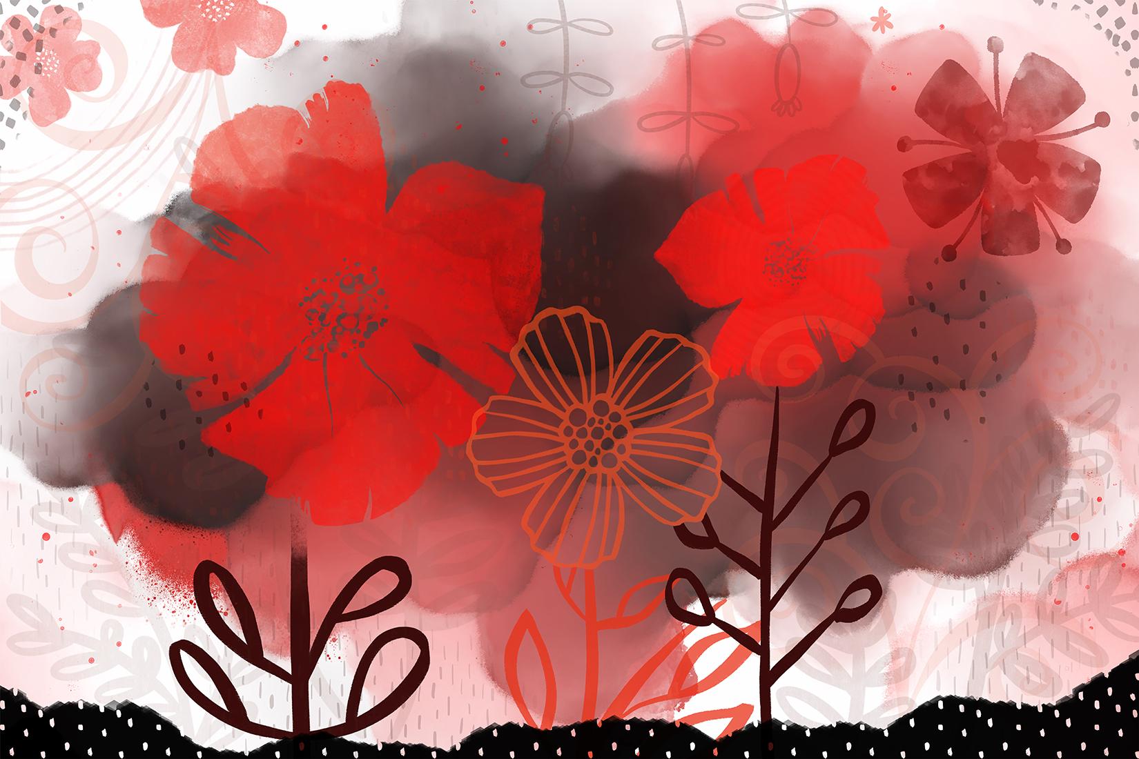
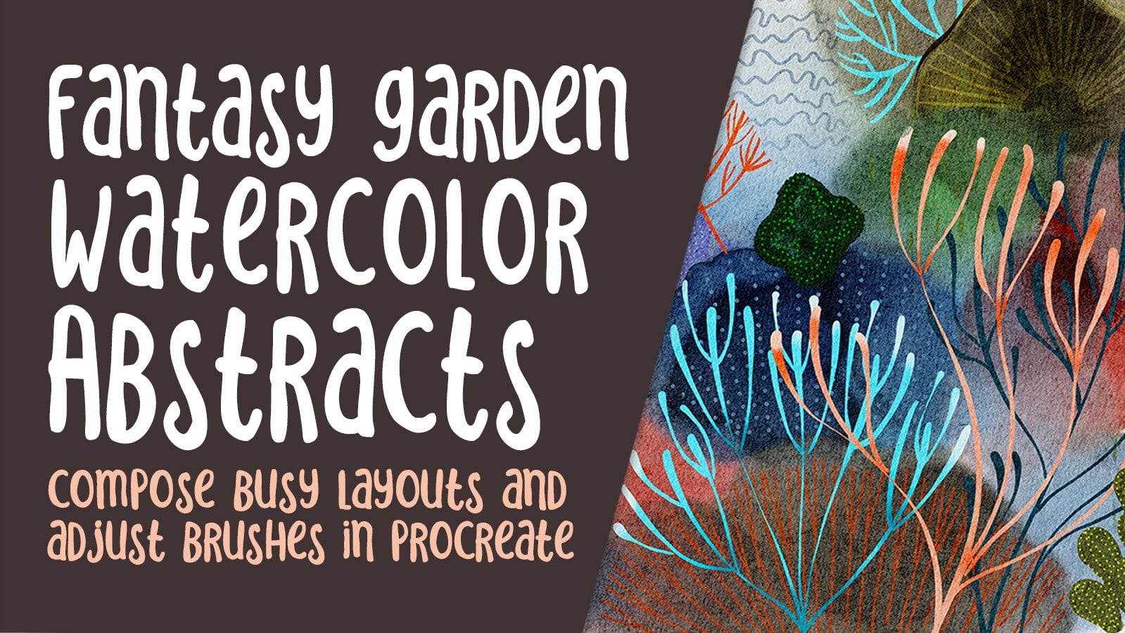
2. Overview and Objectives for Class: Hi guys, welcome to Lesson 1. So to get started here, you might want to download the brush set that's in the project section. Download that to your iPad and then double-click on it, and it will automatically open in Procreate. Once you have that installed, we can get started working on our project. This first lesson is going to be the overview and objectives for the class. Let's get started. So when a class a while back, I talked about creating brushes. And as you can see, I've been kinda going nuts. And so I've got three or 45 maybe brush sets that I'm creating here. You may have seen this one. I think I used that in the other class. And I've been practicing a lot with creating some really cool kind of floral layouts using a really funky watercolor background and then adding the brushes. And in doing this project, I kind of figured out the kind of brushes that I need in order to do that. So that's what's kinda been feeding this whole watercolor floral abstract frenzy. So I'm going to just give you a quick look at the documents that I've created and the kind of layouts that we will be doing in this class. So as you can see, the watercolors that I'm creating are just usually just one color, one or two colors. And then kind of, I guess you'd say messy because I'm doing a lot of just kind of spreading the paint around and then using the blender that I created in order to make this kind of a look. And that's of these blooms that you could create with traditional watercolors, just started creatively using water and different levels of dry paint in the backgrounds. The blooms are created naturally when you have almost dry or dry issued background and then you add some really wet paint to paint will kind of seat and dry with a bit of a hard edge. And even though back in the day when I was being trained as a watercolor artist, this is kinda thing that I would avoid or was taught to avoid in most cases, it's definitely a modern watercolor technique that is very useful to know. So I've got a whole grouping of watercolor paints. With this class. I'm giving you a sampler of the watercolor and flowers damps that you'll need. So if you wanted to, you could just install those and follow along with what we're doing today in Procreate. Now I'm going to show you here kind of how I have. This is actually a very simple one. I wasn't even really what I would consider finished on this one. I'll show you the different things that I've incorporated here to make this an interesting layout. So I've added a lot of watercolor flowers. So there's a couple of watercolors that I've just put in. These brushes were hand painted by myself. And so let me just show you the kind of a look at an individual brush would have had. I am going to be showing you how to create these as well so that you can have those in your set that are created with my brushes. And you'll be learning how to adjust the settings and all of these brushes. Let's go back to layers here. I've also done some line art florals. So this is one of the minor arts that I created. A brush with. A first-time I drew it within, I think I drew right on this document and then I use that graphic to create a brush. So now I have that as one of my brushes. I've got ton of little sort of leaves and flowers that I'm using as accents. Here's another kind of a set of leaves that I've created. These are in my stamps category, or I've got a bunch of them out there for accent here. I've added that in the background. I'm not sure if you can see it there, but I've used a blending mode on this layer and it looks like the overly is what I chose for this one. So I'll be showing you all of those little techniques that I use to complete allele like this. My motivation for really thoroughly learning this is the fact that I have to do a bunch of rural kinda designs for the new licensing agent that I have. I've created all kinds of different flower projects. You've probably been in my watercolor florals, which is the ones that I did here. These were 90 block designs that I did and we did in class. This is a class that I did on creating the brushes that I went through and use brushes to create these layouts. And really as I look at this, I see myself kind of progressing through a whole bunch of different techniques. I painted a bunch of these little watercolor flowers. So these are flowers that I painted traditionally. And then I created these little bouquets. Those had been submitted to license on mugs. Hopefully that deal goes through. Then I really did a bunch more kind of fun stuff with brushes. This is kind of combination of the brushes I've created and a bunch of the textures, as well as some of the native Procreate brushes than a few line art, just playing with the watercolors and the line brushes that I created. I just want to see how those would work and they seem to work just great. And then now into this new look that I am working on. So here's an example of that background I was telling you about with a bunch of colors that have been mixed together. A lot of natural blooms forming here with that watercolor blender that I've created, I added a bunch of textures here. So I have that whole category of textures. Then of course, adding additional detail here, I did a whole series of these leaves. So I've got a brush set that I'll be releasing soon that has those on there. A bunch of really unique and unusual stems. Some more flowers that I have created. This one I've used lightened blending mode in this particular artwork here I am combining some of those line art brushes that I've done with some of the watercolor ones that I've been working on. There's one and there's another. And then yeah, just a bunch of other accents with either leaves or flowers or stems that I've created myself. So basically that's what we're going to be doing in class. I'm going to be showing you how I create the brushes, how I layered this sort of a project. How I use the brushes, how I adjust the brushes, and anything else that's relevant to produce a sort of a layout are eight. Does that sound good? All right, well, let's move into lesson 1. We're organ to start by checking out how easy it is to create a watercolor floral brush. Alright, see you in the next lesson.
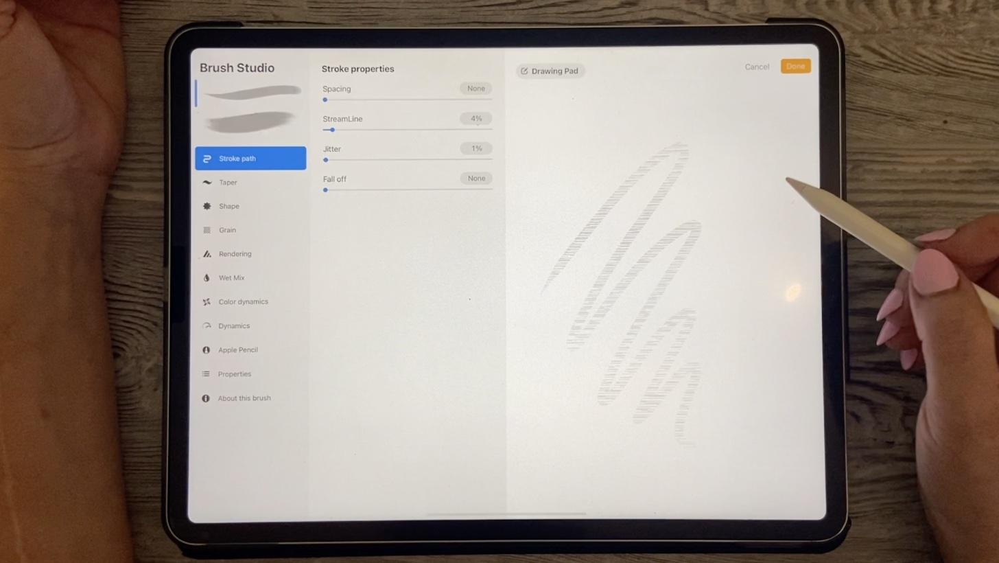
3. Creating Watercolor Floral Brushes: Hi guys, welcome to lesson 2. I'm going to be giving you a short lesson here on how to create Russia's creating brushes is one of the ways that you can really expand on this sort of design. And you'll find that the brushes you've created, you'll use over and over again. It's a great skill to know. Hey, you can also sell those process once you create them. Ready to get started. All right, let's go. So in Lesson 2 here I want to show you a creation of Russia's. So I've got this whole area that I've saved, all my brush creation documents and I've learned a lot of stuff along the way. So I'm probably going to impart a bit of the knowledge that I have in creating brushes. As I go through this, I originally started making brushes at about 600 by 600 pixels. So precise with those brushes was really adequate for creating documents, let's say eight by 10 or 9 by 12. I found out really soon that with the larger size documents that I personally create, the smaller brushes just weren't big enough to enlarge the size that I need them. So then I created a bunch of 1800 by 1800. And a lot of these you'll recognize if you were in the other class. Now, when I was creating these, I would do a black layer and then over top of it I would do a white layer. And I soon figured out that it was much smarter and faster to just create a black background and then have my artworks just in white. So you can see here that I've inked all of these in white to give me that negative image that I need for creating the brushes. Now, even then, the size of the brushes with a little bit too small for me. So now I've pretty much exclusively started creating them on this document, which is 3000 by 3000 pixels. So I've got quite a few layers here for look at the Canvas information here, 3000 by 3000 is the size of my document. I can have up to 70 layer, so I'm not even close, I don't think, to 70 layers, but it gives me a lot of room to create on this one document. So again, I've got that background layer and then I've got all of my flowers and white on top of that block before I save them or export them. And I generally just add a new layer. Choose the brush that I want to use for creating, I've been using for these watercolor florals up and going into my own brushes and just using some of the watercolors that I have created here. And let's try this watercolor smoothie, and I'm going to change it to white. So you can double-click on the white there and then you can use it to start painting. So I would suggest that when you are doing the drawing and watercolor, don't lift your brush until you've got it filled the way you want it. So generally what I would do is go through and actually draw the entire brush. And I'm going to actually make this a little bit bigger. If you go into the properties here, you can go into the size and go quite a bit larger and less. Draw the flower. Now because it's watercolor, watercolor generally tends to be quite translucent. So what I would really want is something a little bit wider than this in general. So a little bit brighter. You can go into just the regular Procreate brushes. And for example, something like the Nikko rule brush and go in and make your, your flower a lot wider. And I'm going to kind of just leave that edge a little bit because I find that that actually works. Okay for these sort of watercolor brushes that I'm creating will get smaller here. And I'm actually going to just kinda lighten that outside area and you'll see what happens without you kind of, in my opinion, gives that sort of soft edge about a watercolor brush can have or the sort of textural edge you can even go in and of course make corrections in black. And another thing that I've done to give that sort of rough edge is to go into liquify, go into crystals. And I'll enlarge this really big. So you can see, I mean, crystals here. I'm not sure about the size. Let me just check out way too big. So undo that, go down a little bit. I don't know if you can see it here, but what's happening is we're getting this sort of a rough edge. And that's something that is inherent in your basic watercolor brush. So you could actually create this entire flower without even using a watercolor paints that's using those like Nikko rule brushes or textured brushes. And then using this liquify and crystals to soften up that edge a little bit. Now the other thing I'd like to do too is to give a little bit of detail in the middle, I'm going to go into one of my textures that I've created. Let's try this one here. And I'll just use it to add a little bit of texture in here. And you're going to see how that works when it's in negative form as the brush. And last thing I'm gonna do is grab that Nikko rule again and go back to my white. Double-click on that white dot and just lighten up this middle part by painting over it and same with the outside edge of it. So I've pretty much got what I need here to show you how to make the brush. So the only thing left to do is to export it. Now you go to the Share menu here. I've been saving them as C pegs and saving them to my files. So I've got a file of civically for brush shapes scams. I was naming them. But I have found that now that I'm creating brush sets and I really want to be efficient, I've just been numbering them and it's a lot easier to find them when I need them. You can end up with hundreds of these. And so it's just easier to just name it something simple like I'm going to name this one 15 because I think I've got at least up to that click Done, Save. And now we can go in and make the brush. So I'm going to go to one of my other documents so I can show you the brush as I completed. I could have completed making the brush with that other document, but let's do it here instead. So I'm gonna go to my watercolor plants. I'm going to add a brush. Actually, what I'm gonna do is I'm going to duplicate one of the brushes that I have here because all the settings that I have are what I want for floral brushes. So I'm just going to drag to the left there, hit Duplicate, go into that brush, will go into the shape. I'm going to hit Edit here and import. And I'm going to import a file. You can import, you go into the library, you can import a photo. I'm going to import a file and take me right to the folder that I've been working with. And you can see here number 15 shows up. So it was just a lot easier to start naming them by numbers so that I could easily access them when I needed them. And for some reason you have to hit this Done button twice. Now also, you can go in and change the green. I have been using this green quite a lot. But you can go in and go to the source library and find something that you would prefer. I find like this rust tire paper. These look actually really good as watercolors. So let's grab this one here and hit done. And you can make changes to the scale of that. And we'll go over a few of these settings as we start using the brushes. But what I would suggest that you do is take that brush set that I've given you and then do exactly what I've done here. Just duplicate it so that you'll get the settings that work for these kind of flowers. And I'm going to go back in and rename this. Name it, whatever you think will work for you to keep it straight your mind. I guess I tried to really think about these names usually, but I'm just going to call it five petal basic. At this point, I'm going to hit done. Now the properties is where you would see the size if you're working with small documents like 8.5 by 11 or a smaller 8 by 10, probably halfway would be more than enough. I've got it quite high because I worked with large size documents. When it comes to the amount of flowers that are there, you can play with both the jitter in the Stroke Path or also in the shape here to specify how many of those you want kind of together. And this takes really a lot of experimentation. So you'd have to kinda mess around with that on your own. But like I said, if you just copy that one that I gave you, you should be good and create your first flower. So let's just give that one a test run. So, oops, I will add a new layer and let's just paint it in the white. And you can see that that's actually produced a pretty decent flower. I'm going to try and color actually see how that looks. And it does have kind of a watercolor. We look to it because of that texture. And then the edges we've got quite softens and a little bit textured. So you can see that in the way that I drew the flower, what the result is. So with these other flowers, you can see maybe sometimes I use more of a watercolor look, so it gave more of that transparency. Let me turn off that background so you can see a little bit better. Well, that one was definitely fall on watercolor paint that I use. But just know that the really most important thing to do is to create it in the negative so that when you go to replace the shape, That's what you're doing is the shape source. It has to be white on a black background. All right, so that's just a kind of a quick look at creating brushes. And the next lesson, we'll take a look at a few more details to do with brushes and how to start using them to create that watercolor abstracts. All right, so I'll see you in that next lesson.
4. Working With Brushes: Hi guys, welcome to lesson 3. In this lesson, I'm going to show you how to work with all kinds of different brushes. Let's get started. All right, So let's start experimenting with the use of the brushes. I'm going to make a new document. I'm here in my gallery. Hit the plus sign. Now the size of document that I create is 24 inches by 16 inches. The reason I create them at this size, and I know I've talked about this in other classes is because for my art licensing agent, I need to produce work that's 48 inches by 32 inches. And so I've made half size standard here in procreate for 24 inches by 16 inches. Now you can work with any size that you want. You definitely don't have to work that size. I would probably recommend for beginning while you're just kinda learning and experimenting to go into the 11 by 8.5 or something like that. So landscape works great. I'm going to go into my 24 by 16. And now the only caveat is that the brushes that I've created and put into this sampler set for you are going to probably be too big when you are working with that smaller documents. So I may have it at full size over here and you may have it at half size. And the good thing about that is a quality of the brush stroke is going to be even better on the documents that you create. So don't worry about the size too much if they still end up being too big for you, you just need to click on the brush that you're trying to Effect. Go to the properties and change the size here. So you can see I've got mine set pretty high that allows me to make a good size here. And I'm going to go through the different brushes that I've got in the sampler. I think I've got about 11 here now, I may be adding more as we go through when I realized that you need something specific. But for now, I'm going to be using these different watercolors and laying down some color. So I haven't really thought about what color scheme to use. Actually had really liked that red ones. So let's work in this red category here. You can import color schemes. You can buy pallets. You can create palettes based on a photograph. I think for this first one, I would recommend that you stick to this a couple of colors and I will show you as I go along why that is just a really nice way to go. The artworks that I did create that I was showing you there. I had showed you a couple of them, that word, just one color basically, plus shades and tints of that color. So that was one of them. The other one, this one here, which I really love. This would be kind of what we're, let's say each words in a way for today's project. And you're not going to be getting all of these brushes, but I'll be giving you enough that you could probably produce something similar to that. I produced this one, which I used for the titles. I've kind of changed it around a bit in Photoshop just to sort of fits the size that I needed for my titles. But to this with more colors, It's fine too. So it's really just up to you what kind of look you're trying to achieve today. So let's go back into our document. We're going to start by just laying down some color. And right now I've got this Dr. Ph. Martin's deep ink spotter edge that I created. And you'll see that it has a pretty distinctive kind of edge to it that has a lot of spatter detail. And then I'm going to use a couple of the other brushes just so you can kind of get an idea of how they look. So this is the powder watercolor that's really soft. The edge is very, very soft and I've got this translucent tapered brush. So you can see how you can get a really nice paper on that one. Let's introduce a little bit into the darker reds. And you can see I'm basically just slapping the color on in, not really thinking too much about the overlapping and translucency. Because what we're gonna do with this after is going to change it a lot. So I'm I'm just putting in some various areas. I had the eraser there. So sometimes I accidentally hit the restricts have kinda got this habit of tapping my Pen. Apparently. Let's try this edge blend. Now this one does a really neat sort of mixing. And that's kinda starting to get to that look that I was talking about with the blooms for me. But this brush that I created is absolutely the fundus to use up, called it the blender. Terrific. Because it does some pretty cool things with the color. So this is where you're going to really start to get that look of the blooms in your watercolor. And even though I've used five different types of brushes here, this is going to really unify it. So I'm going to reduce that down in size a little. And you can see that as I'm dragging over some of those areas like the darker areas that it pulls in and creates these real nice changes in the color. If you start in the white, we can actually switch to white here completely. If we pull in from the white around the edge, you can see how we can blend it out really nicely. And if we pull into these other areas, you can see how it creates those blooms. Now, I've got it set about half the size you can experiment. And you can see that as I'm enlarging and here you can see the texture of that brush. Let me take you in here real quick to show you. Now, I've created that brush with two different brushes combining. And this is the shape I've used, which is one of the shapes that is actually in the source library. I think it's this one here. So these are some really fantastic ones, these ones at the top to use to create brushes. And then grain wise, I've just got a really, I think this is a charcoal green and I think that really gives a really nice watercolor look to it. Go back to that smaller size, I think at any point to you can go back and add, you know, if you want to get a little bit more contrast happening, you could add a little bit more black and then go back to that blend horrific and just kind of work it in. As you push those out, you can really see those nice blooms forming. You can undo it anytime to change things up. And remember that's going to be just a background for all of the flowers that you're going to be placing on here. So after you've done a couple of these, you get the ideas of how you want your different areas of dark and light to be. And I kind of like a variety like this bright in here so that I can use it as a backdrop to some of the line art. Let's say, let's sample that color. I'm holding my finger down on it, getting that red again. And then I can use it to kinda spread into these other areas. And when I'm producing, it's just kind of a big cloud of color. That will be my backdrop for the plurals that I'm going to be putting on here. So that's the basic setup for the background. I'm not a 100 percent sure how we're going to be positioning the flowers and so on. I just wanted you to just have a basic idea of those five or six brushes for doing the background. I'm going to grab that red again and maybe just put a little bit into the corners. You notice with this one, if I don't put a lot of pressure, I'm getting very light. But as soon as I start putting a lot of pressure on it, I get a lot more of the pigment in there. And that reminds me, I called it the Dr. Ph. Martin's brush because it reminds me of the ink that I use that Dr. Ph. Martin's and you can get it very thin with a lot of water and get that really sort of translucent look. Or you can get at full throttle by just putting a lot of just sort of intense layer of it with no watering down. Let's go back to the blend terrific here. And I'm going to kind of grab from the white. Actually switch to white here. I'm starting in the white area and then pulling into that just to kinda build up a little bit on the edges. So we've got something going on here. And I can use that blend, terrific, just as a painter if I want. So you can see here that as I'm just tapping or drawing with it, I do get a little bit of pigment on the paper. So I'm really like humus, I don't want to do too much more on this. I want to move on to the flowers and accents that we're going to put on here. So we'll do that in the next lesson. All right, I'll see you there.
5. Various Brush Uses: Guys, welcome to lesson 4. And less than 4 here I'm going to show you how to work with the brushes that I've given you in that samplers that, let's get started. So in this project I'm going to be using watercolor flowers that are created, as well as some other plants and things. I'm going to show you the use of the stem maker and the leaf brushes that I've included in your set. So those are here at the bottom, and I'm going to probably be using a whole bunch of my other brushes, sort of fill out the designs. So you'll be seeing me use some of these line art brushes as well as a lot of these texture brushes. Okay, and so I really don't know exactly which ones I'm going to use, so I can't really tell you in advance, but it'll give you some ideas on brushes that you can create and possibly buy. Like there are sets available. I have bought sets, for example, from Lisa glands. And in her set she does have textural brushes really similar to what I sell. And I've also been using, and I'll probably use during the course of this class, the Alaina Jensen alcohol ink sac because she's got some really great batter that I like to use. And possibly some of these watercolor flowers that I have purchased off the top of my head account. Remember this artist? Let's just check no, arena trigger Bobo. So if you're ever wondering the origin of the brush, you can just click on the Brush, go to About this brush and the information will be there. So you'll see that, for example, Alina's, if you go into the brush and you go here, you'll see her logo. She'd even signed these. Who else have I got here? Lisa glands. Same thing. You go into the brush and hears her identifying kind of logos and such. And actually my sets are the same. So if you go into my sets here, just click on any of the brushes. I've got my logo in there and made by Dolores arch. Okay, So let's start adding some flowers here. So what I'll do for now is lock this layer just so that I don't accidentally add details onto it. So you have to swipe to the left, hit Lock, and that is safe. Now I'm going to add a new layer, and let's start playing around with some flowers. So the flowers that I've given you, you're going to find Mike a little bit light actually for this background that I've created. You'll see that as you enlarge them and if you stamp them again, that the rotation of the stamp at this point does change. So it makes it look like you've got a different flower. They're just simply because it's rotated. And we'll show you a little trick here for brightening or deepening the look of a flower. If it's a little bit too light for your background. I learned this from a class here on Skillshare could duplicate the layer. You can see now that it's a lot more opaque. And then you can just pinch the two of them together and you've now created deeper and brighter version. Of course, it depends what you're where you're positioning it. If I was to flip that horizontal, that might actually work a little bit better, then I can always rotate it a little bit too. So just now, but I've just put these two flowers down. I'm thinking this would make a really great sort of a poppy or at work. Those are two poppies that I've put in there. And you could use this other flower that I've given you for accents. And I'll show you too that you can either do a simple click or tap, you get a single flower. But if you drag, you can also get additional hang on 1 second. Let's paste those little closer together. I want to change it so that when I'm doing the scatter, how it changes the wave, the second or third flower is positioned. And if you want to, you can use it like a scatter brush in Illustrator where you just drag and additional flowers are created. And also you can see here that from the rotation that I just put in there, you've got changes in positioning. So that one's kinda cute. I think one here, and I'm gonna go into my hours here. These are not necessarily watercolor brushes I have created. If you look at the stamp for any of these that I've created there just as solid. There's no actual texture in that painted brush that I created or that shape source. I've added the grain here, and this is a resident. That's this one here, the stain paper too, a resident texture right here in the source library. And when I painted, now I'm going to change the scale of that so you can see it a little bit better, that texture in there. And when you paint with it, it looks very much like a watercolor brush or a watercolor flower. Just because of that texture that I've put in red shoes, a really deep maroon color for this one, and I'll make it nice and large. So you can see now this was one of the brushes I created earlier on that had a lower resolution or a smaller sized document for my brush source. And because of that, the edges are a little bit jaggedy. Now for a watercolor brush, It's not the worst thing ever. And remember that you can always go into liquefy and use that. Crystals to further texturize your edge. So I haven't thrown away these brushes even though they were kind of a lower resolution, because I just go in and add a little bit of additional texture around the edges here. And that kind of saves me from that jaggedy pixelated edge from my bad source. Now this one I actually should have put on a separate layer. So I am going to use my selection tool here. I've got it on freehand and I'm going to select and drag down and hit Cut and then drag down again and hit Paste. I could've done that actually in one step by doing cut and paste. Now I'll just paste it, paste it in right where I had it. But the reason I wanted to have it on its own layer with so that I could mess around with the blending modes a little bit. So let's just kinda go through a few of these to see how I move this over a little bit, how a blending mode might be useful. And there's a few of them I like already I really like that overlay, that vivid Light is pretty sweet now, reduce down the opacity of it. I think I like that vivid light, so I think I'm going to leave it alone. It looks like I accidentally cut some of that hour. You're off, so let me just get rid of it completely. We can always add something else in there. So you can see that I have kind of possession by flowers along the top here. And that's so that we can have a little bit of fun playing with stems and leaves because of this kind of monochrome layout that I'm producing here, I think I'm going to stick to kind of that burgundy color for the stems and stuff. So let's add a layer. I'm going to pull that layer actually underneath. And then I'm going to use that stem brush that I put into your sampler of brushes. And I'm just going to draw a couple of quick stamps in here so you can draw them behind. You can decide really, it's always up to you and what works for your layout. And I'm just going to add too quick, really simple stems there. I'm going to go in here actually, for myself, I'm gonna make this bigger. You may have to reduce this down in size or reduce it down in size here, but that gives me a stem more like I'm looking for. Now, remember that when you, if you do want to have a perfect straight line, you can draw and then hold so that you can get that perfectly straight line. Now the next thing I want to do is use my leaf maker here, and I'm going to enlarge this so you can kinda see the profile as I draw it. I've created this so that there's a pointed tip. And if you have a really light touch, and I mean light, you can create a tapered leaf Scott from real texture in there. And actually I'm going to put these on their own layer just so that we can possibly darken them up. And like I said, very light touch, stressing a little bit harder where you want the brush stroke to get a little bit wider and then plug it right into your stem. So I'm pressing very lightly and then bringing it over to my stem, pressing a little bit harder to get a little bit of thickness in there. Now what I would suggest you do with this is maybe even just create a new document. I'm just going to do this same size so I don't have to adjust my brush and then just go through and experiment with drawing the leaves, getting the curve, playing with the pressure. And you'll see that with changes in the pressure, you also get sort of a different look to the texture that's in that brush already. Now remember you can also hold when you're at the end of your stroke and you might be able to use that technique to get a better curve. I don't usually use that. I liked that series a little bit of variety with my leaf. After all in nature, they're not all perfect, right? So do a couple of practice runs like this and then go back to your document to drop in some of those leaves. I'm going to delete oh, and do it again. And I find the more I use it, my first start, it's really hard to get that right. And then after a few minutes, I can do them pretty quickly. And I actually don't mind the effect of not joining that stem lines. So it's really up to you. You'll also find that depending on the direction you pull, you'll be more comfortable in one direction or another. These on this side, I can do a lot more easily than the ones on this side just because of direction I'm pulling. But nevertheless, I've got some leaves drawn here and I think that this will work quite nicely. I could add more, I could take some away. The other thing I could do, that technique I showed you before and duplicate the layer pixels together and you've got some really dark stems. Now the other thing in my set that I'm giving you here is a leaf detailer that we've detailer. If you go to a slightly lighter or slightly darker color, you'll be able to put in things like the veins and so on. Now this one has a nice thin line for the veins. If you tilt your brush, you can actually get a very nice shading effect with that too. So if ever you need that, that's something to keep in mind. Now if you want to really smooth of a line, you can go here and set the streamline of the high, and that'll give you a very smooth line if that's something you're thinking about. Now sometimes I do a really fine line, and instead of just drawing a single output, multiple lines in here, a little bit bigger. And this one is really sensitive to the amount of pressure you put down too. So you can get a really thin line and a really thick line without changing the size over here at all was in that doozy, I love this brush. This is a brush you could use for really any sort of inking. It doesn't have to be just for detailing the leaves. And that gives a very nice highlight in there. So we've got a couple of flowers drawing, we've added some detailing here. I think in the next lesson what we'll do is start adding a little bit of the texture and a few more accents to really make this piece pop. I'll see you in that next lesson.
6. Adding Interesting Detail: Guys, welcome to lesson 5. So you've got a basic artwork in place here. Now is time for us to start adding some accents and interests. Let's get started. So we've got quite a bit of our composition going here. I think it's a good start. I definitely would be making a lot of changes here. It's funny because I ate, I'm working at iPad at an angle that's not really big for me. I would need to have it like this in order to really see what I'm doing. But in order to have it really show properly on camera for you, I need to have it completely flat. So at the end of each lesson, as I look through my viewfinder at the composition, I sometimes don't like what I see and there are some changes here I would definitely make. What I do like doing is being able to have these on separate layers. So what I can do things like group them. So for example, two, I can select at the same time by sliding to the right and group them. Now this group should label, but I won't some lazy I can select and re-size or move around accordingly together. So it makes it a lot easier to work on things like that composition. So I'm going to make it slightly larger than I can move this one a little bit. And I can see when I look at this layer here, there is that little piece that I cut off, that other things. So I'm just going to select down here and cut and I think that well hung. Gotten rid of it. Yes, it has. Okay. So one of the things I just should have caution to you about is that once you have put something off the image area or the Canvas, you will have cut it off. So I didn't mention that. And that's just something to keep in mind when you are resizing things. All right, So let's start adding some of the other details that really fill out a piece like this. I would call this a mixed media pieces. Honestly, I've named the class watercolor floral. And definitely it's mainly watercolor as definitely the feel that you get when you're looking at it. But because we are going to be adding a lot of other elements, I would call this mixed media piece. So I think I want to add a few of these other sort of flowers that I have drawn. And this one is really buffet of different types of brushes. At some point I'm going to go through and definitely change up how I've got my sets made when I earnestly start selling these, of course, I will have sets that are specifically flowers and stuff that are specifically embellishments like this. I just haven't got around to it yet because there just aren't enough hours in a day. Honestly. We're still working on our yard and our house here, and there's never an end to the kind of things that I have to do in a day. So right now, I just haven't taken the time to do that and I will see you and I promise. Now I've also got a category that I've been starting to work on for stems here. One of the things that I might consider doing is not using these stems at all and then going in and using one of these sets of stems instead. So I would make a new layer, keep it in that group so that I could move it. And I'm just going to check my size here a little bit. I'd put it in the middle of the page. So that gives me the freedom to go in and resize it to fit. Because my flowers a little bit translucent, I might use my eraser. And remember you could have your eraser be any brush in your entire brush library. I'm going to go to that Nikko rule brush for my eraser and then I can kind of erase the top part of the stem here. You can't really see that on a guess. Let me turn that off but you see how I'm erasing just the top. And I think maybe I'd even, I'd even erase a little bit at the bottom. And I liked the look of this stem a lot better than the one that I had drawn by hand. So let's go back to that stems category. And C would also thought, let me try this one on the right layer. Yes. Let's try actually, let's make that on a new layer and maybe use this one as stem for this flower. And I somewhat like that. I really have the time right now. I would go in and I would make a bunch more stems before teaching this class so that you could see the whole process. But I think that for this class it will be fine. Now I'm going to use my blunt, which is one of my favorite brushes that I've created. And I know that that's what I used for this particular brush, for creating the brush. So that's going to make it easy for me to extend this down to the bottom k. It's not perfect, but you know, class, It's fine. I can erase a little bit on this edge. I just might just kinda did a MacGyver on that to make it work. So let's try a bunch of other brushes. In my flowers. I'm going to add a couple of line art elements because I think that that really works when you've got this sort of thing going on. This is the one that I had used on that other layout. And let's just take a look at that and we get out of this group. I'm going to add a layer, and that's what that brush looks like. So that one's really cute. And the nice thing about it is, it's one of those that I can use paint a bunch of repeats. So in order to affect how that rotates, you can go into your shape here and you can change your scatter, see how that works. That's not likely the one I'm going to use, but I just want to show you that because it's one that you saw earlier. Now I've got a bunch of these. We're also that I've drawn and those work really nice for this sort of a layout. Let's sample so we get the same red here. I'm on that new layer so I can draw our stamp, one of these, and you see sometimes I'm staying away from the edge of mass because I don't want it to be cut off yet. And then I'm going in and resizing because once I do positioned at, off to the side like that, procreate will crop it. Now I'm going to move that layer down by just holding down on it and pulling it down. And let's see around with the blending modes on that one too. So I kinda like that makes it a little bit subtle. You can reduce the opacity of it as well. So that's a nice addition. Now this is a nice Plants BCE. So I could have used as a stem, but I would also like to show you how I use those to just give a little bit of interests in the background. So for this one, I think I'll go to that sort of deeper color that we've got going on here. I'm going to stamp it kind of in the middle and then just enlarge. And with this one, I definitely want to reduce the opacity. So I'm going to go in and just lighten that up. Are you seeing now how this is really working to give unity to the peace and to balance all the elements out. I'm going to make a new layer. I'm going to stamp that one again, would do it right in the middle here again. And this time I'm going to flip it horizontally, change the size of it, and Position off the page like this. Remember now that Procreate has cropped it, but we're going to lighten this up. And I really like that. I find the thoughts of really good filler I've used more than once, add a new layer, and I'm thinking we need something here in the middle. This is where having a huge library of available elements really helps you to flesh out a design. Not really sure what I want there. I think we could actually do another flower. Let's move this actually up to the top. And we're going to go to kinda the brighter red here and add that in here. Just kind of overlaid and a word overlaid on this design. Let's try some of the blending modes to see what could be effective here. Now I like how this screen really makes it stand out and go back to that I like screen and I'm going to reduce the opacity of it. So that kinda gives a really nice effect. Now I think we're begun for stem of some sort. I'm going to go down to the bottom layer here, and let's look at what we could put here. Maybe this one, again, I'm going to add it in the middle and go get larger. And then let's just sort of move that into position and see how that might work. I'm not sure about that. Let's lighten it up and see if maybe it just works as a really subtle background feature. And I think now we can start looking at some of these other the elements to get a bit of interest up here in this area. I love these guys, so I'm going to make a new layer at the top actually this time. And again, I'm going to switch to that sort of brownie color. I'm doing this right in the middle because what I wanted to do is actually turn it upside down and see how that might work. As, I wouldn't say it's a fuchsia. But you know, sort of that same effect of a flower just kind of coming down from the top. I will actually move that down and lighten it just a tad. So I really think now we've added all of the sort of floral elements that I want here for now anyways, I'm ego back and add some more after, but I want to start adding some texture. So I think I will save that for the next lesson. Alright, I will see you there.
7. Textural Details and Other Accents: Welcome to lesson 6. So this is a lesson where we're going to be adding a whole bunch of texture. I'm going to show you a bunch of the texture brushes I created. And it's may give you some ideas for some that you'd like to create for yourself. Let's get started. So one of the things I did off-camera was to move a few things around a little. And then I've also lightened some of the extra background elements that I had in here because I just felt like it was really squished in the middle and needed to be an honest everything needed a little bit more air, so to speak. So I'm ready now to start adding a little bit texture to my document here. Yeah. And the other thing I did was I enlarge the background so it spreads a little bit further. Now my texture brushes are brushes that I have created mainly as I needed them for projects that I was working on. However, they've proven to be really fun and useful to have for doing layouts like this. I'm going to also create a couple of new layers here for my textures. So I think I will start with this one here is just one of my favorites right now. Not sure why his find that it's just a really nice, bold and interesting sort of filler. So I often use that around the edges of the documents. So I'm just going to add a little bit in here is very subtle. Like I said, once you get going on this, you kinda decides where were you think needs a little bit more weight. I guess you'd say. I really only have those stems as darker elements. So I want to add a little bit more dark stuff in there without overdoing it. This texture ball is something that I use a lot. Let me just show you the cheap event. This was so quick to make. I use that lump 90 tool that I had created and created a ball of lines, I guess you'd say, added this kinda leather texture too. And it's actually very light when you paint it down. You can see that I find that I use it on almost everything. So I have found it to be very versatile in pretty much any different color. Like it looks really great. And I've often added it on top of the flower. For example, here I'll add a new layer and I will add, you see how it, that's just given some subtle texture to that flower. Maybe I'll do one on each of the petals, and I really liked that. And he's on a separate layer like this. I can reduce the opacity up and it just gives it a little bit of fentanyl life. So that's one that I use quite a bit. These rates I find are really great for adding just shapes in areas that feel like they're lacking. So let's add another layer here. I'm going to go, well, it's already fairly big and you can see that I can add, I'm going to go quite light, but it's great for adding interests like you that I will lighten that layer up considerably as well. So it's very subtle. If you were in my liner block class, you will have seen me use this as a really great texture. Eyes are on a flower. So what I did there is I selected the flower, put alpha lock on, and then use the rate. And I'm going to mix a red That's just a tiny bit lighter than the actual red for the flower, and it'll travel a bit darker actually. And you can see how that can add some really cool texture to your flower. So I'm going to go just quite subtle little bit later. And you see how that's added just a really interesting texture to it. That may not be something you're looking for. If you're trying to really create a watercolor look, it's completely up to you at this point. When you're doing this sort of project. I think especially at the beginning when you're first experimenting, you don't really know what kind of luxury her until you've tried a bunch of stuff and it either works or it doesn't. It's a really great way to get to know the uses of your brushes. It turns out that I've lightened a lot of that stuff in the background. Let's add a tiny bit more texture here. Now, one of the ones I really have worked a lot with a light line textures. So I've got several different ones. These hippies, again, that's just a brush that I quickly created with just a quick lines made without lineup cut tool. Let's try that in kind of a darker shade. Add a layer, and I've used that a lot too. Just add variety and interest to the background. So that's skipping one. I've got a Skippy is cap1 And skippy to you, and they're all different. The original one has no background hue and then the Skippy one has kind of a slight background to it, and Skippy two has a solid background to it. Now the other one that I like are these dots. And again, Bowser textures that you can just add here in there to make your Leone really interesting. Now this one here is one that can be very, very dark. So I've reached my maximum layers. So I'm at the point where I'm going to have to double up on some of these or flatten some of them together. So these two I think I can put together and go into here. We can put all of these stems together and these flowers together. So that gives me a few more layers to work with. You probably won't run into that if you're just using 8.5 by 11 or nine by 12 document, it's because my document is so large that I've run into problems there. And where was I? Okay, yeah, So I wanted to show you one of these with a really dark backgrounds. Try this one here and you see how that's a solid. And sometimes that can be a really nice one for just putting in some areas of almost looks like the sand or the earth of these flowers could be sitting on. So that's something that's possible to do with those solid textural brushes. I'm going to put that on its own layer so you can really see the full effect of it when it's solid so that when I call long dots, I also have the same in just sort of a little elongated, sort of a dot. Really solid lines. Busy TP is when I call this one here. It would be great for just producing frames on your artwork. And also don't forget that you could use it in a case like this where you alpha lock your flower and then you can just paint that texture on it. All that defeats the purpose of our watercolor theme that we started out with. A lot of times when I show you this stuff, it's just to inspire you so that you can go on and create something probably a million times better than what I'm doing on the spur of the moment like this. But I suggest that you produce a lot to really capture the look. This is a spatter brush that I created and I really like adding that sort of spatter texture all around. And then I've got this one which I call fine flicks. Find Flickr, which I'm going to enlarge so you can get a better look at that. Enlarges the, so you know, that enlarges the size of the brush itself if you wanted to actually increase the size of the grain. So what I've done here as my grain source, and you need to go into the green area and mess around with it here. Okay, so let's go a little bit bigger like that. This is like I said, I'm showing you all this stuff. These are not included in the set that I'm giving you, but this is just so that you know how to go about changing and adjusting your brushes when you are working with them. Another thing I would strongly suggest that you do is experiment by making a few brushes. Now, I've kept the florals to a really minimum amount here just because I'm not giving you all these brushes, but I wanted you to see basically how simple it is to create a brush. And there was that one that we created. Where do we end up putting that one? This one here. So there was that very simple brush that we created. And this is something that you could use to put together a really cute design. So I would suggest you make a couple of the brushes so that you can get some variety in the brushes that you've got to work with. Rather than working just with my sampler, create a few other ones that you can add to it. The other types of brushes that I have created are these little filler brushes. And I've created some that are directional so you could draw and have the stroke go in any direction with that element actually following the stroke. So something like this would be cool to add texture to your flowers. Let's say this at a layer, let's sample the color and then go somewhat lighter. And then this could be something that you could use to add detail with one of your flowers. So I know this totally has nothing to do with this class, but I wanted you to know the power of the brushes and the kind of things that you can do and really complimented design with the brushes that you create. And then I also have these little fillers like a tiny little flower that also follows my stroke. Now I'm just making some minor adjustments here to my colors. It also go into hue and saturation and brightness. And do some adjusting here or work with your curves to lighten or darken parts of the image to try to make it work with your foreground items. And then of course, you know, mess around with your backgrounds to just perfect it and get it looking as good as it possibly can as flowers here I think I'm going to separate again, cut-and-paste. So it goes on layer. And I'm going to just check out some of these blending modes to see if something might be a little bit more suitable, uh, kinda like that color dodge. And that's kind of a nice look there. So I think I will leave that for now. Maybe just move that a little bit again. Now that these aren't separate, I'll just select the one stem and move it over. It's still on the same layer as you can see here because of my limited layers. And this one I still think is maybe a little bit too prominent. That kind of like what is going on here. And I think I'll wrap up this lesson in the next lesson. I'm just going to leave you with a few ideas and some closing thoughts. And perhaps we'll take a look at this on a mock-up or two. All right, so I'll see you in that next lesson. Hi.
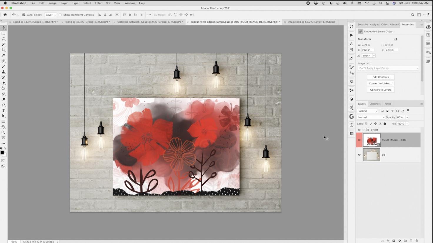
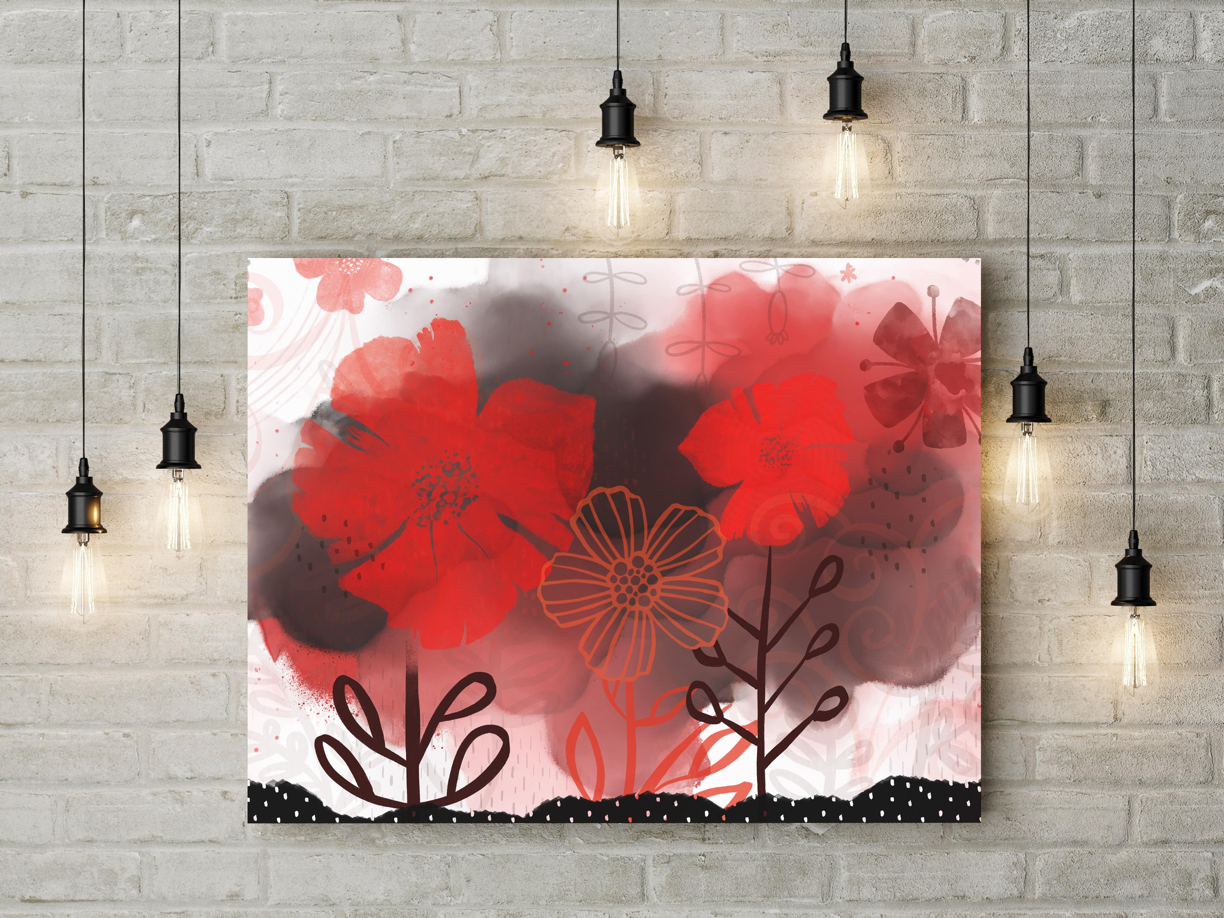
8. Mockups and Upload to POD: Guys, welcome to lesson 7. So I've made a few tweaks on my layout and I want to show you how it looks on some of the mock-ups. I'm going to walk you through the whole process. Let's get started. I always love creating the mock-ups at the end. So I thought my document open here in Photoshop. So I imported it as a PSD and it opened absolutely seamlessly. And I've got this complete artwork in a group now. So everything has been listened to this group and that just makes it easier for me to flatten it. So I'm gonna do Command J, which gives me the duplicates, and then Command E, which flattens that. And I always do it on a duplicate so that I don't mess with that original. I'm actually going to duplicate this background is white background. And so I'm dragging it holding my Option key and I'm going to flatten those together that do that because sometimes the blending modes and stuff that don't look quite the same without the white background. So now I'm just simply going to select all and copy. And then this is the mockup that I've chosen. It's got a smart object over here. I'll have to do is double-click on that Smart Objects. You can see I've used this one a few times and I paste it in. And then I've got a shortcut to fit it to my screen. Proportion is not exactly right. So I'm just going to expand this a little. That would be something that you might want to keep in mind when you're producing your document in Procreate if you have a specific size or proportion. In this case, I'm just going to cut off some of that artwork on the edges. And once I hit Save here, it's going to update back here in this document. Probably could have expanded this just a little wee bit as well. I'm not gonna go into that today. I'm pretty happy with this and I think it looks fantastic on this wall with these particular lights. But really best the process. And I could do the same thing with any other mockups that I have that I would need or want. But it's just super simple. If you buy mockups that have a smart object, you double-click on them, and there you go. You're left with a very easy document to work with, to produce a mock-up that really compliments the look of your artwork. So for this one, let me just open one of my other layouts and I've done, this is one of the ones that I showed you at the beginning. I'd like to see what this one looks like on a wall. It's actually big business in these murals are becoming a real POD caught seller. So showing them on a wall is an awesome idea. I'm going to group all of these, duplicate the group Command J flatmaps, select all copy and go back into this document. Double-click on the smart object. You can tell which mockups are my favorites. I use these in a lot of my classes. I guess I should go out and buy a few more. I've gotten so many of them though, but just some of them definitely float to the top is your favorites after awhile, and I will just hit paste my shortcut for fit. And it looks like this one is probably another one that I'm going to have to adjust the scale a little bit. Hit Save, and that will update my image. Now this is a really large file I can tell because it's taking a little bit longer to process kilo gum on Photoshop. You can do it. Oh my gosh, this would be so gorgeous. Looking at my design, I'd probably make some slight alterations here for this mockup, maybe curve this when for any branch the other way, but we're only seeing part of the wall here. So I think for illustrating the beauty of the artwork, this works great and it really suits this particular mockup, don't you think? So that's two mock-ups to ideas. You could do so, so very much. And going into your POD sites is another idea, my shop on Society 6. And to make changes, I would go into here to manage my post. And here are a bunch of the artworks that I've already made into products in my shop. So ten new artwork I click here. Now I'm going to go back to Photoshop here because I want to show you one of the things I do to prepare for society six. For a lot of the products on Society 6, the width you need has to be bigger than 9600 pixels. So I usually change this to about 10000. Now that doesn't necessarily make the height because I need, but when I'm positioning or playing with this in societies six, this particular proportion of artwork will fit certain items. Actually let me just go 12 thousand here and I'll hit Okay. Now I always keep my file in layers here because for society six and a lot of the other POD sites, I also need different proportions. So for example, I might need a square set up. And if that was the case, that I'd probably be moving a lot of the items into the square parks or middle part of the image. I often duplicate the file to do that and then make the proportion what I need to have it fit. So I've actually got a list of the societies, six artwork sizes for the various items that they carry. If I can find it out posted here with the course materials. Now again, this is taking a while to process and that's because we're now asking Photoshop to interpolate and create pixels and enlarge it. The pixel information that it has here. So I'm exporting it as a J peg and I will call this final read oral Leo. Save it normally I have a numbering system of course, that I use for all this. But for the purposes of this class, this is just to be fine. And I always put this at the maximum file size. Now, if I was going to be making enlargements or exporting this for licensing, I would be saving it as a tiff and not a JPEG. A tiff file is a lossless quality file. So that's what I generally would do and it's fine for this one I'm showing you today. So I'm going to just say, Okay, then we're going to go back to society six. We'll select the file and hit Upload. And of course, if I was doing other layouts like a square or any other proportion that I need here. I would do these all at once and not going to do that today. So I'm just going to hit Continue. Oh, yes, I must name it. Red floral continue. Yes. This is my artwork original and no mature content. Now I can hit Continue again and now this is placing it on any of the products that can use it as proportions and the size of files. This would be an example of one, the poster that I would have done a vertical layout for, and here's one that I would have done a squarely 04 looked terrible square, but I generally like to have the proper proportion of file to make it look really the best. Now, any of the ones that I wouldn't want included, I would just leave it off. And any of the ones that I did want included, I would turn on. So these would be the items that I deem as suitable for that proportion. Here's an example of a file. The curtains need a very specific size. So you can see the size. They are 5300 wide and 99, 100 pixels tall. So I didn't have it tall enough. So some of these I would leave off. This one would be okay. Yes, yes, probably for these round ones, I would select square artwork. But you get the idea. And I really think that this artwork turned out quite nicely for this like look at this clock. Isn't that just scrumptious? And the pillows. And I could see myself buying this product if it wasn't my own. I've been known to buy my own products, So thaw good. And of course you're gonna go through and do all your naming and adding all your tags. And then when you're adding your tags, just be really specific about what the contents is, the colors in, but the size input, the style, anything that can help your product become more searchable. So there are three different ideas and things that you can do to really show off your print and by all means sell it. All right, so, yeah, let's meet in the last lesson and I'll have a bit of a wrap up for you. See you there.
9. Outro: Hey guys, welcome to the wrap up. I'm always so thrilled to get to this point. I really like seeing my artwork on the mockups because I think it really gives me an idea of how they work and whether or not I can really take this one step further and offered on my POD sites or send it to my agents for possible art licensing. You just never know. Going through this process over the last few days has really taught me a lot about this type of layout. And I've got some really great ideas for future layouts. If you're looking for some ideas, check out my Pinterest sites. One of them is called the learners art flourished now script and the other is called teacher glasnost crit on the Dolores art killers now aspirin site, make sure you check out my watercolor inspirations board that when he give you a lot of ideas for possible brushes to create or just really neat layouts that you can try to achieve with these techniques. You can also check out my stores. I've got one on docile.com and in Canada here at Art of where. Also I suggest that you get your name on my mailing list. You can do that by visiting my website at shop dot Dolores art dossier, adding yourself to my mailing lists and hitting that follow button up there. We'll help you get notified if anything new that I'm doing, any classes that I release and any of the freebies that I'm going to offer in my artists resources section on the site. If you have a minute, can you leave me a bit of a review down here? I think it's really helpful for other students to see what it is that you thought of the class are. Just really appreciate reading your comments. If you have any questions, don't forget, you can post them into the discussion section. I usually get back to you within 24 hours. Any questions you have or questions that someone else buy a house. So it's very helpful for you to do that here. So I guess we're done for today. Bye for now, and I'll see you in my next class.
 Delores Naskrent, Creative Explorer