Transcripts
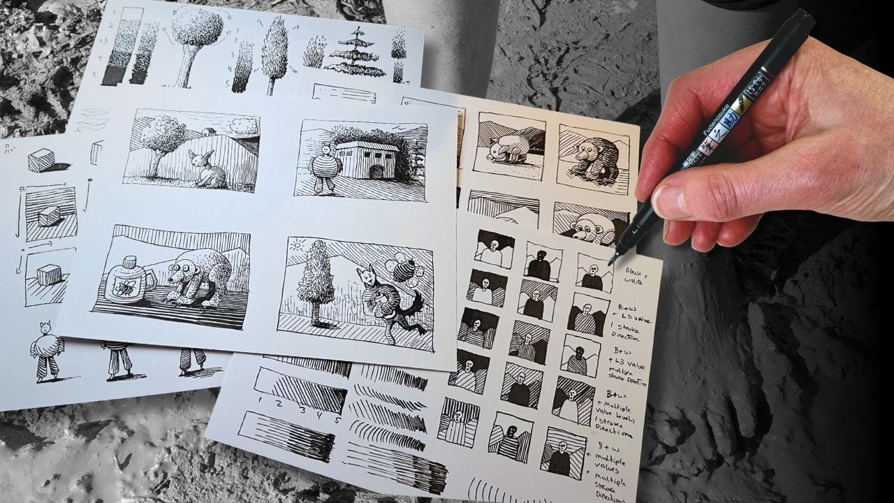
1. Pen and Ink Rendering Intro: With Penink, especially
with black and white, we rely on mark to lead the viewer
through the composition. That's why it's especially
important to understand that the techniques that
build the illusion of form, depth, dimension are achieved by the use of light and shading. And if you're new to Penink by practicing these techniques, you'll see your style. Boom. I'm Chloe, the founder
of Long Stride Illustration. I share practical tips to help pen and ink drawing enthusiasts
reach their goals sooner. I'm a professional member of Speed Ball's Artist
Network for Illustrators. My work is featured regularly in social media
and art galleries, such as WoW x, Wow. And you'll find lots
of how to resources for learning Pen and ink on
my YouTube channel and log. The lessons you'll learn,
three rendering techniques practicing on four
different subjects, using three types
of inking tools. You'll compare how each tool achieves different
aesthetics as we render the same subjects
in various poses so that you can decide which tools
feel more natural to you. We'll first learn how
to create tone with line and build on this
as the foundation so you can consider
how to create the rendering effects you want and strengthen your own style. We'll explore how to balance 12 many compositions and bring it all together
in a final project. It helps if you have
prior drawing experience, but we'll be going through the lessons step by
step in real time. It's easy to follow along
as well for beginners. And let's get started.
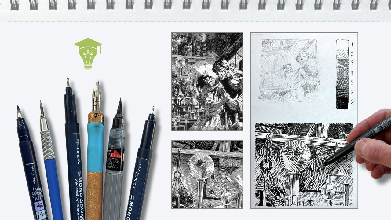
2. Pen and Ink Rendering Supplies: For the lessons,
you'll want a pencil. Traditional or
mechanical, preferably an H lead, a traditional eraser, and a needed eraser, a set of technical pens, fi liners of three tip sizes. One brush pen, you'll
want a bristle brush pen. However, if you have a
sponge tip brush pen, you can achieve similar
effects in the exercises. One midsize dip pen, any of these shapes
of nibs will work. And a pigment based India Ink. Note that if you're
new to using dip pens, I recommend that you
take my dip pen class first to get more
benefit from this one. For the dip pen exercises, we'll also be using
a jar of water and a rag or a napkin and a ruler. For the lessons, we'll be
using two types of paper, one sheet of sketching paper, and you'll need four
sheets of inking paper, three for the exercises, and one for your final project, such as a bristle smooth, bristle villum or other
hot press smooth papers, such as a moleskin
art sketchbook. Gather your supplies,
and let's get started.
3. Leaves A – Pencil Drawing: Take your first sheet
of inking paper and orient it in the
landscape dimensions. We'll draw boundaries
for our studies, six frames per sheet,
something like this. The boundary dimensions depend
on the size of your sheet. We'll be adjusting
the boundaries to suit our reference subjects. So we're not concerned with exact measurements at the stage. No need for a ruler yet. We're drawing these freehand. Estimate general proportions to fit six vertical
rectangles on your sheet. Minor approximately two
and three quarter inches by 3.5 ". Perfect size for many studies. Not tiny like thumbnail
sketches and not too big, that we're tempted to treat
them as finished projects. This is an exercise. We'll sketch the
first image from the references in your
worksheet in the first frame. The reference is a
guide for inspiration. We're interpreting
from observation, so it's not a direct copy. Our priority is to capture
the general shapes into a composition that's well balanced in
our little frame. Start with the contours
of the first shape, the bottom leaf
closest to the center. Drawing the center vein,
and then it's stem. Then the leaf immediately
tucked behind. It's slightly bigger. I'm using very faint
lines with my pencil, extending the leaf here, then adding the center vein, which follows the form. Then on the reference, we see there's another
leaf above there. I'm again, only defining
the shapes, outer edges. This one is at an angle
and the center vein follows the direction that the leaf is growing
from the bunch, providing some information
about the form. The branch continues up and further in the
background behind there. Oh. For this composition, I'd like to add another little leaf here
in the background. It's going to stick out a
little bit out of the frame, going in this direction, and then the stem in the middle reinforces the angle of the leaf keeping
it very loose, and now we can adjust the frame. So a little bit of the leaves are branching
out of the frame. You'll see once we
ink this subject, the frame is an aesthetic
component of the composition. Go ahead and erase any of the remaining
construction lines. This is where I'll use
my needed eraser to pick up excess graphite from
the inking surface. It also cleans up the drawing. Then you can refine the drawing. Go over the lines that you like without pressing
on the paper. Only slightly darker with a
pencil, but without pressure. Keep it light and clean.
4. Leaves A – Ink with Fine Liners: Set your subject aside, take a new sheet for
the inking exercises. Orient the sheet in landscape, then divide it in half
with a pencil line. Again, estimating
with the measurements and separated into
three columns. So two rows and three columns. Our first technique
is called ing cla, which translates to clear line, using fine liner pens for the first rendering
technique, exercise. This time, you can
use a ruler to make a horizontal rectangle across
the top of each column. It's approximately
half an inch thick. Again, the exact
measurements not important. It's just a guide. Keep the
exercises visually organized. I'll be using my
smallest tip for this. Sadly, my favorite tomboPen
dried during this recording, I've switched over
to a SteplerOO. You'll note that I'm
pulling the lines towards me from top to
bottom of the page. If you're more comfortable
pushing lines, then do this exercise
from the bottom up. The first line is made of dots lightly and
even spaced apart. Parallel to the dotted line, we'll do short dashes. Then next to it,
using no pressure on the tip of your pen
a continuous line. Repeat. But this time, add pressure on the pen so
that it's slightly thicker. Next line over, I'm
switching to my 03. Same idea top to bottom, starting with light pressure to look a little bit thicker
than the previous line. We're aiming to keep the
spacing even between the lines. Next one over, use pressure
to make thicker line. Going up one tip
size, same idea. Start with light pressure for the first stroke, evenly spaced. And then we add pressure on the pen for the
next one over. Then another making
it a little bit thicker by going over
the line a couple times. Let's see if we can make
another even thicker. Focus on keeping equal
spacing between the lines, but increasing the weight. For the next exercise, using a mid sized tap here my oh three is a
technique used when a contour line or outline of a drawing
comes to a sharp angle. It's where two lines meet. You'll build those lines
into a subtle wedge. The joining as a
technique I call joinery. Do it again with a
different angle, a little sharper and thicken the joining point by gradually
going over the line. Aim for a smooth
transition to a wedge. And with a deeper angle, here we simply round the corner. Or when the line is quite thin, you can round out the joinery. There's definitions
in your worksheet for the frequently used terms that
I'm using in the lessons. Let's put this into practice. Keep your exercise
in view so that you can refer to it while
we render our subject. For this clear line technique, we'll use thicker
lines to render the elements that
are closest to us, closest to the viewer. And thin lines as the
elements of our subject, get further into the background. For example, hold your
pen up in front of your face and think of it
as a hatch mark or a line. As you move the pen further, it becomes thinner,
smaller, and less detail. So near is thick
and far is thin. Applying that principle
to our drawing, we'll start with
the leaf that's in the front of us using the 05. This time, paying attention to the jagged edges of the leaf, leaving some small gaps at the joining that will
address in a second pass. I'm putting light pressure
on the pen to match the bolder lines in
our comparative scale. I'm inking with a jagged pattern similar to the reference
to outline the leaf. Again, leaving some gaps where the angle of the budding line
changes plane direction. For the center vein of the
leaf, still with the 05, but without pressure on the pen, breaking the line in
sections to indicate volume. Now the leaf that's
immediately behind using no pressure on the pen and continuing with
the jagged effect, varying the length
of the strokes to simulate the pattern
from the reference. Again, leaving some gaps that we revisit in a second pass
when we switch tip sizes. For this technique,
our focus is on the overlaps in the
composition of our subject. What's in the forefront
and what's tucked behind? A This leaf sits on top, so we'll outline it with an oh five without
pressure on the pat. Switching to an
oh three to match the thinner outlines with the leaves that
are tucked behind, continuing the same pattern. Here, there's a tangent line in pencil that we want to avoid. A tangent is where overlapping lines cross or merge
at the exact point, and it creates confusion
for the viewer. So we want to avoid that. Go ahead and outline
the remaining background leaves
with the same pen and no pressure for a lighter line than the
leaves at the front. Switching to the 01, the thinnest tip for the center veins and the
branch in the distance. Then we can also
address our joinery, seeing some of the angles
that match our exercise, we can round out the corners and dab a dot to join the gaps
we left in the first pass, adding a little bit more weight
to where the lines join. If this drawing were larger, then this joinery effect
would look more obvious. On the small study, it's subtle, but the technique gives
finesse to a final drawing. We'll have plenty of
opportunities to explore this technique to its full
potential in every lesson. Still with the 01, we'll draw in the leaf's veins. Check the reference to see where they land on
the patterns edges. I'm putting a curve on the veins to indicate
the form of the leaf. A straight line would
make it look flat. A curve line shows volume. We'll keep the spacing between the veins more or less
evenly spaced apart. For the other side, the vein
line is slightly staggered, so not flushed with
the other side. The veins don't
mirror each other. Repeat this process on the other four front leaves
that we had outlined with the thicker pens so that
those three match in weight based on the distance from the viewer in
the picture plane. Putting a curve on the veins makes the drawing more dynamic, as well, especially with
line art like this. For the leaves further out, use broken lines, dashes
and dots for the veins. This reinforces the illusion
that they are further, and we can see less
of the detailing. Very lightly, no
pressure on my pen, an indication that
the leaf has veins. For the finishing touches, we'll do a last
pass with the 05, making the bottom half
of the two leaves that are in front slightly bolder, gradually building the weight in the very forefront
for a sense of death. And also to pronounce
this overlap. Concluding this subject
study composition with our fluid frame. Give it a few minutes
for the ink to dry completely and erase the
remaining pencil line. We can then see our effect
of the line quality, fix the thin, front to back.
5. Leaves B – Pencil Drawing: Moving on to our second set
of leaves in the references. We'll start with the
bottom leaf drawing a geometric shape to fill the
space in our composition. The leaf above it is pointing
in a different direction, and you can also modify its position for a
more pleasing design. And fill the space
of our frame and create nice overlaps
with the shapes. You'll notice that I'm drawing
with single direct lines, as opposed to many
sketchy little lines or finding lines as
they're also called. Today we'll practice
drawing with a more direct approach and
minimize finding lines, as this translates to more
confident rendering, as well. Let's fill the space
at the bottom with part of a leaf in
the very forefront. This is another reason why I did not use a ruler
for the thumbnail of the borders because
I knew we would be changing the sizing
for each subject. To define the shape of the leaf, we start with the main veins. There's one that goes in the middle and it
just juts out here, then we can draw
the outline that captures the shape of
the parts of the leaves. Its design is like
leaves within a leaf. Let's use the needed eraser to clean up the
construction lines, then refine the lines
we want to keep. Repeat this construction
process with the leaf above. It's going in
different directions, so the center vein follows that. This time, I'll start by
outlining the center part first, then build the veins on
either side of the center, then refine the lines. Moving on to the other leaves,
repeating the process. Once again, I did not draw the jagged pattern at
the edge of the leaves. We can do this at
the inking stage as we did in the
previous lesson. Once more, use the
needed eraser to clean up the drawing and
refine the contour lines. The emphasis, again, is not
on copying the reference, but more so on paying
attention to overlaps, what is close and what is far, and also the overall
structure of the composition, having a pleasing aesthetic.
6. Leaves B – Ink with Dip Pen: Set your pencil
drawing aside for now. And for this inking exercise, we're switching to a dip pen. We'll need drawing
ink, a jar of water, a rag or paper towel, and a small scrap of paper. You'll dip to about halfway
up the tines of your nib, over dip and you'll get spills. Under dip, and you'll not
reach full line quality. Use a scrap paper to
test your pen and avoid leaks before
inking your drawing. When your pen is out of ink, give it a swirl in water, wipe it dry before
you re dip ink. Cleaning your nib
between dips will keep the ink from drying and
caking on your nib. A clean nib will perform
well without issues. To render, I hold the
pen further up than a regular tool at a 30 degree angle from
the paper, not upright. You can pull the lines as
I do or push the lines as long as you keep the tines facing downwards towards
the drying surface. We're repeating what we did in the previous exercise,
starting with dots, then dashes, using no
pressure on the pen, then using pressure to release more ink and create older lines. The advantage of a dip pen, besides really rich lines is the ability to vary the line
weight in a single stroke. Dip pens have a broader range of control than regular
technical pens. Technical pens are
best when you're wanting a more uniform
consistent line. We'll repeat the same
rendering method as we did in the previous study. Using a bolder line weight for the leaf that's
in the forefront. The only difference is that
you can do the joinery on the jagged edge in the first pass without
having to switch pen size. You'll note that I'm
mostly inking left to right on the picture
plane and front to back. This helps avoid smudging
my hand in the ink. If you're left handed, you
would travel left to right. For the veins inside
the leaf boundaries, we take advantage of this tool's capabilities
by using line quality. Tick the fin to emphasize
the joinery effect. Same idea. The veins don't necessarily mirror
either side of the vein. Instead, it looks better if
we stagger the smaller veins. Once more drawing the
veins in a curve to describe a dynamic,
not flat subject. I'm rotating the
paper to render. This is because with a dip pen, as mentioned, the
holding angle matters. So rather than contort my
body in awkward positions, I rotate the paper. For the leaves in
the background, I'm using very light
pressure dots, dashes and broken lines
farthest in our overlaps, then also thickening the leaf in the very forefront for that
added contrast in depth. I'm making up the pattern higher up on the
palm of the leaves. Have some fun and improvise
there as you like. And finishing with
a midwight border.
7. Leaves C – Pencil Drawing: A we'll begin the third set of leaves the same way as
the previous exercises, sketching the basic
geometric shapes. This time, we have a main leaf that will take up
most of the frame. We'll tuck another that's following the edge of the frame. It's split right on
the stem and we'll bulge it out to take up
more space in the front. Then include a third underneath to balance the composition. Next, we'll add the
center stem and use the shape to gauge
the design of the leaf. This time, I'm looking more at the reference
for guidance. You can see that the
curvy divots line up. I'm aiming to match the pointy parts and
the scooping divots. I'm comparing the parts to one another for approximate
proportions. That's the nice thing
about organic subjects. There's more room for
artistic interpretation than when you're drawing hard surface subjects like
buildings in three D. Then we'll just mirror the shape on the other side of
the center vein. Erase the construction lines, then refine the
lines that you like. For the leaf that's on
the side of the frame, I'm repeating the same approach to construct the shape design. Once your drawing is complete, clean it up and we'll move
on to the inking exercise.
8. Leaves C – Ink with Brush Pen: For our inking exercise, you'll see that the
brush pen handles quite differently than the
other tools we've used so far. Bring your fingers closer to
the tip and hold it upright. Once again, test if pulling or pushing gives you
a better effect. Though you'll see as
we attempt to repeat the line weight exercise that this tool does not easily
give you uniform lines, especially if you're using a soft bristle brush
pen, it's very squirmy. What it does have is a much wider range
of line quality than even a dip pen from very thin to very thick using
minimal pressure. The advantage of this
tool is the ability to draw fluid lines,
dynamic lines. As you can see with our subject, I'm not fighting with the
tool to get uniform lines, but rather embracing
the effects. I'm keeping my wrist locked and moving from the elbow
and fingers mostly. My pinky finger stays on the
table for more stability. For the lighter strokes, note that I'm using
smaller movements aiming to keep the lines light. With this tool,
going over the lines in the second pass does
not turn out well. So for the joinery
effects on these veins, I'm aiming to do it all in a single stroke, thin to thick. And finishing with our border. To summarize this clear
line rendering technique, it's used to describe tone to the viewer by varying the
line weight of the outlines. Older outlines are used
for the elements that are positioned in the forefront
of the picture plane, and elements that
are layered towards the background
progressively become lighter and less defined. And you saw that with each tool, we produced different effects. We'll build on this technique for the next set of subjects.
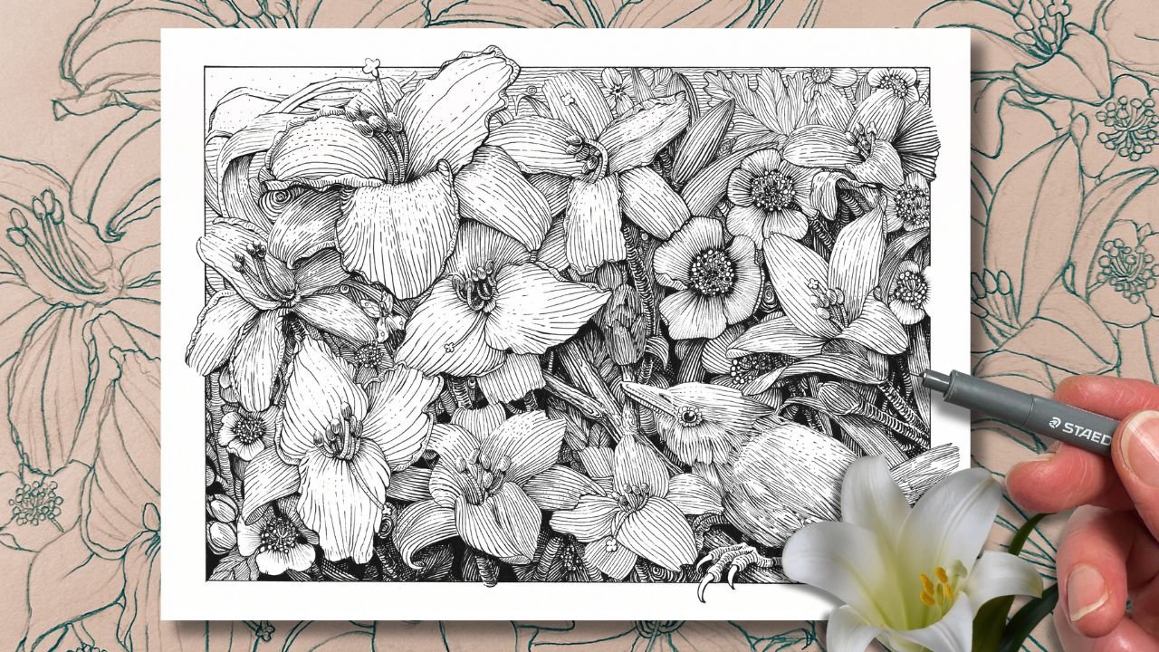
9. Flower A – Pencil Drawing: We begin our next subject with a circular shape in the
middle of the picture frame. Add another circle
inside the first one. From the reference,
we can gauge. The first petal starts and ends about here from
the centerpiece. Oh, actually, let's add yet
another circular guide, then another beyond
that so that we know how far to layer the
unfolding petals. Then draw the second petal
growing from the centerpiece, including the folding
part at the top. Then again, two more markers to indicate the start finish
of the third petal. Add the petal immediately
underneath. Then the next. Again, looking at the reference to estimate the start
finish positions. Continue to build your flower
following the same steps. Erase the construction
lines and refine your design by lightly going over the lines
you want to keep. Next, we'll organize the
centerpiece by first drawing equal curve
lines around the circle. Then making little tubes or
crescent shapes with those. Keep them relatively
uniform in size, but with some variety, so it looks natural. H
10. Flower A – Ink with Fine Liners: Set your drawing aside and grab your inking exercise sheet. Starting with the
smallest tip fine liner will create a gradation scale. Similar process as before, except now we do
several dotted lines, and next to that,
three solid lines. And then we switch pens and gradually make
the lines bolder. The spacing remains
equal between the lines. The first exercise was
to practice line weights that we would use for the
outside edges of our subjects. So those were the outlines. This exercise is to represent the gray tone that will be
used to render our subject. Lines become thicker, but the white space in between
remains of equal width. We can once more practice
the joinery this time, building the lines
more gradually. Render our subject will follow the same steps as the
previous studies. Outline the subject first, front to back, thick, the thin in that order. For the front petals, the protruding parts are bolder. Once the outline is
complete, use your 01, your smallest tip for
the joinery effects, building butting lines
gradually as we practice. With your midwight pen,
I'm using a no three. Start rendering the inside of
the petals closest to you, thick to thin, stemming from the centerpiece,
evenly spaced apart. Now, if you're wondering why
not render thin to thick, this is because the petals
are protruding straight up. They're not flat. So
the flatter sections only are in bold. Also, the hatch lines
follow the form. So they're not shooting
straight from the center. They're following the
curve of the petals. For the larger petal at the
bottom, coming towards us, the lines thin out in the center because they're
receding away from us. This gives the flower a more three dimensional
appearance. Go ahead and render the other petals
using the same logic. For the centerpiece, we can outline the little
crescents with the 03. And layer in some half
circles for texture. And then with the 01 for the texture that is deeper
down into the centerpiece, finishing with an 05
for the border frame.
11. Flower B – Pencil Drawing: Starting our next subject with the main contour
edges of the flower in a geometric shape that takes up most of the upper
part of our frame, then connecting a large oval at the top for the
opening of the flower. Based on these guides, we can estimate where to place the first
foreground petal. Then make our way around the oval to place the
remaining petals. I'm looking at the reference to gauge the approximate distance between the petals and where
their outlines intersect. Two I place markers for the start and
finish of the stem, connect the markers, then add a curvy leaf to balance
out the composition. Erase the construction lines, then lightly go over the
lines that you want to keep.
12. Flower B – Ink with Dip Pen: For our dip pen exercise, we'll do a gradation
of tone using lines, the same as we did
using the fine liners. The difference being that
this tool can control the line weight by simply adjusting the
pressure on the nib. Once again, aiming for equal
spacing between the lines. Increase the thickness
of the line, but keep the white space
in between consistent. To render this flower will bring the hatch lines tighter than
we did on the first subject. Closer to match the
spacing on our chart. But before that, we'll outline the subject following
the same steps from our previous studies, going from thick to thin as the parts of our subjects
layer front to back. Except now we can
take advantage of the tool and vary
the line weight in a single pass wherever there is potential for
the joinery effect. Go ahead and outline your subject using this
technique throughout. We'll begin rendering the
thickest lines first, starting with the stem. And go down a weight
size for the petal. Remember that for
this technique, we're aiming for
consistent spacing between the hatch lines. Also, being mindful, the
flower is three dimensional. The lines therefore
follow the form. Imagine putting
stripes on an egg. Even if they're equally spaced, they take on the
curves of the subject. For this petal in the back, I accidentally
narrowed the spacing. This creates a
visual inconsistency using this technique
for the study. We want to avoid this and keep our hatching equal
throughout the drawing. Our focus is consistency and
changing the line direction to inform the viewer
that the petals are on different plane angles. So really three goals with these studies, a
balanced composition, consistent technique within each drying and to gain practice
with each inking tool. Finishing with our border, give the ink a good ten, 15 minutes to dry completely. Then erase the pencil lines, or otherwise, you might get
smudging like this. Oh.
13. Flower C – Pencil Drawing: For our next subject, start with a circle
for the centerpiece, then another bigger circle
for the first row of petals. Then an exterior circle
for the layer beyond that. I'm taking clues
from the reference to see where the edges
of the petals start and finish and draw those approximately within
our circular guideline. Making an adjustment here, so there's room for the wrap around petals tucked
underneath here, growing from the centerpiece. Then the unfolding petals in the top portion of the frame. Erase the construction lines, over the lines you like, and add a swirly squiggle in the center.
14. Flower C – Ink with Brush Pen: Going over to our
inking exercise, we're back with the brush pen, once again, varying the
weight of the line, aiming to keep the
spacing equal, which, as you can see,
is challenging to gauge the distance because of how
the brush bulges out the ink, just to confirm that
this tool is not intended for rendering
with uniform hatch marks. It's more suited to fluidity
and playful textures. Let's apply these fluid
lines to our subject, following the same approach
as previous studies, thick in the front
and thin in the back. Playing with short
and long strokes with organic looking joinery. We'll add in some hatches on the inside of the
petals to indicate the plane direction and give the illusion that the petals are unraveling from the center. And some are folding
over at the top. Since composition is
one of our objectives, let's add leaves to balance this abstract bloom
in the frame. For the centerpiece,
we'll expand on the swirly squiggly
texture concept. And finish with the
frame and bolding of the very forefront
elements of this piece. Let it dry completely before
erasing the pencil lines. In addition to using line
quality for the outlines, this rendering technique is
used to describe tone to the viewer using hatch marks that gradually
increase in weight. The marks are
evenly spaced apart and run parallel to
the shape outlines. These hatch marks
convey the illusion of form with a
minimalistic aesthetic.
15. Bird A – Pencil Drawing: On a new inking sheet, draw six frames again in pencil for our
next set of studies. We'll begin with the profile
of a common Grackle. We'll estimate the proportions
to fit in our frame and then capture the main geometric
shapes of the subject. Place the eye and mouth as
they are the key elements. This time we include
details in pencils, such as features of the face and design some feathers on
the head, wing, and body. I am just making these up, so have fun with these. Add an element in the
forefront to fill the space, such as a small shrub
or whatever you like.
16. Bird A – Ink with Fine Liners: With our thins tip fine liner, start a value scale, similar to the previous lesson, except now we will reduce
the spacing between the lines as we increase the
weight of the hatch marks. We're creating a gradual
tone with line and value. Say this is our
subject over here. We'll name him Charlie. On the top right hand side
is our source of light. This direct sunlight hits
Charlie with strong highlights. Because he's a round
little guy and not flat, at some point, the light curves around him and
descends into shadow. That transformation area is
called the terminator line. Charlie's body shields the
light from the ground. This is his calf shadow. It's a strong light,
and part of it is bouncing off the ground,
hitting Charlie's belly. So this area would therefore be reflected in a lighter tone. The rest is his core shadow, and that's where the
chart is helpful to help us determine how to hatch the different parts of Charlie or our subject
based on the light source. Let's apply this to our Grackle. We'll begin rendering
the outline with the same
approach as before. The elements closest to the viewer have a
thicker outline, and the outline thins the
furthest from the viewer. Our subject is
three dimensional. So whatever parts of
the grockle would be rounding towards us and
sticking out would be bolder. Now we have the source
of light to manage. We'll address this with
the rendering details. The rules broaden. The contour lines closest to the light source
will be thinner. So the outer outline, we treat the same as
before, near and far. But whatever is
inside the subject, the rendering will follow our gradation scale
from light to dark. Since we're not using color or solid gray to
show the values, all we have to create tone
are hatch marks and lines. But we saw that bringing
the lines closer together makes that
area appear darker. We also know that the
lighter the area, the less detail we see. So far and bright is white and close and
detailed is dark. For our subject, it simply means more lines closer together below the terminator area and
less lines further spaced apart in the upper part of the terminator area
closest to the light. Oh We can shade the shrub at a border and
birds in the sky for symmetry. We will continue to practice these concepts in the
remaining lessons.
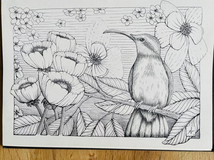
17. Bird B – Pencil Drawing: Looking at the reference, take a rough measurement of
the beak's length and head. Then use those to estimate where to place markers
in your frame. Then sketch out the geometric
shape of the subject, starting with the beaks mouth
and building around it. Continue to refine the shape. I'm more or less following the outer edges with my
eyes in the reference. Then as we did with the
previous pose of this bird, we'll add details,
spacing the lines further apart to indicate the bird's round
cheek and throat. Then narrowing the spacing
between the lines below the terminator line
where the feathers would be in shadow
going around the form.
18. Bird B – Ink with Dip Pen: This time we'll skip
the inking exercise since we've had a lot of
practice with the dip pen, and we can refer to the value scale we did
with the fine liner pens, starting with the outline, bolder in the front,
lighter in the back. Then emphasizing the
eye and mouth of the beak where there would
be shadow from the overlaps. To render the feathers, we'll keep in mind
that the light is coming from the top
right hand corner, shining around the
form of the subject. Therefore, rendering
with thicker lines that sit closer together on the
shadow side of the bird, then widening the spacing and thinning the lines as
we get closer to the light, curving the feathers
around the form, stacking the feathers in layers to give the
illusion of volume. Adding a nostril
here, then the frame, finishing with touch ups of the joining lines, the joinery. We can let that dry for ten, 15 minutes before removing
the pencil marks with eraser.
19. Bird C – Pencil Drawing: Starting in the same manner by adding marks in
the frame to position the subject and
getting the outline of the geometric shapes
with a few lines. Once we have the mouth and eye, we can define the angles so that our bird looks
more convincing. Next is the detailing, layering feathers, using the same line
spacing protocol as the previous two studies. There is space in the corner to sketch a cluster of leaves.
20. Bird C – Ink with Brush Pen: The light direction stays in
the top right hand corner and we aim to add volume on our subject using
the brush pen. I'm using the fluid dynamic
lines to outline the subject, thick to thin, front to back, and once again, bolding the
mouth and bottom of the eye. You can see I'm really improvising with
the feather design. As long as they follow
the spacing protocol, or gradation scale,
then the illusion of volume and depth
will be believable. Now for the very
four front leaves, the border, and the
finishing touches in bold. In addition to using line
quality for the outlines, this rendering technique is used to describe
tone to the viewer using hatch marks that gradually increase in
weight and in space. This technique conveys
form and volume. It makes the subject look
more three dimensional.
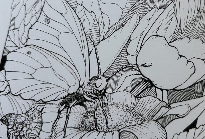
21. Butterfly A – Pencil Drawing: Next series of subjects are
composed of several elements in the picture plane so that we can introduce a cast
shadow texture. We'll begin by sketching
the flower shape in the forefront first,
then the butterfly. Position the wings on the cigar shaped body and
long skinny legs. The top wing can be bigger. Then give it a pattern. Next, we'll add petals. We've drawn lots
of petals already, so this will be pretty quick.
22. Butterfly A – Ink with Fine Liners: With our inking exercise, we are building a
shadow texture. The key thing is to keep the spacing even for
each set of lines, including the lines
crossing over top. Also, we're aiming for a
diamond shaped pattern, not square like this. I'll start with the
parts of the butterfly closest to the viewer
with my 05 pen. Then the petals
in the forefront. Back to the butterfly outlining the bolder parts and minding the joinery effect
for the lines that connect. Though we can retouch
them later with our 01. Now switching to my 03, my midwight pen, continuing
with the outlines. And now a texture for the
centerpiece of the flour. To render the petals, we're simply building on
the previous technique, adding tone gradually by bringing the lines
closer together in the darker areas of the subject
while following the form. This is where we can complement the core shadows with our
cross hatching texture, aiming for that diamond
shape where possible. The stem gets darker, and with that, we get a bound
slide effect on the edge. We can add a cross contour with hatch on the butterfly
body parts as well. Then a shadow on the flower that is cast by the butterfly. I think it needs a second
antenna here and more legs.
23. Butterfly B – Pencil Drawing: In this corner, we have a
cluster of smaller flowers, and our butterfly now facing the other direction is
in a three quarter view. Will extend its legs to land
around the flower cluster. Then add those in
beneath the subject.
24. Butterfly B – Ink with Dip Pen: Same principle as the
previous exercise. We aim for a diamond pattern
with the cross hatching. With a dip pen, we now have the advantage of line quality. So we would cross the hatches thin over thin and
thick over thick. Not quite to this
extreme, but in theory, this is how you would
organize the overlap zone. Go ahead and ink your
butterfly using a dip pen, starting with the elements on the top layer and
closest to the viewer. Thick to thin front to back. Have fun with the wing pattern. Keeping it lighter
than the outline. We can add our cross hatch
on the butterfly body, leaving the very bottom edge
white as a reflective light, like the one that's bouncing off the flower patch,
a bounce light. Next, we can address
those flowers. Using the rendering
marks to emphasize the form and plain
changes of the petals. Then layering a cross hatch for the cow shadow
from the butterfly.
25. Butterfly C – Pencil Drawing: With this pose, let's position the antennas in the corner and build our
butterfly from there. Like with the oak
leaves we did earlier, the wing shape, they mirror on either side of the
body of the butterfly. The wing design
reminds me of how we drew the veins on our
leaves in previous lessons. Once you're happy
with your butterfly, grab your brush pen.
26. Butterfly C – Ink with Brush Pen: For our inking exercise, we'll practice the
cross hatch pattern with our brush pen. Like the dip pen, the sweet spot is to overlap the diamond pattern at the same weight where
the lines cross. Though in the context
of this study, our subject is small, and my brush pen is quite large. I'll be rendering
my hatch pattern with much thinner lines. Otherwise, we're
again building on the same technique we've
been practicing so far. Once the butterfly
outline is done, I add hatch marks to the body. Then a texture to
the flower beneath. It's bold because it's closest to the viewer
and in cast shadow. I'm also putting hatch marks on the petals and changing
line direction. O And the spacing for the cross hatch between
and under the petals. Go ahead and decorate the
wings of your butterfly. Here I find that the contrast on the flower is competing
with the main subject. We can tone it down by layering a light
cross hatch over top, and now the butterfly pops. In addition to using the
previous techniques, we added hatch marks that cross over one another
at a diagonal angle. The more lines we cross,
the darker the tone. This texture is used to describe darker areas
in the composition, such as a core and
a cast shadow. And in the next lesson, we'll bring it all together.
27. Pen and Ink Rendering Project: For our final project, we'll bring it all
together by assembling a composition based on what
we practiced in the lessons. In your worksheet,
take a moment to reflect on the four
rendering techniques. Which one did you prefer?
What about the tools? Will you render
your project with a dip pen or fine liners? Maybe you prefer the fluid
lines of the brush pen. So pick a technique, a tool, and think of which of the
four subjects we rendered you might want to use again
in your final composition. On your sketching paper, pencil, two, three
thumbnail compositions, featuring one main subject and several of the others
from the many poses that we practiced
or come up with new subjects and structure a
composition based on that. Myself, I'll be rendering my project using the
third technique, where we created
gradual tones by varying both the weight
and spacing of the lines. My tool of choice
will be a dip pen. I prefer a vertical dimension, and I'll draw full size on a nine by 12 inch sheet
of bristle paper. Let's go over the steps briefly. After the thumbnail, I followed the same process as we
did for our studies. I captured the geometric
shapes of the main subject, then the elements around them. I used my needed eraser to
clean up the rough sketch, and then I refined the drawing. By the way, remember
to sign your work. I made mental notes as a
reminder of the key things, the front and main subject
to be outlined in bold. A thinner outline for the background elements going thick to thin front to back. I took advantage
of the dip pen to build the joinery of the
linework on the first pass, and I established that
the source of light would be from the top
right hand corner, making sure that the areas
of shadow would therefore be on the opposite side of the light source on
the picture plane. I incorporated the same subjects from the studies because
we had already practiced those with the
outlines complete, I began rendering with hatches, mindful of the light source
as to include core shadows, bounce light, and case shadows. With technique number three, there is no cross hatching. I therefore built
the darker tones by gradually bringing the
lines closer together, thick in the forefront elements and light in the background. The last step, which we did not practice in the lessons is
adding a backdrop layer. Without color, some of the elements need more
contrast stand out. Using the same logic of bold in the front and
lighter in the distance, I used solid black to fill
the gaps in the lower half of the composition and a gradual horizontal
hatch for the top half, which contrasts nicely with the vertical hatching I
used for the subjects. One question I get asked is, when is the piece done? Think of the steps from the lessons as a guide
to assess your piece. Does my piece look balanced? Do I need to add other elements? Do the outlines communicate
near and far, bold and light? Are the joining lines
smooth and clean? If there's rendering, does
it communicate volume? Do I need more contrast in the piece to show
overlaps and depth? Is there a main focal point? If one of the elements
is competing, this is where you might add contrast or tone
in the background, as I did in the last
step of my project. I'll leave you with
those thoughts for your final composition. When you submit your project, please include a few words about the rendering style and
the tool that you use. And anything else you
would like to share that might be helpful
to other students.
28. Pen and Ink Rendering Integration: Thanks so much for taking the class on
rendering techniques with pen and ink and experimenting with
the different tools. My own art journey, I
found a lot of benefits to doing studies like this for planning my
illustration projects, but also testing tools, techniques and
potential compositions. By repeating similar subjects, you get a better sense of the tools capabilities and which techniques achieve
the effects you want. The mini format is also a
factor larger than thumbnails, so you have space to practice, but not full size tempting you to over render or
spend too much time on it. The studies are kept as
exploratory exercises. I hope that you'll
incorporate some of these methods into your
regular art practice. For more on styles, techniques or getting
deeper into dip pens, be sure to check out
my other classes. Let's stay connected. Follow me as a teacher. See
you on the next one.
 Chloe Gendron, Pen and Ink Illustrator