Transcripts
1. Intuitive Painting: Hi friends in tammy Prara, I want to thank you for
choosing my class today. Today we're going
to practice living, or in this case,
painting. In the moment. I call it intuitive painting. This Art is part logical and emotional and part
going with the flow. And how can all
three play together nicely and bind
together to make Art? Let's find out. Watercolor lends itself
to mindfulness well, and this course
will help let go of perfection and engage
our adaptability. I have several techniques
that I use in creating this kind of Art that I can't
wait to share with you. It will help take away the fear of the big void of the paper. Set you free to explore and watch for the beautiful
colors before you. I love this intuitive
choice, making Art, because making the
first choice will lead to the next
and the next until your page is full and
you have discovered how emotionally satisfying
it is to relax, observe, and feel encouraged
to try the experience again, making new choices as
your feelings change. I help you begin
with basic skills. Practice making
watercolor washes, understanding how
the brush works, how to add the right
amount of water. Learn what to look for when
adding a second color. And we're going to practice mark making with a small
watercolor brush. The final piece, you will
have opportunity to see how to combine the
two techniques for a playful
abstract Art piece. Even discuss what to do
when things get too messy. The final project is to create a mailable envelope
with your artwork. I even sneak in two other simple projects with the left over
watercolor paper. Working towards a goal
is the logical part. So share your Art. I'm an artist on
Instagram and I love creating simple Art
projects anyone could do. I believe there is
joy in the process. My approach as a self-taught
artist is to continually explore my Art supplies and
test them over and over. That's the only way to grow and improve the bonuses that I can then take my
Practice Experiences and turn it into gift able Art. How does my ultimate
satisfaction, spending time with
your Art supplies and not always buying more brings some much needed mindful
downtime in a busy day. I hope you take a
moment to yourself to experience your
watercolor supplies, create something today and share it with me in the project
section of the class. I look forward to
seeing your progress.
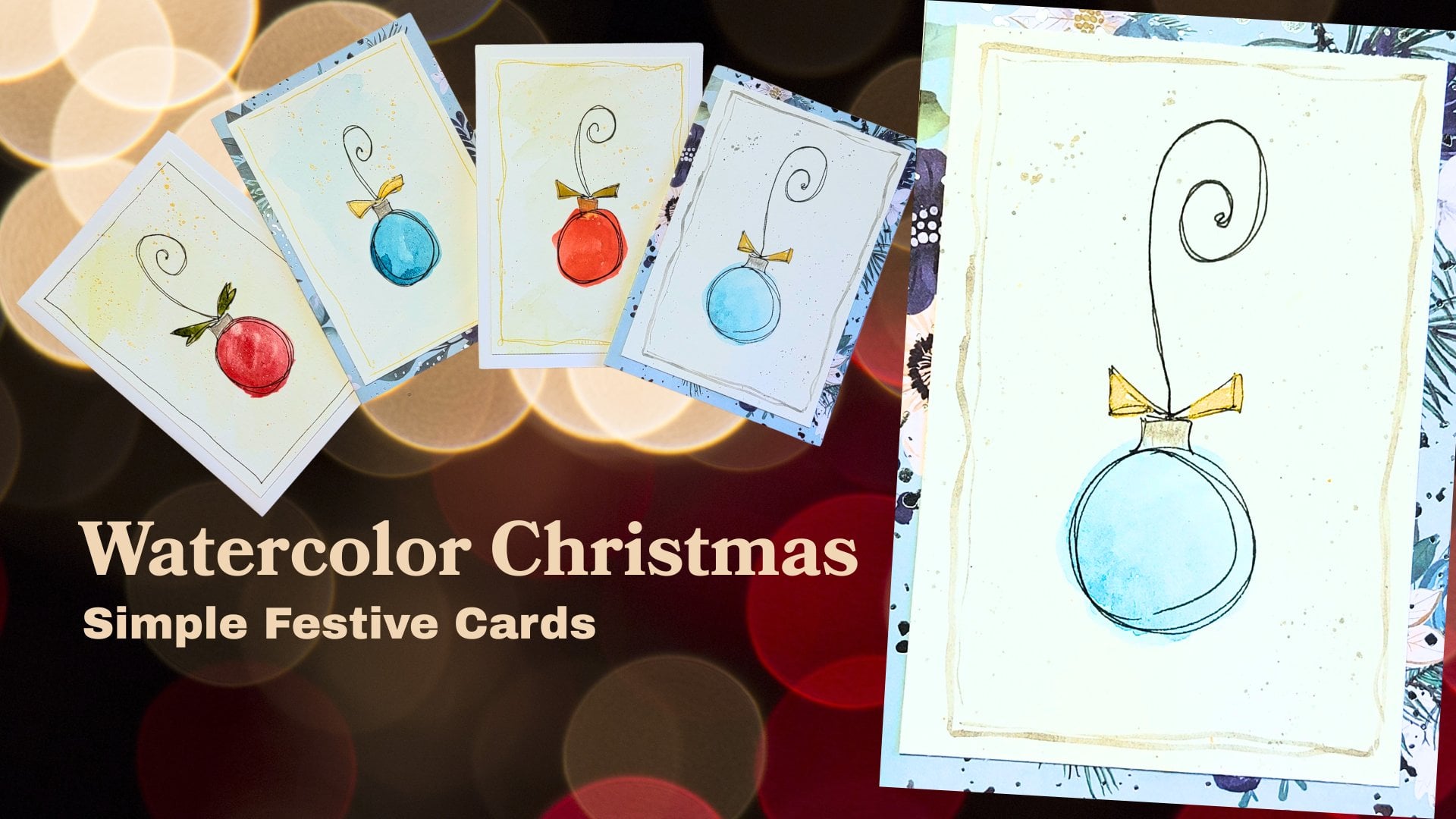
2. Class Project: Your class project is to
make your old mailable Art. Make an envelope using
your watercolor paper. You're watercolor supplies. And the Mark Making the
watercolor washes that we did today and folded
into an envelope. And I demo this in my
class and share with me if you hand-delivered or did you mail it through
the post office? I can't wait to hear
how that turned out or try the other
two project I have. I have making a pocket and
making a mini envelopes. I would love to see your finished projects
and the Project Section. Follow the steps by going
to the project page of the class and uploading a
photo of your project with me. Share with me how that
experience went for you. I can't wait to see
how well you did. And others in the
class love seeing other people's
projects and getting inspired and enjoying
each other's Art
3. Supplies: Supplies for this class are
very typical of watercolor, except for my project. Thank you Ramsay for my project, I want some very light
weight watercolor paper. This is 119 pounds, but it is nine by 12. I would love for
you to find some nine by 12 watercolor paper. This is not inexpensive brand. It's not very white. But what I like is it, It's more of a card stock. Wait. So that works really
well for our project. You do not need any
special, expensive paper. You do want a paper cutter. We're going to trim
our paper down. And watercolor brushes. I have a size eight and
a size three *****, please use what you have. You want a larger round and a smaller round for doing washes and for
doing Mark Making. Now your watercolors. This is my collection of Winsor and Newton
watercolor paints. These are artists grade. Please use what you have. We're looking at about
six to eight colors. You could use fewer or more, but it's up to you. And really the
point of this class is to use something
you're drawn to. What are you loving
in the moment? And so you're picking just
about six to eight colors of your choice that we're going to work with
for our project. You will need a towel to
wipe up from your brushes, clean water, and liquid
glue for our project. Stick glue if you're wanting to do an alternative project. I highly recommend that
Elmore's craft bond. This is not your school glue. Those are the special
glue and craft scissors. If you have a copier, make a copy of your artwork
before you make your project. I'm going to explain how we
can use a copy of our work. If you want to
mail your package, your envelope, you might want to protect it through the mail. Watercolor and watercolor paper are very susceptible to water. Who knew. So you want
to probably protect it, although you don't have to
this as an optional step. This is Tim holds micro
distress glaze that's like a wax, a resistive product, and a very inexpensive brush to apply the matte medium if
you choose to go that way. Mod Podge works. In fact, that's what
I used in my demo. And I'll tell you
how much I love. Hate this. So there you go.
Preparing your papers. Simple. We have this watercolor
paper that is nine by 12. Let's take a page for
the class project. You will need a perfectly
square piece of paper. So we want to make
a nine inch square, nine by nine, trying to open my tremor so I can get
a great measurement. It's the nine. And I'm trimming what I need. Now for this extra
piece of paper. I have an idea. And since it is 3 ", Let's trim off a
three-inch square. I have a project perfect for this square and this rectangle
4. Painty Practice: For our watercolor practice, I have a nine by 12 piece
of paper, watercolor paper. I'm going to fold it in half
because we really don't need the entire piece of paper to do Art,
watercolor practice. So one side will be
our practice and the other side will be
our mark making practice. I've got and size eight, brush. We've got our watercolor. I'm going to prep my
palette with water. And you know what? I don't know what colors I really want to play with today. So sometimes I just end
up a wedding them all. If I use them, great. If I don't, it's okay. It'll dry. That's what I like about my pan. Watercolors, is if I leave them alone and they'll dry and all I needed to add water
to reactivate. And this was just
a squeeze bottle. If you have a Mr. a. Sprayer, whatever works for our
watercolor practice, I'm just going to
show you a few ways of how to make a wash. Make sure your brush is wet. I'm getting it in my water here. And let's pick a color, let's say French ultramarine. I'm really saturating
that in there. You can see my tip
down is full of color. I'm holding my brush, probably near the top of
the pharaoh, like a pen. And my tip is first and then the rest of the body and I just drag it and swish it around. See that white that's coming up. That's the texture
of your paper. My brush is getting
drier and drier. And that's really a dry paint
on a dry piece of paper. That's the effect
you're going to get. This was more wet on
a dry piece of paper. Now, let's get our brush
nice and clean and wet. I'm taking off just the bit of water that was
hanging on the tip. And I'm gonna do the same motion until I have all the
water is out of my brush. You can see the sheen at home. You can probably barely
see it for my class. I'm gonna take that
French ultra marine. Again. I've saturated the
tip of my brush. And you can see it's spreading, its spreading where
the water is, but not where the
water is for that, I have to use my brush. See how it's pooling and moving around where
the water was. That's a wet on wet look. Now I'm holding my brush now
it's even a little higher. But gosh, maybe more like a 30 degree angle because I'm trying to
paint a wide area. And so I want as much of my
brush on the paper as I can, then I just wipe it off to
make sure I don't have drips coming off my brush that
will drip onto my paper. Now I want to show you
where the paint is dried. My brush is very, very wet. I'm actually reactivating
that paint, aren't I? I'm rewetting that paint. I've picked up more
paint as I went across and I was able
to lift it and move it. Making a wash with your paint is one way to
practice your colors. I just dipped once. I did not wipe my brush off. I'll dip again. Just the tip. I'm not brushing that off. And I keep coming
across my paper. This is one way to see
how light you can get your color by rinsing out some color when you
dip it into the water. We're going to be using this
effect a lot in our project. Every color has
different properties. Now, some are similar
and properties, but each color has its own
unique special thing about it. Now I will say this one is
called permanent mauve. And I want you to watch this Can all those crevasses, how dark the paint has
settled into that. This paint in particular
is highly granulating. Granulating means the
paint will have sediment. The sediment gets into the
creases of your paper, and it'll stay there. You will have this
granulating effect. That's the nature of that
one particular color. One color I really like
is tailored turquoise. Just because what I like
the word turquoise. It's this green, blue. And it has a very transparent, clean look to it. I want to compare
it with a color called chromium
oxide of chromium. Now I didn't get that prepped. But there's something
about an oxide of chromium that you're probably
going to notice right away. It almost looks like wash. Now gouache is an opaque watercolor. Look at that. It is so thick you can't see the
paper below it. And yet the turquoise was very translucent and gives a
very clean light effect. So did this green, ultramarine blue, a bit, looks like it's
granulating here. But definitely this permanent mauve is
absolutely granulating. But this has almost
100% opacity. That's fine. That's a
style of watercolor. So what if we want to
bring in another color? One of my favorites
is quinacridone gold. But I like, is it's
brown, it's yellow. I get a two for one. You see that yellow on the end? I want to mix a color with it. What about dioxazine violet? Look at how it's
chasing it away. When we're doing
our color blocking, these are things we're
going to play with. Putting colors next to each
other and letting them touch and run along together
and play with each other. And to see what new color
combos we can come up with.
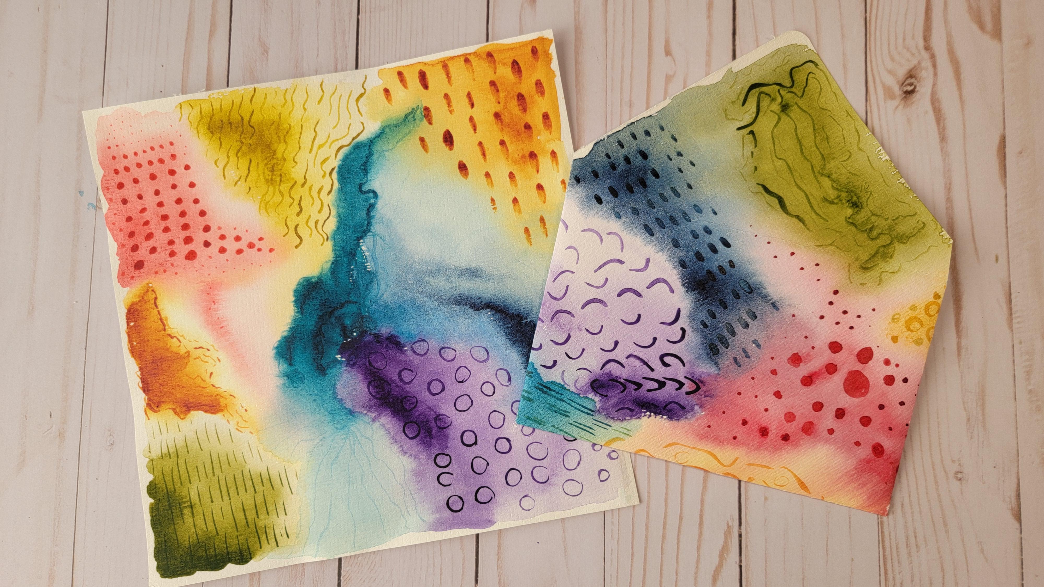
5. Mark Making: Now for mark making, take your thinner round brush. I have a three. You might have a two or a
for something that's round, that's going to have a
nice crisp tip to it. And I want you to
know that there's really only a few
shapes in the world. So think about
circles and lines, and you'll be able to come
up with so many variations. So I think I'm going to
start with that dioxazine, violet just because
it's such a dark color, touch the tip of our brush and make polka
dots make these freckles. A random arrangement. Touching a little harder, makes polka dots, makes circles. Now they're irregular and there's nothing wrong with that. We liked that look
for Abstract Art. You can keep them in irregular pattern or you
can do them randomly. But the other idea is to
just get larger and larger. Larger dots. Ovo, big fat, round
and oval leaf shapes. Maybe even dots with
holes in the middle. Little donuts. Highlight space right there. It's still a circle, It's
still a round shape, but you making
variety out of these. So at times when your brain
just wants to go on vacation, you have a variety
going on here. Fill an area randomly
with combination. You can mix and match
these together. Now what about lines? Let's talk about lines. Using the very tip
of your brush. I've got a little drip there. I don't want the drift. Sweeping the very tip of your brush makes
the finest lines. And practice going
all the directions. Scratch marks, hash marks. Are they equally spaced? That's a pattern. Or they irregularly spaced? That's another pattern. Are the links the same? Are the links different? What about touching your brush? Technically it's like a line. It's a new way of making a mark. Filling it in if you want. I like repetitions. What about combining looks? And you've just of only
managed a few marks, a few different shapes. And you're coming up
with a variety of looks. Doing that. Dry on dry look where the white of the paper
is coming through. Now, a way to combine a line
on a circle as making arcs. They could be, why'd? They could be short? They could be touching. They could be in our locking,
wavy lines, S-curves. S-curves with a heavy hand on one part and a light
hand on the other. Or just trying to
mimic line in front. But just slightly off. So it's always changing. That's another pattern. Sometimes we're going
to be working with the, the edges of the
paint that we see. Here's an edge. Here's an edge. And you can be outlining the different shapes
that you see. This waterline kinda
comes that way. Here's a water line, here's a water line. You could be following
those different shapes. And maybe you're following along the outside of your block. Then you break up. And as your paint
starts to fade out, the colors changing and it's
just the simplest mark. One last mark I want to show you is something that
resembles writing. Now, maybe you have a phrase in your head or
you're singing a song. There's lyrics or
even scripture. You, you've got this quote
that you want to say. You start writing
in a shorthand. What are the words? You are trying to get
out onto the paper? And a very cryptic way. Kind of just squiggle Marks
that resemble writing. That's another mark making. So once you have
your sample page, you're ready to make the Project
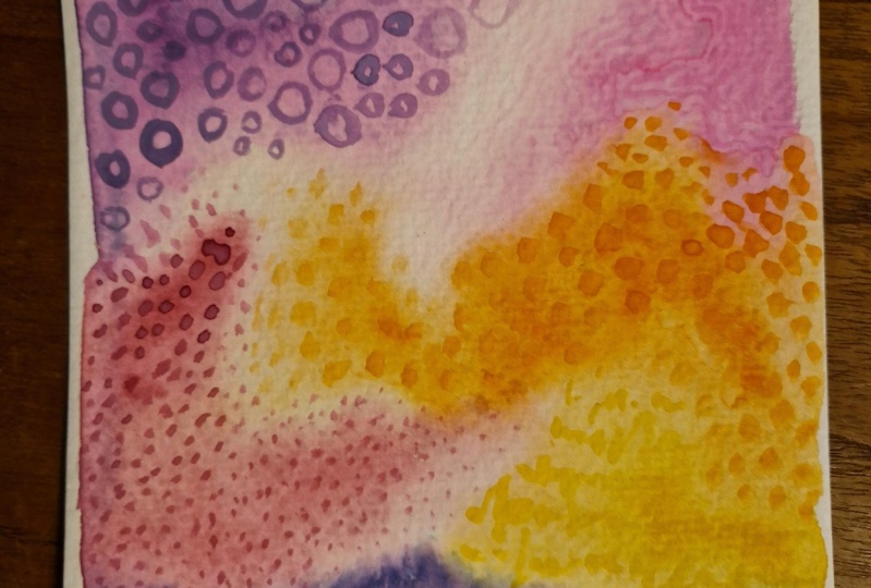
6. Project Square: So I'm looking at my watercolor
palette and deciding what colors in mind drawn
to at this moment. And I think I'm going to dip
into my perylene, violet. And I've got a nice
big blob on here. I want to start my corner
and see how my brush is. Paints on the tip. It's laying flat. You can see there's
lighter wear. My brush was closer
to the feral. That's where a lot of water is. And I just dip the tip and
now I'm going to rinse it out completely and give
it an extra wash. So I have this free flowing
water moving around. My next color is
quinacridone, gold. Hush, I love this one. It just is really cool. Do you see that
yellow right here? And yet it's brown over here. That is just something I
think is so cool about a color having two
dimensions to it. I just think that's cool. Fact I'm going to run
some more water around. Let's fade that out some. How about green, gold, kind of a complimentary
color to that Quinacridone. Just spreading it out. See how I'm really using as
much of my brushes I could. If you've got a larger
brush, go for it. Really want to
spread this around and putting that
wet on your paper. And it gives you that good wet on wet technique when you're
colors are going to blend. I'm going to reach for, let's say aqua green. Got a nice big drop
of paint on here. Beautiful, beautiful. And see how it's seeping
into where that water was. We got there just before
it really dried up. I liked the white when
the paint just kinda skip along the ridges of the
texture of your paper. I think that's really cool. Can we go over here? Should I go dark, light? All right, I'm going
to look at my palette. I'm gonna go for the
turquoise, yellow, turquoise. Now this is dry here, so I am starting wet on dry. Well, I guess it did have a
little bit of water on there. Two very similar colors. In fact, I think I'm going to
come back and drop in some more the turquoise that a
blob of paint right here. You see that dark spec. That's paint that did not
get mixed with the water, so it's a fragment of the paint. Wow, Can we put in here? I don't know why I did that. We're just going with the flow. You wanna do wet on
wet into wet on wet. And how about I put
that perylene violet in here and see how
it's swimming now, that paints just swimming along. I love this look. It's just playing
together so nicely. If it's time to start swishing your paper,
swish your paper. Watch it. Swirl and pool and fill in
the texture of your paper. I think I were to
try burnt sienna. Times neutrals for me
are just as delicious. And when you bump up against
them with other colors, you really have a
neat, neat look. You might really like that. I'm new color combination
that you've just introduced. It just really wants
to swim around, doesn't add, you know what? I like indigo. Punch you off. Just so yummy. Fade out those
deep, deep colors. Now this water line, right, this paint
really had settled in. And when I added more water, it put a harsh line
right across here. Play with that. You see those little droplets
moving the indigo around. There's nothing wrong with that. It's, it's experimenting. It's playing with what you have, what we haven't tried. Let's get this Quinn
red, quinacridone. Red. That's a pop of color, isn't it? Now this paint is dry. And you can see just laying
down my Quinacridone. It's drying on the paper
as I get laid out. I'm going to take
a lot of water. Now I almost think it might
just be, my atmospheric, might just be very
dry where I'm at. And it is just melding. It is not seeping here. Is that no matter how much
water I'm putting on there, I'm going to make sure I have
plenty of water here for it to play with the
next color we do. I think I might
try this dioxide. Dioxazine violet. Dioxazine violet. Now what's amazing,
it's almost black. I want you think. And getting a lots of water on my brush. Pushes. Do you see that? It is pushing against that red. Now I'm not going to
the edge of my paper. Mostly because I don't want
to get my my table wet. Something I could
wipe up easily. But right now, I don't
want to get my table wet. And I did not put anything
underneath my painting to make sure that it would not
spill onto my table. You could put a piece of
parchment down, a paper bag. Right now I'm just
running this paint around and around that red
just wanted to come into here. And now I'm going to go back and the purple
is going to run. And if we tilt it this way, it's all going to just see
and ooze down in here. And my indigo here. It's going to have
a harsh water line. These are just all these
special effects were learning. Look at this beautiful
blending in here. But then there's this
hard water line. It's just interesting.
Isn't that? I just find it fascinating
how paints work. And that's what makes
this so abstract. And Fanta do because
you're just experimenting, you're just learning and
relaxing with the process. I'm going to give this
the quick dry method. I'm going to get my heat gun
and then I will be moving on
7. Layering Marks: Our picture is now
dry and I have freshwater and I'm
going to start adding Marks to our page. Use your imagination, use your intuition,
use your emotions. What's coming out of
you at this moment? There's no judgment, there's
no overthinking this. It's just a goal for it. But sometimes if
your mind is blank, pull out those those examples that you created,
circles and lines. And in what order
and what kind of patterns and what
color are we choosing? I'm going to start and
my upper right-hand. And I remembered that
that was burnt sienna, some little marks, just stripes. It's taking the tip of my brush, dragging it on its side. And look how it's fading out. It's getting more watery
and Liz and I filled in this square of color block that color wash. Next thing I think I'm drawn
to is that indigo. What really strikes me
is this hard water line. Remember we talked to them
about how that would come up, where the paint has
dried against adding more water and it just kinda stopped where the paper was dry. Dragging my tip very slightly reminds me
of topographical map, minds of elevation
of Mountain Lane. Just let your brush do. Barely touching the paper. And I still have pain. I still have water. Stop here, red. Let's start here. Keeping with the blue. Almost looks like waves
doesn't have dioxazine violet. Greg down and I drag it up, literally changing the pressure. It's just the direction
of brushes going one side might look more water no more. Just using the very tip
of my brush right now. Just skimming the paper. That a water drop. Yeah. I have a bit of water on my paintbrush and I think
it's a dribbled on my paper. Now what about that red,
we used quinacridone, red side of my hot, the full side, the side
of the tip of my brush. And doing solid circles
vary the size of them. Sometimes I'm gonna get a little bit more. Scratching. Filling your space. Has the paint gets
lighter and lighter. And lighter areas. That color in here where
it made a layer over the blue light is I still have some color and we're
gonna call that turquoise. I gosh, stop thinking. Just do. Here. I am laying
the tip of my brush down and doing a sweep and letting the tip come up and lifting up
on that very tip. That's why one side's
fatter than the other. Because it's laid down and lift. Laid down and lift. But it's just a mark. There's no perfect way to do it. Other than I really
liked that fade out. Look. My printer really
is talking today Perylene violet. Such a cool, neutral purple that I think we could
space it out to the viewer. Especially down here. There is some type of that one, and let's fill in
a couple of more. Do some random choices. This color blocking idea really helps to stretch
your imagination. Don't you think that? How many different ways
can you do a line? Can you do a circle? Can you do a dot? I think I'll do more lines. 123 space. 123 space when one-two-three. One-two-three. Yeah. You could turn your paper. Do them another direction. Using trying to use the very, very tip of my brush. Sometimes I get
some drag in there. But it's a little
wider than another. I am going to grab a
little bit more paint. An address, whatever
feels right. Not a, not a big deal. And that's very last one
was green gold ocher, I'm gonna take my green gold. How about I follow
the lines again? You know what? I
changed my mind. I'm going to pretend
to be right teen. Pretend to scribble a thought. And if you really
have trouble with just playing with the
tip of your brush, think of different
words and imagine a very light symbolic look of what that writing would say. I really liked how
that color faded out with the fading of
the color itself. Now, to mark or not to mark, that is the question. How about if we Mark part of it? I think I'm going to just mark part of it and
leave the rest. Just dancing the brush around, not trying to be anything. I've started finding
the edges of the hard water
line and then just started skipping around
and playing with it. So that is our finished piece. And if you want to
photocopy this or scan this and save it for other
images or other projects. That would be a great
time to do that. Let it dry or get your heat gun, finish that off
and get it scam so you can reuse this and
other projects as well.
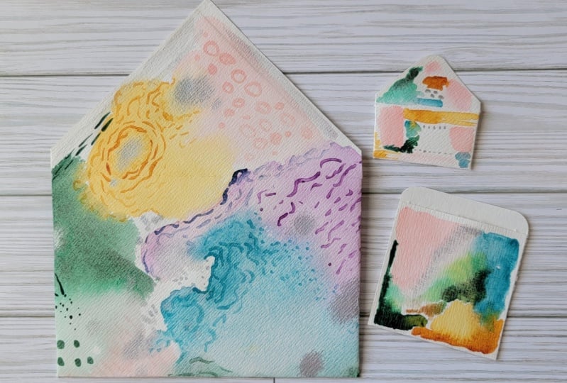
8. Project: Envelope Fold: I have a class on paper
folding your own envelope. And I can demonstrated
here really quickly. But if for more details, please see that other class. This is my favorite fold and it requires having a
perfect square. And so I actually made a copy. So I have my original, I have a copy that
I've scanned in and I am going to trim
this to a perfect square. So I do have an eight-and-a-half
by 11 piece of paper. And I'm going to
give it a tram on this outside line because I did I didn't get
it border to border. So I'm going to call
this eight-and-a-half. Whoops. Silly me. I started with eight-and-a-half. I wanted to trim it down. So what I wanted to trim it down to was eight and a quarter. So let's make that
happen over here. So I'm going to start here
giving it a good trim. Cutting a majority
of the white off. Let's see where I land for eight and a
quarter on this side. Cutting quite a bit. So that's good for me. Now this is the magic
of this envelope. I really don't worry
about perfect. This middle line from
diagonal to diagonal. I want to make sure
my tip is above that. So when you do this, you're going to point this tip to this tip to the best you can. And then this is going to approximate the length
of your envelope. So the higher you come up, the wider your envelope can be. So we're just eyeballing that. I'm eyeballing that this is about the same length as this. I'm hoping this is
really folded neatly. Here's my finger trick. It's about a thumb width. And I'm folding that over. And I'm going to point this to that other side and crease. I give that about
a thumb's width. And I really hope that these two points are
facing each other. Having a little face off. Then I open it up completely and fold the sides back
in and fold that up. Now, most Envelopes
have a trim right here. You could trim it,
you could fold it. That is not extra
important to me. I like having as much
of the envelope that we've created painting
available to see. So I am not going to even
trim out these corners. A lot of people will edge
this little V notch out. I'm okay leaving them on, going to tuck that in. And now for this, how tall do you want
your envelope to be? The only thing I
have is to go by is, well, I'm going to have my
tip coming off my envelope. So maybe I want to
hike it back up a bit before you put
that crease in. Give it that adjustment. So that, that tip
is just to hear. And one trick to
taking that off, find your corner rounder. Do it by hand, that's,
that's totally fine. Also, make sure your paper
is completely in the notch. And you've taken that edge off. And here you have a cute
little rounded edge. So the only thing required
now is some glue. I'm going to put some glue with a glue stick on the inner
and outer flap right there. So that little
triangle gets a bit. The side here gets a bit. And I'm trying not to get
glue all over my table. I usually like to have
a piece of glue paper and give it that warm hand press and seal that up
Bureau envelope. And you have an envelope. One of the reasons we went
with a very lightweight paper. This is not 140 pounds. This was some cheaper paper. And so it's much
more lightweight, maybe more of them
like card stock. But again, I want
this on the diagonal. So we're just going to
repeat the process. I'm coming up aiming my point to this top point is this
about the same as this. I'm going to come in about an
inch pointing to this one, unfolded and bring it back in. Because this is heavier paper, I'm going to notch this
corner V cut right there. I've had my fold lines, so I already know
where I need to cut. The bottom comes up, I think I will trim this and then this is
going to come down. I'm looking for a
half an inch up here. I don't want this to go past. And just manipulating this
paper because it is thicker. You have any perfectly
square paper, you can make an envelope. I'm leaving space here because
it's taller than my edges. In fact, you may even
want to put something down in case that
glue spills over. And this liquid glue
needs a moment to set. We're letting that soak
into our watercolor. One little element is maybe
around that side Off. Not necessary, but
kinda looks cool. Did you want to trim that off? I think I will. This is a ten
millimeter rounder. Here I have the envelope, the original, and copy. There are two different sizes. We cut this one smaller. But there you go. I'm not fine. I hope you make this project. It is really a great use for
your watercolor practice.
9. Finishing Off: If you're mailing your project, this watercolor paper
is not protected. It could get water stains from any rain or any rough handling. So if you want to
protect this image, then you might want a product called micro distress glaze. That's a Tim Holtz product. This stuff is incredible. Now they say, you
just need a tiny bit and you start waxing it in. Well, my fingernails or to LA and I get it
under everything. And I hope you can see this. Let's see here. There, it leaves a shine and you know where
you've applied it because it's like applying
a wax to your project. So just working
and tiny sections. Apparently that's way too much, but that's what
that's what I got. Now, the other idea for this
stuff is it's a resist. So if you apply it to a
project where you don't want paint to actually get to, then that's another
use for this product. So I'm actually
relaxing my paper. Now they say you barely need
any and it will move around. But I guess it does. I can't say I've actually done
a fade Project, does this. I've done postcards. I've done smaller projects. But this is one way you can really protect the product as it's going through the mail, because you never know what
could happen in the mail. I'm going to leave
this part on protected so I can get a good
picture for you to see how it's really applying. The other idea is to get a spray acrylic or
some Mod Podge. You could use a Mod Podge, you could use Liquitex
matte medium. You could do a gloss. But let's see what this does. I'm a little nervous because
I feel like as a liquid, it's going to reactivate. Watercolor. I'm going to start down here. So far the purple
is not lifting. Well, I guess it
is a little bit. You can just see
that color changing. The good news about using something of this
quality is it is a thicker material and it will thicken and toughen
up your Envelope. Be sure to always
wash your brush
10. Bonus Project: What do you do at
the extra well, you have a three by six
and a three-by-three. So what I like to do with
these many projects is to use the colors that we had
used in the previous envelope. Make the extra goodies to
go inside the envelope. Little extra Art. Maybe it's a bookmark
or a pocket, but one thing we can do
is make a mini envelope. So I'm going to choose
maybe three colors, maybe four, that were used
in that original envelope. And truthfully, I'm going straight from my
quinacridone gold. What is it with this that
just tickles me so much. I love the two tone colors. Just cool to me, very, very cool to me. How about that perylene violet? Man, it really wanted
to take off, didn't it? Anything that says turquoise? One of my favorites. Taking a little bit more, really want some deep blue here. I'm rinsing my brush so I can get it lighter on
the sides here. Just gently poking around. I'm actually scrubbing into that hard edge of the
quinacridone gold. And I'm carrying what did
that it carried the gold and the blue all the way
up and turn green. That is really neat. And look how much
paint I have on here. That blue is so wet. We can not at ooze down. Or you can take your
brush and dry it off a bit and let it
mop up some water. Dry it off, mop up a
bit of that water. I had said I really
wanted that deep blue, so I think I'm going
to let it rest. And let's move on to this one. I'll book. I've already
got a water drop. And I didn't rinse
my brush real well, you can just barely see
that blue, the green goal. Because we're coming busy
in the summer and fall, just feels like it's
around the corner. I'm going to take the
aqua green and add that. And you might like to just leave that sketchy white
part of your paint. That's up to you.
This is your project. I like touching that
in some water in here. I can spread one other color. Okay, you're not supposed
to be thinking this heart. So I'm going to take
the perylene violet. I guess I do have the
autumn vibes going on that make a really pretty
fairly pretty Fall card. Again, look how that just
mirrored, smeared, smeared. Really wanted to come
out until the water. I'm going to let it
soak in this way, soak in that way. And just give it a moment to dry before
we finish our project. Now these did dry, a bit lighter and that's fine. That's what we're learning
about our colors, right? How they work and how they
react with each other. Are going to set this paint
aside and work on a pocket. Decide what part did you want
showing for your pocket? Because we're going
to fold it up. I think I'm gonna
go with the blue. Now I'm gonna give myself a bit of top border here
and just crease Now you probably noticed I did not do any mark making on here. I left the marks off. You. Do what you want to do. Do you want to add the Marks? Do you want to add
splatter paint? Do you want to doodle with pen? Totally up to you? I'm going to leave
my pocket more plain and I'm going to take a bit of glue and all I'm doing is from that fold line up, gluing that short side
to the longer side. Don't forget, let that glue set. Won't take long. But
give it a moment before you start going
crazy with your pocket. Here you have your pocket. Now. This little guy, wow, so many options you
could collage on this. It could be a tag,
you could hold, punch the top corner
round all the sides. But what if we made a mini envelope following
the same directions? Bottom comes up, pointed
towards the other point, pressing it down,
the sides come in. They're facing each other
the best they can write. Unfolded. I'm going to notch out the bottom just because I'm getting rid of some bulk that
this watercolor paper has. So I'm hoping those
corner rounder will give me the space. Now I'm going to
open this up again. I'm going to give this notch. Remember I trimmed edge where it comes down to the
base of that envelope. And now I do need some glue. So let's try my glue
bottle out there, a bit there and Up, Up. Now this tiny bit. That's why I don't
put glue all the way. I look along the side
here because it doesn't even come to the top there. And you have your mini envelope. Oh my goodness, put a
secret love note in there. Or a coin. I think that's so sweet. Pop it into your pocket. Now. That's what you can do with your two little extra
pieces from your nine by 12
11. Wrap Up: Thank you for joining me today. I appreciate your time. I know this class
was a lot of PFK-1. And hopefully you've learned some watercolor techniques
that you can use in the future and really work
on your Abstract Art. Playing with your supplies
is so satisfying. And I call it intuitive
painting because you just make the choices you're
feeling in the moment. And now Mark Making you're
feeling at that moment. And create a page, copy it, scan it, use it in other projects. This has so many
applicable ways. Turn it into tags and
bookmarks and envelopes and, and pockets and journal
pages, note cards. The list goes on and on. I can't wait to
see your project. Please share it in the project
section when you're on your laptop or your
desktop computer, have a photo ready to upload
in the project section and please let me know how
that experience was for you. And how was class. I need your review. I love your reviews. I need to know what you loved. What could be improved on. I need to hear it all. So please share that with me. Also. When you're on
your desktop or laptop, go to the reviews. And once you've
finished the class, grade this class for me, I would love to hear from you. I appreciate you so much
and find me on Instagram. You can share your
projects with me there. And I thank you so much. Have a great day.
 Tammy Prara, Making Matters