Transcripts
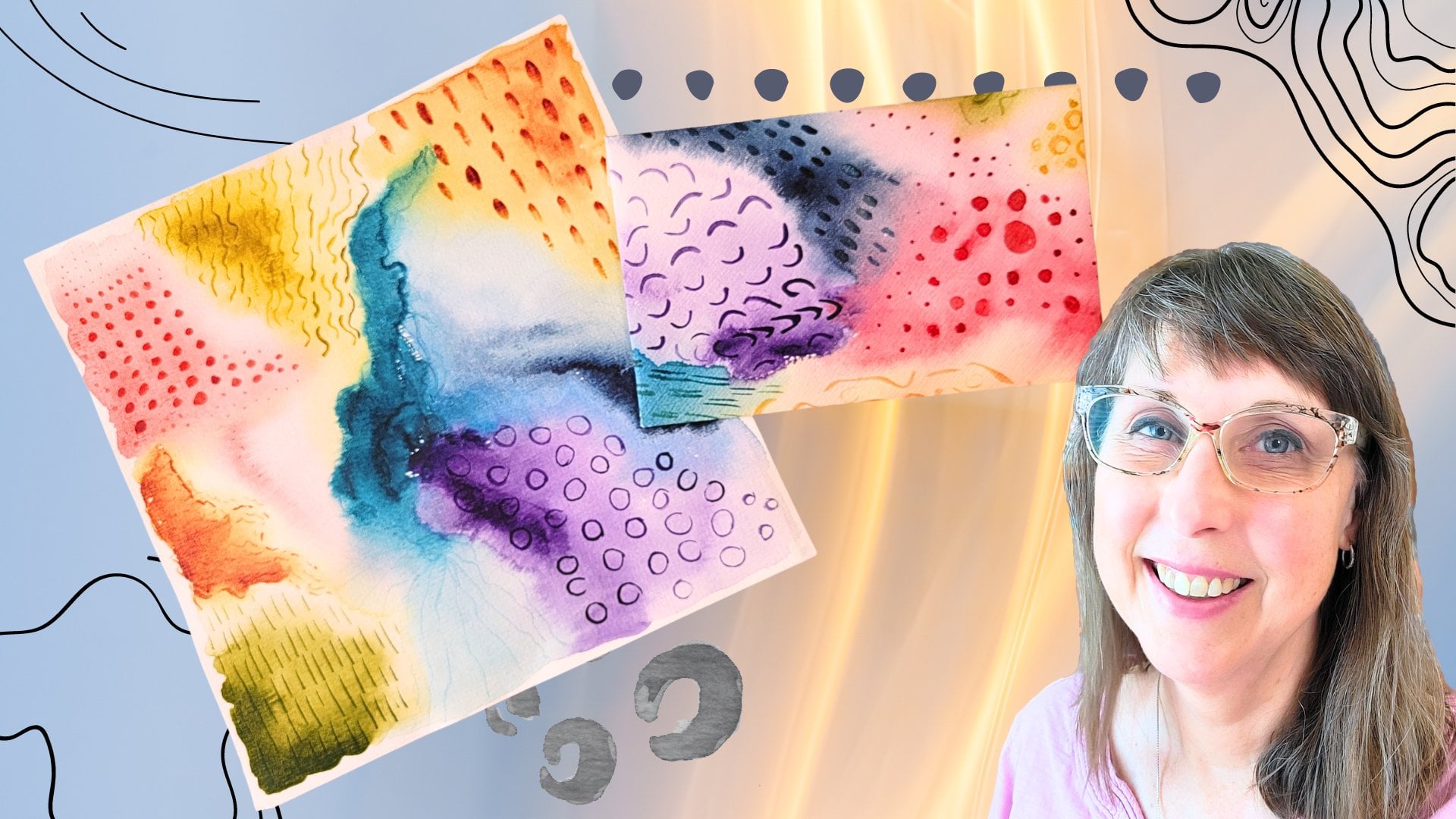
1. Watercolor Christmas Intro: Welcome, friends. Thank
you for joining me today. My name is Tammy Prara, and I'm a watercolor artist. Besides doing a
few other things, but today we are
going to focus on the basics Basics of
watercolor and how to transform doodles and watercolor
into a fun holiday card, a Christmas card
that you can share, that you can mass make. I love making cards
because to me, it's a personal gift from you, you took the time to show your
love and appreciation for someone by putting some
of yourself. Onto paper. Today, I will go over different kinds of
watercolor paper, and why I chose
what I did today. I go over the brushes. Watercolor can be confusing just because of how many brushes
there are out there, and I will show you
exactly why I chose the brushes I did
for this project. I'll also go over the pens I used and why I chose
the ones I did. And all in all, you are going to have a really
good basic understanding of watercolor and how I
approach projects like this. I enjoy the holidays
so much that I want to put a little bit of
myself into the project, and I hope you find
that you can do the same You can find me on
social media at Tammy Prara, and I have Instagram, and I just started up my TikTok, and I have a YouTube
channel, as well. I'd love to see you there. And please, when you get into this project and see
how simple it is, I hope you share that with me. Share your project and the project section
and inspire others. I love giving feedback
and seeing your work, so I can't wait to
enjoy that with you. So let's get started on this
simple cardmaking process.
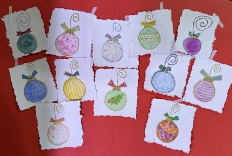
2. Class Project Ideas: Your class project today
is to make a card, make a watercolor gift for
someone or make a bunch. I would love to see
your creations. Today's design is a
very simple ornament, but be creative. Think of other
things you can do. Maybe it's holly
leaves or presents. I would love to see where this whole mass making card idea takes Please share that
in the project section. I'd love to see your work
and I love to encourage you. So you sharing that project always inspires other
people as well. So please take the
time to do that today. I would love to see your work. So let's get started on this
simple card making process.
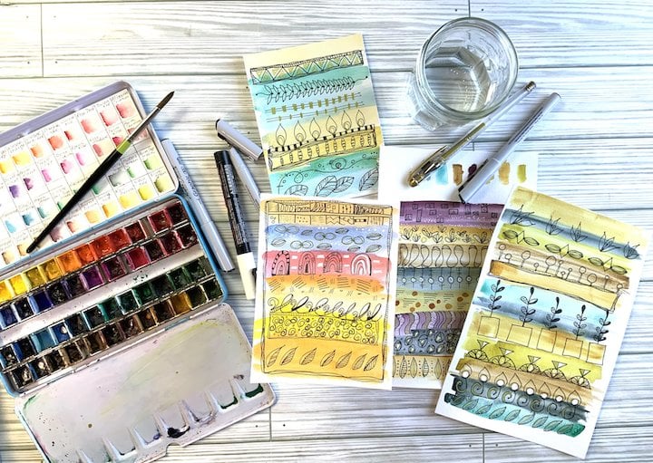
3. Class Supplies: The supplies for today's class
are really rather simple. You just need three colors, two colors would be fine. But I add a third metallic
color to my project. If you have some reds, greens, maybe even blue, you can do this project, and metallic is optional, but I find it really helps
finish the project off. Some water, some
watercolor brushes. I'm using rounds. A two, a six would be just fine, some paper to dry your brushes. I'm using a pen to doodle with, so you need something
that's not water soluble, maybe a metallic pin. Those are always fun to add, something to wet
your palette with, and then the watercolor
paper and some cardstock. I am using a 140 pound paper, and I cut it into squares, so you'll be able to make several in your project
if you have larger paper. The paper I have is
a very fine grain. It's not very rough at all. That works really well
when you're doodling. Very simple supplies today. I can't wait to get started.
4. The Skinny on Brushes: Before we get painting, I think it's really
important we go over paint brushes, watercolor
paint brushes. Now, don't let this
overwhelm you. No, we are not using
all of these brushes, but I wanted to
give you a few tips on why I use what I use. I have a problem, maybe you do too,
of impulse buying. I've watched a video, use a really big mop brush. Oh, I need that.
I have to have it or my art won't look like hers. I don't use this. They
paint really big. I have to have this really big. It's a size 18 round. Oh, it'll change my
life. I don't use this. These really big, soft
wash brushes here. Oh, they're just wonderful. And this one I inherited. So somebody loved on it, but they're not really for me. Now, there's other brushes here. I have a fan brush, and this is technically
watercolor and acrylic, but you have to get the skill
to use this kind of brush. Truthfully, I'm not
that adept at that. There's other brushes,
water brushes, really great convenient brushes. You fill this base
here with water, you screw your tip
on and you have a travel watercolor brush. Here's another
watercolor travel brush. In fact, look how many I have? I thought I needed
natural hair brushes. This is an expensive brand, and you can store them this
way and then take them out and now you have the handle of many of these
type of brushes. Truthfully, I don't paint anywhere and everywhere or
travel with my watercolors. This was a lot of money that
I didn't need to spend. What else is in here? I've got um oh,
this quill brush. When I saw an artist
use this quill brush, I said, This is going
to change my life. I need this floppy. It holds tons of water. This is the brush that's
going to make it for me. And, no, it's a skill. It took a lot of time to
learn how to do that. It's the same with
this kind of brush. This dagger brush,
the artist was incredible and showed the most
amazing floral technique. Yeah, you have to
practice that technique. I did not give it that much
time to get good at it. I think I have
another one in here. I bought two sizes because I thought, Oh,
that's what I need. Flat brushes. I rarely
use. How about this? These cat tongue brushes, also called a Filbert. No, it's a special
technique that I haven't given it the
quality of time I need to. I personally, you could probably
tell by these Princeton, these snap brushes, you can
get them almost anywhere. It's maybe a student grade. It's a synthetic hair, but they're round brushes. See that tip. That means you can paint the finest line and
then when you lay it down, you'll have a nice
broader stroke. I highly recommend getting
some round brushes. You will learn watercolor so easily and they are so flexible
as to what they can do, how much water they can hold. Get different sizes. Here I have a two and
a six, and an eight. Here's a ten. I
rarely use my ten. I wanted to show
you. Look at this. This is a zero. Look how tiny that is. I think I have one even smaller. Look at this triple zero. These are tiny and fine line. Still considered around. This Cotman Windsor Newton, this is a good student grade. But you can see I have the
majority of my brushes are round and I find them to
be everything I need. For today's class, we are
going to use probably a two and a 64 hour project. If you have a four and an eight, just something a little
larger and a little smaller and it will
work out just fine.
5. Picking Paper: This introduction to
watercolor paper, I thought important because the cards we're making today do not require high quality
watercolor paper. But did you know the differences do you see this rough texture? Is that incredible? This paper is watercolor book,
handmade watercolor paper. It is 100% cotton. It says it's 140
pounds, 300 GSM. We're going to be
seeing this number a lot and you're going to see how different
they really are. I know that watercolor paper
has an expiration date. They they will not last forever, but I've got to get more
used to this rough paper. This is what it came out with. One of the reasons I'm
not recommending this is because using
your fine tip pens, your microns, it's
going to really have trouble writing on this paper. We're going to set
this one aside. Here's another paper, fluid 100. I EZ Block. I love their paper. I think they're affordable,
they're great. It's another 100% cotton. Where's that Great. Here it is 300 pound. The last was 140 pound. This is 640 GSM. This paper is so thick. This is how thick one sheet is. No, we're not going
to be using this. I like that when paper is
on a block, it's nice. You don't have to
tape your paper down. It will not move. Paper blocks are really cool, but we do not need 300
pounds for our project. Now, these two Both say, 140 pounds here, here, and heavyweight paper
for watercolor, it's acid free,
they're not cotton. But let's take a look at this. Do you see how little texture
there is on this paper? Something that will be
very smooth for our pen, but also absorbent
for our watercolor. This wasn't brand. I found it at a yard sale
or a book sale, I think. I've never seen it
before, but I grabbed it. It said watercolor
paper. I grabbed it. This Masters touch from Hobby
Lobby, it's not cotton. It's a very affordable pad, but you can already
see that texture. There's way more texture
than in that last pad. Yet they both say
the same weight. Interesting. This is
another good one. Your pen would be okay on this. That's not a problem. Arches is another cotton paper. This is a 140 pound 300 GSM. Arches here in the
States very expensive. I treasure it and I should
be just using paper. But I do treasure it.
Look at that texture. Everything about arches
is just nearly perfect. It's a great heavier weight. It's a great texture. But I do feel like, Oh, when I'm a famous
artist someday, this is when I'll pull it out. Well, friends, use
what you have. You can't store this forever. It does have an
expiration date of sorts. It will start to degrade and you might as well use it and get good at it. Here's another tip. It's the same as your
watercolor brushes. Your technique, your look, your style is going to be
affected by the paper you use. If you use smoother
texture paper, the look of your watercolor is going to look different than if you did the
exact same process on a different paper
with more texture. You have to master the
paper that you're using. For today's crafting project, getting to experiment with
doodles and painting, I would recommend a
more student grade, less textured paper. That would work out just fine, but use what you have. That's what's most important. I want you to start getting comfortable with
the paper you have.
6. Test Your Pens!: Before we begin doodling, I wanted to give you
a little heads up on using the pens that
we're going to use. Not all pens are created equal. So I have a couple sizes
here. I have Look at this. An oh five, an h three, a 005 in two different brands. I just have a ballpoint pen. But I also have a food and Suke. I really like
drawing with these, but I'm going to show you
what we're going to do. We're going to test our pens. We're looking for something
that will be safe to get wet. I have my inexpensive
watercolor paper here and I'm just
drawing a line. This is my food and Suque this is just a ballpoint
pen, Crayolas ballpoint. This is a micron. This is an 03. I think
it's running out. Let's try a different
one. This is my 05 and what did I say Micron. I've got this graphic. This is a master's touch. Looks like that is in
much better shape. I'm going to call
this master's touch. I want to show you if you are going to draw first and
then paint over it, what would happen to your pen? Is it water safe? My food and suke actually
looks pretty good. What's a ballpoint
pen going to do? You see that. That's
a lot of bleed. Might be cool in a
certain art project, but that's not what we're
looking for in our art project. So test your markers, what you're going to use today, see if it is water safe and I'll see you
in the next lesson.
7. Color Choices: The paints I have today
is Prima marketing. They have a collection of shimmer paints and I do have a few extras from
independent makers. But these are metallic
paints in different tones. I love to splatter
paint with metallics. That's why I have
that out today. Use a metallic paint
that you have, and this is my
watercolor palette. All of these paints
are Windsor Newton. I have collected
them over the years. You can get a little
set of Cotman colors. Cotman is the student
grade colors. All of these are
artist grade colors, and they're just richer. You can use less paint. Student grade has
more fillers in it. What I wanted to do
really quickly is to just show you how
I wet my palette. I think I really like
the quinacdon gold, green gold, olive green is good, parla green, and we may
not use all of them. Maybe my Prussian blue is fun. Let's try out all the reds. There's my red row. And these are more pink tones. These colors are in the order that Windsor Newton
puts by their number. That's how I got
this rainbow effect. After I put my water, this is just a simple
squeezy water bottle. Let's take a brush. I always wet my brush first. Get my tip more sharp, wiping it off gently. Basically, I want to see how my colors are
going to look on my paper. I chose the fineer grain, the smoother, this
is Perlin green. If you haven't
swatched your colors, you might want to do that. Now. In fact, I think
I'm going to grab a pin. I can remember this is Perlin green and I prefer to see
my colors in a clear tone. I wash my brush after each. This is olive green. Let's see, olive,
get my rag here. And one of the reasons I like
green gold and why I like quin gold is they really
have a two tone color. Watch this CaqudoneGld. If I can spread this out, it just gets more
and more yellow. I think that's cool. The
same with this olive green, you really see the yellow there, but you can also make it
look much more green. I'm sorry, called it olive, but this is green gold. This is Quinn aquedoneGld. What else? We're going to swatch a few of these
because we want to decide how do we want
our cards to look. What colors might
look nice together. Friends, was this
a zarin Crimson? I can't remember if I picked
the top row. I think I did. Look how orangier that
one is, quinaqudon red. Very rosy. This is Rose Dre. One of the things you're
going to notice about colors, do they granulate? Are you going to see little
color separations as the color gets into the
grains of your paper? Is it going to be more opaque? Is it very translucent? Getting to know what your
colors are, what they do? That's an important skill. Even though we're going
to just play today and choose one or two
colors to work with, go ahead and swatch
it, see what it does. Have a little fun
with that. I think that's the winds are red, I did. One, two, three, four, five, Scarlet Lake here. Mm. Which one's yelling
Christmas to you? Scarlet Lake. That's so much more opaque than the Windsor red.
Do you see that? All right. I'm
going to leave that and move on to
practicing our doodles.
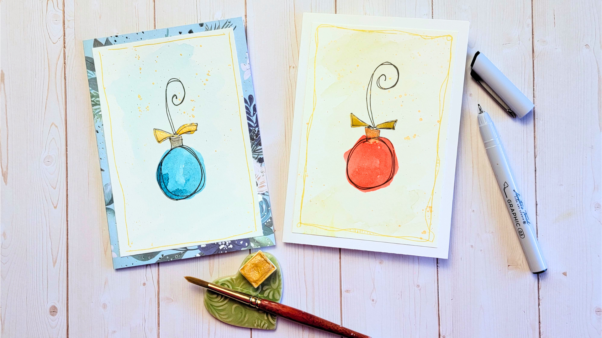
8. Doodle Designs: Do you ever feel like
you just can't think of a single thing to draw or
what to do for a project? I love having a sample, ideas in front of me. In fact, here's a few cards. These Christmas
lights, some holly, one sprig of Holy, whatever's inspiring
you leave those out. Keep that in front of
you to help you focus. Now, I love the sketchy look. One reason is because you may not be able to
draw a perfect circle. Draw it two or three times. Let's just practice
that different sizes. Generally, I try
to match my ends, but if it works great, if it doesn't work, I'm
not worried about it. Are you better at
larger or smaller? You want to have
more consistency? I made an ornament card that had three ornament bulbs on it. This one has a single, and so we're just
practicing circles. Do you want them large?
Do you want them small? See, I didn't quite match right there. We're just practicing. That's what all this
is for. In fact, this is still that
watercolor paper. We're not going to let
anything go to waste. That one just had two,
practice some of those. Whoops. Wow, that's
more of an egg shape. Just keep going, keep going. If you're someone
who really wants the most perfect circle shape, pull out your compass. I don't know where my
pencil sharpener is, but we'll see what
I can do with this. You hold your point down and
drag your pencil around. That'll give you a very
sharp, clean circle shape. A lot of watercolor
artists just want the most faded look of a pencil. They would go back
and erase some of that so it doesn't
show through as much. But that's all up
to you. I'm going to start adding the cap. I'm not making it
perfectly rectangle. You could do that very easily, but I like the looks more
like a crown, doesn't it? That's the top of my ornament. Now, because my ornament is
sketchy, draw it over again. Have it match the style of
your Christmas ornament. One thing you could
do is add a bow. Maybe there's some
tiny little um, ribbon here at the very bottom. I've just taken a triangle. Well, this one's more
like a triangle. Triangle shape, the ribbon
has been cut at an angle. Make that sketchy. I like when
there's this bottom piece, it almost looks like it's
the shadow, of the ribbon. Finally, the cap, the ribbon. And my hook. Now, a lot of hooks don't
have a curly cue at the top, but I just thought that was
fun. That was whimsical. I drew it long and drew a spirally almost looks like
the Grant Christmas effect. That is what can
go on your card. One single ornament. Maybe you want multiple. I have. This is all I have left
of that card that I had done was three ornaments and
a shorter hook at the top. The space down here, you could add your caption. You could write Merry Christmas, you could do a tag, you
could do happy holidays. My your season be bright, whatever your greeting would be. Leave some space for that. Either at the top
or at the bottom, that's one thing
you might want to think about or leave it off. Have this completely
centered on your card.
9. The Perfect Fit: Before we even
really get started, we need to talk about measuring. Sorry, we need to
start talking about measuring because it's
all about the envelope. Will you have a really
nice clean fit? I really like it
when things look about a quarter of an
inch all the way around, a quarter of an inch
around the card stock that fits and shows
off the watercolor. Now, you could completely
skip this step. If you wanted your card stock to be your watercolor paper, folding your watercolor
paper and you paint here and put
it in your envelope. That's completely fine. But for this project,
I'm, you know, want to save as much
watercolor paper as I can because I think
regular paper and envelopes are cheap
enough that I can just save on my
watercolor paper. I'm just going to size it down. How do we do that? Well, it
all depends on your envelope. I find envelopes everywhere, all kinds of thrift stores, if they're on sale at the store, like this one was
from a thrift store. Perfectly pristine,
clean envelopes, but they might fit
just this card. I have envelopes in all sizes. I have to start with
what's my envelope size. Let's take a look here. Looks like my envelope is five
or four and three fourths, four and three fours,
how tall are we? 6.5. Let's take a note of that. I said it was 6.5 tall and
four and three fourths wide. My envy is 6.5 tall and it's four and
seven fifths wide. Seven fifths, three
quarter an inch wide. Now, what are we going to
do with the card stock? Well, if I want a quarter of
an inch all the way around, that's a half an inch
all the way around. Can we do basic math? I hope so. In fact, I think I may even I
should I go into fractions? I'm going to say my card stock. Is going to be 6 " tall
and then it's going to be four and a
quarter inches wide. What does that leave for
our watercolor paper? We're going to subtract
another quarter of an inch all the way around half
an inch top and bottom. That leaves us at 5.5 " tall and 3.75 " wide. Now, this is the watercolor. Oh, boy, COLOR. Okay. What I want to share is what
if you have an 8.5 by 11, a typical letter size paper. How are we going
to measure this? Well, the card stock that
I measured was its front. When I open it because
I want a folded card, I'm going to put
my watercolor on the front and have a
blank card inside. How do I measure this? Well, I'm I'm
doubling the width. We're taking this number
times two, and we get 8.5. That's the exact width
of our card stock, of our letter size paper. The only problem is,
as an 11 inch sheet of paper and I need 6 ",
they're not equal. So yes, you are going to have some scrap and you can use that for a different
size envelope. You could do that for a
different size watercolor piece. It doesn't matter, or you
could just mail this. You could skip this
step completely and send it as a postcard
style in your envelope. Now, see, this is
a little small, but cut your watercolor
paper bigger. Not all cards need to
be an open faced card. You can have it single sided and put your
message on the back. What I like is that maybe your recipient would
want to hang this, set it on the desk, frame it. They have an original art piece. These are things to consider before you really get
into making your project.
10. Making the Cut: Just a quick peek on
how I cut my paper. I really like this paper trimer. What did we say? We're
going to fold it this way. I'm going to turn it, and
I'm going to look for that six inch length I like to just always cut in the same direction from
the bottom to the top. But I love this trick. I use this backstop to help
me fold my card stock, and I seem to get the
most perfect lining up of my edges perfectly. If you have some scrapbook
paper that you want to trim up for your card stock, I love this little
arm that comes out. You might want to just
look at your paper. Is it directional at all? Let's see that this
is coming down. Maybe I want it this way. There we go. If I fold it, remember, I'm looking for this to be 8.5 and it's
obviously much longer. I didn't need to turn it over, but I'm looking for 8.5. I didn't mean to
confuse you there. I will have a little extra. I can trim off. Then this
is going to be folded. I wanted 6 " this way. Let's lay it sideways. Cut my 6 " and the beauty of Scarck paper
that's 12 ". Look at that. I can have two card
backcksFold it over. We can put our
watercolor picture right on top and you'll see
a peekaboo of the blue. If your ornament was green or blue or gold, wouldn't
that be cool? Then you can have
this as your back. That's lovely. All right. Now we've got three
different pieces going. I'm going to trim up
my watercolor paper. I'm choosing that
smoother texture, we decided we wanted a
card that was 5.5 tall. I'm looking at my notes. 5.5 tall. I'm setting it in this
is nine by 12 paper. What I wanted to show you
is I love mass making. I think it's amazing. With a simple project like this, I can make many of them quickly. Now we want three and
three quarter inch. I can cut mine twice, two at a time, three
and three quarter inch. You see my three quarter inch. And like you saw, I took notes. I did swatches. I keep my watercolor scraps for all of those little
practice things that I do. Now I have four
watercolors and we can make our ornament cards.
11. The Business of Painting: I wanted to swatch really
quickly a few of the blues. One, because I grabbed
some scrapbook paper, wintery scrapbook
paper that was blue. This is Prussian blue. Let's see what else? I have P TurquiT is aqua green. Isn't that beautiful. Love that. I have the turquoise. That's on Yummy.
Well, beautiful. Beautiful. We said
that was PH TH. Sal turquoise. We have some other choices.
We didn't do our greens. Do we do our greens?
They were way up here. Let's look at my metallics. I have this gold. I've been using this
treasure quite a bit, but it's not exactly this color. I thought that was interesting. It's coming out more bronze. Copper might be nice. I think this is silvery? It says antique. I think this is twinkle. I think that's supposed
to be up there. Let's take a look at
what these can do. Remember, this could
be your ornament. You know, maybe you have
a sparkly ornament. But I was going to use
these as splatter paint. This one was called gold. This was my treasure. I didn't let that
set really long, did I see how treasure
I don't know, bronze, a touch of green to it. Treasure. This was gold. This was treasure. And who else did I say? Um, Twinkle. It's a very light color. I don't know if I'm going to
like that for an ornament. That might be great for a splatter paint,
shadow effect, maybe. Okay. I think, no,
I got this one. What is this? Disco. I wonder why my colors are mixed up. I don't
know what's going on. Say that's more disco
here. These are dry? Yeah. Now the thing with these, you can just now
see it on my gold. Right there. You can see
the shimmer starting. It's not just the
shimmer of it being wet, but there's actually metallic in the paint. We're
going to save those. I'm going to use the 05 because
I do want something bold. If I leave room for a
greeting on the bottom, let's put my circle about here. And we put a cap and we put our ribbon and our curly hook. All right? Tracing
that a bit closer. All right. Let's draw the rest. No There we go. Now, let's imagine all
our color combinations. What do we have here? I'm going to go with a very light Oh, boy, that's gorgeous. Remember when I
said, round brush has many different uses. We can use that pointy edge. What should we do on our ribbon? Should we make our ribbon gold? Let's pull up my gold then. Tiny. Look at that. You can use the side
of your brush to go really wide or scratch. Look at that. Even just paint lines at the tip of your brush. I'm going to let that dry. For this one, I think
I want a background. I want to make just the
lightest blue background. In fact, that's
probably even too dark. I'm just slopping this around. Scratchy marks are okay. I'm going to let that dry. This one, what should we do
as a background? The green? What was that? Oolive green, very
wet because I want it to be as light as I
can possibly get it. Okay. I think I might try a green
gold on the next. Too much color. Too much color. That's pretty cheery. The crazy thing is the paint will dry lighter and so you're just going to have this
hint of color in the back. All right. Let's go back to the blue. It's almost dry. I think I am going to
go back to that blue. I think that's such
a great color. See I'm laying my
brush on its side. Let's pick up some of
this is that twinkle. Twinkle will be the cap. In fact, I like some of the white showing and
another gold ribbon. Trying not to touch the other paint because I don't want these
colors to bleed. But I don't mind coloring
in the same color on my these areas where my pen went around twice. I'm going to make that
more of a shadowy area. We're going to set that aside.
12. Red Ornaments and Splatter: My last two, I'm going
to go into the red. I was thinking Scarlet
Lake for one, so one, two, three, four, five, one, two, three, take some of
my scarlet lake. Whoa, I think that's.
Let's check that. That's plenty plenty, plenty
plenty smeared around. Like you're a little girl
playing with lipstick. I just got everywhere. Fun. Let's try Windsor
Red on the next. Very saturated, didn't I? Shall we be a little
bit more neat. If you're going to have a
sketchy looking ornament, have a sketchy
looking paint job. I'm okay with that.
I'm having fun. We're enjoying the process. We're doing something handmade, we're learning
about our brushes, we're learning about our paints. There I got it touched. Taking off a lot of the
water on my breast. I'm going to lift
that up. There we go. Maybe this disco for
the cap on this one. What do you think? Now, what color ribbon
should we go for? A colored ribbon or
a metallic ribbon, maybe a green ribbon. Let's try this
olive green again, a bit more saturated. We'll give that a dry. And over here something
unexpected or treasure. We said that had a bit of a
green tint to it, didn't we? You can always go back over
your projects with more pen. Maybe you want to add poka
dots on your ornament. Maybe you want to add
background in doodles. This one did not have a
background and he's almost dry. We're going to give that
just one more minute to dry before we finish up
with splatter paint. 4 hours bladder paint. I'm going to go with
a smaller brush, getting that wet and
dipping it into my gold, getting it nice and saturated. You can just go ahead
and tap on top of your paint brush like that if
you want a little bit more. Here's your splatter
paint effect. There you go. Even a few on
the ornament looks so cool. Love that. Let's try it on our blue again
getting my brush wet. We want something very wet. See this drop on my paint brush. That would go straight onto my paper and leave
a water droplet. Not a big deal, but just
something you can watch for. Decide if you want it heavier on the top or the bottom
of your image. Oh, look at that shimmer. That gold is amazing. Maybe I'll try this glaze. Let's try some of that. A bit oranger. Can you see that? Oh, isn't that pretty? I love the shimmer when
you turn the paper. And our last one I'm
well, look at that. I've already got some
splatter paint overflow from my other paintings. I think I want to go with
some of this twinkle. See how we do with that. I'll move that one a little
bit more out of the way. That's the thing
with splatter paint. You can either set
up a big fortress around you so it doesn't
get onto your phone, get onto your things
around your table, or you just go for it. You look like an artist
who enjoys paint. Okay, can you see this
dry my brush real quick. There's a water
droplet right here. We can lift that up
with a dry brush there, I think that's neat looking. What a beautiful compliment. Now we'll let these dry and then we'll start backing
them onto our card.
13. Finishing Touches: Finishing up our cards here. I think they're all
dry and ready to go. We're going to glue
them to our cardstock. I have some paper, and my glue stick
is ready to go. I was thinking the reds would be good on the
white background, and my blue would be good
for the blue background. What do you think here? You
can always double check, see what catches your eye. Maybe the red looks best to you. Either way, we've got
our cardstock ready and my glutvy heavy dose
of gluestick on here, especially around the outside. This is why I like the extra
piece of paper for when I'm running off the edges
of my watercolor. Just to set that, I call
it my warm hand press. Making sure your painting
is really, really dry. One of the things I noticed
was my gold is very opaque and it hides that
line that I painted. I was wondering if
I could maybe draw in that line again
on top of my paint. I think I like that better. I noticed that over here. I like that better.
Now, let's glue down the white onto my red ornaments, making sure I have glue at
every corner, every side. And centering that as
neatly as possible. There was one last thing
I thought I might do. We could paint a border or
we could draw a border. The first idea is to help
the edges of our card stand out is to doodle a border. If you like the single
line, leave it. In fact, I think that
looks just fine. I'm ready to leave that one. I'm really tempted to
use my paint brush. This one last tip, a very thin brush. Well, there it is,
the two, my two. I think I want to use that one. This one that we did. I got a lot of water around
that feral there and do the same technique holding my brush as lightly
and as tall as I can. I'm good with squiggly. We have a very loose
painting and drawing. What do you think?
Should we double it up? Why not? Let's double it up. I'll lay my arm
on the table this time instead of free
floating like I was. Dragging very lightly. Very lightly. That's even
a lighter, thinner line. Okay.
14. Wrap Up: Today, we went from
a simple doodle and understanding the size of our envelope and
our Christmas card. We also spent some
time doodling, testing out our colors that
we wanted to use today, practicing the shapes
we wanted to do. And we came up with some wonderful handmade
Christmas cards. I hope you enjoyed this process and found it how
simple it could be to mass make and create
something that you can enjoy sharing and have a wonderful time experimenting
with watercolor. Thank you for joining me today. I appreciate your time. I hope you had as much fun as I did playing with
your watercolors, getting out some doodling, and mass making homemade cards. I know your family and
friends will appreciate that special touch that you
put together just for them. And you can use up your scraps. You can use up your
watercolor paper and have fun exploring color and
exploring doodling. If this class was
inspiring for you and you found yourself
wanting to get started, I would love to hear from you. If you would comment
on this video and especially if you
would review this for me, I would appreciate it so much. I love getting that feedback. Knowing what you learned, knowing how it can be improved, that is all valuable
information for me, and I would love
to hear from you. Please make a project
and share it with me. Put it in the class project
section, and let me see it. Let other students see it. We can all be inspired
by each other. You can find me on my
socials at Tammy Prera. I'm on Instagram. I'm on TikTok, YouTube. I would love to see you there, as well. Have a great day.
 Tammy Prara, Making Matters