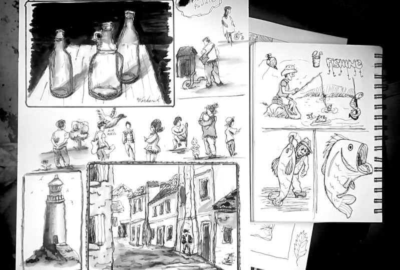
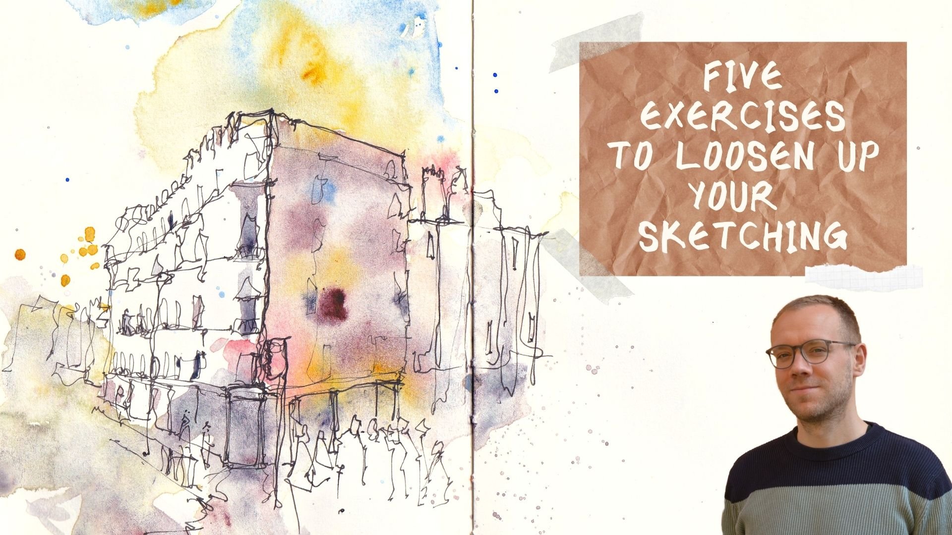
Transcripts
1. Introduction: We often think
about ink sketching is something which is scary. Every mistake is permanent. We need to be
careful building up our textures and our values with hatching and
little details. But today, I'm going to
show you another way. We're going to be
using basic ink, the kind of ink that comes in a normal fountain pen or in the pens you can buy at
your local supermarket. This ink is not permanent. It's water soluble. And that means we
can bring a brush a little bit of water and suddenly create
magic on our page. My name is Toby, and I'm
known as Toby Sketch Luke and I specialize in creating
these kind of loose, quick ink sketches or
sometimes ink and watercolor, but bringing things to life with that spontaneity and
fun on the page. It might sound scary, but
the process is super simple. It takes only a few minutes, and there's just two steps. I'm going to guide you through a series of different
scenes from a windswept lighthouse to
a quirky little street. And I'm going to show
you different ways that you can explore with
these techniques. By the end, I'm sure you'll have built a huge amount
of confidence. Develop some new ideas and
techniques that you can take forward to sketching any
scene and having fun with it, bringing it to life. Now, if that sounds
like a little bit of fun, let's get started.
2. Your Project: Okay. Today's project is simply to create a
page of sketches. I'm going to be drawing
along with you, using a little bit of
water to bring them to life and showing you a variety
of different techniques. You can use any water
soluble media you like. I'm using ink pens, and that's the focus of today. But you'll be able to use these similar principles
using water soluble pencils, graphite, watercolor pens, and many other things that you
might have lying around. In the project
resources gallery, you will find a few
reference photos. Those are the ones I'm
sketching along with you. But you can use
your own sam too. When you're done, go to the Class Project
Resources Gallery, click Create Project, and
you can take a quick photo. Upload it there, and
I'll come back and give you some words
of encouragement, some advice, and answer, of course, any questions
you might have.
3. Testing Out Pens, Ink, and More: When we're talking
about ink sketching, often we're thinking about
using expensive pens, expensive ink, things which are water proof so that we can play with water colors
on top, for example. But in this class,
the idea is that we're going to look
at every day in everyday fountain pens or
other kinds of pens and water soluble media to
create really quick, moody fun sketches
in our sketchbooks. In this first lesson, I'm going to take you through
a few different ideas of media you might use. Now, I'm going to be using
a basic fountain pen with some basic incont
But there are loads of different options for
what you might want to use, and I'm going to show
you him right now. Today, it's all about simple and flexible sketching process. The kind of thing you
can do inside and out. So I'm using my
Strathmore sketch book. This has got A five of a half letter sized
watercolor paper in. And it's great for
doing lots of things. I've got lots of simple
doodles of people in. But I also have some scenes here where I was out and about, and I used a little
bit of ink or Here, a little bit of soluble link. And you see this
gentle moody tone that you can achieve very
quickly with soluble link. That is what we are after today. It's a really beautiful
and fun way to sketch. Now, the advantage
of a sketch book like this is it has
watercolor paper in. So when we do add water, and this is another example of some soluble ink I used to do a quick sketch.
This paper doesn't. Buckle, you can see it's
still nice and flat. That just makes it a little
bit easier to sketch. Now, if you don't have
watercolor paper, you can use normal
sketching paper, and it won't be ideal, but it will be
certainly good enough. And like that, I'm
just going to open out my sketchbook onto
a brand new page, and we can have a
look at the kind of pen we might want to be using. And normally as ink sketches or ink and
watercolor sketches, we'll probably be looking
for something like this, a fine liner with a
nice controlled nib and inside is waterproof
or archival link. But today, we're
after normal pens, and I have a big variety of things here that you
might want to try out. I'm going to mostly be
using fountain pen today because fountain pens I
like as an affordable, refillable, ecologically
friendly option. It also has some
other advantages. If I take this pen, for example, we've got some ink in there. I'd encourage you just to grab whatever pen you're using and do some scribbling like this
and see what happens. I'm going to just compare a couple of different
pens, and of course, I've prepared some
specific things about these pens today. And if you have a close look, can you see what's different
about each of these inks? It becomes very obvious here, but we've got three different
colors of ink in them. And that is one of
the key advantages to using a fountain pen. Now, the ink look a
bit different now, but if we take some
water to them, that's when things
become dramatic and really interesting. This green becomes really
soft and almost neutral. That sort of gentle
shadowy feel. This blue will become
bright and bold and really kind of
exciting and in your face. And this red becomes, maybe even a little
bit sinister, or perhaps just
bright and orange and happy depending
on how you feel. If we want it, if you have
a few different things, you could always start
mixing together and see these inks play together. Now, these are the
kind of techniques that you can have
a real fun with, even if you have two
of the same pen, two different pens, two
completely different things. You can start letting them interact with a
little bit of water. And we'll be doing
some of that at the very end of this class, but most of this class is focused on the sort of basics of getting to know your
pen and getting a little bit of movement
with water like this. So next, what else
could you use? Well, there are plenty
of things out there in the sort of normal high
street shop or in the UK, you can get something
like this pen. In Tesco or in Sinpres'ss just an ink pen and
ink roller pen. Makes a nice black line and sure enough with a
little bit of water. We see that's nice
and water soluble. Then we could use
something else. Here, I've got a
watercolor marker pen. Now, on one end, we
have this big brush. We're not going to
be using that today. We're going to be
using this as if it's a pen on the other end, we have this line
maker a little marker. Again, we can treat
that exactly the same. We can get this beautiful
wash of color out of it. There are lots of other things. For example, here, I've got a refillable brush
pen, and in this, I've got some ink which
I've diluted down. This is water soluble ink, and you can see, it's
nice and light and pink. Then you can compare
that with this. This is a pental brush pen. This has got dark black indio. Now this indic will be
waterproof when it's dry, but when you get to
it quickly after you've drawn it on
the page, again, it's got this wonderful
water soluble nature which you can start
to play with. And if we start thinking
even more outside the box. You could even do this class
with water color pencils or there are some funds like
these graphite pencils. So these are graphite aqual
graphite, but water soluble. So if I draw let's draw a
little person, very simply. Nice shape based person, hands in their pockets, and we could come in
with a darker pencil. That was a four b. This is a six B. Loading up this page with
a bit more graphite. And we come back in
with our same brush. Look at that amazing
movement of that graphite. Again, just instantly creating something
really interesting, fascinating,
beautiful, and moody, and dramatic on our page. So the first challenge for
you is to have a play with some paper and whatever
pen do you have at foam and discover
what inks work well, what amount of water works well. And for the bruh,
just use any bruh. This is a size 12 round. I've got a quarter inch flat, and these are just basic
synthetic brushes, and all of them will be
plenty good enough to start producing amazing effects
with your various inks, whatever you have at home.
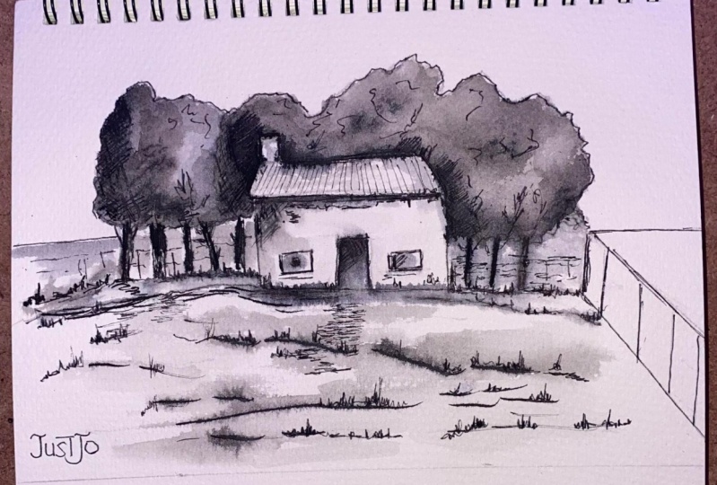
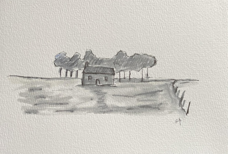
4. Get Started - Simple Techniques: What I'm now going
to do is break down a few scenes for you
in really simple ways. In this first scene, and all the references, by the way, are in
the class resources and projects fold that
you can download them. But in this first scene, we're just going to
use soluble black in the kind of ink
you can get in most fountain pens in all sorts of roller pens and lots of
other kind of pens at home. And I'm just going to show
you a two step process to create beautiful ink
sketches really quickly. In this first step,
we're going to be looking at three concepts. One is shapes, one
is ink loading, and the third is the gentle
application of water. The sam we're sketching, you can download from the class projects
and resources tab, and it is up here as well, there's a little reference
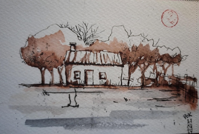
for us to follow. And you can see it's this rather dramatic and fascinating cottage in what looks like very
much the middle of nowhere. The first step of our process is just to get
those very simple shapes, and we're not going
to worry about anything clever at
this stage at all. So we're just getting
these very simple shapes. So we've got a rectangle. Within that, we've
got a rectangle here. Now we've got a sort of
square here, square there. Now, remember, we're going
to be adding a bit of water. So lots of these
lines are going to get sort of washed away. They're going to get
moved. So the idea here is to focus
on loose shapes. They don't have to be
perfect because they're going to get moved
by the water anyway. In the background, that
couldn't be ever more trees. So instead of getting each
of these individual trees, let's just get the
outline of this sort of crowd of trees wh
you're coming around. And then all the way
out here as well. And one last touch would be to bring in our horizon line,
which is coming across. Approximately here. And we've got a little of fence line coming
in here as well. And remember, really approximate because we're going to be adding water and that water
is coming in 2 seconds. Because the next
part of this stage, we've got this very
simple set of shapes. We now just need to have a
look at where are our shadows. So we've got a little shadow
on our building here. What I'm going to do now is
this concept of ink loading. So I'm going to
go over this line and make it a bit folder. Now, that literally
means it's now more ink loaded onto the page. That means it's going to
be more ink for our water to activate and move. We
can do the same here. Different way of inkloading would be some gentle hatching. We can see underneath the bottom lf of all of these trees. It is dark, so we'll
do this method for ink loading over here. And then we've also
got the sky very bright versus a slightly
darker landscape. So perhaps what we want to do is a little bit of ink loading
along the horizon line. And also maybe even just a
few little textural marks in here just to start imagining
the bits of grass. And like that, our simple shapes are done in just a
couple of minutes. We can come back
in with our brush. I've got my size 12 round, the same as I was using earlier, going to make it wet and
then dry out the belly so that the brush is
damp but not soaking. And all we're doing now is
we're coming in and putting water down And just
sort of gently, not scrubbing the ink, but gently manipulating
and moving the ink. And we'll create this
kind of sudden sort of big area of contrast and movement and softness
and loveliness. And we can be quite
abstract about it. We can see, look, my
brush is now drier, so there's a lot
less ink movement. So this is where I'm
going to start doing the less shadowy areas. Then I can come
back in underneath, and we want this whole landscape to be slightly toed
and look what happens? If I just apply water
under that line. Do you see how that
line flows and floats down to come and meet my
brush and all the water? Suddenly in a matter
of seconds are scene is very much
coming to life. If we wanted, we could
add a few extra bits. We could find within this house. We have a few smudges
on the wall, don't we? So we can just start being
more gentle, moving it around. We can even start creating some little lines on that roof to start
getting that texture. And everything will get very so and very loose,
and that's okay. That's what we're expecting. Last thing, we can create
some of these lines. Look, join those trees up. So we got those tree trunks. Now they're kind of higgledy
piggley coming down, meeting the
landscape. That's it. That is step one done. We've done our simple shapes. We've applied gentle shadow, and now we just let it dry.
5. Get Finished - Layering Ink: In this second step, we just want to wait
for our page to dry, and they will come back and apply a couple more
bits of linework. And all we're thinking
about now are restructuring so that we get our shapes back where
we've washed them away, that's a little bit more ink
redefining those shapes. We're then going to
also think about a little bit of extra
contrast and texture. That again is just simple
minimal touches of our ink, maybe a little bit more water in places to build up
contrast to build up the difference between
light and dark where dark is another
layer of ink. By the end of this
very short video, you'll have finished
your first sketch. And we can see and we can touch and see that
we are now drying. So we can safely come
back in with our pen. Now, what we're going to do is a little bit of restructuring. This is where things
get interesting. We add the sort of
certainty to our scene. Here you can see things have got gentle and washed
away. That's great. But now we want to come back and just reinvigorate
some of those lines. So, look, this is our line. Where we have that dark shadow. Behind it, we've got this big contrast between
the house and the trees, and we're going to make that
contrast through a nice, bold line as well. So now the house is
sort of starting to lift forward in front
of the background. And this is what we're
trying to achieve. Now we're trying to achieve
more certainty in our scene. We're also thinking about, you know, maybe we want
these windows blacks. Instead of using water
to create contrast, we can just use our pan and black them in and
block them in like so. Now we have really deep
contrast. The same here. Maybe we want this
line really bold, so we'll make it
bold with our Pen, that's the deepest contrast
we're going to achieve. Underneath, we've got more sort of textures and things
to think about. So this bottom of the house kind of has grass and
things against it. So now we can make some little grass like
lines and shapes. And we can continue doing that into the front of
our scene, as well. So now we can dip
and dab around, little touches here and there. Even though we've not
got a bit of tone, we can add these kind of
little grassy textures, all just adding more certainty. And the idea here is, as I said at the beginning, this takes only a little while, but it becomes
really interesting despite the brevity of
the time we've spent. We've got the other
obvious object. Haven't we got
these lovely trees, and we've already made some tone for the trunks without
drawing them? That's great. Now we can come in with much looser lines and start maybe dividing up
some of these trees, adding in again, little
bits of texture. Now this is
redefining the shape. It's also reloading the page
with ink should we want to apply more water to
any particular place. By applying these
little texture marks, we are again promoting that contrast between this house and these dark dark trees. What we don't want to do in a two step process like
this is come back and apply water in the
same really loose way we did a moment ago. But we've got options. We've got options, haven't we? We can be more delicate, more careful perhaps
as one option. So let's see in a
moment how that works. Here, we created some lines with our water colors already
or not our water colors, but our brush and
our activated ink. And we can even create
little dibs and ds, little textures on
the house to give it that textual feel. Bring it apart from
everything else. If we wanted as well, look, there's some shadowing
things going on under here. So we could bring
that out now as well. These are all little
observations you can make. You can decide how
important they are for you and the
piece you're creating. Now, for me, I'm going to
leave this little segment here as nice, clean,
negative space. I'll have this fence line coming towards us with a
little bit of perspective. And then that I think
is all of my ink done. All of my little
touches of ink done. To elevate this the
final tiny little step. I'm going to come back with
my little brush this time. Again, we can dry
it off if we're concerned about our control
or how much water there is. We can just activate
little areas of this ink. So instead of smudging
the lines an awful lot, this time, we can just
enhance that ink. In the trees, we just come in and apply gentle little
strokes of water. And here we're
enhancing the contrast, enhancing, but not
washing away completely. And this will take some
experimentation to find out your
little happy place, exactly how much you like applying in which
different places. But as you can see,
it's very quick, and you will very quickly
find your happy meeting for how to add little touches
of water at this stage. And there we are. We have our fun dramatic little
scene already completed. There are other things that
we could do to enhance this. But as a simple process, I'm going to call
this unfinished. I'm going to pop my
initials in the corner. And of course, I like to hide my signature
somewhere else as well. So that's my little
hidden signature. And then in the next few
lessons, we're going to move on, and we're going to
start playing with other scenes doing
continuous lines, applying different inks
and having a bit of fun just seeing what else these simple techniques
can achieve.
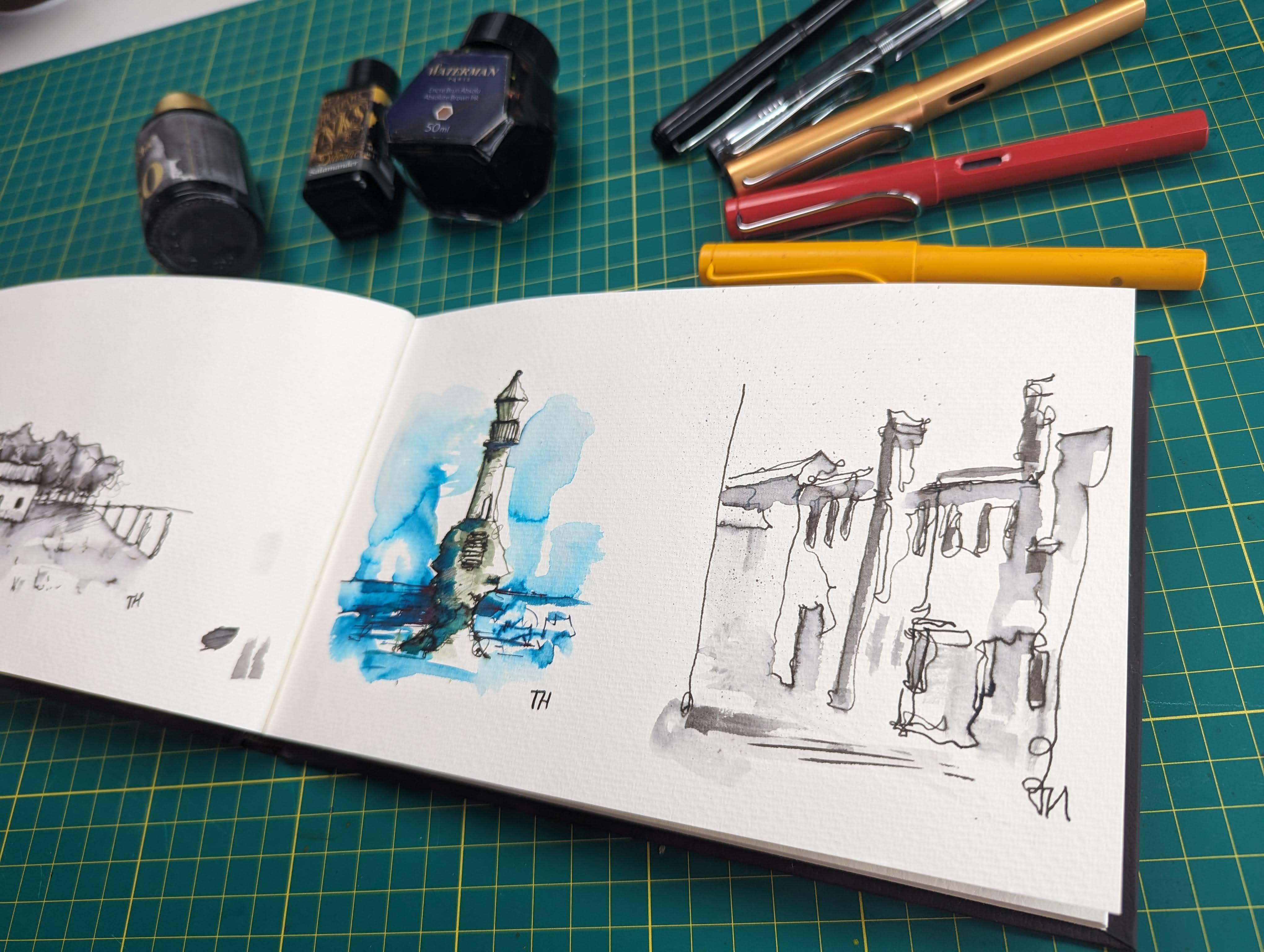
6. Dramatic Lighthouse - Mixing Inks: The next idea that I
want to play with is the idea of using
different colored inks. In the case that you
only have one color ink, you can still number
one, do this, or you could use water colors. You could use water
soluble pencil to just get two different colors done on the page in that
initial stage. And then when we activate
things, things go exciting. They are really fun. So I'll show you the inks I'm
using as I use them, but I'm essentially
just going to use two lovely bright colors to create a really
dramatic lighthouse scene. So we're going to move this
scene off to one side. And we're going to start playing on a new sheet of paper here. And you can see that
reference again, again, downloadable in
the class resources. We have this absolutely
fascinating lighthouse. And all we're going
to do this time. It's a little bit of fun is play with a couple of
different colored inks. And we're going to
play it fast and loose with our lines as well. So the lighthouse itself, let's pop it over in this side. We can create ourselves
a little sort of half page scene here. And I'm just going to go for it with a nice sort of
continuous line. Remember, if you're scared
of continuous lines, well, this is the perfect time to try it because when we come
and wash the colors, everything moves anyway,
we can always correct that line on the
sort of second go. This is a green in. It's a green ink by diamond
it's called salamander, which I think is a lovely name. And just going to
come in and get the idea of this lighthouse
on its big sort of rock. And then come down here, get the other side
of that big rock. Again, we've got so many opportunities
here for inkloading. Look at these dark shadows. We've got dark outlines
in places as well. Just amazing opportunities to get lots of ink on the page. Down here, we'll just
load one side of this lighthouse because you can really see some dramatic
shadows, can't you? And hopefully you're
starting to imagine again, this is just that little
bit of preparation we do, but you're starting to
imagine just exactly where you can put your ink and how you can load
it on the page. Now, there is one thing about different inks and that's how much are they going to activate. We saw in the first lesson, perhaps that this
green one is less dramatic and say, this blue one. This blue ink is also by
diames called little Cris. This one is super dramatic
and when it activates. Here we're going to
come across and create a nice bold horizon line. Then lots of just messy
messy shapes coming around. And why I hear you ask
why messy shapes well. Look at what we're
trying to recreate. Look at that amazing, that dramatic sea we're
trying to recreate. Just imagine with pools of
water what might happen if we have lots of random
textural marks in our sea. There we go. Like that, I think we're ready to just apply our
water straight away. That's the brilliant thing
about this technique. It's so quick and so fluid. Now, let's start in
the lighthouse so that we have an idea of
what's happening. I'm going to come in, just make sure my brush isn't too wet, that makes things too
uncontrollable and look and this greening. Has a very gentle activation. It's not like the
dramatic effect even of the dark ink
we were using before. That lets us be nice and soft. We've got this kind of soft central area of our lighthouse. Then that's going to contrast dramatically with our crazy, bright bold blue ink, and here, the challenge is going to be to
keep it textual. So we want different amounts of water in different
places on the page. But we also have this blue sky. Don't we so. Something that
could be fun to do would be proper load of water in that sky and just bring
it down and connect it. Do you see how just by connecting some water to
this dramatic blue ink, we'll get this sky seeping up. This is where understanding the kind of ink you're
using, the kind of pen, maybe it's watercolor pen, maybe it's watercolor
pencil even. What can it do for you? How does it want to behave? Instead of me trying to painstakingly paint
this sky, I've cheated. I've let the water color effect
of the ink, do it for me. Like that, I'm going
to let it dry. We will see what it
looks like when it's dry and we'll apply a couple of little
touches in a second. And we are back and
pretty much again dry? And what they're
going to do again. Like before, is just find
those simple shapes. It's a bit of restructuring. So I'm going to come in on our
lighthouse with our green, and I'm going to just find
some textures and details, some things which have
been washed away, and considering as we go, are there going to
be other touches of water that we might want to add, or is this just going to be ink we're popping on
the page to stay there. I can find little points
of contrast again. We've got this window here. This shape here, this doorway shape has an extra bit of shadow we
didn't get the first time. Then all across this lighthouse, we've got brick shapes, we can start
suggesting if we want. Down here, we've got
a funny staircase. There's no point
in popping that in the first time because
when we had the water, it would have all washed
away, but now we can suggest it with
some simple lines. And here we can just do maybe even some really
dense hatching to get these dramatic shapes of dramatic contrast in on the underside everywhere
that we find it down here. I'm going to just apply some really dense
hatching like say. Under there gets
loose and flowy, doesn't it from all
of that amazing sea foam jumping up at us. We've got a couple
of other areas where perhaps there's a little
bit of extra darkness. Before moving on
to the blue ink, I just want to see what
happened if I apply again, little touches here
of water just to see, I don't want all of
these texted lines. I want to wash some of
that hatching to one side. I want to know what it's going to look like when
I've done that. I think again, we achieve
a nice much gentler look. I think that is working, in fact, much better
than I hope really well. And it's always nice when
things happen like that when it goes better than you
hope. Don't worry. This process like
watercolors will often also go the wrong way. That's fine. A part of
the experimentation. I'm going to jump back in
with a more dramatic ink. Here, we might just
use it to create some deep contrasting
shadows to pull apart this funny little step
laddery like structure, the lighthouse is based
on, this little cliff. We can pull it apart from the sea just with
a few extra marks. We can even add in some of
that blue into the green. Make things feel a little
more fluid. Having done that. Let's come back in
with our brush again, a little gentle
touches to move things around to soften things to create that shadow
and that overlap. I can even use that blue and paint it into the
green. Do you see? We can paint it in there and then getting even
more drama fluidity, that chaotic and fun feeling. Here we've got patches of water. I could touch my brush to create some more textures and to bring that water across to the
lighthouse at this stage. And there we go like that. I would say pretty much done. Now, we don't have to stick
with two colors, of course. So if you wanted, you
could even come back with your black pen and really just invigorate some
of these outlines. That's one option. You could
come in with what color. You could come in with a pencil. You could come in
with a third layer, a fourth color, you know. There's so many
things you could do. I'm showing you the basics. What I would love you
to do is to show me what you thought of and what your different tools
can also achieve. And like that, just a few
little touches of black ink. Perhaps they add a third, fourth, fifth, I don't
know, an extra dimension. And don't forget
when you were happy, when you finished sign it, and I'm going to
put my signature hidden in the painting as well.
7. A Quirky Alley - Lively Techniques: The next scene we're going to
do is this colorful alley. But with ink, except if you
start mixing lots of inks, when we're just out and about
sketching with one pen, we don't have color, do we? That doesn't mean
these colorful scenes can't come to life with our ink. So we're going to have some fun, get playful and do some more
interesting techniques. Going back to our black ink, or if you're using it, watercolor pencils,
watercolor pens, or just normal ink pens, and seeing what can happen
to make a scene interesting, even if the obvious
thing is something that our ink doesn't clearly achieve. And we are back. We've got our lovely couple
of images here, and now we're going
to create one more to fill up two
pages of our sketchbook. And I'm coming back
to my black ink. And what we have
here is a quirky, colorful street with a
little bit of perspective, but we don't have
color. We have black. But that doesn't mean we can't
have a really fun image. Now, I'm just going to stop
by drawing straight away, going right in for it. And this is this bright orange
building off to one side. That can be our
frame of our scene. From there, I'm going to have a play with one
of my favorite things, which is, of course,
a continuous line. And when we use our
ink in this way, Especially if we're
going to activate it. We will find there is so
much joy in simple scenes. We'll do a couple of
other things after as well to make it even
more interesting beyond just our quirky sort of fun continuous line drawing. What I'm doing is going up
and down, finding the shape. So this is the green building. Then I'm going to find
the next roof line. This is this kind of
light pink building, and we'll come down. And this is the kind of drop coming out of the
light pink building. And then we've got a window. I've not got every def. I've not got every window. And then we're onto this really bright bold, pink building. Then the move building here, got the chimney
really tall up here, which just catches
the top of this roof. And we've got a few windows, you'll come back
along and add in. We got a guttering coming
down there in a window. Don't worry if you can't exactly follow what I'm
doing. The idea here. What I'm trying to
get across to you is that I'm just
exploring the image. I'm having fun moving around. There's a little wet
dollar on my page there. It's mend my line a bit fuzzy, and that's also really great. There we go, we've reached
the edge of our page. I'm going to put my
signature down there. Notice how lots of
this is unfinished. I haven't finished
off the whole bottom. But hopefully, you can
also look at this, look at the reference and go. Well, actually, it does
remind you of that. At least for me, it
reminds me of that. And for you, just get to the point where you are
drawing quickly and happily, going, Yeah, that's got
the key elements in. Next, I'm going to come
in with my smaller brush. I don't want to apply lows of water of this because we'll
create too much chaos. It will be too challenging because it's already a
loose continuous line. But I do want to come back and find some of
these key shadows. I've got shadows underneath
the roof and in the windows. We've got a shadow
coming down here. By picking out these
key little shadows like shadow going back here, we're getting that shape. We're understanding the
greed nature of the scene, despite it being a really
quick really loose image. All of these Lower ground floors have a bit of shadow as well. I notice I'm having to refresh the water on my brush because
I'm using a smaller brush. It's not running out
of ink really quickly. Instead, it's being
nice and controlled. I can get really gentle tone
here, really gentle tone, really soft movements
of the line, and then I can come back and rewet it and start
the process again. Doesn't need to all be quick and immediate and sort of
brutalistic in our application. We can also be really
delicate and gentle. If you feel you miss things out, you can paint them in with
your ink if you want. We can come in,
take some ink from somewhere else and
start doing textures to suggest these paving
slides and get a little bit of perspective in the front and maybe even just soften out some of
these other areas. Up here's another roof line. We'll just get that. Shadow in. And pretty quick. Really quirky. We've got this image, and it's fun. It wasn't hard. There's a couple of other
interesting things. I wanted to show
you razor creating fun on the page without fuss and without having
to be clever with color, without having to have loads
of different supplies. A number one bit
of ink flicking. So with a fountain pen, you
can literally just clam down. Look at that, gently flicking. And you create this
kind of fun texture. That's lovely for C. I could
have done it over here. It's also lovely just to create business in
a simple image. Having done that, I can
also take a bit of the ink, and I could literally paint with the ink straight off our pen. Now, do you see how this
gets a much bolder ink line? So, suddenly, we have another way of kind of
creating bolder inc. We don't have to always
go back to drawing lines, here and here, we drew
more and more lines. Here, we can apply.
Look at this. Look how bold that is.
And that's just coming. It's like treating my pen like a watercolor reservoir,
really, isn't it? That's great. Yet another
flexible way to use our pen. If you don't have
a fountain pen, you might find it more
difficult depending on the pen. But what you will
be able to do is, for example, if I had
a bit of plastic gear, I could draw on that, or
even if I drew on my page, I can make a dense black area. I can just lift up
the ink from there. In fact, let's just do
that as a little example. So if I just draw a
nice dark area there. And I wash away all the
ink off my pen, my brush. So you see my brush is clean. But now, if I come here,
I can pick up that in, and let's do some tone up there. Look at that. Amazing
instant tone. You can see here. I
can pick up that ink, I can paint with it. So there are lovely, simple ways that you
can get inventive. Do little flicks, with your bruh with your pen. You
can change the ink. You can do all sorts. Have fun and explore,
try some other scenes. In the next video, we're
going to do one more thing. We're going to do some really quick
People a bit like this, but we're just going
to level them up with a tiny touch of water. Okay.
8. Quick People: Now we're going to have some fun drawing some really
quick people. Recently, I've made
it a challenge to people every day to try and improve how I'm drawing
and creating my people, whether that's big portraits or tiny people in
the backs of scenes. So this is a great exercise for anyone wanting
to add people. It's a really fun way to
explore how simple people with a little bit of tone can look really fun on our page. So let's open a new page of our sketch book and do our
final project together. This is going to be about
sketching little people. You can see I said I've got
some people to the sign here, we're going to be
doing exactly that, but a bit different. We're going to be
using a bit of water. With these people, you can
see they're all very simple. All I'm doing is taking shapes. We've got a square or a circle. That's our head. Underneath, the simplest would be to do
basically a triangle. That's our body and
then underneath, we can do a triangle
for the legs. We can think about where
the shadows would be. We can do our ink loading, little bits of textured
ink loading as well. And we can move on
to the next one. Let's make this one
more complicated. Let's do a lady with
long hair perhaps. Again, we can do some sort
of ink loading around, keeping it really simple. She can have a big dress on. This is just a big triangle. And then little feet coming out of the
bottom. There we go. And what should we
do next. Let's just create a few smaller fun people. And I'll just so that you
can do this really quickly, really simply start putting arms in and getting someone
holding a phone, perhaps have someone
wearing a hat. All you're trying to do
is use simple shapes. And these simple shapes
sort of build up into scene with perhaps
a little bit of action, perhaps a little
bit of movement, perhaps a funny
little pose here. This idea, hopefully a
man walking away from us. And let's do a couple more
of these very simple ideas. We'll do an older chap here, holding a little walking stick, for example, They can be moving
slowly in our direction. Then let's do some
really quickly, almost hieroglyphic
like people down here. A very simple ideas from these very simple
shape based people, we can just bring them
to life a tiny but I'm going to use my
smaller brush again and let's start here and see how just this tiny bit of
tone applied with water. Can just make this
person feel different. They can feel more
free D. They can be connected to the ground
through a simple shadow. We can give this lady more colorful feeling
hair and a shadow to suggest where that
hair is interacting with her body and
creating shadow. Connect the feet to the
ground with little shadow. The same ideas are going
to work all over here. We can be gentle, we can be more loose with
our color or the way we're applying the color or tone rather I should
be saying of our ink. It's just a way to do yet another different
thing with soluble nk. Here, these very loose people, they can suddenly
have a whole body. They can have legs coming down. They can almost evolve into those carrot type people that we might often paint
in watercolors. Let this page has just come
to life really simply. If we wanted to
have even more fun, we might want to come in. Even whilst the
paper is still wet and add little touches
of other rinks. So here I can add some green in creating these other
aspects of these people, building on little
bits of detail, you know, hand in a pocket here, little legs there, even a kind of perhaps little tree
in the background. Little simple scribbly touches. You can imagine
sitting in a cafe, perhaps you have people
walking past you. You're just picking out that
guy had an interesting gait or was holding maybe this
is no longer a fake. Maybe this is like a
little tankard of beer. This person has an
interesting stick. I just want to catch their gait with my little doodly sketch. This lady maybe has a little bright red patches on her dress, just catching the sun and
looking really interesting. We just want to capture
those tiny aspects about the people we
see in day to day. Like that, using our soluble nk, the normal links we get
in our fountain pens, is another little project
that we can have fun with and just play with and
create life on our page.
9. What next?: Thank you, everyone
for joining me. It's been an absolute
pleasure creating this kind of loose and
quick sketching with you. I hope you've enjoyed yourself. Please do leave me
a review if you've enjoyed the class and you
can press the reviews time. And it takes literally a
couple of minutes at most. Also, as I said before, do upload a project. I love coming back, seeing them, seeing the creativity
of you guys, and leaving a
little comments and supports and encouragement
and answering your questions. You can find more of my classes on my skill share profile, as well as finding me sort
of around the interweb at Toby sketch Loose
or on sketch loose.uk.
 Toby Haseler, Urban Sketcher, Continuous Lines