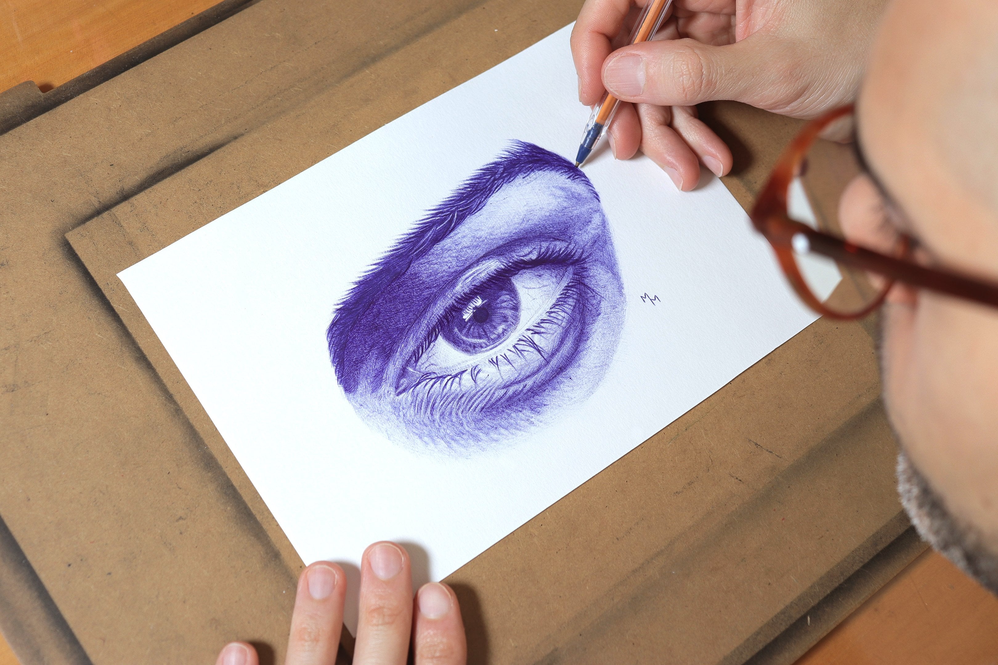
Transcripts
1. Introduction: M many beginner artists and even more experienced
ones believe they need a huge variety of
colors to create high level drawings
with colored pencils. Because of that, they often
spend a lot of money on expensive pencils or sometimes they give up before
even starting, simply because they
feel intimidated or incapable of drawing certain subjects when they think they don't have
enough materials. But what if I could
show you that it's absolutely possible to
create excellent drawings, even realistic ones with a very limited range of colors and teach
you how to do it. Hi, my name is Matus Macedo, and I specialize in
realistic drawing. In this class, I will not only
prove that it's possible, but also show you
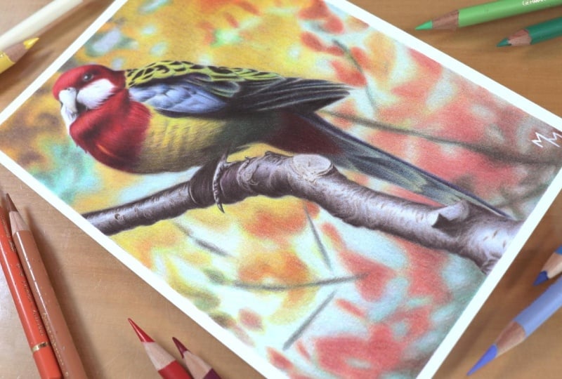
how you can create beautiful drawings using a set of only 12 colors or whatever colored pencils
you already have at home. I will show you how I drew this bird using a 12 color set. And I'm sure that if you follow this drawing
along with me, you'll feel much more confident
using colored pencils, even if you only have
a limited number of colors available. The secret lies
in our ability to mix these colors to
achieve the tones we want, and I will show you exactly
how to do that in practice. I will guide you
step by step through the entire process I
followed to draw this bird from the initial
sketch all the way to the final touches so that you can achieve
the great result, even if you're a complete
beginner in this art form. So I'm ready to get the most out of fair
colored pencil set. If the answer is yes, grab your pencils
and let's draw.
2. Class Project: Welcome to the class Trama
Bird with 12 colors. As the title of the
class suggests, I will show you how I drew this bird using a 12 color set, even though the subject itself contains a wide range of colors. I chose this subject
precisely for that reason to demonstrate that we can achieve a wide
variety of colors, even with a more limited
set of colored pencils. As you can see, this
drawing is not a large one. It was made on an A
five sheet of paper. This is not a long or
time consuming project. You don't necessarily
need to draw the exact same subject in
order to follow this class, but I do think it's a
good idea to do so, especially if you're a beginner. It will make your life
much more easier. Regarding materials,
I would simply recommend use more
professional quality pencils and paper since
they allow you to layer colors and create
blends directly on the paper. I know these materials
are more expensive, but you don't have to buy
them in large quantities. Speaking of materials,
in the next lesson, I'll briefly show you exactly which materials I use
to create this drawing, including some brand
recommendations. I'll see in the next video.
3. Materials: In this lesson, I'll show you which materials I use
throughout the class. Let's start with the
most important material. The whole idea of this
class was to create a drawing using only 12 colors. And in my case, I chose the 12 color polypromo
set by Faber Castel. I will provide a list
of the colors I used, but of course, you don't have to use the same pencils I did. You don't even need
professional grade pencils to complete this exercise, although higher
quality pencils do help Professional lines from
brands like Kahan dash, Prismacolor, and Dervent are among the most popular
and reliable options. The paper I used is Strathmore
300 Series Bristol Smooth. Once again, you don't need to use the exact same material. What I do recommend is choosing
a paper with a good wave, at least 150 grams/square meter, so it can handle multiple
layers of coloured pencil. Since I prefer a more
realistic finish, I usually go for
smooth surface papers. In my opinion, Strathmore
Bristol strikes a great balance between being smooth and still having a
good pigment absorption, which is not always
easy to find. A more affordable option, I know is constant graduate, which meets my criteria
for realistic drawing. There are many other excellent
options on the market, such as fabriano,
Stonehenge, and Hemul. However, availability will
depend on where you live and whether you plan to buy your materials in a
physical store or online. You can sharpen your pencils using any sharpener you prefer. I usually use a crank sharpener, which I find practical
and efficient. However, for more precision and to make the
pencil last longer, I often refine the tip
using a craft knife. I used a Posca pen, but only to sign the drawing. This is completely optional. An alternative
would be a gel pen, although I personally don't
like using that material. In this class, I teach two different methods
for grade sketch, and here are the
materials I use for them. For the first method, the transfer method, I use a regular sheet
of printer paper. At one point, you also need
tissue or toilet paper. I use the four B graphic pencil
I also used masking tape, both for the sketch and to fix the drawing onto
my drawing board. For the transfer
method, as well, you'll need a Bwpoint pen, and I use the red one. For the grid method, I use the B graphite pencil, and I also use a roller
to draw the grid lines. For both methods,
you need an eraser. To lighten the sketch lines, I use a needed eraser, which is a very useful tool. I also use a regular
plastic eraser. This one is in a
pen style format, which I find very convenient. And that's it. These are the materials used
throughout the lessons. Next, watch the videos on the two different
sketching methods to better understand how
these materials are used. See you in the next lesson.
4. Sketching: transfer method: In this video, I'm going
to teach you how to create a perfect sketch using what
I call the transfer method. Of course, you can draw your sketch freehand
if you prefer. However, many beginning students don't feel confident
drawing freehand. And since that is not
the focus of this class, I'll teach you two sketch
preparation methods that require no previous experience or specific drawing skills. To follow the method
taught in this video, you need a printed copy
of the reference image. If you don't have
access to a printer, you can use the grid method, which I'll teach you
in the next lesson. This image is printed
in a five format, which is half of
an A four sheet, and that is the size I
chose for this drawing. You will notice
that the photo is printed in black and white
and slightly lightened. I to save printer ink, both black and color ink. I adjusted the
image in Photoshop, and I will provide a step by step guide in case you are
interested in doing the same. I will also make this image
available for download. With that set for this method, you will need the
printed reference image, the paper you draw on
both in the same size, and finally, a sheet of
paper covered with graphite, which I'll explain shortly. Before that, the
first step is to fix the reference image
onto the drawing paper. To do this, I will use two
small pieces of masking tape. I will place one
piece on each side of the top margin to prevent
one sheet from moving in relation to the other now let's talk about the
graphite cover sheet. It will work like a
kind of carbon paper. You can certainly use
actual carbon paper, but I've never bought one because it's very easy
to make your own. To prepare this sheet, simply take a blank sheet of regular printer paper and a soft graphite pencil
such as a four B. With this pencil, fill the
sheet in different directions, crossing your strokes as
you can see on the screen. Then using a tissue
or toilet paper, gently spread the graphite
across the surface, again, making movements
in different directions. Repeat the process
two or three times, and you should obtain
a sheet like this one. I usually leave some space
blank in the corners so I don't get my fingers
dirty when handling the sheet. I also like to fold it in half so it doesn't stain
whatever I store it, whether in a folder or a drawer. Now, let's talk about how to
position the graphite sheet. Place the graphde sheet between your drawing paper and
the reference image. The graphde side must face down toward the surface
where you will be drawing. Now, using a pencil, a pen, or any pointed object, press along the contours
of the reference image. I like to use a red
ballpoint pen because it allows me to clearly see
where I have already traced. Your strokes should be firm, but there is no need to
apply excessive pressure. Do not press too hard, as you may damage the
surface of a drawing paper. Try to find a balance between
lightness and firmness. My goal here is not to transfer every single detail from
the reference image, but to make sure I have
enough information for every part of a drawing. I don't want to have
to guess certain areas later while I'm focused
on applying color. In short, I try to transfer as much essential
information as possible. From time to time,
leave the sheets and check your drawing to
see how it is progressing. Oh At the end of the process, this is the drawing I obtained after transferring the outlines. Here, I will draw
a small margin of half a centimeter that is 5 millimeters
around the drawing. Of course, this step is
completely optional. You may prefer a
larger margin or no margin at all.
The choice is yours. Now that the sketch is finished, I can remove the
pieces of masking tape and separate the drawing
from the reference image. At the end of the process, I like to use a kneaded
eraser to gently lighten the lines so they don't appear in
the final drawing. This also prevents
the graphite from mixing with the color
pencil pigment. I use a kneaded eraser because I only want to
lighten the lines, not erase them completely. All I do is gently press the eraser onto the surface
and lift it back up, removing some of the
graphite from the paper. Notice how the lines
have become lighter. That was the final goal. I hope you enjoyed this lesson. In the next video,
I'll teach you another sketching method,
the grade method, which you may already know and
which is especially useful when you don't have access to
a printer. Let's continue.
5. Sketching: grid method: All right. In this video, I'm going to teach
you how to create a sketch using the grid method. It's not my favorite
sketching method, but it's a great option
when we don't have the possibility of printing
the reference image. We will need the paper
where we are going to draw a pencil, a roller, erasers, and an
electronic device to create the grid lines
on a reference image. I'll do this on a phone, but you can also do it
on a tablet or computer, for example, as long
as you have an app or software that can
generate grid lines. In this demonstration, I'll use a free Android app
called Grid drawing. As soon as you open the app, select the Let's Grid option so we can choose
the reference image. Then locate the image
in your gallery. For teaching purposes, I created a black and white version of
the image to build the grid. I thought this would
create fewer distractions and make the grid lines
easier to see in the video. Once the image is
loaded into the app, you'll see options to choose how many rows and columns
the grid will have. Tap the number of rows
and columns you want and then press the grid button so the app generates the lines. For example, here I
inserted four rows, so the app divided
the image into four equal horizontal sections. However, the dividing
lines are very thin. So I'll go into the settings, which is the gear icon at the top right where I can change the
thickness of the lines. Notice that at four pixels, they become much easier to see. Now I will also
add some columns. The purpose of the
grid is to create reference points for
the sketch based on where the contours of the reference image intersect
with the grid lines. Because of this, the number of rows and columns will
be determined by you. If you choose a grid
with fewer divisions, the image will look cleaner, but it will have fewer
reference points. If you create a grid
with more divisions, you'll have more
reference points, but the image will
become visually busier. I recommend finding a balance
that works well for you. A grid with seven rows
on seven columns, for example, seemed like
a good option to me. With ten rows and ten columns, the image becomes a
bit more cluttered, although it does make the
drawing process easier. So feel free to experiment with different divisions until you find a number that
works best for you. You can also change the
color of the grid lines. Once again, go into the
settings to do that, to apply the changes, return to the previous screen, and press the grid button again. Up to this point, the grid I created is made of
rectangular sections. It is also possible to
create square sections, which is something I
personally prefer. To do this, go back
to the settings menu and select
square mode grid. I also take this opportunity to adjust the line thickness again. Returning to the image, I will now determine
the number of divisions only by
the number of rows. The columns generated will have the same
dimension as the rows, which means all the sections
will be perfect squares. This makes the
process of throwing the grid on your
paper much simpler because you use the
same measurement for both the horizontal
and vertical lines. Now let's do a bit of math. The dimensions of
an A five sheet, which is the paper I'll
use for this drawing, are 21 centimeters in height and 14.8 centimeters in width. Since the grid is generated
based on the horizontal rows, I'll use the height of the
paper for the calculation. If the paper is 21 centimeters tall and I divide
it into ten rows, each row will be 2.1
centimeters high. Because I chose a square grid, the columns will also be 2.1
centimeters wide. Great. This means I created a grid with squares measuring
2.1 centimeters on each side with the grid starting point located
at the top left corner. For this reason, if your reference image is
not perfectly square, the last column may not align exactly with the right
edge of the image. That is completely normal. I'm just mentioning this in case you were
wondering about it. In my case, after the
last vertical column, there is still 1 millimeter left before reaching the
right edge of the image. It almost aligned
perfectly, but not quite. If you're satisfied
with the number of rows and columns
in your image, press the save button to store
the image on your device. Now, let's draw the grid
on our drawing paper. Take your sheet of paper, your ruler and your pencil. Using the ruler, I start marking the divisions
for the rows, always 2.1 centimeters apart, beginning from the
top left corner. In this case, we'll
create ten divisions. Remember? Do the same
on the right side, again, starting from the top. No, I'll draw the
horizontal lines. Next, I'll draw
the column lines. I'll mark the divisions
with the ruler along the first and last horizontal
lines I just drew. The measurement is the
same, 2.1 centimeters. Once the marks are made, simply connect them
to draw the lines. Now the grid is finished. Before starting the
drawing itself, I'll draw the margin I
created for this piece, which is half a centimeter. Using a regular eraser, I will erase the grid
lines that fall outside the margin just to make the
drawing surface look cleaner. Now we can finally
begin this sketch. As I mentioned earlier, the purpose of the grid is to create reference points based on where the contours of the image intersect
with the grid lines. On the screen, you
can see some of the points I marked
on the image. Starting with the bird's head, I look for those intersection
points and connect one point to another while
observing the reference image. As you can see, it is much
easier to think square by square rather than focusing on the entire drawing at once. This greatly simplifies
the sketching process. All you need to do is pay attention to the
intersection points between the image and the grid and transfer those
points to your paper. First, I drew the order contour, and then I focus on
the internal parts. You can follow whichever
order you prefer. With the explanation
given so far, I believe you already understand
how the process works. I did not include every detail from the reference
image in the sketch, but you can add as many
details as you like. No no. At the end using ed eraser, I erase the grid lines since we obviously don't want them to
appear in the final drawing. Inside the bird and the branch, I use the eraser a
bit more gently, trying to remove the grid lines without losing too
much of the sketch. Afterwards, I redraw
some lines that faded. I choose needed eraser
because it makes less mess and also allows me to lighten lines instead of
erasing them completely. And that's how the birds cache looks using the grid method. I returned with a
regular eraser to remove a few lines that I couldn't
erase with the needed eraser. I also erased some
marks of the margin. Since part of the margin was
erased during the process, I redraw those lines as well. And that's it. I
hope this lesson was helpful and that the
explanation was clear. Now, let's finally
start coloring.
6. Bird: first layers: Alright. Now, let's begin the main project of our
class, the bird drawing. Throughout these
lessons, I divided the project into
successive stages, and in each one, I work on
the drawing as a whole. Usually, I prefer to work part by part from
start to finish. For example, I might begin
with the bird's head and only move on to the next areas after
fully finishing it. However, for this class, I decided to follow a
different approach, where I work on all parts of
the drawing simultaneously, finishing them all
at the same time, except for the background. I felt this structure
would be more didactic. So in this first video, I'll show you how I apply
the initial layers. At this stage, I usually
work with the darker colors. In a way, this step is
still part of the sketch, but now using colored pencils. It helps me define the
different parts of the subject, such as the head, chest, wings, and branch and gives me more confidence to focus on the colors themselves
in the next stages. As you can see, I started
with a black pencil. With it, I begin marking the darkest areas
of the drawing. There is no need to press
too hard at this point, since this is still
the first layer. In some areas, I actually recommend using the
pencil more lightly, creating softer strokes, almost aiming for
a grayish tone. Notice how I vary the tunnel values
throughout this video. Here on the wing, for example, there are areas where
the black is quite intense because they are
indeed very dark details. The same applies to the eye and the area below the bird's beak. Other areas require more care due to the amount of detail, such as here at the
tip of the wing. In this region, I
initially created some control lines to clearly define each section of the wing. Only after doing this, do I feel more comfortable
adding the shadows. Keep in mind that if you want a more realistic
result like mine, you should avoid relying on contour lines because lines
do not exist in nature. What actually exists are
variations of light and shadow, and that is what I aim to
create in the drawing. Could On the chest, I will also work with
more controlled strokes. First, I apply them lightly, since this area is
not very dark and I will gradually build
up the correct value. Another aspect I begin to
work on here is texture. To do this, I try to mimic the
direction of the feathers. Notice the movement
of my pencil strokes. I'm always following
the reference image. Here I will mark
the bird's claws. Then I return to the wing,
adding more shadows. There are several areas here where I work feather by feather. The beginning of the tail is quite dark but not
completely black. So I will build up
this stone gradually. You'll see me apply multiple
layers in this area. Now, moving to the branch, the process remains the same. The first thing I do is define the contours and
the shadowed areas, again, without pressing
too hard with the pencil. My goal is to clearly visualize the boundaries
of the branch, reinforcing the sketch lines
using the black pencil. I also start adding
some details here, which will help me develop the texture in the next stages. Here I add another layer of shadow to reinforce
the darker areas, since this is also a region
with strong contrast. And here, reinforcing
the shadows a bit more. Now, going back to the head, I will begin applying the
first layer of color. I start mapping the colors,
beginning with red. Here, I use yellow applying a simple fill just to indicate
where this color belongs. On the wing, we also have
yellow mixed with other colors. In fact, all areas will
involve color mixing. For now, I'm only placing
the dominant color. In this area, I am using
light ultramarine blue, which is the light blue
available in my 12 color set. With this blue, I begin to add a bit of volume to
these feathers. At the beginning of the tail, we have another area of red. And here I use the
light blue once again. In this area, I am using
a slightly darker blue, which is to blue. Now, I introduce a new color, magenta, which I can see in
some details of the branch. I use this color sparingly, but I felt it was
worth including here. And this is how my drawing looks like after
this first stage. Now I'll start working more on the volume and three
dimensionality of the drawing.
7. Bird: contrast: All right, as I
mentioned before, in this video, I'll focus on
the volume of the drawing. To achieve that, I need
to focus on contrast, that is the difference between
light and shadow values. This is what gives
depth to the drawing. I started here with Magenta, which is the color in my 12 color set that comes
closest to our dark red. The fact that it's
not exactly red, it's not a disadvantage, though. In fact, I believe this choice will make the drawing
look richer and more vibrant than if I had
simply used a darker red. I think you will agree with me once this drawing is finished. Here I'm introducing
a new color brown. You notice that I'm not
relying only on black. Even though I'm
working on contrast, I'm not ignoring
the color quality. I don't want it to
look monotonous. At this stage, you see me
intensifying the shadows, and in each area,
I try to bring in colors that work well
with the dominant color. In these reddish
areas, for example, I chose magenta and brown to create a transition
between red and black. So how do I build this sense of three dimensionality
by creating gradients. To achieve smooth gradients, I vary the pressure
applied to the pencil, pressing more in darkened areas and easing off in lighter areas. Where the brown doesn't reach the level of
darkness I want, I go back in with black. Try to keep your pencil sharp, especially when working in areas that require more
precision and detail. The feathers in general, on the areas around the
eye demand extra care. Here I'm simply reinforcing
marks I made earlier, pressing the pencil a bit more
firmly against the paper. Again, a sharp pencil
is essential here. Let's take a closer look
at the work in this area. In my experience,
the parts that take the most time are not
necessarily the largest ones, but the ones with
the most detail. Now, I return with the
darker blue, tallow blue. Then I add a few touches of magenta and
light blue as well. This step is more
about adjusting the colors than strictly
working on contrast. In a way, I'm moving
slightly ahead in the process, but that's okay. Adding these colors gives me more confidence to go
back in with black, which I consider a
more aggressive color. Here I return with brown to further develop the
lower part of the chest. I also find that brown works
well alongside the yellow. It's a more neutral color, which makes it very versatile across different
areas of the drawing. Now I introduce a new
color emerald green, which is the darker green
in my 12 color set. In this area, there is a
transition from yellow to green that I will develop
more in the next stages. Now, I go back again
with brown and black, which dominate these
deeper shadow areas. In these darker regions, I build up many layers of black. I prefer layering rather than pressing too hard on the pencil. To me, colored pencils produce a much better
result when handled with control rather than force. Moving on to the tail, black is also present here. I also tone these blue slightly
with a bit of magenta. Notice that I continue creating gradients even in smaller areas. For some of the dark details, it is perfectly fine to
apply a bit more pressure. On the branch, I apply new
layers of brown and magenta. Magenta appears
subtly in this area, so I use it sparingly. Brown and black, however, will remain the dominant colors. Gradually, I also start adding texture details using
these same colors. Here I return with black
to add more depth. Notice that I always work with a sharp pencil regardless
of the stage I'm in. I also add some details to
the bird's claws using brown. This is a very dark area due to the shadow
cast by the bird. So black will also be
used extensively here. I still incorporate
other colors, however, because they are present in
this area, including magenta. These are base colors that may
not stand out immediately, but they enrich the
overall drawing. The process along the
branch is essentially the same throughout with
some variation in color. In certain areas, the branch becomes lighter and the
magenta becomes more visible. Pay attention to
this while coloring. For now, I'll leave some
areas of the branch untouched because they
contain stronger highlights. They won't remain pure
white until the end, but white will still be
dominant in those areas. These other half of the branch is a built layer and
contains more detail. Because of that, I observe the reference image
more carefully. However, I'm not
trying to create a perfect copy of
the photograph. It is simply my starting point. If the drawing turns
out slightly different, it won't compromise
the result at all. And here I will conclude this second stage
of the drawing. No.
8. Bird: adjusting the colors: Now we've reached a stage where things start to
get more interesting, at least from my perspective. This is more of an
intermediate stage where the drawing begins to approach its final result and the forms start
to become clearer. My focus here will be on
adjusting the colors, so I will be using almost all the pencils
available in my 12 color set. Here I reintroduce red while also refining the
volume of the head. Notice that this is a slightly
more illuminated area. A new color I introduce
here is orange, which helps make the
red more vibrant. It adds another
layer to the mixture contributing albei subtly to the overall appearance
of the drawing. They The same applies to magenta, especially in the darker areas. I use it as if it
were darker red. In these white cheek
areas and on the beak, I add a light touch of light blue while still leaving
most of the area white. In the final layers, I will come in with
a white pencil. So right now I'm
preparing the base so that the white pencil can blend everything together later. Magenta and brown also appear in the darker areas,
but very subtly. If you use them in your drawing, make sure to apply
them with moderation. Here, just a small
touch of yellow. And here I add a few
very small details. Only do this with a
very sharp pencil, ideally sharpened
with a craft knife, so you can make very precise
adjustments to the tip. Now, I repeat the
same process from the head in the lower
area on the bird's chest. Here, I want to remind you of the importance of
stroke direction. It plays a key role in
achieving a convincing texture. Even though the name of this
lesson is adjusting colors, the work with texture
and volume is still very much present and
deserves equal attention. Here again, you see brown,
orange, and magenta, and you should
balance these colors according to how you perceive them in the overall composition. I return with red, which is the dominant color. Here I go back in with black since the shadows are
stronger in this area. Notice that shadows are not
created using black alone, but rather through a
combination of darker colors. If the dominant color in
a certain area is red, for example, I try to bring in a darker
version of the color. Since I don't have a dark red, I use magenta and brown instead. In the case of yellow, I combine it with
brown and ochre. Ochre is a tone that
sits between yellow, orange and brown, and it is
less saturated than orange. I found orange to be too
vibrant for this area, while ochre has a
more neutral quality that works better here. Here I return with yellow to make the fill more consistent. Working with colored pencils is all about building
up multiple layers. Here I use a darker
green emerald green from fabric Castel. I see it more in
this lower area. I also use a bit of
a lighter green, although I don't think it made
a significant difference. Now let's move on to the wing. Magenta works well with blue, and the blue I use first
here is a darker one. I am still emphasizing
the darker areas, but gradually I start moving
toward the lighter ones. Some parts of the
wing are lighter, so later on, I will come in
with light blue and white. There are also some
green strokes here, which interact nicely
with blue and yellow. In this area, I use both
darker and lighter blues. I also experimented with a few subtle strokes of ochre to give a slightly
different tone to the yellow. We're turning to
the lower part of the bird now using
brown, black and red. On the tail, I add new
layers of black and blue, both light and dark. There is also a subtle touch of magenta, but very discreet. Finally, I add a few
touches of yellow, which you can see very suddenly
in the reference image. As I add more layers, the fill becomes
increasingly consistent. At this stage, as I
return to the branch, I become more detail oriented. I start with brown, adding more details that I observe in the
reference image. These strokes are stronger
and more defined. You'll notice that this is not an exact copy of the
reference image. I'm trying to
recreate the effect I see rather than
replicate it perfectly. Then I use Ochre to enhance
some of these details, giving them a slightly
different tone. And I break in
magenta once again. So areas are particularly interesting and I spend
more time on them, like it's not in the branch. I do this because I have a more realistic approach and I really enjoy
working on the tails. Here, the strokes are made with brown and then toned with ochre. You can probably
notice that I reshaped the tip of the brown pencil
using a craft knife, which gave me much
more precision. I don't know about you, but I also notice a slightly
bluish tone in this branch. So here I introduced a light blue pencil in
this part of the drawing. I also add more details
to the bird's claws. Brown and black are the
most used colors here. And with that, we come to the end of another
stage of this drawing. At this point, I'm
already getting a very interesting result.
I hope you are too.
9. Bird: blending and burnishing: Now we are approaching the final stage of the
bird drawing process. At this point, I
have already built up several layers
of colored pencil, one on top of the other in a
process known as blaering. Now it's time to blend
these colors together. At this stage, I usually apply a bit more pressure with the pencil to promote
this blending. So which colors should
we use for this? In general, I use the
lighter colors of each area. In the bird's head, for example, I will mainly combine
red, orange and white. When I apply the white
pencil with more pressure, I'm doing what we
call burnishing. In short, this means applying
the same colors again, but with greater intensity. On the beak, I will still
make a few adjustments using even some light blue before applying the white
with more pressure. Keep in mind that after
using the heavier pressure, the paper will become
more saturated, making further
adjustments difficult. So be aware that you are now
finalizing your drawing. The chest is an
area where I think I achieved a particularly
nice result. And here I applied the
red quite intensely. This red as the
dominant color becomes the base that will be blending
with the other colors. After the red, I used
orange and white in the later areas and black
to intensify the shadows. In the middle, I noticed a small area where
yellow is also present. W. W. In the yellow part of the chest, I realized I still needed to add more layers
before blending. I can still see a
lot of graininess, which means the coverage
is not yet sufficient. For this reason, I will add
more layers, mainly black, brown ochre, and
light touches of light green before blending
with yellow and white. It was mainly with brown that I enhanced the feather texture, adding detail and
refining the surface. Wow now that I'm more satisfied with the base, I can finally blend the colors. I start with yellow, and I also use a bit of white. In the lower area where
darker tones dominate, I use more brown and black while still
incorporating emerald green, since it is a base
color in this region. I also add small touches of light green and
yellow here and there. Now the focus
returns to the wing. It's time to make this
black feel more consistent, applying the color
with more pressure while keeping the pencil sharp. Since I don't want a pure black, I go over it with dark
blue and magenta. Black, dark blue and magenta are present in each
feather of the wing, at least in this area
where blue predominates. Now that the base is
well established, I can use light blue and
white to blend the colors. This gives me another
finished area. Mm hmm. In the more yellowish
part of the wing, I apply a light layer of light green before finishing
with yellow. I also reinforce
the black areas. There is no real misery here. In the remaining
areas of the wing, I once again use black, dark blue, and magenta with magenta being slightly
more present. I mainly use it to give a purplish tone to
the tip of the wing. Here I reinforce the
black much more strongly. The white pencil comes in to highlight the
lighter details. And that's it. The
wing is finished. Now I will focus on the tail. With the wing completed, I now have a reference
for the darker values, which helps me
finalize this area. So I return with black, brown, and red using each color depending on the tone
I want to achieve. I felt it was worth adding another layer of
dark green here, and then I worked the transition
with brown and black. I don't want a harsh line separating one
area from another, especially considering
how dark this region is. In this wider shot, we can see how beautiful
the birds colors are. Now, it's just a
matter of applying the same principles to
the tail and the branch. On the right side of the tail, I see more magenta and black
blending with dark blue. On the left side,
I see more brown, black, and light blue. To finish this area, I also add a touch
of yellow and white. On the branch, the colors are
already well established, but it still needs a
more consistent finish. I can still see some
graininess in the fiel. Using black, I intensify the shadows to
enhance the volume. Before applying white
in the lighter areas, I also wear a few
details with light blue. Now it's time to use
the white pencil. Even though it
looks interesting, I don't find the branch
particularly difficult. There is no need
to be completely faithful to the
reference image here. I allow myself some freedom when working
on these details. In this darker area, there is clearly a predominance
of black and brown, but I still use a bit of white since there are
small highlights present. Now, I add the final details
to the claws using black and a subtle touch of magenta before finishing
with white, as well. Before starting this drawing, I thought I would miss
having a gray pencil, since it's excellent for
reducing saturation. However, I realize that we can manage very
well using black, brown and white wisely. These are neutral colors that serve this
purpose effectively. Here I also add
touches of light blue, and I can even apply a light layer of brown
in brighter areas. Compare the white of the branch with the white of
the bird's head. Notice that, despite the
highlights on the branch, the white here is not as intense as the white
on the bird itself. If you can capture
this difference in your drawing,
congratulations. That means you have a
very sharp perception. This is something that
comes with practice, so don't worry if
you're not there yet. And This final part will be done in the same way. I add new layers of black now with more intensity to
enhance the volume. Then brown helps make the
shadows look more natural. There are also a
few details here and there that I
enhance with magenta, and in the highlighted areas, I once again use light blue. Oh finally, I use white to
blend everything together, performing the burnishing
by applying more pressure. And with that, we have completed
the bird and the branch. In the next lesson, I will create a background
for this drawing. If you prefer to stop here,
that's perfectly fine. But trust me, adding a colored background
is well worth it. In my opinion, it makes the
drawing much more beautiful. It is a more time consuming
step but not a difficult one. Let's move on to the
next video where I will explain it
in more detail.
10. Bird: background: In this lesson,
I'll show you how I created a background
for this drawing. As I mentioned before, this is an optional step, but in my opinion, it's
definitely worth doing, especially if you're a beginner. Working on the background is a great opportunity
to practice layering, color perception, and blending
with colored pencils. For the background, I will
follow my usual approach. I work section by section, only moving on once the
previous area is finished. I will spend a bit more time on this first area as an example, so you can clearly
understand the process. In the other areas, I
will move a bit faster. Since the method
remains the same, the only thing that
changes is the colors. First, observe which colors
you see in each region. Here, we mainly have
brown and yellow. To add more variation, I can also use ochre and orange. In the initial layers, my goal is to map the colors. That is to roughly define
where each color belongs. Then using those same colors, I build up layers
to fill the area. This is what we call layering. At the end, once I'm
satisfied with the colors, I increase the pressure to
blending them together. This is known as burnishing. Here, for example, I've already applied the colors
I wanted ochre, brown, orange and yellow. Now I'm adding more layers
with those same colors, adjusting them to achieve
the desired tones. At this point, I'm increasing the pressure to create
a more solid fill. I usually leave the
lightest color for last, in this case, yellow. Now that I'm satisfied
with this first area, I can move on to
the adjacent ones. Here I start with dark green, which I combine with brown, light green, and light blue. Since this is a lighter area, I'll finish it with white. U Even though I'm working section by section, don't forget about the
surrounding areas. It's important to create
smooth transitions so the drawing doesn't look like separate pieces but together. Transitions should be soft, especially since this is a blurred and
abstract background. Create gradients by
starting with more pressure and gradually reducing it as you approach neighboring areas. Here, I used yellow
and ochre again, along with blue and green. I used less brown and more white since this
is a lighter area. And this is how I continue
working on the background. As I mentioned, the process
repeats throughout. The only thing that changes
is the color selection. Oh I'm not trying to make a perfect copy
of the reference image. Allow yourself
some freedom here. You can even use different
colors if you like. My main goal was
to keep theground blurred and to use colors that don't
compete with the bird, which is the main subject. In some areas, yellow
is more dominant. In others, orange, especially
in the upper region. On the right side, I also
wetted touches of red. Notice that this area is
farther from the bird's head, so the background won't be confused with the main subject. Looking at the reference image, I have to admit that I don't fully understand what's
in the background. It doesn't seem like
a natural setting. It looks more like a
patterned backdrop. In any case, that
doesn't matter. The purpose of the background
is to enhance the drawing, making it more interesting
and pleasant to look at. I Now, moving to the area
below the branch, following the same process, there are some more linear shape suggesting other branches
in the background, and I represent them mainly
with brown and dark green. In the lower area, at least in my version, there is a stronger
presence of orange, ochre, red, and brown. At the end, I also
add some yellow, white, and a few
touches of green. Don't forget about
these two areas between the bird and the branch. Now moving into
the final stretch of the background.
Don't be fool. This step can be
quite time consuming. Be patient and dedicate yourself to it just as you
did with the bird. Every part of the
drawing matters. I usually start by
marking the branches, which serve as a guide for the
surrounding color patches. Even though I'm not aiming
for a perfect copy, I still try to maintain some resemblance
to the reference. Here, I add patches with
stronger orange and red, but I mix them with brown
to reduce their saturation. Ochre also plays that role. It's essentially a
less saturated orange, and it ended up being one of the most used colours
in this background. I also add some brown
and green areas, and toward the bottom, the background becomes darker. Here, once again, Red takes
on a more prominent role. I use light blue between the reddish areas
and the branches. And I finished the drawing with touches of brown,
green and white. Thank you. For the signature,
I used a Posca pen. The white polychroms
pencil isn't very opaque. It blends with the
underlying layers and doesn't create
strong contrast. So I opted for the pen instead. I hope you learned a lot
and enjoy these lessons. Thank you very
much for watching.
11. Conclusion: Thank you very much for making it all the way to the
end of this class. I hope you'll not only learn how to work with a limited
color palette, but also had fun drawing
this bird with me. In any case, don't forget to upload your drawing to
the project section. I'd love to see your work
and give you some feedback. Also, please remember to leave
a review for this class. Your feedback helps
me continue improving my content and creating even better classes
for you in the future. It really means a lot to me. Thank you once again, and
I hope to see you soon in another class. Bye.