Transcripts
1. Introduction: Did you know that it's
possible to create realistic drawings using
nothing but a point pen? If you love drawing or
intercity realism and want to explore the possibilities of this amazing medium,
this class is for you. Hi, my name is Natus Macedo, and I make redisic
trowings using graphite, charcoal, colo pencils
and Bwpoint ten. Yes, I love this material, not only because it's
affordable and practical, but also because of the amazing
results it can deliver. After releasing a
class designed for Absolute Beginners called How to Shade with Bowpoint
ten for Beginners, I decided to create a
series of classes focus on more specific things,
and this is one of them. In this class, we're going
to put our skills into practice to draw a realistic
eye using only a pen. I chose a reference with an
interesting play of light and shadow and a bit of texture that I'm sure
you're going to love. I'll guide you step by
step from start to finish, showing you how to achieve an excellent result
with this subject. Don't worry if you consider
yourself a beginner. This drawing is
easier than it looks. Before we dive into
the class project, I'll show you some tips on
how to choose a good pen, the ideal paper, and introduce you a few optional
tools you can use. All of them are simple
and easy to find. I'll also show you a
few quick exercises to help you practice and feel more confident handling
the Ballpoint pen. Then we'll draw a
realistic eye together, going through every stage patiently from the sketch
to the final touches. Along the way, I'll give you some tips on light,
shadow, texture, and eye anatomy so that you'll be able to
draw confidently on your own without the painting on tutorials for every
new piece you make. So what you're
waiting for to unlock the potential of that painting for good in the
back of a drawer, I'm waiting for
it in this class. So let's draw.
2. Class overview: First of all, welcome
to this class on how to draw a realistic
eye with ballpoint pen. In this video, I
want to give you a quick overview of what we're going to cover
throughout the class. To begin with, I'll show
you the materials I use. Wait, pen on paper, right? Well, almost, I'll give you some tips on
how to choose a good pen, which type of paper works best, and also show you a
few extra materials that might come in handy. Then I'll share a few quick exercises for
you to practice. Some of them actually anticipate elements will be drawing
later in the class project. So it's a good idea to
try them first separately without the pressure
of working on a more complex
drawing right away. After that, we'll move
on to the main project. I'll show you how I make
the pencil sketch and then walk you through the entire
inking process step by step. At the end, I'll include a bonus lesson where I
use a white ink pen, completely optional,
but it will open up new creative possibilities for your BallpointPen drawings. Oh, and you don't need to use the same reference image I did. Feel free to draw any
eye you want, okay? I hope you'll not
only learn something useful but also have
fun along the way.
3. Materials: Well, in this video, I want to talk to you about the materials used
in this class. You won't need anything
other than paper and pen, but I also suggest that
you have a pencil and eraser and I'll also
recommend one extra item. Let's start with the paper. As simple as a boil point
pen drawing may be, I suggest you pick a paper of at least
intermediate quality. Avoid using very thin paper, those used for printers, because they are not very
resistant and wrinkle easily. A higher quality paper will elevate the quality of
your drawing itself. In this class I'll be
using this sone paper, you see on screen. I'm not showing this paper
so that you try to find the exact same one because you might not find
it where you live. What matters are its
characteristics? In this case, it's a
relatively smooth paper with a weight of 160
grams/square meter. That ensures the
paper doesn't have a very pronounced texture
and is reasonably sturdy. I also like this paper
because of its color. Some papers are more yellowish, others bluish, and I think this one has an intermediate
one that I like. This is an A four sized pad, and I'm going to
cut the sheet in half because the drawing
will be done in A five size, half of an A four. To make a sketch of the drawing, I'll be using a graphite pencil. I will use a B pencil, but an A or two B
will also work. I don't like pencils
that are too hard because they're
harder to erase, and softer ones tend to
smudge more and make a mess. So, for me, these
intermediate grades are the ones I prefer the most. Regarding erasers, I recommend that you
use a kneed eraser. It looks like a different
kind of material, but it's actually inexpensive
and very easy to use. The advantage of a needed
eraser is that it can light in a line if you press it against the
surface of the paper. And if you need to erase a line, it does it efficiently without making a mess or
releasing crumbs. In my opinion, it's better
for working with sketches than a regular plastic eraser because of these
characteristics. Now, we finally get to the start of this class,
the BallpointPen. Here on screen, I'm showing
you two ballpoint pens just to show that there is a wide variety of
them on the market. This one is a medium big pen, one of the most
common in the world. It works perfectly
for this class. I'll make a few
thick and thin lines here just to demonstrate that
it can serve you perfectly. This orange barreled one
is a fine tip big pen. Unfortunately, the one I
grabbed had dried ink, so I had to replace
it with another one. It's this fine pen that I'll be using
throughout the class. However, I insist you don't need to use the
same material I do. It's very possible you won't find this exact pen
where you live, but that doesn't matter. What matters is
that you look for the materials available in
your region and test them. Pick a pen that
isn't leaking ink and that you find comfortable
to handle and draw with. And of course, you
can also use a pen of any color that's entirely
up to your preference. And the completely
optional material is the white ink pen. They are gel pens, but I don't really like
them because they dry out very easily and become
inusable very quickly. Here, I'll be using
this Posca pen, which on the contrary, lasts quite a long time, even though it's more expensive. If you want to buy one,
just pay attention to the fact that there are
several different tip sizes. The one I'll be using this
class is the one with a pin type tip, 07
millimeter think. This is an optional
material that I use to give the file touch
to our class project. I find this to very useful
because it can also be used in colored or black
and white drawings made with other materials, such as colored pencils,
graphite or charcoal. And that's all I wanted to
say about the materials. Now, I want to give you
some quick tips before we start the class project.
Let's get to it.
4. Some quick tips: In this lesson,
I'd like to share a few quick tips on how
to use a Bwpoint pen. The tips I'll give here were
already covered in my class, how to shade with Ballpoint
pen for beginners, but I wanted to
repeat them for those who haven't washed
that class yet. In fact, if you're a beginner, I highly recommend
checking it out. The first tip is to always have a separate sheet of paper
to test your pen strokes. The one you see on screen is the sheet I used while
recording this class. A Ballpoint pen may have some dried ink built up on its tip from the
last time you use it. That's why these first strokes are meant to clean the tip. Tap it gently on the paper surface to
check for any leaking. If you notice excess ink, switch to another pen to
avoid running your drawing. Now I'll grab a new sheet
to make a few strokes here. You can hold the pen closer to the tip or farther away
toward the middle. The farther you hold it, the lighter your
strokes will be. Try different grip positions to find what feels most
comfortable for you. Personally, I've
already found a way to hold the pen that I
find best for drawing. Here, I invite you
to draw a series of parle lines varying the
thickness of each stroke. Making thicker lines is easy. Try making them as thin
as possible instead. That's how you develop control over tonal variation
weight shading. Make strokes in
different directions, top to bottom, bottom
to top diagonal, as shown in the video. Of course, you can always rotate the paper to make strokes in a more comfortable direction. I'll do this
throughout the class. Still, being able
to draw lines in multiple directions
with your hand gives you more versatility. Remember, throughout
the drawing, we'll cross these strokes to achieve an even
consistent shading. That's the very foundation
of Bwpoint band shading. Notice how the ink can start to build up on the
pen tip as you work. That's why having a spare sheet to clean it on is so important. The lines I made here
were quick and fluid, all parallel to one another. Avoid making zigzag strokes
like the ones I'm showing. This is not how we
shade with a pen. To explore other possibilities, try making curved lines as well. Here, I drew slightly
longer ones, which isn't very common, but it's a good exercise. Try varying the line
thickness as you go. It's a nice challenge. I also made a few
shorter curved lines. They resemble eyelashes, which will be drawing
later in this class. I even sketched a few
here for you to practice. Now I'm doing some scribbling, small circular
motions with the pen. This technique helps create textures and you'll see me
use it throughout this class. It Here I'm practicing a texture that appears in
the realistic eye drawing, the wrinkles on the
lower left corner. These small texture exercises are quite simple when
done individually. Just a bit of practice
will give you the tools needed to
draw a realistic eye. Perhaps the biggest challenge is learning to control the
pressure of your hand, balancing firmness and
fluidity in each stroke. As I mentioned, these
quick exercises already anticipated some of the elements we'll see in the
realistic eye drawing, like the eyelashes, skin
texture, and wrinkles. I hope these tips are helpful, and that you can put them into practice in the class project. So let's get started.
5. Sketching: H. All right. Let's begin the project for this class, the realistic eye. I'll start with a
graphite pencil and the first thing I'm going
to do is mark the space, the drawing we
occupy on the paper. At this stage, the sketch, we don't worry about details. As you can see, I'm only making very light strokes just to place the drawing inside this
A five size sheet. To achieve light strokes, I hold the pencil at a slight angle using more of
the side of the graphite. And, of course, without applying too much
pressure on the paper. When making this sketch, don't worry about
being 100% precise or trying to create a perfect copy of
your reference image. That would matter much
more in a potet drawing. Since we're drawing just an I, this is more of an exercise. Still, make an effort to
keep the proportions of the reference I because
practice is always valuable. These sketch should
be more schematic, so you can work with straighter
lines if you prefer. Here I've added a
few small marks in the lower portion of the eye. You might think I'm contradicting myself
by adding details, but I'm always suggesting
those wrinkles, just placing some
light contrasts. Later, when the time comes, I'll give this area
the proper attention. C. Even at this stage, I avoid using continuous
lines to sketch the eyebrow. The pencil marks won't show
up in the finished drawing, but I still don't want
to place a solid outline here because that
wouldn't reflect reality. There's no actual coorline
around an eyebrow, not even if it's
sharply defined. Instead, make strokes that suggest the direction
of the eyebrow hairs. These will be
especially important once we start working
with the pen. So let's practice that now. Now, with the help
of a kneaded eraser, I'm going to lighten
the sketch lines. The kneaded eraser
is excellent for this purpose because it doesn't leave a
residue on the paper. It also has the ability to lift the graphite from
the purpose surface. That's exactly what I'm doing. I'm not rubbing the
eraser on the paper, but simply lifting the graphite. From here, I'll begin
using the ballpoint pen. However, I still consider
this part to be within the sketching stage since I've only been making
light marks with the pen. I'm doing this because the
graphic strokes are now very faint and I don't want to lose the reference
of my sketch. Always keep a separate sheet of paper nearby to test
your pen before drawing. Use that sheet to get
the ink flowing because sometimes the pain may leak
or require extra pressure, which could damage
your drawing paper. Something we definitely
want to avoid. Make sure to test the pin again whenever you
return from a break, even if it was just a short one. At this point, it's essential
to make very light strokes, a skill we covered
in the tips video. Now is the time to put
that into practice. Be careful when
sketching the eyelashes. It's very important here
to make fine strokes, especially at the
tips of the hairs. Since we are now
working with Ben, these lines will show in
the finished drawing. So take your time and
make them carefully. In this upper area of the eye, you might find it
difficult to see the eyelashes because
it's quite dark. If you're viewing your
reference on a screen, try increasing the brightness and zooming in to
see more detail. If you still can't clearly
make out the eyelashes, try to imagine their structure. The lashes are thicker at the base and taper
to finer points.
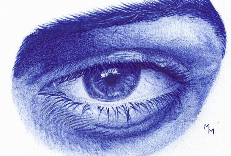
6. Iris and pupil: Let's take a moment to
observe the reference image. First, I want to draw your attention to the
values of light and shadow. Focusing specifically on
the pupill and the iris, I noticed that the darkest point in the entire drawing
is the pupil. That's why when
shading this part, make it as dark as
you possibly can. The same applies to the
upper region of the iris. On the other hand,
notice how the iris is darker at the top and gradually becomes lighter
toward the bottom. This happens because
the eyelashes and the eyelid cast a shadow
over the eye. We can also observe that
the iris is darker near the center and becomes lighter as it
approaches the edges. Another important detail
is the border of the iris. Notice that there
isn't a sharp line separating the iris from
the white of the eye. The edges are actually soft and slightly blurred without
clear definition. Keep this effect in mind if you want your drawing to
look more realistic. I'll show you how to achieve
this in just a moment. Let's begin with the pupil. I'll try to make this
area as dark as I can. At the same time, I'll add a few strokes in the highlight
just above the pupil. This highlight is actually the reflection of the eyelashes. It's a subtle effect, so treat it with
a bit more care. Little by little, I start
adding the Iris textures. At this point, I'm not drawing lines, but rather blotches. This effect is
achieved by making very light circular
movements with the pen. I'm first marking
the darker spots that I can see within the iris. Later on, I'll
darken them further. But for now, I want
them to serve as reference points for the
rest of the drawing. Work on these textures
slowly without rushing, carefully observing
the reference image, and trying to reproduce what you see as closely as possible. Remember, you don't need
to make a perfect copy. What matters is capturing the overall effect
in your drawing. Here I start crossing
the strokes as well. Up until now, my strokes have mainly gone from
the center outward. Now I'll add strokes
that cross over the first ones this time
using circular motions. Watch the video closely to
better understand what I mean. Cross hatching like this is
key to preventing the drawing from looking too linear or
full of visible strokes. While filling in an awesome
Proservia lighter area, right now it looks a bit
exaggerated, but that's okay. It's important to keep
it for the moment. Later, we can
gradually darken it to reduce the intensity
of that highlight. Here I'm adding
the reflections of the eyelashes on top of that
highlight above the pupill. So Now, I'm working on creating that soft diffused
edge around the res. To do this, I make very light circular
movements with the pen. Since these strokes
are more delicate, I recommend practicing
this motion on a separate sheet of paper before applying it
to your drawing.
7. Upper eyelid: Now I'm going to focus
on the upper eyelid. If you prefer, you could move directly from the iris
to the white of the eye, which might even
feel more natural. But for some reason,
I've decided to concentrate on the
upper eyelid first. Once again, I begin by
establishing the darker values. Even though we can see a
slightly more defined line here, I still treat this area as a patch of tone rather
than a hard line. This helps give the drawing a more realistic, natural look. Remember, there are no
actual lines in nature. A line is a human abstraction. What we really see is
always light and shadow. Now, I'll create a general
base of shading in this area. Pay attention to the
movement I make with the pen and the lightness
of the strokes. This base needs to stay
lighter because it covers the entire eyelid and we need to preserve
the lighter areas. With a pen, we cannot undo or lighten a section once
it gets too dark, so be careful here. Don't hesitate to
rotate your sheet of paper so you can
draw more comfortably. I often rotate the
paper to adapt the drawing to the natural
movement of my hand. Little by little, I
add some fine wrinkles and a bit of texture that
I observe on the eyelid. These are sorrow marks, but slightly stronger than
what we've done so far. Notice also that the
eyelid is darker in the upper area and
gradually lightens as it goes downward before becoming quite dark again in the
area of the eyelashes. Here, a bit further
to the right, I work more on the texture
using circular movements. These are light strokes layered one over another until I
reach the tone I want.
8. Tear duct, white of the eye: Now, let's move back to the
inner corner of the eye. Here we are in the
tear duct area. It's a relatively
dark area but with several small
scattered highlights. So as you shade this area, try to preserve the white of those tiny points of
light if possible. Also notice in the
reference image how the transition from the tear duct to the white of the eye isn't marked
by a sharp line. The contrast is created
instead by the difference in light and shadow values with the tier duct being
a little darker. In the area of the
white of the eye, also known as sclera, I'll carefully draw a few
veins that appear here. These are extremely
subtle marks, so your hand needs to be very
light when tracing them. Once again, I recommend practicing on a separate
sheet of paper first. It's also essential to make sure your pen ink is
flowing smoothly. So test it out on that extra
sheet before starting here. When shading the
white of the eye, I also create a
kind of gradient. There's a sliding darker
shadow toward the corners, which gradually lightens as
it approaches the center. Yes, the white of the eye
is not actually pure white. Notice that the highlight above the pupill is even
lighter than this area. This claria is light, but not as light as
the bright reflection. That said, the work here
must be very subtle since we're dealing with one of the lightest areas of
the entire drawing. So we do add shading, but it must remain soft, created with a very light touch without applying much
pressure on the pen. Here I'm crossing the strokes
to achieve a smoother, more even shading
without visible lines. Gradually, I also adjust the values of the shadows
I've already established, darkening them little by little. Here I'm reinforcing
the separation between the white of the
eye and the upper eyelid. Again, I'm not making a sharp
outline, as you can see. Instead, it's more of
an intense shadow, but without a clearly
defined contour. Now on the right hand side, the process is exactly the same. I won't be repetitive here. Just observe this step. Once we finish the
white of the eye, we'll move on to the eyelashes.
9. Eyelashes: For the eyelashes,
the first thing I do is reinforce the strokes I
made earlier in the sketch. We can't always see
the eyelashes clearly, but some areas are quite dark, like the one just
above the iris. In this case, I
improvise a little trying to imagine
roughly how they look. Later, we can darken
this area even more. Remember that eyelashes are thicker at the base and
taper toward the tip. As I darken these strokes, I also take the opportunity to slightly thicken the lashes, since the sketch lines I
drew earlier were thinner. Now we move on to
the lower eyelashes. The process is the same, but notice that they are
thinner than the upper lashes. This means they require a bit more care
when drawing them. Keep the reference
image at hand and try to imitate the natural
curve of the eyelashes. Notice how they don't always
follow the same direction, sometimes crossing over each other and moving
in opposite ways. Paying attention to
these details is what will bring more realism
to your drawing. Since this is delicate work, I once again
recommend practicing a little on a separate
sheet of paper. Here, I'll add some
lighter fine strokes to make the lashes
look a little messier. I hope this gives them
a more natural look.
10. Lower eyelid: Now we arrive at
the lower eyelid. Let's observe the reference
image once again. In this case, the
lighter area is above and it gets darker
in the lower region. Pay close attention to this. It's very important to give
in volume to your drawing. Another important point are these wrinkles that I can
see more on the left. In this lesson, I'll show you how we can
draw them as well. I start by doing a
very light shading, already taking the texture
into consideration. There are some small, irregular spots
behind the eyelashes. And I'll draw them with
very soft hand movements. This here is the water line, which, in my opinion, is the most delicate part
of the whole drawing. It's relatively
difficult to work here because it doesn't
have any sharp lines, and besides that, it's
a very narrow area. So give special
attention to this step. Once again, I recommend
that you carefully observe the reference to try to reproduce
the effect we see here. At this point, I also
take the chance to go back to the lacrmal area and
darken it a little more. It's natural to feel the need to make adjustments
throughout the process. Let's now work on the volume
of the lower eyelid and feel free to rotate your drawing to make your hand movement
more comfortable. Little by little, I reinforce
the wrinkles as well, and you'll notice how this is part of the shading process. Texture and shading are
done simultaneously. They are not independent
from each other. Here I'm also working on
both shading and texture. Gradually, I add
slightly stronger spots. Here I make strokes
in another direction, crossing them with
the previous ones. And little by little, the shadow becomes more intense. Now, I move a bit further down to the lower area
below the eyelid. There are some very
light wrinkles here that I'll draw
through pen movement. Here I'm adjusting the wrinkles, intensifying some of them. Try making wrinkles with different intensities to achieve
a more realistic effect. From this point on, I'll continue working the
lower area as well, starting with very
light shading. Now I'm adding a
second layer this time working a bit more on the texture through
irregular strokes, creating little spots
in different shapes. We will return to
this area later. For now, let's move to the
upper portion of the drawing.
11. Crease, brow bone: Now, let's draw this region between the eyebrow
and the upper eyelid, which we call the brow bone. Here, I want to
draw your attention to the light and shadow values. Notice how this
area is darker on the left and lighting
is a bit on the right, although there is also
a darker shadow here. In any case, the darker side is not as dark as the
black of the pupill, the eyebrow or the crease
above the upper eyelid. It's more of a dark gray, and that's what we'll try
to achieve in our drawing. There's a slightly
more intense shadow near the crease and
I'll start with that. I'll also begin working on this darker
shadow on the right, and I want to pay
special attention to the movement of
the pen strokes. It's important here to
cross the strokes to create a smoother effect
avoiding visible lines. Here, we work on the shading, and the process is very similar to what we did on
the upper eyelid. In fact, it's even simpler here since we don't have
such a defined texture. The shading is more uniform, so I'll definitely be crossing
the strokes later on. The shadow is also a bit more
intense near the eyebrow, which is why I lay down the
first layers in this area. Now, moving from dark to light, let's fill in this area as well. First, I go in one direction, then rotate the paper
to cross the strokes. Little by little, I increase the intensity of the shading
to reach darker tones. Pay attention to the
highlights in this area, too. I started building
the texture by leaving some empty
spaces while shading. I also changed the
stroke direction to create a few
small spots here. I'm also working on the transition from the
eyebrow to the skin. In this case, I draw the eyebrow hairs that sit
along its edge, so to speak. Remember, I don't
outline the eyebrow. Instead, I draw the hairs, which are darker
than the skin tone. When drawing hairs, don't
make them randomly. Observe the reference image to see the specific
direction they follow. Here, I continue
working on the texture, keeping a very light hand since this is a more
illuminated area. And so layer by layer, the shading and texture
are gradually built up. This step by step shading allows better control over the
intensity of tones. Here I'm rotating
the paper to cross the strokes and find a more comfortable
movement for my hand. And here we wrap up this section with the
starker patch on the right, made using circular movements.
12. Eyebrow: Now let's move on
to the eyebrow. First, I'd like to work on its transition to the
surrounding skin. I do this by drawing the hairs that stand out most
in the reference, and my focus is on getting
their direction right. When drawing hairs, we must always pay attention
to two things, the direction and the
thickness of the strokes. Since these are dark hairs, the strokes are
made with firmness. You don't need to press the
pen hard against the paper, but you do need to
apply some pressure. Make sure to start and finish the strokes thinner and make
them thicker in the middle. Once again, I
suggest you practice these strokes on a separate
sheet of paper first. Here I was careful to
make lighter strokes. Notice in the
reference image how delicate they are in the
transition to the skin. Now, let's fill in the eyebrow. At first, I'm creating
a base layer, shading lightly, but soon I'll start drawing
the hairs one by one. In my view, this is the best
way to draw an eyebrow by making a series of firm strokes that
simulate its texture. Pay close attention to
direction of the strokes. I'm simply following
the reference image, trying to reproduce the
effect I see there. On the far left side, this is a darker area, so it's hard to clearly
see what's going on, but that doesn't
mean we should just fill it aggressively
and darken everything. Instead, we try to
suggest some texture. Here in the middle, I notice
that the direction of the hair changes become
more horizontal, which makes them different
from the previous ones. There are some lighter
hairs in the middle, so I'm leaving a
few areas empty. It's the same principle
we apply to the iris, to the upper and lower
eyelids and to the brow bone. This is how I create highlights in ballpoint pen drawings. On the right side,
the direction of the strokes changes once again. Okay. On the left side, I'm adding more layers
to darken the drawing. I also rotate the paper
once again to have a more comfortable hand
movement and to better work on the transition between the right side of the
eyebrow and the skin. And that's it, we've
completed another step. Now we're entering the final
stretch of this drawing.
13. Final touches: As we approach the end, we can better observe the relations between the
parts of the drawing. It's important to control your anxiety at the stage
and carefully examine what you've done
so far to detect any inconsistencies or
areas that need adjustment. The main thing I notice in my drawing is that some
shadows need to be intensified both in the upper and lower
areas of the drawing. I make this adjustment with circular movements of the pen, shading and working on the
texture at the same time. Here, I felt the need
to enhance the shadows. In doing so, I aimed to give the drawing more
three dimensionality, increasing the contrast
between its parts. Once again, I paid special attention to the
direction of the strokes. I could consider the drawing
finished at this point, but I decided to expand
the lower half a little. I started with
very light strokes since this envy is
more illuminated. Notice the direction of the shading and the lightness
of the strokes at first. Later, I will gradually increase the pressure on the pen to
reach the desired tones, which in this case,
are neither very dark nor very light, but
intermediate shades. Here, the strokes are less expensive because I'm
focused more on texture. The movements are
shorter and circular. Down. Continuing, I make
strokes around the eye, which will cross with the
ones I did on the right. Here I take the
opportunity to make a few more adjustments,
intensifying another wrinkle. And as I mentioned, gradually increasing
the intensity of the texture until reaching
the desired tones. On the right side, I
noticed a few darker spots. D. The lower portion
is a bit lighter, but still has some texture. Here, it's important to control the pressure
on your strokes, making these small
spots very lightly. And now the drawing is
officially finished. I hope you enjoyed drawing
along with me, had fun, learned something useful
in these lessons, and that you can apply
these techniques to your future drawings. Before you leave, though,
I'd like to give you an extra piece of advice
for doing highlights. Let's get right into it.
14. Extra tip highlights: All right, everyone. This is
an extra video where I'll show you how to create highlights using an
acrylic paint pen. To be more precise,
I'm using a Posca pen. More than in any other case
presented in this class, I strongly recommend that you do tests on a separate
sheet of paper. After all, we're applying white ink on top
of your drawing, which is a relatively
aggressive intervention. Here on the screen, you can
see a sheet I used throughout the class to test my Ballpoint pen every time I starting a new
drawing session, just to get the ink flowing. With the Posca pen, you
need to do the same. Depending on how long
it's been stored, the tip may be dry and you
need to restart the ink flow. If that's the case, press the pen against
the paper surface. Obviously, never do this
directly on your drawing. Here I made a quicker
version of the eye we worked on in the class
just to run some tests. In the finished drawing, I intend to add only a few subtle light
dots here and there, and that's exactly what I'm
doing in the smaller sketch. So let's get started. I'll begin by adding some
light dots in the tear duct. This is where the
white ink will be most visible since it's
a darker area. I also want to add a few dots
behind the lower lashes, as I see in the reference. Here, the effect will be more subtle because it's
a lighter area, so the white dots won't
stand out as much. So I also add a few light spots on the skin
in the lower left corner. As I mentioned, using the Posca pen is a relatively
aggressive intervention, so I'll only make a few
gentle touches with it. Notice that I'm creating a
kind of pointless effect here, following the texture I see
in the reference image. The effect is very subtle. I don't want anything
too eye catching, since the white ink can easily
draw too much attention, and that's not the
effect I'm aiming for. I'll also add some highlights
on the upper eyelid. Here, the contrast is stronger because
the base is darker, so the highlights
will stand out more. For that reason, be even
more careful when using the posca pen in this area.
So what do you think? Do you feel that
these highlights made the drawing more realistic? Or do you think they create
a more artificial effect? This is a personal choice. It's up to you to decide whether you want to use this
technique in your drawings. I hope this extra
lesson was helpful. Oh
15. Conclusion: And that's where we
wrap up our class on how to draw a realistic
eye with BallpointFn. I hope you've learned
something useful and had a great time
drawing along with me. Since you've made it this far, don't forget to share your drawing in the
project section. I'd love to see your work there and give you
some feedback on it. Also, take a moment to leave
a review for this class. It really means a lot to me. Your feedback helps me
keep improving and reach more students who just like you want to take their
drawings to the next level. Thank you so much for watching this class for
sharing your project, and for leaving your review. It's been a pleasure
having you here, and I hope to see you again in future classes.
See you next time.