Transcripts
1. Introduction: Everyone has drawn with BallpointPn at least
once in their life, but not everyone knows what
this sto is capable of. What if I told you that
with simple exercises, you can considerably improve
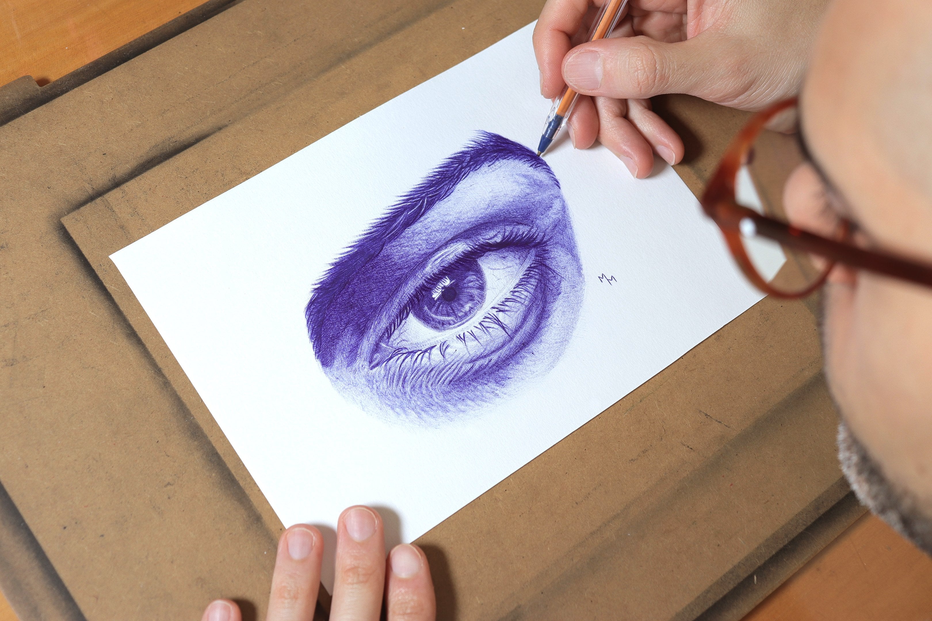
the leve of your drawings? Hi, my name is Matos Macedo, and I am specialized
in realistic drawings. In this class, I'll teach you the basics of Bowie pen drawing. Show you through four
simple exercises, how you can significantly improve your drawings
with this tool. In nature exercise,
I present you a new technique that you can apply to any drawing you make. This is a class for beginners, so don't expect ultra complex
hyperrealisic drawings. I'm sure you have a great time while practicing the techniques proposed in the lessons on
alternate span and paper. If you want to master
the soup that is both cheap and very versatile, don't waste your
time and let's draw.
2. Materials: Well, in this class,
we're going to draw four main exercises, each one of them teaching
a different technique that constitutes the basis of
Ballpoint pen drawing. For this class, you don't need any specific materials
other than paper and pen. However, if you have
a graphic pencil to make the sketches,
use it as this way, you can prepare the
sketches more carefully and correct them with
an eraser if necessary. Pick an H, H B or B
pencil if you can. Speaking of erasers, you can use a regular eraser to
correct your drawing, but if you have a kneaded
eraser, that's even better. This eraser doesn't leave
any residue on the paper when used and is excellent
for lighting pencil lines, which is what I'm going to
do with all my sketches. The pens I'm going to use are regular pens with a 1
millimeter thick tip, which is the most common type. However, be aware that there are pens with
different thicknesses. This one, for example, from Big is zero dt seven millimeter thick and it is
my favorite at the moment. The exercises in
this class will be done on A five sheets of paper, half the size of an A four. Just cut or simply fold
an A four sheet in half, if you want to draw
on paper within the same dimensions as
the ones I will draw on. Any paper will do, including regular printer paper. I used a slightly thiger paper with 90 grams/square meter, which is a bit more resistant, but it's still simple
and cheap paper. Before we start
with the exercises in this class, however, I'd like to give
you some tips that I consider fundamental
for you to make excellent drawings with
this medium. So let's go.
3. Ballpoint Pen Drawing Tips: Well, guys, in this video, I want to give you some tips on how to use a ballpoint pen. This is probably the most
important lesson of the class because everything
that is said here will be applied in
the other lessons. As you can see, I'm using regular pen here,
just like any other. So whatever you have with
you at the moment will do, the color also doesn't matter,
choose whatever you like. One problem that some pens may have is that they leak ink. To check if your pen
is working properly, tap the tip of the pen on the paper and see if it's
releasing ink in excess. If so, I suggest you
get another pen. The first thing I want
to show you is how you can control the
intensity of your stroke. Start by making strokes
as you normally would, but then gradually
make new strokes decreasing the pressure. I'm going to make a series of parallelines faster and faster, and I do this because it makes it easier to make light lines. Note that I'm not making a
zig zag motion with the pen. No, I'm trying to make
parallel strokes. The most comfortable movement for my hand is from
bottom to top. Experiment and see what feels
most comfortable to you. This is the most basic
movement we make, and you may not be able to get such light strokes right away. That's why I suggest you
practice this movement a lot, always trying to obtain
a lighter stroke. One way to vary the pressure you apply is in
the way you hold the pen. When you hold the pen
closer to the tip, the strokes tend to
come out firmer, even if you are holding
the pen more lightly. By holding the pen further back, the lines will tend
to be lighter. Of course, the way you grip the pen in your hand
also has an influence. Try to hold it firmly, but without using
too much force. When I'm drawing, I also tend to gently rest the side of
my head on the paper, which also lets me
draw more comfortably. So these are the
tips for hatching. Now we are going
to see how to do cross hatching.
It's very simple. This technique allows you
to shade an area evenly, not leaving the
lines too visible. The cross hatching technique, as the name suggests,
consists of crossing hatches made in
different directions. I personally like
to cross the lines in at least three
different directions. I find this to be the minimum
to get a more even shading. So notice that here I did
the hatching vertically, horizontally, and
finally diagonally at a 45 degree angle. Do this exercise yourself, too, taking the opportunity to practice the lightness
of the line. Here, I show you
how you can vary the pressure on the pen
within a single stroke, starting and ending it thinner, but thickening it in the middle. However, I recognize that
this is not so easy to do, and in practice, I don't usually make strokes like
this in my drawings. Anyway, I think
it's worth trying it as you have nothing to lose. Finally, I did a
scribbling exercise here, which is a really fun
and easy movement to do, but always trying to
keep your hand light. This movement is useful
for drawing spots, and I'll use it in
the pair exercise, the last one of this class. Now we're going to do a
very simple exercise to practice shading with different
light and shadow values. So for this, I drew a square and divided it into four
smaller squares. Each of these squares
will be covered with a different shade value using
the hatching technique. I'm going to start with
the first quadrant, which will be the
lightest of all. Since it's the lightest, we can extend the shade
to the other quadrants. I'm going to do this
to take advantage and practice this
lighter shading. I then start by hatching vertically, shading
very lightly. Then I turn the paper to repeat
the process horizontally, crossing the previous lines
at a 90 degree angle. Finally, I make a third
layer now with the lines at 45 degrees with the same level
of density very lightly. This shade then is what corresponds to
the first quadrant. Now I will continue
with the shading in the other quadrants,
which should be darker. As you can see in this
square on the right, the procedure will be repeated. I make the lines vertically, horizontally, and diagonally. This is my suggestion
so that we can achieve a more satisfactory shading, achieving better homogeneity. Initially, I suggest that you don't increase the
pressure in your hand. Just by adding another
layer of shading, you'll get a darker value. Later, if you find that the
shade is still too light, you can increase the pressure
on the stroke a little. I suggest, however, that you leave this for
the next square. Use each of these layers to
practice this technique, which is the basis of
ballpoint pen shading. This skill will be
used all the time. Now we come to the
third quadrant. Here I increase the pressure applied to the line a little. Still, I try not to exaggerate because
if it gets too dark, there is no way to go back. Then I'll shade the last
two squares simultaneously, vertically, horizontally
and diagonally. When shading the less
square on the bottom right, be careful not to let the lines
invade the other squares. This is part of the exercise. After all, this type of situation happens
with any drawing you do in which there are two areas with contrasting light
and shadow values. Finally, in the last quadrant, we can make the shading
as intense as possible, reaching the maximum darkness
that the pen can reach. I'm not going to do the
shading in any way. On the contrary, I repeat the process of
crossing the lines, trying to fill in all the gaps that the pen leaves
on the paper. Check to see if the values are not too unbalanced
between the squares. That is, if there is a
coherent transition between the values without a big
difference between them. Then you can make
some adjustments if you think it's necessary. I hope you enjoyed this first
lesson, and let's move on.
4. Gradient: Now I'm going to do a gradient
exercise using a blue pen. Here, I've drawn
a small rectangle whose measurements are
six per 1.5 centimeters, it's not a very
big rectangle and this exercise won't
take too long. The aim here is to create a gradient by controlling
the intensity of the shade just by varying the pressure without
crossing strokes. Then all the strokes
are made horizontally. I would recommend that you place the paper in a position
that is comfortable for you as we'll be making strokes in the same
direction for some time. Note that the strokes made
here are not very long. They are done lightly, and they will be spliced
together so that we can cover the gradient
over a larger area. I recommend that you
try to do as I did, that is making a
lighter first layer, even the area that
is going to be darker so that it can practice the lightness of the
stroke more and be able to make those seams in
a horizontal direction. Here, I'm already
making a second layer. As this is the darkest
area of the gradient, I should increase the
pressure on the stroke. I'm not applying maximum
force to the strokes yet. I'd say this is an
intermediate intensity, which corresponds to what we'll see in the center
of the gradient. As soon as we reach
this more central area, we should gradually reduce the
pressure on the hand again so that the transition from this more intense tone to
the end of the gradient, which is lighter is made. Here, the process continues
with another layer of ink. Now, I'm trying to fill in this corner of the
gradient even more. I'm shading more intensely now, but without forgetting
that we have to make a transition to the area towards the middle
of the rectangle. So it's important that
the strokes end up thin and light
throughout the process. Here, I'm reducing the intensity
of the shade a little, moving on to the central
area, which is lighter. This exercise is very interesting because
it shows what you can do with a Bwpoint pen just by varying the
pressure on your hand, even without crossing
the strokes. I made this gradient
without a reference image. Just imagine what I wanted for each area of the rectangle. Still, I'll leave
it to you to use my own gradient as a reference
image to do this exercise. Here, I'll let you take a
closer look at the process. The further to the right you go, the lighter your
stroke should be. At this point, the changes I'm making are become
more and more subtle. So it may seem that my strokes are not make a
difference, but they are. It's true that I'm a bit
of a detailed person. And at this stage, I'm just putting the finishing
touches on, refining the shading
with the pen, trying to fill in any gaps that are visible
between the strokes. If there is a bit up of
ink on the tip of the pen, wipe it off with a tissue. This is likely to happen, especially as the tip
of the pen should heat up from the continuous
friction with the paper. And now it's time to
stop and call it a day. I hope you also very successful with this exercise. And
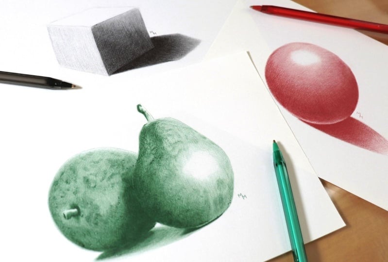
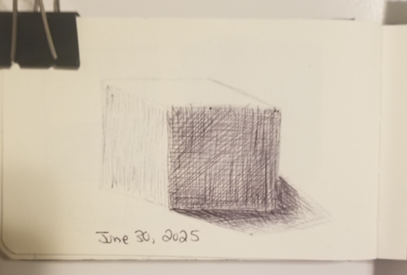
5. Cube: Sketching: Well, now we're going to
do the cube exercise, and this time we're going to use the crosshatching technique. First of all, let's
prepare this sketch. You can use my own drawing as a reference
image if you like. I make the stroke slightly, holding the pencil
a little further back so that you can
see the cube well as you draw it and make light strokes that won't
be visible when finished. If you want, use a
kded eraser to make the sketch lines clear before
using the Bwpoint pen. If you don't have one,
use a regular eraser. I use a needed eraser
because it doesn't release crumbs and therefore
leaves a drawing clean.
6. Cube: Shading: Before you start,
test your pen on a separate sheet of paper and
let the ink start to flow. I start with very light strokes to outline the
faces of the cube. The first phase
I'm going to shade is the second
lightest of the cube. The first is the top face, but it's so light that
will leave it blank. The second lighter one
is the one on the left, which I'm shading now. In this drawing, we are going to cover each phase
of the cube with a different intensity of shadow in addition to the shadow
cast onto the surface. This exercise is simply a slightly more elaborate
but very similar version of that square divided into four parts from the first
exercise we did in this class. I'm sure you won't have
problems with this drawing. The first phase, I'm going to
do with very light strokes, all going in the same direction. So I won't be
crosshatching here yet. Remember the gradiat exercise
where at the beginning I filled almost the
entire rectangle with the same light intensity, always shading in
the same direction. Now, for the darkest
phase of this cube, I'm going to start
with the same type of shading as the
previous phase, but pressing the pen in a little more allowing for
a darker shading. I always follow the
vertical direction with strokes from bottom to top because it is
comfortable for me. You can make these strokes from top to bottom if you prefer. Here, I begin to cross the
lines now horizontally. It's not exactly horizontal
because the face of the cube is slightly tilted
due to the perspective, but we are going to cross the
lines made so far anyway. The pressure applied here
will keep the same for now. W Now I'm going to make diagonal strokes, keeping the same
pressure on the stroke. Be careful not to invade the
area of the adjacent faces. Then strokes made near the edges of the face should
be made more carefully. When we get closer to
the center of the face, we can make broader
looser strokes. For now, I'm making a
first layer of shading. Later, I'll come back here to adjust each part of the drawing. It turns out that it's difficult to do this
before establishing the general values of the drawing because we
like references at first.
7. Cube: Cast Shadow: So now I move on to
the cast shadow, which will be the darkest
part of the drawing. Shading this part
is fundamental so that we can establish
the general values of the drawing and then
be able to adjust each part with more certainty
with more conviction. Since this area is very dark, I can mark the boundaries of the cube will where it
touches the ground. However, as we move
away from the cube, the shadow becomes lighter. So when marking the
boundaries of the shadow, I used very light lines. The lightest I can make
using boy point pen. I'm going to use the cross
hatching technique here too. I started in the
horizontal direction because the shadow is
projected in this direction. Here, I'm doing
more or less what we did in the grading
end exercise again, starting darker on the left, and decreasing the
intensity on the right, always making strokes
in the same direction. Now I'm going to add
another layer of shading, now crossing the strokes. Here, I wasn't so methodical. I didn't make vertical
strokes, but diagonal ones. But the important
thing is to keep going the same direction until
you finish the layer. I also note that the shading is darker with more
intense strokes. It's important to establish a contrast here with the
darker face of the cube. This contrast will help give the drawing a more
realistic look. Emphasizing its volumetry
is three dimensionality. On this layer, too, I'm going to decrease
the intensity as I move to the right, okay? This way, we can create a nice effect for
the cast shadow, which lose intensity
as it moves away from the object that is
casting this shadow. Here, I introduced
another layer of shading now going in a
different direction. I just followed my
intuition here, crossing the strokes
in a direction that seemed more logical to me. So the logic I follow is this to cross the strokes in at
least three directions, and these directions are
chosen according to what the drumming allows me to
do with relative comfort. Of course, you can cross the strokes in more
than three directions, but I'd say three is
the minimum to achieve a more homogeneous effect when it comes to cross hatching. Near the cube, I can make a few strokes parallel
to its edges to fill in some empty spaces that I haven't managed
to fill in yet. Here in the cast shadow is where I spend the
most time shading, not only because it's the
darkest area of the drawing, but also because I hatched
in several directions and tried to reduce the intensity of the shadow further
to the right. All this took me a
little more care and resulted in more
time spent drawing.
8. Cube: Adjustements: The cast shado isn't
exactly finished, but here I went back
to the cube to make those adjustments I
mentioned earlier. As the cast shadow
is quite dark, I thought it necessary to
darken the darker space of the cube a little two to make
the drawing more balanced. There is no secret here. Just add more layers of
shading to this area, increase the intensity of the strokes to obtain
darker values. I also continue to
cross out the strokes as I did in the first
intervention in this area. There's a small subtlety
this time, though. This time, I've tried to make the shading darker on the left and less intense
on the right, as I did with the cast shadow. This subtle touch will make the drawing even
more interesting. So let's watch the shading on the darkest face of the cube. And here, I returned the cast shadow for the
finishing touches in this area. At one point, it got a bit messy because I had crossed strokes
in different directions, but we're all
taking care to keep the lines straight and parallel. I had to come back here and add more layers on top to
see if I could fix it. At the end of the process, I decided to mark the edges of the cube with the pan in
the lighter areas too. So this is the result
of this exercise. I hope you enjoyed this lesson.
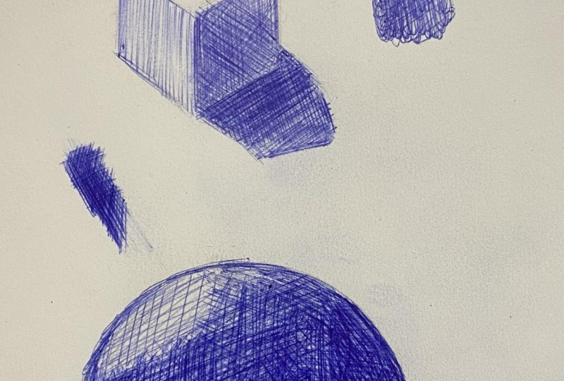
9. Sphere: Sketching: Now in this lesson, we're going to draw a sphere
with a ballpoint pen. How is this exercise different
from the previous ones? The difference is
that now we'll be shading with a pen
on a curved surface. This way, we are gradually
getting closer to more organic shapes the
kind we find in nature. My suggestion is that you
draw the sketch using round object like a tape or the bring of a
glass, for example. There is no need to draw
a very large sphere, otherwise, the exercise
may take too long. After drawing the general
shape of this sphere, I divide it into smaller
areas that correspond to different ranges of light and shadow. This is what happens. There is a variation in the light and shadow values along the surface
of this object. These divisions are great
because they will help you to have better control over what you are doing while shading. Later, you can use the eraser
to make the lines lighter.
10. Sphere: Shading: This time, I'm going to draw
the sphere with a red pen. I started drawing by tracing the outline of the sphere
lightly with the pen. I do the same with
the cast shadow, but in this case, the outline
should be even lighter. You already know the reason
because of the cube drawing. The aim is to create
that shadow affect that loses its sharpness as it
moves away from the object. Here, I finally start
shading and I start in the area where the shadow is most intense inside the sphere. In other words,
it's as if we are doing the greatest
exercise once again. However, the shape of this
sphere forces us to pay more attention to where the darkest shadow is concentrated. Although the shape of
this sphere is curved, I'm going to hatch it with straight lines just as I did
in the previous exercises. Now I'm going to add another layer by making the
strokes in another direction. In other words, I'm
cross hatching. I'm drawing these lines
relatively lightly, even though this
is a dark shade. It just so happens that
this is how I like to draw drawing one layer on
top of another more calmly, having a lot of control
over the process. After all, if you overdo it and go over the top, there
is no going back. I also have the feeling
that by drawing this way, I can achieve a more
delicate and refined finish. Here I'm already moving towards the top of the sphere where
the shadow is lighter. Having started in a darker area, I now feel more confident
about shading a lighter area, which requires
more hand control. So that's one of the reasons to start shading by a darker area. You can also use it as a kind
of warm up for your hand. After all, because
they are darker, these areas give
you more freedom when shading as they
are more forgiving. As you can see, here, too, I'm hatching
with straight lines. Now I'm going to do the
same for the bottom area. At the beginning
of this drawing, there was an ink leak, which resulted in
that dark line. In fact, the pens I chose to record this class
are not the best. I should have used the
ones I usually use. However, later on, I try to hide that line with
the shading itself. And so I continue adding
layer upon layer. In this darker area, we can apply a little
more hand pressure. For now, I've done
the shading here in just two different
directions, but later on, I rotate the paper
and add more layers in other directions. Okay. Here, I've rotated the paper a little so that I can continue hatching at a different angle while keeping my hand in
a comfortable position. Gradually, the values here become more established
and consistent. This dark area will be very important for giving more
depth to the sphere. In general, I'd say
that the strokes were made in the direction of the highlight at the
top of the sphere, but not all of them, okay. It's important to cross
the strokes to get a more even shading
with the pen. Once the darker shadow
areas are more established, it's easier to work on the lighter areas as we
have a reference for them. After all, terms like lighter or darker are all
relative terms. And in fact, what they have is one area dictating how
the other will look. It's at this point that
we can start working on the transitions to remember
the gradient exercise. Well, that's exactly
what we are doing here. Aiming at smooth transitions. Here, I'm shading the
lower area of the sphere, which shouldn't be too light. And here we definitely
have an example of how strokes are made
in different directions. So little by little, I move towards the
top of the sphere. As I shade the other areas, I feel the need to darken
the top areas a little more. It's through these
new layers of shade that I'm also working
on the transitions. Even the darker line
that appeared because of the leaked ink is no
longer so visible, blending in with the shadow
that has advanced over it. Now, closer to the top, the shading is lighter, so you have to be a
little more careful here. I rotated the paper and added new layers in
different directions, but controlling the pressure
in my hand even more. Here, I turn the paper once more now to make strolls
from bottom to top, not just at the
top of the sphere, but along its entire length. Be it in this drawing or
in any other you're doing, it's up to you to decide when
the shading is finished. As I like well finished drawings
with a touch of realism, I tend to go great lengths, spending a long time
on each drawing. Here, I'm not satisfied yet, so keep adding new layers in
different directions until I reach a point where I feel proud to have
made this drawing. There will come a
time when you look at your own drawing
and think it's beautiful or so we hope that will be the moment to consider
your drawing done. At this point, I still see
a lot of loose strokes, a lot of empty spaces
between the strokes, and that bothers me
because it gives the feeling of an
unfinished drawing. One thing I want to stress is
that I don't think this is the only way to shade an
object with rounded shapes. I've only used
straight lines here, but it's possible to hatch using curved lines following
the shape of the object. However, I don't
think this type of shading is the most
appropriate for a beginner to use because it's important
to establish a logic for these lines and it's easy to get lost with this
type of approach. Shading this area at the bottom of the sphere was
very uncomfortable, so I rotated the paper so that I could work
here for longer. It's not the darkest area
of the sphere because of the light reflecting off the surface on which
the sphere rests, but it's still a dark area. Here I am separating the area of the sphere from the
shadow cast by it. Soon, I'll be making
this cast shadow, which will give this drawing an even more three
dimensional look. Taking advantage of
the rotated paper, I add another layer to shade
in a different direction. By now, the shading
is becoming more consolidated and the drawing
is looking very good. It's this feeling that
motivates me to keep going and devote more
time to each drawing. There is no line, the limiting the highlight
at the top of the sphere, just as there wasn't in
the gradient exercise. So why work on the
transition until the lines become lighter
and finally disappear.
11. Sphere: Cast Shadow: Done, here I consider the
shading of the sphere finished. I spent almost an hour
and a half on it. Does that sound
like a long time? Well, it doesn't matter to me. What really matters is that I'm very satisfied
with the result. Now to finish the exercise, let's move on to
the cast shadow. There's not much
of a secret here, but if you want that
faded edge effect, you need to take
your time here too, especially on the edges. You already know
this step by step. I shade with lighter
layers first, crossing the lines in at
least three directions. Note that I don't draw
curved lines here either. They're all straight. Now I
add another layer of shadow, increasing the intensity of the strokes because
I'm now going to concentrate on the
area closest to the sphere at the very bottom. I quickly included strokes
in other directions, and there is no
problem with that. There is no right
order to do things in. And remember the great
exercise where you can achieve excellent shading by making strokes in a single direction. I just prefer to cross the line so that they're
not so apparent, not rendering movement when
I want a more static look. I want this sphere to convey a feeling of stability of rest. We are nearing the
end of this drawing, and I'm already really
liking how it's turning out. Here, it's a question of making the final adjustments
to this cast shadow. It needs to be filled
in a bit more, especially in the
area in the middle. What I want is it to be darker in the middle and
lighter around the edges? And there you have
it, another exercise from this class finished. I really hope you enjoyed it, and I look forward to seeing you in the last exercise
of this class. See you in the next video.
12. Pears: Sketching: We've reached the
final exercise of this class. What's new here? Well, it's a drawing
of two pairs, so we're finally going to draw a real life object to go
beyond geometric shapes. In addition, the pairs
have a bit of texture, which we can work
on with the pen. I start, of course,
with the sketch, and this theme doesn't require us to have
great drawing skills, so I don't have any great
guidelines for this step. Just remember that this drawing, like all the others in
this class was done on a five sheet of paper,
so it's not very big. And here's some tips. For any sketch you make, outline the space that the
drawing will occupy on the sheet before you draw
the objects themselves. Focus on the more general shapes before focusing on the details. Hold the pencil a little further back to handle the
pencil more lightly, using more of the
side of the graphite, and in the end, use an eraser so that the pencil marks
aren't too visible.
13. Pears: First Pear: I'm going to draw this with
a green ballpoint pen, and I'm going to start once again by tracing the outline of the pairs so it'll be easier for you and me to
visualize the drawing. This drawing isn't any more difficult than the sphere. It just takes longer
to do if you want a more realistic
finish like mine. So don't feel obliged to do this drawing all in one setting. In fact, I did this
drawing in two sessions, drawing for almost 2 hours
on two consecutive days. You can even split the
process into more sessions. If you want to do each stage more rested or
simply because you have less time to draw within your routine, it's up to you. For the first stages, I'm going to use the hatching
technique once again. Hence the importance of
the previous exercises. Once you've mastered
this technique, you can do practically
anything with the pen. This time, however, it's worth noting where the brightest
points of each pair are. Remember the highlight
on this sphere? Well, here we have several of
those points in astronomy, and it's a good idea
to make them evident. For the first
layer, I'm going to do both pairs simultaneously. You can drop both
at the same time if you want. It's
not a bad idea. I will focus on each of
them separately, though. As you can see, I started both pairs with
vertical strokes. The rightmost pair is brighter because the light is
coming from right to left. So I'm going to leave
part of it blank. Here, I'm going to make
a stronger separation between the two pairs. This area will actually be quite dark as there is a
lot of shadow here. Now I'm shading at the same
time as making the shadow cast by the right pair on
the left one more marked. You can increase the
pressure applied as the shadow here
will be very dark. Now I'm crossing out the strokes so that I can
get a more even shading. Here, too, I had problems
with leaking ink. I didn't like the pens I used to record this
class, to be honest. That's why my tip is to
try out different pens from different brands or
even from the same brand, as their quality
can vary greatly. Notice how I'm already
shading heavily here. As you saw in the
previous exercise, when we establish the darkest
values in the drawing, it becomes easier to know
how much we should darken the lighter areas as we now have a reference for
the scale of values. What defines the
scale of values are the lighters and darkest
tones fund within a drawing, and the other tones will fall
between these two extremes. Here I'm going to detail this little pear stem and the small shadow that
forms around it. In the shadow, I started even unconsciously to make
some circular movements, what we call scribbling. I showed you this movement
in our first lesson. H Now I start working on the texture. I tried to identify
some small spots in my reference image and
brought some of them here. However, I then continued with the more general shading of the pear after turning
the paper a little. This shading is very similar to what we did in this sphere. The difference is that here the shadows are no
longer so regular. There is a variation
in the volume of the pair which shapes the
shadow in a different way. In the lighter area, I do the shading
while dwelling more on those first spots
I marked earlier. Yeah. And so I gradually build up the
volumetry of the pair with layer upon layer of shading
as I did with this sphere. In both the lighter
and darker areas, you'll notice that I'm making strokes in different directions. Never forget to use the
cross hatching technique, which is so important for
high quality shading. Here, I've added some details
to the shadow of the stem. See how this ends up
shaping its form better, conveying the irregularities
in volume that we see here. Now back to paying
attention to the spots that we see more clearly
in the lighter areas. At first, I'm just
crossing out the strokes I made earlier while
adding more texture. I'm not concerned
here with making a perfect copy of
my reference image, but only with conveyed
the idea it conveys. This is how I usually
draw textures. I don't want to copy each
single spot I see in the photo, but just the general look
they give to the pair. And at the same time, I'm continuing a more
general shading. It's still too light here
with lots of empty spaces, so I still need to
darken this pair a lot. That's why I'm now investing
in broader looser strokes. Since the light is coming
from right to left, you have to pay
special attention to the left side of the pair, which still looks
too light to me. And it's from this
point on that I start to use more scribbling
to touch up the spots. Since they have rounded shapes. This technique will be used extensively throughout
this drawing, as you may have guessed. I switch between working
on the spots and shading the base layer because these two things are not
independent of each other. After all, when I draw spots, the drawing as a whole
gets darker, too, so I can get a better idea
of how much I need to darken the pair as a whole so that the overall values
are well balanced.
14. Pears: Second Pear: Now I'm going to move
on to the other pair, and the first pair will serve as a reference for the second as I intend to repeat the steps here so that the draw
will be coherent. So as I said, you can
choose to do both pairs at the same time instead of doing them one at a time as I did. I started from the
stem of the pair, which requires a
little more attention because of its small details. Then I'll be free to do
the rest of the pair, which allows us to draw in
a looser more relaxed way. Here, I can start with
the general shading. The procedure is the same here
so we can move on faster. That's not to say that this
drawing is done quickly. I spent about an hour and
a half on each pair guys. The drawing as a
whole took me 3.5 hours as it also includes the
shadow cast on the ground, which I'll get to do later. I just want to draw attention once again to the highlight, which this time is on the right. I'll leave this area
blank initially. There are very
intense shadows here, so increase the
pressure on your hand to darken the pair more quickly. However, don't do it carelessly, if you want a more
realistic result, even the darkest areas
deserve a bit of attention. The fact that I've
increased the pressure when darkening the pair doesn't mean that I'm drawing too hard. On the contrary, the pressure
in my hand is controlled. O. Here I'm taking advantage of the shading to
shape the pair. Note that this is basically done using light and
shadow and nothing else. The fact that I work with
successive layers without exaggerating the
force allows me to work on this volumetry
little by little. By now, the left side of the pair has become
better established and it's very exciting
to see how it gets more and more
interesting to look at. Then from that point, I start to make
some spots that I see further to the
right on the pair. Then I go back to the left
side as I haven't yet achieved the shadow values I'd like for that area
of the subject. Now I make the strokes in a different direction to get
a more homogeneous shadow. This lower area also
has intense shadows, so I naturally chose to move to the right side here, mainly. In the lighter area, I'm going to start working
with the texture, adding the spots
little by little. To draw the spots, you can
create a base layer with straight lines hatching or start directly with scribbling. I tend to combine
both techniques, cross hatching and scribbling, especially on the darker spots. So here you can see
how the shading continues as this area
is still too light. Using this technique, I also gradually advance
over the highlight, shaping it as I see
in reference image. There are spots in
the darkest areas, too, so let's do them as well. This work with the texture
will make the drawing much more visually interesting. Okay. As you can see, the texture
work mixes with the shading. And here, too, I do
both at the same time. I think it's important to make these spots in the
darker areas, too. After all, the spots are
present all over the pear peel. Seeing them vary in tone is another thing that makes
it drawing more dynamic, drawing the viewer's eye to different areas
of the drawing. Then I add new spots
here and there, mainly using scribbling, making small circular movements
with the tip of the pen. At the same time, I put in the finishing touches
to the shading, so just a drawing according to the reference and
to my own taste. Trust your artistic
feelings about your drawing and
make the adjustments you think it's necessary.
15. Pears: Cast Shadow: Now we come to the shadows
cast on the ground. Each pair cast a darker shadow, but there is also
a whiter shadow that joins the two pairs. If you watch the
lesson on this sphere, you'll notice that there is no big difference between
these shadows and that one. What does change is this slightly less dark shadow that I'm going to
do on top later. So if you can convey
different tones, even darker ones for this area, your drawing will gain
a lot in quality. You can see how I make
these darker shadows first. There aren't any secrets here. Now I'm going to do a
lighter shadow on top. I recommend starting
this other shadow with a very light hand with very light strokes because the edges of this shade are
not sharp. They are blurred. Once I've done a
lighter first layer, I can cross out the strokes. Here, I do end up making
some curved lines, but it's a small area, so it's unlikely I'll be
making a huge mistake here. Now I watch as I move from
the shadow of one pair to the other to see how the
overall movement of the strokes goes. Now, starting from the shadow
of the pair on the right, I make the same movement
in the opposite direction. At first, shade it more
lightly so that it can gradually intensify
it later if needed.
16. Pears: Final Touches: Once the cast shadows were done, I decided to go back
to the left pair. We are approaching the final
stretch of this drawing. We've reached the stage where we have a sense
of the drawing as a whole because the general
light and shadow values are already well established. So now it's a matter
of making adjustments and retouching the
textures to get it done. So I keep using the cross
hatching technique to adjust the overall values
and scribbling to make more texture
spots on the pair. Remember to position the
paper so that your hand is comfortable during
the process and you don't feel
excessively tired. This can be demotivated
when drawing. Make the act of drawing
as enjoyable as possible. And here we come to the
end of this exercise, the last of this ballpoint
class for beginners. I hope you've learned
a lot and had a lot of fun with
these exercises, and that you are proud
of your drawings. Peeps
17. Conclusion: And here we come to
the end of this class, and I hope you had fun and learned a lot from the lessons. Don't forget to
share your drawings in the class project section. I'd love to see your drawings here and give you
feedback on them. Since you've made it this far, be sure to leave a
review for this class. It means a lot to me, as it will help me to continually
improve the content that I create and to reach new students interested in improving their drawing skills just like you. Thank you very much for
watching and I hope to see you in other classes. Bye.
 Matheus Macedo, Realistic Drawing Artist