Transcripts
1. Introduction: Flowers are one of the
most beloved themes, inspiring artists from
all over the world, and if you like to draw, you have certainly
tried drawing them. However, if you want to get better results using
only colored pencils, this class may be what
you're looking for. Hi. My name is Matos Macedo, and I am specialize
in realistic drawing. In this class, I will
show you how you can draw beautiful flowers using
only colored pencils. Through four different studies, I'll show you how
you can prepare the sketch of your drawing, how to choose the right
pencils for coloring, and I will also present
the best method for using your pencils in order to obtain vibrant colors with
a refined finish. My goal is to show
you how to get the best results without
the painting on tutorials, and using the
materials you have, whether they are cheap
or professional. Believe me, Colored pencils are a median with
enormous potential, and you can create
incredible drawings without needing huge pencil sets
with thousands of colors. Are you ready to take a floor? Drawing to the next level? If the answer is
yes, let's draw.
2. Class overview: Hi, thanks for joining us. Here, I'm just going
to tell you what you're going to
see in this class. We are going to make four
drawings and they are organized by complexity,
not necessarily difficulty. I say so because you
see that the method applied to each of these
drawings is strictly the same. What changes is
that each drawing has more elements and details
than the previous one. Each one will require more time than the
previous one to complete. For each exercise, I'll show you how I choose
the pencils I use, how I prepare this sketch, and I break down
all the process I follow when using
colored pencils. As you can see, each drawing has a different
predominant color, so you have the chance to
practice with different colors. All drawings were made
on a five size paper, so you won't need large
paper for this class. By the way, speaking of paper before we start the
drawings themselves, I'm going to talk about the
materials used in this class. Let's get right into it.
3. Materials: Okay, so in this video, I'm going to talk
about the materials I used in this class. Starting with the paper, I recommend acid
three papers that are at least 180 grams/square
meter in weight. I prefer smooth papers. Papers with more texture
give a more rustic finish, which I personally don't like. All drawings in this class
were made in a five size. So it's important a paper
is at least 148 per 210 millimeters or five dot
eight per eight dot 3 ". The paper I usually draw on is Strep More 300 series
bristles move. Since the sheets are
larger than a five, I'll cut them using a craft
knife and a metal ruder. Regarding the colored pencils, you can use whatever pencils you have regardless of the brand. I just recommend that you have at least a 24 color pencil set. As this way, you
will probably have two different options for
the most basic colors, such as yellow or blue. I'll be using my fabric
castl polychromo pencils. I have a pencil set with 60
colors, but individuals, you see that you try to use as few pencils as possible
to keep things simple. You definitely don't
need such a large set. About the erasers, you see
me use two types of erasers. This is an eraser pen, but it's a regular
plastic eraser. Only its shape, it's like a pen. I like this type
of erasor because of its precision when erasing. The other eraser I'll be
using is the needed eraser. This eraser will be
useful for lightning the catch lines without
erasing them completely. You will need a pencil
sharpener, of course. If you opt for a
regular sharpener, make sure it is suitable
for the pencil you are using as pencils can
vary in thickness. Personally, I like
to use this hand franked sharpener for
my colored pencils. It makes my pencils perfectly
sharp quickly and easily. You can also use a craft knife to shape the lead when needed. For the sketches, we will
need a graphite pencil, and I recommend a
hard pencil for this. I'll use an HB pencil, and you can opt for the
g or two age as well. In addition, you will also need a graphite pencil for
the tracing method. I recommend that you have a
four B or even darker grade. I'll be using an eight B pencil. Also for the tracing, I'll use a red ballpoint pen. I recommend that you
have one of these or a blue one to trace the
outline of the less drawing. Also for the tracing, I'll use a masking
tape or painter tape. To clean the drawing
of razor, residue, or even pigment dust from
the Colored pencils. I'll use a table brush. I have a large one, but
I'll use a makeup brush, since it's a very soft brush. And to protect your drawings
once they're finished, I suggest using a
fixative spray. It creates a protective
layer of ish over the drawing that protects it from the touch of your hands, and also from sunlight, which deteriorates the
colors applied with Colored pencils. And that's it
4. Leaf: Picking the colors: In this video, I
will show you how I choose the pencils
I will use to draw. This is one of the most
important videos in this class, because I want you to be
independent when drawing. In other words, you won't need a teacher to choose
the colors for you. For this reason,
in these videos, I will not say the name of the pencils I'm going to choose. Firstly, because it's
unlikely that you have exactly the
same pencils I have. Secondly, I want you to develop your perception of
colors and know how to make choices according to the pencils you
have. So let's go. The first thing we have to do is to look at our reference image. It's true that there are
various shades of green here, but it can reduce them
to a few basic tones. To do this, I open my reference image in an
image editing software. I use adobe photoshop, but you can use procreate
or even windows paint. We're just going to need
a very basic tool that you can find in practically
any image editor, which is the eye dropper. Almost always the function
of this tool is to identify and select the
specific color in the image. So in this reference, if you had to choose
the most basic colors of green that you see here, which colors would you choose? Well, aiming to
simplify the colors, I identified four basic tones. Using the eye dropper, I then selected these colors and made a sample
of each of them, the corners of the image. Okay, these are the colors
I'm going to try to make with my pencils because I believe
that with these four colors, I can draw the entire leaf. There at the tip of
the leaf on the left, we also have a slightly
more pronounced shade of yellow and a brown, but I'll leave those
two colors for later. Now that we have
defined the colors, we need to draw the leaf, Let's choose the pencils. To draw this leaf, I separated tin shades of green that
I have in my pencil case. It's good to have a wide
variety of pencils, but this also has its problem. Sometimes you can have
many similar colors, and you can get lost when it comes to coloring your drawing. In my opinion, it is much better if you only
set aside a few of these pencils so that
you can simplify the process as much as
possible when drawing. So my goal here is
also to separate only those pencils that I consider essential to
get the colors I want. Reduce your options to
the minimum necessary. This will make your
life much easier. So let's start with
this darker tone. In my kits, I found five
shades of dark green, more or less similar
to this first color. Make small samples
of these colors on the paper and leave the pencils in the same
order on your desk, so you'll know which
one you use to make each tone. Do. Among these pencils. The first one has a tone very close to the one I see
in the reference image. So I'm going to pick this
one to use in the drawing. Moving on to the next tone. I will repeat the
same procedure. Here, I separated the shades
of green most similar to color number two in the reference image and
made samples on the paper. Once again, I found a
single pencil that has a similar shade of green to
the one I see in the image. But here I made a mistake. In this color that I
marked as number two, it would actually
be number three. It turns out that this
color is still too light. That's why I picked another
darker shade of green to see if I could reach the tone that I identified in the
photo as number two. To darken this green, I chose the same pencil that
I to make the first color. So by mixing these two pencils, I got a tone very close to
color number two. Summing up. Color number one is
made by one pencil, and Color number two
is made by mixing the first pencil with a
lighter shade of green. Color number three is this second pencil of a
lighter shade of green. In other words, I'm doing three colors using
just two pencils. Maybe I could even make one of these three colors using
three different pencils, but I find it easier to just use two and
mix them together. Number four seems to be a less saturated version of
the green tone number three. By less saturated, I mean
that it is a weaker, duller shade of green,
closer to gray. Generally, to make
colors less saturated, I blend my color with
a gray colored pencil. In addition to being
less saturated, color number four is
lighter, close to white. So in addition to
needing a gray, I will also need a white pencil. First, I tried to combine the green I have here
only with white, but I didn't think
that was enough. In fact, I need a
shade of gray too. So to make these four colors identified in the
reference image, I will use these four pencils that I have here in my hand. Make a gradient on your
paper using these colors. So you can see how you
can transition from one tone to another using
only these pencils, going from the darkest to
the lightest shade of green. You may also include
black if you want. Do you remember those
shades of yellow and brown that I identified on
the left side of the leaf? I also looked in
my pencil case for pencils that could
make these two colors. For the yellow, I
chose a tone from two different pencils and the same holds true
for the brown. It's true that in both cases, the pencils I had here were
very similar to each other, and perhaps it didn't
make much difference choosing between one tone
and another for each color, but it was necessary to at
least separate a pencil for each so that we could go
through the drawing at ease.
5. Leaf: Sketching: Now we are going to
sketch our drawing. Again, I work under the
principle of simplification. Regarding the reference
image, once again, using photoshop, I simplify the outline of the leaf
into a polygonal image. After all, working with geometric shapes is easier
than organic shapes. When drawing the sketch. First decide how large
your drawing will be. Then mark the edges of
the drawing on the paper. Then trace the shape of the
figure using short lines. I'm using an HB
graphite pencil here, which is a lighter and
more precise pencil. Avoid soft pencils
like 2b4b or six B, as they tend to get messy and mix with the pigment
of the colored pencil. Prefer harder pencils
like HB, h2h. Using geometric shapes,
it is easier to trace the outline of the
leaf as it actually is. You can finally draw curved organic shapes just
like the reference image. I. Having drawn the
cotter of the lif, we can now erase the
construction lines, which are those geometric
lines that we've just used. You can also try lightening the counter lines
like I'm doing here. For this, it's even better
to use a needed eraser, which I'll show
later in this class. Anyway, you can use
a regular eraser like this one I'm using. It's an erasor pan, but it's a common
plastic eraser.
6. Leaf: Shadows: Finally, we can start
to use the cos. Remember, I only chose
four different pencils, a light green, a green, a shade of gray, and white. In addition to them, I will also use the black
colored pencil. I start using the light green to highlight the
outline of the leaf. This way we'll have a well
defined shape to work in. Then I enhance the counter lines in some specific points
using the dark green. My guide will always be
the reference photo. In the process of
coloring a drawing, my suggestion is to start
with the darker colors. This will help you understand the drawing from the beginning, and you can use the shadows as reference for
the next colors. In the exercises of this class, I will always start
by the shadows. That's what I'm doing here. Using the dark green pencil, I'm marking where the darkest
areas of the leaf are, starting from the top
half of the leaf. Try from the beginning to imitate its texture if possible. It's not necessary to copy the texture in its
smallest details. However, it's interesting
to scat its shape. This is just the first layer
of colors we're going to do, but that doesn't mean it
could be done negligently. After all, the colors
that we'll add later will overlap those of the first
layer, mixing with them. Try to map out
from the beginning where you see the
dark green tones and doing circular
motions with the pencil mark the shadow areas. Now I'm using the
light ring pencil, but I'm still
highlighting the shadows. It turns out that these
are lighter shades. For now, I want to leave the light points blank and
mark everything around them. Notice in the reference
image that on the left, we have a brighter area
in the upper half of the. Here I added some
touches of black color. These will be the darkest
areas of the entire. Still, these are
these great touches that will be mixed later
with the dark green tone. The shadow areas are already
more or less defined. I'm just making
some adjustments to enlarge a dark green
area here and there. I'm trying to make the drawing look more like the
reference image. Oh. Regarding the shadows, the top half of the
leaf is already done. I'm adding a layer
of light green, but I'm already getting
a head to the next step. The truth is that this separation
between the shadows and the subsequent layers is a
purely didactic division. The different stages actually end up mixing with each other. I will insist, however, on this division
between the steps so that we can better understand
the process I am following. Let's move on to the
lower half of the leaf. The procedure is the same. I marked the darker areas of this part of the leaf with
a dark colored pencil. As it is lighter
than the upper area, the dark green pencil
will be less used here. Before that, I highlighted some counter lines
using the black. If you want a more
realistic finish, try once again to bring some of the texture
from the reference into your drawing. Oh.
7. Leaf: Layering: Now, let's start
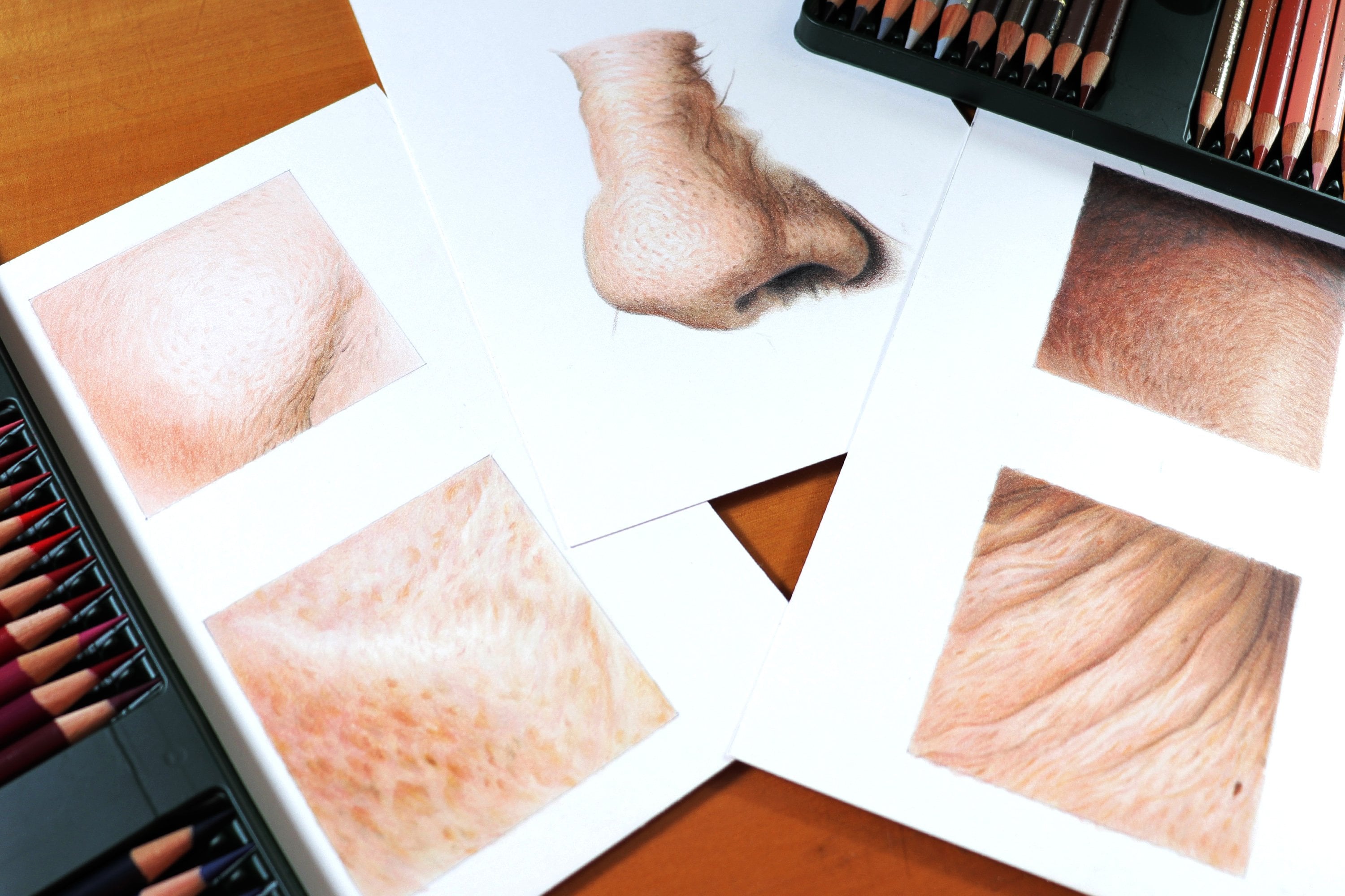
working with layering. This technique is the foundation of working with colret pencils. If you're using good
colored pencils and good drawing paper, you will be able to overlap
many layers of pencil. This is great for getting
consistent coverage, blending different colors, and
achieving a smooth finish. The only downside of
this technique is that it requires some
time and dedication. However, if you want a smooth, more realistic finish, try following the process
presented in this class. In my opinion, it's worth
dedicating more time and effort to produce higher quality work that
makes us proud. I'm using the light green pencil to give a more general coverage, not putting too much
pressure on the pencil. There's no need to
exert force here, invest in circular
motions that are a expensive, a little wider. As the shadows
almost disappeared, I went back to using
the dark green here. It is normal to have to do
this type of adjustment. Now I'm going to start using those two extra colors that I identified on the left of
the leaf, brown and yellow. This yellow specifically
has a tone closer to green, and I found it interesting to use it throughout the
rest of the leaf. I thought this
tone was needed to make the leaf more
vibrant and interesting. Once again, I'm using
the pencil lightly without applying too much force to make a more general coverage.
8. Leaf: Blending: From here on, the
colors are more or less well defined throughout
the entire drawing. For this reason, we can move on to the next step
which is blending. The goal is to give a smooth
finish to the drawing, removing the grainy look by
covering it consistently. Most of the time, I will
use lighter colors, which in this case are light, green, yellow, gray, and white. Now, I do add a
little more pressure when using these pencils. Try not to push too hard though. In addition to breaking
the tip of the pencil, you'll risk overdoing it, and it's difficult to make
corrections at this point. Alternate between
the different colors to achieve the desired balance. If you think this
drawing is too yellow, then use the green again. If it's too green, add a
bit of yellow, and so on. The top half of the leaf is where I see more
shades of gray, especially on the left. I'll use the white more
for the final touches. Add a bit more of
light green and add some touches of
yellow here too. As we are close to
finishing the drawing, we can now add details
more assertively. Here, finally, I will use the white color by adding a little more
pressure on your hand. The white is excellent for blending the colors
of the lower layers. Use it more in the
brightest areas obviously. The fact that I'm using
Fabacstal pencils from the polychromo series is
important information. This pencil has its
own specific behavior. If you are using pencils
from other brands, the white may leave marked, more apparent lines, actually drawing white lines
over the other colors. The Fabacstl pencils tend
to be more delicate, slighting lightning and
blending the colors. Then before using a white
pencil in your drawing, do some tests on
a separate sheet to see how your pencils behave, especially if you're
using pencils from brands such as Kohontah
and Prisma color. Avoid unpleasant surprises
by testing first. And this is the leave done. I hope you are satisfied with your drawing as I am with mine. See you in the next video. A.
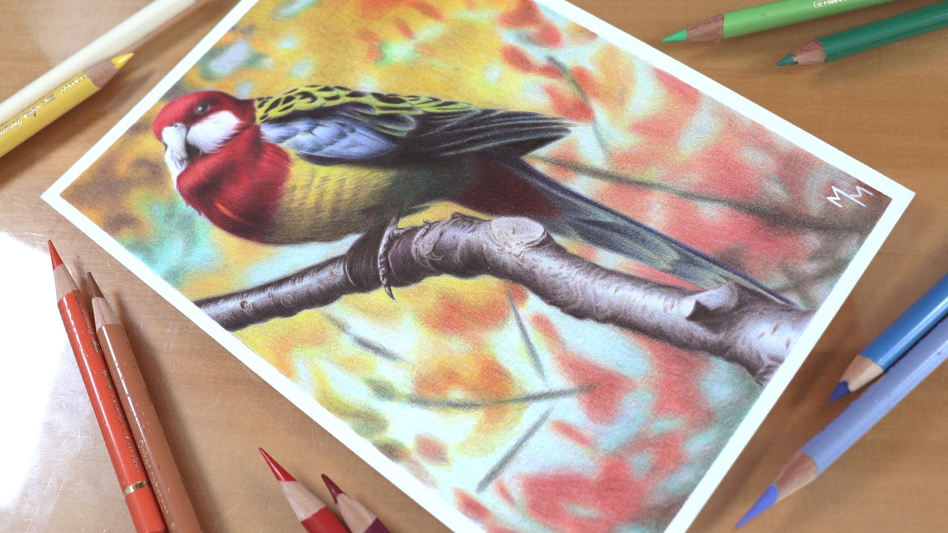
9. Blue Phlox: Picking the colors: Moving on to the next exercise, let's not draw a blue flower. We'll always follow
the same procedure. First, we identify
the basic colors of the reference image. Then we'll see which pencils
most resemble these colors. Finally, we'll try to cut down the number of pencils
used as much as possible. Again, I have broken down the flower into
four main colors. With these four colors, it will be possible to
draw all the petals. Now, to choose the
pencils to use, I'll start with the
darkest color once again. For this color, I found five candidates that are
more or less similar to it. If none of our pencils come
close to a certain color, consider mixing two
or even three pencils to obtain the desired color. In my case, for
this first color, I mixed two different pencils
and included a black. Maybe it's a bit too
much on my part. After all, it's a
very dark color. A dark blue pencil combined
with black should be. The second color,
which is less dark, I can do with a single pencil. In my case, the pencil
is one of the pencils chosen to make the previous
color, which is great. For the third color, I only found three pencils
that would suit me. I knew that a blue pencil
alone wouldn't be enough, but maybe it could
be used in some mix. As you can see, I took two violet colored pencils
and the one on the left. The lighter one seemed
closer to the desired color. Then I mixed this lighter
violet with a light blue tone. Okay, I was satisfied
with this mixture. Finally, for the last color, I separated two
shades of light blue, one of which was already
used in the previous color. I wanted to know which of these pencils will
be most similar to the desired color when
used combined with white. In the end, the two
colors were very similar, so I chose the same blue that I used in color number three. This way, I was able to simplify my range of options even more. This less lighter color is more diluted
throughout the petals. It will be used more to
blend the previous colors, a process that you could already watch in the
previous lesson. This ability to choose colors and can also be
developed over time. Then these exercises are
an excellent opportunity to practice your color
perception skills as well. In the end, I separated six pencils to draw
the flower petals, including black and white. Now let's catch the
shape of the flower. E t.
10. Blue Phlox: Sketching: Okay, so this flower is
known as wild blue flux, and I give you this information
just out of curiosity. I confess that I'm
not a flower expert. And if you chose this class
because you like the subject, you probably know about
flowers much more than I do. In any case, it's a beautiful
flower that will give us the opportunity to work with blue and violet
color red pencils. To draw a sketch, I always recommend using a
harder graphite pencil, which in my case is the H B. Start by defining the size and how your drawing will
be placed on the paper. I myself had problems with the sketch of this drawing
because initially, I drew the entire flower before I realized
it was too small. I wanted to take up more
space on the drawing sheet, which is in A five size as for all the drawings
of this class. Then before starting to
draw the flower itself, pay attention to how
the simplified shape represented by these red
lines is placed on the paper. Notice not only the size, but also the tilt of the image. All of this will define what the drawing will look
like in the end. Oh. After erasing the first sketch, I gave it another try. I the image, noticed that I drew a pentagon
around the flower. This is an interpretation I made of the shape
of the flower. After all, it has five petals. I thought these
guidelines would help me in the process, and
they actually did. I also tried to connect the ends of the pentagon to
the center of the figure, which was also helpful. So I tried to draw the petals using these
lines as a reference. Another reference I
used was the space between one petal and
another inside the pentagon. We call this space
negative space. This is an additional
reference that helps you draw the
petals more precisely. Satisfied with the outline, we can then erase the
construction lines. After that, I will also light in the sketch lines using a
common plastic eraser. You can do this using a
needed eraser as well. Now let's use the
colored pencils.
11. Blue Phlox: Shadows: To start coloring this drawing, I'll take the lighters, blue, pencil and make a light
outline on the flower. I'm going to give a more
detailed explanation of how I color this first petal. Then I'll go through the other petals in a
quicker, more summarized way. After all, the process
will be repeated on the other petals with only
slight variations in tone. Finally, I'll pay
special attention to the central area where we'll have more shades
of gray and white. A Da Da Now, on top of this blue, I'm going to darken the shadow a little more using
a black pencil. Black is a very
interesting color because it gives more
depth the drawing. On the other hand, it's
best not to go overboard with this pencil because black is not a very natural color. It is usually mixed with
other colors in nature. It is rare to see pure black. Now, with the second
shade of blue, a little less dark, we can extend these
shadows a little more. Here it is easier to observe what the texture of
the petal is like, how it extends from
one end to the other. Notice how I finish each
of these shadow marks. Try to finish them
lightly as if it were a gradient that dissolves
until it disappears. This will make a
difference so that we have a smooth
transition between the shadows and the
intermediate tones of the paros themselves. I'm going to limit
the marking of the shadows with
these three pencils. Later we'll come back to make
adjustments when we have a coverage done and have a better sense of the
colors as a whole. Thank you. Tank. D.
12. Blue Phlox: Layering: With this light shade of violet, we can start covering the petal. Once again, I'm going to try to emulate the texture I see
in the reference image. Try to observe places where
the coverage is lighter. That is where we
have highlights. If you can vary the amount
of color in each area, you'll be able to give the petal a greater sense of valume. It is true, however, that we are still in the
first layer of color. With this shade of blue that
I separated for this flower, I'm going to repeat what I
did with the violet pencil. Since the shadows
almost disappeared, I'm going to reinforce
these shadows now once again with
the dark blue pencil. Alternating the
colors between them, I overlay several
layers of colors. Now I'm using the violet
pencil once again, reinforcing and expanding
the shadow marks I made at the beginning. Using a light blue pencil, I'll try to adjust the
general tone of that pedal. There is still plenty of
room for using black, because as I use other colors, the petal becomes lighter.
13. Blue Phlox: Blending: Now that I've reached a reasonably satisfactory
level of coverage, I'm going to start
using the white pencil. Then it's a matter of
alternating the colors, once again, trying to
achieve the desired tones. In this step, you can
increase the pressure on your hand when using
each of these colors. This color mixing
technique that we do by increasing pressure on the
hand is called burnishing. In this last layer, then, try to fill in these small
white pores that give a grainy appearance to
the drawing in order to obtain a smoother and more
homogeneous appearance. Oh.
14. Blue Phlox: Other petals: Well, this is the process. It is the same as what we saw in the leaf exercise and will be repeated until the
end of this class. What will change in
the next exercise are the colors used and the level
complexity of the drawing. But the process will
be strictly the same. This second pal has a piece
cut off in the reference. So I imagined what that tip would look like
and drew it here. We will go through
the next petals in a more summarized way. You will notice that I'm doing practically the same
thing on all the petals, starting by the shadows, moving on to the
intermediate tones by overlapping layers, reinforcing the shadows again to achieve a balance
between the colors. And in the end, I come
with the lighter color to blend all the previous
colors applied to the paper. If you find it hard to do
the texture of the flower, you can draw a simpler
version, ignoring the texture. Try to at least bring
out the variation in light and shadow
that each petal has, varying the amount of
dark and light colors within the area of each petal. Let's watch them as the process is repeated
on the other petals. Don't get it wrong.
Coloring each of these petals takes some time. So don't rush when
coloring them. Take your time and take
the opportunity to practice each of the
steps presented so far. You already know rationally
what you have to do. Now it's a matter of putting
everything into practice. In the end, I'll share
some tips for the center of the flower. D. Tech. For the center of the flower, I'm going to use
two shades of gray, both of them code, which I thought went well with the overall tone of the flower. Try noticing these shades of
gray in the reference image. Here, I start with the
darkest gray pencil between the two I picked up, the limiting the hole in
the center of the flower. I also tried to link this area with the
surrounding petals. I'm using the dark gray
pencil because once again, I'm starting by the shadows. Here, again, I use the
dark gray pencil to make the transition between the black and the
surrounding petals. Here the shade of
blue is very light, so I'm going to use
a light blue pencil. It is indeed a
subtle intervention. Notice in the image that
this area is almost white, so I'm preparing the ground for using the white
pencil in the end. Now I use a lighter shade of
gray also in a subtle way. Yes, this area is white, but not purely white. There is a slight shade
of blue and gray here. Add some touches
of these colors. I then come with the white
applied with more pressure. In the cases, white pencil does not need to be very sharp. In fact, it is too sharp. The tip will probably break. So don't worry about
sharpening your pencil first. By using this pencil, the colors applied
here will blend. However, much of the white will actually come from
the paper itself. Oh. To finish it up, I take the black pencil
for the final adjustments. And here we finished
another exercise. After coloring five petals, you're certainly more confident
at using Colored pencils, right? I hope so.
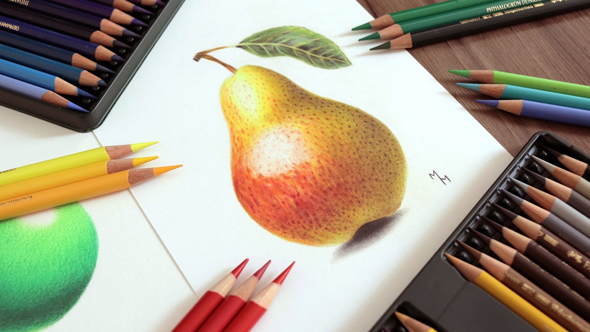
15. Yellow Rose: Picking the colors: Now let's move on to the
third exercise of this glass, which is this yellow rose. I loved doing this exercise, and I hope you'll like it too. As usual, we'll start by identifying the essential
colors of the reference. Here, we have the yellow
area of the flower, but we also have
the green leaves. I'll treat the two
parts separately. Focusing on the
yellows, once again, I broke the flower down
into four main colors. As a matter of fact,
I noticed that the shaded area is
predominantly brown. The choice of colors is
not always so obvious, and we have to believe
in what we're seeing. As you can see, the shaded area is not a yellow
mixed with black, but a dark brown tone. I have four options
in my pencil set, and as usual, I made torches
of each of these colors. However, none of these pencils alone left me satisfied
for co number one. In the end, I decided to mix two shades of brown
with an awkward tone. Yes, I ended up using three
different pencils here. This is color number one. I have many yellow
color options. This may seem like an advantage, but it can also leave
you quite overwhelmed. In my case, these colors are
very similar to each other. Then choosing just one of
the yellows is a great help as I don't want to get lost among my own pencils
while drawing. My color number two is the result of mixing
one of the shades of yellow I have with the same shades of cor
used in color one. I've already decided
about color number three, which is an intermediate
shade of yellow. I can do it using just one of
my pencils, which is great. The same goes for
my fourth color, which is a lighter
shade of yellow. It is certain, however, that I will combine
this color with white just as I will use black in
some parts of my drawing. So in addition to the
black and white pencils, will use five other colors to color the yellow
part of the flower. Regarding the shades of green, I will use the same pencils used in the first
exercise of this class, giving special emphasis to the shades of green
closes to yellow. In the case of greens, I identify the three
most important colors. Now I challenge you to select the best pencils you have
to make these colors. There is no need to make a
perfect copy of these colors. What really matters is that
you're drawing has coherence, maintaining a pattern and continuity between
the colors you have.
16. Yellow Rose: Sketching: Shall we sketch our flower? Once again, I will
do the drawing on an A five side sheet. The first step is to
define the size and placement of the
subject on the paper. Then I start by marking
the edges of the drawing, paying attention
to the empty space that will be left by the flower. Notice the distance
your drawing will leave in relation to the
margins of the paper. That's what I mean by
empty space in this case. As I am using an HB pencil, it may not be very easy to
see the sketch I'm making. However, you already
know the process. I always start by drawing more basic dramatic shapes that give the structure
of the drawing. A Notice that I started the drawing from
the outside to the inside. This is what I usually do
in more complex drawings. This way, I don't
run the risk of making the drawing
as I add details. By defining where the
stem and leaves are, I feel relaxed about adding
the details of each part. The yellow part of the flower
itself has its complexity, but that is exactly why it
can and should be simplified. Start with geometric shapes, drawing the structure using
not too long straight lines. Having made the
structural lines, I use the needed eraser to reduce the intensity
of these lines. Take care when using this
erasor, if you have one. Do not rub the erasor against
the surface of the paper. Just tap the pencil lines
a few times so that the erasor lifts back up the
graphite from the surface. This erasor can be very useful, but sometimes it
can some stains, if not used properly. After drawing the
structural lines, I once again use my HB pencil to draw
organic more natural lines. This becomes an easy task with this geometric sketch
made in advance. With the sketch finished, just use the razor once
again to clean the and with the needed
eraser, we once again, reduce the intensity
of the strokes, touching the razor and pulling the graphite
without rubbing it against the paper. Mm.
17. Yellow Rose: Greens: It's time to color our drawing. I'll start by the leaves and stem that is with
the shades of green. In addition to black, I will only use
three green pencils, one darker, one intermediate,
and one lighter. White and gray will
also eventually be used in more
specific situations. The stem is certainly the
easiest part of this drawing, so it's a good idea
to start from it. Using the darkest pencils first, I started always by
doing the shadows. Do as we did in the steps
in the previous exercises, gradually overlapping
layer upon layer. This reference features
some more intense shadows, and for that reason, you see
me use a black a lot here. However, notice that even
in the darkest areas, I add at least a touch of green. This helps to reduce the
weight of the black while contributing to a more
natural appearance to the drawing as a whole. Mm. Use this stem to practice layering colors. Don't be in a ruh to finish
any part of the drawing. Pay due attention
to all of them, taking the time you need to do them with care and dedication. St. At the end of each part, you can increase the pressure on your hand a little to blend the colors and obtain a smoother or more
homogeneous finish. Here, I use the sor because I accidentally
scratched the paper with one of the plenzos. D.
18. Yellow Rose: Sepals: The process is repeated
in the leaves, so I won't dwell too much on
these parts of the drawing. Even though I'm showing
this spot faster, believe me, I made each of
these leaves very carefully. While making the
shadows of the drawing, I added some details
little by little, especially the thorns
of the leaves. To do this type of detail, always keep her pencil sharp. Oh, D O D. Oh, D. M. I. C. O ccasionally, you may find
some errors in your sketch. Here, I had to make a
correction with the eraser. As you can see, I like
to start the process by lightly tracing the outline using one of the
colored pencils. This helps me visualize the drawing better and
understand what I'm doing. To do this, the pencil
must be well sharpened. After all, the most
important thing is to have precision
in your line. It is very important that
the strokes are light. Otherwise, the drawing
would look like a cartoon. It will be less realistic. Of course, this will
depend on your goal. Let's watch for a while the coloring process of
each of these leaves. A h. Oh. Here, once again, I made a
small mistake when I failed to notice that a yellow part of the rose appeared here
between the leaves. If I let this error go, it wouldn't be a big deal. This is a small detail. But in any case, I wanted to
stay true to the reference. O. When we get close to the end, it becomes easier to
see if the colors are well balanced in
each of these parts. After all, we can
compare one part of the drawing with another that
is one leaf with another. Here, you saw me make each
part of the flower separately, starting with the stem and then making each of the leaves. You can try another approach,
drawing, for example, all the green parts of
the flower at once, finishing them all
at the same time. It's another possibility. Here I'm passing the light
green colored pencil over all the green
parts of the flower. The goal is not only
to mix the colors, but also to seek coherence
between the parts, a pattern, a unity to the whole. I'm also applying dark
green and black pencils over the shadows
with the same goal, seeking a balance
between the parts, intensifying some tones and reducing the
intensity of others. This is one of the most
enjoyable parts of the process, as you actually see the
drawing in a more general way. So this was the green
part of the yellow rose, and it already gave
us a lot of work. Now let's move on to the yellow
part, the flower itself. 35 35
19. Yellow Rose: Shadows: Now we get to the
yellow rose itself, and I'm going to
do this part using basically five pencils in
addition to black and. Once again, starting with the outline using the lightest
yellow pencil I have. I usually outline with lighter pencil
because I don't want these lines to be
seen in the finished drawing as I want
it more realistic. Now I'm going to
map the shadows. And for that, I chose this
occur or colored pencil. I'm already doing some
gradings with this shadow as the shadows are responsible for the volume of the drawing. This petal in the middle, despite the predominantly
yellow tone, is partially covered by
the petal on the right, which is blocking
some of the light, so the ocher and brown
will be very visible here. Here I'm going to darken the outline a little
bit to make it easier to see as I can do that here because one of
the sides is dark. Never draw counter lines
around the shadows, always try to finish them
in a soft and faded way, unless it is the case
of a harder shadow, probably the result of
artificial lighting. That's not the case here. In any case, always be guided
by the reference image. In this lower area, we actually have more
intense shadows, and that's why I'm
using the black. Now, to push the
shadows a little more, I'm going to start
using brown pencils. As they are darker
colors than ocher, I work with them in a
more restrained way always within the areas
limited by the ok. A These petals above
are indeed darker, but don't rush to darken them as there is a risk
of overdoing them. Let's color this drawing
little by little to avoid exaggerating
one color or another. This other shade of brown
I'm using is a sienna brown. It's a warmer brown. I want you to use it because
it will give me a lively, more vibrant tone
with more saturation. This will greatly contribute to the overall tone
of the drawing. I For now, I'm still using
this brown very lightly, just to test the waters. Later, when I have a better
general idea of the colors, I may or may not put more pressure on my hand
to apply this color. Here I use the black
very carefully. Depending on the area
you're working in, the use of black should
be quite subtle, and is the case here as it
is a relatively light area. I chose to use this
color because I really see a little bit of
black in these shadows. After having made a
base for the shadows, now I add new layers
with these same colors, aiming to adjust the shadows. I'm going to use this
car color a lot as it is intermediate tone
between brown and yellow connecting
the two colors. It will serve as a base for all the shadows in the
yellow area practically. Browns are used in a
more restrained way, appearing in more
specific points. The more I use these colors, the greater depth I
get in the flower. Ohh
20. Yellow Rose: Layering: Now, focusing on
this middle petal, I start working on the layering
in a more general way. For this, I chose this slightly
darker shade of yellow. I'm going to use this color to practically cover
the entire petal. Still, I'm going to leave some empty spaces where this
petal is most illuminated. In these areas, I use lighter shades of yellow
in addition to white. It is in these lighter areas that the texture will
be more visible, at least when it comes to
this darker shade of yellow. I'm going to use a lot of card tool to work
on the texture. Speaking of cer, here it is. In this step, I will use it in a very subtle way as I'm drawing
a very delicate texture. With a very sharp pencil, I made a series of
very light lines, trying to create a texture that I see in the
reference image. It's impossible to
make a perfect copy, and that's not even my goal. What I want to do is something that resembles that texture. This is a quite delicate work. I think it's worth a try, even if you're a
beginning artist. After working with longer lines, it was time to work
with shorter lines, as this is how the texture appears in this area
of the drawing. I also reinforced some of these longer lines and
reinforced the general shading, always with the
same walker pencil. Here, I'm using the Sienna
brow once again to warm up the general tone of these shadows and
the touches of cher. With this lighter
shade of yellow, I will cover the
entire petal in focus. We are not at the
blending stage yet, so we will make a
lighter coverage. This lighter yellow can be
used even over the shadows, just to have a greater
integration between the colors, working on the
transition between them. Do you remember that
gradient that I do at the end of each video about
choosing the colored pencils? With the last lighter color, I usually come up with
it and use it over almost all the other
colors going backwards. This is a way to work
on the transition between them smoothly. And that's basically what
I'm doing here in practice. Here, I confess
that I got carried away and paid a lot of
attention to the details. This is a slightly more
advanced approach to drawing. You don't need to work
on the texture like I did if you don't
feel comfortable. You have to be careful here because this is a
very subtle work. I'm using this car
pencil very lightly, barely touching the
surface of the paper. It's very easy to
overdo the details. As my approach to drawing
is more realistic, I love making these textures that explains how much
attention I give them. Here, I probably
entered a unit state of law and joined the
process to its fuist
21. Yellow Rose: Blending: Being finally satisfied
with the texture, I took my yellow pencils to finally work on the
finish of this pedal. We can apply a little more
pressure with our hand as the goal is to
reduce the porosity of the coverage and
mix the colors. So I alternate between the two shades of yellow
that I e for this flower. Obviously, the lighter
shade of yellow is for the brightest areas
and the darker yellow is for the shaded areas. Oh Check your drawing to see if you have shaded
enough these areas. You may still need to wear the more consistent layer
of ocher and brown there. For the most
intensely lit areas, I'll use the white pencil. Observe the effect
it produces on the other colors and evaluate whether that's what you
want for your drawing. And so this is what
this pedal looks like. I just love the result, and I hope you'll like
your drawing too. After making the
final touchings, we'll move on to the
other pedals following the same approach. T.
22. Yellow Rose: Other petals: In the other petals, we have two different
situations. Here further to the left, we have darker petals, so we have a predominance of ocher and browns in this area. On the right, on the other hand, that petal is brighter. So we have a
predominance of yellows, especially the light
yellow and white. Let's start with
the darker area, making heavy use of ocher. Then I adjust the overall tone using the Sienna brown pencil. Now, I'm with the
intermediate yellow to make a more general
coverage layer. Oh. There are some touches of dark brown to intensify the
shadows in a smaller area. Notice how this brown lowers
the overall saturation. It's a shade of
brown closer to gray than Cena brown,
which is warmer. In other words, every time I
use each of these pencils, there is a change in the
general tone of the drawing, sometimes becoming, sometimes becoming duller, more neutral. Notice that even in this area, I use the lightest
yellow available. It's true, however,
that I use it in a more restrained,
more subtle way. Once again, the goal is to provide coherence to
the drawing as a whole. After all, all the petals will have the same
colors, right? What changes between them is the amount of light
that each one receives. Hey. To finish this drawing, let's now move on to
the right most petal. To no one surprise or start
with the shadows using cher. There are almost no shadows
on this pedal, however, the light comes
from right to left, eliminating this pedal
almost entirely. Now, moving on to
the darker yellow And now with the lighter yellow covering
the entire pedal. Do this layer more lightly, avoiding putting excessive
pressure on the pencil. This allows me to
assess whether I will need the darker yellow again
and add new layers with it. If I saturate the paper
with the lighter yellow, it will be more difficult to
make this adjustment later. Also, I know I'm going
to use the white, so I need to leave room for it to With the darker yellow, I even tried to add a very subtle texture here
almost imperceptible. I just can't help myself. Now, with the lighter
yellow and white, I will finally mix these colors until the
paper is saturated. Time to put my pressure
on the pencil. A
23. Yellow Rose: Last touches: I'm done with the petals. Y. Now I'm just going to make some adjustments to the green areas of the drawing. I left some areas blank, which will be covered
mainly with light green, white, and even some
touches of ocher. I also felt the
need to intensify some shadows using mainly
dark green and black. These adjustments
happened because I have a better sense of
the drawing as a whole. And eventually, I noticed
some flaws here and there. I make these final adjustments to all the drawings I make, whether they are in color
or black and white. Thank. And here we finish another exercise
for this class. I hope we had fun as much as I had making these yellow ros. Let's end this class then with
the drawing of a red rose.
24. Red Rose: Picking the colors: Now for the final
exercise of this class, we will once again analyze the colors of the
reference image. Don't be scared by the
complexity of these rows. This exercise is not
necessarily more difficult than the others.
It just takes longer. You will notice that
the process for coloring this flower will
be strictly the same. The only new thing
I'm going to bring in is that I'm not going to
draw this rows free hand, but rather using tracing
method to sketch it perfectly. In other words, you
don't need to know how to draw to do this exercise. But first, let's
find the colors. I have a lot of red
options in my set. There is no way to work with all these options
at the same time. Even because the colors are
very similar to each other, and I myself very noticed the difference
between some of them. Having once again summarized the reds of the rows
to four main colors. Let's find the best
pencils for each of them. The first color is a
very dark shade of red, and to my surprise, none of my pencils look like it. The solution,
however, is simple. Just mix some of these shades of red with brown and black, and we will have our color. I decided to complicate
things a little as one of these basic tones is not
actually red, but red violet. It's not that I had seen
violet in the reference image, but I thought that
using only shades of red from start to finish
would be a bit boring. I wanted some
variation of colors. The decision to add a violet to the mix was more artistic
rather than technical. Allow yourself to do
this type of experiment, adding different colors
to your drawings. This can yield quite
interesting results. The second color that
I highlighted in the reference image is
quite similar to the first. In fact, I'm going to do it using the same pencils
of the first color. In other words, it's
the same color. What changes is that I will cut down the black
to create this tone. The next two colors I highlighted are also very
similar to each other. The difference is that one of them is more saturated
than the other. So I thought about
using a maximum of two pencils for
these two colors. First, I need to
separate these colors from those seven options
that I have here. It's an excessive
number of options. In the end, the solution
I found was to make the red less saturated by
combining two pencils. Since color number four
is a more common red, so to speak, I knew that one of my pencils would
be similar to it. So the solution for color
number three was to use this common red with
some less saturated red. In the end, I chose
this neutral shade of red called venetian red. If your color set
is more limited, you probably don't
have this red. Don't worry. Use the
colors you have. To obtain a less saturated red, you can use some shade of
gray or brown, for example. The fewer color
options you have, the more mixing you
will have to do. And these are finally
the pencils that I separated to create
the red tones of the. To the selection, I
added the white color. D D.
25. Red Rose: Tracing: Now I'm going to
show you how you can sketch this rows perfectly. I decided to bring this method because this reference is
actually quite complex, due to its amount of details. Feel free, though, if you want to draw this
rows free hand. To follow this method, you will need the
reference printed, the sheet of paper on which
you are going to draw, and a sheet of
common print paper. These three paper sheets
are all in A five size. Let's start with the
cheap paper sheet. Using the darkest
graphite pencil, you have covered this
sheet in its entirety. I usually leave just a
bit of the margins empty, so I can manipulate it without
getting my hands dirty. Use the softest pencil you have. I'm using an eight B pencil. If you have a four B pencil
or six B, that's great. If you don't have
any dark pencils, no problem, use whatever
you have available. Then with a piece
of toilet paper, I will spread this graphite over the surface of the paper. I usually fold the toilet paper into triangles to have
more control over it. This step, however,
is not necessary. All you have to do is
spread the graphite. Repeat the procedure once
or twice to darken it more. Now let's fix the
printed reference on the sheet we're
going to draw on. Use at least two pieces
of tape to prevent the reference from moving when we are
transferring the lines. Now, position the
graphite sheet between the reference and
the drawing sheet with the graphite
side facing down. Now, with the help of a pen, I will trace the contours
of the reference. So we will transfer
the reference lines to the drawing sheet through
the graphite sheet. Avoid using excessive force when tracing these
lines, however, press just enough so that
you can see the lines on the drawing sheet without damaging it or creating grooves. You don't need to
use a pen for this. Any pointed tool can do the job. However, I suggest using
a pen that is not black so that you can
see which parts of the reference you
have already traced. I particularly like using
a red pen for this. Transfer as much
detail as you can. The goal is that
you don't have to imagine anything when you
are coloring the drawing. This way, you have
one last thing to worry about when
working with the colors. You may be wondering why the reference looks
like this with the counter lines already highlighted, looking
like a drawing. This is a trick that I
do with photoshop and that I also use it to
spare printer ink. Additionally, this makes it easier to see the counter lines. I will make this reference ready for printing available to you, so you can use it to And so we transfer the details from the reference
to the drawing sheet. From time to time, observe how the counter lines
are turning out. You may have to reduce
some of the lines. When you're sure that
you have transferred all the necessary details and that the sketch is finished, you can finally detach the reference image
from the drawing sheet. So let's move on to the colors.
26. Red Rose: Greens: Just like I did with
the yellow rose, I'm going to start the
rows with the greens. Using a dark green pencil, I make a light outline
on the leaves and stem. For the greens, I'm basically
using these four pencils, one of them being black. The greens are the same ones
I used on the yellow rows. Later on, I will need brown, white, and gray as well. You already know the process. I start using a darker
pencil to map the shadows. From the beginning, I leave some areas empty for
the lighter shades, which will come next. Take advantage of each of
these steps to practice layering and become more experienced with using
colored pencils. Although the greens are not
the focus of this exercise, they do require some
time to be well done. That's why I suggest
that you enjoy every part of the drawing
and do your best. For example, with
this first leaf, try to draw the
most beautiful leaf you have ever drawn
in your life. It took me more than
an hour to finish it, drawing calmly and paying
attention to all the details. Here, I use a bit of black
to intensify the shadows. And here, I use an
intermediate green tone, which is a little
more yellowish. There's a bit of lighter green here that won't be used much on this leaf as this leaf
has a darker overall tone. Now I'm going to make more
layers with the same colors, adjusting the values until
I reach the desired tones. Black and dark green
will be dominant here. Notice that I left empty spaces for lighter
grooves in the leaf. I think that drawing them like this is more efficient
than trying to use an razor later as razors in general can't erase
colored pencils very well. It will also be
difficult to make fine details like the
using jot an razor. Then after using the
intermediate green, I use light green and gray to
fill in these empty spaces. The gray serves to reduce the saturation of
the light green. Notice how this
light green clashes with the other colors. As I don't have a light green that it's not very saturated. The way to decrease
the saturation is to combine it with gray. After that, it's a matter
of making adjustments, overlapping these
colors once again, but to blend them together.
27. Red Rose: Stem: We can then move on to
the other green areas. The process is the same. Difference is that in the stem, I saw some shades of brown, which will be added soon. Although black is present
in all these green areas, be careful not to overdo it. Use other shades of green
to balance the colors. Even the shadows are green, being a very dark green. On the stem, the upper
area is more greenish, and the lower portion has
some shades of brown. That's why I divided this
stem into two main areas. Overall, this stem is very similar to that of
the yellow rose. Try to make a gradient
from left to right, making a smooth transition
from dark to light. This will give naturalness
and valume to the stem. At the bottom, you will notice that I changed the
colors a little. Here I'll use more
black and brown. I'm used the same browns
used in the yellow rose. So, have you already separated your brown pencils for this part of the drawing? I hope so. This is a very dark area, but it also has shades of green, even a touch of light green. The connection between the stem and the leaf is a
little lighter, and in this area, I
use a bit the ocher, as well as light green and gray.
28. Red Rose: Other leaves: As for the other leaves, there is not here. Just pay attention to the
different shades they have. Let's watch the process
of the next two leaves. At the end of the second leaf, I used a little the co grade
to reduce the saturation, and then I came with the white pencil to
add some details. These are subtle details that are visually
very interesting, so much so that I
decided to go back to the previous leaf to do the same type of
detail using gray. Now let's move on
to the third leaf, which is the darkest
of the three, although the
difference is small. Here I'm going to use dark
green and black even more. Don't forget to leave
empty spaces, though. Here I'm using this
yellowish green tone that makes a big
difference in the drawing. If you don't have
a green like this, combine whatever green you
have with a yellow pencil. After I came up with
the black Benson, once again, I wanted to
darken this leave even more. Notice that I make a series
of small gradients within it. These are small transitions
between dark and light. Now, some touches of light green and gray in
these lighter details. And then I continue with the same dark colors until I get consistent and well
finished coverage. And now the last touches of cold gray to finish
this third leaf. To connect the leaf to the stem, I used black, brown, and ker. Gray came later to
blade these colors.
29. Red Rose: Sepals: To finish the lower
area of the rose, we will make these small
structures called sepals. As I said, I am no floor expert, and the name of these
structures is a mere curiosity. What matters is identifying
the colors found here. What I see is mainly a
combination of lighter, green, browns, and grays. Let's see how to work with
each of these colors here. As usual, I start with the
darkest colors I identify. In this case, it's brown
with some touches of plaque. I also see a bit of brown on the tips of
these structures. Then I add greens to the
mix, especially light green. It's worth adding a
few thorns here and there with the brown always
based on the reference. And here is the gray, which is quite present
in these sepals. In the best areas, I will combine it with white. Then I make some adjustments with brown and gray once again, and this part will be finished. The other sepals
are very similar, and the process for
drawing them is the same. I'm going to use the
same colors for them. This sepal in the middle
is the lightest of them, hence the predominance
of light green, gray, and white here. This intermediate shade of green was the darkest
pencil I used here. And finally, the
fourth and last sepal, which is made just
like the others. Let's watch the process to
finish this first part.
30. Red Rose: Shadows: We are finally at the
main part of the rose. This drawing is actually
more complex and will take more time than the other exercise
of this class. But you will notice that the strategies
applied are the same. The first step is to
define the coors well. And for that, I will use this shade of violet
very close to red. This step is very important because it's easy
to get lost among the different parals of the rows with a well
sharpened pencil, slowly go through the
lines of the sketch, leaving each part of the
flower well defined. Look at the reference whenever you're in doubt and
take your time. Now we move on to the next
step which you already know. I'm going to map the shadows. And for that, I'm going
to use the same pencil. In some areas, it is
visible that I make a gradient going from
dark to light smoothly. This is more visible
on the larger petals. Try to work on the two. See this As you can see, I'm not just mapping
the shadows, but I'm already defining the intensity of
each one of them, defining where they
are more or less dark. This definition will give
me guidance when I start using darker colors such
as black and brown. It's easier to think
about this kind of variation when you're working
with a single core pencil. So it might be a good idea
for you to do that, too. This makes the step longer, but it will make the
following steps easier. Now I use the next
color, the black. Strictly speaking,
I'm going to go over the darkest shadows
I've done so far. However, the process
will be easy, after all, simply go over
what was done with a violet. In some places, I dark at more, but it's important to note that this is still the first
layer of shading. After I use the other
colors, a will change, and it will be necessary to make adjustments again with
the darker colors. This reference has some very intense shadows
in some areas, which creates an interesting
contrast and renders volume. There is not a variation
in colors here. What varies most are the
light and dark values. They are what will
define these rows. Each petal hides a gradient and knowing how to make
these transitions, is what will define the
quality of our drawing. We will see soon how
this will be worked out. Tete penalty penalty. Penalty.
31. Red Rose: Layering and blending: From here, I chose to
work petal by petal. You don't have to
follow the same path. You can very well work all
the petals at the same time. However, if you want to
follow along with me, do the petals one at a time. Even though I'm
starting with red here, that doesn't mean that
the shadows are finished. I still want to tone
these shadows with brown. It is a slightly
saturated brown, which will slightly reduce the intensity of the red
while at the same time, it will make a
transition between black and violet with the reds. Despite all the base
made with violet, I will still use
the color a lot. I think it adds a special
touch to the drawing. As the light comes
from right to left, these left most petals
tend to be darker. Hence the more pronounced
presence of black, brown, and violet here. After defining the shadows well, I've been using red
more intensely, already putting some pressure on the pencil and
mixing the colors. This is the process that you will repeat on all the petals, but with the Caveat
that there will be variations in
tone between them. This petal is
further to the left, but it's very exposed to light, having a vibrant shade of red. So I used one of the reds practically without mixing
it with other colors. Only after I used a little bit of brown and violet
to adjust the tone. These next two petals are an example of the tonality
variation that we can observe. The first darker has a
greater presence of black and brown while the second will give more space
to an intense red. A Brown in theory would be more
related to shadows, but in some cases, it will be part of
the mix with red. That's what we're going to
see in this petal here. I think it's a good
idea to work petal by petal because if I did a
general coverage with red, perhaps some details would be lot and I would be lost
between the petals, not knowing when one
begins and the other ends. Plus drawing a single
paddle is a lot less intimidating than doing them all at once.
Don't you think? I think that drawing each part at a time is much more friendly. And this is for several reasons. You may look at this flower as a whole and think that
drawing it is very difficult. But what about when you focus your attention on
a single pedal? Drawing one single pedal is definitely easier
than a whole flower. The process as a whole
can also seem very long, but focusing on each part at a time gives you a better
sense of progress. So forget about how much time you will need to
finish the drawing, but always focus on the
part where you are instead. Interestingly, that flower
that seemed so challenging is actually the sum
of several parts that are relatively
easier to draw. The big secret is not to allow the parts to be incongruous
with each other, transforming your drawing
into Frankenstein. That's why I always set
aside some time in the end to make adjustments in order
to link the different parts. We'll do that in
this drawing too. When coloring with red, I leave some empty spaces
between one petal and another. This is because there are small light lines on the
edge of some petals. As I always say, my guide
is a reference image. From here on, you
see me use more of these less saturated
red, the venetian red. The truth is that the variation in red tones here
is very subtle. You may not even
notice this variation. By the way, this
variation in tones can be done with violet
and brown pencils. So don't worry too
much about having another shade of red just
because I'm using two of them. Of all the colors
I'm using here, this venetian red is
certainly the important.
32. Red Rose: Central area: Now let's get closer to the
central area of the flower. Here as the petals
are even smaller, will sometimes do them together. I don't have to change
the pencils all the time. These petals towards the
center tend to be darker, which is why there is a greater
predominance of violets and browns here in addition
to black of course. At first, I'm going to use
more brown and violet. I'm also going to
combine a lot of the two reds I chose for
the drawing in this area. Don't worry if you don't get the shadows right
the first time. I'll have to make some
adjustments myself in the end as the rest of the
drawing isn't done yet, and it's difficult to compare this area with the
others this way. The amount of shading we
should do also depends a lot on the context and that
it's still missing here. Now you can see that even
in the darkest areas, the red will still be present. M. Here, we can observe that despite
the presence of reds, brown and violet
predominate initially. But this drawing is
still very light, so I'm going to use a
lot of black here later. As I said, this central area is not as I would
like it to be yet. I will work on this
area again later. Let's move on though. The bat. Here, I work once again on
the shadows with the brown, continuing what I did
on the other petals. This is a way of
giving coherence and unity to the
drawing as a whole. I'm also using
more venetian red, which acts as a
transition between brown and pure red violet
itself also fulfills this role. Finally, I come with the most intense red
to blend the colors. O M Behind this petal, there is this strange detail. I don't know exactly what it is, but I did it anyway. This doesn't matter
to me because I see the reference image
as a set of shapes, stains, each of them with different hues and values
of light and shadow. That's what matters to me. Even though I don't understand exactly what this
slighter stain means, I make it anyway the way I
see it as an abstract form. For me, it's a lighter
spot within a darker area, and that's what I'm going
to bring to my drawing.
33. Red Rose: Last petals: Here we are back to
this larger petal, and I start by making adjustments to the
shading with the brown. In the final stretch
of this drawing, I will add some
nice details here. Before that, however, I will worry more about
the shadows and the red tones leaving this petal in harmony with
the rest of the drawing. This petal is divided
into two parts, one darker and the
other brighter. So on the left, I work a lot on the shadows, now adding brown. While on the right, we will have the predominance of reds. When adding reds, try coloring
in different directions. This will prevent pencil
marks from being visible, allowing for a smooth finish. As you progress, you can
increase the pressure on the pencil to reduce the
porosity of the surface. This is probably the
area where the red will appear in the entire. In these petals on the right, I thought the reds were a little less saturated in the reference. It's a very small difference. Maybe that's just in my head. Anyway, for this reason, I used more the venetian
red in these petals. This gave me more peace
of mind when using the more intense red as it wouldn't leave an overly
saturated finish. This is the area
that, in my opinion, presents the most
interesting shadow play. That's why I invested
a lot of time in this area working with
brown and violet. Black also plays an
important role here, especially in the end. At this point, after you
have made so many pedals, you should be doing
it pretty well. I hope this exercises
allow you to learn a lot about
using colored pencils. And so, shading
layer after layer, we managed to build a
very well done coverage. It does take time, but it's
worth it for the result.
34. Red Rose: Last touches: Now that we have a
sense of the whole, we can improve what
may not be so good. The first thing I felt
necessary to improve was the intensity of the shadow in the middle of the flower. By making this area darker, the flower will gain
depth as we increased in contrast between the central
area and the other petals. In some cases, I may
adjust the tone of the red by using other
colors such as brown. Just pay attention
that your drawing will probably be
different from mine. That means that your drawing
may need other adjustments, not necessarily the
ones I'm making. Here, I finally add some
details with the white pencil. It's just a few touches here and there, nothing too exaggerated. In some cases, the goal
is to add a bit of light. In others, the goal is to reduce the saturation as with
this petal on the right. Here, I add a very
subtle texture detail using the same white pencil, and then I add the
venetian red to adjust it giving a more defined shape
to these white lines. And here we are done
with our red rose. In fact, it's a more complex
and laborious drawing. I hope you weren't
intimidated and that you challenge yourself along
with me with this reference. It was a pleasure for me to
do this drawing with you, and I hope you enjoyed
the journey too. O
35. Conclusion: Thank you so much for
watching this class. And I hope you had fun and learned a lot with
the exercises. Don't forget to post your drawings in the
project section. I'll be happy to
give you feedback, give you tips on what you
can improve if necessary. Since you've made it this far, please leave a review
for this class. This is very important
so that I know what I can improve when
creating new classes for you. Thank you very much again, and I see you in
other classes. Bye.
 Matheus Macedo, Realistic Drawing Artist