Transcripts
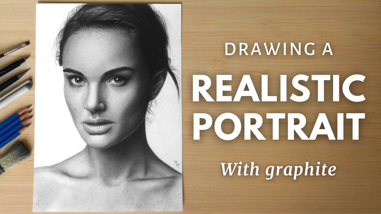
1. Introduction: Hi, my name is Matheus Macedo. I'm specialized in realistic drawings using graphite and colored pencil. I've been focusing on the realistic style for years and I've taught hundreds of students in person and online. I'm here to teach you the basics of shading with graphite pencils and I'm very excited to address this topic because it's the basis of everything I've done so far using graphite. This class is divided into two parts. In the first part, how you approach the shading with graphite using only pencils. I'll give you tips on how to hold the pencil, how to work with the pencil tip in different ways, how to achieve values ranging from darkest to lightest, and how to apply these skills with practical studies explained from start to finish. In the second part, I will introduce you to some tools that can help you achieve even more realistic results, explaining the function of each one of them and how to use them in order to make your drawings stand out. Are you ready to take your drawings to the next level? I hope so. Join us and let's draw.
2. Materials: Now let's take a look on all the materials I use for this class. If you don't have all of them, it's okay. Do your best with the tools you have at hand. There are papers in different colors in the market, but I prefer those that are close to white. You choose the colors according to your taste though. Speaking of paper texture for realistic drawings, I prefer to work with smooth papers. I would recommend you use a paper with medium to high thickness, its weights should be at least 150 grams per square meter. All the drawings are going to be in average size, so you don't need papers bigger than A4 size. If you want suggestions of papers to choose from some good papers are Lana Bristol, Fabriano 4L, Strathmore 300 Series Bristlol Smooth, Hahnemuhle Nostalgie, and Canson XL Bristol. They are different grays photographic pencils, and you don't need a complete set to take this class. I'm going to use the only Hb, AB, A2B, and 4B. My favorite pencil is the Staedtler Mars Lumograph, these blue ones. I use also a 0.5 millimeter mechanical pencil with 3B or 4B graphite lead. When it comes to sharpening, you can use a common pencil sharpener or even use a u-tooth knife for that. I personally use a hands crank sharpener, which is really handy, but maybe it's a little more expensive and less common. Neither eraser will be using this class and it's a good idea having one. This is the Tombow MONO 0, 2.3 Millimeters thick eraser and I use a utility knife to chamfer the eraser and increase its accuracy. Eventually, a common fix sticker eraser might be handy too. The pencil eraser compliments the other erasers. These are blending stumps also known as tortillons and they have two in sizes number 1 and number 3. Get a piece of toilet paper or tissue fold. It in triangles three times to have more control over it and fold one of its steeps to be able to see what you're blending. I also use brushes for blending. They are all flat and I trim some of them to have firmer brushes, which helps to make the graphic grip onto the paper and the others are more delicate for shading. A soft, long haired brush for a cleaner drawing is handy and it's better to use it than blowing the dust and the crumbs on a paper. It prevents you from spilling and ruining your drawing. I'm not going to use these two in this class, but out of curiosity, this is an embossing tool which I use to draw white hairs. It is used to carve, to emboss the paper, as the name suggests. You can also use a ballpoint pen without ink completely clean for the same use. That's it.
3. How to use a pencil: In this video, I'll talk about how to use a pencil as an artist. Well, to start off, I'd like to make some very basic considerations about the use of the graphic pencil. Even though it seems too obvious, I think it's worth drawing attention to some things. We are taught at school to use pencils mainly for writing, even though we also have art classes as kids. For this and other reasons, we are hardly encouraged to hold the pencil in other ways and experiment with other possibilities. Here, I am writing my name and perhaps you'll notice that in this case we hold the pencil quite firmly with our thumb and forefinger close to the tip. When I draw however, I often hold the pencil a little further back with my thumb and forefinger close to the middle of the pencil. The farther away from the tip, the lighter your stroke tends to get. Try to make lighter strokes, at least for shading. Excessively strong lines should be avoided. You can try what I'm doing here. Draw a sequence of strokes, starting with small pressure and lightening your hand as you move along the paper until we can make the lightest strokes possible. Repeat the procedure until you feel you're controlling better the pencil. This goes for ballpoint pens too. I think it was by drawing with them that I learned to control the pressure in my hand. I think this medium is worth trying out too. Here, I quickly drew an eyebrow to show how to apply this lighter and finer strokes on the drawing. It is by making strands of hair that we put to the test our ability to draw with fine lines and with different tonal values. Out of curiosity, I'm using a Ferby pencil here. It's important to pay attention to the tip of your graphite pencil. The tip of your pencil doesn't always need to be super sharp for a good shading. As we draw, the tip of the pencil wears out and forms a flat area that can be used to your advantage. This flat area can be used to fill in the shadow areas while the sharp edge will be used to make fine, precise strokes. You can use sandpaper to get this flat plane, although I usually wear out a little bit of the pencil tip on a separate sheet to get the same result. As I look for a more dedicated and realistic effect, I prefer this flat plane not to be too wide. In the following studies, I'm going to show you how I actually perform the shading in practice.
4. Small Gradients: Linear: In this video, I want to give you some studies to start getting used to the realistic shading technique. Draw preferably with the help of a ruler, a two-centimeter side square. In this first square, I'm going to make a gradient. This starts dark on the left and disappears in the middle of it. I'm going to use the B pencil here. The gradient is done a layer upon layer, the first layer being very light. I'm pulling the strokes from left to right as they start a little stronger on the left and get lighter on the right, almost halfway across the square. The arrow in the left corner of the screen will show you the direction of the stroke am following. Next, I'm going to do the same thing, but now I'm going to make the strokes diagonally from bottom to top, left to right, at a 45 degree angle. Now I'm going to reverse the diagonal drawing from top to bottom, always keeping my hand light in this first step. When we cross these lines, the pencil mark tends to disappear and we have a more homogeneous result. This technique is called crosshatching and I make wide use of it in my drawings. As you fill in the corner of the square, you may want to advance the gradient a little. That's why I am doing it here. I thought my strokes were too concentrated in the corner. Now I'm going to do the vertical strokes. These strokes start and end fine, and I decrease the pressure on my hand as I make my way to the right side. You can draw from bottom to top, or from top to bottom. Do what feels more comfortable for you, first on a separate sheet, if you're not sure which movement you prefer. Notice that my strokes are a relatively short. That's because I can't make fine precise strokes if they're longer. That way, I'm going to have to start other equally fine and delicate strokes high there up so that it doesn't look like they have been spliced together. So make sure your stroke start and end thin and overlap each other. This is the way to get a smoother, more homogeneous covering. In here we finish the first round of drawing this gradient. On the screen you can review the sequence we followed. In order to get the gradient darker in the left corner, let's repeat this sequence, but now putting a little more pressure and the hand. Try to keep our lines thin, even if you push the pencil a little harder. Since the idea is to darken more the beginning of the gradient, I'll be more focused on this area, remembering that we will only use the B pencil here from beginning to end. A common mistake of beginners is not knowing how much we can darken drawing. We'll see this more clearly in the next video, but here we can already get an idea by darkening the corner of this gradient. Anyway, we'll dive into this topic in the next video, when we'll draw a larger gradient. This gradient can be done in different directions; right to left, top to bottom, bottom to top, diagonally, I recommend doing this exercise with other pencils too so you can get to know them better. How about drawing a gradient like the other day for a week, each day in one direction and with a different pencil? Sounds like an excellent idea to me. This study is short. It takes me about ten minutes to do it, so doing one a day wont be too demanding. You will certainly draw the seventh gradient better than the first one, I have no doubt about that.
5. Small Gradients: Radial: The proposal now is to draw a radial gradient that is circular in shape, dark in the corners, and light in the center as if it were a light at the end of a tunnel. Once again, we are drawing on a two by two centimeters square, but now I'm using the 4B so that we can compare dispense with the previous one. I also do this exercise using the cross hatching technique, but now I'm going to pay attention to live in the center of the square blank. When you are darkening their right side, reverse the stroke direction. The arrows show the direction of the stroke I'm following. Then we go on crossing these lines. It is preferable to start the strokes from the edges of the square because we tend to do it with a little more pressure. I think this is pretty obvious and you probably agree with me that starting these strokes in the corner makes more sense. Here I'm going to overlap the hatches to deepen the shadows and filling that gradient even more. In this step, I also wanted to move a little further towards the center of the square because I thought the white area was too big and I wouldn't have much ruined transition from dark to light. For this gradient to be well done, I recommend that you do it calmly and observe from time to time how the tones are. In order to make the adjustments you'll find necessary, first you have to look at your drawing to know what the next step will be. Then take short breaks to just observe your drawing. Here, I'm going to add the finishing touches to make the shadows in the corners very dark. In this step then, you need to put a little more pressure on your hand. Here in the end, I use the razor to eliminate those traces that escape it out of the square. I hope you enjoyed this video, and be sure to practice what you see in class.
6. Large Gradient: Now let's draw a bigger gradient than the previous ones. This study will give you a chance to get to know even better the pencils you have, and teach you how to have more control over them. Draw a rectangle eight centimeters long by two centimeters high, our with dimension is close to it. I'm going to divide this rectangle into four equal areas, each corresponding to a square, but without drawing lines separating one area from the other. These areas will serve as guides for when they go to cover the rectangle. I'm making this drawing using the 2B pencil, but you can make it using wherever pencil you like. The process I follow is similar to the one we applied in the small gradients. I'm going to use the cross hatching technique from start to finish, starting with the darkest area. Since this area is going to be the darkest, we can start by applying more pressure on the hand, but don't do this area carelessly. Take advantage of this gradient to practice the technique I'm teaching here. Start shading with horizontal lines, cross those lines with diagonals, and then draw vertical lines. At first, focus on the first square, but be careful not to make this area too marked. Leave the rightmost portion less defined so that a scene doesn't form in the end. I think this one is a good practice on how to make homogeneous covariance, so enjoy it. Now, I'm going to cover the other areas, but that doesn't mean the first area is done. It's not. But I want to do the first layer of the other areas too. Start the strokes before the second square coming from the first on the left. These strokes, of course, cannot be any darker than the ones done in the first area, so lighten the pressure on the hand a little here. That said, I keep crossing the line so as to achieve a smoother and more even effect. I will soon start doing the third area as well. The right-most area will be empty for the time being. Back to the first square, I'm going to push the dark values here. Now however, I'm going to work on the tonal variations that will happen along this rectangle. For that, I'm going to darken more to the left and decrease the pressure of the hand as I go to the right. The challenge here is that the tones get lighter, but they will still be dark. Look at the surrounding shades to see if you're not making that area too dark or too light. As we are not going to use any erasers here, be careful not to darken your gradient too much as we won't be able to fix this. Now crossing the lines on the second and third squares. At this point, you might think the gradient is finished because we can see the tonal variations from left to right. However, it is possible to go further and give a more consistent finish to this gradient. It's also possible to darken it a lot more, and that's what I'm going to do. I want to push my pencil to its limits. We're going to make layer upon layer, increasing the pressure on the pencil to achieve darker shades. The process is repeated, and here I seek to deepen the variance present in each area. When the darkest values are set, it's easier to know how much to darken or not too darken the lighter areas. Because the darkest area will act as a tonal reference point. When drawing the lighter area, you can hold the pencil with fingers a little farther away from its tip. Your strokes will naturally lighten using this trick. Here I'm going to make the finishing touches on this gradient. Transitions from one area to another require more attention from us, and that's what I'm fixing here. As with the other studies, please take your time to complete it. It took me almost half an hour to make this gradient. But I think it was pretty quick. If you were able to finish it in less time than that, maybe our gradient is not very well done. Be careful with this, don't rush. I hope you enjoy this video and I'll wait for you in the next one. See you there.
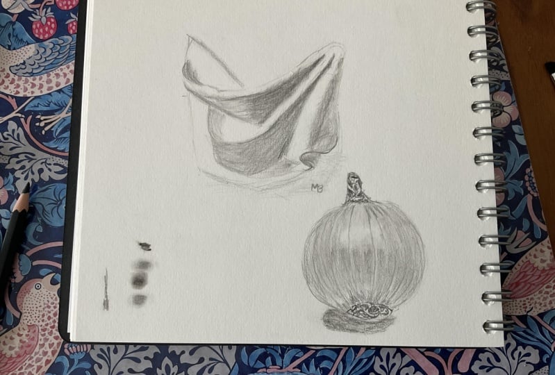
7. Sphere: Hi guys. In this video, we are going to approach one of the most classic studies of the process of learning to draw, which is the sphere. This theme is very important for those who want to master the art of shading. If you like, you can use the inside of the masking tape roll or any other perfectly circular object to trace the outline. You can also use a compass if you have one. My circle here is about 7 centimeters in diameter. I think it's a good size to work with. In this study, we are going to start combining the different pencils we have available to perform the shading. The outline I usually make with the HB pencil. Once the sphere is done, I would draw the shadow cast onto the surface where this sphere lies on. Make this outline very lightly as it cannot be visible in the drawing when it's finished. I'm also going to make a clear line that marks the transition from mid-tones to core shadow. Some people refer to this division as terminator. By the way, in this video, I will refer to some technical terms that can be seen in this image. It can be downloaded from the files attached to this class but will appear here from time to time anyway. An important information, if you are left-handed, you might prefer to draw this image inverted horizontally with the light coming from left to right and with the shadow cast to the right of this sphere. You can do this study this way, no problem with that. I decided to make this sphere that way because I'm right-handed. Let's start off the shade. Now, using the B pencil, our work on this transition line from mid-tones to shadow. The goal here is to hide this line but still keeping the reference towards the shadows. Notice the direction of the strokes I'm making. Next, I'm darkening the bottom area. Making these shadows with successive layers of graphite will allow us to have more control over the tone of variations this arrow presents. After all, here we have the core shadow and the light that bounces on the ground and is reflected over this area. I also shade the area above. We're still in the first layer and a lot of stuff will happen here. Notice that in the upper area we have the light that is reflected off the sphere and goes towards the viewer's eye. Leave this area blank and the shade around it. I'm shading this view with the cross-hatching technique if these strokes very close to each other, and it always do that in the base layers of my graphic drawings. That's how I manage to make smooth even surfaces. The bottom area we already get it a little darker, not because I'm applying more force there, but because I'm spending more time on that area. It doesn't take long, and I already changed the direction of the strokes to achieve greater uniformity in the shading. I'm still using the B pencil. It's by overlaying that I'm going to deepen the core shadow values. Here we can already use the 2B pencil and that's what I'm doing now. Direction of the strokes follows the shape of this sphere and is more comfortable for me. Here I am using the B pencil again as I want to fill in the mid-tone area more. It's time to add some more graphic layers here. These are slightly longer, steady. It took me almost 2 hours to finish this sphere, not counting the breaks it took during the process. If you want achieve a more refined result that makes you proud, don't rush, and enjoy the process. In this step, I'm going to darken this sphere as a whole and work even more on the transition from light to core shadow. I want to point out one thing. We tend to make the reflected light brighter than it is. Although it's a little lighter than the general shades of gray in this area, the tone of the refracted light must be darker than the tone of the illuminated area. For this reason, I'm using the B pencil here once again. The reflected light is a little lighter, but it's still a dark shade of gray. At this point, you will notice that the goal is now to deepen the values placed on this sphere until the covering is consistent enough. I also tried to make a smooth transition from light to shadow, not leaving it marked with a sharp line. Also, control your anxiety in this step. We are finishing the sphere, but it's in the final stretch that we make important adjustments, and I can already see what this sphere will look like. The time has come for us to draw the cast shadow. First, I'm going to rub an eraser over the outline I made because I wanted it to be very light and these lines don't appear in the end. We use the 4B pencil to mark where the sphere ends and where the cast shadow begins. This is the darkest area in our drawing, so it will serve as a tunnel reference as well. Once that's done, we can draw the first layer with the B pencil. This step is also important for us to define the cast shadow's shape. However, be careful not to make a sharp outline for this shadow. Instead, just fill in this area by making strokes in the same direction, just like I did on this sphere around the highlight. I don't want to see any contoured shapes here either. Now I'm going to use the 4B pencil. Here's an important detail. The cast shadow is darker near the sphere and gets less dark as you move away from it. This darkening area is called occlusion shadow, and it's mainly in this area that we will use the 4B pencil. Here, I'm going to make strokes in the way that seems more logical and comfortable. These gradients within the drawing are perhaps the most challenging parts for beginners. Don't be intimidated by them. Rather, see the toughest parts as the opportunity for you to evolve. If you practice these gradients, they will get easier over time. As a German poet Goethe said, "Everything is hard before it's easy." This is the mindset I recommend you adapt. Now to finish this piece, I'm going to work better on this transition from the occlusion shadow to the soft and fuzzy edges of the cast shadow using the B and 2B pencils. Use the cross-hatching technique to obtain a regular gray area. We've come to the end of another study. As I said, it took me almost 2 hours to finish this sphere. This drawing takes a little longer. I hope you enjoyed this subject. I'll see you in the next videos.
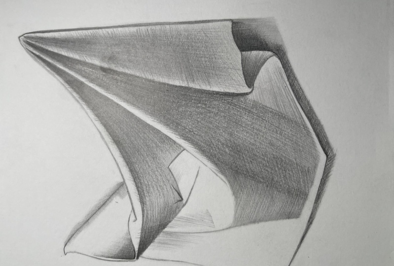
8. Drapery: outline: Now we're going to study a theme that is very dear to artists when to practice the shade. It's a study of a hanging drapery. I love this theme the way it looks like when it's done and so on. It's more of an abstract theme, which is great for us to practice our perception of lights and shadows. But before shading, we need to sketch the outline down the paper. This class doesn't focus on this step, but I wanted to give you some tips about it anyway. First of all, try to hold your pencil in a very loose and relaxed way. Move your thumb up and give it a try. This different grip allows you to see your drawing better because your hand won't be on your way and it also gives you agility on lightness. You will lose some accuracy, but this isn't the most important factor here to consider. By the way, I'll have to make some corrections as the process goes on. As always, I'm using the HB pencil for the sketch. I start by placing on the paper the limits of the drawing. That is, the extreme top, bottom, left, and right points of the piece. I usually sketch from the outside in and always breaking down the reference into simpler shapes. After I mark the extreme points, I start to link them to draw its boundaries. Initially, I draw everything using only straight lines because they're easy to draw. Use this side of the graphic need to draw the line slightly and to be able to erase some of them later without smashing your drawing. To close the boundaries, you need to pay attention to the angles from the different marks. You can use a ruler or even the pencil itself to check the angles on the reference. As soon as you draw the first general shape, you'll find it easier to add on some of these mother shapes that form the whole picture. I start to add some covered lines at this stage if I feel like. The drawing gets a bit more complex now, but the process can be broken down by observing the relations between its components. For example, the way I see this drapery, I would divide it into two different sections, the upper and the lower, and I draw them separately. First, I pay attention to it's sizes. If one is bigger or if they're similar, I try to place them inside the overall shape, noticing if they are close to the center or displaced to one of its sides. I focus on the relations, as I said. By doing so, you save some time because the worst scenario is to spend time going deep on the details and later be noticing that they are out of place on the composition. The measurement I use more often is the basement of the lines in relation to the height and width of the entire piece. Using half of these measurements or 1/3 of them as references is very handy. Once I finish the outline, I raise some of the lines to make the drawing look clean. Then I grab the pencil again and make other lines look sharper and stronger. The outline should be delicate in this step. I will come back to the matter when I will be finishing this drawing. I noticed a problem with the proportions of the drawing so it was time to correct it. Making mistakes is part of the process. Don't feel down if it happens to you. Actually, if you don't have to correct anything on sketch until you think it's done, take a break and when you come back to draw, take a couple of minutes to analyze it more carefully comparing your drawing to the reference. Perhaps there is something to fix before you start to shade that you didn't notice. Now make some final adjustments and adding some details before getting the shading started.
9. Drapery: shading: Here we make the first shading touches. I'm using the 4B pencil to establish the darkest values of the drawing, so when I shade the other areas, I'll have these values as a reference. I'll also mark the transitions from light to shadow I notice in some areas not really drawing lines but rendering a smooth gray mass. Since this area is considerably dark, I'm starting right away to draw the gradient I see here with the 4B pencil. Even though I'm using my darkest pencil, I'm still doing the first graphite layer, so I won't be forcing my hand now. I'm just setting up the drapery strainer values. Now I switch to the B pencil, some tones are very delicate, especially on the left where the light is more intense. I take time to emphasize some lines are of an important and then I'll be back to the shading. Notice how I tend to follow the movement of the drapery. I will be crossing the line soon to make it look a bit more realistic but I tend to do more often what is more comfortable. With the B pencil, I will soon be covering all the areas where I see even super light gray value. I will change the pencil only where if I can't achieve the values as dark as needed with the same pencil. Keep on using the B pencil and switch to the 2B if needed. Here, I got the 4B pencil to push the dark values on the right side. This drawing shows a high level of contrast and we see all the values here on the top. Don't exaggerate on darkening your drawing, but don't be afraid to go further if you notice your drawing looks though. You should find that zone in-between of a balanced drawing. Maybe it requires some experience to be able to notice these subtleties, I agree, but here we are gaining more experience. Do it actively in order to brush up on your skills. Later, I'll be back to B and 2B pencils to put the finishing touches on the gradients. Now we move on to the bottom area and the good news is we are going to perform here pretty much the same process we performed on the top. I start off by layering down the base layer using my lightest pencil, which is the B, even where the gray tones are dark and deep. I do that because the darkest pencils tend to render a rough texture. It looks a bit grainy even if you're drawing on smooth paper. Harder pencils like the B have a role at filling in the papers too. Don't forget to make use of the cross hatching technique adapted to the area you're drawing. Here I'm switching to the 4B pencil again, working on the gradients and darkening most of this area. Now I've spent some time with the 2B pencil trying to render a smooth dark surface. The way I draw my works usually takes time and patience. You need that if you want to get results similar to mine. However, maybe this is not your case, maybe preferred to draw faster to be able to produce in greater quantity. There is nothing wrong with that, you're the only person who knows if my approach suites you. Just be sure, you're not giving up for being lazy because this is a totally different matter. Stick with me if you want to draw like me. Now, I'll be fixing some light areas using the B pencil. They're not exactly white, they show light gray tones that can be drown by using the B pencil lightly. Since I'm not using any blending tool, the strokes are going to be all visible and I'm okay with that. I'm also fond of raw sketching drawings like this. I'm focusing here on these loose fold on the right side and this is a perfect example of how you can give that to a piece by drawing gradients. You're darkening specific area and leave the surroundings light and boom, your drawing looks like it's slipping from the paper surface. Isn't it fascinating? It's just an illusion but we believe in it. I use the B pencil for the first layer and I'm putting more effort in the middle where the values are going to be darker. Take time to go deep as if you were carving a stone. If you use only one pencil for a while, you have more control over the process. Then I jumped to the 4B pencil to go deeper and push the dark values. However, as I finish, you'll see this isn't the darkest area of destroying, so don't exaggerate with the 4B pencil. I could have used the 2B pencil here as well, but I didn't want to, it was easier to use the 4B softly. Even though I tell you the all the time about the pencil I'm using, I recommend you don't get obsessed with the materials because the way you use it is way more relevant than the materials themselves. You'll hear me repeat this piece of advice many times, since it's a strong belief of mine. The way you use your tools is more important than the tools themselves. We've reached the final stretch and it's time to draw the cast shadows. I anticipated the shadow on the top-left, done with the B pencil, and now I go for the rest. The shadow is a gradient, it doesn't have sharp edges in its limits, so I basically will be doing the same thing. I prepared the first layer using the B or 2B pencil, taking care to convey blurred boundaries and be more consistent on the areas next to the drapery. On those areas later, I'll use the 2B and 4B pencils. I want to draw your attention to one fact, do you remember when I recommended you make the outline dedicated and clean? Well, if you succeeded in doing so, now you'll be able to work on a contrast and make our drawing pop. Using the 4B, you can go deep on darken the limits of the drapery on the right and bottom sides where the shadow is cast. Simply by drawing nice and smooth gradients and rendering what we call a occlusion shadows will make this drawing stand out. The effect in my opinion is awesome and you should be proud of yourself if you managed to achieve it. If you are considering it finished, I make some small corrections with their eraser and make the finishing touches with the pencil. If you have a sticker eraser you can correct even the smallest details you left undone. That's it, I hope you had as much fun as I had when doing this study. Thanks for watching this video.
10. Using Blending Tools: In this video, I'm going to show you all the blending tools I have and how to use them for graphic drawing. I'll draw some stains with the pencil and perform some demonstrations with them. Any pencil you pick will do, but darker pencils are easier to blend. It doesn't mean you should always choose a 4B or 6B pencil, for example. There are many ways to blend graphite and each one creates a different effect. The first tool I wanted to show is the tissue. To be more precise, I use a piece of toilet paper. Personally, I fold it in triangles three times to make it firmer and easier to handle. After folding for the third time, I also fold one of its tips. It helps me to see what I'm blending when I hold the tissue. Tissues are great for blending out large areas and make them look smooth. They don't have much accuracy, so you will certainly blend out also the areas around the area you wanted to blend initially. It isn't a big deal if the other areas are not white. If they are, you just need to be more careful and use an eraser later if necessary. You don't need always to use your blending tool directly on the graphite. You can also rub your tool on a stain of graphite on another area of a drawing or on a separate sheet and then rub your tool on an empty area. It creates delicate effects that can be handy. The second tool I wanted to show you is the blending stump. Here, I'm cleaning on a piece of sandpaper. You don't really need to do it often, unless you want to create a very light tone where you are you going to use it. Differently from the tissue, blending stumps are useful for doing small blemishes on your drawing. It doesn't work for rendering large and uniform areas because it always leaves an uneven texture that reminds me of clouds or smoke. I usually use it for drawing something on the ground that is out of focus. It's definitely the best tool for this kind of effect, but not only. Maybe you don't see much of a difference here when I change the tools, so recommend you to try them on a paper in order to feel the way they work. They are very different from each other, I guarantee you. Last but not least comes the brush. I work with brushes in two different ways with, let's say, normal brushes and brushes with trimmed bristles. I believe both types compliment each other, so I trim some of them. This first brush I'm using here is a flat trimmed one. I trim its bristles because it makes them firmer, which helps to make the graphite penetrate more the papers too. The second type of brush I use is the cat tongue. It's a more delicate one and great for soft and smooth effects. I use it sometimes for the first layer on small areas, be them skin, white of the eye or hair, to give a few examples. Actually, you can use anywhere any of the tools shown here. It doesn't depend on the subject, but on the effect you want to add on your drawing. Here, I wanted to zoom in a little bit to show you more of these tools in action. Enjoy it. All these tools are very useful and you see I keep using them all the time. They are more blending tools you can try, such as cotton buds or even your finger. But personally, I'd avoid them simply because I don't like them. You can obviously try alternative tools as well. But I'm here to show my personal method and I'm done with this topic according to my approach. I'm waiting for you in the next videos.
11. Erasers: Now let's have a look on the erasers I use for a graphic drawing. It might sound surprising to you, but the erasers I'm going to mention here are not meant to correct the visual mistakes, but to render some cool effects for a drawing. I'm talking about highlights and I can't stress enough how important they are, especially in realistic drawings. The first one is the pencil eraser. It's cheap and useful, especially if you can't purchase the stick eraser, which I'm going to show you soon. The pencil eraser is very firm and strong so it can erase even some really dark graphite you want to get rid off. I use it sometimes for round highlights, if it doesn't need to be very sharp. It leaves some crumbs, it's a bit messy, but it's handy. It works really well with colored pencils as well. The second one is a Darley among realistic drawing artists. It's the stickers eraser. The most used is the Tombow MONO, 0233 millimeters which we are seeing in action on screen. This eraser is awesome because it's sharp and managed to create fine white lines on masses of graphite. It gets even sharper if you chamfer the tip using utility knife. It's downside is the fact that it won't work while on surfaces covered with fabby graphite pencil or darker, so be aware of that. I use it on everything from skin texture to animal fur, and it always helps me out when it comes to highlights. The third tool here is a fancy one, and I started to use it more recently. It's the electric eraser. There are options from different brands and some can be so thin that you can do the tiniest highlights possible among these tools. It can be sharpened by using it on a piece of sandpaper. As I said, it's quite fancy, not so easy to be found. I've done 99 percent of my drawings without it. But anything that helps you is welcome. It works wonderfully with colored pencils.
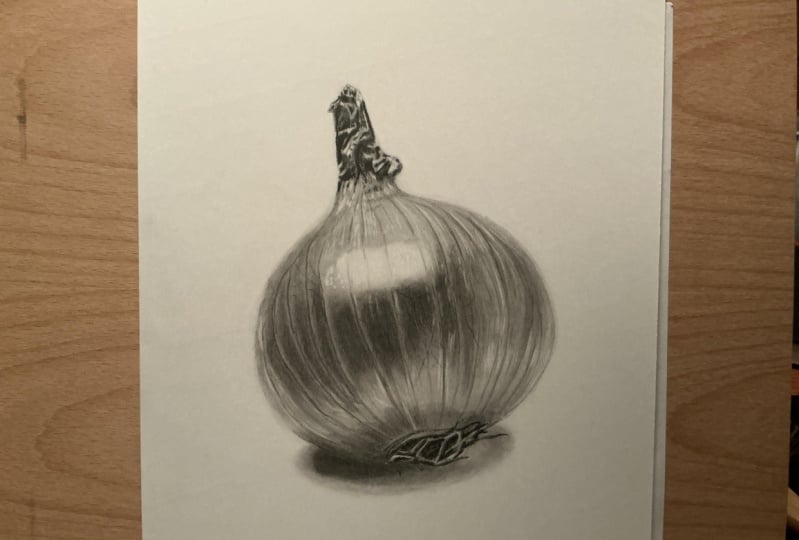
12. Garlic: outline: Welcome to this video and its goal is to show you how you can use all the techniques and tools presented previously. The study is going to wrap everything up. I chose the subject of a garlic. But why you might be asking? Its shape is simple, it's round shape makes the task similar to this sphere study. But now we're going to use the blending tools to make it realistic and render some different textures. I promise it's going to be fun. As always, I'll get the HB pencil to prepare the sketch outline. I marked extreme points from side-to-side to determine the size of the drawing since the beginning and other adjustments will be made considering these first marks. Right from the start, you have to set also the inclination of the object since it's tilted. Lay a pencil or a ruler over the reference photo to have a better perception of it. Try to transfer that inclination to your paper. As soon as you mark the structural lines, let's draw the external shape of the bulb. I didn't manage to draw it perfectly at once, but with a few corrections, it got better. Try to let your drawing as clean as possible during the entire process. If you want a result like mine, don't draw too many sketchy lines and be careful whenever you erase something, because your risks smudging your drawing. Draw intentionally, don't make lines aimlessly. Now let's add some details on the bottom and on the top, delimited the size of both places and add the details according to the reference. You can do it using the HB or B pencil on this step. Harder pencils are a better choice for details. These threads are roots and they have some thickness. Don't draw your lines as if you were drawing hair strands. There will be new essence of value on each single route. We'll take care of that later. On the top, the forms are a bit different, but on both sides, I'll set focus on where the darkest values are. It may sound like abstract art, but in fact, observe the dark masses instead of emphasizing the edges. Most of us don't really know exactly what we're drawing here, but it doesn't matter. We're just trying to grasp the shapes and values and dispose them correctly on the paper surface.
13. Garlic: base layer: The bulb can be drawn like we draw a sphere. Both presents a similar behavior when exposed to light. Firstly, I do these crossing lines using the B pencil. They might fade a little when we will be blending this area out, but anyway, don't do harsh lines. Try to treat all the lines with care. You'll notice I draw almost every thin layer over layer, that is one of the good features of graphic drawing. The possibility of going deeper and deeper until we reach the right values. Then I proceed with the shading using the B pencil to settle the base layer on the base. Then I use the tissue to blend the graphite. I will repeat this process until I achieve the general tones I want to render volume. Observe where the highlights and co-shadows are. I also be redoing some of the lines because I don't want to lose them. They're important and will be visible where the drawing is complete. Let's watch the process a little bit. There is a moment when you realize you have to switch the pencil to make everything easier. The reference photo I'm using shows some dark marks on specific areas, so I'll take the 2B pencil to do them. Then I'll get a blending stump because these marks are more concentrated and the stump is the best choice for creating them. You may feel insecure during the process of drawing this garlic, it happens to me as well, I have to be honest with you. Sometimes I look at my drawings and I don't believe it's going to look good when it's done, because when we are halfway the process, it doesn't look great indeed. Trust me, this feeling is completely normal. Be patient and stick to it to the end because it takes some time to be able to see what it's going to look like in the end. The only way to trust more yourself is getting more experience and you do it by drawing more. You get a better notion of how the medium works and we'll be able to anticipate eventual obstacles that may appear.
14. Garlic: texture: Using the B pencil, now I will add texture on the garlic. Those fingers we see on its surface. As I told you before, hard pencils are more accurate, so I get the B or even the HB pencil to draw textures like this. Try to understand this texture from a more general perspective instead of focusing on each tiny detail as if it were the most important thing on earth. In my opinion, the whole picture is more important than each separate part. Even harder pencils may look grainy, so you can blend them as well. However, use something less aggressive and more precise. Pick a firm brush for this. It makes each line look smoother, but it wants merge or undo the texture. Here, I had to get the 4B pencil. It wasn't dark enough. It doesn't mean the previous steps were useless, they weren't. This drawing has already a nice base layer and volume. I'm now just adjusting the contrast to make it look even better. On the right side, I thought I exaggerated a bit on some lines and blemishes and I drew them too dark, so I got the pencil eraser to adjust them. The pencil eraser in my opinion is great to just look at areas where the graphic values are too dark. If eventually have to do so as well, don't force it. Don't press it hard on the paper because this tool is very aggressive. I use the pencil eraser for this somewhat big highlight on the bulb, which is odd. I normally use the sticker eraser for it, but in this case specifically the reflection doesn't look sharp on the original photo and it's not perfectly white but has a lot of nuances. I thought that pencil eraser would provide the effect I wanted. It will just require some fine adjustments on. Since the texture almost has appeared, I will redo it, but notice I won't cover all the previous texture. Let's take advantage from the fact that it now has a light gray tone, and let's enhance only some specific points. It will give more dynamism and realism.
15. Garlic: upper area: Now, let's move on to both extremities starting by the top side. Remember, I have referred to the very dark values I saw here before, and now I'm going to make them using the 0.5 millimeter mechanical pencil with 4B graphite lead. The mechanical pencil is a very accurate tool, and it will be handy here because this area is small. I just had to correct the outline before starting the shading off. Mark in the darkest masses you spot in the reference and later use the brush to spread the graphite over the area. You see this step is not difficult at all. The brush will smooth the greenness of the 4B as well. You can use a thin blending stem here and there too. Then we finally use the sticker eraser for the highlights. Trim for the tip to be able to reach the narrowest areas here. Before moving on to the bottom area, I'll adjust the volume of the bulb where it is inconsistent.
16. Garlic: lower area and cast shadow: Now, I'm going to work on the last part of this piece, which is not the most difficult one in my opinion. I'll start by the cast shadow because it is behind on the background and the bottom of the garlic will require more attention later. My goal here is to draw an oval gradient and like all shadows its area is regular. I will make the first layer shading with the B pencil, trying to be as neat as possible. I will blend this area out soon but remember blending tools are not meant to correct the work done with the pencil but only to smooth or enhance it. Since this shadow is quite small I want to use the tissue here which would be appropriated for regular masses, but the blending stump instead. Use it clean to prevent the stump from smudging or drying. I also use the brush here to complement the blending stump. As usual, I'll be building up the tones by drawing layer over layer, switching to darker graphic grades as they move on. I started by the B pencil, the second layer will be done using the 2B pencil, and then I'll get a mechanical pencil with far be graphite lead simply because this area is small. As it happens to all shadows its limits are blurred so it's like drawing a gradient on the borders. Also observe this total variation of value inside the shadow cast. It's a little darker on the left because there is some occlusion shadows as well. You'll see I used the 2B and far B there. Now, focusing on the roots and the areas in between, I'll do the darkest tones before and blend the area using the brush. It's the same procedure I've followed when I was drawing the top side of the garlic. I use the long bristle brush just to spread a bit of graphite for the base layer which created these light gray cover that is going to be useful. Anyway, I will enhance it after I use the mechanical pencil for the darkest values and blend it using the brush. I'll be also adding some details using B and 2B pencils. At last the highlights, I normally do them using the sticker eraser. If you think the highlights ended up too bright, you can lower its intensity by rubbing the brush over them. You can go back and forth using the eraser and the brush to adjust the tones until you're satisfied.
17. Garlic: last touches: That's it, guys. I'll only make the final adjustments here now that we have it all almost done. Take a break if you want and come back to your drawing later to check if there is something to be fixed. This piece took me almost three hours to complete. It's a little more complex than the previous studies but it's nothing out of this world. You don't have to draw it three hours straight. You can split the process into two or three sessions if you prefer. Thank you so much for watching this class. I hope it was helpful and you'll be more confident to tackle new drawing projects using graphite. See you in the next class.
18. Conclusion: If you ever watched all the videos till the end and drew along with me, I want to congratulate you for doing so. I hope this class helps you to lever up your drawings from now on. Don't forget to share your drawings on the platform and leave us a kind review if you like. Thanks for watching this class, and I'll see you in the next one. Bye.
 Matheus Macedo, Realistic Drawing Artist