Transcripts
1. Intro: You love drawing on
your iPad and are a big fan of mid-century
or just like me, then this is the
right place for you. In this class, we're
going to discover a typical odd style from
the middle of last century, the cookbook illustration style. Because one thing is granted, mid-century art never
gets old or boring. Hi, my name is Jutta Schneider. I'm an illustrator, designer, and teacher based in Germany. In this class, I am going
to introduce you to one of the most typical art styles from the middle of last century, the cookbook
illustration style on your iPad in Procreate. I will show you my
process of how to tackle such an illustration from
planning to the actual drawing. I will teach you
not only the rules and characteristics of
this illustration style, but I will also show you how
to achieve it in Procreate. As always, I've created carefully a whole bunch of
resources for you to download, which you might find useful when creating your own
mid-century piece of art. There's a font, a color palette, a gorgeous brush set with
every brush you need, and a Pinterest mood board full of inspirations I've
got that for you. What you need to
take this class is your iPad and Apple Pencil
and the app Procreate. A basic understanding of
the app is beneficial, but I will make sure to
explain step-by-step what I do so you will be able to follow along even if you're
new to Procreate. Are you're you
ready now to create a quirky and fun
mid-century illustration with maybe a modern twist? Then let's jump right into it. See you in the first lesson, I am pretty sure we're going to have a lot of fun
together. [MUSIC]
2. Class Project: [MUSIC] Since the
topic of this class is cookbook illustration, we're going to create a cooking or a kitchen related artwork. I walk you through
the entire process from planning to
the finished piece, and all you need to
do is follow along, have fun, and upload your
finished artwork here by hitting the "Create
Project" button in the project and
resources tab. You can draw exactly what I do or you go with a motif
that suits you better. It's up to you. You are the artist and all the decisions you make
are going to be right. By uploading your project, I guarantee you several
positive outcomes. You are going to
be super proud of your accomplishment
and rights you are. You will earn a lot of
positive feedback from your peers and you might help future students to decide whether or not this class
is interesting for them. Last but not least, you make this teacher
here very happy. I can't wait to see your whimsical art here
in the project gallery. Let's get into it. [MUSIC]
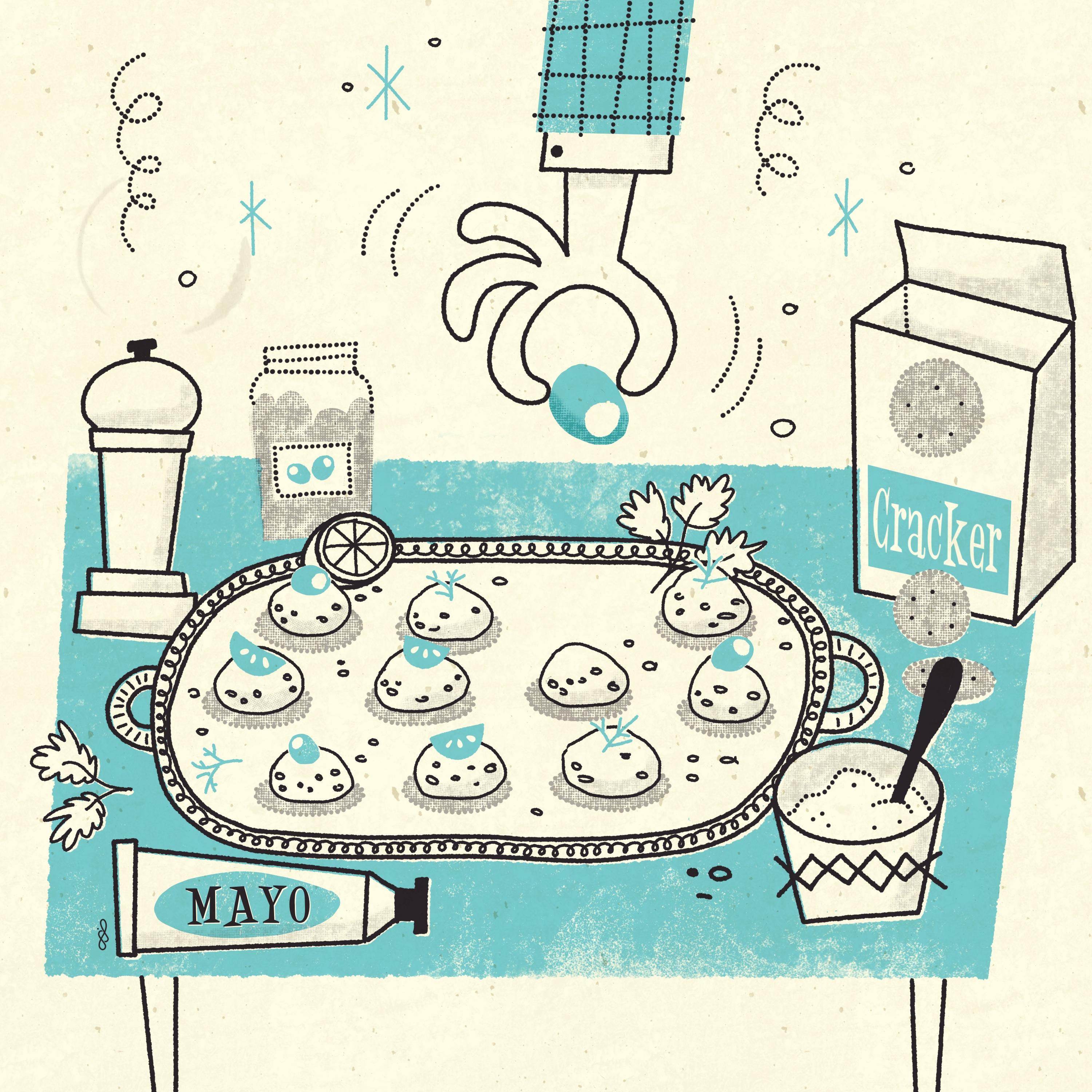
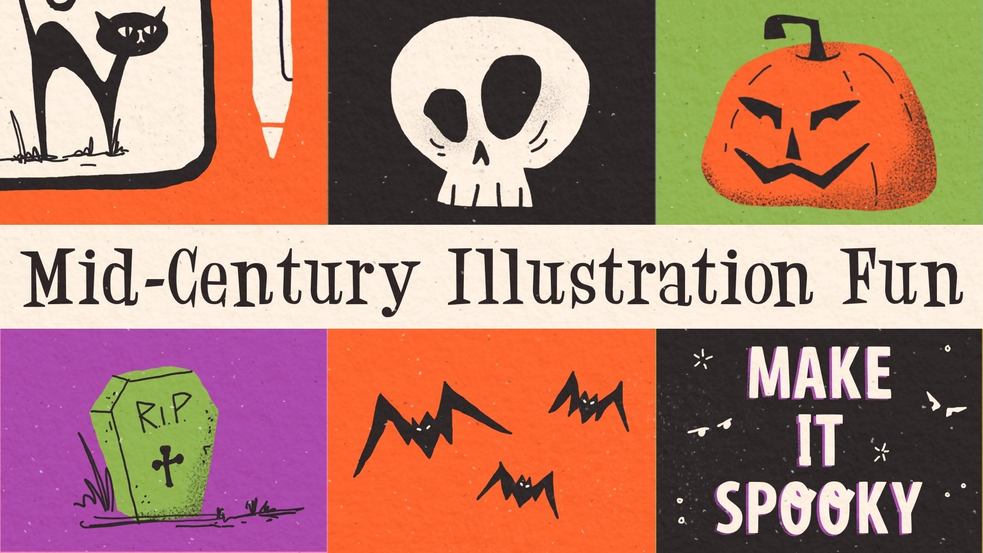
3. Style Characteristics: [MUSIC] In this video,
we are going to find out why this art style
is so appealing, what elements the
illustrator included, and how we are going to adapt that into our own
workflow in Procreate. We're here in my cookbook
illustration, mood board. The link, again, you find
in the Resources tab. By scrolling through it, we notice one thing right away, it's the colors or better
the like of the colors. We can see here this artist
just used one color. The rest is just black
or negative space, which means the white
background of the paper. To depict the shapes, there's just a lot of line work. That's one of our basic rules. We use the negative space, which is the paper background. We are going to
include one color and a dark or black
tone for our line work. We see right away this
is a big limitation. In this piece, we see
the artist included dashed or dotted lines to create some variations
in his line work, and that, of course, at a lot of interest right away. Here we see even though the
artist only used two colors, the yellow and the black, by using halftones, which
is unfortunately not able, we cannot see it
here in the picture. Here, the chimney, the roof, and all the darker yellow areas, there's this other layer on top where the artist
included halftones, the series of dot
put on top to just create a darker shade of the
yellow that's been used. Here he used the halftones
only at the staircase, here two, at the chimney
and on the grass. He added two more
colors to his palette. This is also something
we're going to use later on in our illustration. Let's look further. Here we see the
artist don't really pay too much attention to perspective or body proportions. Let's see this head
here of this baby is way too big for the
rest of the body, but that doesn't really matter, it makes it more interesting, it makes it more
whimsical and that's exactly the style
we want to achieve. Let me show you also
the piano here. The perspective of the
piano is absolutely wrong. However, it makes the
picture interesting, it makes it whimsical
and quirky. This is how we want to draw
our illustration as well. Then there's this last thing. What I noticed about
this illustration style, who's the one that cooks? Of course, it's the woman [LAUGHTER] Who was the
one that cleans up? Of course, it's the woman. Who is the one that raises the child and so
on and so forth, and there we have room
to make some changes, to break up a little bit
with those old stereotypes. You don't have to though, I leave it completely up to you. You do whatever you
feel comfortable with. I just want to make clear those old-fashioned
family models and roles at home have changed, and I want to show that
in my illustration. You can do that, you
can follow along, or you do whatever
you like better. Please always feel
free to go with your own gut, that's
absolutely fine. Let's recap one more time. The rules or characteristics
of our illustration style. We wanted include in our illustration are
first the colors. We are going to
include black and another color and use the white background
as a third color. We create interesting
line work by using liners that are
maybe not crisp in their edges or have
dots or dashes, we are going to include halftones to increase
our color palette. We draw simple illustrations, even breaking up with the typical perspective
or proportional rules. If you want to, I leave
that completely up to you, we can break up with those
old-fashioned stereotypes. In our next video, we're going to talk about
what exactly halftones are and how we are going to include them into
our illustration. See you in the next video.
4. What is a 'Halftone'?: [MUSIC] What exactly
is a halftone? Well, we already talked about the high printing
costs publishers were and still are
confronted with. How to mass print
large editions like a daily newspaper for
a reasonable price. This is how the halftones
came into place. Wikipedia tells us with
halftone printing, you can simulate continuous
tone imagery through the use of dots varying in
either size or spacing, thus generating a
gradient-like effect. Basically, we are talking about a series of
dots put together. Small black dots with an increased spacing would
appear as a light gray tone. Whereas big dots put closely together or even overlapping, they seem dark gray
or even black. If you look at a newspaper
through magnifying glass, you can see those
little dots clearly. This was and still is
a great way to save on ink and thus money while mass printing something
like a daily newspaper. Halftones are nowadays also
used for color printing. You probably already heard
about the CMYK color model. The semi opaque dots in the
four colors, cyan, magenta, yellow, and black, are combined differently to create
full color imagery. In our cookbook
illustration style, we're going to use the halftones
for two major reasons. Number 1 is to increase
our color palette, because the rules of
this style tell us to only use black and
one additional color, and together with the
white background, also called the negative space, we would only have
three colors available. To increase this palette, we include halftones like this. By using one of my
halftone brushes only, we create either a gray tone or a lighter hue of
our chosen color. By using the halftone
brush on top of a solid color with maybe
the multiply blend mode, we can create a darker
shade of the same color. Using a halftone
brush in black on top of a color creates
even darker shades. In general, and that is a reason number two
to include halftones, we create a lot of visual
interest in our illustration. We are also not bound to
the usage of dots only, why not use hatching
or cross-hatching? I included several
halftone brushes to achieve the desired effect. That's a good transition
to our next video, where I'll introduce you
to all the resources that come with the class.
See you there. [MUSIC]
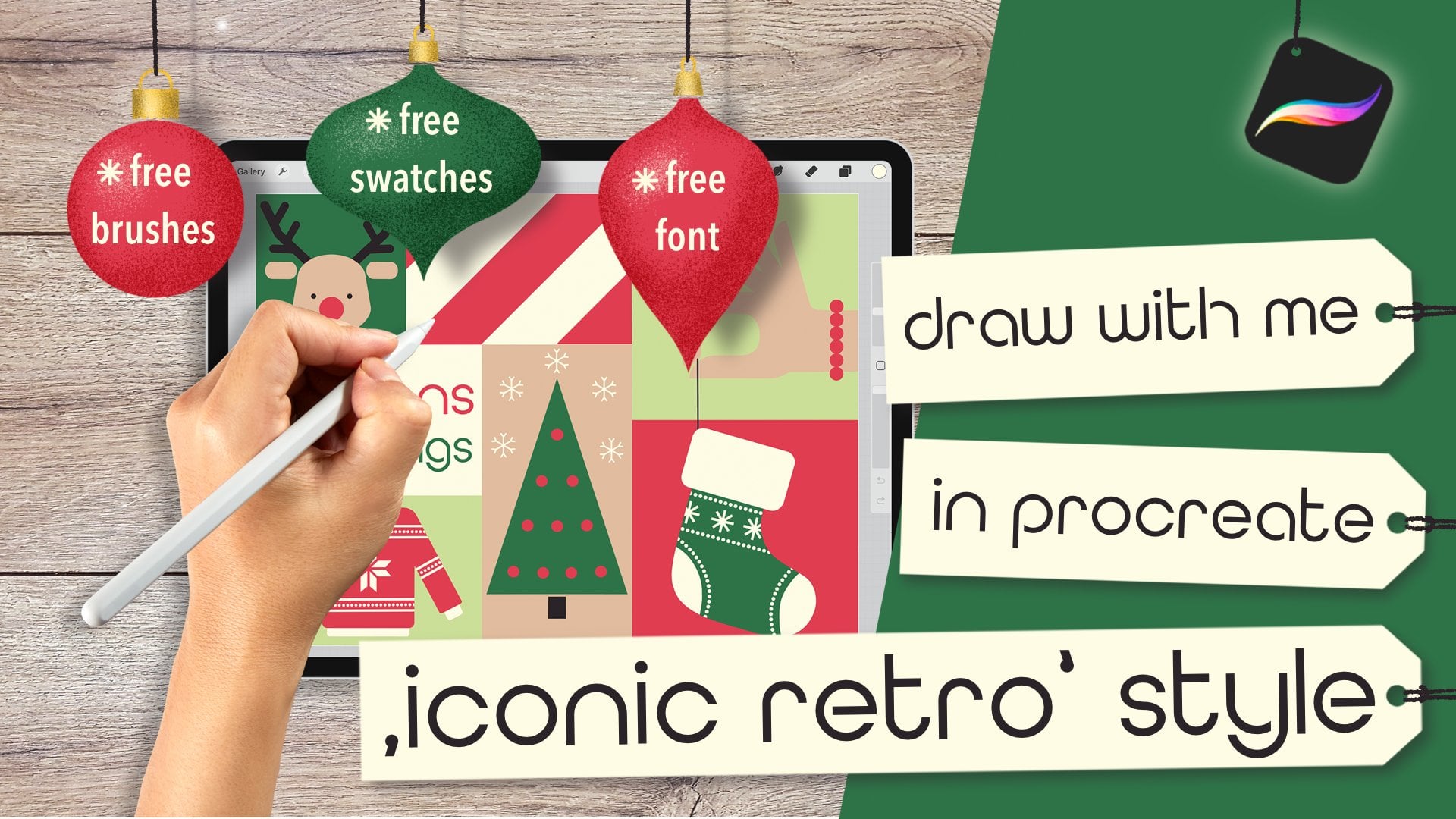
5. Resources: [MUSIC] This class
comes with a lot of cool resources I
carefully created for you and they help you to achieve the same style as I did. You can find all the resources on the Projects and Resources tab on the skillshare.com
website on the right-hand side. There's four
different files that you can download and there's another link for my
Pinterest mood board on mid-century
cookbook illustration. There's my Jitterbug font, there's my color palette, there's my cookbook brush set, and there's an inspiration
collection sheet. Downloading those
files is super simple. You just tap it. You're going to be
asked if you want to download it, you say, yes. Then you wait until this
little arrow here has bounced. You just tap it, tap the file, and
it's going to be imported in Procreate
right away. It works a little
bit differently with the brush set because
it's a bigger file. When you tap the "Brush Set", it's going to ask you again. You say, yes, we wait
until the arrow's bounced. We tap that arrow, and then we tap this file here. My iPad is taking me to my Downloads folder
in my files app. This is where I find all
the downloaded resources. I will tap the brush set file and now it's also
imported into Procreate. I just wanted to show you
that brush sets are always going to be added at the very
top of your brush library, whereas color palettes
are always going to be added at the very bottom
of your palettes library. The last file here is my
inspiration collection sheet. This is a very useful tool. We can also download it by
just tapping, download it. It's also going to be transported into our
Downloads folder. This is from where we can
import it into Procreate. Let me show you quickly. We're in Procreate
in the gallery now, and I want to import
this worksheet, and I tap the "Import" button and I can find the file here. Now it's imported into
Procreate. Super simple. I can work on it now and
I'm going to show you how exactly you can use it in my next video about
finding inspiration. Just a few notes. We always will add a layer on which we can
write just with a pencil, write down some ideas and also sketch out some style examples. Now we have a closer look
at the other resources. If you downloaded the
font the same way, you are going to find it here under the wrench, add text. When you then tap
the little As here, you find the font here
in your font library. There it is, Jitterbug. Here's what you get, my font Jitterbug as
I just showed you. Next, the color palette
you find in my resources, I divided them into medium hues, light hues, and dark hues, as well as gray hues. The medium and light hues, you can choose by preference
whatever you like better. The dark hues though, I just added for line work. Sometimes a black is too harsh
in contrast for my taste, that's why I would rather use a very dark hue of
one of those colors, and sometimes black
is just fine. It depends on your taste and
maybe also on your mood. Down here, you see a few gray shades as
well as kind of black. It's not real black, but it's very dark. This here, in this last
little corner here, there is the
yellowish-white color I would always use
as paper background. I don't really like to
draw on white canvas, so I always use a
little off-white. It also looks a bit like
old yellowed paper. You'll find all these
colors in the palette. Next, of course, is my
mid-century cookbook brush set, which is separated
in four big parts. First, we have this sketcher, which are obviously
like pencils. You can use them for sketching, but also later for
your line work. One of them is a
little bit smoother. One of them is a
little bit more rough. Next category are the
liners and fillers. We have a nice liner mono, a nice liner rough, which creates really nice,
interesting line work. A nice liner tapered, which has tapered ends that
are pressure sensitive. We have a softy which
has really soft edges. I basically don't use it
in that style for drawing, but more for erasing. Then there's the
filler irregular. This is a very nice textured
brush where you can fill shapes but still have
a little bit of a texture. Then we have a dotted
and a dashed liner, which are really nice to
create interesting line work. Next up are the
halftone brushes, where I added seven
different ones. You choose just by preference or depending on the result
you want to achieve. Let's start with this one. It's a light halftone brush. The next one appears
a little bit darker due to the bigger dots. The next one is even darker. The last one very dark. You see the effect
when you zoom out. Very interesting. Then we have an
irregular filler, a cross-hatching, and
a hatching brush. They just bring our
illustration to life and add a lot of interest. Then next category
are my stain brushes. You can see these stains here and also the crease,
those are brushes. You can add them to
your illustration. Because if you ask me, if you look at my cookbooks, especially the old ones
I used really often, they all have stains. I seem to be a very messy cook, I spilled everything everywhere. If you like these real-looking
stains and creases, you can add them to
your illustration. Lastly, we have the
paper textures. Usually, I'm adding
some staples, which you'll find under
this brush here, staples. Then on top, I would
put a paper texture. We have four different
paper textures here. I'm going to be showing
you the texture rough, how I usually use them. I set the layers to multiply. I would add a layer, turning it into a clipping mask, and then turn it into
multiply blend mode. I would duplicate
it because I would add two different layers
with the paper texture. On the first layer, I would choose a light color, maybe a yellow because it makes all the colors underneath
very vivid and then I would just maybe with a smaller brush size and
then I would just draw over. On the next layer, I would add a dark color, like let's say this
blackish tone here. Of course, this is way too dark, but if you turn
down the opacity, make it barely visible, then you really create
this paper texture effect, which I absolutely adore. The last resource can
be found again on the skillshare.com website under the Project and Resources tab. It's the link to my mid-century cookbook illustration
mood board on Pinterest. You just tap the link
and you're going to be transported to Pinterest to the right mood board right away. Here you can scroll and seek for inspiration
as much as you want. This is what we're going
to do in the next video. We find inspiration
for our illustration. See you there. [MUSIC]
6. Finding Inspiration Part 1: [MUSIC] In this
video, we're going to seek out for inspiration. I can tell you right away
no illustrator comes up with every single artwork
from out of his mind only, so everybody needs to find inspiration and inspiration
can be everywhere. Recently, I was sitting in
front of my television with my iPhone and just took some
photos from a documentary. It was a documentary about
the middle of last century, and I saw so many cool features, so I just sat in front of my television and
took photos of it. Very strange, however, it brought me a lot of ideas, what to include in
my illustrations. This is the purpose, and that's what we're also
going to do right now. Just a few words before. First of all, we're not going to take as much time as I would usually do for the purpose that we have a reasonable
length in this class, but you can go above
and beyond with finding and sketching
down ideas. I just want to go a
little bit quicker than I usually do just to make sure the class is not
getting too long. For the same reason,
we won't create a super complicated and
super big illustration. We'll create a fun and whimsical piece and you can
go as complex as you want. Let me explain now
what my workflow is. I discovered off myself
that when I look too much at pictures or
use reference photos, I tend to copy things
which I don't want. I also feel like my creativity is blocked because I'm always focused on
what I see only, and not to think about how
I want things to look like. That's why I came up
with this worksheet, and this works
really well for me. You see here three
different columns. Item. I would write
down maybe eyes, and then I would write
down what attributes I see with eyes in
that typical style, and then later on, I would sketch out some ideas. For the first process, I will start my Google app and we'll just bring it
into split-screen mode, make a little bit more
space for my Canvas. We only need those two
columns right now, since we're going to draw
a cookbook illustration, and also one to break up a little bit with
the stereotypes. I want to have a male person
cooking, that's for sure. I'm going to type
down man cooking, and then it will
give me some images. I will go to Google Images, and then we scroll through. I envisioned something like
a man in the center of my illustration with a
background and a foreground, so he's doing something on a worktop, whatever table thing. That's my envision. I want to find out now what
else I want to include, and how I want this
person to look like. First of all, we think about
the overall composition. For that, we're going to scroll through
those Google images and make sure we add another layer on top
of our worksheet. Get the darker color, which we want to write with, and choose just a
brush to write with, maybe it's a sketcher
here. [MUSIC] That's fine. Now, I'm going to
write down only. Let's go with the character. I want him to be central
and male, that's for sure. He's supposed to do something. This guy here, he has
a pan, he's cutting. I also noticed I don't
want him in the side view, I want him to be in a front
view so he's front view. I think this is a
pose I really like, so he's drizzling
something into something. Let's say he's drizzling. It doesn't really
matter how this looks, it's just you make your nodes. They can be as
messy as whatever, it's just that you need to be
able to read them later on. I see something in the
background which I also like, he has a window background. There's a window with those
bars in, I like that. Also, there's parts
on top of a cupboard. Cool. There's a pepper mill
that's in the foreground, so I guess this is definitely something I want
in my foreground. Somehow, I am obsessed
with pepper mills. So in the foregrounds, maybe it's a table, that makes it simple. In the '50s, they didn't have those super fancy
cooking glass anyway. There's a table in
the foreground, and on the table, there's supposed
to be pepper mill. What else do we see? Maybe we can scroll through
this here. A bottle. I guess a bottle is
great onto the table, maybe some veggies and lemons. Don't mind me when
I write some typos. Oh, he's wearing an apron, I want him to have
an apron as well. Could be a very simple one, but it also could have
some raffles all around, a woman-like print, that would also be cool. He's cutting some things, so I want a cutting board, that's a typical item. Cutting board and also
a knife for sure. What else can we think of? What could be in the
background? Let's check. Maybe he has a plant. Maybe there's a plant or
something in the background. There's the fridge. Yes, a fridge is a great idea. A fridge or maybe
such a cool shelf, maybe a board with things on it. But, we need to see how much space we have
in the background, we don't want it to get the
illustration too complex, that's not the style. You wouldn't find a very
complex illustration in a cookbook anyway, because usually
the illustration, we're just in a vignette style. That means the tiny
little area of the whole page having this
little fun illustration, so we don't want to get
it too complicated. That's already quite a lot. Next [MUSIC] thing I
want to do is look out for features
my character has, how I want him to look like in mid-century style before
we get into the character. What you also could do is
seek out for mid-century. I'm going to show you that too. Our '50s kitchen images, and then you see some really cool ideas of how the kitchen
back then looked like. This is what I
meant, a board with things on it. Super cool. But again, we need to check
if we have the space. There's a pink fridge. Oh, yeah, I would love to have
a pink fridge in my home. What else can we see? This is a cool fridge, so I'm pretty sure I want my fridge to look
like that somehow. Oh, there's a clock in all
those typical sun rays clock. I wanted to clock in
my background as well. I like those curtains here. They're just on the top of
the window and super simple, so why not add in some
curtains here on the window? This is also a super cool
and typical kitchen clock, I guess even my mom
had one of those. The clock would also
look like this. But again, we already
found a lot of attributes and a lot of
items we want to include. Let's move on now to the
Pinterest new board, and this is where we find some typical illustration
features. [MUSIC]
7. Finding Inspiration Part 2: [MUSIC] I show you
what I mean by that. Let's open the Pinterest. In split screen, we're still in our cookbook
illustration mood board. Now we're going to do the same. We add another layer. Turn this one off
by just tapping this little check mark here. It's still there, just the
visibility has turned off. What we are going to do
now is having a closer look how characters were drawn back then in that era and we're going to write
down things we like. We need eyes, we need hair, we need a pose, we need noses, we need mouth ideas. That's super important
because I know how intimidating it can be
drawing a human character. I hope I can show you
the technique that encourages you to try
it out more often. Because the mid-century
cookbook illustration style is very simple to practice with because
they don't pay too much attention to
perspective and proportion. It doesn't really
matter if the head is too big in comparison to his body or if the arms are too skinny, it's the opposite. It makes the whole style super whimsical and fun and that's why I love drawing human character in
this particular style. I can just go and
exaggerate whatever I want and not paying too much attention if
the head is too big, the eyes are on the right
height, and whatsoever. Now, I want to look out for typical character
features and I'm just going to swipe
through my images. The eyes are often closed. The noses, I also noticed
are pointy, angled line. Again, don't mind
me writing typos. The line can also be
connected to the mouth. Again, closed eyes, the mouth though can be
open or just a line. This is a super cool hand, which I'm definitely going to implement in my illustration. This is, by the way, the typical mid-century
style hand. Let's write down
another item, hand. Typical style, thumb and
pointer finger make a circle. That's a typical pose. But back to our mouth, I see an oval mouth. Let's go back to the
layer with the mouse. I don't know how this
shape is called. Let's say it's two lines
forming the mouth. There's a cool knife and
a typical cutting board. This is a board with a handle. I want to write that down too. Let's open even another layer. Turn this visibility
off again. Here we go. A board is going to have
a handle with a hole. The board might have
a little bit of a wood grain but we need to
check if we like it later on. There's a cool window and there's again this
cutting board. See. There's a salt shaker. I like that too. I
might include that too. Let's go on with the
next illustration. Here we see she is winking. Where's our write
layer? Here we go. Closed, she is winking. One eye is a dot. Here's a typical
cutting board again. I like the tubes and I
also like those pots that are super interesting and
also the typical shape. It's just a round opening and then two straight
lines. Roll and see. He has an oval nose and
he has a pointy nose. What I really like
is that the nose comes into the head right
away, into the forehead. This is something I also
need to write down. Let's see where
do we have space. I think here. The head shape. I think we can
notice that the head of a male character
is usually quite boxy and looking like a
rectangle with a huge nose. At least that's what
I like the best. You can see that here, a very remarkable chin. Often you see that the nose just goes into the
forehead right away. Usually, they do
have short hair. Hair is also important. These guys here just have
lines as hair and they also have squinted eyes
and a rectangular nose. Let's go back to our
other layer. Here we go. Nose can also be a rectangle and the
eyes can be squinted. The mouth here is a bend
line with dots at the end. The ear is just a little swirl. Do we have some space for ears? Let's move on to
this layer here. Just are spiral basically. Also, they just have something like two lines in the ear. Open eyes, they
are almond-shaped. I guess that's
enough to show you how this process is
working with me. In our next video, we're going to lay
down some ideas. We're going to sketch down some ideas. See
you there. [MUSIC]
8. Style Experiments: [MUSIC] Here we are.
Now it's time to sketch down some style ideas
that come to our minds. But first of all, what I
need to do is I need to close any photos because that really blocks
my own creativity. I want to go with my memory or even
something completely new. Let's start with
our first layer, turn this visibility off here. Let's see if we want to lay down some ideas for that here. I saw a window and I
like my window to have those bars in them and maybe
it could also be vice-versa. That could also be a window. Then I also want my
window to have curtains, which is basically two
lines to the side, some fringes here,
some fringes here. That's the curtain, super
simple and a plant which could look maybe
just a circle here, another circle
underneath, and then some ****** and just some
spiralish lines. That's right. That's enough. That's already cool for a plant. Maybe we could have a board with something like plates maybe, placed on top of each other
and marks maybe for a pot. Super simple. Let's see if we have
the space, a clock. We could either have
a clock like this or we just have super
simple rectangle with the face like this. That's enough, so we
found some ideas. You can get even more
examples as much as you like. First of all, it gives you
practice in sketching, but also it just gets
your creativity flowing. But for the purpose of a
reasonable length for the class, I'm going to stop here now. The table is basically
whatever wonky shape, rectangle with some legs. But maybe we can have some
features on the legs. I know that kind of this shape, I guess that looks super fun. A paper mill, what could a paper
mill look like? I guess we have this shape here and then this huge
round thing on top, and a salt shaker I saw before. It was just something like this. Maybe with some lines
and a typical top maybe, some holes in it. What else? A bottle. My bottles
usually look like this. Super simple and they do have
a cork here maybe a label, there are some veggies. What about having an onion or what did I write
down a lemon? Lemon is super cool. There's just this thing in
the middle, a cutting board. We want to have
the cutting board. But at least I do
like this and again, that's so wonderful
about this style, we don't need to pay too much attention
with perspective, we just draw a second line
here, however, wonky. Knives, my knife
should look like this. What else could we have? Maybe a bell pepper or an apple. Just super simple like this. It doesn't really matter
if it's super messy, but sometimes we just discover
a certain style we really like and we're going to take this over into our illustration. I think that's enough. Let's go to the next layer. Turn this off so the eyes, a lot of them are closed, it means this way. But I also saw
them this way that means they're squinted
due to laughing. Some of them are winking, some of them are
just dots like this. Some of them are squinted
with lines like this. Some of them are oval, I also saw long ovals. I also saw something
like an almond shape, but I also saw lines
with eyes under knees. I also saw something like this. You can go above
and beyond again to find as much eye
shapes as you like. I think I might go with this pie-shape because I want him to be super
happy when cooking. The noses. We have those noses to the side facing to
the rest of the head. In the face, we have just
something like this line here connected to
the mouth maybe like this or just to know sometimes it's a little
bit of an open triangle. Some have oval nose, sometimes it's even
this pointy shape. I also saw this nose
shape here this, and sometimes you just
see a line like this as a nose and that's
already enough. I'm pretty sure I
either want this style or this nose which is attached to the forehead right
away and then mouth. We have something like an open mouth here in the
face, something like this. We have a line, could be like this, can be like that, can be really bend like
this with dots at the end, can be open like this, can be like that and
even have teeth. Can be a little bit to the side. Maybe can have a tongue sticking out like
this with a dot. When I get really
into the process, it's like a rabbit hole for me I can really start and
just come up with new ideas and ideas and ideas and that's
super cool because you discover the best
shape in this process. Let's move on to the next layer. We have the hand, yes. I want my hands to have a
skinny wrist and some other, this is too long, a thumb like this and the pointer like this, and the other fingers like that. Super messy right
now, don't worry, we're going to clean that up
later on in a real sketch. Also, my hands usually only have four fingers
for whatever reason, I find that easier. But I also saw hands like this, they're basically just
rectangle with lines in them to just indicate hands from the side maybe
holding something. I also saw just basically
hands like this. I saw like this hands. In general, hands are kept super simple in this style
maybe like this. That's enough for this purpose. The head shape could be boxy, like this, really rectangular. Sometimes it's awesome
more trapezoidish, narrower here and wider there, or the other way around. Sometimes it's a bit oval. In general, it has a
huge chin like this, when this is the neck from
the side view, a huge chin. This is something
I really like and also a huge nose
maybe like this. But I also like
when the head shape just is the same width as the
rest of the body like this. This is his shoulders
and here's his arms. This is something I
really like and hairdo. One hairdo, can I imagine, we saw lines, his hair like this. We saw crescents maybe like this or high enough Elvis like with hair in front of ears and behind ears,
something like this. We saw just crescents
on either side. We saw bald guys as well. They only had hair here. A few days later. We also saw hair
here, hair here, and maybe some hair
peeking out from the back, so he has a little
bit longer hair. And we also saw just
lines like this, super messy and
that's already a lot. Let's move on to the next layer. The board was just the rectangle like this with this
handle with the hole, maybe a second line here to indicate three-dimensionality
and they had wood grain. The ears, oh, yes, some ears. Ears we have usually
crescents here, like half circles, some have two lines. Once it was just a spiral, ones it was a little bit oval. How else I think ears could
also have just a dark dot in the middle or just
a second line ear and then there's something
like a crescent in the ear or just a naked oval or
just a longer one picking out like
more the top of it, and the bottom is more
attached to the head like this and maybe just
a light in there. Great. So I guess what are
we going to do now is just decide for whatever features
we want to include. I think I like this ear style. Just a little bit
more out on the top, but more touched on the bottom. This is definitely
something I want to keep, so let's see this hand
and also this hand maybe. I guess I like this head style, but also this one. I like this hairdo
and also this hairdo. I guess I want to go
with these two items. As a mouth, I think when I go
with this shape, I guess the mouth is going to
be like this, just a line. I think we have one more layer. Here we sketched out already. I guess I want to go
with this window, with the curtain,
with this clock, maybe the plant,
maybe the board. Definitely with this and
the rest of the item, there's enough space for those. Now we gathered a lot of ideas and even came up
with style examples. Let's move on to the
next video where we start with our
first rough sketch. See you there [MUSIC]
9. Rough Sketch: [MUSIC] We're ready now to
start with our rough sketch. I'm just going to stay in
this canvas because it has the right dimensions I
want to use any way. It's 3,000 by 4,000 pixels. Let's just go check
out the canvas. Let's go to the wrench tool. Let's check the canvas and
go to canvas information. We see the dimension is 4,000 by 3,000 pixels with 300 DPI. That's the measurement
I usually use. It gives me 51 layers. That's a point which you
have to keep in mind. If you have a smaller
iPad like I do, you might have much less layers. Then it might be better to
go with a different size. I'm going to show you how
you can make another canvas. We just go back to the gallery
and hit the "Plus" button. Then there's here on top, hit the other "Plus" button. Here you can type in whatever
measurements you want, and it will tell you right away how many layers
you're going to get. Let's see if I would go
with 2,000 by 1,500, it would give me 219 layers. Just keep that in mind. We don't need so many layers
for this illustration style, but 20-30 we probably will need. Again, I'm going to
stay in my canvas with the worksheet
because here is where I have all my notes
and I can just refer back if I need to remember what
else I wanted to include. What we can do now is group
all those layers together. We swipe it to the right, and then we hit "Group". We call this group, inspiration. Then we just turn
off the visibility. That means we need to add a
new layer now and start over. I'm going to put
this layer below my group here I just made. In case I want to
refer back to it, then I can just
turn it on and it's not covered by the
rest of my layers. In the beginning I
will always start with turning my white canvas into this yellowish
[MUSIC] of white tone. I just don't like to
draw on a white canvas. I think this yellowish tone is way more soothing
for the eyes, and then I start
with another layer. Grab my sketcher. This time I'm going
to take the sketcher rough and choose a
dark color. Let's go. We said we want to have a male character in the
center of our illustration. Let's see, I guess I wanted standing here a
little bit like this. You see me laying down a curve, and that's for the purpose of the character not
seeming to be too stiff. I want him to be like a
little bit in motion. A curve indicates
that quite well. Then we have his head
maybe here like this, very pointy nose
sticking out here. Here is his body. Here's one leg, and here's the other leg,
something like this. He has one arm like this,
drizzling something, and one arm like that, holding something like a bowl. Right now you'll
only see me doing messy lines, but that's enough. We'll refine our
sketch later on. Let's erase what we
don't need so far. I guess I want him,
not closed eyes. I think I want him laughing. Maybe like this, and maybe the lower lip
sticks out a little bit more. I want him to wear an
apron, something like this. He also has hair and an ear. That's what we said, hair in front of ear and hair in the back,
maybe like this. Now here's a fancy guy. This is already a
very energetic pose. We're going to
indicate that later on with those moving lines, like here and maybe here. That indicates that he's
really moving right now, almost dancing in front of him, let's add another layer. In front of him there's
this table work top. It's just whatever
wonky shaped rectangle. Then we say we want
legs like this, like woodturned legs. Then we want to have
some items on the table. Maybe there's a
bottle with a cork, and maybe there's the
cutting board is here. Let's erase some parts from our character that we have more space on the
table. Like this. It's not visible through
the table anyway. Maybe the cutting board
is right in front of him. That's super simple. By the way, if you go
to the selection tool, you'll just draw around an item, then you tap that arrow here, and then you can
move it just around. Maybe the cutting board
is in front of him, as well as the knife. On the cutting board, what if there's an onion, maybe with those rings
and some onion pieces. We have a peppermill. I guess I want it to
be here. Big one. Also maybe a salt
shaker like this, and maybe a tube. Maybe one of those
cool tubes here. And what if here's a lemon? And maybe also two eggs. One egg, and another egg here. The wine bottle, or the vinegar bottle
or whatever it is, has a label and there's a pot. That's what we said. We want to have a pot. No, I don't like this. But with a spoon in it. Let's clean up the
lines a little bit. Something like this. And here his bowl
also has an opening. It's not just closed. I did that on the wrong layer. Let's go back to him, and draw it here. So, it's a round opening that we can see
what's in the bowl. I guess he's preparing some
sort of salad or something. So there's just whatever in it. Just super simple. And I'm not very happy
with the place of, let's see, let's go
back to the table. I'm not happy with
the salt shaker here. So I guess I want to erase it. Because I also want to put down something like a colander, where the lettuce leaves are in. Could be looking like this. Like this super simple handles and then there's those hole in there and there's also something in it and I like
those spiral lines here. Super cool. So maybe we can place the miles
somewhere here now and by having it peeking
over the table a little bit, we create some depth but
that's also very cool. It looks like it almost
falls off the table, but that already also
creates some interest. Do we still want
the salt shaker? Maybe yeah. Maybe he has
a little bit more space. And I guess, that's
plenty of stuff already. Maybe we come up
with something here. But so far, we don't want
it to be too overcrowded. That makes it too complex
for our purpose here. Now we need the background. The background is
behind my person. So let's add another
layer below. We could also just add layer wherever and then
just move it around, by just tapping it until it
releases here from the menu. So we have a layer
below our character. I guess I want the
window to be here. I don't want him to be right
in front of the window because that doesn't fit
the composition there. It would be too much here, too big of a blob here and then there's
nothing on this side. So I want to spread
it out a little bit. Here's the curtain, like this. Then we have those bars
in the window and maybe, as we said, the flower pot. Having some sprigs
coming out and just some, whatever weird lines. That's parsley, you know what? That's parsley. And I guess you need some
parsley for his salad too. So let's put it on his table. I want some parsley
on his table. Maybe that's what he's drizzling in this bowl here anyway. Some sprigs are here with just some, whatever messy lines. We can clean that up
later on a little bit and replace the things when we think it's too crowded in the center. But this is what I really like. Cool. Then there's another thing missing here in this corner. So, why don't we
add the clock here. Just make sure it's not at
the same exact high-flying, as the curtain, to just create some
more interest. When everything is
on the same level, it looks quite boring. So let's have this
rectangular clock here. We need to think about
what time it is. When is he cooking? I guess he's preparing
dinner, so it's 5:20. Something like that.
And then the fridge. That's going to be a kind of wonky rectangle with
rounded corners, and two feet on the ground. Here is this line
because on the bottom, there's a drawer, here's the handle, and here's
the name of the company. And then, he maybe keeps
his pots on the fridge, he doesn't have any other space. Something like this. Maybe also the pan here. Super simple. Awesome. Maybe I want to
make it a bit smaller. I'm going to go to
my selection tool, draw all around it again. Tap the arrow, and now I can make it
smaller a little bit. I still want it to be covered at least by a corner of the table, that will create
this depth again. Awesome. Although I think, maybe the background has
to move over a little bit. I want to shift it to
the left a little bit because it's too close
to this edge here, and there's too much free space. So let's see on the right layer and
I'm just going to move it, just a little bit. We're going to make sure
that we find a better spot for the pepper mill later on. And this is our messy sketch. It looks great all ready. We could even include
some writing here. Something like maybe
he wants to say, splendid, or
something like that, which is a typical expression from the middle of last century. You're also going to include
some sparkles later on. To just show some happiness. Yeah, just some positive
energy in this kitchen here. Okeydokey. And in
our next video, we're going to
refine our sketch, make sure we place the things
where we like them to be. And so we'll see you there.
10. Refined Sketch: [MUSIC] We're ready to
refine our sketch now. First of all, we can merge our three layers from
the messy sketch by just pinching them together and turn down the
opacity a little bit. It's going to
distract otherwise. Then we're going to add
another layer on top. Now we try to make more refined lines that
start with a window. We want to have a curtain. Maybe also some lines in here
to just show those fringes. We have the window underneath. I guess I want to tint it dark. Let's see if that
works. Yes it works. Erase the bars like this. Then we also want a little
flower pot in here. We erase what's black. We can indicate everything else with lines we add
later on, like this. These bricks are here, and here's the
flower part lines, and then right away, it's going to be visible. We also have our clock here. Just a rectangle plus
a circle on one side. The time we said
it's going to be shortly past five or
something, he prepares dinner. Here we have our
fridge like this. I think I want it to be just whatever color with
some line work in it. Here is the brand name. The feed are super simple. On top there's the
pot and a pan. That's the background we
don't need anything else. Now we have him here. This is his hair
this's also hair. Here we have this ear. I guess I want to have
those two lines in his ear and hair I think I want
the hair like this. Here's his nose and his eyes. Then I like his eyebrows to
be maybe kicking in the hair, maybe like this, maybe
a bit smaller core. Then here we have his neck line little bit diagonal, maybe. His apron. I guess what we see is the upper part is
wearing a bow tie. He's a very fancy cook. He wears a suit while cooking. Here's his body. The apron. Goes in this direction. Very cool. Here's his one arm. That means I need to
erase part of the window. Here's one arm and here
is his hand like this. Here is other arm like this. Has this hand and a bowl, this hand needs
to be the bigger. Here we have the bowl. Let's move it over a little bit. In the bowl there's, whatever. He drizzles something down. That means we also need to erase here in the window a little bit. There we see his
arm not like this. Now, we have, let's
wait with a table. Why don't we exchange
the colander and the pepper mill so the
colander can be here? The handles and here, we have the pepper mill and here we can have it
a little bit smaller. Then the knob on top. Then we can have maybe the tube, the mayo tube maybe, or is it mustard? I don't know. You decide. Can have that here maybe
facing this direction. Having a little label on it. I will probably replaced the
knife more here like this. The cutting board can
stay where it is. But the possly, maybe is here. Just those messy lines. That's enough. Here we have our cutting
board with the whole wall. There's this, maybe this
onion is a bit too big, like this maybe and some rings inside and some
pieces like this. Here we have a part with
whatever and the spoon. There's also a neighbor, maybe something like this. I guess this is
too crowded here. I guess I just wanted
to go with two eggs maybe and the bottle. Maybe the eggs cover a little
bit of the bottle will see. I guess that's plenty
of stuff on the table. Let's go and add another
layer underneath. Just get a nice rectangle
where we can erase the lines if we
want to. Like this. I'm going to make sure
that I will erase or add another line here to just mark the height of the work top. You can erase some of the
parts we don't need here. My pepper mill has
lost his numb. Let's go back to
the other layer. Let's add the numb. Sometimes with my palm
erase parts I just drew. That's a problem because I had to turn off the palm
rejection in Procreate itself. Because the palm rejection
of Procreate would collide with the palm
rejection of the Apple pencil. I had a lot of crashes
in my Procreate app. Once I turn that off, you can do that in your
general settings in your iPad. Once I turn that off, it's gotten way better. But now that also means I sometimes the palm rejection doesn't work
properly ever since, but it's better than having
it crashing all the time. Here we have the
next of our table. Don't pay too much attention, let it look messy. Let it look lose. Because that's adding to the whimsical look
of our illustration. Here, we're going
to have one leg. This is the way I draw
shoes all the time. They have a heel. This foot is a little bit in the air and they're very pointy. The other leg is maybe
curved this way. The shoes facing this direction
here, maybe like this. We can decide if you want
to have some writing here or not but this looks gorgeous. In our next video, we're going to start
laying down the colors. See you in the next
video. [MUSIC]
11. Color Rough: We're ready now for
our color decisions? Let's add another layer and we best add it below our sketch. Let's pinch those
layers together. Let's recap our rules. We said we want to
use a dark color. We want to use the
negative space as a second color and we
want to add a real color. We can decide which
color we want to go. It doesn't have to be the natural color at all because it would
make it super boring. We just add a color we like. Let's see what
colors do we have? We could go with
a purple or red. I think I want to
try red this time. Let's go with a red and choose a brush just to
lay down whatever color. Let's see how that looks. Let's make it a bit bigger. Let's make a blob here. Can I imagine this color
with this kind of style? No. What about green? No. I think I might go
with my turquoise shade. I think that's great. I think I'm going to
go with turquoise and then I want to decide on do I want to include
dots or dashes? I guess dashes are my favorite. Yes, I guess I want
to go with dashes. What Halftone brush
do I want to use? That's a cross hatching. This is already very nice. Or what about hatching
maybe that's also cool. What I cannot recommend is that you mix halftone brushes and also that you don't mix
dots and dashed lines. That makes it too chaotic. We want our illustration
to look cohesive, like as a unit. If you mix up with too
much of the brushes, then that doesn't look nice. Or do I want to go with maybe
the irregular halftones? I guess what I like best was
I guess the crosshatching. Just note that if you turn
up the size of the brush, you will also turn
up the pattern. That doesn't really matter, but it's just a useful
information for you. I guess I want to go
with this. Also a note. If you fill an area
and you lift up, it's a pencil and draw over it again you will
shift the pattern. It's not going to start at the same spot where you stopped. They might be some overlapping. It can be super cool because it creates an even darker
half tone shade. Well, we can also do is, I don't think I want to
go with black this time. I think I want to
go with dark blue. We can also play
with the opacity. So let's see, we draw this dark blue shade and then
we turn down the opacity. Right away it looks gray. It's just maybe a
more diluted color from the printing process. Because when we depict here is the screen printing process. If you want to hear
more about that, you can check out
my other class on mid-century screen
printing style. I can only recommend this
class it's super fun either. I think that's the colors
I want to go with. Black. No, not black. We said dark blue, turquoise, play with opacity, enters
the crosshatching brush. I guess I want to, right away make the [MUSIC]
shade on the floor in gray. I also want the table
to be in crosshatching, maybe a little bit smaller. Like this. Most of the
items can be white I guess. We're getting a little
splash of turquoise. I guess I want the curtain. Also with half tones like this
and maybe also the clock. Just the face is white. I think let's move
on to another brush. Nice line or rough. I guess I want the
fridge to be turquoise. Also his army and his suit. Probably what's in the dish and the coal lender and maybe
the foreshore, the parsley. That means here to maybe also the cutting board is maybe a little color and
maybe the wine bottle. Then the pant is going
to be dark blue. That's also for sure, as well as the shoes. Then the next is the table and the rest we'd gone to
depict with line work. You guys, this looks fantastic. I'm really pleased with how
this sketch turned out. We are also now done with
laying down our colors. In the next video, we're going to start blocking out the colors for
our final result. See you in the next video.
12. Color Blocking: [MUSIC] We are ready to
lay down our colors now. It's a super fun and
also super simple. I can show you a great
trick here in Procreate. First of all, let's turn
off the color rough. We're going to start
by adding a new layer. This is the one for the shade below our little guy
here and the table. As I already mentioned,
if we lift up the halftone brush and put it down again to further draw, we might have some weird
overlapping which we don't like. I show you a cool trick. What we do is we choose again our selection tool,
freehand mode. Then we just draw basically some dot here
underneath the table. Then we just choose
our halftone brush. I guess we wanted to have the
cross-hatching. Here we go. We just start to color. What that does is it only
colors the selected area, which is super handy. Let's turn off the selection. Then we can turn
down the opacity of this layer to have it in that gray tone we
like, that is great. Since we turn down the
opacity of this layer, we don't want to use it
for any other color. Now, we are going to
add another layer, because my aim is to
have all the colors, if possible, on the same layer. That saves us a ton
of layers, actually. The next layer is going to be my tabletop here, the workspace. For that, I also want to use dark blue and the
cross-hatching. We are going to use the
selection tool again. I pick it to get
some straight lines, whatever wonky, but straight. We just tap in the corners. That creates a straight line, and we close the shape. We see everything
else is stripy, just not the tabletop area, so we go back to our
cross-hatching brush there, and then we fill
this space as well. That also means we
need to clean up a little bit here
where our items are. We choose a brush to erase. That's the nice liner rough. That's a good decision. Let me just de-select
and then start erasing. You don't need to
make sure that you meet the line perfectly, due to the screen
printing process, it happened that colored
areas were shifted. Usually, for each color, there was a separate
printing process. If they put the paper not on the absolute correct
space below the mesh, that would cost just a
little bit of shifting. We would have some areas without ink and some areas where
ink would overlap. But that's super cool effect, if you ask me. It also helps to
define our shape because it creates an
extra outline once more. That helps a bit to
define the shape. Here we have the parsley. [MUSIC] The only thing we need to make sure
is that we have our shifted white areas
always at the same side. Here we go. Next in this layer, let's turn down the
opacity a little bit. Next in this layer is
going to be the window and the legs of the table and the legs of our
cute little guy here. For that, I'm showing you
another trick. The window. Let's go to the window first. We do the same as we
did with the table. We just tap down in the corners. But now we're not going to fill this area with the
halftone brush, but we use our
irregular filler here. It creates a colored area, but it still adds texture. I'll show you what I mean. If we draw this here, there's always going to be
some areas with less ink. This is exactly the
effect we want to achieve because it just
creates more interest. It's not just dark color,
it's more interesting. That's the window. I think we're going
to erase something on the top of the curtain, and, of course,
those lines here. We also want to
make sure that we sometimes have some perfect
lines, but sometimes not. If you can't see your sketch
any longer right now, useful tool is to
turn it into multiply the sketch layer that makes it more visible in your layer here. Next, and then we need
to put our dark color, is the legs here, and we want to make sure
that we have a little gap between the legs and the table. For those smaller areas, I'm going to choose
my nice liner rough. I could also go with a
sketcher rough that just creates some more
interest in the outlines. They're not super sharp, but a little bit
edgy, I show you. This is too edgy it's because my sider is too big. Here we go. It doesn't matter when those
lines are a little bit wonky or not straight, that just adds to the
overall wonky atmosphere. Here we go. It looks like he's
tapping with his foot. By having the tip of the shoot pointing in
a different direction, we create again a little bit
of a three dimensionality. [MUSIC] I think I want to turn off one of my
sketchers to just have it a little bit more clean to be able to see
the edges better. [MUSIC] Awesome. Let's move on to our next color, which is going to be turquoise. We do the same trick. You start with the curtain here, and also our clock. Maybe I want to add another
layer just on the corners. Now, we're going to move
on with the fridge. I want to fill the fridge with the irregular filler again. That's why I also need
my selection tool. I'm going to draw all
around the table, but I don't have
to erase anymore. Now I want to fill that with
the irregular filler again. But I have a turquoise color but with still a little
bit of a texture. Then our guy here needs
to be turquoise as well. I'm going to go back to
my nice liner rough. [MUSIC] For those smaller areas, I really don't mind when it's just filled
with a color drop. There, we don't need
so much interest. It wouldn't be visible anyway. But the neckline, I guess I want turquoise either. To define the outline
a little bit better, I want to erase a little
bit in the window. This is the shifted color
problem we just mentioned. I want the whole here to
be turquoise as well. Let's turn off our sketch
and see how it looks like and if the colors
are spread evenly. I really like it. It's only the line
work that is missing. I guess I'm really pleased
with what I see so far. I just want to erase just a little bit
left of those table. Halftone colors here. But the rest looks amazing. That's what we're going
to do in our next video. We're going to put down all the lines and
make sure we switch between straight lines and dashed lines. See
you there. [MUSIC]
13. Linework: [MUSIC] Here we go
with our line work, so we need to make our sketch visible
again, a straight line. I would go with a nice liner rough also would
also looks nice, is the sketch rough or
the sketcher itself. But what I would
not recommend using is the nice line or mono and
the nice liner or taper. Their edges are just too crisp. That doesn't really add to the whimsical illness
of our picture, [MUSIC] so I guess I want to
go with a nice liner rough. So far now I'm going to
pick my dark blue color again and we'll add
another layer. Here we go. I want to make sure I
see the streaks here of my parsley and I want to indicate him here then we have this shirt
peeking out here. Maybe we need to
make a center line here to indicate the color of the suit and here's
some things falling. Let's turn off the sketch
and see how it looks. Oh so cool. I love it. I really like it. Let's go on. I'm pretty sure I want to do the outline with
the dashes here, the outline of the face. But that's too sick. Let's go with this one here. Awesome. I also wanted to indicate here the
flower pot lines. Now I see we forgot the turquoise color of our
parsley in the window. Let's go back to that. Let's pick the nice
liner and just indicate some clouds here and then we can indicate
the lines within the parsley with our
back to our line layer, with our dark blue dashes liner. Here we go. Just some spirals, messy, whatever. That's enough. The same as what
we can do in here. Maybe the lines in his hair. I will indicate with dashes
and I guess that's fantastic. Cool. Let's move
on with our lines. We need to go back
to our nice liner rough and draw more lines here. Here I see, I want to erase the turquoise below
our onion pieces here and I also see I have some dark blue dots
from the table top, so I also want to erase that. Let's go back to
our linework layer. I think we're pretty
good with our lines. Let's turn off the sketch though to see we need something. I guess I want to
add some more lines, maybe dashes here, and maybe another line
within the clock, but it's in one. Yes, I want to add another
layer with white lines, especially dashes because
I want to indicate those spiral thing is here
in the bowl like this. Just to create a little
bit more interests. Awesome. I'm really pleased
with how this turned out. In our next video, we're going to add the
last finishing touches, so we might add
some, some writing, we might add some texture
and maybe even [inaudible]. See you in the next
video. [MUSIC]
14. Finishing Touches: [MUSIC] We're ready now
to add the final touches. First I want to go and add another layer for our sparkles. I want to pick my
nice liner again. Of course, we're going to
use our dark blue again. I'm going to draw a cross
like this and add those lines here to create this typical
mid-century sparkle. I guess no mid-century
illustration is proper without
those sparkles. Here we go. Maybe circle here. Here we're going to
add another one, [MUSIC] and maybe as
well in the window this time with white. That's fantastic.
That's already enough. We don't want to have
it too overcrowded. I think I want to add some
text in our dark blue. So we go to the wrench. We say add text. I'm going to pick
my jitterbug font. I'm going to tap
the keyboard symbol here and write, splendid. So he's super happy. You can decide though. I just wanted to show you
all the options. You can decide if you
want to keep it or not. I want to go with it for now. Next feature is
super cool as well. We already talked about
the stain brushes I have. I want to add another stain, like a greasy stain
because in all of my cookbooks you will
find those stains. I'm going to pick this one here. I always add the stains and the paper texture
on separate layers. I will always turn those layers into multiply mode because it creates more depth and I will always add two different colors. I show you what I mean. Let's add another layer, turn it into multiply, and then we just duplicate
it four more times. First of all, I want to start
with a greasy spot thingy. First, I will always choose a light color like
this yellow tone here. I guess I want to
have it here in this corner and then
on the next layer, I would choose a dark
color like the black. I try to get it
in the same spot. Now, I will play with the opacity because it's
way too dark, obviously. Move it over here. I just want it to be
there, but very subtle. For now you see there's a stain, maybe a little less. There is something, but it doesn't really jump
into your eyes, but it's still there and it just adds to the
overall composition. It just creates more interest. The next layer I would
lay down the stipples, here we have this stipple brush. We can go and just draw
over the whole Canvas, and of course it's too
visible right now. Again, we play with opacity so that it's there a
little bit to see. But it just creates
some subtle interest. The last thing we want to do
is adding the paper texture. I'm going to choose
the next layer. Choose a yellowish color, and then go for
paper texture brush. Let's say we want
to choose smooth, and then I will just draw
over the whole Canvas. Of course, it looks
super awkward now because it's way too yellow, but we going to play with
opacity in a second. On the last layer I just added, we're going to use
a dark color again. Draw over it. Now we play with opacity. Turn it down, quite far down, and here as well so that we
have a subtle texture here. It looks like actual paper. The reason why I always use
yellow together with black, because if you keep
out the yellow, the colors look a
little bit dull. If you have the yellow in there, they make the colors
way more vivid. I also see, I think I want
to add some text here on my bottle and on my tube. The bottle is probably going
to be oil so here in black. Yes, I think I want to
add the black text, and let's write down oil. Let's see if it fits like this. Wonky, that's already enough. We just have to erase
some of the oil here. For that we need to
rasterize our text level, otherwise we can't erase. We tap the layer and
we tap rasterize. Then I'm going to go to my
eraser and just erase this. I think I also want to add some thin lines here. Is
that the right layer? Yes, that's the right layer. Let's pick my nice
liner, rough again. Yes, I want add
another line here. Cool. Now, we want to add some
mayo here in that corner. Let's add another text. Let's write mayo and
make it smaller, way smaller like this, maybe. Then we can pull it in here. To have it a little
bit more visible, we just duplicate this layer and this bottom layer we turn
into the white color. Then we can just shift
it a little bit and have this extra outline created what makes it much
more readable. I think we are done. This is our final piece. You could go back and forth and check even more if
there's something you see that you don't
like or if you want to improve on
another corner. But I'm super happy, I'm super pleased with how
our illustration turned out and I hope so are you. Let's see us in the last video for our final thoughts. [MUSIC]
15. Final Thoughts: [MUSIC] Here it is,
our final piece. I think we did really well. We followed all the style rules, we just used black, one color, and the
negative space. We created an
interesting linework using halftones as well. We created a
whimsical character, breaking quite a few proportional
and perspective rules. We created a happy
and fun atmosphere and broke the stereotype of always having a woman
preparing dinner. You might notice though, that I changed a few details after I was finished
recording the class. That is also part
of the process. Sometimes when you stare at one piece for
a very long time, you might not be able
anymore to decide what you like or if there's
something bothering you, what needs to be changed. When we then take a break and come back to our work later, we have a fresh eye
and mind again. Now it is time to upload your project to
show off your work. If you want me to leave a constructive feedback
in the comments, just let me know. But if you only want
a pat on the back, that's also perfectly
fine for me. Why don't you leave a comment
below your peers work? I think everyone is super
happy to receive some praise. If you enjoyed my
class and you'd like the resources
I've prepared for you, please leave a review
it means a lot to me. You might also want to follow
me here on Skillshare to get a notification whenever
I upload a new class. I also share
tutorials on YouTube. It might be worth it to subscribe to my
channel there too. If you post your art
on social media, please always tag me so I
can see your creations. It is super encouraging
and exciting to see what my students make out of the content they've
learned in my classes. Thank you once more
for staying with me. Happy creating, and we'll see each other in
the next class.
 Jutta Schneider, Artist | Educator