Transcripts
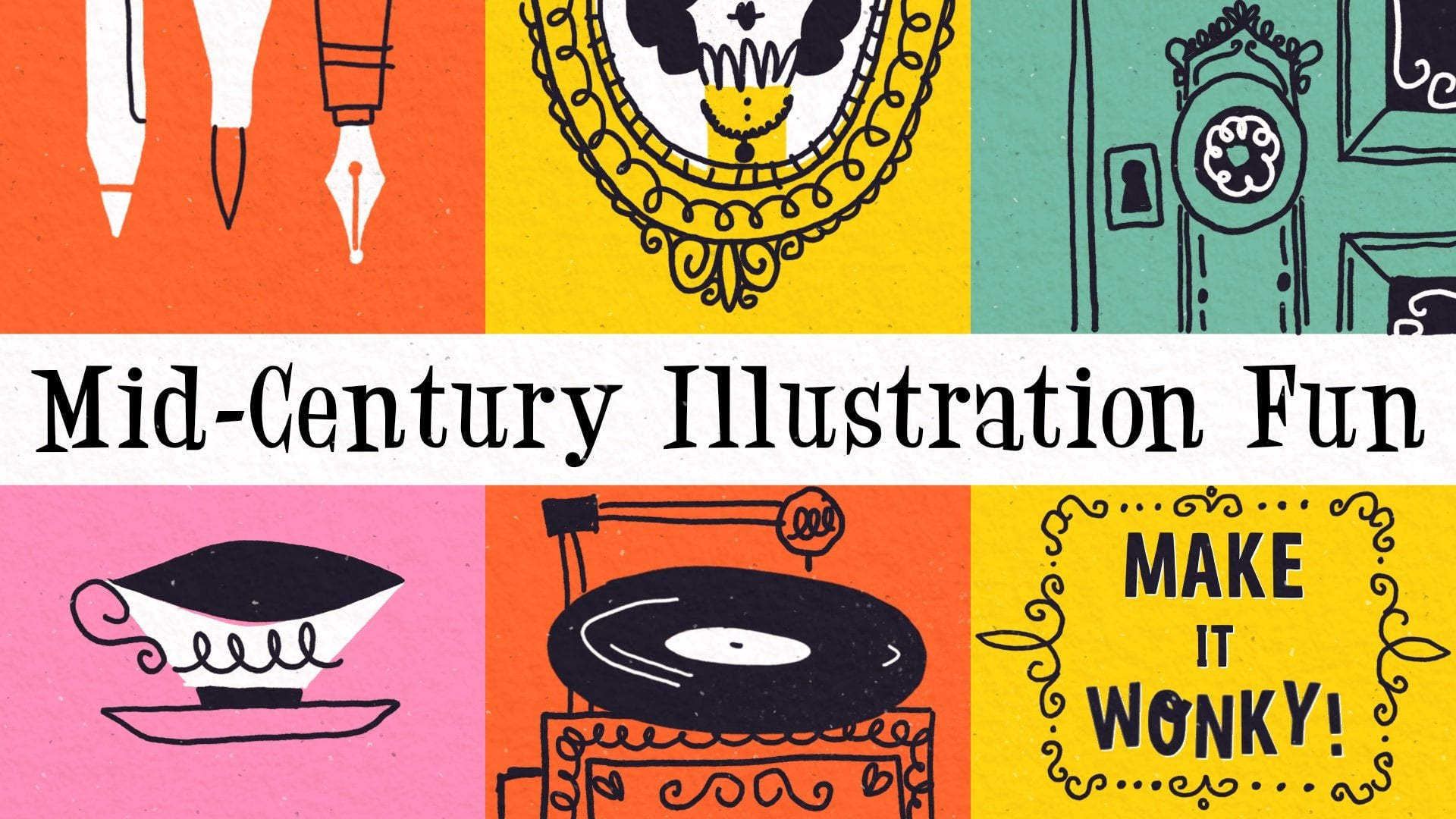
1. Let's Get Spooky!: Hello, Mid Century
lovers and welcome to the spooky Special
Edition class. I'm Jutta. I'm an artist and
educator from Germany, and I am a sucker for mid
century illustration styles. I've already created a series of mid century
Illustration classes, and this one is a follow up to my previous Mid-Century
Illustration Fun core class. In this one, we'll take
our skills up a notch by creating a full colored
Halloween illustration, ready to share or add
to your portfolio. This time we'll be working
digitally in Procreate, and I'll share all the tools and tricks you need to create this cute and spooky mid
century illustration. I'll guide you step
by step through the process from sketching
to adding rich textures, and by the end, you have a finished piece
that's worth sharing. A little side note. This class builds on what I teach
in the main class. If you haven't
checked that out yet, I recommend doing so
first as it gives you the right foundation
before diving into this one. With that said,
let's get spooky. I see you in class. As.
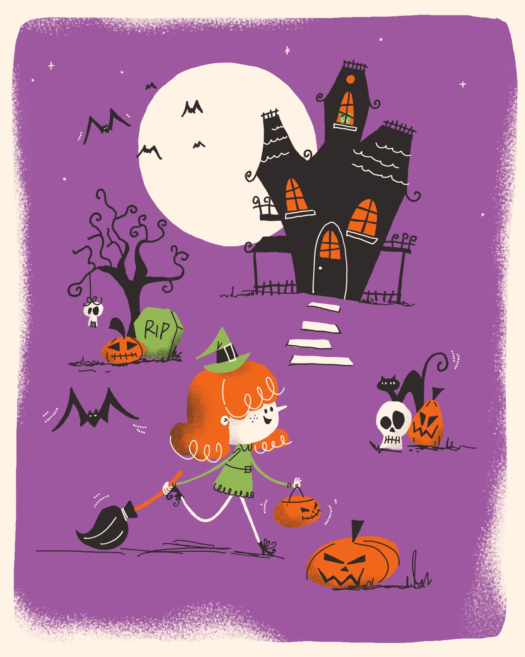
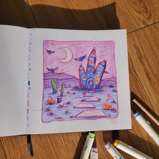
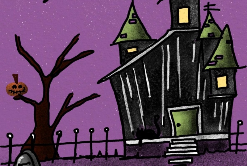
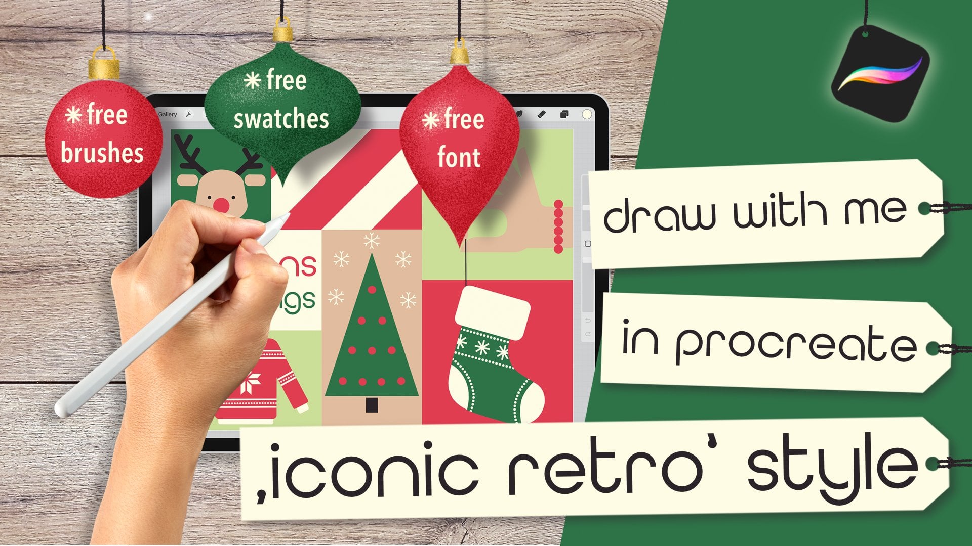
2. Class Project & Preparations: In this class, we'll create a Halloween themed
illustration, obviously. And of course,
that's the project I'd like for you to post
in the project gallery. To be fully prepped and equipped
for the drawing process, you want to make
sure you've watched the core class, Mid-Century
Illustration Fun, make it wonky, have your
iPad and stylus ready, and you've downloaded
and imported the resources I've provided in the project and
resources tab. You'll find a Procreate brush set and my color palette there, as well as the link to yet
another Pinterest mood board. Now, before I created
my illustration, I went ahead and built my Halloween themed
visual library, the way I teach in
my flagship class. I've collected items I wanted
to portray and drew them in different variations until I found the style I liked best. You can skip this deep and draw exactly what I do or
go the extra mile and create a visual library
with Halloween items you love and make your own
project totally up to you. Alright, I think that's
all we need for prep, so let's get started
with our sketch in the next video.
I'll see you there.
3. Sketch: Alright. Here I am in Procreate now and
ready for my sketch. Since I want to share
my illustration, I've opened a canvas with
2000 by 2,500 pixels. In our first step, I
want to move over to plaque and pick my
MCN sketcher brush, and then I'm going to
roughly draw in two lines across and two lines from top to bottom to kind of
mark the rule of thirds, which we should be following
in our illustration process. On a new layer, we can
start with our sketch. In all your illustrations, you should have a
certain hierarchy. Your main motif should
always be on either of those lines or those
meeting points here. In my illustration, I want
to show a little girl like being on a trick or tree trip and a haunted house
in the background, and some typical
mid century items spread across the canvas
just as a filler. So let's start with a
very, very rough sketch. Although I want to
make my rule of third here a little
bit less visible. So I'm on layer two, and I start roughly
laying down my motif. So here in the foreground, I want to have a little girl walking with her pumpkin back for trick or treat
and a broomstick, as I think I want
her to be a witch. So this is kind of
on this point here, and in the background
is going to be a haunted house somehow. It's a wonky one. That's for sure. And the moon, I want to have the
moon, as well. A big one, it's full moon
to make it really spooky. And then here we're gonna have like maybe a tree, a spooky one. And some other items maybe
maybe a tombstone or pumpkin. Oh, maybe there's
even a skull head hanging from the tree. Then here we have another
pumpkin maybe like this, another skull, and
even a black cat. You can't miss a black cat. And here, it seems to
be a little empty, so let's put another pumpkin
down here on this line. Course, we need some bets here. So my main motif, the girl in the foreground,
looks pretty good. I think I want to make
it a tiny tad bigger. Then the pumpkin here a little bit more
towards the bottom. We have always room
for changes later on. But I guess I want my haunted
house a little bit bigger. But we can add to it. So
it's not gonna be too empty. So we could have a little paths. And I guess that's
a rough composition already, which I really like. I just want to make sure that these two items aren't
on the same height to just have it a little
bit more interesting. So this goes up, and this
little group here goes down. And then later on,
we can still add some beds or stars
or other fillers. All right, so that's
a rough sketch. Let's move on. Add
another layer, turn this opacity,
like, really down. And I think we also don't need our rule of thirds anymore. I think the moon needs
to come down a little bit because I want to have something like a frame around my background color,
something like this. But you can make
your you can make the entire background in
your background color. That's totally fine.
I just love having a little white frame
for whatever reasons. I can't really tell
you. Alright, the moon goes here. All right. So let's go over to the tree. So I want this tree
to be really wonky, and I think we won't be able to see the
roots at the bottom. I want to cover them
because I usually don't really know how to
draw the roots. So I want to have
a few branches, like a few thicker ones. And then I want to have a lot
of twigs that are kind of, like, really crooked and wonky. Okay, that's the tree. So from our tree, we have, like, a really wonky
skull hanging down with bigger and a smaller
eye and the teeth. And as I said, I want
the roots to be covered, first of all, maybe from
a nice tombstone here. And then in front
of the tombstone, we even have a pumpkin. So let's erase the
strokes we won't need. And I think I want to
have rest in peace here. Maybe we are going to draw
the tree a little bigger. Then it would be
nice if the branches look a little bit like peek
a little bit into the moon. Okay. Alright, now our haunted house. Okay, so I want to have, like, a really wonky. Look here. And I also like when the
roofs have these kind of wonky round ends here. So our house has some windows. And in the roofs, we have some tiles, maybe, indication
with some lines. I just don't like
this roof right here. I want to put it a
little bit down, although otherwise it's too
much on the same height here. So, how about we have a
really wonky balcony here? And I think the house
is gonna be black and the windows probably
in our orange or so. So some beds definitely appear. And I always want
to make sure I have an odd number of items. I think that looks better. Even numbers kind of if
you have four or six, that doesn't look as interesting as if you have an odd number. So I don't know. That's
just my opinion. So we have another skull here. I like when they have
two different sizes of eyes that kind of gives them a little
bit of I don't know, dumb look less spooky. So I want I want the skull
and the pumpkin to overlap. Do I like that? I think I wish the the skull wouldn't be on the same level as the
pumpkin to just have a little bit more maybe like
this a little bit more depth. A little bit further down. Okay. Maybe like so. And then it's not
so crowded with the mouth and the eye is here. Let's do the mouth once more. No, I think the cat
is way too big. And I'm afraid that
the top of the pumpkin will not be won't be visible
when the cat's there. So let's let's twist it a little bit around
maybe like this. But then we have the
bottom of the cat, maybe. Let's start with the
bottom of the cat first. Okay. That's wonky enough. And then she gets some ice, but probably not
this oval shape, but this oval shape like this. Yes, I guess I like that. And then we have this pumpkin
here in the foreground. This is how I draw my ovals, and then I erase what I
think doesn't look good. Okay. That looks
gorgeous already. Right now, I want
to add a new layer, and this is where I
put my main character, this little little witch
girl kind of situation. I expect to have more changes and erasing on this
little girl character. That's why it's a good
idea to put it on a different layer because all the erasing won't
damage the background. Okay, so let's see. Let's see. So I definitely want her
to have a tiny round face. Not too round, though. And I wanted to have, like, a very pointy nose. And then we have the hair. The eyes are going to be here
and a little cute mouth, smiling mouth because
she's very excited. That she goes. She's going
to get a lot of treats now. So then we need a
tiny witch hat. Maybe this bump here, maybe the bottom is
not perfect yet. Then I think this needs
to be more straight. Kids usually have, like, a little thicker and
more bulged forehead, so I want to indicate that here, too, to make her cute. Okay, so now we have the dress, and to make cute characters, we always have to keep
in mind that needs to be very big compared to
the rest of the body. But I want to you know
what? I want to add. No, I'm still not
happy with the hair. Yes, I think I like that.
Alright. But I want to also add some more hair on the other side of
her head like this, peeks out from behind because
she has beautiful curls. And then here we have the dress. And since she's walking
in this direction, her body needs to lean
forward a little bit. So I'm going to draw her
dress maybe like this. My characters usually
get, like, a really, really small body
compared to the hat. Yeah, this is massive, but it's really cute. It's really cute. And then one leg is to the front because she's
walking like this. One leg is just loosely
towards the back like this. I think I want the legs even more in the front of the dress. And at the end of her Oops, at the end of her legs, she's gonna have
like little boots. Like witches shoes,
but really tiny. Just with some laces. And here, the same. And they curve like
upwards in the front, and they have wonky shoe laces. Great. We miss an ear. Here, I see that we miss an
ear in her hair, and I'm still not very
happy with her hair do. I see. So we need an ear. That's for sure. The ear is kind of at the same
height as her eyes. We're getting there. The sketch usually is what
takes the longest. Like this. Boop, boop, boop. Yes, that's better, I guess. Maybe not that big of a bump. And we can still make
some changes later on when we fill it with
color. Yes, I guess. Now that's where I want to go. Okay, so her one arm goes to the back pretty long and
she carries her broom. Kind of like this with
some lines in there, and her hand is here, fingers here, and the thumb
comes from the other side. And here we have the arm. And this one has
the eyes towards the front and maybe some sort of this mouth, like
with stitches. Oh, yes, sweet. How
cool. I like it. I just think she
still is too long. So maybe I should shorten
the legs a little bit. I think that's gorgeous. I just want to make
sure that the shoe here doesn't end up being
covered from her arm. I don't want to
make like an angle. I really want to
make a round curve. Who cares about,
like, real bodies? That's the charm of mid
century illustration. You can just do whatever
you want and have it. The wonky it looks,
the better it is. Oh, yes. I like that a lot. Let's turn off the first
sketch. No, that's not the one. Let's turn off the rough sketch. It looks brilliant. I really like it. I might change a little
bit from this pumpkin. It kind of is in the same
line as the group here. And I guess it's a
little bit too big. So let's make it a bit Oops. Let's make it a bit. Oh,
I'm not on the right layer. So let's go back to this layer. Here we have a little
bit of an empty spot. So why don't we add a big
bed here? Maybe like this. My beds are gonna look like. Maybe I should
draw that for you. My beds usually have one zig
zac then a small zig zag as the head of the bat and another big zig
zag for the wing. Then I go up at another zig zag. This is the body,
another zig zag, and this is the wing. And this is how my
beds usually look. This one needs a phase. Great. And I think I'm pretty
happy with my little girl. Besides the hair, I'm not
happy with the hair still. Well, that's why we si That's
why we sketch beforehand. We want to be happy
with our motif, so And I think her dress will
get a little color up here, a belt, maybe, and some
whatever at the bottom. Still, the head is not in
the right position, I guess. Whoops. Oh. Here we go. Yes. Yes. Now, I
think that's great. I think I really like that. So, how are we with
our overall hierarchy? I think our haunted house
could be a little bigger. Okay. Now, let's check. Our girl could be
a tiny tad bigger. So let's go to this layer and just make it a
tiny bit bigger. Maybe we can even
squish it a little bit. Okay. And in the end, we're going to add
some more details to just have some
fillers in there. But for now, I'm really
happy with the outcome. Great. Okay, so let's
move on to the next step, where we lay down the colors
for our illustration. I'll see you in the next video.
4. Color Rough: And welcome back. So now we want to lay down the colors
for our illustration. And first of all, we might want to clean up some of the lines. I think we can get rid
of the rough sketch, and we don't need this anymore, but we just use that as a placeholder to be able to add layers
underneath our sketch. And we can pinch
these two together. Then we have our sketch in
one layer to save on layers. And now I'm on my eraser. So let's check and see
what we don't need. We don't need this corner here. Let's turn the visibility
down a little bit. And as I said, we're going
to add a layer underneath. And now we want to indicate what gets which
color. All right. Since I want this to be a
mid century illustration, I don't like the base color
to be white, pure white. It always reminds
me of a little bit of yellowed paper
from an old book. So that's why I want to turn the background into beige
at the very bottom. Let's add another layer. And here we go to lay down
the colors just roughly. So I'm with my fountain pen. And I guess since this is
gonna be a night scene, I want a purple background. Then I want the moon to be in this of white
color, as well. I want, of course, the skulls in white. The haunted house, of course. This is supposed to be black. The cat. The cat is
supposed to be black. The end of the broom, I think it's gonna be black. I think the girl is gonna get, like ginger orange hair. Alright. Mmm. Oh, the broomstick
can be orange. Oh, and the windows. Let's turn the sketch into
linear burn or multiply. Then we can see our lines, even though the bottom
layer is black. So let's make our
windows orange to have it look like there's light. That's enough orange.
It's spread nicely. Great. Let's go with our green. I think I want her
dress to be green. And then I think we need
something green up there. Maybe, maybe we draw
a little monster, something here in this window. How about that?
That could be fun. That could be really fun. Oops. Let's go with black, so maybe I like this here, Burb. Yes, I guess I like that. Okay. And then we just need I think the rest is
just gonna be white. How about we draw
the steps in white? And the shoes are
gonna stay black. Yes, I think I'm
happy with that. This is how I want to
lay down the colors. So let's move on to
our next lesson where we draw our final illustration.
I'll see you there.
5. Color Blocking: Welcome back. So now it's time to start with our
real illustration, where we have to
put a little bit of effort in defining the shapes. Let's just do that
in a new layer. So we can turn this off for now. I want to keep the
Beige bottom layer, and I want to add another
one for the background. The end, I might erase
some of the purple with my beautiful shader
grain smooth brush. But for now, I'm just
going to draw like a rectangle with
rounded corners. I have two brush sizes for my mid century
fountain pen saved. This one is at 9%, and this one is at 5%. And I'm going to start with a thicker one to just
define the shapes. Alright, so let's start
with the purple background. I add another layer, and here I want to
lay down the moon. Okay, on top of that, I will start with
my black layer. The black layer for
the haunted house. Okay. And then we make sure
we have all the corners closed that we can color drop. And the rest of the
line I will be drawing with the smaller brush size. So now let's go ahead
and draw the tree. No. Oh, a very nice bookie tree. I like that. Okay. I think we
can also draw our cat here. Okay, beds and all
the embellishments, I'm going to draw in the
end on a separate layer. So let's move on layer wise. On this white layer
from the moon, we can also draw the slabs
and at least this skull. So let's go back to that layer. And I want to make
sure they kind of look trapezoid, but really, really off and she's
going to cover that. That's okay. That creates depth. Even though we stay still, quite minimalistic
in our illustration, we are still able to create some depth by just having
things overlapping. And if you want the corners
to be pointy, you just erase et's see in our next layer, I think we are going
to go. Let's see. Let's go with green
on our next layer, and it needs to be on
top of the black one. And this is where we're
going to draw our tombstone. And with a head, I'm not sure. I think the green head
needs to go on top because on the next
layer, we need orange. So orange is on top
of this tombstone. I actually think we can
on the white layer, we can also draw her face. And even though the dress
is gonna overlap that, I can show you a little trick. And I know the dress overlaps the face, and
we don't want that. So we can make a
little trick here. We're on the white
layer with the face, and we're going to erase
something from the dress, and that we don't
have a gap down here, we're going to erase
that seamlessly, and I show you how that works. So we're going to go
back to the white layer, and we say select. Now we go to the green layer
and we can see there's this selected area from the face and those stripes here from
the area that's unselected. So that means the
green here is in the selected area from
the shape of the face, and we're just going to use our three fingers to erase that. And now it's seamlessly erased and we don't have
a gap here in between. That's very, very handy trick. Okay, now we can go back to the orange layer and
draw the girl's hair. Let's add a layer
below the white one. So now we need her legs. We can draw them on the
white layer as well. Oh, we forgot the arms. We need our arms. Alright, we need another skull. But I guess this one also needs
to have a separate layer. So let's add that on
top of everything. We need the green hat. I'm just gonna simply add another layer since
I have enough space, and then I want to draw the hat. All right, we still
miss the windows. So on our orange layer, we can add the windows. Let's check if we
have everything we want to show like this. Yes. I guess that's looking
pretty, pretty fantastic. Alright. So let's move on for the details and lineworks in our next video.
I'll see you there.
6. Line Work & Details: And welcome back.
So in this lesson, we are going to follow
up with the linework, and I'm going to, for sure, go one size smaller
with my brush, and I am going to add
a new layer on top. And I will start with
the black lines first. She said, and picked white. So I want to start with
my black lines first. Okay. So what I want
to add here is like a little string next, we move on to the tombstone. What I also want to add is, you know, some bottom texture. And our bata. And later on, we will give him
some cute little ice to have it like really spooky. And the broom here. Her head needs to have a ribbon. Let's move on. So here we
have a pumpkin bucket. He Oh, she needs to She
works on the floor. Of course, she casts
a shadow as well, which is just some simple lines. Just some random marks. And let's move on
to our skull here. That looks pretty
fantastic already. So let's move on here. And, of course, the window have like these kind
of bars in them. The wonkier, the
better, don't forget. Oh, and we need Oh, behind that, we need
the green monster. We didn't draw the
green monster. Let's put that on the
same layer as the head. H. And then let's go back to the black linework layer
and finish the roof. And then, of course,
we need our bets. Okay, let's turn off
the sketch for a second and see where
we are. Oh, boy. I love that. I like it. So what do I want to add? Let me think. I think we
need more bottom stuff here. Oh, and I want to
indicate some depth here. And Oh, I love how it comes together. I think I want rotate
her face a tiny tat. Yes. Next, what we miss some white linework
so add another layer. And, of course, you needs hands. And some loops in
her hair, as well. And what else do we need? Oh, some definition
in the house. Oh, and our monster, of
course, it needs eyes. A big one and a small one. And because I don't want
to add a new layer, I'm going to add the
eyeballs in there. Yes, like this. That is so fun. Oh, the kitty cat also
needs some pupils. Like this. Oh, I love that. I really love that. I think the little girl
needs some eyebrows. How about we draw
them like this? Cool. Yes. I think then we can
move on to our last step, which is adding some texture. I hope you like what
we have so far. It's still a little bit plain. That's why we gonna
add some more texture, and I'll see you
in the next video.
7. Final Touches: All right. And here we go
again in our final step, which is adding a
little bit of texture. And in this case, we are switching our brush
to the shader grain smooth. And then we are
going to start with a purple background
where I want to erase something from
this purple rectangle, which is too equal for my taste. I want it to look like they didn't add
enough paint, maybe. Thus, there wasn't
color everywhere. So that's why I want to erase some parts of our purple
background rectangle, and I'm going to erase
with this shade or grain. For example, this corner here looks a little
bit too plain. So I'm just going to erase
a little bit from it here. Just irregular. And I guess
a little bit from here. I just want to make sure that we don't see the edge
anymore at all. Yes, that adds a lot of
character already. Okay. Then, of course, I want
to give some of my items a little bit of a
texture, a shade texture. So let's move on and
add another layer. Let's start from the bottom
and move towards the top. I want to add a layer on top of the purple
background hair layer, and I want to turn it
into a clipping mask, it only draws on this layer, and then with the shader grain, I want to add a little bit of texture towards the
bottom of her hair. The next layer is the white one, so we add another layer, turn that into a
clipping mask, as well. And then we add a little bit
of texture to our skull, maybe to the path. What Obviously, the black
layer won't get any shading, but the green layer
clipping mask. And then we add
some texture here. Only the dress has some shading, but not her arm. Cool. Then let's move on
to the orange layer. Add a layer, turn it
into a clipping mask, and add some more shading
to our orange items. And if that's too dark for you, that's no problem at all. You can turn down the opacity by tapping this little N
and turn down here, the slider to the left, so you can make it
more or less visible, just that you like it. This skull here needs a
little bit of texture. So clipping mask on top. What else? The head? We said the head
is getting some. Let's add another layer, turn it into a clipping mask. That looks perfect. I just want to add
some more white lines to indicate movements. So I'm going to switch
to my dashes brush. I'm going to go back
to the white layer, and I'm going to pick
white, obviously. And now I want to
make the things move by just adding
tiny little curves. So the bat gets some
the broom is swinging. Of course, the pumpkin
bucket is swinging. And the cat's tail
and maybe here. Oh, these beds up there
don't have any yes yet. So at least this
one needs some yes. So let's go to the B
to the fountain pen, and we could also
add some stars. How about some stars
here and there? So great how everything
comes together. I think the only part that's missing is a little
bit of paper texture. So let's add another layer. Turn the color to black and go to the
stipples brush here. Oh, by the way, if you
rather want to add, like, really nice stars, then I've added this
brush in your brush set, but I want to go
with wonky ones, so I like that better, which is absolutely total preference. But back to the stipples, I want to mark some Black, subtle stipples into the paper, that it's not just plain white, just to take away this digital appearance
and I'm going to play with the opacity
again, that it's subtle. It's there, but it doesn't
jump right into your face. I guess I want to add even
another layer and this time I'm going to do the
stipples with white like this. Again, I'm going to turn down
the opacity a little bit. So there is a subtle texture, but not too crazy. And in our final step, I add another layer,
and this time, I turn the blend mode by tapping this little N into linear burn. And we switch to
our beige color. And this time, I want to pick
the Crenson paper texture, and this just does magic. It turns like a blank canvas into a piece of paper like this. And by turning the blend
mode to linear burn, it just brings a little
bit more saturation in the colors and blends
everything together nicely. So here you can see, we
added the paper texture. The digital appearance
is gone completely. And our illustration is done. Let's look at it
in all its glory. I really like it. If you think the paper
texture is too strong, just again, go ahead and turn down the opacity of this layer. But for this one,
I really like it. You can even see it
in the Black house. So I'm absolutely happy
with my illustration. I hope so are you.
Now you go ahead. You export it by tapping
the wrench icon. Then you go to share, you pick whatever
format you like. I usually export it as a JPAC and then you save
it in your camera roll. In your next step,
you can just post it. Again, don't forget if you post it on TikTok or Instagram, always tag me in your image
that I can see your art. Let's move on to the
final lesson where we wrap up the class.
I see you there.
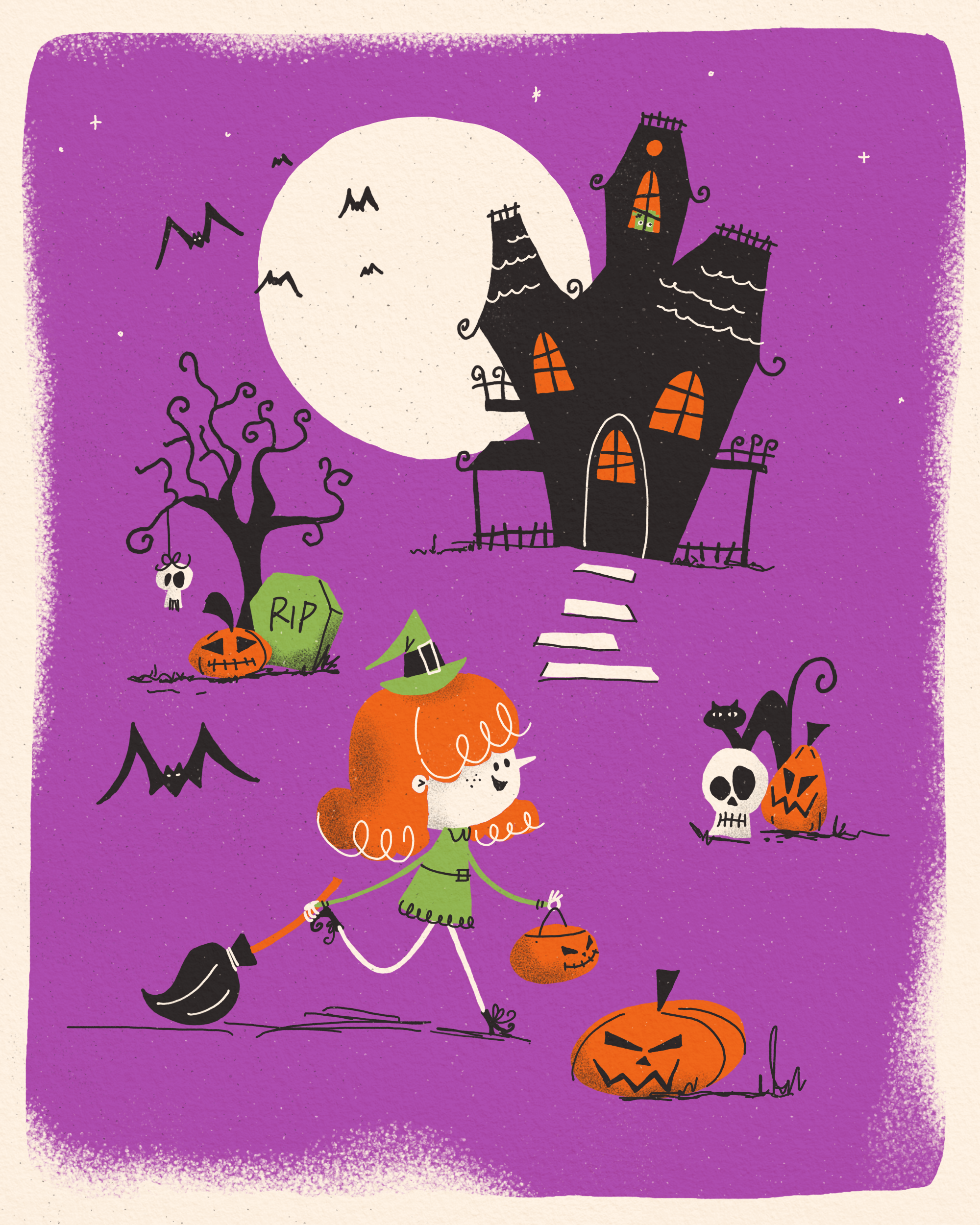
8. Wrap Up: And here we are with
our full colored spooky mid century
style illustration. Throughout this class, you approached your
illustration much like you would a
professional Klein project, collecting inspiration, trying out different variations, sketching and planning ahead, keeping hierarchy and
composition in mind, and finally creating a polished,
sharable illustration. Now, I'd love to see
what you came up with. Please share your artwork
in the project gallery. It's such a great place
to get feedback to inspire others or to
encourage in return. If you've enjoyed this class, leaving a review really helps
more students to find it, and I'd be forever grateful. Feel free to follow my social
media channels to stay up to date with future
projects and upcoming classes. And if you love mid century Illustration style
as much as I do, keep an eye out
for more classes, as I have planned a full
series around the same. Thanks so much for watching. I can't wait to see
your spooky creations in the Project gallery. And now, see you in
my next class. Bye.
 Jutta Schneider, Artist | Educator