Transcripts
1. Welcome: Hello, Mid-Century lovers,
and welcome to part three of my Mid-Century
Illustration Fun class series. In this class, we'll focus on recreating the charming
printed look of vintage greeting cards
and posters by designing your very own Mid-Century
style holiday card. Perfect to send to
your loved ones or to add to your
print-on-demand portfolio. Hi, I'm Jutta an artist and educator from the
middle of Germany. The Mid-Century
Illustration style is my absolute favorite, and I've already made a
handful of classes about it. I love exploring
its many facets and turning them into easy to
follow fun lessons for you. Today, we're going to create a cheerful greeting card that lets us play with a
wider range of colors. We'll focus on achieving
that typical grainy printed look with all its
lovely textures and the subtle misalignments. We'll be working digitally
in Procreate again, and as always, my classes come
with plenty of resources. You'll get all the brushes and the color palette you
need to follow along, plus my popular Jitterbug font, free for you to use
in your illustration. Just like in my other classes, I'll guide you step
by step through the whole process from the rough sketch to
color interactions and print effects
until you end up with a design full of the
tro charm we all adore. This class is a follow up to my Mid-Century Illustration
Fun Make it Wonky class. I recommend checking that out first to build a
solid foundation. Now, are you ready to get jolly? Then I'll see you in class.
2. Class Project & Prep: In this class, we'll create a cheerful mid century
inspired Christmas card. And, of course,
that's the project I'd love for you to post
in the project gallery. Of course, you can portray
any other theme as well. The more creative, the better. To be fully prepped and ready
for the drawing process, make sure you've watched
the core class first, have your iPad and stylus handy, and that you've
downloaded and imported all the resources from the
projects and resources tab. You'll find appropriate brush
set, the color palette, and my popular Jitterbug font all assembled in this zip file. By tapping and
allowing the download, the file will be saved in
your Files app on the iPad. To unpack it, simply
tap the file, and to use each
item in Procreate, just tap them and your iPad will take care of the
rest automatically. Before I created
my illustration, I built a little holiday
themed visual library, the same way I teach it
in my flagship class. You can skip that step
and follow along with my exact illustration or create your own project
with motifs you love. That's totally up to you. And that's all the prep we need. Let's get started
with our sketch in the next video.
I'll see you there.
3. Rough Sketch: Alright. Let's jump right in. I've already opened Procreate, and my canvas is set to
2000 by 2,500 pixels. I also have my brush set
and my color palette handy. I am picking the black
and my sketcher brush. Just like in the spooky class, we'll start by drawing
down the simple rule of thirds grid by adding two
lines from top to bottom, and two lines across. This is such an easy trick
to get a balanced layout. Let's turn down the opacity
of our rule of thirds grid and add a new
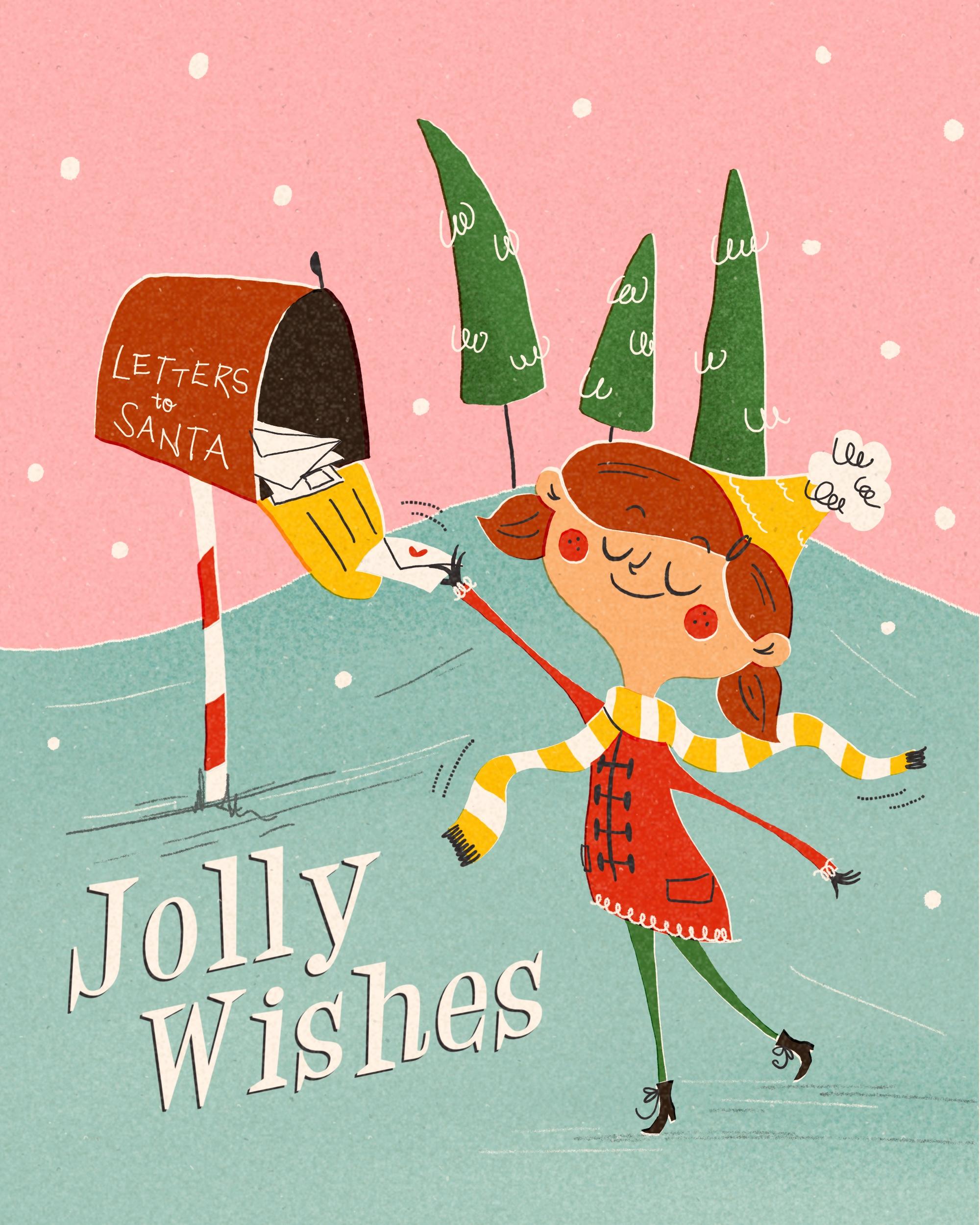
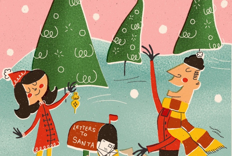
layer for our sketch. I want to portray a
little girl bringing her wish list to Santa to a nice and old
fashioned letterbox. In the background, there's
going to be some trees, and the rest is just going
to be sky and ground. Let's start with the
girl in the foreground. And the letter box
in the background. So my aim is that the girl is gonna stand kind of
on this joint here, and the letter box
on this joint. An illustration appears more interesting when you put
your main items onto these lines or points here rather than having it in the center of
an illustration. So my girl, I want my
girl to stand somehow here in a very
organic, lively pose. And she stretches out
an arm with her ladder, and the other one is
hanging to the back. And then she has, I don't know, a nice hair do maybe with
some pigtails and a nice hat. And the letter box, I want to be kind of
around this joint here, maybe not that high, but almost. And it has some sort of
a quirky perspective. And it stands on a nice post. I think the letter box is open. There's this kind of singing. And we're going to write
letters to center on it. And then we have something like a hill here in the background. And here we have some
wonky pine trees. Something like this. And
this is our illustration. So we go to write
something here down there in that corner since
this is quite empty. So let's write Jolly wishes. And this is what I've
added my font for. Feel free to use that. Let's see if our
illustration is balanced. We have different heights. So the trees end up here, the ladder box here, and the feet of the
Gur kind of here, which is roughly
the same distance to the edge like it is here. To me, it appears
really balanced. So let's move on to the next lesson where we're
going to refine the sketch.
4. Refined Sketch: All right. Now let's move on and add another
layer and turn the opacity of this one pretty down that it doesn't
distract us too much. And if you are bothered
by the rule of thirds, you can also make
this layer invisible. And we are going to start
with the background first and then put the main character
on separate layer. So I noticed that the line of the hill is a
little bit too high for me. I want her to peek
over a little bit. So I'm going to make the hill the highest point of the hill
more towards the center. And then I guess the girl is going to be a little
bit bigger later on. So I like the shape
of this wonky tree here and this one can
lean to the other side. And this one might even be
covered by the little girl. And remember, the wonkier, the better. That's
the background. And for sure, we are
going to add, like, big snowflakes, just
simple little circles. Kind of like this. And maybe
also later on in the snow. And the letterbox
is going to have some quirky shape and
also perspective. And then here we're
gonna do some lettering. And I'm not really
good at lettering, so I don't expect
this to look perfect. It's gonna be very
wonky on purpose. Alright, and as we said, the box is gonna be open. And there's maybe even some
letters inside already, something like a pile, some on top of each other, and the girl's gonna put
his letter in there. Then it has a pretty slim post, and it can be a little bit, you know, crooked
and wonky, as well. And I want it to have, like, this candy cane pattern in red and white,
something like that. Later on, we're going to
add some So, you know, some lines, and maybe
even a little bit of our typical wiggly
lines as fillers. And I guess that's all what
we need for our background. So let's move on and
add another layer on top for our little
girl character. And as I said, I want it to be a little bit bigger
that it reaches beyond the hill here and maybe also covers
some of the trees. It just creates more interest and depth in our illustration. So I need to make some
adjustments on my rough sketch. I want the head for sure
to be a little bit bigger. And then I want the coat, maybe to be a
little bit shorter. And I don't want
it to be right in the center because there
wouldn't be the natural pose. I want it to be a
little bit to the side. And I guess we need to adjust
the arm then, as well. And here, maybe it's a
little bit too long. Something like this, maybe. And the legs, she's
standing on one. Now tippy toes. And the other leg is gonna
lean to the back like this. And she has a very slim
neck. And a scarf. She needs a scarf, something
that flows around here. Alright, that's
already much better. So maybe we can still
put her up a little bit. That's a good thing
in Procreate. You can really adjust
to your liking. And maybe it would be
nice if her letter also overlaps a little bit
from the letter box. Alright, so let's go
back to our girl sketch layer and start by refining. So I want her had to be really oval and quirky
like this, maybe. And then her head. And her hair needs
to be a little wider than the actual face. I think we need to refine
that a little bit here. So the hair's a
little bit wider. And I want more of
a chin bump here, so just a little bit more curvy, and her face is gonna be Whoops. Like this, maybe.
She's very happy, and she has a shiny pointy nose. And she's smiling. She's looking forward
to her presence. And then she has she has a scarf around her neck.
Something like so. And below the scarf, we have the arm reaching out and it's gonna be a very slim
arm, something like that. And it goes here into her coat. And the same here, the other arm is going to
peek out of this sight. And here's the end of her coat. And in her little hand, I want the coat. Let's see. I want the coat to get a little wider towards her hand,
something like this. So she really has slim arms
where the hand starts, there's gonna be a little bit wider just to create
more interest. And then she holds the
ladder like this, maybe. Whoops, now, and this
is on the other layer. And back to our girls layer. So, and she's holding
She's holding the ladder with her
tiny little hand. And the other fingers
are kind of bend away. And I only want to give
her four fingers because I've noticed if you
draw five fingers, the hand looks really
crowded for whatever reason. So I'm just going to stick to two fingers. I like that a lot. Maybe though we could just move the ladder a little bit up. Like, turn it a little bit
upwards. Maybe like so. The thumb is going to be hidden from our ladder because
it's underneath. Yeah, that should be fine. Alright, so here comes her leg. And the other leg is
gonna go this direction. And again, it starts wider
and it's really slim. And here we have her
thiny little boots. And with this one, she
stands on her tippy toes. This maybe. And, of course, some
wonky shoe laces. And the other one is in the air. And here's the other hand and her thumb goes to the
ground towards the ground, and the rest of her fingers are bend upwards,
something like this. Just tiny hands. And then her coat,
now her scarf is kind of flowing to just
add some movement here. And it's gonna have
stripes later on. So let's get rid of the lines we the scarf is
actually covering. A nice a nice, interesting detail would
be if the ponytail reaches over the scarf
because this way we can add some depth
and interest again. And then in the
end, we're going to do some whatever pattern. Oh, her coat needs
a closure, as well. So she's going to get those
nice long buttons here. And we have some loopy
decorations here. Also on her. And I just think the pigtail here and the ear are not
in the right position. So let's fix that. I
think the ear is too low. And so is the pigtail. If the eyes are on this line, so the ear must be kind of here like this and
her hair here, and the pigtail maybe
comes out behind her ear. Just a drop shape like this. Although I think the head is
way too wide on this side. So let's fix that. Let's push it inwards
a little bit. Oh, yes, I get this
is much better. And then we can fix
the pigtail once more. So here we have a
little bigger hair. The head is hidden
behind the hair. And let's check where we
have to have the pigtail. And then we can also think
again about the scarf end. I feel like the ear here
needs to be a little bigger. It's closer to us, so it can be a little bit
bigger perspective wise. And then I want her pigtail
to be maybe like this. Now, that's stupid. And I guess I want the ear to
lean a little bit upwards, just to have a
nice quirky shape, something like this, I guess. That looks perfect. And then she gets two very nice
round red cheeks. And finished, she is. Oh, beautiful. I like
that. I like that. I think this arm is
a tiny tattoo long, so let's shorten that
just by a little bit. Oh maybe the heat
could be a tiny tad bigger. That's brilliant. I like that a lot.
And we can make even more refinements if we think we need them
while we're drawing. So, right, I would say
our sketch is done. Again, we leave this place
free here for our writing. Maybe we can shorten the
letter box a little bit. We can do that right away. I just noticed we forgot the
second end of the scarf. And I'm not so happy
with this curve. So let's do the front once more. Okay, so I guess we are
pretty happy with our sketch, and we can move on to the
next lesson where we're going to rough out our colors.
And I will see you there. We
5. Color Rough: All right. And in our next step, we want to rough out our colors. So let's move on and pinch these two layers together
just to save on space. And I guess we can get
rid of the rough sketch. And we can clean up
some lines here. So let's go to the
eraser and just erase what we don't need to have a little bit of a
better overview. And now let's add
another layer underneath our sketch and turn down
the opacity a little bit. And now let's have a look
at our color palette. So this time, I've added way more colors like seven
colors, which is okay. In the 1950s and 1960s, there were also
more colors in use, especially for advertisements
or greeting cards, and that's our look right now. Since we want to replicate
the vintage look, I want to put my off
white in the background. This helps later on
when we start with blending out layers
as it gives a very, you know, vintage look with a little bit of a yellow wing because that's what
paper did, right? The older it's gotten, the more it yellowed and the darker it got and
it's gotten spots and marks because it wasn't that highly bleached
as our paper nowadays. So we can replicate
this when starting with a beige or off white
hue in the beginning. So now let's add a layer on top and distribute the colors. Start with a background. So
I want the sky to be pink. And let's move over to the jolly pen and make the
size a little bit bigger, so. And then I want the snowy ground in my turquoise here like that. And I think later on, it would be nice
if the hill is not on the same level as her hair. So we're gonna fix
that in our next step. But for now, it's okay.
We just keep it in mind. So the ladder box itself, I think it is gonna be brown, as well as her hair. Alright. Green. The trees
are gonna be green. And then her coat
is going to be red. I want to introduce
even another color. I want to introduce
yellow, as well. And then what else? Oh, yeah, her face is
gonna get the skin tone. And I guess the rest, let's see. The shoes are gonna be black. And here the inside
of the letter box. And the rest, I think
is gonna be white. I ba da da da. Alright. And the scarf, as well. I also want the
writing in white. And now I can show you how
the colors are gonna change. I'm just going to
tap the end and here we see a whole
list of blend modes, and they all do
something different. And for my taste, I prefer the linear
burn blend mode. And as you can see, it turns everything a little
bit more saturated, but also a little bit
to the yellow side. I really like that because that appears so vintage,
in my opinion. Alright, so I'm pretty happy
with this distribution. So let's move on where we give everything its final shape in the final color.
I see you there.
6. Color Blocking: All right. Now
we're ready to give everything its final
shape and color. And we need to keep some things
in mind when we do that. When we have our layers
in a blend mode, they go to interact
with one another. So we need to keep the order of the layers and colors in mind, and we're going to keep
every color in one layer. And then we will have to have a little bit of erasing ongoing, but I'm going to
show you as we go. So for now, let's
put our color layer, our rough colors
at the very top. And turn off the visibility so that we are left
with our sketch itself. And we said, we're going to
put each color on one layer. So let's add the layers
already for now. Let's start with one. And we're going to turn on the blend mode, linear burn right away, just to save us some time. And then we're
going to duplicate this layer until we
have seven in total. Okay. And now we're
going to move our way up from background
to foreground. And since there's going to be some interactions happening, we will do some erasing, and I show you some
handy procreate tricks how we can do that
in a neat way. Okay, on the first layer on top of our yellowed cream
of white layer, we are going to start
with the sky in pink. And I am just going to
follow this line here, and we said the hill is
not going to be as high. So we're going to
do it like this. And then we fill it with color. Yes, I like it much better when the head peaks beyond and
we can make the trees. Later on, we can make
them a little bit bigger or a little
bit further down. So let's think about,
is there anything else we want in pink?
I don't think so. So let's move on to
our next color layer, which is going to be then the teal turquoise
tone we have here. And here we can have a little
bit of overlapping ongoing. That's no problem. And
we collar drop again. And now we can see the first interaction here
between these two layers. And to have that seamlessly, we can just, let's say, we select the pink
layer by tapping, say, select, and then we switch
to the turquoise layer, and we just do the
three finger erase. And now it's erased
everything from the teal color that was
reaching beyond into the pink, and that's all done now. So perfect. That's
exactly what we want. On our next layer, I guess we're going
to start with green. But for that, I want to
fix my sketch quickly because the trees are not in
the right position for now. So let's go to the
selection tool, select the trees and drag
them a little bit down. Maybe let's see. Now, I want them to be a little bit more in
the center, maybe. Yes, I guess that's okay. And then we can just
erase what we don't need. Let's move on.
Okay, we said we're going to go to the
next color layer. And on this one, we're going
to go with our green tone. Let's turn down the
brush size to 9%. And then we're going
to start drawing following the lines
of our trees here. And I guess I want this tree
to start above her hair. Alright. The green
appears pretty dark, and that's because the
green interacts with the pink underneath because we set the blend
mode to linear burn. And to avoid the interaction, we're going to erase
the exact shapes of the trees from
the pink background. So if you're not
happy with the shape, you can fix that right now
because if we're erasing, that's going to be
a damage forever. So you need to make sure we're happy with what we
have right now. Alright, I think I like the
shape of the trees now. So I am going to move forward. And I tap the layer. I tap se mag, and now I move down
to the pink layer. And where you can see that. Here in the pink
area is the stripes. That means this
area is unselected. And here where the trees are, there are no stripes, so this is the selected
section of the canvas. And now, since we're
on the pink layer, when we do the
three fingers crab, we delete the exact shape of
the trees on the pink layer. And I can show you I turn
it off the visibility, and now we see there's just a white empty
space in the pink, and that's exactly
what we want for now. Alright, I think the pans we said the pants of the girls
should be green, too. So let's go back to
the green layer. And as you can see,
the green interacts obviously also with
the teal background. So we can fix that in a second. And then we go to
our Layers panel. We select the green layer, we go to the teal, and we say erase and boom, done. The green looks like
the real green. And we turn the layer off, we see this areas empty
in the teal. Great. Next is gonna be our red layer. Alright, let's move
up to the next layer. We can turn green on again. And now we switch to our red. So, what we need in red
is the coat of the girl. And let's make sure we stick
to our confident lines. And before we're erasing, we need to make sure
that we like the shape. So if there's any blobs or
edges you're not happy with, we need to erase them
or fix them first. Where else do we need red? We need red in her face. So for now, I'm seeing
a problem here that the red coat is interfering
with the green pens. So we can fix that
pretty easily. We are going to the red layer. We select red. And now we're going to
go to the green layer, tap the eraser, and just erase what's peaking
inside the coat. And then no more overlapping. I still want to wait, though, with further erasing
because I want to draw the white post
first to just see where everything interacts with each other so that the strips are in the right size before we erase them from
the layers below. So let's start by going to
the next layer and go to the white and then we draw the post. And yes, we can't really see that because it
interacts too much. So let's turn the blend mode to regular to normal again
and fill it with color. And I think, let me see. Let's turn off the sketch. I think that's a good
that's a good post shape, maybe a little bit smaller. And now we can very smart
erase the red that's peaking over by selecting
this layer, the white one. And now we invert the selection. By inverting is everything
else around the post selected, but nothing within the post. And now we want to erase
what peaks beyond the post. So we go back to the red layer. And we just erase
what's peaking over. And we can't erase
anything that's inside the post because
this is unselected. Let's turn out the selection, and now we do it
the opposite way. Now we want to erase, since we can't see our reds, we want to erase the
reds in within the post. So let's stay with red. Let's tap Select. Let's go to the white layer. And now we can already see
those two selected areas. We just erase these. Tada. And that's done. And I see there's still a
little bit of a white left, so we can just
manually erase that. Sometimes Procreate is not
as accurate in selection, especially when you have
not a very crisp edge, but like something
like a jagged edge. And then it's possible that it doesn't erase
everything right away. But that's okay.
Alright. We also need some white in our scarf. So let's turn the sketch back on and we also need
white for the letter and for the letters in the letter box and for the
little pompom on her head. Okay, let's move on. We still didn't
erase everything. That's okay. We can
still do that later on. But for now, I want to just make sure that we have
the right shapes and the right order before we erase too much and
are going to be set. Let's just do that this way. Okay, we are on the white
layer. We on white. Again, the wonkier
you draw your lines, the better it looks later on. If you are too careful, you're missing the character later on in your illustration. So just dare to
be however wonky. Our next color we
need is yellow. And I know it still doesn't
look right. That's okay. Trust the process. We got
to move on layer by layer. And eventually, you're gonna see how it all comes together. And keep in mind, in
every single piece, every drawing, there's
this ugly phase where Nothing looks right. It looks really wonky. In the colors don't go well. But if you go on and
push through in the end, it's gonna make sense. So, trust me, trust yourself. This is gonna be awesome. So, next layer, and we are
going to go with yellow. So we said the flap here of our letterbox singi
is gonna be yellow. And the stripes of the scarf. And here with the scarf, we can use the white layer as help by selecting
the white layer. Now, we can only draw in the selected area
within the scarf, but not here outside. So that's very helpful already. Let's go back to
the yellow layer. Next one is going
to be skin tone. And I see we have one layer to less because we
added the white one. I didn't count the white one. So let's duplicate this
for skin tone and brown. Okay. This is going to
be our skin tone layer. And let's turn out
the selection. And lastly, we're
missing Oh, actually, we're missing two
layers because we're missing brown and black as well. So, okay, let's go. Duplicate this layer,
go to the next layer, which is going to be brown. And here we're going
to draw the layer boox Since we have some unpleasant
overlapping going on, we can fix that right away
that we don't forget. For now, I don't like that the pigtail here
reaches beyond the face. So I am going to select
the layer with the face, and then I'm going to go back to the brown layer,
pick the eraser, and just erase And now we don't like what's peeking from her skin tone
into the hair. Let's fix that by selecting the brown area and go
to the skin tone layer. And now we erase
what's in there. And since we cannot
really see that, we need to turn off
some other layers. Let's go back. Let's select this layer and go back to brown. And now we can erase the hair. Here I want her ear to
be in front of her hair. And here I want her ear to be covered by the hair for more
perspective and interest. Alright, let's turn
yellow back on. And then turquoise
too, maybe. Alright. And now the last color
that's missing is our black. So go to the last layer. Pick black. The and, I'm not so happy with
the post, I guess. Let's go to White, select white, and select the red
layer at the same time. And then we're going to
go to our selection tool, and we just rotate the
post a little bit. Yes, amazing. That looks great. And now we can also see all
the weird interactions. But we're going to
take care of that in our next lesson.
I'll see you there.
7. Erasing & Shifting: Now, we've noticed that we
have some weird interactions. We took care of some
of them already, but we want to do the
rest. In this lesson. Let's start from
our latest layer. Let's go to the black
layer and select that. And I see some weird overlapping here with the letter
box with the brown. So we go to brown and
we just erase manually. Next we see some
weird interaction with the white layers
and the black. So let's go to white
and select this layer, and then we're going
to go to black and erase here inside of the black. And since the white, I hope you can see
that on camera. The white is peeking
into the brown. So let's select brown now
and go to white and erase. And then we have the white peeking into yellow,
which we don't want. So let's select white again. Go to yellow and erase that I'm just not super happy. Let's undo that. I'm just not super happy with
the shape of the latter. I think I want to
erase the corners. I don't like those
weird blobby corners. So let's get rid of them and make them a
little bit more pointy. So again, select white. Go to yellow and erase
everything in the yellow. Awesome. Yes, here we have the white overlapping
with the brown. Let's select brown. Go to white and erase. It's a bit confusing, but just bear with me.
Follow the process. It's going to work
out in the end. Let's move on to the
trees and the girl. So let's go to yellow. First, select it, and then go to the green layer and erase. And we can't select
we can't erase this tiny little
nip because it's peeking into the brown hair. So let's go to
brown, select brown. Go back to green. And then we can erase the final bit here. Okay. I see we have some empty spaces here
in the white pompom. And I want to fix
that. All right. And now we see, obviously, the yellow hat peeks
into the pompom, and that needs to go as well. So let's select white. Go to yellow and erase. Okay. I think I saw some yellow
peeking into brown, which would cause a
weird interaction, even though we don't
see that right now. So let's get rid of
those background colors, and now we can see
it much better. The yellow is peeking
into the hair, and we don't want that either. So let's select the hair. Go to yellow, and then
I just erase here. And here I see some
weird overlapping, but I don't like this blob
at the end of the brown. So this pig tail, so I want to clean
up the edge first. And then we can erase the part of the yellow
that peeks into the hair. So select brown, go
to yellow, and erase. And then I see the ear here
still has some empty spaces. So let's go to the skin tone. Where else do we
have weird overlaps? I need to fix the
yellow, though. So let's go to the yellow
layer and fix the edge here. And then I guess we can do the best by selecting
the white scarf. Go to the skin tone layer
and erase everything here. All right, do we have any
other weird overlappings? Yes, here with the
shoes and the pans. Let's go to black, select black, go to
green and erase. So next, what we need to do is erase all the color shapes
from the background shapes. We did that already
with the green. But only in the sky to show you. So we also want to erase that within the turquoise.
Select green. Let's go to the teal layer, and then just three
finger scrub. And now we see the green has the right tone and
is not interfering, interacting anymore
with the teal color. Next layer is red. Red peaks, both in pink and both in teal,
so we select it. First, we go to
the pink layer and erase then we go
to the red layer, select it again and
go to teal and erase. Tara now we have the
real red showing. Let's go to the white layer, which is really important. So white, select and go to pink. Erase white. Select and go to teal
and erase, tata Yellow. Select yellow. Go to pink. Erase, Tara. Yellow again. Select. Go to turquoise. Tara. We're almost there, and the colors come
together super nicely. Great. Okay, we need next one. Is the skin tone,
select. Go to pink. Erase. Select skin tone again. Go to tear and erase. Lastly, I guess. We have brown. Select. Go to pink. Erase. Go chill. Brown again, select. Go to teal, erase. And lastly, I think
it's black, right? Black. Select. Go
to pink. Erase. Black, select. Go to teal. Erase. Now we don't have
any overlappings anymore, and that's so cute.
It's amazing. In our next step, we
want to replicate this typical mid century printing look by shifting
the layers around. Mostly, they've used the
screen printing technique, which meant that you were
preparing one screen with a certain shape set the
same way we have it here. And then they would put
this screen onto a paper, print it onto the paper. Then away goes the screen. Color dries, then the
next screen on top and the next paint and the next printing
and so on and so on. And because you couldn't,
like, really, 100%, make sure that the shapes like really are 100%
in the right position, you would have those
white areas in between. And I really like that look. So we can replicate that
by shifting layers around. So let's start with our
turquoise layer here. I'm just gonna tap
the move tool. I have snapping disabled, and now I'm just
moving it like tiny, tiny, little bit, just a tiny bit to see some outlines here. And there's two
things happening. First of all, we
see the shapes way better because of the white
outline we've just created. And second, the colors
interact with one another, which creates even another
kind of set of outline. And the blend mode really makes it nicely and
realistic looking. So we can move on by just shifting each layer
a little bit. Let's go with the green. Let's move the green
layer a little bit. And I hope you can
see that here. We have the darker outline here. And I just see there's this one little line
I don't want to. Yes. So we have the darker where the green
interacts with the pink, and we have the white where we have the empty
space from underneath. So that's really cool.
I like that a lot. Okay, let's move
on layer by layer. With the white layer, I'm not sure yet if we will keep it. I want to turn it off for now
because we basically have all the shapes already in the background because
with the negative space, we created by erasing. So I'm going to turn off the visibility of the
white layer for now. I still have to decide if we're going to
need that later on. So now let's move on to the yellow and move the
yellow a little bit. Like this, maybe, then the
skin tone, and the brown maybe the shoes look good, but I want to move this around, so I'm just going to select this part here of
our black layer and move this a
little bit to have a little bit of a
white here in between. Just a tiny, tiny little bit. Great. That looks
fantastic. I love that. What we didn't draw
yet is the snowflakes, but that's going to
come in our next step. We're going to move on and add all the cool lineworks and details and the juicy textures. So, I see you in the next video.
8. LineWork & Details: Alright. Now it's all about
blending it all together, adding those nice details. So let's just do
that right away. So what we still miss
is all the linework. Let's go and start with that. We're going to go
onto a new layer, and we have different
options here. You can either use the MCM
jolly pen for your linework, for some crisper lines, or you go with the MCM sketcher for some more textured lines. And I'm going to show
you both of them. So let's get going with
the MCM jolly pen first. And this time, I don't want
to add black lines only, but both black and white lines. So let's say on this layer, we're going to go
with white first. And we're missing the writing
here on the letter box. So I wanted to say
letters to Santa, and I'm just gonna
roughly quirky, quickly, write it down. I'm not a letterer, so don't expect me to do
a perfect job here. I think it's almost too thick. Let's go a little bit
further down in size. Now I'm a size five person. I just wanted to look crooked
and wonky on purpose. Brilliant. That's enough. And now I want to go
back to the other size. And I want to give my
wonky pine trees here a little bit of funky
lines, some character. Alright. Maybe the wool in the head is getting
some texture as well. Just some wavy lines here. And, of course, we're
missing the snowflakes. So let's bump up the
brush side a little bit. And then we're just gonna
draw snowflakes here. I'm going to leave
this area free because here we're going to add
the text in a minute. Now I want to switch to
the MCM sketcher and just give her some her coat, some texture, just
some loopy lines, but that's a little
bit too thick. So I notice a problem we have here with the red cheeks because we didn't erase
them from the face. So we need to make
some adjustments here. Let's go back to the
red layer and move it back into the position
it was initially. And the same with the face. And now I want to
erase the cheeks out of the face by
selecting the red. Go to the skin tone layer
and just erase the cheeks. And then we can shift
everything around again. So we have some white
outlines here. Amazing. So we're missing the
black line work, and we're going to do
that on another layer. Maybe we're gonna add
it below the white. So add another layer
below white on top of the black colored layer
and switch to black. And now we want to draw
the stems of our trees, but not with the sketcher
with the jolly pen. And we're gonna turn down
the brush size back to 9%. And this one we can't see. Then we didn't add
the ledge thing here. We can do that. Maybe the
flap gets some lines here. And we need to mark the
outline of our ladders. So Awesome. And her ladder leads here
the triangle thing, as well. And we don't have her hand yet. Oh. Let's turn on the sketch to see where we want to
draw her fingers like this. Beautiful. And her other
hand is the thumb goes down. And all the other
fingers bend away. Although the pointer finger
usually is a little bit smaller than the middle finger, so I'm going to make that
a little bit longer. And the pinky is, of course, the shortest. Let's see. I am afraid the thumb is
a little bit too long. And turn off the
sketch to see it. Yes, looks brilliant. Okay. We also need her coat. The buttons in her coat. So let's I see a problem here. Ha. The scarf is not
erased from the coat, so we need to fix that, as well. So that means we need to bring the red layer back into
its initial position. And then we select
the white layer, go to red, and erase the
scarf from the coat. Go back to white, turn it off, go to red, and move
it away again. And now we see the yellow again. Now it's correct. Okay, back to our linework, go to the black layer. And then we draw here
the closure of her coat. And then on her edge, she has something
like this, maybe. Let's turn of the
visibility of the sketch. Oh, her face. Of course,
we need her face. So let's troll her eyes. Let's turn off the sketch
and see what we got. Think I'm not happy
with her mouth. So let's do the
mouth again. Yes. And I guess I want
her to have some. What does it look
with some freckles in her cheeks? Oh, cute. Perfect. Alright, what
else are we missing? The shoelaces. And
some eyebrows. And maybe a little
hair clip here. Oh. I love it. She looks really cute.
And maybe some texture in her pom pom. Hmm. I think I want to
add a little bit of texture onto the snow. S. Now, I'm going to switch to the MCM sketcher and draw
some lines with that. But I might I might draw that on a different layer
that it doesn't pop as hard as it
does right now. Then I can turn down the
opacity a little bit. And some kind of shadow indication. We
don't need much more. I guess that's already enough. I just don't like the
curve of these ones, so let's erase them once more. And maybe some white ones, too, for a little bit of variation. But first, I want to turn down the opacity of this
one a little bit, that's not too, you
know, too obvious. A little bit more subtle and add another layer, switch to white. And then we're gonna do
the same with white. That looks amazing. Okay. Let's see if we want to turn
down the opacity, as well. No, I guess it can
stay as it is. Okay, now we're still
missing the text. So go to the wrench tool. Go to add and say Add Text. And then we write Jolly and then you mark
it by just tapping, and you can tap either
this a 01 saying or the two as here. This will open up
the font studio, and here we can scroll through the library until we
find the Jitterbug. All right. Done. That's tap done. Now I want to move
this in position, and I want to rotate it a little bit and make it a
little bit bigger. Let's just duplicate this layer. And on the bottom one, going to just tap the layer. We're going to mark the
text and we write wishes. Then we move that into the
right position like this. I think the word jolly can move a little
bit to this side, and I think they
rotated too much. And then the word jolly can move to this side a little bit. That the Y is in between
the dot of the I and the H. That's nice. And now, since it's just rotated, it is we need to
slant it because now the letters all lean to the side and that
looks kind of weird. So I'm going to go
to the move tool, and then I tap freeform, and then I just tap
the middle center dot here and move it until I think
they're kind of upright. Like this. That's better. And we see the layer is
being rasterized for now. It's not a font layer anymore. That's okay. That
doesn't matter. And let's go to wishes. And now it looks
nice and quirky. I just think we don't
have enough contrast for now between this layer
and the background. So I want to duplicate
both layers. Move this underneath. I'm going to swipe
with two fingers to the side to turn on Alpha lock. And what that does is it fills only the pixels on this
layer with a new color. So I'm going to pick my
black I'm going to pick this layer with the Alpha
lock and say fill layer. This is no longer
white now, but black. We're going to do the same
with the layer underneath, swipe it to the right
with two fingers, or you just tap it
and tap Alpha log. And then we say, fill
layer with the black. And now we're going to
move these two layers, just some tiny little inches to the side to create this
kind of three D effect, which is a perfect outline. And that's so cool.
I like it a lot. Alright. So, le work
and details are done. In our last lesson, we're gonna add the
nice juicy texture. So I will see you there.
9. Final Touches: Alright, now we're ready
for our final step. And this is adding
the juicy texture. So first of all, I
want to add a tiny, tiny little tad of shading
by the bottom layer, which seems to be a little
bit too dark for my taste. So I'm gonna tap this layer, and I am adding another layer on top and turn that
into a clipping mask. Then I go back to turquoise
and add yet another layer, which is also like a
clipping mask right away. Now I change the blend mode
from the bottom one to linear burn and the blend mode
from the top one to screen. Screen is going to
make every color a little bit lighter
and linear burn, we've noticed that already, is going to make it
a little bit darker. On the darker layer, I want to go back to
the turquoise and pick my wonderful shader grain brush and just make the snow
a tiny bit darker, just a tiny bit here. Mm hm. And then we can play with the opacity and turn
it down a little bit, just to have some
subtle, subtle texture. And here on the bottom, I'm
going to make it a little bit lighter, like this. And also here again, we can turn down the
opacity a little bit. Next, I want to shade the trees, just a tiny little bit. So I'm going to repeat the
same process, add a layer, turn it into a clipping mask, and add another
layer underneath. Turn one layer into
a linear burn and one layer into
screen blend mode. And then I pick the green shade and turn
down the opacity again, and here a little
bit of a lighter. I think that's the only shading
I want to apply for now. The rest is going to
happen with the texture we're gonna put on
top of everything. In our next step, we
go to the very top. If you have enough space, you don't need to delete anything. If you can't draw
on too many layers because of the
capacity of your iPad, it's good if you just delete the layers with a color
rough and of course, obviously, the one with
the grid here down there. I want to add another layer. Turn the blend mode to
multiply this time. Now I want to add some dark
spots stipples in the paper. The paper back then, we spoke about it already, wasn't that nicely bleached and bright white
as it is nowadays. So they always had some
tiny little fibers embedded into the paper. So we gonna we go
to replicate that. Of course, this is
way too obvious. So let's turn down the
opacity to just have some, you know, some darker
speckles in the paper. And on another layer on top, we're going to do the
same just with white. We can leave the
blend mode as it is, and just add some
white spots in here. And also, again, we can turn
down the opacity. Okay. Add another layer.
We're getting there. And this time, we want to
turn the blend mode to, let's see, linear burn again. We pick our beige color, and now we're going to add
the final texture noise. Which creates a
super cool effect. It makes the paper, the canvas look old right away. Of course, this is
way too obvious. So we turn down
the opacity until it blends nicely
into each other. And then we can see we have some texture spread everywhere. And this really looks
like old aged paper. So let's add another
layer on top. Turn the blend M
to screen, maybe, and pick the white, and now we're going to do the
same with just some white. Of course, that's too much. So let's play with the opacity
until we like the outcome. Oh, wow. So let's check. I am at 27%
with a white noise layer, and I'm at 41% with the darker
noise layer, and you play. You play until you really
like now I'm at 33, and I really like this noise. It creates this vintage effect. It looks like the paper, and the printed ink
on top has aged over time and reacted differently
with the paper underneath. I'm really happy with
the outcome right now. And I just wanted
to call this done, but I noticed we don't
have our movement lines, so let's add them before
we wrap up the class. So let's go back to the layer
with our black linework, switch to black and
pick the dashes brush. That's really
important and cannot be missed in any
Mid-Century illustration. We want to indicate the ladder is kind of
flapping in the wind. So we're going to draw
some movement lines here, as well as to the scarf
and maybe also here. Great. Now we can
really call it done. And there we have it. Our finished piece. I really hope you enjoyed creating this illustration
as much as I did. You can now save your artwork
by tapping the wrench tool, tapping Share, and save
it either as JPEG or PNG. And then you can turn it into a holiday card for
your friends and family or even upload it to
a print-on-demand platform. It's also a lovely piece to
include in your portfolio. So let's head over now
to the next video and take a quick look
back at what we've learned in this class.
I will see you there.
10. Recap: Congratulations on making it
to the end of this class and for creating your very own Mid-Century
style greeting card. In this class, you worked through your
illustration process in a professional way from the first sketch to
the final artwork. You've learned about the
printing techniques from the Mid-Century era and how to replicate
them in Procreate. Now you have a gorgeous
piece in your hands, ready to send to your loved ones or upload to your
print-on-demand portfolio. But before you do that,
please don't leave us out. Post your project in
the project gallery. This way, we can admire your
art and cheer each other on. And in case you're sharing
your art on social media, please always tag me so
I will be able to see your art and give it a little
shout out in my stories. If you've enjoyed this class, please consider leaving a
review in the review tab. It really helps support my work. And if you're Mid-Century
style lover just like me, make sure to check
out my other classes and hit that follow button so you don't miss the next one, as I have a whole serious plan. Thank you so much
for taking my class. I can't wait to see your jolly artworks in
the project galleries. See you in my next one. Bye.