Transcripts
1. Welcome: Know that moment when you open Procreate full of motivation, and then nothing feels right. I've had days where I spent more time undoing things than
actually drawing anything. I used to think I
had a skill problem. Turns out, I only had
a perfection problem. If that sounds familiar, then you're in the
right place. Hi. I'm Jutta Artist and
educator from Germany. I'm the creator of
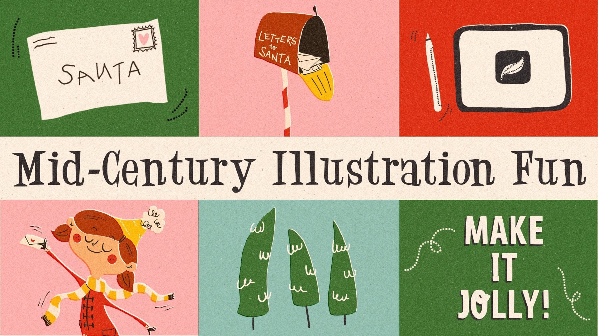
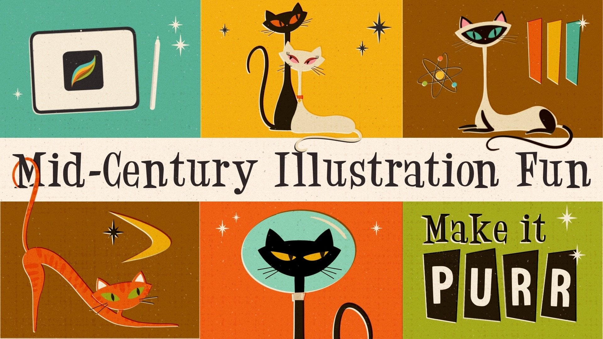
the Mid-Century Illustration Fun Series and a big believer in embracing the human imperfect side of art. In this class, I'll show you a completely
different approach to drawing where we'll create stunning artwork without
actually drawing. Across five different projects, you'll discover how powerful
wonky shapes can be, how they calm down your
inner perfectionist and how easy it can be to
create with joy again. You also get a better
understanding of Procreate and learn how to use its tools in a way that supports your style rather
than fighting against it. No pressure, no perfection. Just a joyful way of making art. So if this sounds like
something you need, then grab your iPad and
I'll see you in class.
2. Class Project & Resources: Okay. In this class, we'll work on five
different projects to show you how versatile this
technique really is from single illustrations to small collections and even
simple character designs. For your class project, you can upload one or all of the exercises
you'll be working on. Once your first one is done, just head over to
the Projects and Resources tab and click
on Submit Project. You can give your project a
title, upload your artwork, and if you like, tell us a little bit about how
this process felt for you. Then just click
Publish and that's it. And if you finish more later on, you can always come back
to your project and add new images
using this button. I always love seeing your work, and I often hear from
students how inspiring it is to scroll through the gallery and see what others
have created. So let's make this a beautifully wonky
and colorful place. In the same tab, you'll also find all the resources
for this class, including my brush set
and color palette. They're both included
in a ZIP file. Just download it, open it, and then tap each file individually to import
it into Procreate. And that's it, you're all set. Let's move on to the next
lesson where I'll show you why this technique works so
well. I'll see you there.
3. Why this Technique Works: You might be wondering why
this technique works so well, especially if it
feels so simple. Well, that's exactly the point. Most of the stress when drawing comes from trying to
get things right, perfect lines, perfect
proportions, perfect details. In this class, we're doing the opposite. We're simplifying. Instead of focusing
on tiny details, we break everything
down into a few bold, simple shapes, and
that changes a lot. First of all, it
removes pressure. You're not chasing
perfection anymore. You're just placing shapes. But at the same time,
something interesting happens. Even though the
process is simple, the results still looks strong, intentional, and
visually interesting. That's the beauty of it. Once you understand the system, you can apply to
almost anything. Objects, plans, patterns,
even characters. And because the
process feels easier, you naturally start
creating more, which means more practice, more confidence, and over time, a stronger personal style. This technique is not just
about how your art looks. It's about making the
process feel lighter, simpler, and a lot
more enjoyable. So now that you know why
this technique works, let's start putting
it into practice. I will see you in a
warm up exercise.
4. Warm Up Exercise: All right. Welcome to this
first hands on lesson. This one is all about loosening up and getting comfortable with a technique we'll
be using throughout the class. Here's the twist. We're not going to draw
in the traditional sense. We're not dragging
any pen across the canvas trying to
create the perfect curve. Instead, we'll
build our shapes by setting anchor points almost like creating a vector graphic. That shift alone
changes everything. It gives you a really
cool visual effect, but more importantly, it helps you let go of that constant thought
that every line has to be perfect because there are no precious lines
here, just shapes. And the outcome, it looks bold, modern, and very human
made in the best way. Let's get started and
just play with it a bit. I'm here in a new canvas, which is 2000 by 2,500 pixels. As this is just
my favorite size, it's the measurement Instagram supports the most. All right. Here I'm in my wonky
shapes color palette, and I think I really want to get started with my light purple. I'm just going to drag the circle and throw
it over the canvas. So we have already a
little colored background. Let's add a new layer on top. All right, and now it's time to just roughly lay down our shape. This is super simple. We just go tap the
selection tool, and we're going to select
the free hand mode, and we want to make sure
that color fill is enabled. And now we only need
to tap on the canvas, which puts down some sort of anchor points like in any
other vector program. And as soon as you
close the shape, it's going to be
filled with color. Let me show you. So I'm just
going to go ahead and tap. And let me show you. I hope
you can see that on camera. Here, we have this tiny gray
dot and like a dashed line. And as soon as I go back
here and tap the gray dot, the shape is going to be
closed and filled with color. That's super handy. Alright, so our
first shape is done. Let's move on to the next one. I think I want to
add a new layer. And how about we are going
to pick our green shape. And now we want to do
something like a crust, and we do it the same way. We enable the selection tool. Go all up and down into the side and down and
to the other side. And boom shape closed, and we have our
little cross shape. And I really don't pay attention at all if my line is straight. It's actually the opposite. I don't like that straight
and perfect shapes. No, I think the handmade feel
is way more interesting. You know, some edges, some wonky shifts in direction. And this is just
such a cool look. So I really aim for that. Okay, let's move on. How about we're going
to add another layer. And let's go to the dark yellow. And this time, I guess I want to I just want to
lay down a heart, pick the selection tool, and then just tap
that you kind of roughly achieve a heart shape, close the shape again, and boom, it's
filled with color. And let's add just one
more shape in the corner. Let's add another layer. And how about we go with purple? I think we just go with some
sort of a flower shape. Let's go with some sort of a weird wonky flower like this. Tada, and the shape is closed. Now we can turn off the
selection tool and we have our four shapes lay
down. That's step number one. That wasn't super
difficult, right? Okay. So now we want to have it, you know, interacting in a
nice way with one another. So let's move on. And I show you what I mean. I'm going to just go
to my layer five here, tap the little N and play
around with the blend mode. Let's go to linear burn. As you can see, the color
has completely changed, and this is happening because the actual purple
layer interacts now with all the colors
from the layers underneath. I interacts with the purple in the background
that turns it darker. It interacts with
a darker orange, obviously that mixes
to a darker orange, brownish shade as
well and the same happens here in the heart shape. So that's not actually the
outcome I was hoping for. And the reason is, I don't
want my shape to interact everywhere with what's
underneath, but only partially. So let's go back to
normal blend mode. And instead, what
I want to do now is I want to
duplicate this layer. And I'm going to drag the
duplicate at the bottom. And then I want to switch
to my off white shade here. And when I now go ahead, tap this layer and tap select as we have color
fill still enabled, my shape is filled
with color right away. Okay. So that doesn't
make anything right now. So what we can do
now is we can change the blend mode of our color shape back to linear
burn for whatever reason. It's my favorite.
I just think it makes the nicest color
change in my opinion. But you can play around. You can go with
color burn, shade, darken multiply
whatever you wish. Just play around and do
whatever you like best. I just like linear burn
because it makes a warm, very saturated kind of color, together with the off white. So that's just what I go for. But again, you go with
what you like best. And now I want to go
back to my white layer here and I want to
move it a little bit. So let's just go and give it some notches here to
the top and to the side. And now we've created
some cool interactions. As you can see, since the off white layer is still set to normal, there's
no interaction. But the purple now where it touches the
layers underneath, it creates this cool outline
due to the interaction. Here, basically, we
define the shape a little bit better by creating this darker or lighter outline. That's something I really like. Let's just move on and do that with all of our shapes now. Let's go to the heart. Let's duplicate it. Let's go to the
bottom layer, tap it. Tab select and now go
back to the top layer, set the blend mode to
linear burn and you could see it's gotten a little darker and a little more saturated. Now we can put this layer
to the side a little bit to the top and we could
even rotate it a little bit to create more
irregularities, just like so. Cool. And then let's
move on to the green. We duplicate it once more. We go to the bottom
layer, we tap select. It's going to be
filled with white, and we change the blend
mode from the green one. And then we drag the white layer we twist
it around a little bit, and this time, we're just gonna
just put it to this side, just to create some
variation maybe like this. And the final one is the orange. So let's duplicate it. Go to the bottom
layer, tap, select, and then change the blend mode to linear burn or
whatever you've picked. And then we can move
the white layer around a little
bit and maybe add some rotation as
well. Like this. Okay. So that makes a
lot more interest in our entire illustration. However, there's many
more things possible. So now it would be really cool if we could have the shapes, the colored shapes
interact with one another, but still keep the outline. So how can we do that? I will show you you
would just have to drag the white layer
below a colored layer. Let's start with this
green and orange here. So let's find the white
duplicate of our green cross. If we track that now, under the dark orange layer, we have green and
orange interacting. Let me show you. I'm
just going to tap it, pull it down, and here we have this
interaction happening. We could do now the
same with the purple. So the white is blocking the purple from interacting
with the orange layer. Again, we're going to drag
down the white duplicate. And here we have the
interaction happening again. And lastly, I also want the heart to
interact with the cross. So let's take the
last white layer. And drag it down. Now we have both the outlines
and the interactions. And it looks pretty
cool already. It's just a little
bit, let's say, plain. So we have still a lot of options to just
add some interest. So how about we just
going to go ahead and add some lines or stripes
to our oval shape. So I'm going to
tap my oval shape, and I'm going to add
a new layer on top. And this one I'm going
to set to clipping mask. All right. And now let's
pick some light color. How about we're going
to pick yellow. And a brush here, we could go with
the sketcher to get some pencil strokes lines or we could get with
a nice liner mono, for example, to get
some more crisp lines. I think I want to
go with this now. So now I'm just going to draw whatever tada and here we go. And if that's a little bit
too obvious for your taste, you could just go ahead
and turn down the opacity. Tata. Let's say
we're going to add some pattern to our heart
here in the corner. So let's do the same. We go to the heart. We add another layer. This time, I think
I just want to do some simple shapes so we don't even have to turn
it into a clipping mask. And I want to do that with the same selection
tool method again. So let me zoom in. And then I'm just
gonna add some random, whatever rectangle ish kind of things here just to add a
little bit of interest. Just like so. Ta da. And here we go. And we can even turn down the
opacity a little bit. That looks gorgeous. But our shapes are still a little bit too
plain for my taste. So I'm always a fan of texture, even when it's subtle. And I've also added a very nice brush we can
use to add some texture. It's our shader grainy. And you can use it both
for putting color, but also for erasing. And I like both. So let's switch to
our orange layer here and pick our shader, and let's see what
size are we at. Alright. So but now I don't want to color.
I want to erase. So I'm going to just
tap the eraser and hold it until it says erase
with current brush. And then I'm just gonna carefully erase a
little bit here. And then you can see
there's some speckles, and this is where color was taken away, just
erased, basically. But I could also do the
opposite if I just pick my orange color and add another layer on top and turn that into a
clipping mask, as well. And how about we send the blend
moto linear burn as well? And if we then draw, we add the texture. We add color. Like this. And this brush is
pressure sensitive, so the harder you press, the more you put down, but you could always
play with opacity. And here, we have a
subtle texture added, but not too much, and enough to take away the digital feel here. And we could do that
with all our shapes. All right. And one
last step I always do is to make the
whole illustration a little bit more cohesive. I always put a
little noise on top. So that's what you see me
doing throughout the class, basically throughout
most of my classes. I'm going to add
another layer on top, and I'm going to switch to
a very nice beige tone. Layer I've just added, I want to set the blend
mode again to linear burn. Now if I pick my noise
brush and draw over it, it adds a noisy grainy
texture on top. Let me show you how that works. I'm just going to draw over it. You can see the
change is not much. It's just a little bit, but due to the noise
that's added everywhere, the digital feel is lost, it's gone completely, and
everything is nicely combined. So as you can see, with
some simple methods, we put down a pretty
cool graphic already, and the steps were
really simple and we did not even draw except of this
decorational line here. So let's close our warm up for now and move on to
the next lesson, where we start with a
very simple project. I will see you there.
5. Project 'Mug': Alright, welcome back. And in this first real exercise, we are going to create a simple mug with a
bold flower on it. Just think about
the cup you drank your coffee or tea
from this morning. Was it a straight one?
Is it slightly curved? Does it have a big
or small handle? That's just enough. We're
not aiming for accuracy. We're just aiming
for familiarity. So here I am with my
new canvas again. It has the same dimensions, 2,500 by 2000 pixels. And I think I want to throw down let's go with a dark orange this time
in the background. Alright. So let's add
a new layer on top. And now we want to put
down the shape of our mug. So let's go again to
the selection tool. But we need to pick our
color first because I don't want the mug to
have the same color, obviously as the background. So I guess this time, I want
to go with my light pink. And now I'm basically
just gonna tap the shape of a mug
here onto my canvas, and I want to have
it pretty big. So I'm just basically start here at the top
with the opening. I want it to be a little round. And then I want to go down. The bottom is getting
a little narrower, and then I go back up
and the shape is closed. Boom. Alright. This looks like a cup or glass or whatever. But if I now add the handle, something like this,
This is a cup. Tata. All right. And underneath, I want to have a spoon. So let's add another layer. Technically, we could do
everything on one layer, all the basic shapes. But to have a little
bit more flexibility, when we later on
duplicate those layers, then we can drag them around and rotate them in
different directions. That's the only reason why
I draw on different shapes. So here I am on
this layer three, and I guess I want to
pick my yellow now, and now I just want
to add a spoon. So let's select. And then we have
something like an oval here and go back straight
and close the shape, and here we have our spoon. Tata, that's all we need. Let's just make sure we arrange
them in a way we like it. Kind of centered. All right. So that already
is our basic shapes. Let's move on with
the first step, duplicating our basic shapes
and turning them white. So I'm going to
duplicate this spoon, and I'm going to
duplicate my cup. And always the bottom ones are going to be filled
with our off white. So I'm going to tap and
I'm going to say select. And the same with this one, we just tap and we
just say select. So both layers are now white, and now the top layers need
to have their blend modes. Otherwise, there's not going
to be any interaction. So let's switch to linear burn, and I always love how it makes each color a little bit warmer. Tata. Here we go. All right. And now
we can just drag around those base
white layers here. And maybe a little rotation for a little bit more
interest. Ta da. Beautiful. And the same
with our spoon, base layer. Like this. Perfect. All right. Now we
can still really tell that it's supposed
to be a spoon. So let's add another layer
on top of our spoon. Pick the yellow again and turn the layer
into linear burn. And then we just draw like a
little oval in the center. Tada. Great. All right. So that makes it
more like a spoon. It kind of shows the drowning, the dip in the spoon, but it's a little bit too dark, so I want to turn the
opacity down a little bit. And I think I want to already erase a little
bit with my shader, just to have it more interesting so that the top
fades a little bit like this. Great. Oh, yeah, cool. Very cool. And I think I want to just since I'm on the eraser, I want to give my
spoon a little bit of, you know, texture as well. So I'm just going to
erase until we have this speckle texture
in my spoon. Awesome. So that's all
we need for the spoon. It looks gorgeous already
and super simple. So let's move on to the cup and define that a little bit better. So if you look into
the opening of a cup, it's usually a
little bit darker. So this is what I
want to add now. So on top of my cup, I want to add a new
layer, and guess what? We're going to turn it into
linear burn blend mode. And then I'm going to
pick my pink again. And with my selection tool, I kind of draw the opening. Something like this, just so we can have a little
something inside. And now I also want the
brim of my cup to be a little lighter because this is where the light
hits it the most. So this is going to be the
lightest spot of my cup. And to do that, I don't just want to add white. And that's also for
shading as well. If you add white to
create a highlight, or black to create some shading and then
turn down the opacity, it dulls down the colors. And that's the reason
why I rather go with blend modes because then
it makes more saturated, nicer, more natural
colors, in my opinion. So let's add a new layer, which is going to be
a little bit lighter. But we still stick
to our light pink. And this time, I
also want to turn it into a clipping mask. And then I'm just gonna
pick my selection tool, and I'm just going
to, you know, here, go ahead and create some
sort of oval here on top. And even though we said, fill it with color, nothing happens. It's because we have the
normal blend mode enabled. So let's just go ahead. And this time,
we're not going to scroll to one of those top ones. We're going to go down. And lighting or lighten
or screen or color Dutch usually makes a
very nice light shade. But this is a little
bit too obvious. So I'm going to just
play with the opacity. And turn that down. Maybe maybe like
this. That's enough. Perfect. Alright, and now I
also want to add a little bit of shading down here to
create more interest, you know, when the
light source comes from here and the
brim is lighter, then we also need to make the
bottom a little bit darker. So let's now add
another clipping mask. Gonna do that here. And we
stay with the same pink. We just change the blend
mode again to linear burn, and then we're just gonna tap
down some shape like this. Just some random fuzzy kind
of shape and close it. And here we have our shade. It's just a little bit too dark. So again, let's play
with the opacity. Tanna. And here we go. Maybe we could add a
little bit more darkness here on our handle. Do the same, go to
the selection tool, and then just basically
create a shape down here. So because this is a little bit still too
plain for my taste, let's just go ahead and erase
some of the texture here. And maybe some texture
to the cup itself here. All right, but now
our cup is empty. So we still need to
put some coffee in it. And we can do that by add
another layer on top of this oval here, the darker area, add another layer and turn that into a clipping mask that we can only draw here, and then we're going
to add some coffee. Let's go with our brown and go with the selection
tool, basically add. Some other oval
shape entered up. Here, we have a coffee. It's just a little bit
too dark for my taste, so I'm going to turn down
the opacity a little bit. Like this maybe. Yes, and that looks amazing. But I promised we want to put a little flower on
top of our cup. So let's go ahead and do that. Just add another layer. And since daisies are
my favorite flowers, I want to put a
daisy in the center. So and still, we
don't have to draw. We're just going
to go ahead with our selection tool and just tap and put down some
petals like this. And don't worry if
it gets too big. We can make it smaller like this until we're
happy with the size. We just tap the arrow
and put it in the center of our cap. Maybe like this. And then we also
want to add a little yellow.in the center because that's how a Daisy
looks like, right? So we're gonna enable
the selection tool, and then we're just gonna
draw a rough circle. And since everything
else here is in blend mode linear burn, I want to do that with
the circle as well, just to have it cohesive and to have it interact with the background
nicely as well. A little bit I want to add here, I want to add a little
darkness to my dot. I'm going to add a layer
on top and turn it into a clipping mask and set the
blend mode to linear burn, and then I go with my shader
and then I just want to add some darker spots down here just to get rid of this
plain digital look. Play with the opacity
until I like the outcome. I just think the background is still a little bit too boring. So let's work on that. Let's add a layer on top, and I just want to have some
stripes in the background, but not straight
ones, wonky ones, so it matches our
overall, you know, wonky, edgy linework here. So I'm just going to go with the dark orange again and play. You know me that by now, play with the blend mode. I'm going to set it to screen. And then I'm just gonna just lay down some fat
lines here like this. And then I want to move the
entire layer somewhat in the center, like so, and turn down the opacity
so that it's just subtle, but there maybe like this. Maybe colour touch makes
it a little bit warmer. Yes, I like that a lot. All right. And our final step, you remember, is the noise. So we put another layer on top. And we set the blend
motor Linea burn, and we are going to pick the
base and the noise brush. And Tada we go over everything, play with the opacity. Let me zoom in that
you see what happened. So here are tiny, teeny, tiny little
darker speckles, not really visible,
quite subtle, but our illustration is done. It makes it super cohesive, and it just brings
everything nicely together. And our super simple Mug
illustration is done. It was super easy, simple shapes, simple methods, and it looks really cool. It looks handmade, wonky, imperfect, and that's
the beauty of it. So let's move on now to the next lesson where
we go to create a vase collection with some more simple shapes.
I will see you there.
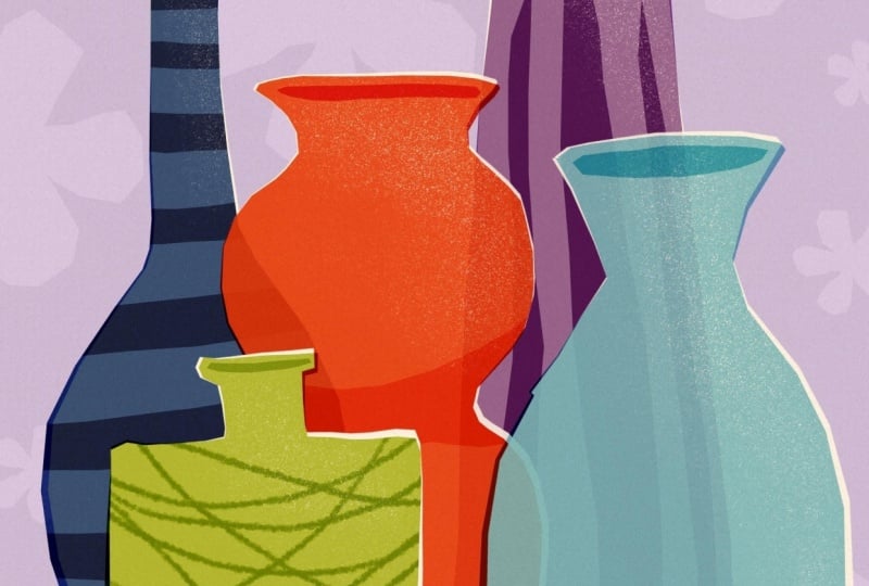
6. Project 'Vases': Hello, and welcome back. So in this lesson,
we are going to create a collection of vases. And if you want, you can absolutely look at
photos of vases. They are great because they
come in endless shapes. They're tall, round, narrow chunky, straight,
curved, whatever. And if you already have a few forms in your head,
then go with those. If not, just take
a quick look at some reference just to
see some varieties. You might need five ish
kind of shapes in total. So I guess if you just think about what you have
in your cupboard, you might even come to more
than just five shapes. And this exercise really is just about composition
and interaction. So let's just jump right in. And this time, we
also want to start with a simple a
very simple sketch. So I'm going to pick my black
and go with the sketcher. And since I know
I'm going to put down a background color, I am already adding
another layer, and this is where
I start sketching. So it's always nice to put big things in the background
and then get smaller, the more you come
to the foreground. So I guess my back vase
is going to be something like this long ish neck kind of singi something like this. And here I want to
have like something. How about this? And here, this one
is even smaller, but this is very, very edgy. That's all we need. And
then in further here, I guess I want this kind of typical oval one with
this wider brim, and then something like this, maybe and a very, very thick round one here at the very front,
something like this. So, super easy. Hard to tell them apart,
but we'll get there. I guess that's
already super cool. I just think the back one is
not in the best shape yet. So let's erase it a little bit. And later on, we're
gonna put them on separate layers, anyway. So that's going to be fine. Alright. So let's try once more. Something like so. Awesome. Alright. Let's put
it in the center. Okay. That's all we
need for sketch. You can sketch as many
as you want, obviously. So this is what I'm
going to go with. Yeah, so let's start
putting down the colors. Turn. Pasity a little bit. The process is going
to be the same. We're going to
start with putting down the shapes in color, duplicating the layers,
turning them to white, dragging them around, and then create a little
bit of interest. Super simple, super easy going. As always, we're going to
start from the back to the front that we don't have to drag around all the
layers all the time. So I think I want to go
with my light pink here. And put that down. All right. And then the next layer is going to be my vase
in the center. This is the one
in the very back. And I guess I want that to be. How about we're gonna make it purple? Let's go with purple. Pick my selection tool. No brush, just the
selection tool. And then I just want to tap
down some random shape. Kind of following what I drew
underneath in my sketch. So let's go with this one next. So we add another layer first. Then I think I'm going to pick green and my selection tool. And I think this one is
just a little bit too high, and I make it a
little bit smaller. Next one done. And now I want to go with
this one, I guess. So add another layer. Let's pick the light
blue right now. And I want this to be a
little shorter than this one, just to have more interest here, pick my selection tool
and start down here. I think I think I want to add
a little bit of color here. This looks kind of too hollow. Okay. And now we need
this oval one here. So let's add another layer. Mmm. Yeah, let's go
with a dark orange. And this is obviously
again shorter. But I think this is I don't like the height
of this one either, so I'm going to go a little bit shorter and you just do
what you need to do. A and the last one
is the one in front. How about we go with
a dark yellow here? Let's go Let's do it like this. Selection tool, and up we go. So let's see what we got
and turn the sketch off. Alright, I think I want to rotate some of
them a little bit. And I guess I want to put them a little bit more to the side, especially here, the blue one. Maybe I can squeeze
it a little bit. Let's check. Let's
go to free form. Let's go to free form and then just squish
it a little bit. Maybe like this. Yes,
I like that better. And I guess I can do the
same with the green one. It also kind of looks a little bit wonky wonkier
than I want it to be. Let's pick distort. And now move it to the
side a little bit. Yes, that's much better. And I guess the orange one needs to come
down a little bit. Yes, that looks much better. Cool. That's really
cool already. Alright. And now we need
to add the second layer, the base layer in white. So let's do that. We're
just going to duplicate all our layers and change the bottom ones to
white by just tapping select. And the blend mode from the colored ones
into Linear Burn. And now we can just
drag them around. All right. That looks
fantastic already. So now I would just love to have some interactions with
some of the vases, making them translucent, as if they would
be made of glass. But that can be a
little bit tricky. We could just move
down, for example, if I want this to be translucent and
interact for example, with the purple one, I could just drag down this white layer. And put it under purple. That's already very nice. However, it's too much
too much interaction. This one gets too
dark for my taste. So I wish it would
be a little bit less translucent and I
can actually achieve that by just duplicating
this white layer. Let's just go back first. I can achieve that by just
duplicating this white layer, dragging one under purple. Ta. And this one, I turn down
the opacity a little bit. So this way, I just have a
little bit of interaction, and I can actually control how much it interacts
with purple. And I guess I want to do the same with my orange maze here. Let's just pretend it would
be made of glass as well. So we duplicate the white layer, drag one under everything. Under purple. And the other one, we turn down the opacity. Oh, yes, just a tiny tad. So it's a little
bit translucent, and now we can see
purple and green. E that's so cool already. I love it. Okay. And now we just need to yeah, just decorate and create a little bit of interest
with our vases. So let's go ahead and add the openings by adding another layer on
top of everything. I think we can draw all
the openings on one layer. So let's go ahead and turn the blend mode
into linear burn. And then we pick the
colors from the vase. So let's start with purple. Go to the selection tool and just draw some oval
shape here. Cool. And the next one is
going to be light blue. And I want to make sure that I don't put
the corners right down below where there's a
corner in the basic shape, just to have it, you know, wonky and more interesting. And let's go with yellow here. Cool. It's a little
bit too dark, though, so we can just
turn down the opathity. Alright, and also since
this is a very edgy vase, and the light comes
from somewhere the top, so I want to have this bottom here of those
kind of weird zig zags. I want them to be darker. Alright, so we need
to add a layer on top of this turquoise vase. And then we're going to turn
it into a clipping mask. And we also want to set the
blend mode to linear burn. Alright. So, and
now selection tool. Now I'm just going to start
here adding those shades. Oh, yes, that's amazing. A little bit too dark. Let's make it match the
opening ish kind of like so. Alright. I think this
is a little bit plain. I want to give this
yellow vase here a little bit of a
stripe pattern. Let's add a layer on top and turn it into
a clipping mask. Then I want to go with
the light yellow, and I guess my sketcher. And then I'm just going to
give it some wild lines. Mako. And I guess the last one here, this is also a little
bit too boring. The green one maybe. So I'm going to add another
layer to the green one. And turn that into a
clipping mask, too. I guess I want to turn that
into linear burn, as well. And I want to give this vase
some ridges. Let's try. Let's go with the
selection tool. Let's see if we can make it. That's really cool.
I like that, too. Okay, but to dark. And in our last step, we
need to add the texture. So I'm going to
go ahead and just erase with each shape
just a tiny Oopsy. Not with this one, but
with our shader granny. Just to give it some
some slight texture. And here with the blue one, especially where the
light areas are to just give the indication of a little bit of a
highlight, maybe. And I think the background
is a little bit plain still. So I want to add some
pattern to the background. So I went down to
the pink layer, add a layer on top. And then let's go with
the light pink again. Turn it into let's say we turn
it into screen blend mode. And now I'm going to pick
my wonky flower brush. It's always really handy
to have some sm brushes, just to help you with textures or patterns in your background. And I made this
wonky flower stamp, which was super simple. And I'm actually going
to add another lesson at the very end just to show
you how I made this. So you can make your own wonky stamp collection
if you want to. And we're going to use
this damp now to just create some flowers
here in the background. This one is pressure sensitive, so the harder you press,
the bigger it gets. Obviously this is way too much, so I'm just going to turn
the opacity down to have it really subtle that
you can barely see it. I get that's enough. To be honest, I don't like
the background so much. I think the pink looks
a little bit too cold. I want to go to this
layer to the pink layer, and I want to adjust
the color a little bit. I want to have it a
little bit warmer. I'm going to go to the wand tool here and pick
saturation brightness. Then I'm going to play
around here with the slider. And see where I get it
a little bit warmer. Yes. I like this way better. Just a tiny little
bit is enough. And now it's not
that cold of a pink, but a little bit
of a warmer shade. All right. And now
it's basically done. We just need to add
our noise layer on top to just combine
everything nicely. Let's add a final layer on top. Pick the bage, turn the
layer into linear burn, pick the noise, brush, and then add the texture and play with the opacity until you're happy
with the outcome. I guess I'm going to go with
60%. Let's just zoom in. You'll see the subtle
speckly areas here, also in the background, and that makes a great
vase collection. Again, it was super simple. Besides sketching, like,
scribbling in the beginning, we didn't really draw. And still, we got a
really cool outcome here. So I hope you're
happy with yours. And remember to always post your project in
the project gallery. I'm so curious to see the
vases you came up with. And then we move on to the next lesson where
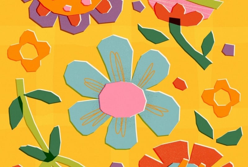
we are going to get even more plenty and floral by just filling a canvas with fantasy flowers.
I'll see you there.
7. Project 'Flowers': Hello, and welcome back. In this exercise, we're creating a page full of fantasy flowers. They don't need to be realistic. You can invent them completely. If that scares you, of course, you can quickly look at photos just to collect a
few basic shapes. Again, we're not aiming for
accuracy or perfection. We're just building
a collection of simple but visually
interesting forms. To prove this technique works with smaller
shapes as well. Alright. So I've opened again, my four by five
Canvas, which is, again, 2000 by 2,500 pixels. And again, we're going to
start with a little sketch. So let's switch to black add another layer on top because I know we're going
to work underneath so that makes everything easier. We don't need to drag
around layers later on. And I'm going to move
over to my sketcher. So let's start with a
simple flower up here with tiny but white petals,
something like this. This can have some
decoration line, something like this. Okay. Then I guess that's enough. Basic flower shapes. But we can add some little decorational flowers
maybe like this. Alright, super basic
flower shapes. They're for sure, not
realistic. They're just fun. And now we want
to fill that with beautiful colors that
just makes us happy. So on the first
layer on the bottom, we start with the
background color. All right. And now the sketch
is a little bit too dark, so we just turn
down the opacity. And in my next step, I guess I want to lay down the basic shapes
of the flowers. And this time, I don't think
we need to put each color on a separate layer that
would be just too complicated and too
many layers as well. We're just going to
start with having the basic shapes
all in one layer. So let's add a layer first. So let's see. I think I want to
start with purple. And then I pick my
selection tool again, make sure color fill is enabled. And then I'm just going to
start with this flower here. All right. That's purple done. I deselect because I want
to pick a new color now. And if I would keep
the selection on, it would change
all the colors in all the shapes that
were in this go. That's why I deselect
and now I can pick a new color without
affecting this purple shape. This time, I want
to go with pink. Alright, let's move on to this flower here in that corner. And I guess I want to turn
that into orange or light red. And I want to show you
a nifty trick here. We can also erase. So let's first pick
our selection tool. And now I want to show
you how you can erase. So I just deselect it and I turn on the
selection tool again. But this time, I
turn off color fill. And now I want to erase
those little triangles here. Let's just put down the shape. So all we need to do now
is our three fingers crop, and boom, we erase those
little sections here. And then we only need the
flower in the center, and I guess I want to give it. Let's give it light blue. And color fill, and here it is. As usual, we want to
duplicate the layer. You want to pick our off white. We want to select the layer
to have it filled with white. We need to change the blend
mode of our colored layer. And again, I want to go with my beloved linear burn because it makes everything
a little warmer. And now we just notch it
a little bit to the side here just to create some
cute outlines here, white ones and darker ones. All right, let's move up one layer and start
with some decoration. We add a new layer. How about we go with dark
orange and start here again? All right, deselect.
And now, my next shape, I guess I want to go
with light green, and these can all stay
on the same layer. Okay, then turn
off the selection. And I guess those dots
here I want to have like in my dark yellow here. I guess we can even fill in those dots and
those little flowers. Ta da. Deselect, select
again. But this time, we turn off color fill, and now we just mark the centers Tata the centers are erased. I think we need a
little bit more purple, so that's what I'm
going to pick now. Do. And the rest, I guess, let's turn
off the selection. The rest I think I
want in dark orange. Same procedure. We
duplicate this layer. We change the color
to our off white. We tap the bottom layer, we tap Select to make it white because color
fill is enabled. Then, of course, we change
the blend mode to linear burn and always feel free to play around with what you
would like better maybe. I want to go with
linear burn just to have it consistent
throughout the illustration. And then the white
one is selected. So I'm gonna just notch that
to the side a little bit. Beautiful. And again, more
outline and more definition. Now, let's work with the
stems and the leaves. And here I want
some interaction. I want that the stems reach into the flower and create some
color interaction here. So we know already
how that works. We just need to move the white
layer a little more below. Let's first add a new layer. And then I feel I want to
start with light green, pick the selection tool and just start roughly laying down
the shape of the stem. And I want to make sure that I reach within
the circles here. And now our next stem. And for this, I think
I want to go with my bluish, darker green. Duplicate this layer,
tap the bottom layer, go to our off white
shade, select. Change the blend mode of the colored layer
to linear burn, and then we move the
white layer to the side. As I said, I want these
areas here reaching into the flour to interact
with the color underneath. So that's why we need to move our white layer under the layer with the
pink and the red here. So I guess it needs to
go to the very bottom. Let's drag it down to the
very bottom, and here we go. Here we have the fun
interaction of the green leaning into the pink and
here into the orange. I really like that effect. We just add a new layer on top. And we're still missing
these two leaves here. We're missing the cross here, and we're missing the
center of this flower. And I think here we need
even two more colors. So let's now first start
with the dark yellow again. All right. And I guess
that's all for this layer. So let's duplicate this. Again, pick white, go
to the bottom layer, tap select to make it white, go to the top, the colored one, and turn into linear burn. And then we move
the white layer. Very nice. And I see now
that this does not work, what we just did,
because I also want these leaves to interact
with the green stem. So the white part here technically also needs
to go to the bottom. So we can fix that easily. So let's go to our beloved
selection tool again, but turn off color fill. And now I just gonna mark
all around the two leaves. Then you can do the
three finger wipe down to open the copy and paste menu. However, I've put this function on the double tap
of my Apple pencil. Here I have the copy paste menu, and now I just want this
area that's selected. I just want to cut it and
paste it onto a new layer. That's why I just hit this
button here. Here we go. Now we have the two leaves on a separate layer
and I can just drag this down Tada we have our
interaction happening again. Beautiful. We need some
decorational lines here and the dots there, but we can't put them
on the same layers. We just add another layer on top of our basic flower shapes. And this is where I want to draw those decorational lines, and I guess I want to do them. Let's say, dark yellow. And I want to use a brush. How about we go with
a nice line of mono? And then I'm just gonna put
some loops down, chaotic. That's enough. And I feel like the tulep here is also
a little bit plain. So let's change that. And I guess I want to
go with my light pink. We're just gonna draw
some whatever lines here. But since it reaches
beyond the shape, we need to turn it
into a clipping mask. So our layer is a clipping mask. Now we can't see anymore
what goes beyond our flower. And the last one, I guess, are the dots here, and
then we're almost done. So Okay, let's go to
the very top because we need to be on top of
this yellow shape here. Let's add a new layer there. So I'm just going to go with
my dark pink shade again, and I zoom in, tap
the selection. Great. And here we also need our white outline because the contrast isn't high
enough for my taste. So let's duplicate this layer. It looks fantastic. I just need to turn of the sketch to see it
in all its beauty. I feel like the background
is a little bit too plain. How about we create
something like a visi pattern in
the background? I show you what I mean. So let's go to our
yellow bottom layer. Add a layer on top. And I guess I want, like, the stripes to
be a little lighter. So I'm going to this time turn the blend mode to
screen because I know this is turning
it very light. And then I pick my the same yellow as I used
for the background color. And we can now we
can just duplicate this layer and rotate
it by 45 degrees. We've done put it just
where we want it to be. And since there's some missing
here at the very bottom, I'm just going to
duplicate this layer once more and just drag it down to
where I think it should be. So these can be the
horizontal stripes can be on one layer. So I'm just going to
pinch it together. Now we have all the four
stripes in one layer. And, of course, since
it's way too bright, I'm going to turn down the
opacity like I think to 20, I guess that's enough. And the same we're
going to do here. Let's see how that looks. I think it's still
a bit too much. So let's turn down the opacity a little
bit more, maybe 215. We just want to have some subtle interest in
the background. Yes, N guess, that's
totally enough. And since we added
the blend mode, we have here a
little lighter area where the stripes meet, and the rest are
not so bright here. Okay. And now I feel like there's a bit
of texture missing. So let's just go ahead to our colored layer,
pick our eraser, shade a grainy, and just
carefully add some texture. And on the next colored
layer, the same Okay. We're almost
there, you guys. In the last step to bring
everything nicely together, we're again adding
another layer on top. Turn that into line n, and we want to add
the noise now. And turn down the opacity until we're happy
with the result, like 60%, I guess,
it's pretty nice. So here you can see the grain, the noise texture, really nice. And now we can call it done. See, with some simple tricks and simple techniques in
Procreate itself, without drawing, we created such a cool flower illustration, and it's just bright and colorful and makes
me really happy. And now we can move on to the next lesson where I want
to draw some heads with you. And before you start
getting scared, know drawing people
can feel intimidating. But with this technique,
everyone can do it. So let me show you in the next lesson. I
will see you there.
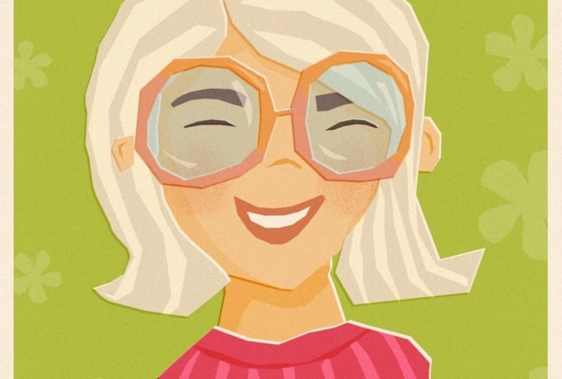
8. Project 'Heads': So welcome to our final exercise in which we are
going to draw hats. And I know for many people, drawing humans
feel intimidating. Faces, especially. We tend to think
everything has to be accurate and balanced
and symmetrical, and then there's this cross. No, not today. We're going to keep
this extremely simple. Just think of a hat as
just another shape. What do we need to recognize
it like an oval and two dots for eyes and maybe a curve for the nose and another
curve for the mouth, and maybe two ears, and that's all we need to make sure it's recognizable
as a face. So let's just put down some
wonky blobs, and that's it. The beauty of this technique is when you simplify this much, the result often feels
stronger and more expressive. Oh, let's get into it. Again, I want to switch
to my black and sketch. So let's add another
layer right away. So let's just roughly lay
down six shapes here, maybe something like this here. So here, some here. So here, another one here
and another one like this. That's all we need.
And now we're going to fill these with
different skin tones, and then we see where we're at. So Alright. And not to work with
the white background, I want to start with
coloring the background, and I guess how about
we go with green? Alright. And on
top, a new layer, this is where we are
going to lay down our head shapes,
just some blobs. Skin tones are usually somewhere in the range
of these colors here, and then we can drag around this circle here to make it darker or lighter or
whatever we want. I guess I'm going to start
with the peach shade, and then I drag
around my dot here. And then I want
to start here and just lay down the
basic head shape, and I also want to give
them ears somewhere here. And here we can already
add a lot of variation. If you make the one ear a little higher
than the other one, it's clear the head is
a little bit tilted. And if you put the
ears further down, it's sure this is
going to be a child. And if you make the ears a
little bit longer and wider, this person is probably
a little bit older. All right, Phase one is there. Let's go play around
here a little bit. Maybe like this. But
down this oval here, roughly following our sketch. And I feel like this head is also tilted in
this direction, so I'm just going to
draw the ears there. So let's turn off
selection tool. I think I want to
change the color now, and I guess I want to
go more maybe like towards Rose I maybe
like this here. Let's see if we even
need ears with this one. Brilliant. We can already turn off our sketch so it's
not so distracting. As usual, we just duplicate
this layer right away. We switch to white. We tap select to have it
color filled with white. We change to linear burn here, and we move over our background
and maybe we can even rotate it tiny little tad I
really love the outcome here. So on the next layer, we want to just start adding the hair. I guess this one is
gonna be a girl, and I guess she's gonna
get like space buns. Alright, let's just
try and lay it down without a sketch.
Maybe like this. And here's the
hairline. Like so. And here is B number one. And here is bun number two. Oh, I love it. I love it. That's so cool. Alright. That's hair
from person number one. Let's move on to this one. I feel like this is
an older person, so I want to give that
more grayish hair. He doesn't have that
much hair anymore. And maybe he also has a beard. Cool. I love that. And how about this one here? It's she and she has something like a bob situation going on. Something like this.
Oh, yes, cute. And maybe from her
back behind her head, there's the rest of her hair peeking
through. Just like this. Ah, cute. How about this one here? I feel like he needs brown hair. So let's go with just our brown Oh, yes. Very fancy. I like
him. I like him a lot. Maybe, though, maybe we need to bring it up a
little bit, this one. Let's turn off color fill, draw around this one and
just bring it up a notch. And now, this person here, um, I feel like she needs she
needs to have ginger hair, and I guess I also want
to give her some curls. So And then how about we let
that end behind her ear. We have the head
peeking through here, so we need to add a little bit more volume here at the top. Yes, beautiful. Oh, yes, she has very curly hair. And again, from behind her ear, you know, she put her
hair behind her ear. She's going to have
hair peeking out. Move this up here.
Oh, yes, I like it. And I guess this person here, this is probably a little boy, and he probably just
has light hair. And fill it with yellow. Beautiful. Yes, and so easy, we put down six
different persons. It was just super simple. And now let's do
our usual trick. Duplicate the layer,
tap the bottom layer, pick off white, tap select, turn the top colored
layer into linear burn, and just move it over a little bit to create
the outline. Amazing. Technically, you
could even stop here. I just want to show
you how I would continue with just some simple, super simple facial
features by just adding another layer and
tapping selection tool, pig black, and just
add some eyes. So since that's the
line of the ears, I'm just going to
draw the eyes on kind of the same height, Tata And here we have the eyes. I feel like down here, they're a little too small, so it's turn them
a little bigger. Alright, and same trick. Duplicate, bottom
layer, turn to white. Top layer, linear burn. Bottom layer. Move. And they still look a
little bit dead to me, so I want to give them some little highlights in their eyes. And here on the sunglasses, we just add some light
reflections like this. And now with this step,
you could stop here, but I'm going to
show you how I would draw my rest of the
facial features. So I would just pick Big, my beige tone, turn this
layer to linear burn. And now I'm going
to add noses and little indication of
the inside of ears. So my noses usually
just look like this. They're just simple curves. And here we go and draw just something
like a crescent shape. To indicate the ears super
simple and super cute. And since they're a
little bit too obvious, I'm just gonna turn the
opacity down a little bit. And we could also add the mouth, just on a new layer, turn that into
linear burn again, and I'm just going to
switch to my orange shade. He doesn't have a mouse. It's hidden behind his beard. And she looks like she's
having an open mouth, so let's give her some teas. So we could even give them some rosy cheeks on the next
layer with orange maybe, and maybe our shader Tata Boxy that's a
little bit too much. And we could even we
could turn the layer into linear burn to
have it interact nicer. All right. To finish
up our illustration, I just want to mark
all the layers here, and kind of I feel like it's
not really in the center, so I'm going to put
it in the center. You can just go ahead
and add more texture. You remember by just
erasing with our shader. You could even add some
shades, add another layer, turn it into a clipping mask, turn it into linear burn
and with our beige tone. And see here we create
those darker speckles here this maybe on the bottom, you know, there's some
darker areas here. I feel like the background
is a little bit too plain, so let's just add
some stripes here. Go on to the layer on top
of the green background, turn that into screen again, pick our green and
the selection tool. This is so much fun to
have it wonky and uneven. And now we're just going
to drag the layer in the center till the
yellow lines appear. Here we go and play with the opacity until
we like to result, have something subtle
in the background. Yes. That's very nice. And then our noise texture at the very top to finish
up our illustration, beige, linea burn, our
noise texture brush. To bring it all together
and play with the opacity. And here we go. Our six people are finished, and I really love the
way they've turned out. I'm very happy with the result. And I hope this technique took a little bit of the fear you
have from drawing humans. And you see with just
some basic shape, you can do so much. Alright. That was our
last drawing exercise. Let's now move on to the next layer where I
show you how you can make a little stamp brush
that can help you to put some texture in the
background. I will see you there.
9. Make a Wonky Stamp Brush: Alright. Welcome
back. So as promised, in this lesson,
I'm going to show you how you can make
your own stamp brushes. A stamp brush is super
easy and a great tool to help you add textures
and shapes easily. The most important thing is
you need a square canvas. That's number one and number two is you need to draw with
the blackest black. Otherwise, your stamp brush is not going to be fully opaque, and that's going to create some weird effects later
on when you're using it. So I'm going to just double
tap here in the black area. This turns it to the
blackest black possible and we can make sure where we
at when we tap the value. We need to have zero here in the RGB section and
we need to have the hexadecimal code
of six times zero. All right. Let's now just create the shape, and I'm just going to
show you a basic flower. I'm just going to tap
here on my canvas. Give it, let's say, five petals, however wonky, and fill the shape. In my next step, I just want to make sure the brush is centered. Alright. And now you can do
your three finger wipe down to open the
copy and paste menu. I just need to do
the double tap on my Apple pencil to open
the copy and paste menu. And now I want to say copy all. It's important to
copy everything, not just the shape, but also the white background. Otherwise, the technique won't work properly in
the brush studio. Alright, we say copy all. And now we open
the brush library, and here we are in our
bold shapes brush set, and this is where I want to
add my flower shape brush. I'm just going to tap
the plus button here. And it's going to ask
me what I want to do, and I want to
create a new brush. Tata. Here we go. We've opened the
brush studio here, and now the first
thing I need to do is bump up the spacing. Since I want to
create a stamp brush, it's best to have
the spacing at Max. Then stabilization, we
don't need anything. Taper we also don't need
anything, but here shape. That's the very
important spot here. And here we want to
change our shape source. So let's tap at it here. And then we can say
import and paste. So now we've pasted
our flower shape. However, we need to
invert the color. Here in the brush studio, whatever is black is not going to be colored when
using the brush, but everything that's white. So we need to invert the colors. And that's super simple with a two finger tap on
the canvas like this. Tata. Now, it's going to just use
the white shape for drawing, and that's exactly what we need. So we tap the check mark here. Chata. And here we
already see our flowers. However, they look
very uniform here, and I like my flower shapes
to just appear random. So we can turn on
randomized here. And that's going to
change the direction, and we can enable flip eggs. It's going to be
flipping it around the X axis, and flip Y. It's also going to flip
it along the Y axis. We can also add some rotation to create more variations here. I guess that's all for here. We don't need to
change anything with grain, rendering, wet mix, no, color dynamics, no, nothing dynamics,
but apple pencil. Here we need to make
another setting, and we need to turn the
opacity down to zero. Opacity just means
the harder you press, the darker the brush gets, and that's not
exactly what I want, but I want to change the size. I want to press harder
to make it bigger. Press lighter to
make it smaller. Let's just go with,
I don't know. 50% maybe. All right. Properties. We can set the maximum
size a little bigger, and the minimum size is
also a little bit higher. The preview here, we want
to use the stamp preview. Now we can turn it
down a little bit just to have it
displayed properly. We don't need to change
anything else here. Then about this brush, make sure you add one of your
photos, type in your name. And sign it. As soon as you've added a photo, nobody can copy and
remove the photo anymore, which is really handy. And then we have made
all the changes. And since the latest
Procreate update, you can't change the brush
name here any longer. That's not going
to work. So we're finished in the
brush studio now, and we just tap the check mark, and here's our brush. And now we see it's untitled, but we can just tap and hold. And here's the rename option. And here we can name it bold, wonky flower or whatever you
want to name your brush. Apply. And here we've
made our changes. So let's just check if
it's going to work, turn off the black,
pick a color, and just state up ahead. So a slide tap makes it small, and a hard tap makes it big. And that's exactly what I want. I hope this helps, and you're going
to start creating so many cool brushes to
fill your brush livery. Alright, and that's
it for today. So let's now just move on to our final video where we wrap up the class.
I'll see you there.
10. Wrap Up: Before we wrap up,
I just want to say, well done for making it
all the way through. I hope this class showed
you that creating art doesn't have to feel
complicated or stressful. Sometimes simplifying
your shapes and letting go of perfection
brings back all the joy. And more importantly,
I hope you keep going. You can use this technique to create all kinds
of little things, little collections, patterns, or even something like
an entire alphabet. The more you play with it, the
more natural it will feel. I'm already looking forward to seeing your projects in
the project gallery, so don't forget to upload them. If you'd like, feel free to share your work
on social media. I love to feature student
work in my stories. And if you enjoyed this class, leaving a review really helps. Thank you so much
for being here, and I will see you
in my next one. Bye.