Transcripts
1. Introduction: A mid century series
wouldn't be complete without cats and a little spotlight
on the atomic age. So here we are. Hello,
mid century lovers and welcome to another class in my Mid century
Illustration fun series. I'm Yuta an artist and educator from the
Middle of Germany. Mid century Illustration is
my absolute favorite style. And over the years, I've
created several classes, exploring it from
different angles. All focused on making
the style playful, approachable, and
fun to work with. In this class, we're going
to create these iconic, elegant atomic cats in
classic mid century style. We'll work with clean shapes, bold colors, and subtle texture, inspired by vintage prints, fabrics and wallpapers
of the Atomic age. I'll also show you how you can turn your illustration into a seamless repeat
pattern because atomic cat items at home
are kind of a must. We'll be working digitally
in Procreate again, and the class comes with
a custom brush set and a color palette so you
can focus on creating. I'll guide you step by step
from the first sketch to the final textures
until you end up with a seamless repeat pattern
full of retro charm. This is part four of my mid century
Illustration fun series. And if that's your vibe, make sure you check out
the other classes as well. Alright, ready to make it per, then let the fun begin.
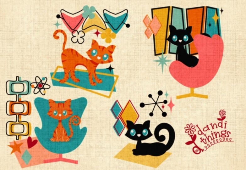
2. Class Project & Preparations: In this class, we'll
illustrate a cat in a typical Atomic Age design and turn it into a
seamless repeat pattern. I'd love for you to upload at least your kiddy
illustration, but if you've created more and turned them into a
seamless repeat pattern, go ahead and upload those two. We'd love to see everything
that you create. Before I started my design, I built a small visual library, the same way I explain
it in my flagship class. If you'd like to understand
this process in more depth, make sure to check that
class out as well. For this project, I
collected motifs I wanted to include along with
typical color combinations. But as always, it's perfectly
fine to follow along step by step and draw what I'm drawing just to get
the hang of it, and then you can adjust things to match your own style ideas. This class comes with a
custom propriate brush set and a color palette. You'll find these resources in the projects and resources
tab as a ZIP file. Once you download it, the file will be saved in the
Files app on your iPad. To unpack it, simply tap the file and to import
everything into Procreate, tap these files once more, and your iPad will
take care of the rest. And that's all the
preparation we need. So let's move on and
take a closer look at the Atomic Age and its
visual characteristics. I'll see you in
the next lesson. B
3. Atomic Age & Visual Language: Before we start drawing, I want to take a quick step back and talk about the
atomic age and the visual language
behind it because understanding that
makes designing in this style much easier. The atomic age refers roughly to the period
after World War two, mainly the 50s and early 60s. It was a time shaped
by new technology, science, and a strong belief
in progress and the future. And all of that showed up very
clearly in art and design. Visually, atomic age design became more abstract,
graphic and playful. Instead of realistic
illustrations, artists use bold shapes
and simplified forms to express ideas like energy,
movement, and optimism. Typical elements
you'll see again and again are things like starburs, boomerang shapes, orbit
lines, and sparkles. These shapes don't represent
one specific object. They're more like the
symbols for motion, speed, and futuristic mindset. What's important here is that atomic age art wasn't
about realism. It was about stylization. And this is exactly
where cats come in. Cats wear a surprisingly
popular motif in mid century and
atomic age design, not because of science
fiction stories, but because of their
shape language. Cats have long elegant
bodies, strong curves, and very recognizable
silhouettes, which makes them perfect
for graphic abstraction. When you reduce a cat into
its essential shapes, it suddenly fits beautifully in the same visual world as
starbursts and boomerangs. The curves echo each other. The forms feel balanced, and everything works together in a very modern decorative way. So, in short, cat content back then worked just as
well as it does today. Another important part of atomic age design was
textile printing, especially on fabrics
like bar cloth, a heavy textured cotton that was very popular
for curtains, upholstery, and home decor. Because prints were applied directly onto this
textured surface, they naturally looked a
bit grainy and imperfect, and that's where a bit
of wonkiness comes in. All right. Now we know what we're aiming
for in this class, so let's move on and
start with our sketch. I'll see you in the
next lesson. He
4. Sketch: All right. Let's get the fun started here. I'm already in Procreate with my trusty four
by five Canvas. It's 2000 by 2,500 pixels white, and I have my wonderful brush set and my color palette handy. As usual, we will
start with our sketch. That means I'm going
to get my sketcher, and I will first start
with my rule of thirds. Usually I start with it by dividing my canvas in
three equal segments. By length and also by width, just to see where to
put my focal point, the main motif on my canvas. Illustrations are
usually the most interesting when
the main motif is on either of those joints here or on either
of these axises. So that's what we're
going to aim for in this illustration, as well. Well first start with a single
cat with a fun background, a typical mid century atomic
background, and later on, we're going to add
more cats and we will turn it into a pattern. Let's get going with
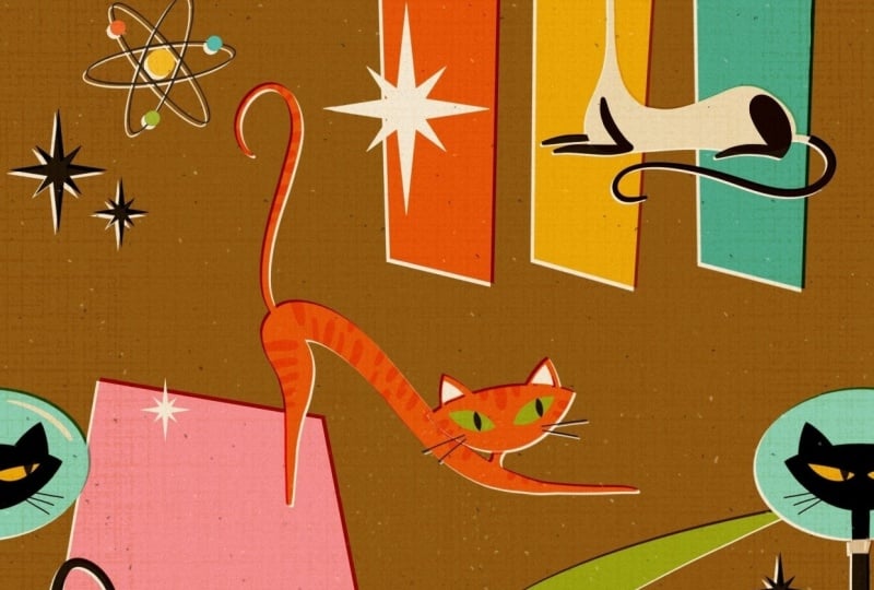
our first kitty cat, which is going to be a Sim cat. Back in the days, the Sim cats were really on trend
in the 50s and 60s. They were exotic. They were something new, and they were just
overly a sign for future for progress for moving onwards. So that's why you see a lot of Sim cats in this
era's illustrations. Absolute typical sign
for mid century cat is a very white and pointy head and a very slim and
extremely long body. No one cared really
for proper proportion. It should be nothing
less than realistic. That's what we're
aiming for here too. I want the cat's head to be
up here with two point ears, and it's going to have a very
long neck and a slim one. Then this is where it lays. It's a lay cat. It has a
nice curve here. Like this. And I feel the bottom is
a little bit too big. So I'm going to make
it a bit smaller. And let's turn off
snappingsF now, like this. And I guess I want to
squish it a little bit. It's a little too high. Something like this. Yes. Okay, so going to work
on this pose here. And again, in this era, illustrations were
absolutely minimal. They were reduced to the
absolute minimum of information. So we're going to
stick to that as well. So the cat's going to
have one leg here, one front paw, and
another one here. Something like this and
a rear leg as well. Maybe like so, and then
a nice curved tail. And this is all we
need for a cat. Of course, it's going to have this dark area in their
face and blue eyes. And it's going to
look really majestic. So that's something all cats had in this kind
of illustrations. They were all looking
like queens or kings, like on a throne, like, really, they're the best. They need to be adored and they knew that they should
be adored all the time. So that's what we want to picture in our
illustration as well. Alright, this is the cat, and then let's add
another layer and pull it underneath for our background. In the atomic era, you'll find a certain
set of shapes in all kind of illustrations
and a lot of artworks, an atomic sign it is
stars, of course. It's trapezoids. And then there's these
boomerang shapes. It might be indicating the
orbit of a planet or of a moon or also of the
electrons around a nucleus. So that was really famous
and often used symbols. So this is what we're going to include in our
illustration, as well. We're going to start
with trapezoids, and I guess they're going to be kind of the cats go
to overlapping them. Let's put just three here, kind of the same and later on, we can just copy and paste the shape and just fill
it with different colors. Let's see how that matches
something like so. And then maybe another
trapezoid kind of here. Maybe like so. And then we have our atom shape
kind of here somewhere, and the nucleus in the center, and maybe some stars around it to indicate this
is the future. Like so. And maybe down here, we are going to add our boomerang shape
which couldn't be miss. And here we're just going to
have some sort of a post. And there's a star
in the center. Something like this and maybe we're going to have
another star down here. So that's the sketch. For our illustration,
it has everything. We want a picture, the cat, atomic features, and I think
we spread everything nicely. So let's move on
to the next lesson where we block out our
colors. I see you there.
5. Meow!: All right. Welcome back. Here we are with our sketch, and in our next step, we are going to turn down
the opacity a little bit, and I think I'm going to make the background
invisible for now, as it's going to be a little
bit distracting right now. So I leave my rule
of thirds just to make sure that the cat
is where I want it to be. And then I'm just going
to add a new layer. I think I will start with the background color right away, which is going to be
my brown tone here. Brown was just a typical
color from back then, and I think it matches
nicely with a lighter cat. All right, that's the
background layer. So let's add another layer, and we're going to
start with our cat. First of all, I want to prep my canvas a
little bit because I need to work with the symmetry tool quite a
bit in this illustration. Unlike my regular
illustration style, this one is pretty crisp
and pretty symmetrical. That means lines are straight. They're not jagged. And we don't have so many wonky
lines in this one. So this is what we use the
help of Procreate for. I want to turn on the
drawing guide for this one, which is here under
the wrench tool. Drawing guide, I'm
going to turn that on and then I'm going to
tap dit drawing guide, and I will set it to symmetry. Now you see we have this
symmetry line here in the center where it
doesn't really help me. We can move the bar a little
bit and I want to set it onto the axis of
my rule of thirds. Just here, just drag the blue node and just move it around to where
you want to have it. This is where the symmetry
is going to happen now. We tap done, let me turn
of the rule of thirds. Here you can see this
small line here. Turn on the rule
of thirds again. And in my next step, I switch to this off white U and to my catad stamp,
which is really fun. So I'm on this layer. It says assisted for now. But when you stamp, it can cause a problem. When you just want to
have a single shape and the drawing assist is on, I show you what happens. You get those two
heads right away. You get them mirrored. So
that's not what we want. For now, I'm going to
turn drawing assist off, and I'm just going
to at my cat head. So I just sm and
the head appears, and now I want to move it onto my bar here from the symmetry. I'm just going to make
sure that the nodes are on the symmetry
axis right now. Alright. And that's enough. Okay. The head is there. It's a little bit
wider than a sketch, but that doesn't really matter. That's okay. So let's move
on with the body of our cat. I will add another layer
underneath the head. And then I'm going to switch to my nice liner tapered brush. And here again, I don't want
the symmetry right now, the drawing assist right now because then our cat would
end up with two necks. We don't want that. We just
want the body like this. So I'm going to
draw a really Oh, my gosh, it's a
little bit too big. Let's go with this size. I'm gonna draw a really
big and thin long neck and go back up. Then I'm going to close the
shape and fill it with color. Let's turn on the
sketch so we see. I think the back could
be a little bit longer. Alright, so that's the
basic shape of our cat. Now it needs the paws. So Asymcat had a
cream colored fur, but it used to have
like dark legs and this dark shadow
in their face. So that's what we're
going to draw here now. Let's add another layer
on top of the cat's body. And then we're going
to switch to black. Oh, wait a second. No, our cat needs a tail. So let's go back and draw the
tail first, back to beige. And now I think we can increase the brush
size a little bit. My nice liner tapered
is pressure sensitive. So by pressing harder, the strokes going to get wider, and by loosening up, the strokes going to get thinner,
which is really nice. This way, you don't
have the equal width of the stroke all
the way around. So that's exactly how I
want my tail to look like. I'm just going to add a nice flowy curve,
something like this. Yes. That's a very majestic
tail poster. All right. So the basic body is finished. Let's move on to our
already added layer on top and draw first a front leg. And then we go behind
the cat's body, add there another layer, and here we're going
to add the other paw. Perfect. All right. We want to add the darker
spot in the cat's face. So let's go to the head and
add another layer on top. And here we want
to use symmetry. That's for sure. And in our next step, we want to fill the ears, but we don't want to go
beyond the line of the shape. So I'm going to go
and select the head. And then I'm going to go back
to the black layer here. And I also want to erase
the center of the ear. All right, we can turn
off the selection. And what I'm looking
for next are the eyes. So a Siam cat has
definitely blue eyes. So I'm gonna pick my teal here and I'm going to pick
my cat eyes dam brush, and then let's see what
size the eyes are. A little bit too big. So let's make them a
little bit smaller. And place them in the
center. Oh, brilliant. In our next step, I guess, I also want to add a
little tiny nose in pink. I didn't show you that yet. With this little square here, I can turn on and off my drawing assist.
This is a function. I've set here, wrench tool, preferences, gesture
controls, assisted drawing. You can see I've put here
on tap this rectangle, so I can toggle on and off by just tapping
this rectangle icon. Wanted to show you in case
you want to do that, too. I'm going to turn on
the drawing guide, drawing assist on, and I
need to change my brush. I go back to the
nice liner taper, adjust the brush size, and then I'm just going to draw a teeny tiny triangular nose. All right. On the next
layer on top of the eyes, we want to have the pupils, and I want to turn this
layer into a clipping mask, so it doesn't draw beyond
the shape of the eyes. So let's say clipping mask. Yes. Oh, great. Okay, we miss some whisker. So let's add some whiskers, too. On which layer
should we do that? Let's go to the
black layer where we indicated the
ears and the face. I think the only thing I want to add is below the black ears, I want to have pink to indicate
the inside of the ears, just to add a little
bit more interest. So I'm going to add
another layer on top. Oh Wonderful. Yes, that's a great
sin cat. I love it. I just think she should have her head a little bit tilted. Let's go and mark all the layers that belong to the cat's head,
which is all of those. And I'm gonna group
them, as well. And then I'm just gonna go
and tilt the entire thing. Great. Let's turn off everything that's distracting our eyes. Also, the drawing
assist here. Alright. Oh, yes, that looks fantastic. I really like this kitty cat. I just noticed we're
missing the black tail, so I want to go back. I think I'm going to go back
to this layer with the legs, but I'm going to select
my cat's body first. Go back to this black layer, turn my color to black, go to the nice liner tapered. And then I can only
draw where the tail is. Okay. Yes, now I think
we have everything. Let me see. Yes, this
cat looks fantastic. Let's move on to
the next lesson, where I will show
you how we can add this wonderful mid century offset to our kitty cat.
I will see you there.
6. Misalignments: Okay, and welcome back. So a mid century illustration wouldn't be mid century if there wouldn't be this
nice misalignment and fabric was no different. So this is what we want to add to this
illustration as well. First of all, we want to
group the entire cat. Let's mark everything. That's the body and also
the group with the hat. And now we turn it
into a group again. Let's name our group just
to keep it in order. Let's name it cat. All right. What I want
to achieve now is I want to keep my background
layer fully intact, which will help us
later on when we are going to create
our seamless pattern. That's why we're going to go
a different route this time, which is even easier. What I want to do now is I want to duplicate the group
with our Sim cat. Then this group can
just be flattened. That means everything that
was on those multiple layers before is now combined
into one layer, this one, now we want to turn on Alpha
c and we are going to fill it with this off white so we tap it again and
we tap Fill layer. Alright, now we just have
the white shape of our cat, and I'm going to put
it underneath our cat, but within the group. Next step I want to do is I'm
going to tap the move tool and I'm going to move
the cat bottom layer, the white shape, I'm going
to move it to the side, and now we can see this
nice misalignment here. Although it doesn't really
make sense for now, but bear with me, we're
going to get there. In our next step, that we have the cat itself also interacting with
the color underneath. We want to turn the blend
mode into linear burn. So all the layers belonging
to the cat, let's see. It's for sure, the rear leg. Let's turn the blend mode
to linear burn by tapping the N and then moving
towards linear burn. Then we go the neck
to the next layer, which is the cat's body. We tap the N, we set
it to linear burn, and now you can already
see what happens here. So those two layers
on top of each other, the colors are interacting
with one another. So the off white from
the bottom layer from the white shape interacts now with the white from
the layer on top, which, which turns it into
this beige cream shade. And since we misaligned
the bottom layer, we also get this
darker outline here, which is just
amazing. It's subtle. It's there, and it creates
this vintage feel right away. Okay, let's move on
to the cat's head. Now, to the legs here, the front legs, we
also make them. Turn them to linear burn. And I saw this problem here. The real leg
interacts, of course, with the body, which makes
it kind of translucent. So we're just gonna erase
what peeks into the body. Just like so wonderful. Alright. Again, let's move on. So let's open the head group. H. Next, we want to turn the
black into linear burn. And I guess also the pupils, otherwise, we have
a weird contrast between two black tones. A, let's also turn
those into linear burn. Yes. I see a little
bit of a problem here where the neck
pokes into the head, so we just erase what's
peeking into the shape here. Just roughly as good as you can. Yes. Amazing. Yes, and here we
go. So our cat with the offset feel is now finished.
And it looks gorgeous. I really like it. Alright, then let's move on to
the next lesson. Where are we going
to take care of the background? I see you there.
7. Background: All right, here we go again. So let's turn on
our sketches again. Here's the cat. And here's
the rule of thirds. Looks really nice. And here, let's bring our background sketch to the top
and turn that on. And I guess our cat is
really nicely located. It's absolutely on
the focal axises, and I like that a lot. Time to take care
of the background. Let's turn of the cat sketch and make the background sketch a little bit more invisible. And now we can shift
around items when we feel like it should be there
should be some changes. So I think I think this
rectangle here should move up a little bit like this
that it doesn't have the same heights as our
boomerang kind of shape here. And I guess these can move down also a little bit
those trapezoids here. Just to have some variation in heights and not everything
on the same level. First of all, we can close the group that we are not
distracted by too many layers, and then we are going to add another layer right on
top of our background. Start with turquois. No, not with turquoise because the eyes are already turquois. So let's go with orange
here. Let's pick orange. And then I'm going to
pick my selection tool. I am at free hand. And then I just I will just make the trapezoids with
the selection tool, and fill it with color. Tata. That's great. We don't
need anything else. We are just going to
duplicate this layer now. Just duplicate it. Just turn it into Alpha lock by either swiping with two fingers to the right. Although, for whatever reason, I find that highly complicated. I like to tap the
layer once more and then just tap Alpha lock. And now you see the
checkered pattern, that means you're only going
to add color to the shape, the pixel shape that is already there on this layer,
and nowhere else. And now we change our color too. Let's go with a yellow U. And then we say fill layer. And now we can move
it to the side. I just see there is a problem. We apparently have k here. Okay. Now that's gone. And to have a little
bit of interest here, I'm going to tilt it a tiny tat, just a diny. Okay. So let's now duplicate
this layer once more. It is already an alpha lock, and now we're going
to go with our teal. And we tap fill layer, and we move it to
the side as well, and we might tilt it in
the other direction. So even though it's
three equal shapes, they look completely different. Okay, let's move on. We definitely add another layer, and then we're going to go
with our selection tool again. Behind the cat here, we're gonna make the
next trapezoid shape. Close it. And this one, I think we fill with pink. Tata. And then our boomerang
shape, add another layer. Go to green. And then we're going to pick our
boomerang stamp here. And we're just gonna
let's see where we at, maybe a little bit bigger. Yes, but I want to flip it, so I'm just going to tap the move tool and
say flip horizontal. And then I'm going to move
it where I want it to be somewhere here. Awesome. I like it. And then
we need a star. We definitely need a star here. So I'm going to
add another layer. I'm going to go to black, and then I'm going to pick
my starburst, brush stamp. And this one is also
pressure sensitive. So if you tap lightly, you get a small star. But if you press harder, it's going to get a
bigger one. Alright. And I want a small one
here in the center. So I'm just gonna press lightly, and then we have a star here. I think I changed my mind.
I think I don't like. When the star is
on this post here, I might just put it over here instead, wow
that's too big. Like this. And I'm actually
unsure about the post. Let's see how it
looks, and maybe we don't just use it.
That's totally fine. I think I want to go with
my nice liner mono now, which is set to 5%. Let's undo, Let's make
it a little bit bigger. And now let's check and
see what we've got. We like it. Churned
out the sketch. Yeah, I think that's nice. I think we can keep
that. Okay, but it's still super empty here. So let's add more items to
the background. Let's see. I think we need our
atomic sign here. Let's stay too black. And let's pick the
atom brush stamp here. And then we're gonna
stamp it just up here. But I want to add a
little bit more interest. I want to have a nucleus, which could be yellow. Whoops. Of course, I need to go back to my nice liner brush. And then I'm just gonna draw
a circle here in the center. Data, move it center is. And then I want to give
those electrons a color too. That could be on the same layer. I just want to select
the atom shape again. And now I can only paint on those pixel from the atom shape, and then we go back
to the yellow layer. We pick let's say
we pick turquoise. One electron in turquoise. One, let's say in green. And the last one I get
in orange again. Cool. Hey I love it. Alright, I think we
need more stars. Let's go back to the star
layer and stamp them here. So a bigger one and
a smaller one here. And then I guess I
want white stars. How about that? We
add another layer, go to our off white. And I think I want a big one. Oh, that's too small. A big one? No. But I want to move it here. It's on the edge a little bit. And a smaller one. Kind of here. And
another big one, how about we put that here. So let's turn off our rule of thirds and check what we've got. Oh, yes, it looks fantastic. Just the post here, I guess
I'm gonna ditch that post. I think it doesn't really
add to the illustration. It's just confusing, so I'm just going to delete it. Here we go. Yes. Alright. I love it. The only thing that I don't like is that we don't
have the offset yet. So let's add that, as well. So again, as we did it before, we are going to
mark all the layers belonging to the shapes that are on top of
our background. We turn them into a group. And now we just want to
duplicate the group, tap it once more, and
just tap flatten. And now we have all
the items again, combined in one layer. We turn on alpha lock. And we fill it with white, and then we drag it
underneath into our group. You can check it's
now on the bottom. And now we can move it to the side to create
this wonderful offset. Although it's not really
working nicely yet, because our colors don't
interact with each other. So that means we need to
change the blend modes again. Whoops. Tap the N, go to Linear Burn, and right away, it's interacting with the
layers underneath. And that's exactly what we want. So let's go on and do that
with all those colored shapes. M. The only thing
that's bothering me is, I guess, that the white stars can't be really red anymore. That's why I just want to go
to this white layer here. Um, turn off Alpha lock. And then I'm just gonna erase That's fantastic. I like how the colors and
the shapes are distributed. I like how the colors interact with the
layers underneath. And I'm really happy with
the outcome for now. The only thing that's missing now is the beautiful texture, and this is what we're going
to do in our next lesson. I'll see you there. Um,
8. Texture: Okay, welcome back.
Now it's time to do a little bit of a
housekeeping. Name our group. We rename it. Background
shapes All right. This one is our background
color that's clear, technically, we could
erase our sketch layers. When you're short on layers, make sure you do that, and I'm going to add another
layer on top of our Sim cat and I will turn the blend
mode to multiply right away, and next, I will pick
my stipples brush. Next, I need to change
the color to black. And now you see beautiful
marks and stipples are added. It's just a little
bit too obvious, so I'm going to turn
down the opacity here. And then we add another layer. Now we go to white, and we add some marks
in white as well. But again, too much
too light, too bright. So let's turn down
the opacity as well. Okay. Step one done. Now we need the
bug cloth texture, which is this
beautiful brush here. Here we go. We pick that. We go onto a new layer. Add a new layer, turn the
blend mode to linear burn again to have the texture interacting with
each of the colors, which makes it blend in
right away and very nicely. And I guess I will stick to my off white tone and
let's see what we've got. Yes, that's dark enough
already. All right. Now you can see in some areas, it's a little darker, in some area, it's
a little lighter. And again, this is way
too obvious for my taste. I'm just going to turn down the opacity until
I like the result. So in some areas, it's
almost invisible, and in some it's a
little bit darker. That's exactly what
we're aiming for. So it already has
this fabricy texture. The last thing I want to add
is a little bit of noise. So I'm going to add
yet another layer. Again, turn the blend
mode to linear burn. And this time, I'm going to
switch to my beige color here and I'm going to pick
my noise texture brush. That just blends everything
in super nicely. It creates this kind of
stipply noisy texture, but it also interacts with the
colors and makes them even more vivid and even
more mid century. I don't know how
to explain that. It's a little bit
too dark, though. So I'm going to turn down
the opacity once more. And here we are with our final illustration
of our Sim cat. This would work on its
own perfectly well. You could print it out, you
could make it a poster. You could upload it to your
print on demand shops, and people are probably gonna
drag it out of your hands. However, I want to turn it into a seamless
repeat pattern, so we could also have it printed on a wallpaper or a fabric, which would look
really, really cool. So let's move on
to the next lesson where I'll show you how
we're going to do that. I'll see you there.
9. Pattern: All right, time to
make the pattern. And this is what I did. I took
the original we just drew. I selected it, and I
duplicated it into this one. And let's open this canvas now. Before we can start
making it a pattern, we need to adjust a little
bit to make it easier for us. Let's open the layers panel. First of all, I've
added more cats. I did that off camera, but I'm going to explain
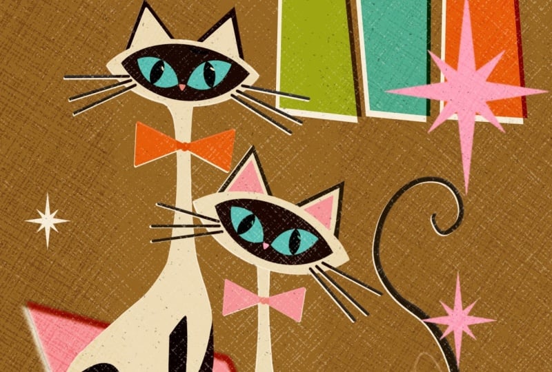
you what I've done. So let me show you. Let's turn off the Sim cat. Let's turn on our cat couple. So here, I have a girl and a
boy cat next to each other. It's basically the same shape
as the other laying cat, the sim cat we made before. Then I've added a sitting cat, not a laying cat, a sitting cat, and this one is
just the black one. This one is just the white
one. That's our couple. Let's call it cat couple. Next, I've added a ginger cat, which is stretching right now. Pretty simple, pretty
straightforward. And then, of course, you know, no Atomic illustration is
complete without an astro cat. Here we have our astro cat, which is basically the same
shape as the boyfriend cat in our couple just with a helmet
and the head is not tilted. So that's the only difference. And it looks like, really, you know, proud, maybe
or maybe annoyed. I don't know. Maybe the food in space doesn't
really taste so yummy. I don't know. Anyhow,
that's the Astro cat. What I also did, though, I've flattened these cats, but I flattened them without
the white background. And this is what we
have to add now. Because if I would
have flattened them with this white
shape in the background, then we couldn't create this
beautiful color interaction anymore because then
the linear burn is not possible anymore. So that's why I removed the
white shape background, and then I flattened it without. So let's duplicate our Astrocat
then we select the layer. We pick our off white, and then we fill it. All right. We drag it underneath and put it to the
side a little bit. Like this, maybe. And then we can turn our original cat
back to linear burn, and we have the
interactions again. Great. This is exactly how
I want it to look like. So let's make it a group again. Let's do the same
with our ginger. But I just see, like, we need to fill the ears. And then we can turn original
into linear burn again, make it a group, tied up. So these are all my cats, and now we need to shrink them. They're way too big to all fit into this tiny
canvas, if you will. So what we can do
now is just mug all the groups and then
shrink them all together. They need to be really tiny. I guess that's a good
size that they fit basically in a quarter
of this canvas. Alright, and now we want
to move them around. So let's see. I think I want to name the layers again.
Which one is this one? Okay. I want to name this cat couple that I know what
I'm dragging around. Here we have ginger. Here we have Okay, Astro and here we have Siam. And Siam is the
one I'm going to. Oh, interesting. We still have the background
problem here. That is so funny. I think
it's with the orange. Here we go. Alright.
So, let's see. Let's start with our Sim cat. Let's move it here in
the top right corner. Like this, I think that's okay. All right. Next
one is our ginger. Let's turn that off.
Let's turn Astro off. And I guess ginger
should be flipped. Let's flip ginger. Let's mark the layer, go to the move tool,
and flip horizontal. And then we're gonna drag her
down maybe like over here. And next, what do we have next? Now we need our Astro cat. Astro, I want to
place half of it down here and half
of it down there. This way, we don't
have to be super careful with everything we do that everything
is lined up and, you know, like duplicate layers, duplicate move it around. We want to go with
Procreates built in tools, and they are really helpful. So let's first of all,
I show you what to do. Let's just duplicate the
Astrocat then we want to turn everything else off beside
one besides one Astro cat. So now I want to move Astro
cat down here in this corner. And for that, I
now need snapping. Okay. So let's move it down
here that we have it snap to this line with the center nodes and to the bottom line
with the bottom notes. Alright. And now we
can do the same. With the other one. I just want to turn this off to not have it interact
in a weird way with this side that we have
the snapping happening easier and more correct. Yellow line, yellow
line, snapped in. Perfect. All right. So this can be on. This can be on. This can be on. And Ginger was on, as well. And now we only have our
beautiful cat couple, although I think I still want to move my Sim cat over here. And I guess the ginger goes into the center,
maybe like this. And then I want to
have the couple here and here. Let's see. Let's open the couple. And I guess we want to
flip that, as well. Let's mark this layer. Let's go to the move
tool, flip horizontal. Turn it off, and then we
duplicate the couple as well. All right. And now we
do the same trick. We are going to move it up. One couple we're
going to move up, one couple we going
to move down. But we want to have it snap with the center.
Let me show you. I want to turn
everything else off again and just move this one up. So the center nodes. So they snap here and there. We have the golden line here. We have the golden line there. Okay. And now let's see if it works with all
the other cats. Oh, brilliant. Yes, I like it. I like it. And now let's see if it still
works with our background. I think we have to drag a few
things around. Let's see. First of all, let's see. I think for now, I want to get rid of the stars. And here we have a problem
here with the white. All right. And I think
the ginger is a little bit too close to the
orange rectangle. So what I want to do is
what I now want to do is just select the entire
group through all layers. Procreate can do that. And then we're
just going to move the entire shapes
up here like this. And now it's not interacting
with ginger any longer. And then we can move this
group around as well. Here, the Atomic
sign and the stars. And this is absolutely
awesome. I love it. I think we can add a white star Let's turn the visibility
of this one on again. I think we can move these
stars here over there. Oh, I cut off a piece of the
star. Let's do it again. So like this one, we can
move these stars over here. Let's turn off snapping.
It's easier to move the. Maybe like this. Oh, yes.
Oh, yes, I like that. And what could we do
with the white one? I guess it's just too much here. Let's just erase that. Let's try out how it looks
when we add another star. Maybe a small one here and
maybe a small one there, maybe a little bit bigger. Like this. So let's turn on
our texture layers again. And now it's time to check if it's going
to work as a pattern. But to not make any destructive
changes to this one, we're going to do the same
trick as we did before. We're going to go
to the gallery. We're going to
swipe to the left, we say duplicate, and then
we open the duplicate. All right. And here
in our duplicate, we can flatten all these cat
layers with the background. So we only have
one colored layer, and we mark all the five layers that are left and turn
them into a group. This way, we don't
have so many layers, which makes it easier for
the one with a smaller iPad. So let's duplicate
this three times. We go to group one. We go to the move tool, we
enable snapping. And now we go to
shrink it by half. And that can be a little bit
tough with all the texture, so we're just going to
tap it in the corner. Instead of 2000 by 2,500, we're just gonna type
in thousand by 1,250, and that shrinks it
automatically by half. Okay, we go to the next group. Move tool, the other
corner node, 1,000. Boom, shrink. Oh, I can't wait to see. If I it fits, it's so exciting
every time again. Alright, group three. Move
tool, corner node, 1,000. And last group. Move tool, Corner node, 1,000. And here we go. You guys, I matches perfectly. There's no seam. There's no odd line. The texture matches
up perfectly, and it just looks so cool. And this is our pattern. And as you can see,
you don't always need a square tile
to make a pattern. It also works with a rectangle. I think it creates even more
interest if it's a rectangle because then it's harder to
see where the repeat starts, and I'm really happy with
how this has turned out. So I hope you give
this a try and you show us your single cat, and your pattern maybe
in the project gallery. So now let's move on to our final video where
we wrap up the class. I'll see you there. A
10. Wrap Up: And that's it.
Congratulations. You know now how to create a mid century Atomic
cat illustration and turn it into a
seamless repeat pattern. I'd absolutely love to
see what you create, so make sure you upload your project to the
project gallery. Feel free to share your
art online and tag me. I always enjoy to
see your art out in the wild and following
along with what you create. If you enjoyed this class
and found it helpful, a quick review really helps
and means a lot to me. And to stay in the loop, you can follow me here and on social media to see what
I'm working on next. Thank you so much
for learning with me and spending your
creative time here. I hope you had fun, and I'll
see you in my next class. Bye.
 Jutta Schneider, Artist | Educator