Transcripts
1. Introduction: As artists, we all
know how easy it is to get stuck in chasing
the perfect outcome. All the overthinking
and criticizing of our own work can get frustrating,
even scary sometimes. But honestly, there is
so much fun in just letting go and drawing freely lose full of life and character. And that's exactly what we're
going to do in this class, exploring one of the most charming mid-century
illustration styles where wonky lines and quirky shapes make
everything come alive. Hi, I'm Jutta, an artist and
illustrator from Germany. Over the past years, I've created several classes
on mid-century Illustration, and it has really become one
of my favorite art styles. Every time I dive into it, I discover something
new and exciting. I really want to share with you. Today, I'll walk you through
five different exercises. You'll learn to loosen up, let go of perfection, and boldly draw quirky
motifs in mid-century style. You'll get to know the
main characteristics of mid-century illustration
and step by step, discover how to
create without fear, but with joy,
confidence, and courage. You'll be surprised how freeing
it feels once you start. You can follow along
with markers and pen on paper or on your iPad and Procreate using
the resources I've created for you. And
here's the best part. In this class, you have full permission to make
mistakes and welcome these happy little accidents because being
imperfect is perfect. So are you ready? Then let's dive right in and have
some fun together.
2. Class Project: Creating a class project is a great way to put what
you've learned into practice and make
the class experience more fun and rewarding. It not only helps you
solidify your new skills, but it also inspires others
when they see your work. Five different exercises
in this class, chances are you'll end up with at least one finished
illustration that's perfect to share
in the project gallery. Just head over to
the Projects and Resources tab and
click Submit Project. Give your project a title, upload an image and
tell us how you enjoyed this freeing way of making
art. One quick note. If you use a portrait
image as your cover, it might get
cropped. No worries. Upload it again and feel free to add even
more project images, too, by just clicking the
little add More Media icon. Once you've done, you just
hit the Publish button. Now just imagine the gallery filling up with wonderful
quirky illustrations, and how great it feels
when other students and I leave encouraging
comments on your work. Let's make this a fun, cheering gallery where
we lift each other up. And with that said, let's move on to the next
lesson where we talk about the materials we'll use in class. I'll
see you there.
3. Materials & Resources: Let's talk about the materials. This is a hybrid class again, which means you can follow
along on any medium you like. I'll be switching between
paper with markers and ink and my iPad
and Procreate. So just use whatever
feels right for you. Because this class is more about the exercises than
the final outcome, any paper or sketchbook will do. In case you're curious
what I am working on, it's the color printer
paper from Clair Fontaine. It's bright, white, smooth, so gentle on marker nibs, a little thicker
than regular paper and of great quality
for the price. For markers, I'm using
my beloved huh markers, my Sadler pigment fine
liner or my fountain pen, and sometimes a white
gel liner for details. If you're in Procreate, you'll find everything
you need in the projects and resources tab. I've put together a custom brush set and a color palette for you. Just tap the files on your
iPad to download them and they land in your File apps
Downloads folder by default. And when you tap an item there, it'll automatically
import into Procreate. In the resources tab, you'll also find
the reference photo we'll be using for exercise too. It's best to grab it now so you have it
ready when you need it. And lastly, I've curated a Pinterest mood board full
of style inspiration for you. The link is in the
resources tab as well. Just remember to use other artists work
as inspiration only. Now gather your materials, pick your colors
for the exercises, and then let's move on to the next lesson where
we'll talk about the mid-century
illustration principles we're aiming for in this class. I see it there.
4. Style Principles & Visual Library: Alright, let's get a clear idea of where we need to keep in mind to create art in this wonky mid-century
illustration style. To do that, we're going to look at my Pinterest mood board, where I've collected artwork that perfectly shows the
style we're aiming for. And to help us remember
these principles, we'll create a visual library, basically our own
style guide as we go. You can do that in your
sketchbook on a spare piece of paper or write in Procreate, and that's what I will be using. So let me quickly pull up
Procreate in split screen. Now, the specific mid-century style I want to focus on today because there are
many variations is characterized by black, often wonky linework and a
very limited color palette. This combination makes
each piece lively, playful, and
interesting to look at. The motifs themselves aren't necessarily from the
mid-century era. They can come from earlier
periods like art deco, which often has more
embellishments, swirls and decorative
details we can borrow. Today, we want to focus
on two main things the use of color
and the line art. Let's start with color. As mentioned before, the color palettes are
often extremely limited, most of the times even reduced
to one or two colors only. Looking at our examples, I can see four main
ways how color is used. First of all, here, we have abstract shapes
in the background. I can see trapezoids
or blobs or lines. They're not part
of the main motif, but they add visual interest and balance. Let's note that. And second, there's one
used to color parts of the motif like here and here. And when used to color
part of the motif, there's not always an outline. And when there is an outline, the shape is often
shifted slightly or even has a different
shape than the outline. Let's add that to
our notes, too. The next way of how
color is being used in this mid-century style is by coloring the background and leaving some negative
space for the main motif. As we can see here,
the background has a solid color and the motif or sometimes it's
even more than just one, they sit in cut outs
of negative space. Let's jot that down as well. Since the class is
all about wonkiness, you won't mind my
wonky penmanship. The fourth way of how
color is being used in this illustration style is with multiple colors for
a themed collection. Here is a great example. We see some music instruments, and each one is held
in a different color. This is another great example. They use only three
different colors, but you can distinguish easily that there's
different lamp shades. And with the linework, even with white marks, it looks quite different, versatile, and
super interesting. So let's add that to our
style guide, as well. Now, let's move on
to the line art. I'm going to add a new layer, make this invisible, and
write my line art here. And while there's a
lot we could document, we'll focus on lines, flourishes, decorative
patterns, and fillers. This one is a very good example. We can see all the
lines are pretty wonky. Sometimes we have lines
that are broken as well. And then we might
have wavy lines. Here I see a great
example for flourishes. Let's mark that down as well. Another great example for
flourish is this kind of shape. Here I see a dotted line. So why don't we add
that to our line art? As patterns, we see this
kind of this hatched area, maybe crosshatching, maybe just hatching and maybe hatching
in different directions. Then I could also see some
dots here as a pattern. And, of course, we see stripes. Here we have little flowers. They could be either
fillers or pattern. And remember, we want
to keep it wonky. Here we have a nice plate
pattern. Look at this. And we have a cool flower. So maybe we want
to draw this rose, which is basically just a swirl. Oh, this is a great
way of using a line with big and small dots and also this kind of mazy
way of having a line. There's also a cool flourish. And you see here for the doors, we see a lot of boxes, a lot of round shapes. It's just super simple
and very wonky, but the overall impression
is really interesting. So this is also a
great way of using a line and as you can
see another detail, the artist here
didn't really pay attention where the
line starts and stops. So here it goes beyond
the actual shape. The lines are really wonky, and here they also go
beyond each other. So that's so cool. It gives you so much freedom. I actually like this
way of having a line. And this is also a very
simple way for a flourish. And here we see a
nice example for fillers in an empty
space of the paper. They just add dots and circles. So here I can see like a heart. I want to add a heart. I actually like this way of just adding ovals as a pattern. This way of having a flourish, like just basically
these kind of shapes. And here we see this is this
line repeating over and over and here we have
even flowers, so cute. And here it's basically this pattern just
flipped upside down. So you don't really need
that many different items. And having these few items repeating in your illustration, that's what makes them cohesive. Here we see great
examples for fillers. This is basically just whatever
random little stipples or lines or dots. That's a way of having
a line we did not put down yet. It's with dashes. Also a great way of having your lines end is
with a little dot. Let's put that to flourishes. Oh, a great way of
having a decoration is, like, just a simple bow tie. Or like this. I like this one a lot. Oh, I think we did not use
this filler pattern here. Oh, here we see little
star, so why not? Oh, the stars are here as well. And look at this line here, which is also really cool. It's basically a line with a lot of dots on the line itself. And I know we could spend
hours collecting these ideas. There's so much to discover
in this wonderful style. But the point of
today's exercise is to create something you can refer back to whenever
you feel stuck or want to stay consistent
in your artwork. So feel free to check for more details you want to
collect in your style guide, but I want to move on for now. So whenever you're trying
to understand a new style, I highly recommend building
your own guide like this. All right. Let's move on to the next lesson where we'll set a few playful rules or guidelines for our exercises.
I'll see you there.
5. Tips & Tricks: I've noticed a few things
that can make your drawing either more enjoyable or can
get a little bit in the way. That's why I put
together a few tips and tricks to help you
get the most out of each exercise and feel confident when exploring this
wonky mid-century style. My first tip is about
reference photos. It's totally okay
to use a reference, but here's a trick
that really helps. Take a good look for
about 20 seconds and then put it away. This way, you can focus on the essential without getting
lost in the details. And of course, if you
forget something, f free to peek again, but then put it
away right after. My second tip Make mistakes. Don't be afraid of wrong
lines or shapes or colors, and you don't need
to erase them. This is your permission to create messy or imperfect work. And sometimes, figuring out what does not work is
just as valuable. It teaches you a lot for
your future choices. Here's tip number three, skip the safety net. For the main illustrations, we're going to skip
detailed sketches. We're going to map out our composition on
a little thumbnail. But then we're going
to draw freely our main illustration
because honestly, who really likes
to sketch anyway. Tip number four is for
our Procreate users. Procreate can get a little bit in your way when
you're trying to achieve wonky lines because
of all of its built in tools. So here's what I did. All my brushes come without
streamline and stabilization. This way, the app is not going to smooth
out your strokes. I recommend keeping it like
that throughout the class. The same goes for the
quick shape tool. It really makes your shapes look way too perfect
for this style. I will show you even
how to turn that off. And lastly, and that's
probably the hardest one. Try not to hit
undo all the time. Except your happy accidents, those unexpected little mistakes that actually make your artwork way more lively and unique. No one is gonna judge you. Remember, these exercises aren't about creating a
perfect outcome. They're here for
you to have fun, to experiment, and to embrace
your own artistic style. The more you enjoy yourself
and your unique art style, the more confident and free
your drawing will feel. And with that s,
let's jump right into our first exercise.
I'll see you there.
6. Warm-Up Exercise: Okay, now that we have a clear vision of the
style we're aiming for and the guidelines we want to follow in
our illustrations, we can start with a
little warm up exercise. This will help loosen your hand, get you into a playful mindset, and take the pressure of before we dive into
our main projects. For this, I am using a sheet of a five paper a marker
and my fountain pen. And since I'm drawing
with alcohol markers, I put a little protection
sheet underneath, since these alcohol markers tend to bleed through the paper. Of course, you can
use whatever you have on hand or you
draw in procreate. So what we're going to do
now is we are going to draw three upright rectangles
with our marker, and in procreate, you would
choose the MCM marker. So don't worry about making them neat or perfectly straight. Wonky is perfect. Remember, so this is
my square number one, and I don't really pay attention how I'm
gonna color them. Sometimes I go beyond the line, but that's no problem at all. Remember, it's just a exercise, and we want to have fun
and there to be wonky. Okay, my three
rectangles are done. And now I will take
my fountain pen. You can take your fine liner or whatever else
you have on hand. And then we're going to turn these three rectangles
into something. So let's see. I think this
one is going to be a house. It kind of looks like a house. So let's see. Gonna
start with the roof. And then I'm adding
some windows. And maybe another one. Here's gonna be the door. And since it's a bit higher, it's gonna get some stairs. So let's add a window here. And maybe a handle. This. And here, the windows
need something. Here are these shutters. And maybe on the roof, we're going to draw
those window things, too. Maybe like this. Alright. That is
definitely a house. And I found it was
super nice to draw. I actually like the
character of these lines. So some parts are a little bit thicker and some part where
I was a little bit faster, the line is a little bit
thinner, and I don't mind that. I actually really like
this going beyond a shape. So overall, this looks
super fun to me. Okay, let's move on and turn the next rectangle
into something. How about how about we
turn that into a table. So a table with a completely
weird perspective. Here's another leg. And here is another leg. So, who cares? It
doesn't matter. It's just about the
overall impression we get when everything is done. So let's put some fun
vase here in the middle. And it's going to have a
little bit of a pattern. And in our vase, there are some flowers
maybe like this. Oops. Oh, good. Alright. And some
stems and some leaves. Maybe some leaves up here. And tada here we
have a nice table, but maybe it's getting
a little doily. And maybe how about, now I've added the table legs, but we could even add something like a tablecloth,
something like this. And we could give it just
funky Uh, like plate pattern. That's definitely a
table and a vase. Alright. How about? What are we going to do
with our last rectangle? Um, I think I think
I'm going to turn that into just like a coffee
pot or a jug or something. Let's see. So again, I'm not gonna give
it an outline, just the way I did
with the house. I am just gonna add something
like a irke like lid. Maybe it has a little bit
of stripes pattern here. And then we have
the handle here, a nice flourish handle. And here we're gonna
pour out the coffee. And I guess it needs
a pattern, too. So how about we go
with this one here? That's not mid-century,
I don't know what is. Yeah. And that's it. See, I told you the
wonkiness works. Even though we
deliberately painted some pretty wonky shapes and
wobbly lines everywhere, the overall image still feels harmonious and
interesting to look at. And that's the beauty
of this style. It doesn't rely on perfection. In fact, the imperfections are what make it alive
and full of character. This exercise is a great
reminder that you don't need flawless lines or
correct proportions to create something that works. Just dare to be wonky and embrace the freedom of
drawing, imperfect. You'll see there's no
such thing as ugly art, only cool and funky stuff. Alright. And now that
we're warmed up, we can head straight to the
next lesson where we'll take these ideas a step further with a new exercise.
I'll see you there.
7. Exercise 2: Gramophone: Hello, and welcome
back to this exercise. This time, we're going
to draw a gramophone. This is a perfect example
of taking a motif from an earlier era and applying mid-century
drawing techniques. In this case, are black and wonky lines and abstract shapes
in the background. I'll be working
in Procreate this time just to show you my
workflow there as well. Of course, you can use whichever method you
prefer analog or digital. I've already pulled up
the reference photo, which you can find in the projects and
resources tab as well. I found that on Pixel Bay, which by the way, is a great source for royalty
free reference photos. Okay, let's look at the photo for around
20 seconds or so. Here we see the huge speaker, and this is the arm where it's attached to the box underneath. Here we have our shellac record, and there's a lot of
carvings and decorations. And I also see that down there is a little bit
wider of an area, and it stands on feet. We also have this lit
crank here which you need to twist that the thing
starts working at all. And then this arm with this
circle kind of thing here, this is the needle which
plays the music later on. I also noticed some
embellishments and lines here on the speaker. And I guess that's
all I need to know, so I can go over to Procreate
and start my thumbnail. And here I am in
Procreate with a 2000 by 2,500 pixel canvas. And I want to start
with my thumbnail. This means I want to
just just roughly map out my illustration to see
how it looks later on. And then I can use that as my reference for my
final illustration. So let's start moving
over to black, and I'm going to pick
my sketcher brush. So let's see what I remember obviously is this huge speaker, and it had kind of these
petal like shapes here, all around the edge. And then there was this kind
of funnel thing like this. Underneath, there was a box, and I want to make sure
I make it a bit wonky. Like the bottom of the
box was a bit wider. I don't know. Do I
want it round or maybe angular? I don't know yet. And maybe we add another
little line down here, and then we had the feet. I guess my feet are
supposed to look like this. How about this?
Yes, I like that. And then we had some
carvings and decoration. And I guess I want to have
it looking like this. And maybe maybe
something else in here. How about how about we're going to go with
flourishes like this? Alright. Yes, great. Up here, there was a Shellac record. And this can be wonky. It adds absolutely to the feel. And it has this kind of
thing in the middle. Now we know where to attach
our arm like this maybe. And there was some
embellishment, as well. And how about we put the
player arm like this? And here was this
circle in the needle. And then, of course, the
crankier which can also be super wonky Oh, I love that. Great. And there were some
lines in here I remember. And there was some decoration. And I guess I want to go with
just something like this. Maybe I could even, like, just dash these lines to have it not that distracting
for the eye, maybe. How's that? Maybe like this. Yeah, we'll see later on. I guess I guess I like
the dash lines better. They are not so they
are not too bold, too obvious for the eye. And that's enough
with our thumbnail. And as we said, we want to add some color in
the background, just one blob, just one shape. And I thought of this typical mid-century
kind of bean shape. I've just added another layer
and pulled it underneath, so I'm not going to
damage our thumbnail. So I thought of, why don't
we just add this kind of How about this one?
In the background. Let's see if we can do that in our final color right away. I think I like that a lot. That's super mid-century. Okay, I think my thumbnail is done and I'm
really happy with it. So I'm going to say
that in my camera role. I just want to turn
down the opacity of the background a
little bit that I can see my sketch a
little bit better. So let's just share it as
a JPAC in our camera role. Alright. Now I want
to go over and open a new canvas that
I'm not going to be tempted to draw with a sketch. I want to practice my
visual imagination, so I'm going to start
on a new canvas. So here I've opened the same
size 2000 by 2,500 pixels. I will be starting with
my orange right away. So I'm going to start by drawing this triangular beanish
kind of shape here. All right, our background
shape is ready. And now that I remember
correctly what I wanted to draw, I'm going to pull up my
thumbnail as a reference photo. So we go to the wrench tool. We switch to Canvas, and here we enable reference. Now I just need to pick
my image. Here it is. And then I'm just
going to pull it to the side that it's not
too distracting to me. So I can see my speaker
peaks beyond the shape, so this is what I'm
going to do first. Here, the black. And I think I'm going to go with my fountain
pen this time. Alright. And I start with
these pedal kind of things. Here we are going to have this
kind of little rectangle. And then we have
our box underneath, and I want to make sure that
I have enough space between the speaker and the
box underneath. So I guess I'm going to
start here. Go to the side. And that's a problem when you
are working with Procreate. It turns your lines into the quick shape tools
pretty quickly. We can change that, though, because this is quite bothering, and it keeps us away from having our wonderful
wonky lines. So for now, I'm going
to change that. I'm going to go to
my wrench tool. I'm going to go over to preferences and then
gesture control. And here we have the
quick shape tool. So what is enabled right
now is draw and hold, and I'm going to
simply turn that off. Now there's not going
to be any quick shape, perfect shape tool applied
any longer, which I prefer. If you still want to use
it, that's totally fine. Keep it on. I just want
to turn it off for now. Alright, so let's go to
the side and up and over. And then I said, I want to add this
diagonal kind of bottom situation and
another line and my feet. Like this. Amazing.
Here we've said, we're going to add
the flourishes. Let's do them this way. And here we go to mirror
them if I can do it. Yes, great. Alright. And maybe
we're gonna draw. We see. Maybe we're gonna
fill in something in here, but maybe it's not
really necessary. Alright, now, let's
start with our record here. A little wonky. And then I want to fill it. But I want to make sure that I'm not gonna
fill it entirely, but leave some spaces orange to indicate those typical lines in a vinyl, you might remember. There are those ridges engraved. And by keeping these, you can clearly tell
this is a record, and it has this ridges. I hope this is the right word. Okay, and now my decoration, it was this kind
of rectangle here. And I said, I'm gonna
apply my typical loops. I love the loops. I really do. Okay, here. Let's see. Here we're going to attach
the arm to our box. So now we need to
embellish our funnel here. And I'm not gonna
draw them all the way down because that's
gonna get too narrow. I feel like there should be
a little bit more black, maybe we just turn
this black here, this tire little thingy and maybe the feet.
How about this? There we have it our final
gramophone illustration. Even though we focused on wonky lines and
simplified shapes, it really comes together and looks super lively
and fun, doesn't it? This exercise is a great
reminder that we don't need perfect details to create something
visually interesting. It's all about observing, experimenting, and just
trusting your hand. So I hope you had
as much fun as I did and that you can see
how these techniques, wonky lines, abstract
backgrounds, and playful patterns can add personality
to your own work. Now let's move on to the next lesson where we're going to have just as much fun as
we will be drawing some vintage picture frames
together. I'll see you there.
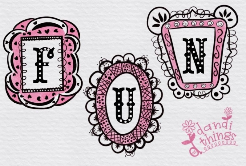
8. Exercise 3: Vintage Frames: And welcome back to
our third exercise. In this one, we'll draw super
fun vintage picture frames. You know, those orn decorative ones with plenty of flourishes
and embellishments. We'll also add one color again this time to fill in some details
of our illustration. I am sticking with
paper, marker, and ink, but you can use
whatever medium you like. Let's start by doing a quick Google search
for some example. You can, of course, update your style guide while
we do this if you want. I'm skipping that step for now because I already
have mine set up. I just want to focus on finding some fresh visual
inspiration here. And I'm searching
for vintage frames. And then I switch over to
Google Images. Here we go. I prefer using Google over
Pinterest for this kind of search because my
Pinterest boards are mostly filled with
artwork I've collected. And while that's great
for other things, it's not ideal here. I want to avoid copying someone else's
illustration style. So I look for photos instead. That way, it's easier to make
the idea completely my own. Alright, let's see
what we've got here. This is a very nice example. It has something in the corners. It has something in the
center of each side, and it's a rectangle. This one is also a
very nice example. So it has this embellishment
on top bottom and side. And in between, there's these curved lines,
also very nice. And then we can see
here in the inside, there's another brim or however you might
want to call that, and it has tiny little dots. I don't know if you
can see it on camera. It has dots here, so also a pattern. Oh, I find this really
fancy here with this shape. Very interesting. And I also
like this kind of wavy, whatever, frilly
outside of this one. You see a lot of
really fancy shapes. Like, for example,
oh, this one here, you see those curvy fun lines that is neither rectangle
nor circle oval or whatever, but it looks just gorgeous. And I also like this
bow tie up here. Alright, I don't want
us to go too deep down this rabbit hole.
You get the idea. So feel free to browse
as long as you like. But for now, let's get
back to our illustration. If you get stuck along the way on how to
decorate your frames, just refer back to
your style guide. I'll keep mine to
the side, though, mostly because my
desk is really tiny. So let's begin with a
quick thumbnail sketch to plan how we want to
arrange our frames. I'm going to use my fine
liner just to save up on ink. So of course, we want
to mix up our shapes a bit to make the illustration
as interesting as possible. So let's see. I think here, I'll go
with an oval frame. And over here maybe a
horizontal rectangle like this. Then perhaps an upright
rectangle right here. And maybe how about Oh, how about we go totally wild and draw some fancy one
like this here. With all these kind
of fun curves. All right, a bit wonky, but this is just our thumbnail. No worries about that. Okay. So let's see how do
we want to decorate them? What's very important for
sure is that the frames themselves will get a pass
partout kind of thing inside. And this is the frame. And then we will have
something up here. And maybe some decoration in here in the frame throughout. Yeah. We don't need more
right now. So let's see. I want to add some
flourishes here in the corner like this. And let's turn around
our thing. It's easier. Like this maybe. Whoops,
maybe. Let's see. And then we're going to
add something like this here, there, and there. And then, look, we're going to draw those curved lines here. Yeah, this looks gorgeous. Alright, then here is the frame itself and a pass part inside. And maybe here we gonna add
another line set like this. Okay. That looks great. Um, in our next one, I guess. How about we start with
cool flourishes here. Oops. The other way around. Oh, I really struggle
with the direction in which they have to to
look at. That's so funny. Alright, here and here and here, and Oops, um, here. All right. And then we can
have the frame go like this. Oh, no, that's not gonna work. No, this is not gonna work. Um, how about? How about? Oh, we give it a little bit a little something
in the corner. How about this? Oh,
yes, I like that. This is cool. And maybe
we just go on here with, let's see, another line here and there and here and there. And we just go on
with our flourishes here like this and like this. And like this, we will
make this later on. We make this smaller, and we just have this kind of flourish situation
within the wood here. And then we have like a
little bit of another one. And maybe some sort of fringe. Is that even a word? Maybe something like this. Here, around. Yes, that's plenty, and don't
forget the passp inside. Alrighty. Okay. The last one. I feel that this one needs
a lot of flourishes. First of all, let's go.
Straw the frame itself. So then let me see. I want to have this. I want to have one here and one here, one here, and maybe
some along here. And then how about this and this and this here and something
kind of like this there. And then we'll just
add some circles here in the frame, right? Okay. That looks gorgeous. I like that a lot. Okay, and that's enough for our thumbnail. It's just clear. What I want to do
is I want to give the wood of the frames
the yellow color. So let's see. So this
is gonna be yellow. And this is gonna be yellow. And this here as well. And this as well. The embellishment, I think, can just stay black. So then I guess, let's see, we need to put some
people into the frames. Alright, here, let's do. Let's put Aunt
Agatha in this one, and she has a yellow blouse. And then how about
Uncle Archibald? Let's see. Let's go with
Uncle Archibald and his hair. His hair is yellow, and maybe he's wearing
a bow tie in yellow. I think in this one,
we would just put something like a landscape scene and there's the
sun being yellow. And what about the last one? Oh, the last one, we're just going to put some sunflowers. Of course, they have a bigger center and just like
this and then some leaves. So here's gonna
be our mountains, and some trees and some
more bushes over there. Yep. And here we have some leaves also and Uncle. What did we name him, Archibald? Yes. So here's his
eyes, here's his mouth. And I guess he's wearing
like, of course, he's wearing a white
shirt over a black suit. Yes, great. And aunt or
aunt Agatha, let's see. She has a very for sure, she has fringes here
along her blouse. And she has a pearl necklace, and she has this kind of curly adu and just two eyes, and nose and her mouth, yes. And I think I think
Aunt no uncle, Uncle Archibald, he needs
this kind of monocal thing. Let's just put it like this. Oh, so fun. Okay. And that's
our illustration mapped out. Let's take our actual paper now and start with
colored frame shapes. So let me put my
thumbnail over here. And then I'm gonna
take my marker. And I want to lay my
oval somewhere here. The horizontal
rectangle kind of here. And the upright one we put Oops. The upright one we put here. And then our fancy curved one here. Great. We could add many more, but that's okay for this lesson. Um, how about? We said, we want to give it
some loops up here. And I don't really need to stay outside of the
line of the shape, I can also go inside or
leave some white space. Okay, now let's decorate the inside of the frame
with just some lines. Let's move on to this one here. Okay, what did we say? We said, It's gonna get something
in the corners like this. All right. Okay.
I think I want to add a second line in here. And then, of course,
the past part too. So, here, what do we have here? Let's see. We have the
wooden frame here. Problem. I need to turn around
my paper all the time. Otherwise, I'm gonna get con
No, here we here we are. No. What What's
the direction? Ah. See, that's I don't know. It's really hard for me to
mirror, but that's okay. Gosh, that's so okay. No one will notice that. This okay. So and then we said,
we're gonna give it a little something here. Yes. And I guess that's enough
for this one. All right. Let's go with a very lucious
one here, the last one. Oh, boy, I really
love that. So fun. And then, I think,
since this has a very, very weird shape,
I'm just giving it like an oval pass part thing. I guess this also
needs a pass part. And then I think I might switch up the sunflowers
and put them in here. And the mountains, because
they're kind of high, I will put them here
in this more slant in this narrower picture frame. Okay, so let's grab a marker again and start with
the colored details. So let's make sure we put
the sun in this one here, since this is the
mountain scene. And then we have the
sunflowers here. And then Uncle Archibald And aunt Agatha with her
blouse. That's so fun. I know you can hear it. I have a lot of fun here. So let's see. I guess I should not
start on the left, though, because then I'm
gonna smudge my ink. Let's just make sure
it's completely dry. Looks like it is.
Alright. Let's start with Aunt Agatha on
the right again. Tada Aunt Agatha is done. Oh, I love her. She looks so fun. Okay, let's move on. So here, Uncle Archibald. Oh That is Uncle Archibald. Done. Alright, let's move on. Here we have our sunflowers. Here we go. Alright.
And the last one is going to be our mountains. So our four frames and paintings
and pictures are done, and I find them gorgeous. I really love them. And you can tell I had such
a great time drawing this. I could easily keep going
and make even more frames. But I want to show you a few more ways to
play with color. So let's move on to
the next lesson. There we'll experiment with a color background and negative
space. I see you there.
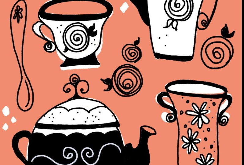
9. Exercise 4: Coffee Set Thumbnail: And here we are with
our fourth exercise. And this time,
we're going to draw a mid-century tea
and coffee set. Well, just a few items
spread across the canvas. In this one, I want to
show you how you can work with negative space
in your illustration. I'll be working in
Procreate again, but as always, you draw wherever you feel
the most comfortable. I have my iPad in split screen mode again
because I want to research shapes of pots and cups and map out my
thumbnail at the same time. We'll keep the illustration simple because working
without a detailed sketch, while focusing on
negative space, can feel a little
bit intimidating. But don't worry. No
one is judging you. This is just a great exercise to sharpen your
visual imagination. And always remember
we're practicing here. It's not about the outcome. It's not about perfection. It's about gaining
confidence, having fun, being bold and brave and also remembering that mistakes
don't define your value. And with that said, I'll start my research for mid-century
tea and coffee sets. And again, move over to images. And here we see a lot of
cute examples already. Oh, my God, how adorable. You need to know, my mom had a real passion for
beautiful China, and growing up, I learned the differences between
coffee and tea cups and pots. We had a huge collection
of sugar spoons and tongs, and, of course, an impressive
number of different sets. Just in case you
were wondering what make me think of
this as our motif. So, but let's see now
what Google shows us. I love that. Already,
this is adorable, and I really like this
pattern here and the shape. And in case you don't know, my mom told me a long and
slender pot is for coffee, whereas a smaller and more
rounded pot is for tea. Now you know too. So some
random, uninteresting facts. However, let's go on, well, this is adorable too. I think I want to go with this shape for my
coffee pot, let's see. I want to have the sketcher
again and I'm on black. So I want the pot to be
really long and slender, maybe more towards down here. I also want to have some, sorry, I love flourishes, even though it might not
be too mid-century. I want to add a
flourished handle here, and then we have the thing to pour out the
coffee like this. And then I want to exaggerate the shape of the top of the lid, and this is going
to be the knob. Then I'm just going to draw this pattern as the
pattern for the pot. So here we have a coffee pot. That means we would
also need a teapot, and that's going to
be maybe down here. It's a bit more rounded. Maybe it has a flat bottom, and it has this kind of I
don't know how it's called, but it has since it's
one service or one set, since it's one service, it has the same shape of the lid here and also the same
pattern like this. That's super simple.
That's something we can easily portrait later on
in our main illustration. Let's go and find more bigger shapes because they will appear like really obvious
and they fill the canvas. So afterwards, we can spread the smaller items a
little bit easier. So I guess I want to go
with a plate right here, just around cake plate. And it has the same pattern
here all along the brim. So what else do we
need? For sure, we need a coffee, a coffee cup. This, for example, is more
of a coffee cup as it is slender and
higher. So let's see. I'm going to put that here. But I want to give it a
little bit of a foot as well. And I also want to
have this flourished. You know, artists choice. Let's add a sugar pot, maybe down here and it maybe gets this kind of shape
and also a little foot. I guess I want to add a little foot to the
coffee pot as well. And then it has the same lid here with this kind
of knob at the top. Of course, it has the
same the same pattern, and I guess this one
gets two handles. Whoops, like this, maybe. Ah, how cute. I like it. Alright. And then, next, what else do we need? We need a teapot. I guess I want this to
be more more rounded. And also, with a
florished handle, I just don't want
all the handles. Oh, we forgot the
handle here like this. Just don't want the handles
all to be in one side. So let's put this here. And I think I'm going
to erase this one. And I'm gonna make this
a little bit bigger. And then I'm going to add Oops. The handle to this side. And I guess I want to put
the teapot somewhere else as well because it looks a little
bit too crowded down here. So let's go for this here, and I guess the sugar thingy should be a little bit bigger. Okay. And then I guess we need
we need a milk jug thingy. So let's see. Let's see. Let's see we go this way. And since this is a
very plain shape, we're gonna be plain
as well and add this kind of pouring thing, but the same lit because
it's all one service. Alright. And probably
another handle. Now we are to crowd it up here. So let's move this a
little bit and make it maybe a little bit
smaller like that. Maybe the teapot is also
a little bit too big. Maybe like that. That's better. And we can also move
the plate around. So as long as you guys
are in your sketch, or some nail, you can
do whatever you want. Move it around,
erase, start new. That's no problem at all until you are happy
with the outcome. Alright. And then up here, we still have,
like, a free space. And here, I guess I want to
add I want to add a spoon. So let's go like this, maybe. And then something down here
with a little pattern here. And, of course, oh, I think the spoon is huge. Let's make it a little
bit smaller. Okay. That's a good size. And
now I guess I want to put the fork the other
direction just like this, just to create more interest. And here we have a nice fork
with something down here. Yes, and this looks like a very, very nice layout already. I guess I want to I'm not
very happy with this one. I think it's too big and
too close to the edge. Alright, we can close Google. Let's think about how we want to place the negative space. Some items I want to keep white and without a outline later
on. That's very important. If you have a white shape, this is not going
to get an outline. So for that, we
should be able to tell the shape more
or less, yeah. And also, I also
changed my mind. I guess I want to
add a little bit of a wonky perspective to
the openings of my cups. And that's because we
want to work with black. The negative space means white and the background color
we are going to use. And by only having white spaces and some
black thin lines, it would look quite boring. So that's why I want to
spread out some black areas. And I guess I'm
going to do it here as well with our teapot. By creating a little bit of a dimension here
with the opening, but it can be really
don't worry about it. It can be really wonky. It doesn't need to be
the proper real shape. All right. Like this, maybe. And then the lid goes
down here and we see some black and the
knobs here up there. They got to be black as well. And maybe we could
even turn that black. We'll see. We'll see how
that looks later on. Okay, I think what I want
is this cup to be white. The plate to be white, the teapot, and the coffee pot. And the rest is going to be just filled with
a background color. So let's indicate that. I think this time we're
going to go with pink. Let's add a layer underneath
and go to our marker. And now you will
understand why drawing with negative space can feel
a little bit intimidating. It's because you need
to be able to tell the exact shape of something because you don't
draw an outline. If I would just go like this, like I would usually do, then it would be hard to tell that this is a
teapot due to the, you know, irregular shapes. However, I still have
a tool in my toolbox for keeping the outlines
crisp without a sketch. So keep that in
mind for later on, we will talk about
that once more. Let's go back to this
layer and start over new. So I'm going to try to kind
of just roughly tell me later on that I remember that this is going
to be negative space. This is going to be filled. This is going to be
negative space again, but not the handle. The handle is just going
to be on top of pink. Alright, let's see. Here,
negative space, negative space. I think the plate can
be negative, as well. This would be an easy shape. And let's go here. And I guess up there, the cup is going to be negative space. So white like this. And the rest is just
going to be covered. That's great. Alright. And now you see those black accents really
make a difference. Okay, I'm happy with my
thumbnail right now. Now let's move on to the
next lesson where we turn this into our final illustration.
I'll see you there.
10. Exercise 4: Coffee Set Illustration: Okay, I'm happy with my
thumbnail right now, and I'm going to take
a picture again, so I'm going to share
it in my camera role. And then I will
start a new canvas. Let's go back, start new. Let's use the same
dimensions. All right. And let's refer
back to our sketch. Go to the wrench tool,
Canvas and reference. And now we pick the
image. All right. Let's move the whole thing to the side and Can we
make it a bit smaller? Let's try laying down the color first and
don't be scared. We can fix something
that we've messed up, but also feel free to draw with pencil on a separate layer
that makes it easier for you. But because I'm so stubborn, I want to try it without. So let's go ahead and mark
the outline of my coffee pot. So it's gonna be here
and it's gonna have this thing here. And that. That's my coffee pot. And here's gonna be my teapot. And then here we have the plate. And here we have the teacup. Alright. And the rest
can just be pink. All right. And now we're
ready for our line work. So let's pick black
as our color. And maybe this time I'm going to go with my MCM nice liner. So first of all, I see
this looks kind of a bit messy here and it's hard to tell what
it's going to be. Let's see if it gets better by adding the
lines for the lid. Like this and our pattern and giving the foot
here also some black. It is much better, although I still don't like this
kind of situation here, but we can fix that. And this is something that
you could even do on paper by just using your gel pen that has the same
color as your paper. So you just take your
white and you just go over this weird area a
little bit to make it a little bit more even and easier to
understand what we see. Boom, done. Looks so
much better already. And I think I want to go
and do the same here, maybe a little bit
of cleaning up So, right, let's go
back to black here, and I think I want to make
this a little bit wider. And then I need to clean up a little bit more
of the pink here. And then we can really
tell what we see. Alright. And now
let's move on to our coffee pot. So let's see. Um, we create this. Oops, we're still at white, so let's go back to black. Alright, we'll creing
this kind of oval shape. Like this kind of the same
size, kind of the same size. Alright, and then we're
gonna draw our pattern. And I really like that. And a little foot down
here. That's what we said. Just to create more
different colored areas here. Alright. I think we need to clean
up a little bit, too. So let's go back to our white. Amazing. Now we can
totally tell what we see. I think with a plate,
it's totally fine. So we go on with our plate. And here we have our
wonderful wonky teacup. And I think I want to clean up this weird thinking,
No, not erasing. Just pick white and
just go along here. Just this spot here. All right. Perfect. And
oh, it needs a handle. It needs a handle.
Did we draw handles? No, we did not draw
handles yet, so let's go. Let's go and do
our handles here. So I want to start with a big flourish and
end with a small one. And here we're going
to do it a little bit longer like this. Tata and here we have
again, like this. Okay. Oh, that looks
so cool. I love it. And now let's move on to
our two hour milk jug. It gets around opening as well. And, of course, the
top lid situ Oops. No, no, no, no, no. Okay? This is a little
bit thicker. Who cares? We make mistakes. Like this. And it also has a handle. Maybe just a small one here and the pattern
that cannot be missed. And here we have our sugar. Pot with a tiny little
foot down here as well. And pattern and the lit. And again, the knob up here. And I decided differently. I don't want to give it handles because there's
not enough space, but I'm just going to
put a spoon in there. Boom, done. And I think I think our lids should
have a little line here. And then we need
another cup here. Okay. And here, you're
going to fill in. Maybe it doesn't
have to be maybe it doesn't have to be straight. Look, how about? How about? How about
we gonna go like this? A spoon goes here. Like this. And here with the pattern and maybe another the fork maybe the fork
is just down here. Ta da. Oh, wonderful. That looks amazing. I really like that. So let's see did we add all the
details we wanted to do? I think we did. And I think that's something I
would do on paper, as well. I think I would add some
I think I would add some sugar cubes to just fill some areas which
seem to be a little bit empty by just adding, you know, just a cube like this. Uh, I love it. I really do. Oh, wait. We forgot the we
forgot the here. Do you see that? How
can you pour the milk? You cannot pour the milk here. Now you can pour the milk. Here we go. Alright, I really love how this
has turned out. The lack of too many details
keeps it fresh and light. And those white areas without any outline work just
beautifully here. They give the whole piece
such a mid-century feel. It's just a great
reminder, you know, that you don't have to
fill every inch with lines or color for
it to feel complete. Sometimes the empty spaces
do the heavy lifting. And now let's move on to our next exercise
where we'll have just as much fun drawing vintage doors. I'll
see you there.
11. Exercise 5: Vintage Doors Thumbnail: Welcome back to our
final exercise. This time, we're going
to draw vintage doors. It's a perfect
opportunity to practice our wonky lines and play a
little bit with composition, especially when it comes
to placing colors, since we'll be using more
than one in this exercise. I'll draw my final
illustration on paper, but I'll use my iPad to
create the thumbnail first so I can gather some inspiration from Google images
at the same time. You just go with whatever
works best for you now. So I've opened my
split view again. On the left, I have a
canvas in Procreate, and on the right, I have
Google ready to search. This illustration will
be in a portrait format, so that's why I opened
this canvas like this, and I'm going to just
grab my Apple pencil, and then I will type in vintage doors and
see what we get. Let's move over to images. And here we start
right away with some very, very cool examples. I think I want to illustrate
six different ones in two rows of each
three different doors. And of course, we want to switch up door
shapes and patterns. So we will look for the
overall door shape, whether it's rectangle
or round or just curved. And we will also pick different patterns like
windows or panels, and maybe even this
wrought iron decoration. Let's start with a
rectangle door here. Then maybe one that's really rounded at the top,
like this here. Then let's go for
another rectangle, but maybe this has kind of
22 really narrow doors. And down here, let's see. O with a slight curve
at the top only. Let's see, there's
a whole collection. More like this, maybe
a little bit rounded, but not like a crescent
shape. Let's see. Let's put that here. This, maybe another rectangle, just regular plane
one in the center. How about maybe we
do differently? How about we put the one with
a slight curve over here, a plain rectangle in the center, and maybe another two
door 12 door thing here, so we don't have the
direct repetition below each other like this. So here I definitely want
to have this kind of shape. So here with this kind
of lines in the window. And I think I definitely want to have
these kind of panels in there and maybe maybe a double one like this and
with these kind of lines. Can you see that? Lines towards the outside, just like this. And again, this is just a map. It doesn't really matter. Wait, what are we doing
the Maybe on the bottom, we'll get like a really
big one like this. The same pattern. And here
we have like, what is it? A ladder adder slot, I guess, that's how you call it. And maybe here we have this
knocking ring situation. And it needs a knob. Alright. So this door is done. Okay. Alright. Let's go for
this plain one. I think. I think I like this one where there's so many different
panels in this one. So let's just go ahead and
draw a lot of panels in here. Like this. And I guess
it needs a frame, another one. Maybe like so. And here again, here
again, here again. Here again, and number five. And then, let's see, where
do we at the door knob? Mm. I think the knob is here, and then we have a little
keyhole down here. And I think I want to add a
second here in the center. And then I want
to have it like a raised like looking like a
raised panel, maybe like this. And then it gets this
kind of cross here. Just like this. Oh, that's fine. I like that. What kind of
door are we giving this one? I think should we just go with something
like this, very plain. So let's add two
big panels here. And then we have
two of those rings. They look really
cool. I like them. And we should not forget, like the kind of I don't know how this is called the
bottom part of the door. You see? It's
usually a little bit longer than the brim up here. So let's add that as well. Maybe like this, just a
little extra one extra box. Could be the doorstep, could also be just the
bottom of the door. Alright. And maybe how about we're just adding like a letter slot in
this one side here. And then the other side gets a knob or keyhole,
whatever you want. So, here we have this door
that's just a little bit rounded and not a full
crescent or half circle. And I guess I want this to
have a whole lot of pattern. I think I want to go
with this kind of thing. Oh, yes, I like that. Like this. So there
could be there could be this panel here with a
window here in the center, and maybe even maybe this
also has this pattern. A, here we have a big panel, just a wooden panel. Maybe it's raised like this. And then here we
have this kind of longer and handle
thingy going on. Here we put the ladder
slot, and here, don't forget the
bottom or the step. Okay, so this is going to be
a window. Let me mark that. And this is going
to be a window. And now I need to check. If we have enough
windows up there, there's another window, yes. Okay. And I think in my illustration, I will continue to color
the windows black and then draw my highlights or the patterned linework in
white, just like this. This is just another way of
illustrating in that style, just for you to get another idea and another tool
for your toolbox. Alright. So, let's go. Let's go with this one. I think I want something like, really I don't know. Wrought iron. Um, I don't know. Flourished, decorated,
embellished one. So let's see. Let's
see. I guess. Okay, let's see. I
guess we have a lot of panels maybe up here. And then, no, I changed my mind because here
we have a window, and I think this is
gonna get more windows. And then we'll add, how about a big panel down here is the
bottom of our door. How about Oh, I like this one. This looks really
cool. Let's see. I think I'm going to
use this for that, and this one stays just wood. And maybe like this. And then maybe we have the
same big panel down here. So maybe we just do
let's erase that. We'll just do two longer panels down there. How about that? How does that look? Like this and like this. Yes, I like that. And maybe we could just add some wooden carvings
in here like this. How do we like that?
Oh, that's cool. Blop and blop. Just squiggles right now, maybe even later on. Yes, I like that.
That's carvings. That's also really cool. And how about we put the letter slot the
letter slot upright. And just a door knob in the center and maybe
a keyhole here. Yes, I like that. That's great. And I guess I want to go
with this pattern here. Can we see that? Like this? I guess I want to
have how do we do it? Let's see. We will have
just some carvings up here. Like this. Very simple. Then we have
two windows, like this. And then we have two
panels down here. And the bottom of the door, but that also gets Let's see. Is it a slab or is it
the bottom whizzing. Doesn't really matter right now. Okay, so here we have whoops. Here we want to color that in black because that's a window. That's the carving. So
I leave that in white. No, that's not a window. This is a window. Okay. And
then we just at the circle. In here. Now, that doesn't
really look right. That doesn't look
right. Let's see. How about the shape
is wrong? Let's see. Let's do it again.
How about we just add the dark windows in round and the rest gets the
color. Let's see. So a round window. And down there, the other
shape to make it rectangular. Just like this. That
looks kind of cool. Like this. Exactly. Yeah. And then this one gets
another panel singing, and then whatever pattern
carved in here like this. And then we have this kind
of longer situation here. And here, I guess I really
want to add some I don't know. So decoration. Just some flourishes like this. Oh, yes, I like
that. That's cool. And maybe maybe here, two lines. And then, you know, this kind of embellishment. I don't even look at
Google anymore because I get so many ideas
once I just started. So let's see what
we've got here. Yes, that looks amazing. The lines are wonky, but even though even as it is right now, like, really
scribbled and wonky, I absolutely love
how this looks like. So let's just add
quickly a layer below. And then we'll check and
see how we want to color. Since orange is the
most popping one, I guess I want to
start with that. And I guess I want this
door to be orange. And maybe also this one like
this. And then let's see. Then I think I want to go
with my turquoise here. I think the bottom does not get the
turquoise because this looks like a doorstep and
the same here, I guess. So whoops. Let's go here
and draw this turquoise, as well. Oh, boy. It gets this mid-century
feel right away. I don't know. I am so
in love with that. Okay. And I guess yellow. For this one, I really want
to use all the colors. We've picked for this class. I still haven't
decided, is it a step or is it part of the door? I guess here it is
part of the door. Let's see. And this one, what's left pink this one. This door will get pink. Don't you want a pink door, too? I would love to
have a pink door. Oh, yes. I really like that. So, right. That was the mapping out
of our illustration. Now let's move on to the
next lesson where we turn this into our final illustration.
I'll see you there.
12. Exercise 5: Vintage Doors Illustration: Alright. Now we have our six different doors mapped out with color and
embellishment. Now, let's just start with
our final illustration. And since I have my
thumbnail on my iPad, I'm just going to
put that aside. That I can still see it, but you probably won't because it's out of the camera angle. Okay, I'm again using an
A four piece of paper. This time, I want to use
it in portrait mode. And as you saw on
the iPad already, I'm going to go
with four colors. These four. And I've
added a black this time, but I don't ruin my fountain pen and my fine liners, either. Then I have my white gel pen, and I have a fountain
pen for the linework. This is what I'm going
to use for the linework. Since we have mapped out
our doors with the colors, I want to start with my markers and putting out the
colors for our doors. I'm just seeing on the thumbnail both turquoise doors
have two wing doors, and I actually don't
really like that. So I wonder how it
looks like if I switch pink and turquoise
in my final illustration. So I'm going to go for that. So that means the top right door is going to be turquoise, and I'm just roughly
drawing my rectangle, not really caring
about how I fill it, how it looks wonky or not. That's just how I
want to draw that. And the center, bottom door
thing is also in turquoise. That's what we just decided. Okay. Next color, let
me go for yellow. And this one has
this rounded top. So this is how I
want to color it. And again, you go
with the colors or medium you really like. What works best for you, this is what works for me. Okay, that's the orange door. And the other orange
door down here, this has this curved
top like this. And again, I draw, like, really wonky,
don't pay attention. And the last door here
is going to get a little bit wider because it has two wings. Is
that how you say it? Two wings. And I will
call that pig again. And again, I don't
really pay attention. I think this style just lives from the wonkiness
even in coloring. Okay. Now onto the
night workork. Let's grab the fountain pen, and we start with the
right one, which, first of all, has a
step on the bottom. Like this. I'm still thinking, pondering whether or not I want
to give them a outline, but I think I do
because I want to have not only the door itself, but also a slide frame just makes it easier
to distinguish. Then this door is to
part door like this. And it has two long panels here. And I really, really, really don't pay much attention
to how I draw my line. I just let them happen. Like this, like
this and like that. Okay. So here we have a
tiny keyhole singing. Here is our ladders
slot like this. And here we have
the I don't know, how do you call them
knocking rings? I don't know. This one gets, like, a little
something down there. Ah, cool. Let's move
on to the next one. So here we have No step, but the door itself like this. And here we have this
half circle window. And this is what I'm gonna
color in black later on. Let's just continue right
now with more panels. So here I said I'm going to have two narrow ones and
one big one down here. And I will draw the white lines later once the black is dry. The next one, let's go
on with the orange one. This one is just a door. I really like that the color
peaks over here at the top, whereas here are some spot
where there's no color. This makes it so lively, in my opinion. I
really like that. Okay, now we get a wooden door, a completely wooden door. It is important for you and for this style that you really
draw confident lines. It doesn't matter if
they get wonky or you miss the end and
don't hit it perfectly. That doesn't matter as
long as your lines are, like, really brave and bold. And onto our last door. So this one is gonna get a
doorstep down here again. Okay. And we said, we want to give it a little bit of white as well. So in this window, I'm going to start with this crescent thing and then
some rays moving outwards. This is a typical
door window pattern. And here, we're going
to have this kind of diamond pattern as well as here. Do And here we said we want to have
just some flourishes like this, like that. And here. Oh, man, I like that. And on the bottom, as well, like this. And then here we have two lines. It's basically the pattern from up there, continuing down there. And then we just
have this kind of thing and this kind of thing. Oh, very, very ornate
here. Oh, my God. And here we go.
That's our six doors. Let's just take a step back and look at the whole illustration. Even though the shapes
and lines might be wonky, I think the composition
just works. And as you can
see, the fun comes from daring to be wonky and make mistakes and then discovering unexpected details you might
love throughout the process. So I really hope you continue
to experiment drawing freely and bravely and
don't worry about mistakes. And that wraps up the last
exercise in this class. For all procreate users. Just join me in the next lesson where I'll show you how to add paper texture to your digital artwork.
I see you there.
13. Final Touches: I promised I showed
you my technique for touching up illustrations
in Procreate. We've done an amazing job
drawing loose and wonky, and maybe our illustration
turned out so well that we really want to use it in our portfolio or just
share it on our socials. But there are a few details
we're not happy about, which we want to refine before presenting our
work to the world. This process is
absolutely legit. Pretty much every artist does
these final refinements. It's also a perfect
way to digitalize your illustrations that were
originally made on paper. Our first step is, of course, open your artwork in Procreate. This could be a welded photo
or a scan of your drawing. I'm just going to work with my Procreate coffee
set illustration I made earlier in class. Looking at it, I want to
make some minor amendments. First of all, I'm bothered by some dark areas here where
my marker brush overlapped. I can fix that by carefully smudging with my markup
brush. Let me show you. I'm just going to open my
smudge tool here and make sure I'm on the right
brush. All right. Next, I want to select my layer. Since I want to keep my
white areas nice and crisp, I want to make sure I'm not going to damage
them with smudging. And by selecting my layer, just tapping it and tap select, I can only make some
amendments here, but not in the white area. So I want to just get rid of these obvious kind of
weird, darker spots here. Yeah, that's much better. I would go all around
my illustration to fix these kind of weird
overlapping areas here, but there's something else
I really would like to fix, and that's the outer edge here. So let me turn off
the selection. And now I'm just going to erase. I want to make sure I'm
erasing with my fountain pen. So I'm just going to
tap and hold my eraser, and this is going to
use the same brush. Alright. And I
want to get rid of these weird bumps
here and there. I don't need to be too straight. I just don't like these
kind of bumps here. What look really cool is if
the handle would go beyond. So let's see if I
can just redraw. Awesome. Great. Great. Now, let's see if we can move the entire layer a little
bit towards the center. Let's see. Snapping is enabled. So U. Make sure we have both
golden lines here appearing. That means it's
perfectly center. Great. And in my next step, I want to show you how you
can get rid of this kind of flat appearance some
digital illustrations really have and to make
it more paper like. So if you have watched my
other mid-century classes, you know the trick already. I am going to use brushes to make my canvas look
more like paper. So I would add another layer. And I would change to
the stipples brush here, and then I would just apply
some darker spots here. This is what I just applied, those kind of I don't
know, tiny little flakes. The paper back then
in the 50s and 60s wasn't as bleached and as
white as it is nowadays. There were always some kind
of imperfection in it, and this is what we can just
easily show with this brush. It's just a little bit too
harsh for my taste right now. So I would just go and
play with the opacity. But I would also
change the blend mode, the blend mode to multiply
so that it works together with the colors in the
background and that makes it very subtle but
still visible. Let me zoom in a little
bit to show it to you. Here you can see it's subtle. It's there, but it just
doesn't jump into your eyes. In my next step, I would
also add some paper texture. How you going to do
that, it's super simple. I would add even another layer. And here, I will turn the
blend mode to linear burn. I just think this gives
the better results. Feel free to play with the blend modes as much as you want. On this layer, I want to
add my paper texture and I do have the CransonPaper
texture brush in here. Now, we could go ahead and use black it would be very
obvious and very strong. However, if I zoom in, I really don't like
that look, especially. It reminds me too much
of these 90s wallpapers. So I don't like that. Instead, let's undo. Instead, I'm going to
switch to my beige color. This color is also integrated
in the color palette. And by adding this in beige, you get, like, really
subtle texture. And the beige tone doesn't alter the color used in the
illustration below, either. So that's a win. And
I really like this. You see a little bit, a subtle amount of texture, and it takes away the
flatness completely. And that's it. You can take as much time as
you want to refine your illustration
and don't forget to sign your artwork before
sharing it with the world. And now join me in the final lesson to
wrap up this class.
14. Final Thoughts: And here we are at the
end of this class. Thank you so much for
staying here with me today. By now, you've
learned a lot about the wonky mid-century
illustration style and all its characteristics. You've also learned to
let loose and how freeing it feels to draw without the
fear of making mistakes. I hope you've embraced a
few happy little accidents. Remember, this is
just the beginning. Keep experimenting, keep
playing with shapes, colors, and won key lines and don't forget to share your projects
in the project gallery. It's a wonderful
way to celebrate your work and to see what
other students have created. Leave comments,
cheer each other on, and be part of the supportive
creative community. If you have a
moment, please leave a review as it helps more
students discover this class. Follow me here and
on social media. And when you post your artwork, feel free to tag me. I love to see my students work and
feature it in my stories. So thank you so much
for joining me today. I can't wait to see
what you create. And then I'll see you
in my next class. Bye.