Transcripts
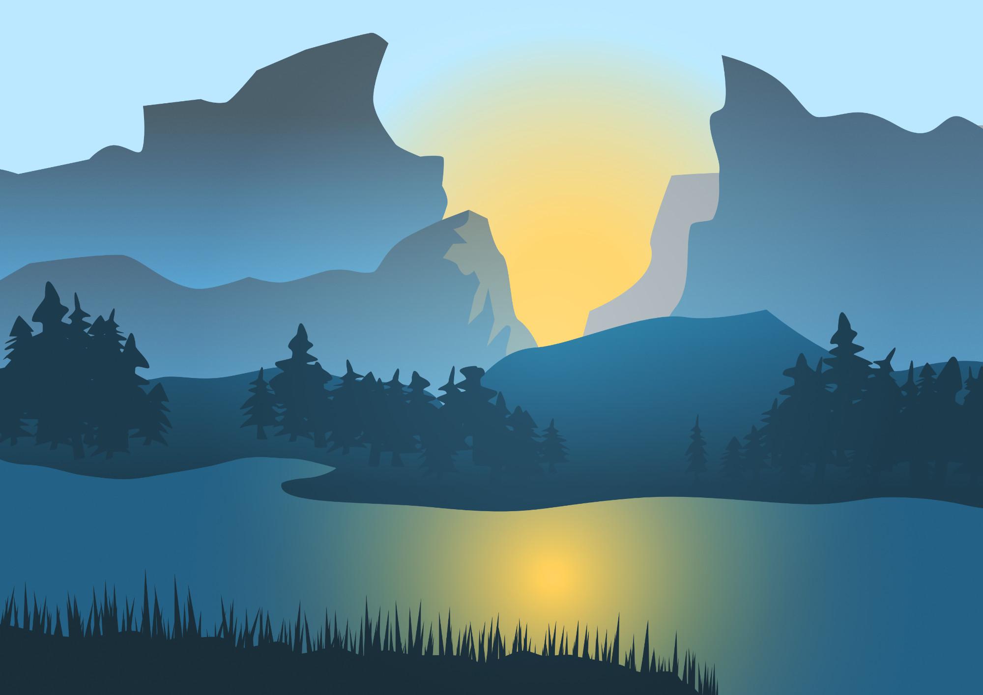
1. Intro: Hello. My name is Mark. In this short class, we're going to create this
vector landscape from scratch. We are not going to trace
any existing photo, we're just going to grab a pencil tool and doodle
a few shapes here and there and turn it into a very
simple vector illustration. This is a perfect project
for totally beginners. This can be even your
very first project in Affinity designer. I'm going to limit myself
to just few tools. Pencil to note two, shape two, and that's really it. We are going to avoid hard to
use tools like a pen tool, right, there'll
be no pen tool in this tutorial, simple tools, put together, add few
colors, rearrange, and we are done with the very first vector landscape
in around 30 minutes. All right, please join me
and let's get started.
2. Create a New Document: Let's start by
creating new document. As you can see here, I select the default preset
for A for paper, but I modify margins. I don't want any
margins in this one, so I switch this off. I did not set up any bleeds as I'm not sure I'm going
to print this out ever. That's why I also stick
with GB cool mode for now. Let's create here
at the bottom right and you will see your Adboard
your paper, you could say. Don't worry about the
stuff that going to pop up a bit outside. It will be trimmed by default. We don't need to try to make it exactly as it is in the
Adboard whatever pops outside this page will
be trim while we are exporting a final
image. Alright. What I like to do is
I like to look at some photos first to kind of inspire myself before
making a vector landscape. Don't get me wrong. I
don't plan to stick a reference layer here and just trace what someone else
already captured in nature. No, that's not the goal here. I still want to create
my own original image, but I think it's
not a bad idea to, like, spend a moment
before you start, maybe find three
interesting images so you can set up kind of the
mood for your own picture. And here are my three images
that caught my attention while I was doing my little
inspirational research. As you can see, all of
them feature mountains. Two of them got some trees as well and some body of water. But I want you to focus on how
the layers are structured, because that would
be very important for us as we're
going to turn this into shapes that is kind of stuck on the
top of each other. So look at this one here. It's a photo, but we can kind of see this layer
here of the sky, mountains far away, one
belt of mountains closer, this chain is closer, and then finally we got detail dark mountains close to us with somebody or
something here as well, that kind of attention and we see that this
color always gradually moving towards the sky color being more and more pinkish
and yellow at the very end, interesting graduation of color. This one is very detail, and our goal in vector graphics
here in this landscape, we not to recreate very
detailed photo like that. No, we want to kind of turn this into shapes
that tell the story, send the message, right? So we need to think about
clever way how we can do it. And I really like
this one over here because it's opening
here between those two massive mountains
with sun kind of popping up. And you see those trees far away in the very
beautiful blue color, and then we got those trees
closer to us already green. All right, so that's how
the color will work for us. Items farther away
will be kind of faded into sky
almost. All right. So we took a moment to look
into photos to inspire ourselves as we are
sitting in front of a computer inside the room, I'm guessing not looking at
those mountains right now, so it's good step
to take to just admire those mountains for a
moment before we even start. All right. As I mentioned, I don't want to keep looking
at them working on it. I don't want to start
just copy and paste nature that somebody
already capture. I want to creating
my own unique work, so I'm going to delete
all of that right now. All right, we're going to start
with pencil to over here. Pencil to will simply
help us to draw lines. We can turn on stabilized option and we feel like you're pulling
the card behind your car. Take a look. I'm pulling
something on the line, and that's why this
line is smooth. I think this little line between my cursor and the tool
is a bit too long, so I can make it shorter here. I will go with 20. I will use Auto close feature as I
plan to draw closed shapes, not just lines. All right. Let's get rid of that, and
I will try to draw a kind of massive here on
this left side. Then try to go close to the
beginning of your line. You see, it's snapped. And when I release my mouse, I got my very first shape. I will not need a stroke color around the shape, so
I switch this off. And for now on, I will use
like temporary gray color inside the shape as I don't know exactly what colors
I want to go for yet. Alright I'm going to draw another thing just
in front of it. Again, I go back
to the beginning, this red area and it snaps. This one will be closer to me, so it will be darker. All right. I want to
do something similar here on the right side. Press and hold while
you're drawing, don't release your
mouse until you back to the very beginning until
it snaps like this. That's the way how you
can make a closed shape. All right, I will use this
quick color picker to change the color to this previous
color I choose before. Okay. And I will draw something here in front of
it, as well. Nice. I try to use different shades of gray so I can see my shapes. And then I will probably
have some kind of body of water here that will give us
nice reflection later on. But now I want to
focus on the note two. The note two is this white selection tool
here on the list on the left. The note two will help us to
move or even add new notes. So that's almost like a
cheating in the art class, huh? Even you draw it already. Now you can add new nodes
or move the old one around and reshape your shapes, in our case, our mountains. I can click here, add
a brand new node, and also change how
curvy this area is. This node tool is great. This node tool guarantee
that we will have exactly the effect as we want
as we can always go back. If you got enough time and
patience, we can go back. And reshape those mountains, those shapes into
exactly what we need. I hope you manage to
draw one, two, three, four similar gray shapes
here on the horizon, making some blocks of mountains. Don't need to copy
me one to one. You can just go with the flow as you feel
like it, as you can see, we got this great tool call, no tool to our disposal so we
can always add more notes. We can move them around. If you feel like you don't
need this note anymore, hit delete on your keyboard. It's gone. I can add two more
nodes to replace that one. And if you pull the line
directly without adding node, you can change how curve it is. Okay. I think I will add
a few more notes here, make it a bit rough. Okay. It was a bit
too smooth for me, so why change it?
We got nice setup. We create a new
document and start drawing shades with
the pencil too. Let's continue on
in the next one. We'll add more elements to our little landscape vector art.
3. Use Node Tool: Let's continue on by
adding color for the sky. We just can use
our rectangle tool here on the left.
Draw a rectangle. Let's give it some kind
of pinkish color for now. I plan to do it with this
color if you plan to have your sky yellow or
blue, go with that. All right. And as
you can see now, this rectangle is
a brand new shape, so it's all the way in front. Let's reorder this to the back. Let's reorder this here on the right side in
the layer panel, pull it all the way down below other shapes
and then scale it and then scale it to match with the
size of your arboard. We got some color at the
top of this arbod already. Let's continue with
the bottom part. I want something in
the foreground here. Again, pencil two,
and I think I will have something a little island maybe or something like that, popping out on this side and
again go to the beginning. It's snap, you close
the shape nicely. And this free area here I want this to be
some body of water. Again, I will use rectangle tool just to fill it in
with the color. This time, I will go
some blue temporary, maybe I will change
it later and again, move it at the bottom
here in the layer panel. All right we setting up some basic composition
for our illustration. I still got one
area missing here, so I will need to
grab a pencil to once more and I would need
something to finish up here. I can use the color picker tool. Why the shape is still selected, take at still highlight
is brand new shape. I can use the color
picker to pick the color from another shape
that is already in the picture. Here it is. Okay. If you got two shapes of the same color
overlapping and you want to join them together into one
shape, you can do it as well. Just select both. In my case, I'm going to hold Shift, click on this one and this one, both are selected and I
can click Add at the top, and now they became
just one shape. You see how it's popping
up outside this page? That's fine. As I mentioned at the beginning, it
will be trimmed. As you may notice, my rocks, mountains are rather
rounded everywhere. What if we need a very
sharp turning point? Let's try to add one here. I add the node, and it's
the rounded one again. But I can click
here, sharp node, and I will end up with
a very sharp turn, let me zoom in a bit. I use common plus to zoom in and you can see this
node a sharp one. Now I'm going to inspect my illustration and I will
try to add few sharp nodes. We don't have many because I
use the stabilized pencil, the one that is super
easy to draw with, but we end up with
very curvy shape, so I need to add few
sharp nodes around. When you already
zoom in like that, you can press and hold space bar to drag yourself
around the picture. You don't need to zoom
in and out all the time. Changing this shape
as you can see, I draw it once, but I can still change it as
much as I want. That's the beauty
of the vector art. All right about here. A bit stronger
shape. Extra node. If you want a smooth line, avoid adding multiple nodes. You got one or two
will be enough here. If you want a more
rough detailed line, add more nodes close to each other to give more
texture like feel. Okay. That's nice. I think I will need
one more mountain like shape in the
backdrop, very far away. I will draw it again
with the pencil to here. Go to the very beginning
to close the shape. This way we can fill it
with color. All right. I will pick the
color from the sky, present hold to pick the color, and then I will make it just
a bit darker than the sky. As you can see, I also
need to manage in the layer panel to be sure that it's in the
correct position. Okay. All right, so we got this illusive mountain
somewhere very far away. We are not focusing on it. It's almost same color as the sky indicating it's far from us. We don't
need to worry about. Okay. Not bad. All right, so we push our little
illustration forward. We got several layers now
and we are almost ready to start adding the actual
colors that we want. For now, I've been using kind of temporary colours that are not nicely matched
to each other, but let's start recoloring and adding details
in the next video.
4. Add More Details: This was one of the images
that inspire my artwork. I put it back here
because I plan to use some colors from it. Let me try to click
here on the sky and literally use
the color picket to pick the color
from that image. Press and hold on the
quick color picker and I will pick this
color here from the top. What is cool about this sky in the original image is showing that there this yellow glow here like the sun going
to rise or going down, we don't really know, but
it's give us this mystery, nice reflection on
the water as well. I'm going to do the same
thing using a gradient. Let me hide this image. To hide the layer
temporary just click on this dot and it's hidden now. I'm going to use the gradient
on this sky rectangle. By the way, if you
are confused by many layers in your project, you can double tap on the layer. Type. Custom names for them sky. Okay. Let's grab the
gradient tool on the left. By default, you got solid color. I want a radial gradient coming from here in between those
mountains like that. One color will be this
original one I choose and this one here
should be something yellow like,
something like that. Alright, we got this nice
glow behind mountains. Next, we will make our
mountains all bluish kind of. So I hold shift to select
all of those shapes, and I will give them the
same colour at first. Something like that. And now I will change field
cool photos mountains to be gradients as well, except this one very far away. I don't need this one, so I can click on it again to deselect. Gradient two this time, linear gradient like that
from the top to the bottom. And we want more saturated
blue color this time. Something like this will do. But we need to go now
one by one and try to apply the gradient
way that you can see separate shapes. The gradient is already
there, we just need to reapply it by clicking with the mouse so we can get those kind of separate
shapes out of that. And for this last one, we need to make it
closer to the color of the sky to give this
far away vibe. Okay. We are working vectors, so don't worry about stretching them or
moving stuff around. It's all scalable up and down
without losing any quality. That's a big advantage for us. I think those colors
look way better. Let's look at the
original picture. We will have a bit
of green here, like dark green here and here. We got also forest. We don't want to recreate
that in one to one. We need to decide what
details we want to preserve. Let's try with this
line of trees. How can we draw them easily? I'm grabbing the
pencil tool again, and I will try to sketch
very simple ugly tree. Important part is to go back to the beginning so we
can close the shape. All right? It looked terrible, but don't forget
about the no to. Now I grab the no tool and modify it the
way I want this to. Look. It's need to look a bit chaotic because
it's from nature, so we don't want, like perfect symmetrical
Christmas tree here going on. Feel free to zoom in if you need comment plus always helpful. Again, don't fall
into the trap of making this into
perfect Christmas tree. We need something more
organic, just like that. Now I'm going to make
several copies of this tree, and then I will modify it
and make several copies of that modified version
and then modify it again until I got some kind of
forest going on here. So let's go with pressing command or control on your keyboard
and moving this. When the button is pressed, instead of moving this around, you will make a copy of it. So again, the trick
is to present hold command on
MAC or control on Windows while you try to move the tree so you can
make a copy instead. Feel free to use horizontal flip to make more like
randomized trees. Alright now it's time to make some modification to
it to zoom in again. Grab the node tool and I will make some changes to this tree. Alright, we got another
alternative version of it, and now I can make a
few more copies of it. I think we will need at
least two more versions to create our little forest. Don't forget, try to
add a bit of rotation, scale them up and down. Okay, let's make
another version of it. So I zoom in again. No two. And this new version
will again help us to make more trees around
across this landscape. Here one more flip, scale up and down, rotate. You can have some fun with them. As I mentioned, the most
important part is to not go, like, into much detail
and try to make them, like, super beautiful
Christmas trees. That's because that's not
the style we're aiming for here today. All right. I think just more, one more and we will be good to go with this little forest. Again, copy of this
and now I try to modify it to create alternative version
of this pine tree. The note to is so handy during this part as we can
modify existing shapes, making alternative versions
of them instead of drawing everything from
scratch again and again. Okay, next step is to
now change the color of this land here too much
the color of the trees. I will pick the same color. Okay, now I cannot see my trees. Let's apply the gradient. Just like that from the tree colour to something
just a bit bright. That's more like it. Okay. Now we reach the water here. As you can see, the color
of the water will be not exactly solid because we have reflection from the sun, the sun is yellow here, so we need to have
something like that. The water will be way darker. Okay, something like this, but I need to make a
radio gradient again. I hope you still remember
that one over here, and for the centerfan we will put some kind
of yellow color. Alright, now this
rock here in front, I'll make it a bit lower. And in the color of
this coastal line, just a bit darker than that
because it's closer to us. All right. Take a look. We are ready managed to sketch this little picture
using just pencil tool, no tool, and adding a few
gradients here and there. All right. I hope you are ready
to add even more details, finalize this simple
vector landscape and export us a JPEG that can be printed out
or shared easily. All right, see you
in the next video and we're going to
finish up our picture.
5. Finishing Touches: It's time to add a few
more details here and there and then export
our artwork as a JPEG. Keep in mind, we
don't want to over detail one area of this image. The whole style of it is a flat layer like
vector based landscape. If we now start working with just one aspect of this
image and add more details, textures and stuff like
that, it will look really odd and weird and ruin
the whole picture. The artist to balance this. We want to add a few more
details here and there, but we don't want to turn it
into realistic illustration, especially like half baked one. Let's try our best to add
few more details here and there and then export this
as a nice JPEG or PNG. To do that, I will
zoom in again comment plus all contro
plans on Windows. There are several different
ways of zooming in. I'm sure you already
got your favorite way. Again, no tool and
small adjustments. It's a bit tempting to
introduce the second current for those mountains to give
it more like treed like loop, but I try to not do that, so we can maintain this
in this flat style. Alright, and then we got this chain of mountains
a bit closer to us. We doodle everything
using pencil tool, and I also add stabilize to it. So now I'm kind of picking
some areas that I want to add those sharp notes for more
like sharp lines around. Okay, and our forest. Now we can randomize
it even further. All right, you know what?
I think I will need one more tree design to
make it finishing touches. So let me just make a copy of this and as we did in
the previous video, I'm going to randomize it a bit. I need one extra tree with
a bit wider top like that. Okay. And now let's use that to make this forest
even thicker. All right, this one
needs to be a bit smaller and a bit more detailed
to match the rest of it. Remember, you can just hold
command while dragging existing objects to make
copies very quickly. All right, now I got more irregular structure
of this forest, and also I use some copies to get rid of the lights
between some certain trees. Okay. That's nice.
That's better. I plan to make the actual shape of the sun to a bit
more detail here. It's a bit empty, so
I use the Oval two, as you can see. All right. And now we will need to hide
it behind the mountain. So again, yes let's use
the layer panel for that. Just drag it all the way down. Nice, now we can readjust our gradient feel on
the sky a bit, I think. How strong you want
this? Maybe like that. Okay. The transition between yellow and blue is
always a bit tricky, but I think we got a
really good result here. We could make some additional
glows on those mountains, but as I mentioned,
we must be careful. We don't want to over diesel
just one aspect of this. So let's try to do it and
see how it will look. I'm grabbing pencil to again and draw a random shape
here just like that. Now I will try to pick the color from here and mix
it a bit with the yellow. So maybe all the way
to the sky hot better, and now I will need to make this shape to be
cropped inside another shape. How can we do it? We
call this a child shape. This is this curve here, let's name it rock. Okay. And this one, let's
place it on it directly. Let's search for this layer
called rock and not above, not below, but on
it. Take a look. And this way, this new shape is trimmed inside that
existing shape. I can reduce opacity a
bit to 20%, maybe 25. And we still see the
whole shape is there, which just cannot see
that area that outside. So what we did is a
child layer here. All right, so we got a bit
more detail here like this. Part of this mountain is a bit more brighter because of the sun like enough
ing through it. We need to make it rough to be sure that it look
more like a mountain, not just a piece of paper. That's why using multiple
sharp curves this time. Okay, so it's climbing here, and we see it's not regular
line, it's not smooth. It's like the sun is kind of divided between
different rocks, bumps. All of that. Okay.
That's way nicer, huh? Alright, so we add a bit more
details in this empty area. We add the sun, as the oval, and a bit of glow
on this mountain. Now I want to fix my water. It's way too dark, I think I will literally pick
the color of the sky first. Nice. Make it a bit darker
and then use the gradient, the radio one we did before. From here, and our color
there will be the sun color. More like that. Okay. We got this island close to us
in the very foreground. So what I want to do here, I don't want to put any
trees to obscure the view, I want to put the grass. So I'm going to grab
some simple shape, like, let's say, triangle. So I'm using the
built in shape to. I make triangle in the color of this
little island in front, and I'm going to maybe
duplicate this triangle around until I got more
texture like area here. We could do it with
the duplicates, but I really want
this human touch to it that you need to
move it every time. You need to scale
it up rotation. Just give us this randomness. Okay. This will be
our finishing touch, you can say, a bit of texture edge to this
foreground island. No trees this time, just more like a grasping. Can make it a bit longer. Yeah. So again, the whole
trick gets to hold, command or control, and
then whenever you move it, you make a new copy of it. As I promised, we limit
ourselves to simple tools, shape tool, pencil, no two,
and that was it really. Alright, so this will give
us this nice contrast because everything
is a bit rough. We got the smooth mountains, and in front, you
will get this like hairy almost like
texture of the grass. Okay, just a few
more here and there. Again, we are not doing any
photorealistic stuff today. It's more like artistic
landscape illustration. Everybody can do it.
Just a few tools require, a bit of patience. And then as we know already, there is a no tool for you
to fix any mistake you made. So if you're patient enough, you can do this piece even with zero experience with
computer graphics, with vector R, zero experience
with affinity designer. You can still have your
very first picture today. Okay, almost done. All right, so I add those kind
of grass like shapes, and also I'm going to modify the main shape for
this one, as well. So I will make it a bit less smoother by adding more points, more nodes to it, so we can
This is close to us, right? So we can see more
details on it. It's close to the viewer, it's close to our eyes. The mountains are far away, so they appear smooth. But this island, this violin
is the closest object. So we need to be sure
it's rather Rugh as the nature create
objects that are really not perfectly symmetric, so we want to have some
randomization here. Okay, a few more points. And that would be it, I think. All right, let's zoom out. And here it is our very
simple vector landscape. We got some sun
between two mountains. There's a forest and a bit
of reflection on the water, and we observing this from
other side of this river or lake because we can still see there's land on
this side as well. And you know what? If you don't like it, the best part is, it's all in vectors so we can literally group
this whole thing. Common G or right click
in the layer panel, group switch of the visibility of your group and take a look. It's a bit different
picture now. All right, so here it is. I hope you managed to create
your own image as well. Let's summarize
everything we have learned so far in
the last video.
6. Export and Summary: All right, it's time
to export our artwork. First, I would suggest to save the project file in case you want to make some
changes in the future. Click File, Save and save this as the affinity
designer file for yourself. Then we're going to click Export and save it as the
image that we can share, print, post online,
whatever we like. Let's select PNG. You can see the preview
of your image over here, click Export and we are done. Now we can open this new
image file from the drive. Here it is a little
Vctaillustration, little Vctor landscape that everybody can really do without any experience or prior
knowledge of Vctor arts. I hope this was fun. I hope you managed to finish
your illustration. Please post it in
the project section. Thank you for today. See you in the next class.
 Mark Krukowski, Kru Mark Tutorials