Transcripts
1. Intro: Hello, I'm Mark. In this class, we're going to use
a faint designer to create a vector art. But in this project, we're going to use
multiple artboards. We're going to practice
how to work with more than one page
in your document. We need to create three
different artboards because we're going to tell a simple story across
those three pages. And as you can see here, we're going to work with
minimalistic shapes and symbols. That's the whole beauty
of this art form. Using simple shapes and symbols, we will tell a story and to
understand the whole story, you need to see
all three pieces. Then I will also
show you how you can display your artwork in a little mockup settings
using the real picture as the backdrop and creating
some frames and effects. So I hope you are ready. We're going to
create three pieces, but this would be kind of
like a single art project. You need to see all
three together to understand the
whole meaning here. You will need a
printed designer. I will use the desktop version, but it will be very similar
process on your iPad, so you can also follow along
with the iPad version. Alright? Get ready.
2. Working with shapes recap: Before we kick off this project, let's do just a short recap
on working with shapes. So as you may notice here at the bottom
of your tool panel, we got multiple shapes. Usually, by default, you got rectangle and oval that
kind of stand out, and then there's
this hold shape menu when you can open
this long list, multiple shapes, and some of them go with special control. So if you got the
star tool shape, and you draw it, by the way, hold shift to one to one
proportions like that. Present hold shift for that. Did you notice those
orange points? Those points allow us to
customize the shapes. Certain shapes can be customized with those
control points. You can also see them in form of the slide
here at the top as well. And there's also additional
thing points that we can modify to decide how many
arms do we need here? Okay. So that's how you can use a basic shape tool to draw
and customize your shapes. Let's draw another shape so we can recap on how we
can combine shapes. So let's go with a
classic circle again, hold shift for one
to one proportion. Okay, we got two
overlapping shapes. There are four basic actions
we can apply on them. Be sure you selected both and then we can click
here at the top, add, and you turn
two shapes into one. Let's undo and try the next
action called subtract. In that case, the top shape will cut the hole in
the bottom shape. It's also intersect. As you may guess, we got only intersecting part left
and the difference of intersection when
everything except the intersection is left, and we got one additional
action in Af designer divide. If you click on that, at first, seems like nothing happened, but then you will discover
that everything is divided. Alright, so there
are basic operations that we can apply when we
got more than one shape. We can combine them
in different ways. So we recap how we
can draw shapes, how we can combine
them, but we cannot forget about dedicated
shape builder tool. So what is cool about that that is work not only with shapes. So let's say I got this. Rctangle I got this. Circle here. Let's just
make a bit of mess. So we got something to practice with maybe this hard shape, huh? Okay. But on the top
of that, I got lines. Let's say I draw something with just regular pencil tool,
like line like that. Alright, I I select all of that, I can now select
shape builder tool. And this tool allow me to decide which part will be merged or
which part will be deleted. So if I go to minus mode, can now delete this and
this part, and it's gone. I go to plus mode. I can now unite this part, this part and this part, and it's united together. All right. So Shape Builder is
really powerful tool that allow us to do interactions
between multiple shapes, but also lines, as you can see, I cut this all here
with just line. I was not proper
close shape, right? So Shae Builder to it's a
bit overwhelming at first, but it's really
powerful tool and let's give it a go one more
time with another example. We've got two shapes like that, maybe without the
field color so we can see through and grab
shape build the tool. There's also another mode. We try plus mode,
we try minus mode, and the last mode is to create a brand new shape
from that area. I can now click
here, here, or here. This will be a brand new shape. I can now pull it out and
add a color. All right. So this was just a
very short recap on how we can work
with different shapes. Of course, all of the shapes got two main properties like main field color and the
stroke color around. We can rotate them. We can scale them up and down, and we can also convert them to curves for more adjustment. So we can now customize
them with a no two. All right. So that's how we can work with
different shapes. The project will be all about
basic shapes and how we can convey the story through those basic pictograms,
symbols, and shapes. All right, we are done
with the short recap, so let's get started
with the actual project.
3. 3 Artboards sample triptych: In this project, our
art piece will be kind of stretched into three
separate artboards. So we end up with three pieces, but all of them will be
part of the bigger story. So let's create a
brand new file new. And now we see the
size of the paper. Keep in mind that's
just one artboard. We're going to use more than
one page in this document, so click this checkbox over
here, create artboard. Okay. Don't worry, you forget that it can be added
later on as well. In my case, I'm
going to use A four. It's recommended to use international standard
in your region. In US, maybe it's a letter
paper in Europe and Asia. A four is really popular.
Let's go with that. Click Create we got
Adbard number one. Let's head straight
to the Adbod two and click Inset Adboard and
once more inset Adboard. All right. So we're going
to do a first little story across three different
art boards using very basic geometrical graphics, mostly shapes and solid colors. The thing is, it will
have a full story. So we got beginning, middle,
and end of the story. So for the first one, to get used to this form of art, we will make a popular story. So maybe some from the book. Or from the movie, and
then we'll try once more with your personal story
that makes sense to you. Maybe people will just see a beautiful geometric
shapes and art on the wall, but for you we make
tons of sense, right? So that's the whole point here. Let's start with
some popular story. You can copy me if you'd like to get familiar with all of
those tools and the process, or you can think about
your own favorite book or movie and go with that. Okay. So our task
is not to create some beautiful realistic
illustration here. We're going to think about
strong symbols, colors, and shape from that
story that can convey, very important emotions from that story to people that
are familiar with it. Okay? That's the key
point. If somebody that's not familiar
with it for them, it's still a nice
geometrical piece of art. Maybe they don't fully understand
what's going on there, but it's nice decoration. But if you know the story, it's even better because
you can like, Oh, wow, I understand
what's going on here. Let's do just that. I will pick Harry Potter. Okay? So this is popular story. Many people are
familiar with books and also movies. I
will go with that. I will split it into three chapters like
beginning of the story, middle and the end of the story. As you can guess, I will start with a little lightning symbol that is such important
for those books. I'm going to do triangle, just like that, using the triangle tool
from the shape panel. Can you see this
orange control point, we can freely move it. Let's move it to the right, stretch it with the move tool, and then I will change the color of it to a bit darker
for us to see. All right. I will copy and
paste this horse shape, common ito copy,
common Vito paste. Now I can flip horizontally
and vertically. Make them overlap a bit, select both shapes, and we
can join them together, create brand new shape. Just click the ad
button at the top here. Nice. So we got shape of a little lightning
here. That's good. It's not complete piece, but I will be jumping from
one artboard to another. To smooth this process, remember about holding spacebar to have this hand tool
to drag yourself around. Now we got three
different artboards, so that would be helpful. You can just hold Spacebar. You have this hand and you can
just drag yourself around. Okay, so I got this
lightning here. What do I need next? Next, we'll go with
a pair of glasses to symbolize his years at school, right, so I will make over shape and add
the stroke this time. This time, I'm not adding fill
color but just the stroke. This time to duplicate hold command and drag the shape out, will create a copy for me. I don't need to come and
see command V anymore, and I just need this
connecting line here. But I don't want this
line to be flat, so I will pick a pen tool. Holding shift, I
will make a line, but then then I will click
on that line and bend it. We got option to bend and
adjust lines just like that. All right. Let's
select all I think it's a bit too thick.
That's better. You can use Noe tool
to move nodes around. This way we can make
final adjustment for this line connecting
those two circles. Here are glasses, and
now I'm going to turn those round empty shapes
into actual shapes. I will have to layer and I
will expand those strokes. Now I can join everything
together using Add button again and
that's just one shape now. I think I'm going to reuse
this here as well. All right. And then the final one, the final one will be pretty
easy because the story has concluded with those
three powerful items. So I'm going to draw the
symbols for them because the actual symbols for them
in the book in the movie. So that would be the
easiest one to recognize. All right. So this convey
a short story from Harry Potter series starting from the day the boy was born, go to school with glasses, kyo symbolizing that, reading, learning, study, and then
the final conclusion when all of those three
items were together. Okay, so now we just need to make it a bit
more attractive and I think I need a bit
more for the first one because it's not that clear
what's going on here. I have decided to draw a house
like shape here to mention his family home
that was raided by the dog wizards and as
the result of that, he got this lightning scar on his forehead because of
parents get murdered. If you didn't read or
watch Harry Potter, now, I give you
all the spoilers. Sorry for that. That's nice. We got nice beginning at home, cozy but destroyed by this
lightning that is now on his forehead forever and
we got those paw glasses. That's nice. And then everything lead to the
conclusion of the story, those powerful items
at the very end. Okay. I got all
those basic shapes. I need to tell the story. As you may notice, I did not pay much attention to
colors just yet. I would like to leave
the background bright. It would be completely
white right now, gray or maybe very subtle
yellow like paper. So let's play with those
shapes a bit more. This one can be more
like a lightning itself, but a bit greenish maybe. It's kind of related
to dark magic. Okay. That's nice. I need a contrasting
colors for this home. Maybe like that. All right, so we got those three shapes and now I'm going to
use distribute on them. So I align to the center
and distribute them, so they got exactly same
spacing in between. Hm. I don't think that's better, so let's experiment
with that a bit longer. So I'm going to
move this lightning back you touching the roof. I really like that. So we will make them all touch each other. How about if you got
perfect square here? Let's try with that. I'll draw this again
holding shift. That's nice. Okay. All right, so
we got just that. And then I think I'm
going to cover half of this pat with the
actual backdrop color. So somewhere like that. Now we need to reorder this layers because it's at the top, I need to drag it
all the way all the way down over here. Okay. So let's make it. The lightning is here
above in the skies. I like that. Okay.
I like it now. And this whole
house should be way large and maybe touching
the bottom like that. Perfect. Okay. So
with few shapes, we already create a nice
minimalistic artwork. Okay, now we don't need
this color anymore. We just need to have some
kind of dark sky instead. And we can have a simple
color here as well. Now we're going to use the color pickle tool
to pick colors. Here is, you can just track this color picker to pick existing color
from the art bowler. Let's do it for the
second lightning. I click on the lightning first, click on hold color picker, drop it on the color you like. I will be here in the preview. Click on that color
and we are done. Okay, can we move those glasses
a bit higher like that? Okay. Or maybe we should move them lower and then use
the same trick with half of the page got
backdrop, actually, huh? So again, we need
to reorder that. Okay, that's interesting. And then the final piece, and I will do this half
of the page backdrop. But this time, I think
it would be really good if you do it
vertically like that. All right. Now I'm going to come and save a square bracket to move
it all the way back. This time with the shortcut, it's going to be also done in the layer panel like
I did before just by dragging and dropping
those different layers. Okay, I got something like this. I want to fill this circle
with the white color as well. Okay, that's cool. And what should be
the color here? I think we will need some
kind of additional color or maybe a gradient to make
it a bit more interesting. Maybe I'll do a gradient here. Using the gradient tool, I can now select two colors. The gradient is a
smooth transition between two colors,
something like this. And this side can be a
bit more yellow, I think. All right. That's nice. And now now I'm going to pick this gradient and
put everywhere else. So I can now come and see, I want to copy the shape, select other shapes
with this color, so I can hold shift to
click on all of them at the same time and click
Edit paste style. And all of them will
receive the same style, in this case, a gradient. Okay, I want this lightning
to be just a pure yellow. So I just color
pick from the top. We already know
how to color pick, and I think I will go with a pure yellow for maybe for the rooftop or maybe let's go with
the orange, huh? So the orange from the
bottom, like that. That's better. And then pure
yellow here, will that do? Okay, maybe not. Maybe let's
go all the way around again. I'll click Edit Paste
style. You know what? Let's group that before. So I select both and I'll press right in the layer panel
and group. All right. So now, this is just one
group in the layer panel. We can paste this
style on that group. And this way, we have a bit better control
across both shapes. Take a look. They're not
acting separately like before. Okay. That's what I want. All right, so we create those three pictures using
mostly simple shapes. But for us, it's convey a story of the boy from
the book Harry Potter. And people that know this story, they may also notice that. For others, it will be just
simple geometrical art, a nice decoration on the wall. Okay? So this was
our warm up task to kind of show you what
we're going to do here. And now now you need to think about your personal story
you want to convey. Or if this is too personal, you can still work
with some kind of fantastical story from the
books or movies, right? So that's the whole
process in the nutshell. Let's start this all over again focusing a little bit more on the technical
aspects as well, making this a bit more
geometrical, a bit better. Now we know the whole concept, and we can kick off this project starting
from the next video.
4. Your story: Alright, so now we are ready
for our own personal story. So once more, click File New. We will create a
similar document. Your previous setting
should be here if you're doing this just
after last test project, click Create. Here we are. Let's add two new artboards. Switch to HardboardT, click
Inset Artboard twice. We can zoom out, common
minus or the navigator here, zoom in and out to see all
of the artboards at once. In the previous one, I used a similar colour scheme
across all three pieces, but this time, I want to
have some progression, so the color will change. On the first one, I will stick with some kind of
greenish colors maybe. Then the second one, I want
this one to be a blue piece. And the last one will be
some reddish like that. That's my overall idea and
this will be personal story, so it doesn't need to make
sense to anybody else but you. We don't need any high
end artistic skills here as this is just a
minimalistic geometric artwork. I will stick with
the bright backdrop and start drawing my shapes. I will go with a rectangle tool. Like that. Now I can round those corners using
this slide at the top. You can go from rigor rectangle to the rounded corner 100%. I want to make this look like a speech bubble from
the chatting app, so I'm going to use a pen tool. I just click click click and
go back to the beginning. This way I draw a
custom triangle that they can fill in
with the same color, and I can even select
both of those shapes, the rectangle and
my custom triangle and unite them together using R. All right. Let's undo that action. Command Z to undo. Whatever you change your mind, you can also undo. Like that. I'm not ready yet to
unite them together. Keep it this way and now I'm going to replicate
this whole thing. Come and C, comment V. I got copy and I can flip it horizontally using the
flip button at the top. We got some charter
going on here. I may need to modify
those nodes here. You know what? I think I over dated with this rounded corner. I'm going to change this
to 50% maybe or maybe 30%, 33, I think that would be good. Let's go with 33%. All right. And now we got some response
here from this side. Again, you can come
and see command video. You can hold command or Control on Windows and drag it out, you
would just move it. But if you holding command, you will make a duplicate
instead of just moving it. Okay. So we got some kind
of chatter going on here. Chance like that. Now I'm going to be sure everything
get nicely aligned. You see all of those
helpful lines. If you cannot see
them on your side, be sure the snapping is turn on. There's little magnet here
at the top, snapping off, snapping on. All right. Now I can select all of that.
I cannot see it in one. It's the whole artboard,
so I'm going to zoom out a bit to see everything like this and I can now reposition the whole thing to the center. I was thinking about using
the green colour, remember? So I will select all and search for some kind of shade
of green or mint like that. That's nice. And from one side of the chat have a bit
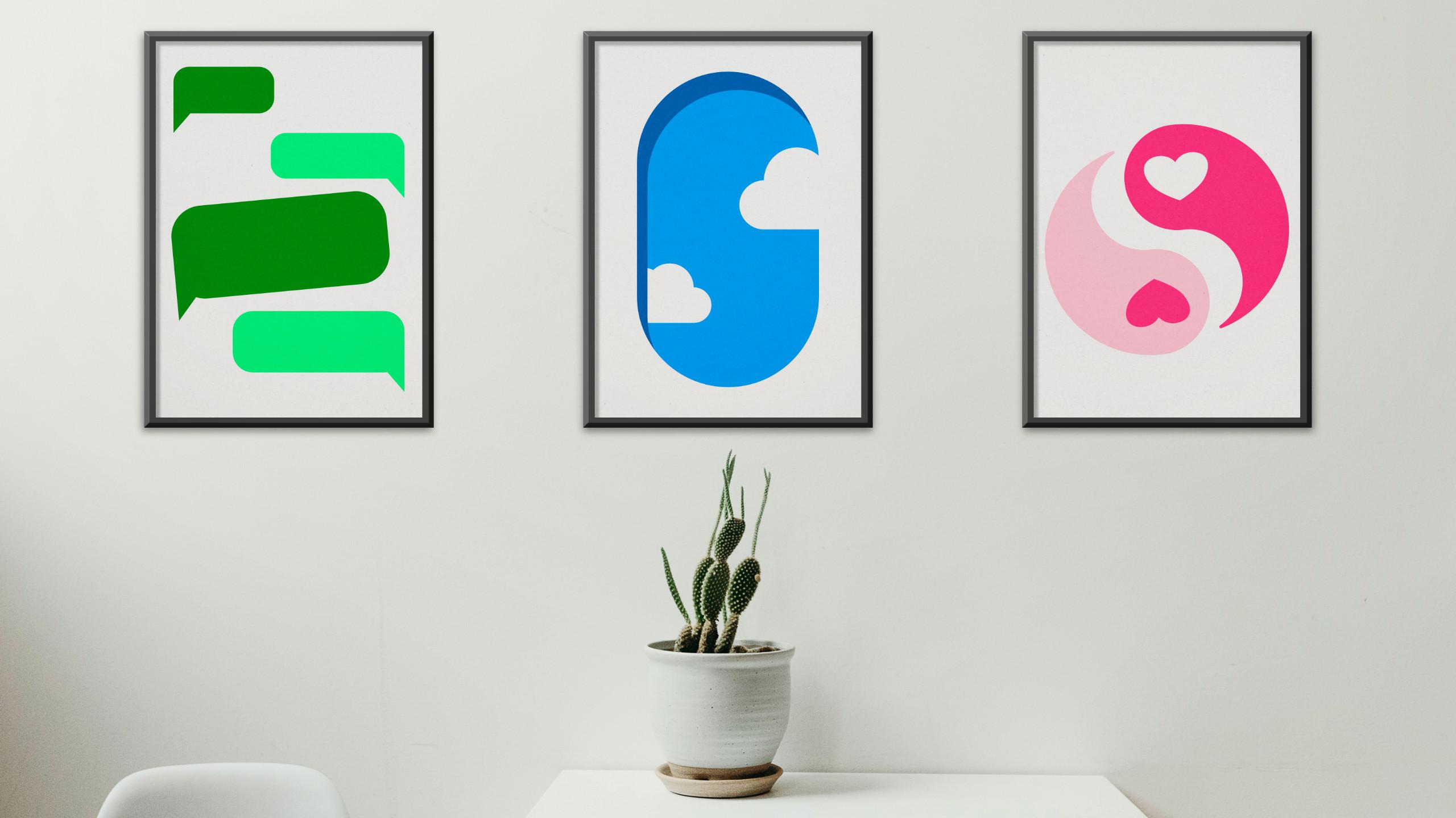
different shade of that color. All right. I like it. All right. It got meaning for
me, strong meaning. I know what is the first
artboard all about. Okay, take your time, design your first artboard using simple shapes and symbols. In my case, that's chatbox
symbols from online app, keeping in touch with
somebody abroad. I can spoil my
story a bit, right? And I decide to keep it
all in green colors. We're going to add a bit more
finishing touches later on. Remember the test project
with Harry Potter, I kind of jump in between back and forward
between different artboards. I'm going to do a
similar thing here. So later on, if I got
this overall concept, I got all of this
kind of drafted, I'll go back and try to make
some finishing touches, adding texture, modifying
colors a bit, okay? So let's just move to the
second part of the story. I'm going to start the
rectangle again. You know what? No, I will show you a bit different way how
we can do that. I will start with a
circle holding shift to maintain one to
one proportion. I will copy this circle, copy and paste, just like that. Now I'll go two circles, select both of them,
and unite them. Click this at button. But this time, I
will use the node to this white selection tool to get rid of those
unnecessary nodes. I can grab any node I
want and move it around. But I can also click
Delete to get rid of it. I can click Delete to get
rid of this one. All right. I mentioned before
for the second one, I'm going to use
some shade of blue. Let's do just that
straight away. Nice. I'm going to copy
and paste the whole thing. Position like this. Now
I need to select both. Maybe let me just change the color for you so you
see what's going on here. The second one, the second one, I make this copy at the top. The copy is around here. Take a look. The copy is here. I select both now and then I will pick this bucket
two vector flat field two, and I will fill this
area with a new color. Okay, that's what I need.
Now I can delete this shape. I just need it temporary
to use the bucket too. It's gone. It's red color. Let's change it
to the same shape of blue from the main one. It's inside this group. And then I'll make
it darker like this. Okay. Now I just need my finishing shape here
that will be a cloud shape. To build the cloud, I can draw several circles.
And you know what? You can do it
outside the artboard as well. Let me
show you just that. We can go all the way
outside the artboard to not mess anything with
our actual image. And then I can make a few
circles here and there. Like that, now we can select all we can now
maybe use another option. We could click at here
and make some changes, but I can also grab Shape build
tool from the tool panel, click Plus to unite them, and now just make a line
across what you want to unite. In my case, everything,
just like that. We can use the no tool to remove unnecessary nodes
here at the bottom, and I end up with a cloud shape. All right. This will be white, but with some transparency. I will reduce the opacity of this cloud to
be like maybe 75%. Make a copy of it,
flip it. Okay. Now I want those
clouds to be clipped inside this plain window shape. I will now drag them
in on that shape. I would just drag them and drop them on the
main shape here. Then I can re order
this shade here. It's almost like I got three different shapes
inside that shape. We call this parent and
child relationship. The child of this big shape is the dark blue,
and both clouds. Means they will only
appear on that shape area. They cannot go out of
it. You know what? I will put this
opacity a bit up. Maybe 80%. That's better. That's my second piece. We got clouds that you can see from the
window of the plane. That's my second one. That's in blue shades and the final piece
here on the right. I draw a circle holding shift, it's one to one proportion,
perfect circle. Okay, I will place
it at the center. Now I will click this arrow between the field colour and the stroke color to flip them. I need to see stroke for now, so it will be easier for me
to build the actual shape. Let me just copy and paste this big circle and scale
it down to the half. Again, if you cannot see all of those helpful guiding lines
appearing and snapping, be sure this little magnet is turned on,
snapping at the top. You can even explore more detailed options what
is snapping to what. I will make a copy of
this here. That's nice. Now I need a hard shape. Because my story is a
happy ending story. Okay. There's so many shapes ready to use. So
everything's here. Doughnut shape, Pi star, hot. Many, many shapes we could just grab and use straight away. And also, don't
forget we can unite different shapes together for
different results, right? So we can use all of those four actions
at the top, as well. Alright, let's back to my art. I got this heart shape. Come and C, come and,
move it down and flip it. Okay. Now I'm going to
need shape, build the two. I select everything I
made on this artboard. I will grab shape,
build the tool again. I'll use plus mode. But this time, I must
be more careful. I don't want to unite everything like we
did with the Cloud. I would just click
here. And here. That's one shape now, like here and here,
and that's another. All right. Let me
just inspect what I got here this side. Correct. All right. I just need to put the color inside one side of it. And then I need to search
for this hot shape at the bottom to have a
color there as well. This red is way too strong. Let me just try to
change that in a moment. But first, I need to
clean it up a bit. I don't need this hot shape at the top anymore, so delete. This one here, delete. Okay, I look at my layer
panel and now I just cleaning up. Okay, we got this. So I got only three elements left that would be way
easier to manage first. All of them got a stroke color. So I need to modify the
stroke color first. Okay. Maybe something
more like pinkish. And now I will also
modify the field colour. Only two objects
got field color. This one is without
the field color. It's transparent, it's white. So what is the field color here? Let's start with the
exactly same shade of pink and maybe make
it even brighter. A bit more red or maybe
a bit more violet. Okay, that's way better, but I also want to try
the version without the stroke because
that you notice I don't have any stroke
on the first hardboard, second, and then the stroke only appears on the last piece. So it looks like it's a
bit in different style, let's try to have the stroke and the color of the shape
in exactly same color. So it will look like
this no stroke. I make the stroke even
thicker and then I will make the fill color exactly
the same as the stroke color. Like that. And, of course, on this left side, I need to go with
white. All right. I will move the right
side a bit further from the left side as I want to
break this perfect circle. I don't want this to
be a perfect circle. It's a bit too large now. Okay? Because I got
this long shape here, I want this to be more like going from the
left and right. It would be not that long. It's almost like 90% inversion, but I still bothered by this
strong stroke like design. So I need to figure
out something here. I think I will go without
a stroke and simply make another shade of of pink
here, just like that. Here way better. Alright, that was the solution to my problem. Now it's all look like
in the similar style. So it may happen to you
as well if you're using solid colors in one
artboard and then you go with the lines
and strokes in another. It will look like this is
not from the same set. All right? I just resolve this problem in
front of your eyes. I got those strokes, they get rid of and just use the solid color and
that solved my problem. So I got one, two, three artboards
telling the story. Is the story of happy ending. We don't need to be
worried about me. We got some chat boxes
from the messaging app. Somebody in the plane and then find another half a soulmate. That's a happy ending
story from my life. I hope you managed to
create three pieces telling the story of something important that
happened in your life. This is not a final
version of it. We just draft the story
and in the next video, we're going to add maybe a bit of texture, tweak this, that, and learn how to export
all of that into both digital and
printable formats. See you in the next one.
5. Finishing touches: I'm really happy how
my artboards turn out. Now I will just do
a small changes, and also maybe I will try to
find a paper like texture. So I'm making this
first one a bit less align less
aligned like that. Okay. And now I'm going
to move to the last one. The middle one is
perfect. I love it. I move to the last one, and then I'll use the corner to round those corners
here at the end. Maybe let's try to do
both sides same time, so I holding shift
so I can select both points and just
slightly round it like this. So it's more open up. Maybe I need to move
one a bit higher like this and back a bit
closer so I can scale them up. I can make them a bit larger. Alright. That was
the change I needed. Okay. H a bit of
rotation as well? Nice. All right. Next, I want to put paper
like texture on each, and then we're going
to export all of them. If you would like to change
the name of each artboard, you can just double
tap on the name here and you can easily
rename your pieces. Okay. For now, I go and
search for the texture. If you don't have any
textures on your machine, you can always go to
unsplash.com and search for relative free
stock images here. I just type in paper texture and I already see some free to use options. How about this one. Let's click Download. Thank you for the free texture. Now I can drag and Rob
it to my first artboard. Scale it down a bit. Okay. Now we cannot see
what's on the artboard, so we need to play
with the opacity, but also the blending mode. How about blending mode
that help us to maintain the texture but still show us the original colors
that we set up before. I will go with the linear burn and reduce opacity even more. Okay. I want this extra texture because our graphic is simple. Shapes go very clean. So we got this extra
texture to give us this artwork like vibe. Alright, I will bump
back the opacity to 60%. I really like paper here, but I don't like this
yellowish like colors. So what I'm going to
do is I'm going to apply adjustment on that texture to make it less saturated. For that, I will head
to Pixel persona. So far we work only with
a designer persona, and as you may
notice, in the moment I switch to Pixel persona, all of my tools change
because this is the dedicated
interface persona for working with the RSTAimages before we work with
the vector graphics, and now we are in
this mini RSA editor is built in in
affinity designer. Now we're going to modify
RStaimageO texture. I had to layer new adjustment, and I need to search for HL so I can bring
down saturation, take a look -70%. I can bring down the
brightness as well if I like, or increase the brightness. Depends which paper
that you choose. I will decrease this 5%. All right. That's nice. So now you can see this
adjustment icon on that texture. All right. And I will settle for exactly 50% opacity
for this layer. Nice. Let's copy and
paste this here, but I'm going to flip the texture to randomize
it a little bit. So let's go with
the flip horizontal then I copy and paste on the last hardboard
and this time, I will flip vertically. With the strong
texture like this, now is the final time to adjust
some colors if you need. I think I will adjust this bright pink to be
even brighter like that. Maybe for my clouds with
the texture like that, I can actually go
with the full white. Full white. All right. That's nice. Okay, so I just put a strong texture
on all artboards. How can we export all of them? Simply, click File, Export. And now you have choice
to pick certain artboard. I will show you the preview, but you can also
select the option at the top hole document.
But take a look. In this case, we exporting
everything as the one page. That's not what we
need. The only format that will support this
correctly in our list is PDF. Take a look device, switch to PDF and select whole document. Each artboard will be a
separate page in that PDF. You have PDF with three pages. So that's only option here. So instead of doing that,
let's explore another persona. We try we design everything
in designing persona. We make some adjustments
using pixel persona. The last persona at the top left corner is
called export persona. As you can guess, this
will allow us to export all three artboards
with just one click. Everything's already
set up for us. We can just click here Expo slices all set up as P and G. If something
is not right, you can select all of
them holding Shift, and then change the format here. Let's go with PNG and
then click Export slices. This way, you can export all three artboards with
just one single click. Take a look. I got
PNG number one, PNG number two, and
PNG number three. Alright, so that's what we did. We export the whole
thing correctly, but we also save it as the native affinity design a
file for our future edits. So file, save. In
the next video, we're going to make
a little bit of mockup to display our
art on the digital wall. Maybe right now you
are not ready to print this out, hang
it on the wall. You are renting the place. You don't have paper in
your printer, who knows? So let's make a little
digital display so we can actually see it on the wall
on our little simulation. So let's do a mockup
in the next lesson.
6. Export and display: Let's display our art on
some kind of digital wall, something that can
be posted online or set as the wallpaper of
your computer or phone. So let's click File
here in the designer, new and create a
common resolution. Board. Let's search for web. Here we can select full HD or we can select four K. All right. I will go with something
in between full HD. Full HD is ten ADP and four K is this FQHD in between that
we got this 14 40 P option. Let's go with that this
time. Click Create. And now we got this landscape 16 times nine resolution perfect for the desktop
of your computer. We will need a
picture of the wall. We already know the
great website for that. Let's try to use unsplash.com. I search for wall, and now I can browse
those pictures of the real wall that we can
use to place our artwork on. We already know that our
orientation is landscape, so we can set this up here,
landscape orientation. Let's show only
free to use stuff, so change to free and now we got some kind of
filtering going on. So we will only see
more suitable pieces. All right, I managed to find this wall with also some kind of furnishes going on
and I will display my art on this
blank space above. I also think about this one. This one is pretty good too. You know what? Let's
go with this one. I download this picture and I'm going to drag it in
to our upended designer. Here it is, it's a bit too
big, but we can zoom out. Now I can see the boundaries of this image and I
can scale it down. Okay. Something like this will do maybe a bit lower so I got more
space for the picture. All right, so we got
realistic by group, and now we simply need to place our images on the top of that. We already export
them as P and G, so let's simply drag them in. All right. I got all three in, and it's now it's important to select all three at
the same time so holding shift because
we need to scale them down together,
also holding shift. We don't want to change the proportion or
anything like that. Hold shift, scale them
all down together. All right, maybe even
smaller like that. Cool. Let's zoom back in. You can use command zero to get the optimal zoom
level like this. So let's place this one exactly
in the middle using here. Horizontal alignment button. Okay. Now, be sure we got
same spacing. Like that. You can select the one on the
right side holding shift, the one on the
left, and this way, you can have both of them and be sure we can make exact
spacing like that. Nice. I think I will
scale up my image a bit. I got a bit more
wall to work with, I need my images to
be just a bit larger. All right, select
all of them with shift a bit larger
at the center. Okay, I like this. Now we need to create
some kind of frames and shadows around them to make
it who realistic process. So let's go with frames. For that, we can actually
use a rectangle tool. So if I grab a rectangle
and draw around them, I can give it some darker
color like dark gray. Then I can drag it
under so we can see the artwork on the top
and scale it up a bit. Reorder to be at the center. We got this darker
gray color popping out all sides of the
artwork like that. Next, we're going to apply
effect to this rectangle. Click FX in the layer panel. The very first one that
can make a Bible and Embaseffect inside the shape, increase the size a bit and
make the profile Sharp, just like this. Okay. That's nice. Maybe
you want to reduce the brightness of it a
bit, and this should do. Okay, we got our frame here. Let's click FX. Now we got
already FX on the layer, so you can click on that to
go back to this pop up menu. Let's add At shadow as well. Add radius and then play with offset to move the shadow
away from the object. We can change the angle down, not completely down but almost. And maybe away from
the scent like that. Okay, maybe smaller
shadow, smaller offset. Something like this will do. Okay. Let's close it, and we're going to duplicate
this whole rectangle. C to copy, comment V to
paste so we can now move it under the middle
one and then again, command C common V. We move our frame
under the last piece. Did you notice something? In our artwork, we use
a transparent texture. So the texture is still kind of transparent without a
proper white color. So let's put a
proper white paper inside. Okay, like that. And I will need to duplicate this white paper for
each hardboard as well. And now we got our final display when we add a digital frame but also digital paper
behind the artwork. So we got now the
whole experience. How it will look like after you print it out on
the proper paper. And, of course, thanks
to our transparency, we could actually change
the paper color now to simulate how this artwork will look like with
different paper colors. You got the yellow paper. So that's really nice. We can have a full simulation here. We can change the color of
the frame to the brown. If you like, and check that out. So that's nice. That's
why we're doing this today here to make some
kind of simulation. All right, the finishing touch will be to grab this
white paper we just made. We can select all of
them, holding Shift, FX. Let's add inner
shadow in this case. So it will look like the
frame is casting shadow. On the print inside the frame. Like that. Okay. You see
this little shadow here. Nice. Let's modify the
shadow here at the center. Outer shadow will
be more like down. And then on the right side, the outshadow will be
going to the right a bit. Okay. Let's zoom out a bit
to see the final simulation. That's nice. All right.
That's what we made. We create those three
pieces that tell a story. If you want to do some kind of final lightning to it,
let me show you a trick. If you add layer, a pixel layer this time, at the very top, go to the pixel persona and mess it up with very dark gray color. I'm filling this whole layer using bucket to be like that, reduce opacity a bit. So you can see what's under. Alright, now I grab
a very soft brush. So I'm using the brush to. Keep in mind, this step
is totally opposite. It's a bit like playing around. So we can now using this brush to very soft brush to, like, paint lights at the
top of each artwork, one, two, three, and
then one more here. You can change the
size of the brush from this slider or using square
brackets and then one, two, three, and then way
weaker brush so opacity, maybe only 40%,
something at the center. And that's it. And now we can click blending mode
to be overlay. So we got some kind of
more natural lightning coming from the top like those in galleries and got
those highlights. So we can use that to kind of
bump up the opacity a bit, maybe the saturation a
bit of those art pieces. And same time, the bottom of the picture got
those gray shadow, so it will be a bit darker. So we got a bit more light
spotlight on the art. Let's put it on 20% opacity. And we got the spotlight
from the top giving us this effect that somebody places extra lightning above
pictures in the galleries. Maybe 15 this time. Right that's our final mockup. That's a simulation how our artwork will look on
the actual real wall. Let's save this as JPEC. Click File Export, JPEC. We can have 90% quality for the optimal
file size, export. All right, and we are done with the mockup displaying our
art on the real world. In the next video, I will give you some
final little task, something that can help you out with your storytelling skills and symbol selecting skills. So we're going to draw additional symbols
as a little exercise at the end of this class, just to recap to learn what symbols can represent
which emotions. And then we will summarize everything in the
time lapse video. All right, so let's do
a little practice with symbols and then summarize the class. See you
in the next one.
7. Symbols practice: Before we wrap up one
little practice left. As you can see, I have prepared a brand new document with
seven artboards on it. So you can do the
very same thing. You can click File New, and then create a new document. The size doesn't really matter, but I suggest to keep a landscape and remember
to turn on dbards. So then you can use the AdbTol to insert additional
Adboards like we did before. As you may notice, I got a
text prompt on each outboard. You don't need to type it in. You will see the text prompt in this video, that's enough. Our task for this
little exercise is to practice with symbols and
pictograms and shapes. In this type of art, we
convey the story emotions to those easy to recognize symbols, universal
symbols, right? So let's practice drawing them without context of the
vector artwork just yet, but simply based on the prompt. So how can we convey love,
compassion, and connection? You can draw one symbol
that come to your mind. You can draw several symbols, or in case you are really blank, you stare at this prompt for
3 minutes without any idea. That's also good because that's
a start of the research, then you can research more
on that symbols of love, compassion and see how
different culture, different people use
symbols, colors, and pictograms to express that
and you can learn from it. Let's do this. Little
exercise at the very end that will enhance our
ability to convey emotions with certain
symbols and shapes. So, in my case, love compassion. I think about hardship
straightaway that very Western thinking, I guess. So hot ship is on the list here. So we don't need to draw it
from scratch, so that's good. We can even modify how
deep this curve here is. We can squish it like that. In this case, I will get
rid of the field color, I will add some stroke
color and as you can see, automatically going
into red area, red colors, pinkish
colors for this emotion. I make duplicate of that, so I come and see C and
V. What I want next is I want turn a stroke
into actual shape. I select both of
that and I will go for layer expense stroke. This is not stroke anymore, it's actual shape. Okay. Now I can rotate both, and I want to kind of
interlock them like that. So to do that, I
will need to use a shape build tool. All right. I select both, and then I can
use the shape build there. I will simply add a brand
new shape in this area. That's the third
option. I click here. It seems like nothing happened, but it's a new shape here. That's what I need, and I will use the color
of the shape below. It will give us
this interlocking. All right, so that's my symbol for love, compassion
and connection. To interlocking heart
shapes. Y can be different. This is for us to have a bit
of practice to play around. If you are not ready to
move to next artboard, just stop this
video right now and continue working on
your first symbol. Okay, what's on the second page? Identity patriots belonging. I got two main ideas here, so I think I will make
two symbols for that. The first one in my
mind is like the flag. So a simple flag. Okay, so I got this rectangle. Then I will make some kind of flag pole with
another rectangle, maybe little circle at
the very top of it. Can unite those two together. How we can make is
this flag wavering, we can use this tool
over here below the layer panel
warp. Let's warp it. Okay, so we are bending it. Maybe I need some kind of a
vertical one. No, not really. How about classic mesh
that I can play with? So none first, and
then I move to quad so I can actually add
some points myself, and I can move them around. Okay, that's what I need. Okay, so that's a warping too. We can have some
kind of waving flag. That's my ID number one. And ID number two
for this kind of patriotic belonging team is
to make some kind of shield. That's more protection
as well, but patriotic, I guess, some kind of shield by rounding the bottom
corners of the rectangle. Okay. That's what I got
for the second one. The third artboard direction
movement progress. Not sure about that. First thing in my mind was
some kind of arrow like shape. So what if I make a triangle? Then I make a copy of it. Subtract, something like this. Maybe a few copies of this
kind of triangle. Mm hmm. I don't know why I progress. I kind of think
about green colour. That was the first symbol
in my mind for direction, movement, progress, some kind of triple mod arrow. All right. Again, if you just want to catch up with the three
symbols so far, we start with the
love compassion, identity, and now we are
on movement and progress. We've got three cover. If you didn't draw
anything so far, you don't need to watch
the whole video first. You can stop it right now, catch up a bit, and
then continue on. We got four more to go. I prepare seven prompts
for this practice. If you want to review this
practice on your own later on, you can just prepare seven
new prompts for yourself. We got something about faith and sacrifice, spiritual thing. This would be very much
based on your backdrop, your surroundings, your parents, what do you think about
faith and sacrifice. In my case, that should
be the Christian Cross, I guess, the first
symbol in my mind. And you can see this straight away how this is
kind of very personal thing. So different symbols in different countries got different meaning
and colors as well. So that's why this exercise
is rather important. I don't know. Also,
thinking about the sun. In this case, I'll use the
star and raw the star, but I will increase
number of points to 20 and make them way
short of those arms. I end up with the sun and the cross for this one,
for the spiritual one. Those two symbols in my mind. Protection, health,
restoration. In that case, I again think about shield, but I already draw
a shield once, so maybe I will skip the shield. That was the protection. I go straight for the
shield. Oh, you know what? Let's do a shield once more, but a bit different design. Okay, so we are
protected by the shield. Again, I will do the
bottom corner to. But at the top, I will do another version
of cornering too. Take a look instead of a
classic corners rounded. We can change the style at
the top to this one, concave. That's very nice shield. I will copy and paste
the whole shield now. I will use there. Additional
shape so I can intersect. So I can have two
tons in this one. Okay, that's nice. Something like
bright blue, maybe. So I got shield
protection, restoration. Hmm. I think about
modern medicine here, so maybe I will
make some kind of Peel, and again, we can
do that very quickly by rounding corners like that. Then I can copy that by holding
command on my keyboard. Let's do another intersection so we can have double colors. Okay, something like this. Shield and medicine. Your symbols can be different. That's the beauty
of this exercise. Did you notice what
happened when I tried to scale my
shield, take a look? The corners that I rounded
with the tool are not baked, so we can do that
by clicking here, baked appearance, and
then the coroners we scale up with
the shape. Okay. And the pew. All right. We almost just two more prompts
for this little exercise. Next one is growth
wisdom circle of life. Two things in my mind. One is simply a seed. That's a really small
thing that we can do, and then I will
convert to curve so I can make those two nodes sharp. Okay, so we get seed
and then grow tree. Tree can be complicated
symbol to quickly draw, but we can use the trapezoid
tool for the base. And then we can use oval
shape to kind of make those random randomized
structure of the tree drawing several different
ovals like that to make a very quick tree without drawing this branch
by branch quickly, we can modify this like that. And you may guess I can
add it all together. Can even use the
round corner tools now to make those
gaps a bit round. Okay. So I make a tree and a seed that can be
actually seed of the tree. Two things I think about when you give me
the prompt growth, wisdom circle of life, from the seed to the
tree growth. All right. And we got the last one, purity, enlightenment and awakening
in spiritual manner. This one is interesting. I don't know why I'm going
straight to some kind of very beautiful,
geometrical symbols. I don't have any legend
or religion in mind, but just something like
that with enlightenment, some kind of kind
of space colors, colors from space,
stuff like that. Straight in my mind right now. So I think I will go
with some kind of main up sacred geometry symbol that I don't think even exist. Something like this, maybe. And this last one is
a good example of me. I have no idea what
should I draw, so I doodle something, but now I also can
research a bit, so I can I can type this in or copy this into a browser
and do a small research. So as you can see, I can type
it in in the image search, and they will show
me various symbols from different religions, different cultures that got this kind of spiritual meaning. Alright. So I can kind of
learn from that as well. Oh, Lotus Lotus is such a
nice symbol for that. Hm. Let's try to draw lots then
little final exercise. Let's start with oval. Then I will convert to curves, make the top one sharp. Those two nodes a bit lower. We got almost the color
right for the lotus? It's going to be pink
lots like that, I guess. Then I will have copy of that going to the
right and left. I hold in command to
make a copy of it quickly without need
to copy and paste. All right. That's nice start. We need some additional
lotus leaves. So I will come and see
common V. This big one here, make it smaller and brighter. So we get some kind of contrast
in this symbol like that. Here I can flip at
the top horizontally. That's my lotus,
that's for the purity. I modify my initial
shape after I did a little bit of
research. Here it is. I give you seven prompts to make you think about seven
different emotions, seven different ideas that can be conveyed through
pictographic symbols. We didn't draw any
detail picture here. We just are basing on symbols already known
to most humans. Like heart shapes,
shields and flags, arrows, sun, cross,
medical pill. Again, I make a shield
for protection that was exactly same symbol
like identity for me. Okay, and I got growth and wisdom with the tree and seed of the tree ending up with purity enlightenment
with the lotus flower. Alright, so that's my
exercise, finished. I got seven prompts. And I managed to draw
a simple symbol. I don't need to be
really beautiful. This exercise is more about connecting with those
different emotions and also practicing
those basic tools because we use rotations, we use no two, we round the
corners here and there. So it's a great exercise. Even without doing
the major artwork, you can improve your
skills here. All right. So please don't hesitate to do a similar practice
on your own, and let's summarize the whole
class in the next video.
8. Summary: Well done, you reach the
very end of this class. I hope you managed to create your own illustrated story in
three different artboards. I already show you how you
can export your work as a common file like JPEG or
PNG, simply click File. Export. This way you can
prepare a simple image that you can share in
the image gallery below. So don't hesitate and just share your project
with us, right? That will be the final
step of this class. And if your project is still
not ready to go, remember, you can always
rewatch some steps of this lesson and try to redo some parts until you
are happy with the result. All right, I'll be waiting to see your project in the gallery. Thank you for learning with
me and see you next time.
 Mark Krukowski, Kru Mark Tutorials