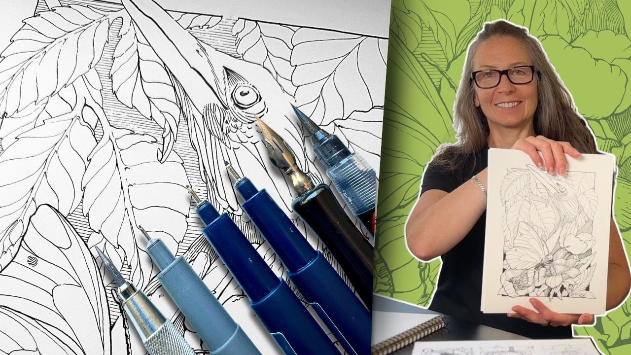
Transcripts
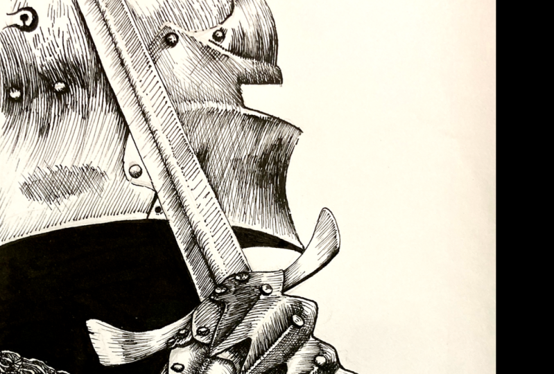
1. Class Welcome: If you like the look of using Dip pens and curious
how to get started. This class is about accelerating your inking skills to get the results you want using dip pens for realistic drawing. Hi, I'm Chloe from Canada. A retired learning specialist, turned full time artist. I spent the last
three years building my inking skills from beginning
to a full time business. I'm excited to share everything I've learned about
drawing with dip pens so that you can have
a smooth start for your pen and ink artwork to
turn out the way you want. Planning is key. The structure
of this class revolves around progressive steps that
lead up to a final project. As part of the lessons, we'll first go over
tools and supplies. We'll look at which
dip pens, ink, and paper combos are
the best match for your specific goals and how
you naturally like to draw. By doing the exercises, you'll learn more
about your preferences for how to render and
produce certain effects. We'll practice line
quality edging and other subtle effects
for big results. We'll work through
the fundamentals to create illusions
and how to arrange your composition using values
in visually pleasing ways. The lessons progress from
beginning to advance and are suitable for someone without any inking experience. Though it is helpful to have basic drawing knowledge, you can still take
this class and gain insights using
alternatives to dip pens, such as fine liner pens. For the class project, you'll render an ink piece subject of your choice
using the techniques, fundamentals, and process
taught in this class. If you're keen to accelerate your skills using dip pens
for realistic drawing, download your workbook
and let's get started.
2. Get the Results You Want: When I was first looking for where to begin
with Dip pens, my search only led
to more confusion. There are so many
options for Nibs, pen holders, ink
types, paper textures. What if that combination
doesn't work? If you've tried dip
pens in the past and didn't get the results
you were hoping for, it turns out that some
Nib types will respond well to your approach and others can just
work against you. In this lesson, my
goal is to guide your choices so that you
can have a smooth start. In your workbook on page eight, you'll see a complete
list of the tools and materials that I
use for this class. However, these are suited for my style and
my preferences for the type of artwork that most inspires me to get the
results that you want. The first step to finding the best fit between
the materials and your aspirations is to start with the
end goal in mind. So let's begin the class by learning more
about you and what you're aiming to
achieve with dip pens and ink on page two
of your workbook, take a moment to answer
those three questions. What do you hope to
achieve with pen and ink or do differently
by taking this class? Is there a particular
look or effect that you're excited about
exploring with dip pens? Who are your influences? Is there a master whose work resonates with you in terms
of what you'd like to emulate in your art if you
hadn't thought much about your influences On the next page is a short list of pen
masters, four ideas. The list consists
of illustrators, comic artists, manga Kas, and a few painters
who sketch an ink. Go ahead and look through these. The names are all hyper link so that you can go and
admire their work. These answers may
influence your choices for the next lessons where we
review tools and materials.
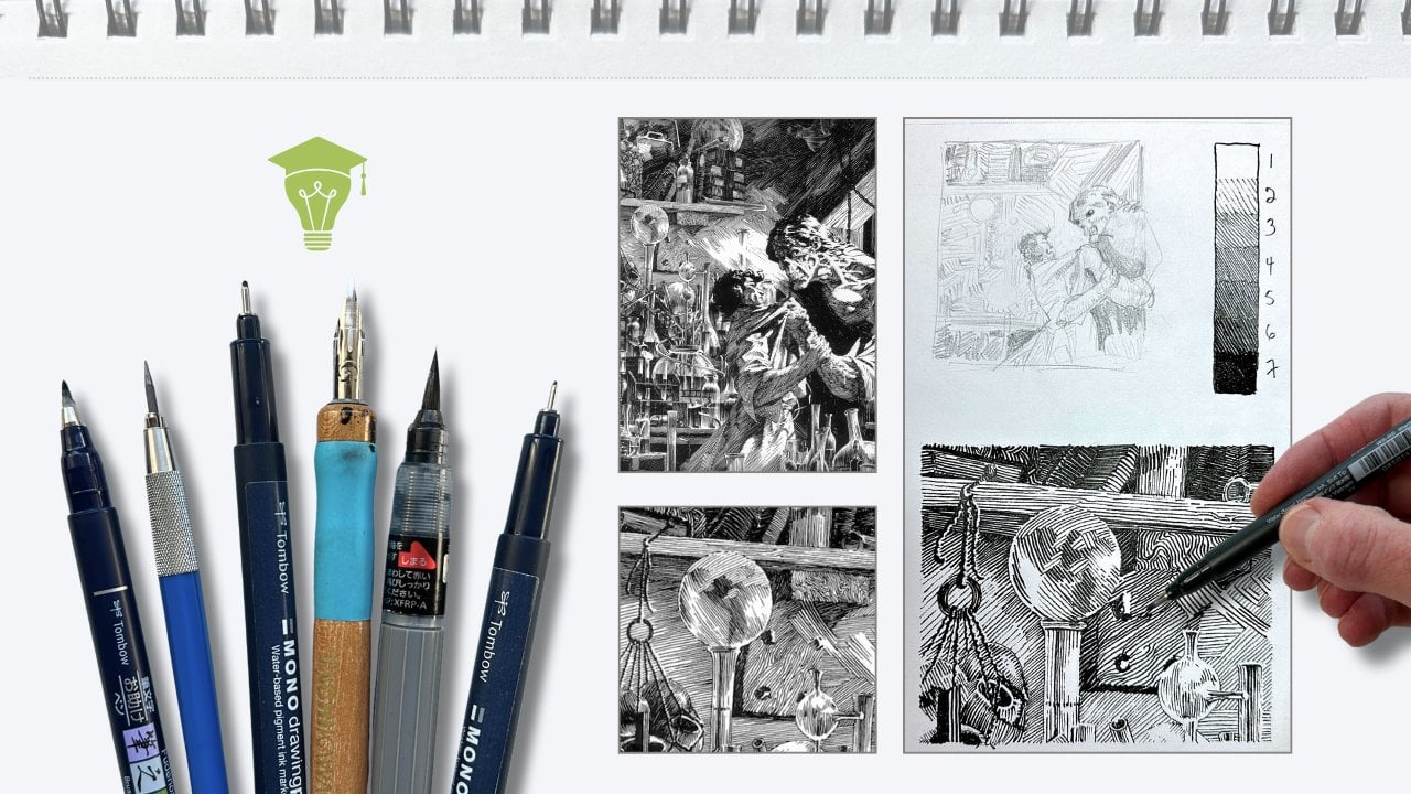
3. Best Inking Tools for You: Now that you've identified what you want to
achieve with dip pens, let's discuss tools and
materials to find a match. In this lesson will
cover benefits of using dip pens,
types of nibs. Best nibs for your approach and pen holders by definition. A dip pen is a pen
that you dip in ink. It has two parts, a nib and a pen holder, also
called handle, where dip pens shine and
why you would choose it over another inking tool is the flexibility of the nib. You can seamlessly
vary the thickness of a line in one stroke without
having to switch pens. This is what's
called line quality. Another advantage to
dip pens is you can own one handle and switch the nib to vary the effects
of the line quality. Though myself, I prefer to have a dedicated holder for
each nib. This saves time. You can use the same pen with different types of ink and
experiment with color. Dip pens are eco
friendly compared to non refillable
throwaway pens. They're relatively
inexpensive and last a long time compared to
a regular inking pen. Dip pens can be less convenient because there's
more parts to deal with. They require maintenance and care to stay in
good working order. It does take longer to complete a piece because of
the constant dipping and wiping and safe keeping of your nib during
the ink application. And depending where you live, you may be challenged
to even find these materials at
your local art store. It can be perplexing to purchase online without really
knowing what to look for. When I first started, I found it daunting because
the vast options I learned that actually a lot of Nibs are made uniquely
for calligraphy writing. That means you can
narrow your search to nibs or pen sets that
are labeled for drawing, sketching, mapping,
or illustration Ah. But some nibs labeled
for calligraphy are multi purpose for
both writing and drawing. If it's not specified
on the packaging, you can identify
the Nibs visually. The Nibs you want taper into
a sharp point at the end. Ah, but there's the crux. Each brand type and size of
Nib performs differently. As mentioned, some Nib types will respond well
to your approach, and others will be
really frustrating. How can you tell which is which? The three things that
matter most with Nibs are line quality,
flexibility, and elasticity. Line quality is the width
or weight of the line. Similarly to how fine liner pens are numbered by tip size, nibs have a range
from thin to thick. This large nib is comparable
to a tip size seven, eight. This croquill has line with variety compared to
a double zero five. If the majority of your work is tiny details or mostly
big bold lines, then you consider a Nib by its size and range
of line quality. The other factor to consider is the ratio of flex
and elasticity. Flexibility refers
to how much a nib will bend when you
press down on it. Nibs can range from extremely
stiff to super soft. If you're a heavy hander
using a lot of pressure, an overly flexible nib could
feel erratic or sloppy. It would wear out prematurely, or bend out of shape and
quickly just get ruined. In turn, an overly stiff
nib can limit the range of strokes you can do to create effects and can actually
break under pressure. Therefore, if you're
a heavy hander, look for a moderately
flexible nib. A light handed inker
would enjoy a soft to moderate elasticity
refers to how quickly a Nib will spring
back into its original shape. After pressure is applied, a beginner may find a highly elastic nib too bouncy and unpredictable
to make even marks with. You'll get a jittery stroke. Advanced inkers will
appreciate moderate to extremely elastic
nibs because of how responsive they are to the
slightest change in pressure. Choose elasticity by your
level of experience. If you're a beginner,
look for a Nib that has low to medium elasticity. My recommendations, if you're hesitant about settling
on a single pen, a good option is to
get a sample it. I really enjoyed my speed
ball sketching kit. It comes with two pen
holders and six Nims. This way you can
compare tests and have a clearer sense of what to look for as you progress
and build your kit. I don't recommend that you get a Manga specific samper kit. Those nibs are typically
too stiff and bouncy for beginners if you prefer
to purchase a single pen. There are some champion Nims that are easier
to start with. I call these generalists such as the popular browse steno
known as the blue pumpkin. It's a medium saw the all purpose speedball hunt bowl nib, it's a medium, stiff. Ideally consider two pens
for a wider range of line quality where
you would pair a generalist with a
small mapping nib. Either a speed ball hunt, one oh two croquil, which is a medium soft, or the tashi kawa 77 soft meru, which is a medium soft. If you find a dip pen set where the nib and pen holder are
sold together, get that. Oftentimes though, they
are sold separately. Pen holders come in
different shapes, diameters, materials
across brands. Some are wider in
the grip or offer a rubber section
for added comfort. My favorite holder is
Tashikawa's model 40. It has a classic mount
with two holes that fit standard Japanese
and most western Nibs otherwise look for holders that have a universal mount with the four prongs for higher compatibility
with different Nibs. Some of the western made
cylindrical shape nibs like the Croquill is compatible only with its own
croquil holder. To summarize, when
choosing a dip pen, you want to consider
the shape and size of the Nib for
the line quality, the flex elasticity ratio of
the Nib for your level of experience and drawing
approach compatibility of your pen holder if purchasing Nibs separately and testing brands of
similar shape Nibs, because as mentioned,
different brands for the same type of Nib
will behave differently. Thanks for hanging to
the end of last lesson. This is probably way more than you wanted to know
about dip pens. So now you're informed to find the best tools for your
goals in your workbooks. On page four are three questions about your medium choice, your drawing approach, and
your experience level. And page five has a Nib
rating guide as reference. In later lessons, we'll
do a warm up with your Nibs to see how
they behave in motion. In the next video, we'll
look at ink and paper.
4. Ink and Paper Combos: Now we'll look at what to
consider when choosing ink and paper for
drying with dip pens. Look for pigment based inks. The ink sits and glides on the surface of
the paper rather than being absorbed into the
paper like a de based ink. Both India and acrylic
inks are pigment based, waterproof marker proof, and can be mixed
with other mediums. The higher quality inks have a pigment carbon mix that contains a substance
like a varnish that gives it more permanency and a light fast archival
quality acrylic ink acts more like a paint. India ink has a
nicer consistency for covering big solids and will generally give you less issues like blobbing or caking
on the nib while you ink. Most brands that are labeled as India Ink or drawing
ink will work. Different brands
vary their formula, such as drying time,
viscosity, and opacity. The top preferred brands of
India Ink are Speedball, Super Black India Ink, Windsor, Newton Black India Ink, Doctor Martin's Black Star,
Waterproof India Ink, and the leader black paper plays a major role in the outcomes
for dip pen inking. Bristle paper is ideal because
it has a heavier weight, which is more resistance
to potential bleeding, lifting and scarring
from Nib action. Bleeding is when the ink
spreads or feathers out, which is an undesirable effect if aiming for precise line work. Bristle paper comes in two surface finishes,
smooth and vellum. Smooth is best for precision drawing and
advanced anchors. Vellum is more beginner
friendly, and versatile. The surface texture of vellum provides a subtle
resistance for the nib, which makes it easier
to control marks compared to the slick
surface of a bristle smooth. The most reliable brands of
bristle paper are Strathmore, Windsor, Newton Bang,
Fang, and the Leader. Just a note, Be
sure it is indeed bristle paper and not paper simply labeled for pen and ink. Pen and ink paper might perform
well using regular pens, but is less suitable
for dip pens. If you intend to use wet
mediums with your ink, such as guash markers, watercolor or variety
inks and washes, then look for a mixed
or watercolor paper. Options are hot pressed
or cold pressed papers. Be mindful that paper
has limitations and anticipate compromises
when choosing one finish over another. In your workbook on pages 6 and 7 is further information
about ink and paper. The name brands suggested
are products that I've tested and I like though there are other good
choices out there. My goal is to
narrow your search. You can also complete
section on page eight once you've gathered
all of your supplies. In the next lesson,
we'll learn how to prepare and care for your Naves.
5. Important Nib Prep: New Nibs out of the
package are covered in the protective oil
or waxy coating. This is for storage and shipping and requires
prepping before use. In this lesson, we'll look at Nib prep, maintenance,
and storage. It only takes a few minutes, but skipping the step
means it'll take you longer for your
Nib to work properly. Submerge the Nib
in hot water with mild soap for approximately
one to 2 minutes, then wipe it dry. Some brands and nibs are
more sensitive to heat, so no more than 2 minutes. Even better if you have
proper pen cleaners such as speed balls
cleaning agent. If not using the
special soap to be certain there's no lingering
protective residue. Wipe the nib with
isopropyl alcohol, then wipe it dry so there
is no moisture on the nib. You may have heard
of other methods, saliva and toothpaste
are ineffective. For some brands of coating, a hot flame works, but it needs to be
lightning fast. Or failing this, you'll damage. The finish potato
method presents the risk of bending the
ties of a softer nib. Once the coating is
removed with soap and water and your nib
is completely dry, gently inserted back
into its holder, get the results you
want from a dip pen. Part of the process
is being attentive to its maintenance while in
use and after each session. Never let ink dry on the nib. Because we're using waterproof, it can be difficult
to clean after use. Quick drying inks make
cleaning even more urgent. Luckily, if you clean before the ink fully
sets on the Nib, then any ink stains you see are cosmetic and won't affect
how a Nib performs. Some Nibs are coated in other finishes to help
prevent corrosion, but majority are made of
typically stainless steel. Either way, they can rust. Never let a Nib air dry. An ultrasonic jewelry cleaner
is a nice alternative, especially if you
have several Nibs to clean at once for storage. After each session, I
insert dry Nibs back in their hole and keep the pens away from snag or fall hazards. For orphan Nibs, I keep them in a resealable plastic baggy along with a sachet of silica beads inside
to prevent rusting. A question that
often comes up is, how long does a Nib last? A well maintained and careful Nib will last hundreds of hours. I have Nibs that have
clocked thousands of hours. You'll know that
a Nib is ready to retire when it becomes
overly flexible, leaks ink is visibly
misshapen or encrusted with ink or rust to prevent
damaging your artwork. It's best to just
replace a worn out nib. And the next lesson we'll do penhandling exercises
and start making marks.
6. Your Nib in Motion: Let's do a warm up to
get a feel for your nib in motion and gain control
of your instrument. Gather a pencil and eraser, a jar or container
filled with clean water. A rag or paper towel your ink, dip pens or pen, two sheets of bristle paper, a ruler, and means
to cut your sheet. If using fineliner pens
for the entire class, you'll need a minimum of two tip sizes and one
sheet of inking paper. If you don't have dip pens yet. You're of course,
welcome to state or skip forward to the next lesson. I'll be demonstrating
with a Hunt 512 full nip, paired with a
universal pen holder, bristle vellum paper, and
super black India ink. Grab a ruler and cut one of your sheets into
sample size sheets. Use a knife or a ruler
to cut the sheets. Press the flat
part of your ruler firmly and tear the
paper like this. The dimensions are
not important. You'll use one of these
mini sheets in the worm up, all the exercises and
the class project store the remainder
of the mini sheets for future projects. As a beginner, I was fond
of this tripod grip, but holding the instrument like that builds tension in the body. It also limits the
Nibs capabilities. My art transformed after I
switch to holding the pen more loosely with the hand high up on the shaft
away from the nib. Lock your wrist and aim to
move with the whole arm. From the shoulder and elbow, you'll produce the
best line quality. Holding the instrument at
a 25 to 30 degree angle, not vertical like
you'd hold a brush. Let's begin the warm up. Dip your nib halfway
up the eyelet, then use the mini sheet to prime your nib with
a stroke or two. This safely removes excess ink. Then it's prime to go pull a series of lines
towards you using light, even pressure on the nib. If you're right handed,
pull top to bottom, moving left to right
across the mini sheet. If you're left handed,
rotate the sheet so that you can travel
from right to left. You move in these directions
so that your hand doesn't cover your work and it avoids
smudging of fresh ink. Now, depending on the nib, the paper surface and
your drawing approach, you may need to reload with ink each five to eight strokes. A good quality drawing ink
is viscous and quick drying, but that makes it
problematic for accumulating and drying
on the nib while in use. This is where your
jar of clean water comes in to keep the
nib well functioning, periodically swell,
rinse it in water, wipe it dry, then
reload it with ink. Rather than continuously
dipping it in ink. I call this the swirl, wipe load and Prime
reload protocol. I sell rinse each
time I dip an ink based on the combination of
materials you've chosen, you can judge whether that's an effective cleaning frequency
to keep your nib happy. That is the pulling motion. Now let's test a push
motion away from the body. Vary the speed, very
slow to medium speed, but aim to keep even
pressure on the nib. Let's make another set of marks, this time varying
the line quality. Apply pressure to make
a series of thick, thin strokes, then
thin to thick again. Try both directions to see what's more comfortable,
push or pull. Don't worry if you're not seeing a huge difference when you
apply pressure on the nib, it has more to do with how
stiff and bouncy your nib is. My five 12 bowl. Nib is a medium, producing an average
but consistent range. Note if one direction
feels more natural to you. Have a look at your strokes which are more
attractive so far, The pulling or pushing motion. Repeat the process with a
series of curved strokes, continuous wavy lines, varying the pressure
with various marks. And basically tests by fine tuning the
angle and direction. This warm up also helps break in the Nab so that it's
ready for the next step. Sure, you have a safe
spot or a holder to set your pen down when you need to so that it doesn't
roll off into hazards, and it prevents the Nab
from getting damaged. And the next lesson will
begin the exercises.
7. Values Chart and Line Quality: Now we began building
a values chart. This chart is essential
in many ways. It's a practical means to practice techniques
and effects, test ideas towards
the final artwork, weed out issues early
in the process, and engage your
progress over time. It's also the reason to use the same inking materials for the chart that you'll be
using for your final artwork. If you have more than
one sized dip pen, you'll get a chance
to evaluate how each behaves under
the same criteria. Keep your small sheet, flip it over on your large
sheet of inking paper. In landscape format pencil,
eight columns across, five rows down, so that you
have approximately three, four inch squares with
a gap in between each. The first four columns extend
to the bottom of the sheet. There's an example in your
workbook on page nine. It doesn't need to be exactly
the same as long as you leave space on the side of the
squares for later lessons. Let's begin the ink application. Continue to use the
reload protocol as we did in the warm up. And the mini sheet
is for priming the nimp to ensure
the proper flow. Draw evenly space
lines moving slowly, using little to no pressure on the nimb for the
entire exercise. I'm doing vertical lines
pulling towards me from top to bottom because that's most
comfortable for me. If from the warm up you noted a preference for
pushing the lines, then do what feels more natural. The trick is to
keep a steady pace. Slowly released, just
as you get close to the edge for the next square,
we're going diagonal. Rather than twist my body, I rotate the paper for
the optimal angle. The challenge is to match the same tonal density
as the previous box, the same gray value. Next we'll go with
squiggly lines, again, keeping the same amount of space between the marks as
the previous two. Remember to monitor your nib, swirl, wide, load, and prime. Now with the lines on a curve or an arch for the
following four boxes, same row, moving across. Repeat the pattern in a
slightly darker tone. You'll achieve a darker tone by reducing the space
between the lines, bringing the marks
closer together. Feel free to experiment
with the angle of your arm, but limit the movement in
your fingers and wrists. Try to get a feel for the
elasticity of your nib. Pay attention to
the timing of when it springs back for
the row beneath. You have the option to either
repeat the first row with the same nib in a darker tone or switch to a smaller
nib if you have one. I'm using a cro quill
to test the same thing. Or the third option is to use more dynamic lines with
speed and less orderly. The more practice, the better. Next we introduce line
quality in the third row. Begin the line with pressure and gradually release the pressure
to achieve thick to thin. Keep the lines evenly spaced. Aim to release pressure
approximately in the same spot so that
your texture looks even. This is what's called
tapering or a fading effect. Here you can see how this
technique shows up in artwork. Tapering the line weight creates a smooth
transition of tones. Next column, box, same
thing except thye thick. If you're using fineliner
pens with practice, you can also achieve that tapering effect by going
over the lines gradually. Next box, try thine thick
lines, all in one stroke. Then another variety of
that with squiggly lines, thick to thin, and some
curvy irregular lines. Fun, right? Again, pay attention
to how your pen is behaving in terms of the
flex elasticity ratio. Here are examples of the squiggly lines
in a sky background. You can see how these techniques are used to create artwork. And by practicing
targeted exercises, you'll quickly
accelerate your skills and control the medium. It's tempting to skip these
fundamental exercises. I know now how critical this step is for improving
with pen and ink. In your workbooks on page ten, drop down general impressions about using your pen so far. Did you prefer pulling
or pushing the lines? What was challenging
about the exercise? Changing the speed or
varying the pressure. Did you notice the flex
elasticity of your nib? What surprised you and what
are you excited about? In the next lesson, we introduce more fundamentals and
continue to build our chart as we progress the exercises to
lighting and shading.
8. How to Work the Fundamentals: Fundamentals are the principles and components of art
With pen and ink, the illusion of depth, form, dimension are achieved through
the use of grading values. Mark making techniques are the essential design
fundamental in pen and ink. Marks are used to render shapes, explain form, build values, add texture, divide space, provide structure, and guide the viewer through
your composition. In this lesson,
I'll briefly review those fundamentals
and we'll dive back into our chart to
practice how these apply. Shape is the design of
two dimensional elements. Shape is a space enclosed
within boundaries. These boundaries can be created with outlines or are implied. An outline is used to explain
shapes to the viewer. A shape is flat, a
form is three D. Adding volume is what creates
the illusion of form. Volume is conveyed through
the use of values. With pen and ink, values
are created with marks. Value is how light or
dark something is. Tone is the degree to which
the value is light or dark. The terms tone and value are
often used interchangeably. For this class, think of tone as the shading either from light
to dark or black to white. You'll hear me use the
term tonal density, which is building the tone of a value by creating a gradation. More density means increasing
the darkness of the tone. Shading refers to the
shadows in a piece. Lighting refers to highlights
The difference between the lightest value and the darkest value is
known as the contrast. What will make a piece
successful is how convincingly we're able to communicate those
fundamentals to the viewer. If you're keen to see your
pen and ink technique, Sky Rocket, then the following exercises
will help with that. Let's continue with our chart. If you have two nib sizes, start with your
smallest fine line. Your alternatives start with
one or two on our chart, go to the bottom first column. Using lines, create a
gradation from light to dark. You darken the tone by
increasing its density. You achieve density through
spacing the line quality. Bring the strokes
closer together, reduce the space
between the marks, and progressively
use thicker lines by increasing the
pressure on the nib, or by switching pens, or both. From my small nib,
I'm using a Croquill, then I switch back to my bull
nib for the thicker lines. In the next column, I repeat the same exercise, except with a clearer
distinction between the tones. Now you can grade the tones
as a scale 1-5 These swatches of grays will later assist your decisions on how to
render your final artwork. If you intend to draw from
reference or from life. A good way to translate
what we see into black and white artwork is to
compare from your swatches. Here, my reference that I
converted to gray scale, I can compare the darkest
tone in the picture. A five is the darkest
of my swatches, and this is a four, and a
three, and a two and a one. You can pre map out your entire drawing in an
arrangement of values this way. Now you know how the
chart can be used and we'll revisit
arrangement of values. In further lesson,
we've just looked at the importance of understanding the art fundamentals
for pen and ink shape, form, volume, and tone. We practice gradation scale by varying the tonal density
using lighting and shading. Finally, this chart you'll
see becomes a valuable guide. Definitions of the
fundamentals are in your workbook whenever you want to refer back
to them as well. On page 11 is a sample
of the completed chart. To give you an idea,
in the next lesson, we'll continue to
build towards that and introduce volume and depth.
9. Subtle Technique, Big Results: Now we'll create the illusion of volume as it relates to
the source of light. In pencil, sketch a
couple of three D boxes. These don't need to
be polished drawings, just aim to make your
cubes believable. For this exercise, start
with your larger nim, or a medium fine liner pen. Let's establish that the
source of light comes from the top left corner for box
one. Draw a little sun here. As a reminder, the bottom
right hand corner for box two, using lines as the
primary technique, the box panels closest to
the light are a number two. The panels furthest from the
light are a number four. That means the remaining
panels are a number three. You'll notice I did not ink an outline around the
cube before shading it. This is an advanced technique
called missing edges, where the outline is implied. I'm introducing this technique
at a foundational stage because I wish I had learned it earlier in my
Pannonic journey. This Frank Frazetta master
study that I did demonstrates how the missing edges technique is applied in an illustration, most notably here on the spear, the stairs and the
prisoner's legs, where the highlights
are strongest, the outline is implied. It's a great technique and we'll come back to
it in later lessons. Next, in pencil, draw
a circle free hand, or if you have a tool
such as a stencil or a compass with the source of light coming from
the left corner. Also add a small circle to indicate a highlight
which stays white. You can render it as you wish. Aim to follow the form, shade it from high
light to shadow. As we practice, increase
pressure on the nib, on the shadow side
of the sphere. I blundered on the form. Despite this, you can see that the tonal gradation
automatically creates the illusion of volume. We vary line weight
to build volume, and it also works
to create depth. To demonstrate this in pencil, draw another slightly
smaller sphere beside and slightly
above the first one, then stagger a third, much smaller behind
the first two. Use your smaller nim. Or if using the
same, be very light, use slightly lighter marks
to shade the spheres, spreading the line
further apart, comparatively to the sphere
position in the foreground. For the third sphere, the line work is even lighter. The idea is that the elements that are furthest away
from the viewer on the picture plane
will be lighter in weight and have less
discernible details. This principle is
what's referred to as atmospheric perspective, which will also be
addressed in later lessons. In summary, you saw how the source of light
influences tonal value. Rendering lines that follow the form gives the
illusion of volume. Varying the line weight
contributes to explaining a sense of volume and
depth to the viewer. Next we'll explore
different types of mark making techniques to
render various textures.
10. Create Illusions with Marks: Texture refers to a pattern or design that describes how
a texture might feel. Texture holds importance
with pen and ink, especially working
in black and white, because proper texture
has the power to explain a subject to the viewer in a much
more convincing way. The most common
hatching techniques are hatching along the form, contouring the form,
cross hatching, curve, cross hatching,
stippling, scribbling. An irregular lines create textures using any of
those or make up your own. A question that
often comes up is, are there rules around when to hatch along or across the form? It depends on the
piece as a whole. Let's say this is
a tree trunk you can shade following the form or contouring the form either are effective at explaining a tree. What makes it work better
one way or the other? In my opinion, has
more to do with your style preference and what else is going on
in the composition. Now I'll demonstrate at double speed the hatching
techniques mentioned. The chart has spare boxes
for you to experiment with additional textures for ideas, you can refer to your workbook. You don't need to complete these before the next lesson though. We will use up all the
spare space on the sheet. In another lesson in your
workbook on page 15, know which of the mark making techniques and textures
most appeal to you. Were you able to create
the illusions you wanted? Which of the exercises
were more challenging? And which techniques or textures will you want to practice
more in the future? In the next lesson, we'll put these exercises in context with a kickoff of
the class project.
11. Project Intro: Now that you've tested
your tools in motion, it's time to tie all
those techniques together with a
final composition. Your class project is to create a piece of artwork
that demonstrates your understanding of
the techniques and fundamentals that we
cover in this class. The final piece can be in the
dimensions of your choice. You're welcome to
use mixed media with your ink piece
to add color. I'll summarize parameters of the class project
in more details. In the closing section, for
the remainder of the class, I'll introduce additional
concepts that will solidify your knowledge of
the pen and ink fundamentals. In the following lessons, I'll walk you through
a five stage process to complete the project. The stages are
research, thumbnails, a subject study, the
pencil underdrawing, and the ink application. Each stage is an integral
part of the final artwork. It's a good system to
weed out issues early on, and helps find a
suitable subject, select the ideal format
for your composition, evaluate rendering techniques
for the style you're after. Additionally, it
serves as a method to assess your progress
for future improvement. I mentioned issues a lot. Well, the reality of
traditional pen and ink, especially using dip pens, is that mistakes have
a higher consequence. It's normal to be nervous about making blenders to
prevent mistakes. It's best to follow a plan
like this five stage process. Do targeted specific practice like what we've already
started with our chart, and to respect the pace if you're attracted
to pen and ink. That tells me that
you're a patient artist. When I make a blender, it's
because I'm getting tired. I just want to get
the piece done. But inc has its own pace
and it tends to foster a calm mindsets. The pieces I'm most proud of are the ones that came out
better than expected. And it's thanks to following
this five stage approach. In the next lesson, we begin the first stage of
our class project.
12. Project Research: And the first stage is research. In this lesson, we
look for inspiration, gather references,
so that we're all set up to create our
pen and ink artwork. Here are four suggestions for finding a suitable
subject from life, from imagination,
from photo reference, or a combination of these. For this class, I'm opting for a royalty free photo combined with my own photography
for the project. Plan to have a single element
as the center or focus. If you're wanting
to draw scenery, for example a
landscape or a town, pick one thing in that scene
to be the main emphasis. I'll be constructing
a scene by adding a background and a
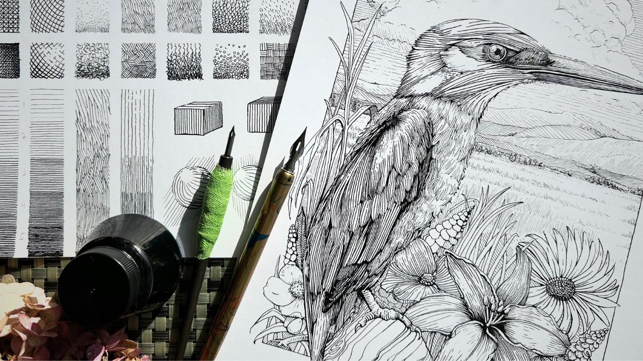
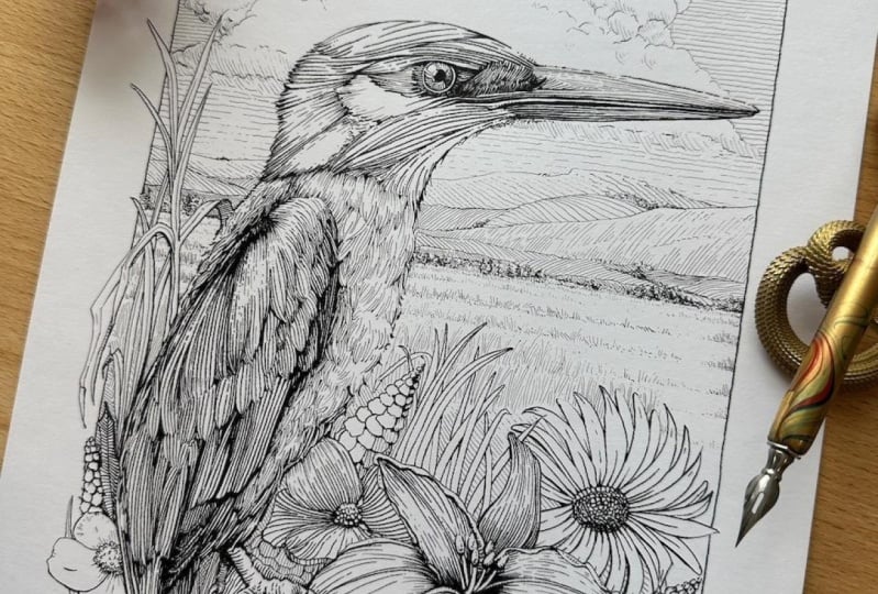
foreground to my subject. A King Fisher on the log
will be the focal point. Flowers in the foreground with a distant landscape and
clouds in the background. I'll be using these
elements to demonstrate the process for the
remainder of this class. Complete your workbook on
page 16 where you'll also find links to suggested
royalty free resources. Go ahead and conduct
your research. Come up with one or two ideas. In the following
lesson, we'll start sketching these ideas
for project thumbnails.
13. Project Thumbnails: Now that you have ideas
for your project, we'll explore how to explain the subject through a
series of thumbnails. And the thumbnails
will determine the composition and the
values arrangement. For most art projects, thumbnails are typically
small concept sketches. Thumbnails are
simple, but they're the first step to resolving
potential problems. Composition is the
structure of a piece. Guidelines for effective
composition include the golden ratio and
the rule of thirds to divide a picture plane
in visually pleasing ways. These two guidelines are
linked for reference. Ultimately, it may come
down to the eyeball method, where you judge what looks best. Intuitively, you want to achieve a combination of balance,
symmetry, and clarity. You've invested effort into grading values in the exercises, and this is where
that chart plays a defining role in the
outcomes of your final piece. An effective arrangement of values places emphasis
on the subject strategically so that the eye flows naturally
through your piece. In this arrangement, we see a white spot against
a black background. The white pops and the eye goes directly to it to demonstrate
how this arrangement looks. In an illustration, here's a bright house against the
background of dark trees, and the dark trees are
supported by a gray texture. It invites your gaze towards
the main focal point. Have a look at
your values chart. It's easy to number
this composition. The house is zero, the trees are five, the path is of one. Now here is the reverse of
the previous treatment. In another illustration,
also by Arthur Gutpill, is a dark building silhouetted against a white sky
surrounded by gray. These two examples
are extreme contrasts with the darkest and the
lightest values juxtaposed. These arrangements are
simple to execute, but what if you're trying to match the tone of your subject? More realistically, the main subject might not
be all white or solid black. If we look at my subject here, he's somewhere in
a mid tone range. By doing a thumbnail first, it provides the
opportunity to resolve tonal problems at a low
commitment stage of the project, rather than be frustrated
to figure out how to keep my composition harmonious
at the inking stage, let's put these
principles into practice. For supplies, you'll want a pencil eraser and
sketching paper. Start with the boundary
lines of the picture plane. I'll try a horizontal
layout first. With your references in sight, loosely sketch the
main elements to establish the structure
of your composition. Use basic shapes to represent the main subject and supporting
elements I've outlined. The bird used
circular shapes for the florals in the
foreground and some kind of landscape
in the distance, on the horizon, line
clouds in the background. Don't add shading
or texture yet. Keep your thumbnails as a contour drawing
without any details. This should only take three
to 4 minutes to sketch. Some artists will fill
a page with thumbnails. It's up to you how far you want to experiment with layouts. Now, for the values arrangement, if you're using a reference, convert it to gray scale. As I have comparing my subject to my chart on a
scale of one to five, he's mostly a three
with a darker beak. Shade your subject first in the tonal value
that's most dominant. I prefer to frame the bird
with lighter values because the clouds are mostly white and the flowers can stay as two. The background sky, I'll shade
darker behind the clouds and maybe a darkish horizon
line just to make sure. Let's see if I make
the clouds dark instead and move those
other values around. You can see how thumbnail
sketches can really help. By doing the stage, you find the best composition plus
a combination of balance, symmetry, and clarity by arranging the values
to frame the subject. Go ahead with your thumbnails. You can refer to my samples on pages 16 and 17
of your workbook. In the next lesson,
we'll see about the source of light and
hatching treatments.
14. Project Subject Study: We'll refine what
we started with, the thumbnails by
doing a subject study. Now you can experiment
with mark making treatments to render
your final piece. Looking at your
preferred thumbnail, identify which elements in the composition
stand out as having a texture so we send texture is a distinct pattern that gives
the illusion of a surface. A surface that you
can explain to the viewer using various
techniques that we practiced for my main subject. There's
a distinct feather pattern on the bird's head and wing. Potentially the log and flowers, which could be
addressed with texture. Sky and clouds might
have some rendering. And the hills in
the horizon line. The objective is not to
single out each element, but rather to evaluate the
possibilities and then narrow those options down
to a few accent textures. Consult your workbook. Reflect back on the
masters whose style you might want to emulate in your
artwork as well your chart. Which of the mark making techniques and textures
most appeal to you? For myself, I've settled
on mostly linework, hatching, and cross
contour hatching. And for accent textures, I'll be testing irregular lines. What helps is to frame part
of the reference image and draw that section
as though you're zooming into a
picture in pencil. I've gone ahead and
sketched those sections of the elements into frames to
test my hatching treatment. Let's first establish
the source of light. If using multiple references, use lighting cues from the references of
the main subject. Look for the deep shadows and the high lights to locate where
the light is coming from. For my subject, the source of light is above and to the left. If you're drawing
from imagination, you can choose where the source
of light is coming from. For the ink application, Using my bigger nib, I start with the subject using the hatching treatment as plant. Remember to refer to
your thumbnails for the values arrangement and the chart to match
your values by number. This is the time to integrate all the techniques
we've practiced so far. My subject, I said, was three, the flowers were two. I've rendered those
first two frames as such using my bigger nib, referring back to the
spheres on the chart. If you recall, when
objects are further away from the viewer in the picture plane,
there's less detail. The hatchmarks are lighter, thinner, and therefore
using a smaller nib. Go ahead with your ink sketches. These subject studies
are not polished. Like final drawings, the
focus of the stages to test hatching techniques and your textures on the elements
of your composition. You want to keep an
eye on the value scales for the arrangement that you planned
in your thumbnail. If you find that the frames
are too small and limiting and you're unhappy with
how things turned out, you have the option,
as a bonus step, to do further studies
in a sketchbook. I didn't like the
feather pattern on the bird's head and wing
in the first frame, so I did an additional version
of a subject study as an optional exercise
before the final artwork. You have a section to complete on page 18 of your workbook. In the next lesson, we'll
talk about the underdrawing.
15. Project Underdrawing: The underdrawing is
the pencil drawing of your subject and the last
stage before the final art. Miss lesson, I share tips to prepare your
pencils for the inks. There are different approaches
to the underdrawing. Some masters, like Mobius, said that his inks turned
out better when he included a lot of information with the pencils
and his underdrawing, such as changes in
plane direction or an indication of the line treatment for the shaded areas. That way he could
focus on the artistry rather than on decision
making while inking. Some artists swing
the opposite way. They'll go direct to ink with very little information
in the pencils, just a few marks of the
subject in proportion. My approaches, somewhere
in the middle, all include more information
for the main subject, especially the face and any area on the drawing that I'm a little less
confident with. I'm quite comfortable
with the main subject because I have a lot of
experience inking birds. So for my kingfisher, I include only the lines that contour the
edges of the forms. I penciled a few more details
for the foreground section. As for the background,
I'll revisit that section after I've
made progress with the inking to gauge
whether I need to adjust any of the
shapes or add details. It's a balance
between saving time and feeling confident with
your ink application. Drawing everything out
might not be necessary. Since we've already planned and practice each section
in the previous stages. We also want to be mindful
not to dent smudge or overwork the paper as this affects the surface for
the ink application. How I like to ideally do my underdrawing is to
erase the graphite from a section that's been
inked and pencil additional details only
when I reach that section. In terms of the sequence for
how I did the under drawing, I started with the border
and the main subject. I added basic shapes for the foreground elements
followed by the background. I'm paying attention to my
thumbnail for the composition and the references for
proportions of the elements. Once all the shapes
were on the page, I added more information to the subject's face and
the foreground flowers, including a dedicated spot
for the artists signature. I concluded by erasing
the construction marks. Complete page 19
of your workbook. Once you're satisfied
with your work, join me in the next lesson to
begin the ink application.
16. Project Ink Application: Congrats on making it to the
final stage of the process. Chances that your
project will turn out the way that you
want is very high. With this level of preparation
from these lessons, I'm confident that you'll have a great experience with
your ink application. The only addition to the
materials is either a glove or a spare sheet of
paper to protect the surface of your
artwork from skin oils. Six tips for confident inking. Begin your ink application with the main subject
for the bird. I started with the
eye with a small n. The eye is the
natural focus point. After the main subject, I proceeded to ink the elements that are
closest to the viewer, going from most detailed to least detailed in
the picture plane. Try the missing edges
technique first. Rather than using
a solid outline. You can always add marks
later to adjust the effects. We briefly touched on this technique in the
charts exercises. There's an example
in your workbook on page 14 In sketch one, the outlines are minimized, edges are missing in the
areas of strong highlight. In sketch B one, I outlined everything
with a solid line. Compare two to B two, after I added the shading, which one looks more convincing
with the edges implied? It engages the viewer to complete the
outline in their mind. If after your shading
is complete you don't like the effect
of the minimized edges, it's easy to add a contour, but much harder to remove. Let's return to our
chart for a moment where we shaded the
boxes and spheres. Since we shaded these
forms without any outline. Now try adding contour lines, leaving gaps where
there's more light. The background then
acts as the edges. I use a combination of these
techniques where I'll use broken outlines for missing edges or do the shading first, then layer in the background to act as the contouring edge. Start light, build the darks gradually by using
the techniques we practiced in our chart. For some mediums,
it makes sense to start from dark to
light, back to front. But within, there's no clean
way to remove the darkness. Once it's committed to paper, you can add, but you
cannot subtract. One way to resolve this is
to render a first pass of the entire composition
in a tone slightly lighter than you intend or
lighter than the reference. We want to avoid having
a single area that is overworked or overpowering
here on the bird's shoulder. I definitely went
overly dark too soon, and it affected the whole
values arrangement. Once the first pass is complete, I assess the relationships
of values and address the areas in the composition
that need more contrast, or smoothing with mid tones in the transition areas,
like my wing here, it helps to periodically
squint at the artwork, take a step back,
or take a photo. I notice more things
when looking at the art from my phone or
in a different light. If you get to a section
and start to hesitate on how to ink it or
you start improvising, this can quickly lead
to blunders to me. These are red flags that
signal it's time to pause. For example, after a, I came
back to my piece and resolve my issue by adding information and pencil for how to
render the clouds. If you're getting lost or uncertain about how
to resolve a blunder, leave the artwork overnight. When you come back, read
through your workbook, look at your values chart and assess how to
get back on track. But oftentimes when you
see it again the next day, it looks better than you
thought and an easy fix. Remember to build the darks
gradually as we practice, by bringing the marks closer
to each other or letting the light in by widening
the gap between the marks. Continue to use line quality to create the illusion
of depth and volume. Crosshatching is one of many
methods to shade artwork. It's an effective technique for building tone as a pattern. However, I find that
crosshatching can create chaos, or monotony for the
viewer when it's over used or rendered
with inattention. Rather than add lines across
marks to shade an area, try building density in the shadows by using the
methods shown so far. Layering each mark with purpose. Remember the source of light. I often will pencil a little sun as a reminder,
Rotate the paper, not your body, to
avoid smudging and for the optimal position to
create beautiful marks. Be sure to sign your work
as a finishing touch. I also date the back and pencil. Please go ahead and complete the section in your workbook. In the next lesson,
we'll wrap up and review what the cement
for your class project.
17. Bonus Content Tips: For reliable ways to
track your progress. Here are three quick tips. The practice exercises offer
an accurate picture of our art progression because there's targeting an
area for improvement. Date your values chart three months from now when
you create a fresh one. You can compare your technique
more directly by simply having a habit of writing
down the date on exercises, even on thumbnail sketches. To keep a chronological record becomes a useful means
to assess progress, limit the subjects that you
practice within a time frame. For example, if you want to improve how to render portraits, then only do portraits
for 21 days, use a timer. It makes it easier to
compare progress when the subject is rendered
under similar constraints. Meaning you compare
a 15 minute sketch against another
15 minute sketch, like apples to apples. The theme here is that it's more straightforward to
assess our progress objectively by comparing
exercises or drawings to one another when they're completed under
similar criteria. Whether it's the same subject, same medium, or executed under
the same amount of time. Do a formal review
every four to six months and see if there
is a visible progress. Make note of why that is, and be specific as to what you did differently to
achieve those results.
18. Project Conclusion + Next Steps: Thanks for watching the class, going through the workbook, doing the exercises,
and of course, bringing it all together by
doing your final project. I shared everything I wish I had known when I got
started with Dip pens. I hope that you'll find
it valuable in getting the results that you want with your Dip pen and ink projects. We talked about finding the best fit between the
materials and your aspirations. We reviewed what to look for when choosing
inking supplies, then tips to maintain nibs and how dip pens
behave in motion. By doing the exercises, you learned more about your preferences for
how to make marks and to produce effects that you can directly apply in your ink work. Moving forward, we talked
about key fundamentals, shape, volume,
lighting, and shading, how to build tones,
plus the importance of arranging values to harmoniously lead the viewer through
your composition. In adopting the five
stage approach, you'll be equipped to resolve potential problems
before getting too far into an inking piece. And it also provides
a process to find suitable subjects and plan out
your artwork step by step. A key takeaway is
that this process, especially the values chart, is an effective method to
assess your progress over time. Another bonus is that
the same values chart can be used again as
reference for many projects. There's no need to create a
new one for each project. Complete the last
section of your workbook and reflect on the final stage. What went well with
your ink application? Is there anything you would do differently in the next piece? What are you still
curious about? And what might you practice
more often after today? If you have questions about general content
in this class, you can write me a note
in that discussion page. If you want specific feedback
on your final artwork, please be sure to
post your work to the projects and resources
page of this class. When you post your
final artwork, you would share a short list, just a few bullets of the
materials that you use so that other students can
be inspired by your work and learn
from your choices. It's optional to include
the chart and thumbnails, though helpful to others to see your planning
progression. This was my first class
teaching on skill share. If you're curious for
what's next with de Pen, you can follow me here as a
teacher or on social media. I'd love for you to
leave a review as this helps other students
know about the class. Congrats on finishing and I wish you all the best
with your art goals.
 Chloe Gendron, Pen and Ink Illustrator