Transcripts
1. Welcome: Learning how to
digitize my work was a fundamental step
in my art journey. It gave me the possibility
to work on new products, combine traditional media
with digital media, and expanded my creative skills. Hi, my name is Althea
and I'm an artist, graphic designer, an online
educator based in Italy. Today, I'm going to
teach you how you can digitize your artwork
in Adobe Photoshop, going from a real-life
illustration to a digital asset you can
use for analysts projects. We'll get started by creating a
set of watercolor illustrations from gathering inspiration to
painting the wall flowers. With our artwork ready to go, we'll jump right into the
digitization process. I break down all the
steps you need to scan your artwork and
adjust the colors. Digitize pieces can sometimes
lose their vibrancy, but I will give you
all the tools you need to bring your art back to life. After that, we'll
work on removing the background and
isolating each element. This part of the
class will be packed with simple Photoshop
tips and tricks. We'll learn how to
deal with watercolors that don't have
well-defined edges or fixing painting mistakes
and after taking this course, you will see just how
simple it is to turn your beautiful paintings into
exceptional digital assets. For the final project
of this course, you will learn how to combine your botanical elements into
an elegant composition. You will create a
beautiful initial decorated with all
your botanical assets. This project can
make a perfect gift, a nice art print, a social media image or
anything else you can imagine. Well a basic understanding
of watercolors in Photoshop might come in handy. This class is designed
for students of any level who want to take their
handmade art to a new level. I welcome everyone to start
on this journey with me. See you in class.
2. Getting Started: I'm so happy that you're here. Welcome to class. While digitizing your artwork can open up a lot of
new opportunities, initially, it can feel daunting. It might be challenging to
know how to scan your work or how to use
image-editing softwares. When I first started digitizing
my artwork in Photoshop, I often felt confused
and overwhelmed. It was all new to me and it
has so many strange features. In addition, I was
noticing that there wasn't just one right way
of digitizing my artwork but that every artist had
their own way of doing this. This made me unsure
how to approach the process of digitization. If you can relate, I'm
here to show you that with a little bit of
practice and consistency, you will start feeling
more confidence, and you will also develop the skills to digitize
your artwork. In the first part of the course, we'll be painting botanical
elements together, and then I'll show
you my workflow for digitizing that painting. Whether you are a
beginner to painting, to Photoshop or both, I'll be breaking
down both painting and digitization
method in detail, so students of all levels
are welcome to join. If you already have some artwork ready feel free to
bring it along. Otherwise, you can
paint with me. I'll be very happy to have you join me for the
painting session. We'll get started by finding the botanical
elements will paint. I have created a
board on Pinterest that's full of photographs
of wild flowers that I will share with
you to find inspiration, then I like to make
rough sketches of the botanical elements that I can refer
to while painting. This stuff makes me
feel more confident and also speeds up my workflow. The following warm
up exercises with watercolors are
also great because it will be creating a color
palettes and practicing different brushstrokes
for painting various parts of the plants. Next, we'll paint around
10 botanical elements. Once they're dry, will scan them and import them into Photoshop. The first step in digitization is going to be color correction, we'll adjust the
vibrancy of the colors, making sure that the
digitized version is similar to our
original painting. Then we'll remove the
background and learn how to isolate each
element separately. This lesson will be packed with tips and tricks for
fixing mistakes, dealing with watercolors where the edges are
not well-defined and turning your
illustrations into clip art files that
are ready to use. My hope for this
class is to give you all the tools you need to
start digitizing your art, and of course, to present you
with a workflow that will make this whole process as
easy and quick as possible. In the final project, you will apply the
tips and techniques learned throughout
the class to create a card with the
initial of your name decorated with
digitized watercolors. You'll be surprised by the many things you
can create by having your watercolor paintings
turn into digital assets. Under the projects
and resources tab, I've included some resources that you can reference
for this class. You will find a file containing
my botanical sketches, a checklist of the materials
and tools we'll need, a step-by-step guide on how
to digitize your artwork, and lastly, a page filled with examples to create
your botanical letter. Without further ado, let's jump right
into the next lesson where I'll walk you
through the materials and tools we'll
need for the class.
3. Materials and Tools: Here are all the materials
we'll need for sketching any pencil or pen and
sheet of paper will work. I'll be using a sketchbook. I'll be drawing the
elements with fine liners. For painting the
botanical elements, you'll need watercolor
paper, paints, and brushes, along with two jars of
water and mixing palette, and some paper towels. I'll be using the Winsor
and Newton paint set, which is very affordable and offers a variety of
colors to choose from. As for the paper, I'll be using this
one from Art-n-Fly. It's 300 gsm cold-pressed. This paper is also
very affordable. I find it perfect to use
it for warm-up exercises. For the final painting, I'll be using this
paper from arches, which is higher in quality. The brushes are from Princeton and both are brown brushes. The advantage of
these brushes is that the bristles
are in a fine point. This allows me to add detail without switching
to another brush. When it comes to painting
with watercolors, there are many options in
terms of brands and supplies. If you need a little bit
more guidance in this, I recommend you watching
my class on loose flowers, where you can find a lesson dedicated to the
materials I use. Next, to scan the painting
you'll need a scanner and a computer with
Photoshop installed. If you don't own a scanner, a good alternative
can be using a camera or a cell phone that takes
high-resolution photos. The digital tablet can
also come in handy, but this is not necessary. I only use the digital tablet when I have to use
the eraser tool or the brush tool and make precise adjustments
to my paintings. But you can do all of those
things using your mouse. These are all the materials and tools you need
for the class. You can also find a checklist under the projects
and resources tab. Now let's blend the elements we'll paint and get inspired.
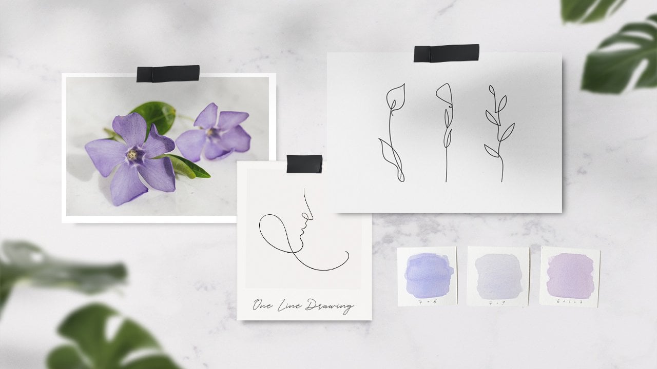
4. Inspiration and Sketching: Whenever I create
graphic collections out of my illustrations, I always like to start with a quick sketch of the
elements that I will paint. This allows me to
have more control and flexibility over
what I'll be creating. I can always go back, erase and make changes
before the final painting. To help us sketch the
botanical elements, I've created a Pinterest board where I've collected
photographs of wild flowers. You can find this
collection under the Projects and Resources tab, and here's the link to it. Feel free to also gather
inspiration from anywhere else; outdoors, from reading a
book or from the Internet. You can also sketch the elements
from your own imagination or use some real-life
inspiration. I'll just use this
photographs as a rough source of inspiration, but my goal here is
not to reproduce the whole flower with
all its details. The goal of this lesson
is to generate ideas so that we can have references
when we start painting. Keep in mind that we'll need around 10 botanical elements to create a nice composition
for the final product. I would consider sketching
3-4 types of branches, three different
types of flowers, and a couple of single elements such as leaves or flower heads. One more tip before
we get started is to vary your botanical elements. I would avoid sketching
only branches, flowers, or botanical elements very
similar to each other. Instead, think about
how much variety and distinctive traits
you can find in nature. Having a good amount of
variety in your illustrations will make your final
composition more dynamic. I'll use a fine
liner as I sketch so that you can see the
outline of my drawings. After [inaudible]
the photo gallery, I'll start with a sketch of a
branch from my imagination. I'm tracing the main stem first and then I'm touching
the smaller ones and filling them with leaves. To give movement to this branch, I'm making short pointed leaves
in different directions. The second branch has
a simpler structure. I just trace a wavy stem
and now I'm drawing the leaves on both the
sides in a symmetrical way. As I work my way up, I make the leaves
smaller and smaller. You can imagine
this branch being contained within an
imaginary triangle shape. When sketching, I never
put pressure on myself or expect the elements
to look perfect. My focus is just on having
a general plan for later and getting a preview of
what I'll be painting. With this in mind, I
really want to remind you to take this part
of the class easy, and the whole sketching and painting process should
be fun and relaxing. Well, sifting
through the photos, I found this interesting plant. It is very different from the usual looking
branch and leaves and I think it will
help embellish the final botanical composition. I start by drawing
the stem first, attaching a second branch to it. At the top, I'm
adding small branches and now I'm drawing small and even circles with the
ragged edges in clusters. These, to represent the flowers, or just the top
part of this plant. Again, this is a very
rough sketch and the photo served me just as a
guide and inspiration. Another element among
all these flowers that caught my
attention was this bud. I'm tracing the stem. I'm adding two leaves
at the bottom part and more leaves on the
upper part of the stem. Lastly, I'm adding the buds
on top of the two stems. Now that we have enough sketches
of branches and leaves, I will start sketching
the flowers. I found this photo of
the Cosmos flower, which I think is so simple
but yet so beautiful. I started by creating
the center of the flower and now I'm slowly drawing
the petals one-by-one. For the stem, I
decided to go with a simple curved line
without adding any leaves. The next flower is going to
be a little bit more complex. After sketching the main stem, I added a second branch
on the right side and I'm sketching a tiny flower facing to the right
onto that branch. To sketch the main flower
on top of this stem, I first marked four points that will benchmark the center
of the flower and then I just completed it by adding four rounded petals around
the benchmarks, this way. I'm adding two more
elements just in case we need to fill
in certain areas of the composition with something that doesn't have a long stem
or there is a full branch. I hope that the sketching
lesson was really interesting and helpful in building
your set of illustrations. Now, you can go to
the next lesson if you're curious to
know the color palette that I'll be using and if you want to do
some warm-up exercises before starting to paint.
5. Color Palette and Warmup: This lesson is
intended for everyone who would like to
get comfortable with their paints and brushes before starting to paint
the final elements. We're going to start off by
creating a color palette, and I'm going to show you the colors I chose
for this class. Then we'll warm up a
little by painting leaves, stems, and a flower you can
use for the next lesson. I'm getting all my
watercolor supplies ready. I prepared two jars of water because I'll be using
one for the browns and the other jar
for lighter colors. This way the colors
can stay pretty clean and won't mud each other. Here is a color chart
of Winsor and Newton, and these are the colors
that I'll be using. Yellow ocher, burnt sienna, light red, burnt
umber, van dyck brown. As you can tell, I
went for warm colors and I guess I'm still not
over the fall season. But anyway, I always
encourage my students to use the colors
that speak to them and bring their own
style to any creation. If you feel that these
colors don't vibe with you, just feel free to
pick different ones. I will start by laying down color patches for
the colors I chose so you can visualize how they
look and feel side-by-side. I will first lay down
the color burnt sienna. I start by picking a dense amount of
paint with my brush, and then I dilute it with water to create a nice
smooth gradient. I'm just going to
repeat this step for the rest of the
colors I chose. Having all the colors
laid down on paper, is going to help you get a better view on the
color choices you made. This is also a big
part of the process when I have to come up
with color palettes. To choose this particular
color palette for the class, I experimented by laying down
different colors on paper and seeing how they
look together. Every time there was a color
that didn't convince me, I replaced it with another one until I was happy
with the result. Our color palette is ready. If you picked different
colors from me, I'm very curious to see how
the final project will look. Now we can warm up a little. I like to start with thin lines, which are usually the ones that require the most
attention and effort. Using the tip of the
brush allows me to paint the thin and fine lines, and I'm also only touching
the paper very lightly, not pressing down on
the brush too much. Since we'll be
painting many stems both to create the
branches and the flowers, I decided to try
out a few of them. To paint a stem, I would normally start
from a main line, and after that I would
attach smaller sense to it, making sure they point
in different directions. Right now I'm painting
a few leaves. I start very light, going with the tip of the brush, and then slowly press down
with the belly of the brush and release the pressure. This helps to create
a single stroke leaf. To complete the leaf and have a white
line in the middle, you just have to repeat this
step with the other side, making sure that you are
leaving a bit of whitespace between the two
sides of the leaves. I'm going to add a
couple of more elements, and I'm also going
to show you a quick and easy method for
painting flowers. If you've never painted
a flower before, you can easily use
this simple technique. If you feel you need
more of this practice, I also suggest checking out my watercolor class
for beginners. There you'll find lessons to
learn how to paint leaves, flowers, and branches, using the loose technique. First, start by picking a color and apply a dense amount
of it to your brush. Paint some dots or tiny line to create the center
of the flower. Make sure to leave some
whitespace within each dot. Now rinse your brush fully and make sure it's
pretty loaded with water or just with another color. That's the center
of your flower only with the point of your brush, and then apply pressure
to create a petal shape. We're ready to start
painting the final elements. See you in the next lesson.
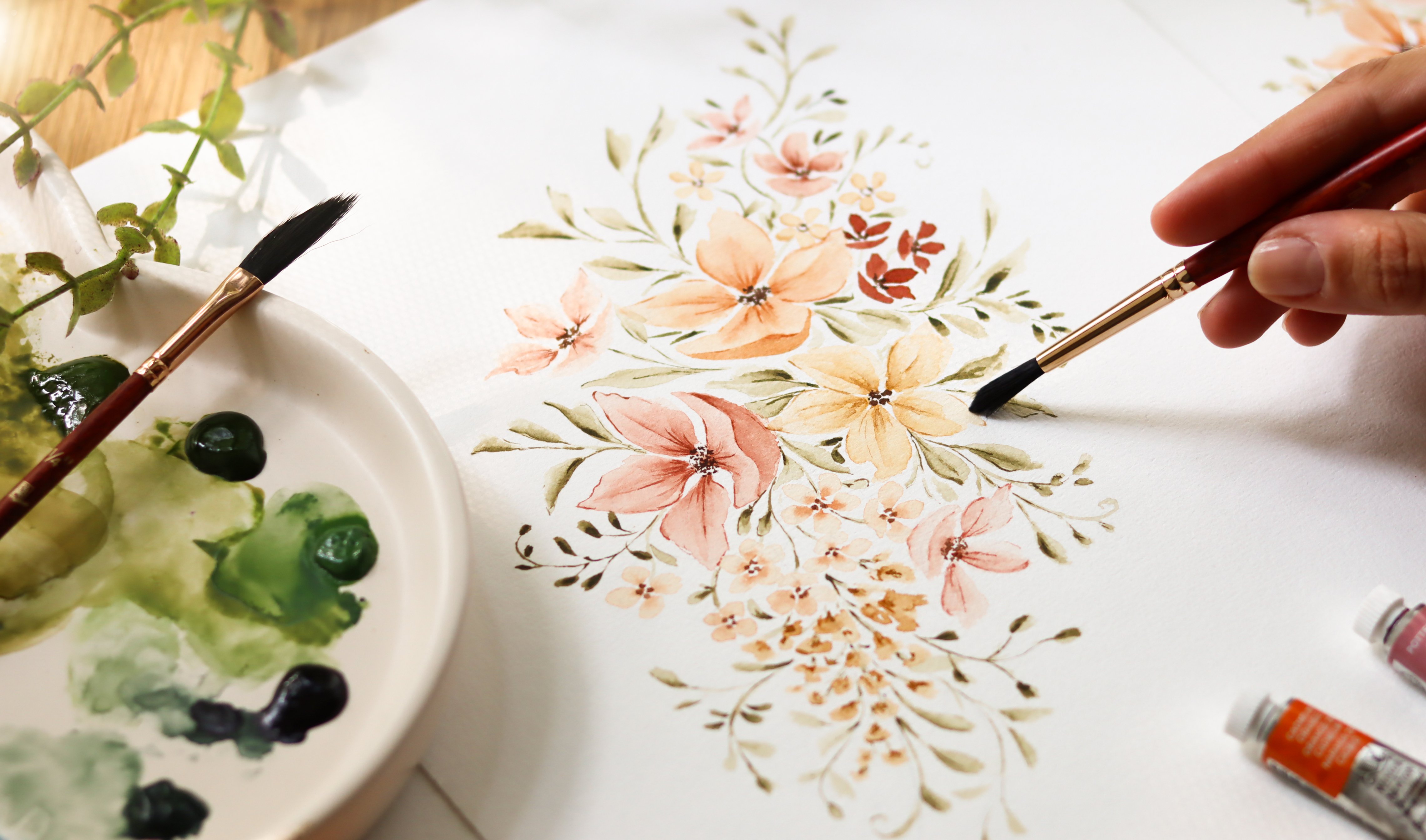
6. Painting: I'm going to keep the
sketchbook containing the botanical elements close by. I have included these sketches in the class resources
just in case you prefer to keep
my sketches printed or displayed on your
laptop for reference. For the first branch, I'm picking a dark brown and I'm loading the brush with a good amount
of this color. Let's start by tracing
the main stem first. I'm going in very light and slowly to make the
line quite thin. At the bottom, I'm going to add a small branch and
fill it with leaves. For the leaves, I
want them to look a little bit dry just like
the leaves in fall or winter so when I apply pressure to create the leaf shape I try to wiggle the stroke on purpose. Now let's paint one more branch just a little bit above
the one we just painted. Our first botanical
element is coming to life. Let's add more leaves to
the remaining branch. As I get closer to the
end of the stem I make the leaves smaller to give this branch the
right proportions. For the next branch, I'm
using a different brown. I'm diluting the color with
a little bit more water as opposed to the paint I
used for the first branch. Again, I'm starting by painting
a very thin stem first and now I'm going to add the
leaves just on one side. As I work my way up
I make them smaller. The leaves are simply following the
direction of the stem. I'm going in with more color
while the paint is still wet to create a nice blurry
effect on some of the leaves. I continue painting the leaves and I use the paint that I
already have on my brush. Branch number 3, here I'm diluting the brown
I just used with more water. I want this element
to be very clear. When we combine all
these elements together, having the branches painted with different shades is really
going to add depth and contrast so I really encourage
you to slightly vary your colors and avoid
using the same color or intensity of
hue consecutively. Just like the leaves
in my sketch, I am painting them symmetrically and I'm scaling them
down as I reach the top. This botanical
element is going to resemble the dry plant
that I have next to me. I'm starting by
creating the stem that then folds into two
different branches With the same brown, I first make it just
a few small dots slightly above the
tops of the branches. Now I'm picking
up a yellow ocher and repeating the steps
and adding more dots. I'm just positioning them closer to the ones
I made in brown. Now, let's dilute these
colors to blur the dots and add more volume so I'm going back in with a
pretty clean brush. To complete this element I'm just painting some
small branches that connect the main stem to the
topper part of this plant. The structure of this new plant is similar to the previous one. You want to create a stem that splits into two
different branches. On top of the stems, I'm adding some lines that will serve as a
bird for the flower. Then with the same color, I'm painting a leaf closer
to the bottom of the branch. Because I want to
make this flower a little bit more dynamic, I'm diluting the brown and I'm painting smaller
leaves on either side of the stem in a lighter color. Finally for the buds, I'm picking up a
good amount of live red that I lay down near
the top of the bud. Then I make sure my brush is
pretty loaded with water and I just go back in and
create this blurry effect. Next I'm starting by painting
some petals with burnt sienna and I'm leaving some
whitespace within each petal. I'm grabbing some water
to clean my brush and I'm going back in
to make the inner part of the petal light while still
leaving some white space. This is adding a little
bit of contrast to the petals making them
more interesting. Then I'm picking some
brown for the stem and painting it starting from
the bottom, moving up. You can add some leaves
if you would like to but I'm just going to leave
this stem very simple. I'm going to skip painting the
center of the flower for now and come back to it later. I want to wait for the
petals to be completely dry before I add more color here. For the next flower, I'm using a dark brown to
create the structure of it. I'm using a good
amount of color here and I'm starting by tracing
the main stem first. Then I'm adding two leaves in
the lower part of the stem using the tip of the brush
to make them pointed. I'm also adding a little branch where I will place a
second flower later. For the flower I'm
picking a light red and I'm loading the brush
with a lot of pigment and starting to create
the center of the flower. I'm just painting small dots and lines to demark the center. Then creating the petals
using the same thick and then this color, I'm painting four petals. Again, I'm leaving
some white space. I'm also using the
tip of the brush to make them a little
jagged and uneven. This will give that nice fall
winter look to our flower. You don't want these
petals to look too small. Well the paint is still wet, I'm going back to the
petals with a clean brush so that I can give that
nice blurry effect. If you notice that your brush
strokes are too watery, you can just tap the
brush in your napkin to release some water. Let's add a tiny flower here. I'm adding three petals
to create a flower that hasn't bloomed yet. Now that the flowers
are completely dry, we can create the
centers of them. I'm picking the brown and I'm loading the brush
with a lot of pigment and I start to tap the color
to create the center of it. Our next botanical element
would be the head of a flower. I'm painting this one by keeping things
again, very simple. For the previous elements, we usually started
with a dark pigment that we then diluted
to make it brighter. But for this flower, I'm going to start with
a very light color and later I'm going to
drop some color on it while the paint is still wet and I'm going to make some
part of the petals darker and we'll create a really
nice smooth gradient. First with a very light color, I outline the shape
of the petals leaving some white
space in-between. While the petals are still wet, I'm slowly adding more
paint to the inner part. As I paint each
petal one-by-one, I continue layering
the paint slowly. This creates a
beautiful gradient that gives some shading
to the flower. Now I'm just adding
a couple of leaves to complete our set
of illustrations. Our paintings are finished, but if you like, you can also add details to some of the
botanical elements. For example, here I've added some lines on top
of this leaves, and I also made the buds pop out a little more by
adding more color. Illustrations are
ready to be scanned, just wait for
everything to be dry and I will see you
in the next lesson.
7. Scanning: We have just concluded
the painting session, so now we can start the
digitization process. When digitizing your work, you have two options for getting your handmade artwork
onto your computer. First, you can use a scanner, which is the method that
I highly recommend. Or you can use a camera
or a cell phone instead. If you're choosing to use a
camera for the scanning step, here are just a couple of tips that you may want to consider
before shooting the photo. First, find a location with
even and undirect light. Cloudy days are
usually the best ones because the light
is very neutral and gentle on your
paper and doesn't alter the colors of
the illustration. Avoid shooting with sunlight
or in any situation that creates shadows
on your paper. When you're shooting, make sure you're holding
your camera from the top and that you're not cropping
out any parts of your paper. If you have a tripod, I recommend you use it to avoid any distortion and shaking. Here's a piece of white
paper to bounce light back onto your art for
more even lighting. To digitize my artwork, I use a scanner and the
model is the Canon LiDE 400. It's a good thing
Scanner to start with if you need any recommendations because it's not as pricey
as the professional ones and does the job perfectly. You didn't really need the most expensive
one to get started. So before I started
digitizing my artwork, I always make sure that
the painting is dry. The second thing to do
is to make sure that the bed of the scanner is clean, even if I can't spot any dust, I always wipe it
down with a towel. There haven't been many
times I scan my work and noticed dust on my painting
when editing in Photoshop. This is just extra work that we want to avoid as
much as possible. When you're ready, you
can place the paper, close the lid and hold
your hand on the lid or place a couple of
books on top of it. The watercolor paper
is usually uneven, so some weight can help during the process
of digitization. Within the scanner
software on your computer, you have several options
for your scan settings. These will depend on
your specific scanner and your dialog box might
be slightly different, but the options we're going
to set should be there. When scanning artwork, I
always select photograph mode, and then I set the resolution. If you want to keep
the illustration for web project then 72 DPI is fine. If you're planning on
printing the illustration, I recommend you to start
from at least 300 DPI. I usually scan at
600 DPI because it tends to be easier to
scan at a higher resolution. If I need my file to
be smaller then I can always export it at a lower
quality in Photoshop. Then I check where the file is going to be saved and lastly, I select the format I want
my file to be saved as. Here I have PNG, TIFF, and JPEG. If you're stressing about
what format to use, either of these will do, but just be aware
that TIFF files store much more data
than JPEG files. This means that there will
be higher in quality, but this will also translate
into larger file sizes. The JPEG format uses
lossy compression, which means that
these files reduce picture quality to
achieve a smaller, more manageable file size. So even though my
file will be bigger, I always select TIFF format
for the best quality image. We are all set. Now we can click "Okay." Now I'm clicking on "Photo"
to start the scanning. Once you have your
illustration scanned, you can open Photoshop
and go to the next lesson where we'll work on
color correction.
8. Color Adjustments: The first thing I do
after I've scanned my work is to
correct the colors. First of all, let's
open Photoshop. Click on "File", "Open", and then select the
file you just scanned from where you saved it. Now, you may need to
rotate your image. If so, go to Image,
Image Rotation. If you hold down the
spacebar on your keyboard, a little hand will appear and will allow you to move
your work area around. I'm going to use this
function pretty often, so I just wanted
to show it to you. As you've probably noticed during the process of scanning, our artwork lost a little
bit of brightness. It may appear a little yellow
or on the opposite side, it may appear to
be a little cool. This really depends on
the scanner you have. To correct for
this color change, we need to balance
the white background against the overall image, so click on "Image",
"Adjustments", "Levels". Here you see three eye droppers and you need to click
on the third one. Zoom in on a clear part of
the background by clicking "Control plus" and sample a
white point from the paper. The difference in the
overall color change might be slight, but in general, the look of the image should
be more natural. Another interesting
option we have in the levels panel is
the input levels. There's more triangles you see under the graph are handles so you can move around to adjust the colors
in different ways. I always use the first one to add contrast to
the illustrations and just moving it
a little is enough. If you overdo this, your illustrations might
look a little bit dramatic. I don't usually move
the other two handles because I don't want to
alter my painting too much. But of course, each
painting is different, so at times I might
add brightness by dragging this last
handle to the left. But again, just a little bit. I think the watercolors
look good now and more natural but I'm
going to do one more thing. Sometimes the colors in
your scanned paintings can look a little bit flat, so I like to add a little bit
of vibrance and saturation. Let's click on "Image",
"Adjustments" and "Vibrance". As I mentioned, I only go very lightly
on these adjustments. My goal is to make
the scanned photo look as similar to my painting, back to the original, maybe with just a splash of
contrast and saturation. In the end, how you do
the color corrections comes down to each
individual artwork, the color you used and
how you want it to look. This was it regarding
color correction. In the next lesson we will work
on removing the background and isolating each
botanical elements.
9. Removing the Background: There are many ways
you can go about doing the same
thing in Photoshop. There are also several
different ways available to you for how
to remove the background. In this lesson, I'm going
to show you the steps I take to isolate each element and create a nice clean PNG file ready to use for any
type of project. Along the way, I will share
some tips about how to deal with watercolors that
don't have well defined edges. I will also demonstrate
how to get rid of imprecisions or
painting mistakes. In the class resources, I've included a guide about all the steps
we're about to take. You may want to check that out. Let's lock the level
where you have your photo by
clicking on the lock. Create a new level and drag
it below the first one. Make sure the new level
is selected and then in the tools section, you
have on your left-hand side, click on the first square
in the color section, pick any dark color,
and then click. ''Okay''. Now select
the bucket tool and click anywhere
on the canvas. This dark color
layer will come in handy when we will
remove the background. It adds a stark
contrast and helps us identify places within our
watercolor elements that, for example we
haven't erased well or white spots that
still require cleaning. To keep things tidy, we can give a name
to the level we just created by
double-clicking on the current name and
changing it to background. I'm also renaming the level
containing the skin file. Now make sure you are on the
main level and in a toolbar, find the eraser symbol. Click down on it and hold
to see more options pop up, and among these, select
the Magic Eraser. Up here we have a value
which is called tolerance. The value we give to the
tolerance will define the range of colors
the eraser removes. A lower tolerance
erases only pixel with a color very similar to
the one that you select. A higher tolerance
erases pixels with a broader range of
color similarity. I'm going to demonstrate the different effects
as we vary tolerance. But before we do that, makes sure that contiguous is checked so only the
background gets erased. If contiguous is unchecked, then all pixels of that color anywhere on the
image would be erased. Now let's set the tolerance to a high number like
60 as an example. Now I'm going to click on the white background
that I want to remove. As you can see, many parts of
our illustrations have been erased and this because the value of the tolerance
will set pretty high. Let's reset by
hitting "Control Z". This time I'm going
to try a low number. As you can see, the illustration
themselves are intact, but much of the paper
didn't get erased. This because the paper has texture and some
color variations. The goal here is to find a value that works well
with our paintings. Let's bring the
number to around 30. This value seems to work well and to strike
a good balance between maintaining the elements and removing the background. We just have to bring back a few parts of the
botanical elements, but as you can see, the
overall result is good. Now I'm going to zoom
in and look at each one of my botanical
elements in detail. If there are any white
areas that I want to erase, I click on them with
a Magic Eraser. There are some white
areas that I don't erase because I want those to be part of the final look
of the element. You might also see some
residue paper texture left or some white
dots along the canvas. You can click on the pixels you see a couple of times and some of
them will disappear. Don't worry if you can still see some dots and imperfections, we'll get rid of them by
the end of this lesson. We have now removed
the background, but in some places we have
removed a little too much. In the next steps, we're
going to bring back some of the parts of the elements
that were erased. To do this, first, I click on the
History Brush tool, you can find in a toolbar. Once it is selected, you can go on the
top right side of your screen and
click on this arrow. This will open a history or a chronology of all
the actions we took. If the window pops up too small, you can expand and resize
it by dragging it down. Within the history, you want
to select "Paint Bucket". This essentially creates
a brush that brings back the parts of the illustrations
that you have erased. If you need to adjust the
dimension of this brush, right-click with your mouse, and here you can choose the
size and also the hardness. Always make sure you
are on the main level, then you can zoom in to make
more precise adjustments. This part of the
editing process does require a little bit of
patience and precision, but don't go crazy about the jagged ends that
your watercolors have. We will smooth them out later, but if you see something
that really bothers you, you can pick the
eraser and erase the edges to smooth
out your shape. I'm moving my canvas around and I'm going
over the parts of the elements that
require this editing. The digital tablet
comes in really handy for this tab. So if you have one, I encourage you to try use it. Another helpful
trick you may need is a tool that lets
you fix mistakes. Sometimes it happens
that the scanner picks up some dust particles
you didn't notice, or simply that one of your illustrations has a
splotch or a mark in it. To fix these mistakes, we can use the Clone
Stamp tool right here. I'm going to zoom in
really close to see if I can find any
dust or imperfection. Here is a good example of what a dust particle
might look like. To adjust the dimension
of the Clone Stamp tool, right-click just like we did with the History Brush tool. Now you can adjust the hardness
and the dimension again. You want to keep the hardness
of this tool to zero. Now, hold down Alt and click on the area close
where the mark is. The brush will reproduce
the area we just picked. Click on top of the mark and
you'll see it disappear. You can repeat this step
for all the parts you need. We're almost ready to save
each illustration separately, but before we do that, we're going to take one less
step for the final touches. As always, make sure the
main level is selected and that you are zoomed in
on your illustrations. In the layers panel
go to the main layer, right-click within the
little preview rectangle, among the options that pop
up, choose select pixels. Now we're going to create a
mask and adjust the outlines of your illustrations in the window above
the layers panel, which you can expand
to your liking. You want to click on
"Select and Mask". Now click on "View"
and select on layers. This option will
allow you to see any changes that you make
immediately in real time. Among the option that
are now displayed, we will only utilize the bars in the global
refinements section. Each bar, will edit the outline
of the illustrations in a slightly different
way and how you want your elements to look in the end really comes down to
personal preference. I would suggest just playing
around with the handles and seeing the changes they
producing your paintings. When you move the handles, you might not see any change
but just give your computer a few seconds to
compute because we are working on multiple
illustrations. This can take a
little bit of time. Once we're happy
with the result, let's click on ''Okay'' and then to apply the mask, click on this tiny icon that has a little arrow facing down. We are now ready to
save our illustrations. See you in the next lesson.
10. Exporting: Okay. We're just one step away from working on
our final project. Let's export and save our
set of illustrations. We're going to put each
element into a separate layer. With the lasso tool which
you can find in the toolbar, let's select this branch. Now click "Control Shift J", and the element you just
selected is now on a new layer. We can hide this
new layer to see which elements we still
have left to isolate, and let's repeat this step
for the remaining elements. Go back onto the main layer. With the lasso tool, do a selection around
your illustration, and again, click
"Control Shift J". If you want to
deselect an element, just hit "Control D". It takes time to finish this. I sped up the lesson a little, but whenever you're ready, you can eliminate the
new layer because it's an empty layer and
we don't need it anymore. Now we can go through each layer and save
our illustrations. I'm starting from Layer 1. Before saving it, I just do
a quick check by zooming in. I use the eraser tool to get
rid of any white pixels left, if there are any. To save this illustration, I right click on the level and I choose Save As PNG. Make sure to save the file in the right folder and
then click "Okay". The file will be
saved in PNG format with a transparent background, and it's ready to be used. You can proceed by saving
the remaining illustrations. The technical part is over and we can finally create
our botanical card. I know it can be
quite a lot of work, especially if you're
new to Photoshop, but once you start doing
this a couple of times, it will definitely
feel like less work and something that
comes more naturally.
11. Final Project: This is the part that
I love the most. I have all my
illustrations ready, and this allows me to
work on a variety of projects from creating
social media templates, greeting cards,
invitations, and anything I can imagine customized
with my own illustrations. For this class project, I want to create with you a small square card that
will contain the initial of a name with your hand-drawn and digitized botanical illustrations on top. Cards like these
are very versatile. It can be a very special
gift to someone, you can use it to write on the back and use it
as a greeting card, or you can even use it
to decorate your home. In fact, I'll be
putting my card in this frame and keeping it
to decorate my art studio. Back to Photoshop. Let's create a new document
by clicking on File, New. On the right-hand side, you can set the width
and height of your card. I'm going for a square format, and I'm selecting
centimeters as the units. I want my card to be 12 by 12 centimeters and I want to set a three
millimeter of margin. I'm leaving the
resolution at 600 DPI, but if you scan your
paintings at 300 DPI, you can go with 300 DPI. For me, the RGB
color mode is okay. I'm just planning to print
this with my own printer, but if you need this graphic
for professional use, you want to set the
CMYK color mode. We first want to
make a text box to display the first
letter of the initial. To write on the Canvas, go on the toolbar, select the text symbol, and click anywhere on the
Canvas to start typing. On the right-hand side,
there's a column, and here you can set the font
type, dimension and color. Right now I can see what I just typed because the
color is set to white. To change this, I highlight the text I wrote and click on this white rectangle in the
menu to select a new color. In the type layer properties, you can also find
this icon which allows you to
capitalize your text. Now I'm adjusting the
dimensions of my initial, increasing the size until
it's as big as I want. I'm clicking the first symbol
in the toolbar to move the letter and position it
in the center of the Canvas. Now I'm going to
change the font type. I'm going for a serif font, something classy that
can go well with my personality and
my studio as well. I'm leaving the color for
later so this way I will find the perfect tint that will
also match the illustrations. Now let's open the
folder containing our illustrations and let's select the ones we want to use. You can use them all, but I will be selecting
several elements. To select the elements, I'm holding down control and clicking on the element
I want to pick. I selected seven elements, now I'm dragging
them in Photoshop, click "Enter" for
each illustration to insert it into
your work area. To select all the layers
containing your illustration, start by selecting the one at the top hold on shift
and select the last one. Now, hit "Control T"
to scale them down. This is the time where
you can start decorating your letter and there
are no rules here. The goal is to arrange your botanical elements
around the initial in a way that feels
right for you and if you need ideas
to get started, here is a graphic
collection I've realized this fall and I've included the letter
of the alphabet along with numbers decorated
with watercolors. You can find this collection under the class
and resources tab. I'm moving only elements in the top left corner so that
I can have a room to work. You can pick an element
simply by clicking on one specific layer or by clicking on the
group of elements. If you need to scale
or rotate the element, click "Control T" and when you have completed
the adjustments, you want to make,
just click "Enter" [MUSIC] Another thing you
may want to try is to reordering the layers, so, for example, here I want to move this flower on top of
all these elements. I'm just going into the
layer panel and I'm dragging the layer containing this flower on top of all the other layers. I also want to try
to flip this element to see if it looks
better and you can do the same by clicking control T and then
right-clicking with your mouse, the illustration will flip when you select flip horizontal. Here you can also
find the option to flip your element
vertically [MUSIC] Guys, I will continue placing the elements until I'm
happy with the composition. During this step, I
often go back and forth, rotating and scaling
the elements, reordering and
moving them around. It usually takes me a couple of tries and some experimenting. I will speed up the
video, but as always, feel free to pause and work
at your own pace [MUSIC] I'm very satisfied with how the botanical elements
look on top of my letter so now it's time to pick a color
for my initial. I'm going to select the
layer containing my letter. I'm going to click
on the rectangle. Here, I can choose what color I want to set my letter to. I'm looking to go with a brown
since the color palette I picked to create
the illustration is fall themed and warm. Now I'm going to
select all levels except for the background
and I'm going to merge them together by clicking control E. This way
we have everything, the initial and the
illustration all in one layer. I'm going to do one more thing
before exporting the card. Instead of keeping the
background pure white, I want it to be a
slightly different color with a white border around it. To achieve this effect, I'm going to create a
new layer and select the color I want for my
background in the toolbar. Then I'm going to use
the paint bucket in the same toolbar to fill this layer in with
the color [MUSIC] To make a white border, I'm going to select
the background color by clicking control T and then I scale it down a little bit and I position it in the center. I'm happy with the result so I merged the background
together with my letter by clicking control E and now we're ready
to export the file. Click on "File" Save a
Copy, rename your file, and then select the PDF format if you want to print this card or you can simply select JPEG format if you want to
share it on social media. From here, the possibilities
of what you can do with your final digitized
composition are in your hands. Throughout this process,
you learned and gained a lot of skills from sketching and painting to editing and composing
your digital assets. You can really use them
in endless projects. You can apply these skills
to any handmade art work, not exclusively to watercolors an I really can't wait to
see what you come up with. You have reached to
the end of the class so huge congrats to you
for making it this far.
12. Thank You: [MUSIC] Thank you so
much for choosing to spend your time with me today. I hope that you found
this class useful and that you feel
inspired to turn more of your artwork into digital assets to use
for new projects. I can't wait to see
your botanical carrots. I use mine as a decoration in my studio and I think
it looks gorgeous. Make sure to go to the Projects
and Resources Section to upload your work and feel free to post any part
of your project. I'll be very happy to take
a look and leave feedback. Also, if you post your
project on social media, don't forget to tag me. Lastly, if you feel stuck on a certain step of the class,
especially with Photoshop, or if you have questions, feel free to use
the Discussion tab, and I'll be more than
happy to help you out. You can also follow me
here on Skillshare to get updates as soon as
I release a new class. Thank you so much
again for joining me today and I hope to
see you soon. [MUSIC]
 Altea Alessandroni, Artist and Designer